
Hour 23. Universal Applications and Size Classes
What You’ll Learn in This Hour:
 What makes a universal application universal
How to configure universal applications
The use of size classes in application design
The iPhone represented Apple’s first entry into touch-based computing. It was a single device with a single screen size. Man oh man, how times have changed! We now live in a world with the iPhone, the iPhone Plus, iPad, iPad Pro, and—who knows how many more are the pipeline? Throughout this book, we’ve been targeting one platform or another. But you know what’s even better? Targeting all of them. We’ve already built a few universal applications, but we have always had an interface that looks the same on the iPad and iPhone. The applications have also been effectively unaware of what platform they are running on. In this hour’s lesson, you will learn how your apps can be created to be universal, but also have distinct user interfaces on the iPhone and iPad.
Universal Application Development
A universal application is one that contains the necessary resources to run on the iPhone and the iPad. Although the iPad already supports running iPhone applications, they don’t look so great being all stretched out. Unlike other platforms that try to reformat a small screen to a large display, Apple recognizes that these are unique user experiences. To build a true iPad application, you may need different scenes, images, and maybe even completely different classes. Your code might even need to make decisions on-the-fly about the type of device it is running on.
Note
Keep in mind that not all capabilities (vibration support, for example) are shared across your development platforms (iPhone/iPad/iPod touch). Be sure that you plan your universal apps appropriately.
Not all developers have decided that a universal application is the best approach for their projects. Many have created separate HD versions of their apps that are sold at a slightly higher price than an iPhone version. If your application is going to be substantially different on the two platforms, this might be the route you want to take, too.
Configuring a Project as Universal
To create a universal application project, you have two possible approaches. First, you can use the Devices drop-down menu during project setup to choose Universal, as shown in Figure 23.1.

Alternatively, if you’ve already created the project for a single device, follow these steps to update it to be universal:
1. Select the Project group in the project navigator.
2. Make sure that the first target is selected.
3. Click to select the General button at the top of the editor area.
4. Within the Deployment Info section, change the Devices drop-down menu to Universal, as shown in Figure 23.2.

There’s really nothing special or complicated about making an application universal. There are a few additional resources, however, required by applications that run on both iPhone and iPads.
App Icons
Using a universal application’s asset catalog, you can set app icons for both iPhone and iPad. Select the Assets.xcassets asset catalog in the project navigator, and then choose the AppIcon category. Xcode displays image wells for each device and icon type. To calculate the size of icon that is required, look at the measurement beneath each well. The size is given in points, so you’ll need to multiple by the scaling factor (1x, 2x, or 3x) to get the dimensions in pixels.
If you don’t see spots for both iPhone or iPad image files, open the Attributes Inspector. Here you can activate both iPhone and iPad icons, as shown in Figure 23.3.

Launch Screen
Each Xcode 7 application template now includes a LaunchScreen.storyboard file that contains a single scene, shown in Figure 23.4. You can use this scene (and all the Interface Builder tools, including Auto Layout) to create the screen that is shown when your application launches. In earlier versions of the development tools, launch screens were actually images—requiring many different versions of a single image to cover all possible device sizes and orientations.

Universal Tools and Techniques
In this hour’s lesson, we’re going to look at how size classes can address the need for different interfaces on the iPhone and iPad. There are, however, several approaches you may want to investigate:
Size classes: A new feature (introduced in iOS 8), size classes will give us the best flexibility for defining adaptive user interfaces for universal applications. Using size classes, we can develop for the iDevices that exist today and will exist tomorrow.
Multiple storyboards: The classic approach for iPad and iPhone interfaces is to use a different storyboard for each. By keeping the user interfaces separate, we can focus on creating the best possible UI for each device. You can set separate storyboards for iPhones and iPads by adding the keys “Main storyboard file base name (iPhone)” and “Main storyboard file base name (iPad)” to your project’s Info.plist file along with the names of two independent storyboard files.
Device models: Apple lets us quietly query what kind of device our code is running on. By performing a model or “interface idiom” query, we can programmatically make decisions about how to behave on different devices. This comparison, for example:
UIDevice.currentDevice().userInterfaceIdiom ==
UIUserInterfaceIdiom.Pad
Returns true if the code is executing on an iPad.
Unless your project is highly dependent on device type or orientation, you should always use size classes to create the most device-agnostic application possible.
Size Classes
You’ve learned about adaptive segues, storyboards, and, starting now, size classes. Size classes are the final piece of Apple’s adaptive technologies that will enable us to create a single storyboard that targets different device types (sort of, but more on that in a second).
The way it works is this: For any given size class, you can define a set of objects and object constraints that apply within that class. Want a button that only appears on a landscape iPhone? Set up the button for that size class, but no others. Want a label that orients in an entirely different position for an iPhone in portrait versus an iPad? Create one set of constraints for the iPhone’s size class and another for the iPad.
So, what is a size class? It isn’t exactly a device type, but a generic semantic representation of a particular type of device/orientation. What we will refer to as a size class is actually made up of two elements: a horizontal size class and a vertical size class. The horizontal class describes the width of the device, and the vertical class describes the height.
Note
The documentation on size classes isn’t always consistent. A horizontal and vertical size class are together called a trait, but are more often just referred to as the more general size class. As you develop, you probably won’t find many instances where you’ll be referring to a size class as anything other than the combination of horizontal and vertical size classes (and vice versa).
For example, a size class of Compact Width, Regular Height describes any iPhone in portrait view. A size class of Regular Width, Compact Height is an iPhone Plus in landscape. A horizontal or vertical class can also be replaced with Any, meaning that it matches any possible values within that class. By default, when you create a universal application, you are designing for a size class of Any, Any; this combination applies to every device that Apple makes. All objects and constraints defined in the Any, Any size class apply to all devices, and are inherited by the more-specific size class.
All of this will make sense if you look at the different devices and orientations and the size classes that target them. Table 23.1 shows all of the current size class definitions and the devices they represent.

There are a couple things to consider right off the bat. First, these definitions aren’t very granular. It’s easy to imagine that a Compact width and Regular height describes an iPhone in portrait orientation. But how does Compact width and Compact height describe any iPhone in landscape mode? Apple currently believes that only the iPhone “Plus” models in landscape deserve to be called out separately with the Regular, Compact size class. Don’t think about it too much - the goal is to pick the size class closest to what you need (and as generic as possible), and if Apple comes out with devices in that class in the future, your app will be ready for them.
The second thing to notice is that an iPad in a portrait orientation has the exact same size class as an iPad in landscape. No, that doesn’t mean that there’s some magical way a single size class can do double duty. It means exactly what you think it does: A size class cannot be used to differentiate between an iPad in portrait mode versus one in landscape. For that, you need to turn to the techniques we covered in Hour 16, “Building Responsive User Interfaces.” Apple’s opinion is that an iPad interface should be roughly consistent between landscape and portrait (so they cannot be targeted independently).
Why is Apple so mean? The answer lies in iOS 9. If you follow iOS development, you know that iOS 9 supports side-by-side multitasking on the iPad in iOS 9. To support iOS 9, your application needs to support Auto Layout along with size classes. Orientation becomes irrelevant when your screen is shared between two applications. In short, you must be able to adapt from Regular (W), Regular (H) layouts to Compact (W), Regular (H) layouts. In multitasking mode, the available iPad screen space is always taller than it is wide; the height is always Regular, whereas the width varies between one-third and two-thirds of the available screen width. In other words, it is Compact.
Tip: iPad Multitasking by Doing Nothing
If you want to support iPad multitasking in your application on iOS 9, you really don’t need to do a thing. If you support Auto Layout and size classes, your application will automatically work with split-screen multitasking in iOS 9.
Caution: Watch This Space
Size classes are still quite new. Over the next few years, who knows how they’ll evolve? Apple may add additional classes for new devices. Of course, if you use Any, Any, the storyboard will function anywhere in any size and orientation.
Using the Size Class Tools
Using size classes is much simpler than many tutorials and the Apple documentation would lead you to believe. In fact, it’s as easy as creating your interface—something that you’ve been doing for hours. When you create a new project and open the storyboard, you’re immediately dropped into a design using a size class of Any, Any, as shown in Figure 23.5. This literally means any horizontal class and any vertical class. (That is, every single device in every single orientation will use the objects and constraints you define in this configuration.)

If you have a simple application interface, this makes sense, and you absolutely should try to use this “generic” class. If, however, you think you may want to create custom layouts for other size classes in the future, this could lead to trouble. The problem with using one of the Any class designations is that everything you define within that class is inherited by other size class definitions. If you design within Any, Regular, for example, you’re effectively designing for Compact, Regular and Regular, Regular.
Setting the Active Size Class
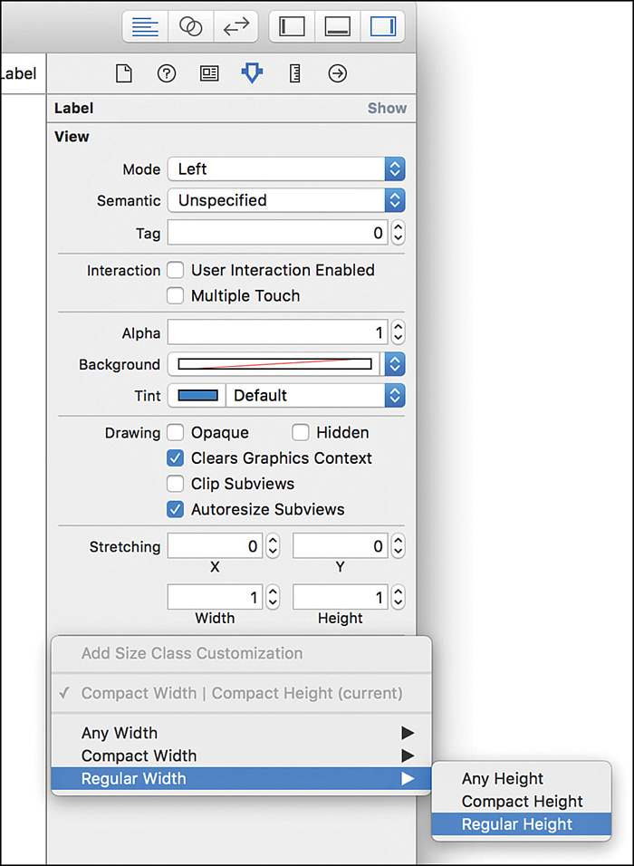
To set which size class you are working with in your storyboard, click the label in the bottom center of the editor. A pop-up selector appears, as shown in Figure 23.6.

FIGURE 23.6 Choose which size class you want to target by clicking, then hovering your cursor over the grid.
When I started working with the size class selector, I thought it was confusing. I still do. What you’re doing in this tool is positioning your cursor so that the selected area best represents the size (visually) that you want to target. That said, the visual representation isn’t close enough to “reality” for me to know what I’m looking at. Instead, I pay attention to the size class description, and I recommend you do as well. The description shows exactly what device and orientation the selected size class will target.
Note
As you move your cursor around the size class selector, you’ll see little green dots appear in the grid. Those dots highlight the other size classes that will inherit any settings you make in the one that is currently selected.
After selecting a size class, what do you do? You design. You add objects, constraints, and have yourself a merry old time. In fact, you don’t need to know anything else to design for a size class; you just work as you normally would. Of course, there’s more to the story than that, but not too much more. After designing for one size class, you use the selector to choose another—and the process begins again, with one exception: You can inherit the constraints and objects from your other size class.
In the initial release of size classes in Xcode 6, Apple displayed Any at the top of the size class selector when you selected a class that matched either Any width or Any height. This has gone away in Xcode 7. Now, when the width or height is Any, it is simply left out of the selector’s label. For example, if the selector says Regular Width at the top, it really means Regular width, Any height.
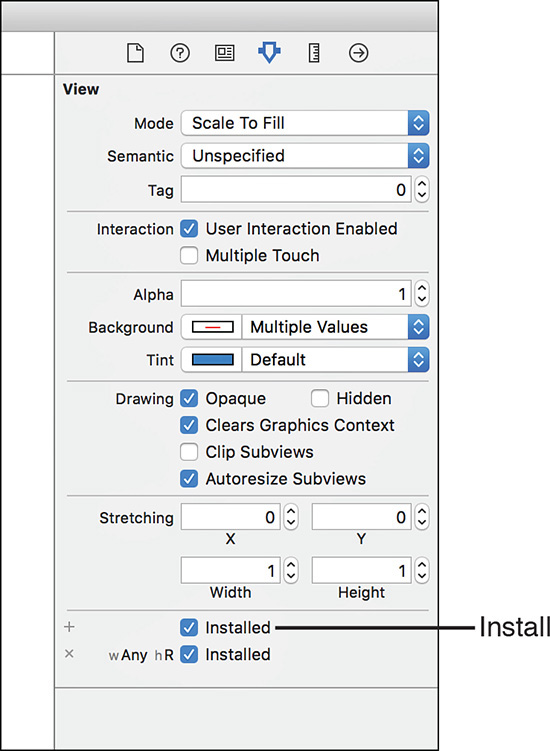
Configuring Installed Size Classes
An object or constraint that is active in a size class is known as installed. You may recall from Hour 16 that when you view constraints in the Attributes Inspector, you see an Installed check box, as shown in Figure 23.7. The same goes for objects that you added to a specific size class. When that box is checked, the object is active in that size class. When the check box isn’t checked, the item is ignored. A check box is listed for each size class that could potentially apply to an object/constraint.

FIGURE 23.7 Installed objects and constraints are those that are active within the currently selected size class.
Constraints and objects that are being ignored in your currently selected size class are shown grayed out, as shown in Figure 23.8. You can still select them, but they won’t become active and until you check their Installed check box.

FIGURE 23.8 Grayed-out objects and constraints are not installed for the currently selected size class.
Manually Setting Size Classes
The easiest way to work with size classes is to create your designs in one class, switch to another size class, install the objects/constraints that you want active in that class, and you’re done. Apple has also made it possible to add settings for any size class at any time, directly within the Attributes Inspector. Suppose, for instance, that you’ve installed a label in the Compact, Compact size class and you know you want it in the Regular, Regular class as well. You can select the label and view the Attributes Inspector, then scroll down to the Installed check boxes and click the tiny + button, shown in Figure 23.9.

A menu appears, as shown in Figure 23.10. Use the menu to choose a new size class that you want to install, such as Regular, Regular.
After making your selection, the new size class will be visible in the list of check boxes and can be managed just like any other size class. Personally, I’d rather use the size class selector to switch to the desired class and edit the Installed check box there, but that’s just me. There is, however, one very specific instance where using this + button is fast and simple: setting size class-controlled fonts.
Controlling Fonts with Size Classes
When setting the font for a label or control, you’ll notice that the Attributes Inspector includes a small + button beside the Font field. You can use this to set custom fonts and sizes for any size class. Clicking the + button opens the same size class selection menu that you saw in Figure 23.10. Choose the size class you want to configure, and you’ll see a new font selection field appear for just that size class, as shown in Figure 23.11.
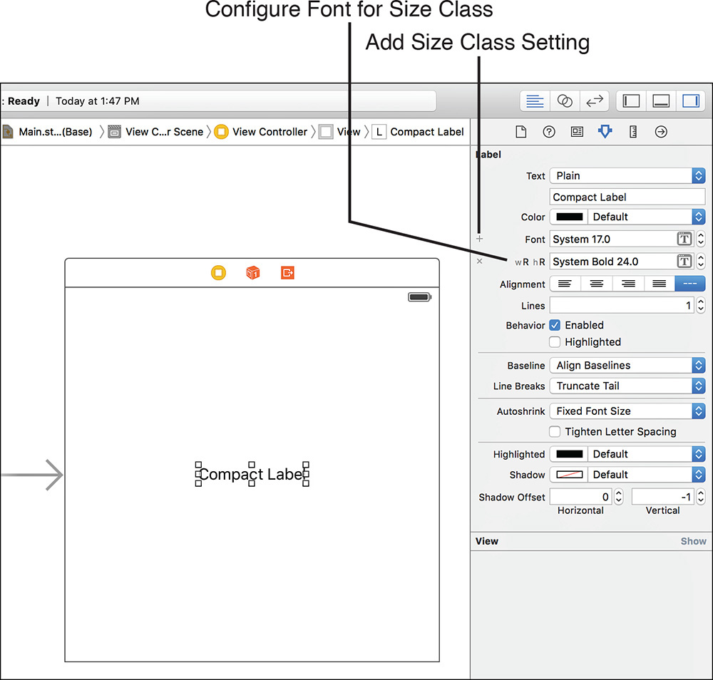
You can configure the fonts however you’d like, and they will only be visible when the appropriate Size Class device/orientation is in effect.
Controlling Images with Size Classes
One last piece of Xcode functionality can be modified by size classes: images in asset catalogs. As you’ve learned, images can come in 1x, 2x, and 3x scaling factors, but you can also define images for different horizontal and vertical size classes, as well as size classes specific to the iPhone and iPad. To see how this works, open any asset catalog and add an image. Next, open the Attributes Inspector with the image name selected in the Asset Catalog list, as shown in Figure 23.12. Use the Width and Height drop-downs to choose a size class, and the Devices drop-down to choose what hardware you’re supporting. You can even use the Memory check boxes to enable different image options depending on the amount of memory in the devices you are targeting.

FIGURE 23.12 Customize image sets to include device-specific options as well as size class-based selections.
Within the grid of image wells that appear, Any is represented by an asterisk (*), Regular is a +, and − is Compact. Obviously, you should try to use images that work in as many places as possible, but this feature lets you customize your apps so that different images are shown on different devices/orientations without writing any code at all.
Creating a Storyboard with Size Classes
The problem (in my opinion) with size classes is that they’re a heck of a lot easier to use than they are to talk about. For the project this hour, we’re going to build out a storyboard that demonstrates how targeting two different size classes can create two unique interface scenarios. We’ll be setting many constraints during this process, so it’s important that you’re comfortable with the Auto Layout tools before starting.
Implementation Overview
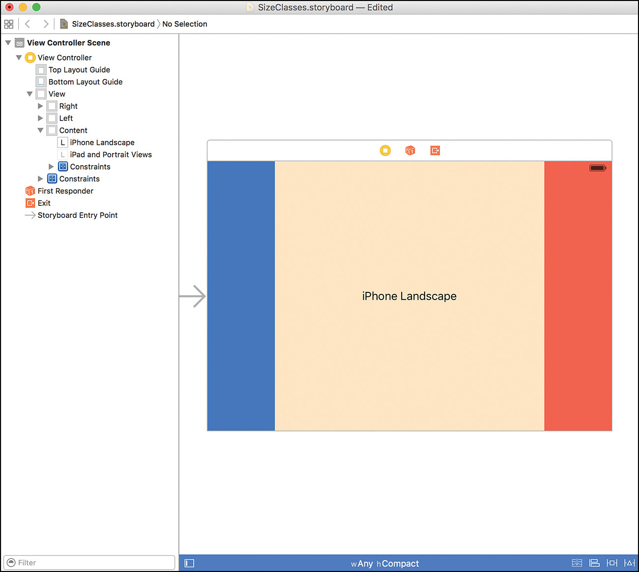
If you’ve ever played a game in landscape mode versus portrait mode on an iPhone, you know that the controls are rarely laid out the same. For this project, I’m imagining a hypothetical driving game with two control areas—one to turn right, and one to turn left—and, of course, a content area.
When the game is played in portrait mode (or any orientation on the iPad), I want the controls at the bottom of the display so that they are easily reached without obscuring the screen. When the game is shifted to landscape, however, I’d like the right and left controls to shift to the sides of the screen with the content in the middle. Figure 23.13 shows the layout that I’m imagining. The blue and red areas represent the controls; the beige/yellow is the content.

To create the interface, we’ll be using simple UIViews with colored backgrounds. This should give us clear visual indicators that things are working (or not working) the way that we want.
If you’ve been reading closely, you know that we’ll want to target a size class of Any Width, Compact Height for the landscape layout, and Any Width, Regular Height for portrait modes. Remember, Any includes all possible options for that portion of the size class:
Any Width, Compact Height = Compact Width, Compact Height and Regular Width,
Compact Height
Any Width, Regular Height = Compact Width, Regular Height and Regular Width,
Regular Height
You can refer back to Table 23.1 to verify that this does, indeed, include all the devices and orientations that we’re concerned about.
We’ll begin by implementing the portrait view, and then change size classes and create the landscape design.
Setting Up the Any Width, Regular Height Size Class
Open up the Empty.storyboard file included with this hour’s project. I’ve included a completed version of this example in the file SizeClasses.storyboard—but don’t peek unless you get stuck.
Start by clicking the bottom of the editor and setting the size class to Any(w), Regular(h); this will show as Regular Height in the selector. The bar should turn blue to show that we’re working in a specific size class.
Next, add three views to the design. Set the background of one to red to represent the right control, one to blue for left, then the other to something else. (I chose a nice Band-Aid color.) Click each view’s label in the document outline and change it, too, so that you can tell them apart. I’ve labeled them as Left, Right, and Content. You now should be looking at something similar to Figure 23.14.

To save time, I recommend selecting each view and then using the size inspector to position them using these coordinates. You’re welcome to drag them into position if you prefer.
Content: X: 0, Y: 0, Width: 600, Height: 700
Left: X: 0, Y: 700, Width: 300, Height: 100
Right: X: 300, Y: 700, Width: 300, Height: 100
These coordinates, of course, are just placeholders. We need Auto Layout constraints added so that the content will shrink and expand as expected and stay where we want it to. Before adding any constraints, add one more object—a label. Drag a UILabel from the Object Library into the center of the Content view. Center the label and set it to read iPad and Portrait Views.
Your display should now resemble Figure 23.15.

Now, we add the constraints. I’m providing the instructions for the constraints I used, but you’re welcome to try your own:
1. Select the Content view and pin the Leading, Trailing, Top, and Bottom spaces to the superview.
2. Select the Right view and pin the Trailing and Bottom spaces to the superview. Pin the height as well.
3. Select the Left view and pin the Trailing space to 0.
4. Select the Left view only and pin the Leading and Bottom spaces to the superview. Pin the height as well.
5. Choose the Label and use the Align constraints to align horizontally and vertically in the container.
One more constraint to add, and this one’s ugly. To make sure that the controls at the bottom are exactly 50% of the width of the content, we need to create a proportional constraint. To do this, select the Content view and the Right view and Pin Equal Widths. We don’t actually want them to be equal, so select this constraint (you can choose one of the objects and double-click the constraint within the Size Inspector) and open the Attributes Inspector to edit it.
If the First Item field does not show Content.Width (the width of the Content view), click the field and choose Reverse First and Second Item from the drop-down menu. Now, set the multiplier to 2. If you remember from Hour 16, this sets up the following relationship:
Content.width = 2 × Right.width
In other words, the width of the Right view is half the width of the content area. We only need to do this on one of the control areas (I chose Right) because Left is pinned to the side of Right and to the superview—so it will have no choice but to resize appropriately.
At this point, if you are seeing any errors in the storyboard, you either forgot a constraint or something got shifted. Use the Editor, Resolve Auto Layout Issues menu to update the frames in the view controller if needed.
You should now be able to use the assistant editor to preview this layout in any portrait display mode on any simulated device—but that’s not what we’re going for. We want to update the Any Width, Compact Height size class to make the design entirely different for landscape iPhone layouts.
Adding the Any Width, Compact Height Size Class
Use the size class selector at the bottom of the editor to change to the Any(w), Compact(h) class—shown simply as Compact Height in the selector. As soon as you do, you’re going to notice that everything gets ugly; in fact, objects may vanish altogether. If you are missing any of the views, select them in the document outline, and use the Attributes Inspector to click the Installed check box, as shown in Figure 23.16.
Don’t bother installing the label; we’ll add an entirely new label to the project for this layout. Next, adjust the positioning of each view so that it appears the way you want. Again, I recommend just selecting each view and using the Size Inspector to adjust the coordinates, as shown here:
Content: X: 100, Y: 0, Width: 400, Height: 400
Left: X: 0, Y: 0, Width: 100, Height: 400
Right: X: 500, Y: 0, Width: 100, Height: 400
Caution: Why Not Drag and Drop?
A bit of honesty: Not only am I trying to save you time with moving the objects via the Size Inspector, but I’m also trying to save you from some annoying Interface Builder bugs. When working with size classes, sometimes objects will reposition themselves, suddenly change their dimensions to 0 width and 0 height, and all sorts of fun stuff. It usually happens when I’m dragging things around, so I’m trying to avoid that in this tutorial.
Once everything is where it needs to be, again drag a UILabel into the Content view. Center the label and set it to read iPhone Landscape. This new label isn’t installed in the other size class, and the other class’s label isn’t installed here, so these will be unique to each layout. The final design will look a lot like Figure 23.17.
Now, setting the constraints. None of the constraints from the previous layout really make sense here, so we won’t be installing any of them. Instead, we’ll add new constraints:
1. Select the Content view and pin the Top and Bottom spaces to the superview.
2. Select the Content view and pin the Trailing spacing to 0.
3. Select the Left view and pin the Trailing spacing to 0.
4. Select the Right view and pin the Trailing, Top, and Bottom spaces to the Superview. Pin the Width as well.
5. Select the Left view and pin the Leading, Top, and Bottom spaces to the superview. Again, pin the Width.
6. Choose the Label and use the Align constraints to align horizontally and vertically in the container.
If you noticed any changes to the size of the objects as you added constraints (Interface Builder can go a bit wonky when working with size classes), use the Size Inspector to fix the objects. Once everything is in place, use the Resolve Auto Layout Issues options to resolve any remaining Auto Layout issues. You’ve just completed the project.
Previewing the Results
Open the Assistant Editor (View, Assistant Editor, Show Assistant Editor) and switch to a preview. Take a look at the interface on the iPhone in various orientations and the iPad. The design should expand and collapse thanks to Auto Layout, and entirely change in the iPhone landscape view courtesy of size classes.
Further Exploration
The best way to learn more about universal applications is to start building them. Apple’s developer documentation iOS Human Interface Guidelines will help you understand how your application’s interface can be presented on each device.
These documents are also important because what is “acceptable” on one platform (according to Apple) might not be acceptable on the other. Classes such as the UIPickerView, for example, cannot be displayed directly within a view on the iPad. These features require the use of a popover (UIPopoverPresentationController) to meet Apple’s guidelines. iOS introduce adaptive segues that make universal development much easier, but you should still be cognizant of what isn’t the same between devices.
Summary
This hour’s lesson covered the process of building universal applications on the iPhone and iPad. Using universal iOS application templates and size classes, you can quickly create an application that is customized to the device that it is running on. Size classes are the future of iOS cross-device development. They can quickly turn a project targeting one platform into one that runs on all of Apple’s devices. I highly recommend spending time revisiting your development efforts and implementing size classes anywhere you can.
A. Surprisingly, many people are still creating different versions of apps for different devices. In my opinion, this is being driven by two things. First, many applications, when expanded for the iPad, are “different” enough that a separate application is warranted. Second, I think that many developers see the potential for higher profits by selling multiple copies of their apps.
Q. I want to share code, but my views are too different to share a controller. What do I do?
A. Look for opportunities to create other shared classes. View controllers aren’t the only opportunity for shared code. Any application logic that is shared between the iPhone and iPad could potentially be placed in its own class.
a. Landscape/Portrait iPads
b. Landscape iPhones/Landscape iPhone Plus
c. Portrait iPhones/Portrait iPads
d. Landscape iPhone Plus/Landscape iPad
2. A size class set to Any, Any matches which of the following?
a. All horizontal and vertical size classes
b. Regular horizontal and vertical size classes
c. Compact horizontal and vertical size classes
d. None. This disables size classes entirely.
3. Size classes can be implemented without which of the following?
a. Installed objects
b. Auto Layout constraints
c. Code
d. Xcode 6
4. Universal applications, by default, use how many storyboards?
a. 0
b. 1
c. 2
d. 3
5. An object or constraint that is active within a size class is considered what?
a. Active
b. Ready
c. Installed
d. Used
Answers
1. A. Size classes cannot differentiate between the different orientations of an iPad.
2. A. Designing in a size class of Any, Any means that your design will be inherited by all horizontal and vertical size classes.
3. C. Size classes can be implemented entirely in Interface Builder, without writing any code.
4. B. By default, a universal application uses a single adaptive storyboard.
5. C. An object or constraint that is active in a size class is said to be installed in that size class.
Activities
1. Review the App Store to see the current trends in universal versus individual iPhone/iPad apps. What are the pricing differences between the approaches?
2. Return to a project in an earlier hour and create a universal version using size classes.