
Hour 5. Exploring Interface Builder
What You’ll Learn in This Hour:
 Where Xcode’s Interface Builder fits in the development process
The role of storyboards and scenes
How to build a user interface using the Object Library
Common attributes that can be used to customize interface elements
Ways to make your interface accessible to the visually impaired
How to link interfaces to code with outlets and actions
Over the past few hours, you’ve become familiar with the core iOS technologies, Xcode projects, and the iOS Simulator. Although these are certainly important skills for becoming a successful developer, there’s nothing quite like laying out your first iOS application interface and watching it come to life in your hands.
This hour introduces you to Interface Builder: the remarkable user interface (UI) editor integrated into Xcode. Interface Builder provides a visual approach to application interface design that is fun, intuitive, and deceptively powerful.
Understanding Interface Builder
Let’s get it out of the way up front: Yes, Interface Builder (or IB for short) does help you create interfaces for your applications, but it isn’t just a drawing tool for graphical user interfaces (GUIs); it helps you symbolically build application functionality without writing code. This translates to fewer bugs, shorter development time, and easier-to-maintain projects.
If you read through Apple’s developer documentation, you’ll see IB referred to as an editor within Xcode. This is a bit of an oversimplification of a tool that previously existed as a standalone application in the Apple Developer Suite. An understanding of IB and its use is as fundamentally important to iOS development as Swift. Without IB, creating the most basic interactive applications would be an exercise in frustration.
This hour focuses on navigating IB and will be key to your success in the rest of the book. In Hour 6, “Model-View-Controller Application Design,” you combine what you’ve learned about Xcode projects, the code editor, IB, and the iOS Simulator for the first time. So, stay alert and keep reading.
The IB Approach
Using Xcode and the Cocoa toolset, you can program iOS interfaces by hand—instantiating interface objects, defining where they appear on the screen, setting any attributes for the object, and finally, making them visible. For example, in Hour 2, “Introduction to Xcode and the iOS Simulator,” you entered this listing into Xcode to make your iOS device display the text Hello Xcode on the screen:
var myMessage: UILabel
myMessage=UILabel(frame:CGRectMake(30.0,50.0,300.0,50.0))
myMessage.font=UIFont.systemFontOfSize(48.0)
myMessage.text="Hello Xcode"
myMessage.textColor=UIColor(patternImage: UIImage(named:"Background")!)
view.addSubview(myMessage)
Imagine how long it would take to build interfaces with text, buttons, images, and dozens of other controls, and think of all the code you would need to wade through just to make small changes.
Over the years, there have been many different approaches to graphical interface builders. One of the most common implementations is to enable the user to “draw” an interface but, behind the scenes, create all the code that generates that interface. Any tweaks require the code to be edited by hand (hardly an acceptable situation).
Another tactic is to maintain the interface definition symbolically but attach the code that implements functionality directly to interface elements. This, unfortunately, means that if you want to change your interface or swap functionality from one UI element to another, you have to move the code as well.
IB works differently. Instead of autogenerating interface code or tying source listings directly to interface elements, IB builds live objects that connect to your application code through simple links called connections. Want to change how a feature of your app is triggered? Just change the connection. As you’ll learn a bit later this hour, changing how your application works with the objects you create in IB is, quite literally, a matter of connecting or reconnecting the dots as you see fit.
The Anatomy of an IB Storyboard
Your work in IB results in an XML file called a storyboard, containing a hierarchy of objects for each unique screen that your application is going to display. The objects could be interface elements—buttons, toggle switches, and so forth—but might also be other noninterface objects that you will need to use. The collection of objects for a specific display is called a scene. Storyboards can hold as many scenes as you need, and even link them together visually via segues.
For example, a simple recipe application might have one scene that consists of a list of recipes the user can choose from. A second scene may contain the details for making a selected recipe. The recipe list could be set to segue to the detail view with a fancy fade-out/fade-in effect when the name of a recipe is touched. All of this functionality can be described visually in an application’s storyboard file.
Storyboards aren’t just about cool visuals, however. They also help you create usable objects without having to allocate or initialize them manually. When a scene in a storyboard file is loaded by your application, the objects described in it are instantiated and can be accessed by your code.
Note
Instantiation, just as a quick refresher, is the process of creating an instance of an object that you can work with in your program. An instantiated object gains all the functionality described by its class. Buttons, for example, automatically highlight when clicked, content views scroll, and so on.
The Storyboard Document Outline
What do storyboard files look like in IB? Open the Hour 5 Projects folder and double-click the file Empty.storyboard to open IB and display a barebones storyboard file with a single scene. You will need to choose View, Show Toolbar from the menu bar to make the workspace look like a normal project. Once the file is open and the toolbar visible, we can get our bearings.
The contents of the file are shown visually in the IB editor area, and hierarchically by scene in the document outline area located in the column to the left of the editor area (see Figure 5.1).

Tip
If you do not see the document outline area in your Xcode workspace, choose Editor, Show Document Outline from the menu bar. You can also click the disclosure arrow button in the lower-left corner of the Xcode editor area.
Note that there is only a single scene in the file: View Controller Scene. Single-scene storyboards will be the starting place for much of your interface work in this book because they provide plenty of room for collecting user input and displaying output. We explore multiscene storyboards beginning in Hour 11, “Implementing Multiple Scenes and Popovers.”
Click the arrow in front of View Controller Scene to show its hierarchy (and then expand the View Controller object within it, as well).
Six icons should be visible in the scene: View Controller, View (within View Controller), Top Layout Guide (within View Controller), Bottom Layout Guide (within View Controller), First Responder, and Exit. With the exception of View, these are special icons used to represent unique noninterface objects in our application; these will be present in most of the storyboard scenes that you work with:
View Controller: The View Controller icon denotes the object that loads and interacts with a storyboard scene in your running application. This is the object that effectively instantiates all the other objects described within a scene. You’ll learn more about the relationship between UIs and view controllers in Hour 6.
Top Layout Guide: A guide line that marks the “top” of your content area (usually the bottom of the iOS status bar). You can use this guide to keep your UI objects below the portions of the display managed by iOS. This is part of the Auto Layout system that we discuss later this hour, and in depth in Hour 16, “Building Responsive User Interfaces.”
Bottom Layout Guide: A guide line that marks the “bottom” of your content area. This is usually the bottom of the view itself. Like the Top Layout Guide, this is used to help position your user interface. Again, this is an Auto Layout tool that we won’t really need until much later in the book.
View: The View icon is an instance of the object UIView and represents the visual layout that will be loaded by the view controller and displayed on the iOS device’s screen. Views are hierarchical in nature. Therefore, as you add controls to your interface, they are contained within the view. You can even add views within views to cluster controls or create visual elements that can be shown or hidden as a group.
First Responder: The First Responder icon stands for the object that the user is currently interacting with. When a user works with an iOS application, multiple objects could potentially respond to the various gestures or keystrokes that the user creates. The first responder is the object currently in control and interacting with the user. A text field that the user is typing into, for example, would be the first responder until the user moves to another field or control.
Exit: The Exit icon serves a very specific purpose that will come into play only in multiscene applications. When you are creating an app that moves the user between a series of screens, the Exit icon provides a visual means of jumping back to a previous screen. If you have built five scenes that link from one to another and you want to quickly return to the first scene from the fifth, you’ll link from the fifth scene to the first scene’s Exit icon. We test this out in Hour 11.
Storyboard Entry Point: This icon is just an indicator that this scene is what your application is going to display when it launches. Storyboards can have many scenes, but they need to start somewhere. That somewhere is the entry point.
Note
The storyboard shown in this example is about as “vanilla” as you can get. In larger applications with multiple scenes, you may want to either name your view controller class to better describe what it is actually controlling or set a descriptive label, such as Recipe Listing.
Using unique view controller names/labels also benefits the naming of scenes. IB automatically sets scene names to the name of the view controller or its label (if one is set) plus the suffix scene. If you label your view controller as Recipe Listing, for example, the scene name changes to Recipe Listing Scene. We’ll worry about multiple scenes later in the book; for now, our projects will contain a generic class called View Controller that will be in charge of interacting with our single view controller scene.
As you build your UIs, the list of objects within your scenes will grow accordingly. Some UIs may consist of dozens of different objects, leading to rather busy and complex scenes, as demonstrated in Figure 5.2.
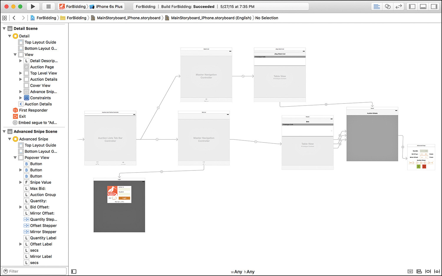
You can collapse or expand your hierarchy of views within the document outline area to help manage the information overload that you are bound to experience as your applications become more advanced.
Note
At its most basic level, a view (UIView) is a rectangular region that can contain content and respond to user events (touches and so forth). All the controls (buttons, fields, and so on) that you’ll add to a view are, in fact, subclasses of UIView. This isn’t necessarily something you need to be worried about, except that you’ll be encountering documentation that refers to buttons and other interface elements referred to as subviews and the views that contain them as superviews.
Just keep in mind that pretty much everything you see onscreen can be considered a view and the terminology will seem a little less alien.
Working with the Document Outline Objects
The document outline area shows icons for objects in your application, but what good are they? Aside from presenting a nice list, do they provide any functionality?
Absolutely! Each icon gives you a visual means of referring to the objects they represent. You interact with the icons by dragging to and from them to create the connections that drive your application’s features.
Consider an onscreen control, such as a button, that needs to trigger an action in your code. By dragging from the button to the View Controller icon, you can create a connection from the GUI element to a method that you want it to activate. You can even drag from certain objects directly to your code, quickly inserting a variable or method that will interact with that object.
Xcode provides developers with a great deal of flexibility when working with objects in IB. You can interact with the actual UI elements in the IB editor, or with the icons that represent them in the document outline area. In addition, any object that isn’t directly visible in the UI (such as the first responder and view controller objects) can be found in an icon bar directly above the UI design in the editor. This is known as the scene dock, and is visible in Figure 5.3.

If the scene dock above your view does not show any icons and is displaying the text View Controller instead, just click it. The dock defaults to the name of a scene’s view controller until it is selected.
We go through a hands-on example later this hour so that you can get a feel for how interacting with and connecting objects works. Before we do that, however, let’s look at how you go about turning a blank view into an interface masterpiece.
Creating User Interfaces
In Figures 5.1 and 5.2, you’ve seen an empty view and a fully fleshed-out interface. Now, how do we get from one to the other? In this section, we explore how interfaces are created with IB. In other words, it’s time for the fun stuff.
If you haven’t already, open the Empty.storyboard file included in this hour’s Projects folder. Make sure the document outline area is visible and that the view can be seen in the editor; you’re ready to start designing an interface.
The Object Library
Everything that you add to a view, from buttons and images to web content, comes from the Object Library. You can view the library by choosing View, Utilities, Show Object Library from the menu bar (Control-Option-Command-3). If it isn’t already visible, the utility area of the Xcode interface opens, and Object Library is displayed in the lower right.
Caution: Libraries, Libraries, Everywhere!
Xcode has more than one library. The Object Library contains the UI elements you’ll be adding in IB, but there are also File Template, Code Snippet, and Media libraries that can be activated by clicking the icons immediately above the Library area.
If you find yourself staring at a library that doesn’t seem to show what you’re expecting, click the icon of a square surrounded by a circle above the library or reselect the Object Library from the View, Utilities menu to make sure that you’re in the right place.
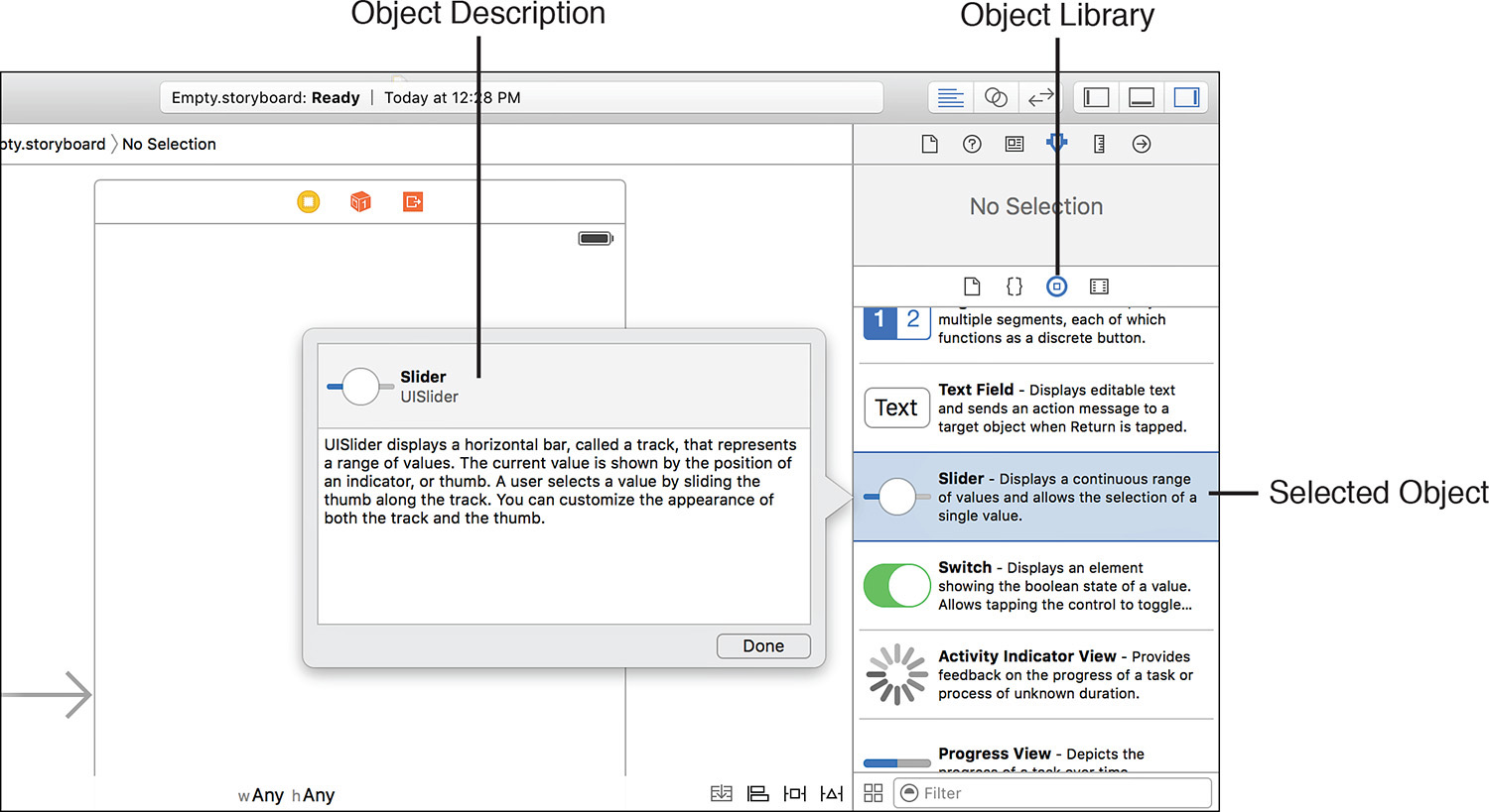
When you click and hover over an element in the library, a popover is displayed with a description of how the object can be used in the interface, as shown in Figure 5.4. This provides a convenient way of exploring your UI options without having to open the Xcode documentation.
Using view button (four squares) at the bottom-left of the library, you can switch between list and icon views of the available objects. If you know the name of an object but can’t locate it in the list, use the filter field below the library to quickly find it.
Adding Objects to a View
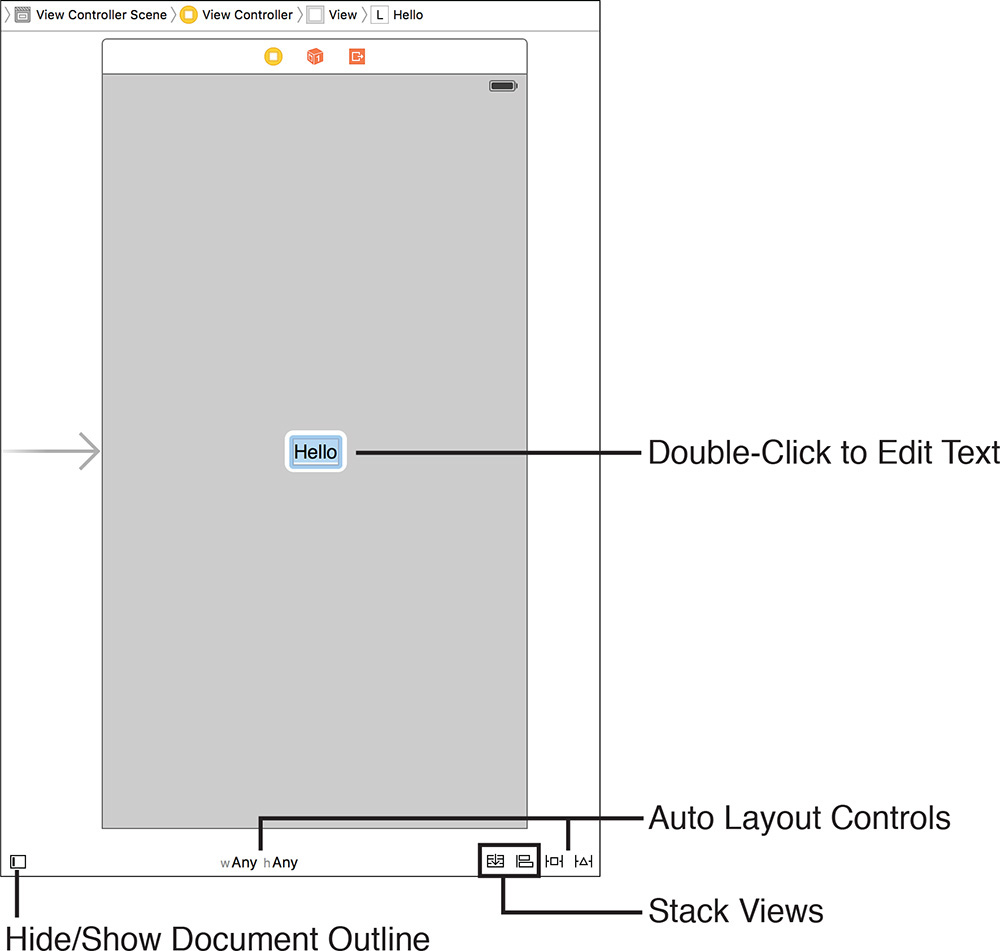
To add an object to a view, just click and drag from the library to the view. For example, find the label object (UILabel) in the Object Library and drag it into the center of the view in the editor. The label should appear in your view and read Label. Double-click the label and type Hello. The text will update, as shown in Figure 5.5, just as you would expect.
With that simple action, you’ve almost entirely replicated the functionality implemented by the code fragment presented earlier in the lesson. Try dragging other objects from the Object Library into the view (buttons, text fields, and so on). With few exceptions, the objects should appear and behave just the way you’d expect.
To remove an object from the view, click to select it, and then press the Delete key. You may also use the options under the Edit menu to copy and paste between views or duplicate an element several times within a view.
Note
Notice the tools along the bottom of the editing area? These are largely related to view positioning and Auto Layout (more on that shortly), with one exception:
The button in the lower left hides and shows the document outline, giving you more space to work. You’ll want to make use of this button a lot, especially if you’re working on a laptop.
The middle set of menus (typically labeled “w Any” and “h Any”) are used when designing interfaces to fit a variety of devices, while the buttons on the right are used to insert stack views and reveal menus for managing Auto Layout Alignment, Pinning, and Constraint issues.
Working with the IB Editing Tools
Instead of having you rely on your visual acuity to position objects in a view, Apple has included some useful tools for fine-tuning your interface design. If you’ve ever used a drawing program like OmniGraffle or Adobe Illustrator, you’ll find many of these familiar.
Guides
As you drag objects in a view, you’ll notice guides (shown in Figure 5.6) appearing to help with the positioning. These blue, dotted lines are displayed to align objects along the margins of the view, to the centers of other objects in the view, and to the baseline of the fonts used in the labels and object titles.
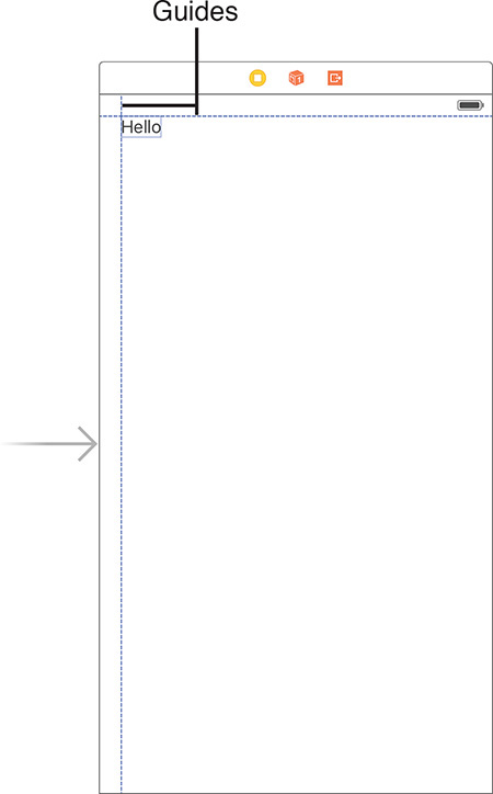
As an added bonus, guides automatically appear to indicate the approximate spacing requirements of Apple’s interface guidelines. If you’re not sure why it’s showing you a particular margin guide, it’s likely that your object is in a position that IB considers “appropriate” for something of that type and size.
Tip
You can manually add your own guides by choosing Editor, Guides, Add Horizontal Guide or by choosing Editor, Guides, Add Vertical Guide. You can position manually added guides anywhere in your view by dragging them; they will appear orange in color. When you drag an object close to the guide, the guide highlights in blue to show when they are aligned.
Tip
To fine-tune an object’s position within a view, select it, and then use the arrow keys to position it left, right, up, or down, 1 point at a time. You can also zoom in and out of a view by pinching on a Magic Trackpad, or Control-clicking (or right-clicking) in the Interface Builder editor view and choosing an appropriate zoom level from the menu that appears.
Selection Handles
In addition to the guides, most objects include selection handles to stretch an object horizontally, vertically, or both. Using the small boxes that appear alongside an object when it is selected, just click and drag to change its size, as demonstrated using a text field in Figure 5.7.
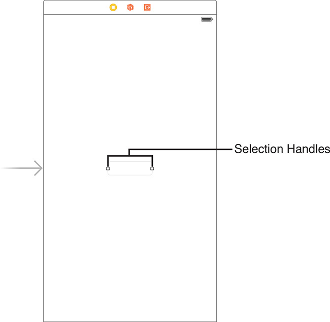
Note that some objects constrain how you can resize them; this preserves a level of consistency within iOS application interfaces.
Tip
In busy interfaces, it can be difficult to figure out what object you’ve selected just by the appearance of selection handles. If you’d prefer Xcode also darken the selected object, choose Editor, Canvas, Show Selection Highlights.
Arrangement and Alignment
When you’re working with UI objects in Interface Builder, you’ll likely start to feel like you’re working in a drawing program. Two commands common in object-based drawing applications are Arrange (where you can position objects in front of or behind one another) and Align (where you can make misplaced objects line up). You’ll find both of these options also exist in Interface Builder.
To arrange objects, you can choose from the Editor, Arrange menu. Use the Arrange selections (Send to Back, Send Forward, and so on) to move UI elements behind or in front of other elements.
To quickly align several objects within a view, select them by clicking and dragging a selection rectangle around them or by holding down the Shift key and then choosing Editor, Align and an appropriate alignment type from the menu.
For example, try dragging several buttons into your view, placing them in a variety of different positions. To align them based on their horizontal center (a line that runs vertically through each button’s center), select the buttons, and then choose Editor, Align, Horizontal Centers. Figure 5.8 shows the before and after results.

The Size Inspector
Another tool that you may want to use for controlling your design is the Size Inspector. IB has a number of inspectors for examining the attributes of an object. As the name implies, the Size Inspector provides information about sizes, but also position and alignment. To open the Size Inspector, first select the object (or objects) that you want to work with, and then click the ruler icon at the top of the utility area in Xcode. Alternatively, choose View, Utilities, Show Size Inspector or press Option-Command-5 (see Figure 5.9).
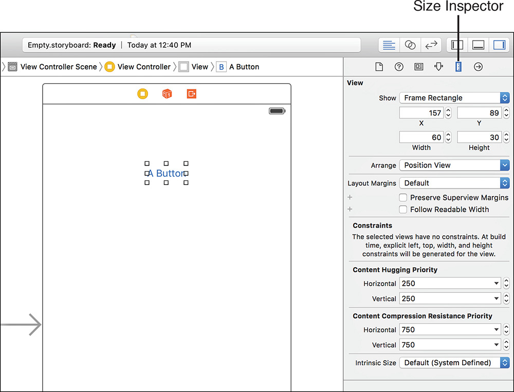
Using the fields at the top of the inspector, you can view or change the size and position of the object by changing the coordinates in the Height/Width and X/Y fields.
Note
At the top of Size Inspector’s View settings, you’ll often see a drop-down menu where you can choose between Frame Rectangle and Alignment Rectangle. These two settings will usually be similar, but there is a slight difference. The frame values represent the exact area a “raw” object occupies onscreen, whereas the alignment values take into account spacing around the object for drop shadows and the like.
The Arrange drop-down menu gives you quick layout arrangements for the selected object (or objects). Using this menu, you can center the object, align it with other objects, or size it to take up the width or height of the view that holds it. You can do all of this with the main Interface Builder tools as well; this menu is just another place to make quick tweaks to your layout.
Below the Arrange menu are options for controlling layout margins. Layout margins are the amount of space around an object in your design. By default, layout margins are 8 points on the top, bottom, left, and right of each object. You can explicitly set layout margins to include more (or less) space around an object. These margins, however, are only used when using Auto Layout. Bear with me, I’m about to tell you what Auto Layout is.
Notice that the Size Inspector includes a section at the bottom labeled Constraints. Constraints are part of the Auto Layout system that we will be using to create resizable user interfaces in Hour 16. Because you’re likely to run into a few references to Auto Layout before we get there, let’s take a few minutes to get an idea of what this beast is.
Tip
Hold down the Option key after selecting an object in IB. As you move your mouse around, you’ll see the distance between the selected object and other objects that you point to.
The Auto Layout System
While the guides, Size Inspector, and other tools are helpful for laying out interfaces—even interfaces that can adapt to view changes—iOS applications can take advantage of a new powerful tool for managing layouts: the Auto Layout system. Auto Layouts are enabled by default on new projects and make it possible to write applications that adapt to a number of different screen sizes and orientations without needing to modify a single line of code. Do you want to write software to take advantage of all the available iOS device screen sizes? How about layouts that rearrange themselves when you move from portrait to landscape orientations? You’ll want Auto Layouts!
Understanding Constraints
Auto Layout works by building a series of constraints for your onscreen objects. The constraints define distances between objects and how flexible these relationships are.
For example, open the Constraints.storyboard file included in the Projects folder. This storyboard contains a view with a single label positioned in the upper center. Expand the View Controller scene in the document outline so that you can see all the objects it contains. Notice that at the same level in the hierarchy as the label, a Constraints object is showing up, as shown in Figure 5.10.
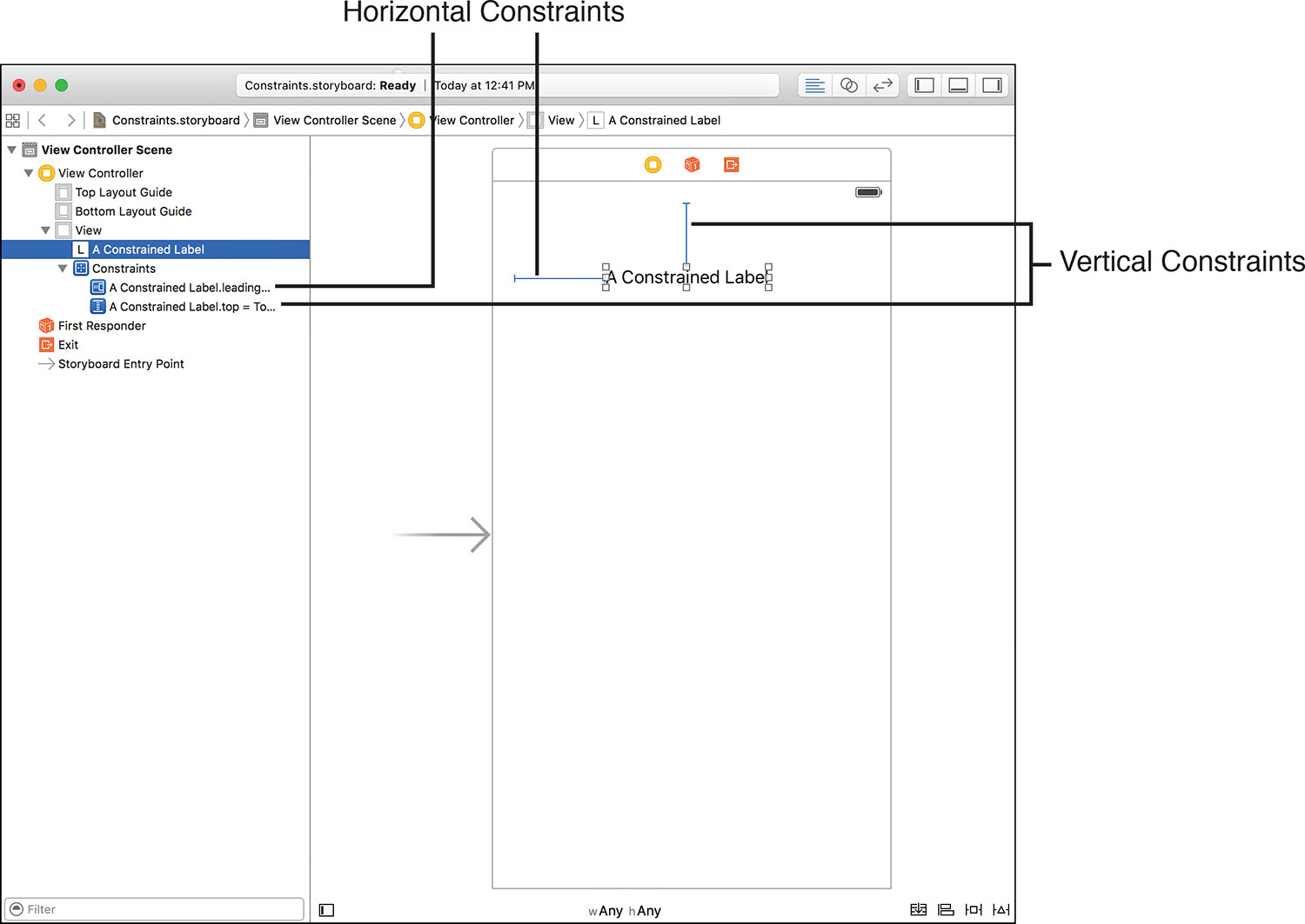
Within the Constraints object are two constraints: horizontal space and vertical space constraints. The horizontal constraint states that the left or right side of the label will be a certain number of points from the left or right edge of the view. These are known as leading and trailing constraints, respectively. A vertical constraint is the distance from the top or bottom of the view to the top or bottom of the label. Intuitively, these are called the top and bottom constraints.
Constraints, however, are more than just entries that tie an object to the view it is within. They can be flexible, ensuring that an object maintains at least or at most a certain distance from another object, or even that two objects, when resized, maintain the same distance between one another.
Constraints that set a specific size or distance between objects are called pinning. The flexibility (or inflexibility of a constraint) is managed by configuring a relationship.
Content Hugging and Content Compression Resistance
Now that you’re viewing an object with constraints, the Size Inspector updates to show a bit more information than we saw earlier. Click the label in the Constraints storyboard file and make sure that the Size Inspector is visible (Option-Command-5), as shown in Figure 5.11.

The constraints affecting the label itself are shown near the bottom of the Size Inspector information, but there are additional settings now visible for Content Hugging (how friendly!) and Content Compression.
These settings control how closely the sides of an object “hug” the content in the object and how much the content can be compressed or clipped. An object that can expand horizontally but not vertically would set horizontal hugging as a low priority and vertical hugging as a very high priority. Similarly, if the content of the object (say a label) should not be compressed or clipped at all, the content compression resistance settings for both horizontal and vertical compression could be set to a very high priority.
Another Auto Layout option you’ll encounter in the Size Inspector is an Intrinsic Size setting. The intrinsic size is just the size of the object as determined by your layout. If you’re creating custom views, IB will have no idea how large the view actually is, so you’ll need to use the Intrinsic Size drop-down to set a “placeholder” size. This is a relatively advanced topic and not something you’re likely to encounter in day-to-day development.
Auto Layout and Automatic Constraints
When Apple introduced Auto Layout in Xcode 4.5, suddenly constraints were everywhere. Any label, button, or object you positioned in your user interface immediately had constraints appear. Each object requires at least two constraints (horizontal positioning and vertical positioning) to determine its location in the interface and (often) two to determine height and width. Add 10 objects, and suddenly you’ve got at least 20 to 40 constraints (and 40 blue lines all over your view).
In later releases of Xcode, Apple made this blue crosshatched nightmare go away. Now, when you position objects in your UI, you won’t see any constraints until you manually add them. That doesn’t mean they aren’t there; Xcode automatically adds constraints when you build your project. For beginners like us, this is perfect. We can lay out our UIs and not worry about constraints until we absolutely need to do something “clever” with object positioning. As already mentioned, we’ll “get clever” with Auto Layout in Hour 16, but for the time being, you can pretend it doesn’t even exist.
Customizing the Interface Appearance
How your interface appears to the end user isn’t just a combination of control sizes, positions, and constraints. For many kinds of objects, literally dozens of different attributes can be adjusted. Although you could certainly configure things such as colors and fonts in your code, it’s easier to just use the tools included in IB.
Using the Attributes Inspector
The most common place you’ll tweak the way your interface objects appear is through the Attributes Inspector, available by clicking the slider icon at the top of the utility area. You can also choose View, Utilities, Show Attributes Inspector (Option-Command-4) if the utility area isn’t currently visible. Let’s run through a quick example to see how this works.
Turn back to the Empty.storyboard file with the label you’ve added (or just use the Constraints.storyboard label). Select the label, and then open the Attributes Inspector, shown in Figure 5.12.
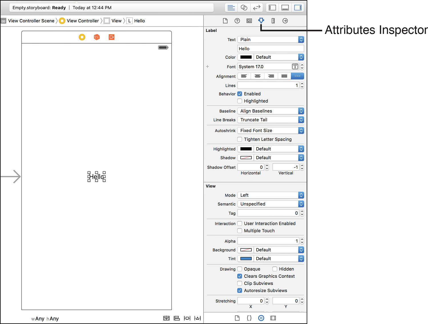
FIGURE 5.12 To change how an object looks and behaves, select it, and then open the Attributes Inspector.
The top portion of the Attributes Inspector contains attributes for the specific object. In the case of the text object, this includes settings such as font, size, color, and alignment (everything you’d expect to find for editing text).
In the bottom portion of the inspector are additional inherited attributes. Remember that onscreen elements are a subclass of a view. Therefore, all the standard view attributes are also available for the object and for your tinkering enjoyment. In many cases, you’ll want to leave these alone, but settings such as background and transparency can come in handy.
Don’t get hung up on trying to memorize every attribute for every control now. I cover interesting and important attributes when they are needed throughout the book.
Feel free to explore the many different options available in the Attributes Inspector to see what can be configured for different types of objects. There is a surprising amount of flexibility to be found within the tool.
Note
The attributes you change in IB are simply properties of the object’s class. To help identify what an attribute does, use the documentation tool in Xcode to look up the object’s class and review the descriptions of its properties.
Setting Accessibility Attributes
For many years, the “appearance” of an interface meant just how it looks visually. Today, the technology is available for an interface to vocally describe itself to the visually impaired. iOS includes Apple’s screen-reader technology: Voiceover. Voiceover combines speech synthesis with a customized interface to aid users in navigating applications.
Using Voiceover, users can touch interface elements and hear a short description of what they do and how they can be used. Although you gain much of this functionality “for free” (the iOS Voiceover software will read button labels, for example), you can provide additional assistance by configuring the accessibility attributes in IB.
To access the Accessibility settings, you need to open the Identity Inspector by clicking the window icon at the top of the utility area. You can also choose View, Utilities, Show Identity Inspector or press Option-Command-3. The Accessibility options have their own section within the Identity Inspector, as shown in Figure 5.13.
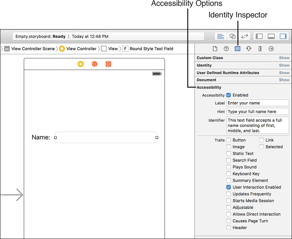
FIGURE 5.13 Use the Accessibility section in the Identity Inspector to configure how Voiceover interacts with your application.
You can configure four sets of attributes within this area:
Accessibility: If enabled, the object is considered accessible. If you create any custom controls that must be seen to be used, this setting should be disabled.
Label: A simple word or two that serves as the label for an item. A text field that collects the user’s name might use “your name,” for example.
Hint: A short description, if needed, on how to use the control. This is needed only if the label doesn’t provide enough information on its own.
Identifier: Similar to the Label attribute, the Identifier should contain a more detailed description of the control (for example, “A text field for your first and last name”).
Traits: This set of check boxes is used to describe the features of the object—what it does and what its current state is.
Tip
For an application to be available to the largest possible audience, take advantage of accessibility tools whenever possible. Even objects such as the text labels you’ve used in this lesson should have their traits configured to indicate that they are static text. This helps potential users know that they can’t interact with them.
Previewing the Interface
If you’ve worked with earlier versions of Xcode, you know that you could easily simulate your UI. This feature disappeared in Xcode 4, but has made a happy return in the latest Xcode releases (even if it is a bit difficult to find).
To use the preview feature, you must use the Xcode assistant editor feature that we reviewed in Hour 2. For example, open the PreviewUI.storyboard file included in this hour’s Projects directory. This storyboard contains a simple user interface: a label, a field, and a button. Choose View, Show Toolbar from the menu bar so that all the typical window controls are showing. (On a normal project, the toolbar would already be visible.)
To preview the view as it will look on a device, first activate the assistant editor. Next, click the bar above the assistant editor pane where it reads Automatic. A drop-down menu appears, with Preview as the last option, as shown in Figure 5.15.
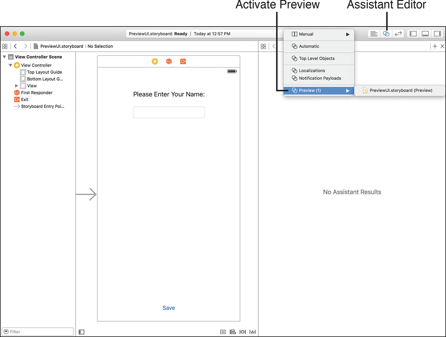
FIGURE 5.15 Select Preview (or choose from the options in its submenu) to activate a preview in the assistant editor.
Select Preview, and the assistant editor refreshes to show a live preview of what your UI will look like on a device. Use the button at the bottom of the preview to toggle between portrait and landscape orientations. In Figure 5.16, I’m previewing the UI on a 4.7-inch iPhone in landscape mode.
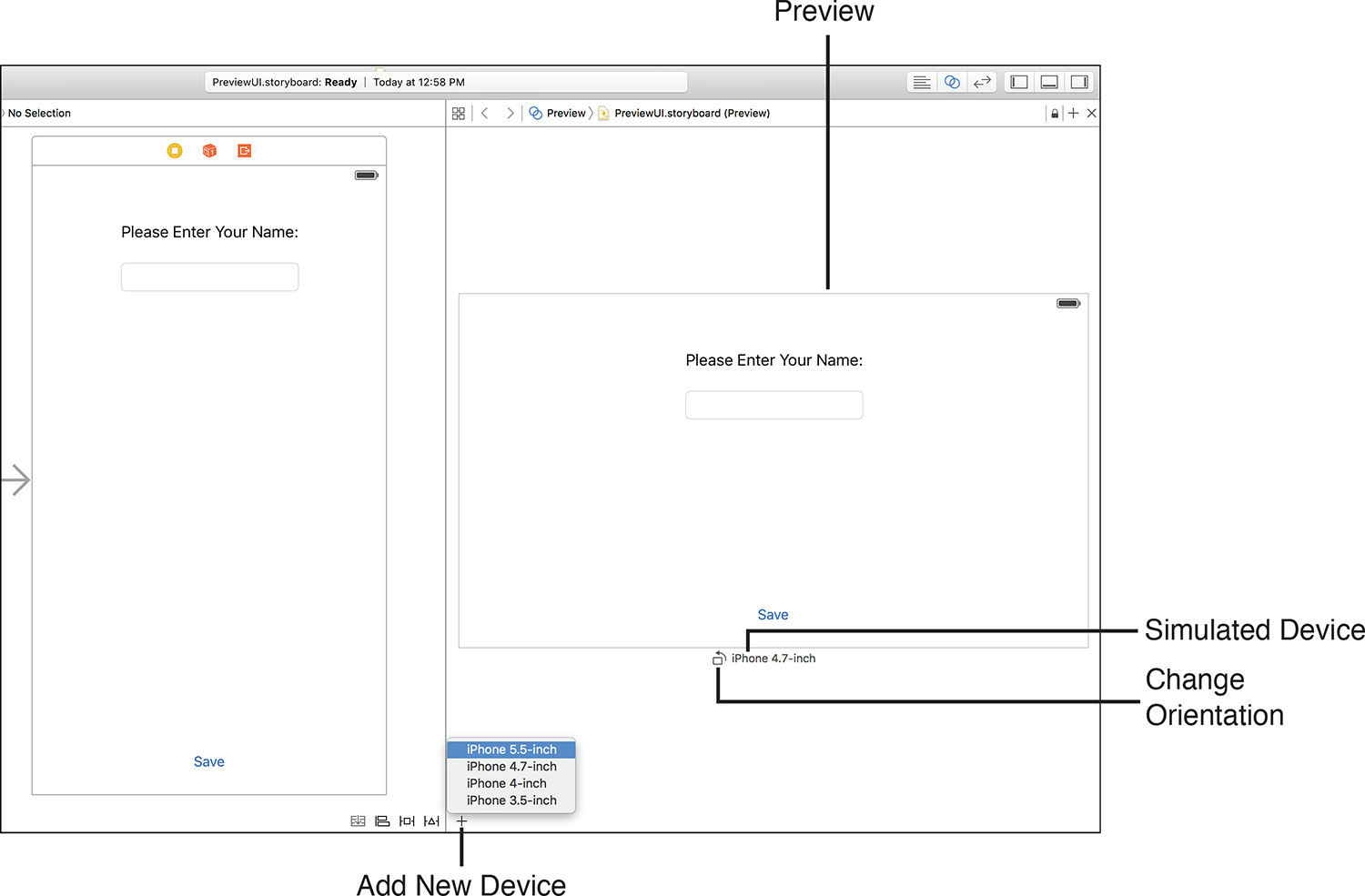
To add additional devices to the preview, click the + menu and choose the iOS device you’d like. If you’re creating a project that runs on earlier versions of iOS, you can even choose to preview a device running a different OS version.
The preview is added to the right of the existing preview. You can even add multiples of the same device so that you can see a landscape and portrait view at the same time. To remove a preview, click to select it, and then press the Delete key.
This will come in very handy when we explore Auto Layout more in Hour 16. In addition, if you want to test your application UIs, you can always run your apps in the iOS Simulator, even when they aren’t entirely written. Apple’s development tools make it possible to see results as you build, instead of having to wait until every single feature is in place.
Connecting to Code
You know how to make an interface, but how do you make it do something? Throughout this hour, I’ve been alluding to the idea that connecting an interface to the code you write is just a matter of “connecting the dots.” In this last part of the hour, we do just that: take an interface and connect it to the code that makes it into a functional application.
Opening the Project
To get started, we use the project Disconnected contained within this hour’s Projects folder. Open the folder and double-click the Disconnected.xcodeproj file. This opens the project in Xcode, as shown in Figure 5.17.

After the project is loaded, expand the project code group (Disconnected) and click the Main.storyboard file. This storyboard file contains the scene and view that this application displays as its interface. Xcode refreshes and displays the scene in IB, as shown in Figure 5.18.

Implementation Overview
The interface contains four interactive elements: a button bar (called a segmented control), a push button, an output label, and a web view (an integrated web browser component). Together, these controls interface with application code to enable a user to pick a flower color, touch the Get Flower button, and then display the chosen color in a text label along with a matching flower photo fetched from the website http://www.floraphotographs.com. Figure 5.19 shows the final result.

FIGURE 5.19 The finished application enables a user to choose a color and have a flower image returned that matches that color.
Note: A Blurry Visual Treat
You may notice one additional (noninteractive) element in this project: a visual effects view. This view lives behind the color controls and labels and blurs out the background behind it. It’s used to very easily create the soft blurred backgrounds prevalent in iOS.
Unfortunately, right now the application does nothing. The interface isn’t connected to any application code, so it is hardly more than a pretty picture. To make it work, we create connections to outlets and actions that have been defined in the application’s code.
Outlets and Actions
An outlet is nothing more than a variable property by which an object can be referenced. For example, if you had created a field in IB intending that it would be used to collect a user’s name, you might want to create an outlet for it in your code called userName. Using this outlet and a corresponding variable property, you could then access or change the contents of the field.
An action, however, is a method within your code that is called when an event takes place. Certain objects, such as buttons and switches, can trigger actions when a user interacts with them through an event, such as touching the screen. If you define actions in your code, IB can make them available to the onscreen objects.
Joining an element in IB to an outlet or action creates what is generically termed a connection. For the Disconnected app to function, we need to create connections to these outlets and actions:
colorChoice: An outlet created for the button bar to access the color the user has selected
getFlower: An action that retrieves a flower from the Web, displays it, and updates the label with the chosen color
chosenColor: An outlet for the label that will be updated by getFlower to show the name of the chosen color
flowerView: An outlet for the web view that will be updated by getFlower to show the image
Let’s make the connections now.
Creating Connections to Outlets
To create a connection from an interface item to an outlet, Control-drag from a scene’s View Controller icon (in the document outline area or the icon bar below the view) to either the visual representation of the object in the view or its icon in the document outline area.
Try this with the button bar (segmented control). Pressing Control, click and drag from the view controller in the document outline area to the onscreen image of the bar. A line appears as you drag, enabling you to easily point to the object that you want to use for the connect, as shown in Figure 5.20.
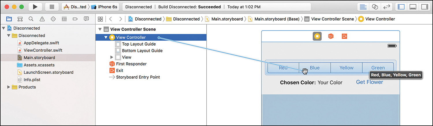
When you release the mouse button, the available connections are shown in a pop-up menu (see Figure 5.21). In this case, you want to pick colorChoice.
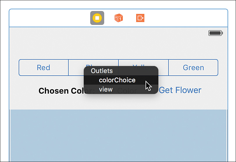
Note
IB knows what type of object is allowed to connect to a given outlet, so it displays only the outlets appropriate for the connection you’re trying to make.
Repeat this process for the label with the text "Your Color", connecting it to the chosenColor outlet, and with the web view, connecting to flowerView.
Connecting to Actions
Connecting to actions is a bit different. An object’s events trigger actions (methods) in your code. So, the connection direction reverses; you connect from the object invoking an event to the view controller of its scene. Although it is possible to Control-drag and create a connection in the same manner you did with outlets, this isn’t recommended because you don’t get to specify which event triggers it. Do users have to touch the button? Release their fingers from a button?
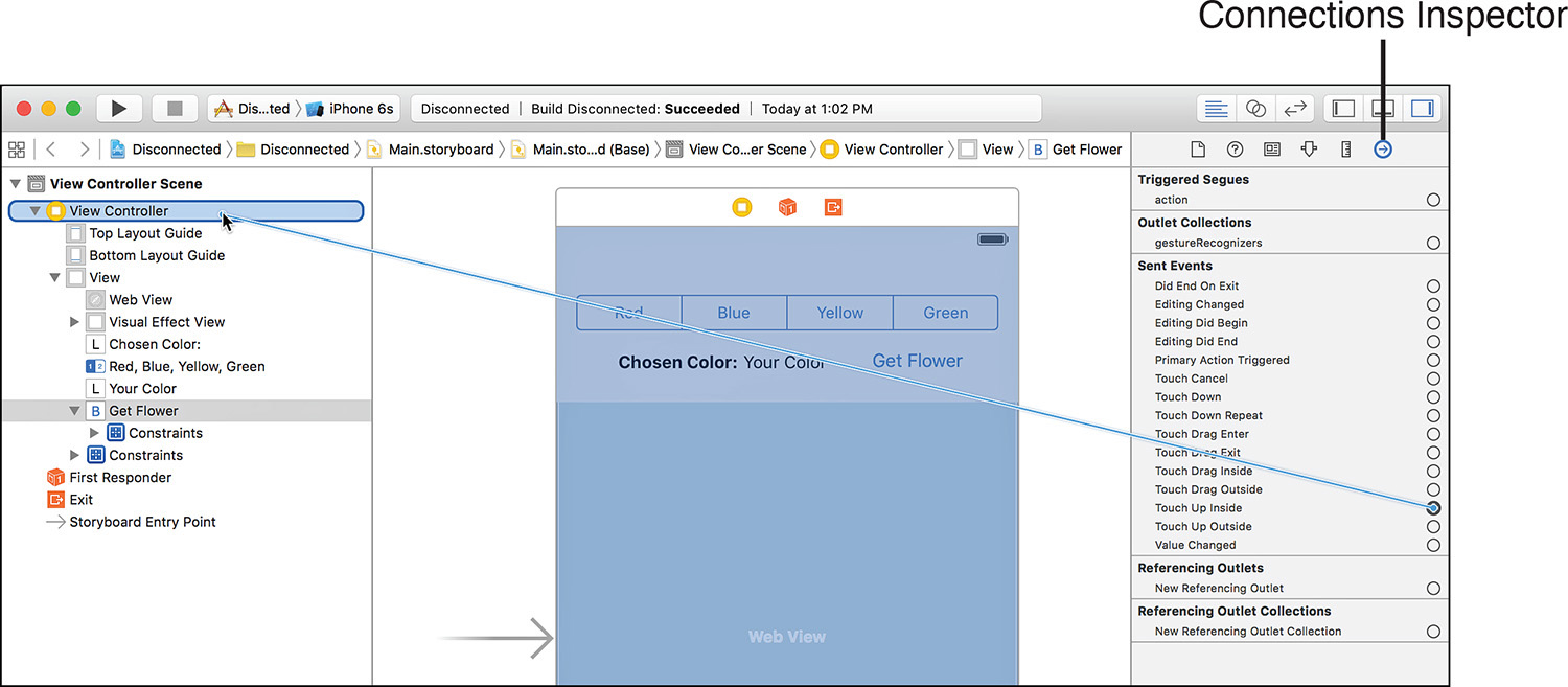
Actions can be triggered by many different events, so you need to make sure that you’re picking exactly the right one, instead of leaving it up to IB. To do this, select the object that will be connecting to the action and open the Connections Inspector by clicking the arrow icon at the top of the Xcode utility area. You can also show the inspector by choosing View, Utilities, Show Connections Inspector (or by pressing Option-Command-6).
The Connections Inspector, in Figure 5.22, shows a list of the events that the object, in this case a button, supports. Beside each event is an open circle. To connect an event to an action in your code, click and drag from one of these circles to the scene’s View Controller icon in the document outline area.
Note
I often refer to creating connections to a scene’s view controller or placing interface elements in a scene’s view. This is because IB storyboards can contain multiple different scenes, each with its own view controller and view. In the first few lessons, there is only a single scene, and therefore, a single view controller. That said, you should still be getting used to the idea of multiple View Controller icons appearing in the document outline area and having to correctly choose the one that corresponds to the scene you are editing.
For example, to connect the Get Flower button to the getFlower method, select the button, and then open the Connections Inspector (Option-Command-6). Drag from the circle beside the Touch Up Inside event to the scene’s view controller and release, as demonstrated in Figure 5.22. When prompted, choose the getFlower action, shown in Figure 5.23.

After a connection has been made, the inspector updates to show the event and the action that it calls, demonstrated in Figure 5.24. If you click other already connected objects, you’ll notice that the Connections Inspector shows their connections to outlets and to actions.
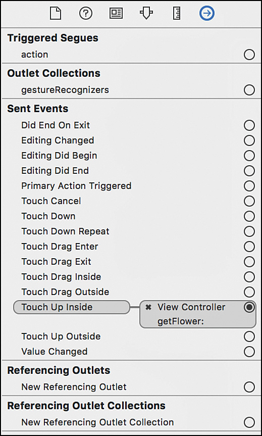
FIGURE 5.24 The Connections Inspector updates to show the actions and outlets that an object references.
Well done! You’ve just linked an interface to the code that supports it. Click Run on the Xcode toolbar to build and run your application in the iOS Simulator or on your personal iDevice.
Editing Connections with the Quick Inspector
One of the errors that I commonly make when connecting my interfaces is creating a connection that I didn’t intend. A bit of overzealous dragging, and suddenly your interface is wired up incorrectly and won’t work. To review the connections that are in place, you select an object and use the Connections Inspector discussed previously, or you can open the Quick Inspector by right-clicking any object in the IB editor or document outline area. This opens a floating window that contains all the outlets and actions either referenced or received by the object, as shown in Figure 5.25.

Besides viewing the connections that are in place, you can remove a connection by clicking the X next to a connected object (see Figure 5.24 and 5.25). You can even create new connections using the same “click-and-drag from the circle to an object” approach that you performed with the Connections Inspector. Click the X in the upper-left corner of the window to close the Quick Inspector.
Although clicking an object, such as a button, shows you all the connections related to that object, it doesn’t show you everything you’ve connected in the IB editor. Because almost all the connections you create will go to and from a scene’s view controller, choosing it and then opening the inspector will give you a more complete picture of what connections you’ve made.
Writing Code with IB
You just created connections from UI objects to the corresponding outlets and actions that have already been defined in code. In the next hour’s lesson, you write a full application, including defining outlets and actions and connecting them to a storyboard scene. What’s interesting about this process, besides it bringing all the earlier lessons together, is that IB editor writes and inserts the necessary Swift code to define outlets and actions.
Although it is impossible for Xcode to write your application for you, it does create the instance variables and properties for your app’s interface objects, as well as “stubs” of the methods your interface will trigger. All you need to do is drag and drop the IB objects into your source code files. Using this feature is completely optional, but it does help save time and avoid syntax errors.
A method stub (or skeleton) is nothing more than a method that has been declared but executes no instructions. You can add stubs to your code where you know what you’ll be writing in the future but aren’t yet ready to commit it to code. This is useful in the initial design stages of an application because it helps you keep track of the work you have left to do.
Stub methods are also helpful if you have code that needs to use a method that you haven’t written. By inserting and referencing stubs for your unwritten methods, your application will compile and run—enabling the code that is complete to be tested at any stage of the development process.
Object Identity
As we finish up our introduction to IB, I’d be remiss if I didn’t introduce one more feature: the Identity Inspector. You’ve already accessed this tool to view the accessibility attributes for interface objects, but there is another reason why we need to use the inspector in the future: setting class identities and labels.
As you drag objects into the interface, you’re creating instances of classes that already exist (buttons, labels, and so on). Throughout this book, however, we build custom subclasses that we also need to be able to reference with IB’s objects. In these cases, we need to help IB by identifying the subclass it should use.
For example, suppose we created a subclass of the standard button class (UIButton) that we named ourFancyButtonClass. We might drag a button into a scene to represent our fancy button, but when the storyboard file loads, it would just create the same old UIButton.
To fix the problem, we select the button we’ve added to the view, open the Identity Inspector by clicking the window icon at the top of the Xcode utility area or by choosing View, Utilities, Show Identity Inspector (Option-Command-3), and then use the drop-down menu/field to enter the class that we really want instantiated at runtime (see Figure 5.26).
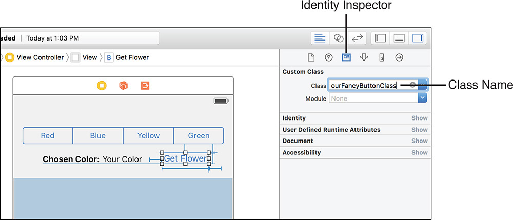
FIGURE 5.26 If you’re using a custom class, you need to manually set the identity of your objects in the Identity Inspector.
This is something we cover on an as-needed basis; so if it seems confusing, don’t worry. We come back to it later in the book.
Note
I see that Module Name field you’re ignoring! When setting a custom class name, you can also set the name of the module that defines the class. Modules provide a way to organize large numbers of classes into functional groups, but aren’t something you’ll need for the projects in this book.
Further Exploration
The IB editor gives you the opportunity to experiment with many of the different GUI objects you’ve seen in iOS applications and read about in the previous hours. In the next hour, the Xcode code editor is used in conjunction with IB for your first full project, developed from start to finish.
To learn even more about what you can do with IB, I suggest reading through the following five Apple publications:
Interface Builder Help: Accessed by right-clicking the background in the IB editor, the IB help is more than a simple help document. Apple’s IB Help walks you through the intricacies of IB using video tutorials and covers some advanced topics that will be important as your development experience increases.
Auto Layout Guide: This document presents a good introduction to the Auto Layout system and is an excellent read for anyone wanting to get a jump start on adaptive interface layout techniques.
Xcode Overview: Build a User Interface: Part of the larger “Xcode Overview” document, this section offers a nice tutorial on Interface Builder principals.
iOS Human Interface Guidelines: The Apple iOS HIG document provides a clear set of rules for building usable interfaces on the iOS device family. This document describes when you should use controls and how they should be displayed, helping you create more polished, professional-quality applications.
Accessibility Programming Guide for iOS: If you’re serious about creating accessible apps, this is a mandatory read. The Accessibility Programming Guide describes the accessibility features in this hour’s lesson as well as ways to improve accessibility programmatically and methods of testing accessibility beyond the tips given in this hour.
As a general note, from here on, you do quite a bit of coding in each lesson. So, now is a great time to review the previous hours if you have any questions.
Summary
In this hour, you explored the Xcode IB editor and the tools it provides for building rich graphical interfaces for your iOS applications. You learned how to navigate IB storyboards and access the GUI elements from the Object Library. Using the various inspector tools within IB, you reviewed how GUI elements can be placed within a scene using constraints, how the look and feel of onscreen controls can be customized, and how interfaces can be made accessible to the visually impaired.
More than just a pretty picture, an IB-created interface uses simple outlets and actions to connect to functionality in your code. You used IB’s connection tools to turn a nonfunctioning interface into a complete application. By maintaining a separation between the code you write and what is displayed to the user, you can revise your interface to look however you want, without breaking your application. In Hour 6, you examine how to create outlets and actions from scratch in Xcode (and thus gain a full toolset to get started developing).
Q&A
Q. Why do I keep seeing things referred to as NIB/XIB files?
A. The origins of IB trace back to the NeXT Computer, which made use of NIB files to store individual views. These files, in fact, still bore the same name when Mac OS X was released. In recent years, however, Apple renamed the files to have the .xib extension, which has subsequently been mostly replaced by storyboards and scenes. You’ll still see a XIB file used for your startup screen in your project (see Hour 2 for details), but, in general, anything that refers to a XIB or NIB file applies to storyboards as well.
Q. Some of the objects in the IB Object Library can’t be added to my view. What gives?
A. Not all the items in the Object Library are interface objects. Some represent objects that provide functionality to your application. These can be added to the scene in the document outline area or on the icon bar located below a scene’s layout in the IB editor.
Q. I’ve seen controls in applications that aren’t available here. Where are they?
A. Keep in mind that the iOS objects are heavily customizable and frequently used as a starting point for developers to make their own UI classes or subclasses. The end result can vary tremendously from the stock UI appearance.
a. Main
b. iPhone
c. Universal
d. Default
2. Which inspector enables you to update the appearance of an interface object?
a. Identity
b. Appearance
c. Visual
d. Attributes
3. To change the height or width of an object, you could use which inspector?
a. Attributes
b. Constraints
c. Volumetric
d. Size
4. What system gives us a way to describe interfaces that resize and change depending on device screen size and orientation?
a. Auto Adapt
b. Attributes
c. Auto Layout
d. Content Autosizing
5. To set a custom class on an object, we would turn to which inspector?
a. Class
b. Identity
c. Object
d. Location
6. Invoking the Quick Inspector on which object is a good way to see most of your scene’s connections?
a. View
b. View Controller
c. First Responder
d. Class
7. Through what is an interface object referenced in code?
a. Plug
b. Action
c. Connection
d. Outlet
8. Interactive interface elements often connect to code via which of the following?
a. Classes
b. Actions
c. Connections
d. Outlets
9. To test the accessibility of iOS interfaces, you can activate which of the following tools in the iOS Simulator?
a. Accessibility Viewer
b. Accessibility Chain
c. Accessibility Inspector
d. Accessibility Wizard
10. What library enables you to find and add interface objects to a scene?
a. Object
b. Media
c. Interface
d. Tool
Answers
1. A. The default storyboard name is simply Main.storyboard.
2. D. Use the Attributes inspector to change visual properties for any object in your interface layout.
3. D. You can use the Size Inspector to fine-tune the height and width of most interface elements.
4. C. Auto Layout is the name of Apple’s system for describing size/orientation-independent interfaces.
5. B. The Identity Inspector enables you to set an object to a custom class.
6. B. Select the View Controller object and open the Quick Inspector to view most of the connections within a scene.
7. D. Outlets connect interface objects to a variable property in code.
8. B. Actions provide a connection point between an interface element and an underlying method in code.
9. C. Use the Accessibility Inspector to view the accessibility properties set on interface elements within the iOS Simulator.
10. A. You’ll use the Object Library to find, select, and place interface elements in Interface Builder.
Activities
1. Practice using the interface layout tools on the Empty.storyboard file. Add each available interface object to your view, and then review the Attributes Inspector for that object. If an attribute doesn’t make sense, remember that you can review documentation for the class to identify the role of each of its properties.
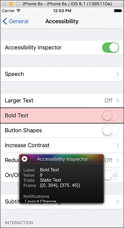
2. Revise the Disconnected project with an accessible interface. Review the finished design using the Accessibility Inspector in the iOS Simulator.