
7. Compositional Aesthetics
Canon EOS-1 • ISO 100 • 1 sec. • f/11 • Canon 80–200mm lens at 200mm
Creating a Visually Literate Image
A well-designed photograph forms a coherent conclusion for the viewer. The subject matter and the creative way you capture it affects how the image is received. But finding your personal vision goes beyond what you choose to photograph. Instead, it’s rooted in how you arrange objects in the scene, use color, and control perspective to your advantage. In this chapter, you’ll learn techniques that will enrich your visual literacy to effectively depict long and brief exposure times. Beginning with the rules of pictorial composition, you can translate your intention into an effective image, much like using the alphabet to read and write.
Poring Over the Picture
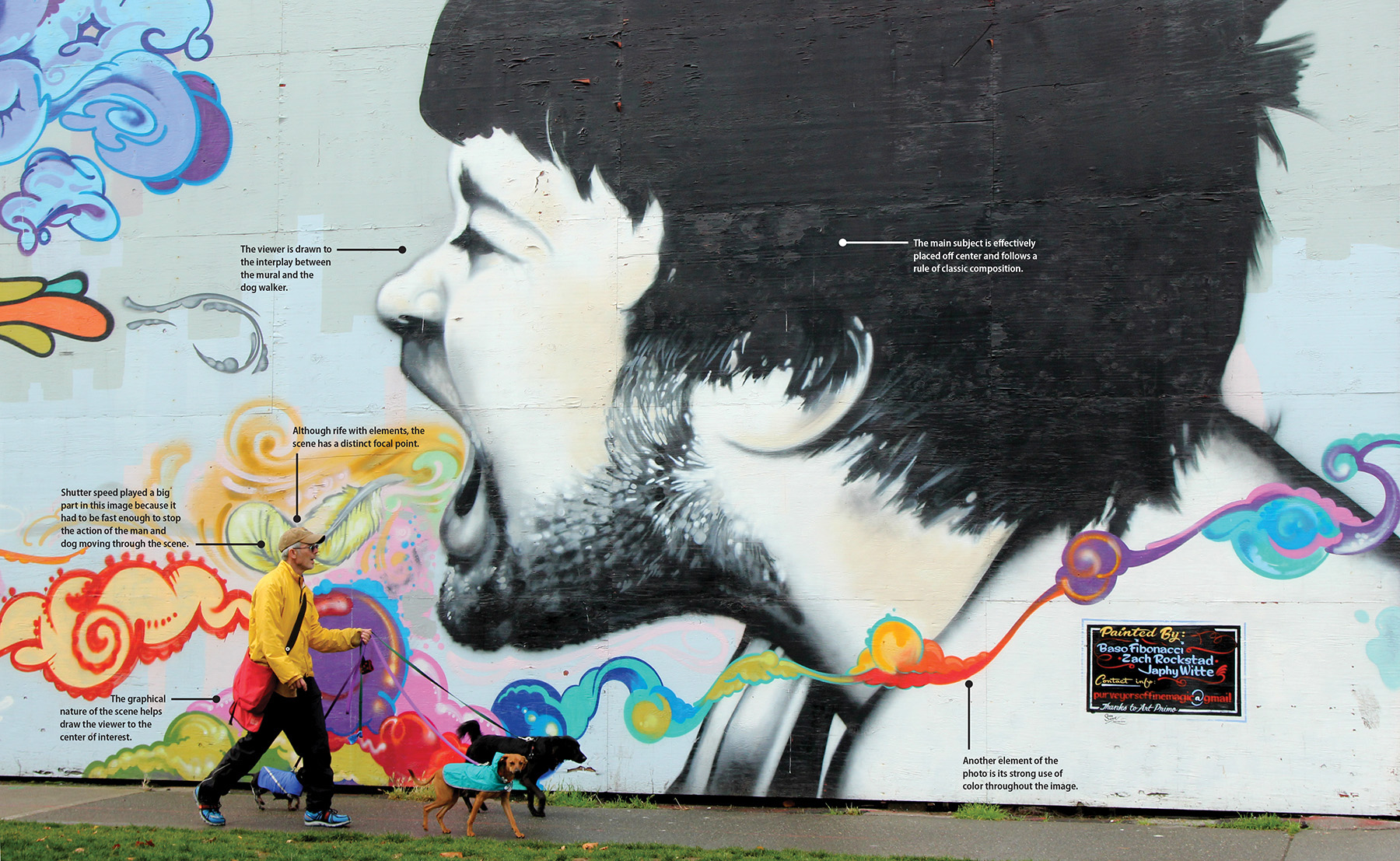
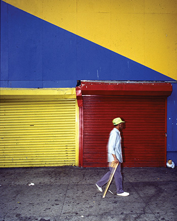
A well-composed picture depends as much on subject matter as it does on the decisive moment. The man walking his dog was captured at the moment he walked into the center of interest—the mural’s colorful breath.
Canon T2i • ISO 400 • 1/320 sec. • f/8.3 • Canon 24–105mm lens at 35mm (equivalent to 56mm)

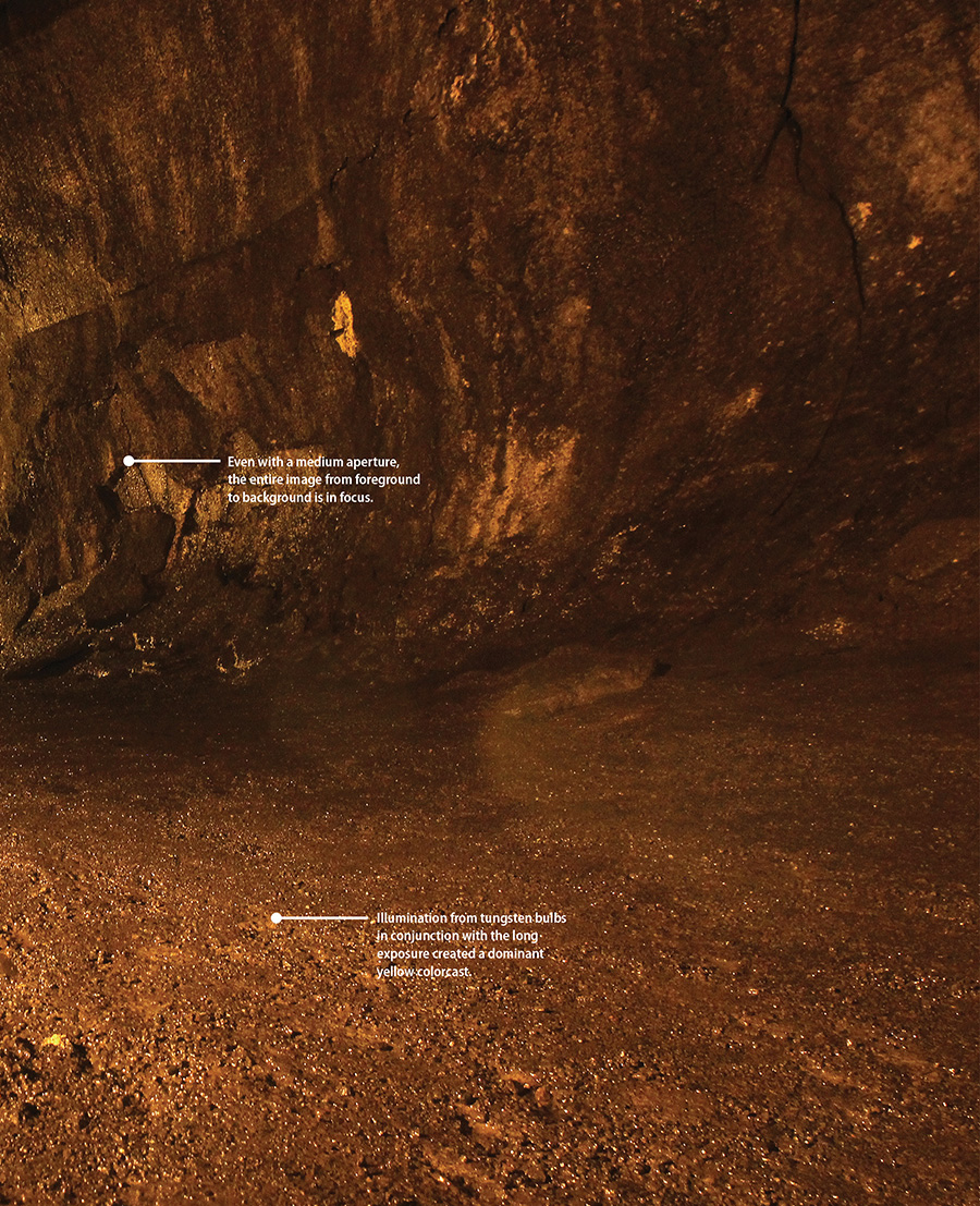
Poring Over the Picture
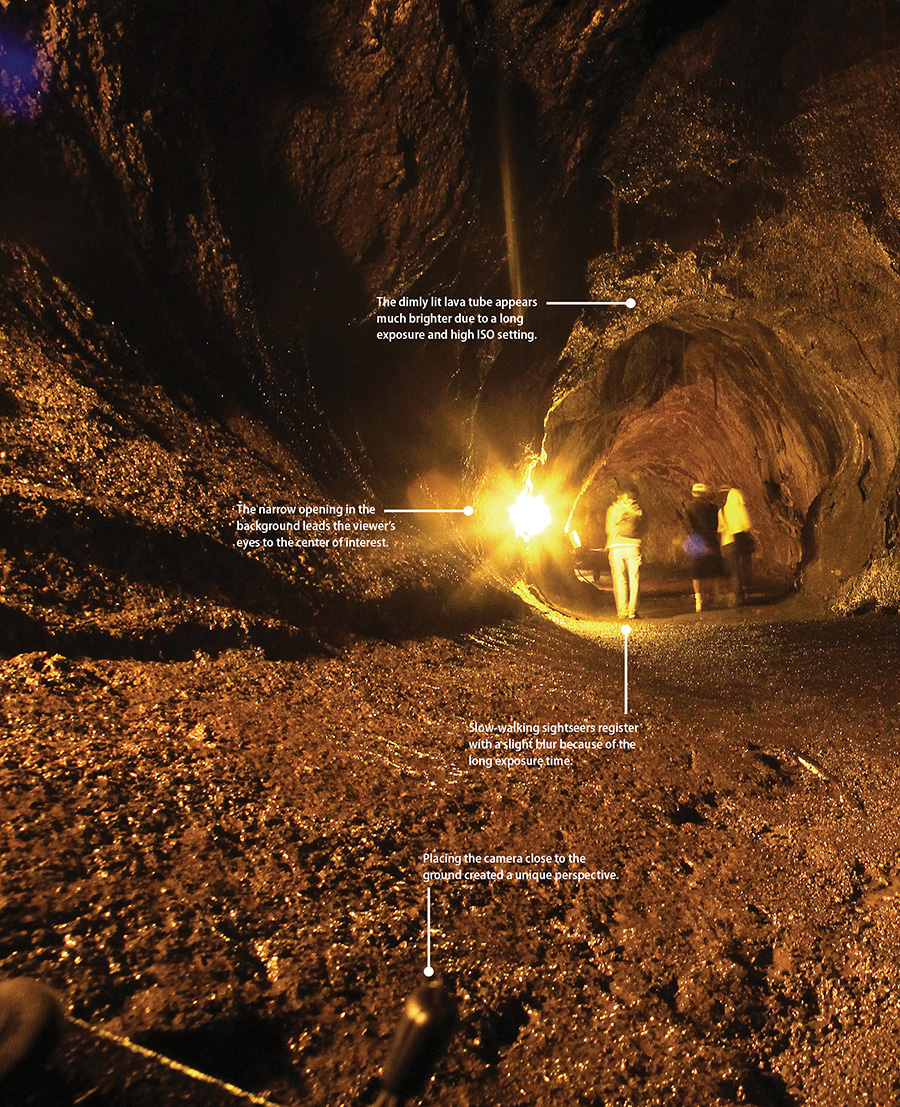
Shot inside the Thurston Lava Tube at Volcano National Park, this scene has an expansive view. Because it was shot with an ultrawide-angle lens, the foreground areas appear much wider than the background, even though the widths are similar.

Canon T2i • ISO 1600 • 1.3 sec. • f/10 • Sigma 14mm lens (equivalent to 22mm lens)
Utilizing the Tools of Composition
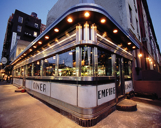
Allegedly, a picture is worth a thousand words, but that doesn’t mean every word is clearly understood. Just as it happens in conversation, some pictures easily communicate to the viewer, whereas others make it more challenging to be understood. Becoming fluent in visual literacy begins with understanding the components that make up an image, such as arrangement of elements in the scene, focal length, angle of view, and color (Figure 7.1). All play a big part in explaining the scene to the viewer.
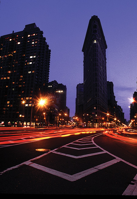
Canon EOS-1 • ISO 100 • 8 sec. • f/16 • Canon 24mm lens
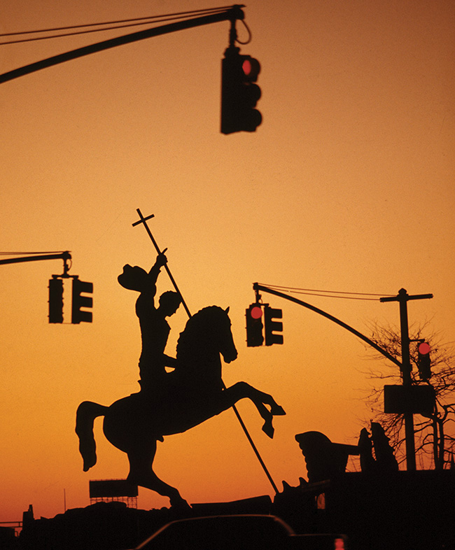
Figure 7.1 This New York City scene captured at twilight uses numerous compositional techniques, including the rule of thirds, shape, form, and leading the viewer.
It All Happens in the Frame
An image resides within the confines of the frame, which is all the viewer has to make sense of it, so the visual arrangement of elements helps tell the story. Beginning with the rules of composition, you can translate whatever your intention is for the image into a visually cohesive one. Clearly, viewers are drawn to a technically perfect image; otherwise, they wouldn’t continue looking at it. But once you’ve established the technical aspects of an image, it’s important to understand the different elements that make up a visually appealing image.
Creative Composition Techniques
The art of taking a three-dimensional scene and depicting it as a two-dimensional picture heavily depends on how you compose the scene. Deciding how to control elements in a scene is an art form that allows you to create an image that appeals to the viewer (Figure 7.2). Effective composition accentuates your objective, whereas a weak composition impedes it.
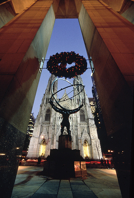
Canon EOS-1 • ISO 100 • 8 sec. • f/11 • Sigma 14mm lens
Figure 7.2 This rendering of the Atlas statue and St. Patrick’s Cathedral uses various compositional techniques, including a wide focal length, perspective control, and framing.
Let’s examine some of the compositional elements that effectively depict an image.
The Rule of Thirds Rules!
Dating back to the ancient Greeks, the rule of thirds is perhaps the oldest and most revered rule of composition. The rule of thirds suggests that you keep the main subject outside the center of the frame. Basically, it divides the image into nine equal parts: three parts from top to bottom and three from side to side. By placing the subject in one of those areas but not in the center, you can create a more pleasing arrangement in the scene.
Devised by the Greek mathematician Euclid, who felt that the ratio between the minor and major division of a whole part was more pleasing than when equally divided, the Greeks used the rule of thirds primarily for architecture and sculpture. It eventually found its way into photography and pictorial art as an effective device. Just think of an image divided into a tic-tac-toe board with the optimal placement for the main subject outside the center square, as shown in Figure 7.3.

Canon T2i • ISO 200 • 1/800 sec. • f/5 • Canon 200mm lens
Figure 7.3 This lazy beach scene on a Bora Bora motu uses the rule of thirds.
When a scene has a distinct horizon, as shown in Figure 7.4, arrange it on the upper or lower line.
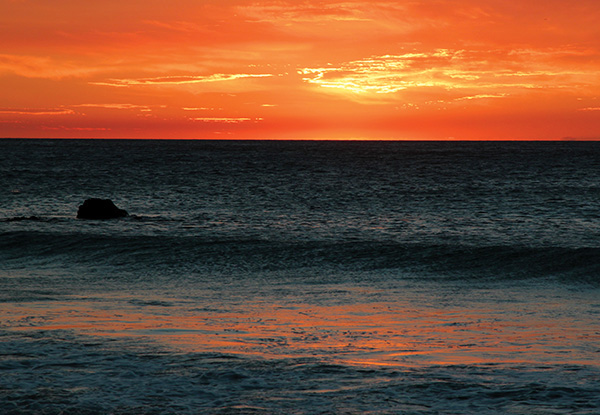
Canon EOS-1 • ISO 400 • 1/640 sec. • f/8 • Canon 24–105mm lens at 105mm (equivalent to 160mm)
Figure 7.4 This image of sunset on Hapuna Beach on Hawaii’s Big Island creates a series of warm tones and uses the rule of thirds, placing the horizon above the center of the frame.
Although the rule of thirds technique dates back thousands of years, it’s still as important today as it was for Ictinus and Callicrates, the architects of the Parthenon, which follows this principle.
Keep It Simple
More often than not the axiom less is more applies to photographic composition, especially when defining the center of interest. The reason is that the effectiveness of an image greatly depends on creating a focal point in the image, and often that means separating it from the extraneous clutter in the scene. Distracting elements, such as a telephone pole in the background or a light flaring into the lens, can interfere with the intention of the image.
A simple arrangement (Figure 7.5) prevents confusion. But arranging a minimal composition is not as easy as it sounds, especially when you’re dealing with the passive situations that occur outside a controlled situation, such as a photo studio.
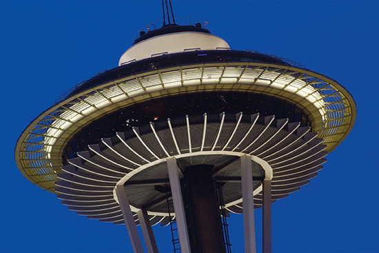
Canon T2i • ISO 400 • 5 sec. • f/25 • Canon 200mm lens (equivalent to 320mm)
Figure 7.5 The Seattle Space Needle was photographed from below using a telephoto lens to isolate the subject.
Here are some helpful hints for composing a clean image:
• Watch out for complicated backgrounds: Extraneous elements in an image can distract the viewer and make the picture less effective.
• Use focal length to your advantage: Bring the subject closer by using a telephoto lens to emphasize the center of attention. You can also use a wide-angle lens inches away to isolate the main subject and create a unique perspective.
• Try selective focus: Another way to isolate the subject is to limit focus to the main subject, thereby deemphasizing extraneous elements.
• Move closer to the subject: Call it the poor man’s telephoto or just getting personal with the subject, but either way, moving closer to your subject allows you to capture just the subject and nothing more.
Framing the Subject
Objects in the foreground help create a sense of depth in your composition. Shooting through a window, archway, or overhanging tree branches (Figure 7.6) helps to define the main subject because each element occupies the otherwise empty areas of the frame, making it simpler to distinguish the center of interest. It’s a useful technique that often makes the difference between a snapshot and a great shot.
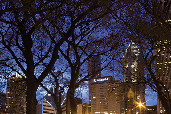
Canon T2i • ISO 400 • 13 sec. • f/22 • Canon 50mm lens (equivalent to 80mm)
Figure 7.6 The Chicago skyline was photographed through a row of trees, making a mundane scene more appealing. A small aperture setting was used to control depth of field.
Working the Dutch Angle
You don’t always have to keep the horizon straight to make a great picture. Sometimes, you can intentionally tilt the frame to add some pizzazz to a boring composition or simply to create a cool effect (Figure 7.7). It doesn’t work in every situation, but for those times when you come across a situation that’s cliché or one that leaves too much negative space in the frame, give the camera a tilt and check out the results. Just make sure the effect is evident. A slight tilt may lead the viewer to believe you weren’t holding the camera steady. Also, be aware of any background elements, and try to ensure they are symmetrically composed.
Canon T2i • ISO 200 • 1/400 sec. • f/5.6 • Canon 20–35mm lens at 21mm (equivalent to 34mm lens)
Figure 7.7 A variety of elements make this scene intriguing, including tilting the camera.
Shadows and Reflections
Although distinctly different, shadows and reflections share similarities when they are being used as creative devices. Balancing the subject with a shadow or reflection can help unify a one-sided arrangement or add some zing to an image because both can effectively act as an extension of the main subject.
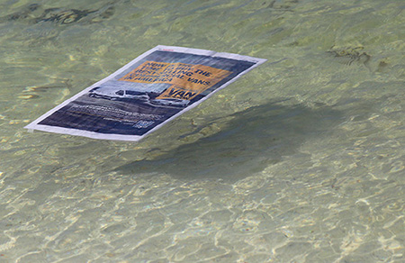
Shadows produce a rich texture that can balance the frame, lead the viewer into the picture, or show depth (Figure 7.8). Reflections also capture viewers’ attention by drawing them into the scene. But you can also use reflections effectively as the main subject (Figure 7.9).
Canon 6D • ISO 400 • 1/1250 sec. • f/8 • Canon 200mm lens
Figure 7.8 Floating on the shoreline, this newspaper casts a shadow on the beach floor, adding depth to the subject.
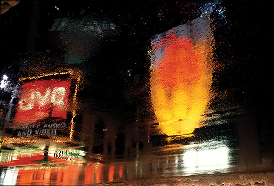
Canon EOS-1 • ISO 100 • 8 sec. • f/8 • Canon 100mm lens
Figure 7.9 The wet pavement made the perfect surface for a reflection of these colorful neon signs.
Using Shape and Form as Creative Devices
Depicting the shape or form of a subject provides another strong compositional device. Geometric and free-form objects are found just about anywhere, so all you have to do is look around you (Figure 7.10). To create a great image, sometimes it’s a matter of picking the right angle; other times it’s more about selecting the proper focal length to isolate the form.
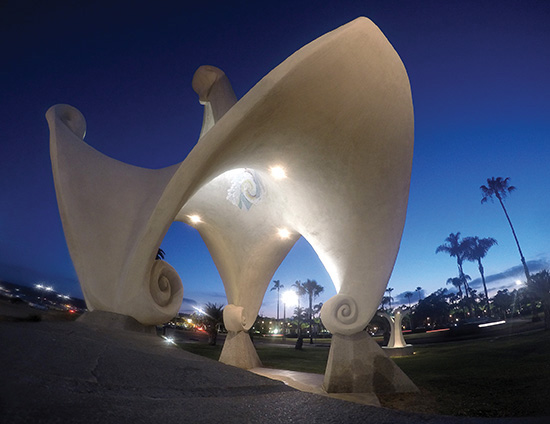
GoPro HERO3+ Black • ISO 400 • .3 sec. • f/2.8 • Ultrawide-angle view (equivalent to 14mm lens)
Figure 7.10 The Pacific Portal sculpture was captured using an ultrawide-angle lens to depict it in a free form.
Dealing with Symmetry
Another strong dialect for visual language is symmetry because it provides balance by strengthening elements in the scene, such as form, color, and light. It can also “even out” the arrangement of objects in the frame, as shown in Figure 7.11.
Canon T2i • ISO 200 • 1/100 sec. • f/3.5 • Canon 50mm lens (equivalent to 80mm lens)
Figure 7.11 Sometimes the picture shows balance on both sides.
In contrast, asymmetrical balance, which is sometimes trickier to achieve, also proves to be an effective device. In some ways it’s an extension of the rule of thirds: The subject occupies half of the frame, and the other half consists of scenery (Figure 7.12), negative space, or a contrary object. Just keep in mind that viewers read the frame from left to right and top to bottom—the same way you read a newspaper. The problem is that sometimes the frame can look like it’s divided in half, making it appear as though the image consists of two separate pictures.
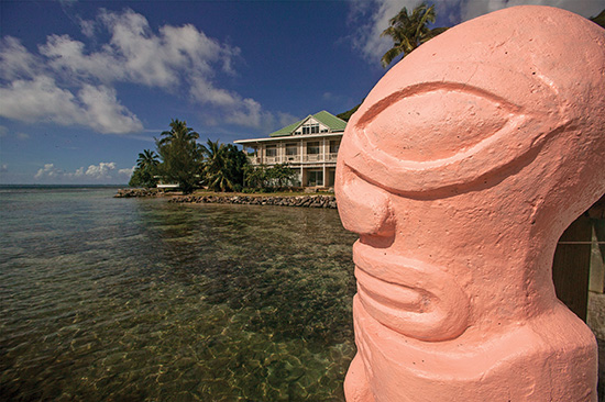
Canon EOS-1DS • ISO 320 • 1/1000 sec. • f/16 • Canon 14mm lens (equivalent to 80mm lens)
Figure 7.12 With the main subject positioned on the right side of the frame, the viewer’s eyes are led across the landscape to the pink statue.
Consider the following when capturing a symmetrical image:
• When you place the subject on the bottom right of the frame, it leads the viewer through the frame to the subject.
• When you place the subject at the top left of the frame, the viewer’s eyes are drawn to the subject first and then the rest of the scene. The eye movement across the image allows viewers to draw a conclusion about the picture.
• Sometimes the viewer is looking into the center of the frame; other times the viewer is looking outside of it. The direction in which the subject is looking can help the viewer understand your intentions.
Using Color Effectively
You can use color to help establish a strong visual statement in your photos, creating dynamic imagery that can wow viewers and draw them into the picture (Figure 7.13). Exploiting color not only acts as another compositional tool, but can also help convey a mood, depending on how you feel about the subject, or the response you want to elicit from the viewer. And because color is often used in association with certain feelings, such as green with envy, got the blues, and red with anger, using color in your images can show a strong connection between emotions and the hues that represent them.
Canon EOS-1 • ISO 100 • 1 sec. • f/2.8 • Canon 24mm lens
Figure 7.13 Captured just before twilight, this street scene makes an impact with its display of primary colors. Because the final image required a slightly long exposure, the passing gentleman was illuminated by a burst of flash.
For the Sake of Color
There’s a distinct difference between photographing an afternoon sky and returning hours later to shoot it again. Instead of exhibiting the pale blue background captured earlier in the day, the sky is alive with the warm colorful hues of sunset. The setting sun provides one example of the many subjects you can shoot merely for the sake of color. Some colors are indicative of the subject, whereas others are the result of color temperature (see Chapter 3) and the way the camera renders it (Figure 7.14). Regardless, the intensity of color can make the difference between a good photograph and a great photograph.

Sony Cybershot • ISO 320 • .3 sec. • f/2.0 • Sony 30mm lens
Figure 7.14 The burning coals show both the warmest and coolest tones, making for a visually interesting image.
Here are a few ways to look for color in a scene:
• Monochromatic color: Some pictures tell a story with the use of a single color, whether it’s a warmly lit subject captured in the late afternoon or one dominated by a single-colored accent light.
• Subdued color: Some scenes are best depicted using subdued lighting, and others are best depicted in natural light, as shown in Figure 7.15. You can also desaturate the color in Photoshop to make a visual statement.
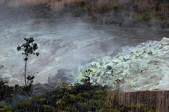
Canon T2i • ISO 800 • 1/320 sec. • f/5.6 • Canon 24–105mm lens at 105mm (equivalent to a 168mm lens)
Figure 7.15 Sulfur Banks at Volcano National Park reveals a harsh, yet interesting beauty, mostly because the sulfuric gas emanating from fissures on the surface have killed or stunted the plant life.
• Complementary color: Some situations thrive on the interplay between colors opposite one another because complementary colors help create a more dramatic image. Each color makes the other livelier—for example, a yellow object juxtaposed against a rich, blue sky. Cyan and red as well as magenta and green are also opposites that are considered complementary.
Controlling the Scene with Focal Length
Perspective also plays a big part in how a picture communicates with the viewer, so it’s important to understand the effect focal length can have on a subject. Wide-angle and telephoto lenses have distinct qualities. A wide-angle lens provides an expanded angle of view as wide as 180 degrees, allowing you to fit a confined area into the context of the photo frame. Telephoto lenses cover a narrow field of view and can bring the subject much closer to you.
In addition to allowing you to change the magnification of the subject as it appears in the frame, focal length can affect the size relationship of objects in the foreground or background, as shown in Figure 7.16.
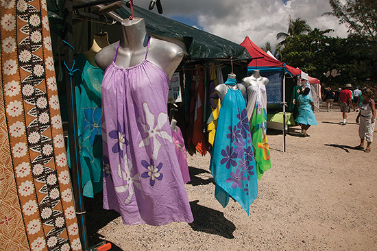
Canon EOS-1DS • ISO 320 • 1/500 sec. • f/16 • Canon 24–105mm lens at 24mm
Figure 7.16 The shopping bazaar on Mo’orea was captured with a wide-angle lens to emphasize the garment closest to the lens while still showing the other tents down the line.
Understanding Ultrawide-Angle Lenses
The foremost misconception regarding ultrawide-angle lenses is that they include more of a scene by covering an expansive view. That’s like saying your laptop computer can only search the Internet. Just as your computer can run different software, the ultrawide-angle lens does more than capture a wide view. In fact, quite the contrary; these lenses are most effective when you get extremely close to your subject for an intimate view and unique perspective (Figure 7.17).
Canon EOS-1 • ISO 100 • 2 sec. • f/16 • Sigma 14mm lens
Figure 7.17 This unique perspective was created by placing the camera at a low angle near the corner of the building.
By definition, an ultrawide-angle lens has a field of view of 84 degrees, which in more practical terms means the field of view of a 24mm lens, or wider, on a 35mm camera. But remember that the same lenses that used to provide an expansive, beautifully distorted view on a full-frame sensor behave similarly to a moderate wide-angle lens when you’re using a camera in the APS-C format.
The Wide-Angle Lens
Basically, a wide-angle lens has a focal length with an angle of view greater than 60 degrees. That’s usually a focal length as wide as a 28mm lens on a 35mm camera. As mentioned earlier, the focal length depends on the sensor size of the camera. The APS-C sensor makes a wide-angle lens behave more like a normal lens, so a 28mm lens behaves like a 45mm lens. Other sensors are much smaller but create the equivalent of a wide-angle lens, such as the lens on the advanced point-and-shoot camera used to capture the image in Figure 7.18.
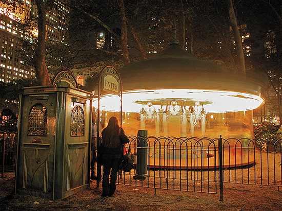
Nikon 5000 • ISO 100 • 2 sec. • f/4.0 • 7.1mm lens (equivalent to 28mm)
Figure 7.18 This small merry go round in Bryant Park was captured using a Nikon point-and-shoot camera that could capture a long exposure. The camera was placed (and leveled) on a trash can for stability.
The Normal Lens
The only age-old question of “what is normal?” that doesn’t require a philosophical debate is the one that refers to photographic lenses. Quite simply, a normal lens reproduces a field of view with a natural perspective, very much like our own eyes. In mathematical terms, that field of view is approximately a 50-degree angle of view from the lens when you’re holding the camera horizontally. In the 35mm format, or frame sensor in digital speak, that is equivalent to a 50mm lens. When you’re using a camera with an APS-C sensor, a normal field of view ranges in focal length between 28mm and 35mm (Figure 7.19). The reason is that a 50mm lens behaves more like a moderate telephoto lens in the 80mm range, as shown in Figure 7.20.
Canon T2i • ISO 200 • 1/500 sec. • f/10.0 • 20–35mm lens at 29mm (equivalent to 46mm)
Figure 7.19 Street art in Philadelphia was captured using a “normal” angle of view. Because this photo was taken with a camera using an APS-C sensor, the focal length brought the subject closer than a full-frame camera.
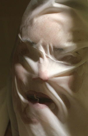
Canon T2i • ISO 1600 • 1/125 sec. • f/3.5 • 50mm (equivalent to 80mm)
Figure 7.20 This scary face made by using a shower curtain was taken with a normal lens, but the camera’s crop sensor allowed the lens to behave like a moderate telephoto.
Bringing It Close with a Telephoto
A telephoto lens makes distant subjects appear closer to you. Besides filling the frame with more of the subject, a longer focal length can exaggerate subject distance by compressing the space between near and distant objects. The telephoto range begins with an angle of view less than 30 degrees, which is approximately 85mm. Here’s a case where the limitations of the APS-C format become its strength, especially when you’re shooting sports and natural scenes. A 100mm lens acts like a 160mm, and a 200mm lens behaves like a 320mm (Figure 7.21), immediately bringing you closer to your subject.
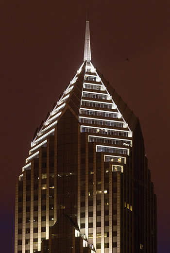
Canon T2i • ISO 400 • 5 sec. • f/22 • 200mm lens (equivalent to 320mm)
Figure 7.21 The crop sensor increased the focal length of this telephoto lens and brought the Two Prudential Plaza building in Chicago closer in the frame.
Employing Angles Effectively
When he was making the classic film Citizen Kane, director Orson Welles shot a low-angle scene by placing the camera in a hole to emphasize an unusual perspective. Although that technique is a bit extreme, it’s better than shooting every scene at eye level, unless, of course, your intention is to bore the viewer into submission. Instead, varying the angles at which you capture the subject helps articulate the message you’re trying to convey to the viewer.
Climb a flight of stairs and shoot downward or situate yourself on higher ground to shoot down on the subject. Or, take it to the other extreme and find a low position to shoot at ground level or upward (Figure 7.22). Many tripods let you widen the spread of their legs to resemble a three-legged spider, leaving you with a perspective inches from the ground. You can shoot also from overhead to get a flatter perspective, or tilt the camera using a Dutch angle, as mentioned earlier in the chapter.
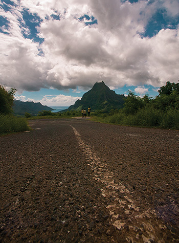
EOS-1DS • ISO 320 • 1/800 sec. • f/13 • 14mm lens
Figure 7.22 Placing the camera on a road in Mo’orea produced a unique view of Mont Rotui.
When you add these effective angle variations to your photography, they provide a nice supplement to using a wide, normal, or telephoto focal length.
Here are some ideas for shooting at different angles:
• High angle: Raise the camera high on the tripod, or get to some high ground, and angle the camera down toward the subject to provide an objective view of the subject in relation to its surroundings. This elevated perspective can also show a graphical composition of the frame, as shown in Figure 7.23.

Canon T2i • ISO 100 • 1/250 sec. • f/13 • 14mm lens (equivalent to 22mm lens)
Figure 7.23 Shooting from a high angle doesn’t mean you need to stand far above the subject. This shoreline photo off a Bora Bora motu was captured by standing in the water and holding the camera down, letting the ultrawide-angle lens take it all in.
• Bird’s-eye view: Alfred Hitchcock loved using a bird’s-eye shot, and not just for his terrifying film The Birds. Positioning the camera high and directly above the action allows the viewer to dissect elements in a two-dimensional view, often making common objects unrecognizable. Although you won’t always have the opportunity to use this technique, this perspective can also provide a two-dimensional overhead composition of the subject.
• Low angle: Shooting up at a subject provides another dynamic option for your pictures and can also change the perception of the subject, as shown in Figure 7.24.
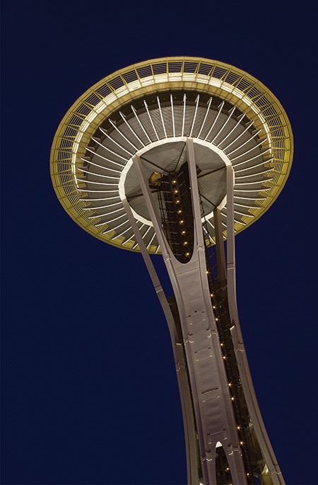
Canon T2i • ISO 200 • 6 sec. • f/20 • 50mm lens (equivalent to 80mm)
Figure 7.24 When shot from underneath, the Seattle Space Needle takes on an abstract form.
The next time you come across an interesting subject, try shooting it using a few different compositional techniques, but always incorporate the rule of thirds. Shoot the same scene several times but place the main subject in different parts of the frame, except, of course, in the center. With practice, you’ll instinctively avoid including the main subject in the center of most of your images.
Look for Shadows and Reflections
Shadows and reflections are omnipresent, and make great compositional fillers as well as main subjects. Look for shadows from sunlight early in the morning or late in the day and incorporate them into your pictures. Finding reflections is not that difficult; just look for glass or shiny surfaces near a subject that intrigues you. You can also shoot reflections after a rainstorm or when the snow melts.
Experiment with Focal Length
Shoot the same subject with focal lengths that range from wide to telephoto while maintaining the same image size in the frame. Then observe the results that each lens provides and the relationship between the objects in the frame.
Same Scene, Different Angles
Creating great shots is all in the angles. They play a big part in the message you’re trying to convey, so practice shooting every worthy subject using at least three different angles. Start at eye level; then position the camera near the ground to capture a low angle; and finish by shooting the subject from a high position. You can also tilt the frame to incorporate a Dutch angle, and if you have the opportunity, attempt a bird’s-eye view shot.
Share your results with the book’s Flickr group!
Join the group here: flickr.com/groups/timelapse_longexposure_fromsnapshotstogreatshots/