
PROJECT: DEVELOPING SOLUTIONS FOR TABLETS
Mobile development is not simply restricted to smart phones. There is a whole world of devices beyond phones. The popular category is now tablets, led by Apple’s iPad but gaining solid competition from Google’s Android Tablet OS, and BlackBerry’s PlayBook. In Figure P6.1 you can see a picture of Apple’s iPad. Tablets are following the innovative interface design popularized by the iPhone.
Building a website for a tablet is slightly different than building one for a smart phone. The size of the tablet, how you use it, and the processing power is different than a handheld phone. A tablet is really more like a computer than a smart phone.
With this in mind, you will want to design your website slightly differently for a tablet. In this project you will extend the current release of jQuery Mobile with a custom theme to illustrate how you can make a tablet experience different than a smart phone experience.
What You Will Need
To get started with this project you will need to download the files from www.visualizetheweb.com. The files for this project are contained in a ZIP file that you can extract on your desktop.
The project contains a lot of files. Many of the files are additional themes you can use.
Setting Up Your Project
The default project is a collection of calculators written in JavaScript that can be used on a tablet, as shown in Figure P6.2. The concept shows that you can use additional JavaScript libraries with jQuery Mobile.
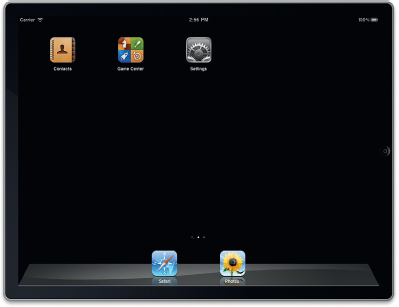
Figure P6.1 Apple iPad tablet.
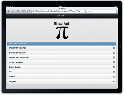
Figure P6.2 jQuery Mobile is being used to frame the app.
The core focus of the project is controlling the themes and structure of the elements. A second folder, labeled JQM-Themes, contains eight additional themes you can use on your site. To add the themes you only need to follow the next instructions.
The main document you will use is the index.html file. This loads the main theme and links to all the other files.
The HTML for the index.html looks like this:
<!DOCTYPE html>
<html>
<head>
<title>Calculator</title>
<link rel=“stylesheet” href=“jquery.mobile-1.0a2.css” />
<link rel=“stylesheet” href=“http://code.jquery.com/mobile/1.0a4.1/jquery.mobile-1.0a4.1.min.css” />
<script src=“http://code.jquery.com/jquery-1.5.2.min.js”></script>
<script src=“http://code.jquery.com/mobile/1.0a4.1/jquery.mobile-1.0a4.1.min.js”></script>
</head>
As you can see, the setup of the page is a standard jQuery Mobile HTML5 document. The rest of the page provides links to external web pages containing each calculator:
<body>
<div data-role=“page” id=“menu”>
<div data-role=“header”>
<h1>Calculators</h1>
</div>
<div data-role=“content”>
<p align=“center”> <img src=“images/head.png”></P>
<ul data-role=“listview” data-inset=“true” data-theme=“c” data-dividertheme=“b”>
<li data-role=“list-divider”>Mathematic Calculators</li>
<li><a href=“simple.html” rel=“external”>Standard Calculator</a></li>
<li><a href=“scientific.html” rel=“external”>Scientific Calculator</a></li>
<li><a href=“square.html” rel=“external”>Square Root Calculator</a></li>
<li><a href=“circle.html” rel=“external”>Circle Calculator</a></li>
<li><a href=“primeNumber.html” rel=“external”>Prime Number</a></li>
<li><a href=“sine.html” rel=“external”>Sine</a></li>
<li><a href=“cosine.html” rel=“external”>Cosine</a></li>
<li><a href=“tangent.html” rel=“external”>Tangent</a> </li>
</ul>
</div>
</div>
</body>
</html>
Each link to a calculator uses the Rel attribute. This forces the link to release the Ajax session currently being used by jQuery Mobile.
Control over your graphical layout is essential as you design any website. You need to have colors blend with those of your company or client’s brand. Buttons and tabs may need to be highlighted or muted.
On the whole, jQuery Mobile limits the use of image files to a minimum. Buttons, backgrounds, and tab bars are created using Cascading Style Sheets (CSS). There are some exceptions where you will use PNG images to control your layout, but this is the exception and not the rule. Page design with CSS has matured dramatically with CSS3 and has reached a point where you can use rounded corners and gradients to replace techniques that traditionally required JPEG or PNG images.
Most of your design can be controlled with CSS in jQuery Mobile. jQuery Mobile uses CSS to control the visual layout of content on the screen. There are two main sections for the CSS document:
• Structure
• Theme
The structure section of the CSS document controls the position, padding, and margins for elements such as buttons and tabs on the screen. The theme controls specific visual elements such as fonts, colors, gradients, shadows, and corners. Modifying a theme allows you to control the visual elements of objects such as buttons. An additional enhancement to a theme is the addition of a feature called swatches. A swatch sets the properties of a group of colors for a theme. Taking advantage of swatches allows you to easily switch in and out alternative color schemes from the main theme.
The default CSS document that comes with jQuery Mobile has a theme with a set of swatches right out of the bag.
You can switch out different color swatches for sections of your page. This is OK to start with, but what if you want to go further and control the visual layout of all the content you are looking at? Remember, you are using CSS to control all the visual content.
All the position, border, padding, and other visual effect rules are controlled with the following CSS file you reference in the head of your page: jquery.mobile-1.0a4.1.css.
You can open the CSS document in Dreamweaver or your favorite text editor. The style sheet consists of two main sections:
• Theme
• Structure
Themes control visual elements such as color, gradients, fonts,
and shadows. Within the theme section of the CSS document is a section that controls how swatches are controlled.
The structure section of the document defines padding and placement of structural elements such as buttons.
Each of the pages in the project is controlled by jQuery Mobile themes.
Editing Swatches
Each of the swatches follows a similar structure. Each swatch is lead by a comment that identifies the swatch name. Five swatches (a, b, c, d, e) are included with the current release of jQuery Mobile.
Let’s look at swatch a and examine how it formats the page. The first CSS class is:
/* A ------------------------------------------
-----------------------------------------------
----------*/
.ui-bar-a {
border: 1px solid #2A2A2A;
background:#111111;
color:#ffffff;
font-weight: bold;
text-shadow: 0 -1px 1px #000000;
background-image: -moz-linear-gradient(top, #3c3c3c, #111111);
background-image: -webkit-gradient(linear, left top, left bottom, color-stop(0,#3c3c3c), color-stop(1,#111111));
-ms-filter: “progid:DXImageTransform.Microsoft.gradient(startColorStr=‘#3c3c3c’, EndColorStr=‘#111111’)”; }
The name of the class is special. It is labeled ui-bar-a. jQuery Mobile looks for the name of the suffix when the Data-theme attribute is added to an element. For instance, in the previous CSS example you need to define the Data-theme to be a. When this is selected the CSS class is used to format the toolbar in your page.
The final a is a variable that can be dynamically set. This allows for additional swatches to be easily created. For instance, you can change the swatch by using ui-bar-b.
The ui-bar class controls the footer and header toolbar. There are no images referenced. To create visual effects, the class relies on CSS3. You can use any of the text-shadow and gradient effects.
It is a good idea to start with small changes as you start to work your way through customizing the swatches in jQuery Mobile. For instance, in the following example, the only change is that the text color is now red instead of black:
.ui-bar-a {
border: 1px solid #2A2A2A;
background:#111111;
color:red;
text-shadow: 0 -1px 1px #000000;
background-image: -moz-linear-gradient(top, #3c3c3c, #111111);
background-image: -webkit-gradient(linear,left top,left bottom,color-stop(0,#3c3c3c),color-stop(1,#111111));
-ms-filter:
“progid:DXImageTransform.Microsoft.gradient(startColorStr=‘#3c3c3c’, EndColorStr=‘#111111’)”; }
Save the file and reload your page. You will see that the title in the header and footer is now red.
CSS offers you many different stylistic controls. Here you have made one change—the font is now red—but you can experiment with modifying the other properties. The one property that is challenging is the background-image property.
Background images take advantage of a new CSS3 property called gradients, used to fill in areas where the colors transform from one color to another. The earlier example has the gradient transforming from dark gray (3c3c3c) to white (111111) using the following properties:
background-image: -moz-linear-gradient(top, #3c3c3c, #111111);
background-image: -webkit-gradient(linear,left top,left bottom,color-stop(0,#3c3c3c),color-stop(1,#111111));
-ms-filter:
“progid:DXImageTransform.Microsoft.gradient(startColorStr=‘#3c3c3c’, EndColorStr=‘#111111’)”; }
What is confusing is that there are three different ways in which a gradient is applied. The reason for this is due to different browsers supporting different ways of using a filter. In this example the first background image property is for Firefox web browsers, the second is for Apple’s Safari and Google’s Chrome, and the third setting supports Microsoft’s Internet Explorer.
Each jQuery Mobile swatch has 26 different classes you can edit. You do not need to edit them all. In fact, you may want to copy the swatches and edit only the properties you want changed. The ZIP containing the documents used for this chapter has additional swatches. The approach used to modify each swatch was to copy the default a swatch and modify only the CSS properties needed. The rest is left the same.
Changing the Visual Elements
The first 600 lines of the CSS document (jquery.mobile-1.0a4.1.css) is dedicated to defining the five swatches that come with the default theme. The rest of the CSS document is used to define general aspects of the theme such as the size of the roundness of the corners for the buttons. It is here that you can customize buttons for layout on a tablet screen.
The following example highlights the CSS classes for corner roundness:
.ui-btn-corner-tl {
-moz-border-radius-topleft: 1em;
-webkit-border-top-left-radius:1em;
border-top-left-radius:1em;
}
.ui-btn-corner-tr {
-moz-border-radius-topright: 1em;
-webkit-border-top-right-radius:1em;
border-top-right-radius:1em;
}
.ui-btn-corner-bl {
-moz-border-radius-bottomleft: 1em;
-webkit-border-bottom-left-radius:1em;
border-bottom-left-radius:1em;
}
.ui-btn-corner-br {
-moz-border-radius-bottomright:1em;
-webkit-border-bottom-right-radius: 1em;
border-bottom-right-radius: 1em;
}
.ui-btn-corner-top {
-moz-border-radius-topleft: 1em;
-webkit-border-top-left-radius:1em;
border-top-left-radius:1em;
-moz-border-radius-topright: 1em;
-webkit-border-top-right-radius:1em;
border-top-right-radius:1em;
}
.ui-btn-corner-bottom {
-moz-border-radius-bottomleft: 1em;
-webkit-border-bottom-left-radius:1em;
border-bottom-left-radius:1em;
-moz-border-radius-bottomright:1em;
-webkit-border-bottom-right-radius: 1em;
border-bottom-right-radius: 1em;
}
.ui-btn-corner-right {
-moz-border-radius-topright: 1em;
-webkit-border-top-right-radius:1em;
border-top-right-radius:1em;
-moz-border-radius-bottomright:1em;
-webkit-border-bottom-right-radius: 1em;
border-bottom-right-radius: 1em;
}
.ui-btn-corner-left {
-moz-border-radius-topleft: 1em;
-webkit-border-top-left-radius:1em;
border-top-left-radius:1em;
-moz-border-radius-bottomleft: 1em;
-webkit-border-bottom-left-radius:1em;
border-bottom-left-radius:1em;
}
.ui-btn-corner-all {
-moz-border-radius: 1em;
-webkit-border-radius: 1em;
border-radius: 1em;
}
Each of these classes is generic—they do not reference a specific swatch. The role of the swatch is to control color, font, and gradient effects. In the previous CSS classes, each class controls one element of a radius. Again, as we saw earlier, the inconsistent support of new CSS3 properties requires that each class have three properties that are essentially the same.
If you are going to create your own theme or modify the default theme then I recommend you make a copy of the default CSS document.
1. Open jquery.mobile-1.0a4.1.css in a text editor and save the file with a new name; for example: jquery.mobile.theme.css.
2. Change the roundness in the classes listed earlier (you will find them at line 601) to 0.1em.
3. Save your work.
In the HTML page, change the reference from the default jQuery Mobile CSS document to your new document. Save the page and preview on your tablet.
Coming Soon: ThemeRoller for jQuery Mobile
Controlling color with jQuery has been possible for some time with jQuery UI’s ThemeRoller. A version of ThemeRoller that ships with jQuery UI is coming for jQuery Mobile. The jQuery Mobile ThemeRoller will be slightly different, but to get an idea of what is will likely look like you can preview the jQuery UI ThemeRoller at http://jqueryui.com/themeroller/.
Themes and swatches in jQuery Mobile, however, significantly improve on the efficiency of the original jQuery UI ThemeRoller. Gradients are controlled with CSS3 and not images. Indeed, CSS3 is used throughout jQuery Mobile to control rounded corners, text, drop shadows, and more.
Summary
Controlling the display of your website on a tablet can be driven with themes and swatches in jQuery Mobile. Moving forward, the jQuery Mobile team has already stated that it is working on a specialized version of ThemeRoller for jQuery Mobile. Although this will certainly make it easier to create themes for your mobile websites, it is important to understand why CSS are structured the way they are. Before you use ThemeRoller for jQuery Mobile I encourage you to write your CSS swatch file by hand. The jQuery team has done a great job to make this as easy as possible.