Building Character and Location
Stories are about people. The people (toys, fish, aliens, cars, dragons, etc.) are the characters through which the story is told. The story belongs to the character. Without a good character you don’t have a story.

Character Explorations for Defective Detective, by Avner Geller and Stevie Lewis, Ringling College of Art and Design
What is a Good Character?
A good character is one that is both believable and memorable.
A believable character is an ordinary character (in relation to the world that he lives in) who finds himself in extraordinary circumstances and reacts to those circumstances truthfully.
A memorable character has the ability to move an audience emotionally through the events of the story. It is a character that elicits a reaction from the audience.
Appeal is something different. Appeal refers to the visual design of the character. Ollie Johnston and Frank Thomas originally coined the term appeal in their book, The Illusion of Life. To them, appeal meant that “your eye is drawn to a character and you appreciate what you are seeing.”1 You immediately identify with the character. The character can be beautiful or ugly, intricate or plain, good or bad. The character’s appeal makes you want to watch and find out more about him.
An appealing design is complemented by a captivating personality. A good character is imbedded with strong personality traits with which an audience can identify. These traits are constructed to either aid or impede the character in the pursuit of his goal. As you watch and get to know more about the character, he engages you. You begin to hope for the character’s success or failure. At each event in the story, the emotional investment becomes greater.
A good character is one that is right for the story.
Character Profiles
A good character is also a character that you understand. Knowing your character well allows you to construct believable reactions to conflicts faced in the story. These reactions are what will move your audience through the story. To engage the audience, you need a fully developed character.
What does that mean? In films there are many types of characters. There are main characters, supporting characters, opposing characters, minor characters, and extras. The term flat is often used to describe minor characters or extras. As an audience we don’t get to know them very well. They are singular in both function and emotion. Sometimes they are more like props used to move the story forward. Main characters are fully developed. We engage with them because they have a history complete with a full range of emotion, strengths, weaknesses, idiosyncrasies, and faults.
In feature films, character development is called a back story. A back story is an extensive biography of the character. It includes everything from physical attributes, education, professional history, family, relationships, lifestyle, and hobbies to past diseases, disorders, strengths, weaknesses, fears, and phobias to a myriad of other traits that determine a character’s success or failure in a situation.
For the short we just don’t need to know that much. There is not much time, in the few minutes your film will last, for deep character development. Instead, your audience needs to know immediately—within the first ten seconds of your film—who your character is and what he wants. As the animator, you need to know a bit more to progress the story. But what you need to know can be limited to a few major traits determined by the following definitive questions:
- What is your character’s ethical perspective? Ethics are the means by which we make decisions. Knowing—or assigning—an ethical baseline to your character will help you keep him consistent in the way that he approaches conflict. Paul Lester, author of Visual Communication, outlines six ethical baselines:
- Categorical Imperative. This character would have a strong sense of justice. Right is right and wrong is wrong.
- Utilitarianism. This character believes in the greatest good for the greatest number of people. The focus is on consequences. He would sacrifice one life to save many.
- Hedonism. This is the pleasure principle. This character just wants to have fun. He is selfish.
- Golden Mean. This character compromises and negotiates. He will try to find the middle ground to reach a peaceful agreement.
- Golden Rule. Do unto others as you would have them do unto you. This character has empathy and compassion.
- Veil of Ignorance. This character blissfully goes through life wearing rose-colored glasses. Everything is good, everyone is equal.2
- Is the character dominated by emotion or logic?
- What is his greatest strength?
- What is his flaw?
- A Hero will be flawed, but the flaw will be redeemable.
- A Villain is fatally flawed. Whatever is flawed will be his downfall.
- What would be something that would be an impediment to your character’s success?
- How does he see himself?
- How is he seen by others?
- What is this biggest secret?
- What is at stake for the character?
- What does the character want?
- How far will the character go to get what he wants?
- What does the character need to learn?
These questions build what is called a character profile. The character profile forms the personality of the character. It is best if these questions are answered with the story and story conflicts in mind. Then you can construct a character that meets the conflicts and drives the story in the way that you intend.
Let’s look at a possible profile for Chunk, the main character of the short The Animator and the Seat.
Concept: There are no breaks during crunch time.
Premise: An overworked, tired animator wants to take a break, but is forced back to work by an unexpected authority.
Chunk:
- Ethical Perspective: Golden Mean.
- He is dominated by emotion.
- Greatest Strength: Chunk usually has an unwavering work ethic, incredible talents and the ability to sound cooler than he really is.
- Flaw: He is bored with his job.
- He sees himself as complacent and law abiding.
- He is seen by others as weak, but a great workhorse. He will go the extra mile to get a project done.
- Biggest secret: He has decided he needs a change in employment.
- What does the character want? A break.
- How far will the character go to get what he wants? Not very far. He is a pushover. He is extremely excitable when faced with physical threat. He will use all of his willpower to avoid a physical situation and will give in rather than fight.
- What does the character need to learn? There are no breaks during crunch time.
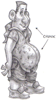
Chunk by Eric Drobile, Ringling College of Art and Design
Chunk is an animator who starts to take a break, only to be forced back to work by his chair. His chair has clearly been charged with the task of keeping him in his place—working.

The Animator and the Seat, by Eric Drobile, Ringling College of Art and Design
The character profile makes sense when put in relationship to the story and how the character emotionally reacts to the situation in which he finds himself. If your profile doesn’t help your character progress through the story, then you need to change your profile or change your story. Don’t think of the profile as something that is set in stone. Think of it as a working document that can be refined as you go through the story development process and learn more about your character(s). Characters are constructed. Their personality traits may need adjustment for the good of the story.
Note that the profile defines internal character traits. This is because there is a difference between character and characterization. When most people begin to define characters, they talk about physical traits, occupations or hobbies. This is characterization. What really defines a character—and why we watch—is to see how he reacts under pressure. Two characters might have the same build, work at the same company, like the same girl and drink the same coffee from Starbucks, but can react very differently when the Starbucks they are at is robbed. One might confront the robber while the other one flees. This is when we see what the true character is made of and, from this, what life lesson he/we might learn.
Working with Two or More Characters

Gopher Broke, directed by Jeff Fowler, Blur Studios
When working with two or more characters, there is additional information you need to add to the profiles:
- What is the relationship of your characters? Characters have relationships. Did they just meet or do they have a history? Are they strangers, acquaintances, friends, foes, family members, lovers, siblings, enemies? How do they feel toward each other? How does that affect the way they act in the story?
- What is the status of each character? Status is defined by how much power you wield in a relationship. The power in a relationship is negotiable. We negotiate status all of the time. In a restaurant the customer is of higher status than the waiter. It is the job of the waiter to serve the customer. But that power shifts if you ask the waiter for a recommendation. Characters will negotiate power by being aggressive, passive, pleasing, assertive, or manipulative. Who has the power in your story and how is it negotiated with the other character(s)?
- What do they want from each other? This is slightly different from the original question, “What does the character want?” In Gopher Broke, all of the characters want the same thing. They want vegetables. The gopher wants the other characters to leave the vegetables alone. After all, he has done all the work. The other characters simply don’t care. In fact, they are willing to threaten and fight the gopher for the vegetables. This defines the relationship between the gopher and the other characters and becomes the primary conflict.
- Who is the story about? This may seem obvious, but frequently when there are two strong characters, you sometimes lose sight of whose story you are telling. Make sure that you keep it clear who the main character really is. Often the main character is the one who arcs—or learns—the most.
Character Arcs
A character arc is the transformation of the character(s) through the course of the story.
In Gopher Broke, the gopher starts out clever and hopeful as he digs holes to dislodge vegetables from the produce truck. As his efforts are continually foiled and his frustration rises, he buries the vegetable sign causing a huge crash and ultimately his own demise.
In The Animator and the Seat, Chunk begins the story as a bored, overworked employee looking for a break. In a bizarre occurrence, his chair refuses to let him leave and he ends up trapped, despondent, and still working.
- Physical: life to death, rich to poor, fat to thin, weak to strong, drunk to sober
- Mental: sane to crazy, foolish to wise, naive to enlightened, confusion to clarity, forgetful to remembering, positive to critical
- Spiritual: bad to good, wrong to right, stingy to generous, out of love to in love, nonbeliever to believer, intolerant to tolerant, revenge to forgiveness.
All transformations include an emotional arc. There cannot be a transformation in character without a corresponding transformation in emotion. Determine how your character changes and identify the emotional arc in your story.
In terms of design, determine if there are any physical attributes that change as the character arcs. This would give you the ability to express the arc in the design of the character. This is the Pinocchio principle. In the beginning, Pinocchio has a small nose. The more he lies, the bigger his nose gets until he learns his lesson. This is not something that is necessary; it is just a possibility that is often overlooked.
Character Design
A well-designed character has the following characteristics:
- It will be immediately recognizable and relatable.
- It will be have a recognizable shape or silhouette.
- It will reflect the personality of the character.
- It will have physical attributes that complement the content of the story.
- It will be able to complete the actions that are required by the script.
- It will be interesting to watch.
Searching for the right gopher. Sean McNally character design sheets for Gopher Broke, Blur Studios
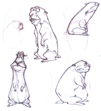
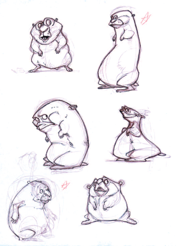
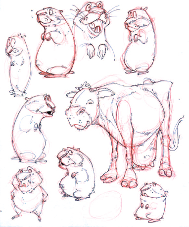


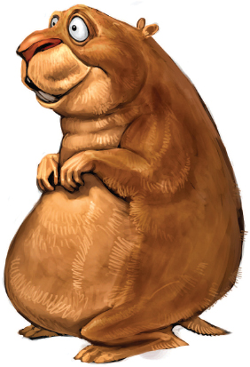
In the animated short, we need to set up the story, tell the story, and get out. There is precious little time to get to know your character. Therefore it helps if we understand the character’s personality and function the first time we see him. If your character is a weird part-alien, part-human, part-machine creature, we need to know immediately if we are for or against him, if we like him or hate him, how he works and why. If this isn’t clear you will either lose your audience or waste time trying to explain the character. The point is to engage your audience, and to construct empathy, concern or at least curiosity about the character as soon as possible in the story.
Shape
Shapes have inherent meaning. Circles are organic, cyclical and innocent. Squares are human-made and solid. Inverted triangles are strong (think of the chest on a superhero). Upright triangles have a lower center of gravity. They can be subordinate, complacent or content (think of the nerdy scientist). Sharp angles and diagonals are dynamic suggesting tension or danger.
Most characters are constructed from a combination of basic shapes. The relationship of the shapes to each other will determine the visual interest that your character will command. The goal is to have a nice contrast of size, shape, and proportions that will express the personality of the character and meet the needs of the story. If you have more than one character, you want each one to have visibly distinctive traits. You will need to put them in contrast to each other, each made out of different combinations of shapes, proportions, exaggerations, and details.
For example, in The Triplets of Belleville, Sylvain Chomet created distinctly different and geometric figures:
Of the characters, many have geometric silhouettes because it is a silent movie. The characters cannot be recognized by their voices. So when they are far away or even when they appear in a scene very fast we need to know, okay, that is this character. So the audience doesn’t get too confused. So when they see something that looks very small like a yogurt pot, they know it is Madame Souza and an enormous square-ish character in black, they know it is the Mafia. This is also something you can do with animation which you cannot do with live action.
The characters are quite convincing because of their shape and also probably because they have lives on their own. They have a story and they are just like us—they live, they suffer, they exist, they can get hurt, and they are so natural.3
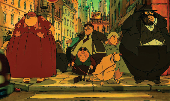
Mme. Souza in Belleville. Sylvain Chomet, Triplets of Belleville
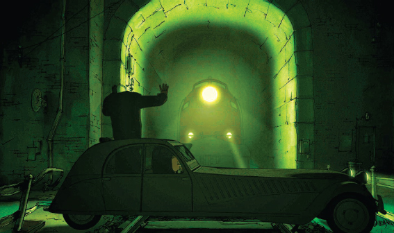
Mme. Souza in Belleville. Sylvain Chomet, Triplets of Belleville
When you begin a character, begin by thinking in shapes. Style and details can come later. What are the basic shapes that communicate the essence of your character?
Personality and Function
After you have identified the basic shapes for your character, it will need to be pushed further. Why? Whether you’re designing a gopher, a computer animator, a grandmother, or a robot—there are hundreds of similar designs out there. Your character will be generic unless you express their unique personality and style.
The best character designs have personality. They pop off the page. You’d love to meet them. So how do you do that? Achieving personality means combining two things: originality and function.
To make a character original, you need to look closely at its character profile. Who are they and what makes them unique as a character? Find this trait and exaggerate it in the design. If your character is a great intellectual, exaggerate the cranium. Give him a big forehead. If your character is a habitual eavesdropper, give him big ears. If a gopher is highly optimistic but slow, give him big eyes, but a heavy lower body. Define what visual attributes are necessary to effectively tell your story.
Sometimes these attributes are defined by what characters have to do in the story. What they have to do gives cues to their visual design. In The Incredibles, Elastigirl is not just an interesting design for a superhero; she stretches because she is a mother and must always multitask. Dash is fast because he is a little boy with so much pent-up energy. Violet disappears and has a protective shield because she is in adolescence. Elastigirl is organic and loose in the joints. Dash is solid, low to the ground with strong legs. Violet is slim and has hair that perpetually hangs over her large and watchful eyes.
Another way to find a unique character design is to look at the characters’ goals and the conflicts that they must confront. In The Triplets of Belleville, Mme. Souza’s goal is to save her kidnapped grandson, Champion, from the French Mafia. She is small and old. Many obstacles are put in her way: an ocean, lack of money, the city of Belleville, and the Mafia. You would think that this would be enough. But Sylvain Chomet designed her with one leg shorter than the other. She wears one elevated shoe. Because of this, she can only move slowly. There is, in her physical design, an impediment to her goal: to quickly rescue her grandson. It is not enough that she is small and old. We expect grandmothers to be small and old. That is ordinary. Her foot makes her different and memorable. The first time we see her we see her foot. It creates intrigue and we want to know more about her.
Similarly, Chris Perry’s little girl in Catch is made of simple geometric shapes. Her environment is also made up of shapes. The shapes represent the simplicity and innocence of childhood. They contrast sharply with the photographic reality of a grown, well-developed woman in a billboard. The little girl must confront her future and decide what is worthwhile at that time in her life. The design of the character is in direct contrast with the conflict she must face.

Catch, Chris Perry, University of Massachusetts at Amherst
Creating originality and function can be simpler than that. It can be as simple as designing a character who wants to sew on a button but has extremely fat fingers, or a character who needs to scratch an itch but has very short arms.
Finally, there may be times when it is necessary for the design to contrast with the personality traits or functions of the character. In Meng Vue’s The Dancing Thief, the policewoman is defined by her over-bearing size and her badge. These are cues that signal how seriously she takes her job and the threat that she poses to the thief. We are surprised and delighted when we discover that she is graceful, loves to dance, and is capable of love.

The Dancing Thief, Meng Vue, Ringling College of Art and Design
Remember that the short film needs to deliver more in a smaller time frame. Carefully constructing your character design to immediately convey strong personality traits or character functions will communicate the essence of your character to your audience faster.
Actions, Gestures, and Additional Attributes
The final step to designing your character is to test it against the actions and gestures it will need to perform in the story. If you have designed your character with a big head and short arms, but the story requires him to cross the monkeybars in a playground, you might be in trouble. If you need his mouth to drop to the floor and his tongue to roll out across the room, make sure he is designed in a way that will allow him to do so.
Look at the extremes of the emotional expressions your character needs. The face and the hands are the most expressive parts of the body. How far do they stretch? What kinds of exaggerations are necessary? This becomes a bigger consideration when you begin to model, but at the design stage, you want to make sure that the expressions are readable.
Also think about how detailed the character is and how the design will affect the time it will take to animate it. Things like flowing hair, loose clothing, big bellies, and large feet all have additional considerations when you model, rig, and animate the character. Make sure that you will have the time to execute what you have designed. Consider leaving out unnecessary attributes that do not drive the story forward.
The bottom line is that your character design is driven by the story. It needs to match the tone of the content. That is the goal of your character design.
Model Sheets
Once the character design is finalized, a model sheet is required to begin the production process. The model sheet will be used to create your 3D model. If you have more than one person working on the film, it will help keep everyone consistent. The model sheet is a detailed drawing of the character that shows exactly the style, proportions, costuming, and all anatomical details in front, back, three-quarter and side views. It is also the first step in guaranteeing that your character is appealing and animatable from all angles.

The Animator and the Seat, Chair Model Sheet
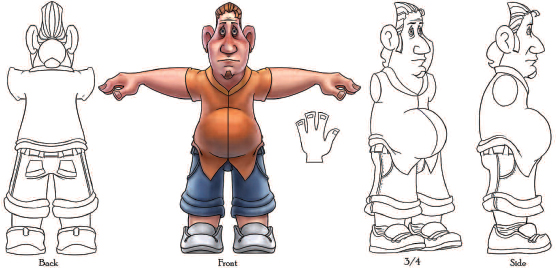
The Animator and the Seat, Chunk Model Sheet
A good location:
- Sets the stage for the animation
- Determines the mood of piece
- Supports the story.
Setting the Stage
Some of the most cutting-edge work in animation is in the design of the environment. We only have to look at the ballroom scene from Disney’s Beauty and the Beast, the vast, frozen terrain of Blue Sky’s Ice Age, the underwater world of Pixar’s Finding Nemo, the complex kitchen in Ratatouille, or the islands in Avatar, to see how environments have been innovative in pushing both visual and technological progress as essential storytelling elements. The location is not just a background for a piece. It is not just a space in which the character acts. The location is the world in which the character lives.
Props
Props are objects that populate the environment that the character uses to drive the story forward. A landscape is never just a landscape, a town just a town, a building just a building, or a room just a room. The location, and the objects in it, is specific to the character and the story. They give the audience many visual cues that provide instantaneous information about the character, the back story, and the situation.
For example, in Gopher Broke, we begin the story on a dirt road in the middle of a wheat field. The first thing we see is a sign that points in the direction of the Farmers’ Market, posted in the rocky dirt on the side of the road. Next, we see dandelions. Then we see the dandelions disappearing into the earth until the Gopher runs into the sign and gets a better idea as a pickup truck loaded with crates and tomatoes (identical to the ones on the sign) drives by. We learn from this introduction that we are in the country. There is a critter who ordinarily eats dandelions but now has an opportunity for something better. The make and model of the truck tells us the time period. Because the story involves several iterations of vegetable displacement from various trucks that drive by, we need to consider the other props we need for the story: trucks—making them the same but different colors will help with feasibility; types of vegetables; types of crates.
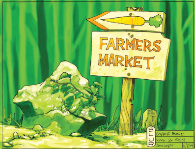
Gopher Broke, Prop Concept Art by Chuck Wojtkiewicz, Blur Studios
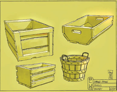
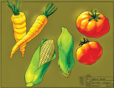

Important props, like the sign and the dandelions, need to be prominent. The sign is of particular significance because it is the prop that ultimately causes the demise of the gopher. The gopher, in frustration, throws the sign on the road where it is hit by a truck that careens out of control, catapulting a cow from the back of the truck, which lands on the gopher. The lesson here is that a prop is also never just a prop. It must be used to convey information or drive the story forward. Be careful not to overpopulate your sets with props. Use only what you need to tell the story. Make sure the props don’t steal the scene from the character.
Props give us important information about time period, geography, character personality and history. If a piece is set in the present, props become especially important, providing specific and unique information about the character and space that distinguishes them from the rest of modern society.
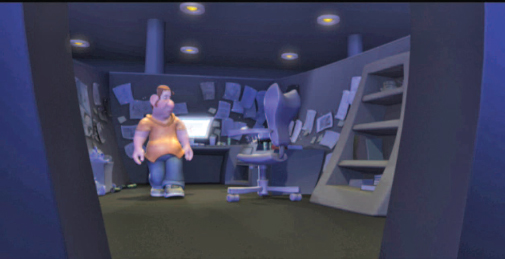

The Animator and the Seat, by Eric Drobile, Ringling College of Art and Design
Space is the empty area in a set that must be big enough for the characters to do what they need to do. Whether this is a claustrophobic interior or a vast expansive exterior, the design of the space should direct the viewer to the important action in the scene. Therefore, great care needs to be taken to analyze the action and compose the props in such a way that they do not visually interfere with the action and so that they are where they need to be when the character needs to use them.
Look at the space in the design on p. 91. In this story, the animator needs to move from his desk toward the entrance to his cubicle. As the entrance is blocked by his chair, he tries to climb the bookcase as an alternate route of escape. He is pulled off the bookcase and forced back to work at his computer. The space is designed with a direct route from the chair to the door. The desk is placed against the far wall of the cubicle. The character simply needs to turn his chair around and head for the entrance. When the entrance is blocked, the bookcase is to the left of the character so he can turn and begin to climb. There is, then, the same direct route back to the computer from the bookcase, allowing for maximum action, minimum interference from other furniture, and minimum movement of the camera.
Imagine the difference if the desk was turned around facing the entrance and if the bookcase was located behind the desk on the far back wall. The space would require the character to run around the desk, creating a barrier between the character and the chair, stopping the action.
Too often, beginner animators create their locations from something they have seen or something they know. They then move the characters to the props rather than position the props where they are needed for the story. They waste valuable animation time making the character move around obstacles or walk or run great distances—movements that with good design are avoidable. Analyze first the function of the space, the action that takes place, where the camera will be placed, and then design for maximum efficiency.
Defining the Mood of the Piece
What is the mood you want to create for your piece? Is it night or day? Are we in a happy place or a scary place? What is the atmosphere, the weight of the air, the temperature of the space? As soon as the film fades up from black and begins, an impression, emotion, feeling, or dramatic effect is created by the texture, color, lighting, and design elements of the location.
Texture
Everything in a location has a texture—the hard surface of a desk; the smoothness of a flower petal; the coarseness of a brick street. Texture is the fabric, material, fiber, grain, pattern, flexibility, or stiffness that gives a tactile surface quality to the objects in the world. The amount of texture defines the level of detail and reality in a scene. The more texture and detail present, the closer to reality the scene becomes for the viewer.
In The Animator and the Seat, there is a relatively low level of texture. This supports the boredom of the cubicle and desire of the animator to leave the space. The lack of texture also means there is a lower level of reality present which supports the believability of the unusual occurrences that take place in the space.
On the other hand, Respire, Mon Ami, is filled with semi-realistic, heavily textured locations. The reality of these spaces magnifies the weak grasp the boy has on his own sense of what is real.

High texture and detail give a sense of realism. Respire, Mon Ami, Chris Nabholz, Ringling College of Art and Design
Some colors that we use in a scene are dictated by what is called local color. These are colors that have natural associations. Grass is green; the sky is blue; the wood floor is brown, etc. Other colors are used to create emotion through visceral, psychological, or cultural associations. For example, green is associated with nature, growth, and rebirth. But it can also mean lack of experience, good luck, greed, envy, jealousy, or sickness. How can one color generate such a range of possibilities? The range of emotion often has to do with the value or saturation of the color. Yellow-green connotes sickness. Dark green is the color of ambition. Pure green symbolizes healing, safety, and nature. Colors have finite emotional associations. Reds and yellows are warm. Greens and blues are cool. Grays are neutral. Good design requires that you understand the range of emotion that a color can create so you can apply it thoughtfully in your work.
- Red—warmth, richness, power, excitement, eroticism, romance, anxiety, anger
- Orange—hot, healthy, exuberant, exhilarated, ambitious, fascinated, exotic, romantic, toxic
- Yellow—happy, energy, joy, innocence, caution, cowardice
- Green—vital, successful, healthy, fertile, safe, inexperienced, jealous, ominous, poisonous, corrupt
- Blue—stable, calm, dependable, tranquil, loyal, sincere, passive, melancholy, cold
- Purple—wise, dignified, independent, mysterious, mystical
- White—innocent, good, pure, clean, cold
- Black—elegant, formal, strong, authoritative, powerful, dangerous, evil, grief, death.
For every location in your piece, you will have a color palette that will define the emotion in the scene. The color of the scene may set one mood that remains constant throughout the scene or the color may change with the emotion of the character or the rising intensity of the action to support specific moments in the story. A color key or color script is used to plan the color scheme of a given film.

Color Script for Defective Detective, by Avner Geller and Stevie Lewis, Ringling College of Art and Design
In this story, an old woman is making tomato soup. When she hears a mouse, she screams and drops her pot. Some of the soup leaks through the ceiling to the apartment below where an inept detective decides to save her. The color script shows the difference between the monochromatic world of the detective and the bright high key world of the old woman. Both color and light contrast their worlds.
Light
This is the most important element in creating the mood of your piece. Many cinematographers refer to light as the paint for their canvas—the screen. Light is what shows or hides important details, defines shapes. Light sets the atmosphere, the tone, color and the drama of the scene through the quality and intensity of the light. Light determines what we see. It sets the composition.
Below is an excerpt from an interview with Bert Poole, CG Supervisor at DreamWorks. Bert describes the use of lighting situations to support different types of narrative content.
Q: How is light important in setting the mood of a piece or helping support the narrative of a scene?
Bert: Lighting serves two masters:
It is in service to story in that it conveys important information like the time of day or the mood at the current moment in the film. Color is an obvious example, where it can reinforce the emotional beats in a sequence. Reds convey passion whether it be anger or love, blues convey fear or sadness, yellows convey nostalgia or sentimentalism, etc. A more subtle yet equally important device is the quality of the light. An overcast soft quality can convey either an apocalyptic or a mystical tone where direct harsh light can bring out action or comedy. The lack of light or playing something in silhouette can either create a feeling of suspense or help emphasize the action in a given beat.
Lighting is also in service to the readability of a shot or a series of shots. Each shot is a compositional puzzle. Given the space through and the time over which a shot takes place, you’re determining where and what the audience will see. If it’s a quick shot with a lot of action you may need to simplify the lighting so the basic shapes read quickly. If it’s a shot where the character is delivering a key line, you’ll need to be sure that the face reads well at the right beats.
The tricky part is that you’re dealing with cameras, layout and surfacing that, when brought together, fight the two-dimensional composition of a scene. Through lighting, you can completely counter all of those other elements to make a more compelling composition. We use our core illustrative tools, the relationship of value, hue and saturation, to push and pull the viewer through the scene.
An example of knocking down visual complexity to create a strong simple read would be the sequence in How to Train Your Dragon where Hiccup finds Toothless for the first time in the woods. Throughout the sequence, we used pockets of fog and a diffused soft-lit quality to simplify the plants in the forest which could have easily cluttered the image. By grouping these using subtle value, hue and saturation relationships, we could direct the viewer’s eye to the important aspects of each shot.

How to Train Your Dragon™ and © 2010, DreamWorks Animation LLC All Rights Reserved
Q: What are the different types of lighting situations and when might you use them to support different types of narrative content? (high key; low key; high contrast; low contrast, etc.)
Bert: High key often involves the quality of the light, where the scene is a bit more directly lit and shapes the character of the core areas. Midday lighting can be thought of as high key. Typically high key is used in situations when readability is important. For instance, comedy is one situation where a character’s facial gestures are important. Action can also benefit from a high key situation. High key is meant to overstate something. An example of high key lighting would be the opening fight sequence in Kung Fu Panda 2 where Po rescues the village. In that case, you can see how the comedy plays out easily amongst a lot of action.
Low key features a softer quality to the light. It’s meant to be more moody or suspenseful, involving mystery, reflection or ominous tones. Mystical is another word which comes to mind. An example would be in How to Train Your Dragon when Hiccup encounters Toothless for the first time bound in ropes in the foggy forest. You can see how it creates a feeling of mysticism and suspense.
High contrast can involve high key lighting, but it can also be characters in full silhouette in a low key situation, such as in the wide shot where Stoick is hunched over Toothless when he fears that Hiccup is dead. In that case, it is high contrast because of the bright atmospheric quality but Stoick himself is in a low key scenario where it’s more overcast and apocalyptic in quality. The high contrast in that shot makes Stoick easily readable where we need him to read amongst a lot of debris and destruction from afar. The crowd is then entering from the right with the primary characters having a little more hue and value contrast making them the secondary read. Using the atmospherics also allowed us to desaturate the scene and diffuse the light giving it a soft quality for the tender contemplative moment.

How to Train Your Dragon™ and © 2010, DreamWorks Animation LLC All Rights Reserved
Low contrast is often used to play something down and is typically juxtaposed against a high contrast situation for pop and excitement. An example of this would be in the original Kung Fu Panda, the close-up on Tai Lung when he is waiting to escape his prison. As he lies in wait to escape, the lighting relationships are played down to help build the suspense and mystery. Upon his escape the contrast is boosted to emphasize the action and excitement, which also services the quick cutting action making things easily readable over just a few frames.
When lighting a scene make sure it is the image you want. Be deliberate. Remember that the computer always gives you an image. Make the image you want to make rather than being satisfied with what is given to you. Never forget that you are designing an image.
The line, shape, scale and directional orientation of the elements in a scene communicate meaning and create style. An environment composed of organic shapes has a very different feeling than one created with geometric shapes. Curves, right angles and horizontal orientations are calming and stable. Diagonals, pointed edges, repeated verticals and whacked perspectives create energy and tension.
In The Animator and the Seat, the perspective and shape of everything in the environment from the doorway to the bookcase to the desk is off kilter, creating an environment that is tense—like a bad dream. This reinforces the idea that the chair could come alive in this environment. It walks a line between reality and hallucination.
Catch uses primary shapes to evoke a sense of the simplicity and childhood. The beginning of the piece is open and round. The forest is large, vertical and sharp. The scale of the forest creates danger. The billboard scene uses hard verticals to create a feeling that is industrial and cold.
Gopher Broke is more realistic. The design elements reinforce the story of a gopher in the Midwest.
In Defective Detective, the design elements used in the characters place the height and angularity of the detective against the compact and curved elements in the old woman. Likewise their apartments are equally contrasting. Everything in the detective’s environment is square and slightly at an angle. It communicates the detective’s need for control and his inability to get it. In contrast the old woman’s environment has a lot of circular elements and rounded edges. Just from the environments, we know that the woman will control the situation when these two finally meet.
Supporting the Story
Everything about the location—the props, space, texture, color, lighting, and design combine to support the story and communicate the time period, genre, and style of the piece. Styles range from general categories such as realistic, abstract, caricatured, cartooned, exaggerated, organic, and geometric; to specific recognized styles in art like Art Deco or Film Noir; to very specific times or locations like Muncie, Indiana, in the 1950s. Don’t copy styles from other people. Don’t make the style of the piece the way it is because “that is the way you draw.” Choose a style that will best enhance your character and tell your story.
Locations are developed in concept art called master sketches or master backgrounds. This is art that is produced to accompany story pitches. It should communicate the atmosphere, lighting and design of the piece. These pieces should create intrigue, curiosity, and interest in your audience. For the short, you want the visual of your location to get your audience into the story quickly. Just as with your character designs, the location design needs visual interest that makes us want to know more.
The following drawings show two possible variations for a scene that takes place in a grandmother’s house. The first is a perfectly acceptable drawing of the living room. It sets the stage, has room for action to take place, and gives a sense of who lives there. It is a passive but functional space.
However, the second drawing has intrigue and implication. It is a location where something has happened and more could happen. It is an active space. The furniture and accessories have been carefully moved to the edges of the room. The rug has been rolled up, the mirror taken off the wall. Tools lie prominently in the foreground and a hole has been broken through the floor. It creates questions in the mind of the audience. Who has done this and why?

Gary Schumer, Ringling College of Art and Design Gary Schumer, Ringling College of Art and Design
The first drawing sets the stage, but the second drawing is what you want to sell the piece and to start the story.
Summary
Character:
- A good character is one that is believable, memorable, and right for the story.
- Understanding your character will allow you to create believable reactions to the conflicts in the story.
- Knowing your character comes from creating a back story or character profile.
- The character profile forms the personality of the character.
- When working with two or more characters, you must also establish their relationship, status, and individual goals.
- You must establish which character the story is truly about.
- That character will arc or change, physically, mentally, spiritually, and always emotionally, throughout the course of the story.
A good character design will:
- Be immediately recognizable and relatable.
- Have a recognizable shape.
- Reflect the personality of the character.
- Include physical attributes that complement the content of the story.
- Be able to complete the actions that are required by the script.
- Be interesting to watch.
A good location:
- Sets the stage for the animation through props and space.
- Defines the mood of the piece through texture, color, light, and design.
- Supports the story.
- A good location design creates intrigue, getting the audience quickly into the story.
Additional Resources: www.ideasfortheanimatedshort.com
- Telling a Story with Light: An Interview with Bert Poole, DreamWorks Feature Animation
- Visual Design: An Interview with Kendal Cronkhite, DreamWorks Feature Animation
- Visual Design: An Interview with Kathy Altieri, DreamWorks Feature Animation
Recommended Reading
- Tom Bancroft, Creating Characters with Personality For Film, TV, Animation, Video Games and Graphic Novels
- Eric Goldberg, Character Animation Crash Course
- Marc McCutcheon, Building Believable Characters
- John Alton, Painting with Light
- Patti Bellantoni, If It’s Purple, Somebody’s Gonna Die
- http://www.salon.com/ent/col/srag/1999/08/05/bird/: This is a great interview with Brad Bird that explains how everything in an environment supports the story. If it is still available online, you should read it.
Notes
1 Ollie Johnston and Frank Thomas, The Illusion of Life, rev sub-edition, Disney Editions, 1995, p. 68.
2 Paul Lester, Visual Communication: Images with Messages, 4th edition, Wadsworth Publishing, 2005. The names of the six ethical perspectives come from Paul Lester’s book. The definitions have been modified for simplicity and space. For deeper definitions of these terms, please refer to this book.
3 Quotes from the Making of Belleville, by permission of Sylvain Chomet.
Personality, Goals, Shapes and Variance in Character Design: Tom Bancroft, Funnypages Productions, LLC
Tom Bancroft is a partner in Funnypages Productions, LLC, a company that provides illustration, character design and artistic animation development for clients like Disney, DC Comics, Big Idea Productions, Warner Brothers, CBN, Scholastic, NavPress, Thomas Nelson, and Zondervan. FP Productions has also developed many original properties for film and television and illustrated over 30 children’s books. Prior to Funnypages, Tom worked for Walt Disney Feature Animation on both shorts and features films including Beauty and the Beast, The Lion King, Aladdin, Mulan, Lilo and Stitch, and Brother Bear. He is author of the book, Creating Characters with Personality.
Tom: For this book, I was asked to contribute some of my thoughts on the subject of character design.
I don’t have much room here to go into all the nuances of character design, but I did want to hit four main principles that you should think about when designing a character:

Personality
You don’t want a bland, generic character, right? So, don’t just think: “I want to draw a cute, little bear.” Think: “I want to design a bear that is kind of lazy and only motivated to go fishing (his one true love). He knows everything about fishing, but won’t do anything around the house for his wife. In high school he was a football champ, but has since let himself go because he doesn’t need much strength for fishing. He is a likeable guy though.” Now you’re ready to design a character with a personality. Knowing what you are designing is job one.
Goals
It’s important to know what, why, and how you want to design this character. Make some goals. If this character is not just for fun but for a client, then you will have a lot of the “goals” of what you need to design given to you. Is it for a certain age group? Do you want it to be cute or just appealing (there is a difference)? Does it have to do anything special, like: run fast, look pretty/sexy, look a certain age, etc.? Is there a style that you are trying to accomplish? Should it look realistic or extremely cartoony? All these things should be thought about or discussed before pencil hits paper. After all, without goals, how do you know when you are done?
Shapes
When I start drawing, the first things I start thinking of are what shapes will make up this character. If it’s a happy, thick character, I will start working with circle shapes. A strong, firm kind of character would get squares. A thin, wimpy kind of character might be rectangles or ovals. You always want to be able to break your character down into basic shapes so that you (or others) can duplicate that character in a variety of different angles, poses, or expressions.

Below are some designs that I created for a made up assignment. First, let me state my goals:
I am trying to design an extremely cute girl character, around six to eight years old, that has a “devilish” side to her. Stylewise, I’m going for a pretty cartoony style too. It’s for TV, so it needs to be a fairly simplified design also.
As you can see by the designs (and they are numbered in the order I produced them), that I didn’t decide I “had it” after the first design. I kept refining and trying different shapes and sizes of things. One will have longer legs and a short torso. The next: a big head, medium torso, and short legs. One has small eyes that are close together, another, large eyes that are farther apart. In short, I am adding “variance” to the designs. That’s variance—using shape and size in various ways to create different designs. Which one would I pick as my favorite? I’ll let you decide which one met the above goals the best. Enjoy the challenges of creating characters with personality!

Visual Design: Interviews with Kendal Cronkhite and Kathy Altieri, DreamWorks Feature Animation
Kendal Cronkhite graduated from Art Center College of Design in Pasadena, California, with a major in illustration. After working for magazines and newspapers, a former instructor recommended her for work on Tim Burton’s The Nightmare Before Christmas. Kendal then art directed on James and the Giant Peach before coming to DreamWorks to art direct on Antz. She was production designer for Madagascar and is now production designer for Madagascar: The Crate Escape.
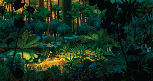
Madagascar™ & © 2005 DreamWorks Animation LLC. All Rights Reserved
Q: Some animation studios seem to have an identifiable style or “look” to all their films while DreamWorks seems to develop a new look or style for each film. Do you agree this is true? And could you talk a little bit about how content influences design?
Kendal: It’s absolutely true. It’s a standard that we try to hold to studio-wide. I remember sitting down with the Antz directors and producers, and saying, “All right, do you want us to design for the computer?” And they said, “Absolutely not, we want you to design what’s right for our story and we’ll figure out how to make it technically later.”
By designing what is right, visually, for the story, we end up pushing the technology. We don’t want to do what’s been done before; we don’t want to repeat ourselves. It’s more exciting, and it’s more interesting creatively for all of us. And it kind of moves us into the future.
Q: How you begin to come up with the design for the film?
Kendal: We read the script, the treatment, and then break it down and start to design the movie that visually tells that particular story. I often start by doing the visual structure on the film. This is a visual map that follows the drama. I use line, shape, space, and color to enhance what’s going on in our story.
For example, if it’s a movie about coming home again I may use circles as a design element throughout. If there are emotional highs and lows, I may enhance those moods with light and darkness. If it’s a traveling film, I may choose to use deep space and focus. After this visual map is created, we go into each set and sequence in greater detail. We also look for the style for the film. Is it a comedy or drama? Is it a certain time period? All these questions are asked and answered visually.
I can take you through how Madagascar happened. Initially, what was really striking about the story was that it was a real New York-style comedy. The characters came across as real New Yorkers with a definite East Coast sense of humor. There was a lot of physicality to it.
In talking with the directors, we felt strongly that here was our chance actually to do something we had thought about before—to make a real 3D cartoon. It just seemed to suit it.
One of the first things we did was hire a character designer, Craig Kellman, whose strength has been to take retro 2D character styles and infuse them with a modern edge. He came from Cartoon Network and had designed characters for Powerpuff Girls and Samurai Jack.
He initially nailed down our four lead characters. They have a stylistic point of view that was based in the design of the 1950s and 1960s. A strong design element is contrast between straight edges and curves.
The humor in the design is in the pushed proportions. Alex the lion has a huge head on a really thin body. Gloria has a huge body with tiny hands and feet. When you look at something that has those extreme proportions, it’s funny and that was really important to the tone of our film. So we took those elements and then designed our world around them.
When you look at our world, everything is also designed with straights against curves and pushed proportions. It also has what we call a “whack” factor—sort of a cartoony design element. Let’s say you had a building. You would never design a straight, linear-shaped building. You would do what we call “whack,” which means you would angle the sides, the tops and windows off kilter to each other. Additionally, every leaf on every tree—all the vein patterns, the bark on the jungle trees— everything is stylized the same way.
In most other films, jungles have been mysterious, disorienting, claustrophobic, and for our film we couldn’t have that. Our jungles needed to be cheery, and fanciful and slightly childlike, because our characters were new to this environment—like children seeing it for the first time.
The director said, “Well what about Henri Rousseau? His jungles have that oversized, childlike, naive quality. They have primary colors everywhere.” So, we combined Rousseau with our stylistic concept to get that childlike, beautiful, sweet jungle out of Madagascar.
Q: So, when you design, a lot of what you choose is based on the point of view of the character in the story—what and how they would see things, correct?
Kendal: Yes. Try to put yourself in the character’s shoes, and then move through the story. In Madagascar, we wanted the characters—in the moment they hit the beach—to feel like they were in a world unlike anything they had experienced before.
In New York, we tried to make everything feel very manmade. The plant life is very manicured and contained within metal chain-link fences because we also wanted the feeling of containment. Not trapped necessarily, but that our characters were contained within this atmosphere. So even when birds fly up, they can’t get out of the surrounding cityscape. You never see them escape. We also took out the sun, moon and stars, even though we have night and day. Everything is linear and straight. There are few curves in that world. We tried to strip all of nature out.
So when we hit Madagascar, it was all nature in. Madagascar is all about curves, the sun, the moon, the clouds, the stars, and the bounty of nature. We wanted the audience to have the same experience that our characters had when seeing Madagascar for the first time—complete awe. These designs then, are character-driven and that is very important.
Kathy Altieri has been working in the animation industry for more than 25 years. She began as a background painter in television animation, and then went to Walt Disney Feature Animation as a background painter and supervisor on The Little Mermaid, Aladdin, The Lion King, and The Hunchback of Notre Dame. At DreamWorks, she was an art director on the Prince of Egypt, and production designer on Spirit: Stallion of the Cimarron, Over the Hedge and currently on How to Train Your Dragon.
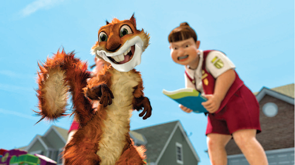
Hammy (Steve Carell) has no idea that he’s about to be “booked” by a Trail Guide Girl in DreamWorks Animation’s computer-animated comedy Over the Hedge. Over the Hedge™ & © 2006 DreamWorks Animation LLC. All Rights Reserved
Q: Could you talk a little bit about how content influences design in Over the Hedge?
Kathy: There’s no question that the scenarios in Over the Hedge could be happening, at least in some part, right now in our very own backyards, in real life. It’s a film about how critters have learned to adapt to our enthusiastic development of the wilderness.
Since the film is meant to reflect our lives and homes as they really are, the film’s style is basically realistic. The homes are “set dressed” to look like our own backyards, complete with doggie toys and old lawn chairs, beat-up grass and barbecues. The lighting and atmosphere are realistic; the homes are built in the computer to imitate the homes that are built in the Midwest.
In addition, one of our directors, Tim Johnson, felt that we have a strong emotional connection to the photographs we all have in our albums—so we re-created a similar lighting environment that we recognize in photographs. It has to do with the behavior of light in the lightest lights and darkest darks. The average viewer won’t notice these choices, but they add to the feeling we were trying to create of familiarity, of home.
Q: You had some interesting copyright issues when it came to designing some of the elements of Hedge that, I think, beginning storytellers wouldn’t consider. Could you talk about those considerations a little bit?
Kathy: You have to be really careful when you’re working on a film that’s set in a contemporary environment. Any product you use in your film that’s recognizable from “real life” has to be carefully examined for possible copyright infringements. Any product you design or logo you make cannot bear any resemblance to the real product without first “clearing” it from the manufacturers themselves. In addition, any spoof of an existing product also has to be considered.
For example, we had girls in Over the Hedge delivering cookies door to door. Of course, these were originally meant to be Girl Scouts, but the Girl Scouts of America had objections to what we had “their” girls do in the film, basically smash a squirrel with a Girl Scout Handbook. Of course, this is a cartoon, and no squirrel was really hurt—but we completely understood their concern and went about designing our own fake girls’ organization, the Trail Guide Gals. Every last detail of the Trail Guide Gals had to be passed through legal for clearance—the color and style of their uniform, their logo, the design of the handbook, the type of bow they had at their neck, even the name itself.
Q: Where does this type of thing come into play for young animators?
Kathy: In any creative undertaking, we all strive to be as original as possible. In doing so, it’s really important to be aware of and respect copyright and trademark laws. Being a student or young professional does not exclude you from responsibility to this, so be aware that all of your work should be truly original and unique to you.
Closing: What are the important things to remember when designing a film?
Kendal: One of the most important things is that you’re a filmmaker; you’re not just an illustrator or a painter. So how a film turns out on the screen is the most important thing. Learn the process, and immerse yourself in the filmmaking. Learn about camera and camera composition, line and shape, space and light, and how it all comes together to create a strong cinematic point of view. When you decide on a visual point of view for a film, the best way to get it across is to be consistent through every aspect of it, from the character design to the design of the world to every element that goes into that world, and it should work with the story and the tone of the story.
We start designing in art, but then it goes through many departments before it ends up on screen. From art to modeling to surfacing to lighting to animating, you have to make sure you are staying true to what is important in the design. So that when you get this image on screen and your characters are moving around in it, it says what you want it to say, throughout the movie.
There are a lot of voices and a lot of stress in the kitchen, and it gets hard to juggle it all. You have to feel pretty passionately about it, and stick to your guns. That can be challenging over a two- to three-year process. Have a strong point of view and see it through.
