Chapter 11. Drop Caps
THE USE OF DECORATIVE FIRST LETTERS as a design element has evolved from a long tradition of illustrated first letters stretching back to before the invention of the printing press. Before printing, books were dictated to scribes, and each book was regarded as a unique treasure. The scribes incorporated individual flourishes to distinguish their work from others. It was with the decorative first letter that a scribe could really cut loose and show his stuff. Each major section usually began with an illuminated letter made with metallic, mineral, or vegetable pigments that were bound by glue or gum to the paper or parchment.
The purpose of the initial letter, or versal, was to call attention to the beginning of the book. By the 14th century, versals had evolved from enlarged heavy letters into elaborate illustrated works of art, most often used to decorate religious texts. An illuminated versal might flow down the whole side of a page, or extend up and around the top of the page. Sometimes a versal included illustrations and took over the entire page. In 1455, when Gutenberg printed his 42-line Bible—the first book to be printed in the western world with movable type—he acknowledged the importance of this tradition by leaving space in the printed text for a scribe to add a decorative first letter. As printing evolved, so did the forms of initial caps used by designers. The current variations include hung caps, several forms of dropped caps, and raised or stick-up caps. InDesign uses the term drop cap for all initial cap styling.
Figure 11.1 Two pages from the Gutenberg Bible (1455), the left showing an illuminated first character painted by a scribe, the right showing smaller initial characters in red to indicate new sections.
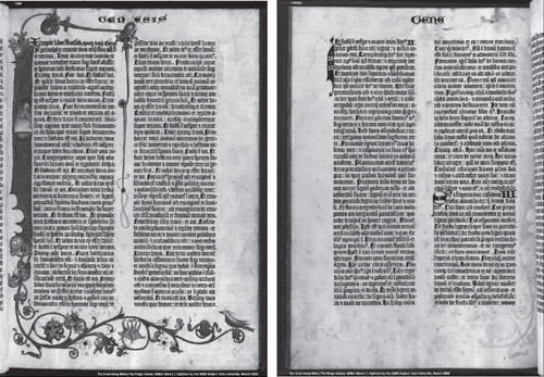
Figure 11.2 Some drop caps in contemporary magazines.
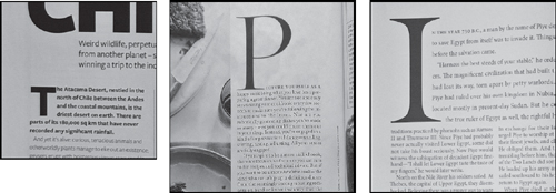
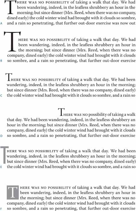
Figure 11.3 Drop and initial cap examples: (A) This three-line drop cap is followed by small caps applied to the first four words. (B) The size of the drop cap is increased to create a drop cap/stick-up cap hybrid. (C) This is a simple stick-up cap. (D) Here, a stick-up cap is combined with a large first-line indent. (E) The drop cap is cut and pasted into a separate text frame that is anchored to the main text frame, floating in the outside margin, and “molded” around the shape of the text frame. (F) The drop cap is cut and pasted into its own text frame, which is anchored in the main text frame. A text wrap is applied to the drop cap text frame.
Creating a Simple Drop Cap
Contemporary magazine and book publishing continues this centuries-old tradition by beginning chapters and articles with large initial letters. The treatment can be incorporated into a paragraph style or applied locally through the Control Panel.
Figure 11.4 Using the Control Panel to apply a simple drop cap. Note that Optical Margin Alignment is turned on in the Story panel, allowing the crossbar of the T to stick out into the left margin.
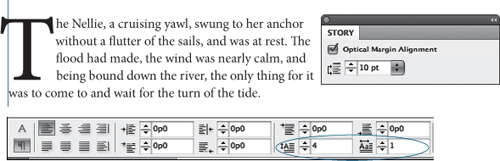
To create a drop cap, insert your Type cursor into the paragraph and type the number of lines for the drop cap in the Control Panel, then specify the number of drop cap characters you want—usually one, but this isn’t always the case.
For more options, choose Drop Caps And Nested Styles from the Control Panel menu. In this dialog you can align the left edge of the drop cap to the left edge of the text frame, as well as scale drop caps with descenders to avoid collisions between the descending part of the drop letter and the line that follows it.
Certain letters will not look optically aligned because the left sidebearing (the space incorporated into the letter’s design) causes the letter to appear slightly indented. This can be addressed by selecting Align Left Edge in the Drop Caps And Nested Styles dialog.
If you plan to apply the same formatting to more than one paragraph in your document, it saves time (and ensures consistency) to incorporate the drop cap attributes into the style definition. The Drop Cap paragraph style is commonly based on your body text style with any first-line indent removed.
Choose New Paragraph Style from the Paragraph Styles panel. To edit an existing style, Ctrl/right-click on the style and choose Edit.
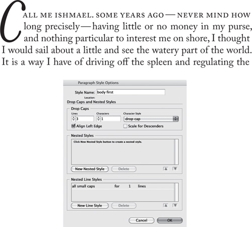
Name the new style; “first par” and “body first” are common naming conventions. If you have a “body” style, you may want to base your “body first” style on this. Choose “body” from the Based On: drop-down menu.
Figure 11.5 Making optical adjustments according to the character shape and style of the drop cap.
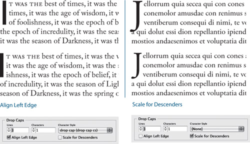
Figure 11.6 Incorporating a drop cap into a paragraph style definition.
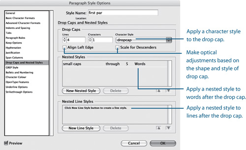
Choose Drop Caps And Nested Styles from the list in the left column. Specify the number of lines to sink the first character and the number of characters that you want to include.
You can use the Character Style drop-down menu to apply an existing character style to the drop cap, or you can choose New Character Style to make and apply a character style.
Drop Cap Aesthetics
There are no hard-and-fast rules concerning how big a drop cap should be, but common sense should prevail. Size matters, although in this context bigger isn’t always better. The purpose of the drop cap is to signal to the reader where to begin. To do so, the drop cap doesn’t need to scream at the reader and shouldn’t overwhelm any headline that precedes it. The drop cap comes below the headline in terms of page hierarchy; usually, though not always, it will be smaller than the headline. Also, don’t repeat the letter that you use as the drop cap at the beginning of the text.
In addition to the initial drop cap for the first paragraph of a chapter or article, it’s common practice to use smaller drop caps as section markers (set up as a style based on the parent drop cap style). This is visually effective to break up the monotony of columns of type, and it’s necessary if the text doesn’t have illustrations, subheads, or other graphic elements. That said, if you sprinkle drop caps too liberally throughout a document, they cease to be elegant and functional graphic devices and start to become repetitive and annoying. Don’t use more than two drop caps per page. Paragraphs that get drop-cap treatment should not be close to each other on a page, and preferably the drop caps should be different letters.
Figure 11.7 Kerning a drop cap. The example on the left shows the result of applying a three-line drop cap in Adobe Garamond Pro. The serif of the W collides with the “h.” Insert the type cursor between the two letters and press Option+Right Arrow (Alt+Right Arrow) to kern the space between the W and the “h” (right).

Kerning Drop Caps
A problem with automatically generated drop caps is that the big first character often collides with the body text that follows. You may need to kern to avoid such problems. Note that when you kern between the drop cap and the first character of the text, kerning is applied to all the lines adjacent to the drop cap.
With a decorative letter, selecting Align Left may not be sufficient to optically align the drop cap. In addition, you’ll want to kern the drop cap to the left margin. To do this you’ll first need to add a space before the drop cap. Note that adding a space will mean you have to drop two characters instead of one—if you see yourself likely to do this more than once, make a paragraph style with this specification. You can then insert your cursor between the space and the drop cap and kern by pressing Option+Left Arrow (Alt+Left Arrow) until the character is optically aligned with the left margin edge. Instead of using a regular space, however, you can add a thin space by pressing Cmd+Shift+Option+M (Ctrl+Shift+Alt+M)—if you do that, you won’t have to kern as much.
Figure 11.8 When working with highly decorative drop caps, the Align Left Edge and Scale For Descenders options may not be sufficient for the optical spacing of the opening letter, as you can see in the top example. In the bottom example, a thin space (Cmd+Shift+Option+M/ Ctrl+Shift+Alt+M) was added before the dropped letter, and this space was then kerned back, which moved the F into the left margin.
Creating a Picture Drop Cap
Converting a drop cap to outlines—by selecting Type > Create Outlines or pressing Cmd+Shift+O (Ctrl+Shift+O)—allows you to place an image into the letter shape. It’s a compelling idea, but unless the drop cap is very large and in an extra-bold typeface, there’s unlikely to be enough space within the letter shape for the image to be visible. There’s also the danger of visually disassociating the drop cap so that the reader scans the first line without the first letter.
Creating a Contoured Drop Cap
Putting your drop cap character in its own text frame allows you to contour the text to the shape of the drop cap. Apply a text wrap to the drop cap text frame, then use the Direct Selection tool to sculpt the text wrap outline to conform to the shape of the letter. Make sure that the space around the drop cap is optically the same on the right side as it is beneath the drop cap.
Figure 11.9 Using the first letter as a picture frame: an almost irresistible idea that seldom works well. The “window” onto the picture is rarely big enough for the picture to be clearly visible.
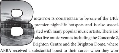
Figure 11.10 A contoured drop cap. The W is in its own text frame, and a text wrap is applied and then adjusted to correspond to the letter shape.
Adding Small Caps
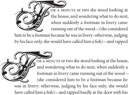
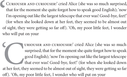
An often-used device to create a visual bridge between drop cap and body text is to put the words following the drop cap in small caps. This creates a transition from the large decorative character into the upper- and lowercase text so that the drop cap does not look like an isolated graphic. Just how many characters are put into small caps is a matter for discretion—it may be just the first word, the first phrase, a specified number of words, or the first line. Whatever you choose, be consistent throughout the publication.
It’s possible to use a nested style to specify character-level formatting for one or more ranges of text within a paragraph. For a drop cap character with a different color or font (or both) than the rest of the paragraph, define a character style with these attributes, then nest that character style within the paragraph style. Thereafter, you can apply all the formatting with a single click.
Figure 11.11 Small caps applied to five words to ease the transition from the big first character to the upper- and lowercase body text. To apply the small caps to a whole line, create a nested line style.
Figure 11.12 Combining nested styles with Drop Caps to transform raw text. With a single click, in addition to the paragraph and character attributes, a Character Style is applied to the drop cap and a Line Style applied the first line of the paragraph.
Creating Nested Small Caps
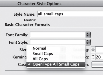
- Create a small caps character style. If you are using an OpenType font, choose OpenType All Small Caps from the Case drop-down menu to keep the case of your small cap range consistent without having to rekey any initial caps as lowercase letters.
- To “nest” the small caps character style in the paragraph style, Ctrl-click or right-click the paragraph style in the Paragraph Styles panel and choose Edit to open the Paragraph Style Options panel, then choose Drop Caps And Nested Styles from the lefthand column.
- Click New Nested Style and specify the number of words to apply the nested style to. If you haven’t already styled the type, you can create a new character style by clicking [None] in the window and selecting New Character Style from the drop-down menu. Note that the drop-down menu option appears only after you have selected the various options in the window.
To automate the application of small caps to the entire line, create a new line style.
Figure 11.13 If available, choose OpenType All Small Caps when creating a small caps character style.
Other Uses of Drop Caps
Drop caps can have uses beyond the obvious. Here are a few examples of other ways in which drop caps can be applied.
Figure 11.14 Drop caps used for question and answer section (A), step-by-step instructional text (B) and for page numbers (C) in a table of contents.

Difficult Drop Caps
Drop caps are just one way of kicking off a paragraph; they’re not always the best solution. If you have the occasional opening paragraph that needs customizing, no big deal—so long as it’s an exception. If you find yourself fussing over every chapter or article opening, then use another type of opening device—an initial cap, perhaps—or simply remove the first line indent and add a paragraph space before the section or chapter opening text.
Before you decide on a particular opening device, familiarize yourself with the material. Here are some instances when drop and initial caps don’t work well:
• When the first character of the paragraph is a number.
• When an opening paragraph begins with a quotation mark. You will need to drop both the opening quotation mark and the initial cap. The opening quote mark will probably look disproportionately large. You’ll want to reduce its size, adjust its vertical position by applying a baseline shift, and kern the space between it and the drop cap that follows it. Exact amounts will vary according to the nature of the font, so there’s subjectivity involved here. You should also hang the opening quote mark.
• When opening paragraphs can’t accommodate the drop cap’s depth. Trying to sink a cap three lines into a one-line paragraph can create some visual confusion, although InDesign does an excellent job of coping with that by allowing the next paragraph to come up. However, if you find that you are repeatedly using a three-line drop cap on paragraphs that are only two lines deep, then you might consider using a raised cap instead.
Figure 11.15 Because this paragraph begins with a quotation, the quote mark is dropped instead of the initial cap (top). To drop the initial cap as well, as shown in the bottom example, select 2 for the number of dropped characters. Reduce the size of the punctuation and adjust its vertical position by applying a baseline shift. Finally, kern the space between the punctuation and the C.
• When your articles or chapters begin with poetry, song lyrics, or other quoted material. To apply the drop cap here would add an extra (and unnecessary) level of decoration, possibly confusing the reader. You could use the drop cap after such a passage, but it is no longer signaling the beginning of the chapter, article, or section, and so is extraneous and can tend to look fussy as a result.
Figure 11.16 InDesign copes elegantly with short opening paragraphs, bringing the second paragraph up next to the drop cap and maintaining its first-line indent. If you find yourself making many such “exceptions,” you probably need an opening device other than a drop cap.