Chapter 5. Letterspacing, Tracking, and Kerning
TYPE IS ABOUT NOT ONLY THE LETTERS, but also the space between the letters and the space between the words. Typography is not just black on white, but also white on black. Each letterform and each word inhabits a field of negative white space, and this space establishes the rhythm of the words.
You can put as much nationality in the spacing of a typeface as in the typeface itself.
— Danny van den Dungen of graphic design studio Experimental Jetset. [Quoted in Helvetica, Dir. Gary Hustwit, 2007]
The spacing of type is to some degree a matter of personal preference and typographic trend, but whether a tight or loose letter fit is favored, for the type to be readable and to communicate without interruption, the spacing should be even, the rhythm steady.
InDesign offers three distinct but related approaches to adjusting the space between words and letters. Letterspacing is the overall adjustment of space between letters and between words. Tracking is the adjustment of the space between the letters and words across a range of text. Kerning is the adjustment of space between letter pairs, to compensate for uneven spacing.
Letterspacing vs. Tracking
In InDesign, letterspacing adjustments are made using the Word Spacing and Letter Spacing options in the Justification dialog box. Letterspacing and tracking can both achieve the same results, but there is an important distinction: letterspacing is macro; tracking is local.
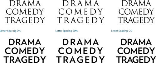
Use letterspacing to adjust the overall tightness or looseness of certain classes of paragraph as part of the paragraph style definition. This approach is preferable when you can predict the need for adjusting the spaces between characters, as in tightening headlines or loosening captions. I’ll refer to Word Spacing and Letter Spacing options collectively as letterspacing throughout this chapter.
Use tracking for local adjustments to sections of text to fix composition problems (see the section “Widows, Orphans, and Runts,” later in this chapter), or to adjust the space between the characters of a range of text within a paragraph.
In general, it isn’t necessary to adjust the letterspacing of your body text. Doing so is like taking a musician’s composition and playing it at a different tempo, overriding what the type designer considered the optimum figure-ground relationship for his or her typeface.
Figure 5.1 The blue bars indicate Word Spacing (line 1) and Letter Spacing (line 3).
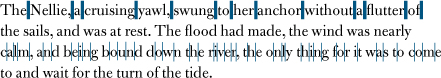
Figure 5.2 The first two lines in the example on the right have positive letterspacing applied as part of their paragraph style Justification options.
When applying tighter letterspacing, pay careful attention to what happens to pairs like rn; letterspaced too tight, these might look like an “m,” ri might look like an “n,” and cl like a “d.” If you find yourself reducing letterspacing often, consider using a condensed typeface that was designed with the efficient use of space in mind.
Increasing letterspacing for an airier feel has its own pitfalls. Go too far and you disrupt the relationships between the letterforms so that they no longer form familiar word and phrase shapes, but are merely a scattershot of disconnected characters. Italic or script types with letterforms designed to almost or actually connect with their neighbors should never be loosely tracked. Spacing your letters loosely might not seem like a big deal to the layperson, but typographers get quite upset about such practices. The American typographer Frederic Goudy (1865–1947) famously said, “Men who would letterspace lowercase would steal sheep.” Reputedly, that’s the sanitized version of the quote.
That said, none of these admonitions are absolute. Sometimes we need to make adjustments to the letterspacing of our type, and some designers feel that tight letterspacing enhances readability and improves comprehension. Don’t take anything as gospel. Print your page and evaluate for yourself, getting a second opinion if necessary.
Tight letterspacing might be useful in the following situations:
• In sans serif headlines, tight letterspacing can help the characters hold together better to form more easily recognized word shapes and create more density and impact.
• When using condensed typefaces, their vertical nature calls for a reduction in the spaces between letters. Too much “air” and the words lose their dynamism.
Figure 5.3 Tight letterspacing can cause certain letter pairs to look like other letters.

Figure 5.4 The effect of letterspacing on display type in all caps. Positive letterspacing gives the serif type (Trajan, top) an elegant look and feel, whereas negative letterspacing causes the serifs to collide. With the sans serif type (Verlag Bold, bottom), positive letterspacing causes the word shapes to lose their cohesion and the eye tracks vertically instead of horizontally, whereas negative letterspacing creates an effective, dense look and feel.
Loose letterspacing might be useful in these situations:
• In serif headlines set in all caps, extra letterspacing can yield a more elegant look.
• When reversing type out of a solid background, extra letterspacing can improve readability.
• When using small type, like captions or photo credits, loose letter-spacing can ensure that the individual letterforms are clearly identifiable.
Tracking vs. Kerning
A surefire way to raise the hackles of a purist typographer is to use the terms tracking and kerning interchangeably. While closely related, they are distinct. Here’s the difference: With a range of characters selected, you are tracking; with the cursor inserted between a pair of characters, you are kerning. Both share the same keyboard shortcut (Option/Alt+Left Arrow for tighter, or Option/ Alt+Right Arrow for looser). Tracking works in combination with your other type settings; if your Justification and Hyphenation settings are set appropriately, for example, there will be much less need for manual intervention in the form of tracking.
Widows, Orphans, and Runts
Given the drama of their names, the actual definitions of widows, orphans, and runts may be a little disappointing. Definitions vary depending on your source, but I define them as follows.
A widow is the last line of a paragraph, stranded at the top of a column or page. Widows should always be avoided.
An orphan is the first line of a paragraph that occurs at the bottom of a column or page. Orphans are not desirable.
A runt (a termed coined by InDesign guru David Blatner) is the last line of a paragraph that ends with a short word or, worse, a single syllable of a hyphenated word (which you can prevent with appropriate Hyphenation settings). A single word on the last line may not be a problem if it’s a long word. Ideally, the last line of a paragraph should be about one fifth of the column measure.
To fix widows, orphans, and runts, select a range of text within the problem paragraph, possibly the last line or perhaps the whole paragraph, and apply tighter tracking with the keyboard shortcut (Option+Left Arrow or Alt+Left Arrow). Tracking is a flexible and fast way of improving the look of type, but it is a compromise: It goes against the golden rule of consistency. It’s important that the reader not notice that the spacing between the words gets a little tighter here and there. The aim is to pull back a line by (imperceptibly) tightening the letterspacing across the range of words. Choose your battles wisely—certain paragraphs may be resistant to tracking. Forcing them too much will result in a cure worse than the original problem. Different publications have different standards of what’s acceptable, but I suggest applying no more than –15/1000 em. More tracking than this and the reader may notice a concertina effect on the type.
Fixing widows and orphans should be one of the last stages in your workflow. There’s no point in addressing these problems when the layout or the text itself isn’t yet finalized. Here are some other things to consider when tracking to fix widows and orphans:
• Start at the beginning of your text flow and work methodically to the end. Don’t flip back and forth from one page to the next or you’ll find yourself fixing one problem only to create another.
Figure 5.5 Widow, orphan, and runt.
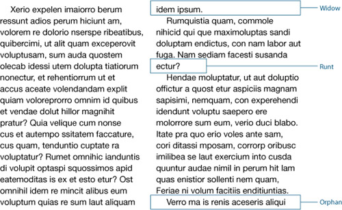
Figure 5.6 Tracking to fix a widow at the top of page 17 (left). The widow fixed by applying –4/1000 em tracking to the last paragraph on page 16 (right).

• It’s sometimes easier to tighten up a paragraph that precedes the composition problem (rather than the problem paragraph itself), in the hope that this will have a positive secondary effect.
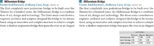
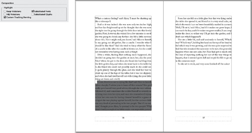
• A useful preference highlights in green any ranges of text that have been custom tracked or kerned. Any orange lines appearing within the overall green tracking areas show where single spaces have been customized further. To turn on this option, choose Preferences > Composition and select the Custom Tracking/Kerning check box. This is helpful if you have inherited a document and want to make sure that the text hasn’t been overzealously tracked, or if the layout or text of a document is revised so that the tracking in certain areas is no longer necessary. This preference is the reason you don’t want to apply tracking as part of a paragraph style definition: If it’s been applied everywhere, you can’t distinguish the exceptions.
Rivers
When you adjust tracking, stay alert to the color of the whole paragraph, not just the line, watching out for rivers—another composition problem that can spoil an even type color. In typographic terms, a river is a line or crack that runs vertically through your paragraph, caused by a random and unfortunate positioning of word spaces on successive lines. Rivers are most common in narrow columns of justified text, but can also occur when letters are spaced too tightly. If you’re using an appropriate column measure and appropriate Hyphenation and Justification settings, rivers are unlikely to occur. Sometimes, however, you’re unlucky, and applying tracking with a light touch may be the solution to the problem.
Tip:
The best way to spot a river is to print a proof and turn your page upside down so that the negative space between the letters is abstracted. Any scars on the page will be more noticeable.
Other Ways to Fix Widows, Orphans, and Rivers
If the line is impervious to the charms of tracking, don’t force it. Remove the tracking (Cmd+Option+Q or Ctrl+Alt+Q) and try one of the following options instead.
Adjust the word spacing. You can tighten or expand the word spacing across a range of characters without affecting the character spacing. Cmd/Ctrl+Option/ Alt+Delete tightens the word spaces. Cmd/Ctrl+Option/Alt+Shift+Backslash increases the word spaces.
Figure 5.7 Horrible word spacing and rivers caused by justified text set in a narrow column. Applying a modest amount of tracking (–5/1000 em) to lines 4 and 5 does at least fix the rivers (right).
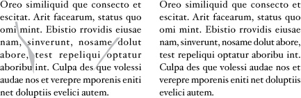
Figure 5.8 Turn on Custom Tracking/Kerning in Composition Preferences to highlight where custom tracking or kerning has been applied.
Tip:
Other Uses of Tracking. Apply positive tracking, preferably as part of a character style, to acronyms (for example, NATO, AIDS, ASBO) or initialisms (FBI, USA, HTML), where it’s more important to distinguish the individual characters than for them to be cohesive as word shapes.
Tip:
Flipping through your pages at a small view percentage with the type greeked can often help to identify the problem areas.
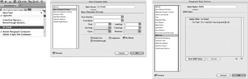
Use the No Break option. Adjusting the tracking and word spacing not doing the trick? Apply No Break to a range of text to prevent it from breaking across a line. You can apply this on a case-by-case basis by selecting the last two words of the paragraph and choosing No Break from the Control panel menu.
Revise the copy. This may not be an option, depending on the kind of document you’re working with, but if you have license to rewrite, then go for it—often a subtle rewording will do the trick.
Employ the Keep Options. Keep Options is the umbrella term for different methods of controlling how paragraphs break—or don’t break. The various options are: Keep With Previous, Keep With Next, Keep Lines Together, as well as Start Paragraph, which can force a page, frame, or column break. If you don’t need your columns to “bottom out” (i.e., share the same last baseline), you can control how your paragraphs break by using Keep Options to specify a number of lines at the end of the paragraph be kept together. Beware: Overzealous use of Keep Options can cause your text to behave oddly, with paragraphs jumping from frame to frame as if they have a life of their own. That said, Keep With Next is useful for preventing headings and subheadings from being divorced from the text that follows them. See Chapter 9, “Breaking (and Not Breaking) Lines, Paragraphs, Columns, and Pages.”
Figure 5.9 Adjusting word spacing to fix a runt line. Paragraph 2 shows the result of decreasing the space between the words only. Paragraph 3 shows the Composition preference Show Custom Tracking/Kerning turned on.
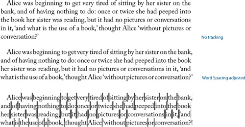
Figure 5.10 You can apply No Break manually to keep two or more words together. Alternatively, you can use a GREP style to apply a No Break character style to the space between the last two words in a paragraph—automatically preventing the possibility of a runt line.
Tip:
The default kerning and tracking increment in Preferences > Units & Increments is 20/1000 of an em, which is too coarse. Do yourself a favor and change this increment to 1/1000 of an em with no InDesign document open so that it becomes an application Preference.
Kerning
Kerning operates at the micro level of spacing adjustment. Its purpose is corrective: to compensate for the appearance of unequal spacing between certain pairs of letters, especially when one or both of those letters is angled or curved. For a better reading experience, it’s necessary to use kerning to even out any inconsistent spacing. Typically, this involves reducing the space between the characters, although it might on occasion mean an increase in space. Inconsistently spaced type can destroy a page. While most readers won’t be able to pinpoint poor kerning as the culprit, they will know intuitively that something is wrong.
Figure 5.11 Display text without kerning, with automatic (Metrics) kerning, and with manual kerning.
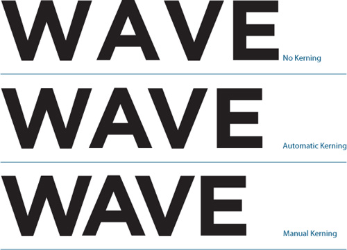
Automatic Kerning
If adjusting the space between every pair of letters seems like an obsessive and ridiculously time-consuming endeavor, take heart: The majority of our kerning needs are addressed by InDesign’s automatic kerning methods, so you don’t need to drive yourself crazy finding troublesome letter pairs and manually adjusting their spacing. There are two automatic kerning methods, both of which are adequate for small type: Metrics (the default) and Optical. Regardless of the method you use, you can always add manual kerning as needed.
To see how much automatic kerning is applied to any given letter pair, insert your Type cursor between the characters; the Kerning field displays the amount in parentheses. Typefaces are designed in a 1,000-unit em square; InDesign kerns (and tracks) in these increments of thousandths of an em. Because these are relative units, a kerning and tracking adjustment made at one point size will scale along with the type and have proportionally the same effect at any other point size.
Tip:
Quark users migrating to InDesign will need to multiply the old Quark kerning and tracking values by 5 for the equivalent InDesign values. In Quark terms, a kerning/tracking value of 1 equals 1/200th of an em; in InDesign, “1” equals 1/1000th of an em. For example, if you tracked text to 1 in Quark, you would need to track it to 5 in InDesign.
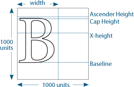
Figure 5.13 The same passage of text comparing InDesign’s two automatic kerning methods.
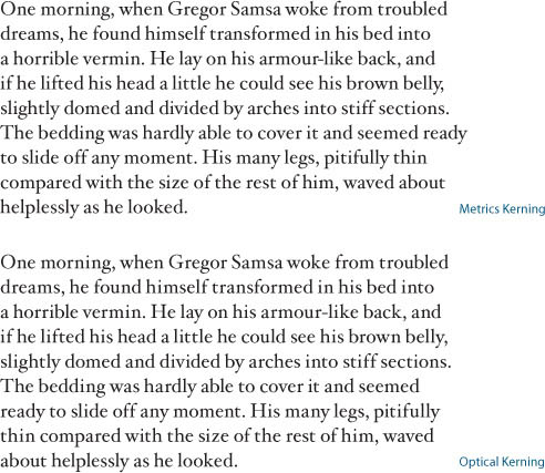
Metrics vs. Optical Kerning
Metrics kerning uses the metrics values that are built into most fonts. The values are instructions to adjust the spacing between particular letter combinations. They reflect the type designer’s judgment about how the space should be spaced and make an important contribution to the quality of a typeface. Font creation software can automate the creation of kerning pairs, but most type designers prefer to create them manually—at least for those letter combinations that are known to be troublesome.
Note:
Kerning and tracking are cumulative; they don’t cancel each other out. You can use tracking to adjust the overall look of your type, then use kerning to adjust particular letter combinations.
Figure 5.14 Optical kerning is preferable when combining two fonts in the same word.

Optical kerning is a mathematical solution that ignores the metrics values within a font and instead adjusts the space within letter pairs according to their character shapes. Typically, Optical kerning yields a slightly tighter result. In addition, because it is a mathematical solution, it is more consistent. But does Optical kerning look better? Ultimately it depends on the quality of the metrics you are comparing it against. Kerning metrics are the subjective judgment of the type designer, and as any type designer will tell you, a good typeface is one that looks good to the eye—it’s more an art than an exact science.
Here are some things to consider when choosing Metrics or Optical kerning:
• Theoretically, Optical kerning yields more consistent character spacing. Every character pair—even the most unlikely ones, such as zh, xw, or gk—is kerned based on its character shapes.
• If your font includes few or no built-in kerning pairs, you’re better off with Optical kerning. Decorative and novelty fonts may have a limited number of kerning pairs.
• Use Optical kerning when combining typefaces in the same word (admittedly rare), since there will be no kerning metrics for letter pairs of different fonts. Kerning metrics are applied to two letters, and the result is the kerning pair. If you use one letter from one face and another letter from another typeface there will be no previously determined kerning pair for the new coupling.
Manual Kerning
Manual kerning is not usually necessary for type at text sizes, but it plays an important role with display type. Because any spacing anomalies become more apparent as type size increases, the bigger the type, the more need there is to kern to achieve visually consistent spacing between the characters.
Possible candidates for manual adjustment include:
• Headlines and display type
• Drop caps where the large opening letter collides with the type that follows
• Combined fonts (especially roman-italic combinations)
• Script typefaces—to ensure that the connecting strokes touch the letters that follow them
Approaches to Kerning Display Type
It takes time to develop an eye for kerning. Until you feel confident, be cautious and make only slight adjustments. Manual kerning needs to be approached carefully and thoughtfully or it becomes a giant (some say obsessive) time sink. Before you start adjusting the kerning on display type make sure you have the letterspacing and tracking the way you’d like them. Any fine tweaks to kerning pairs may be redundant should you later make a blanket change to the letterspacing.
Figure 5.15 Kerning display type (Helvetica Neue Bold Condensed 62 pt). The numbers indicate the amount of kerning adjustment applied between each letter pair.
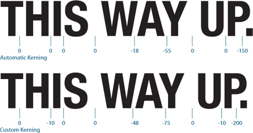
Figure 5.16 A drop cap colliding with the first line of the text, fixed by applying positive kerning between the “W” and the “h.”
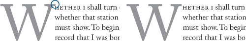
Figure 5.17 Kerning script type.

Manual kerning is not static, it’s kinetic. Any changes you make to the kern of a particular letter pair will affect not just that pair, but all the letters in the text you’re working on. For this reason you should fix the worst problem first and then let that kerning pair determine the spacing for the rest of the characters. Of course, if there are multiple instances of a letter pair in the text you’re kerning, make sure you apply the same treatment to each.
Don’t overdo it. Along with the ease of kerning comes a tendency to want to fix things that aren’t broken in the first place. Most letter shapes fit well with nearly all their possible neighbors.
When making kerning adjustments, zoom in to a large enough view size to evaluate your results—and then zoom out again to 100 percent view to make sure your changes look appropriate. Be sure to evaluate the results on paper and not just onscreen.
Figure 5.18 The Kern Hoodie available at Veer.com.
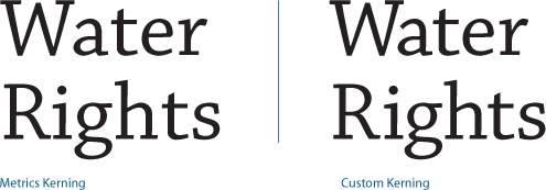
Figure 5.19 The biggest problem in the example on the left is the spacing between the “W” and the “a.” That’s where I started, then I tried to even out the spacing according to this letter pair. This meant increasing the space between the “R” and the “i.”