Chapter 4. Leading
LEADING (pronounced “ledding”) is the space between lines of type, sometimes referred to as line spacing. The term comes from the days of hot-metal typesetting when thin strips of lead, known as reglets, were inserted by hand between the lines of type to add vertical space. Lines of type without these strips of lead were—and still are—referred to as “set solid.” Leading plays a big part in the readability of your text. Body text is usually made more readable by a positive amount of leading (a leading value greater than the point size of the type). Headlines and display type, however, may benefit from negative leading (a leading value less than the point size of the type).
Getting the Lead Out
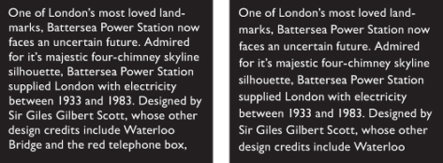
When it comes to leading there is no “one size fits all.” On one hand, tight leading increases the density of the type and gives your type authority. On the other, if you go too tight your type looks claustrophobic, and the descenders of one line may collide with the ascenders of the next. On one hand, loose leading can create a luxurious look. On the other, if the leading is too loose, the lines of type look like individual strips that don’t belong together as paragraphs. This is especially true if the leading value is greater than the size of the space between the paragraphs.
Leading is measured in points from one baseline to the next. The leading value includes the point size of the typeface and the actual space between the lines. Thus, 10-point type with 12 points of leading really means two points of space between each line. This is written 10/12, spoken as “10 on 12.” Other common type size and leading combinations for body text are 9/11, 11/13, and 12/15.
Figure 4.1 Leading is indicated by the red strips between the lines. The total leading is measured from the baseline of one line to the baseline of the next.
How Much Is Enough?
Bad leading makes your text harder to read because the eye has trouble locating the next line of type. Getting the leading just right depends on several variables:
• The nature of the text. While text intended for continuous reading benefits from some breathing space, a short burst of advertising copy or a title might be more effective if the lines are tightly leaded.
• Type size. As type point size increases, you will want proportionally less leading. With display sizes, the same relative amount of space between the lines appears larger, so much so that it’s common to use negative leading for display type.
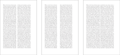
• The width of the column. Increase leading as you increase column width. Increasing the leading anywhere from 0.5 point to 2 points improves readability by keeping the lines distinct and preventing the eye from dropping off to the line below or doubling back to reread the same line.
• The width of the column gutters. Leading, like all type attributes, needs to work in harmony with everything else on the page. The width of the column gutters should be the same as the leading value or a multiple thereof. If the gutters are too small there will be a tendency to read across the columns; too large and the separate columns will look unconnected.
Figure 4.2 You can measure the leading value used on a printed piece with a leading gauge.
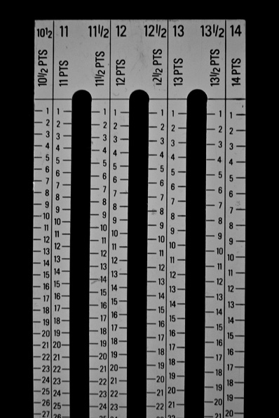
Figure 4.3 An excerpt from Beatrice Ward’s influential 1932 essay on typography The Crystal Goblet, showing common leading and type size combinations.
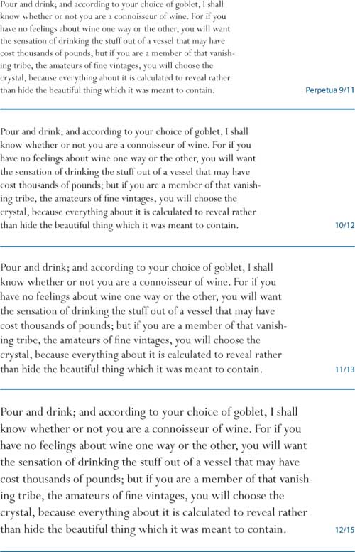
Figure 4.4 Positive leading works OK for body text sizes (A), but as the type gets bigger (B), proportionally less leading is needed (C).
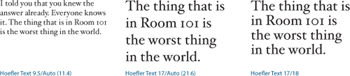
Figure 4.5 Leading and column width. In the top example the leading is too tight; below, the leading has been increased to compensate for the wide column.
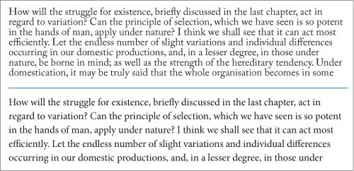
Figure 4.6 In the example on the left, the gutter width is the same as the leading value. In the center, the gutter width is too big and the columns lose their visual relationship to each other. On the right, the gutter is too small so that the two columns look almost like a single line.
• The size of the word spaces. Justified type in narrow columns, such as in newspapers, may result in word spaces that are larger than the leading size. This causes the eye to jump to the next line rather than to the next word. In such situations, adding extra leading ensures that the space between the lines is at least as wide as the space between the words. Better still, don’t set justified type in narrow columns.
• The color of the background. Because we’re used to reading black type on white paper, when we use the opposite, we’re guaranteed to get attention. However, reversed type tends to “sparkle,” making it hard to read. A slight increase in leading—as well as avoiding fonts with delicate serifs—can compensate.
Tip:
A convenient rule of thumb for determining leading is to take the width of a column in picas and divide it by the type point size, then round the result to the nearest half point. For example, if I have 10-point type on a 24-pica measure my leading is 2.4, rounded up to 2.5 and expressed as 12.5 (the lead added to the point size).
Figure 4.7 With justified type on a narrow measure, it helps to increase the leading to ensure that the space between the lines is not less than the space between the words.
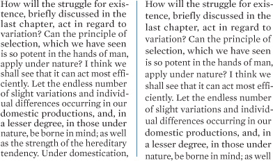
Figure 4.8 Type that reverses out of a solid color benefits from increased leading (right).
• The characteristics of the typeface. Typefaces with larger x-heights, such as Helvetica, are perceived as bigger than other typefaces at equivalent sizes. The lowercase letters are large relative to the size of the overall character, and thus require more leading.
Didone (also called Modern) typefaces, like Bodoni, that have a strong vertical stress guide the eye down the page rather than across the line. Adding more leading with these typefaces keeps the eye tracking horizontally rather than vertically.
Figure 4.9 Typefaces with a large x-height, like Helvetica, require more leading. Didone or Modern typefaces, like Bodoni, that have a strong vertical stress require more leading to keep the eye moving along the line, rather than down the page.
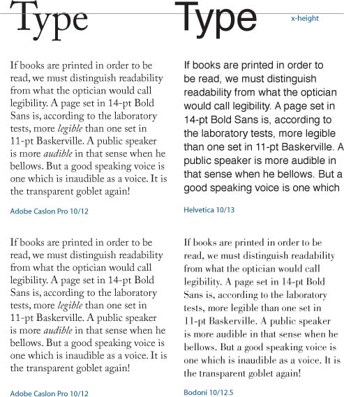
Figure 4.10 Even though Bernhard Modern has elongated ascenders, it has a low x-height and short descenders, and so can be leaded tightly (bottom).

Figure 4.11 Raniscript has elongated ascenders and descenders, but its low x-height means it looks good tightly leaded.

Typefaces that combine a low x-height with particularly tall ascenders require special treatment. The low x-height begs for tighter leading, but tighter leading might lead to the ascenders and descenders colliding. Much depends on the characters themselves. If you’re working on display type, rewording—if you have editorial license—might make all the difference. Let common sense prevail—and be open to the possibility that colliding ascenders and descenders might even look good in certain situations.
Bold and Semibold typefaces benefit from extra leading to prevent the type color—the darkness or blackness of the letterforms as a block—appearing too dense.
Typefaces with small x-heights, like Garamond, appear to have more horizontal space between lines and thus require less leading.
Type set in all caps requires less leading because the lack of descenders makes the lines appear farther apart.
Tip:
The paragraph mark, or pilcrow, at the end of every paragraph carries the text formats. Not including it in a selection can result in inconsistent leading. To select the whole paragraph, click four times in the paragraph rather than swiping across it with the Type Tool—and make sure your Hidden Characters are shown.
Figure 4.12 The same headline in all caps needs less leading because there are no descenders.

Figure 4.13 Stacked all caps with negative leading to create a wall of type.
When you work in points, there’s an easy way to determine the leading value for a specific number of lines in your type area. First, draw a rectangle between the top and bottom margins of a page. Then, insert your cursor in the Control Panel after the height value of the rectangle and type /N (where N is the desired number of lines). Press the Tab key to divide the height of the rectangle by the number of lines. The new height of the rectangle is your desired leading value. You can now delete the rectangle.
Figure 4.14 By default the Auto Leading value is 120% of the point size of the type. When Auto Leading is chosen the value appears in parentheses on the Control Panel.

(Not) Using Auto Leading
Auto Leading is a relatively new concept, emerging with desktop publishing in the mid-1980s. Auto Leading allows InDesign to assign a leading value based on the type’s point size. By default, Auto Leading is 120 percent of the type size, although you can change this in your Justification options. Leading values in parentheses indicate Auto Leading.
The best thing you can say about Auto Leading is that it’s convenient. You can change your text size as often as you like and your type will always be readable. As your font size increases or decreases, so does your leading.
The largest leading value in a line of type determines the leading for the whole line, which means that the leading will be inconsistent if you inadvertently make one character bigger than the rest of the text. You can change this behavior in your Type preferences by selecting the Apply Leading to Entire Paragraphs option. This ensures that only one leading value can be applied to any given paragraph. Changing this setting does not affect the leading in existing frames. This may be a worthwhile “safety” feature, but strangely, it does not apply to paragraphs with Auto Leading applied. The problem with having this preference turned on is that when you apply optical leading, you need to apply more than one leading value within a paragraph.
Figure 4.15 The Apply Leading to Entire Paragraphs option keeps your leading within a paragraph consistent. However, it doesn’t work with Auto Leading.

Auto Leading is useful when you’re experimenting with type sizes, but when you decide upon the size, convert the leading value to an absolute number—even if it is the same as the Auto Leading value. Here’s why you shouldn’t use auto leading:
• Auto Leading is proportional to your type size—but specific to the biggest piece of type in the paragraph. This means that if you have one word larger than the rest of the paragraph, your leading value will be 120 percent of the largest word or character.
• Auto Leading doesn’t give you the control that you need. Sure, if you’re using 10-point type, Auto Leading is 12 points, a nice easy number to work with. However, if you’re working with 11-point type, then your leading value is 13.2, which is difficult to calculate in multiples if you intend to work with a baseline grid.
• While Auto Leading works fine for body text, it can look terrible when applied to display type, which generally requires less leading.
Figure 4.16 The problem with Auto Leading: 120% of what exactly? Because one character (a space at the end of line 5) is larger than the rest of the paragraph, the leading is inconsistent.
Figure 4.17 Using Auto Leading for inline graphics ensures that the height of the line grows to accommodate the size of the graphic.
Keep It Consistent, Except …
Leading, like so much in typography, is about rhythm—and as with a piece of music, you want your rhythm to be steady and unfaltering. The best way to achieve this is to set the leading values within Paragraph Styles. Should you need to change the leading values, you can edit the style definition rather than work on the text locally.
When it comes to fixing widows and orphans, don’t mess with the leading. You have other tricks up your sleeve—rewriting, tracking, discretionary hyphens, forced line breaks—to fix such problems. Tempting though it may be to tighten the leading a little bit here and there, your document will suffer if you do. Always keep your body text leading consistent, otherwise the rhythm of your type will wander like the beat of a distracted drummer.
Also, don’t be tempted to go for the quick ‘n’ dirty solution of using vertical alignment, which increases the leading in a short column to make it bottom out (i.e., end on the same baseline as other columns). While columns of uniform depth are usually preferable in continuous prose, InDesign CS5 can now achieve this with the Balance Columns feature, which will adjust the height of all columns, rather than just extend the shortest one.
Figure 4.18 Good leading gone bad: The columns are balanced, but at the expense of inconsistent leading across the two columns.
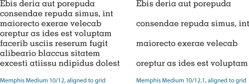
Figure 4.19 When using a baseline grid, the grid increment will trump the leading value, as in the right column. Any increase in the leading value causes the lines of the paragraph to snap to the next available grid increment.
Ultimately, it is our eyes we should trust and not the math. There may be times when you need to relax consistency in favor of optical leading and tweak the leading of individual lines to make the leading appear more consistent. Such a situation may arise in display type, for example, if one line doesn’t have descenders.
Figure 4.20 Using optical leading: In the example on the right the leading for the fourth line has reduced to compensate for there being no descenders on the line above.
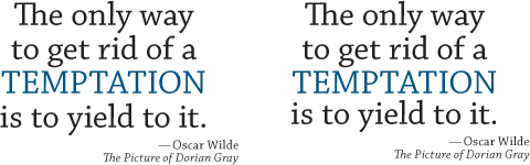
Figure 4.21 The Skip by Leading option pushes the line after the graphic down to the next leading increment. However, if cross alignment of baselines is what you’re after, you’re better off aligning your text to a baseline grid (see Chapter 15).
