Chapter Thirteen: New Properties in CSS3
For all the power and precision of the new selectors we’ve just seen, it’s CSS3’s properties that get most developers’ hearts racing. Imagine never again having to break open an image editor to style text with shadows, or to use any font other than the standard web fonts. Imagine never again using image replacement techniques for text. Imagine drop shadows and rounded corners without extraneous markup. All these scenarios and more are a reality with CSS3, and all are supported in one or more widely available browsers in ways that let them degrade gracefully. As long as you don’t believe all web pages must look exactly the same in every browser, the future of web development has already begun.
Shadow Effects
Shadow effects—on text and more recently on page elements—have been a staple of web design for many years. But until recently, with the exception of text shadows in Safari (supported in 2003’s version 1.1), it has been difficult to add shadows to elements or text, and the process has come with serious drawbacks.
Until now, developers have been forced to use images to achieve such effects as text with a drop shadow. For years, the only way to produce this effect was simply to use an image in place of the text—a technique with many attendant accessibility and usability issues. The advent of image replacement techniques such as FIR (Fahrner Image Replacement), sIFR (Scalable Inman Flash Replacement), and Cufón have addressed some of these problems, but even these techniques (which are discussed in Chapter 4, if you’d like a refresher) are plagued by accessibility, usablity, and workflow problems.
Adding a box shadow to an element has traditionally been even more complicated, typically requiring extraneous HTML elements to contain the box-shadowed element, with background images on these containing elements providing the desired effect. (If this description sounds complicated, you should see the markup.)
Thankfully, CSS3 offers properties like text-shadow and box-shadow, which will in time make these painful workarounds unnecessary.
text-shadow
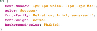
The text-shadow property allows you to add one or more shadows to the text of any element. Each shadow is specified with a horizontal offset, a vertical offset, a blur, and a color. Consider the following rule:
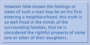
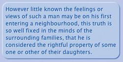
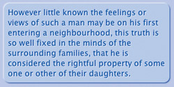
This rule adds to the text of all h1 elements a shadow which is offset 2px to the right and 2px below the position of the text itself [13.1]. The shadow will be blurred by 2px (the higher the blur value, the more blurred the shadow will be), and it will be a pale gray. The color value may be placed either before the three length values or after them, but the three length values always follow the same order: horizontal offset, vertical offset, blur.
With a negative horizontal offset, the shadow begins to the left of the text, and with a negative vertical offset, the shadow begins above the text:
Text shadows don’t just take pixel value offsets and blurs, they can also take relative values like ems. This can have a surprisingly significant effect. For example, figure 13.2 shows our first shadow example, with 2px offset and blur, zoomed up to a very large text size:
13.2 A zoomed, pixel-based text-shadow

Here’s the same text, using a text shadow with .1em offsets and blur [13.3]. As with other properties we’ve seen in the book, relative length values like em often make for much more scalable or adaptable designs.
13.3 A zoomed, em-based text-shadow

Multiple Shadows
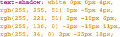
Individual drop shadows are nice, but text-shadow can produce more sophisticated effects via multiple shadows on the same element. We can add any number of text shadows to an element (Opera has a limit of about six shadows, which in practice is enough for just about any effect) by adding a comma-separated list of shadow values to the text-shadow property. For example, an etched effect is simple to achieve using just two shadow values:
The above statement gives us the effect shown in figure 13.4.
13.4 An etching effect created using two text shadows
This example also demonstrates why we must be careful with features supported in some, but not all, browsers. Figure 13.5 shows how the same heading would be rendered by a browser that doesn’t support text-shadow.
13.5 text-shadow may cause backward-compatibility problems when its shadow effects mask insufficient contrast between the underlying text color and background color.
Astute readers will note that these shadows only have two length values, not three. In the case where a length value is omitted, the value is treated as zero. So here we have a blur of 0—which is, in effect, no blur at all.
We can also emboss using just two text-shadow values, like this:
This CSS rule produces an effect like that seen in figure 13.6:
13.6 An embossed effect created with two text shadows
More, and more elaborate, effects can be achieved using additional shadow values. Consider this commonly used example from the website CSS3.info [13.7]:
13.7 Complex effects created using multiple text shadows
You can achieve this effect using the following CSS:
In this example, there are five shadows, but how do we indicate which order they should be drawn in? Because text-shadow is not part of any definitive CSS standard (it was in CSS2 which never became a final W3 recommendation, is not in CSS2.1, and is now in CSS3’s text module), there is no definitive answer. Safari renders the last specified shadow first, and then so on until it renders the first shadow last. Opera and Firefox render in the opposite direction. There is often little practical difference.
Compatibility
text-shadow is supported in Safari (version 1 and higher), Opera (version 9.5 and higher), and Firefox 3.5 and higher. Internet Explorer doesn’t support the text-shadow property, but it does have a proprietary filter mechanism that enables various shadow and other effects. With the release of Internet Explorer 8, use of these filters becomes quite a complicated matter, because filters can’t be used with the browser’s “standards” mode, only with “Quirks” mode. Since they will almost certainly never be supported in browsers other than Internet Explorer, the use of these filters in new projects is something that should be carefully considered. (We’ll touch on IE filters again when we look at the opacity property.)
box-shadow
The text-shadow property was part of the draft CSS2 recommendations and was implemented in Safari 1.1 back in 2003, but the ability to add shadows to an element’s box hasn’t been implemented in Safari and Firefox until recently, and is still not supported in Internet Explorer 8 and Opera 10.
Like text-shadow, the box-shadow property specifies one or more shadow values that are applied to the element’s box outside its border, but inside its margin. No matter the size or offset of the shadow, it has no effect on the flow of the document, meaning that it won’t affect a page layout in any way. This greatly aids its use for progressive enhancement, as there is no need to take into account a shadow’s size when laying out a page (this is true of text shadows as well).
To add a shadow around a block of text, we’d use a CSS rule like this one:
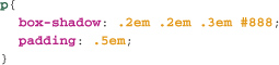
...which will give us a shadow like the one in figure 13.8:

Or at least, such a rule will work in theory. In practice, because the CSS3 Borders and Backgrounds Module is not final at the time of writing, browsers that support this feature do so only with their vendor-specific extensions: -moz- and -webkit-. To make this work in WebKit- and Mozilla-based browsers like Firefox 3.5, we’ll need to use a rule like this one:

As with text-shadow, we can add multiple shadows to etch or emboss a box, using, for example:
This rule produces an effect like the one shown in figure 13.9:
Shadows in CSS3 are easy to implement and increasingly well supported. They are also backward-compatible, provided you maintain high contrast between text color and background color to ensure good legibility without text shadows. Otherwise they are an almost perfect candidate for progressively enhancing your sites.
Compatibility
box-shadow is supported in Safari (version 3.1 and higher) and Firefox 3.5 and higher. Internet Explorer doesn’t support the box-shadow property, but it does have its own proprietary filter mechanism that can enable various shadow and other effects. With the release of Internet Explorer 8, use of these filters becomes quite a complicated matter, and as they will almost certainly never be supported in other browsers, using these filters in new projects is something that should be very carefully considered. We’ll touch on the issue of IE filters again when we look at the opacity property.
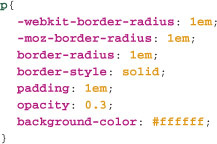
border-radius
Rounded corners on box elements, although visually appealing, have long been difficult to implement with HTML and CSS. Generally, developers must add several elements with background images to produce the effect, and the CSS to make it all work can be complicated. Fortunately, CSS3 comes to the rescue in the shape of the border-radius property, supported in Safari (versions 3 and up) and Firefox (poorly in version 2, but well in versions 3 and higher). The old-school hacks will still be required to support rounded corners in Internet Explorer (and possibly Opera) for some time, but this design effect is a good candidate for progressive enhancement.
border-radius is very simple to use. The property takes one or two positive length values, which specify how “rounded” the corners of an element’s box are. (You can also specify different radii, if you wish.) Let’s begin with the simplest case of a single length value for border-radius.
If we add a border-radius to the element we’ve just “etched” using box-shadow, figure 13.10 shows how Safari will render it.
13.10 A paragraph with rounded corners, created using border-radius
The Math of Rounded Corners
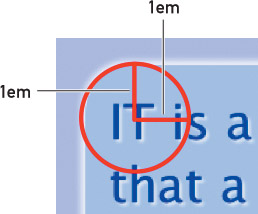
How exactly does the value 1em translate into a rounded corner? For those who need to know the gruesome details, border-radius defines an ellipse for the corner. When there is a single value, the ellipse has a vertical and horizontal radius of 1em. And an ellipse with equal radii is a circle. Now, imagine the circumference of the circle aligned so that a quarter of the circle aligns with the corner of the element, as in figure 13.11.
13.11 A border-radius with horizontal and vertical radii of 1em
As with many other properties, we’ll use relative em units, rather than a unit like pixels, and figure 13.12 shows why.
13.12 A border-radius of 10px at normal zoom
When we specify a border-radius of 10px, as in figure 13.12, it appears fine at a normal zoom. But what happens when we increase the font size?
As we see in figure 13.13, the radius remains the same size (10px), but the proportions change markedly. However, if we specify with ems, the border radius scales up and down with the text, maintaining the proportions we see in figure 13.14.
13.13 A border-radius of 10px, zoomed by several font sizes
13.14 A border-radius of 1em, zoomed by several font sizes

Relative length values like ems—whether used for font-size, shadow, margin, padding, line-height, or many other CSS properties—give your designs a flexibility that absolute units like pixels don’t. An understanding of the power and appropriate use of relative units is a much-overlooked aspect of CSS, and one all professional developers should have as part of their toolkit.
Compatibility
border-radius is supported in Safari (version 3 and higher), Firefox 2 (with aliased corners, producing an unattractive effect), and Firefox 3 (good support) and higher. The browser specific extensions -moz- and -webkit- are still required, at least in Safari 4 and Firefox 3.5.
transparency
With many CSS3 properties like shadow, border-radius, and others, you may notice a pattern: many of these features provide a straightforward, standards-based approach to techniques used by developers for years, but which have typically required complicated hacks, and very messy HTML and CSS (sometimes even requiring JavaScript).
Another very common design effect is the use of apparently overlapping semi-transparent elements.
There are several ways of achieving transparency in web pages, some from CSS2, and some involving image formats like PNG or GIF. CSS3 provides new ways of achieving transparency.
background-color: transparent
You’ve long been able to set the background color of an element to transparent. Then, anything “behind” an element with such a background is visible. However, text is still fully opaque, and there’s no way to make semi-transparent backgrounds—there’s no color: transparent equivalent of background-color: transparent.
Semi-Transparent Background Images
The still-common GIF format allows for single-color transparency. You specify which color in the image should be transparent, and the browser renders any pixels in the image that are that color transparent. However, GIF transparency is either off or on, which limits its usefulness.
The PNG format has long since brought variable or “alpha-channel” transparency to the web... almost. Although PNG has been supported in Internet Explorer since version 4, alpha channel transparency support only came with version 7. There are numerous workarounds for this problem, which we also explored earlier. The problem remains that this form of transparency applies only to the background of an element. There are cases in which we’ll want the whole element (including its children) to be semi-transparent. We can accomplish this with CSS3 in a couple of ways.
opacity
The CSS3 property opacity has been supported in all contemporary browsers (other than Internet Explorer) for some time, and there’s no need to use a browser-specific extension. opacity takes a single value between 0 (completely transparent) and 1 (completely opaque). So, a value of .5 is 50% transparent.
For example, this rule produces the effect seen in figure 13.15:
13.15 A semi-transparent element created using opacity

Note that the background, text, and any descendent elements are also semi-transparent. This cannot be overruled by setting an opacity of 1 to child elements within a semi-transparent element, which can decrease the legibility of text—semi-transparent text over a semi-transparent background can be very difficult to read. Fortunately there’s a related CSS3 feature to help us address this.
RGBa Colors
Now supported in Firefox, Opera, and Safari, RGBa color values specify an alpha-channel transparency value of 0 to 1, in addition to red, green, and blue color values. This allows us to make semi-transparent backgrounds using an RGBa color value. Figure 13.16 shows the preceding example, but with an RGBa background color instead of opacity.
13.16 A semi-transparent element created using RGBa colors

The text is more legible because it is completely opaque, while the background is semi-transparent [13.15].
We can set an RGBa color anywhere we can use a color value. So, we can make the border semi-transparent by using a property value like border-color: rgba(0,0,0,0.5); giving us a border with 50% opacity. And we can create semi-transparent text using an RGBa value for the color property.
To a developer with a hammer, everything looks like a nail: we often learn one skill, then use it any time it might work, without considering potentially superior alternatives. In this case, CSS provides several alternatives for creating transparent elements. Understanding the strengths and weaknesses of each (opacity is inherited by all its descendents and can’t be overridden; RGBa applies to individual properties; the transparent color value only applies to backgrounds; PNGs can be difficult to use with older versions of Internet Explorer) we can use the simplest and most appropriate solution to a particular problem.
Compatibility
RGBa is supported in Safari (version 3 and higher), Firefox 3, and Opera 9.5 and higher. opacity is supported in Safari version 3 and higher, Firefox 3 and higher, and Opera 9 and higher, without the need for a vendor-specific extension. Opacity can be created in Internet Explorer 5 and higher using the IE-only filter “opacity.”
Multi-Column Text
We devoted an earlier section to multi-column page layouts. CSS3 has a multi-column feature, but rather than applying to page layouts, it applies to the flow of text inside an element. With CSS, it has so far only been possible to have a single column of text inside a given element, such as a paragraph. With CSS3’s multi-column properties, it’s now easy to make the text inside an element flow into two or more columns.
At present, the multi-column properties are part of the as-yet-unfinalized Multi-column Layout module. It’s supported in Safari 3 and higher and Firefox 3 and higher, in both cases with their vendor-specific extensions: -webkit- and -moz- respectively.
The multi-column properties allow you to specify:
• column-count: Number of columns to display.
• column-width: A length value that specifies how wide each column should be (columns must all be the same width). If no width is specified, the browser calculates the width based on the number of columns, padding, the gap between the columns and so on. If the column-width is too wide to allow the number of columns specified by column-count into the width of the element, a smaller number of columns will be used. In essence, column-width is more important than column-count for calculating how many columns are displayed.
• column-gap: A length value that specifies the space between each column.
• column-rule: A value similar to border that specifies the style, width, and color of a vertical line or rule between columns.
The columns shorthand takes two space-separated values, specifying the number of columns and their width, in that order.
The column-count property can be used without the other properties—but of course, without a column-count value, the other properties won’t have any effect.
Here we’ll specify that each paragraph is to have three columns of text, each 15em wide. The gap between each column is 5em, with a medium dotted gray rule between the columns.
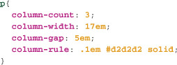
At present, you’ll need to add -moz- and -webkit- to the properties for these browsers to display the multiple columns, but I’ve left off these properties here as the CSS can get quite unwieldy when replicated for each browser extension. The effect is shown in figure 13.17.
13.17 Three text columns created using column-count. Note that the browser balances the length of the text in each column as much as possible.

Multi-column text can usually be used to progressively enhance our pages safely; when browsers don’t support the properties, a single block of text will be displayed. This may decrease legibility when an element is particularly wide, but these properties should not cause problems for readers whose browsers don’t support them, as seen in figure 13.18, which shows the same page as rendered by Opera 10.

Transitions
Rounded corners, semi-transparency, shadows—these are all staples of the “Web 2.0 aesthetic.” Another of the most commonly used effects among websites—and particularly web applications—are transition effects such as fading, zooming, and the smooth scrolling and panning of elements.
These effects are currently achieved using JavaScript, increasingly as part of JavaScript libraries like script.aculo.us and mootools, which take a lot of the effort out of implementing effects and help ensure cross-browser consistency. However, Apple has proposed as part of CSS3 (and implemented in Safari) several properties that make transition effects as simple as specifying any other CSS property. While it is still only a draft standard—and only implemented in Safari—it does point the way toward ever more sophisticated capabilities of CSS.
Conceptually, a transition allows a smooth change to the value of a property like an element’s position, size, or color. We can specify the property for which we want the transition to occur (it’s possible to specify all properties at once), the time the transition should take (in seconds), and optionally, a “timing function” and a delay.
But what causes a property value to change? One way in which a property value might change is via CSS rules with dynamic selectors, like hover, focus, or the new target selector we saw in the previous chapter. The second way that properties might change is via scripting. They might even change when users change their preferences—by changing the page zoom, for example. Transition properties apply regardless of how a property changes.
Specifying a Transition
Transitions are specified by a number of properties. The required properties are:
• transition-property: The property that the transition should apply to. Use the property name, a comma-separated list of property names, or the keyword all.
• transition-duration: The length of time in seconds the transition should take. If multiple properties are being transitioned, then this is a comma-separated list of durations in seconds, corresponding to the comma-separated list of property names, respectively.
There are also two optional properties:
• transition-timing-function: Specifies how intermediate values are calculated during the transition. This takes one of several keywords which specify ways in which the animation will occur. For example, an ease-in timing begins the animation slowly and accelerates it, and ease-out has the opposite effect.
• transition-delay: A time value that specifies how long the browser should delay before performing the animation.
It’s rather difficult to give an example of an animated property in print, so you’ll have to jump online to see it in effect at www.devwws.com/examples/transitions. A very common technique is to change the background color of a link when it is in the hover state. But instead of an abrupt transition, what if it faded more smoothly, as seen in the fade effect pioneered by sites like 37 Signals’ Basecamp (www.basecamphq.com)? Here’s how we can accomplish this with CSS transitions:

As with most of the other properties we’ve seen in this chapter, you’ll need a browser-specific prefix (in this case -webkit-) to see this in action at present—and of course Safari 3.1 or higher.
Now, when the user hovers over a link, the background color will smoothly transition from white to red (and then back again when the mouse no longer hovers over the link), taking one second to do so.
If transition-duration: 1s draws a big “huh?”...well-spotted.
Seconds are a valid CSS3 value (typically used with aural style sheets). The format is a number followed by the letter s. Fractions of a second like 2.5s and .2s are permitted.
As we mentioned, transitions are still a WebKit-only proposed addition to CSS, and they were first available in Safari 3.1. They point in the direction we are likely to see CSS head. But should you use them today? In most cases, adding a transition to a property value should have no impact on the usability or legibility of a page. So, along with the other properties discussed in this section, transitions are great for progressively enhancing your pages. If you are looking for effects that work across as many browsers as possible, you can always investigate the various JavaScript libraries which provide these kinds of effects. With luck, we’ll be using CSS for these kinds of effects before too long. Only time will tell whether we’ll come to regret these innovations as much as we do the blink element.
Other Properties
In a sense we’ve only scraped the surface of many of the new properties available in CSS3, and proposed and implemented in browsers like Firefox, Safari, and Opera today. Some of the other new CSS properties you might be interested in include the following:
Border Images
You can specify an image to be used as the border of an element. Presently supported in Opera, Safari, and Firefox, border images can be tricky to use, because they require slicing a single image into components to be used as the borders and corners of an element. And in some ways, RGBa colors, box-shadow, and border-radius reduce the need for border images, as these are the kinds of decorations developers and designers usually add to the borders of an element.
A widely-seen example of border-image in use is in IUI-based applications tailored to mobile Safari. IUI is an HTML, CSS, and JavaScript framework that helps give web-based applications and sites a “native” iPhone appearance and behavior.
IUI uses border-image to create buttons. Figure 13.19 shows a source image and some examples of buttons created from it. This single image and the border-image property can create a button of varying widths:
13.19 Buttons styled with border-image
Multiple Background Images
CSS3 allows you to add multiple background images to a single element, though this is presently only supported in Safari, where it has been since version 1.3.
As such, its usefulness is limited, as high contrast between foreground text and background colors is essential for good legibility, and when using multiple background images, the contrast between the foreground and various background colors will vary. You’ll need to carefully ensure that text is still legible when only a single background image is showing.
CSS Transforms
Like CSS transitions, CSS transforms are a feature of CSS3 proposed by Apple, and are now a working draft, the first stage in the process of becoming a W3C standard. Unlike transitions, transforms are supported by Firefox 3.5 as well as Safari. Transforms allow you to scale and rotate an HTML element (for example, you could rotate a page by 90 degrees) while keeping the element’s text still selectable, the links still clickable, and so on.
Transforms are a bit complicated, but anyone with a good grasp of CSS will be able to understand them readily. We won’t go into them in detail here because they are difficult to use in ways that degrade gracefully for older browsers. An example of what can be achieved with transforms is the remarkable cube effect (www.fofronline.com/2009-04/3d-cube-using-css-transformations) by Paul Hayes [13.20].
13.20 A cube made from HTML elements and styled using only CSS transforms

Gradients
The gradient background is another increasingly common design effect on the web. Gradients are typically created as images, then added as backgrounds to an element using the background-image property. It’s also possible to create gradients in SVG. But WebKit once more has proposed an extension to CSS for CSS3, the gradient function. -webkit-gradient (implemented in Safari 4 and higher) generates an image which may be used in CSS anywhere an image is—for example, as a background-image, a border-image, a list-style-image, or with generated content. One example is the Apple navigation bar we saw in Chapter 12 [13.21].
13.21 Apple’s navigation bar, implemented using CSS gradient backgrounds
We create the gradient background-image using this CSS rule:
More, More, More!
There are yet more CSS3 properties in various stages of development—both as standards and in browsers—including features that focus on web application functionality (like editable text, control appearance, and drag and drop) as well as vastly improved typography (which we’ll look at in Chapter 15). The properties we’ve covered in this chapter are on track to be CSS3 standards, and to be widely supported in contemporary browsers. Most importantly, they are relatively easy to implement in backward-compatible ways, so you can safely start using them today to add extra sophistication for users whose browsers support them, without negatively affecting the experience of the users whose browsers don’t.
I hope you’re now intrigued enough to go and investigate some more CSS3 features, and to start using these in your projects right now... but we aren’t finished with CSS3 quite yet. In the next chapter, we’ll turn to the question of how, given an increasing variety of web-enabled devices, we can tailor our style sheets to devices based on such characteristics as their resolution, color depth, and more.