Okay, this is your final rule. This is the rule that ties everything together and moves you to being a master stock market investor. To become a master stock market investor, you must learn how to time the market. Very few stock market investors know how to achieve the goal of actually and consistently timing the market and timing it correctly. Follow the steps in this rule and you will know exactly how to time the market.
This rule will make timing the market a reality for you and, more importantly, show you how to make money when almost everyone else is losing money.
In this rule, you will learn how to master the art of knowing the best time to buy stocks, the best time to sell stocks and/or tighten your stop loss orders, and the best time to short stocks.
Hopefully, you have read and studied the previous nine rules and are ready to start building your world-class portfolio of stocks. But is right now the best time to be buying stocks?[15] Maybe we are in a cyclical bear market; maybe we are topping out on a secular bull market; maybe we are facing a recession; maybe we are just coming out of a recession; maybe commodity stocks are soaring; maybe the dollar is plummeting; maybe a new war is about to break out; maybe interest rates are rising; maybe forecasters are predicting a market collapse; maybe we are in the middle of the biggest bull market in history or the worst bear market. Should you buy great stocks in a bear market? Should you buy stocks that are at lifetime highest highs in a bull market?
This rule is all about the timing aspect of buying and selling stocks.
The fact that you have found a great stock with super Demand Fundamentals and, seemingly, the ideal technical trend does not necessarily mean that you should buy that stock right now, in this particular market.
What is fascinating about this rule is that it will improve your ability to make consistent profits in the stock market, regardless of the methodology or trading strategy that you use. It doesn't matter if you are a day trader, an options trader, a swing trader, a momentum investor, or a market timer—this rule will make you more money and help you make smarter investment decisions.
Financial advisers who tell you to have a 3-year, or 5-year, or 10-year investment horizon are only telling you this because they do not have a clue about how to time the market and, therefore, hope the market will continue higher if you just wait long enough. I would never pay someone for that kind of advice, and I hope you won't either. The main reason they want you to have a long-term investment horizon is that they hope you will forget the advice they gave you 3, 5, or 10 years ago.
You may be asking: Just how long should my investment horizon be to properly take advantage of the typical market swings? The answer is: just as long as the stock you are holding continues to make you more and more unrealized gains. When it stops making you a profit, you should sell it. Remember, you can always buy it again at a later date. My average hold time for stocks varies with the type of market we are in. At this writing, it usually ranges from 30 to 60 days.
There are times to be long in the market, there are times to be short in the market, and there are times to be out of the market. Without timing the market, you will sometimes be lucky, but most of the time you will be unlucky. Not all market timing strategies are good strategies. I use one in conjunction with my other nine rules, and not solely by itself. The one you will learn in this rule is an excellent market timing strategy, and it will serve you well all of your investment life.
Let me define for our use in Rule 10 the terms Market and Timing:
Market refers to any of the following:
Broad indexes such as the S&P 500, the Dow 30, the Nasdaq, Global Markets, country exchanges (known as ETFs), and so on.
Sectors, including Basic Materials, Capital Goods, Financial, Health Care, and so on.
Industries, including Aerospace, Agriculture, Auto Manufacturers, Biotechnology, Business Services, Coal, Department Stores, and so on.
Timing means picking a point in time in which it is more likely that future events will unfold in some predictable manner. If the market (as defined above) is exhibiting a downward trend, then the assumption is that the downward trend is bad for long positions in the market and good for short positions. Likewise, if a position in your portfolio has a sizable amount of unrealized gain and you have a normal stop loss order in place that, if triggered, would cause you to lose a substantial portion of that profit, knowing the market is about to reverse on you, it probably would be a great time to move your stop loss up and/or sell, thus capturing all or most of your unrealized gain and turning it into realized profit.
First of all, I want you to understand how to use timing data to help you manage your portfolio of stocks. I am going to take you through the charts[16] that you will need to use every week before making a single trade.
There are five timing charts that come into play when deciding how and when to invest in the market. These charts are:
These charts will tell you not only the right time to buy, but whether you should be in or out of the market, and if you are in the market, whether you should have a bullish view or a bearish view of the near term.
Don't forget this very important concept: The best way to consistently make significant profits in the stock market is to buy the right stock at the right time and to sell that stock at the right time.
Timing is everything. Without a great timing strategy, you may as well have a buy-and-hope strategy.
Okay, let's get started with our first market timing chart.
Figure 10.1 is a semilog of the Dow over the past 100+ years.
You may be familiar with this chart or you may have never seen it. It is a great chart that provides an excellent "big-picture" view of the total market. Now, before you get too worked up about my using the Dow as opposed to the S&P 500 or some other larger cross-section, keep this in mind: The Dow has a typical correlation to the S&P 500 of over 95 percent. You can argue about minor details with regard to whether the Dow adequately and appropriately represents the overall market, but from a big-picture perspective, it does a marvelous job of tracking bull and bear markets and consolidation periods.
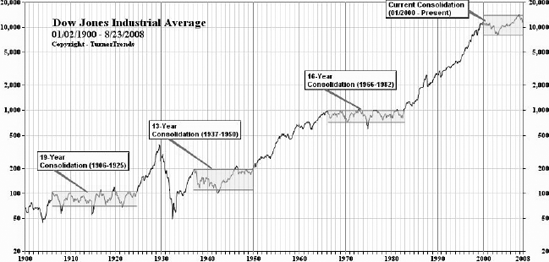
From 1900 through 2009, there were four consolidation periods where the Dow traded in relatively narrow ranges:
First consolidation (1906–1925): The Dow traded between 70 and 105.
Second consolidation (1937–1950): The Dow traded between 110 and 195.
Third consolidation (1966–1982): The Dow traded between 720 and 1,000.
Fourth consolidation (2000–2009+): The Dow traded between 8,000 and 14,280.
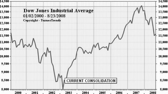
When we are in a consolidation period, as we are as of this writing, an investor has a pretty good idea when to become very concerned about a market top and a market bottom. Figure 10.2 is an expanded chart of the fourth consolidation.
Once the Dow reached 14,000 and then retreated, an upper resistance level was set. This means it is likely that the Dow will, indeed, trade between a high of 14,280 and a low of 8,000 for 12 years or more, if it stays consistent with the previous three consolidation periods.
You may be asking: Why is this important?
As a stock market investor, you should want to know if the market is going to trade in a range. That way, if the trend is moving lower within a consolidation period, you can decide either to be in cash or have a long or a short bias on the market. As the Dow gets closer to a resistance or support level, you can adjust your investment strategy and stop loss strategy accordingly.
In Figure 10.2, the Dow is moving lower toward the middle of the current consolidation range. As an investor, there are two strategies that should be at play at this time:
It is amazing to me that when you listen to the talking heads on TV and read the financial press, most pundits seem to be confused about the market. Very few are looking at the market with a century view of the Dow. The Dow has been very consistent with its trends when in a consolidation period and when it breaks out of a consolidation period. When these trends are identified, it behooves investors to adjust their investment strategies accordingly.
If you knew nothing else about the market, these historical charts of the Dow would provide you with a very clear market bias; that is, whether to be buying or selling. But there is a lot more that the market can tell you about timing your investments for buying, selling, shorting and covering. Whereas the Dow helps us make big-picture decisions that have decade-long strategies, there are often smaller (cyclical) bull and bear market trends that occur inside consolidation periods and outside consolidation periods. This is where the Total Market Forecast comes into the picture.
Markets move in both secular (more than a year) and cyclical (less than a year) cycles. Often, the talking heads like to refer to "Market Corrections," when the market sells off by 10 percent or more.
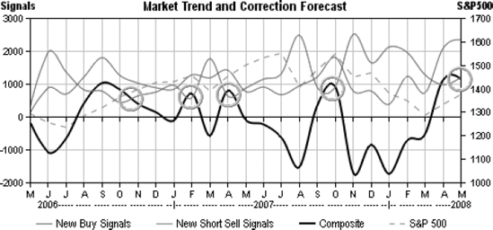
No one likes to be caught in a market correction when you want your investments to move in one direction, but the market is moving in the opposite direction and taking your stocks with it. Wouldn't it be great if you could avoid Market Corrections? Wouldn't it be great if you could sell your long positions just when the market is beginning to move much lower? Figure 10.3, the Market Trend and Correction Forecast chart, will go a long way in helping you avoid future market corrections. The algorithms in this chart and the forecasting component are registered with the U.S. Patent Office.
Note the five black circles in Figure 10.3. Each of those circles is pointing to an early warning indicator to an impending market correction. This is an incredible chart for helping you time when to get in and out of the market. It provides a snapshot of the entire market. The data represented on this chart are the technical results of all the stocks that make up my total universe of stocks, which are most of the larger stocks traded on U.S. exchanges. These "technical signals" are exactly the same signals that you learned in Rule 3. Two of the lines on this chart representing the following:
The total number of new technical short sell signals.
The difference between the total number of new technical buy signals and the total number of new technical short sell signals.
Unlike the Dow chart, which is a century chart, the Market Trend Forecast chart is a much shorter and more recent time frame of the market, but the information that it provides is incredibly valuable.
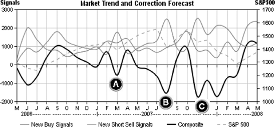
In Figure 10.4, you see three letters, representing three previous market corrections or sell-offs.
Prior to these corrections, right after the composite line moved above and then back below the new short sell signals line, I was able to adjust my trading strategy such that I was able to avoid the corrections that has always occurred right after these crossing events. I would stop buying new positions and start raising my stops tighter and tighter against the market price of my stocks. In 2007, using the methodology allowed me to generate more than a 30 percent gain in my portfolio.
Take a look at Figure 10.5, which is similar to Figure 10.4, but has some directional arrows added to it. The arrows provide a trading bias. If the arrow is sloping upward, the bias is bullish. If the arrow is sloping downward, the trading bias is bearish.
When the arrows slope upward, look for buying opportunities. When the arrows slope downward, look for short selling opportunities and/or move to cash by raising your stop loss orders. Don't forget that when the arrows slope downward, you can also look for opportunities to buy inverse ETFs.
Refer back to Figure 10.3 and take note of the peaks of the black, composite, line. When the black line (composite) moves above and then back below the new short sell signals line, it is indicative of a market top. At market tops, you want to be taking unrealized gains and moving those paper profits to real profits by looking for opportunities to sell. What is fascinating about this chart is that at these specific moments in time, the market is booming. Lots and lots of stocks are in bull mode with share prices rocketing upward. But when the composite line goes above and then starts to move back below the new short sell line, it means, almost certainly, that a correction is imminent.
When you think about it, this phenomenon makes sense. Market tops are always marked by surging upward prices with more and more new technical buy signals and a very small number of new technical short sell signals. You will notice the dropping number of short sell signals, just before a market top.
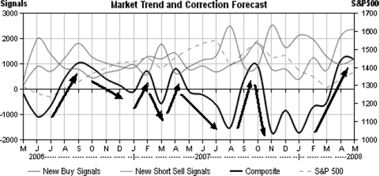
The Market Trend and Correction Forecast chart has accurately predicted every market correction since its inception back in 2006.
Think about it. You can avoid most, if not all, market corrections forever with this strategy!
Okay, we've gone from a century (the Dow chart) to a two-year (the Market Trend and Correction Forecast charts) to our next chart, the Bull/Bear Rating for the upcoming week. To generate this forecast, you need to apply Rule 3 to your universe of stocks. Then, compare the total number of new technical buy signals to the total number of new technical short sell signals for the most recent week-ending close.
From these two numbers, you can generate a ratio. For example, if you found that there were 250 new buy signals and 500 new short sell signals, the ratio would be 250-to-500; which is a ratio of 1-to-2. This means that for every new buy signal, there are two new short sell signals. This is a very bearish indicator and means that there is more money being taken out of the market than being put into the market, since selling tends to drive prices lower and selling takes money out of the market.
Lowering prices means more stocks are triggering new short sell signals. The more money that investors take out of the market, the more bearish the market becomes.
Likewise, the opposite would be true if the number of new buy signals was significantly greater than the number of new short sell signals.
I like to rank these ratios from a rating of −5 to a + 5, where −5 is extremely bearish and a rating of +5 is extremely bullish, as follows:
7-to-1 or greater is a − 5 rating when there are more new short sell signals than new buy signals.
7-to-1 or greater is a + 5 rating when the number of new buy signals is larger than the number of new short sell signals.
5-to-1 up to 7-to-1 is either a + 4 or a − 4, depending on which number represents the new buy signals or new short sell signals.
3-to-1 up to 5-to-1 is either a + 3 or a − 3, depending on which number represents the new buy signals or new short sell signals.
2-to-1 up to 3-to-1 is either a + 2 or a − 2, depending on which number represents the new buy signals or new short sell signals.
1-to-1 is neutral and generates a 0 rating.
Of course, the big question in your mind should be: What do I do with this Bull/Bear Rating? Primarily, you will use this rating to trade for free—meaning you can "effectively" avoid paying sales commissions to your broker. Let me show you how.
In Rule 4, you learned how to calculate the "expected move" (EM). This is the amount a stock can move against you and still be in an up trend. Another way to look at the EM is the amount the stock can fluctuate in price and still be within one standard deviation of its mean price.
One way to avoid the net negative impact of broker fees is to buy stocks for less than market price. You can avoid, in most instances, paying market for a stock by using limit orders that are set below market. The problem most investors have is how to set a limit order that is far enough below market to pick up the stock, but not so far below the current market price that the trade does not fill. You can calculate below-market limit orders as follows:
If the Bull/Bear Rating is −5, which is extremely bearish, you can use a limit order of 50 percent of the EM below the most recent Friday closing price.
If the Bull/Bear Rating is −4, you can use a limit order of 40 percent of the EM below the most recent Friday closing price.
If the Bull/Bear Rating is −3, you can use a limit order of 30 percent of the EM below the most recent Friday closing price.
If the Bull/Bear Rating is −2, you can use a limit order of 20 percent of the EM below the most recent Friday closing price.
If the Bull/Bear Rating is −1, which is mildly bearish, you can use a limit order of 10 percent of the EM below the most recent Friday closing price.
If the Bull/Bear Rating is 0, you can use a limit order of 5 percent of the EM below the most recent Friday closing price.
If the Bull/Bear Rating is +1 to +4, which is bullish, you can use a limit order of 10 percent of the EM above the most recent Friday closing price.
If the Bull/Bear Rating is +5, which is extremely bullish, you can use a limit order of 20 percent of the EM above the most recent Friday closing price.
Of course, when the Bull/Bear Rating is bullish to extremely bullish, you may have to pay up a bit to pick up your trade. Still, using the above calculations for your limit orders will help you buy on dips. This means your net cost of the trade, including broker sales commission, will likely be less than if you were buying at market.
Now, let's move to the final set of charts that will help you time the market for opening a new position. Much of what I cover below, you learned in Rule 3, but here is where we tie everything together.
Keep in mind that to get to this point, you have made the following decisions:
You have found only the best stocks with the strongest Demand Fundamentals (Rule 1).
You have narrowed that list by comparing the relative price-to-earnings ratio (P/E) of each stock so that you are only looking at those stocks that are the best and cheapest in each peer group (Rule 2).
Of those stocks with exceptionally strong Demand Fundamentals, you have selected only those that are exhibiting a technical buy signal (Rule 3).
Based on the Historical Dow chart, you believe now is a good time to be putting money to work in the market (Rule 10).
Based on the Current Market Forecast, you believe now is an excellent time to be buying since it appears the market is poised to move higher in the near term (Rule 10).
Now, you want to make sure that the industry and sector are supporting the upward movement of your stock's pricing trend.
Figure 10.6 is a technical chart for AAPL: Apple Corporation.
(To refresh your memory: We discussed how to read this chart in Rule 3, "Trade like a Technician." The top portion of this Apple chart shows the trend line, technical buy signals, and, the technical short sell signals.)
As of this writing, this is a stock with very good Demand Fundamentals and excellent technicals, if you want to be long in a stock. Take a look at the industry (Personal Computers) and sector (technology) charts at the bottom of Figure 10.6.
The industry is Personal Computers. This chart represents the average price of every stock in the Personal Computer industry. This is the same type of chart that you learned about in Rule 3, but instead of it being a technical chart of a stock, it is a technical chart of an entire industry. This view of the market is extremely valuable, since you not only get to see what the stock is doing, but you get to see how the market is looking at the entire industry. Your stock is a part of that industry and a significant portion of the pricing trend of your stock is tied to the pricing trend of the entire industry. If the average price of every stock in the Personal Computer industry is moving higher (as in the case in Figure 10.6), then there is upward pressure on your stock (in this case, AAPL) share price. Money is flowing into the Personal Computer industry. How do I know that? Just look at the far right side of the Personal Computer industry chart in Figure 10.6. Note how it has broken out strongly above its trend line. This is a very bullish indicator on the entire industry.
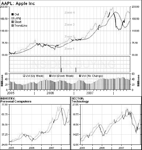
When the average price of all the stocks in an industry moves above the trend line, you should consider the industry in "bull mode." When the average price of all the stocks in an industry moves below the trend line, you should consider the industry in "bear mode."
It is a good thing to buy into industries that are in bull mode and sell into industries that are in bear mode.
The same logic used to determine bull mode and bear mode for industries can be used to determine bull mode and bear mode for sectors.
When investors are selling more shares than they are buying, it means demand is weakening and the price action will be lower. This is true for individual stocks, and for groups of stocks as in sectors and industries. It is important to watch the money flows. When investors start pumping money into an industry or a sector, nearly all of the stocks in those two categories will begin to have positive price action; meaning the market prices tend to move higher.
You will recall I said earlier "a rising tide lifts all boats and a lowering tide lowers all boats." The same thing happens here when it comes to watching the movement of sectors and industries. Let me explain:
When you buy a stock in an industry and sector where the average price of all the stocks is moving higher, it tends to put a positive push on your stock. Your stock, which will have its own reasons for moving higher or lower, will tend to have more upward pressure on its share price when the industry and sector are moving higher. Remember, almost 50 percent of a stock's price action is tied to its sector and industry.
When you buy a stock in an industry and sector where the average price of all the stocks is moving lower, it tends to put negative pressure on your stock's market price.
I like to buy stocks where everything possible is moving in my direction. I want the stock to have strong Demand Fundamentals; I want the stock's market price to be trending well above the trendline; I want the sector in bull mode; and I want the industry in bull mode.
When you sell a stock short, the opposite of everything I just told you is true:
You want the stock to have weak Demand Fundamentals. Why? Strong Demand Fundamentals are a lot like mass. The bigger something is and the heavier it is, the harder it is to turn it. I like to use the example of trying to steer a large ocean liner in the water. It's much easier to steer a small fishing boat. When a stock with strong Demand Fundamentals is moving higher, those Demand Fundamentals tend to keep that stock moving higher. Likewise, a stock with weak Demand Fundamentals has little to push its market price higher. So, weak Demand Fundamentals tend to be a good thing for shorting a stock and a bad thing for buying it long. In our AAPL example, the strong Demand Fundamentals are a negative for shorting the stock.
You want the sector and industry (particularly, the industry) to be in bear mode. This means you want the week-ending closing prices for the sector and industry to be very red and moving lower. This tends to help push your stock's market price lower and lower, as more and more investors take money out of the sector and industry. This is the example of a lowering tide lowering all boats and helping push your short trade lower and lower.