
CHAPTER 7
Design, label, and caption diagrams clearly
Of course diagrams can break up text, relieving otherwise uninterrupted, sometimes daunting text columns. But although useful, the passive ability to take up space is the least of their benefits. Among the myriad active roles they perform, charts, graphs, maps, and process drawings can
- compare numbers
- plot locations
- clarify relationships
- show trends
- quickly and sometimes dramatically answer questions for the reader
When the situation calls for a diagram, a well-designed one communicates more clearly and memorably than text alone can. It communicates on a different level than words do because it shows, it doesn't just tell. Good writing creates images in readers’ minds; diagrams, like good photos, bring the images into focus. Unlike most photos, diagrams also can bring numbers into focus.
A graph is “a shorthand means of presenting information that would take many more words and numbers to describe. A graph is successful if the pattern, trend, or comparison it presents can be immediately apprehended,” according to Graph Design for the Eye and Mind by Stephen Kosslyn.
When readers see it before text that describes it, a good diagram might provide an overview that draws them into the text to learn more. When they see the diagram after reading, it can deepen understanding by (depending on the situation):
- adding depth with the visual perspective
- eliminating wrong impressions
- improving information recognition and recall
Those benefits would be reason enough for you to get familiar with diagrams’ various forms. But the least talked-about yet perhaps most valuable role of diagrams in the communication process is this: The process of creating a diagram encourages the creator to intensively analyze the data. In fact, the process almost demands that the creator consider the data more deeply and more from the reader's perspective than might be the case with text alone.*
In fact, the process of planning or redesigning a diagram, approached with full respect for the reader, often sends the conscientious writer back into the text. It can point out content flaws such as the absence of appropriate emphasis or the presence of inappropriate redundancy (for example, where the text should stop and the graphics take over) or fuzzy thinking in general. (In some cases, it might even guard against fuzzy diagrams, which complicate or distort info instead of clarifying it.)
The thinking that leads to a clarifying diagram includes the search for the right kind of diagram. We'll look at the most common variations, which ones work when, and how to make them clear.
Where to begin
Kosslyn's book distinguishes between quantitative and qualitative visual displays. Quantitative displays show measurements and quantities. They include:
- graphs, including pie “graphs” (the term Kosslyn recommends instead of “pie charts” because they're quantitative)
- maps, because they imply measured distance between geographical points
Qualitative displays show processes and relationships among people and categories. They include:
- organizational (“org”) and flow charts, and family trees
- process diagrams, such as the illustration that identifies the various parts of a piece of equipment in its operations manual
All diagrams share the need to answer a primary question for the reader. The question itself helps determine the right diagram for the purpose, so begin by identifying the question. For example, looking at the classic example of sales figures by months, you get the main question just by restating the problem: “How do sales for each month compare with sales in other months?”
Text alone would make the answer tough to compare and harder to recall: “In January, sales totaled $112,000; in February, they rose to $130,000; in March, they dropped to $97,000…” As the example shows, the best the text can do is to point out whether each amount is more or less than that of the months before and after it.
Rather than a forced march through the months, text would more logically interact with a comprehensive graphic by reinforcing the high-or lowlights, as in: “September showed the biggest sales income, posting almost 20 percent more than May, its closest neighbor, and almost twice as much as lowest-reporting July.”
To fine-tune the kind of diagram and its details, fine-tune the question. Maybe the audience wants to go further, asking the question, “What are the best and worst months?” In that case, a vertical bar graph might answer best by calling quick attention to the extremes in bar heights. If the difference between the tallest and the next tallest bars isn't pronounced enough to be obvious but is important to convey, an element such as a different, stronger color would help emphasize it.

A vertical bar graph. Adapted from “Uses and Misuses,” by Nigel Holmes (Designer's Guide to Creating Charts & Diagrams).
Why vertical rather than horizontal bars? As a convention and in general, quantity tends to be on the vertical (y) axis of an L-shaped graph, and time on the horizontal (x) axis. People associate height with quantity, and width (reading from left to right for a Western audience) with time.
Why not a line graph, with plotted points on the graph connected by a line? A line graph answers a different question: “What is the sales trend over twelve months?” The bar emphasizes individual months as compared with every other individual month, where the line emphasizes the year's pattern.
A pie graph is the wrong choice in this case. You might argue that a pie shows parts of a whole, so each month could be a pie slice, showing how the year's sales divided up by month. It certainly could, but with clutter and commotion. Besides, twelve slices is at least twice as many as most pie graphs can comfortably contain.* (See Color Plate 34 for an unusual pie graph example.)

A line (also known as “fever”) graph. Adapted from “Uses and Misuses,” by Nigel Holmes (Designer's Guide to Creating Charts & Diagrams).
Looking at trends, both the diagram and the text might be in percentages instead of numbers. A table—which you might think of as a combination between text and a diagram—lists the data without the extraneous words in between. For example:
| Jan | $112,000 |
| Feb | 130,000 |
| Mar | 97,000 |
| Apr | 125,000 |
| May | 141,000 |
| June | 117,000 |
| July | 85,000 |
| Aug | 114,000 |
| Sep | 168,000 |
| Oct | 136,000 |
| Nov | 119,000 |
| Dec | 123,000 |
A table will provide the most accurate portrayal of the data. But you can't compare data as vividly with a table as you can with a graphic display, and although a table reflects a pattern, graphs show the pattern more quickly. In a table, your only emphasis tools are color, weight, or extra space; graphs add hierarchy based on size.
Some of the varieties, boiled down:
- Bar graphs visually represent each month's sales and how each compares with the others. They clearly show the relative amounts in chronological order, with an emphasis on the amount of sales and the highs and lows. But should the bars run vertically or horizontally? When time is one of the comparisons, tradition says run time increments across the bottom, on the x axis (but, again, defy tradition when it's clearer and more meaningful the other way). Kosslyn recommends putting the most important part of the data (“the major independent variable of interest”) on the x axis as a default. But, he says, “there are situations where horizontal graphs make more sense, e.g., if the labels are too long to fit in a vertical format.”
- Line graphs emphasize trends more than they do individual points.
- Pie charts, meant to show only how parts relate to the whole, work for this example only if you add the months’ sales figures (to equal 100 percent), and convert each month's figures into a percentage, or pie slice, of the whole. But even then, the large number of slices and the closeness of some of the months’ results, would recommend another type of graph.
Add a second product to the graph with a line or bar in another color. Or use stacked bars to show readers how the sales of each product compare and combine. At least that's the idea. As always, don't assume what readers will understand. Sketch your best, clearest diagram of the material and then make sure you test it for clarity.
EXERCISE: A report on a salary survey needs diagrams to help convey the results. Respondents represent twelve main categories of industry and about as many job titles. The diagrams need to show them all because respondents measure the info's effectiveness by how clearly they can “see themselves” in it.
Come up with a graph or table to answer at least three of the following numbered questions. For the purpose of the exercise (only!), you can make up the data. As you analyze, consider in which cases you might
- answer the “how much” question with a percentage instead of the actual quantity
- combine any two questions in one graph or table
- use a solid bar (in bar graphs) or maybe substitute an icon
Throughout, put yourself in the place of the reader to consider which questions might provide you with the most support in asking for a pay raise. For example:
- How many respondents have which job titles?
- How many respondents make how much?
- How does the staff size affect salary scale?
- Which job titles make how much (overall, and by gender)?
- How does geographic location affect salary scale (overall, and by gender)?
- How many respondents got a promotion (overall, and by gender)?
- How many respondents got how much raise?
- How have respondents’ salary scales changed in the past five years, compared with the national average of workers’ salary scales (overall, and by gender)?
- How does the size of the organization affect salary size?
- How do the number of years on the job and number of years in the field (usually different figures for respondents) affect salary scale?
EXERCISE: Collect comparative data from your daily life and the lives of those around you, then determine the best way to depict it. For example, you could track, record, and plot how long it takes you to travel the same commute over a week. Or you could track:
- the price of a gallon of gas over the past two months
- the amount of time you spend in meetings compared with other work tasks
- the number of songs you download in any given week
You also could compare attendance levels at work or in your classes, as observed over two weeks. Or track and compare what time in the day your colleagues showed up over the course of a week.
Find logical increments
After you choose the right diagram format, you also need to analyze the data to find workable increments to plot. For example, working with the numbers set on page 182 (leaving off the thousands)—112, 130, 97, 125, 141, 117, 85, 114, 168, 136, 119, 123—let's first arrange them in hierarchical order, then find equal increments that encompass them.
At least at first, the twelve-number set from 85 to 168 suggests ten increments of 10, from 80 to 170. But consider whether that many increments will clearly portray the situation, and how much space the publication allows. If a small space dictates fewer increments, you can add precision by labeling the graph with the actual numbers represented (but added labels can diminish the power of the graph, according to Kosslyn).
More increments would be more precise—19 increments of five—as long as the extra height wouldn't negate the benefits. Or you could go in the opposite direction, and still get across the differences among the numbers with six increments of 20, or even five increments of 25.
Notice how using fewer increments minimizes the differences between the numbers so they might distort the message. So might this: Viewers might not notice that none of these increment sets starts from zero. For ethics and clarity, make clear when numerical data doesn't start at zero. (A little diagonal or curved-line symbol often isn't prominent enough; add words.)
More about avoiding distortion (keeping out the riffgraph)
Graphs work so well to convey a quick impression that they can just as quickly convey the wrong one, by plan or accident. Information can get easily distorted in graphs because of what viewers take for granted, Kosslyn says. We expect more (bigger, wider, taller, steeper, or more voluminous) of any element in a graphic to mean a greater quantity. We also expect elements that look less to be less, and those that look the same to be the same.
Make clear and meaningful graphs (and detect deliberate distortions in other people's graphs) with the help of these guidelines:
- Write a title that's more like a headline than a label to make clear the point of the diagram. A headline form, preferably with a verb in it, better reflects the fact that a diagram is meant to answer a question.
- Start the scale at zero or visually shout the fact that it doesn't. (Again, although a small diagonal or curved line drawn through the scale is a conventional way to show it's truncated, readers don't always notice the symbol.)
- Use equal increments within a graph. If you don't, readers who fail to notice the inequality will register the wrong impression.
- Use equal scale increments on adjoining related graphs, or the reader's likely to assume that the scale used on the first one applies to the rest.
- Make labels and other type legible and consistent. Favor a clear type-face that's big enough for your audience to read easily. Shoot for the same minimum size—9-point—as for text, or the biggest you can fit in the tightest spot. And use a clear sans-serif typefaces for graph labels, although serif and sans-serif typefaces are equally legible for text. But for labels, especially in smaller sizes and with numbers, serifs can clutter the field. And sans serif labels also help to distinguish themselves from serif text (but they're also a good choice with sans-serif text).

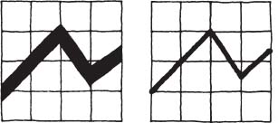
Use equal increments within each graph (and equal scales on parallel graphs). Although the two graphs show the same figures over the same time frame, the unequal increments on the left-hand graph incorrectly suggest a direct trip, while the equal ones on the right show an accurate gradual trend. Adapted from “Uses and Misuses,” by Nigel Holmes (Designer's Guide to Creating Charts & Diagrams).
Where's the firehouse? Too many details on the left-hand graph get in its way. The right, reduced to its essence, makes the way clearer (only Harvard Square's prominence, by arrow and bigger type, might now interfere). From Graph Design for the Eye and Mind by Stephen M. Kosslyn.
- Speaking of numbers, make sure readers can tell the difference between, say, an 8 and a 6, a 3 and a 5, or a 4 and a 1. Such figures are tough to tell apart when they're set in type that's too small (in point size or x-height), too detailed (such as italics or serifs), either too light or too bold, or on tinted backgrounds. In the “Lap Lane Availability” table in this book, the number (of lanes) is one point bigger than the word lanes; the numbers are more important, and it was hard to distinguish the numbers at a smaller size. They also made time increments bigger to fit bigger labels throughout the table.

In fact, too-small labels are one of the most common problems Kosslyn reports seeing in graphs. Perhaps even more common is “packing too much information in a single display.” To save your displays from such reader-unfriendly afflictions:
- include only what clearly and quickly answers the readers’ question
- make keys* concise and simple enough for easy recall. And put them close enough to what they describe that they can be seen in the same visual field, instead of far enough away to force readers’ eyes from the graph. If readers don't bother to make the trip, they can get the wrong impression. Or if the keys contain too many definitions, readers must make the trip more than once to read the graph. (Such a key probably means that the graph is too complicated and might need dividing in two.)
Too-thick fever lines …
- avoid lines in line graphs that are so thick that they obscure the reference points
- avoid graphics that look three-dimensional for the same reason. In a bar graph, for example, the appearance of dimension often makes it hard to tell which line is being measured.
- make icons a consistent size. For example, let's say you want to compare the number of cups of coffee bought by graduate students versus undergrads in a year at one university. So you draw a coffee mug as an icon to fill the bars of your graph. Use one size of icon to represent an amount that makes sense for the data, maybe 1,000 cups. Then stack the icons to show more or less quantity—three mugs for 3,000 cups, and so on. If instead you changed the mugs’ proportions—stretching the mug to show more cups—you'd distort the difference.
- make icons easily discernible, logical, and understandable at the sizes at which they'll display
- make colors and patterns that symbolize data clearly distinguishable from each other
- limit the number and complexity of patterns to keep diagrams from looking like patchwork quilts and readers from confusing and forgetting them. We can't reliably or comfortably hold more than three or four pieces of data in short-term memory. The optimal number for patterns might be smaller still if they ask viewers also to recall detail, not just major differences.

… and bars that look three-dimensional hide the data points. Both sets on this page adapted from “Uses and Misuses,” by Nigel Holmes (Designer's Guide to Creating Charts & Diagrams).
Avoid grid lines that overpower the foreground, as on the left. On the right, the “fever” line dominates the grid, as it should. From Graph Design for the Eye and Mind by Stephen M. Kosslyn.
- use background lines or a grid if they're needed, and only as many and as thick as you need to serve as reference points. As always, the background must never intrude on the foreground.
- put related information close together, especially in a table. Readers should be able to easily scan from one column to the next without risk of connecting unrelated items
- avoid pies when you want to compare more than five or six parts, or those of very different proportions
- when you use a pie graph, put the key categories in the same order they appear in the pie to help readers make sense of them
- you can follow convention by starting the biggest slice of the pie graph at the circle's top center (at 12 o'clock) and proceeding clockwise to the smallest slice. But readers aren't likely to know the convention. And although it would seem that the big-to-small-slice sequence works because it emphasizes the biggest, it's possible that readers’ familiarity with a clock face makes it more natural to read small to big. Either way, it makes sense to start at the noon position, choose an order, and be consistent about it.

EXERCISE: Analyze the “Car Markets” pie graphs to discover where they failed to answer the implied question (and ask colleagues what they think the implied question is): “How does the Italian market compare to the total European Community (EC) market for these car makers?” Note any navigation and accuracy problems within the “Car Makers” section. (Also note how overly complicated graphs make it tough to catch mistakes in them.) What form of diagram would work best in this case? Sketch it.
The “Revenues and Employees” pair of pie graphs on the next page work better because of a closer correspondence between sections, and fewer sections. (Again, though, depending on the point, another form of diagram, such as a bar graph, would more efficiently show a correlation between number of employees and amount of revenue.)
Here are some general guidelines for tables—verbal, numerical, or mixed:
- Put columns close together so they're easily read across a row (but not so close that they seem to run together). For example, the columns in the “Calendar” table on page 191 could have lost a quarter of an inch and still left a pause after the first column's widest item. And you can improve the copy by trimming it and imposing parallel construction. For example, only one listing (“Memorial Day Weekend,” next to last) says “closed for”; some other listings say “break.” They should be consistent. And won't readers assume classes resume at the end of the “closed” period without stating it? Also, because other listings say “closed” or “break,” it's unclear whether school is closed for “Martin Luther King Birthday” and “President's Day.” (See sidebar.)

Too many slices, all those patterns, and tedious eye tracking discourage recall (in these diagrams that were designed to show what not to do). One graph with eight bars divided in half—for the EC and Italy—would be clearer. From Graph Design for the Eye and Mind by Stephen M. Kosslyn.
With just five slices and sequential shading, from light to dark, this pair's much easier on the eyes and brain. From Graph Design for the Eye and Mind by Stephen M. Kosslyn.
- Reinforce horizontal tracking by adding fine lines between rows, a pale screen or color behind alternate rows, or extra space after every third row, suggests White's Editing by Design, third edition.
- Line up columns on the left, except for numbers, which should line up by decimal (whether decimals are shown or just implied).
- Put headings in bold to contrast with the table's data.
Groceries Price tomato sauce 2.49 milk 1.83 lemon .35 - Consider the meaning of line weights: Make them as lightweight as visible between rows, noticeably heavier to separate categories of rows or the headings from the rest.

 Calendars rarely get the care of other types of communication because they're often inherited or thrown together at the last minute. That's in indirect proportion to the amount of attention they receive from readers, who'll be grateful for the effort you spend to clarify them.

Help the eye connect the columns in this calendar in a ballet school's program booklet by taking out space between the columns and editing the first column for consistency. Horizontal dotted lines already help. Client: Ballet Royäle Institute of Maryland. Design firm: Design Army. Creative directors/Art directors: Pum Lefebure, Jake Lefebure. Designer: Dan Adler. Programmer: Tim Madle. Copywriter: Howard Kaplan.
Diagrammatic case studies
Bar graphs compare “cases”
No lines, scales, or axes muddy up the bar graphs on the annual report spread shown in Color Plate 35. Careful readers who check “cases docketed” bars for meaning will note more difference between the second and third bars (although they represent less numerical difference) than between the first and the second bars. Or, if they expect consistency among the graphs, readers might reasonably question the proportions of the end bars compared with their neighbors, which would have to be almost twice as tall to share an implied scale.
Fortunately in both cases, the big red numbers are likely to speak more loudly than the bars. But if readers miss the smaller type for the year, they might mistake the bar on the right of each graph for the current year instead of a five-year average. Although annual reports often try to put a positive spin on things, that potential mistake doesn't seem like a deliberate distortion because a bigger number isn't always better in the third column (“cases pending end,” which means pending by the end of the year, not the end of pending cases, the text explains).
The graph format continues through the report. On a previous page (see Color Plate 36), readers might wonder about the numerical breakdown under the red numbers. Then they have to figure out that the number before the slash represents “mediation” cases and the one after it represents “ADR” cases, as hinted at in the title. Both are in white (reversed) type, which is weak against the gold ink. It will be clear only to readers who've seen and understood the shorthand before or who read the text before examining the graphics.
Unclear diagrams meet goal
Graphs and pictorial tables abound in a brochure from a design firm that wants to show how it can help law firms recruit students. The diagrams don't communicate clearly, but they're not meant to, says Burkey Belser of Greenfield/Belser Ltd. Their goal is more to impress than to inform. (See Color Plates 37, 38, and 39.)
The designers chose graphic design over information design, and form over function. They meant these charts to be “irreverent and appealing. It's in fact pretty difficult to pull information from those charts,” Belser says. “I could have conveyed that information much more efficiently than we did. So we chose to be inefficient in order to be creative” in a style students would appreciate. The designers wanted to show the audience (law firms) “ways to present themselves (to law students) that they never thought about.”
The graphic style and samples of recruitment work for clients are intended to distinguish the design firm's work from law firms’ typical recruitment materials: dense “stuff that students just toss in the trash can as soon as they get it.” To show what the law firms’ materials could look like, the booklet's light tone reflects the design firm's understanding of college students, the audience's audience. Anyway, he adds, “the key information's in the headline.”
But even within that context, the designers didn't have to sacrifice the graphic information. For example, let's look at the decision tree chart. (See Color Plate 37.) The “tree” becomes the playing surface of a pinball machine whose pins and levers represent students’ deciding factors. The factors seem to be arranged in order of importance to students, but not consistently. Students rated the levers at the bottom as more important than what's immediately above them, serving the graphic's theme more than its content.
Nor is color used consistently for the top percentages and graphics. But it's almost consistent, so to show the 21-percent category, using pink (the color for factors with secondary priority), instead of higher-priority blue, seems like a mistake. Another inconsistency: The factors that counted least are yellow, but their percentage figures are pink. (Maybe yellow numbers would seem too relatively important because, of the three colors, yellow contrasts most against the background.)
EXERCISE: Analyze the pinball diagram in Color Plate 37 for ways to enhance the information's clarity, then redesign it.
Graphic table tells who, what, how many
Firms typically display client lists and other self-promotions on their Web sites. Potential clients can use this info to help them answer questions such as:
- “Do they have experience doing projects like mine?”
- “Whom did they do them for?” (“Do they have experience working with companies like mine?” “Have they worked for any well-known companies?”)
- “Can they handle a range of projects?”
But lists can get repetitive, so many firms group the type of projects under category heads. Clients who want, say, a Web site can click on that heading to see what other sites the firm has designed. One firm went farther, as you can see in Color Plate 40. A matrix shows the firm's clients and the project or projects—ID (identity: logo, stationery), Web site, collateral (brochures, ads), or system (combinations of the preceding)—the firm designed for each. Dots alone simply and nonverbally convey a lot of information without repeating the common elements.
Each project type has its own column and color for its heading and related dots: lightest cream for systems, lemon for ID, marigold for Web, and pumpkin for collateral. On the left, the client names are in white. After the first screenful, the list of names is beyond the reach of the project-type headings. Instead of repeated headings cluttering the top of each new screenful, the headings show up on their side at staggered intervals to aid column identification.
The dot colors reinforce the categories for those who notice and recall them, at least until you mouse over the dots. At that point, dots turn white with butterscotch circles around them. The dots are live, so clicking on them answers another important question from the audience: “What do the projects look like?”
Distinguished by shape
A series of diagrams made of the simplest geometric shapes helps to describe how an investment firm screens financial products. The screening process is the star of the firm's capabilities brochure, because the audience identified “‘a consistent process’ as the most important element when choosing investment managers,” writes Kate Dautrich at Carla Hall Design Group.
The simple diagrams also help sales people convey the process in person. A circle, triangle, and square each represent a different part of the screening process. The designers chose “very primary shapes that would clearly be differentiated from one another,” creative director Carla Hall says. At least two of the shapes also reflect what they symbolize. The “thematic screen” seemed more circular, and the “quantitative [screen] starts from the bottom up, so we've got a nice triangle pointing upwards.”
The master diagram on the first page (on the facing page) introduces each screen and its shape, then combines it with the other two on its way toward client portfolios. In this case, the graphic approach works for the sophisticated audience: institutional investors, who don't need the level of verbal explanation that less knowledgeable investors would, the designers say.

In one of a series of investment brochures, three geometric shapes correspond to as many types of processes for screening potential investments. © M&T Investment Group, all rights reserved, used with permission. Design firm: Carla Hall Design Group. Art director: Jim Keller.
The designers intend transparent vellum paper on the first and last pages to introduce the shapes, but also to reinforce how transparent the firm is making the process, subtle though it is. “It's a subliminal emotional thing; some people might recognize that,” Hall says.
It's tough to count on audience members drawing that or perhaps any other conclusion from such a subtlety. So make explicit any messages that your information design must convey. But Hall also says she mixes the emotional and the intellectual in designs because “people perceive communication from so many different levels.” And it's typical to have to reach a wide range of people with any project. “You have to be sensitive to your audience. I am always putting the designers who work with me in the shoes of who is going to read this.”
In choosing colors for any project, the designers first look at the competitive environment and the project's relationship to other work by the same client. For this business-to-business brochure series, the designers chose sophisticated-looking cool metallics to contrast with the brighter palette for materials that go to the company's retail audience.
Other diagrams in the brochure use different shapes to distinguish other services. The one on page 197 holds an overview of the services in a process diagram, which looks like an organizational chart with flow.
Universal nonverbal messages in the chart include:
- solid lines to solid arrows: a direct path
- dashed lines to open arrows: optional or secondary paths
- starting at the top, ending at the bottom: orderly direction, with arrow direction reinforcing starting and ending points
- big caps above a section: headings of the categories they introduce
- smaller upper-and lowercase type enclosed in a shape: identifies only the object that encloses it
- a second color (when visible to the viewer and used consistently): reinforces common elements, in this case everything that isn't an upper-and lowercase label.
- different shapes: different services
“Planning Services,” on another page in the brochure, contains another organizational/flow-chart look (see the next page). In this case, the format's familiarity could delay readers’ understanding of the content. The arrow direction, dual headings, and the space between the two “columns” are the first nonverbal clues that the diagram compares opposite situations. A subtle second color, another clue, takes a back seat to the blue that's shared between columns for headings and backgrounds.

This brochure also uses shapes in another flow chart to describe services. ©M&T Investment Group, all rights reserved, used with permission.
One exception: In the bar at the bottom left, the brown dominates as the highest-contrast element on both pages. The diagram meets the designers’ complex challenge: to graphically compare a hypothetical estate with and without estate planning. And they did it with space for legible type, and with only two colors plus black.
EXERCISE: Sketch a different way of showing the comparison, focusing on the nonverbal signals without losing any needed verbal ones. The point is to encourage estate planning without overselling. As the original recognizes, a credible tone is essential.
Working within the same data constraints, analyze the problem, get feedback from people around you, and incorporate it into a revised design.
Chart freedom
An art director agreed to do the statistics-filled magazine for a sailing association on one condition: total creative freedom, every designer's dream. The client agreed. Let's see whether the art director used that freedom to the reader's advantage.
The previous magazine, for the German section of the International 14 World Association, offered plenty of room to improve. It was a “horrible, boring design … like a cheap Xerox-copy thing,” says art director Lars Harmsen. Charts were “just one Excel sheet followed by another.”
Harmsen reduced and grouped poor provided images, and found good photos to blow up to full-page size to add drama. (See Color Plate 41 and the spreads on page 201.) Why talk about drama in an information-design book? Knowing the readers also means giving them an emotional connection to the material. And this audience, often passionate about the sport, would appreciate dynamic images more than just dry results, he reasoned.
Emotional connection, along with a budget only for black-and-white interior pages, also is Harmsen's reason for breaking rules. He threw out the typeface-restraint rule he learned in graphic design school (and you learned in this book). Chart headings get as many styles as headings, where consistency would better show their parallel structure.

In the same brochure, a organization-chart-like graphic compares a couple's finances with and without estate planning. © M&T Investment Group, all rights reserved, used with permission.
Different words present enough diversity for any project, and too many typefaces often only interfere. So here you have another example of where graphic design and information design can part company (although Harmsen, like most graphic designers, would choose a consistent style sheet in most cases).
The only possible defense of diverse headings in this case: If readers are more interested in one heading than the others, and if the headings are consistently inconsistent from chart to chart or magazine visit to visit, a nonverbal flag might help readers find the info they want. Harmsen explains that the heading diversity also shows that the magazine is “about sport, fun, and lifestyle,” not about the economy. But if you're just trying to find someone's ranking ….

Inside pages, all in budget-friendly black-and-white, show race results. The style of the results is more consistent than that of the headings, at least usually—but in one chart, the number 62 in bold stands for unfinished or unstarted races. In another, those races are shown between parentheses, with no bolding.

Lower-Quality photos get reduced and grouped; good ones get featured. Design firm: Magma [Büro für Gestaltung]. Art direction: Lars Harmsen.
Challenging chart
On the last page of a program booklet, color, pattern, and shapes turn a course schedule table into a chart. Color Plate 42 shows the whole page reduced, so you can see the layout; Color Plate 43 shows a detail from the first six months, so you can see the type as the audience did.
The page takes on a big job, giving at least nine categories of info: course names, numbers, quantities, language, months, dates, durations, format, and even location. Can one chart do all that effectively?
EXERCISE: Analyze the course schedule's strengths and weaknesses from the perspective of someone who has signed up for classes. Focusing on clarity, what can you improve?
Of course the first step for any project like this would be to interview the staff and the audience, and you can't do that here. But you can show it to people around you to watch their reactions.
Table of contents isn't parallel
The design of the events calendar's contents page (see Color Plate 44) raises questions because of the nature of its content and because it doesn't follow parallel (design) construction. Before you read on, examine the table of contents for any potential confusion for readers (who are county residents).
Lack of parallel construction is the main confusion factor: All but one of the listings are months, yet you find that out only by reading the words. The page would communicate more clearly if it used different type styles or a subheading over the months to show the difference between the two categories.
And although it's a table of contents, some people might see the numbers that come after months as dates instead of page numbers. The confusion becomes even more likely when you turn to the actual listings (see Color Plae 45), where numbers in the same style and color now do mean dates.
Putting the months after the page numbers in the table of contents would be clearer. So would taking out the unneeded ending page number. That and reducing the numbers also would help to deemphasize the numbers and make them look less like dates.
Readers also might wish for a number color that contrasts better against white than gold—such as red—and for more help with navigating content. Tomato red's already on the cover and the edges of left-hand pages (see Color Plate 45). Right-hand page edges get the gold, alternating for no good informational reason. And the gold edges fail to give enough contrast to the page numbers reversed out of them.

The edition of the calendar that came out the year after the one in Color Plates 44 and 45, lost the color and some of the emphasis on the page numbers, making them look more like page numbers.

Inside the updated calendar, dates and page numbers look identical. They shouldn't, yet they're still clear because of their position. But page borders—the only part of the page that doesn't inform—inappropriately scream for attention.
Alternating colors could help in two conditions: if the colors corresponded to alternate months in the table of contents and on the actual pages, and if research showed that readers look for what's happening during a particular day, weekend, or month.
Research is important because effective content and design depend on finding out how people need and want the info. Will people search by date or by category, say, all events in the performing arts (or some other criterion we'll find out from the audience)? If by date, the contents page has it mostly right.
The following year's calendar on pages 203 and 204 avoided the whole color question—and expense—with black-ink-only interior pages. In that edition, page numbers are only slightly more prominent than the contents. Left alignment further helps to emphasize the contents, and ellipsis points (the dots connecting categories to page numbers) make the numbers look more like pages.
But the page borders add clutter without information. Instead they could serve as tabs visible from the closed book to show where each section starts.
* The standard disclaimer applies: Every information design project, regardless of its components (text alone or text with graphics), should begin with the deepest level of analysis.
* Here's a communication principle to trump all others: When following any principle would interfere with clarity, go with clarity. For example, limiting pie slices makes sense unless the point is the clutter, such as a market that has become fragmented (an example from Kosslyn's Graph Design for the Eye and Mind).
* Sometimes also known as “legends,” keys identify what symbols or colors represent in graphs.