8
PALETTE STRATEGIES
Working with color strategies and color grouping reinforces our understanding that color choices are never arbitrary. Every choice is driven by our color goals for that painting. So, it stands to reason that the particular colors we choose for our palette will not be arbitrary either. Like ingredients in a recipe, the particular pigments we use in a painting will direct the kind of harmonies or “flavors” that can be achieved. Our palette and color strategy have a reciprocal relationship: the strategy determines which colors we will include on our palette and the palette supports the strategy.
We will review two essential practices in the palette strategy: the limited palette, which simplifies color mixing and helps build more cohesive harmonies, and targeting, in which we choose the colors that best conform to the color strategy. We will also review the split primary palette, a popular all-purpose palette for oil, acrylic, or watercolor painters.
Dale Laitinen, Night Quarry Laitinen’s palette includes eight colors, plus a neutral tint. Each color has a different hue, temperature, and saturation level. This gives him a wide latitude in developing the various harmonies he needs for different paintings. A painter’s palette directly supports their color strategy.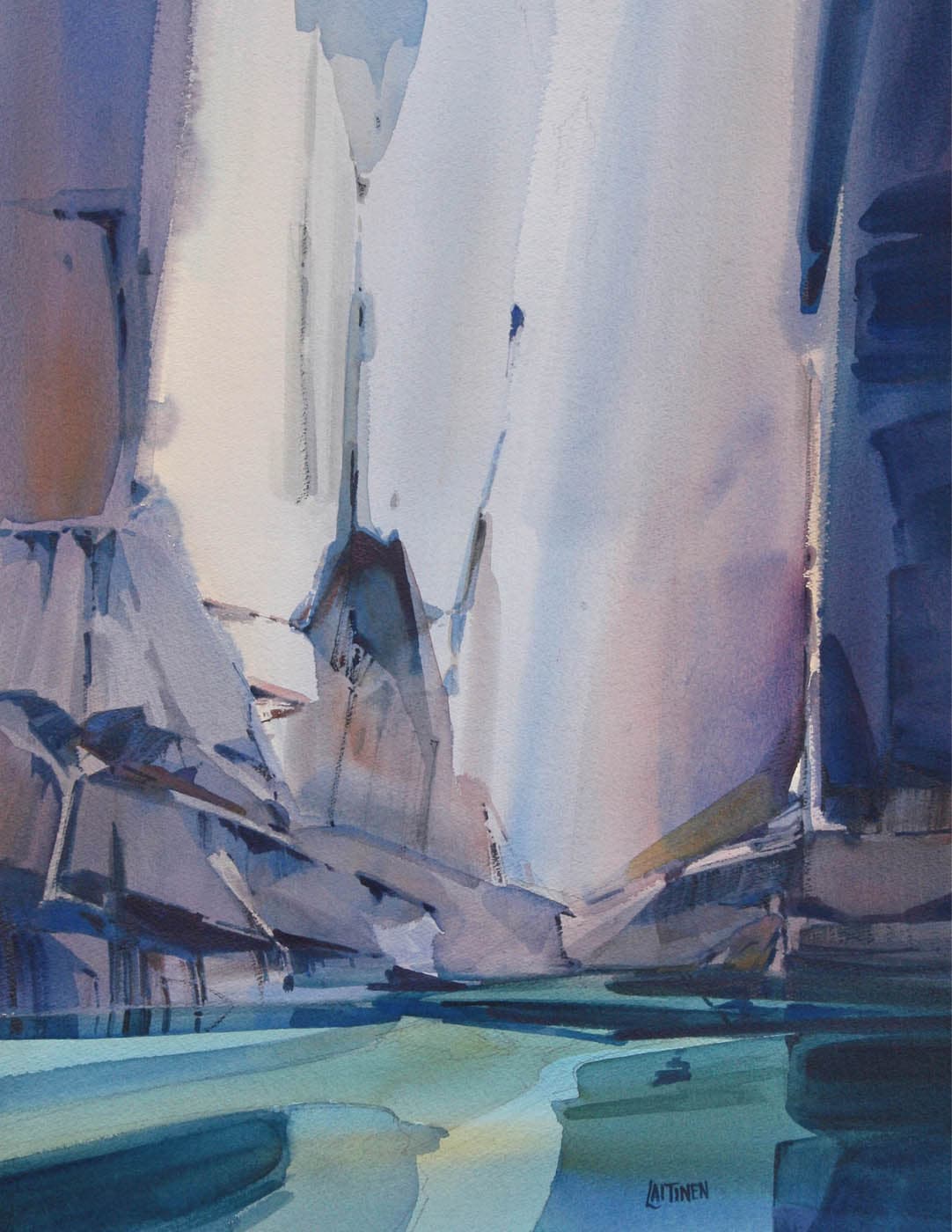
Watercolor on paper, 30" × 22" | 76 × 56 cm
There are so many pigment options—dozens in oil, acrylic, and watercolor and hundreds in pastel—that we couldn’t possibly use them all. Nor would we want to. Every palette must have limits.
In a genre that relies on color richness and diversity, restricting the number of pigments might seem contradictory to our mission. As with so many aspects of the painter’s practice, however, limiting options doesn’t actually limit us. It leads to better, more focused results. There are several advantages to working with a limited palette:
- A limited palette is practical and efficient. It simplifies color mixing because it doesn’t load up with every conceivable color, only those appropriate to the task at hand. What are the fewest colors you can use to achieve your intended harmony?
- Fewer colors produce mixtures that are more cohesive, which leads to more unified harmonies.
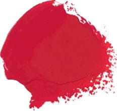
CADMIUM RED MED
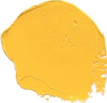
CADMIUM YELLOW MED
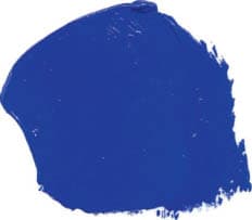
ULTRAMARINE BLUE
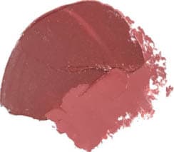
INDIAN or ENGLISH RED
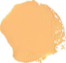
NAPLES YELLOW
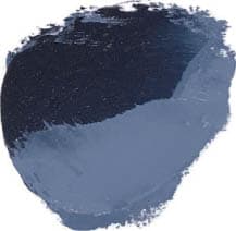
PAYNE’S GRAY
THE THREE-PRIMARY PALETTE
Painters are taught that they can mix any color the want from the three primaries (plus white). This is not entirely accurate. A three-primary palette can steer color mixtures in a particular direction and not allow the painter to mix any color they want. There are so many different types of reds, yellows, and blues, that depending on which primary is used, you will get different results. The TOP PRIMARY SET includes only saturated pigments. With these you could create both saturated mixes and (by mixing complements together) neutral mixes. The BOTTOM PRIMARY SET includes neutral versions of the primaries. These also allow you to mix a wide range of colors, but because these pigments are inherently neutral, the mixes would also be neutral. You would never be able to mix saturated colors.
ULTRA-LIMITED VS. LIMITED PALETTES
Some palettes are ultra-limited, with just red, yellow, and blue, plus white. Using so few colors forces painters to do more mixing, which in turn, helps them discover how colors can be mixed from the three primaries. For this reason, the ultra-limited palette is often prescribed to fledgling painters (although seasoned painters find benefit in working with it as well).
Most painters prefer to work with a slightly expanded, but still limited, palette, which might include eight, ten, or twelve colors. The additional pigments allow them to mix any color they want, but are still few enough to make the palette manageable.
For convenience, a painter might keep their most frequently used colors on their palette at the ready—but they won’t use all of them in every painting. When a painter considers a pigment’s properties—its value, its temperature, and its saturation level—and chooses it according to how it best fits the color strategy, they are targeting their palette.
For example, if the yellows in the painting need to be bright and saturated, then you would naturally select a yellow that is also bright and saturated, such as those from the CADMIUM or HANSA families. If the painting has more neutral harmonies, you might pick a more neutral yellow such as NAPLES YELLOW or yellow ochre.
Targeting is an essential part of the palette strategy. It directly supports the practice of color strategies and color grouping.
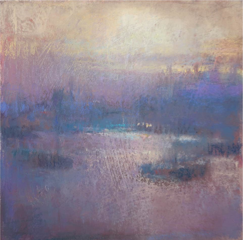
Loriann Signori, From Silence to Symphony
Pastel on paper, 8" × 8" | 20.5 × 20.5 cm
From the hundreds of sticks a pastel painter has, they pull out a smaller group that fits the color plan of the painting. For the pastel artist, this is their version of a targeted palette.
WHY WE TARGET: DIFFERENT PROPERTIES, DIFFERENT RESULTS
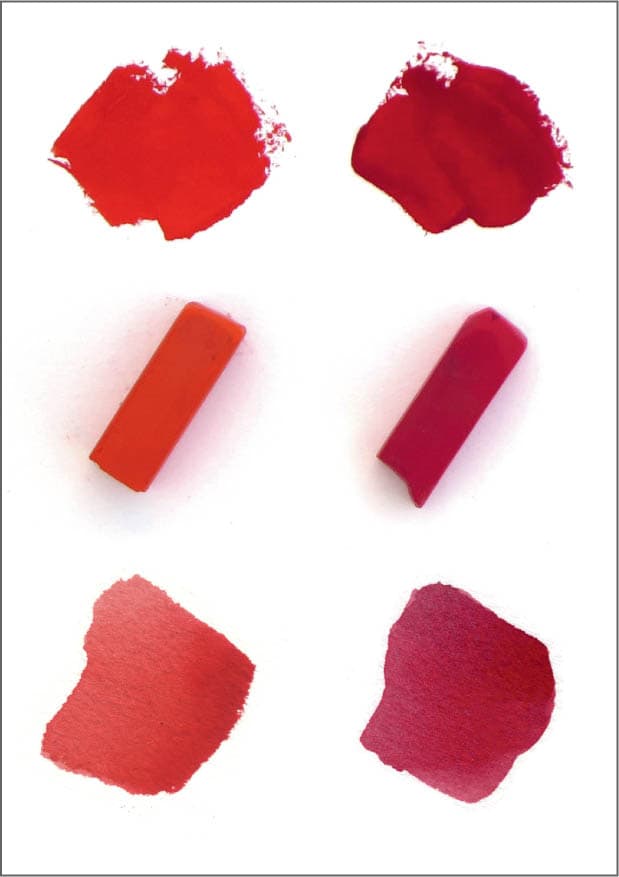
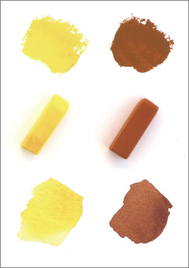
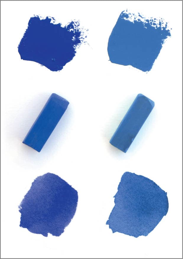
Why does choosing a particular blue or particular red matter so much? Because all colors are not created equal. Within any given color family there are many different pigment varieties, all of which have different properties. For instance, there are many varieties of blue, each with a different value, temperature, and saturation level. By understanding these properties, we can choose the pigments that best target the strategy. Below is a small sampling of the different properties of pigments within the same hue family. The top row shows colors in oil, the middle row displays an equivalent pigment in pastel, and the bottom row is watercolor.
DIFFERENT VALUES AND TEMPERATURE
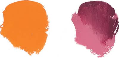
Two reds that differ in value and temperature: CADMIUM RED LIGHT (left) is lighter and warmer than CADMIUM RED DARK (right).
DIFFERENT VALUES AND SATURATION
Two yellows that differ in value and saturation levels: A lighter, more saturated HANSA YELLOW MEDIUM (left) and a darker neutral YELLOW OCHRE (right).
SAME VALUES, DIFFERENT TEMPERATURES
Two blues: ULTRAMARINE (left) and MANGANESE (right) are similar in value, but differ in temperature.
DEMONSTRATION: TARGETED PALETTE IN PASTEL
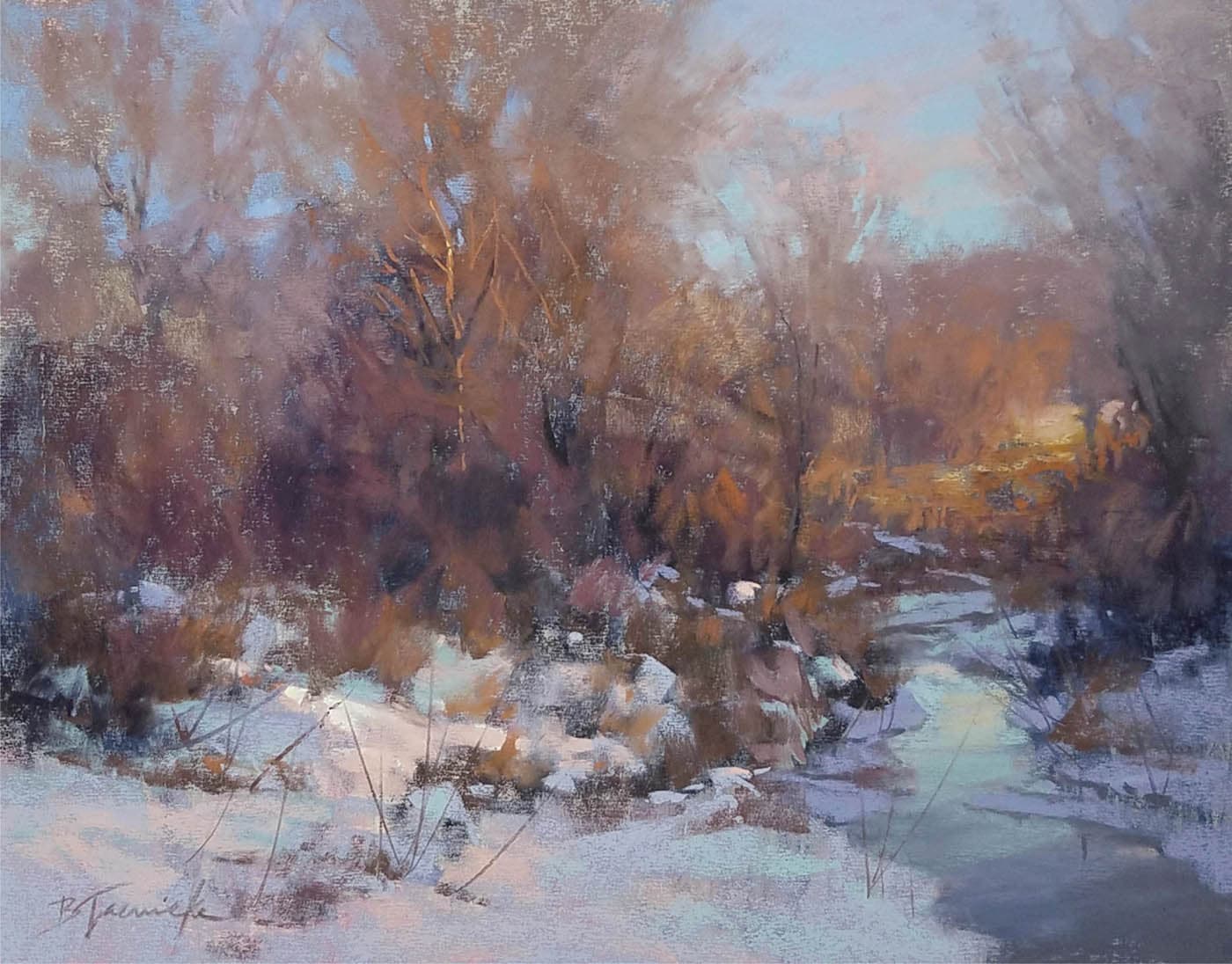
Barbara Jaenicke, Golden Light of Winter Day’s End
Pastel on mounted paper, 11" × 14" | 28 × 35.5 cm
Every one of Jaenicke’s paintings has a distinct color key. This is in large part because she builds a targeted palette based on a limited number of color groups. Jaenicke explains the relationship between individual colors and groups: “Once I establish the initial color groups, I build the rest of the palette using variations of value, temperature, and saturation of those initial colors, which facilitates the color harmony.” (Also see Jaenicke’s painting Remembering Spring on this page.)
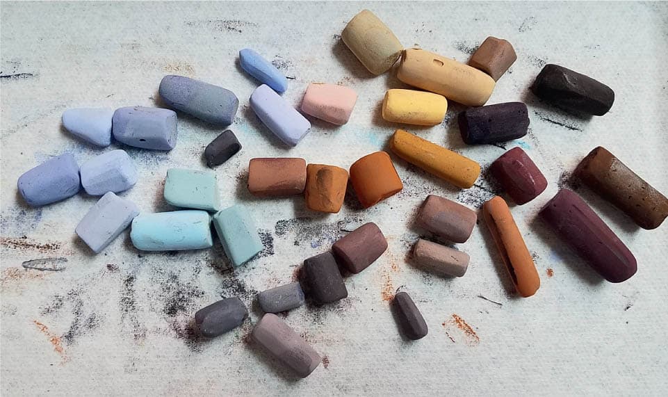
The thirty-five colors Jaenicke uses are all organized into two basic color groups: a cool-temperature group (formed by the blues and blue-violets) and a more dominant warm-temperature group (made up of neutral earth tones). Within each group there are variations of value, temperature, and saturation. There is no limit to the number of individual colors a painter may use in a painting as long as they are organized into a limited number of groups.
DEMONSTRATION: TARGETED PALETTE IN OIL
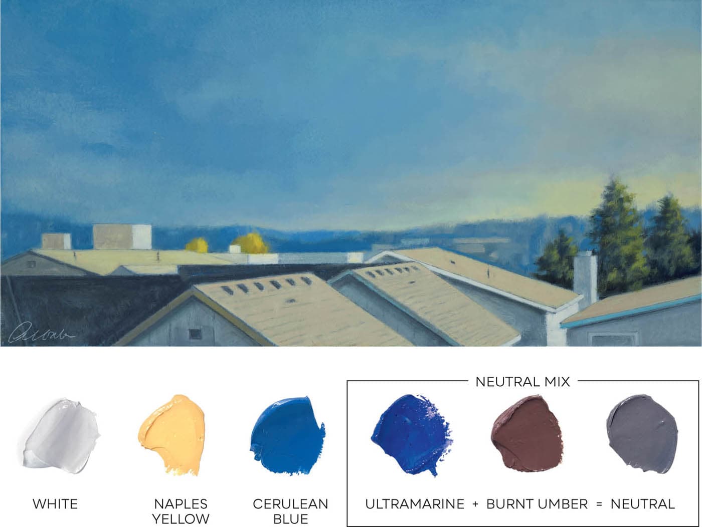
Mitchell Albala, Rooftops 59th Street, After the Rain
Oil on paper, 7" × 14" | 18 × 35.5 cm
After the Rain is a painting with a fairly neutral harmony. Colors range from slightly neutral (in the sky) to very neutral (on the rooftops and fronts of the houses). This palette will allow me to more easily create the neutral mixes I need. Using a limited palette will also help keep my color mixtures more unified.
OBSERVE: To help create my neutral mixes, I make a gray color by combining the neutral pigment BURNT UMBER and ULTRAMARINE, as shown on the right side of the palette. This neutral mix will be added to nearly every color in the painting. When there is a little more ULTRAMARINE in the mix, the mixture leans cool, as in the sky. When there is less ULTRAMARINE, the mixture is not as cool, as in the dark rooftop in the lower left and the fronts of the houses.
KEY AREAS
SKY: Ordinarily, I prefer a single blue on the palette, but in this painting, the sky needs a hint of warmth that can only be achieved with a warm blue like CERULEAN. Thus, the sky is made with both ULTRAMARINE and CERULEAN, then desaturated with the NEUTRAL MIX, and finally hints of NAPLES.
LIGHT ROOFTOPS: WHITE and little bit of BURNT UMBER creates the warm buff color of the light rooftops.
GOLDEN TREES: Even the seemingly saturated yellow trees are made with NAPLES YELLOW, which is like an earth yellow and less saturated than yellows from the CADMIUM or HANSA families. The light sides of the trees are made with NAPLES, and a little BURNT UMBER is added to create the shadows.
GREEN TREES: The sunlit side of the trees are made with a mix of NAPLES and ULTRAMARINE, while the shadows are a combination of the NEUTRAL MIX and ULTRAMARINE.
LIGHT ON HORIZON: The strip of light on the horizon is made with NAPLES and WHITE, but also contains a hint of blue-gray sky color. The sky also contains a hint of the NAPLES. This helps unify the two color zones of the sky.
A popular all-purpose palette used by many painters is the split primary palette. It is a compact palette with few enough pigments to keep color mixing manageable, but enough to allow one to mix nearly any color they want. It’s also lightweight (fewer tubes for oil and acrylic painters to carry), making it a good option for travel and working outdoors.
The strength of the split primary palette is that it includes two of each primary: a cool and a warm. That temperature difference covers a wider portion of the spectrum, increasing the range of possible color mixtures.
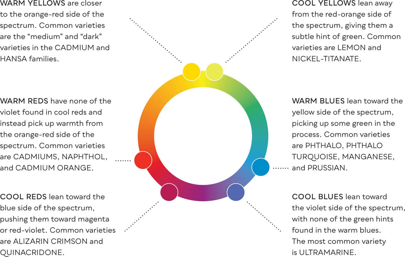
TAKING SIDES: COOL AND WARM PRIMARIES
The “cool” or “warm” labels we assign to pigments are based on which side of the spectrum they lean toward. For example, warm reds lean toward the orange side, while cool reds lean toward the violet side. Pastels are made from the same pigments as oil and water-based media and possess the same cool and warm attributes.
Colors in the split primary palette are usually saturated colors. However, those working with neutral harmonies (as a Tonalists do) can replace the saturated primaries with neutral pigments. For example, a CADMIUM or HANSA YELLOW might be replaced with YELLOW OCHRE or NAPLES YELLOW. (See “Two Roads to Neutrals”.)
SPLIT PRIMARY PALETTES AND PAINTINGS
As we see in the color wheel on the previous page, there are many different pigments that can fill the warm and cool slots on the split primary palette. The two split primary palettes shown here, from oil painter Scott Gellatly and watercolorist Bill Vrscak, each use a different set of primaries.
Note that the pigments in both split primary palettes are pure and saturated, yet the paintings have many colors that are neutralized to some degree. As with any palette, neutrals or grays will have to be mixed. (See “Two Roads to Neutrals”.)
REDS
(WARM) CADMIUM ORANGE
(COOL) QUINACRIDONE RED
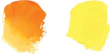
YELLOWS
(WARM) INDIAN YELLOW
(COOL) CADMIUM YELLOW LT.
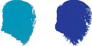
BLUES
(WARM) COBALT TEAL
(COOL) ULTRAMARINE
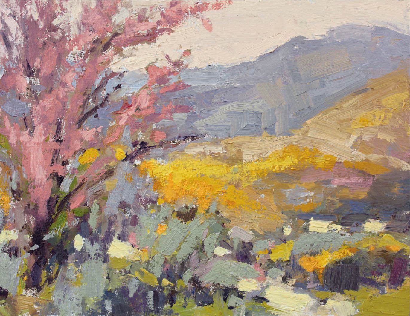
Scott Gellatly, Desert Flora
Oil on panel, 9" × 12" | 23 × 30.5 cm
When working outdoors, Gellatly uses a six-color-plus-white split primary palette. His choices maximize the temperature range within each primary. By using CADMIUM ORANGE instead of the more customary CADMIUM RED LIGHT, he gets an extra wide temperature range within the reds. (CADMIUM ORANGE is also richer than an orange produced by mixing red and yellow pigments together.) Straight from the tube, INDIAN YELLOW appears orange, but its tint is a distinctly warm, radiant yellow. COBALT TEAL has a stronger green bias than blues like PHTHALO or MANGANESE, so alongside ULTRAMARINE it allows for a wider temperature shift within the blues.
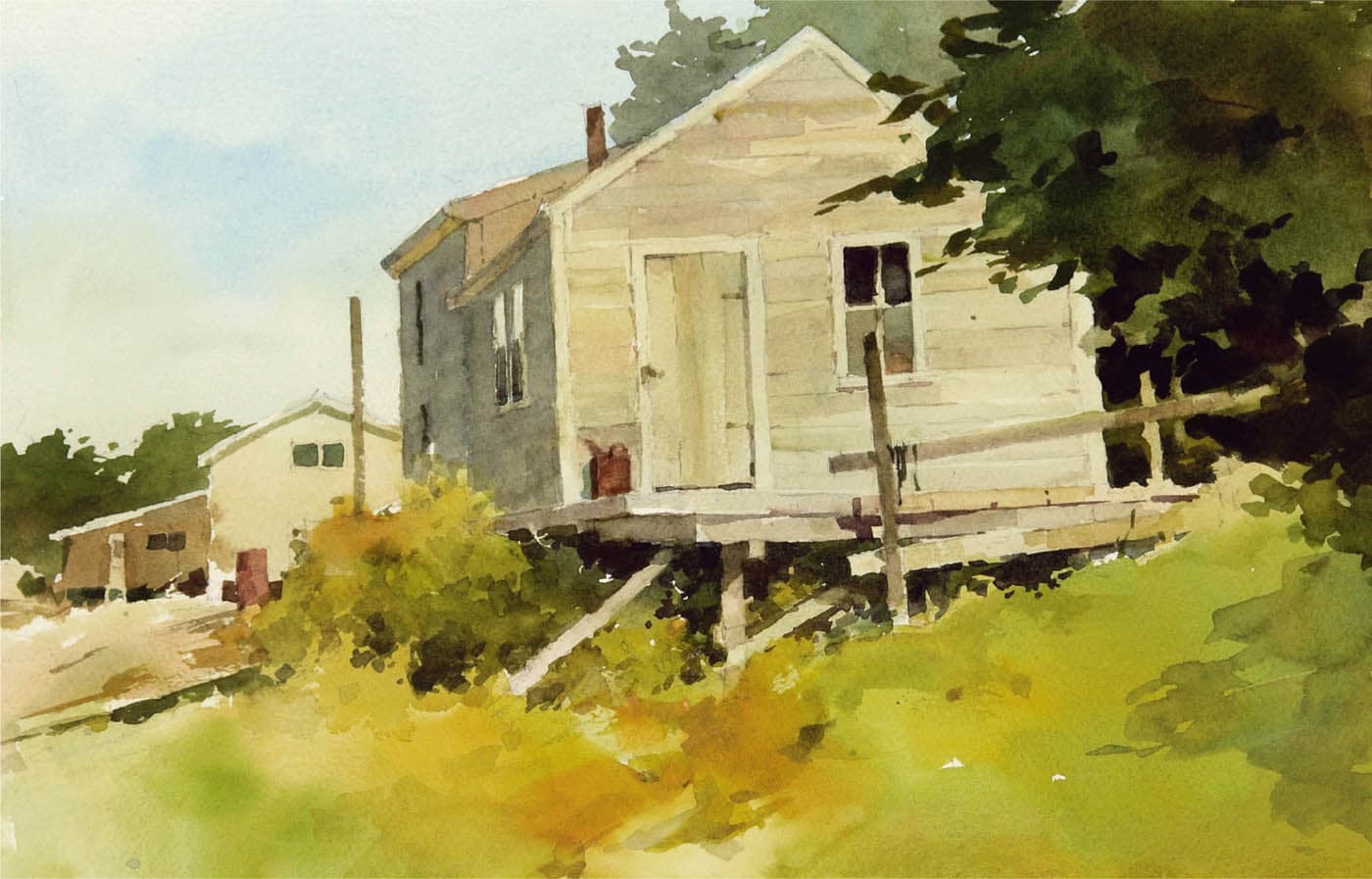
Bill Vrscak, Cap’n Jim’s Place, watercolor, 12" × 18" | 30.5 × 46 cm
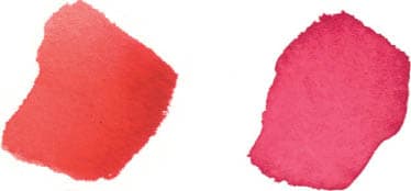
REDS
(WARM) CADMIUM RED
(COOL) ALIZARIN
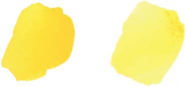
YELLOWS
(WARM) CADMIUM YELLOW
(COOL) AUREOLIN YELLOW
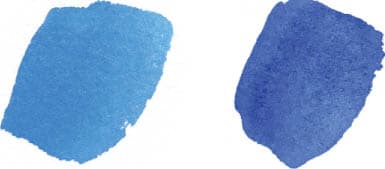
BLUES
(WARM) CERULEAN
(COOL) COBALT
Vrscak uses an entirely different set of primaries than Gellatly. This isn’t because watercolor is a transparent medium. Vrscak’s colors are also available in oil or acrylic. (And Gellatly’s colors are available in watercolor.) As with any palette, the artist chooses their colors according to how it meets their color intention and personal style. Vrscak says, “If the look of my blues and greens becomes too predictable, I will often change out some of the colors on my palette. For example, replacing AUREOLIN YELLOW with NAPLES or MANGANESE BLUE with CERULEAN.”
Every color that ends up in our painting has to be mixed, and neutral colors are no exception. Even painters who favor high saturation strategies rarely use fully saturated colors. This means that most colors need to be at least partially desaturated.
NEUTRALIZING WITH COMPLEMENTS
If you asked most painters how to desaturate or neutralize a color, they would tell you to add its complement. This is a tried-and-true method for creating neutrals. However, neutralizing complements rarely produce a “perfect” neutral without any color bias at all. They nearly always retain some of the hue identity of one of the complements. This color bias can be desirable, as it allows for more nuanced, color-based neutrals. But it also makes mixing complementary-based neutrals difficult to control. Often, we have to add a third color to achieve the neutral we want.
NEUTRALIZING WITH NEUTRAL COLORS
Alternatively, one can also create neutral mixes by using colors that are neutral to begin with. This approach is easier and more direct than mixing complements. Of course, you can also create neutrals with complements and neutral pigments.
NEUTRALIZING WITH COMPLEMENTS | NEUTRALIZING WITH NEUTRAL COLORS |
|
|
CADMIUM RED + PERMANENT GREEN | CADMIUM RED + BURNT UMBER |
|
|
CADMIUM YELLOW + DIOXAZINE PURPLE | CADMIUM YELLOW + YELLOW OCHRE |
|
|
ULTRAMARINE BLUE + CADMIUM ORANGE | ULTRAMARINE BLUE + PAYNE’S GRAY |
In each string, the color on the left is fully saturated. As its complement is added, the mix becomes progressively more neutral. Note the color bias of the neutral mix on the right. | You can also desaturate pure colors by adding pigments that are neutral themselves, such as BURNT UMBER, YELLOW OCHRE, RAW SIENNA, BURNT SIENNA, VAN DYKE BROWN, or PAYNE’S GRAY, to name a few. |
KEEP A COOL AND WARM NEUTRAL ON YOUR PALETTE

When including neutral pigments on your palette, consider having both a cool and a warm neutral. In combination, ULTRAMARINE BLUE and BURNT SIENNA can produce a wide range of both warm and cool neutrals.
Equal portions of ULTRAMARINE BLUE and BURNT SIENNA (plus white) produce a nearly perfect gray, with no color bias at all. When slightly more blue is added to the mix, the resulting neutral will have a cool blue bias. If there is more BURNT SIENNA in the mix, then it will have a warm bias.


