Chapter 1
THE BASICS

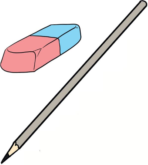
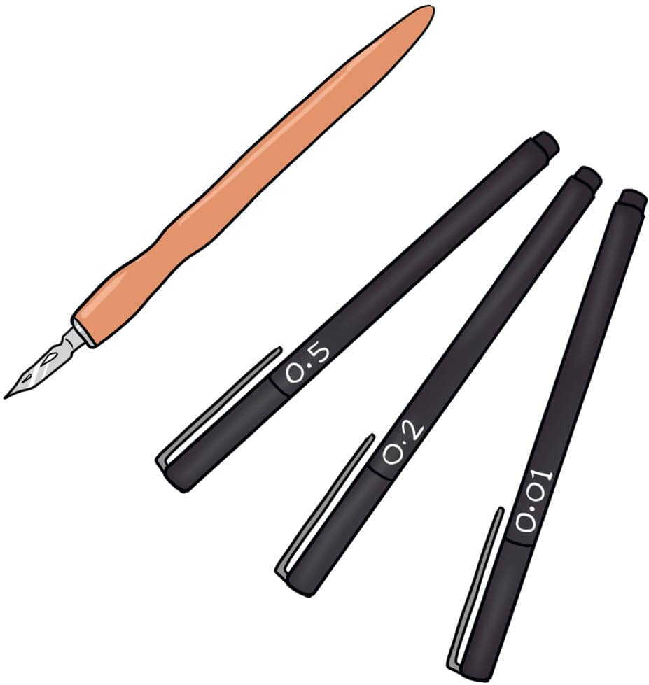
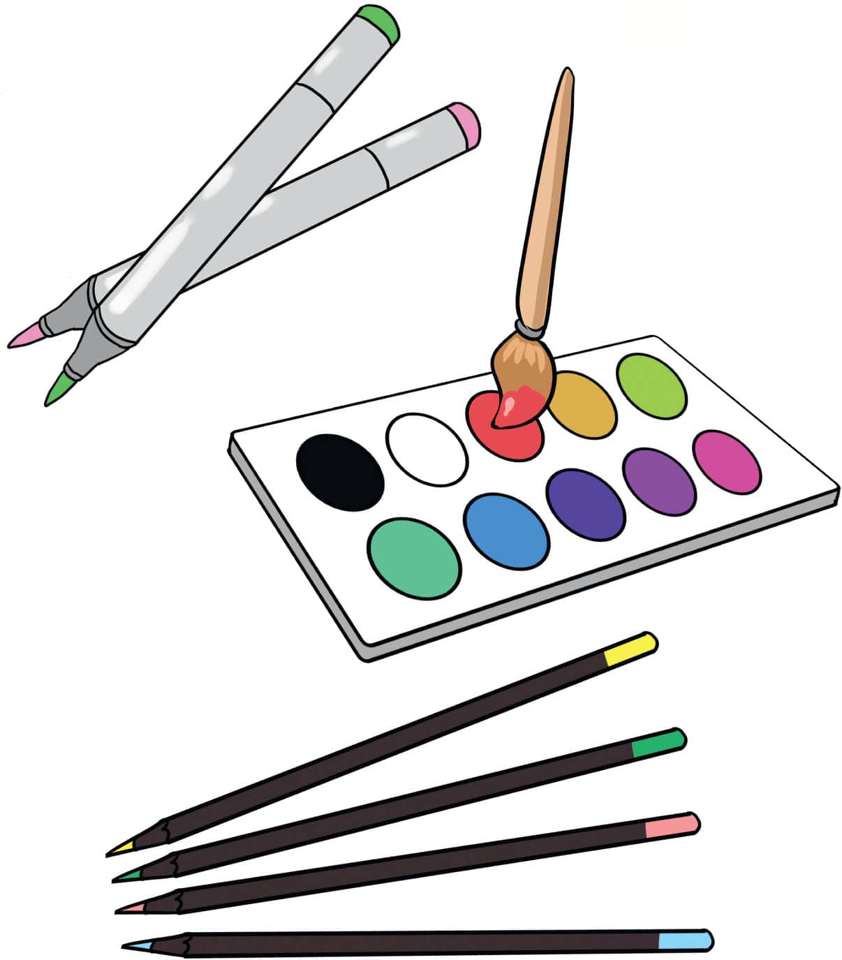
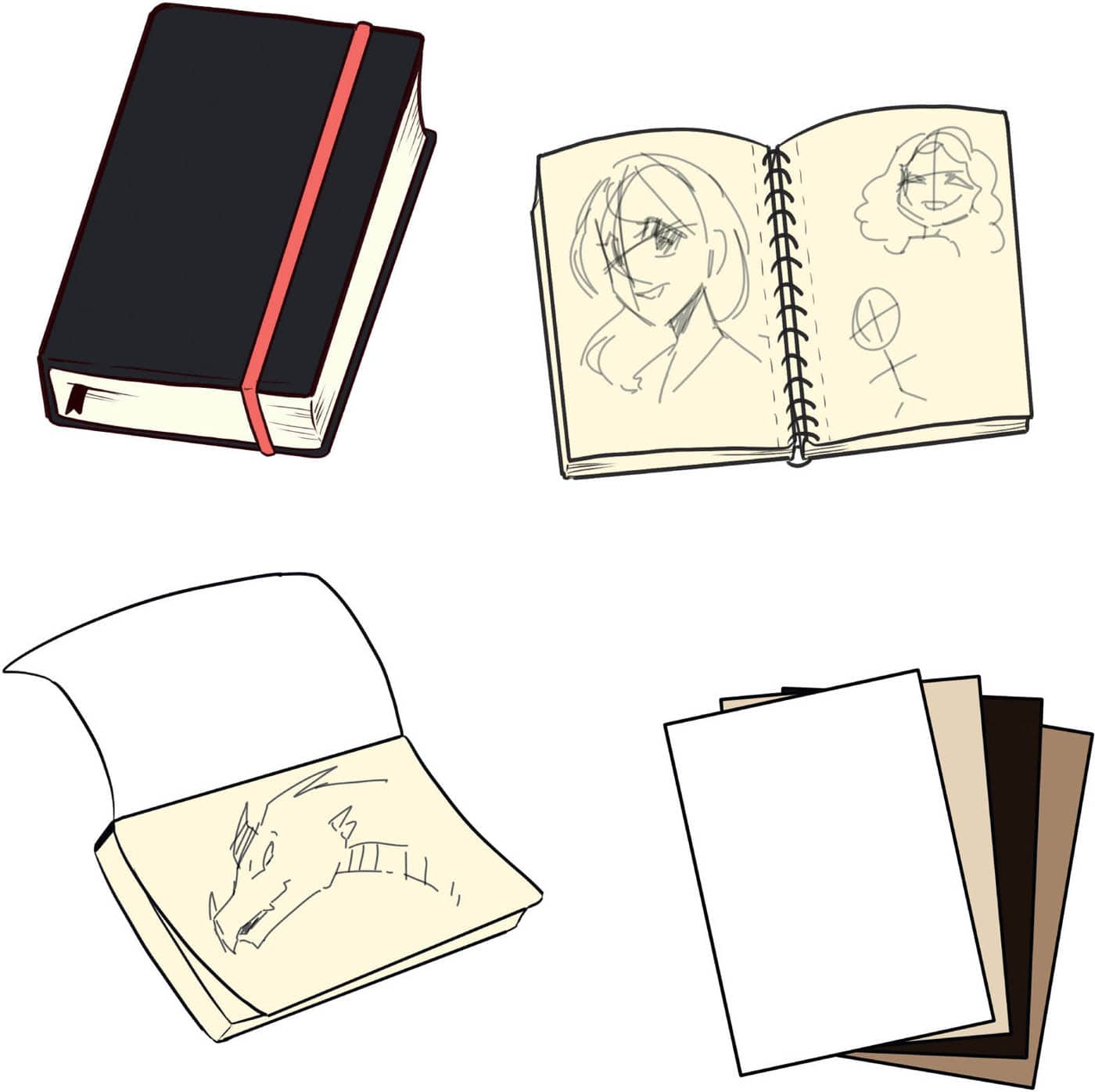
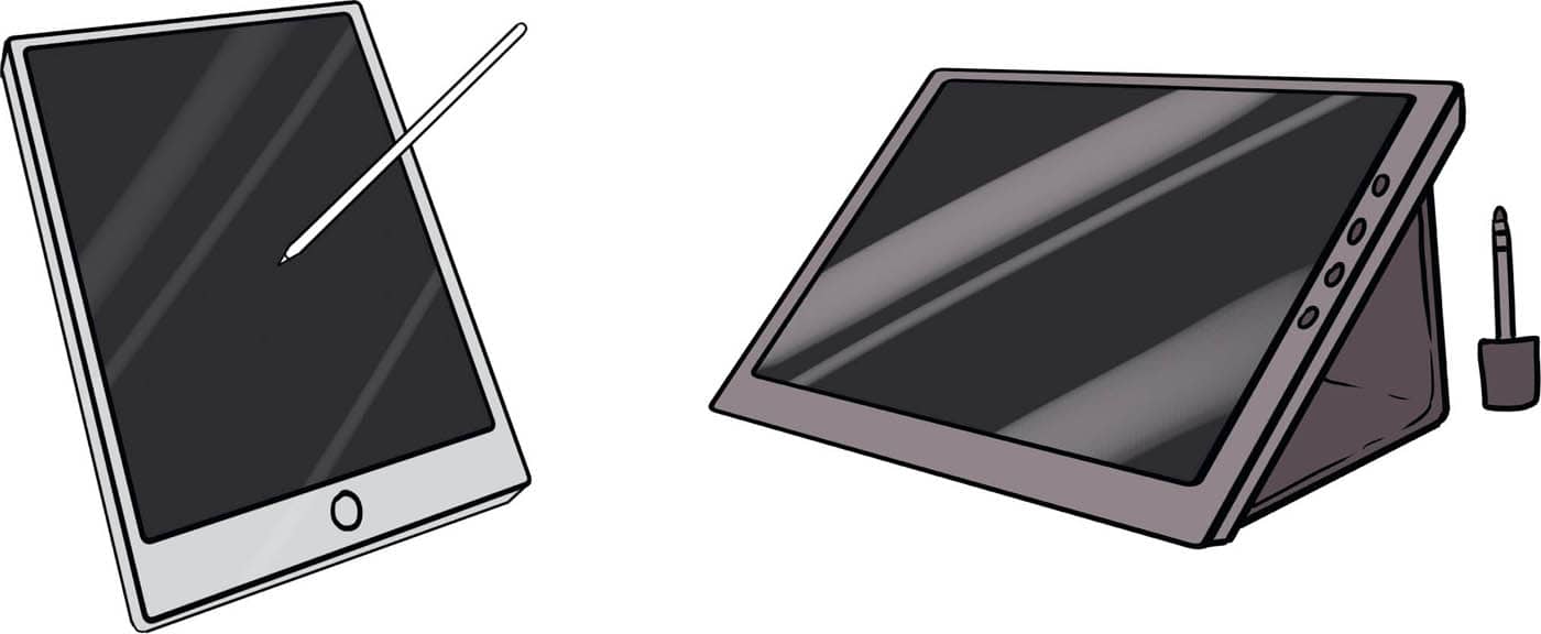
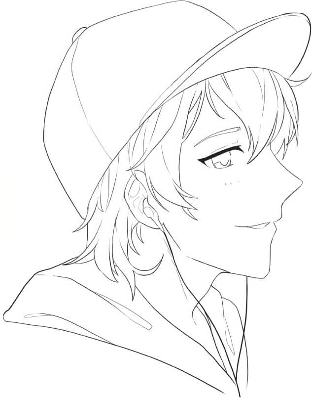
It is always helpful to have graphite pencils of a variety of densities. Make sure your pencil kit includes a light shade (2H), a medium shade (HB), and a darker shade (2B–6B). A popular choice for many mangaka is a mechanical pencil, which allows for different lead thicknesses and colors. Try different pencils and see what works best for you. Inking is an important part of the manga process, both as a major part of illustrating manga comics as well as the preparation stage for coloring. Manga artists like to use fine-line pens or dip pens for this stage. When using liner pens, make sure to have a variety of thicknesses. A great nib thickness range is from 0.03 to 0.5 or above, plus a brush pen. Many art supply stores sell these in ready-made sets to make starting your collection easier. Traditional manga illustrators use dip pens with interchangeable nibs. The most popular nibs for manga artists are the kabura pen for straight lines, G-pen for diverse thick and thin lines, and maru pen for extremely thin lines. If you are a beginner at inking, try liner pens first, and then move on to dip pens once you become more confident. Four popular coloring media for manga are alcohol markers, watercolor, gouache paint, and colored pencils. Alcohol markers are a popular choice among mangaka for their superior blending and color range. Use watercolor for backgrounds and light, transparent elements. Gouache is more opaque than watercolor and can be used for any part of an illustration. White gouache is often used for highlights and finishing touches. Colored pencils are the perfect finishing layer on top of paint and markers to add deeper coloring blends and textures to your piece. Experiment with them and see what you love! Choose your paper depending on the medium you are using. Unless practicing, avoid using generic printer paper. Wet media such as watercolor or markers will need thicker paper, as opposed to dry media such as colored pencils. Mixed-media paper is a great all-round option if you aren’t sure what you need. Use bound sketchbooks for practicing. For in-depth illustrations, use sketchbooks with easy-to-tear paper so you can display your completed drawings. You can draw manga digitally as well. Generic-use tablets with pens can be used for digital drawing, with more and more drawing apps becoming available at a low cost or even for free. Many web-based manga, such as webcomics, are created digitally, so it doesn’t hurt to be versed in both traditional and digital options. If you’d like to invest in higher-quality digital drawing tools, there are many to choose from. Graphics tablets that connect to computers are very popular, but before investing a lot of money in a graphics tablet, research your options and test some out to make sure the tablet you buy is right for you.PENCILS
INK
COLORING TOOLS
PAPER
TABLETS
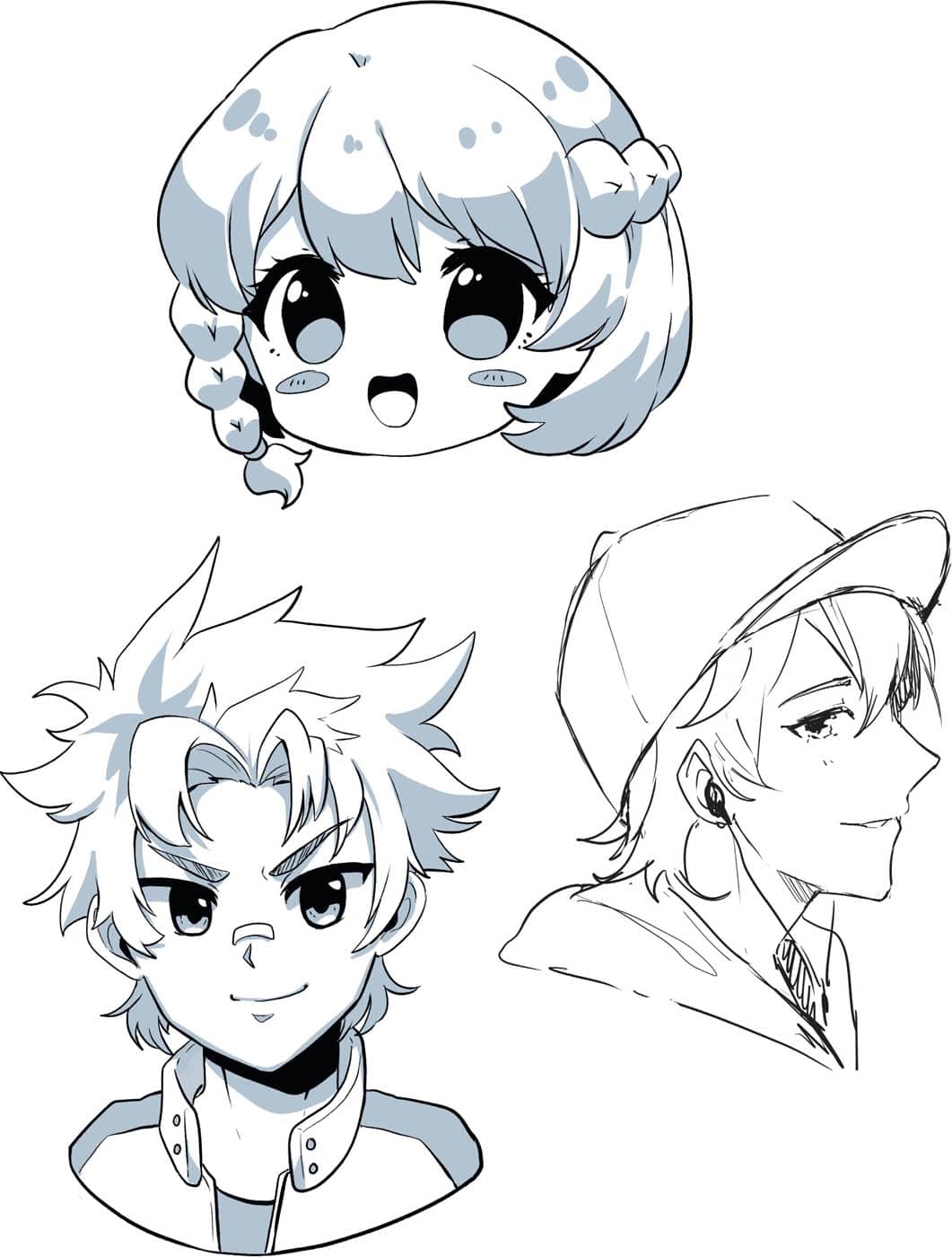
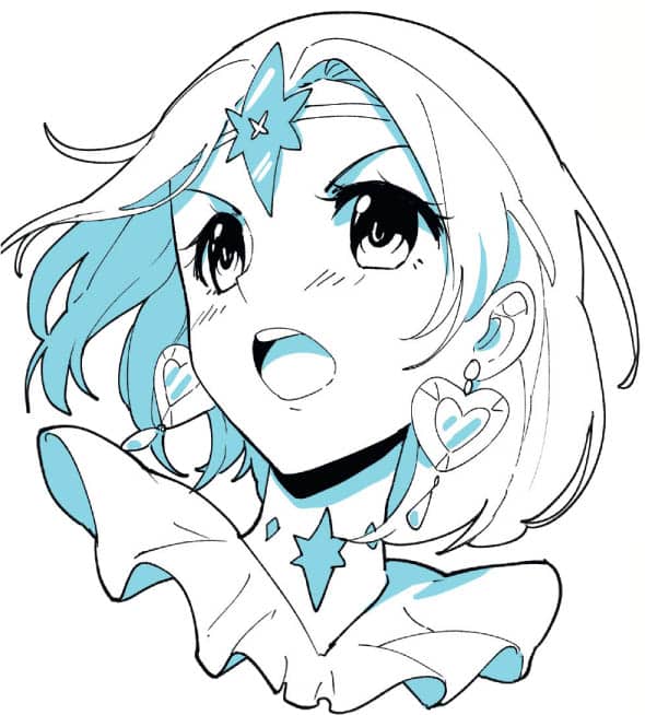
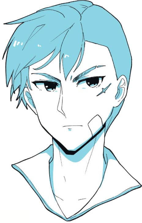
The word shonen translates to “young boy” in Japanese. This style is called shonen because it is commonly used in manga that are aimed toward young teen males. They tend to have male lead characters with lots of action, and the drawing style is usually sharper with bold and bright colors. Similar to shonen, the word shojo translates to “young girl” and is the manga style used in stories marketed to girls and young women. This style is much softer both in the drawing application as well as the colors chosen. These stories are often based around themes such as romance and have strong female leads. Although not a dominant style in manga art, slightly stylized realism is commonly seen in genres for older audiences, particularly in horror and action. This style can now be found throughout all genres, as more manga artists have emerged who prefer the realistic style. Chibi translates to “small” or “short” and is a fun style common in comedy manga or stories for younger children. It is characterized by exaggerated proportions, with large heads and eyes accompanied by small bodies. The faces are very expressive.SHONEN

SHOJO
REALISTIC

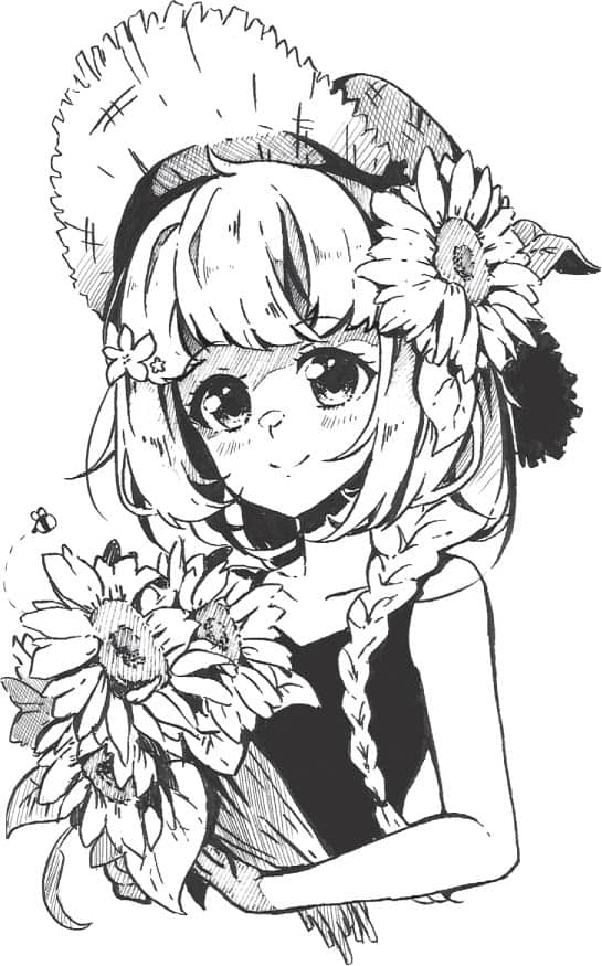
CHIBI

Fantasy is a hugely popular genre in all media, and manga is no exception. You can have fantasy creatures, people, vehicles, and even entire worlds. A manga creator’s world-building creativity can shine in this genre! The slice-of-life genre is all about the beauty of everyday life and features normal people in believable situations. The reader can’t help but root for the main character and whatever they want to achieve. This genre is usually paired with romance or comedy. A branch of the fantasy genre in manga is magical girl or guy. These plots are usually a marriage of slice-of-life and fantasy genres. Powers are bestowed upon normal characters who then become fantastical beings. These characters achieve amazing feats such as saving the world. Romance is a theme often central to slice-of-life manga stories. However, a good romance story can be found in almost every genre. Thrilling action, both of a fantastical or believable nature, is a staple found in many popular manga series. The comedy genre is usually set in normal, everyday life. These stories revolve around comical, weird, or crazy situations and tend to have highly stylized art to assist its comedic and lighthearted nature. Many successful and interesting manga stories have based their characters and plots around different sporting activities. Volleyball, basketball, soccer, and swimming have been the basis of quite a few manga and anime series.FANTASY
SLICE OF LIFE
MAGICAL GIRLS & GUYS
ROMANCE
ACTION
COMEDY
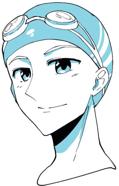
SPORT
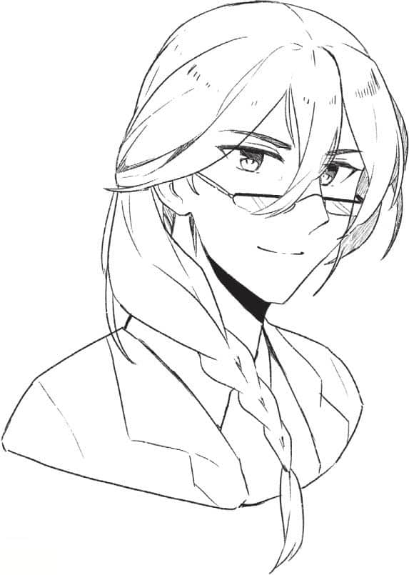
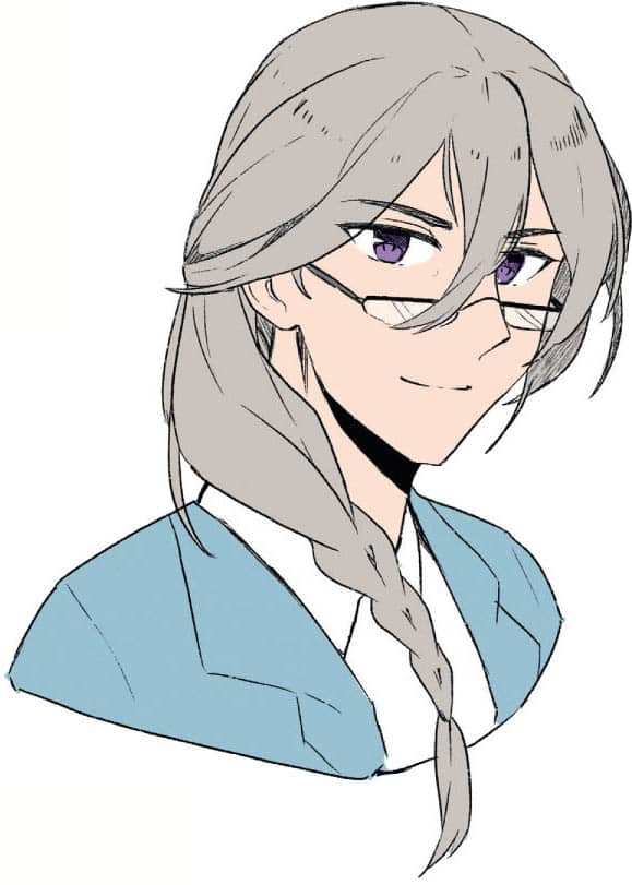
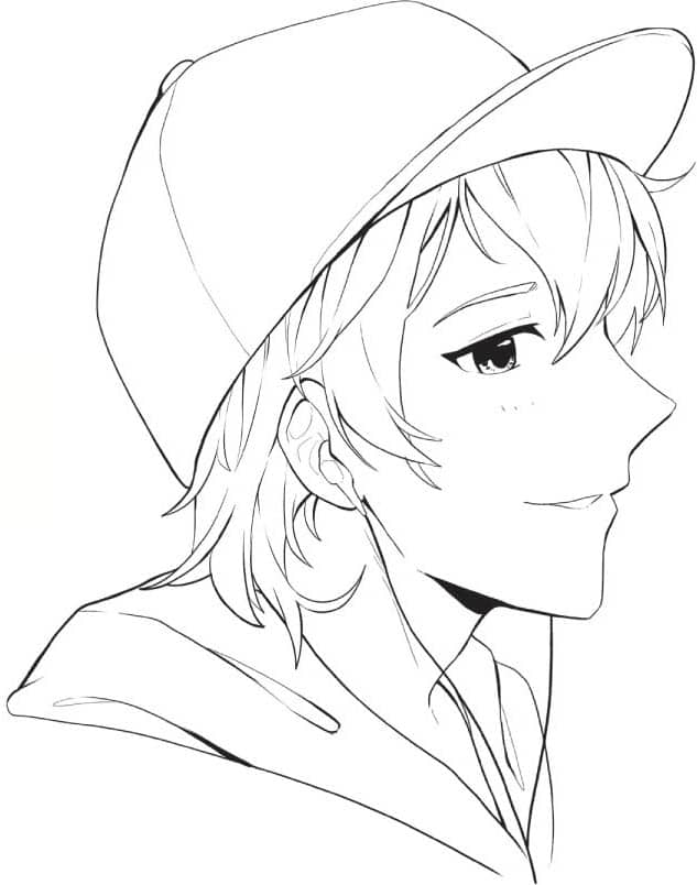
Line art is the stage after sketching in which you use a liner pen or dip pen to outline the lines of the drawing that you want to keep. After applying line art, you erase your sketch and are left with beautiful, clean lines minus all the guidelines used when first sketching. This is then taken into the coloring stage or the inking stage. Inking is used when creating black-and-white manga panels with blocked-in shadows and dark colors with solid black. This is to enhance the depth of the drawing when color cannot be used to do that. Here is a breakdown of this line art and inking process. 1 Complete your sketch and tidy it up. The neater the sketch, the easier lining will be. There’s nothing worse than going in with a pen not knowing which lines you actually want to keep. 2 Using a thin liner pen or nib, trace over the lines you want to keep. Make sure you’re not holding the pen too tightly or else your lines will come out scratchy and shaky. Have a loose wrist and take your time. 3 To make the line art more dramatic, go in with a slightly thicker pen and darken areas where lines meet or where there is shadow. These usually occur under the neck, around the hairline and in clothing folds. After finishing this stage, you can color or ink it. 4 To ink a manga story or for black-and white-art, go in with a black brush pen and block in shadows and dark areas or patterns. Make sure to leave some white areas to give contrast and add depth to your drawing. Other shading techniques such as crosshatching or stippling can also be used in inking to produce more natural shading gradients. Shading conveys depth and volume in your drawings, making them look more three-dimensional, because you show how light and shadow reflect off of your subjects. There are a few different ways to shade using inks, as shown below. Hatching is good for slightly dark areas. Crosshatching produces texture and darkens a little more than one-way hatching lines. Stippling is a time-consuming shading technique but produces natural gradients. To stipple, apply small dots in different densities. Full black ink is for the darkest parts of the illustration.INKING A DRAWING
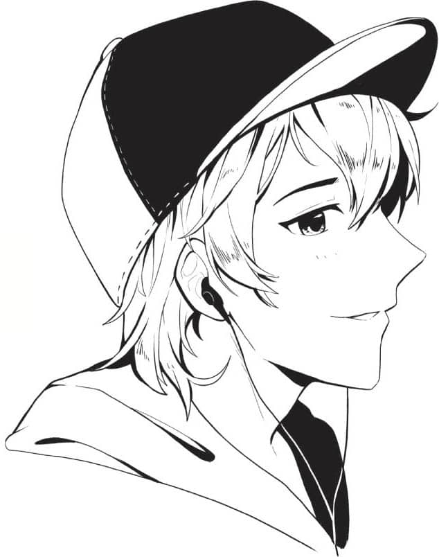
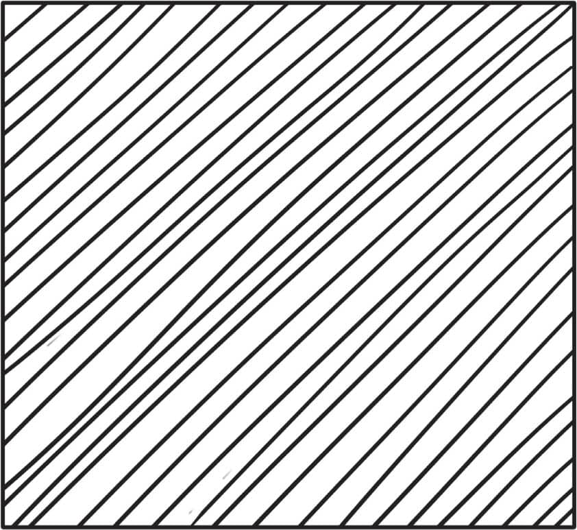
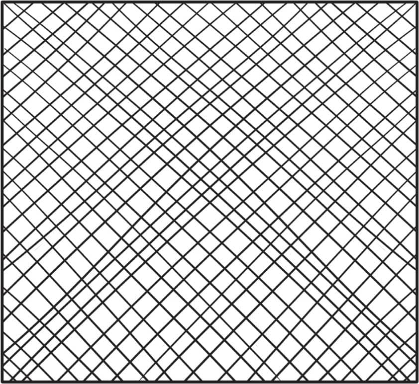
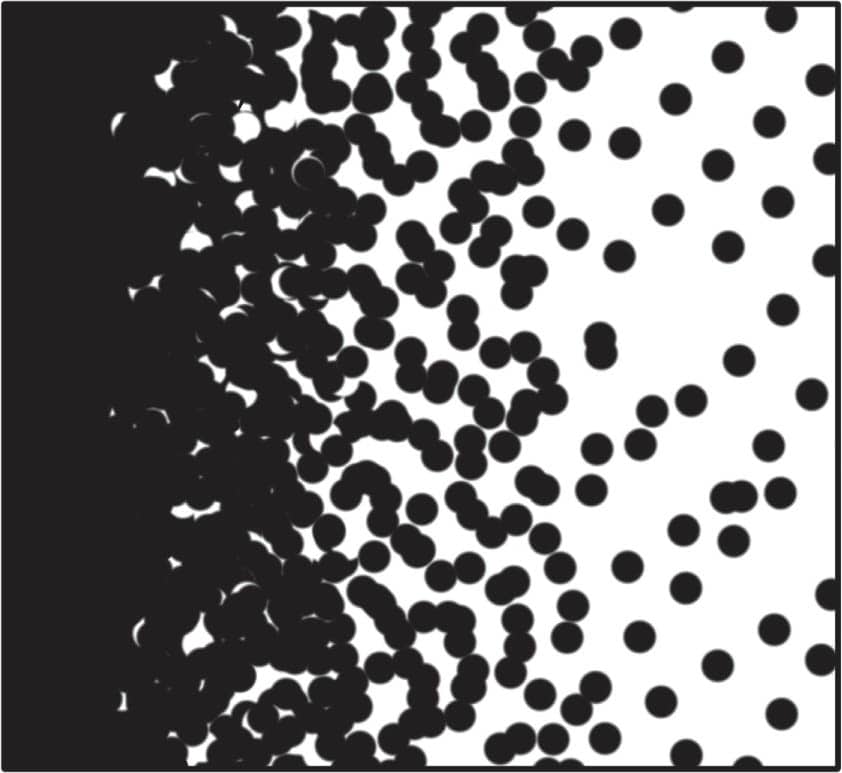
SHADING WITH INK

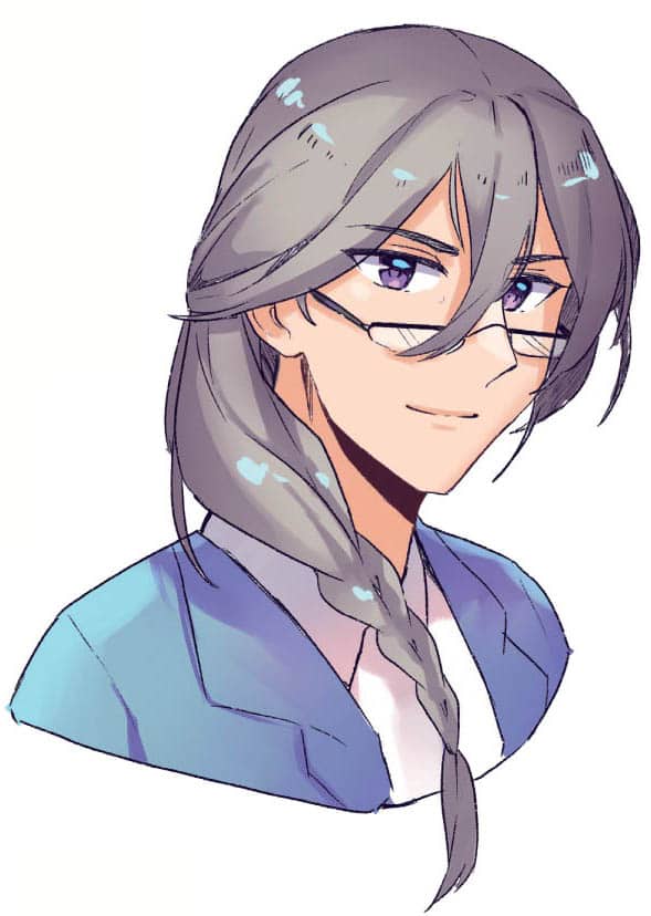
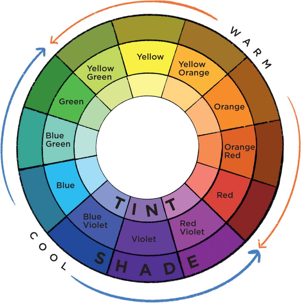
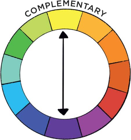
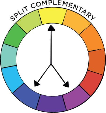
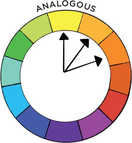
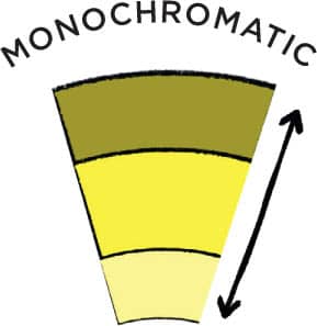
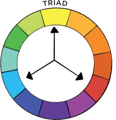
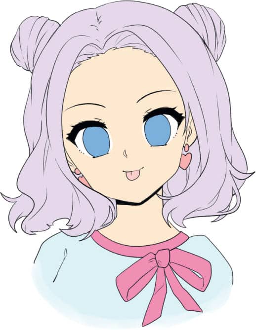
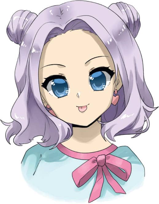
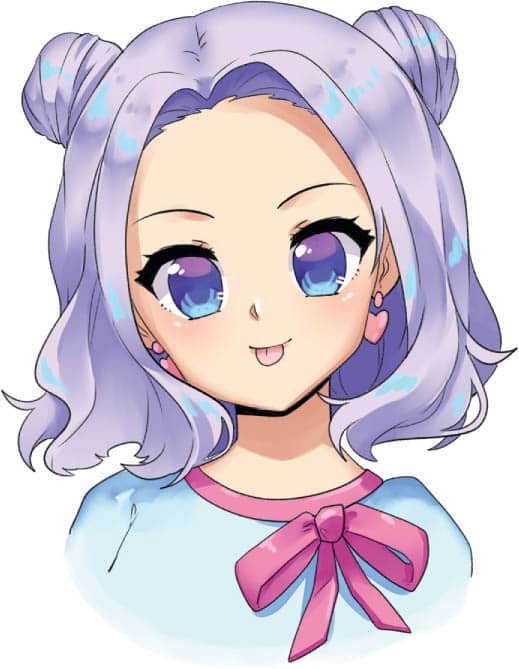
When choosing color palettes, have a color wheel handy! Knowing the colors’ relationships to one another can help inform you how and when to use them in your drawing. Complementary colors are directly opposite each other on the color wheel. When mixed together, these colors create “true gray.” Pros: Complementary colors have great contrast. Cons: Because they mix to make gray, the colors can look muddy if they are mixed too much in the drawing. Split complementary colors include the main color and the two colors on either side of the main color’s complementary color. Pros: Quick and easy pallet inspiration. Cons: Not as much contrast as the complementary color. Analogous colors are the ones directly next to your chosen color. Pros: Analogous colors look pleasing together. Cons: There is not a high contrast, possibly making it less interesting than other color choices. Monochromatic colors are the various tints, tones, and shades found in a single hue (color). Pros: An easy-to-manage color choice, monochromatic colors will always work well with your chosen color. Cons: With limited contrast, this color choice could become visually uninteresting. Triad colors are all evenly spaced from each other on the color wheel. Pros: Triad colors work harmoniously together, while maintaining contrast. Cons: You will not see as much contrast as with complementary colors. Many beginner manga artists shade with monochromatic colors. They choose their base color and add black to the color for shading. Although this does work to an extent, it leaves the drawing looking muddy and not as intense or interesting as it could be. Instead, when choosing a color for shading, slightly change the hue and then use a shade of that color. For example, if your base color is yellow, rather than just using a “darker” yellow, move to yellow-orange and then find a shade color from there. Base Color Both of the following drawings have the same base color (shown above). The second image was colored with monochromatic colors and looks bland and dull when compared to the last image. This image was shaded with slightly warmer and cooler hues than the base color. Although the change is small, the outcome is totally different! Monochromatic Shading Shading with Hue and Tone There are many ways to work when coloring traditionally, depending on the medium you prefer using. Follow along with the villain step-by-step drawing project on this page to see in-depth instructions for coloring with alcohol markers. Here are some tips to help you color traditionally. 1 Have your line art ready and make sure the ink is dry before coloring. 2 Color in the lightest colors for the base. Leave areas white where highlights will be. 3 Shade the base color, still leaving the white highlights. It’s usually easiest to work light to dark, but that can change depending on the drawing, so use what method works best for you. 4 With ink or gouache, paint in the highlights on hair, skin, and eyes. If you’d like to get into drawing digitally, below you’ll find some tips and tricks to help get you started. See the hero drawing project on this page for step-by-step digital coloring instructions. 1 Have your line art ready and open in your drawing software, either drawn using the software or scanned into your computer after drawing it on paper. 2 Block in the base colors in a new layer under your line art layer. Have each section on a different layer (skin, hair, clothes etc.). 3 Shade each layer by adding a new layer on top of the base color. Set layer to “multiply” for even shading. 4 Add in highlights and any extra shadows, and you are all done!THE COLOR WHEEL
A BETTER WAY TO SHADE
COLORING TRADITIONALLY
COLORING DIGITALLY