Although it can seem as though browser development is moving at a glacial pace, a lot has happened in the past decade. In this chapter, we’ll take a look at some of the concepts that are part of the CSS3 draft specification, and those that browsers have already implemented, giving us a chance to have a peek into the future of CSS.
The techniques described in this chapter are taken from working drafts of CSS3, and any of these aspects could change substantially before becoming a final recommendation. What is clear, however, is that the W3C is looking at new ways to solve the problems that exist in laying out our pages using CSS; some interesting proposals are being developed to help ease those difficulties.
By way of a quick clarification, CSS3 is the next version of CSS, currently being developed by the W3C. In any discussion surrounding CSS3, you’ll likely come across references to the specification being “modularized.” All this means is that the different parts of the specification have been split up into modules; for example, one module for selectors, another for positioning, and so on. Breaking the specification into modules allows different parts of the specification to progress and become an official recommendation at different times.
Therefore, browser vendors can begin implementing completed modules more quickly, without needing to wait for the entire specification to reach completion. As we’ll see in this chapter, some modules are more advanced than others and even have working implementations in browsers that we can try out. Other modules are at a very early stage, so we can only describe what promises the current working draft is making for them. I hope that you will agree, after reading this chapter, that there are some very interesting innovations on the horizon for CSS!
First up, we’ll look at the eagerly anticipated opportunity for developers to create newspaper-like columns in their layouts; I give you the CSS3 multi-column layout module. In a multi-column layout, you have a single block of text that’s formatted into multiple columns; the text flows down column one, then continues at the top of column two, and so on. Currently, if you have a block of content that you’d like to display in three even columns, you have to try to work out where to break the content and start the next column. The locations of column breaks are very difficult to predict when you’re not formatting each page by hand; for example, this is the case with most database-driven web sites that generate pages dynamically.
With traditional layout techniques, we have to carefully tweak the column markup to achieve the effect we want. Here’s some sample markup for a multi-column layout:
<div class="wrapper">
  <div class="col1">
    <p>Lorem ipsum dolor sit amet, consectetuer adipiscing elit.
        Fusce porttitor porta magna. … Nullam
        pulvinar nisl viverra risus dapibus cursus.</p>
    <p>Aliquam tristique tristique massa. … Donec vestibulum
        elementum urna. Aenean convallis luctus lacus.</p>
  </div>
  <div class="col2">
    <p>Ut tincidunt turpis quis sem. … Sed pellentesque, neque
        ac iaculis congue, sapien est convallis nibh, eget
        posuere eros leo quis mauris.</p>
  </div>
  <div class="col3">
    <p>Sed ullamcorper, elit eget dignissim blandit, … Donec
        eget massa. Nam eget est et nisl vestibulum iaculis.</p>
  </div>
</div>
In the above markup, we’ve had to manually place an even amount of text within each column. Here’s the accompanying CSS:
.wrapper {
  width: 80%;
}
.col1, .col2, .col3 {
  width: 30%;
  float: left;
  margin-right: 2%
}
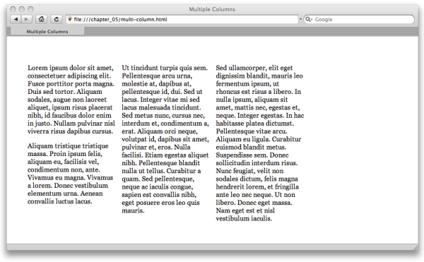
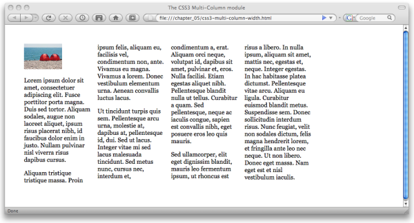
We can achieve the effect shown in Figure 5.1 with careful tweaking of text
in the three div elements and application of the above
CSS. However, if any of the content changes we then have to reflow the
whole thing; a less than satisfactory situation!
The CSS3 multi-column module will allow you to divide a block of content into a specified number of equal-height columns. All we need to recreate our example above, as far as markup is concerned, is the following:
<div class="multi-wrapper">
  <p>Lorem ipsum dolor…</p>
  <p>Aliquam tristique…</p>
  <p>Ut tincidunt turpis…</p>
  <p>Sed ullamcorper…</p>
</div>
In the above markup all we need is a parent block element, into which we then place all the content paragraphs. The following CSS will create our columns:
.multi-wrapper {
  width: 80%;
  column-count: 3;
  column-gap: 1em;
}
Specifying a column-count value for the containing div
will automatically turn the block of content into three equal-height
columns. The column-gap property is used to set the width of the gutter between columns. In
the case of a fluid layout, resizing the browser window will cause the
columns to reflow; the browser works out the size of the columns and where
to break the content. If your page content is dynamic, as long as the
content is placed within the correct container, the browser will do all
the work for you.
Happily, we can put this module through its paces—it’s been
implemented in Mozilla Firefox since version 1.5 and Safari since version 3. In order to see it in action, you’ll need
to prefix the properties with a vendor extension identifier:
–moz- for Mozilla Firefox, and
–webkit- for Safari:
.multi-wrapper {
  width: 80%;
  -moz-column-count: 3;
  -moz-column-gap: 1em;
  -webkit-column-count: 3;
  -webkit-column-gap: 1em;
  column-count: 3;
  column-gap: 1em;
}
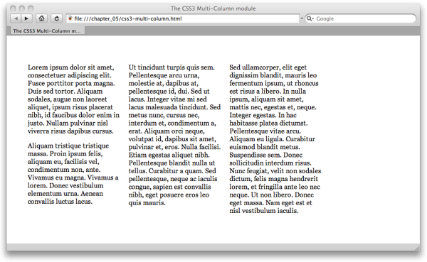
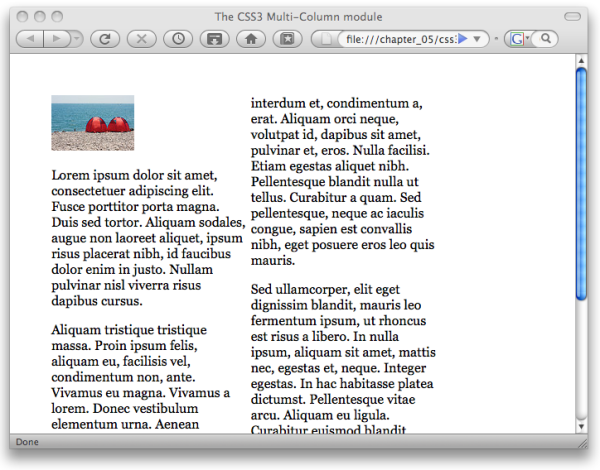
If you open the example in Safari, you’ll see the contents formatted evenly into three columns, as shown in Figure 5.2.
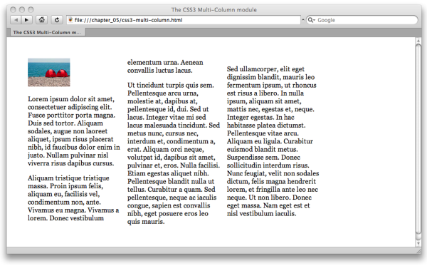
If you add more content or perhaps an image, the text will reflow to remain evenly distributed across the columns, as you can see in Figure 5.3.
Another way to break your text into columns is to specify the width that you’d like your columns to be; the browser will create more or fewer columns depending on the amount of available space. All we need to do is a quick CSS modification:
.multi-wrapper {
  width: 80%;
  -moz-column-width: 10em;
  -moz-column-gap: 1em;
  -webkit-column-width: 10em;
  -webkit-column-gap: 1em;
  column-width: 10em;
  column-gap: 1em;
}
The column-width property allows us to specify our desired column
width—10em in the above CSS excerpt. Figure 5.4 shows the result in
Firefox: a four-column layout. However, if we reduce the window
size, the content is reformatted. Figure 5.5 demonstrates Firefox’s reduction of
the content to two columns when we reduce the width of the browser
window.
The following list details the other properties defined in the CSS3 multi-column layout module, along with their equivalent vendor specific extensions where appropriate:
columns-
This shortcut property allows the specification of the
column-countandcolumn-widthproperties in one declaration. column-rule-color-
This property works like
border-colorand allows the color of the rule between columns to be specified. You can also use-moz-column-rule-colorin Firefox 3.1 and up, and-webkit-column-rule-colorin Safari 3 and up. column-rule-style-
Like
border-style, this property allows the style of the column rule to be specified. You can also use-moz-column-rule-stylein Firefox 3.1 and up, and-webkit-column-rule-stylein Safari 3 and up. column-rule-width-
Just like
border-width, this property allows the specification of the column rule width.-moz-column-rule-widthis available in Firefox 3.1 and up, and-webkit-column-rule-colorin Safari 3 and up. column-rule-
This shorthand property acts in the same way as the
borderproperty, specifying all the column rule properties in one declaration; for example,column-rule: 1px solid #000;. You can also use-moz-column-rulein Firefox 3.1 and up, and-webkit-column-rulein Safari from version 3. column-span-
You can use this property to specify that an element should span two or more columns.
column-balance-
This property takes a value of
balanceorauto, and is used to specify that the browser should try to balance the columns or fill them sequentially. column-break-beforeandcolumn-break-after-
For paged media, these properties are used to specify where columns should break when running onto another page. They take the values
always,avoid, andauto.
Note: Using Vendor-specific Extensions
Many browser vendors have implemented extensions to the CSS
Specification. Vendor-specific extensions allow browser vendors to experiment with implementations
of parts of the specification that aren’t yet at Recommendation level,
and so are subject to change. The use of the dash
(-moz- for the Mozilla Foundation, -ms- for Microsoft,
-o- for Opera, and -webkit- for the Webkit Open
Source Project used by Safari) is the W3C-recognized way for extensions to be implemented. By
using this method, a browser vendor can be sure that the CSS
Specification will never include a property with
this name.
An excellent introduction to browser-specific extensions can be found in the SitePoint CSS Reference.
CSS properties that deal with the layout of items on a grid are encapsulated in the CSS3 Grid Positioning Module. As grid-based layouts become ever more popular, designers struggle to make CSS layouts behave within the constraints of a grid. As we’ve seen in this book, having CSS tables in our toolkit will help us create grid-based layouts right now; the Grid Positioning module, as well as the Template Layout module we’ll look at next, really push layout control to the next level. Imagine being able to define a grid for your page, then snap elements to that grid! This is what the CSS3 Grid Positioning module is trying to make possible.
At the time of writing there are no current browser implementations of the CSS3 grid positioning module, so we have to take a look at the working draft to see what’s being proposed.
The new properties introduced in this module are
grid-columns and grid-rows.
These allow the designer to create an explicit grid within a containing
element—which could be the body, or a
div, or other element as required.
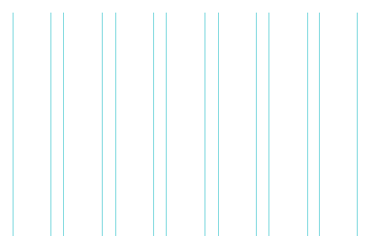
So, if you wanted a seven-column grid where each column is
10em wide, with a 1em gap between
the columns, you’d specify this using the following CSS rule:
body {
  grid-columns(10em,1em,10em,1em,10em,1em,10em,1em,10em,1em,10em,
      1em,10em;
}
The grid layout that would be created by the above CSS is depicted in Figure 5.6.
Since this is a repeating pattern, we can also use the following notation instead of specifying all of the columns individually:
body {
  grid-columns(10em,1em)[7];
}
The [7] in square brackets after the column
values means “repeat this pattern seven times.”
Likewise, grid-rows gives you the ability to
specify the number of rows and their heights in your grid.
According to the working draft, we could also create our grid using the columns and column-gap properties, like so:
body  {
  columns: 7;
  column-gap: 10px;
}
This CSS would give us a grid of seven columns with a ten-pixel
gap between them, and the columns would evenly stretch to the width of
the container. In the case of a body with no width
applied, they’d evenly stretch if the window was resized.
Of course, once you’ve created a grid, you’ll want to be able to position items along the grid lines. This is where grid positioning really comes into its own.
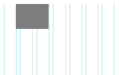
The Grid Positioning Module introduces a new length value:
gr. This unit of length is to be used to specify
how many grid units an element occupies. So the following CSS would
cause the element with an id of
promo to span four grid units, and
be positioned one grid unit from the left:
#promo {
  position: absolute;
  left: 1gr;
  width: 4gr;
}
The result of this rule is shown in Figure 5.7. You’ll notice that the
4gr value for the width of the element includes the
columns we specified as gaps.
There are several illustrated examples in the current working draft for this module, as well as further information about how it might be used. The working draft is worth a read, if you’re interested in where CSS might be taking us in the future—and it’s one of the more readable CSS3 documents.
The CSS3 Template Module, previously referred to as the Advanced Layout Module, introduces the concept of templates within CSS. It’s also an alternative layout method to the Grid Positioning Module for positioning elements to a grid or other layout. As with grid positioning, this module is still in an early stage of development, and as such there are no current browser implementations. The specification is likely to change prior to becoming a full W3C Recommendation.
The latest working draft of this module introduces the concept:
This specification is part of level 3 of CSS (“CSS3”) and contains features to describe layouts at a high level, meant for tasks such as the positioning and alignment of “widgets” in a graphical user interface or the layout grid for a page or a window, in particular when the desired visual order is different from the order of the elements in the source document.
The Template Layout Module aims to enable developers to create a template with slots in which to place the different elements. So rather than absolute positioning, which requires you to position elements using coordinates, you’d be able to command “place the navigation into slot A, and the main content into slot B”—very nice indeed, no?
Templates are created using the display
property. Just as we saw with CSS tables, layout templates can be used
for the whole layout or just a smaller element within a layout. For
example, the following markup defines an unordered list with a class of box:
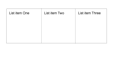
<ul class="box">
  <li>List item One</li>
  <li>List item Two</li>
  <li>List item Three</li>
</ul>
We’d like to display the list as three columns, and we’ll use the
template layout properties to achieve this end. To set up the
three-column template, we use the display property
with a value of "abc", a letter for each template
slot. This is, I’m sure you’ll agree, a bit of an odd departure from the
usual use of the display property; however, each
letter simply represents one slot in the template:
.box {
  display: "abc";
}
This module uses the position property to
place elements into the slots. A letter that corresponds to the slot
into which the element goes is used as the value for the
position property, instead of the current keyword
values, such as absolute and
relative, that we’re used to. We’ll place our list
items into their slots like so:
.box li {
  position: a;
}
.box li + li {
  position: b;
}
.box li + li + li{
  position: c;
}
The above CSS puts the first list item into slot
a, the second into slot b, and the
third into slot c. The result is shown in Figure 5.8.
One important point to note about this module is that, unlike
CSS tables, you’ll have complete control over the source
order of your markup. You could display these list items in any order
you like; the first item can go into slot b and the
second into slot c, for example.
CSS3 templates also allow far more complex grids to be defined. While each letter specified in the string value for the display property represents a slot, you can specify multiple strings to represent rows. Here’s a rule that specifies a grid of two rows with three columns:
body {
 display: "abc"
          "def";
}
You can also specify slots that span columns or rows using
repetition; here, we specify that slot a should span
three columns:
body {
 display: "aaa"
          "bcd";
}
CSS3 templates can be even more complex than that. We don’t have enough room in this book to speculate on all the possibilities, but we’ll conclude this section with an exciting example that demonstrates the real power of templates:
body {
  display: "a.b.c" /2em
           "a.d.e"
           5em 1em * 1em 10em;
}
Along with the letters, you can also include one or more dots
(.) to indicate whitespace—that no elements can be
displayed, as we’ve done above. We’ve also specified the height of the
first row and the column widths. What the above rule creates is a
two-row, five-column grid. The first row has a height of
2em. The first column is 5em wide
and spans both rows; the second column is a 1em wide
whitespace column, as is the fourth column. The last column is
10em wide. The central column has a flexible width,
which is specified by an asterisk (*). This way, we
achieve a level of layout control previously unheard of with CSS.
Tip: Having a Virtual Go with JavaScript
As people start to get more interested in these modules, it’s likely that we’ll see more attempts to emulate them using JavaScript, such as the ALMcss plugin available from http://www.cesaracebal.com/research/thesis/almcss/.
If you like playing with these concepts, such emulators can certainly be a great way to bring them to life—although I wouldn’t advise using them for production work!
As with the grid positioning module, the template layout module is in an early stage of development. The working draft contains more examples and up-to-date information as to how this module might eventually take shape. If you’re interested in CSS3, do go and look at the examples in the working drafts; they are often far easier to understand than you might expect, as they aim to describe how something would work in practice. It may seem a bit complicated at first read, but a lot of that is because working in this way is quite a mental shift after being used to pushing things around using positioning and floating as we do currently.
If these examples have piqued your interest in the development of CSS3, a great site to visit and add to your RSS reader is css3.info. This site contains up-to-the-minute information about the status of different modules, and the state of browser support.
So we come to the end of our look at how, in a sense, everything you know about CSS is wrong. The support that Internet Explorer 8 will bring for CSS tables is just the beginning. It’s an ironclad certainty that the way we lay out sites will change—how fast that change happens remains to be seen. However, by keeping your techniques up to date and not expecting life to remain the same, you can ensure that you’re not left behind as techniques and support move on.
Recalling the history of CSS earlier in this book reminds me of just how brief is our history. While we might feel that certain buggy browsers have been around and will be around forever and ever, the reality is that “forever” is only a year or two away. To be a web designer or developer, and to be good at what you do, means accepting that change is rapid and constant. We all have to keep reading, keep trying out new techniques, and be ready to start using them as soon as browser technology catches up with us.
We all know how frustrating it can be when you have a project that really could do with multi-column layout right now, or when you’re champing at the bit to be able to lay page elements out to a grid! However, playing around with browser-specific implementations can be fun, and keeps you right up to date with the new specifications. Reading working drafts and trying to figure out how implementations will work might not be everyone’s idea of bedtime reading, but it brings you closer to the work that’s being done to design the CSS of the future. Once we do start to see browser implementations, rather than complaining about having to learn something new, you’ll be among those crowing, “At last we can do this!”