
Chapter 5
Enabling and Optimizing Web Sites for the iPhone and iPad
WHAT YOU WILL LEARN IN THIS CHAPTER:
- Making your website compatible with IOS devices
- Making your site easy to navigate from iPhone and iPad
- Adding custom style sheets for IOS devices
Although this book is focused on developing web apps for IOS devices, the reality is that you’ll probably also need to deal with designing a website that is compatible with iPhone and iPad.
I remember having trouble browsing the Web on the iPhone when it was first released in 2007. I recall one evening in which my boys and I were watching the third quarter of a Monday Night Football game. The electricity suddenly went out because of a town-wide outage. Because my son’s favorite team was playing, he was frantic. What’s happening in the game? Are the Titans still winning? I immediately pulled out my iPhone and confidently launched Safari in search of answers. But upon going to NFL.com, I discovered that its live updating scoreboard was Adobe Flash media. All I could see was a gray box with a Lego-like block in its place. I then pointed the browser to the official Tennessee Titans site, only to discover more useless empty blocks scattered across its front page as well. We spent the rest of the outage using the iPhone to scour the Web, looking for a sports site to help us.
Fast forward to today. The expectations of the iPhone and iPad user are far different than what I had in 2007. At that time, I would just accept the lack of mobile support as something to be expected for being on the cutting edge of technology. However, today, if you design or run a website, your visitors won’t be nearly as forgiving.
In the past, you could design a minimalist, text-only style sheet for mobile users with the expectation that your normal website would be viewed only by desktop browsers. However, expectations of IOS users are not so modest. They are expecting to view the full web in the palm of their hands. Therefore, as you design and develop your website, you need to consider the level of support you want to provide for these Apple devices. Do you offer mere compatibility and device friendliness, or do you even create a design specifically targeting IOS users? This chapter goes over the four tiers of enabling your website for Safari on IOS:
- Tier 1: IOS compatibility
- Tier 2: Navigation friendliness
- Tier 3: Device-specific style sheets
- Tier 4: Dedicated alternative site
The first tier of support for IOS is simply making your website work inside Safari on IOS. Fortunately, because Safari is a sophisticated browser, far closer in capability to a desktop than a typical mobile browser, this is usually not problematic. However, there are some “gotchas,” including the following:
- Adobe Flash media, Java applets, and plug-ins are not supported.
- You cannot use the CSS property position:fixed.
- The JavaScript functions showModalDialog() and print() do not function under Safari on IOS.
- Downloads and uploads (including HTML element input type="file") are not supported.
Given its widespread popularity and desktop install base, Flash is the thorniest incompatibility for many web designers and developers. Until the original iPhone’s release, Flash support was typically considered a given except in the case of a relatively small percentage of users. In fact, many designers could take it for granted that if a user was coming to a website without Flash support, then that user was probably not a target visitor anyway and so the designer could either ignore that user or simply refer him to the Adobe download page. However, with the ubiquitous nature of IOS devices, those assumptions are now invalid. Web designers over the past three years have been forced to rethink their site’s reliance on a technology that they had become dependent upon. Figures 5-1 and 5-2 demonstrate the harsh reality in which a state-of-the-art website that looks amazing in Safari for Mac OS X never accounts for iPhone users.


Therefore, if you plan on using Flash for an interactive portion of a page then you should also plan to degrade gracefully to a static graphic or alternative content. At a minimum, you should place a disclaimer over Flash content. It’s not ideal, but it is better than the empty block. Or if you have a Flash-driven site (such as the one shown in Figure 5-1) then you should consider an alternative HTML site or, if warranted, even an IOS or mobile-specific site.
In order to detect Flash support, one solution is to use SWFObject, an open source JavaScript library that is used for detecting and embedding Flash content (available at http://code.google.com/p/swfobject/). SWFObject is not IOS specific, but it encapsulates the Flash Player detection logic, making it easy for you to degrade gracefully for Safari on IOS. For example, the following code displays a Flash file for Flash-enabled desktop browsers but displays a splash .png graphic for non-Flash visitors, including IOS users:
<!DOCTYPE html PUBLIC "-//W3C//DTD XHTML 1.0 Strict//EN"
            "http://www.w3.org/TR/xhtml1/DTD/xhtml1-strict.dtd">
<html xmlns="http://www.w3.org/1999/xhtml">
<head>
<title>Company XY Home Page</title>
<meta name="viewport" content="width=780">
<script type="text/javascript" src="swfobject.js"></script>
</head>
<body>
<div id="splashintro">
<a href="more.html"><img src="splash_noflash.png"/></a>
</div>
<script type="text/javascript">
   var so = new SWFObject("csplash.swf", "company_intro", "300", "240", "8",
    "#338899");
   so.write("splashintro");
</script>
</body>
</html>
As you can see, the swfobject.js library file is added to the homepage. When Flash is available, the script replaces the content of the splashintro div with Flash media. When Flash is not supported then appropriate content is substituted inside the splashintro div.
Therefore, at a minimum, you should seek to make your website fully aware and compatible for Safari on iPhone users.
TIER 2: NAVIGATION-FRIENDLY WEBSITES
When your website degrades gracefully for IOS users, you have achieved a base level of support for Apple mobile devices. However, while a user may be able to see all of the website’s content, it still might not be easy for Safari on IOS users to navigate and read. A wide section of text, for example, may be perfectly fine for iPad, but it can become a stumbling block for iPhone and iPod touch users to read because horizontal scrolling is required when the user zooms in to read it. With this in mind, the second tier of support is to structure the site in a manner that is easy for Safari to zoom and navigate.
Working with the Viewport
A viewport is a rectangular area of screen space within which a web page is displayed. It determines how content is displayed and scaled to fit onto the iPhone or iPad. Using the viewport is analogous to looking at a panoramic scenic view of a mountain range through a camera zoom lens. If you want to see the entire mountainside you zoom out using the wide-angle zoom. As you do, you see everything, but the particulars of each individual mountain become smaller and harder to discern. Conversely, if you want to see a close-up picture of one of the peaks then you zoom in with the telephoto lens. Inside the camera’s viewfinder you can no longer see the range as a whole, but the individual mountain is shown in terrific detail. The viewport meta tag in Safari works much the same way, enabling you to determine how much of the page to display, its zoom factor, and whether you want the user to zoom in and out or whether she needs to browse using one scale factor.
The way in which Safari renders the page is largely based on the width (and/or initial-scale) property of the viewport meta tag. With no viewport tag present, Safari considers the web page it is loading as being 980 pixels in width, and then shrinks the page scaling so that the entire page width can fit inside of the 320-pixel viewport (see Figure 5-3). Here is the default declaration:

<meta name="viewport" content="width=980;user-scalable=1;"/>
Suppose your website is only 880 pixels wide. If you let Safari stick with its default 980-pixel setting then the page scales more than it needs to. Therefore, to adjust the viewport magnification, you can specify a width optimized for your site:
<meta name="viewport" content="width=880"/>
Figures 5-4 and 5-5 show the noticeable difference between a 980- and an 880-width viewport for an 880-pixel width site.


With this declaration, instead of trying to fit 980 pixels into the 320 pixels of width, it only needs to shrink 880 pixels. Less scaling of content is needed (.363 scale instead of .326), making the site easier to use for iPhone and iPod touch users. Note that the viewport meta tag does not affect the rendering of the page in a normal desktop browser.
In addition to the width property, you can also programmatically control the scale of the viewport when the page initially loads through the initial-scale parameter. For example, if you want to set the initial scale to be .90, the declaration is the following:
<meta name="viewport" content="initial-scale=.9;user-scalable=1;"/>
After the page loads, however, the user is able to change the scale factor as he wants using pinch and double-tap gestures as long as the user-scalable property is set to true (the default). If you want to limit the scale range, you can use the minimum-scale and maximum-scale properties:
<meta name="viewport"
  content="initial-scale=.9;maximum-scale=1.0;minimum-scale=.8;user-scalable=1;"/>
In this way, the user has the ability to pinch and zoom but only to the extent that you want to allow.
If you develop a site or app specifically for iPhone or iPad, you need to size the page to the viewport by setting the width=device-width (device-width is a constant) and initial-scale=1.0. Because the scale is 1.0, you don’t want the user to be able to rescale the application interface, so the user-scalable property should be disabled. Here’s the declaration:
<meta name="viewport" content="width=device-width;
  initial-scale=1.0; maximum-scale=1.0; user-scalable=0;">
The device-width constant is treated as 320px on an iPhone and 1024px on iPad. In general, you need to avoid hardcoding a specific width and height for the viewport by making use of device-width and device-height. This is especially important for iPad because viewing with a viewport that has a width less than 1024 can affect the rendering quality of the content.
Table 5-1 lists the viewport properties. You don’t need to set every property. Safari infers values based on the properties you have set.
TABLE 5-1: viewport Meta Tag Properties
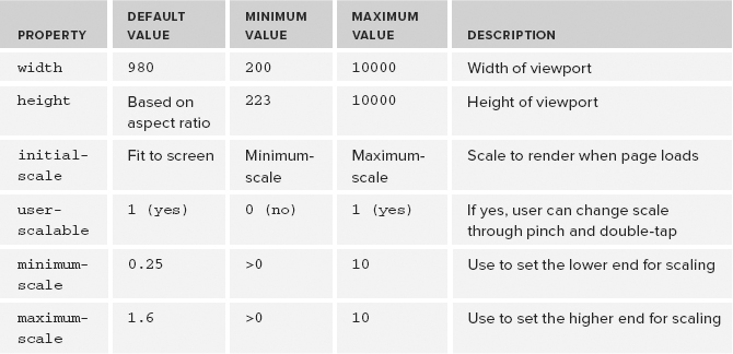
Keep in mind that the width attribute does not refer to the size of the Safari browser window. It refers to the perceived size of the page in which Safari shrinks down to be displayed properly on the mobile device.
Although it’s not generally recommended, you can specify the width of the content to be greater than the viewport width, but that requires the user to scroll horizontally.
Turning Your Page into Blocks
One of the most important ways to make your website friendly for IOS users is turn your web page into a series of columns and blocks. Columns make your page readable like a newspaper and help you avoid wide blocks of text that cause users to horizontally scroll left and right to read.
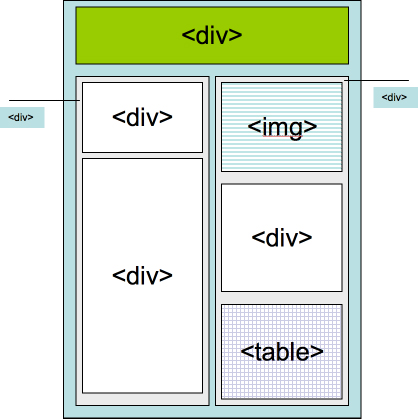
When a user double-taps an element, the iPhone or iPad looks at the element that is double-tapped and finds its closest block (div, ol, ul, table, and so on) or image ancestor. If a block is found then Safari zooms the content to fit the block’s content based on the viewport tag’s width property value and then centers it. If the user taps an image then Safari zooms to fit the image and centers it. If the image is already zoomed then zoom out occurs.
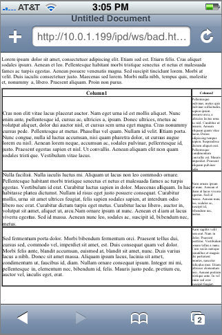
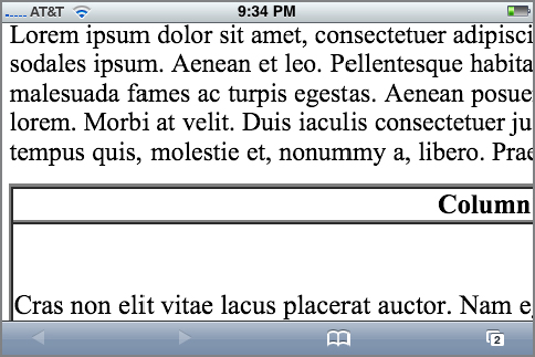
Figure 5-6 shows a sample page with a relatively simple structure, but it’s one that makes it difficult for the iPhone to zoom in. The table is defined at a fixed width of 1000px, and the first column takes up 875px of that space. The text above the table spans the full document width, but, because it is outside of any block, Safari can do no zooming when the user double-taps. The user is forced to go to landscape mode and pinch to get readable text, but it still scrolls off the right of the screen (see Figure 5-7).
TRY IT OUT: Making a Web Page Easy to Navigate for IOS Users
With a few simple tweaks, you can transform the page into something far easier for smaller devices (iPhone and iPod touch) to work with. Follow the instructions below on a page you want to work with.
1. Open the desired page of your website in a text editor.
2. Add a viewport meta tag to gain greater control over the width:
<meta name="viewport" content="width=780"/>
3. If your body content is not enclosed in any sort of block container, add a div block element and, if it makes sense for the design of your page, transform it into a column (say 50% of the page):
<div style="width:50%">
</div>
4. Locate any fixed-width tables and change to sized by percentage (90% of width). For example:
<table width="90%" border="1" cellspacing="1" cellpadding="1">
<tr>
<th width="75%" valign="top" scope="col"><div align="center">Column1</div></th>
<th width="25%" valign="top" scope="col">Column2</th>
</tr>
<tr>
</table>
5. Save your page.
How It Works
In this exercise, we just performed some simple general purpose tasks that can make your website easier for IOS visitors to navigate. You added a viewport meta tag, added block containers for your content, and converted fixed-width tables into percentage-based. Even with these rudimentary changes, your page becomes easier to browse when you double-tap the page, as shown in Figure 5-8.
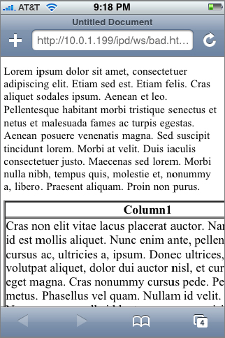
Figure 5-9 shows the model block-based web page that is easily navigated with double-tap and pinch gestures of iPhone.
Defining Multiple Columns (Future Use)
The latest versions of WebKit (Safari) and Mozilla-based browsers provide support for new CSS3 properties that enable you to create newspaper-like, multicolumn layouts. For a content block, you can specify the number of columns, width of the columns, and the gap between them. Because not all browsers currently support multiple columns, these style properties are prefixed with -webkit and -moz:
-webkit-column-count: 2;
-moz-column-count: 2;
-webkit-column-width: 200px;
-moz-column-width: 200px;
-webkit-column-gap: 13px;
-moz-column-gap: 13px;
Unfortunately, the current version of Safari does not support these properties. However, be watching for their future support. When Safari does support multicolumns, it can offer an easy way to transform existing content into the columnar structure that iPhone users love.
An iPhone user can navigate a Tier 2 website with double-tap, pinch, and flick gestures, but that does not necessarily mean that it is easy or enjoyable to do so. Panning and scrolling across the screen can become quickly tiresome. Users will quickly find themselves returning to sites that provide a richer, more tailored experience for Safari on IOS. The easiest way to do this is to create custom styles specifically for iPhone and iPad.
Media Queries
If you want to specify a style sheet for IOS usage, you can use a CSS3 screen media query. You can then use the link element to set specific styles for iPhone and iPad by looking for devices that only support screen display and have appropriate widths:
<!-[if !IE]>->
<link media="only screen and (max-device-width: 480px)" type="text/css"
   rel="stylesheet" href="iPhone.css" />
<link
  media="only screen and (min-device-width: 768px) and (max-device-width: 1024px)"
  type="text/css" rel="stylesheet" href="iPad.css" />
<!-<![endif]->
<link
   media="screen and (min-device-width: 1025px)" href="default.css"
  type="text/css" rel="stylesheet"/>
The first media query targets the iPhone and the second targets iPad. The only keyword prevents non-compliant browsers from selecting one of the mobile style sheets. However, the problem is that, under certain situations, earlier versions of Internet Explorer (versions 6 and 7) fail to ignore this rule and render the page anyway using the iPhone-specific style sheet. As a result, you need to guard against this possibility by using IE’s conditional comments. When you do, Internet Explorer ignores this link element because the [if !IE] indicates that the enclosed code should only be executed outside of IE.
You can also set IOS-specific styles inside a single CSS style sheet, by using a @media query:
@media only screen and (max-device-width: 480px)
{
  /* Add iPhone styles here */
}

@media only screen and (min-device-width: 768px) and (max-device-width: 1024px)
{
  /* Add iPad styles here */
}
Text Size Adjustment
Normally, the font size of a web page adjusts automatically when the viewport is adjusted. For instance, after a double-tap gesture, Safari looks at the zoomed width of the content block and adjusts the text to zoom in proportion. This behavior makes the text easier to read for typical uses, though it can affect absolute positioning and fixed layouts. If you would like to prevent the text from resizing then use the following CSS rule:
-webkit-text-size-adjust: none;
In general, for most website viewing, you will want to keep this property enabled. For iPhone-specific contexts in which you want more control over scaling and sizing, you need to disable this option.
Case Study: Enabling an Existing Web Site
Consider a case study example, the website of Operation Classroom, a nonprofit organization doing educational work in Africa. Keep in mind that the style sheet of each website needs to be optimized in a unique manner, but this case study demonstrates some of the common issues that crop up.
The website renders nicely on iPad as is, but less optimally on a smaller IOS device. Figure 5-10 displays a page from the site with a basic viewport meta tag set at width=780, which gives it the best scale factor for the existing page structure. However, even when the viewport setting is optimized, a user still needs to double-tap in order to read any of the text on the page. What’s more, the top-level links are difficult to tap unless you pinch and zoom first.

However, by creating an iPhone and iPod touch-specific style sheet, you can transform the usability site for Safari on IOS users without affecting any of the HTML code.
Each website is going to have individual needs and customizations to work well with iPhone users, so the specific transformations that I performed with this website may or may not apply to you. However, in general, these provide a good example of the types of modifications you should think about for your site.
Looking at the page (see Figure 5-10), notice that several transformations need to occur:
- Shrink the page width.
- Shrink the Operation Classroom logo at the top of the page.
- Increase the font size for the menu links, page header, rabbit trail links, and body text.
- Move the sidebar to appear below body text.
Updating the HTML files
As a first step, I add a media query to the document head of each page in the site:
<!-[if !IE]>->
<link media="only screen and (max-device-width: 480px)" type="text/css"
  rel="stylesheet" href="iPhone.css" />
<!-<![endif]->
<link media="screen and (min-device-width: 1025px)" href="default.css"
  type="text/css" rel="stylesheet"/>
Next, inside the HTML files I change the viewport meta tag to a smaller width:
<meta name="viewport" content="width=490"/>
The 490px width is wide enough to be compatible with the existing site structure but small enough to minimize the scaling.
That’s all of the work that I need to do to the HTML files.
Creating iPhone.css
To create the new custom style sheet, I begin by opening the default style sheet already being used and then save as a new name — iphone.css. My first task is to change the width of the document from 744px to 490px. Here’s the updated style:
@media all {
  #wrap {
    position:relative;
    top:4px;
    left:4px;
    background:#ab8;
    width:490px;
    margin:0 auto;
    text-align:left;
   }
Next, I change the original font-size:small property defined in body to a more specific pixel size:
body {
  background:#cdb;
  margin:0;
  padding:10px 0 14px;
  font-family: Verdana,Sans-serif;
  text-align:center;
  color:#333;
  font-size: 15px;
  }
Although this size is not as large as what an iPhone web app would use, it is the largest font size that works with the current structure of the Operation Classroom website. Fortunately, the rabbit trail (pathway) and page header fonts are relative to the body font, as shown in the style below:
#pathway {
  margin-top:3px;
  margin-bottom: 25px;
  letter-spacing: .18em;
  color: #666666;
  font-size: .8em;
}
#pageheader {
  font-family:Helvetica,Arial,Verdana,Sans-serif;
  font-weight: bold;
  font-size: 2.2em;
  margin-bottom: 1px;
  margin-top: 3px;
}
The next issue is to shrink the size of the banner at the top of the page. Here’s the pre-iPhone style for the banner text:
#banner-text{
  background:url("./images/bg_header.jpg") no-repeat left top;
  margin:0;
  padding:40px 0 0;
  font:bold 275%/97px Helvetica,Arial,Verdana,Sans-serif;
  text-transform:lowercase;
  }
The two properties you need to try to shrink are the padding and the font size. Here’s a workable solution:
#banner-title {
  background:url("./images/bg_header.jpg") no-repeat left top;
  margin:0;
  padding:10px 0 10px;
  font: Bold 35px Helvetica,Arial,Verdana,Sans-serif;
  text-transform:lowercase;
  }
The final and perhaps most important change is to enable the sidebar to follow the main text rather than float alongside it. Here’s the original pre-iPhone definition:
  #sidebar {
    background:#565 url(".images/corner_sidebar.gif") no-repeat left top;
    width: 254px;
    float: right;
    padding:0;
    color:#cdb;
    }
To move the sidebar content below the main body text, I remove the float property and add a clear: both declaration to prevent the sidebar from any side wrapping. I also change the small width of 254px to 100 percent, which enables it to take up the entire contents of the content div. Here’s the code:
  #sidebar {
    background:#565 url("./images/corner_sidebar.gif") no-repeat left top;
    width:100%;
    clear: both;
    padding:0;
    color:#cdb;
}
Figures 5-11, 5-12, and 5-13 show the results of the transformation.


As you can see, you can often transform your existing website into an iPhone-friendly site with a handful of well-thought-out style changes.
Unless you are creating an iPhone or iPod touch application, developing for Tier 2 or 3 support provides sufficient support for most sites. However, you might find a compelling need to actually develop a site specifically written for iPhone or iPad. The content may be the same, but it needs to be structured in a manner discussed throughout this book.
If you are going to offer an mobile version of your site, you need to offer your users the freedom to choose between the mobile site and your normal full site. Don’t auto-redirect based on user agent. Because Safari on IOS can navigate a normal website, you should always allow users to make the decision themselves. Therefore it is standard practice to add a link at the bottom of the page to your full site for users who access the home page with their iPhones.
A second alternative is to do the reverse: When an IOS device loads the page, the site asks whether or not the user would prefer to go to the dedicated mobile site instead.
TRY IT OUT: Prompting IOS Users to a Dedicated Site
Follow the instructions below to add this capability to your site.
1. Open up the home page of your website in a text editor.
2. Add an empty div element at the top of your content, just below a top navigation menu if it exists on your page:
<div id="ios-notify"></div>
3. Add the following script to the document head:
<script type="application/x-javascript">
function isiPhone()
{
  result ((navigator.platform.indexOf("iPhone") != -1) ||
          (navigator.userAgent.indexOf('iPod') != -1))
}
function isiPad()
{
  result ((navigator.platform.indexOf("iPad") != -1)
}

function init()
{
  if (isiPhone())
{
     var o = document.getElementById( 'ios-notify' );
     o.innerHTML = "<h1 style='text-align:center;border: 1px solid #a23e14;" +
     " -webkit-border-radius: 10px;'><a href='iphone-index.html'>" +
     "Tap here to go to our<br/>iPhone web site.</a></h1>";
  }
  else if (isiPad())
  {
  if (isiPad)
{
     var o = document.getElementById( 'ios-notify' );
     o.innerHTML = "<h1 style='text-align:center;border: 1px solid #a23e14;" +
     " -webkit-border-radius: 10px;'><a href='ipad-index.html'>" +
     "Tap here to go to our<br/>iPad web site.</a></h1>";
  }

  }
}
</script>
4. Save the file.
How It Works
This example shows you a simple way in which you can offer iPhone and iPad visitors the option of viewing a site designed for each device. The empty div element serves as the placeholder for the message that you display to IOS visitors.
The init() function calls the isiPhone() function to determine whether the user agent is an iPhone or iPod touch. If the device is an iPhone or iPod touch then HTML content is added to the placeholder div element. If not, then the isiPad() function is called to see if the user is coming to the site using an iPad. The init() function is then called from the onload handler of the body. Figure 5-14 shows the results when viewed from an iPhone.

EXERCISES
1. Is Flash supported on IOS devices?
2. What is the purpose of a viewport meta tag?
3. What constant should you use to size the page to the width of the device’s viewport?
4. Why is it a good idea to make frequent use of columns in your web page structure?
5. What is the link syntax for defining an iPad media query?
Answers to the Exercises can be found in the Appendix.
• WHAT YOU LEARNED IN THIS CHAPTER
| TOPIC | KEY CONCEPTS |
| Making your website compatible with IOS devices | Avoid using Adobe Flash media, Java applets, and Plug-ins. Also, avoid using the CSS property position:fixed. |
| Making your site easy to navigate with IOS devices | Add a viewport meta tag, which determines how content is displayed and scaled to fit onto the iPhone or iPad. Turn your Web page into a series of columns and blocks, which are much easier for an iPhone to zoom and navigate. |
| Add custom IOS styling to your website | Use a CSS3 screen media query to set specific styles for iPhone and iPad. |
| Maintaining a parallel website for mobile devices | Allow mobile users the choice of using the mobile site or the full site. |