Chapter 20
Finding Useful Techniques
In This Chapter
![]() Techniques for planning
Techniques for planning
![]() Control techniques
Control techniques
![]() Techniques for the Business Case
Techniques for the Business Case
![]() Risk management techniques
Risk management techniques
How often have you struggled to do something and eventually found a way through? Then, after you’ve finished, you find that there was a great technique that you could have used to make the job both simpler and faster.
Project management has been around for a long time, and in that time a lot of people have come up with a lot of ways of doing things. Then a lot more people have found a lot more ways of making those techniques even better. You benefit from all that experience when you use techniques that are well tried and tested. In your projects then, don’t struggle to do something when by looking at this chapter you could find one or two techniques that will make your life a lot easier.
The techniques listed in this chapter are to give you a starting point. If one looks like it might be useful, have a look around in places like the internet and project management books to find out more about it. There are many more techniques than listed in this chapter, but the set summarised here are mainstream ones that are useful in a lot of projects.
Following the normal checklist format in this book, each list has the item – in this case a technique – followed by some explanation. For each technique the explanation tells you a bit about what the technique is and in some cases gives you a tip on where you can use it.
Planning Techniques Checklist
There are a lot of planning techniques out there, and they’re really powerful. The one that you may be most familiar with is the Gantt Chart, popularised by Henry Gantt almost 100 years ago and now at the hub of most project management software. However, that’s just one in an array of powerful techniques in this checklist that you can, and often will, want to use together.
This checklist starts with product techniques then moves on to activity planning techniques, following the ‘product based’ approach recommended in this book.
- Work Flow Diagram: Also known as a Product Flow Diagram, you use this network diagram to show what the project will produce (the deliverables) in the order that you will do them. It shows product dependency where an arrow shows that you can’t build one product before another is complete, but it also shows lack of dependency where, importantly perhaps, you can build more than one product at the same time. It’s an extraordinarily powerful diagram and useful for control and risk management as well as for planning.
- Work Breakdown Structure (WBS): You can sometimes use this diagram as a listing tool to set down the products which you will then show in the Work Flow Diagram. It’s a hierarchical diagram showing the products grouped in categories and, sometimes, sub-categories. Some variants of the diagram have an activity breakdown in this hierarchy instead of a product breakdown.
- Product Definitions: Forms that are used alongside the two diagrams at the start of this checklist. The Product Definitions say exactly what each product is and specify things like what skills will be needed to build the product and, very importantly, what quality criteria it must satisfy.
- Activity Network: There are two variants of the activity network. The PERT Chart (Programme Evaluation Review Technique) is one but it’s rarely used now. The more common variant is the Precedence Network. As its name suggests, the Activity Network is a network diagram showing the activities in rectangles and then arrows to show the order in which the activities will be performed. It also shows the timings and which activities have spare time on them (usually known as float) and which don’t.
- Critical Path Method (CPM): The CPM technique follows on from the Activity Network. The network will have many paths through it, but one is the longest path of dependent activities, and that is the Critical Path. The Critical Path is significant because if you have a delay somewhere along it, you make the longest path longer so the project end date goes out. Every project has a longest path through it, so for your project your only choice is, do you want to know what it is or not? Most of us say, ‘Too right I want to know!’
- Gantt Chart: This activity chart was popularised by Henry Gantt, an American management consultant. However, similar work was also done by the Polish management specialist Karol Ademeiki. The chart lists activities on the vertical y axis with time along the bottom x axis. Bars on the chart then show the activities and their durations and the positioning of the bars reflects any dependencies between activities.
- Time Line: A simple but useful diagram to show the main parts of the project without the technicality. It is a line stretching horizontally, or off into the distance, with markers or pictures showing key events such as design, build, test and implementation. This diagram can be really useful for communicating with business staff and other stakeholders who need to see the main parts of the project but don’t need the detail shown on a complex Gantt Chart. See Figure 20-1 for a typical Time Line.
- Resource Histogram: A bar chart with vertical bars showing the amount of resource required against the time of the project which runs along the bottom x axis.
- Resource smoothing: Following on from the Resource Histogram, you’ll have a problem if a bar showing required resource is up above the line of available resource. You need to chop the tops off the ‘hills’ and thrown them into the ‘valleys’ by resource smoothing. You may achieve part of the smoothing by scheduling an activity to start later when the staff involved have finished other work.
- Critical Chain: A technique devised by Eliyahu M. Goldratt where he combined the Activity Network with resource; clever move.

Figure 20-1: A simple Time Line.
 If you’d like to know more about the Critical Chain technique, have a look at Eliyahu Goldratt’s book which is called, perhaps not surprisingly, Critical Chain. It’s published by Avebury.
For some hints and tips on estimating the durations of activities have a look at Chapter 23 in the Part of Tens.
Control Techniques Checklist
There are some powerful techniques around to help you control your project once it’s underway. That control includes monitoring progress but also keeping an eye on things like the spending. Have a look to see if any of the techniques in this checklist may be useful to you on your project. Using the Work Flow Diagram for progress monitoring is especially powerful and, happily, extremely easy to interpret, so Project Steering Groups (PSGs) like them –as do Project Managers and team members.
- Earned Value Method (EVM): A way of associating progress with spending. You compare the value of work scheduled to be done by a point in time with that actually done. You can also compare budgeted costs with actual costs to see whether things are costing what you expected. For example, suppose you’d budgeted to spend $30,000 by now. You’ve done (‘earned’) $30,000 worth of work at the costs set down in the plan, but it’s actually cost you $35,000 to do it. By comparing the figures you can determine that at this point in time you’re on schedule but over-budget.
- Exception management: An approach where someone is given delegated authority to manage something within set limits, typically time and cost. If the projection for completion of the work goes outside these limits, the stage or project is ‘in exception’ and the matter must be reported immediately to the next level of management.
- S Curve: An ordinary line graph that shows the planned spend on the vertical y axis against time on the horizontal x axis. You plot the actual spend as you go along so you see the actual cost plotted against what you expected and you can also include a forward projection for the spend through to the end. The graph is called an S Curve because of its typical shape with a lower rate of spending at the start and end of the project, with more rapid spending in the middle.
- Work Flow Diagram: This is the ‘jewel in the crown’ of progress reporting. Useful initially in project planning (so the technique also appears in the planning list earlier in the chapter) it also has great applications for progress control. By colour coding the products on the diagram you can show which are complete, which are under construction, which haven’t been started yet and which are overdue or expected to be overdue. Using the diagram and the product status for control is powerful because it is fact-based reporting, not an estimate of ‘percentage complete’.

Figure 20-2: The S Curve
Business Case Techniques Checklist
The next checklist covers techniques that you can use for calculations associated with your project’s Business Case. Some may seem complicated at first sight, but don’t panic because you’ll find that they’re quite straightforward once you’ve had a go with them.
- Cost–Benefit Analysis (CBA): Usually set down on a spreadsheet showing the costs of the project and then ongoing costs set against savings, year on year for a set number of years, often five. The CBA shows when the project will pay back; the point at which the cumulative savings become greater than the cumulative costs.
Some projects will never pay back but you have to run them anyway, such as for legal compliance. In that case the CBA will show the final cost after the offsetting of benefits, if any.
- Direct Payback: See Cost–Benefit Analysis above. It’s a term associated with CBA but refers just to the point where the costs will be offset by the financial benefits. It doesn’t take account of the future value of money, as covered by the next point on the checklist.
- Discounted Cash Flow (DCF): Also known as Net Present Value from the spreadsheet function @NPV. DCF shows money in future years as less valuable than that in earlier ones. So a project costing $5 million, and paying back nothing before Year 5 when it will make a one-off saving of $5 million won’t actually pay for itself.
 If you find the DCF concept awkward to understand at first, consider this simple example. Imagine – and please note carefully the ‘imagine’ – that I were to give you $10,000. I could transfer the money directly into your account today, or I could transfer the $10,000 into your account in five years’ time. Which would you prefer? Well, you’ll say ‘today please’. You know that in five years’ time the money won’t have the same spending power. Even if you put the money into a savings account you’d end up with more than $10,000 in five years’ time because you’d get some interest. The Discounted Cash Flow technique just reflects that reality with the discount factor increasing year by year so that the further you go into the future, the less value the money has.
- Internal Rate of Return (IRR): Related to DCF, you can use this technique to look at different possible projects to see which offers the best return. You set a date, such as 5 years, then increase the discount factor until there the project exactly pays for itself. The higher the discount factor needed to get to the zero, the better the return of the project. However, see the Remember point below.
- Return on Investment (ROI): A simple formula to compare the financial return from the project (financial benefits) against what it costs to run the project. So an ROI of 2.0 would mean the return would be double the investment. You should also specify a period of time. An ROI of 2.0 would be more impressive after ten months than after ten years.
 The techniques used for making calculations on benefits and on investments are financially based. Remember that there are other reasons to run project, although a benefits justification is the most common. If you’re not familiar with the different justifications, have a look at Chapter 5, Checking the Justification and Benefits.
Risk Techniques Checklist
Risk management is a vital area within project management and it’s also an area with a very large number of techniques that can help you with risk analysis and risk management. Here’s a checklist with some that are particularly suitable for use in project risk management.
- Decision Tree: A branching diagram that shows possible decisions (such as a risk management actions) and then, for example, the cost of each branch. Each branch may then divide, and divide again with further costed options for lower level decisions.
- Interviewing: It’s easy to overlook this powerful technique in risk management. Go and talk to people with different interests in the project such as users, team members, PSG members and stakeholders and ask them what risks they see in the project.
- Ishikawa (fishbone) diagram: This diagram, named after its inventor, is also called a fishbone diagram because it looks like a fish with a spine, primary bones and then secondary bones. It’s a ‘cause and effect’ diagram, but you can use it in projects by putting a risk impact as an effect, such as overspending. Then the primary bones are risk categories such as people risk, technical risk, business risk and so on. Using the secondary bones you then show the risks that you identify in each of the category areas. This technique works really well in a risk workshop (see later in this checklist for more on risk workshops).
- PI Matrix: There are different names around this technique, but at its simplest it’s a 5 × 5 grid with probability (P) on one axis and impact (I) on the other. You rate each risk on a scale of one to five and write its reference number on the grid. You can then monitor any movement as you review risks. The grid also indicates the need for action, especially for risks towards the top right of the grid with high measures for both impact and probability.
- Risk Anatomy Diagram: a simple but powerful diagram that you can use for mapping out the three elements of a risk, the threat or opportunity (sometimes referred to as the trigger and shown with an arrow), the risk itself (shown in a rectangle) and then the impact (shown in a circle). You can use the diagram to think through risks by modelling things such as multiple triggers to a single risk, multiple impacts, chain reactions where the impact of one risk forms the trigger for another, and combined impacts where two risks occur at the same time.
- Risk Checklist: Simply a list of risks that can affect projects in your organisation and project circumstances. Don’t use it first though or you will be so focused on the list that you fail to spot a new risk staring you in the face. Use other techniques first, then the checklist as a safety net to see if there is anything that you’ve missed. If you spot a new risk that could affect future projects, add it to the risk checklist.
- Risk workshop: This technique has two powerful advantages. You get together a group of people representing the different interests in the project; in a small to medium project you may include everyone who will be involved. Then they think of risks. The first advantage is that a risk that one person comes up with sparks other thinking, and other people then come up with risks which wouldn’t otherwise have been spotted. The second advantage is that everyone is now aware of the risks because they were there when the risk was first identified and talked about.
- Risk Proximity Frame: A constantly changing diagram as you keep it up to date. The left hand side of the frame is ‘today’ and the x axis is then time into the future. You model different risks according to their severity, showing them in different sized circles. You can then see how soon the risks can affect the project and how significant they are. You might, for example, see that there are a lot of high-severity risks that are now just six weeks away. As a refinement you can go on to colour code the circles to show which risks are very controllable, which are partly controllable and which ones can’t be controlled at all (such as weather conditions). Figure 20-3 shows an example.
- SWOT Analysis: A four-segment square to help think through the strengths, weaknesses, opportunities and threats to something, such as the project or a business area in your organisation.
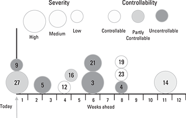
Figure 20-3: Risk Proximity Frame
- Work Flow Diagram: The Work Flow Diagram is a planning technique but it has two powerful uses in risk management. First, it allows you to see where the project is dependent on products coming in from outside, such as from suppliers and other projects. Second, it gives a structure for a systematic review of what risks are associated with the building of the different project products.