
CHAPTER 9
Case Study #5: Molycorp (MCP) in 2011
Market history is filled with examples of compelling, hot investment themes that drive huge upside moves in groups of stocks. In Chapter 8, we saw how the disruptive technology of 3-D printing created a group move in the 2012–2014 market, but before that investment craze hit the market there was another mania that arrived in the form of what were known as rare earth metal stocks. Rare earth metals, technically known as rare earth elements, consist of seventeen chemical elements in the periodic table. Fifteen of these names are known as the lanthanides; and the other two are scandium and yttrium. The lanthanides are lanthanum, cerium, praseodymium, neodymium, promethium, samarium, europium, gadolinium, terbium, dysprosium, holmium, erbium, thulium, ytterbium, and lutetium. What these metals all had in common was not that they were rare per se, but that they tended to be geologically dispersed and hence not found in concentrations great enough to make the economics of mining such metals ideal.
Because of this, they are not so much rare as they are scarce. And because they were critical to a number of industrial and technological processes and applications, they were considered to have strategic value. Throw in fears that China was attempting to control supplies of rare earth metals as they shut out the rest of the world, and you had the ingredients for a boom in rare earth metal mining stocks.
One key factor driving the upside in rare earth metals stocks in 2010 was simple supply and demand. Because there were only two viable stocks that could serve as vehicles for riding the rare earths craze, Rare Element Resources (REE) and Molycorp (MCP), there was a shortage of supply to feed investor interest in the space. As the only two stocks in the rare earth metals, these were not just rare earth plays—these stocks were themselves somewhat rare. Because it reached the highest absolute price, peaking at 79.16 in April of 2011, we will focus on MCP as our case study. While REE ran up from about $3 a share in August of 2010 to a peak of 17.92 in late December 2010, it never exceeded “teenage” price status. Thus, MCP can be considered the primary big-stock play in the rare earth metals phenomenon of 2010.
The weekly chart in Figure 9.1 shows the “superstructure” of MCP's top in late 2010, including its fast and sharp run-up after coming public in late July 2010 and its steady “round-trip” back to and well below its initial public offering price of $14 a share. In fact, at the time of this writing in 2014, MCP was selling below the $3 price level. The decimation of MCP is a brutal illustration of what a “long-term” investment mentality can do to one's portfolio. Stocks have their life-cycles, and it is important for investors to understand this. While they will be favored by investors for one or two consecutive market cycles, sometimes three, there will almost always comes a time when the music stops and the dance floor empties.
What makes MCP a bit unique among our short-sale case studies is its ascending neckline. Theoretically, an ascending neckline is not as “weak” as a flat or horizontal neckline, which in turn is not as weak as a descending or downward sloping neckline. In practice, this is mostly bunk, since we can observe for a fact that the “stronger” ascending neckline formation can lead to some very severe downside breaks and downtrends. As MCP ran up from its IPO date, it formed two reasonably well-defined bases. After breaking out and running up about 45 percent from the second base, MCP formed a short two- to three-week flag formation from which it tried to break out at the beginning of May 2011. This breakdown off the peak lasted seven weeks and took the stock down to the 40-week moving average, corresponding to the 200-day on a daily chart. At that point it became clear that the stock had completed a left shoulder and a head in a potential head and shoulders (H&S) set-up.

FIGURE 9.1 Molycorp (MCP) weekly chart 2010–2012.
Source: Chart courtesy of HGSI Investment Software, LLC (www.highgrowthstock.com), ©2014.
The entire right shoulder complex took another three months to form, and at that time the stock broke out to the downside and through the neckline at what could be considered a short-sale entry point. The only issue here is that the move through the neckline did not occur in continuous fashion; it occurred on a downside gap following its third-quarter earnings report, so the entry point is not as cut and dried as it appears on the weekly chart. From there, a rally back up into the 10-week moving average would offer another short-sale entry point, and the second rally up into the 10-week line four weeks later offered yet another entry point. As MCP continued to break down, it dropped below the 24 price level in late November 2011, and the stock chopped back and forth between that level and the 32 price area before pushing further above the 10-week line and up into the 40-week line. That represented a short-sale entry point in early April 2012, and the stock came apart from there. One more little bounce up into the 10-week line in June of 2012 ended with another cascading break that completed the stock's round-trip from a $14 IPO to a high of 79.16 and then all the way back below the original IPO price.
We can also see on the comparison chart of MCP versus the NASDAQ Composite Index throughout this time period, shown in Figure 9.2, that MCP correlated reasonably well to the NASDAQ throughout the formation of its H&S. In fact, the two appear to have formed their respective H&S patterns in synchrony, with only a few minor variations.
The left shoulder peak of MCP's formation, which was actually the start of its second base on the way up, preceded a left shoulder peak in the NASDAQ by a little over a month. MCP's breakdown and failure on the breakout attempt from the short flag formation at the absolute peak of the head correlates exactly to the NASDAQ's peak and breakdown at the same time. The peak of the right shoulder in MCP's pattern correlates to a second, slightly lower peak in the NASDAQ at the end of July 2011, which could be viewed as a sort of right shoulder as well. MCP rolled over from its right shoulder peak and completes its H&S formation just as the NASDAQ broke down sharply in late July and early August of 2011. The NASDAQ, however, bottomed in mid-August and began to trend higher, eventually running into a short term peak in mid-September that was followed by a sharp downside break in late September. This September peak and ensuing breakdown coincided with MPC's downside breakout through the neckline of its now fully-formed H&S pattern.
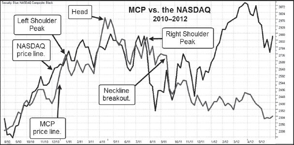
FIGURE 9.2 Molycorp (MCP) versus the NASDAQ Composite Index 2010–2012.
Source: Chart courtesy of HGSI Investment Software, LLC (www.highgrowthstock.com), ©2014.
I suppose if we wanted to, we could get away with simply showing the weekly chart of MCP and drawing arrows at the obvious short-sale points at the neckline breakout and the subsequent rallies up into the 10-week and 40-week moving averages as the stock progress through its overall downtrend. Unfortunately, there are many more details that in fact make MCP a rich example as a short-sale case study.
First, let's break this down on a close-up weekly chart view of the entire H&S complex that MCP formed around the early May 2011 peak in Figure 9.3. We can see that the right shoulder in the pattern was actually the start of a 10-week double-bottom base from which the stock broke out in late March 2011. This led to a quick four-week run-up before the stock started to consolidate in a short flag formation of two to three weeks in duration. A volume reversal off the peak marked the top of the head, and the stock dropped below the 10-week moving average. The low-volume rally back into the 10-week line was in fact your first short-sale point in the pattern, labeled SP on the chart, and occurred at the mid-point of the right side of the head. A breakdown from there to the 40-week moving average completes the right side of the head and another rally up into the 10-week line ensues before the stock drops back to the 40-week moving average. The bounce off the 40-week moving average carries beyond the 10-week line and into prior resistance at the prior peak at point SP. This is a second short-sale entry point, labeled SP2 on the chart. Notice also that point SP2 also marks the peak of a “head” within the entire right shoulder complex. That is, the entire area underneath the dotted line that arcs from late June to mid-September is itself a smaller, fractal H&S formation. The right shoulder of this mini-H&S shows stalling action at the 10-week line on weak volume, and two weeks later the stock collapses through the neckline.
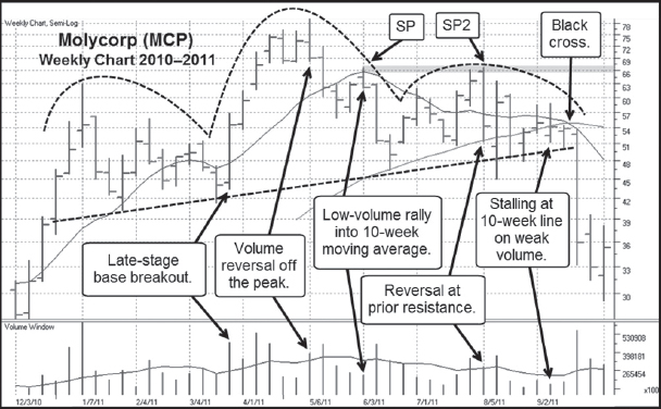
FIGURE 9.3 Molycorp (MCP) weekly chart 2010–2011. A close-up view of MCP's H&S complex.
Source: Chart courtesy of HGSI Investment Software, LLC (www.highgrowthstock.com), ©2014.
Now let's look at MCP's entire H&S complex on a daily chart, shown in Figure 9.4. We can see that the breakout from the base that the stock formed from early January 2011 to the latter part of March began with a pocket pivot buy point coming up through the 50-day moving average. That pocket pivot led to a 52 percent–plus move from the closing price of the pocket pivot day to the peak at 79.12 in early May.
The short V-shaped flag formation at the peak leads to a breakout attempt through the 76 price level, and volume looks very good on this move. However, the very next day the stock reverses on heavy selling volume, and this marks the peak of the head in MCP's overall H&S formation. Remember that in Figure 9.2, MCP's peak coincided with a sharp breakdown in the NASDAQ. In some cases, if I can correlate a possible peak in a stock on such a high-volume reversal to a similar peak in the general market, I will just short the stock right there, although this can't really be classified as a typical short-sale point.
The breakdown off the peak carried below the 50-day moving average as the stock tested the top of the prior base formed from January through March. The short bounce back up into the 50-day moving average in late May coincided with a similar bounce at the same time in the NASDAQ. At the end of March, the NASDAQ started to break down in earnest, and MCP likewise broke down below its 50-day moving average. This is the first short-sale point in the pattern, labeled SP in Figure 9.3. There was a very sharp collapse to the 200-day moving average, which represented a cover point for any short position taken at point SP as one waited to see what the stock did from there. We can view this action in greater detail in Figure 9.5.

FIGURE 9.4 Molycorp (MCP) daily chart 2011. Another close-up of MCP's H&S complex at a more granular daily view.
Source: Chart courtesy of HGSI Investment Software, LLC (www.highgrowthstock.com), ©2014.
In the latter half of June, MCP started rallying up and off of the 200-day line in a little wedging and stalling rally that was capped off with a little “exhaustion gap” that carried right into the 50-day line, and the stock caromed back to the downside. Notice, however, that as the stock came down, selling volume dried up to the point of becoming nonexistent. Had one shorted the stock into the short-term exhaustion gap in late June, this would have been a clue to cover one's position and bank whatever profit was there to be had. This then led to a rally through the 50-day moving average, and the alert reader might notice the pocket pivot buy point as the stock came up through the 50-day line 7 days before the end of July. As we've discussed previously, this is at least a cover signal if one is still short the stock from any prior short-sale entry points.
Notice that as MCP rallied back up towards resistance around the 66 price level and the prior short-sale entry point at SP, volume dried up sharply at the peak, and then the stock reverses on heavy selling volume. This led to a sharp breakdown that carried below the 200-day moving average.
Scrolling a little further, we can now view Figure 9.6, which overlaps with Figure 9.5 to show the entire right shoulder complex from early June through the latter part of September. As we've already pointed out, MCP's right shoulder complex was itself a smaller, fractal H&S formation, and we can now see how the short-term exhaustion gap in late June formed the right shoulder, and the rally up into the 66 price level and prior resistance at point SP in Figure 9.5 formed the head. The breakdown through the 200-day moving average undercut the prior June low, and this led to a sharp, V-shaped upside rally attempt that stalled out on heavy volume as the stock gaps above the 50-day moving average. This can be viewed as a short-term exhaustion gap of sorts, and indeed the stock dropped back below the 50-day line over the next few days.

FIGURE 9.5 Molycorp (MCP) daily chart 2011. The peak of the right shoulder offers a second short-sale entry point.
Source: Chart courtesy of HGSI Investment Software, LLC (www.highgrowthstock.com), ©2014.

FIGURE 9.6 Molycorp (MCP) daily chart 2011. A complete view of MCP's right shoulder complex that is also a fractal H&S formation.
Source: Chart courtesy of HGSI Investment Software, LLC (www.highgrowthstock.com), ©2014.
At that point, the stock got into a little bit of a “slop and chop” phase and in fact flashed a pocket pivot buy point when it regained the 50-day moving average in late August. This pocket pivot didn't hold up, however, and the stock dropped back below the 200-day line before making another attempt to clear the 50-day line in early September on another pocket pivot. This second pocket pivot had a couple of things working against it, namely the V-shaped move from which it was occurring and the fact that it stalled and closed in the lower half of the daily range on above-average volume. Over the next two days, the stock dropped below the 200-day line and then slid sideways just underneath the line before gapping to the downside in a nasty neckline breakout.
On the day of the gap-down and neckline breakout, MCP could have easily been played as a shortable gap-down, as we can see on the daily chart in Figure 9.7. The stock opened up at 49.73, got as high as 49.91 on an intra-day basis, and then plummeted to an intra-day low of 41.33 before closing just a few cents higher at 41.45. Thus one was able to use the 49.91 as the high of the day for the purpose of setting an upside stop either at the 49.91 level or 3–5 percent higher, depending on one's personal risk preference and precise entry point. For example, if one had entered a short position at 48, then using the 49.91 intra-day high represents a slightly less than 4 percent stop. Obviously, entering a position on any gap-down day carries risk and is not guaranteed to work every time. The fact that this was also a neckline breakout, and the neckline was running through the 50–51 price area, which was within 2 percent of the 49.91 high of the day, also worked in its favor. Thus, the closer to the neckline one can short the stock, the better. This breakout through the neckline was the beginning of a sharp move to the downside that cut the stock down just about 45 percent by the end of September 2011.

FIGURE 9.7 Molycorp (MCP) daily chart 2011. The neckline breakout occurred on a shortable gap-down move.
Source: Chart courtesy of HGSI Investment Software, LLC (www.highgrowthstock.com), ©2014.
As the stock descends, it loses downside velocity before it bottoms out and begins a slow move within a short uptrend channel that carries right into the 50-day moving average. The stock stalls here and rolls over with another gap-down move that leads to even lower lows.
Let's back up for a moment and look at a wider view of the action so far on the daily chart shown in Figure 9.8. This shows us why the low at the end of September was a good place to cover any short position taken on the neckline breakout. As the stock came down into the 30 price level, it reached a support level along the lows of the first base it formed back in the late October through mid-November 2012 time period. With a 40 percent profit-plus in the position, there was absolutely no reason not to take profits. If you can get a profit like this in a short-sale position within five to ten trading days, that is a gift horse that you certainly don't want to look in the mouth. This would have allowed for a potential re-short at the 50-day moving average at Point #10 in Figure 9.8.

FIGURE 9.8 Molycorp (MCP) daily chart 2010–2011.
Source: Chart courtesy of HGSI Investment Software, LLC (www.highgrowthstock.com), ©2014.
Staying on Figure 9.8, we can also conclude that it's very easy to go back with full benefit of hindsight and pick off all the potential short-sale points. The reality, however, is that in real time, you will see a number of points at which the stock might be shortable, and you can't tell beforehand exactly how they might or might not play out. Things are always much trickier in real-time and never as cut and dried as they look in hindsight! Obviously, when we analyze these in hindsight, we can get a sense of how short-term peaks in the pattern are likely to occur. MCP was the type of short-sale set-up that could have been campaigned on the short side at several points within the right side of the pattern (everything right of the peak of the head). Note the various support areas in the pattern, including where the stock undercut lows and began to rally in logical undercut and rally moves.
At Point 1, we see the first rally into the 50-day moving average following the violation of the moving average. MCP bounced off the midpoint of the prior base and pushed just above the 50-day moving average before failing and breaking back to the downside. Point 2 represents a possible short-sale point because the stock bounced off of the 200-day moving average and retraced about 50 percent of the distance from Point 1, which also coincided with the midpoint peak of the prior base. The stock gapped down for one day before turning back to the upside and eventually gapping right into the 50-day moving average at Point 3. Keeping a tight stop at Point 2 would have avoided the more-than-10-percent move higher from there into Point 3 and would have put one in a position of coming after the stock on the short side once again.
The decline from Point 3 ended well before the stock reached the 200-day moving average, and one could get a sense that it didn't have a lot of selling thrust behind it by the volume drying up, as was seen in Figure 9.5. As well, in Figure 9.9, the weekly chart of MCP over the same period reveals that while it did not reach the 200-day moving average on the daily chart, it did reach the 40-week moving average on the weekly chart. From there the stock found support and bounced up into Point 4. In Figure 9.8, we can see that Point 4 occurred at the same price level as Point 1, which is now viewed as a point of upside resistance, and this is highlighted in gray on the chart. Point 4 led to a jagged break to the downside that broke through the 200-day moving average, but this undercut the prior low from mid-July and sparked a very sharp undercut and rally move. This move into Point 5 ran into a resistance point marked by Point 3, as is highlighted on the chart, and the stock again broke down through the 200-day line. Now, in Figure 9.8, we can see that the stock was starting to find consistent support at the neckline of the overall head and shoulders formation. This is also evident in the weekly chart in Figure 9.9.

FIGURE 9.9 Molycorp (MCP) weekly chart 2011.
Source: Chart courtesy of HGSI Investment Software, LLC (www.highgrowthstock.com), ©2014.
We can jump back and forth between the daily chart in Figure 9.8 and the weekly chart in Figure 9.9, both of which are labeled with the various short-sale points in the pattern, and compare the information that each gives us at each labeled point. This gives some insight into how the action on the weekly can be combined with the action on the daily to provide more “clues at the scene of the crime.” We can see on the weekly chart that Point 6 and the week before it would represent reasonable short-sale points if one were only relying on the weekly chart. However, we already know that the peak that occurred just before the peak at Point 6 on the daily chart was also a pocket pivot buy point, so it was not until that pocket pivot began to fail that we would have discerned Point 6 as a short-sale point on the daily chart.
By the time we get to Point 7, the weekly chart is showing a black cross, as the 10-week moving average, corresponding to the 50-day moving average, was already crossing below the 40-week moving average, corresponding to the 200-day moving average on the daily chart. What we notice here is that the black cross occurred on the weekly chart before it occurred on the daily chart. Thus, by the time we reach Point 8, we might be on the alert for a major short-selling point to occur, and it did with the neckline breakout and shortable gap-down that occurred at Point 8.
Point 9 occurs at a potential overhead resistance level, as is highlighted in Figure 9.8, which means one might have reasonably viewed that as a short-sale point, but the stock continued higher into the 50-day and 10-week moving averages in both Figures 9.8 and 9.9. Notice the big weekly outside reversal at point 10 in the weekly chart as the stock plummeted to new lows.
Finally, the weekly chart in Figure 9.9 gives a very clear view of the wedging rallies (labeled with a W) that occurred as the stock moved up on declining volume into Points 1, 3, 6, and 10. Even briefly analyzing and comparing the action between Figure 9.8 and 9.9 demonstrates why one should be monitoring the stocks on their short-sale watch list in real-time on both daily and weekly charts. As well, it is important to study both daily and weekly charts when reviewing historical examples, and the reader will have a substantial opportunity to do that in the next chapter.
 Summary
Molycorp (MCP) provides another strong example of a stock that had a wild upside run based on a sudden interest in its particular field, with the added benefit of favorable news flow that played upon the emotions of investors. Rare earth metals suddenly became a hot topic in 2010, and the added story of a foreign power, China, gaining control of the world's rare earth metals supplies fed investors’ imaginations with the potential for rare earth miners like MCP, despite the fact that the stock was showing increasing losses in 2010 to the tune of −56 cents per share versus losses of −34 and −15 cents in 2009 and 2008, respectively. MCP did finally show a profit of $1.31 a share in 2010, but the stock topped right in the middle of all the good news. For the June 2011 quarter, MCP reported a net profit of 53 cents a share, but the stock had already topped in May 2011.
MCP was technically very playable on the upside throughout the latter part of 2010 and the first few months of 2011. The stock had two pocket pivots coming off the lows of each of its two bases that were formed on the way, and MCP had sharp upside moves following each and in short order. So the next time you're making money on the long side of a “hot” stock that is the subject of a current hot news topic, keep in mind that eventually you could be looking at an equally profitable vehicle on the short side once the stock tops.