
CHAPTER 10
Templates of Doom: A Short-Selling Model Book
In November 2013, Magnus Carlsen of Norway became the second-youngest World Chess Champion in history when, at the tender age of 22, he defeated then-reigning champ Vishwanathan Anand. Carlsen began his chess career as something of a child prodigy, giving former champions and chess “giants” like Garry Kasparov (who still holds the distinction of being the youngest World Chess Champion in history) and Anatoly Karpov serious runs for their money when he was as young as 13, and attributes a large part of his success to his phenomenal memory. At the age of 7, he had memorized all the countries of the world and their respective capitals. As an adult professional chess player, he attributes his meteoric rise to the top of the chess world to his ability to memorize and retain mental images of chess board positions from games between prominent chess players of the past, both recent and long ago. He can recall these positions and the moves that followed, and this gives him an edge when faced with similar positions in his own real-time games.
In the same way, studying and memorizing the chart patterns and positions of stocks that served as outstanding short-sale targets from the past can give one an edge in recognizing when a major short-selling opportunity is at hand. We have already covered a number of real-world short-selling examples in previous chapters, but this chapter represents what I view as the real meat of the book in terms of putting everything together. We have selected 91 “templates of doom” or what one might consider models of the greatest short-selling plays in recent history. For the purposes of this book, we have focused on short-selling examples that occurred after the great bear market of 2000–2003. Readers who wish to see examples of stocks from before then should refer to How to Make Money Selling Stocks Short, by William J. O'Neil and Gil Morales (John Wiley & Sons, 2004), which contains its own model book of short-selling examples from as far back as the 1960s. In this book, we have intentionally stuck to more recent examples to demonstrate that the basic principles of short-selling discussed in that original 2004 work are still viable and continue to work even at the time of publication of this book that you now hold in your hands (either physically or electronically!).
In my view, there is nothing mechanistic or deterministic about short-selling. Sometimes these set-ups work beautifully, sometimes they don't, and the probabilities of success rely heavily on contextual factors. These contextual factors include the current action of the major market averages, the phase of the market, the overall national and global economic backdrop, industry developments, earnings news, and the occasional, random, and sudden positive news or rumors that trigger a bounce in an otherwise weak, down-trending stock. Relative to the long side of the market, my experience is that the short side tends to be far more volatile and fraught with uncertainty. While stocks can break down sharply, it is not uncommon for them to also bounce sharply within overall downtrends, and many of the examples shown in this chapter demonstrate that.
Despite the uncertainty and heightened risk of short-selling, the fact is that the same short-sale set-ups do show up frequently, and when they work, whether during a short-term or intermediate-term market correction or an outright bear market, they can result in significant profits. The precise techniques that we use are also quite effective from a profit-generation perspective, when they work. How these techniques are used in precise terms often varies from stock to stock depending on a variety of technical or contextual factors. Often, short-selling is all about being in the right place at the right time, and the methods we use are designed to put you in that place while also allowing for the possibility that in the stock market, one can also be in the wrong place at the wrong time. Thus risk management is a big component to longer-term success on the short side, and such risk management also entails having a keen idea of where you are in the stock's topping phase as well as the market's.
Many say that investing in the stock market is part art and part science. Short-selling is probably a little more of an art than a science as compared to the long side of the market. Recognizing patterns and how they might play out based on historical examples is part of this art, but it remains an art because while we can identify a particular short-selling pattern, we can never know for sure how it will play out in real time. A valid short-selling set-up can easily morph into a bullish formation from which the stock launches higher. Case studies and other material presented in previous chapters provide the reader with a framework of how to view the templates of doom shown in this chapter in terms of their basic technical components and how these relate to initiating and handling a short-sale position in a particular short-sale target stock.
It is important to understand that critical clues can be found on both the daily and weekly chart, and when monitoring short-sale target stocks one must keep an eye on both time frames. Sometimes what is not seen on the daily chart can be seen on the weekly chart and vice versa. A rally that looks strong and pulls back on the daily chart, for example, might show heavy-volume stalling or churning at a critical area on the weekly chart. A gap-down move on the weekly chart may not show a brief rally from the original gap-down day that is evident on the daily chart and hence potentially shortable.
Each template shows at least one weekly and one daily chart, with accompanying notes. The annotations are by no means intended to be complete, and the reader might discover certain characteristics and features on the charts that are not revealed in the annotations. As well, this is not a complete list of short-selling examples from the periods shown. Many more exist, but we have done our best to produce a healthy cross-section of the various set-ups and their permutations over more recent times. All charts shown are courtesy of HGSI Investment Software, LLC (www.highgrowthstock.com), ©2014, and we are grateful to them for allowing us to use their charts throughout this book. We also recommend HGSI Investor software as the perfect charting tool for studying the historical action and behavior of leading stocks. The system allows one to easily scroll backward to view historical price/volume data for any existing stock. It also enables one to scroll forward one price bar at a time, which is useful if one wants to see what the chart of any stock looked like at any given point in time. In this manner one can simulate the interpretation of price/volume action on the chart as it if it were occurring in real-time, and test themselves by scrolling forward one day or week at a time to see how their interpretation would have played out. In other words, have fun with it.
 Taser International (TASR) 2004–2005
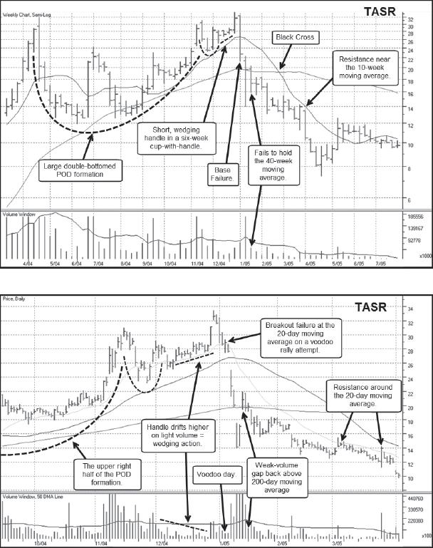
Notes: Taser International (TASR) became a “hot stock” play in the post 9/11 environment. The basic groupthink was that airlines would equip pilots with Tasers, and this would result in big sales growth for TASR. This led to a massive upside run that blew up in spectacular fashion in April 2004. The stock then bottomed and rallied all the way to a marginal new high in December 2004 to form a large punchbowl of death (POD) topping formation. The breakdown on the right side occurred after a late-stage breakout from a small cup-with-handle formation failed, resulting in what was a shortable gap-down move. Notice that as TASR trundled lower after the massive gap-down in January 2005, it followed the 20-day moving average to the downside. Both the left side and right side peaks of TASR's POD formation occurred in conjunction with general market corrections.
eBay (EBAY) 2004
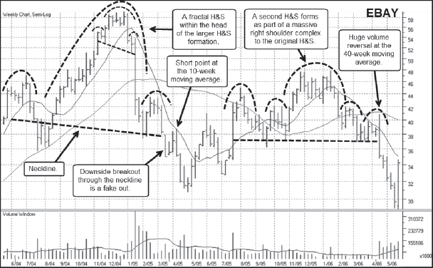

Notes: From 2004 to 2006, eBay (EBAY) set up in two different head-and-shoulders (H&S) formations that could be thought of as a primary H&S off the peak and then a secondary H&S that formed after the stock retraced a little over half of the price breakdown that occurred from January to April 2004. Two daily charts are shown here, the first of which focuses on the initial breakdown off the peak in January 2005 and the second on the breakdown off the peak of the head of the secondary H&S formation in January 2006. Note that both peaks in January 2005 and then in 2006 were late-stage failed-base (LSFB) set-ups where a breakout attempt failed once the EBAY broke below the 20-day moving average on heavy volume. Each of these peaks was associated with a short-term market correction.
Omnivision Technologies (OVTI) 2004
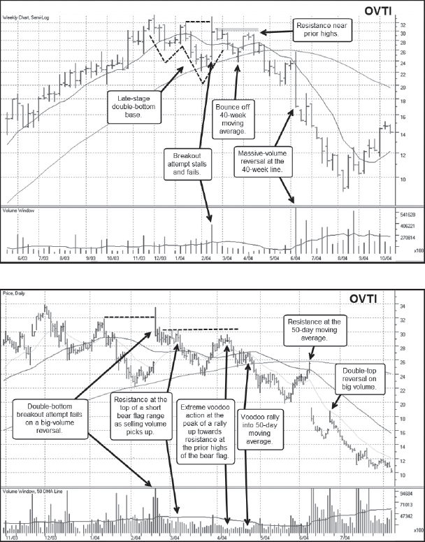
Notes: Omnivision Technologies (OVTI) made chips for the cameras that were showing up in smartphones and other handheld devices and thus became a very hot stock based on this investment theme. The stock topped with a late-stage double-bottom base that was somewhat wide and loose. The daily chart shows the exact day of the double-bottom breakout attempt that failed immediately, closing that same day near the lows of the daily trading range. It then built a short bear flag before dropping down to the 200-day moving average. Notice that the rebound off the 200-day line, which is quite logical, took the stock past both the 20-day and 50-day moving averages on the upside and right up near the highs of the prior bear flag it formed right after the failed breakout attempt. This sort of retest of prior highs just below a prior failed breakout point that also carries just beyond the 20-day and/or 50-day moving average is not uncommon in leading stocks as they just begin to fail off the peak in an LSFB type of set-up. On the weekly chart, one can make out a small head and shoulders that formed with the left-side peak of the double-bottom forming the head of this H&S pattern. The mid-point of the double-bottom W forms the peak of the right shoulder.
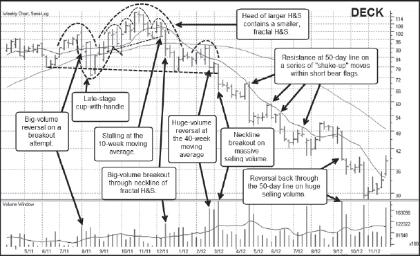
Deckers Outdoor (DECK) 2005
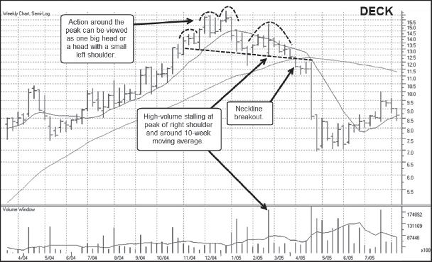
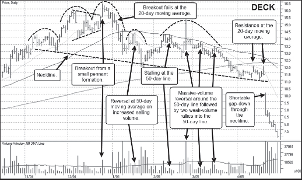
Notes: Deckers Outdoor (DECK) topped with an H&S formation that could also have been looked at as a late-stage cup-with-handle base where the handle is well in the lower half of the pattern. The peak of the right shoulder was formed by a large one-day price spike that was also a failed breakout attempt from the improper cup-with-handle that closed back below the 50-day moving average. Furthermore, notice that the right shoulder of the overall H&S formation also contains a fractal H&S where the big price spike at the peak of the right shoulder also forms the peak of the fractal H&S's head.
Monster Beverage (MNST) 2012

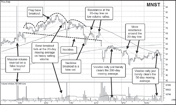
Notes: Monster Beverage (MNST) was formerly known as Hansen's Beverage, trading under the symbol HANS. The name change was made to emphasize its flagship Monster brand of energy drinks. The energy drink craze helped fuel strong earnings for MNST during its upside price run and rumors began to abound that Coca-Cola (KO) was going to buy the company, accounting for the huge price spike that we interpret as the right shoulder of an H&S top it formed at the peak. This, of course, assumes some interpretive license, based on the fact that the stock closed very near the lows of the weekly trading range. Just before the downside neckline breakout, the 20-day moving average came into play as it often does, serving as stiff resistance on short reaction rallies off the neckline in late July and early August 2012. The gap-down breakout through the neckline in early August 2012 was also a very playable shortable gap-down move using the intra-day high of the gap-down day as a guide for an upside stop. Interestingly, MNST topped as the general market was forming a low in June of 2012.
CBRE Group (CBG) 2007
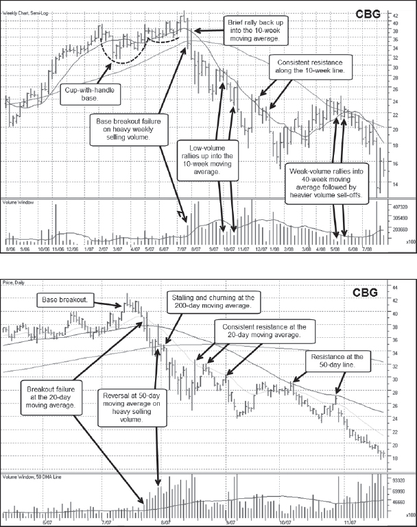
Notes: CBRE Group (CBG) was formerly known as C.B. Ellis, a real estate development company that was riding high on the real estate bubble/boom that finally ended in 2006–2007. The stock topped during a short market correction leading up to the October 2007 top after an abrupt breakout failure coming out of a late-stage cup-with-handle formation. The late-stage base was relatively well-formed, but the daily chart shows how quickly the stock came apart once it failed at the breakout point and dropped through the 20-day moving average on heavy volume. Throughout late July and August 2007, the stock followed the 20-day moving average to the downside as it slashed its way lower. As the 50-day moving average continued lower and approached the 20-day line in early October 2007, the 50-day line assumed the role of overhead resistance. The stock could have been shorted into both of the rallies it had up into the 50-day line before breaking to fresh lows in early November 2007.
Precision Castparts (PCP) 2007
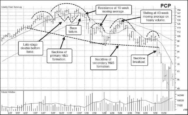
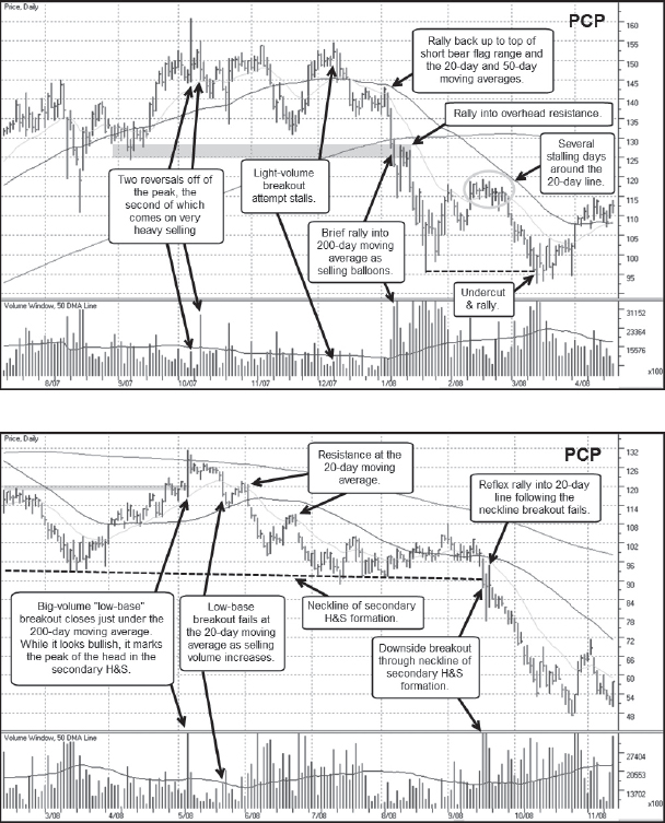
Notes: Precision Castparts (PCP) topped in late 2007 as it formed a relatively large H&S formation. After the neckline breakout to the downside from this primary H&S formation, the stock then formed an even larger, seven-and-a-half-month-long secondary H&S formation. PCP initially topped with the general market in late 2007, and the first neckline breakout occurred during the first leg of the brutal 2007–2009 bear market. The neckline breakout from the secondary H&S formation occurred in September 2008 as the general market began the very steep second down leg of the 2007–2009 bear market.
VMware (VMW) 2007
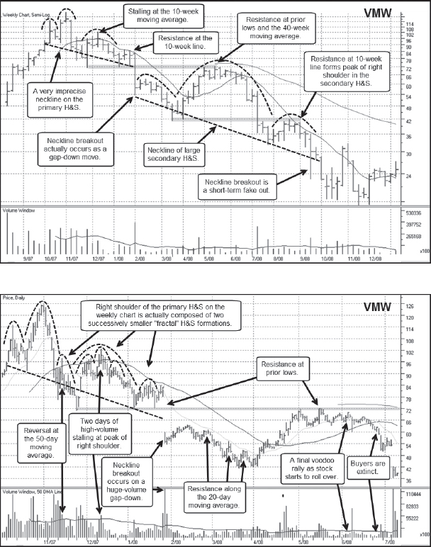
Notes: VMware (VMW) was a hot stock IPO that came public in August of 2007 and immediately ran to the upside without forming any discernible base on the weekly chart. The stock's move became somewhat climactic in late October 2007, and the stock topped in tandem with the general market peak at that time. The right shoulder of the H&S contains a small, fractal H&S formation, and the neckline breakdown occurred on a huge-volume gap-down move that could have been shorted but which would have stopped out any would-be short-sellers. The ensuing rally and “dead cat” bounce after the gap-down ran into the 20-day moving average in late February 2008, and the stock could have been shorted at that logical resistance point.
Baidu (BIDU) 2008
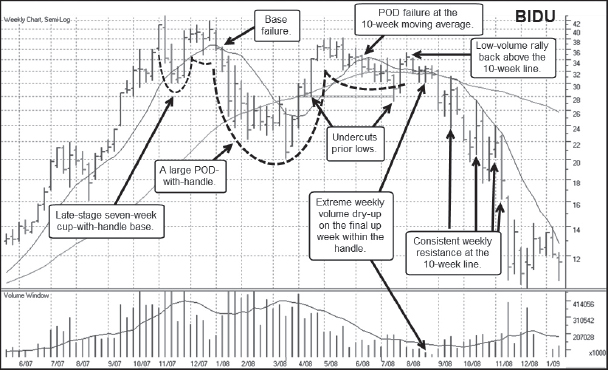

Notes: Baidu (BIDU) topped with the general market in late 2007 after forming a short, late-stage cup-with-handle base. This late-stage base formed the left peak of what later became a big POD topping formation. BIDU broke down sharply in January 2008 after the failed cup-with-handle breakout attempt in the first daily chart, and the steep decline formed what later became the left side of the large POD formation. BIDU then rallied all the way back up to the late 2007 highs and failed from the right side peak of the POD in May 2008. The ensuing large cup-with-handle, or rather “POD-with-handle,” formation took longer to break down, and is similar to the topping patterns seen in Broadcom (BRCM) in 2000, Apple (AAPL) in 2008, and First Solar (FSLR) in 2008. This POD-with-handle formed its left peak around the same time as the general market top in 2007 and its right peak at around the same time as the second leg down of the 2007–2009 bear market got going in September 2008.
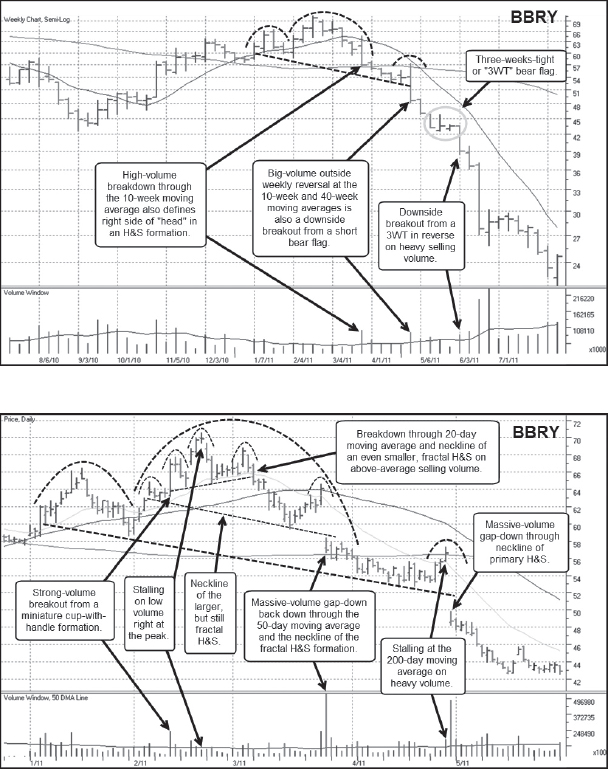
Blackberry Limited (BBRY) 2008
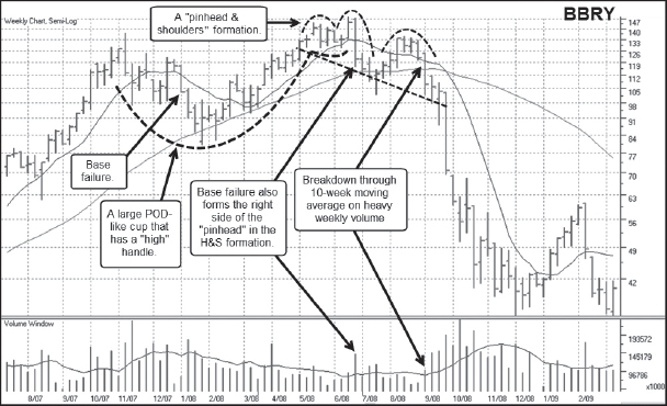
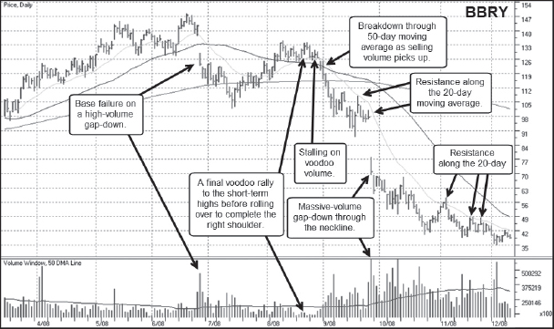
Notes: Blackberry Limited (BBRY) was originally known as Research in Motion (RIMM), maker of the famous Blackberry smartphone which became so popular and addictive to its users that it soon earned the nickname “Crackberry.” BBRY's top is unique in that it formed a rare and unusual “pinhead and shoulders” formation on the right side of a large POD topping formation. The left side of this POD coincided with the market top in late 2007, while the right side and final breakdown from the right side and the pinhead and shoulders formation occurred in synchrony with the second down leg of the 2007–2009 bear market that began in September 2008. The neckline breakout in late September 2009 was in fact a shortable gap-down, and the stock simply followed the 20-day moving average lower from there. Notice also that the pattern that formed from late June to August of 2008 looks like a cup-with-handle, and the handle failure at the end of August would have provided a much earlier short-sale point, as the stock broke down below the 50-day moving average on expanding selling volume.
Crocs (CROX) 2007

Notes: In our first book we described Crocs (CROX) as the “poster child” of H&S topping formations. The big H&S formation it formed when it topped in October 2007, at the same time as the general market began the 2007–2009 bear market, has all of the textbook features of a classic H&S. The only problem is that such textbook H&S formations are more the exception than the rule. Nevertheless, CROX's 2007 H&S top provides a clear example of the basic, identifying features of an H&S formation. It was also a hot stock recent IPO with a hot product, namely the rubberized Crocs shoes that were hailed for their comfort and utility. Crocs also created Jibbitz™, shoe “charms” with which kids could decorate their shoes, adding to the Crocs craze. Crocs also found favor among certain professionals like doctors and nurses, who found the shoes to be very comfortable to wear while on long hospital shifts. The initial break off the peak occurred in late October 2007 on a bad earnings report, just as the general market was starting to top. This break came in the form of a massive-volume gap-down that was in fact a shortable gap-down, as it never again got back above the intra-day high of that gap-down day, as the daily chart clearly shows.
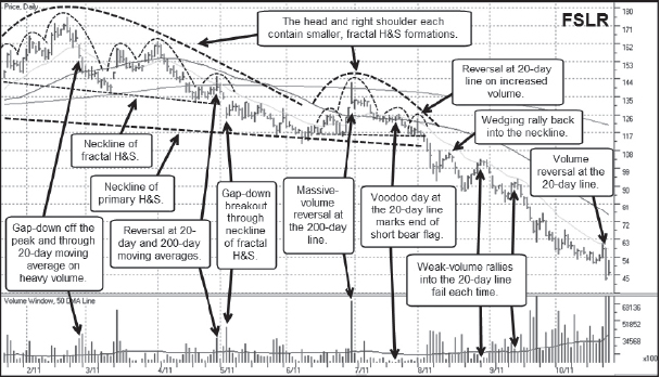
First Solar (FSLR) 2008

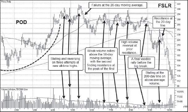
Notes: Solar stocks were a hot group in 2007. First Solar (FSLR) was one of the primary big-stock leaders of that group phenomenon, and it took a long time to form a complete and final top. The first top in the stock occurred after the initial October 2007 market top and formed the left side of a large POD formation. This evolved into a POD-with-handle formation that is similar to the patterns seen in Broadcom (BRCM) in 2000, Apple in 2008, and Baidu (BIDU) in 2008. Notice that the handle part of the POD-with-handle is also a fractal H&S formation that also has the look of a “rolling top.” There were three rallies on the right side of this fractal H&S that formed the right shoulders and that found resistance right around the prior failed breakout point from mid-May 2008. The final breakdown occurred in synchrony with the second down leg in the 2007–2009 bear market that got going in September 2008.
Sunpower (SPWR) 2008
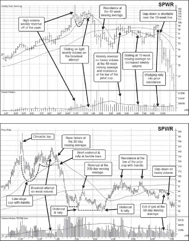
Notes: Sunpower (SPWR) was another one of the big-stock names in the “hot stock” solar group in 2007, and its meteoric rise ended in a classic climax top. This led to a sharp decline down to the 50-day/10-week moving averages and the ensuing bounce off the moving averages formed a late-stage cup-with-handle base. A breakout attempt from this cup-with-handle formation occurred in late December 2007 but immediately failed, as the stock broke back down below the initial breakout point and the 20-day moving average on heavy volume. That breakdown briefly found support at the 50-day moving average before the stock completely blew apart, dropping a total of −67.7 percent from its October 2007 peak. The stock then spent the next six months chopping back and forth but finding consistent resistance around the 100 price level. It finally failed after a final wedging rally into prior resistance before plummeting again to the downside in synchrony with the second down leg of the 2007–2009 bear market that started in September 2008.
JA Solar (JASO) 2008

Notes: JA Solar (JASO) was a smaller “hot stock” name in the solar stock craze of 2007 and came public in February 2007. The stock very quickly launched to the upside, going on a very steep run before peaking roughly two months after the general market top of October 2007. The breakdown in January 2008 formed the left side of a narrow 15-week POD. The POD built a short handle along its right side peak before a breakout attempt in mid-May failed and reversed sharply to the downside, sending the stock through its 20-day moving average on heavy selling volume. Two short rallies as the stock began trending lower from the breakout point found resistance at the 20-day line before the stock bounced off the 200-day moving average. This bounce carried up into the 50-day moving average where it ran into stiff resistance and reversed back to the downside, slicing through the 200-day line before finding support roughly along the lows of the prior POD formation. After a brief rally that carried up into the early June 2008 low, JASO broke back down through the 50-day line and plummeted to the downside in synchrony with the second down leg of the 2007–2009 bear market that began in September 2008.
U.S. Steel (X) 2008

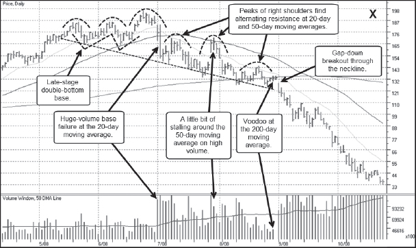
Notes: Sharply rising commodities prices, from gold and copper to oil and agricultural products like wheat and rice, gave rise to the big move in what we dubbed “stuff stocks,” stocks of companies that handle the “stuff” from which other finished products are made. In addition, the need for a commodity like steel as a global building boom took hold sent steel stocks like the granddaddy of all steels, U.S. Steel (X), rocketing higher. Interestingly, X did not top with the market in late 2007, but instead continued moving higher and did not reach its final zenith until early July 2008, two months before the brutal 2007–2009 bear market began its second down leg in September. X provides a good example of leading stocks that continue moving higher even after the general market tops, but which eventually form their final top at around the same time a second or third down leg within an overall bear market takes hold. While X topped in the manner of an H&S top, it also formed an LSFB right at the peak, as is evident on the daily chart. The head of the H&S formed right at the point where the final late-stage base breakout attempt failed, gapping down through the 20-day moving average on heavy selling volume. This would have provided an early short-sale entry point. Once X began to “live” under its 50-day moving average, it formed a second, fractal H&S formation. The gap-down breakout through the neckline of this fractal H&S, which also coincided with the neckline of the overall H&S, was very shortable as the stock plummeted to the downside with the general market in September 2008.
Steel Dynamics (STLD) 2008

Notes: Steel Dynamics (STLD) was another steel stock moving to the upside during the stuff stock craze, and it broke down very similarly to X. While it formed an H&S top before breaking down, the daily chart, as with X, shows that the actual peak occurred on a late-stage base breakout failure. That breakout failure occurred on a massive volume breach of both the 20-day and 50-day moving averages. A notable feature on the weekly chart is the three weeks in late July and early August 2008 where the stock closed right at the lows of the long weekly ranges on above-average weekly volume. Each week found resistance just underneath the 10-week moving average on the weekly chart, but we can see that the more granular view provided by the daily chart reveals that each of these weeks found resistance at the 20-day moving average. Notice that in late June, the stock had one final little bounce back up through the 20-day line on a churning and stalling voodoo day. Like X, STLD then came completely apart as the general market came apart in September 2008.
Freeport McMoRan Copper & Gold (FCX)
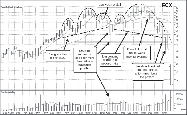
Notes: Freeport McMoRan (FCX) was primarily a copper stock play during the stuff stock craze of 2007. Like steel stocks, it also benefitted from the global building boom of the day. FCX is unusual for its dual H&S formations, where the peak of the head of the first H&S coincided with the general market top in October 2007 and the peak of the head of the second H&S formed a couple of months before the 2007–2009 bear market's second down leg, which began in September 2008. The first H&S formation has an ascending base, and one could have made some money shorting the neckline breakout in January 2008. Even more optimally, the stalling rally back up into the 10-week moving average in late December 2007 also offered a decent short-sale entry point. Once FCX began to break down in late June 2008, it followed the 20-day moving average all the way down to the descending neckline of the second, higher H&S formation. The final breakdown through the second H&S neckline occurred in synchrony with the 2007–2009 bear market's second down leg in September 2008.
Peabody Energy (BTU) 2008
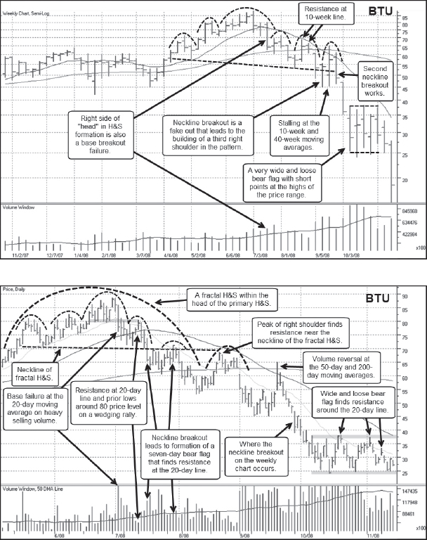
Notes: Since coal is a particular type of “stuff” that is not only used as a source of energy but also in other industrial processes, such as steel and cement manufacturing, coal stocks were also players in the stuff stock move of 2007. Among these, Peabody Energy (BTU) was a major coal play that topped out after it formed a six-month H&S pattern, but the actual peak in the stock occurred on a late-stage base breakout failure in early July 2008. One could have entered a short position as the stock rallied up into the 20-day moving average in mid-July. As well, the head of the larger H&S formation contained a smaller, fractal H&S pattern, and the neckline breakout in mid-July was also shortable. The ensuing rally back up into the neckline and the 20-day line in late July was also a reasonable short-sale entry point. One final rally up into the 50-day and 200-day moving averages in mid-September that stalled on heavy volume provided a final short-sale point before the stock blew through the neckline of the larger head and shoulders formation in synchrony with the second down leg in the 2007–2009 bear market.
Consolidated Energy (CNX) 2008

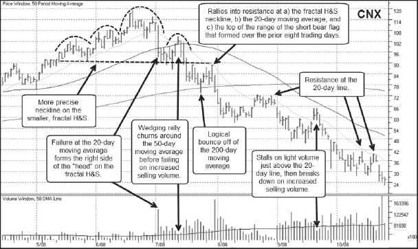
Notes: Consolidated Energy (CNX) was another leader among the coal-related names that participated in the stuff stock rally of 2007. The stock formed a massive eight-month H&S formation, but from a practical standpoint it actually became shortable within the fractal H&S that formed inside the head of the primary H&S pattern. Shorting the fractal neckline breakout in mid-July would have been a reasonable entry point. Notice the Black Cross that occurred in late August 2008 as the 10-week moving average crossed below the 40-week moving average. Once CNX broke the 10-week line in July, it never traded back above the line throughout its downside break in the latter part of 2008.
Cliffs Natural Resources (CLF) 2008
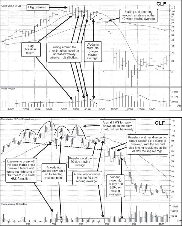
Notes: Cliffs Natural Resources (CLF) provided a combination play on metals and coal as a major iron ore producer and a significant producer of high- and low-volatile metallurgical coal. The stock began to wobble around its peak in July 2008 as the weekly price ranges began to widen. On the daily chart, notice the improper double-bottom it tried to break out of July 2008 and failed miserably right at that point. One final, wedging rally into the 10-week and 50-day moving averages on the weekly and daily charts, respectively, in late August provided short-sellers with a reasonably optimal entry point given the voodoo rally evident on the daily chart. The stock essentially blew apart from there.
Rio Tinto Plc (RIO) 2008

Notes: Rio Tinto PLC was another producer of various ores, including aluminum, copper, and iron, that performed similarly to CLF in the great stuff stock boom of 2007. RIO corrected 35.9 off of its peak during the initial general market top in October 2007, but like CLF, it recovered and broke out to new highs in April 2008. That breakout lasted all of four weeks before the stock topped in June in an initial LSFB set-up. This eventually evolved into an H&S top that finally split wide open with the general market when the second leg of the 2007–2009 bear market took hold in September 2008.
Union Pacific (UNP) 2008
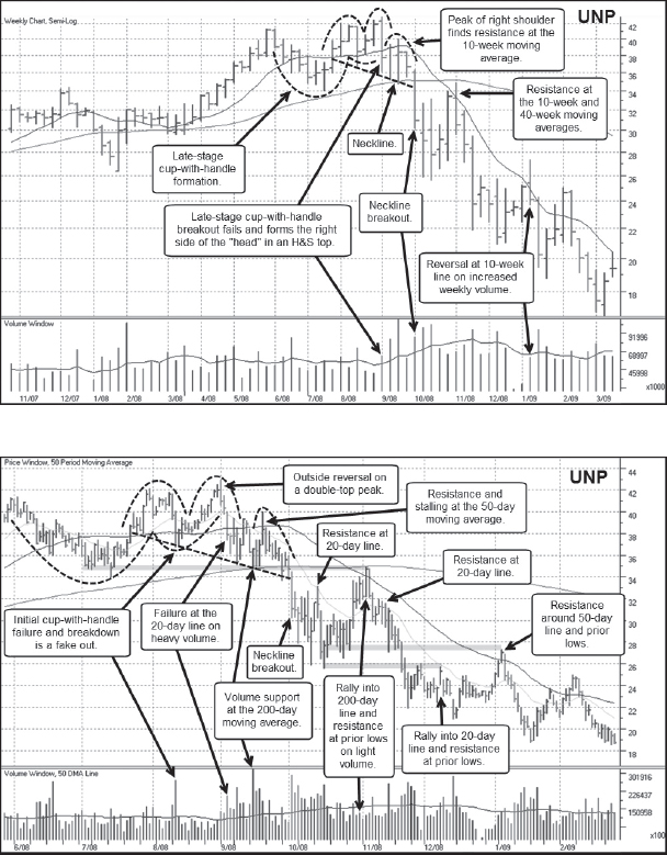
Notes: As stuff stocks were moving in 2007, so were the stocks of companies that moved stuff, such as the railroads. Union Pacific (UNP) was a big-stock railroad leader during this period, and it bucked the general market top in October 2007 as it continued to make new highs until finally topping in the first week of September 2008 as the second leg of the 2007–2009 bear market was beginning. UNP topped after forming a late-stage cup-with-handle and failing on a big outside reversal week to the downside, as can be seen on the weekly chart. This later evolved into a big H&S formation, but note that the action around the handle of the late-stage cup-with-handle formed a smaller, fractal H&S formation that provided earlier reference points for short-sale entries. In fact, the fractal neckline breakout provided a very profitable move to the downside for short-sellers.
CSX Corporation (CSX) 2008
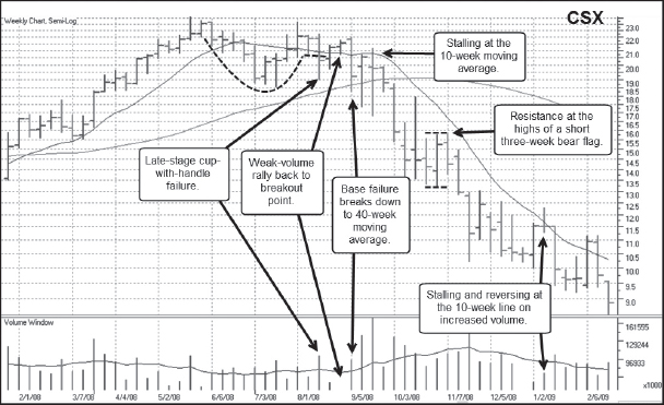
Notes: Railroad stock CNX Corp. (CNX) was another stuff stock rally participant, and had a role in the coal boom as well given its exposure to coal-producing areas in the Eastern United States. It topped in similar fashion to UNP, making new highs after the general market top in October 2007. The stock rolled over off of the peak in early September 2008 at the same time as UNP and the start of the second down leg in the 2007–2009 bear market. CSX had formed a late-stage cup-with-handle, and topped with a big outside reversal week exactly as UNP did. Notice the rally in late August 2008 that carried right up to the prior breakout point before reversing hard on heavy volume. This is a common retest of a breakout point that is often seen in LSFB set-ups.
Diana Shipping (DSX) 2008

Notes: Railroads weren't the only movers of “stuff” that had big price moves during the stuff stock craze of 2007. In addition to the need to move stuff over land via rails, stuff also had to be moved over the oceans, and oceangoing shippers like Diana Shipping (DSX) had phenomenal upside moves in 2007. DSX initially topped with the market in October 2007 and broke down with a great deal of downside velocity, diving −55.4 percent below its November 2007 high before turning back to the upside and coming within 11 percent of that high by May 2008 to form a 28-week-long POD topping formation. Notice how the POD formed logically within the context of what was going on in the general market. The left side peak of the POD coincided with the market top in October 2007 while the right side peak and eventual breakdown coincided with the start of the second leg of the 2007–2009 bear market in September 2008.
Dryships (DRYS) 2008
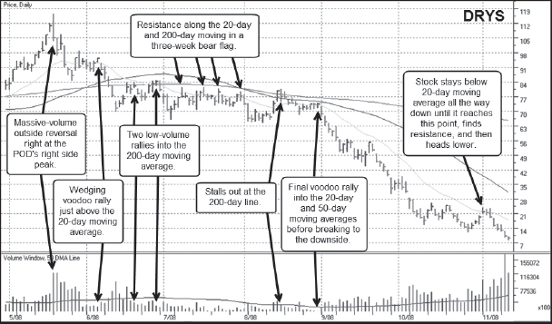
Notes: Dryships (DRYS) joined DSX in the stuff stock shipper rally, and you could not find better proof that stocks tend to move in packs. DRYS topped in POD fashion exactly as DSX did, forming a 29-week POD where the left side was formed in sync with October 2007 general market top and the right side was formed as the market was beginning to break down again in late summer 2008 on the second leg of the 2007–2009 bear market.
Potash Saskatchewan (POT) 2008
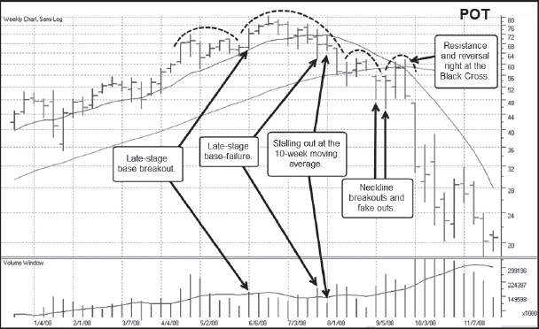
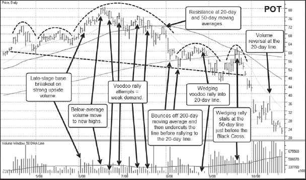
Notes: With commodities on the move during the stuff stock rally of 2007, the upside trends in agricultural commodities led to increases in the prices of products that helped grow those commodities, namely stocks of companies that produced fertilizer components. Nitrogen, phosphorus, and potassium are the three main ingredients in fertilizer, and Potash Saskatchewan was a major miner and manufacturer of potash, essentially a mined or manufactured form of water-soluble potassium. POT started out as an LSFB set-up and later evolved into a five-month-long H&S formation that finally blew apart with the market in September 2008. One last wedging rally into the 50-day moving average in late September provided an optimal short-sale entry point, and the stock plummeted from there.
Agrium (AGU) 2008

Notes: Agrium (AGU) was another big-stock fertilizer play in 2007, and its business covered most of the bases when it came to fertilizer production. AGU manufactured nitrogen, phosphate, and potassium as well as “crop protection products,” and was also a major supplier of crop production services. It topped in similar fashion to POT, topping initially as an LSFB and then evolving into a larger, roughly five-month H&S formation. The gap-down neckline breakout was in fact a very manageable shortable gap-down move, and the stock blew apart from that point as the second leg of the 2007–2009 bear market took hold in September.
CF Industries (CF) 2008

Notes: CF Industries (CF), as a producer of nitrogen, was the third of the big-stock fertilizer plays in 2007, and it topped in similar fashion to POT and AGU. A slight wrinkle occurred here in that the stock topped after a failed double-bottom breakout attempt, as is evident in the daily chart. One last voodoo rally in late August formed the peak of the right shoulder in the five-month H&S pattern before the neckline breakout in early September 2008. Following the neckline breakout, CF formed a short, two-week bear flag and then gapped down through the lows of the flag on heavy volume as the stock blew apart with the general market.
Mosaic Company (MOS) 2008

Notes: The fourth and final 2007 big-stock fertilizer leader was Mosaic Company (MOS), the world's largest combined producer of phosphates and potash. It topped in similar fashion to the other fertilizer names in mid-June 2008, starting out as an LSFB and later evolving into a five-month H&S formation. An interesting point here is that one can actually draw a neckline on the daily chart that is higher than the neckline on the weekly chart. The neckline breakout on the daily chart occurred in early August, while the neckline breakout on the weekly chart occurred in early September. There was one last voodoo rally into the 20-day and 200-day moving averages before the stock blew apart with the general market in September 2008.
Goldman Sachs (GS) 2008


Notes: The bear market of 2007–2009 was all about the great financial crisis of 2008, and many financial stocks were hammered during this bear market. These names were difficult to play on the short side because of the extreme volatility and highly news-oriented moves they had. Goldman Sachs (GS), certainly one of the biggest of the big-stock leaders in the 2007 bull market, is a reasonable example of this phenomenon. GS topped after forming a large, late-stage cup-with-handle. The daily chart shows a great deal of volatility around the cup-with-handle breakout point, all of which served to form a very jagged, fractal H&S formation. As the stock zig-zagged lower, there were a number of undercut and rally moves, and each rally following an undercut of a prior low in the pattern eventually ran into resistance and reversed. GS's downtrend began to plummet in a fairly uniform move throughout February 2008, and the short-term low occurred at the time that Bear Stearns (formerly BSC) went bankrupt. This created something of a short-term panic low for the stock and the general market at the time as the first leg of the 2007–2009 bear market came to a conclusion.
Apple (AAPL) 2008

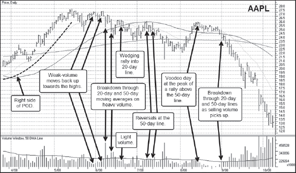
Notes: In Chapter 5 we discussed Apple's (AAPL) top in 2012, but the stock also put in a major top during the 2007–2009 bear market. After the general market topped in October 2007, AAPL continued moving higher into the end of December as it broke out from a late-stage cup-with-handle formation. That breakdown coincided with the first major leg down in the general market and resulted in an AAPL decline of −43.1 percent from the peak. The stock then turned back to the upside and in May 2008 came within 5.5 percent of its prior December 2007 high to form a large POD topping formation. The first daily chart shows the left side of the POD, the second shows the right side of the POD. The breakdown off the right side peak took time to develop and eventually split wide open in September 2008 as the general market began its second down leg in the 2007–2009 bear market. This is a rich example that illustrates how a long-term big-stock leader like AAPL can have periods where it becomes a very profitable short-sale target, even in the midst of a longer-term upside price run over many years.
Priceline.com (PCLN) 2008
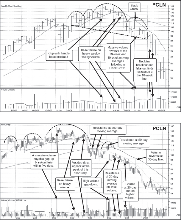
Notes: By the time September 2008 rolled around and the bear market of 2007–2009 was embarking on its second major down leg, leaders of all stripes were pummeled. Big-stock NASDAQ leader Priceline.com (PCLN) was no exception. It topped after a cup-with-handle breakout that was also a buyable gap-up in early May 2008 failed and evolved into a five-month H&S formation. In early August 2008, the stock gapped down from the 50-day moving average and then followed the 20-day line all the way down to the November 2008 bottom.
Amazon.com (AMZN) 2008
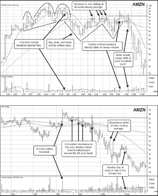
Notes: Amazon.com (AMZN) also did not escape the wrath of the September 2008 market break, and an early August breakout attempt from a big, ugly, late-stage double-bottom base failed in short order at the beginning of September. The weekly chart also shows that the left side of this big double-bottom formation was formed by a breakdown from a late-stage cup-with-handle breakout failure in January 2008. Notice how the left side of that cup coincided with the October 2007 market top. Like AAPL at that time, AMZN tried to make a comeback but could not quite make it to new price highs; it broke hard to the downside throughout January and February of 2008 as the market staged its first major leg down in the 2007–2009 bear market. AMZN blew apart along with everything else on the second major leg down that carried into November 2008.
Salesforce.com (CRM) 2008

Notes: Salesforce.com (CRM) was one of the first hot “cloud” stocks to hit the market after its IPO debut in 2004. It had a relatively shallow price run in 2007, but it topped with the same velocity that any number of big leading stocks did in September 2008. After forming something of a “squat” H&S formation, CRM gapped down in the latter half of August 2008 and worked its way sideways in a four-week bear flag before splitting wide open in late September. The rallies into the highs of the bear flag and the 20-day moving average in early September provided reasonable short-sale entry points.
Molycorp (MCP) 2010
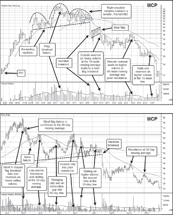
Notes: Molycorp (MCP) is discussed in detail in the Chapter 9 Case Study.
Skechers USA (SKX) 2010

Notes: Shoemaker Skechers USA (SKX) had a big price run off the April 2009 market lows and finally topped during the summer 2010 market correction that began with the Flash Crash in May. SKX tried to break out of a wide and loose late-stage base in late June 2010, and as the general market began to bottom and turn back to the upside, SKX diverged and headed lower. As the market began to bottom in the latter part of August 2010, SKX broke out through the neckline of a roughly four-month H&S formation. The neckline breakout came on heavy volume and coincided with a breach of the 40-week and 200-day moving averages on the weekly and daily charts, respectively.
Blackberry Limited (BBRY) 2011
Notes: After its initial major top in 2008, Blackberry Limited (BBRY), formerly known as Research in Motion (RIMM), bottomed out in March of 2009, rallied, and then retested the 2009 low in late 2010. That retest down to 42.53 held well above the 35.05 March 2009 low, and the stock then embarked on a 65.8 percent upside price run from there. This six-month price run ended in February 2010, and the stock formed a short, three-month H&S formation. The gap-down through the neckline of the fractal H&S in late March 2011 was a shortable gap-down. The stock then descended below the 200-day moving average, and one last stalling rally up into the 200-day line resulted in a second gap-down neckline breakout in late April, this time through the neckline of the larger H&S formation. From there the stock never really looked back as it plummeted all the way down to a low of 6.22, more than a 90-percent decline off the 70.54 peak of the H&S formation that formed during the first quarter of 2011. This is a good example of a company that is coming under serious brand pressure as its products are displaced by newer, faster, and better ones made by other companies, and how it can have a final, highly profitable short-selling wave as its obsolescence destroys earnings and sales. This in turn results in a final “extinction” selling wave that decimates the stock price.
Rovi Corp. (ROVI) 2011
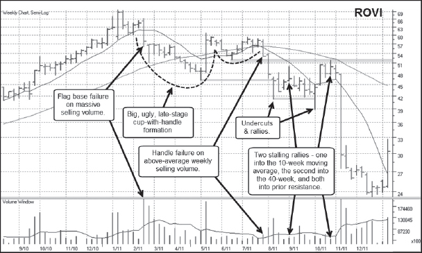

Notes: The boom in digital entertainment in the New Millennium gave rise to the need to find, organize, and record such content and created a business opportunity for companies like Rovi Corp. (ROVI). The company provided software for updating and maintaining media libraries and interactive program guides that help users find, sort, select, schedule for viewing, and record specific digital entertainment content. Bottoming in November 2008 before the market low of March 2009, ROVI had a big price run throughout 2009 and 2010, and topped in February 2011 after a late-stage flag breakout attempt failed on heavy selling volume. That led to a -33.8 percent decline off the peak before the stock bottomed and began building what became a big, ugly, and improper cup-with-handle base. That base failed in late July 2011, leading to a decline that finally saw the stock bottom nearly 12 months later at 9.91, a decline of over 85 percent from its January 2011 high of 69.50.
Akamai Technologies (AKAM) 2011
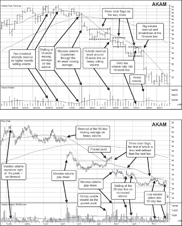
Notes: While the term cloud computing might conjure up images of applications and data floating in the air, the reality is that the cloud, for all practical purposes, exists on remote servers that are networked together. Akamai (AKAM) became a play on the cloud-computing theme in 2009–2010, if not part of the cloud itself, with its global network of computer servers. The stock eventually topped out in a very nondescript way, falling out of bed, so to speak, from a choppy four-month triple-bottom sort of structure in early 2011. Once it gapped down through its 200-day moving average in early February 2011, it was in play on the short side. This gap-down move occurred less than two weeks before a short-term general market correction took place. While the “dead-cat” bounce after the early February gap-down could have been shorted into on the fourth-day of the bounce, the only other practical places to attempt to short the stock would be on moves up to the top of the three bear flags it formed after the February gap-down.
F5 Networks (FFIV) 2011
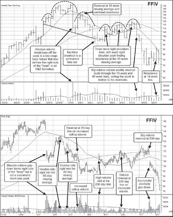
Notes: F5 Networks (FFIV) was another cloud play that had a huge price run from late 2009 into early 2011. The breakdown off the peak in January 2011 occurred on a huge-volume gap-down following a poor earnings report. That move was not shortable, as it turned out, but the ensuing rally right back into the 50-day moving average that formed the right shoulder of a H&S topping formation offered a very optimal textbook short-sale entry point. The rally itself ended with a voodoo upside day followed by an outside reversal right at the 50-day moving average, as can be seen in the daily chart.
Netflix (NFLX) 2011
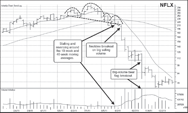

Notes: Netflix (NFLX) and its 2011 top are discussed in detail in the Chapter 6 Case Study.
Keurig Green Mountain (GMCR) 2011
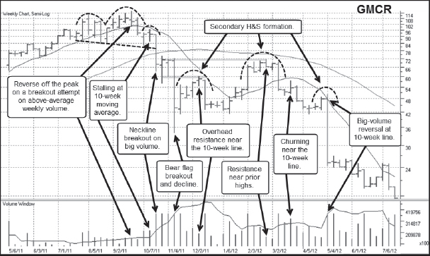
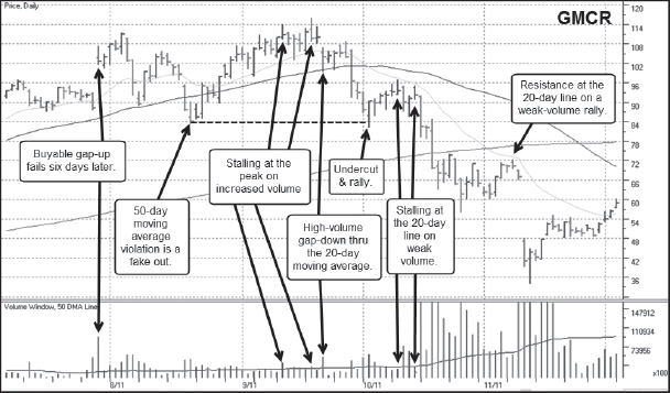
Notes: Keurig Green Mountain (GMCR) and its 2011 top are discussed in detail in the Chapter 7 Case Study.
Omnivision Technologies (OVTI) 2011
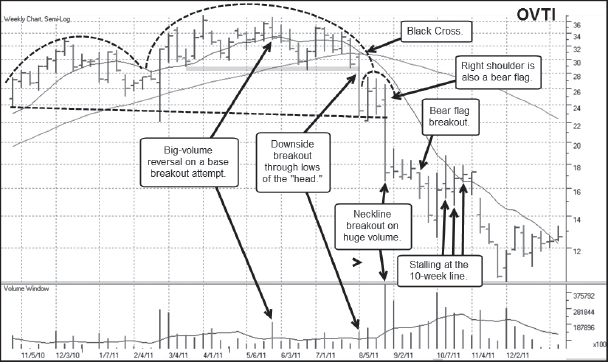

Notes: Since Omnivision Technologies (OVTI) began trading as a public company in year 2000, it has had something of a jagged past, with two massive price runs and three major tops. We looked at OVTI's 2004 top earlier in this section of the book, and OVTI's other major top occurred in 2006, but after a lesser upside price run where the stock “only” tripled off the lows. The stock topped from a long, rolling five-month base that formed a sort of head in a big H&S formation. However, the critical short point occurred as the stock “fell out of bed” from the five-month base in July of 2011. There was a very uniform, almost “slow motion” breakdown as the stock steadily descended through the 200-day moving average and just kept going. A short bear flag or “pennant” formed in the middle of August 2011; the highs of this pennant formation found resistance along the 20-day moving average. OVTI then gapped down from the 20-day line and well below the lows of the pennant in late August.
Riverbed Technology (RVBD) 2011

Notes: Riverbed Technology (RVBD) was another cloud networking company that had a huge price run throughout most of 2010 and into early 2011. The stock topped in March 2011 and formed a clear H&S top, but eventually was able to break out above the highs of the first right shoulder to form a second, higher right shoulder. However, another way to look at this is as a late-stage double-bottom base, where the second low of the double-bottom W did not undercut the first low. RVBD briefly moved up through the middle of the W on a standard-issue double-bottom breakout attempt in early July 2011. That breakout attempt failed on a massive-volume gap-down at that time that blew right through the 200-day moving average and which was quite shortable. The stock continued lower from there, finding resistance along the 20-day moving average as it moved lower.
Jinko Solar (JKS) 2011

Notes: Jinko Solar (JKS) missed the solar stock boom of 2007, but it came public in May of 2010 at $11 a share and had a sharp 279-percent upside move from there to a peak of 41.75 in November 2010. The stock broke out of what could be considered a late-stage flag formation in November and immediately failed. That breakout failure is shown at the extreme left of the daily chart. The stock could have been shorted as it blew through the 20-day moving average right after the breakout failure, and this would have led to some very sharp downside gains over the next four weeks. The stock slowed its descent, then started back to the upside, forming a large, late-stage cup-with-handle formation, as can be seen in the weekly chart. A breakout attempt from that formation occurred in early March 2011, then the stock simply rolled sideways for the next five months. JKS is an unusual example, because it started with a failed flag breakout, stabilized, and set up in a cup-with-handle, tried to break out again and failed, then morphed into a “pinhead and shoulders” formation with four right shoulders. The final three right shoulders formed their own fractal H&S, and the stock eventually blew apart in August 2011 during a sharp market correction. It also came under pressure with the rest of the stocks in the solar group, as the next example will show.
First Solar (FSLR) 2011

Notes: First Solar (FSLR) put in a major top in 2008, which we looked at earlier in this section of the book. The breakdown from the 2008 peak formed the first down leg of what became a long-term price decline that saw the stock decline from a peak of 317 in 2008 to a low of 11.43 in 2012. The second down leg of this long-term decline began in in early 2011 with a long, rolling H&S top that broke apart in August 2011 during a severe market correction and an overall breakdown in the solar stock group. On the daily chart, two fractal H&S formations can be seen, and there were two key short-sale entry points where the stock rallied into resistance at the 200-day moving average within these fractal H&S patterns.
NXP Semiconductor (NXPI) 2011

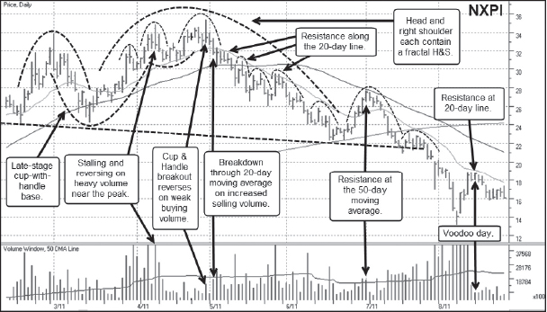
Notes: Fabless semiconductor company NXP Semiconductor (NXPI) was a hot IPO in August 2010 that spent 16 weeks building a cup-with-handle base right out of the gate. It then broke out of this base formation and set off on a quick 152-percent upside run. The stock's glory was brief, however, and finally topped after breaking out of a V-shaped cup-with-handle formation in April 2011. As can be seen on the daily chart, that breakout failed in late April. Once the stock failed, it broke below the 20-day moving average and followed the line all the way down until it met up with its 200-day moving average in mid-June. This breakdown formed the right side of the head in what later became a full-blown H&S top. The mid-June low at the 200-day line provided the third point along which the neckline was formed, and the ensuing bounce off the 200-day line ran into resistance right at the 50-day moving average. That then led to a breakdown through the 200-day moving average as well as the H&S neckline. From there the stock never looked back. Overall this was a very straightforward, textbook breakdown with simple entry points along the way that worked in very neat fashion. If only all short-sale target stocks behaved this well on the downside!
Aruba Networks (ARUN) 2011
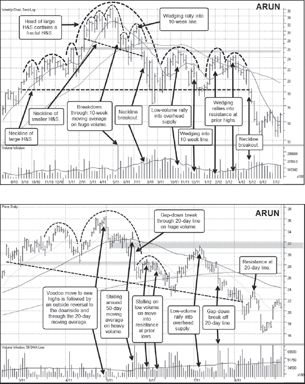
Notes: On August 29, 2010, on a very warm summer day in New York City, I was sitting on the live television stage of Fox Business News spewing my market views to anchors Liz Claman and Cheryl Casone. I was actually constructive on the market at that time, as both I and Chris Kacher were seeing a number of stocks that were acting well. One of these was Aruba Networks (ARUN), a hot new mobile networking company that had just broken out of a short flag formation at around $18 a share. The stock went on to double from there before topping out at 36.40 in early May 2011. The absolute peak occurred as the stock was moving to all-time highs on a very low-volume voodoo day, as can be seen on the daily chart. As the stock broke down from there, it moved along the 20-day and 50-day moving averages in a short bear flag and was shortable along the highs of this formation. Eventually the stock broke down through its 200-day moving average in mid-June 2011, and then rallied back above the 50-day line in early July but right into a short congestion area defined by the lows of the bear flag that formed right after the breakdown off the peak. From there, the stock broke back down to the neckline of a now fully-formed H&S formation. There was one neckline breakout and fake out, but the stock was quite shortable on the bounce back up through the neckline once it ran into the 20-day line in early August. The stock finally came apart in sync with the severe August 2011 general market correction.
Tata Motors (TTM) 2011


Notes: In 2001, the term BRIC led to a hot investment theme, as investors were lured to the strong economic growth of newly developing countries Brazil, Russia, India, and China. As the largest automobile manufacturer in India, Tata Motors (TTM) was a clear BRIC play and had a big upside move off of the 2009 market lows. The stock topped after a climactic run to new highs led to another spastic sort of move to new highs with wide, volatile, daily price ranges in late November 2010. The breakdown off the absolute peak was very severe and formed the right side of the head of a small H&S formation. The ensuing rally back to the upside and just above both the 20-day and 50-day moving averages was shortable and served to form the right shoulder in the narrow H&S pattern. A gap-down through the neckline rallied one time back up into the neckline before splitting wide open all the way down to the 200-day moving average. This was a very profitable move for short-sellers, and it occurred during a general market uptrend. Three months later, as the stock rolled back down through the 200-day moving average, the stock's ensuing breakdown correlated to a sharp general market correction that began in late July 2011.
Intermune (ITMN) 2011
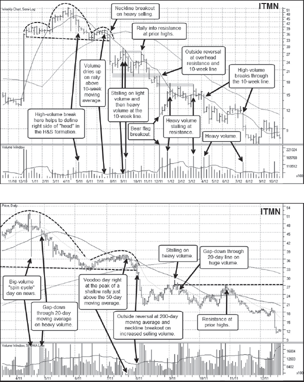
Notes: Intermune (ITMN) in 2011 is an interesting example of a volatile bio-tech that had huge news-related gap moves in both directions in 2010. This sort of action is not uncommon for bio-tech stocks, particularly those that are highly speculative and dependent on the development of a hot new drug. ITMN's first gap move was a “two-stage” gap-up in March of 2010 that took the stock from 14.61 to a high of 39.50 in three days. The stock then based for about five weeks before gapping to the downside on a massive price break that took the stock from 45.44 to 11.38 in one day. On December 17, 2010, the stock then gapped up on a blast from 14.27 to 34.89. This gap move shows up as the long price bar on the left side of the weekly chart. The stock then went on to build a very uniform H&S formation. The breakdown off the peak of the head in the pattern was a volatile affair, but eventually it gapped below the 20-day moving average and stayed there. This then led to a steady decline that remained well below the 20-day line until the stock undercut the lows of the left shoulder in the pattern. This led to a wedging rally that drifted just above the 50-day moving average and which ended on a final voodoo day right at the peak of the rally. The ensuing neckline breakout was also very “clean” in that the stock quickly dropped −35 percent over the next four days in more or less a straight line. This neckline breakout correlated to the sharp August 2011 market correction. The stock then went on to form a 15-week bear flag with one shortable rally up to the top of the bear flag range before the stock broke out through the lows and descended further.
Deckers Outdoor (DECK) 2011

Notes: Shoemaker Deckers Outdoor (DECK) started out looking as a potential LSFB topping formation in August 2011, as it failed on a late-stage breakout attempt in synchrony with the sharp market correction that occurred at that time. The stock broke −31.2 percent off its peak before bottoming and recovering to form a sloppy cup-with-handle formation, from which it attempted to break out in late October. That breakout failed as well and formed the peak of what became the head in a developing H&S top. The initial neckline breakout from the fractal H&S that made up the head of the larger H&S formation was a very profitable downside move. This led to a price break all the way down to the lows of the left shoulder, at which point the stock began to rally and build what eventually became the right shoulder in the larger H&S. The early March 2012 breakout through the neckline of the larger H&S was also profitable. Notice, however, that the late February rally into the 200-day moving average also formed the highs of a bear flag range. The lows of this bear flag ran along the neckline of the larger H&S. From the 200-day line the stock gapped down to the neckline in late February, briefly tried to rally above the neckline, and then sharply broke back to the downside.
Rockwood Holdings (ROC) 2011
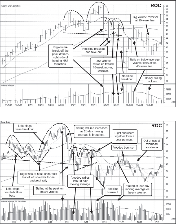
Notes: The absolute peak in chemical name Rockwood Holdings (ROC) occurred at the same time as the sharp August 2011 general market correction. This was a late-stage breakout failure that sent the stock crashing through its 20-day moving average right off the peak and formed the right side of what became the head in a H&S topping formation. The right shoulder complex could also be seen as a bear flag or “pennant” that then broke out to the downside and through the H&S neckline in late September 2011, as the market correction continued to run its course. Notice the voodoo rallies in each of the right shoulder rallies that moved up into the top of a bear pennant and the 50-day moving average.
Illumina (ILMN) 2011
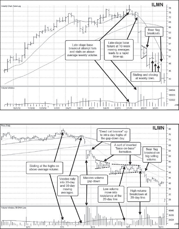
Notes: Illumina (ILMN) makes “life science” tools and systems used in the analysis of genetic variation and function, and so has been a DNA-related biotech/medical leader throughout the New Millennium since it came public in year 2000. The stock had long run from its 85-cent low in 2003 to a peak 47.87 in July of 2008, and then broke down with the rest of the market in September 2008. It then set up again and had another strong price move in 2010 into 2011. In early September 2011, the stock attempted to break out from a seven-week late-stage base and failed. After drifting along the 50-day moving average for two more weeks, the stock began a steady and rapid descent, forming a couple of bear flags on the way down. The second bear flag shows up as three straight weeks where the stock closes at the lows of the weekly range in September 2011. This can be seen as the inverse of weekly supporting action, where instead of closing at the peak of a long weekly range, generally bullish action, the stock closes at the lows of the long weekly ranges in very bearish fashion. Putting this clue on the weekly chart together with the clues provided on the daily, where a clear bear flag can be seen to be forming, would have put short-sellers on “high alert” and ready for a possible downside breakout through the lows of the bear flag.
Arch Coal (ACI) 2011
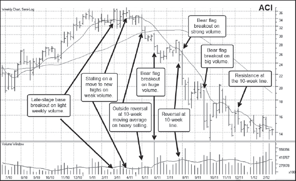
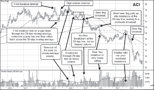
Notes: A number of the stuff stocks that broke down in the financial crisis bear market of 2007–2009 recovered after the bottom in March 2009 and had strong recovery moves from there. Many of these moves were quite playable on the upside, and eventually led to shortable tops. Arch Coal (ACI) formed an LSFB top in March and April of 2011 and then broke down in fairly uniform fashion after a failed breakout attempt in late March. This failed breakout could also be seen as the tiny head of a small fractal head and shoulders, although this can be understood and interpreted as an LSFB set-up first. The early April breakdown coincided with a general market correction that began in late April 2011. Once ACI broke down decisively through the 50-day moving average in late April 2011, ACI went on to form a series of bear flags as it stair-stepped its way lower. A voodoo rally in late July 2011 ended at what became the high end of a bear flag range that formed between early June and late July. The sharp breakdown through the 50-day moving average in late July led to a very rapid descent to new lows.
Peabody Energy (BTU) 2011
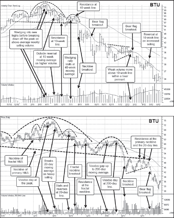
Notes: Peabody Energy was another coal-related stuff stock leader that had a comeback move after the lows of the 2007–2009 bear market. BTU topped at about the same time as ACI, and built a topping formation that is more discernible as an H&S pattern. The head of the larger, overall H&S also contained a smaller, fractal H&S. The fractal neckline was pierced in early May 2011, and three rallies over the next two and a half months all ran into resistance at that neckline. The last two of those rallies also found resistance around the 200-day moving average and together formed the right shoulder of the larger H&S. The breakout through the neckline of the larger H&S led to a decline of about −20 percent before staging a series of rallies back up into the neckline that formed a sort of “ascending triangle” bear pennant. The gap-down through the rising lows of this ascending triangle led to a sharp downside price break.
Walter Energy (WLT) 2011
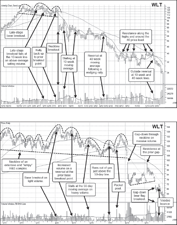
Notes: Walter Energy (WLT) was a third coal-related name that had a comeback rally after the bear market low of March 2009. WLT was unique in that this recovery rally actually took the stock to new highs, well above the 2008 peak it had reached in the prior stuff stock bull market. BTU came within 17 percent of its 2008 high, while ACI only retraced half of its 2008 bear market decline. BTU tried to break out of a late-stage base in early April 2011, but that breakout failed, chopping its way down through the 200-day moving average by late June. At this point WLT almost started to look like it was rounding out a new base as it came back up to the April breakout point, flashing a pocket pivot buy point as it came up the right side of the structure. This rally, however, gave out at the April breakout point and formed the final right shoulder in an overall H&S top. The stock broke out through the neckline of this H&S pattern and plummeted lower during the severe August 2011 general market correction. What is interesting to note here is that the end of this rally in late July 2011 started to pull back off the peak on low volume, giving the pullback a benign, orderly appearance. Once it busted through the 200-day line in early August 2011, however, volume picked up and all bullish bets on the stock at that time were off! The cascading descent included a gap-down neckline breakout that was shortable in early August, and then a second rally in early September right back up to the intra-day highs of the gap-down day. This rally stalled on heavy volume, whereupon the stock simply started losing altitude and tumbled to new lows.
Jones Long LaSalle (JLL) 2011


Notes: Jones Long LaSalle (JLL) was a real-estate developer and operator that had a long recovery rally off of the March 2009 lows of the brutal 2007–2009 bear market. As a real-estate-related company, it suffered mightily at the hands of the great financial crisis of that period but was able to recover in 2009 into early 2011 well enough to come within 14 percent of its 2007 peak. JLL failed on an April 2011 late-stage base breakout attempt, gapping below the 20-day moving average in late April on very heavy selling volume. This breakout failure and the subsequent decline to just below the 200-day moving average formed the right side of a head in a large H&S formation. This head also has a smaller, fractal H&S within. The rally off of the 200-day line in June carried beyond the 50-day moving average but ended with an “island gap” voodoo day right at the peak. This formed the top of the right shoulder in the larger H&S but also the head of a fractal H&S that formed inside the right shoulder. Once JLL slashed through the 200-day moving average in late July 2011, selling volume jacked higher as a sharp general market correction took hold. JLL had one brief bounce back into the neckline, and at the outset of August began a steady slide to the downside that accelerated into a final exhaustion gap-down low in early August. It then set up in a one-month bear flag and broke out to fresh lows in mid-September 2011. Note how the stock “obeys” the 20-day moving average all the way down in September.
Kraton Performance Poly (KRA) 2011

Notes: Chemical company Kraton Poly Performance (KRA) came public in December 2010 at $13.60 a share and then set up in a seven-week flat base. It then broke out in early March 2011 and took off on a 210 percent upside ramble before topping out in late April 2011. KRA's top came in the form of a steep late-stage flag breakout failure that also formed a “pinhead” in what became an H&S type topping formation. The second right shoulder of this H&S formation contains within it a smaller, fractal H&S, and the breakout through the fractal neckline in late July 2011 was shortable. The stock then formed a four-day bear flag right above the 200-day moving average and in early August gapped down through the neckline of the larger “pinhead & shoulders” formation. This led to the formation of a “descending triangle” bear flag or pennant, from which it broke out on the downside in early September on massive volume. Note how the stock “obeys” the 20-day moving average on the downside throughout September. Another very interesting point to note is that JLL's bear flag and the action following the bear flag breakout in August and September 2011 are very similar to KRA's, despite the fact that JLL is a real-estate operations and development concern while KRA is a chemical concern making polymers and other compounds for industrial use.
Finisar (FNSR) 2011
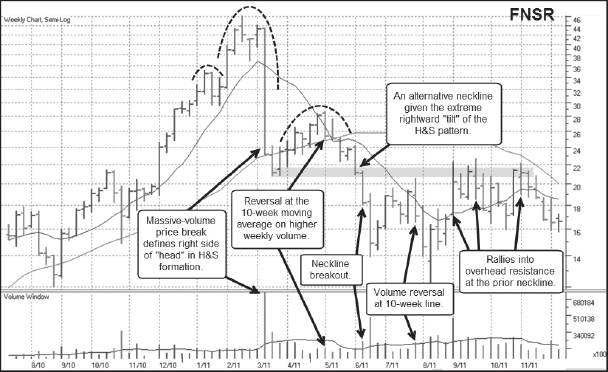

Notes: Fiber optics maker Finisar (FNSR) had a brief but glorious upside move in early 2011 that ended in a climactic type of top. The daily chart shows that on the final run to the top, the stock was up 12 out of 14 days in a row and the 8th day of the 14-day price run was a buyable gap-up move. FNSR stalled at the peak on heavy volume and then tried to build a short three-week flag formation but failed on a massive gap-down through the 20-day and 50-day moving averages after a poor earnings report in early March 2011. This price break took the stock down to the top of a prior V-shaped cup-with-handle structure it had formed in October and November of 2010, as can be seen on the weekly chart. This led to a rally up into the 50-day moving average in early May 2011 that formed the peak of the right shoulder in a “poster child” H&S formation that resembles the one formed by Crocs (CROX) in 2007–2008, shown previously in this chapter. This right shoulder also contained a smaller, fractal H&S within it, and the downside breakout through the fractal neckline coincided with a breach of the 200-day moving average in the latter half of May. The larger H&S neckline breakout occurred in early June and sent the stock sharply lower over the next two weeks, culminating in a final exhaustion gap-down low in June.
Stratasys (SSYS) 2011

Notes: Three-dimensional (3-D) printing name Stratasys (SSYS) is a unique situation that topped after trying to break out from what is known as an ascending base. On the weekly chart, the last two of the three peaks of this ascending base are indicated with a dotted line showing them as two left shoulders in an overall H&S top. An ascending base is generally characterized as an ascending price channel, where there are three peaks followed by three pullbacks that did not exceed the prior pullback low. The pattern is said to be 9–16 weeks in duration. The first peak in the ascending base occurred in mid-February, and one can easily see how the pattern rolls higher from there with a second peak and pullback in March and a third in April. The breakout from this ascending base in late April failed very quickly as the stock collapsed through the 20-day moving average in early May 2011. The stock descended about 20 percent or so from its peak in three days, formed a six-day bear flag, then continued on down through the 200-day moving average. Downside momentum was lost as the stock bottomed and turned back up through the 20-day line in late June, first finding resistance at the black cross in early July where the 50-day line crossed below the 200-day moving average. SSYS was able to push beyond the 50-day line where it encountered resistance just beyond the 200-day line on a final voodoo up day. From there it gapped back to the downside on a shortable gap-down move in late July and then “limped” lower as it tracks below the 20-day moving average. SSYS's peak in May 2011 correlated to the start of a short-term market correction, and its gap-down through the neckline in late July occurred three months later.
Sina Corp. (SINA) 2011


Notes: Chinese Internet names had a decent period of upside price performance that lasted from late 2010 into mid-2011. One of the strongest of these was Sina Corp. (SINA), which peaked in April 2011 on a clear climax top, as can be seen on the daily chart. This led to a sharp decline that led to the first leg down in a massive, wide, loose, late-stage double-bottom base, but the practical reality here is that the stock could have been campaigned on the short side not too long after the April climax top. The midpoint of the big double-bottom W in mid-June 2011 runs into resistance right around a series of peaks that formed around the 20-day moving average in early May. The stock reversed from there on massive volume that sent it knifing through the 50-day and 20-day moving averages. The stock finally bottomed in the latter part of June after undercutting the 200-day moving average and set off on a rally that formed the second leg up in the W pattern. This rally carried right up near to the midpoint of the W and prior resistance where it failed and dropped back below the 200-day line. The weekly chart shows the big stalling reversal weeks at the mid-point and right side peak of the late-stage W formation, and the ensuing breakdown correlates to the severe August 2011 general market correction. SINA's overall top was a very volatile affair that offered many sharp rallies into which one could initiate a short position followed by equally sharp price breaks to the downside. While the long-term downside trend was far from being smooth and orderly, and hence far from anything one might be able to sit through, the overall topping formation was ripe with numerous “swing trade” short-sale opportunities.
Sohu.com (SOHU) 2011

Notes: Chinese Internet play Sohu.com (SOHU) also had a strong upside price move during the same period that SINA did, and topped at the same time as SINA in late April 2011. The breakdown off the peak in early May formed what later became the head of a large H&S formation that extended from October 2010 to September 2011. However, the head of this large H&S pattern also contained a smaller, fractal H&D that formed around the peak, as can be seen in the daily chart. The fractal neckline breakout also pierced the 50-day moving average in early May, leading to a sharp downside break. A short bear flag formed from which SINA broke out to the downside before reaching the lows defined by the left shoulders in the larger H&S formation. This led to a rally back up to the neckline of the fractal H&S in late July 2011 that ran into resistance just below the 92 price level and formed the peak of the right shoulder in the larger H&S formation. This right shoulder, however, also contained a fractal H&S within it, and the two fractal right shoulders in this formation were each formed by voodoo rallies back above the 200-day line in August. The final breakdown through the large H&S neckline occurred in mid-September during a general market correction.
Ctrip.com (CTRP) 2011


Notes: Chinese Internet travel concern Ctrip.com (CTRP) was a weaker Chinese Internet play in 2010–2011, but its breakdown in 2011 provided many profitable short-sale opportunities. Initially, CTRP began to play out as a late-stage double-bottom base breakout failure, but the stock founds its feet in late June 2011 and attempted to come up the right side of a small cup-with-handle formation, which can be seen on both the daily and weekly charts. The late July breakout attempt from this cup-with-handle base failed quickly, and the stock gapped down through its 20-day, 50-day and 200-day moving averages in early August 2011 just as a sharp general market correction was getting started. The stock rallied back up into the 50-day and 200-day lines in late August before reversing back below the 50-day line and moving to new lows. CTRP's final demise came after it formed a bear flag in October 2011, rallied to the highs of this bear flag range and the 50-day line in late October, and then gapped down as it broke out through the lows of the bear flag in mid-November.
United Rentals (URI) 2011

Notes: The rental business might not appear to be the type of dynamic industry context that generally drives big price moves in stocks, but United Rentals (URI) had a strong price move in the latter part of 2010 into the first quarter of 2011. It topped after a late-stage base breakout failed in early April 2011, and once the stock broke down through the 20-day moving average right after the breakout failure, it descended in orderly fashion down to its 200-day moving average over the next two months. From there the stock zigged and zagged back and forth as it built a wide and loose bear flag throughout June and most of July 2011. The downside breakout through the lows of this bear flag occurred in synchrony with the severe general market correction at that time and sent the stock moving sharply to the downside.
Youko Tuduo (YOKU) 2011

Notes: Youku Tudou (YOKU) was a hot Chinese Internet content IPO in December 2010 that had a brief but brilliant run after forming an “improper” double-bottom IPO base. The run was not quite eight weeks in duration before the stock topped in April 2011, and YOKU completely reversed that upside move and more over the next eight weeks, eventually dropping all the way to within a dollar of its $12.80 December 2010 IPO price by September 2011. On the weekly chart, one cannot outline an H&S formation, since there are no up weeks in the downtrend from late April to late June 2011. On the daily chart, however, we can see a smaller, fractal H&S form. The breakdown through the 50-day moving average can also be seen as a neckline breakout through an alternative ascending fractal neckline, the thinner of the two dotted necklines on the chart, and the stock could have been shorted at that point. The breakout through the lower neckline is also shortable, and leads to a quick 35.6-percent spill over the next nine days. The decline off of the late April peak to the mid-June low was the “fat” part of YOKU's decline, and occurred during a general market correction that covered the exact same time period.
Goldman Sachs (GS) 2011


Notes: Big-stock financial Goldman Sachs (GS) had a steady price decline during 2011 that wasn't preceded by a big upside run. In fact, the stock simply dropped out of a long, 18-month cup-with-handle formation where the handle of this long base formed as a head and shoulders pattern. A late-stage breakout attempt in mid-January 2011 started the stock out on its downward journey, and once the stock gapped down through the 200-day moving average in mid-April 2011, the descent began to accelerate. Another gap-down in the early part of May took the stock through the lows of a short bear pennant, and the stock then meandered lower in what looks like the inverse of an ascending base, which we should probably dub a descending bear base. An upside shakeout or shake-up in late July took the stock just above the 50-day moving average before it reversed and plummeted to the downside at the same time as the severe general market correction at that time.
Mellanox Technologies (MLNX) 2012

Notes: Israel-based Mellanox Technologies (MLNX) was strong leading fabless semiconductor play in 2012. The company produced chips based on the InfiniBand architecture that sped up the transmission of data throughout the cloud. Its sharp upside price move was brief by most standards, extending from April to early September 2012. The breakdown off the peak occurred on a high-volume drop through the 20-day moving average in early September. After establishing a short-term low around the 50-day moving average the stock meandered up and down to form a four-week bear flag below the 10-week moving average. MLNX then broke out through the lows of this bear flag, and the following day gapped down on a rapid descent to the 200-day moving average. A bounce off of the 200-day line found resistance along the 20-day moving average, and this served to form the peak of the right shoulder in what had evolved into a large H&S formation with an ascending neckline. The reversal along the 20-day line in late November 2012 was an optimal short-sale entry point, and the stock set off on a steady downside descent that undercut the late October low. This led to a very short undercut and rally move back up into overhead resistance, and from there the stock descended to new lows as it remained below the 20-day line.
Broadvision (BVSN) 2012


Notes: Internet software maker Broadvision (BVSN) was an interesting “flameout” type of short-sale play in 2012 that had a quick nine-week run before topping out in a short H&S formation. The entire descent off of the peak was not as rapid as the prior ascent, but it was as complete, as it erased all of BVSN's upside move and then some. The high-volume reversal off the peak in March 2012 was the first sign of trouble, and this was eventually confirmed later in the month when the stock slashed through its 20-day moving average on heavy selling volume. This descent continued through the 50-day moving average, and BVSN eventually found support along the 24 price level before rallying up to the 20-day line. Three days of stalling along the 20-day line ensued before the stock collapsed down to what was now the neckline of a fully-formed H&S formation. The neckline breakout that occurred in synchrony with a general market correction in May 2012 then led to a steady downtrend that eventually took the stock to an all-time low at 7.80.
Vivus (VVUS) 2012

Notes: Biotech company Vivus (VVUS) was a big erectile-dysfunction play in the 1990s, but the development of therapies for obesity and sleep apnea helped drive a second price run in 2012. A big news-related gap-up in late February 2012 sent the stock doubling overnight from just over 10 to just over 20, and the ensuing trek higher eventually topped out at 31.21 in mid-July 2012. The initial breakdown off the peak was a volatile affair, but eventually the stock collapsed after a breakout attempt from a short flag formation in mid-July gave way. The stock found support in early August along the lows of a prior flag base it had formed in March 2012, and this helped to define an initial neckline for an evolving H&S top. A pocket pivot buy point in mid-September 2012 did not last long, as the stock then gapped back down to the neckline and then staged a neckline breakout and fake out as it turned back to the upside to test the mid-September high. This rally then failed as the stock dropped below the 50-daily and 200-day moving averages on higher selling volume. Notice also that shortly after this breach of the two moving averages, a black cross formed where the 50-day line moves below the 200-day line. This led to a second neckline breakout that worked, and VVUS collapsed to new lows.
Chipotle Mexican Grill (CMG) 2012


Notes: Mexican “healthy” fast-food restaurant Chipotle Mexican Grill (CMG) had a steady upside price move in 2012. The stock was looking quite powerful by early April 2012 after closing up for 17 weeks in a row. That 17-week run reversed on heavy volume right off the peak, and the stock corrected in what was looking like a normal but potentially late-stage “cup-like” base in June. CMG was tracking tight along its 50-day line at that time, but a sudden high-volume break below the 50-day and 20-day moving averages sent the stock through the lows of the cup base and down to the 200-day moving average. That engendered a logical upside bounce right up to the 50-day line where a pocket pivot buy point can be seen on the daily chart. This was abruptly slammed on a massive-volume downside gap following a bad earnings report. This gap-down could have been shorted for a relatively small amount of further downside play, but CMG quickly found its feet and began to work its way back up through the 50-day moving average. Buying interest soon waned near the peak of what became the head of a secondary H&S formation that formed from August to October 2012 and below the prior failed cup base. Once CMG dropped back below the 20-day line in late September 2012, it formed a three-day bear flag before breaking out to the downside and through the 50-day line. Another short bear flag formed in October that also made up the right shoulder of the secondary H&S. CMG then gapped down through the neckline and on to lower lows.
Select Comfort (SCSS) 2012
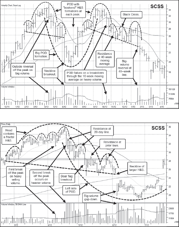

Notes: Mattress retailer Select Comfort (SCSS) was a big POD top in 2012 that could have been shorted at both ends. The left side of the POD formed as an LSBF in mid-April 2012, and once the stock dropped below the 20-day moving average, it actually continued to descend along the moving average all the way down to its late June 2012 lows. Thus rallies into the 20-day line provided potential short-sale entry points as the downtrend developed. As SCSS descended below the 50-day moving average, it began to evolve into an H&S top, gapping down through the neckline in early June 2012. However, this neckline breakout did not lead to very much in the way of further downside, and SCSS started up the right side of what would become a completed POD topping formation by October 2012. The right side peak of the POD came in the form of a short, late-stage cup-with-handle base failure when CMG gapped below its 20-day and 50-day moving averages in the latter part of October 2012. A stalling day right at the 50-day line provided a short-sale entry point, and the stock descended below the 200-day moving average from there. An undercut of the 200-day line led to a voodoo-rally into the 200-day line and three right shoulders began to form in what evolved into an H&S topping pattern. A final gap-down through the neckline of that H&S sent SCSS to new lows.
Apple (AAPL) 2012

Notes: This example of Apple (AAPL) in 2012 was discussed in detail in the Chapter 5 Case Study.
Cirrus Logic (CRUS) 2012
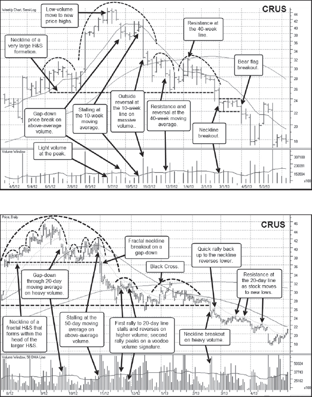
Notes: As a supplier to Apple (AAPL), Cirrus Logic (CRUS) often correlated to price movements in AAPL. When AAPL was in an uptrend, so was CRUS, and when AAPL topped in late 2012, so did CRUS. In early September 2012, CRUS was making new highs on light weekly volume, and toward the end of the month it failed and broke down through its 20-day and 50-day moving averages. A series of rallies into and just above the 50-day line in October formed the right shoulders of a smaller, fractal H&S formation that made up the head of what later became a larger H&S formation. The downside breakout through the fractal neckline in early November sent CRUS tumbling through its 200-day moving average, leading to the formation of a nearly three-month long bear flag that also forms the right shoulders in the larger H&S. A final rally up into the 200-day line marked the highs of this bear flag range and the peak of the second right shoulder, and occurred just after a black cross. The breakout through the neckline of the large H&S led to a steady descent from there that tracks just below the 20-day line.
Lululemon Athletica (LULU) 2013
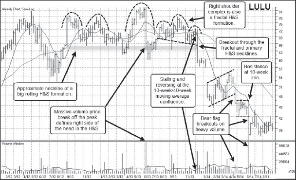
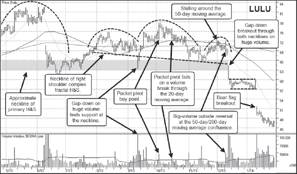
Notes: Lululemon Athletica (LULU) is discussed in detail in Chapter 4.
LinkedIn (LNKD) 2013
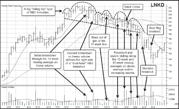
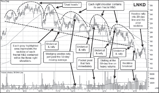
Notes: Business-oriented social-media name LinkedIn (LNKD) was a hot IPO in May 2011 that turned out to be rather cold. LNKD came public at $45 a share on May 20, 2011 and immediately launched to a high of 122.70 on its first day of trading. From there, however, the stock went nowhere as it dropped to a low of 55.98 by early December. Eventually, the stock completed a long, wide-ranging post-IPO consolidation and eventually broke out in February 2013 at 125.50. This led to a price move that carried as high as 257.60 before the stock lost momentum and built a long, rolling top that can be seen as a “mountain range” type of H&S pattern. This slow, rolling descent off the peak also looks like a downside trend channel where the lows of the channel formed a descending neckline to the H&S formation. The best way to play this descent, as it turned out, was to short LNKD into the rallies that carried up to the highs of the descending price channel. Eventually LNKD broke out through its neckline in early April 2014, broke to lower lows, and then “voodoo'd” its way back up into the neckline and the 20-day moving average before finding resistance and turning back to the downside and lower lows.
Nationstar Mortgage Holdings (NSM) 2013
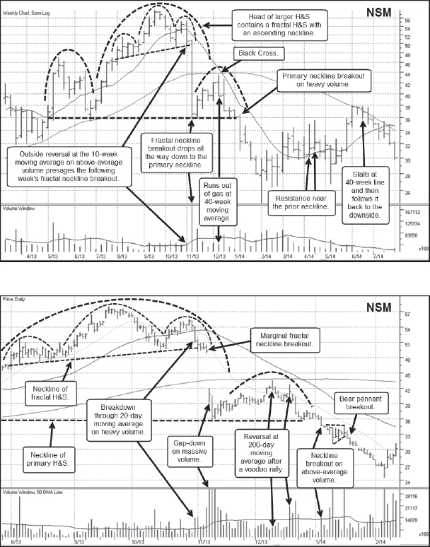
Notes: As the great financial crisis of 2008 sorted itself out following massive injections of liquidity, otherwise known as quantitative easing or QE for short, from the Fed that began in late 2009, mortgage-servicing stocks became hot plays in 2012 and 2013. Nationstar Mortgage (NSM) was one of the big-stock leaders in the group, and after it came public in March 2012 at $13 a share it formed an eight-week flat base and then launched on a strong upside price run. NSM eventually topped in September 2013 at 57.95 after failing from a short five-week base in late October as it broke below the 20-day and 50-day moving averages on heavy selling volume. This led to the formation of a fractal H&S pattern that formed inside of what later became the head of a larger H&S. A gap-down below the 200-day moving average in early November found support along the lows of a base the stock had formed in May and June of 2013, and the ensuing rally formed the right shoulder in a very large H&S topping formation. The peak of the right shoulder found ready resistance at the 200-day line and the stock dropped back down to the larger H&S neckline, formed a short six-day bear flag, and then broke out through the neckline and the short bear flag. This breakdown occurred just before a short-term general market correction in late January 2014.
Ocwen Financial (OCN) 2013


Notes: Ocwen Financial (OCN) was another big-stock mortgage-servicing play, but having come public way back in 1996 it was not a “hot IPO” play in the group. It did, however, have a big price run in 2012 and 2013 as the group caught fire. OCN topped in late October 2013 at the same time as NSM after a breakout attempt at that time failed when the stock broke below the 20-day and 50-day moving averages on heavy volume. This breakdown off the peak undercut the early October lows and then rallied right back up to the prior failed breakout point, as can be seen in the daily chart. This rally served to form a right shoulder in what had by then developed into an H&S top. The high-volume breakdown through the 50-day line in January 2014 sent the stock collapsing through the neckline and well beyond its 200-day moving average before it finally found a low in late February and began rallying up into the 20-day and 50-day lines. The neckline breakout correlated to a short-term general market correction in January 2013. As it ran into the 50-day line in April, it was forming the right shoulders of a small, fractal H&S formation. The ensuing downside breakout through this fractal neckline sent the stock to lower lows, and at the time of this writing [October 2014], the stock is continuing to make fresh lows below the 20 price level.
Angie's List (ANGI) 2013

Notes: Online customer review sites caught investors’ attention in 2013, as names like Yelp (YELP) and Angie's List (ANGI) had strong runs. In this example, we see one of the weaker names in the group, ANGI, as it topped in July 2013 and then broke down from an H&S formation in early October. While the stock didn't really have what one could call a big upside price run, the ensuing decline off the peak did eventually exceed −75 percent, and in our view that qualifies as a shortable downtrend! The peak in early July occurred after the late-stage double-bottom base breakout attempt failed. There was one “re-breakout” attempt in the latter part of the month, but once the stock gapped down below the 50-day moving average in late July, that price level served as strong upside resistance on ensuing rallies. The rally in early August failed right at the 50-day line, sending the stock to lower lows where it temporarily bottomed to form the neckline of an evolving H&S pattern. The final rally back up through the 50-day line in late September found resistance at the prior base-failure point and forms the second right shoulder in the H&S pattern. A high-volume reversal at that point carried through the 50-day moving average and led to a gap-down neckline breakout in early October. The stock then formed two short bear flags in October and November, what you might call a “base-under-base,” and then broke out to new lows in mid-November. ANGI's overall top and price breakdown in 2013 did not correlate to the general market action. The peak price in the rally occurred as the general market was in fact coming off the lows of a short-term correction.
Rackspace Holdings (RAX) 2013
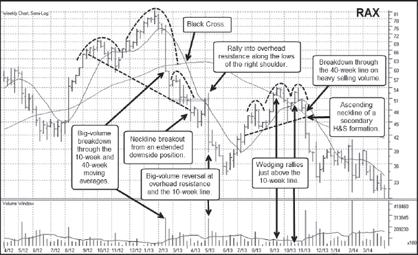
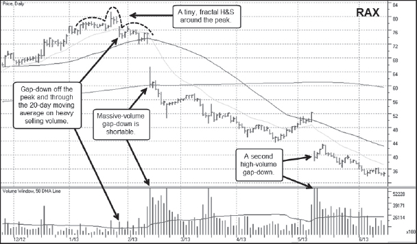
Notes: Rackspace Hosting (RAX) was a big cloud play in 2013 as a provider of managed hosting services. In other words, RAX rented out space on its cloud-based data centers to companies that didn't want to build the hardware and software infrastructure necessary for cloud-based operations. RAX had a stellar price run from the initial first-stage breakout at 11.67 in May 2008 to its 81.36 price peak in January 2013. At the peak, the general market was still rallying, but RAX failed on a breakout attempt from a short flag formation, gapping below its 20-day moving average in late January. The stock tracked along the space between the 20-day and 50-day moving averages before gapping down in the earlier half of February on heavy volume. This gap-down could have been shorted, as the stock never came close to the intra-day high of that gap-down day. It quickly dropped below the 200-day moving average and was not able to mount any kind of rally until late April 2013. That resulted in a pocket pivot buy point coming up through the 50-day line in early May that failed the next day on a massive-volume gap-down. Note that once RAX went into the steady downtrends that characterized the action from mid-February to late April, and then from early May and beyond on the daily chart, the 20-day moving average would have provided a very effective upside guide for a moving trailing stop.
Solar Winds (SWI) 2013
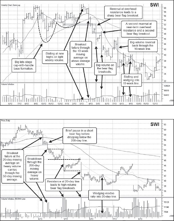
Notes: Solar Winds (SWI) had a strong price run that began in late 2011 and continued until early 2013. As a provider of network management software, SWI was another cloud play during that period. SWI started out as a big, ugly, wide, and loose late-stage cup-with-handle base failure. SWI broke down through the lows of its handle and the 50-day moving average in early April 2013, triggering an orderly price decline that formed several bear flags on the way down. After busting through the 50-day line, SWI formed a short three-day flag right on top of the 200-day moving average and then broke out to the downside, formed another bear flag that ran into resistance at the 20-day moving average, broke out to the downside again, and formed yet another bear flag that found resistance around the 20-day line. SWI then broke out through the lows of that final bear flag and then limped lower, following the 20-day line to new price lows before it was able to turn back above the line in early July 2013. Certain price breaks within SWI's overall downtrend occurred in synchrony with short-term general market corrections in 2013, but during its entire decline it moved lower as the general market moved higher.
Ruckus Wireless (RKUS) 2013
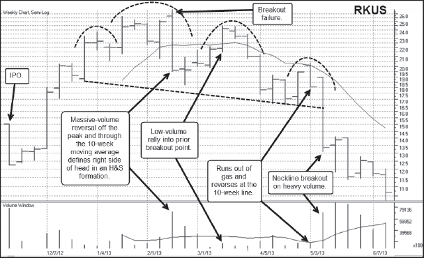
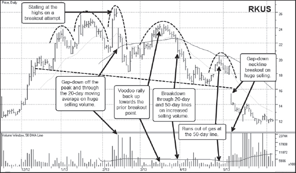
Notes: Ruckus Wireless (RKUS) was another one of these “flameout” IPOs that had a quick run after it came public in November 2012 and quickly doubled over the next 13 weeks. RKUS was another cloud-variant play, but its life span was brief. A breakout attempt from a volatile flag formation in February 2013 failed on a high-volume gap-down through the 20-day moving average that sent the stock through the 50-day moving average over the next two days. That descent came to an end as the stock found support along the lows of a short flag pattern it had formed in December 2012. A rally from there ran out of gas in late March near the prior failed breakout point as buying volume dried up in voodoo fashion. RKUS then rolled over to complete the peak of a right shoulder in a developing head and shoulders top. That descent back down through the 50-day line saw the stock close down for 14 days in a row before it finally sputtered back up towards the 50-day line in late April 2013. A reversal at the line took RKUS back below its 20-day moving average. A couple of days later the stock gapped-down through the neckline of its H&S topping formation and on to lower lows.
Intuitive Surgical (ISRG) 2013
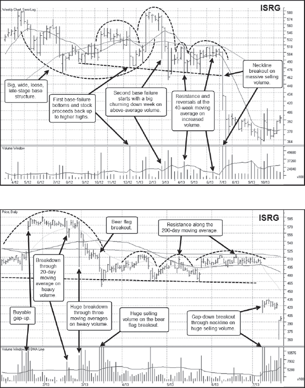
Notes: Intuitive Surgical (ISRG) is best known for its Da Vinci® robotic surgery devices, and had a big recovery move to all-time highs following the early 2009 lows of the prior 2007–2009 bear market. In early 2013, ISRG finally began to show signs of a top when it failed from a late-stage base in February. The break off the peak started with a huge-volume downside break in late February that saw the stock gap-up the very next day where it found resistance at the 20-day moving average and then reversed course, moving to lower lows over the next two weeks. ISRG then undercut the lows of the big, ugly base structure that was formed between May 2012 and February 2013. This led to the formation of a series of right shoulders within a developing H&S top. These right shoulders also have the look of a single, long bear flag formation that runs along the underside of the 40-week and 200-day moving averages on the weekly and daily charts, respectively. A gap-down breakout through the neckline of the H&S and the lows of the right shoulder complex/bear flag was a shortable gap-down move that saw the stock move to lower lows. Interestingly, this neckline/bear flag breakout occurred as the general market moved to new highs.
Cree (CREE) 2014
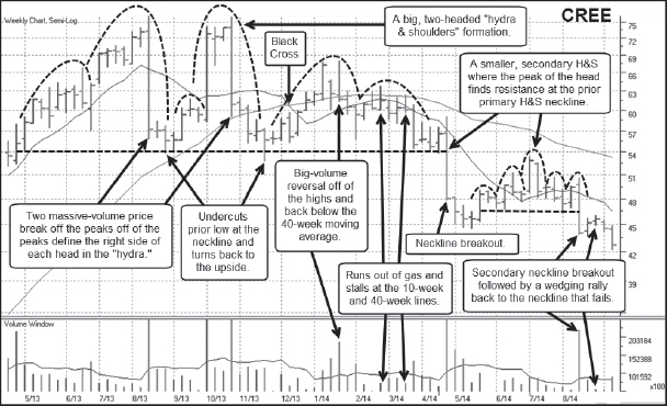
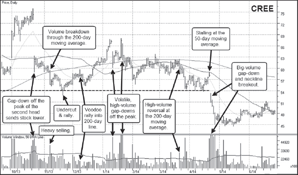
Notes: LED-lighting manufacturer Cree (CREE) is a very unusual example of an extended H&S formation that has two heads—a sort of “hydra and shoulders” formation. By the end of September 2013, CREE looked very much like a textbook H&S top that was merely setting up for lower lows. The big price break off of the peak occurred on a huge gap-down following a disappointing earnings report to form the right side of head, and this was followed by a rally into the 10-week moving average that looked to be forming a vulnerable right shoulder. But the stock fooled would-be short-sellers and rocketed back up to its prior highs in early October, only to gap-down and give up all of those gains in the latter part of the month. That gap-down did in fact lead to lower lows as the stock broke below the 200-day moving average in early November, eventually finding a bottom along the prior lows in what became a hydra and shoulders formation extending back to May 2013. At this point, with two massive-volume gap-downs in the pattern, the stock was somewhat “sold out” and so needed some time to work off this arguably oversold condition. That occurred over the next five months as CREE went on to build two right shoulders. Notice how the action following the late October gap-down and extending through April 2014 has the look of a fractal H&S within the right shoulder complex. A final low-volume rally into the 200-day moving average reversed on heavy volume in late March 2014, and the stock dropped down to the neckline of the hydra and shoulders formation. One last rally into the 50-day line was followed by a gap-down neckline breakout on heavy volume that moved lower over the following three days.
3D Systems (DDD) 2014

Notes: 3D Systems (DDD) is discussed in detail in the Chapter 8 Case Study.
Stratasys (SSYS) 2014

Notes: The top in 3D Systems (DDD) was part of a group top when other previously hot 3-D printing names joined the topping party in 2014, including Stratasys (SSYS). SSYS's 2014 top is discussed in detail in Chapter 4.
Exone Company (XONE) 2014
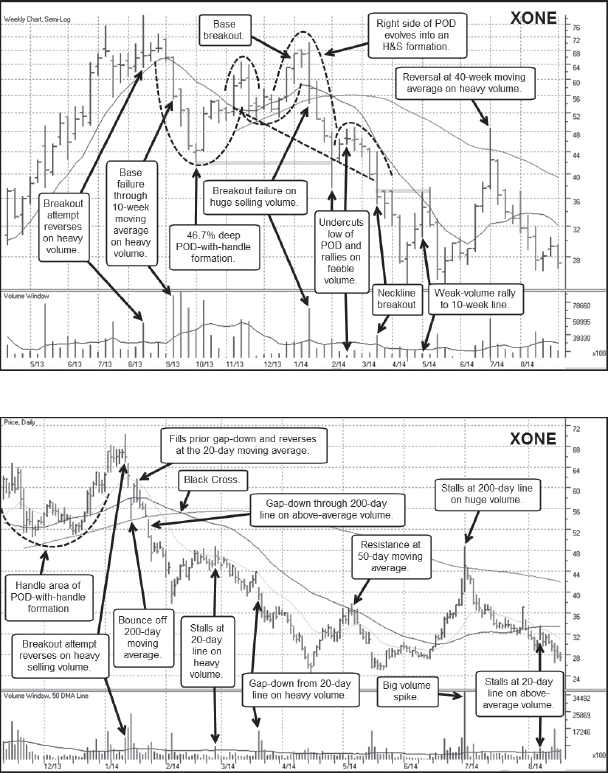
Notes: Exone Company (XONE) was another 3-D printing name that topped in January 2014 with the group. Its early 2014 top was discussed in detail in Chapter 4. Note how all three 3-D printing names shown in these three examples—DDD, SSYS, and XONE—all had big upside bounces at the beginning of July 2014 as a result of rumors at that time that one might be bought by a larger technology company like The International Business Machines Corporation (IBM) or Hewlett-Packard (HPQ). When these rumors proved to be false, the news-related rallies all provided short-sellers with the gift of a fantastic contrarian short-sale entry point!
Lumber Liquidators (LL) 2014
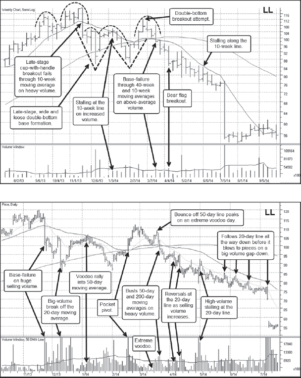
Notes: Lumber Liquidators (LL) and its 2013–2014 top are discussed in detail in Chapter 4.
Pandora Media (P) 2014
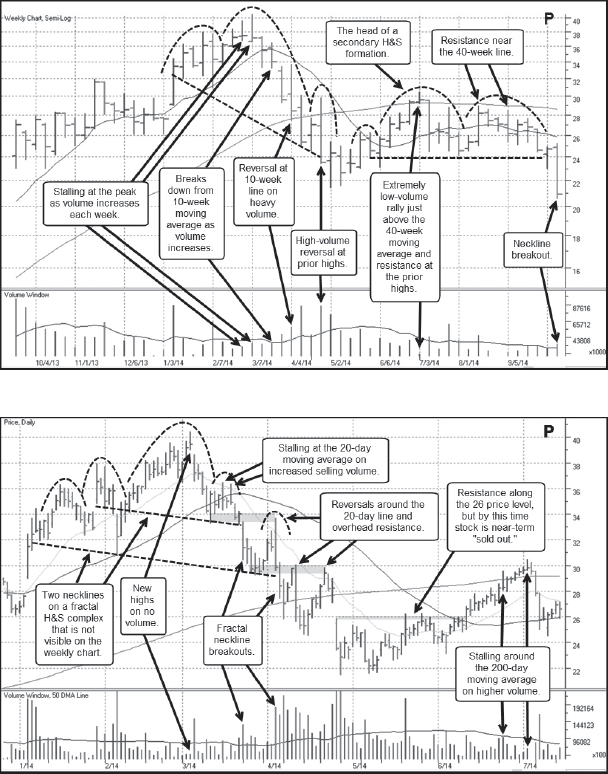
Notes: Pandora Media (P) and its 2014 top are discussed in detail in Chapter 4.
Amazon.com (AMZN) 2014
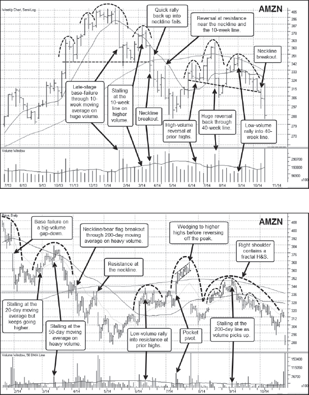
Notes: Big-stock NASDAQ name and juggernaut Internet retailer Amazon.com (AMZN) was making all-time highs in late 2013 before it broke down from a late-stage flat base in late January 2014 at the same time that a short-term general market correction began. While the general market's correction was very short, AMZN broke down hard off the peak on massive-volume gap-down through the 20-day and 50-day moving averages. This breakdown formed the right side of the head in an eventual H&S top. As the stock undercut the lows of a short three-week flag it formed in November 2013, it turned and rallied back up through the 10-week/50-day moving averages, where it began to stall on higher volume. This formed the peak of the right shoulder in the H&S formation and the ensuing decline, which occurred at the same time as a general market correction began in early March and carried down to the H&S neckline and the 200-day moving average on the daily chart. A short bear flag formed along the 200-day line before the stock broke out to the downside and through both the 200-day line and the neckline. A short rally back up into the neckline reversed on a big-volume gap-down that took the stock to lower lows and near the lows of a prior cup-with-handle base AMZN formed back in August–October of 2013. The stock found support at that level and rallied back above the 40-week and 200-day moving averages in a wedging rally that failed on a late-July 2014 gap-down break. This formed the peak of a secondary H&S formation, and the undercut of the June lows set off a rally back up into the 200-day line which failed and sent the stock back to the downside. Note that this rally forms the right shoulder of the secondary H&S while also containing a small, fractal H&S within its structure. Once the stock started to break out through the neckline of this secondary H&S, it rallied once back up into the 20-day moving average before gapping down to lower lows near the 285 price area.
Netflix (NFLX) 2014
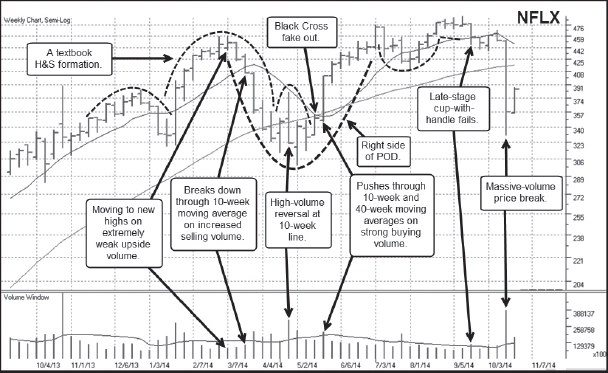

Notes: Netflix (NFLX) has often been a favorite of “valuation” shorts, most of whom shorted the stock into its rallies in 2010–2011 and again in 2013. Of course, NFLX was also a strong short-sale target stock during these periods once it began to show bona fide signs of topping, as we first saw in the example of 2011–2012 shown earlier in this chapter and in the Chapter 6 Case Study. NFLX's top and severe breakdown in 2011 was a very profitable short-sale event, and the stock had another shortable top in early 2014. This was an unusual top, however, in the sense that if one had been operating solely on the basis of what was shown on the weekly chart, one would have been pushed out as the stock rallied up and out of the right shoulder of what looked like a “textbook” H&S top in May 2014. However, using the information available on the daily chart, one could have picked off the stock as it was breaking down through the neckline of a fractal H&S it formed within the head of the larger, so-called textbook H&S formation. This would have led to a very profitable decline. As well, the big-volume stalling gap-up move that formed the peak of the right shoulder in the larger H&S was also a shortable event, and the ensuing breakdown and undercut of the prior lows might have been sufficient to cause one to cover their short position at that time. In late May, NFLX flashed a pocket pivot as it came out of the big right shoulder and moved to new all-time highs by July 2014. At this point the stock tried to break out but pulled right back in to form a 10-week cup-with-handle base from which it failed in mid-September 2014 as a general market correction took hold. Notice that the breakdown off the March peak and the subsequent rally back up to new highs in July formed a big POD topping formation. This started to look shortable, but the stock turned and made another run to new highs. After dropping back below the 50-day moving average in mid-September, it blew wide open in October on a disappointing earnings announcement.