
Chapter 4
Adding Up Gross Domestic Product
IN THIS CHAPTER
Understanding the measurement of GDP
Discovering the components of GDP
Seeing how GDP is related to living standards
Thinking about inequality
Macroeconomists love talking about gross domestic product (GDP) as much as sci-fi fans love discussing Star Trek, TV chefs the benefits of organic turnips, and Donald Trump the size of his hands. When economists examine a country’s economy, GDP is probably the first thing they look at — and for good reason. It provides a convenient snapshot of the total amount of economic activity taking place in a country. More precisely, it reveals the value of everything an economy produces in one year.
The total production idea is key. If the economy produced just one good, say oil or sugar, total production would be easy to measure. It might be 3 billion barrels of oil per year, or 40 million metric tons of sugar. Of course, a vast economy the size of the U.S. produces thousands of different goods, not just one. So, how can we measure this total?
The answer is “we pretend.” Or, in macroeconomics jargon, we assume. In particular, we pretend that the economy does produce just one good. It’s not oil or sugar per se — it’s simply called GDP. The thing about this pretend GDP good that is really special is that it has an incredible range of uses. You can take a chunk of GDP and mold it into transportation services, or into manufactured goods, or health services, or food, or shelter, or clothing. It can in fact be used to substitute for any other good that you can imagine. It’s the mother of all multi-purpose goods.
Some basic questions then arise:
- Efficiency: How much of this pretend one good can we produce if we use all our resources effectively?
- Composition: What kinds of uses are we putting this one GDP good to? Are we using it to produce mostly goods for current consumption? Or are we using a good portion to make capital goods that can help us produce more consumer (and capital) goods in the future?
- Equity: Does everyone get a similar amount of the GDP good?
In this chapter we look at GDP in some detail and why it’s important. We show how economists calculate it and how equally it’s shared and describe the light it can shed on people’s living standards.
Grasping the Idea of GDP
As of late 2015, the U.S. GDP is more than $18 trillion, and projections are that it will grow by 2.7 percent to over $18.5 trillion before 2016 is over.
In other words, if you add the value of all final sales recorded in the U.S. in one year it comes to more than $18 trillion. But note the qualifier final: To avoid double counting, economists count only the value of final goods produced, not intermediate goods. So, if a car manufacturer produces a car worth $20,000 but buys component parts worth $8,000 to physically make the car, the total addition to GDP is just the final $20,000.
In this section, we describe a few of the ways in which economists view GDP.
Adding up final expenditures and value added
Sometimes you hear people calling GDP the total value added. They do so because you can think of the contribution of a good or service to GDP as the value that is added to it at each stage of production.
For example, the car manufacturer we mentioned has added value worth $12,000 (by buying the parts for $8,000 and then selling the car for $12,000 more). The same applies to the parts for which component manufacturers may have had to buy raw materials for $2,000 in order to produce the $8,000 worth of parts. They have then added value worth $6,000.
 As Table 4-1 shows, the value of the car (the final good being produced) is $20,000. This is exactly equal to the total value added by the raw materials, the component manufacturer, and the car manufacturer. If a dealer now sells the car for $23,000, it implies further added value of $3,000 in advertising and sales services.
TABLE 4-1 Total Value Added
|
|
Cost of Inputs ($) |
Value of Output ($) |
Value Added ($) |
|
Raw materials |
— |
2,000 |
2,000 |
|
Component manufacturers |
2,000 |
8,000 |
6,000 |
|
Car manufacturer |
8,000 |
20,000 |
12,000 |
|
Total value added |
— |
— |
20,000 |
Determining national income — and not consuming it all at once
 Someone pays for the value of whatever is produced. So, someone gets paid for the production, too. Those payments are income for whoever receives them. Thus, GDP tells you not just the aggregate production but also everyone’s individual income summed in total. And that should be equal to GDP, the aggregate amount of income of the economy. In other words, the total of everyone’s income should equal the total of all expenditures made to buy domestic goods, and both should equal GDP.
To continue the example from the preceding section, the car manufacturer has managed to turn $8,000 worth of parts into a $20,000 car, leaving it with a surplus of $12,000. Some of this surplus goes to pay the workers in the factory (say $8,000), leaving a profit of $4,000. Ultimately, people own firms, so this profit also provides an income to somebody. Thus, the manufacturer’s value added is entirely distributed as income either to its workers or its shareholders.
The same is true for the component manufacturer and the owners of the raw materials: The value added must have been paid to someone as income. Because the total value added equals GDP, so too must total income equal GDP.
Of course, when you have your part of national income or GDP, you have to decide what to do with it. Here you have a number of options:
- You can consume it all: Which would mean spending all your income on consumer goods, such as food, entertainment, and similar goods and services. Another way of thinking about this option is that your income gives you a claim to a certain share of national output. By spending it all now, you’re choosing to use your entire claim on consumption today.
- You can consume some of it and save the rest: This would mean you spend only part of your income on consumer goods. By saving some of it, you give up some of your claim to consumption today and trade it for a claim to consumption in the future. The interest rate tells you the terms of this trade. If you save some of your income by putting it in a savings account or perhaps a bond fund that pays 5 percent, it means that by giving up $100 worth of consumer goods today, you will establish a claim to $105 worth of consumer goods one year from now. Thus, economists think of saving as a way of converting consumption today into consumption in the future.
- You can consume more than your share: How? By borrowing from someone who wants to save part of his share. The catch is that you’ll have to pay that person back at some point by giving up some of your own future consumption. This is the same trade as before but in reverse. In this trade, every extra $100 worth of consumer goods you buy today requires a sacrifice of $105 worth of consumer goods in a year. Thus, economists think of borrowing as a way of converting income in the future into consumption today.
Watching a nation’s GDP flow
GDP is the same thing as aggregate annual income and so therefore it must be a flow variable, one that’s measured per unit of time — yearly, in this case (see Chapter 2 for more on flow and stock variables).
It’s important to remember then that as a flow variable, GDP “restarts” each year. We produced roughly $18 trillion worth of goods and service in 2015. On January 1, 2016, we started producing all over again. As noted at the start of this chapter, we will probably produce $18.6 trillion by the end of 2016. The point is that because GDP is a flow variable, it has a rate of time or per year dimension. Over 2015 and 2016, we have been producing at an average rate of $18.3 trillion worth of goods and services per year, with some acceleration in this pace over time.
Because GDP is a flow, all the component variables such as household consumer spending, private investment spending, and so on, are also flow variables. A new, hopefully bigger pie or flow will be produced next year because we’ll have more workers, more capital, and better technology.
Dissecting GDP Further
In this section, we distinguish between real and nominal GDP and go on to explain why real GDP is the focus of economists’ attention.
Distinguishing real and nominal GDP
Let’s go back and talk about the assumption (pretense) that underlies GDP — that we can think of the economy as just producing one, very multi-purpose good. Why do we macroeconomists make this assumption?
The simple answer is that we’d like to talk about “the economy” as parsimoniously as possible. If someone asks about the U.S. production last year, we don’t want to have to say that it’s $2.2 trillion of manufacturing, $3.6 trillion of financial serves, and so on. And we really don’t want to have to say that it’s $155 billion of machinery, $100 billion of air transportation, $1.4 trillion of finance and insurance services, and so forth. That’s too much and too detailed information for anyone to take-in. By the time the list was completed, it would be out of date in any case.
So, we’d like to keep it short — just one number that summarizes aggregate production overall. But that requires adding up the sugar, oil, manufacturing, finance services, apples, oranges, and so on, all into one total. And we all know from math class that there’s only one way to add up apples and oranges and manufacturing goods and finance services — we need to find a common denominator.
Dollars (or whatever the domestic currency is) are the common denominator. That’s why we quoted the U.S. GDP as $18 trillion. That’s the sum of the final dollar sales (or value added) across all goods and services. It’s easy to add up these magnitudes because they’re all expressed in the same unit of account.
No good deed and few good shortcuts go unpunished, though. Using dollar magnitudes allows us to add everything up easily. But it also introduces a new problem. We said that the U.S. produced about $18 trillion worth of GDP in 2015. Suppose in 2016 the economy experienced a lot of inflation — so much so that the price of everything doubled. And imagine that the total quantity of goods and services produced in 2016 were the same as in 2015 — the same number of apples, oranges, tons of steel, barrels of oil, passengers carried on airlines, and so forth. The question is: What’s GDP in 2016?
Well, because the price of everything doubled and the quantity of goods remained the same, you could argue that GDP is now $36 trillion. And in one sense you’d be right. That is the “value” of everything being produced in 2016. But that doesn’t sound quite right, does it? The economy is producing just as much this year as last year and yet GDP appears to have doubled.
In such a situation economists say that, although nominal GDP has doubled, real GDP has remained unchanged. Here’s the difference:
- Nominal GDP: Measured using current prices — prices that were current at the time of measurement. 2015 prices in 2015 and 2016 prices in 2016.
- Real GDP: Measured using constant prices — meaning an arbitrary year is chosen to be the base year, and GDP in all other years is calculated on the basis of prices in the base year.
Why real GDP is the real deal
Remember, we’re imagining GDP as one single good. If that were really the case — if, say, we only produced oil — we’d have no trouble saying that if we produced 1,800 billion barrels of oil this year and next year, our real production hasn’t increased, even if oil prices doubled from $10 to $20. We would just divide the second year values by 2 to make the comparison. That same logic should apply to our fictitious single good called GDP.
What economists are really interested in then is the actual amount of stuff — barrels of oil or pounds of sugar or units of GDP — that the economy is producing in a year. As the oil example indicates, to calculate that value, we have to purge our nominal GDP measure of price movement effects. If we don’t correct the nominal GDP values, we won’t know whether say a 5 percent increase happened because
- The price level is unchanged and the actual quantity of goods being produced increased by 5 percent; or
- The price level increased by 5 percent and the actual quantity of goods being produced remained unchanged; or
- The price level increased by 10 percent and the actual quantity of goods being produced fell by 5 percent; or
- Some other combination of price level and real GDP changes.
From the viewpoint of real production and what people have available to them for consuming (or saving), the preceding scenarios are all very different, even though in all three cases nominal GDP has risen by 5 percent. Real GDP, however, has increased by 5 percent in the first case, remained unchanged in the second case, and fallen by 5 percent in the third case. Economists think that people should care about the amount of goods being produced rather than the nominal value of those goods, and so the changes in real GDP are what really count.
In the base year, nominal GDP and real GDP are the same
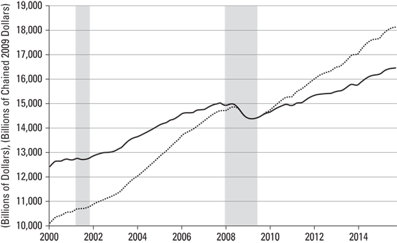
As briefly noted, real GDP is calculated using the price level in the base year. Figure 4-1 shows the real and nominal GDP for the U.S. since 2006. Here, the base year is 2009, which means that real GDP in all other years is calculated using the prices of things in 2009. This approach allows economists to compare output in a meaningful way across time.
© John Wiley & Sons, Inc.
FIGURE 4-1: U.S. real (solid line) and nominal (dotted line) GDP.
By holding prices constant, the only thing that’s different between any two years is the real output. For example, the U.S. produced about $14.5 trillion of output or real GDP at the start of 2006. It produced $16.4 trillion — about $2 trillion more — a decade later at the start of 2016. In contrast, the rise in nominal GDP is much greater, from $13.7 trillion to $18.1 trillion. That’s because nominal GDP includes both the $2 trillion rise in real GDP and the effects of a decade of roughly 2 percent inflation each year. You can also see that total output generally rises. However, it slipped a little in late 2007, moved sideways in early 2008, and then fell sharply until early 2009 as a result of the global financial crisis.
Another thing to notice is that real GDP and nominal GDP are exactly equal in 2009. That’s the base year after all, and real GDP that year has been calculated on the basis of prices in 2009. Nominal GDP is always calculated using the prices that were prevalent at the time. Thus, real GDP and nominal GDP always coincide at the base year.
We chose the base year of 2009 arbitrarily and could equally have chosen another year. A different choice wouldn’t affect the graph of nominal GDP but would change the graph of real GDP to ensure that it was equal to nominal GDP during the base year. For example, if the base year was 2006, the real GDP “number” for all the years would be much lower than the numbers in Figure 4-1, and nominal and real GDP would be equal in that year. That’s not because a different base year affects total output or living standards, but because the real GDP figures would be based on what prices were in 2006.
One final point: Like nominal GDP, real GDP is still measured in dollar values, for example, $16.4 trillion at the end of 2015. But the dollar values used to calculate real GDP are unchanging, that is, they reflect the prices from the base year. For this reason, real GDP is often called “constant dollar” GDP. It’s a measure of the total production in dollars of a constant value — ones that are not losing value due to inflation (or gaining it due to deflation).
Identifying the components of GDP
As we’ve emphasized, this special one good called GDP is incredibly flexible. You can take some of it and turn it into manufacturing goods, some into wholesale and retails services, and some into defense goods and services. In fact, we do exactly that. Currently, we use about 16 percent of our GDP for manufacturing, about 14 percent for wholesale and retail trade, and about 4 percent for federal defense outlays. The rest goes for all other things — healthcare, transportation, education, and so on. That’s how we constructed GDP in the first place. We added all the value added from each sector into one total.
Once we’ve got the total, though, we can reclassify how we slice up that GDP in other ways. We could do it regionally — GDP in the West, in the South, in the North and East, or by state. There are many ways to decompose GDP into various components.
One way that macroeconomists find particularly useful is to think about the kinds of uses to which the goods are put, that is, the reason that different people want them. Households acquire consumer goods — let’s call that C. Businesses spend money to acquire goods that will help them meet demands in the future, new capital and inventory investment — call that I. The government acquires goods and services G for education, police and fire protection, military defense, national park services, and so on.
We’ll talk later about why this particular decomposition has proven useful. Basically it reflects a view that consumer spending is largely stable, whereas corporate investment spending is pretty volatile. Because government spending is, in principle at least, controllable, this division suggests a way to use policy changes in G in conjunction with the stable relationship for C to offset the volatility in I. (Did you get all that?)
If we denote the total GDP as Y and if the three categories above are the only sources of spending then, because everything produced is bought by somebody, we could write:
For better or worse, though, that equation is not quite correct. Why? Because although households acquire C consumption goods, some of those are imported from other countries. The same is true for some of the new capital goods I that businesses buy. Because these imports (M) are goods produced abroad, they cannot be part of gross domestic product. So, we have to subtract them from the C + I + G spending to get the part that is domestically made.
But the flip side is also true. Households and businesses in other countries also buy goods and services from the U.S. These American exports X do come out of U.S. production. But because they’re purchases that are not made by domestic agents, we have to add them in on top of the C + I + G part.
Putting it all together, we get this:
where NX = X – M just stands in for net exports.
Consumption (C) is the largest of these components. It accounts for roughly 68 percent of the U.S. GDP. In other words, around 68 percent of everything produced in the U.S. ends up being consumed by households in one way or another. Whether you’re slurping a soft drink, chomping on a chocolate bar, or even gobbling some grapes, you’re contributing to the country’s consumption.
C doesn’t just include things you literally consume, such as food and drink (and, if you’re Homer Simpson, flowers) — all goods and services that households purchase are included in consumption. So the flat-screen TV you got for Christmas is consumption. That train ticket you bought last week — that’s consumption. Even the rent you pay for your tiny overpriced San Francisco apartment counts as the consumption of “housing services.” Basically, if you buy something — and you aren’t an entrepreneur buying something for your business — it’s probably consumption.
Investment (I), the third largest component of aggregate demand, accounts for roughly 16 percent of GDP in the U.S. — though, being the most volatile component of GDP, this amount can vary substantially. Typically, during a boom (a period of above-average economic growth) investment can rise sharply, whereas during a bust (a period of below-average or negative economic growth) investment can fall sharply.
Investment is one of those words that economists use substantially differently than laypeople. You may think of buying shares in Apple or purchasing an old house as an investment. But neither expenditure goes for new production. So, neither contributes to GDP. But when a firm buys new plant and machinery, its purchase does go for new production. Moreover, the purpose of the capital bought is also clear. It’s to help the firm have more productive capacity in the future — to meet the future demands for its goods.
Government spending (G) is perhaps the most misunderstood GDP component of all. To begin with, it includes spending in the entire government sector — federal, state, and local. But it’s not equal to all the spending that these units do. That’s because a lot of government spending doesn’t go for any production — that is, to acquire any GDP. The bulk of such spending is in fact for what economists call transfers. These include social security, interest payments on government debt, unemployment compensation, and other income-support programs.
For example, in 2015 the U.S. federal government had total (on- and off-budget) outlays of about $3.75 trillion. Yet nearly half of that (about $1.75 trillion) was accounted for social security, income assistance, and debt interest. That leaves out Medicare and Medicaid, which account for perhaps another $850 billion. Although transfers are important — they help households consume goods and services — they’re not directly part of GDP itself.
In this sense, media statements that the government (federal, state, and local) controls 40 percent of the economy are misleading. The government sector spends a lot, but more than half of the time it does this by transferring funds to households and letting them spend it. When it comes to actually buying goods and services that are part of GDP, the government sector is closer to 16 percent of GDP.
Dealing with inventories and used goods
Everyone knows that the moment you drive a brand new car off the lot, its value falls sharply. The next person that sells it will be you — not some well-established dealer with a name to protect. You’ll be a used car seller who has to sell at a discount.
So, imagine that you decide to buy smart and get a used car and not a new one. What does that do for GDP? Not much. If you buy from a used-car dealer, his “services” in terms of cleaning and refurbishing the car are new production. So is his sales pitch, which also counts as a sales service — after all, he does get paid for it.
The bulk of what you pay, though — say, 90 percent or more — is not new production. The car’s building was part of GDP several years ago when it was first constructed. You may think you’ve made a smart investment. But except for subsequent cleanings and services, the used car is not investment and is not part of GDP.
Of course, if you don’t buy a new car, the new car dealer may not sell as much as he anticipated. As a result, the stock of cars on his lot will build up a bit given that he ordered new car deliveries anticipating more sales.
This is important. The dealer’s order of new cars does spark production at GM or Toyota or somewhere. So long as the plant that builds and delivers the cars is in the U.S., that order will count in the investment component of GDP. It’s part of GDP because it is new production. It’s investment because the inventory helps the dealer meet future car demands just as more capital plant and equipment do.
Often, a firm wants to hold some inventories — car dealers like to have a good selection of stock on the lot. Sometimes the extra inventory may be unwanted. Either way, though, the increased inventory comes from new production, contributes to the firm’s ability to meet demand in the future, and was definitely acquired by someone (the business). So, just like new plant and equipment spending, inventory accumulation is part of the GDP that falls under business investment.
Buying an existing house is like buying a used car: Neither reflects new production or GDP. But economists do count purchasing a newly built house as investment (more precisely, they call it residential investment). The idea is that purchasing a new house provides you with a stream of new “housing services” in the future. In other words, new housing adds to the housing capital stock. That means building a new house involves investing in new residential capital. That’s why it counts for investment. A second-hand house doesn’t count because it merely entails the transfer of an already existing stream of housing services from one person to another. Residential investment is the one part of the overall investment component that is determined more by households than by businesses.
If you think about it, deciding that buying a new house counts as investment whereas, say, buying a new car counts as consumption is a little strange. After all, a new car provides a stream of “car services” in the future. Why isn’t it investment? Well, it perhaps should be, but the problem is, why stop there? Buying a new washing machine provides a stream of “washing services” in the future — should that be counted as investment? What about a new pen? Doesn’t that provide “writing services” in the future? Should that be counted as investment?
As you can see, all sorts of little ambiguities arise in trying to draw a line between consumption goods and investment goods. Economists had to draw the line somewhere, though. For whatever reason perhaps because housing is such an economically important sector, they decided that buying a new house is recorded as investment, whereas almost anything else a household would buy is considered consumption.
Adding It All Up: Calculating GDP
GDP is probably the single most important statistic in assessing the state of the economy. So, calculating it accurately is vitally important. Unfortunately, working out a country’s GDP is no simple matter.
In this section we look at how GDP is calculated in the U.S., why it’s not always 100 percent accurate, and also how to take into account improvement in the quality of goods. Other developed economies calculate GDP in a similar way.
Introducing the basics
In the U.S., the Bureau of Economic Analysis (BEA), a division of the Commerce Department, is responsible for the measurement of the U.S. GDP. In particular, the BEA constructs the National Income and Product Accounts (NIPAs). As the name suggests, these show both gross domestic income (GDI) and gross domestic product (GDP), as well as their underlying components. The NIPAs are usually presented on a quarterly basis but updated monthly.
In constructing the NIPAs, the BEA does not gather all of its own data directly. It relies instead on data collected by other government agencies, including the Census Bureau (also part of the Commerce Department), the Treasury Department, the Bureau of Labor Statistics (Department of Labor), the Internal Revenue Service (IRS), other government agencies, and some private foundations. Some of the data reflects complete coverage of a population, such as tax filings. Some of it is based on sample survey techniques. It’s a major effort to collate, match, and integrate the various data sets to construct the basic NIPA tables. Here are the basics:
- Calculating GDP: GDP is calculated as the sum of the total gross expenditures in precisely the four categories described earlier: household or personal consumption, gross private domestic investment spending, federal, state, and local government purchases of goods and services, and net exports. BEA also makes use of what are known as input-output tables that track value added in each industry. The total value added across all industries is equal to the expenditure measure of GDP by construction.
- Calculating GDI: GDI is calculated as the sum of all the incomes earned and costs incurred in production. Specifically, GDI is the sum of labor compensation of employees, government taxes on production and imports (less subsidies), net profits for private enterprises (and any government enterprises), plus reported depreciation.
Remember, GDP and GDI should, in principle, be equal. In practice, the differences in the data used to derive the two measures lead to a discrepancy. This “statistical discrepancy” is defined in the NIPAs as GDP less GDI. Because the source data used to derive the expense-based GDP measure is based on more comprehensive surveys and censuses than the income-based GDI measure, the GDP measure is considered more reliable. Therefore, the statistical discrepancy is entered as an additional component on the income side so that GDI and GDP have the same bottom line.
Revising the estimates
As we mentioned, calculating the GDP of an economy is no easy matter. BEA itself employs hundreds of staff. There are hundreds more at each of the other agencies providing BEA data. As also noted, much of the data used is collected via surveys. Although these surveys sample only a relatively small proportion of individuals/firms in an economy, they have to be large enough to capture what is going on in the economy as a whole. So, a cast of thousands is ultimately involved in constructing the GDP numbers. There is simply no way other way to do it accurately.
Of course, accuracy is not the only goal. There is value in getting some information sooner rather than later, even if it’s not perfect. So, BEA issues several versions or “vintages” of NIPA estimates for any given quarter or year. The first is the “Advance” current quarterly estimates. These are acknowledged to be based on incomplete monthly data. They’re released near the end of the first month after the end of each quarter. They’re followed by a first and then a second monthly update in each of the next two months. For example, the third quarter ends on 30 September. The advance estimate of third quarter GDP will then be issued near the end of October. A first update will appear in November, and a second, final update will appear in December. Then the process starts all over again for the fourth quarter.
BEA also provides annual GDP estimates. These go through revisions, too. In July of each year the quarterly estimates of the previous year (with some further revision) are presented. Further revisions of the annual values are made in the July reports of each of the next two years, somewhat analogously to the quarterly estimates. Finally, there is the comprehensive revision of all the NIPAs every five years.
Again, all this effort reflects the importance of GDP as the central indicator of economic activity. As noted earlier, the cyclical health of the economy is not captured by GDP so much as it is reflected in the difference between actual and potential GDP — the GDP gap. However, potential GDP can only be measured by looking at the capital and labor resources used to produce actual GDP and then estimating what GDP would be if those resources were fully employed.
Even apart from cyclical considerations, though, GDP information is still valuable. Looking at the quarterly numbers indicates the rate of overall growth. It also provides data on which sectors of the economy are growing and which may be slowing down. This and other data is all valuable. The BEA tries to balance the need for having some information quickly with a number of revisions that will make that information more accurate over time.
Adjusting seasonally
You may not realize it but GDP rises notably every late-year holiday season. The surge in economic activity reflects increased retail shopping, delivery services, and a speed-up of construction and other weather-contingent projects in an effort to complete them prior to the onset of winter.
Not surprisingly then, there is a substantial slowdown in GDP in the first quarter of each year. Consumers hold back on purchases as they try to rebuild their bank accounts, sending gifts and other kinds of shipping decline, and the weather cuts into construction, sometimes quite sharply.
The information we want about GDP is not just about how fast it’s growing and in what areas, but how it’s doing so relative to what’s normal. The seasonal fluctuations just mentioned (as well as others) are normal movements. And they can be large. The seasonal movement in GDP from the fourth quarter of one year through the first quarter of the next can be big — on the order of 6 to 8 percent for real GDP. Such regular seasonal effects are a part of basically every data series BEA uses.
Because the NIPAs are meant to reflect how the economy is doing relative to some normal measure, BEA reports GDP and GDI values that are seasonally adjusted. That is, they correct the data for normal seasonal movements of the type just described. In this way, the GDP and GDI values don’t reflect movements that happen for normal seasonal reasons. By filtering out the seasonal factors, the seasonally adjusted GDP values let us focus on movements in GDP that are due to fundamental forces.
Comparing Living Standards with GDP and Other Methods
Perhaps the main reason macroeconomists are interested in GDP is that summarizing the total amount of income in an economy in a year gives some indication of living standards in that country. But wait a minute. China has a very large GDP, yet living standards for the average person aren’t that great. And what about the fact that a $60,000 annual salary in the U.S. can’t buy you as much as the same amount of money in Thailand can?
Don’t worry. Macroeconomists have the same concerns. In this section we look at how GDP can be used to reflect living standards in a country, but we also consider some other indicators that might do a better job of reflecting living standards than using GDP alone.
Using GDP per capita: How much production or income per person?
If you think about real GDP as the total size of the production pie, China has a very big pie: about $11 trillion or so. That’s a lot less than the $18 trillion plus size of the U.S. GDP but still good enough for second place in the world — and well more than double the GDP of Germany and Japan, the number three and four economies.
Yet just about everyone agrees that living standards in the U.S., Germany, Japan, and many other countries are higher than in China.
As you may have guessed, the total size of the pie is less important than how much pie each person gets — the size of each slice. To find out the average living standard in a country, you need to divide the country’s GDP by the number of people in it. This ratio is called GDP per capita. Using it changes comparative living standards a lot. According to the International Monetary Fund (IMF), China’s GDP per capita (in 2015) was only $8,280, and its rank among countries on a per capita basis is 74th. It is far below Portugal ($19,000), the United Kingdom ($44,000), and the U.S. ($56,000). The U.S., though, is not at the top of the list. That honor, according to the IMF, goes to Luxembourg, with a per capita GDP of over $100,000.
However, these are nominal GDP per capita. They’re calculated using market exchange rates between the U.S. dollar and the local currency. But market exchange rates don’t reflect the real relative purchasing power.
Finding a fairer comparison: Purchasing power parity (PPP)
If the U.S.’s GDP per capita is $56,000 and China’s is $8,000, does that mean living standards are on average around seven times higher in the U.S. than in China? No, because the nominal per capita GDP doesn’t take into account the fact that the cost of living in China is less than in the U.S. To adjust for the different purchasing power of money in different countries, economists calculate a country’s GDP per capita at purchasing power parity (PPP). This basically allows them to compare the amount of goods you can buy with your (average) income in different countries. Taking PPP into account makes the difference between the U.S. and China a bit less stark.
When these PPP adjustments are made, the U.S.’s GDP per capita (PPP) is around $55,000, whereas China’s is around $13,000. So, when you adjust for the purchasing power of money in the two countries, U.S. average incomes are only 4.23 times more than average incomes in China. So, although people in the U.S. have on average a higher standard of living than people in China, the difference is much less when you take the different purchasing power of money into account.
Accounting for quality improvements
Macroeconomists aren’t simply interested in comparing living standards across countries. That’s the keeping up with the Jones’s concerns — an important thing but not the only thing. They (we) are also interested in comparing living standards within an economy over time. How well off is this generation of Americans relative to previous ones?
One of the biggest problems when trying to compare real GDP across time is the fact that often the quality of products increases over time, especially in the technology industry. A laptop computer today is far superior to one from a decade ago. Furthermore, despite the higher performance, the real price of a laptop today is also much less than it was a decade ago. Simply comparing the total market value of laptops sold today compared to a decade ago would erroneously give you the impression that living standards (at least as far as laptops are concerned) have fallen. But the truth is that more people have access to high-performance laptops today than ever before.
Trying to take into account quality improvements isn’t easy. Still, some effort has to be made, and this is done where possible. In the case of cars, for example, the BLS makes adjustments to car prices reflecting such changes as better rust protection, improved warranties, sealing improvements, more horsepower, and others. Still, most macroeconomists think that real GDP figures don’t sufficiently correct for quality improvements overall. So, living standards may in fact be rising faster than increases in GDP would suggest. Yet the difference is not huge. The underestimate is likely on the order of 0.7 to 1 percent annually.
Searching for a broader measure: Human Development Index (HDI)
The great thing about having a high GDP per capita (PPP) is that on average people in that country have high living standards. Furthermore, countries with high levels of income tend to have high life expectancy, low illiteracy, low infant mortality, and lots of other good things. Even in “happiness” surveys, people in richer countries tend to report higher levels of happiness and well-being, even though people are on average no happier today than they were 50 years ago (when the world was much poorer).
Sometimes a country can have a relatively large GDP per capita (PPP) and at the same time not have all the other good stuff usually associated with having a high income. China’s famously poor air quality contributes to considerable illness and makes life difficult and unpleasant for millions of Chinese every day — but this is not reflected in its GDP per capita. Equatorial Guinea, a country in Central Africa, provides perhaps the most striking evidence that per capita GDP is not always a good indicator of general well-being. Thanks to the discovery of large oil deposits in the mid-1990s, the country is a very rich oil exporter with an IMF per capita GDP of $36,000 in 2015, rivaling that of New Zealand and South Korea. Yet its infant mortality rate of 55 per 1,000 is 10 to 15 times worse than those two developed countries, and it has one of the worst human rights records of any African nation.
To focus more attention on the “things that really matter” and not just on GDP, prominent development economists Amartya Sen and Mahbub ul Haq created an index that they argue does a better job of measuring living standards: the Human Development Index (HDI). The HDI combines information on three different indices:
- Life Expectancy Index: Calculated using how long someone can expect to live from birth.
- Education Index: Calculated using the mean years of schooling and expected years of schooling.
- Income Index: Calculated using income per capita.
Using the HDI measure, Equatorial Guinea falls way down the list to 144th in the world. It ranks below other African countries such as Botswana, Cabo Verde, and Gabon, and of course, it is very far below either South Korea or New Zealand. HDI is a broader measure than GDP per capita and penalizes countries (by way of lowering their world ranking) that have high incomes but don’t convert these high incomes into positive outcomes for their people generally.
Yet despite the appeal of the HDI and other alternatives, per capita GDP remains the standard that dominates among macroeconomists. One reason is that unlike per capita GDP, which is measured in PPP-adjusted dollars, the HDI is an index that is generally bounded between 0 and 1. It’s a good bit easier to compare $36,000 per capita GDP to one of $8,000 than it is to compare an HDI value of say 0.8 to 0.4, because the latter seems a bit arbitrary. Equally important is the fact that Equatorial Guinea, with a very high income but low HDI, is very much an anomaly. Most countries with a high GDP per capita (PPP) have a high HDI. As a general rule then, the HDI adds little to international comparisons beyond what per capita GDP is already telling us.
Recognizing levels of inequality: The Gini coefficient
The major reason for the poor living standards in Equatorial Guinea is the fact that it is run by a repressive dictatorship that largely relegates the country’s very extensive oil revenues to itself instead of sharing it with citizens in general. This points to the concern that a country can have a fairly high GDP per capita but low living standards for large numbers of people because the GDP is distributed very unequally. Inequality isn’t necessarily “bad”: in fact, most economists think that some level of income inequality is inevitable given that people have different skill sets and preferences for leisure time. Nevertheless, very high levels of inequality such as those in Equatorial Guinea are almost universally seen as undesirable.
The Gini coefficient is a numerical measure for the “amount of inequality” present in a country. It’s always a number between 0 and 1. A Gini coefficient of zero represents the case of perfect equality, where everyone has the same income. As the Gini coefficient increases, incomes become more unequal until the Gini coefficient reaches a value of 1, which represents perfect inequality, that is, one person has everything. A rise in the Gini coefficient has been happening in a number of countries for some time, but more in some than in others. The U.S., for example, has seen one of the more dramatic increases. The Census Bureau estimates that the Gini coefficient for household income has risen from 0.397 to 0.49 since 1967. The rise has been less in other countries. Among the Scandinavian countries of Denmark, Finland, Norway, and Sweden the Gini coefficient averages about 0.27.
But where do these numbers come from? How are they calculated? Figure 4-2 shows the Lorenz curve for a hypothetical economy — a graphical representation of how income is distributed. On the horizontal axis is the percentage of households (ordered from poorest to richest). On the vertical axis is the percentage of the economy’s income (or GDP) earned by that group. So, for example, point x on the Lorenz curve tells you that the poorest 50 percent of households took home 25 percent of the total income.

© John Wiley & Sons
FIGURE 4-2: The Lorenz curve.
The Lorenz curve must always go through the points (0,0) and (1,1), because by definition the “poorest 0 percent of households” (no one) must get nothing while the “poorest 100 percent of households” (everyone) must get everything.
When you have the Lorenz curve for an economy, you can calculate how unequal it is by comparing it to the situation where everyone has an equal share, represented by the “line of equality” in Figure 4-2. The closer the Lorenz curve is to the line of equality, the more equally income is distributed. The Gini coefficient is a numerical measure for how “close” the Lorenz curve is to the line of equality:
Gini coefficient = A / A + B
A and B are the areas above and below the Lorenz curve, respectively.
The Gini coefficient is a useful and widely used measure of inequality. Its strength is that it gives you a single figure that summarizes the level of inequality in a country and allows comparisons across countries and across time. It’s not the only measure of inequality, though. We could for instance look at the share of income that goes to say the top 1 percent of households (that share is 20 percent before taxes in the U.S.); or examine the ratio of the income of the top 10 percent to the bottom 10 percent (a little over 11 in the U.S.). All such measures are useful. Over the longer run, they also have been moving in the same direction, indicating that although the per capita income of the U.S. remains high, the total income has steadily become less equally shared.