
Chapter 11
Managing Charts

A chart is an effective way to grasp data in a worksheet visually. You may remember how you had to create charts in math classes in school, where you learned the relationship between data and a graph. It should come as no surprise that Excel has charts built in since Excel deals a lot with math.
I start by showing you how to create charts, both in the same worksheet and in a separate worksheet in a workbook. Next, you'll learn how to modify charts by adding data series, switching between rows and columns, as well as adding and modifying various chart elements.
Finally, you'll learn how to format a chart by adding layouts, styles, and Alt text (short for alternative text) to a chart, which helps you better explain what a chart is about.
Creating Charts
If you used an older version of Excel before version 2019, or the version for Microsoft Office 365, you may have used Chart Wizard to create a chart. In that case, you will be disappointed to learn that the Chart Wizard is not included in the latest versions of Excel.
Even so, Microsoft still makes it easy to create charts in the latest versions of Excel. You can build a chart, both within an existing worksheet and as a separate worksheet within your workbook, so that it's easier for readers to move back and forth quickly between a worksheet with data and a worksheet with a chart, which references that data.
Building Charts
So, how do you build a chart? After you open a workbook that contains a worksheet with numerical data, here's how to find the chart you want and add it to your worksheet:
- Select the cells you want to use to create a chart.
- Click the Insert menu option.
- In the Charts section in the Insert ribbon, click the Recommended Charts icon, as shown in Figure 11.1.
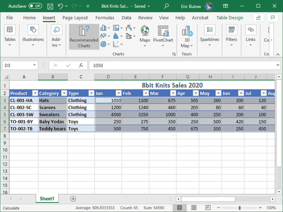
FIGURE 11.1 The Recommended Charts icon in the Insert ribbon
- In the Insert Chart dialog box that appears in Figure 11.2, scroll up and down the list of recommended charts in the Recommended Charts tab. Click a chart type in the list to view a sample of how the chart will look as well as a description of what the chart is about and when to use it.
- Select the All Charts tab to view a list of all charts. The Column category is selected in the list on the left side of the dialog box (see Figure 11.3).
The column chart area appears at the right side of the dialog box; the column type icon is selected at the top of the area.
- Move the mouse pointer over the column type to view a larger preview of the chart.
- For this example, select the Recommended tab and add the Clustered Column chart that you saw in Figure 11.2.
- Click OK.
The chart appears below the table in the example, as shown in Figure 11.4.
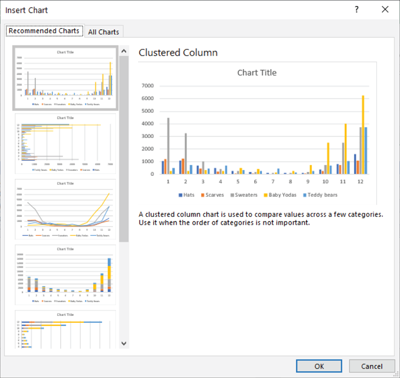
FIGURE 11.2 The Insert Chart dialog box
Now your text is in the table, though you may have to do some more tweaking to get it to appear the way you want it to look.
Working with Chart Sheets
When you don't want to have a chart appear with the same worksheet, Excel makes it easy to create a new chart in a new worksheet. Microsoft calls this a chart sheet, and you may find it most useful if you are creating a chart from a large amount of data.
For example, instead of having your viewers scroll around your worksheet to find the chart, you can make it easy for them to view the chart with one click of the worksheet tab that contains your chart sheet.
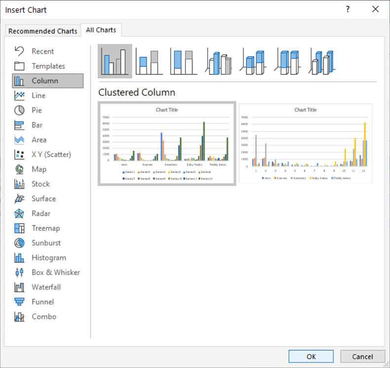
FIGURE 11.3 The Column category in the All Charts tab
Create a chart sheet by following these steps:
- Create a chart as you learned to do earlier in this chapter. I will use the chart I created earlier in this chapter for this example.
- Click anywhere in the chart.
- Click the Chart Design menu option.
- In the Location section in the Chart Design ribbon, click the Move Chart icon, as shown in Figure 11.5.
- In the Move Chart dialog box (see Figure 11.6), click the New Sheet radio button.
- Type a new name if you want by pressing the Backspace key and then typing the new name in the New Sheet text box. For this example, leave the default Chart1 name.
- Click OK.
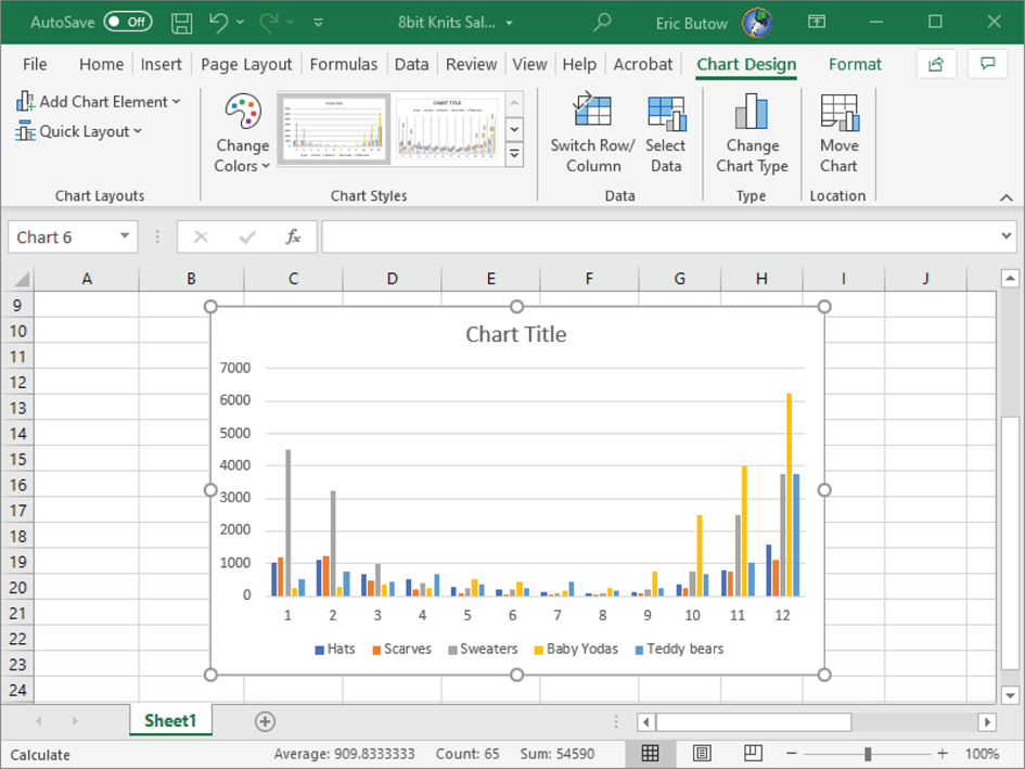
FIGURE 11.4 The chart in the worksheet
A new worksheet appears, as shown in Figure 11.7, and the chart takes up the entirety of the worksheet space.
The chart sheet tab appears to the left of the worksheet tab. Click the worksheet tab to view the worksheet data without the chart.
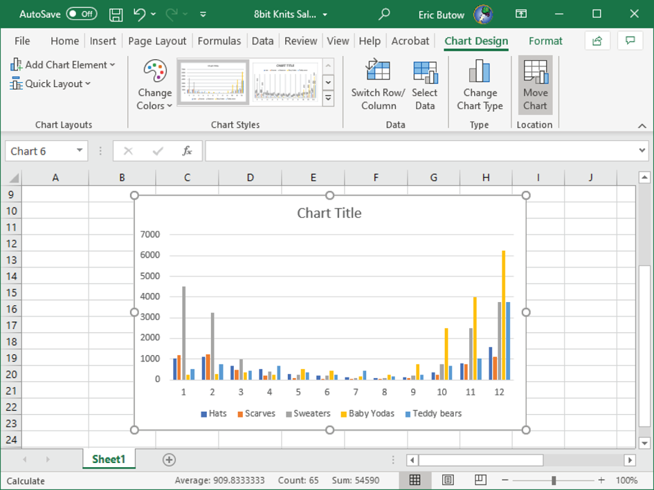
FIGURE 11.5 Move Chart icon in the Chart Design ribbon
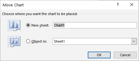
FIGURE 11.6 Move Chart dialog box
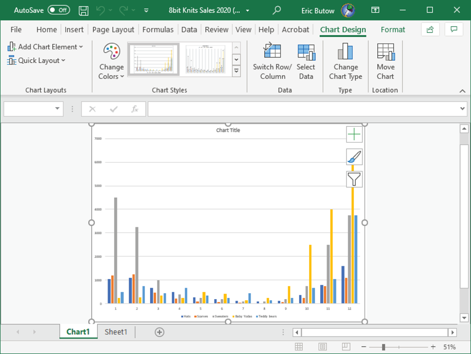
FIGURE 11.7 The chart in a new tab
Modifying Charts
Excel gives you a lot of power to modify your charts as you see fit. You can sort text and/or numbers in a table. You can also take advantage of more tools to change the look of the text and graphics in your chart, align your chart in the worksheet, and even change the chart type.
Adding Data Series to Charts
A data series is one or more rows and/or columns in a worksheet or table that Excel uses to build a chart. After you add a chart, you may want to add more information to the worksheet and have Excel update the chart accordingly. It's easy to do this in the same worksheet chart and in a chart sheet.
Add a Data Series in the Same Worksheet Chart
Follow these steps to add a data series to a chart in the same worksheet:
- Click the chart if necessary. The corresponding rows and/or columns of data appear in the worksheet or table.
- In the worksheet or table, click and hold the sizing handle at the bottom right of the selection that you want to add.
- Drag the sizing handle to place the selection over the data you want to include.
- Release the mouse button.
The selection box in the worksheet or table now reflects your changes, and the chart shows new bars that reflect the data in column F (see Figure 11.8).
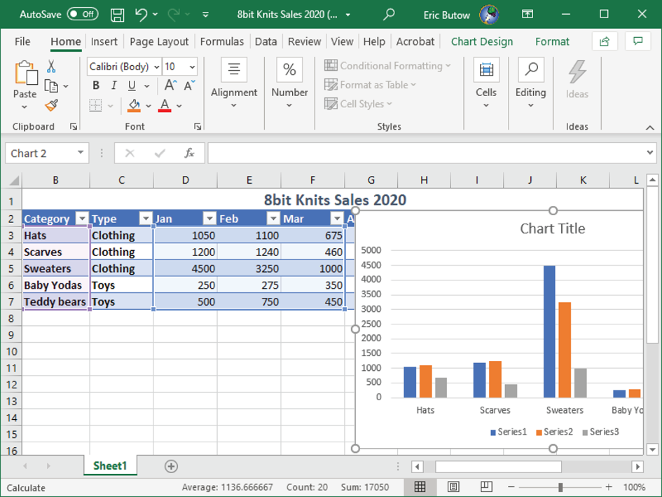
FIGURE 11.8 The updated chart and expanded selection area in the table
Add a Data Series to a Chart Sheet
When you have a chart sheet based on data in another worksheet, and you have a lot of data in that worksheet, then selecting a large range may not be a practical option. In this case, Excel allows you to add a data series within the chart sheet. Here's how to do it:
- At the bottom of the Excel window, click the sheet tab that contains the chart. In this example, the chart sheet name is Chart1.
- In the Data section in the Chart Design menu ribbon, click Select Data.
- The Select Data Source dialog box opens, and the worksheet with your data appears in the Excel window (see Figure 11.9).
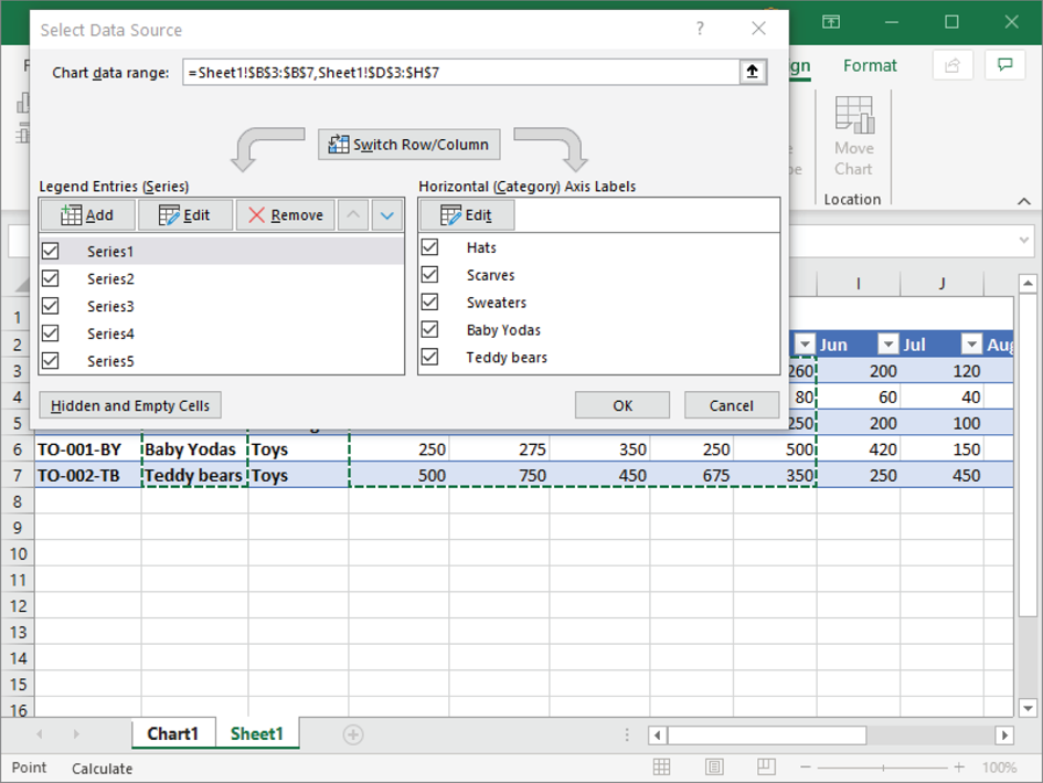
FIGURE 11.9 Select Data Source dialog box and selected table cells
- Press and hold the Ctrl key as you click and drag on more cells that you want to add to the chart.
- When you select all the cells in the worksheet or table, release the Ctrl key and the mouse button.
- Click OK in the Select Data Source dialog box.
In this example, the updated chart with the added bars for the month of June appears in the chart sheet (see Figure 11.10).

FIGURE 11.10 Updated chart in chart sheet
Switching Between Rows and Columns in Source Data
Excel follows one rule when it creates a chart: the larger number of rows or columns is placed in the horizontal axis. For example, if there are 12 columns and 5 rows, then columns are along the horizontal axis.
But what if you want the rows to appear in the horizontal axis? Excel makes it easy. Start by clicking the chart in your worksheet or in the chart sheet. In the Data section in the Chart Design menu ribbon, click Switch Row/Column.
Now the axes have switched, as you can see in Figure 11.11, so you can determine whether you like it. If you don't, click Switch Row/Column in the Chart Design ribbon again.
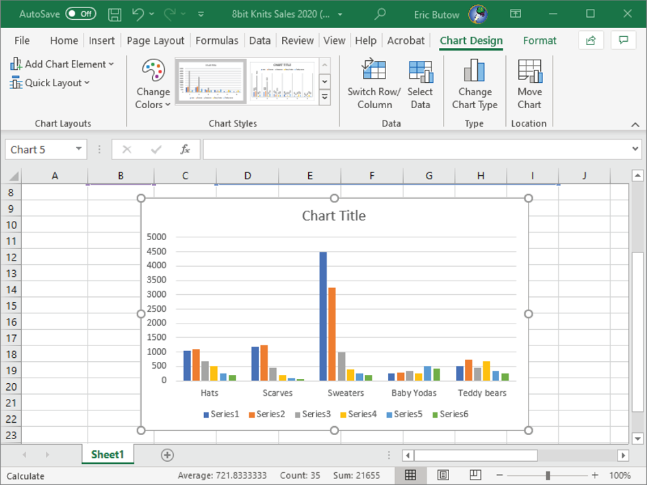
FIGURE 11.11 Row titles in the horizontal axis
Adding and Modifying Chart Elements
It's easy to add and modify the elements you see in a chart. You can view a list of elements that you can add to the chart by clicking anywhere in the chart and then clicking the Chart Elements icon at the upper‐right corner of the chart.
A list of the elements appears, with check boxes to the left of each element name, as shown in Figure 11.12.
Selected check boxes indicate that the element is currently applied. Cleared check boxes mean that the element is not applied. When you move the mouse pointer over the element in the list, you see how the element will appear in the chart—that is, if the element is not already applied.
The following is a list of the elements you can add and remove from your chart:
- Axes
These are the horizonal and vertical units of measure in the chart. In the sample chart shown in Figure 11.12, the horizontal units represent products sold and the vertical units represent sales in increments of 1,000. Excel shows the axes by default.
FIGURE 11.12 Chart elements list
- Axis Titles
These are the titles for the vertical and horizontal axes. The default name of each title is Axis Title. You can change the title after you add it by double‐clicking within the title, selecting the text, and then typing your own text.
- Chart Title
Excel automatically shows the title of your chart, which is Chart Title by default. You can change this title by double‐clicking Chart Title, selecting the text, and then typing a new title.
- Data Labels
These add the number in each cell above each corresponding point or bar in the chart. If your points or bars are close together, having data labels can be difficult to read because the numbers can overlap.
- Data Table
This places your selected cells in a table below the chart. If you have a large table, then you may need to enlarge the size of the chart in the worksheet.
- Error Bars
If you have a chart with data that has margins of error, such as political polls, you can add error bars to your chart to show those margins. Error bars also work when you want to see the standard deviation, which measures how widely a range of values are from the mean.
- Gridlines
This displays the gridlines behind the lines or bars in a graph. Gridlines are active by default.
- Legend
Excel shows the legend, which explains what each line or bar color represents, at the bottom of the chart by default.
- Trendline
A trendline is a straight or curved line that shows the overall pattern of the data in the chart. In the example shown in Figure 11.13, I can check to see the trendline for sales of teddy bears throughout the year.
Once I select the Trendlines check box, the Add Trendline dialog box appears and asks me to click the series that I want to check. After I click Teddy Bears in the list and then click OK, the dashed line appears and the trendline also appears in the legend (see Figure 11.13).
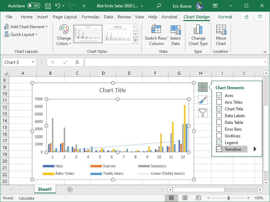
FIGURE 11.13 Trend line for teddy bears
Formatting Charts
When you need to format your chart, click within the chart to view the two formatting ribbons:
- Click the Chart Design menu option to add and change chart styles. The Chart Design ribbon appears after you create your chart.
- Click the Format menu option to change formats of the various elements in your ribbon.
When you click in an area outside of your chart and then click the chart again, Excel remembers the menu ribbon that you last used and opens that ribbon automatically.
Microsoft has identified three common tasks when you create a chart, and so those tasks are in the MO‐200 exam: apply a chart layout, apply chart styles, and add alternative text, which is also known by the shorthand term Alt text.
Using Chart Layouts
After you create a chart, Excel applies its default layout to the chart. Microsoft realizes that you may not want this layout, but you also may not want to take the time to create your own custom layout. So, Excel contains not only the default layout but also 10 other built‐in layouts that you can apply to a chart. Follow these steps to apply a chart layout:
- Click the chart if necessary. The corresponding rows and/or columns of data appear in the worksheet or table.
- Click the Chart Design menu option if necessary.
- In the Chart Layouts section in the Chart Design ribbon, click the Quick Layout icon.
- Move the mouse pointer over the layout tile in the drop‐down menu. As you move the mouse pointer over each layout, the chart style in your worksheet or chart sheet changes so that you can see how the style looks (see Figure 11.14).
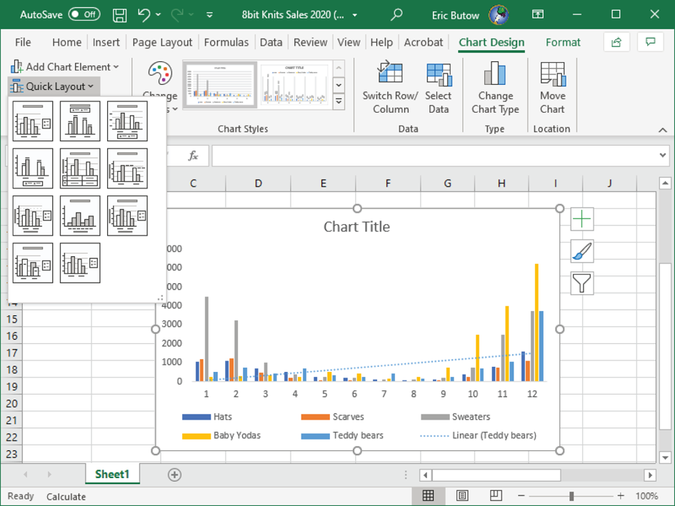
FIGURE 11.14 Excel previews the layout in the chart.
- When you find a chart layout, click the tile in the drop‐down menu.
Excel applies the chart layout that you previewed into the chart.
Create Your Own Chart Layout
You may like some parts of the built‐in layout that you selected but not others. Excel gives you the ability to change different parts of your chart layout to suit your needs.
Start by clicking the chart and then clicking the Format menu option if necessary. In the Format ribbon, which is shown in Figure 11.15, you can select options within the following seven ribbon sections.

FIGURE 11.15 Format ribbon sections
Current Selection
In the Current Selection section on the left side of the ribbon (see Figure 11.16), you can change the following settings:
- Chart Area: The current area that you're editing appears in the area box. Click the down arrow to the right of the box to view a drop‐down list of all the areas that you can edit. Select an area to edit by clicking the area in the list.
- Format Selection: Click Format Selection to open the Format pane on the right side of the Excel window and make more precise edits, such as the background fill color for the horizontal axis.
- Reset To Match Style: Discard your changes and revert to the built‐in settings of the chart style by clicking Reset To Match Style.
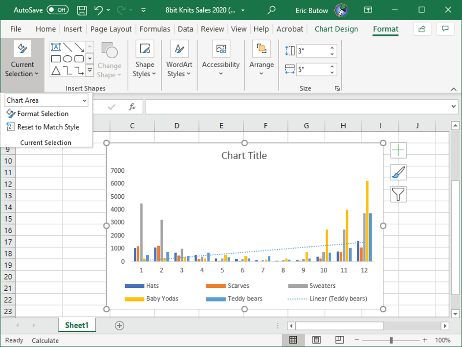
FIGURE 11.16 Current Selection section
Insert Shapes
In the Insert Shapes section, shown in Figure 11.17, you can insert shapes as separate elements in the chart by clicking the shape icon.
FIGURE 11.17 Insert Shapes section
If you don't see the shape you want, click the More button to the right of the icons. (The More button looks like a down arrow with a line above it.) Then you can select the shape icon from the drop‐down list.
Add the shape by following these steps:
- Move the mouse pointer where you want to add the shape.
- Click and hold down the mouse button.
- Drag the mouse pointer until the shape is the size you want.
- Release the mouse button.
Once you add a shape, you can make changes to your shape in the Shape Format ribbon.
Shape Styles
The Shape Styles area, shown in Figure 11.18, allows you to apply the following features to a shape:
- Shape Styles: Click one of the seven shape style icons to change the shape border color. If you don't like any of those style colors, click the More button to the right of the icon row. (The More button looks like a down arrow with a line above it.) From the drop‐down list that appears, you can select a style with your desired border, text, and/or fill colors.
- Shape Fill: Change the fill color or background.
- Shape Outline: Change the shape border color and thickness as well as the outline to a solid or dashed line.
- Shape Effects: Add an effect to a shape. In the drop‐down menu, move the mouse pointer over one of the effects to see how each effect appears. You can choose from Preset, Shadow, Reflection, Glow, Bevel, 3‐D Rotation, or Transform.
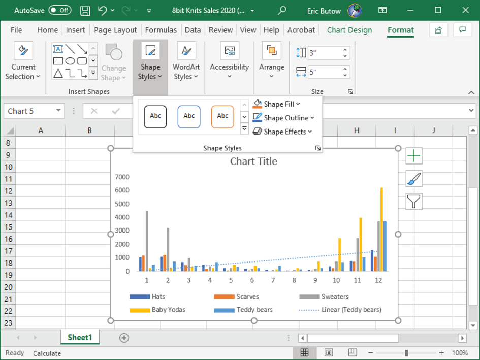
FIGURE 11.18 Shape Styles section
WordArt Styles
WordArt is Microsoft's term for special effects applied to text in Word, Outlook, PowerPoint, and Excel. In the WordArt Styles section, click one of the three built‐in text effect icons (see Figure 11.19).
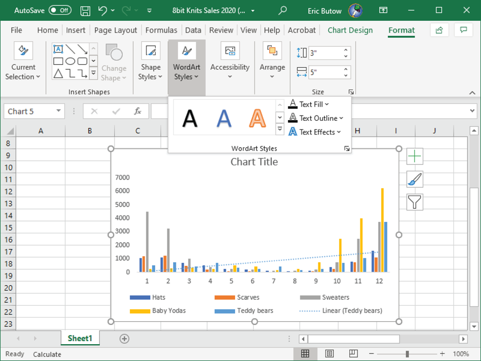
FIGURE 11.19 WordArt Styles section
You can view more styles by clicking the More button to the right of the text effect icon row. (The More button looks like a down arrow with a line above it.) Then you can select the style from the drop‐down list.
If you want to create your own style, click one of the following icons:
- Text Fill: Change the text color in the drop‐down menu.
- Text Outline: Add an outline, including color and outline line width, using the drop‐down menu.
- Text Effects: View and add other effects to the text. In the drop‐down menu, move the mouse pointer over one of the effects to see how the effect appears in your photo. You can choose from Preset, Shadow, Reflection, Glow, Bevel, 3‐D Rotation, and Transform.
Accessibility
Click the Alt Text icon to add alternative text to your chart. This information is important enough that I will discuss this topic in its own section later in this chapter.
Arrange
If you have multiple charts in a section, you can click one of the options in the Arrange section, as shown in Figure 11.20.
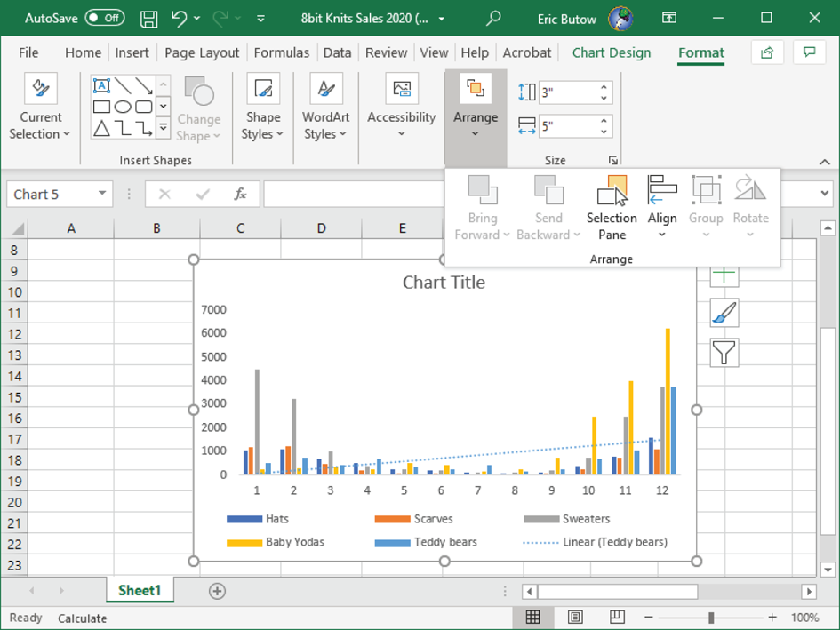
FIGURE 11.20 Arrange section
For example, click Selection Pane to open the Selection panel on the right side of the Excel window so that you can see all the charts, and choose to hide a chart for some reviewers who don't need to see it but show the chart again if you want to display the chart for other reviewers.
Size
Change the exact height and width by clicking the Height and the Width box, respectively (see Figure 11.21).
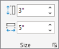
FIGURE 11.21 Size section
You can type the height and width in inches as precise as hundredths of an inch. To the right of the Height and Width boxes, click the up and down arrows to increase or decrease the height by one tenth of an inch.
Applying Chart Styles
When you create a chart, Excel applies its default style for the type of chart you select in the Insert Chart dialog box that you learned about earlier in this chapter. If you don't like that style, you can add one of an additional 13 styles.
Excel also allows you to make changes to a style to make the chart look the way you want. Before you can make changes to a style, you must apply the built‐in style.
Apply a Built‐In Chart Style
Here's how to apply one of the built‐in styles to your chart:
- Click the chart if necessary. The corresponding rows and/or columns of data appear in the worksheet or table.
- Click the Chart Design menu option if necessary.
- In the Chart Styles section in the Chart Design ribbon, click the More button to the right of the last chart style tile in the row. (The More button looks like a down arrow with a line above it.)
- Move the mouse pointer over the style tile in the drop‐down menu. As you move the mouse pointer over each style, the chart style in your worksheet or chart sheet changes so that you can see how the style looks (see Figure 11.22).
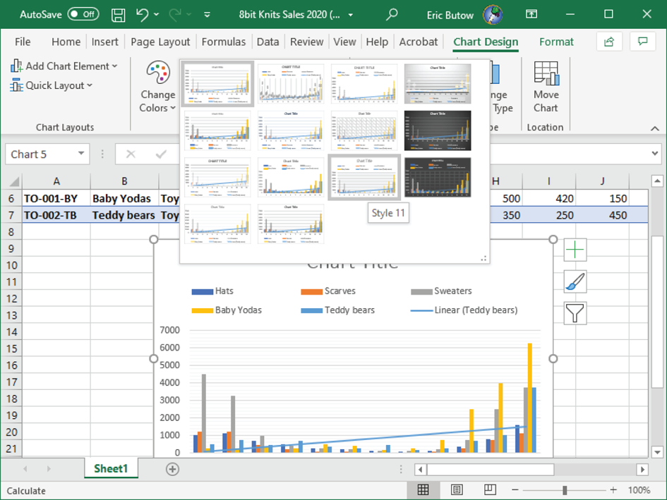
FIGURE 11.22 The preview of the style in the chart
- When you find a chart style, click the tile in the drop‐down menu.
Excel applies the chart style that you previewed into the chart.
Create Your Own Chart Style
After you apply a chart style, you can modify it in only one way: the color scheme. To do that, follow these steps:
- Click the chart if necessary. The corresponding rows and/or columns of data appear in the worksheet or table.
- Click the Chart Design menu option if necessary.
- In the Chart Styles section in the Chart Design ribbon, click the Change Colors icon.
- Swipe up and down in the list of color swatch groups. There are six colors in each swatch group (see Figure 11.23).
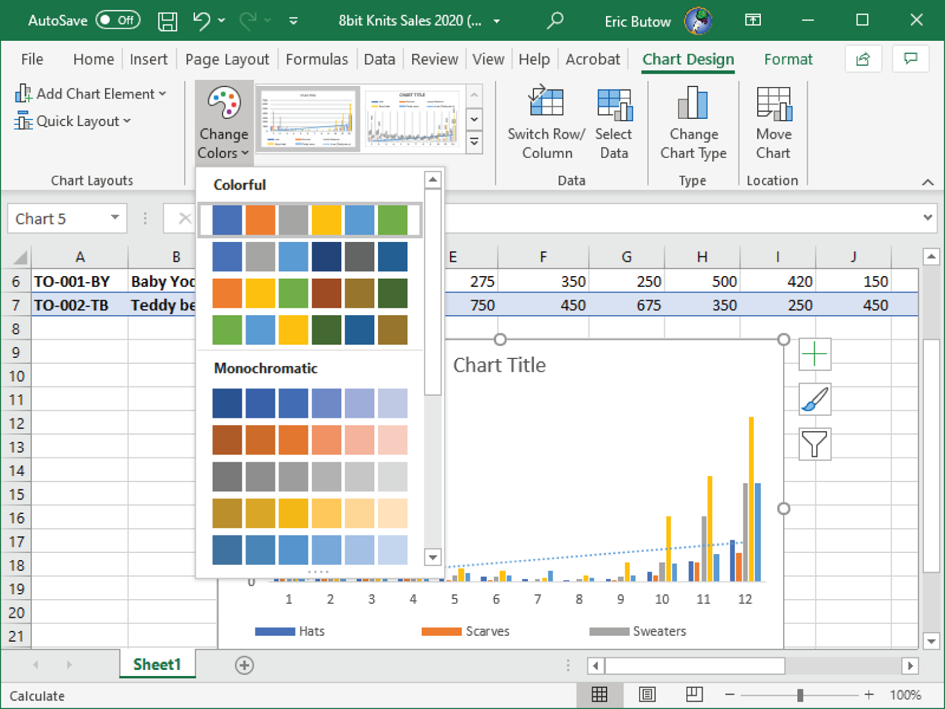
FIGURE 11.23 Six swatch colors in the selected swatch group
- As you move the mouse pointer over each swatch group, the colors in the chart change so that you can see how they look. When you find a color swatch you like, click the swatch group in the list.
Excel applies the color swatch group to all elements in the chart.
Adding Alternative Text to Charts for Accessibility
Alt text, or alternative text, tells anyone who views your document in Excel what the chart is when the reader moves their mouse pointer over it. If the reader can't see your document, then Excel will use text‐to‐speech in Windows to read your Alt text to the reader audibly.
Here's how to add Alt text:
- Click the chart if necessary.
- Click the Format menu option if necessary.
- In the Accessibility section in the Format ribbon, click the Alt Text icon. (If your Excel window isn't very wide, you may need to click the Accessibility icon and then click Alt Text.)
- In the Alt Text pane on the right side of the Excel window (see Figure 11.24), type one or two sentences in the text box to describe the object and its context.
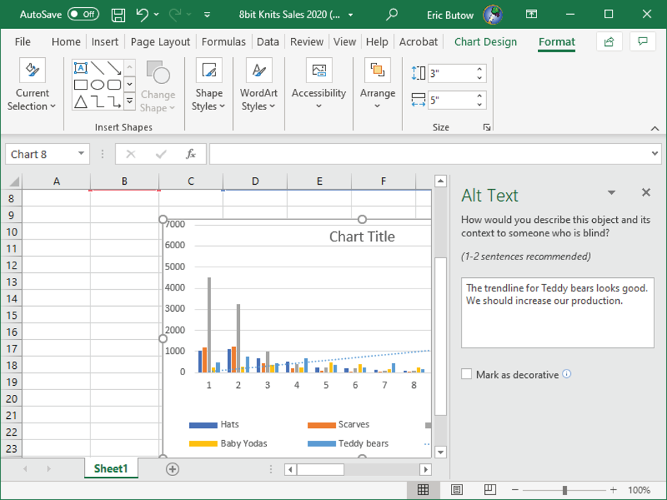
FIGURE 11.24 Alt Text pane
- Click the Mark As Decorative check box if your chart adds visual interest but doesn't require a description.
- When you're done, close the pane.
Summary
This chapter started by showing you how to create a chart from selected data in a range or table within a worksheet. Then you learned how to place a new chart in its own worksheet, called a chart sheet.
After you created a chart, you learned how to modify the chart to suit your needs. I discussed how to add more data series to a chart. Next, you learned how to switch the axes in a chart, and you learned how to modify the look and feel of your chart, including the axes, the axis and chart titles, data labels, the data table, error bars, gridlines, the legend, and trendlines.
Finally, you learned how to use and apply chart layouts, apply and change the color scheme in chart styles, and add alternative text to a chart.
Key Terms
| Alt text | error bars |
| chart | legend |
| chart sheet | trendline |
| data series | WordArt |
Exam Essentials
- Understand how to create a chart.
Know how to create a chart by accessing the Insert Chart dialog box and then selecting either a recommended chart or one of the many chart types Excel has available.
- Know how to create a chart sheet.
Understand how to create a chart that appears separately within an entire worksheet.
- Understand how to add a data series to a chart.
Know how to add additional cells in a worksheet or a table into a chart after you have already created the chart.
- Know how to switch between row and column data in a chart.
Understand how Excel places data series in the horizontal and vertical axes as well as how to switch those axes in a chart.
- Understand how to add and modify chart elements.
Know how to add chart elements to your chart—including axes, axis titles, the chart title, data labels in the chart, a data table in the chart, error bars, gridlines, a legend, and a trendline—and be able to modify those elements.
- Be able to apply chart layouts.
Know how to apply a different chart layout using the Quick Layout menu in the Chart Design ribbon.
- Know how to select and change chart styles.
Know how to apply a chart style from the Chart Design ribbon as well as change the color scheme for the style.
- Understand how to add Alt text.
Know why Alt text is important for your readers and how to add Alt text to a chart.
Review Questions
- How do you view a list of all charts that you can create?
- Click the Change Chart Type icon in the Chart Design ribbon.
- Click a new style tile in the Chart Design ribbon.
- Select the All Charts tab in the Insert Chart dialog box.
- Click the Chart Elements icon in the upper‐right corner of the selected chart.
- If you create a chart from a worksheet or table that has equal numbers of columns and rows, what does Excel use as the horizontal axis?
- A dialog box appears and asks you if you want to use rows or columns.
- Columns
- Rows
- An error message appears in a dialog box.
- What types of styles can be applied when you format a chart? (Choose all that apply.)
- Shapes
- Chart area
- WordArt
- Size
- What do you need to add to a chart that explains what each line or bar color represents?
- Legend
- Data labels
- Data table
- Axis titles
- What shape attributes can you change with a built‐in style? (Choose all that apply.)
- Border color
- Text size
- Text color
- Background color
- How do you change a data element in your chart more precisely?
- Click Add Chart Element in the Chart Design ribbon and then click the type of element that you want to edit.
- Click Format Selection in the Format ribbon.
- Click the right arrow next to the element name in the Chart Elements list.
- Click Quick Layout in the Chart Design ribbon and then select the appropriate layout from the drop‐down menu.
- How do you resize a chart in the chart sheet?
- Click and drag one of the sizing handles at the boundary of the chart.
- You can't resize it.
- Set the measurement in the Format ribbon.
- Resize the chart in the worksheet before you move the chart to its own chart sheet.
- Why do you add a trendline in a bar chart?
- To better show the levels of a bar in a chart
- Because Excel requires it before you can save the chart
- To see the overall trend of data over time
- To show the margins of error in a chart
- What is the difference between a chart layout and a chart style?
- They're the same thing.
- The chart layout lets you change the type of chart, and the chart style changes the look and feel of the chart.
- The chart layout applies the chart style elements to the chart.
- A chart layout shows chart elements, and chart styles change how the chart looks.
- Why should you add Alt text to a chart?
- Because it's required for all charts in an Excel workbook
- To help people who can't see the chart know what the graphic is about
- Because Excel won't save your workbook until you do
- Because you want to be as informative as possible