Chapter 5
Means, Medians, and More
IN THIS CHAPTER
![]() Summarizing numerical data effectively
Summarizing numerical data effectively
![]() Looking at means, medians, and standard deviation
Looking at means, medians, and standard deviation
![]() Working with percentages
Working with percentages
In Chapter 4, you see a few statistics used to tell the story of data that falls into specific categories. The topic of descriptive statistics continues in this chapter, in which you focus on ways to summarize numerical data.
Measuring the Center with Mean and Median
With numerical data, measurable characteristics such as height, weight, IQ, age, or income are represented by numbers that make sense within the context of the problem (for example, in units of feet, dollars, or people). Because the data have numerical meaning, you can summarize them in more ways than are possible with categorical data. The most common way to summarize a numerical data set is to describe where the center is. One way of thinking about what the center of a data set means is to ask, “What’s a typical value?” or, “Where is the middle of the data?” The center of a data set can actually be measured in different ways, and the method chosen can greatly influence the conclusions people make about the data. This section hits on measures of center.
Averaging out to the mean
NBA players make a lot of money, right? You often hear about players like Kobe Bryant or LeBron James, who make tens of millions of dollars a year. But is that what the typical NBA player makes? Not really (although I don’t exactly feel sorry for the others, given that they still make more money than most of us will ever make). Tens of millions of dollars is the kind of money you can command when you are a superstar among superstars, which is what these elite players are.
So how much money does the typical NBA player make? One way to answer this is to look at the average (the most commonly used statistic of all time).
The average, also called the mean of a data set, is denoted ![]() . The formula for finding the mean is
. The formula for finding the mean is
where each individual value in the data set is denoted by an x and ![]() represents the sum of the n numbers in the data set.
represents the sum of the n numbers in the data set.
Here’s how you calculate the mean of a data set:
- Add up all the numbers in the data set.
- Divide by the number of numbers in the data set, n.
 The mean I discuss here applies to a sample of data and is technically called the sample mean. The mean of an entire population of data is denoted with the Greek letter μ and is called the population mean. It’s found by summing up all the values in the population and dividing by the population size, denoted N (to distinguish it from a sample size, n). Typically the population mean is unknown, and you use a sample mean to estimate it (plus or minus a margin of error; see all the details in Chapter 14).
For example, player salary data for the 13 players on the 2021–2022 NBA Los Angeles Lakers are shown in Table 5-1.
The mean of all the salaries on this team is ![]() . That’s a pretty nice average salary, isn’t it? But notice that Russell Westbrook, LeBron James, and Anthony Davis really stand out at the top of this list, and they should because they are such excellent players. If you remove these three players from the equation, the average salary of all the Lakers players besides Russell, LeBron, and Anthony becomes
. That’s a pretty nice average salary, isn’t it? But notice that Russell Westbrook, LeBron James, and Anthony Davis really stand out at the top of this list, and they should because they are such excellent players. If you remove these three players from the equation, the average salary of all the Lakers players besides Russell, LeBron, and Anthony becomes ![]() — a difference of around $5 million.
— a difference of around $5 million.
This new mean is still a hefty amount, but it’s significantly lower than the mean salary of all the players including the three superstars. (Fans would tell you that this reflects their importance to the team, and others would say no one is worth that much money; this issue is but the tip of the iceberg of the never-ending debates that sports fans love to have about statistics.)
Table 5-1 Salaries for L.A. Lakers NBA Players (2021–2022)
Player | Salary ($) |
|---|---|
Russell Westbrook | $44,211,146 |
LeBron James | $41,180,544 |
Anthony Davis | $35,361,360 |
Talen Horton-Tucker | $9,500,000 |
Luol Deng | $5,000,000 |
Kendrick Nunn | $5,000,000 |
Carmelo Anthony | $2,641,691 |
Trevor Ariza | $2,641,691 |
Avery Bradley | $2,641,691 |
Wayne Ellington | $2,641,691 |
Dwight Howard | $2,641,691 |
DeAndre Jordan | $2,641,691 |
Kent Bazemore | $2,401,537 |
Malik Monk | $1,789,256 |
Stanley Johnson | $1,248,915 |
Austin Reaves | $925,258 |
Mason Jones | $295,125 |
Sekou Doumbouya | $294,461 |
Jay Huff | $225,997 |
Darren Collison | $151,821 |
Isiah Thomas | $151,821 |
Chaundee Brown | $93,058 |
Jemerrio Jones | $85,578 |
TOTAL | $163,766,023 |
Bottom line: The mean doesn’t always tell the whole story. In some cases it may be a bit misleading, and this is one of those cases. That’s because every year, a few top-notch players (like Russell, LeBron, and Anthony) make much more money than anybody else, and their salaries pull up the overall average salary.
 Numbers in a data set that are extremely high or extremely low compared to the rest of the data are called outliers. Because of the way the average is calculated, high outliers tend to drive the average upward (as the three superstars’ salaries did in the preceding example). Low outliers tend to drive the average downward.
 Q. Find the mean of the following data set: 1, 6, 5, 7, 3, 2.5, 2, −2, 1, 0.
A. 2.55 The mean is ![]() , divided by 10 (because you have 10 numbers), or 2.55.
, divided by 10 (because you have 10 numbers), or 2.55.
1 Does the mean have to be one of the numbers in the data set? Explain your answer.
2 Suppose you have an outlier in a data set (a number that stands out away from the rest). How does an outlier affect the mean of that data set?
3 Suppose you find the mean for a certain data set.
- Depending on what the data actually are, the mean should always lie between the largest and smallest values of the data set. Explain why.
- When can the mean be the largest value in the data set?
Splitting your data down the median
Remember in school when you took an exam, and you and most of the rest of the class did badly, but a couple of nerds got 100? Remember how the teacher didn’t curve the scores to reflect the poor performance of most of the class? Your teacher was probably using the average, and the average in that case didn’t really represent what statisticians might consider the best measure of center for the students’ scores.
What can you report, other than the average, to show what the salary of a “typical” NBA player would be or what the test score of a “typical” student in your class was? Another statistic used to measure the center of a data set is called the median. The median is still an unsung hero of statistics in the sense that it isn’t used nearly as often as it should be, although people are beginning to report it more nowadays.
The median of a data set is the value that lies exactly in the middle when the data have been ordered. It’s denoted in different ways; some people use M and some use ![]() . Here are the steps for finding the median of a data set:
. Here are the steps for finding the median of a data set:
- Order the numbers from smallest to largest.
- If the data set contains an odd number of numbers, choose the one that is exactly in the middle. You’ve found the median.
- If the data set contains an even number of numbers, take the two numbers that appear in the middle and average them to find the median.
The salaries for the Los Angeles Lakers during the 2021–2022 season (refer to Table 5-1) are ordered from lowest (at the bottom) to highest (at the top). Because the list contains the names and salaries of 23 players, the middle salary is the 12th one from the bottom: DeAndre Jordan, who earned $2.64 million that season from the Lakers. DeAndre is at the median.
This median salary ($2.64 million) is well below the average of $7.12 million for the 2021–2022 Lakers team. Notice that only 4 players of the 23 earned more than the average Lakers salary of $7.12 million. Because the average includes outliers (like the salary of Russell Westbrook), the median salary is more representative of the center for the team salaries. The median isn’t affected by the salaries of those players who are way out there on the high end the way the average is.
Note: By the way, the lowest Lakers’ salary for the 2021–2022 season was $85,578 — a decent amount of money by most people’s standards, but peanuts compared to what you imagine when you think of an NBA player’s salary!
 The U.S. government most often uses the median to represent the center with respect to income data, again, because the median is not affected by outliers. For example, the U.S. Census Bureau reported that in 2021, the median household income was $67,500 while the mean was found to be $78,500. That’s quite a difference!
Q. Find the median of the following data set: 1, 6, 5, 7, 3, 2.5, 2, −2, 1, 0.
A. 2.25 To find the median, order the numbers: −2, 0, 1, 1, 2, 2.5, 3, 5, 6, 7. Now move to the middle and find the two middle values: 2 and 2.5. Take the average: ![]() .
.
4 Does the median have to be one of the numbers in the data set? Explain your answer.
5 Why do you have to order the data to calculate the median but not the mean?
6 Suppose you have an outlier in a data set (a number that stands out away from the rest). How does an outlier affect the median of that data set?
7 Give an example of two different data sets containing three numbers each that both have the same median and mean. Explain why the median isn’t enough to tell the whole story about a data set.
8 Suppose the mean and median salary at a company is $50,000, and all employees get a $1,000 raise.
- What happens to the mean?
- What happens to the median?
9 Suppose the mean and median salary at a company is $50,000, and all employees get a 10 percent raise.
- What happens to the mean?
- What happens to the median?
Comparing means and medians: Histograms
Sometimes the mean versus median debate can get quite interesting. Suppose you’re part of an NBA team trying to negotiate salaries. If you represent the owners, you want to show how much everyone is making and how much money you’re spending, so you want to take into account those superstar players and report the average. But if you’re on the side of the players, you would want to report the median, because that’s more representative of what the players in the middle are making. Fifty percent of the players make a salary above the median, and 50 percent make a salary below the median. To sort it all out, it’s best to find and compare both the mean and the median. A graph showing the shape of the data is a great place to start.
One of the graphs you can make to illustrate the shape of numerical data (how many values are close to or far from the mean, where the center is, how many outliers there might be) is a histogram. A histogram is a graph that organizes and displays numerical data in picture form, showing groups of data and the number or percentage of the data that fall into each group. It gives you a nice snapshot of the data set. (See Chapter 7 for more information on histograms and other types of data displays.)
Data sets can have many different shapes; here is a sampling of three shapes that are commonly discussed in introductory statistics courses:
If most of the data are on the left side of the histogram but a few larger values are on the right, the data are said to be skewed to the right.
Histogram A in Figure 5-1 shows an example of data that are skewed to the right. The few larger values bring the mean upwards but don’t really affect the median. So when data are skewed right, the mean is larger than the median. An example of such data is NBA salaries.
If most of the data are on the right, with a few smaller values showing up on the left side of the histogram, the data are skewed to the left.
Histogram B in Figure 5-1 shows an example of data that are skewed to the left. The few smaller values bring the mean down, and again the median is minimally affected (if at all). An example of skewed-left data is the amount of time students use to take an exam; some students leave early, more of them stay later, and many stay until the bitter end (some would stay forever if they could!). When data are skewed left, the mean is smaller than the median.
If the data are symmetric, they have about the same shape on either side of the middle. In other words, if you fold the histogram in half, it looks about the same on both sides.
Histogram C in Figure 5-1 shows an example of symmetric data in a histogram. With symmetric data, the mean and median are close together.
FIGURE 5-1: A) Data skewed right; B) data skewed left; and C) symmetric data.
By looking at Histogram A in Figure 5-1 (whose shape is skewed right), you can see that the “tail” of the graph (where the bars are getting shorter) is to the right, while the “tail” is to the left in Histogram B (whose shape is skewed left). By looking at the direction of the tail of a skewed distribution, you determine the direction of the skewness. Always add the direction when describing a skewed distribution.
Histogram C is symmetric (it has about the same shape on each side). However, not all symmetric data has a bell shape like Histogram C. As long as the shape is approximately the same on both sides, you say that the shape is symmetric.
The average (or mean) of a data set is affected by outliers, but the median is not. In statistical lingo, if a statistic is not affected by a certain characteristic of the data (such as outliers, or skewness), then you say that statistic is resistant to that characteristic. In this case, the median is resistant to outliers; the mean is not. If someone reports the average value, also ask for the median so that you can compare the two statistics and get a better feel for what’s actually going on in the data and what’s truly typical.
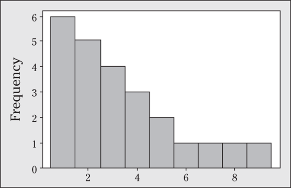
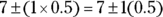
Q. Describe the shape of the data shown in the following histogram.
A. This data set is evenly distributed among the values 1−10, meaning it has a uniform distribution. (Keep in mind that a uniform distribution doesn’t mean that all the data values are the same; it means that the frequencies for the data are the same across the groups.)
Q. Explain why a data set having the mean and the median close to being equal will have a shape that is roughly symmetric.
A. The mean is affected by outliers in the data, but the median is not. If the mean and median are close to each other, the data aren’t skewed and likely don’t contain outliers on one side or the other. That means the data look about the same on each side of the middle, which is the definition of symmetric data.
The fact that the mean and median are close tells you the data are roughly symmetric and can be used in a different type of test question. Suppose someone asks you whether the data are symmetric, and you don’t have a histogram, but you do have the mean and median. Compare the two values of the mean and median, and if they are close, the data are symmetric. If they aren’t, the data are not symmetric.
10 Is the data set shown in the following figure symmetric or skewed? How many modes does this data set have?
11 Describe the shape of the data set shown in the following figure.
12 Describe the shape of the data set shown in the following figure.

13 Give an example of a symmetric histogram with two modes.
14 Suppose the average salary at a certain company is $100,000, and the median salary is $40,000.
- What do these figures tell you about the shape of the histogram of salaries at this company?
- Which measure of center is more appropriate here?
- Suppose the company goes through a salary negotiation. How can people on each side use these summary statistics to their advantage?
15 Suppose you know that a data set is skewed left, and you know that the two measures of center are 19 and 38. Which figure is the mean and which is the median?
16 Can the mean of a data set be higher than most of the values in the set? If so, how? Can the median of a set be higher than most of the values? If so, how?
Accounting for Variation
Variation always exists in a data set, regardless of which characteristics you’re measuring, because not every individual is going to have the same exact value for every variable. Variation is what makes the field of statistics what it is. For example, the price of homes varies from house to house, from year to year, and from state to state. The amount of time it takes you to get to work varies from day to day. The trick to dealing with variation is to be able to measure that variation in a way that best captures it.
Reporting the standard deviation
By far the most common measure of variation for numerical data is the standard deviation. The standard deviation measures how concentrated the data are around the mean; the more concentrated, the smaller the standard deviation. It’s not reported nearly as often as it should be, but when it is, you often see it in parentheses: ![]() .
.
Calculating standard deviation
The formula for the sample standard deviation of a data set (s) is
To calculate s, do the following steps:
- Find the average of the data set,
 .
. - Take each number in the data set (x) and subtract the mean from it to get
 .
. - Square each of the differences,
 .
. - Add up all of the results from Step 3 to get the sum of squares:
 .
. - Divide the sum of squares (found in Step 4) by the number of numbers in the data set minus 1; that is,
 . Now you have:
- Take the square root to get
which is the sample standard deviation, s. Whew!
At the end of Step 5, you have found a statistic called the sample variance, denoted by ![]() . The variance is another way to measure variation in a data set; its downside is that it’s in square units. If your data are in dollars, for example, the variance would be in square dollars — which makes no sense. That’s why I proceed to Step 6. Standard deviation has the same units as the original data.
. The variance is another way to measure variation in a data set; its downside is that it’s in square units. If your data are in dollars, for example, the variance would be in square dollars — which makes no sense. That’s why I proceed to Step 6. Standard deviation has the same units as the original data.
Look at the following example: Suppose you have four quiz scores: 1, 3, 5, and 7. The mean is ![]() points. Subtracting the mean from each number, you get
points. Subtracting the mean from each number, you get ![]() ,
, ![]() ,
, ![]() , and
, and ![]() . Squaring each of these results, you get 9, 1, 1, and 9. When you add them up, the sum is 20. In this example,
. Squaring each of these results, you get 9, 1, 1, and 9. When you add them up, the sum is 20. In this example, ![]() , and therefore
, and therefore ![]() , so you divide 20 by 3 to get 6.67. The units here are “points squared,” which obviously makes no sense. Finally, you take the square root of 6.67, to get 2.58. The standard deviation for these four quiz scores is 2.58 points.
, so you divide 20 by 3 to get 6.67. The units here are “points squared,” which obviously makes no sense. Finally, you take the square root of 6.67, to get 2.58. The standard deviation for these four quiz scores is 2.58 points.
Because calculating the standard deviation involves many steps, in most cases you have a computer calculate it for you. However, knowing how to calculate the standard deviation helps you better interpret this statistic and can help you figure out when the statistic may be wrong.
Statisticians divide by ![]() instead of by n in the formula for s so the results have nicer properties that operate on a theoretical plane that’s beyond the scope of this book. (Not the Twilight Zone but close; trust me, that’s more than you want to know about that!)
instead of by n in the formula for s so the results have nicer properties that operate on a theoretical plane that’s beyond the scope of this book. (Not the Twilight Zone but close; trust me, that’s more than you want to know about that!)
The standard deviation of an entire population of data is denoted with the Greek letter ![]() . When I use the term standard deviation, I mean s, the sample standard deviation. (When I refer to the population standard deviation, I let you know.)
. When I use the term standard deviation, I mean s, the sample standard deviation. (When I refer to the population standard deviation, I let you know.)
Interpreting standard deviation
Standard deviation can be difficult to interpret as a single number on its own. Basically, a small standard deviation means that the values in the data set are close to the mean of the data set, on average, and a large standard deviation means that the values in the data set are farther away from the mean, on average.
A small standard deviation can be a goal in certain situations where the results are restricted, for example, in product manufacturing and quality control. A particular type of car part that has to be 2 centimeters in diameter to fit properly had better not have a very big standard deviation during the manufacturing process. A big standard deviation in this case would mean that lots of parts end up in the trash because they don’t fit right; either that or the cars will have problems down the road.
But in situations where you just observe and record data, a large standard deviation isn’t necessarily a bad thing; it just reflects a large amount of variation in the group that is being studied. For example, if you look at salaries for everyone in a certain company, including everyone from the student intern to the CEO, the standard deviation may be very large. On the other hand, if you narrow the group down by looking only at the student interns, the standard deviation is smaller, because the individuals within this group have salaries that are less variable. The second data set isn’t better, it’s just less variable.
Similar to the mean, outliers affect the standard deviation (after all, the formula for standard deviation includes the mean). In the NBA salaries example, the salaries of the L.A. Lakers in the 2021–2022 season (shown in Table 5-1) range from the highest, $23,034,375 (Russell Westbrook), down to $85,578 (Jemerrio Jones). Lots of variation, to be sure! The standard deviation of the salaries for this team turns out to be $13,363,152.03; it’s almost twice as large as the average salary. However, as you may guess, if you remove Russell, LeBron, and Anthony’s salaries from the data set, the standard deviation decreases because the remaining salaries are more concentrated around the mean. The standard deviation then becomes $2,308,873.81.
Watch for the units when determining whether a standard deviation is large. For example, a standard deviation of 2 in units of years is equivalent to a standard deviation of 24 in units of months. Also look at the value of the mean when putting standard deviation into perspective. If the average number of Internet newsgroups that a user posts to is 5.2 and the standard deviation is 3.4, that’s a lot of variation, relatively speaking. But if you’re talking about the age of the newsgroup users where the mean is 25.6 years, that same standard deviation of 3.4 is comparatively smaller.
Understanding properties of standard deviation
Here are some properties that can help you when interpreting a standard deviation:
- The standard deviation can never be a negative number, due to the way it’s calculated and the fact that it measures a distance (distances are never negative numbers).
- The smallest possible value for the standard deviation is zero, and that happens only in contrived situations where every single number in the data set is exactly the same (no deviation).
- The standard deviation is affected by outliers (extremely low or extremely high numbers in the data set). That’s because the standard deviation is based on the distance from the mean. And remember, the mean is also affected by outliers.
- The standard deviation has the same units as the original data.
Lobbying for standard deviation
The standard deviation is a commonly used statistic, but it doesn’t often get the attention it deserves. Although the mean and median are out there in full view in the everyday media, you rarely see them accompanied by any measure of how diverse that data set was, so you are getting only part of the story. In fact, you could be missing the most interesting part of the story.
Without standard deviation, you can’t get a handle on whether the data are close to the average (as are the diameters of car parts that come off of a conveyor belt when everything is operating correctly) or whether the data are spread out over a wide range (as are house prices and income levels in the U.S.).
For example, if someone told you that the average starting salary for someone working at Company Statistix is $70,000, you may think, “Wow! That’s great.” But if the standard deviation for starting salaries at Company Statistix is $20,000, that’s a lot of variation in terms of how much money you can make, so the average starting salary of $70,000 isn’t as informative in the end, is it?
On the other hand, if the standard deviation is only $5,000, you have a much better idea of what to expect for a starting salary at that company. Which is more appealing? That’s a decision each person has to make; however, it’ll be a much more informed decision once you realize standard deviation matters.
Without the standard deviation, you can’t compare two data sets effectively. Suppose two sets of data have the same average; does that mean that the data sets must be exactly the same? Not at all. For example, the data sets (199, 200, 201) and (0, 200, 400) both have the same average (200), yet they have very different standard deviations. The first data set has a very small standard deviation ![]() compared to the second data set
compared to the second data set ![]() .
.
References to the standard deviation may become more commonplace in the media as more and more people (like you, for example) discover what the standard deviation can tell them about a set of results and start asking for it. In your career, you’re more likely to see the standard deviation reported and used in the future as its value becomes more apparent to people.
Being out of range
The range is another statistic that some folks use to measure diversity in a data set. The range is the largest value in the data set minus the smallest value in the data set. It’s easy to find; all you do is put the numbers in order (from smallest to largest) and do a quick subtraction. Maybe that’s why the range is used so often; it certainly isn’t because of its interpretative value.
The range of a data set is almost meaningless. It depends on only two numbers in the data set, both of which may reflect extreme values (outliers). My advice is to ignore the range and find the standard deviation, which is a more informative measure of the variation in the data set because it involves all the values. Or you can also calculate another statistic called the interquartile range, which is similar to the range with an important difference: it eliminates outlier and skewness issues by only looking at the middle 50 percent of the data and finding the range for those values. The section, “Exploring interquartile range,” at the end of this chapter gives you more details.
Q. Find and interpret the standard deviation of the following data set: 1, 2, 3, 4, 5.
A. 1.58 First, the mean of this data set is 3 (see the previous section, “Averaging out to the mean,” for mean info). After you calculate the mean, find the deviations from the mean and square them: ![]() , and −2 squared equals 4;
, and −2 squared equals 4; ![]() , and −1 squared equals 1;
, and −1 squared equals 1; ![]() , and 0 squared equals 0;
, and 0 squared equals 0; ![]() , and 1 squared equals 1; and finally,
, and 1 squared equals 1; and finally, ![]() , and 2 squared equals 4. Sum these values up to get
, and 2 squared equals 4. Sum these values up to get ![]() . Divide 10 by 5 − 1 (because
. Divide 10 by 5 − 1 (because ![]() ) to get
) to get ![]() . The final step is to take the square root of 2.5, which gives you
. The final step is to take the square root of 2.5, which gives you ![]() . This answer means the data are, on average, about 1.58 steps from the mean (3).
. This answer means the data are, on average, about 1.58 steps from the mean (3).
Q. Find and interpret the range of the following data set: 1, 2, 3, 4, 5.
A. 4. The largest value in the data set is 5, and the smallest value is 1. Thus, the range is ![]() . This means that all the values of the data set span a distance of 4, but it doesn’t say how the values in the middle are spread out.
. This means that all the values of the data set span a distance of 4, but it doesn’t say how the values in the middle are spread out.
17 What’s the smallest standard deviation you can figure, and when would that happen?
18 Choose four numbers from 1 to 5, with repetitions allowed, to create the largest standard deviation possible.
19 Suppose the mean salary at a company is $50,000, and all employees get a $1,000 raise. What happens to the standard deviation?
20 Suppose the mean salary at a company is $50,000, and all employees get a 10 percent raise. What happens to the standard deviation?
21 Is the standard deviation affected by skewed data? If so, how?
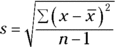
Examining the Empirical Rule (68-95-99.7)
Putting a measure of center (such as the mean or median) together with a measure of variation (such as standard deviation or interquartile range) is a good way to describe the values in a population. In the case where the data are in the shape of a bell curve (that is, they have a normal distribution; see Chapter 10), the population mean and standard deviation are the combination of choice, and a special rule links them together to get some pretty detailed information about the population as a whole.
The Empirical Rule says that if a population has a normal distribution with population mean μ and standard deviation ![]() , then
, then
- About 68 percent of the values lie within 1 standard deviation of the mean (or between the mean minus 1 times the standard deviation, and the mean plus 1 times the standard deviation). In statistical notation, this is represented as
 .
. - About 95 percent of the values lie within 2 standard deviations of the mean (or between the mean minus 2 times the standard deviation, and the mean plus 2 times the standard deviation). The statistical notation for this is
 .
. - About 99.7 percent of the values lie within 3 standard deviations of the mean (or between the mean minus 3 times the standard deviation and the mean plus 3 times the standard deviation). Statisticians use the following notation to represent this:
 .
.
The Empirical Rule is also known as the 68-95-99.7 Rule, corresponding with those three properties. It’s used to describe a population rather than a sample, but you can also use it to help you decide whether a sample of data came from a normal distribution. If a sample is large enough and you can see that its histogram looks close to a bell-shape, you can check to see whether the data follow the 68-95-99.7 percent specifications. If they do, it’s reasonable to conclude the data came from a normal distribution. This is huge because the normal distribution has lots of perks, as you can see in Chapter 10.
Figure 5-2 illustrates all three components of the Empirical Rule.
FIGURE 5-2: The Empirical Rule (68 percent, 95 percent, and 99.7 percent).
The reason that so many (about 68 percent) of the values lie within 1 standard deviation of the mean in the Empirical Rule is because when the data are bell-shaped, the majority of the values are mounded up in the middle, close to the mean (as Figure 5-2 shows).
Adding another standard deviation on either side of the mean increases the percentage from 68 to 95, which is a big jump and gives a good idea of where “most” of the data are located. Most researchers stay with the 95 percent range (rather than 99.7 percent) for reporting their results, because increasing the range to 3 standard deviations on either side of the mean (rather than just 2) doesn’t seem worthwhile, just to pick up that last 4.7 percent of the values.
The Empirical Rule tells you about what percentage of values are within a certain range of the mean, and I need to stress the word about. These results are approximations only, and they only apply if the data follow a normal distribution. However, the Empirical Rule is important in statistics because the concept of “going out about two standard deviations to get about 95 percent of the values” is one that you see mentioned often with confidence intervals and hypothesis tests (see Chapters 14 and 15).
Here’s an example of using the Empirical Rule to better describe a population whose values have a normal distribution: In a study of how people make friends in cyberspace using newsgroups, the age of the users of an Internet newsgroup was reported to have a mean of 31.65 years, with a standard deviation of 8.61 years. Suppose the data were graphed using a histogram and were found to have a bell-shaped curve similar to what’s shown in Figure 5-2.
According to the Empirical Rule, about 68 percent of the newsgroup users had ages within 1 standard deviation (8.61 years) of the mean (31.65 years). So about 68 percent of the users were between ages ![]() years and
years and ![]() years, or between 23.04 and 40.26 years. About 95 percent of the newsgroup users were between the ages of
years, or between 23.04 and 40.26 years. About 95 percent of the newsgroup users were between the ages of ![]() , and
, and ![]() , or between 14.43 and 48.87 years. Finally, about 99.7 percent of the newsgroup users’ ages were between
, or between 14.43 and 48.87 years. Finally, about 99.7 percent of the newsgroup users’ ages were between ![]() and
and ![]() , or between 5.82 and 57.48 years.
, or between 5.82 and 57.48 years.
This application of the rule gives you a much better idea about what’s happening in this data set than just looking at the mean, doesn’t it? As you can see, the mean and standard deviation, when used together, add value to your results; plugging these values into the Empirical Rule allows you to report ranges for “most” of the data yourself.
The condition for being able to use the Empirical Rule is that the data have a normal distribution. If that’s not the case (or if you don’t know what the shape actually is), you can’t use it. To describe your data in these cases, you can use percentiles, which represent certain cutoff points in the data (see the later section, “Gathering a five-number summary”).
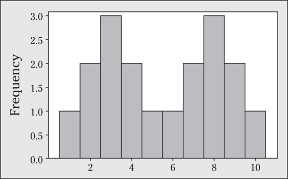
Q. Does the Empirical Rule apply to the data set in the following figure? Explain your answer.
A. Yes, the Empirical Rule applies, because the data set is mound-shaped.
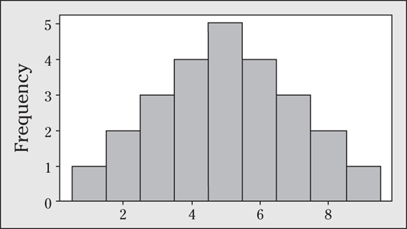
Q. Suppose a driver’s test has a mean score of 7 (out of 10 points) and a standard deviation of 0.5.
- Explain why you can reasonably assume that the data set of the test scores is mound-shaped.
- For the drivers taking this particular test, where should 68 percent of them score?
- Where should 95 percent of them score?
- Where should 99.7 percent of them score?
Q. Sometimes, you have to make reasonable assumptions before you proceed to solve a problem.
- Test scores from a properly written and calibrated test are likely to be bell-shaped, with equal numbers of people scoring below the mean as scoring above the mean.
- The Empirical Rule says that about 68 percent of the test takers should score within one standard deviation of the mean — in other words,
 . The lower limit is
  , which is 6.5, and the upper limit is
  , which is 7.5.
 - The Empirical Rule says that about 95 percent of test takers should score within two standard deviations of the mean — in other words,
 . The lower limit is
  , which is 6, and the upper limit is
  , which is 8.
 - The Empirical Rule says that about 99.7 percent of test takers should score within three standard deviations of the mean — in other words,
 . The lower limit is
  , which is 5.5, and the upper limit is
  , which is 8.5.
22 Does the Empirical Rule apply to the data set shown in the following figure? Explain your answer.
23 Suppose you have a data set of 1, 2, 2, 3, 3, 3, 4, 4, 5, and you assume this sample represents a population.
- Explain why you can apply the Empirical Rule to this data set.
- Where would “most of the values” in the population fall, based on this data set?
24 Suppose a mound-shaped data set has a mean of 10 and a standard deviation of 2.
- About what percentage of the data should lie between 8 and 12?
- About what percentage of the data should lie above 10?
- About what percentage of the data should lie above 12?
25 Suppose a mound-shaped data set has a mean of 10 and a standard deviation of 2.
- About what percentage of the data should lie between 6 and 12?
- About what percentage of the data should lie between 4 and 6?
- About what percentage of the data should lie below 4?
26 Explain how you can use the Empirical Rule to find out whether a data set is mound-shaped, using only the values of the data themselves (no histogram available).
Measuring Relative Standing with Percentiles
Sometimes the precise values of the mean, median, and standard deviation just don’t matter, and all you are interested in is where you stand compared to the rest of the herd. In this situation, you need a statistic that reports relative standing, and that statistic is called a percentile. The k-th percentile is a number in the data set that splits the data into two pieces: The lower piece contains k percent of the data, and the upper piece contains the rest of the data (which amounts to ![]() percent, because the total amount of data is 100 percent). Note: k is any number between 1 and 100.
percent, because the total amount of data is 100 percent). Note: k is any number between 1 and 100.
The median is the 50th percentile: the point in the data where 50 percent of the data fall below that point, and 50 percent fall above it.
In this section, you find out how to calculate, interpret, and put together percentiles to help you uncover the story behind a data set.
Calculating percentiles
To calculate the k-th percentile (where k is any number between 1 and 100), do the following steps:
- Order all the numbers in the data set from smallest to largest.
- Multiply k percent times the total number of numbers, n.
- If the result from Step 2 is not a whole number, round it up to the nearest whole number and go to Step 4a. If the result from Step 2 is a whole number, go to Step 4b.
4a. Count the numbers in your data set from left to right (from the smallest to the largest number) until you reach the value indicated by Step 3. The corresponding value in your data set is the k-th percentile.
4b. Count the numbers in your data set from left to right until you reach the one indicated by Step 3. The k-th percentile is the average of that corresponding value in your data set and the value that directly follows it.
Q. Suppose you have 25 test scores, and in order from lowest to highest they look like this: 43, 54, 56, 61, 62, 66, 68, 69, 69, 70, 71, 72, 77, 78, 79, 85, 87, 88, 89, 93, 95, 96, 98, 99, 99. What is the 90th percentile of the data set?
A. 98. To find the 90th percentile for these (ordered) scores, start by multiplying 90 percent times the total number of scores, which gives you ![]() . Rounding up to the nearest whole number, you get 23.
. Rounding up to the nearest whole number, you get 23.
Counting from left to right (from the smallest to the largest number in the data set), you go until you find the 23rd number in the data set. That number is 98, and it’s the 90th percentile for this data set.
There is no single definitive formula for calculating percentiles. The formula here is designed to make finding the percentile easier and more intuitive, especially if you’re doing the work by hand; however, other formulas are used when you’re working with technology. The results you get using various methods may differ, but not by much.
27 Suppose you have measured the height in inches of 11 randomly selected adults. In order from lowest to highest, they look like this: 59, 61, 65, 66, 67, 67, 69, 70, 72, 73, 75.
- What height marks the 15th percentile of the data set?
- What is the 80th percentile of the data set?
28 Suppose you have surveyed 8 randomly selected adults for their typical commute times to work. The responses in minutes look like this: 8, 13, 25, 16, 20, 15, 5, 35.
- What commute time marks the 60th percentile of the data set?
- What is the 33rd percentile of the data set?
Interpreting percentiles
Percentiles report the relative standing of a particular value within a data set. If that’s what you’re most interested in, the actual mean and standard deviation of the data set are not important, and neither is the actual data value. What’s important is where you stand — not in relation to the mean, but in relation to everyone else: That’s what a percentile gives you.
For example, in the case of exam scores, who cares what the mean is, as long as you scored better than most of the class? Who knows, it may have been an impossible exam and 40 points out of 100 was a great score. In this case, your score itself is meaningless, but your percentile tells you everything.
Suppose your exam score is better than 90 percent of the rest of the class. That means your exam score is at the 90th percentile (so ![]() ), which hopefully gets you an A. Conversely, if your score is at the 10th percentile (which would never happen to you, because you’re such an excellent student), then
), which hopefully gets you an A. Conversely, if your score is at the 10th percentile (which would never happen to you, because you’re such an excellent student), then ![]() ; that means only 10 percent of the other scores are below yours, and 90 percent of them are above yours; in this case, an A is not in your future.
; that means only 10 percent of the other scores are below yours, and 90 percent of them are above yours; in this case, an A is not in your future.
A nice property of percentiles is they have a universal interpretation: Being at the 95th percentile means the same thing, whether you are looking at exam scores or weights of packages sent through the postal service; the 95th percentile always means that 95 percent of the other values lie below yours, and 5 percent lie above it. This also allows you to fairly compare two data sets that have different means and standard deviations (like ACT scores in reading versus math). It evens the playing field and gives you a way to compare apples to oranges, so to speak.
A percentile is not a percent; a percentile is a number (or the average of two numbers) in the data set that marks a certain percentage of the way through the data. Suppose your score on the GRE was reported to be the 80th percentile. This doesn’t mean you scored 80 percent of the questions correctly. It means that 80 percent of the students’ scores were lower than yours and 20 percent of the students’ scores were higher than yours.
A high percentile doesn’t always constitute a good thing. For example, if your city is at the 90th percentile in terms of crime rate compared to cities of the same size, that means 90 percent of cities similar to yours have a crime rate that is lower than yours, which is not good for you. Another example is golf scores; a low score in golf is a good thing, so let’s just say that being at the 80th percentile with your score wouldn’t qualify you for the PGA tour.
Comparing household incomes
The U.S. government often reports percentiles among its data summaries. For example, the U.S. Census Bureau reported the median (the 50th percentile) household income for 2014 to be $53,700, and in 2021 it was reported to be $67,463. The Bureau also reports various percentiles for household income for each year, including the 10th, 20th, 50th, 80th, 90th, and 95th. Table 5-2 shows the values of each of these percentiles for both 2014 and 2021.
Looking at the percentiles for 2014 in Table 5-2, you can see that the bottom half of the incomes are closer together than the top half of the incomes. The difference between the 20th percentile and the 50th percentile is about $33,400, whereas the spread between the 50th percentile and the 80th percentile is more like $46,300. The difference between the 10th and 50th percentiles is only about $41,400, whereas the difference between the 50th and the 90th percentiles is a whopping $103,800.
Table 5-2 U.S. Household Income (2014 versus 2021)
Percentile | 2014 Household Income | 2021 Household Income |
|---|---|---|
10th | $12,300 | $15,600 |
20th | $20,291 | $27,012 |
50th | $53,700 | $67,463 |
80th | $100,000 | $141,100 |
90th | $157,500 | $201,052 |
95th | $206,600 | $273,850 |
The percentiles for 2021 are all higher than the percentiles for 2014 (which is a good thing!). They are also more spread out. For 2021, the difference between the 20th and 50th percentiles is around $40,000, and from the 50th to the 80th it’s approximately $73,600; both of these differences are larger than for 2014. Similarly, the 10th percentile is farther from the 50th (about $52,000 difference) in 2021 compared to 2014, and the 50th is farther from the 90th (by about $133,600) in 2021, compared to 2014. These results tell you that incomes are increasing in general at all levels between 2014 and 2021, but the gap is widening between those levels. For example, the 10th percentile for income in 2014 was $12,300 (as shown in Table 5-2), compared to $15,600 in 2021; this represents about a 27 percent increase (subtract the two and divide by 12,300). Now compare the 95th percentiles for 2014 versus 2021; the increase is almost 32.5 percent. Now, technically, you may want to adjust the values for inflation, but you get the basic idea.
Percentage changes affect the variability in a data set. For example, when salary raises are given on a percentage basis, the diversity in the salaries also increases; it’s the “rich get richer” idea. The guy making $30,000 gets a 10 percent raise and his salary goes up to $33,000 (an increase of $3,000); but the guy making $300,000 gets a 10 percent raise and now makes $330,000 (a difference of $30,000). So when you first get hired for a new job, negotiate the highest possible salary you can because your raises that follow will also net a higher amount.
Examining ACT Scores
Each year, millions of U.S. high school students take a nationally administered ACT exam as part of the process of applying for colleges. The test is designed to assess college readiness in the areas of English, Math, Reading, and Science. Each test has a possible score of 36 points.
ACT does not release the average or standard deviation of the test scores for a given exam. (That would be a real hassle if they did, because these statistics can change from exam to exam, and people would complain that this exam was harder than that exam when the actual scores are not relevant.) To avoid these issues, and for other reasons, ACT reports test results using percentiles.
Percentiles are usually reported in the form of a predetermined list. For example, the U.S. Census Bureau reports the 10th, 20th, 50th, 80th, 90th, and 95th percentiles for household income (as shown previously in Table 5-2). However, ACT uses percentiles in a different way. Rather than reporting the exam scores corresponding to a premade list of percentiles, they list each possible exam score and report its corresponding percentile, whatever that turns out to be. That way, to find out where you stand, you just look up your score to find out your percentile.
Table 5-3 shows the percentiles for the scores on recent Mathematics and Reading ACT exams. To interpret an exam score, find the row corresponding to the score and the column for the exam area (for example, Reading). Intersect the row and column, and you find out which percentile your score represents; in other words, you see what percentage of your fellow exam-taking comrades scored lower than you.
Table 5-3 Percentiles for All Possible ACT Exam Scores in Math and Reading
ACT Score | Mathematics Percentile | Reading Percentile |
|---|---|---|
34–36 | 99 | 99 |
33 | 98 | 97 |
32 | 97 | 95 |
31 | 96 | 93 |
30 | 95 | 91 |
29 | 93 | 88 |
28 | 91 | 85 |
27 | 88 | 81 |
26 | 84 | 78 |
25 | 79 | 74 |
24 | 74 | 70 |
23 | 68 | 65 |
22 | 62 | 59 |
21 | 57 | 54 |
20 | 52 | 47 |
19 | 47 | 41 |
18 | 40 | 34 |
17 | 33 | 30 |
16 | 24 | 24 |
15 | 14 | 19 |
14 | 06 | 14 |
13 | 02 | 09 |
12 | 01 | 06 |
11 | 01 | 03 |
1–10 | 01 | 01 |
For example, suppose you scored 30 on the Math exam; in Table 5-3 you look at the row for 30 in the column for Math; you see your score is at the 95th percentile. In other words, 95 percent of the students scored lower than you, and only 5 percent scored higher than you.
Now suppose you also scored a 30 on the Reading exam. Just because a score of 30 represents the 95th percentile for Math doesn’t necessarily mean a score of 30 is at the 95th percentile for Reading as well. (It’s probably reasonable to expect that fewer people score 30 or higher on the Math exam than on the Reading exam.)
To test this theory, look at column 3 of Table 5-3 in the row for a score of 30. You see that a score of 30 on the Reading exam puts you at the 91st percentile — not quite as great as your position on the Math exam, but certainly not a bad score.
Gathering a five-number summary
Beyond reporting a single measure of center and/or a single measure of spread, you can create a group of statistics and put them together to get a more detailed description of a data set. The Empirical Rule (as you see in the section, “Examining the Empirical Rule [68-95-99.7],” earlier in this chapter) uses the mean and standard deviation in tandem to describe a bell-shaped data set. In the case where your data are not bell-shaped, you use a different set of statistics (based on percentiles) to describe the big picture of your data. This method involves cutting the data into four pieces (with an equal amount of data in each piece) and reporting the resulting five cutoff points that separate these pieces. These cutoff points are represented by a set of five statistics that describe how the data are laid out.
The five-number summary is a set of five descriptive statistics that divide the data set into four equal sections. The five numbers in a five-number summary are
- The minimum (smallest) number in the data set
- The 25th percentile (also known as the first quartile, or
 )
) - The median (50th percentile)
- The 75th percentile (also known as the third quartile, or
 )
) - The maximum (largest) number in the data set
Q. Find the five-number summary of the following 25 (ordered) exam scores: 43, 54, 56, 61, 62, 66, 68, 69, 69, 70, 71, 72, 77, 78, 79, 85, 87, 88, 89, 93, 95, 96, 98, 99, 99.
A. 43, 68, 77, 89, and 99. The minimum is 43, the maximum is 99, and the median is the number directly in the middle, 77. To find ![]() and
and ![]() , you use the steps shown in the section, “Calculating percentiles,” with
, you use the steps shown in the section, “Calculating percentiles,” with ![]() . Step 1 is done because the data are ordered. For Step 2, because
. Step 1 is done because the data are ordered. For Step 2, because ![]() is the 25th percentile, you multiply
is the 25th percentile, you multiply ![]() . This is not a whole number, so Step 3a says to round it up to 7 and proceed to Step 3b.
. This is not a whole number, so Step 3a says to round it up to 7 and proceed to Step 3b.
Following Step 3b, you count from left to right in the data set until you reach the 7th number, 68; this is ![]() . For
. For ![]() (the 75th percentile), you multiply
(the 75th percentile), you multiply ![]() , which you round up to 19. The 19th number on the list is 89, so that’s
, which you round up to 19. The 19th number on the list is 89, so that’s ![]() . Putting it all together, the five-number summary for these 25 test scores is 43, 68, 77, 89, and 99. To best interpret a five-number summary, you can use a boxplot; see Chapter 7 for details.
. Putting it all together, the five-number summary for these 25 test scores is 43, 68, 77, 89, and 99. To best interpret a five-number summary, you can use a boxplot; see Chapter 7 for details.
29 Suppose you have measured the height in inches of 11 randomly selected adults. In order from lowest to highest, they look like this: 59, 61, 65, 66, 67, 67, 69, 70, 72, 73, 75. Find the five-number summary for this data set.
30 Suppose you have surveyed eight randomly selected adults for their typical commute times to work. The responses in minutes look like this: 8, 13, 25, 16, 20, 15, 5, 35. Find the five-number summary for this collection of commute times.
Exploring interquartile range
The purpose of the five-number summary is to give descriptive statistics for center, variation, and relative standing all in one shot. The measure of center in the five-number summary is the median, and the first quartile, median, and third quartiles are measures of relative standing.
To obtain a measure of variation based on the five-number summary, you can find what’s called the inter-quartile range (or IQR). The IQR equals ![]() (that is, the 75th percentile minus the 25th percentile) and reflects the distance taken up by the innermost 50 percent of the data. If the IQR is small, you know a lot of data are close to the median. If the IQR is large, you know the data are more spread out from the median. The IQR for the test scores data set is
(that is, the 75th percentile minus the 25th percentile) and reflects the distance taken up by the innermost 50 percent of the data. If the IQR is small, you know a lot of data are close to the median. If the IQR is large, you know the data are more spread out from the median. The IQR for the test scores data set is ![]() , which is fairly large, seeing as how test scores only go from 0 to 100.
, which is fairly large, seeing as how test scores only go from 0 to 100.
The interquartile range is a much better measure of variation than the regular range (maximum value minus minimum value; see the section, “Being out of range,” earlier in this chapter). That’s because the interquartile range doesn’t take outliers into account; it cuts them out of the data set by only focusing on the distance within the middle 50 percent of the data (that is, between the 25th and 75th percentiles).
Descriptive statistics that are well chosen and used correctly can tell you a great deal about a data set, such as where the center is located, how diverse the data are, and where a good portion of the data lies. However, descriptive statistics can’t tell you everything about the data, and in some cases they can be misleading. Be on the lookout for situations where a different statistic would be more appropriate (for example, the median describes center more fairly than the mean when the data is skewed), and keep your eyes peeled for situations where critical statistics are missing (for example, when a mean is reported without a corresponding standard deviation).
Practice Questions Answers and Explanations
1 The mean (or average) doesn’t have to be one of the numbers in the data set, but it can be. For example, in the data set 1, 2, the mean is 1.5, which isn’t in the data set; however, in the data set 1, 2, 3, the mean is 2.
2 Outliers attract the mean toward them and away from the rest of the data. For example, the mean of the data set 1, 2, 3 is 2. Suppose the largest value changes so that you have the data set 1, 2, 297. The mean is now ![]() divided by 3, which is
divided by 3, which is ![]() . In this case, the mean of 100 doesn’t really represent a “typical” value in the data set.
. In this case, the mean of 100 doesn’t really represent a “typical” value in the data set.
3 This problem gives you one way to check your answer to see whether it makes sense.
- Because it averages out all the data in the set, the mean has to be somewhere between the largest and smallest values in the data set.
- The mean could equal the maximum value in a data set if all the values in the data set are the same; otherwise, any other value that isn’t at the maximum pulls the mean down.
4 The median will be one of the numbers in the data set if the set has an odd number of values in it, because the set has one distinct middle value in that case. If the set has an even number of values, you find the median by averaging the two middle values, and the answer may or may not be one of the values in the data set. For example, if the data set is 1, 2, 3, 4, the median is 2.5, which isn’t included in the data set; however, if the data set is 1, 3, 3, 4, the median is ![]() , which is included.
, which is included.
5 If you don’t order the data to find the median, you get a different answer. For example, look at the data set 1, 5, 2. The median is 2, but if you don’t order the data, it would be 5. And, if you reorder the same data set to be 2, 1, 5, you get a different answer for the median: 1. So, you should always order the data from smallest to largest to always get the same answer for the median.
For the mean, you add up all the values in the data set and divide by the size of the data set. Using the commutative property for addition (and you thought you’d never use algebra later in life!), you know that ![]() . Even if you reorder the data, you still get the same sum. So you don’t have to order the data to always get the same answer for the mean of a given data set.
. Even if you reorder the data, you still get the same sum. So you don’t have to order the data to always get the same answer for the mean of a given data set.
6 Outliers affect the mean, but they don’t affect the median. For example, the mean and the median of the data set 1, 2, 3 is 2. Suppose the largest value changes so that you have the data set 1, 2, 297. The mean is now 100. However, the median of the data set 1, 2, 297 is still 2.
Outliers affect the mean, but they don’t affect the median. The mean gets pulled in the direction of the outlier and may not truly represent a “typical” value in the data set.
7 Many answers are possible. The key is to put the same number in the middle. One possible answer is data set 1: 100, 200, 300; data set 2: 199, 200, 201. The mean and median of both data sets is 200. These two data sets have the same center with totally different ranges (or spreads). If you want to tell the story about a data set, the center isn’t enough because it can’t distinguish between two data sets with different spreads.
8 This problem really points out what happens to the measures of center when you add any constant to all the values in the data set.
- The mean also increases by $1,000 to $51,000, because you literally pick up all the salaries, move them up $1,000 on the number line, and put them back down, which moves the mean by the same amount.
- The median also increases by the same amount, to $51,000, for the same reason.
Adding or subtracting a constant to or from all the values in a data set changes the mean and median by that same constant. Be careful — that constant could be negative as well as positive.
9 This scenario highlights what happens when you multiply all the data by a constant. Here the constant is 1.1, because you take the old salary, call it X, and add 10 percent of the X to it: ![]() . But
. But ![]() ; so, in other words, 1.10 times the original salary gets you the new salary.
; so, in other words, 1.10 times the original salary gets you the new salary.
- The mean also increases by 10 percent to become
 because you multiply each value in the data set by 1.1.
 - The median also increases by 10 percent to become $55,000, for the same reason.
10 This data set is known as “U-shaped” because it looks like the letter U. The data is symmetric, because if you draw a vertical line down the middle, the picture is the same on each side. The data set has two modes, or peaks, at the values 1 and 6 — the values that appear most often in the data set.
Sometimes a data set has no peaks, as in a uniform distribution, which is flat (refer to the figure in the first example problem in this chapter for an illustration). You may think that every data value is its own peak, but that doesn’t mean very much; so, in that case, you should say that no modes exist.
11 This data set is skewed. The skew is in the direction that the tail goes (the part that trails off). The set is skewed to the right because the tail trails off to the right. The skew means that a few of the values in the data set are higher than the rest of the values. Data that skew right are also called positively skewed.
12 This data set is skewed to the left because the tail trails off to the left. The skew means that a few of the values in the data set are lower than the rest of the values. Data that skew left are also called negatively skewed.
When data are skewed, you can easily confuse the direction of the skew. Look at where the tail trails off to find the direction of the skew (not where the mound in the data set is).
13 The histogram shown in the following figure is symmetric because it looks the same on each side when you draw a line down the middle. It also has two peaks, or modes. When a histogram has two modes, the data have a bimodal distribution. Note: There are many possible correct answers to this problem.
14 Just knowing the mean and median can tell you a lot about a data set.
- This data set is skewed to the right. A few people in the company have very large salaries compared to the others, driving the mean up and away from most of the data, yet the median remains unaffected by the skew, staying in the “middle” of the data.
- The median is the most appropriate measure of center to use when the data set is skewed because outliers don’t affect it.
- The employees would want to report the median salary because it’s lower and better represents most employees in the company. The employers may try to use the mean salary, because it’s higher and indicates what they actually have to pay overall for their employees.
If the data are skewed right, the mean is higher than the median. Conversely, if the data are skewed left, the mean is lower than the median. If the data are symmetric, the mean and median are the same (or very close).
15 Because the data set is skewed left, you have a few values that are lower than the rest, which drives down the mean. So, the mean must be 19, and the median must be 38.
This is another point that instructors hammer home: the relationship between the mean and median for skewed data. Remember that skewed right means a few large values, and skewed left means a few small values. This helps you think about how the mean and median compare.
16 Where the mean shows up among the data depends on the shape of the data. The mean can be higher than most of the values; in this case, the data are skewed to the right. The median can’t be higher than most of the values; it’s higher than 50 percent of the values and lower than 50 percent of the values, putting it right in the middle.
17 The standard deviation can’t be negative because of the squaring that goes on in its calculation. However, it can be 0, although it happens only when the data set has no deviation in it — in other words, when all the data are exactly the same value. For example, 1, 1, 1 or 2, 2, 2, 2, 2 are two data sets with a standard deviation of 0.
18 If you choose 1, 1, 5, 5, you get the largest standard deviation possible, because these numbers are as far as possible from the mean (which is 3).
19 Adding a constant to the data doesn’t change the standard deviation, because you just relocate the data in a different spot on the number line; you don’t change how far apart the values are from the mean.
20 Multiplying by a constant changes the standard deviation. If you multiply an entire data set by 1.1, the spread increases. Suppose two employees have salaries of $30,000 and $50,000 — right now the figures are $20,000 apart. With a 10 percent raise, they become $33,000 and $55,000, making them $22,000 apart (the rich get richer and the poor get less rich). If you recalculate the standard deviation, you find that it goes up here by a factor of 1.1 as well.
The new standard deviation becomes c times the old standard deviation, when you multiply the data set by a non-negative constant c. If you multiply the data by a negative constant, −c, the new standard deviation becomes |c| times the old standard deviation (again, because of the squaring that goes on, the negative sign disappears). Also note that if c is a number between zero and 1, the new standard deviation gets smaller than the old one.
21 The standard deviation is based on the average distance from the mean. Outliers (which often appear in skewed data) influence the mean, and, therefore, influence the standard deviation. Outliers drive up the standard deviation, making the average distance from the mean seem larger than it is for most of the data. How to get around this? You can report something called the interquartile range, the difference between the 75th and 25th percentiles (which I discuss later in this chapter).
How can you tell whether a point in the data set is an official outlier? Statisticians have a few general rules, but nothing really hard and fast. You can look at the histogram and calculate your statistics with and without the outliers to see how the numbers change. The obvious outliers are the ones that change the statistics the most.
22 No. Because the data are skewed, the data set isn’t mound-shaped. It has one mode, but it isn’t symmetric.
The Empirical Rule works only if the data is mound-shaped. It doesn’t apply to skewed data. Check the shape of the data first before you attempt to apply the Empirical Rule. Don’t get caught applying something that doesn’t fit the data. (If you learned Chebyshev’s Theorem, use that for data that isn’t mound- or bell-shaped.)
23 The histogram for this data is shown in the following figure.
- This data set is mound-shaped, so the Empirical Rule applies.
- Because this sample is representative of the population, you can say that most of the values in the population should lie within two standard deviations of the mean of the sample. The mean is 3, and the standard deviation is 1.225. This indicates that 95 percent of the values in the population should lie between
 and
and  ; in other words, they should lie between 0.55 and 5.45.
“Most of the data” can mean 68 percent, 95 percent, or 99.7 percent, but most statisticians would say that 95 percent is the magic number when you want to discuss where “most” of the data lies. Be sure you define what you mean by “most” if you’re asked to describe where most of the data is.
24 This problem combines the Empirical Rule with the idea that the total of all the relative frequencies of a data set have to equal 1.
- Because 8 and 12 are both one standard deviation from the mean, the percentage of data lying between them according to the Empirical Rule is about 68 percent.
- Because mound-shaped data are symmetric, half the data should lie above the mean and half the data should lie below the mean. So the answer is 50 percent.
- Because about 68 percent of the data lie between 8 and 12,
 percent of the data lie between 8 and 10, and the other 34 percent lie between 10 and 12. Because half of the data lie above 10, and 34 percent of the data lie between 10 and 12, 50 percent − 34 percent = 16 percent of the data should lie above 12. Take what you know and subtract the part you don’t need in order to get the part that you want. See the following figure for an illustration of these ideas.

A picture may be very helpful for problems involving the Empirical Rule. It helps you to stay organized in your thinking, and it helps your professor see what you’re doing, in case you make a mistake in your calculations somewhere along the line. Mark off the mean and the standard deviations to the left and right (go out three of them on each side), and then shade in the area for which you want to find the percentage.
25 This problem uses different parts of the Empirical Rule in tandem.
The number 6 is two standard deviations below the number 10 because
 . You know by the Empirical Rule that about 95 percent of the data set lies between 6 and 14, so half of that (or 47.5 percent) lies between 6 and 10 by symmetry. That gives you one piece of what you need. Now you need the part from 10 to 12. Twelve is one standard deviation away from the mean, and you know that about 68 percent of the values lie between 8 and 12, so 34 percent of the data lie between 10 and 12. This gives you the other piece that you need. Add the two pieces together to determine that
  of the data should lie between 6 and 12. When using the Empirical Rule, add the two pieces together when you want the percentage of data that fall between the two numbers when one is below the mean and the other is above the mean.
This time you find the two pieces and subtract them, because you want the area between them. Because 6 is two standard deviations below 10,
 , so you know that about
  percent of the data lie between 6 and 10. Because 4 is three standard deviations below 10,
  , so about 99.7 percent of the data lie between 4 and 16. That means half of the data, or 49.85 percent, should lie between 4 and 10. You want the area between 4 and 6, so take the area between 4 and 10 (49.85 percent) and subtract the area you don’t want, which is the area between 6 and 10 (47.5 percent). You determine that
  percent of the data should lie between 4 and 6. Percentages are never negative, so make sure you take the bigger area first and subtract the smaller area that you don’t want to find the percentage of the data that fall between two numbers. This subtracting is done only when both numbers are on the same side of the mean and the Empirical Rule is being used.
- To get the area below 4, take the area from 4 to 10, which is about
 , and subtract that from 50 percent (0.5) because half of the data lies below 10 by symmetry. So the answer is about
  percent of the data should lie below 4.
26 You can calculate the mean plus or minus one standard deviation to get the upper and lower limits. According to the Empirical Rule, if the data are mound-shaped, about 68 percent of the data should lie between these two values. Count how many data points are actually in this interval and divide by the sample size. If this percentage isn’t close to 68, the data isn’t mound-shaped. If it is, move on to the next standard deviation. Take the mean plus or minus two standard deviations and find those limits. Find the percentage of data lying between those two numbers and compare it to 95 percent. If the figure is close, go on to the third step (99.7 percent). All three criteria have to be met in order to say the data are mound-shaped.
27 To calculate the percentiles, simply follow the steps. Fortunately, I have one less thing to do because the data is already ordered.
- To find the 15th percentile for these (ordered) heights, start by multiplying 15 percent times the total number of heights, which gives you
 . Rounding up to the nearest whole number, you get 2. Counting from left to right, go until you find the second number in the data set. That number is 61 inches, and it’s the 15th percentile for this data set.
 - To find the 80th percentile for these heights, start by multiplying 80 percent times the total number of heights, which gives you
 . Rounding up to the nearest whole number, you’re looking for the ninth number in the data set. Counting from left to right, you find that’s a height of 72 inches.
28 These aren’t in order! Remember to line them up from smallest to largest before doing anything else.
- In order from smallest to largest, the values are 5, 8, 13, 15, 16, 20, 25, 35. Now multiply 60 percent times the total number of values, which gives you
 . Rounding up to the nearest whole number, you get 5, and the number in the fifth position is 16. So, the 60th percentile for this data set is 16 minutes.
 - Once the values are in order, multiply 33 percent times the total number of values. This gives you
 . Rounding up to the nearest whole number, you get 3, and the number in the third position is 13. So, the 33rd percentile for this data set is 13 minutes.
29 The minimum is 59, and the maximum is 75. Because this data set contains an odd number of values, the median is the value smack dab in the middle: 67. To find ![]() and
and ![]() , you use the steps to find the 25th and 75th percentiles with
, you use the steps to find the 25th and 75th percentiles with ![]() . Step 1 is already complete because the data are ordered. Because
. Step 1 is already complete because the data are ordered. Because ![]() is the 25th percentile, you multiply
is the 25th percentile, you multiply ![]() . This is not a whole number, so round it up to 3 and count from left to right in the data set until you reach the 3rd number, 65; this is
. This is not a whole number, so round it up to 3 and count from left to right in the data set until you reach the 3rd number, 65; this is ![]() . For
. For ![]() (the 75th percentile) you multiply
(the 75th percentile) you multiply ![]() , which you round up to 9. The 9th number on the list is 72, so that’s
, which you round up to 9. The 9th number on the list is 72, so that’s ![]() . Putting it all together, the five-number summary for these 11 heights is 59, 65, 67, 72, and 75.
. Putting it all together, the five-number summary for these 11 heights is 59, 65, 67, 72, and 75.
30 Remember to line up the commute times from smallest to largest before doing anything else.
In order from smallest to largest, the values are 5, 8, 13, 15, 16, 20, 25, 35. The minimum is 5, and the maximum is 35. Because this data set contains an even number of values, the median is the average of the middle two: ![]() .
.
To find ![]() and
and ![]() , you use the steps to find the 25th and 75th percentiles with
, you use the steps to find the 25th and 75th percentiles with ![]() . For
. For ![]() (the 25th percentile), multiply
(the 25th percentile), multiply ![]() . Count from left to right in the data set until you reach the 2nd number, which is 8. For
. Count from left to right in the data set until you reach the 2nd number, which is 8. For ![]() (the 75th percentile), you multiply
(the 75th percentile), you multiply ![]() . Count from left to right until you reach the 6th number, which is 20. Thus, the five-number summary for these eight commute times is 5, 8, 15.5, 20, and 35.
. Count from left to right until you reach the 6th number, which is 20. Thus, the five-number summary for these eight commute times is 5, 8, 15.5, 20, and 35.
If you’re ready to test your skills a bit more, take the following chapter quiz that incorporates all the chapter topics.
Whaddya Know? Chapter 5 Quiz
Quiz time! Complete each problem to test your knowledge on the various topics covered in this chapter. You can then find the solutions and explanations in the next section.
1 Suppose you start with a set of 10 salaries that are almost the same, then add an unusually small salary to the group. Will the standard deviation increase, decrease, or stay the same?
2 Suppose you start with a set of 10 salaries that are almost the same, then add an unusually small salary to the group. Will the median increase, decrease, or stay about the same?
3 Suppose you take a data set of 10 numbers and cut them all in half. What will happen to the mean?
4 Suppose you take a data set of 10 numbers and cut them all in half. What will happen to the median?
5 Give a situation where the standard deviation of a five-number data set is 0, and the mean is 6.
6 If a histogram is skewed left, the mean is _________ than the median.
7 If the standard deviation is large, the mean must also be large. True or False?
8 A five-number summary includes the mean. True or False?
9 The interquartile range is the 75th percentile minus the 25th percentile. True or False?
10 Suppose a class of students took an exam and most students were done up to halfway through the test, while a few students stayed until the near the end, and a couple of them stayed until the very end. Are the exam-taking times skewed left, skewed right, or symmetric?
11 Is it possible for ![]() and the median to be equal to each other: Yes or No?
and the median to be equal to each other: Yes or No?
12 Suppose exam scores are mound-shaped with a mean of 80 and a standard deviation of 5. About what percentage of the test scores lie between 75 and 80?
13 Suppose exam scores are mound-shaped with a mean of 80 and a standard deviation of 5. About what percentage of the test scores lie between 85 and 90?
14 Which set of 4 numbers has the largest standard deviation: Data set 1 (1, 2, 3, 4); Data set 2 (1, 1, 4, 4); or Data set 3 (1, 1, 1, 4)?
15 What is wrong with this sentence? Bob’s test score is at the 80th percentile; that means he scored 80 on the test.
Answers to Chapter 5 Quiz
1 The standard deviation will increase, because the unusually small salary will make the other numbers further from the mean and will also add more distance to the mean on its own.
2 The median will stay about the same. The one usually small number that was added to the group will go away in the new calculation of the median, and the rest of the numbers are about the same. The median won’t be affected.
3 The mean will also be cut in half, because all of the values are cut in half.
4 The median will also be cut in half, because all of the values are cut in half.
5 The only answer is 6, 6, 6, 6, 6. All the numbers are the same, so the standard deviation is 0, and the mean is 6 because all the numbers are 6.
6 If a histogram is skewed left, the mean is less than the median. This is because the few extra small numbers compared to the others in the skewed-left data set pull the mean toward them, bringing it below the median.
7 False. If the standard deviation is large, it only means the concentration of data around the mean must be large; it has nothing to do with what the mean actually is.
8 False. The measure of center that is included in the five-number summary is the median. The mean is not part of the five-number summary.
9 True. The interquartile range is ![]() . The value of
. The value of ![]() is the same as the 75th percentile, and the value of
is the same as the 75th percentile, and the value of ![]() is the same as the 25th percentile.
is the same as the 25th percentile.
10 Skewed right. A few students stayed longer than the rest of the students, making for a few long test times, compared to everyone else. Those students make the histogram of exam-taking times skewed right.
11 Yes. If the median and ![]() are equal, that means all the numbers between the 50th percentile in the data set and the 75th percentile in the data set are the same.
are equal, that means all the numbers between the 50th percentile in the data set and the 75th percentile in the data set are the same.
12 About 34 percent. You know by the Empirical Rule that about 68 percent of the scores lie within one standard deviation ![]() of the mean (80), so about 68 percent of the values lie between 75 and 85. You want the percentage that lie between 75 and 80, which is half of about 68, or about 34 percent.
of the mean (80), so about 68 percent of the values lie between 75 and 85. You want the percentage that lie between 75 and 80, which is half of about 68, or about 34 percent.
13 About 13.5 percent. You know by the Empirical Rule that about 95 percent of the scores lie within two standard deviations ![]() of the mean (80), so about 95 percent of the values lie between 70 and 90. Half of this (47.50 percent) represents the area between 80 and 90. You don’t want the area between 80 and 85, which is half of 68, because 85 is one standard deviation above the mean, and 68 percent of the values lie between one standard deviation below the mean (75) and one standard deviation above the mean (85). So, subtract
of the mean (80), so about 95 percent of the values lie between 70 and 90. Half of this (47.50 percent) represents the area between 80 and 90. You don’t want the area between 80 and 85, which is half of 68, because 85 is one standard deviation above the mean, and 68 percent of the values lie between one standard deviation below the mean (75) and one standard deviation above the mean (85). So, subtract ![]() .
.
14 Data set 2 (1, 1, 4, 4) has the largest standard deviation of the data sets presented. It has the largest concentration of data away from its mean (2.5), pushing the numbers as far from the center as they can possibly get. In data set 1 (1, 2, 3, 4), the numbers are farthest from each other, but not as far from the mean (2.5) as data set 2. And data set 3 (1, 1, 1, 4) has a mean of 1.75, bringing the 1’s closer to it than data set 2.
15 The conclusion of the sentence is wrong. Bob’s test score is at the 80th percentile. That means 80 percent of the scores lie below Bob’s score. Bob’s score could be anything at this point; you only know that 80 percent of the other test scores are lower than Bob’s.