Chapter 6: Conceptualizing a Logo
When you receive a new design brief, you may be tempted to jump straight onto the computer and start delving into the vast array of effects that creative suites offer. The problem is, creating without thinking about a suitable solution can result in logos that have less impact. Not only does a well thought-out idea save you and the client time, but the final result is much stronger, more focused, and more relevant.
When you’re designing a logo for a client, your job is to provide original and interesting ideas that will appeal to the target audience. Start looking at logos in your daily life—not just those of famous companies, but the less famous ones. You can always tell when a designer has put a significant amount of thought into a logo design, and when the logo was rushed. Your goal is for every logo you design to fall into the former category.
The conceptualizing process is possibly the most vital stage of logo design. I find that going straight to the sketchpad is problematic—there’s no point in drawing if you don’t have a practical and relevant idea yet. So, put away your pen, pencil, or graphic tablet for the time being, and use the greatest tool available to any designer: the mind.
Unlocking Your Mind
I’ve found that just like writers, designers can experience what I refer to as “creative block.” Creative block can occur during any project—inspiration seems to be a distant memory, and it lasts for what feels like an eternity. This shortage of ideas can affect any designer, regardless of your skill level or experience. When faced with the daunting task of creating something new and unique, such as a logo, creative block can be challenging to overcome.
I liken finding great ideas to mining for diamonds. You’ll be lucky to find one with the first dig into the surface. It’s more likely that you’ll find a lot of common stones before you discover that elusive gem. If you dig holes in enough places, you’ll increase your chances—but it’s more efficient and productive if you know where to look.
In this section, I share some of my own strategies for overcoming creative block and starting the conceptualization process.
Starting with the brief
As a designer, the brief is your road map. But it can also help open your mind and expand your creativity. Every brief contains key words that help identify the overall brand image.
Write down a few words that summarize the brief and your research (see Chapter 5), and use those words as a starting point and a guide to help you form the basis for your thinking (see Figure 6-1).
Because you’ve started with the key elements from the brief and your research, you know that what you come up with will be relevant to the identifier (the organization or individual you’re designing the logo for).
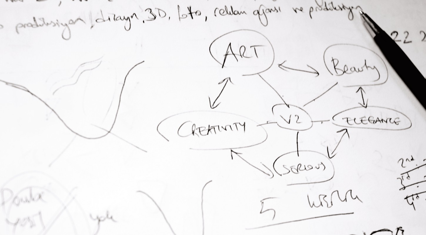
Figure 6-1: Designer Oguzhan Ocalan (www.gravitart.com) shows how key attributes of the brand are linked to form the overall message.
Flushing out the bad ideas
Spend an hour or so writing down all the ideas that come to mind when you think of the aims of the brief. This will get your mind moving, and also allow you to get all the bad ideas out of the way. Still, you never know—you may be lucky and come up with a great idea during that first hour.
Think before you sketch
Avoiding mistakes at the conceptualization stage, before your pencil even touches the paper can save you hours of time and refine your workflow. Here are some tips to ensure your ideas are winners:
• Avoid clichés. During your research (see Chapter 5), you probably looked at hundreds of logos of your client’s competitors. Some of the logos you saw likely use similar imagery. For example, I’ve worked on three different identity projects for PR firms, and every single one of them suggested some kind of puzzle piece in the icon—probably because they had seen another PR firm using a puzzle piece.
Clichés are dull, overused, and uninspiring concepts that make the client’s brand fade into the background. Steer clear of the mundane and try to put the spotlight on the brand you’re designing for through new ideas.
• Ignore trends. Popular trends come and go. When you incorporate a trend into your logo design, that’s like putting a sell-by date on the logo. Your logo will quickly appear stale and dated, but you want the logo to stand the test of time.
It’s far more exciting to set the trend than to follow the crowd. Discovering new avenues of creativity through experimentation will not only help you as a designer but also create a unique solution for your client.
• Think beyond the literal. Some of the most famous logos don’t include imagery of what the company does or sells. There is no cheeseburger in the McDonald’s logo, no computer in the Apple logo, and no sneakers in the Nike logo. As long as the solution you come up with is memorable and relevant, it doesn’t matter what the image is of. The connection between the target audience and the brand identity is the most important factor; if they remember it, the logo is a success.
• Resist the urge to be clever. A logo doesn’t have to be “clever” to be successful. Many designers think that a logo must have some kind of hidden image that will make the viewer yelp with glee once they spot it. I’ve christened this “the FedEx effect.” If you had any kind of formal graphic design education, you were probably shown the FedEx logo as an example of a creative and effective design. You’ll have a fond memory of the first time you spotted that hidden arrow, and you may still point it out to nondesigners to show off. The FedEx logo is great because the hidden arrow doesn’t intrude on the aesthetic of the design—it’s simply an added bonus.
Many designers spend nearly all their time fretting over how they can include a creative use of negative space or some kind of cunning wordplay in their logos. If this kind of cleverness helps the visual presence of the brand, sure, it can be effective. But if the design ends up with a cool image in the negative space and the overall image looks like an obscure blob, the brand won’t translate to the viewer. Remember: You aren’t designing for other designers. Nondesigners won’t see or think the same way that you do.
Do something else
I find that if I spend too long thinking about a solution, it can lead to mental exhaustion and frustration. When this occurs, I put away my sketchpad, steer clear of the computer, and do something completely unrelated to design, such as a favorite hobby or even going for a walk outdoors. You’ll find that doing something else allows your creative senses to rest and work subconsciously, often drawing inspiration from something you would have never thought would be relevant.
Finding Inspiration
In an interview for a professional design position, I was asked, “Where do you find your inspiration?” I later found out that I got the job because I answered, “Everywhere,” whereas the other applicants had listed the work of their favorite designers.
Inspiration truly is all around. In this section, I give you some ideas of where to look.
Nature
We often forget that art and design are all around us—art not just in the literal sense, but in the beauty of design employed by nature. Beautiful color schemes, interesting shapes and composition . . . it’s available at any time and doesn’t cost a penny. To me, observing the intricate construction of a spider’s web or the unique structure of a snowflake is far more inspiring than looking at a bunch of logos in a book.
Letting inspiration find you
Personally, I find that inspiration finds me rather than the other way round. Otherwise it becomes like chasing a tire down a hill. You can’t force good ideas out. Galin Kastelov, a brand identity and logo designer shares a similar view:
Everything good is born out of nothingness. In a way, you have to stop the inner dialogue that darkens the mind. You achieve that with presence in the moment. If you don’t resist the moment, the ideas will come to you. In a way, you have to stop thinking to think of something that works. If you force yourself, you get dull, commonly used results.
Panicking because you haven’t yet thought of any fantastic concepts can lead to poor decision-making. Don’t rush the process, but manage your time effectively. A relaxed state of mind will help the ideas flow naturally.
Andrej Matic, a graphic designer based in, Serbia, sought inspiration from the surroundings of his client while designing the new identity for the Port of Kinsale, Ireland (see Figure 6-2).
Kinsale is a natural harbor surrounded with beautiful green grass fields and hills. The landscape immediately came to mind when thinking of ideas for the new logo. Nature also helped me to determine my decisions for color usage—with the obvious decisions being blue for the sea, and green for the hills and fields. I wanted not only to provide a glimpse of the harbor itself but also to abstractly refer to the activities that occur there. A sail is abstractly drawn within the form, as sailing and yachting are popular activities in Kinsale.
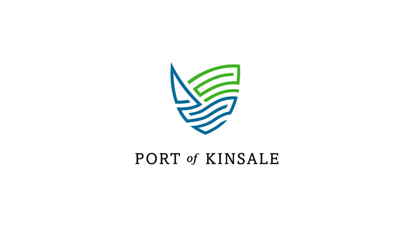
Figure 6-2: The final Port of Kinsale logo, designed by Andrej Matic (www.logohype.net).
Everyday objects
Most people are surprised when I tell them I can gain inspiration just by looking at an everyday object. But as a logo designer, you can take comfort in the fact that you don’t have to go far to find inspiration.
This Is Nido, from Birmingham, England, was inspired by the pattern that a splattering of mud formed on the top of a used can of paint (see Figure 6-3).
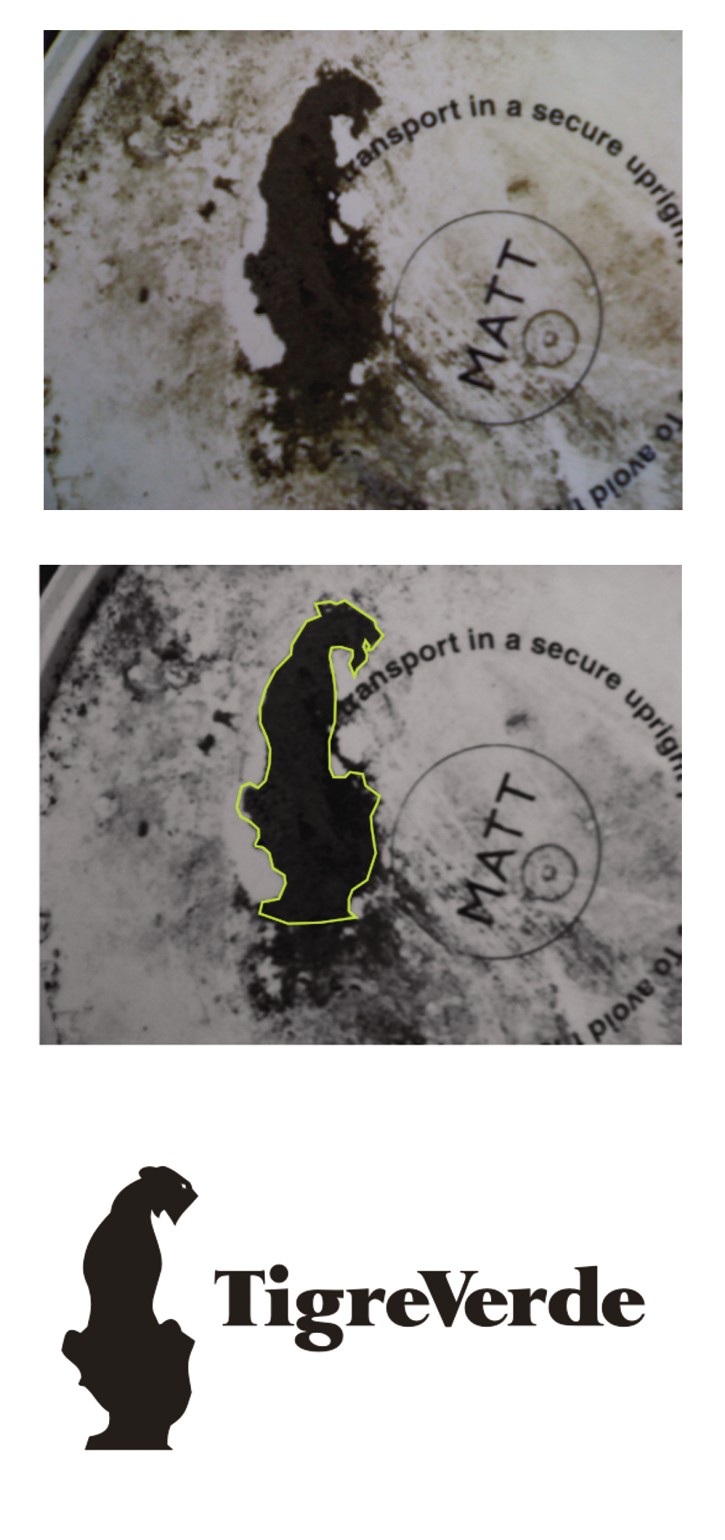
Figure 6-3: As he was designing this logo, the splattering of mud on a can of paint inspired This Is Nido (www.thisisnido.com).
I once pitched an idea to a company called Wine Searcher, which offered online users the chance to browse through thousands of different wines online. While sitting in a bar, staring at some bottles of beer in front of me on the table, I noticed that the contours could form a pair of spectacles or binoculars (see Figure 6-4). From here, I was able to tie in the concept of searching for wines (see Figure 6-5).

Figure 6-4: Bottles.
Photo by Gareth Hardy
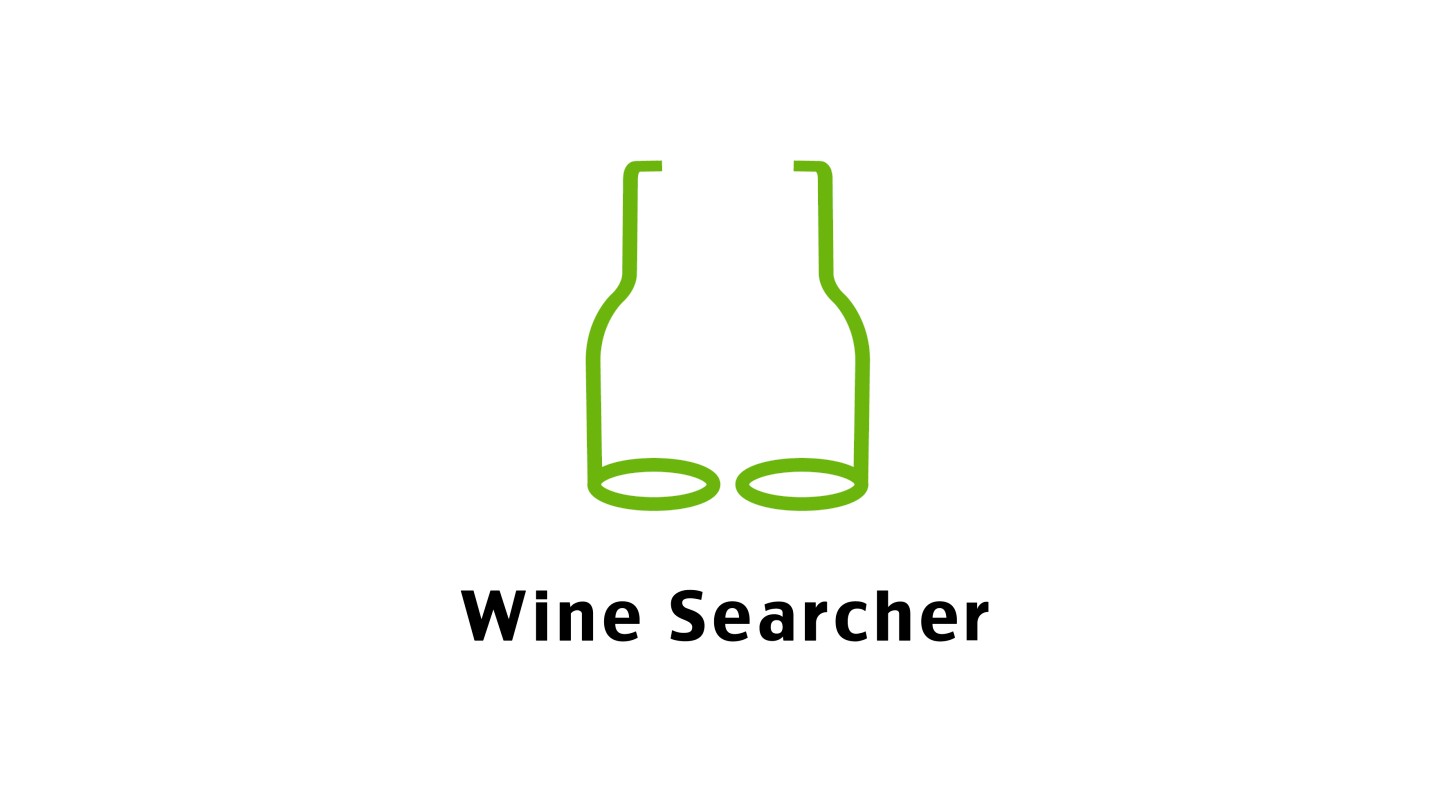
Figure 6-5: The final proposed concept, designed by Gareth Hardy (www.downwithdesign.com).
Traditional art
Some people believe that traditional art and modern design should be distanced from one another, but I completely disagree. Visiting museums and studying the work of the masters can be an eye-opening experience, only increasing your arsenal of imagery from which inspiration can be drawn.
Denis Olenik, a graphic designer hailing from Minsk, Belarus, was asked to create the new identity for Christophor Publishing House. To reflect the brand name, it was suggested that the logo should feature a mark based on a ship captained by Christopher Columbus. Denis began researching existing paintings and depictions of the ship to gain inspiration. This allowed Denis to go on to create his own interpretation that resulted in a clean and classy image that serves the brand well (see Figure 6-6).

Figure 6-6: The final Christophor Publishing House logo, designed by Denis Olenik (www.denisolenik.com).
Memories and experiences
Inspiration isn’t found only in objects that you can see. Real-world experiences and memories can be just as stimulating to your thought process.
Raja Sandhu, a brand identity specialist in Ontario, Canada, was faced with the problem of designing the new identity for I Can Fly, an organization that aims to arrange trips to the United States for smart yet underprivileged young people living in China. Once in the United States, the kids are offered the chance to learn how to fly a plane and train to become a pilot.
Raja took an interesting approach to the unique task:
As soon as the client told me, “We’re going to be taking kids in China from rice fields straight into the cockpit of an airliner—and some of these kids haven’t even ridden a bike yet,” I immediately realized, it’s like a dream. I remembered that, as a child, I had a dream of being able to fly. I was always jumping out of trees with a trash bag around my neck in the hopes that I could take off into the sky above. I discussed the concept of re-creating this wish as it relates to the aims of the I Can Fly program. I even jokingly asked if the silhouette of the person used in the logo could be myself, as it would be surreal to see myself on the side of a Boeing 777. They took me up on my tongue-in-cheek offer—they said they’d be delighted to have me fly with them.
Raja took a photo of himself in a flying position and used this as the basis of the concept (see Figure 6-7). The photo was traced, with the silhouette of a plane taking off as the shadow to further enhance the message (see Figure 6-8).

Figure 6-7: The original photograph of Raja Sandhu as preparation for the final file.
Photo by Raja Sandhu

Figure 6-8: The final I Can Fly logo, designed by Raja Sandhu (www.rajasandhu.com).
Keeping track of ideas
When I have an idea, I try to write it down or do a quick sketch of it as soon as possible; otherwise, I’ll forget it completely. You’ll probably find that you can’t plan ideas. If coming up with ideas were as simple as sitting down at an allotted time every day and telling yourself, “I’m going to think of some great ideas now,” there would probably be more designers in the world. Unfortunately, the human mind doesn’t work that way. Ideas can arrive at any time, often when you least expect them.
I keep some form of writing material and a pen or pencil with me wherever I go. This allows me to write down my ideas or even draw a rough thumbnail sketch if I feel it’s easier to illustrate. Cellphones are also handy—you can use yours to save personal notes that you can refer to later. You could even record your own voice detailing your idea, which you can save as an audio file.
Don’t forget to keep a notepad and pen on your bedside table. It’s common for ideas to come to fruition when you’re trying to sleep, possibly because the mind is in a state where there are no distractions and you can freely wander off into your own imagination. Dreams sometimes play a major role in my work. I’m not alone in this belief—the groundbreaking surrealist artist Salvador Dalí claimed the same thing. The beauty of dreaming is that there are no rules or restrictions and, in a sense, you aren’t consciously in control of your own thought process. If you’ve been thinking about the specifics of a project all day long, you might find that this has a direct or subtle effect on your dreams. If, like me, you wake up during the middle of the night and have a great idea, write it down as soon as possible, because you’ll probably forget by morning.
Whether the ideas come to me in a bar or while I’m asleep, I stick these random pieces of paper into a solid sketchbook for ease of reference.
Sketching Your Ideas
There is no secret formula to sketching. Some designers find that a few sketches are enough to use as a starting point before converting the concept into a vector file. It’s more likely, however, that your drawings will go through a development process, and that process is what I cover in this section.
There isn’t a magical type of paper that transforms every designer’s sketches into revered works of art. But I do find that working with traditional graph paper has advantages. Graph paper allows you to make precise measurements because of the consistent lines; this can make curves, in particular, much easier to draw.
Everyone has some ability to draw. Sketching and drawing, like everything else in life, takes practice. As you progress with pencil, you’ll notice that the final artwork you produce on-screen improves significantly. So, don’t overlook this key step.
Starting with thumbnails
A common practice among designers is to start by drawing small thumbnails, which can then be refined if the concept is deemed worthy of exploration. The quality of your initial drawings isn’t important, as long as you have a rough reference to the concept you have in mind.
Different designers take their own approaches to thumbnails. The general census is that thumbnails are not polished drawings but quick, small sketches that allow you to quickly see your idea and develop it later (see Figure 6-9). Your drawings can be as abstract as you want them to be, as long as they get your mind working to refine your ideas (see Figure 6-10).
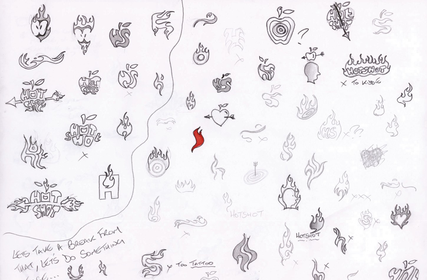
Figure 6-9: The thumbnail technique, employed by designer Josh Hayes (www.hayesimage.com.au).
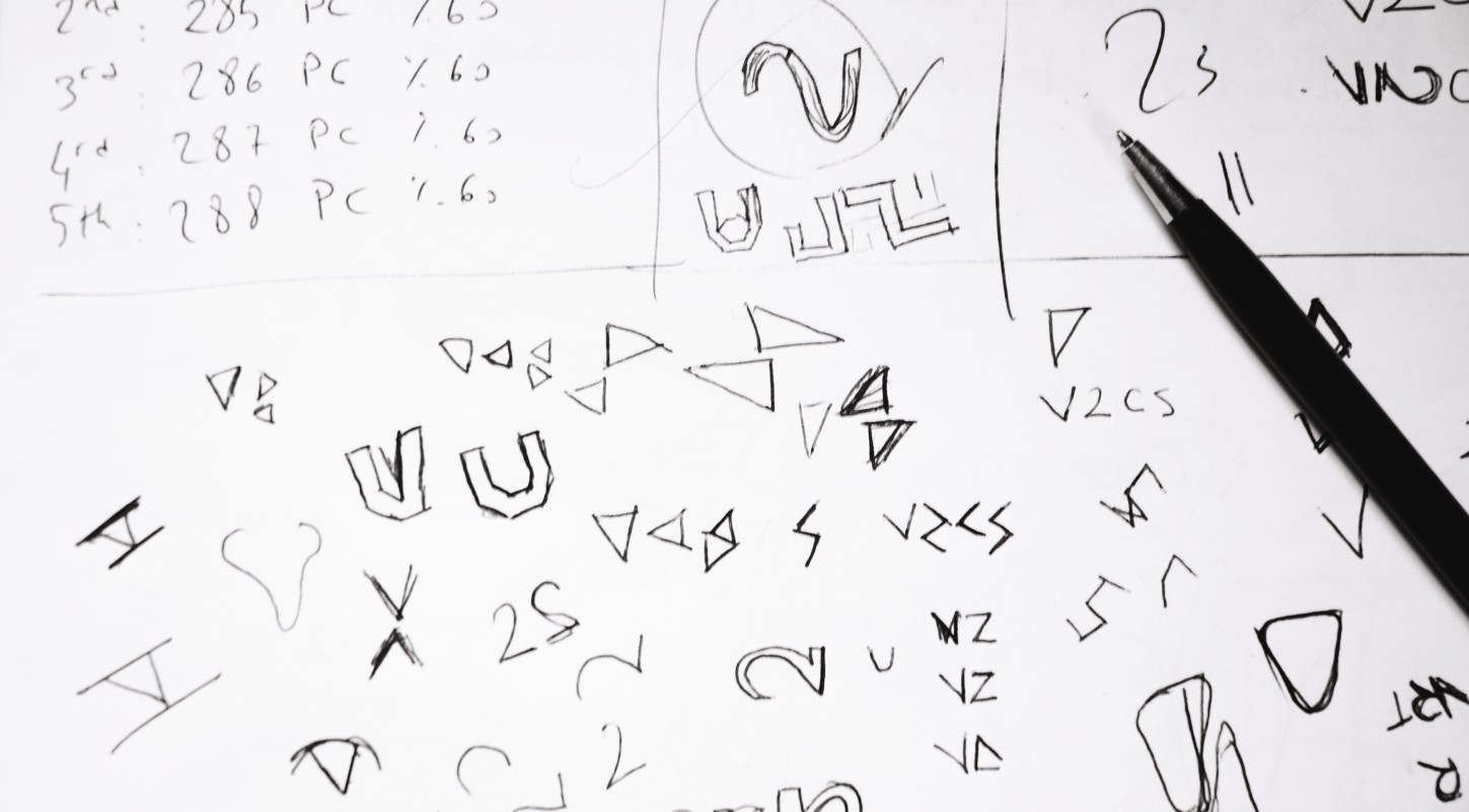
Figure 6-10: Oguzhan Ocalan (www.gravitart.com) took a more abstract approach when working on the new identity for V2b.
Be original
It would be impossible to check that your logo is completely unique—different from every logo ever designed. But there are methods you can use to prevent yourself and your client from being accused of copying someone else.
I often use resources that are marketed as being “inspiration resources” as a means to validate my own concepts, instead of using them as a starting point for new ideas. There are many logo design books that show examples, as well as hundreds if not thousands of logo inspiration websites. Checking these for concepts similar to the ones you’ve come up with can be time-consuming, but it might safeguard your client’s new identity. Laziness at this stage could result in your having to repeat the whole process from scratch—and it might even lead to your client being sued for copyright infringement.
So, how different should your logo be from other logos in existence? There is no clear-cut answer to this question. Obviously, if the two logos are exactly the same, that’s a problem—not only because you’re copying someone else, but because you’re failing to help your client achieve individual recognition.
A recent example of two logos that looked too close for comfort occurred in 2005, when Quark, a publishing software company, released a new logo. A small lowercase q was constructed using a circle merged with a small square on the right-hand corner. Unfortunately, Quark, based in Denver, Colorado, was unaware that the Scottish Arts Council was using an almost identical logo on the other side of the world. Because of this, Quark had to revisit the whole process and create a new identity that didn’t infringe on any already existing logos.
The bottom line: Do everything you can to ensure that your logo is truly unique—or at least different enough from other existing logos that you and your client have nothing to fear.
There is no rule for how many thumbnails you should complete before you end up with a successful solution. Thumbnailing is a crucial but exciting part of the creative process because it allows you to be as expressive as you can be. It also allows you to weed out ideas that won’t work. You may find that the thumbnailing process begins to inspire new ideas—seeing images can stimulate creativity (see Figure 6-11).
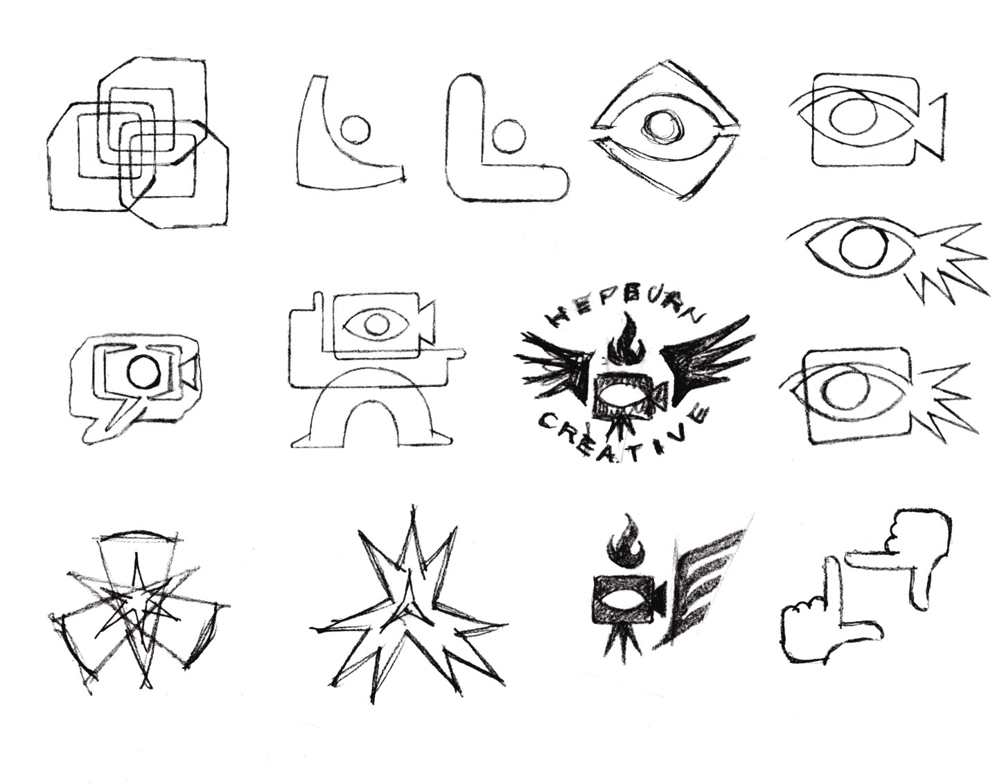
Figure 6-11: Thumbnail sketches for logo concepts by Von Glitschka (www.vonglitschka.com).
During my own process, I like to highlight any sketches that I feel can be taken further. I just make a small check mark next to these thumbnails so they stand out from the rest for easy reference (see Figure 6-12).
Developing your thumbnails into something more
With thumbnails completed, you can easily see exactly what you have in place as workable concepts. It’s unlikely that every thumbnail will be worth exploring further, but with any luck, at least a few will be.
Now you can continue to work with traditional media to refine these sketches into something that looks more like a logo (see Figure 6-13). Experimenting through variations of the concept is also beneficial.
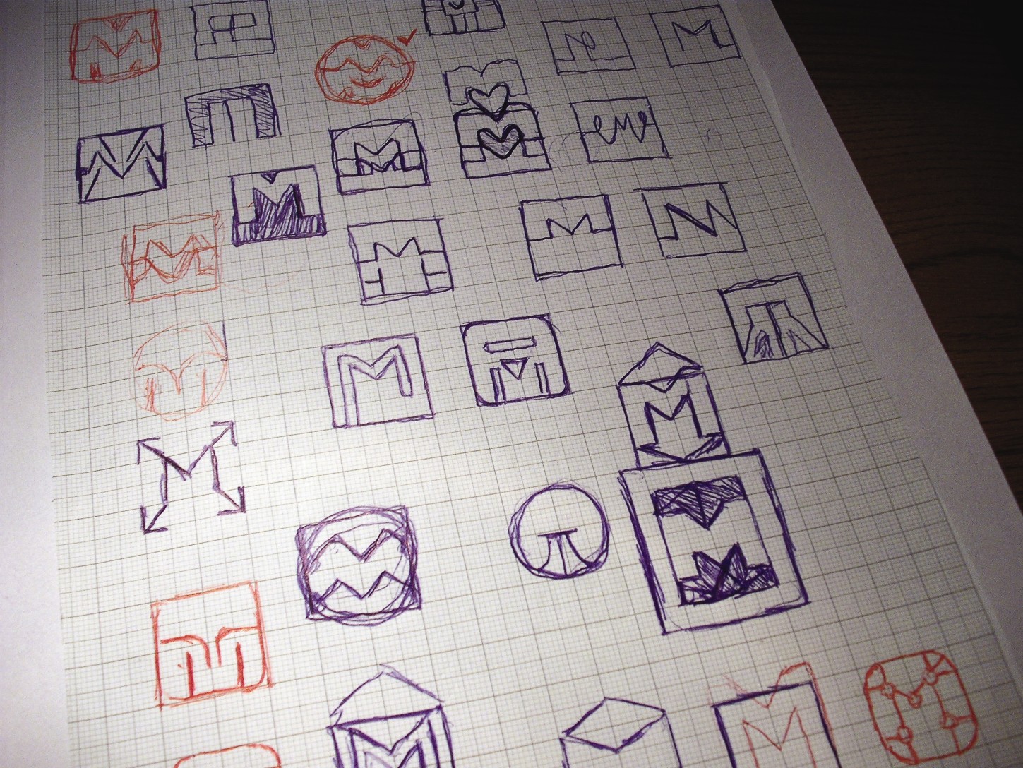
Figure 6-12: My own thumbnail sketches carried out for an online media and marketing agency.
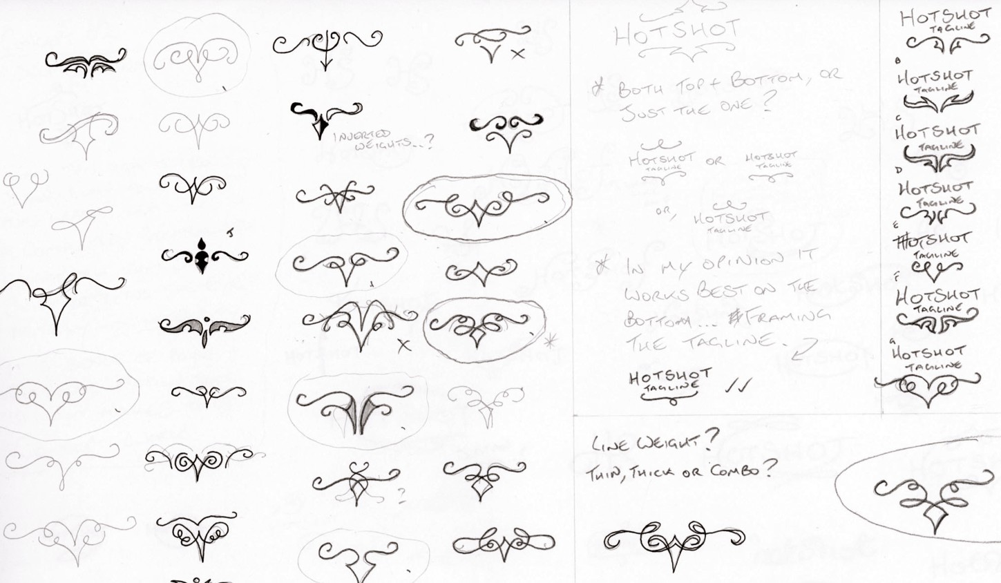
Figure 6-13: Developmental sketches drawn by Josh Hayes (www.hayesimage.com.au).
Experimentation through sketching also applies to working with hand-drawn letterforms. I was faced with the task of designing a wordmark for a homemade brand of honey distributed by Ridgeway Apiaries in the United Kingdom. I decided that the homemade delicious message could be portrayed by a typeface created by spoonfuls of the product itself (see Figure 6-14).
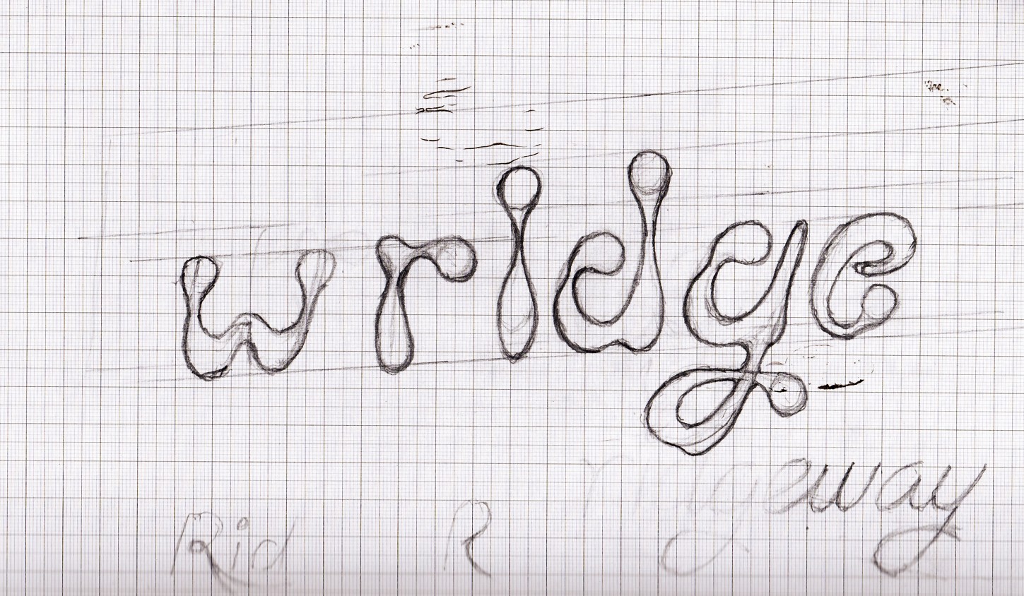
Figure 6-14: My own experimentation with custom-designed letterforms.
Running your ideas by the client
I find it saves time to talk the client through my initial ideas instead of waiting to present everything after the final execution. This approach prevents you from putting in hours of work on the refinement and expansion of a concept, only for it to be rejected. The client will be happy that you’re willing to keep them involved in the process. Just remember that you don’t want them to seize the reins and begin sending sketches of their own—you’re the designer, and they’re the client.
After a brief discussion with the client, they’ll probably give you some feedback—negative or positive. If it’s the former don’t just settle for one-word answers; try to get them to elaborate on what exactly they don’t like about your designs. This will help you narrow the focus and improve your chances of finding a concept that answers the brief and one that the client is proud to use.
How many ideas to present
Many designers include a number of concepts in their fee. This is perfectly fine, as long as you’re comfortable with the financial reward you’re receiving for the depth of exploration that you undertake. Some designers are happy that, once they’ve reached that set number of suitable concepts, the exploration stage is complete. I always strive to push the boundaries and not limit the number of ideas that I think of. There’s always that one elusive concept waiting to be discovered. Aim for perfection—it’ll be worth it.
Testing your ideas
If you have the time and resources available, present your concepts to people who fit the target audience. Don’t just ask one person and assume that everyone else agrees. Design is subjective. Some people have fantastic taste, and others don’t—and you can’t do anything about that. By collating the opinions of a number of people, you’ll be able to gauge an average opinion and get a better sense of whether your idea will be successful.
Another good test is to show your initial ideas to both designers and nondesigners whom you trust. (Seeking the opinion of your friends and family is often pointless, unless you know that they won’t be prejudiced in your favor.) Ask if the logo reminds them of any existing logos that they’ve already seen and what feelings they get from looking at the image. You may be surprised at the results.
Try to think like the target audience and forget the fact that you’ve designed the logo. Nobody will care who designed it—all that matters is that the idea makes a connection with the target.
It’s also a good idea to test the semantics of the image. Could there be any hidden meaning or image perceived by the design you’ve created. View it from it from all angles and at various sizes to check that any unwanted imagery is not present.
Refining your sketches
When you’re convinced that you have unique and successful solutions at the ready, try to rein in the excitement and avoid the computer just a little longer. How much time you should spend on your sketches before transferring them to screen depends on how comfortable you are with drawing using vector graphic software. You could even draw directly into the program if you find it easier than using a pencil, but I find that having real sketches is beneficial when presenting the development process at a later stage.
I carry out the majority of the drawing on paper rather than on-screen. I have fun working with traditional media—it keeps me from feeling like a slave to the monitor. Figure 6-15 shows one of my refined sketches before translating the design to vector format.
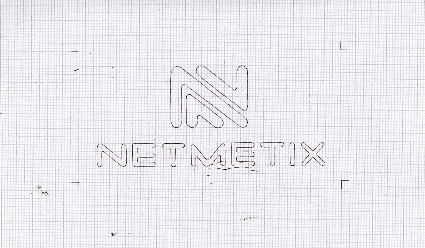
Figure 6-15: My refined sketches.
