Chapter 7: Getting Your Ideas On-Screen
You may start the creative process with a sketch of the logo you’re designing, but a sketch is worthless to a client. Clients can’t use sketches as fully functioning logos. In order for a logo to meet all the criteria in Chapter 3, you have to draw the logo using vector graphics editing software, such as Adobe Illustrator or CorelDRAW. (It doesn’t matter which program you use, as long as the software is able to produce vector-based images.)
A vector graphic is an image that is created using mathematically precise points joined by paths, which allows for the image to look exactly the same, regardless of its size. You can blow up a vector graphic to the size of a billboard and it won’t appear jaggy or pixilated. Logos need to be functional at a variety of sizes, so it’s essential that you create your logos as vector-compatible files.
In this chapter, I help you translate your original sketches from the sketchpad onto the screen.
Note: This chapter is written specifically for Adobe Photoshop and Adobe Illustrator, but you can use other vector graphics editing programs with similar features to achieve the same results. The key is to draw with vectors as opposed to pixels.
Preparing the File
The hardest part of logo design is thinking of a suitable solution. The second hardest part is execution. Maybe you think your sketch could compete with the Nike Swoosh, but if you can’t translate that sketch into something your client can use, it won’t stand a chance.
After you’ve refined your sketches and given them as much detail as necessary, you need to scan them into the computer. How much detail is enough? It really depends on how comfortable you are with drawing on-screen, whether with a graphics tablet or a mouse. I’m used to drawing with a tablet, so my original sketches don’t have to be super-polished for me to create the finished product in vectors.
Some designers use their sketches as guides and draw them on the computer using software like Photoshop or Illustrator, but I always find it easier to do as much as possible on the line work before the sketch goes anywhere near the computer. The line work is what’s important. Don’t worry about shading for the time being—focus on the paths that you’ll be drawing to create the form.
If you’re relatively new to drawing on-screen, get the sketch as close as possible to how you want the final logo to look before scanning it into the computer.
You’ll need to scan your image at a medium resolution—200 dpi to 300 dpi is ideal. Save the file as a TIFF or JPEG. Store the file somewhere where you can easily find it, and name it something related to the project, for easy reference.
Open your sketch in Photoshop. In Figure 7-1, I’m using one of my sketches of a hummingbird as an example. You open the file in Photoshop so that you can make necessary adjustments to the pixel-based image before importing it into a vector graphic program (like Illustrator) that will form the basis of the logo artwork.
I always prefer to crop the image so that it’s smaller and easier area to work with. To crop your image, follow these steps:
1. Select the Rectangular Marquee tool, and draw a square around the sketch. Leave roughly 20 pixels space around the edges.
2. Select Image → Crop. You’ve now removed the unnecessary blank areas of the sketch so that the focus is on the drawing of the logo itself (see Figure 7-2).
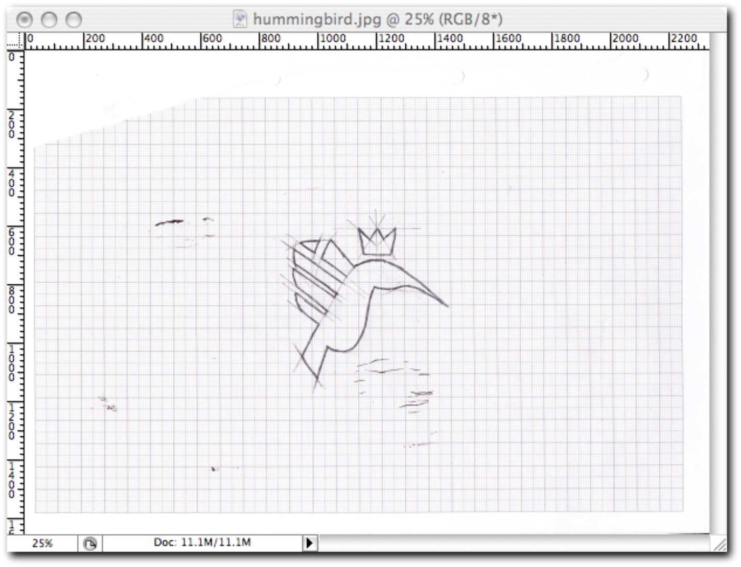
Figure 7-1: My scanned sketch opened in Photoshop.
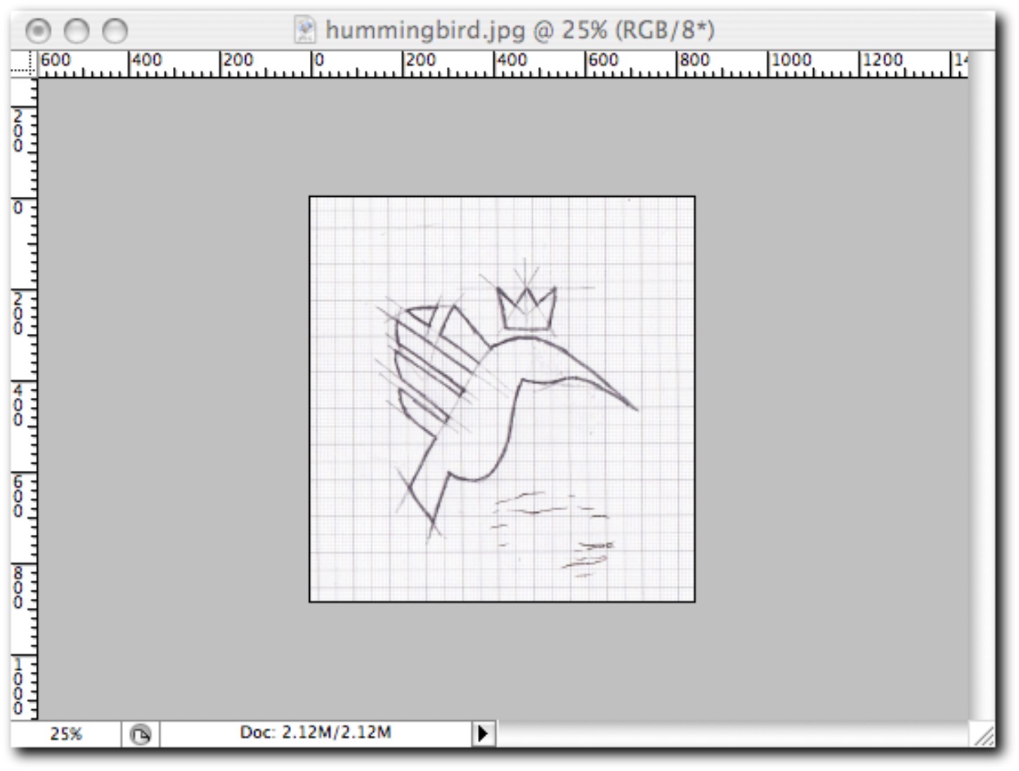
Figure 7-2: The drawing scaled down to add focus.
If you’ve done your sketch on graph paper, you probably want to tone down the grid lines on the newly created image so that they don’t become a distraction. Here’s how to do that:
1. Select Image → Adjustments → Levels. The Levels dialog box (shown in Figure 7-3) appears. You’ll see a graph of data, which details the levels of darkness within the image. To reduce the level of intensity of the grid lines, you need to adjust these levels.
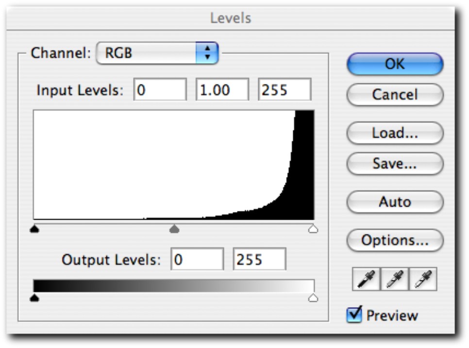
Figure 7-3: The Levels dialog box in Photoshop.
2. Underneath the histogram, there are three Levels Input sliders. Click the slider on the right and drag it toward the left, which makes the grid lines almost invisible.
3. To further enhance the intensity of the lines of the sketch itself, click the slider on the left and drag it toward the right. The sketch should now be clearer (see Figure 7-4).
4. Click OK.
Working with Vectors
This is the fun part, the part where you’ll finally get to see your idea come to life. Open Illustrator (or whichever vector graphic program you’re using), and create a new document. It doesn’t matter what size the document is (you can always adjust this for output later if needed), but make sure that the color mode is set to CMYK (see Chapter 10 for more on this). Import your sketch to the work area by following these steps:
1. Choose File → Place. The Place dialog box appears.
2. Select your sketch in the location that you saved it, and click Place. Your sketch will now be imported into Illustrator.
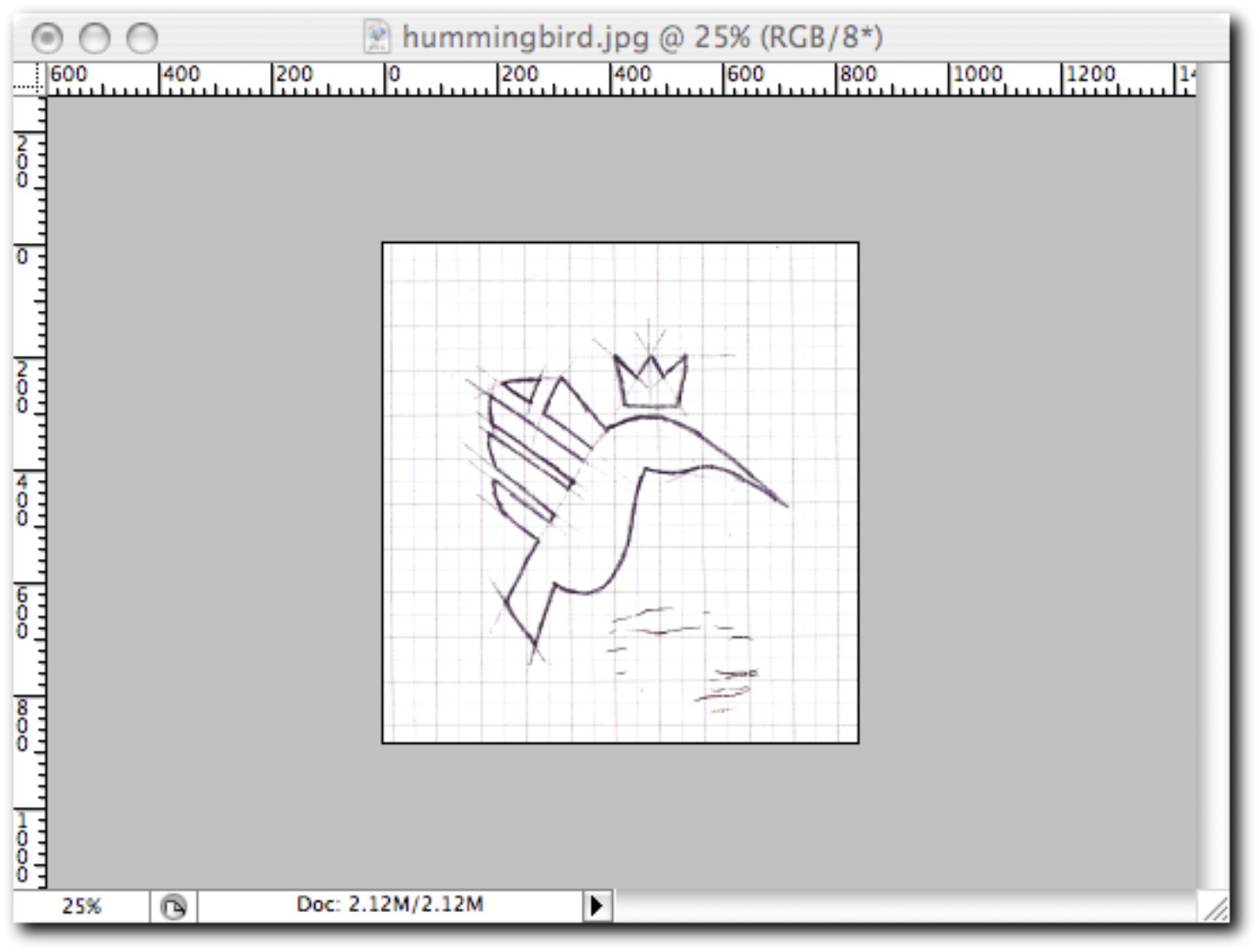
Figure 7-4: The grid lines are lighter and the sketch itself is darker, making it easier to trace the line work.
To be able to trace over the top of the sketch without causing a distraction when selecting elements, you want to place the sketch on its own layer. Here’s how:
1. Choose Window → Layers. The Layers windows appears.
2. You’ll notice that there is already one layer that contains your sketch. Double-click that layer to open the Layer Options dialog box.
3. Give your layer a name (I always name it “Sketch” for ease of reference), and make sure the Lock and Dim Images to 50% check boxes are selected (see Figure 7-5). Your sketch will now be on its own layer, locked so that it stays in place when you trace it, and dimmed so that your vector line work will be clearly visible.
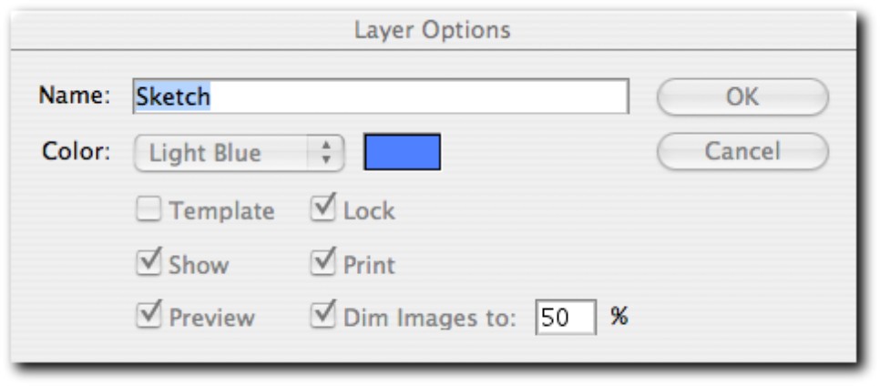
Figure 7-5: Placing the sketch on a locked and dimmed layer.
Your line work will need to be on a separate layer, placed above the sketch layer. To do this, follow these steps:
1. With the Layers window open, click the Create New Layer button. A new layer will appear above the layer that contains your sketch.
2. Double-click this new layer to open the Layer Options dialog box again.
3. Give this new layer a name such as “Line Work” for ease of reference.
Make sure that your line work layer is selected; otherwise, your artwork won’t be on its own layer. To select a layer, simply click it in the Layers window. You’re now ready to finally begin drawing the logo on-screen.
Using the Pen tool
The Pen tool (P) is my weapon of choice when drawing in Illustrator. I find that it offers the most control, especially when drawing curves. The places that you click on the sketch using the Pen tool are referred to as points. The completed line connected by a series of points is called the path.
Before you start drawing on-screen, make sure that the stroke color you’re working with is a color that stands out against the background, I prefer to use red. This greatly improves the contrast of the line work against the background image of the sketch. Even with a red stroke, you may find that it isn’t noticeable enough; if so, you can increase the stroke weight.
With red selected as the stroke color, follow these steps:
1. Find a joining point between two lines on your sketch, preferably a corner. This will be the starting point for the path that you’re about to create.
2. Click the center of the join. (It doesn’t have to be precise at this stage—you can alter the precision later, if necessary.)
3. Click the ending point of that line. The first part of the path is now in place (see Figure 7-6).
If your path is no longer selected, click the previous point that you created. If your drawing contains no curves, you can continue to repeat the same process you used to create the first two points. If your sketch is like my example, however, you’ll need to know how to successfully negotiate a curve.
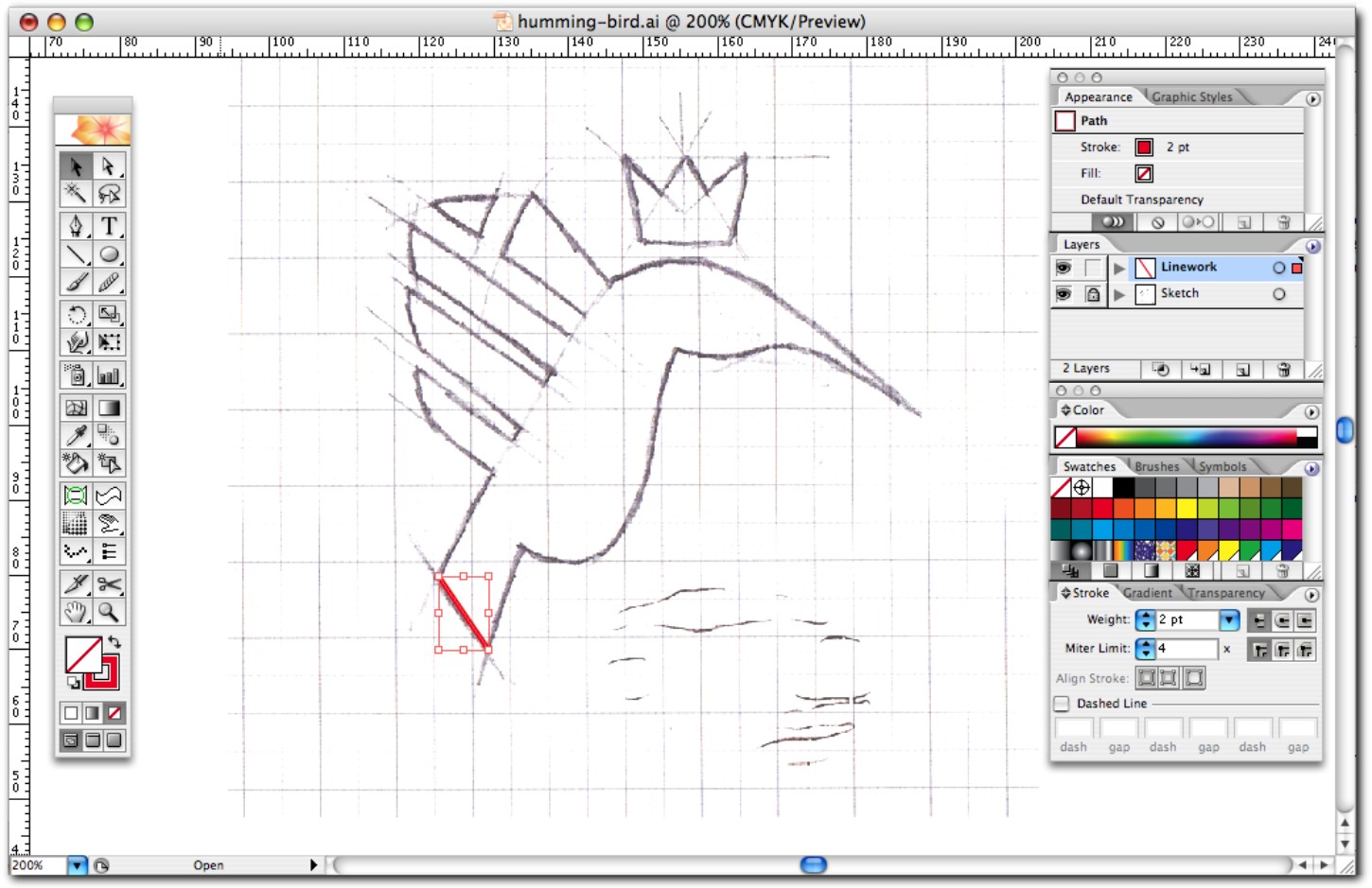
Figure 7-6: The first section of the path.
The easiest method is to draw a Bezier curve, which is created using two points. Depending on the curve, you can draw it using one Bezier curve or a sequence of many Bezier curves. (Some curved lines are impossible to draw using just two points.) The Pen tool (P) allows you to draw Bezier curves.
1. When you need to draw a curve, try to identify the middle of the curve. In my example, the middle of the curve is on the belly of the hummingbird.
2. Click this middle point to continue your path, but be sure not to release your mouse.
3. With your left mouse button still firmly pressed down, drag the cursor away from the point. You’ll notice that you have control over the direction and the radius of the curve (see Figure 7-7). You probably won’t get the measurements of the curve exact on the first attempt, but practice makes perfect.
4. When you have the first part of your curve in place, click the end point of the whole curve to create a new path point, and repeat Step 3 so that the curve is now fully integrated as part of the path. You may find that two points won’t be enough to achieve the same line as your sketch, so you can add more points if needed (see Figure 7-8).
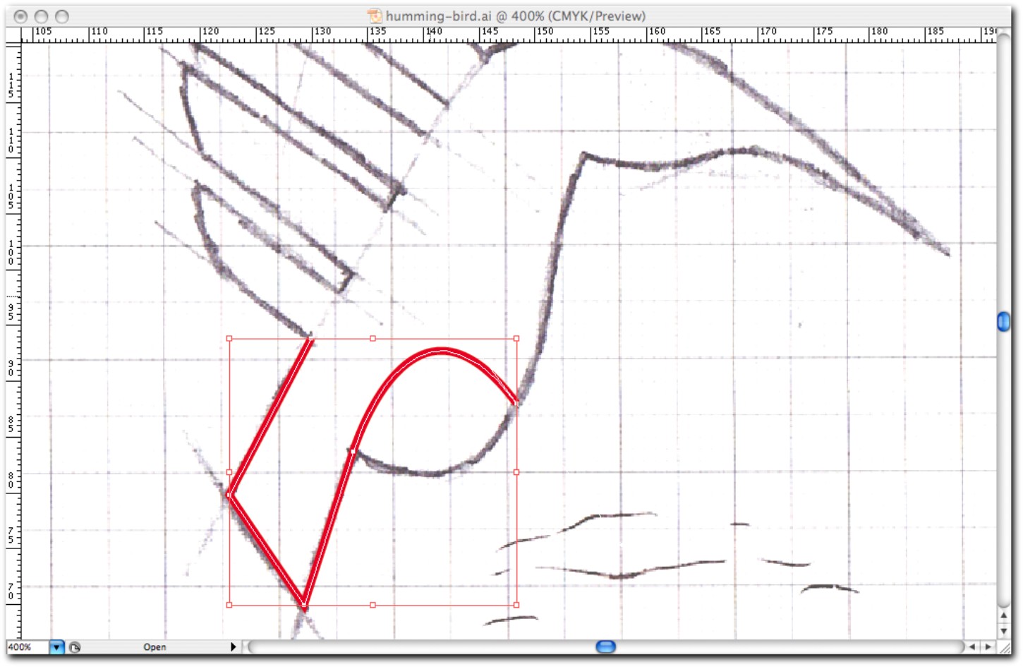
Figure 7-7: Drawing a Bezier curve.
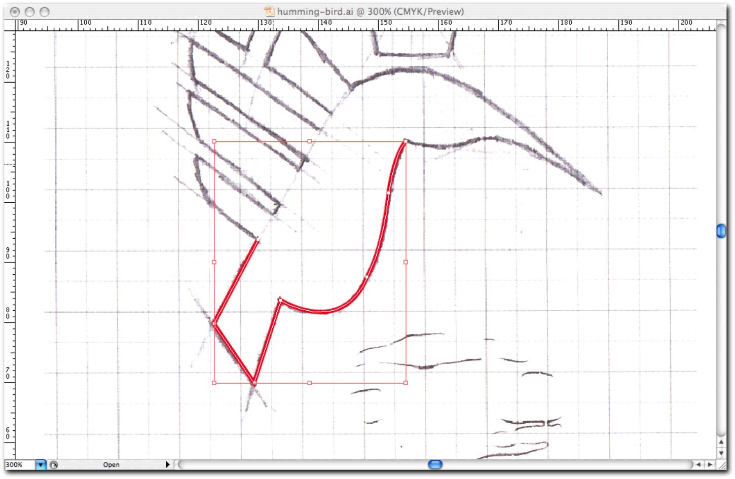
Figure 7-8: The completed curve.
You can complete the path by carefully tracing over the remaining lines of the sketch. To ensure that a path is closed, make sure that the final point you click is also the starting point (see Figure 7-9).

Figure 7-9: The completed closed path.
If your curves are perfectly circular, an alternative to the Bezier curve is the Ellipse tool (L). The Ellipse tool is far more accurate than drawing the curves of a circle by hand, but it works only if your curves are circular.
Adjusting the path
You’re now done with the sketch, so you can hide the Sketch layer in the Layers window by clicking the eye icon next to it. (When you’re ready to output a final file to send to your client, make sure that it doesn’t include a layer that contains your original sketches, because this looks quite unprofessional).
With the line drawing completed you’ll probably notice that there are some imperfections. The goal is for the path to look like a digital piece of artwork, not something hand drawn (unless hand drawn is the style of the image).
The biggest imperfection you’ll notice is that the curves aren’t smooth and don’t flow well into one another. You can fix this with the Direct Selection tool (D). With the Direct Selection tool selected, follow these steps:
1. Click one of the points of your curve. This will reveal two handles: the point where the curve starts and the point where the curve ends (see Figure 7-10).
2. If you click one of the handles and drag the selection, the radius and position of the curve will change (see Figure 7-11). You’ll need some practice to achieve the results you want. You also can edit the positions of any point on a path, again by selecting the path using the Direct Selection tool and using the arrow keys to adjust their coordinates on the document.
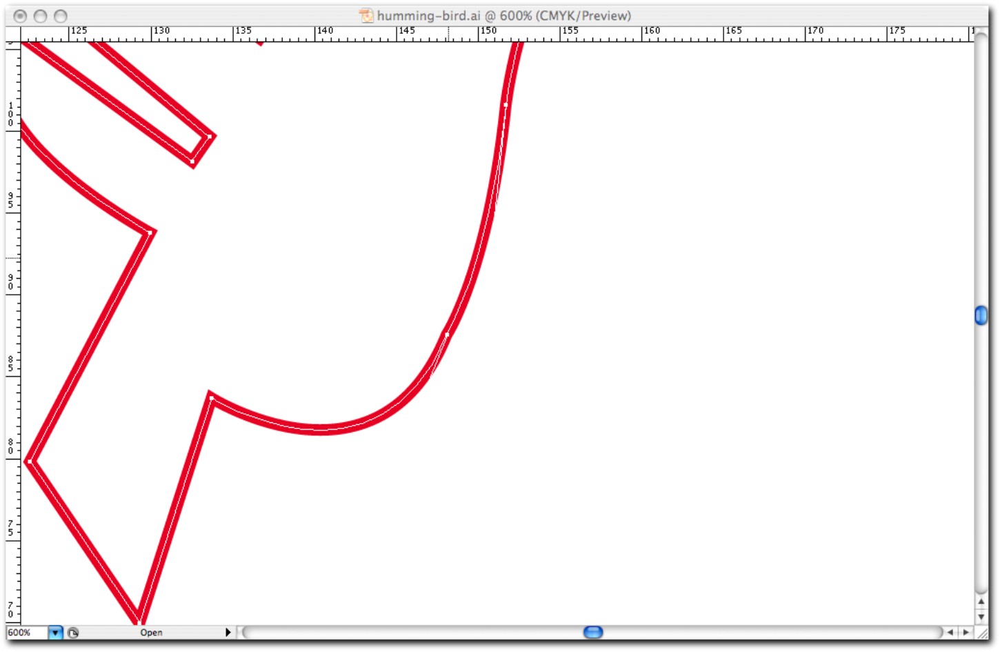
Figure 7-10: Clicking a point using the Direct Selection tool.
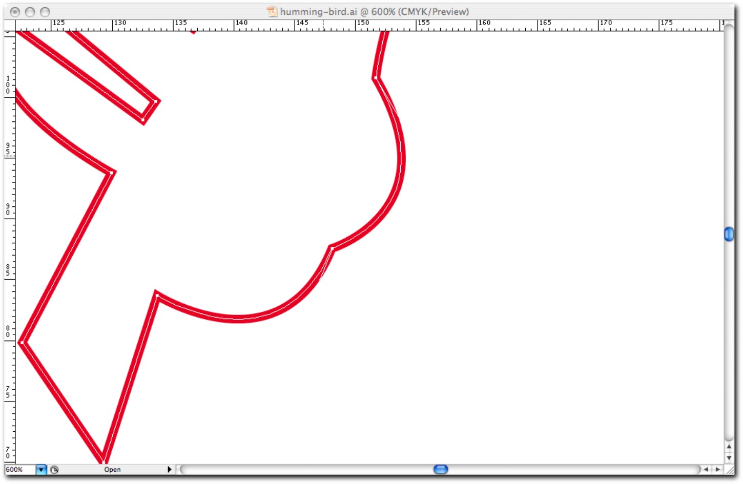
Figure 7-11: Changing the radius and position of the curve.
Another method I use to perfect curves is the Smooth tool, which is located under the Pencil tool. With your path still selected, select the Smooth tool and click and drag along the curve you want to adjust. This reduces any noticeable joins between the points. You may notice that the Smooth tool adds points to your path so that the curve is now less staggered and flows more easily (see Figure 7-12). It’ll take some time and practice to get the path looking just right.
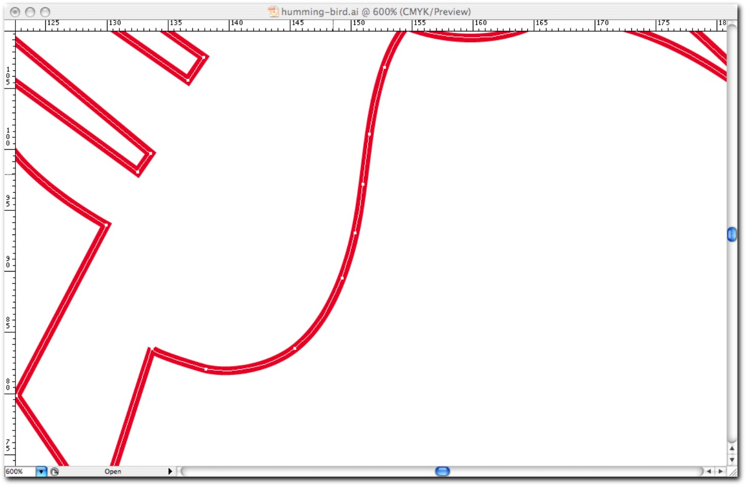
Figure 7-12: The result of a path using the Smooth tool.
When adjusting the path, continually zoom in and out to check your work. Some imperfections won’t be noticeable when you’re zoomed out, but you also want to get a sense for how the entire image looks.
Working in black and white
With the path completed and the curves refined, it’s time to analyze the form. At this stage, I always convert the stroke of the path into a black fill (see Figure 7-13). You can do this by selecting the path with the Selection tool (V) and using the shortcut Shift + X.
Working in black helps you to focus on the form and not get distracted by other design choices that you have to make further into the process. You also can spot any imperfections when the logo is scaled down or when it’s reversed.

Figure 7-13: The completed path given a black fill.
To scale the image down (see Figure 7-14), follow these steps:
1. Select all the artwork using the Direct Selection tool (V).
2. Place your cursor over one of the corners of the bounding box.
3. While pressing the Shift key, carefully scale the artwork to a smaller size by dragging your cursor. Holding down the Shift key ensures that the scale remains proportional for both the horizontal and vertical measurements.
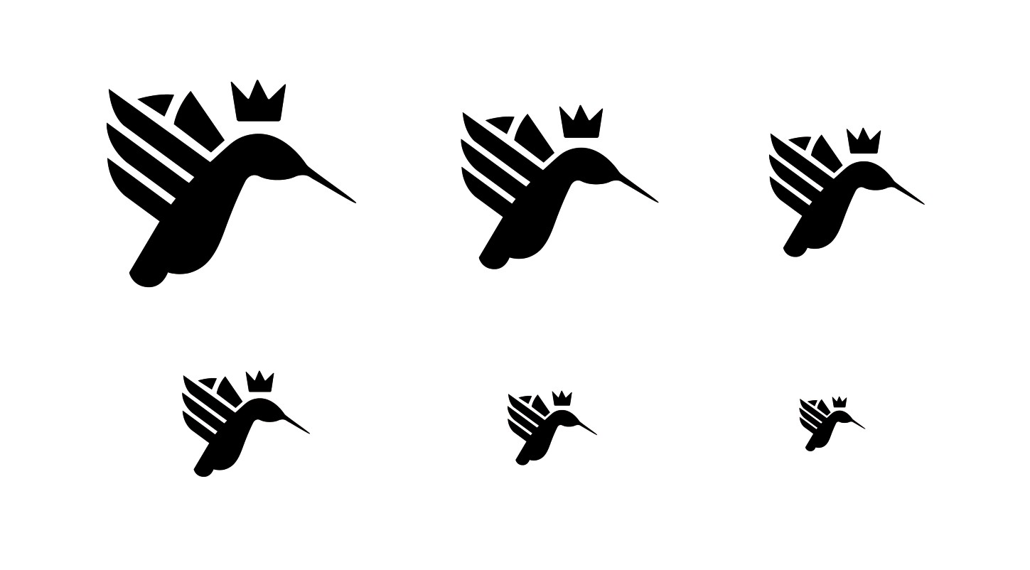
Figure 7-14: Analyzing the form scaled down.
To reverse the image (see Figure 7-15), follow these steps:
1. Select the Rectangle tool (M).
2. Draw a black-filled rectangle on your art board or wherever you’ve drawn your artwork.
3. Select your artwork using the Direct Selection tool (V) and give it a white fill.
4. Place the newly colored artwork onto the black rectangle.
You may want to place the black rectangle on its own locked layer so that it doesn’t move as you’re continually making adjustments.

Figure 7-15: Analyzing the form reversed.
Just because you’ve finished drawing the logo doesn’t mean you’re finished with the artwork. There’s always room for more creativity, refinement, and experimentation. Don’t be afraid to create variations of your original idea: Remove elements, add elements, and play with the proportions and the weight of the drawing. Even the style in which you draw can be altered (see Figure 7-16). You want to carry out these experiments at this stage, before the rest of the elements have been applied—it’ll save you time in the long run.
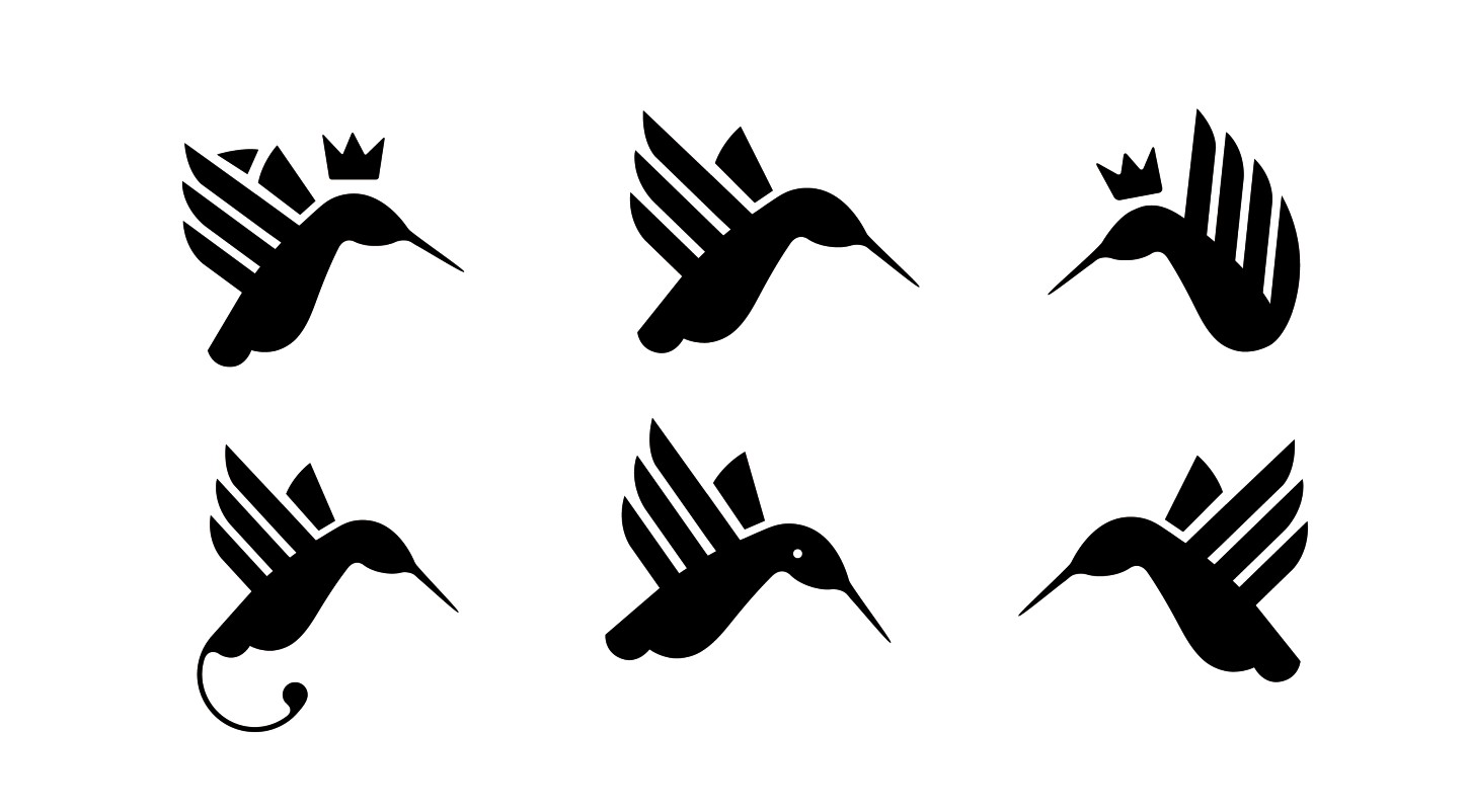
Figure 7-16: Experimenting with variations of the form.
