Chapter 9: Playing with Layout
Here’s a question for you: What’s the best way to arrange a deck of playing cards? Would you opt for the easy way of just placing them flat on the table, or would you be more adventurous and arrange them to create an impressive house of cards? The best way depends on your goal—what you plan to do with that deck of cards. The same principle applies when deciding on the layout for a logo design. The truth: There isn’t a best way at all.
This chapter explores how working with layout doesn’t have to be boring and predictable. As with every other design element, layout gives you the opportunity to be creative.
Working with Alignment
Alignment concerns the placement of the elements in relation to one another. Many logo designers either rush through this part of the process or overlook it completely. But alignment plays an important role in a logo and shouldn’t be ignored.
Your alignment choice will be based on a number of factors:
• The form of the elements: The shape of a mark can dictate the alignment of assisting type in order to achieve balance.
• Where the logo will primarily be applied: If the dimension of the application has either a dominant horizontal or vertical measurement, you’ll want to test whether your design will make the best use of the space available. You may find that you have to offer more than one alignment option for different applications.
• Most important, the subjective opinion of the designer: There are no rules set in stone, so your own judgment will be the deciding factor when it comes to alignment. Continually guide the client toward the alignment you think works best.
Looking at common alignment options
If you have a mark with assisting type, you could just lump the two together and hope for the best, but that probably won’t help to achieve the maximum impact and unity between the two separate elements. You can pretty much display the two elements in any alignment you want, as long as they look connected. If you place the mark too far away from the type, this could appear disjointed and could even come across as two separate logos.
In this section, I show you some common options, as well as explore more creative and unusual decisions.
Stacked
Probably the easiest way to align your logo is it to stack the mark and type on top of each other (see Figure 9-1). Take a look at many of the world’s most famous logo designs, and you’ll see stacked alignment. However, stacked alignment isn’t always best. In Figure 9-1, there isn’t a complete unification between the mark and the type.
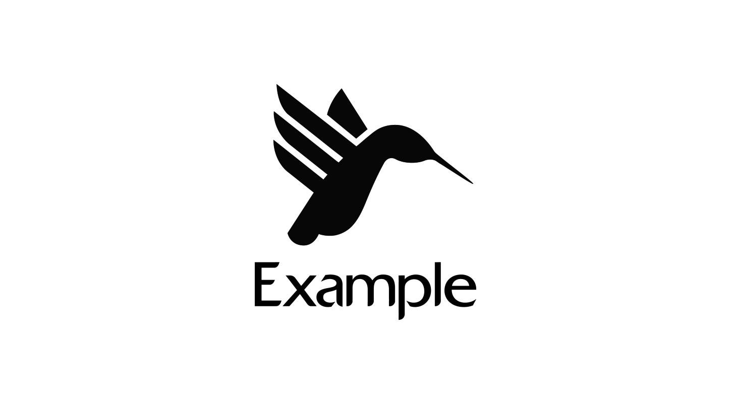
Figure 9-1: Stacked alignment.
Horizontal
Horizontal alignment is placing the type and mark directly adjacent to each other. You can arrange the logo so that the mark is on the left (see Figure 9-2) or on the right (see Figure 9-3). The viewer will likely notice whatever’s on the left first, because we’re used to reading from left to right, so keep this in mind as you decide which arrangement you prefer. (Of course, in some languages the viewer reads from right to left, so keep this in mind if your client and the target audience are located in an area where this is the case.)
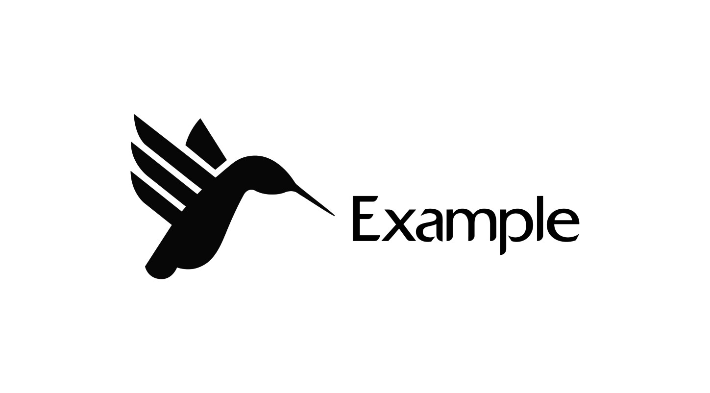
Figure 9-2: Horizontal alignment with the mark on the left.
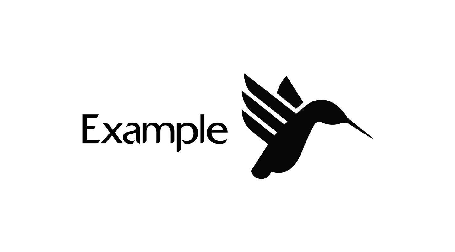
Figure 9-3: Horizontal alignment with the mark on the right.
The form of the mark also can play an important role in where the eye is drawn. In my example, you’ll notice that, on the right of the mark, the beak of the hummingbird is narrow and pointed, which forces the eye to the right. If this mark is placed to the left of the type, it leads the eye to read the type, but if the mark is placed to the right of the text, it points toward white space.
Experimenting
Don’t think that the only way to align objects is to place them directly adjacent to each other or stacked high; there are many alignment options beyond the most common ones. If the alignment of your logo looks a little different from the norm, it may help increase recognition, as long as the logo isn’t one big jumbled mess that the viewer can’t begin to comprehend.
Be creative with your alignment choices and explore the endless possibilities (see Figure 9-4). Even then, if you do come up with a more adventurous and unusual layout, you may have to convince the client it will work.
Dealing with awkward shapes
Some shapes have a way of giving designers headaches. The goal is a harmonious balance between a mark and the type, but some shapes make this more challenging than others. Circular and square shapes are typically quite easy to balance, but shapes that have no defined classification can be a little trickier.
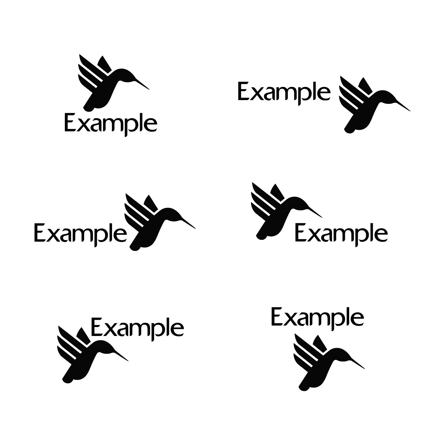
Figure 9-4: Experimenting with alignment.
For example, if the shape of the mark forms a perfect triangle, but the overall shape of the typography is more rounded, it will clash. The selection of typography should help, but some marks can be tricky to align regardless of the type. In my example, the mark doesn’t fill a defined area—it’s wider in some places than others, mainly because of the narrow space that the hummingbird’s bill forms (see Figure 9-5). There is a greater amount of negative (or white) space in the bottom-right area. As a result, if the mark were to be placed directly above the assisting type, I’d have to counter this so that the focus isn’t placed on that awkward area.
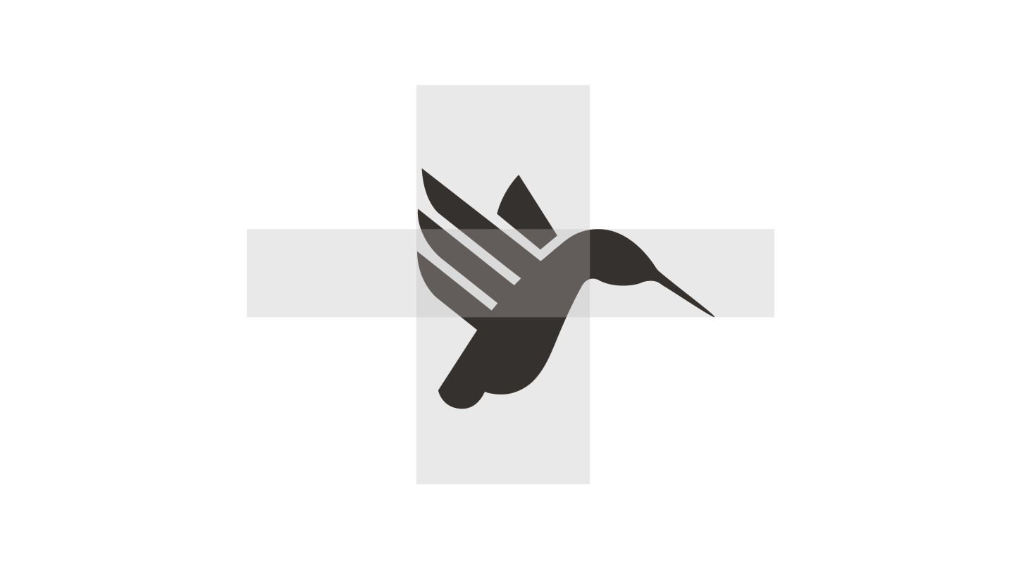
Figure 9-5: Identifying the positive and negative space of a mark.
In my choice for alignment, I chose to place the mark at a diagonal angle to the type, so that it fills part of the negative space (see Figure 9-6). This also makes it look more natural, as if the hummingbird is hovering above the type, but it still faces toward the right, forcing the eye to read the brand name.
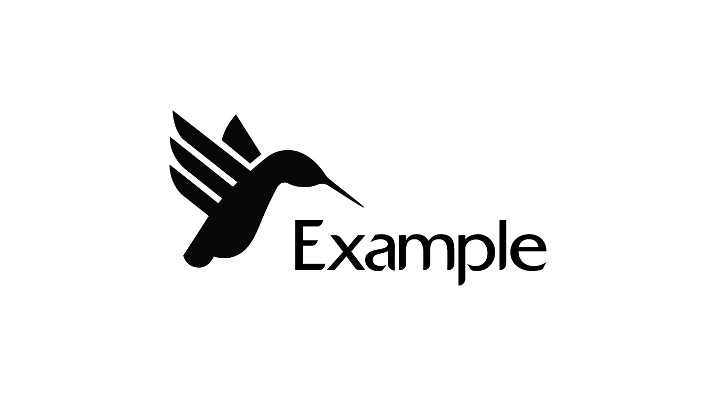
Figure 9-6: Making allowances for the negative space that awkward shapes can create.
Creating the Right Balance
Another key aspect of layout is balance. You want the proportion of each element in the logo—the mark and the text—to result in a design that’s balanced, where neither element overpowers the other. You also can use the rule of thirds to refine the logo’s balance.
Proportion
When it comes to proportion, there are no hard-and-fast rules—as long as the type and the mark are legible, you can experiment until you achieve the right balance. Remember: Especially for new brands, the type is critical—it communicates the name of the brand and must be easy to read.
Proportion also may depend on the nature of the mark. In my example, the mark is a literal pictorial illustration of a hummingbird, so if I were to scale it in a gigantic size compared to the type, it would start to look unnatural (unless there is a rare breed of gigantic hummingbird that I’m not aware of). On the other hand, I don’t want the mark to be so small that it becomes unnoticeable.
As with the alignment, the best way to achieve balance between two or more elements is to experiment with as many options as possible. I played with the proportion in my example to see what works best (see Figure 9-7).
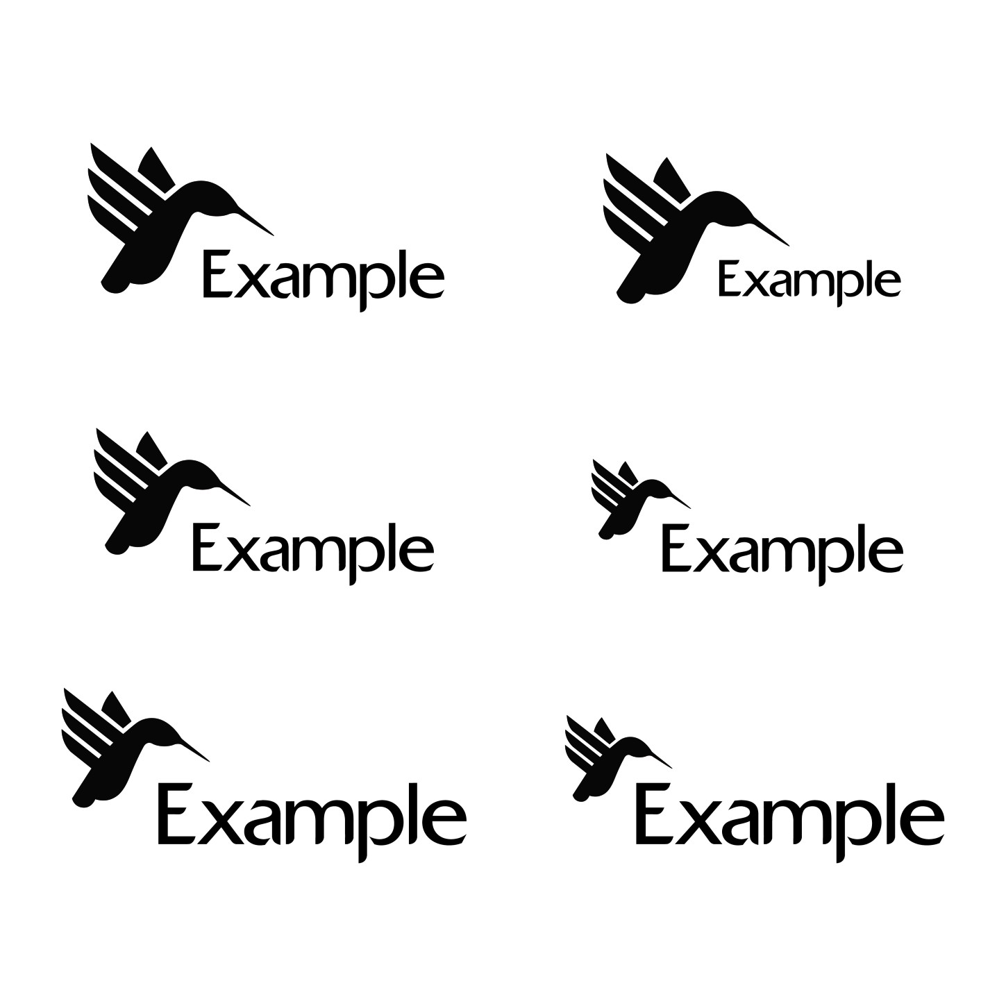
Figure 9-7: Experimenting with proportion.
The rule of thirds
If you want to be more precise than using the naked eye to create balance, you can apply the rule of thirds, which has been used in art and design for hundreds of years (initially as a means of proportioning scenic paintings). The rule of thirds divides an image into nine equal parts, to create a 3 x 3 grid.
In my example, I’ve placed my chosen layout for the logo in a rule-of-thirds grid (see Figure 9-8). You’ll notice that, even though the mark slightly overlaps the area of the typography, the ratio is roughly 1:2 in favor of the type by horizontal measurement. By the vertical measurement, the ratio is roughly 2:1 in favor of the mark. This is what works in my example because of the unusual shape of the mark. For other logos, it may be the other way around.
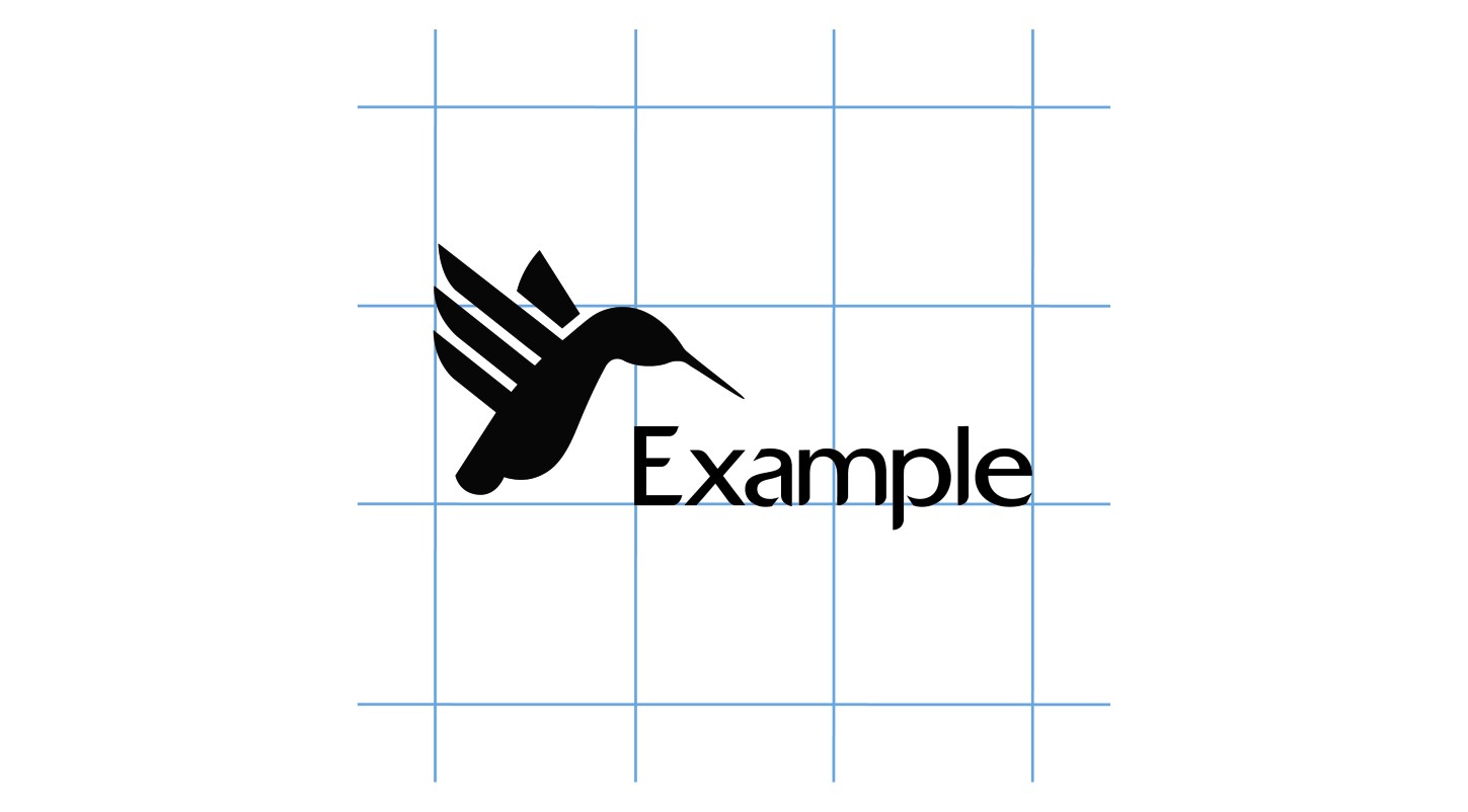
Figure 9-8: Applying the rule of thirds.
In Figure 9-9, you can see my final chosen layout with the proportion and rule of thirds applied.
The rule of thirds can help you achieve balance in your logo, but rules are made to be broken. Don’t be a slave to the rule of thirds. Use it as a tool—one of many tools, including your own personal preference, in your arsenal.
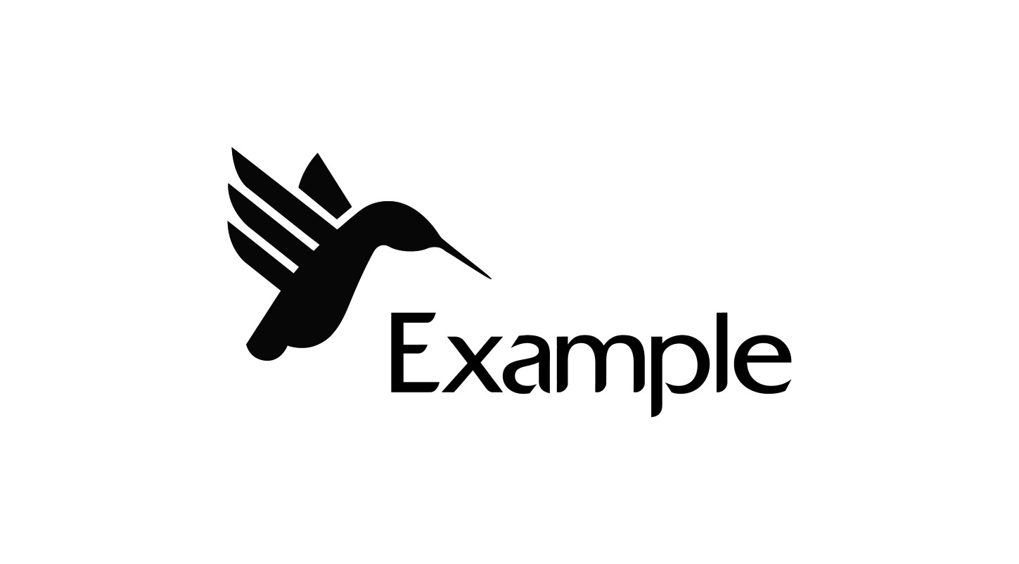
Figure 9-9: The final layout.
