Chapter 8: Turning to Typography
Typography is the art of creating, arranging, and modifying type. Relating to logo design, it’s the way in which you visually display the letterforms or characters.
Typefaces have great influence over people’s decisions, helping to further emphasize the message of a brand. The typefaces that you choose can effect whether the right message is being communicated to the viewer. Handling typography correctly is such an enormous subject that I can’t explain the ins and outs of its theory and best practices within one single chapter—entire books have been written on the subject. However, this chapter does give you a greater understanding of working with fonts and adjusting typefaces to help improve a logo design.
If you’re interested in delving deeper into typography, I recommend the following books:
• Stop Stealing Sheep & Find Out How Type Works, by Erik Spiekermann & E. M. Ginger (Adobe Press)
• The Elements of Typographic Style, by Robert Bringhurst (Hartley & Marks)
• Typography Essentials: 100 Design Principles for Working with Type, by Ina Saltz (Rockport Publishers)
Note: You’ll frequently hear people use the terms font and typeface interchangeably, but there is a difference. A typeface is the particular design of a style of type; a font is the physical element in which the typeface is created to apply the typeface. A font is the file that you acquire and then go on to use in your work.
Designing your own typefaces
In an ideal world, you wouldn’t even use existing fonts in a logo. Fonts are available to anyone, so if you choose to use a particular font, there’s no guarantee that someone on the other side of the world (or across town) won’t have chosen the same font. I’m not suggesting that you should source a font that nobody else has ever used before, but over time, the more popular choices start to become more recognizable and, in turn, can make the identity that you’re designing for look a little common and unoriginal.
If you can, you should draw the brand name itself as a unique piece of artwork. This will ensure that the image is completely unique, which is obviously a bonus for any logo. Not all designers have this ability—drawing letterforms from scratch is a highly specialized area. If you don’t know what you’re doing, you’re probably better off using a font and making some modifications to it. Even then, you’ll need to have a basic knowledge of drawing type to avoid making amateur mistakes.
Knowing Where to Look for Fonts
The best and easiest place to source fonts is online. Fonts vary in their cost, but as a general rule, the more prestigious fonts (such as Helvetica or Avant Garde) are more expensive than fonts designed recently. If you must use a font for your project, I recommend the following sources.
Font distributors or vendors
Distributors or vendors are websites that source font from foundries or individual designers. They don’t design their own fonts. Instead, they’re more like an online catalog of fonts. Here are some of the vendors that I use regularly:
• Fonts.com (www.fonts.com) offers more than 150,000 font-based products.
• FontShop (www.fontshop.com) was the first ever reseller of fonts in digital type history, founded in 1989.
• MyFonts (www.myfonts.com) has a massive collection of fonts with the added feature of being able to identify a font used by uploading an image.
• Veer (www.veer.com) offers over 12,000 fonts from a low starting price.
Font foundries
A font foundry is a website that designs typefaces and distributes them as fonts. Here are some of the best-known foundries within the typeface design industry:
• The Font Bureau, Inc. (www.fontbureau.com) is one of the leading designers of typefaces, specializing in fonts to be used in editorial format.
• House Industries (www.houseind.com), a foundry made up of a collective of extremely talented typography experts, offers a brilliant variety of typefaces.
• International Typeface Corporation (www.itcfonts.com) has a library of over 1,650 typeface designs.
• Letterhead Fonts (www.letterheadfonts.com) is a foundry specializing in fonts of a more decorative nature.
• P22 (www.p22.com) has been providing digital fonts online since 1994.
• Sudtipos (www.sudtipos.com) is a creative type foundry based in Argentina, with a particular expertise in designing script typefaces.
• (URW)++ (www.urwpp.de) is a fantastic font foundry based in Hamburg, Germany.
• YouWorkForThem (www.youworkforthem.com), founded in 2001, is a relatively new foundry that houses modern fonts.
Independent font designers
You also can purchase fonts directly from designers themselves. Here are some of my favorites:
• Doyald Young (www.doyaldyoung.com) is one of the modern-day typographic masters. I also recommend purchasing some of Doyald’s books on hand-drawn lettering, which you can find on his website.
• Mark Simonson (www.marksimonson.com) is a freelance type designer who has created over 30 commercial fonts.
• Nick Shinn (www.shinntype.com) has designed over 20 fonts that cover a vast array of typeface styles.
Free or fee?
The Internet has opened up the world of commercial fonts to a broad audience. You have two options if you choose to use a font that you didn’t create yourself: Pay for one, or download one for free. As you can probably guess, fonts that cost money are likely to be of a much higher quality than their free counterparts. It can take professional font designers months to perfect a font. To absorb some of the costs of paid fonts—and some are not cheap—you can include this cost in the estimate that you send to the client. (If you’re working with a large budget, you could even hire a designer to create a custom typeface for you, but that’s not as fun or rewarding as completing the task yourself.)
I’m not suggesting that every free font available online is unusable—you might stumble upon a gem in the rough. I sometimes find free fonts useful as the basis for type customizations, especially if the font carries some of the characteristics of the way I envision the final lettering looking.
Whatever you do, don’t use a free font without any kind of modification. You may want to customize the letterforms or simply correct the tracking, leading, or kerning. If you just pick a font and simply type the brand name out on-screen, you’ll probably see that font used elsewhere and, chances are, it’ll look unprofessional without some tweaking. The biggest sin you can make as a logo designer is using an unmodified free font as a wordmark. Keep your logo design as original as you can.
Choosing the Correct Typeface
The first typeface you choose probably won’t be the perfect fit. Experimenting with a variety of typefaces is always a good thing, especially when presenting possibilities to a client.
Your typeface choices can depend on the following factors:
• The message that the client intends to communicate to the target audience
• The presence of a mark and its style
• The versatility of the typeface
Your client’s message
Every typeface style communicates a message to the viewer (see Figure 8-1). The personality of the typeface you choose should be in tune with the brand image that the client wants to convey to the target audience. For example, you wouldn’t want to use a fun and juvenile typeface for the logo of a funeral director—the tone of the typeface doesn’t match the message of the client. On the other hand, you wouldn’t want to use a formal, old-fashioned typeface for the logo of a kids’ play zone.
Some typefaces have more than one personality. For example, older typefaces may be perceived as being traditional, but in some applications they can look elegant. How a typeface is perceived also depends on the assisting graphics or brand imagery that the typeface is couple with.
The style of the mark
If the logo is type based, the designer has free reign over the attributes of the typeface. The only requirements are that the logo be legible, appeal to the audience, and be easily reproducible.
Supporting typefaces
When you’re choosing a typeface for your logo, you also want to be thinking of supporting typefaces—typefaces that the client can use for other text-based information they present (for example, in advertisements or brochures). The supporting typefaces should
• Be different enough to distinguish from the type used in the logo
• Have a similar style to the type used in the logo
• Have a style that will appeal to the target audience
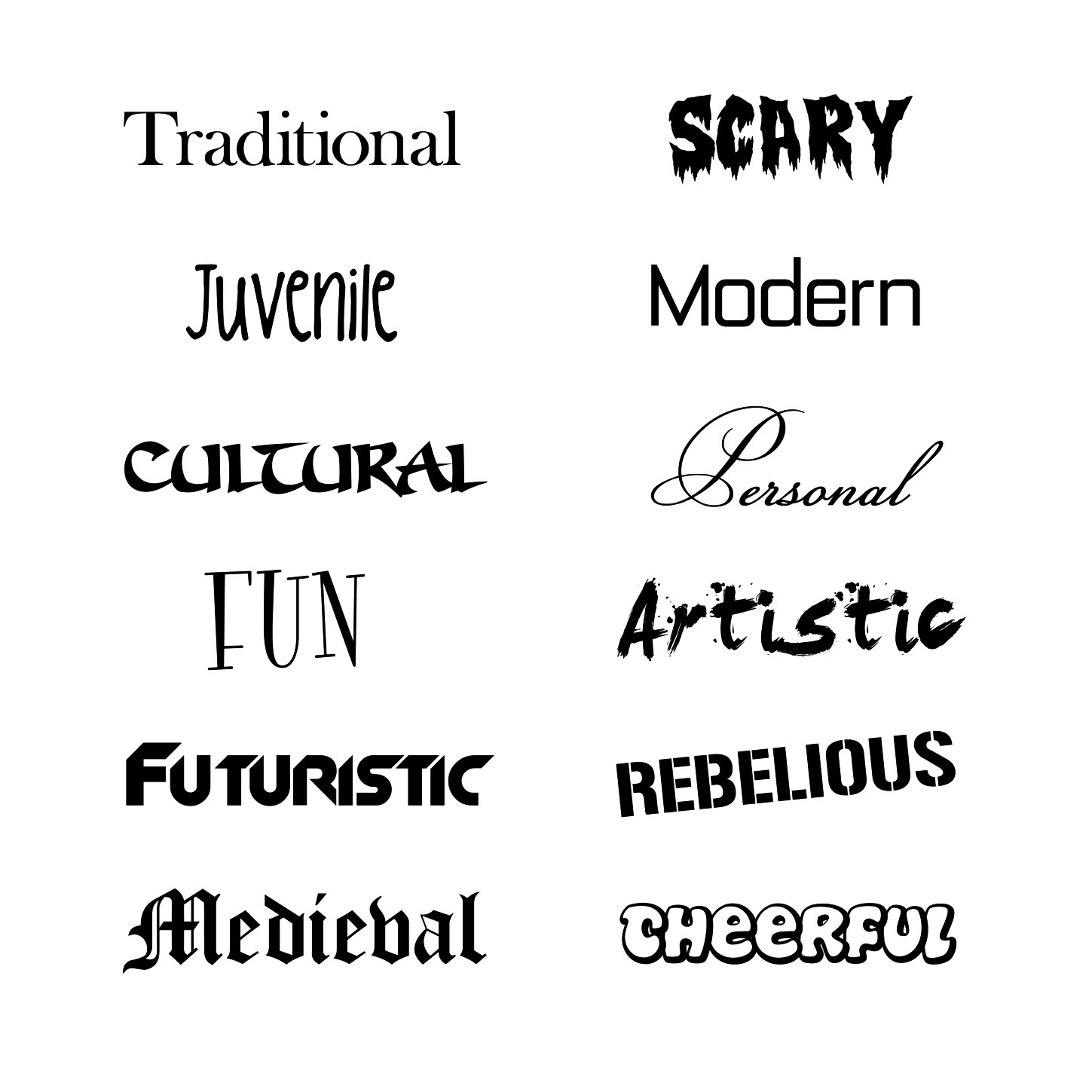
Figure 8-1: Different typefaces send different messages to the viewer.
A logo that incorporates both a mark and typography poses a different problem to the designer. Both must have a similar (if not identical) style, so that the image of the two elements combined is one cohesive unit. Making the wrong type choice for assisting a wordmark is like dressing up in a $5,000 dollar suit only to slip on your 5-year-old sneakers before walking out the door—your image will be ruined (see Figure 8-2).
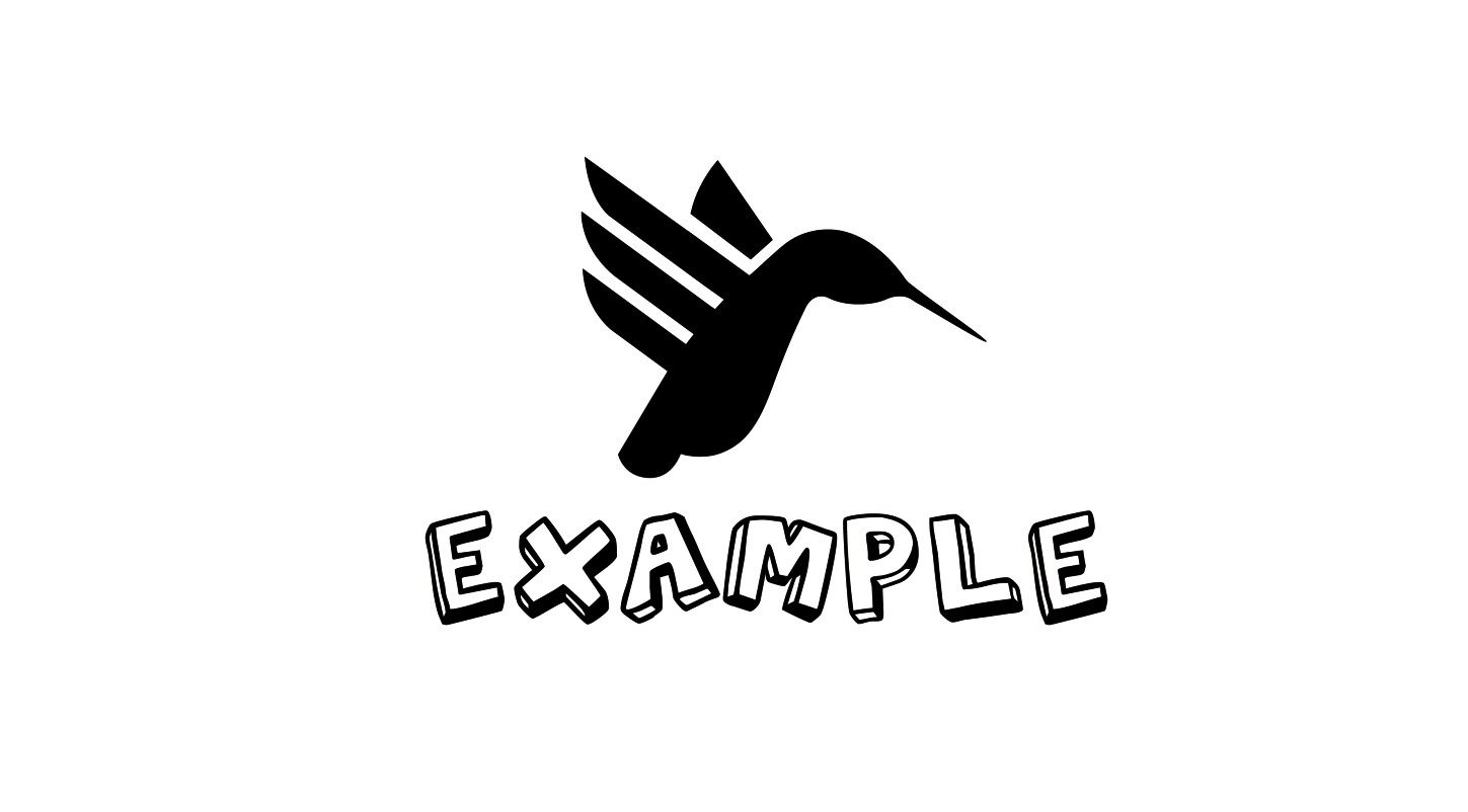
Figure 8-2: A typeface choice that has a completely different style from the mark doesn’t present a cohesive look.
Try to summarize the style of the mark, and look for a typeface style that has similar attributes. Is it square? Round? Tall? Wide? By analyzing the characteristics of the form, you can narrow your choice of font from the millions that are available. The best type style choice is one that has either very similar characteristics to the mark for complete unity (see Figure 8-3) or one that has slightly similar characteristics to add a small amount of focus (see Figure 8-4).
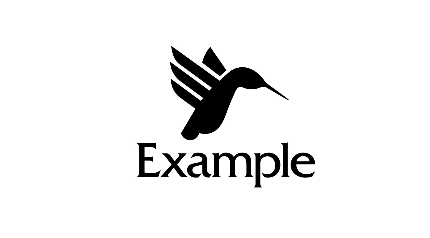
Figure 8-3: A typeface that has a style very similar to that of the mark.
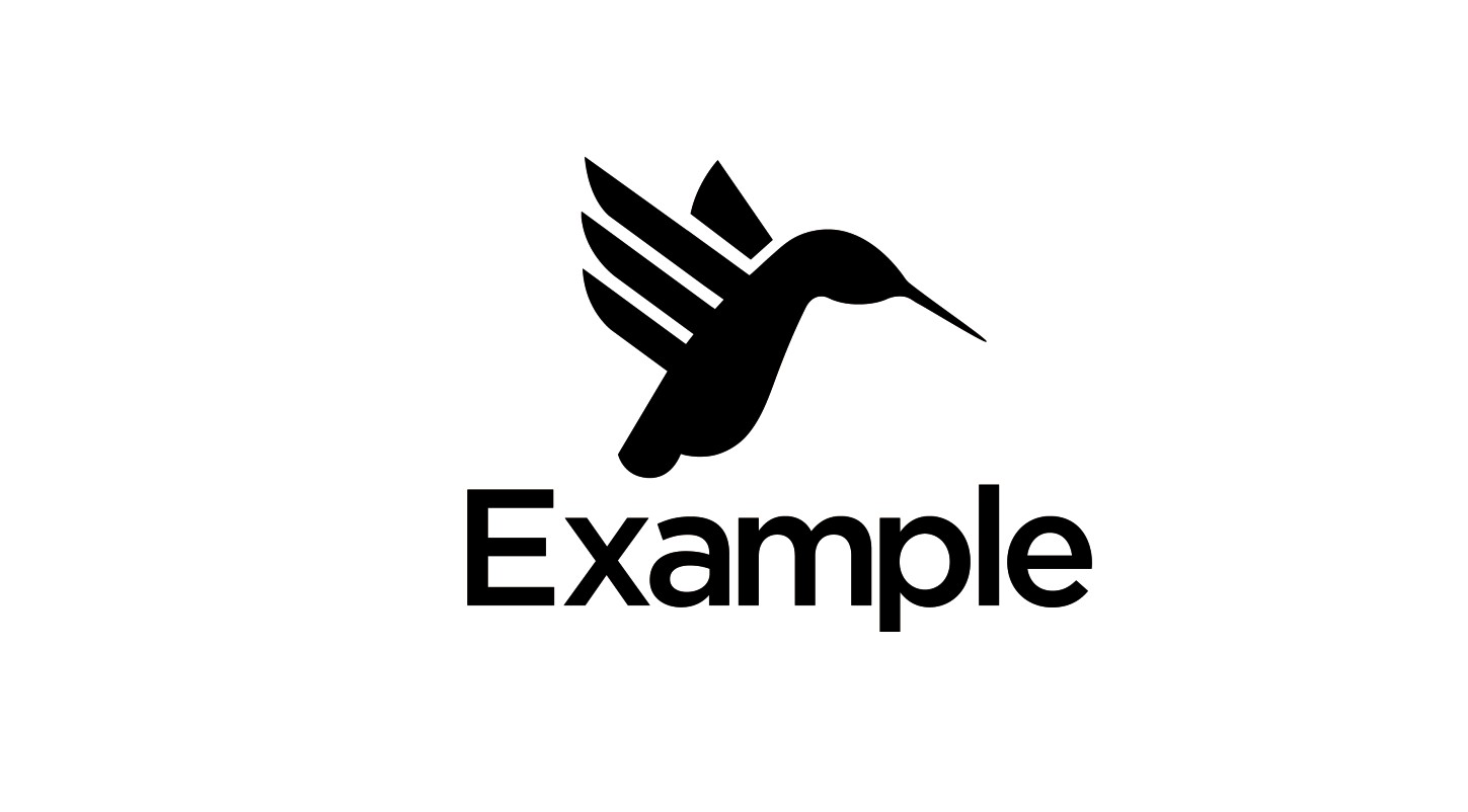
Figure 8-4: A typeface that has a style slightly similar to that of the mark.
Weight
Font come in various different weights, and deciding which one to use to create the right balance with the mark can be confusing. Look at the mark again and look at the impact it has on the page. Does it utilize large areas of positive space? If it’s a line drawing, what is the weight of those lines? The correct weight is one that is harmonious with the weight of the mark so that complete emphasis is neither on the mark nor on the type.
If the type choice is too heavy, the emphasis will be on the type alone, and the mark will lose impact (see Figure 8-5).
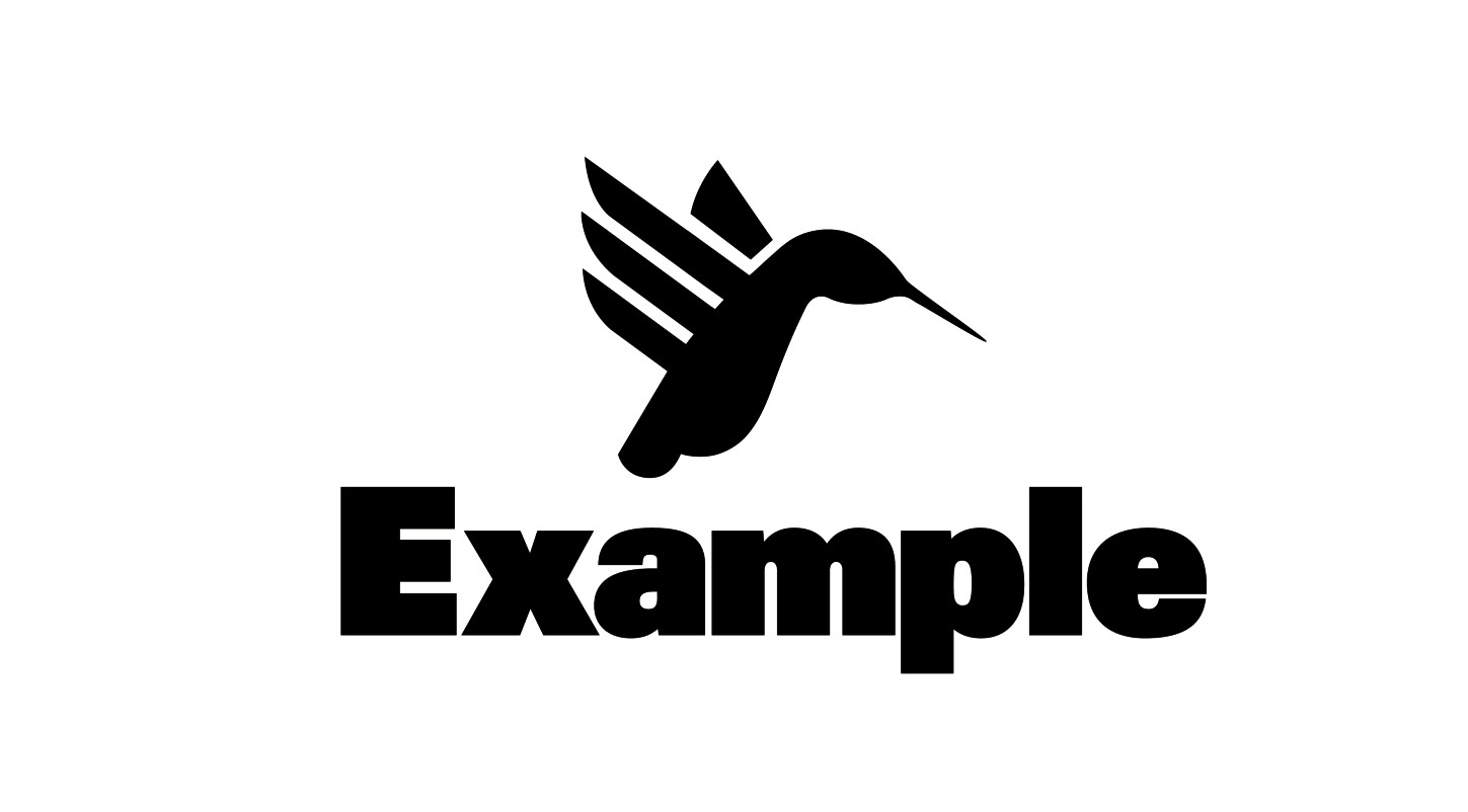
Figure 8-5: This typeface is too heavy for the mark.
If the type choice is too light, the emphasis will be on the mark, and the type will have less impact (see Figure 8-6).
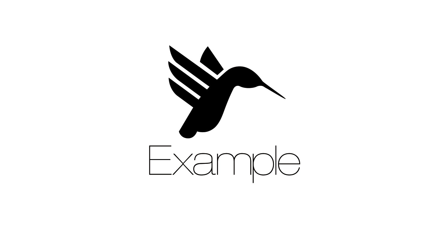
Figure 8-6: This typeface is too light for the mark.
Proportion
The proportion of fonts is categorized by the width of the characters and ranges from ultra-condensed to ultra-extended. In the presence of a mark, proportion has a greater significance than it does for wordmarks. As with matching the weight, it’s important that the proportions of the type and the mark are similar. If the mark is wide and short, a tall and thin typeface won’t be the correct choice, because the design will look unbalanced. Figures 8-7 shows a typeface that’s too extended for the mark, and Figure 8-8 shows a typeface that’s too condensed for the mark.
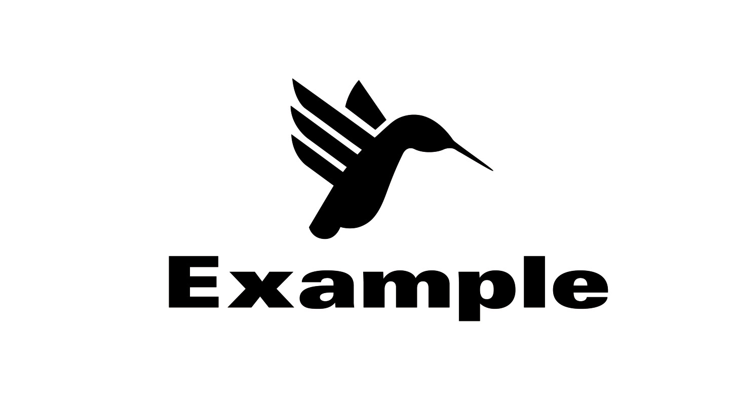
Figure 8-7: Here, the typeface is too extended for the mark.
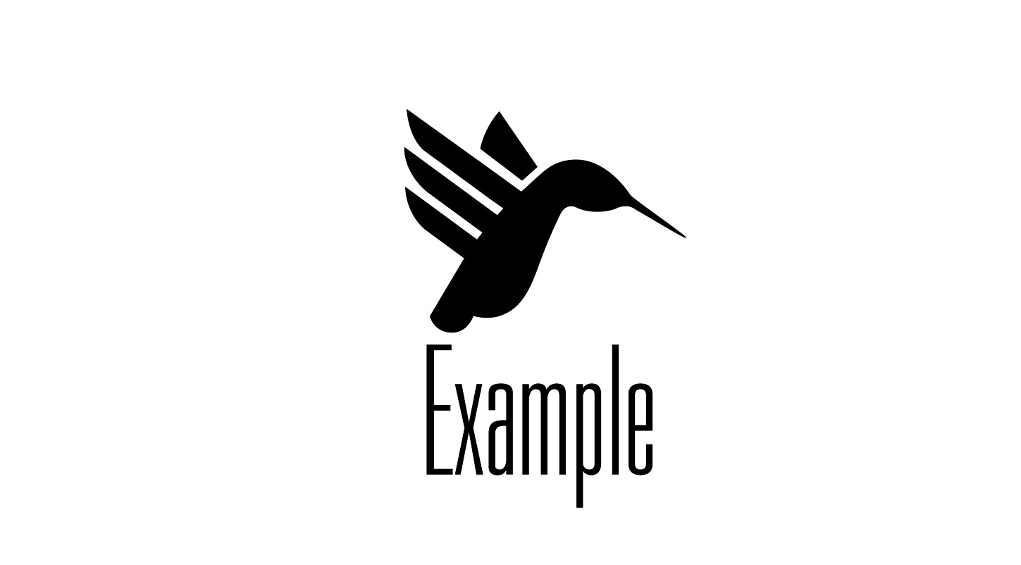
Figure 8-8: Here, the typeface is too condensed for the mark.
Typeface versatility
There is no point in displaying a brand name for the entire world to see if the viewer can’t read it. Don’t be a dingbat and pick an obscure font that people will take minutes to decipher. Clarity is a must. Let the viewer do as little work as possible.
Each project brief will lead you to make different typography decisions, depending not only on the audience but also on where the logo will be used. You may be required to work with typefaces that can work at very small sizes, for example on the face of a watch. Not all typefaces have the ability to work when scaled down at such small dimensions (see Figure 8-9), so it’s important that your choices have a certain amount of flexibility.
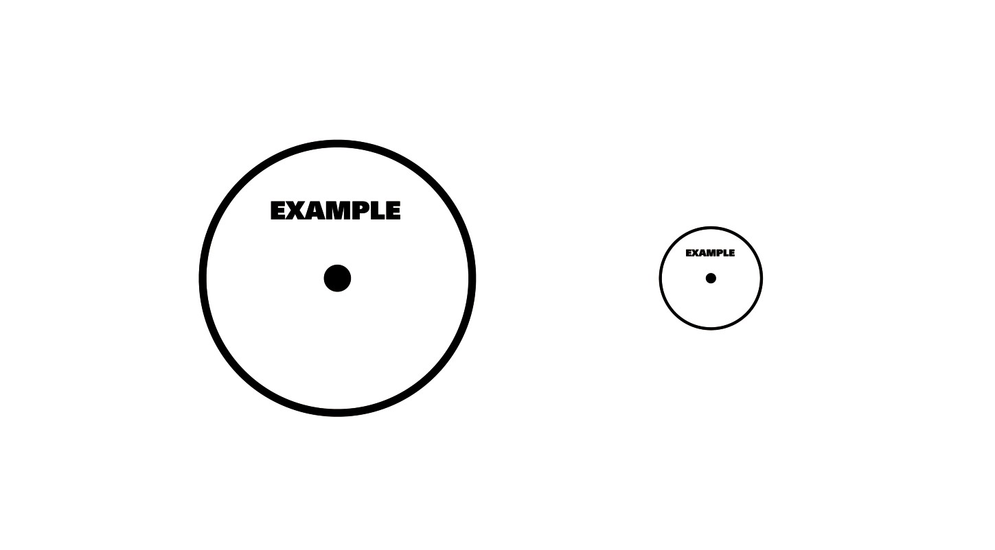
Figure 8-9: The typeface can affect scalability.
Working with Type
You should never just type out a word using a font and declare it a logo—that’s not professional practice. The arrangement and modification of type is an art form in itself, one that can take years to truly master.
There are many elements of typography that you must address in order for the type in your logo to look professionally crafted. These elements include tracking, kerning, and leading.
Tracking
Tracking is the amount of horizontal space between the characters of a font. The tracking is set by one consistent value and decides how much horizontal space the set type will take. Your decision regarding the tracking affects the legibility of the type. If the tracking is too loose, it’ll take up too much room, altering the balance (see Figure 8-10). If it’s too tight, the brand name will become hard to read (see Figure 8-11).
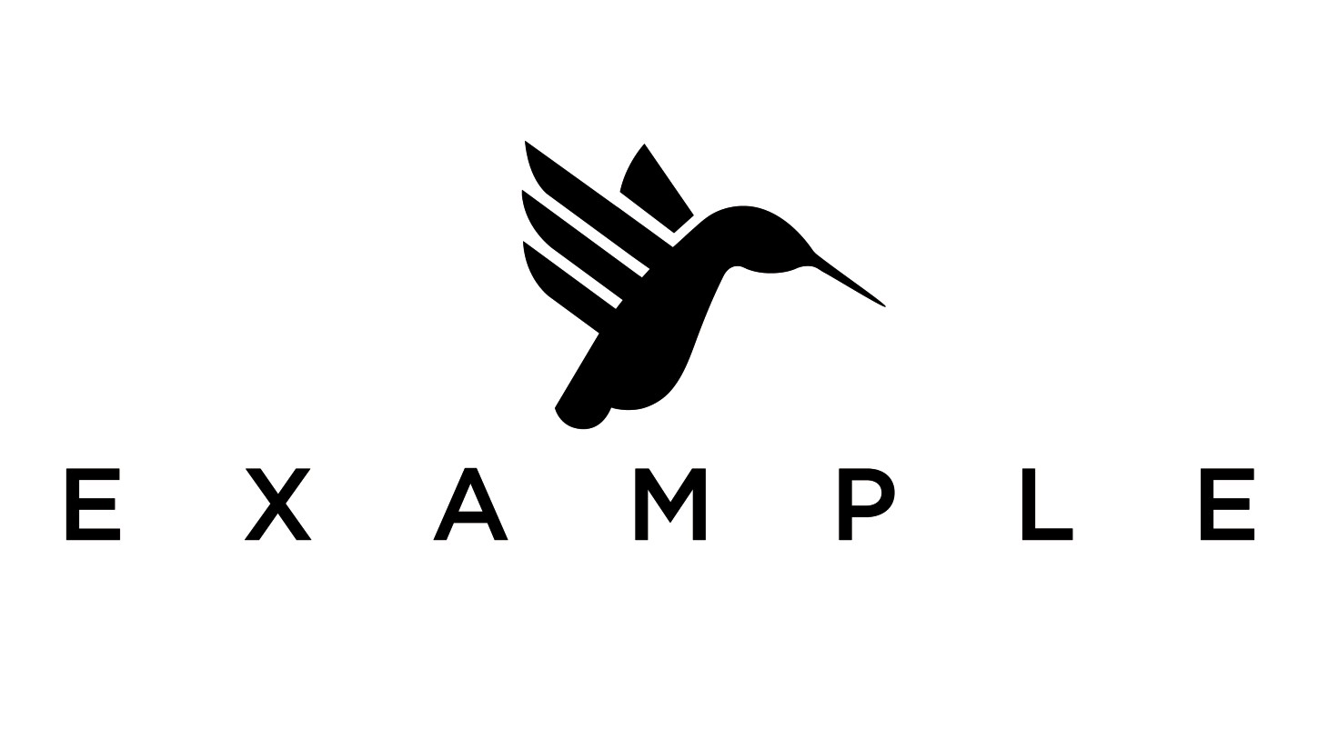
Figure 8-10: Tracking too loose in relation to the mark.
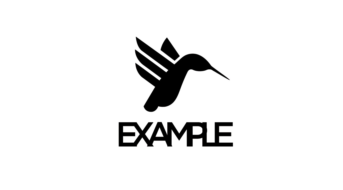
Figure 8-11: Tracking too tight regardless of the mark.
Kerning
Kerning is the process of adjusting the horizontal spatial measurements between two characters of a font. The measurement of kerning is determined between two selected characters. At smaller sizes, we don’t take notice of the amount of space between the characters of a font, because it isn’t big enough to affect the legibility. However, at larger sizes, it’s more apparent. Because there is no limit on the reproduction size of a logo, your kerning will come under great scrutiny.
Figure 8-12 shows the word kerning typed without adjustment. You’ll notice that in the example on the right, the space between the characters is inconsistent. For example the space between the r and the n is tighter than the space between the n and the i.
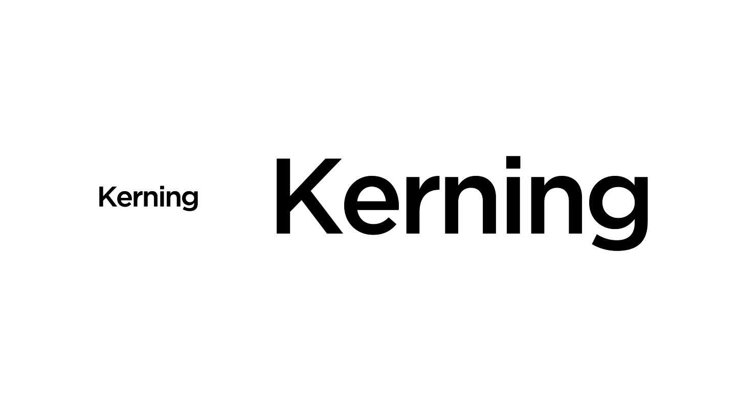
Figure 8-12: The need for kerning is more apparent when type is set in a larger size.
By making adjustments to these different values, you improve the kerning. Unfortunately, kerning isn’t as easy as measuring out the same distance between each character. Some characters create more visual space than others, so you need to compensate for this. A good tip for making the kerning process easier is to flip the word upside down. This way, your eyes don’t read the word, and you can fully focus on the imperfections (see Figure 8-13).
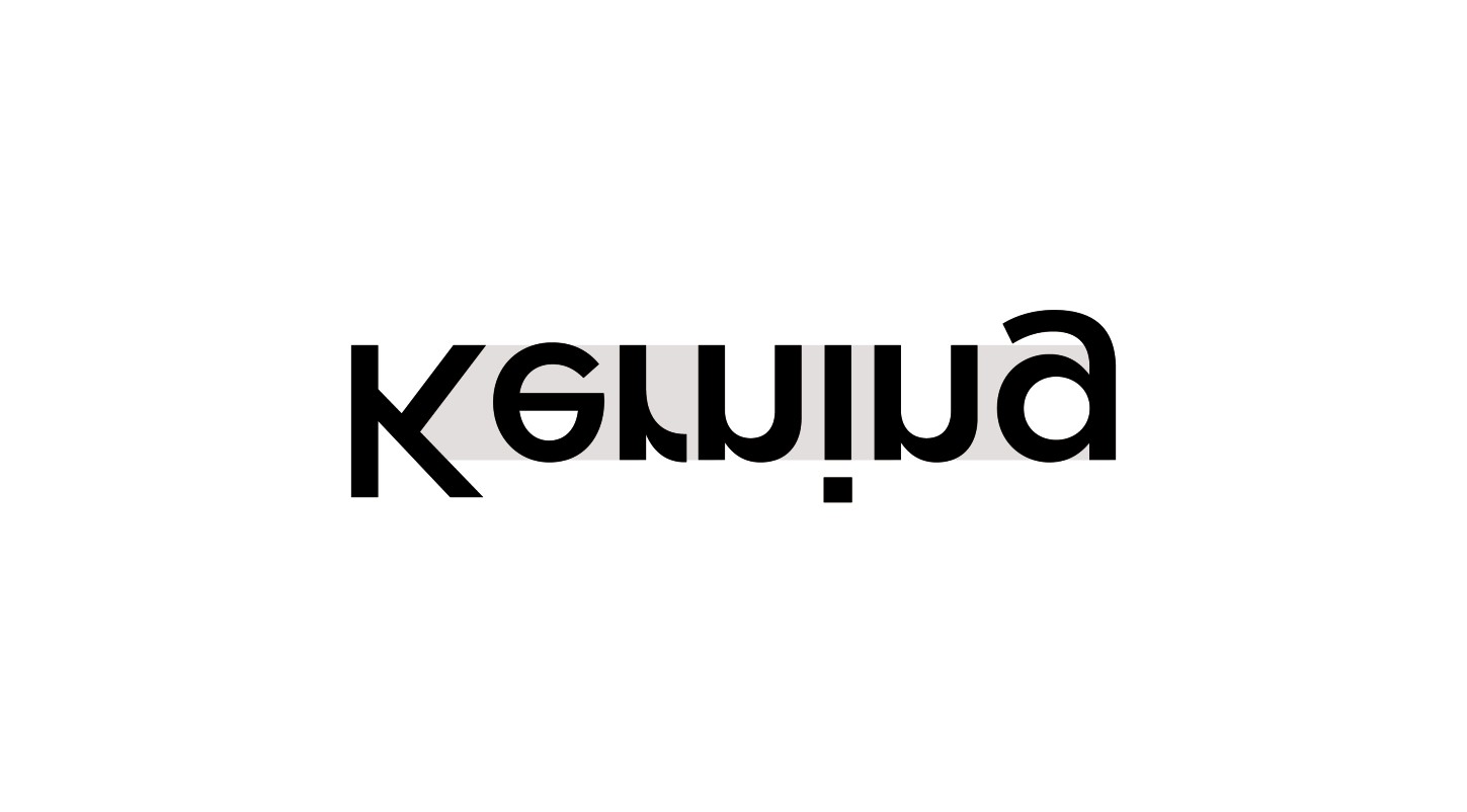
Figure 8-13: Flipping the type upside down to increase focus.
As you being to kern characters, you’ll find that the space created between some character pairings can be awkward to work with. I always find r and a with tight tracking particularly tricky, because the legs on both characters point toward each other. Coupled with the slope of the A, this creates a vast amount of space that needs to be accounted for (see Figure 8-14). By joining the characters, the word reads more easily and isn’t disconnected.
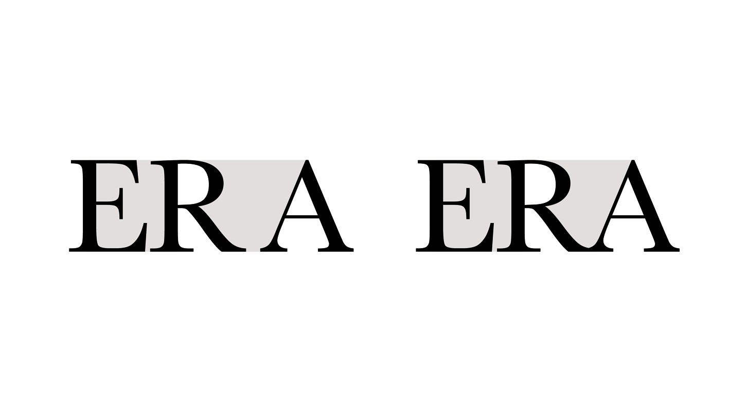
Figure 8-14: Compensating for awkward character pairings.
Leading
Leading is the vertical spatial measurements between lines of type (see Figure 8-15). Typically, leading is measured by a set, consistent amount when the content of the type is still editable.
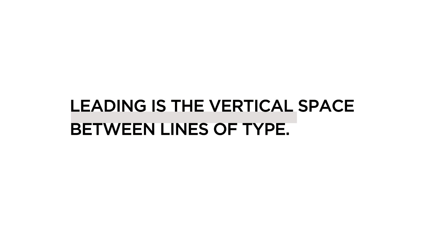
Figure 8-15: How leading is measured.
When modifying the arrangement of type that you’ve previously converted to outlines, you’ll find that you’ll have to correct the leading by hand. If more than two lines of type are used, retaining the leading as a consistent measurement ensures that the type used in the logo is easier to read as one block of text (see Figure 8-16).
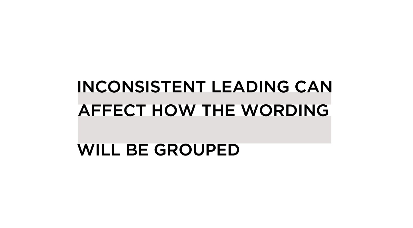
Figure 8-16: Inconsistent leading can reduce legibility.
Using More Than One Typeface
A logo doesn’t have to use the same typeface for each word, but the typographic style should convey a similar message. If the typefaces selected have different styles, it will confuse the viewer not only by reducing the legibility but also by sending out contrasting messages (see Figure 8-17).
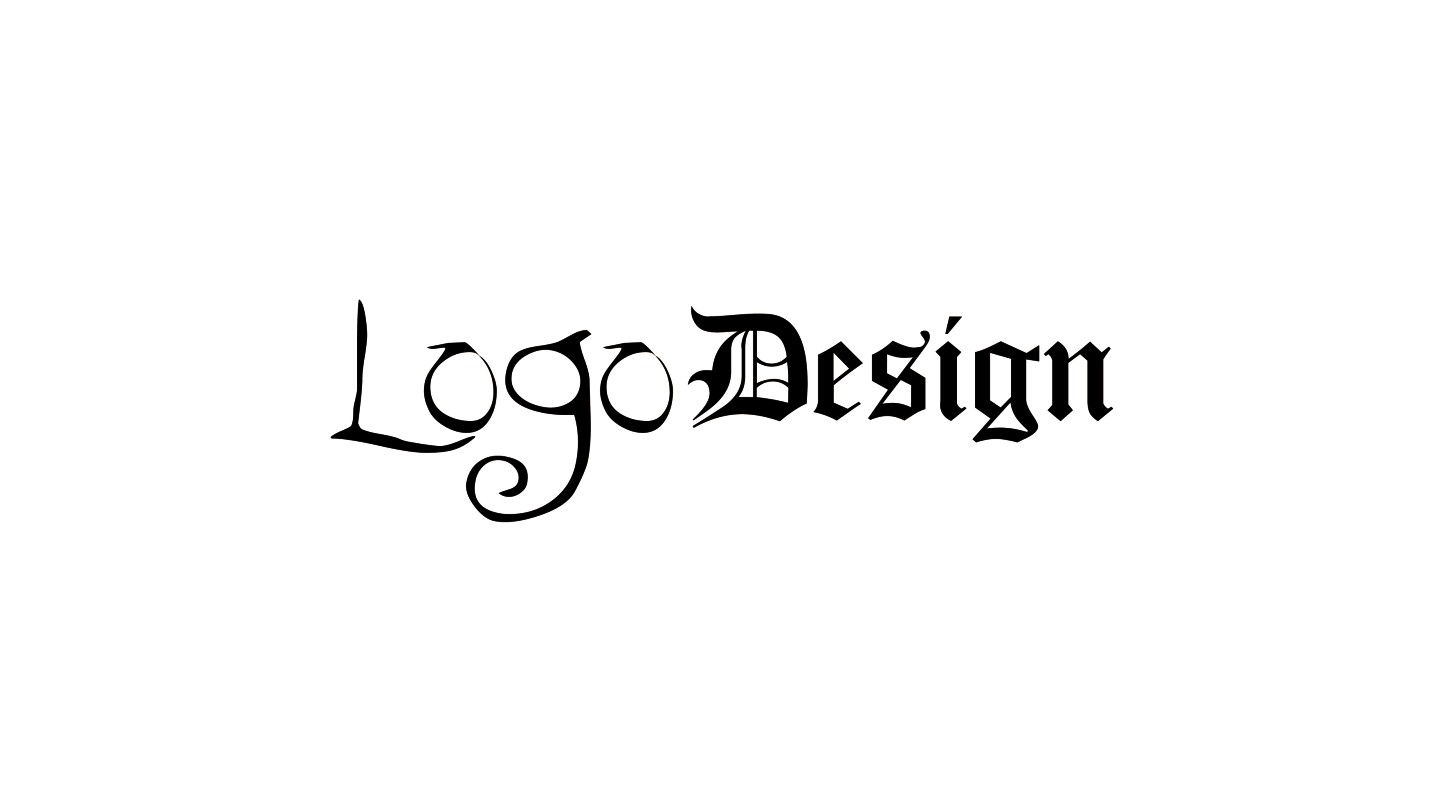
Figure 8-17: Typeface selections of contrasting styles can cause confusion.
Type doesn’t always have to be set in the same font from a particular typeface family. Emphasis can be added or reduced depending on the attributes of the selected fonts (see Figure 8-18).

Figure 8-18: Different weights can add or reduce emphasis.
Try to limit the number of typeface choices to a maximum of two or three. Even if the styles are similar or the fonts are from the same family, too many typefaces can make the name difficult for the viewer to decipher (see Figure 8-19). If the type isn’t easy to read, it won’t be easy for the viewer to remember the logo.
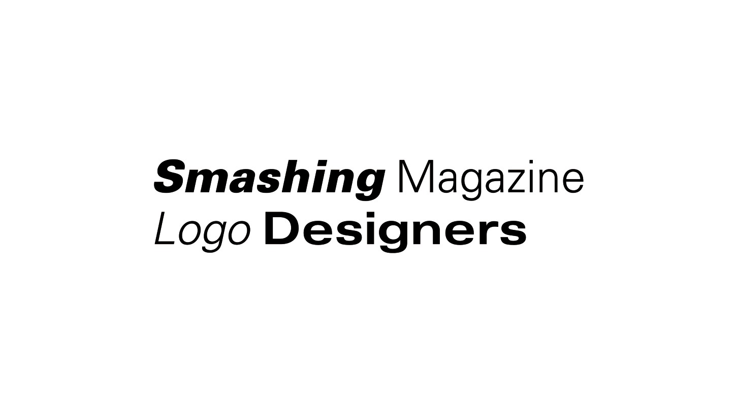
Figure 8-19: Using too many typefaces affects the legibility.
Dealing with large amounts of type
Having to work with what feels like the world’s longest brand name can often leave you scratching your head (see the following figure). Before you make any severe changes to the way in which you intend to display the type, make sure you make your ideas clear to the client.
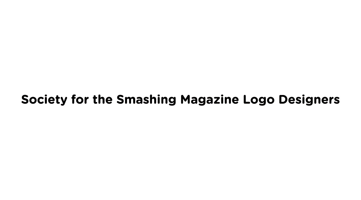
An example of a long brand name.
The obvious solution is to break up the text into separate lines if the client allows this (see the following figure). The lines of type should be of similar width so that the balance is not reduced. The reduced focal area not only makes it easier to work with in the future but also improves the scalability.
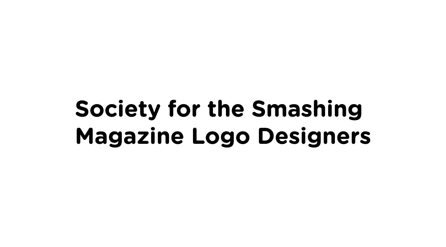
Adding a line of type to improve legibility.
If the brand name includes a signifier, such as the location or profession of the client, does it hold as much visual importance to the main name? Words such as Worldwide, Architects, and Limited don’t have to be placed on the same line as the main brand name; they also can be set in a smaller size. This can actually improves how quickly the viewer can recall the brand name, while retaining all the relevant information (see the following figure).
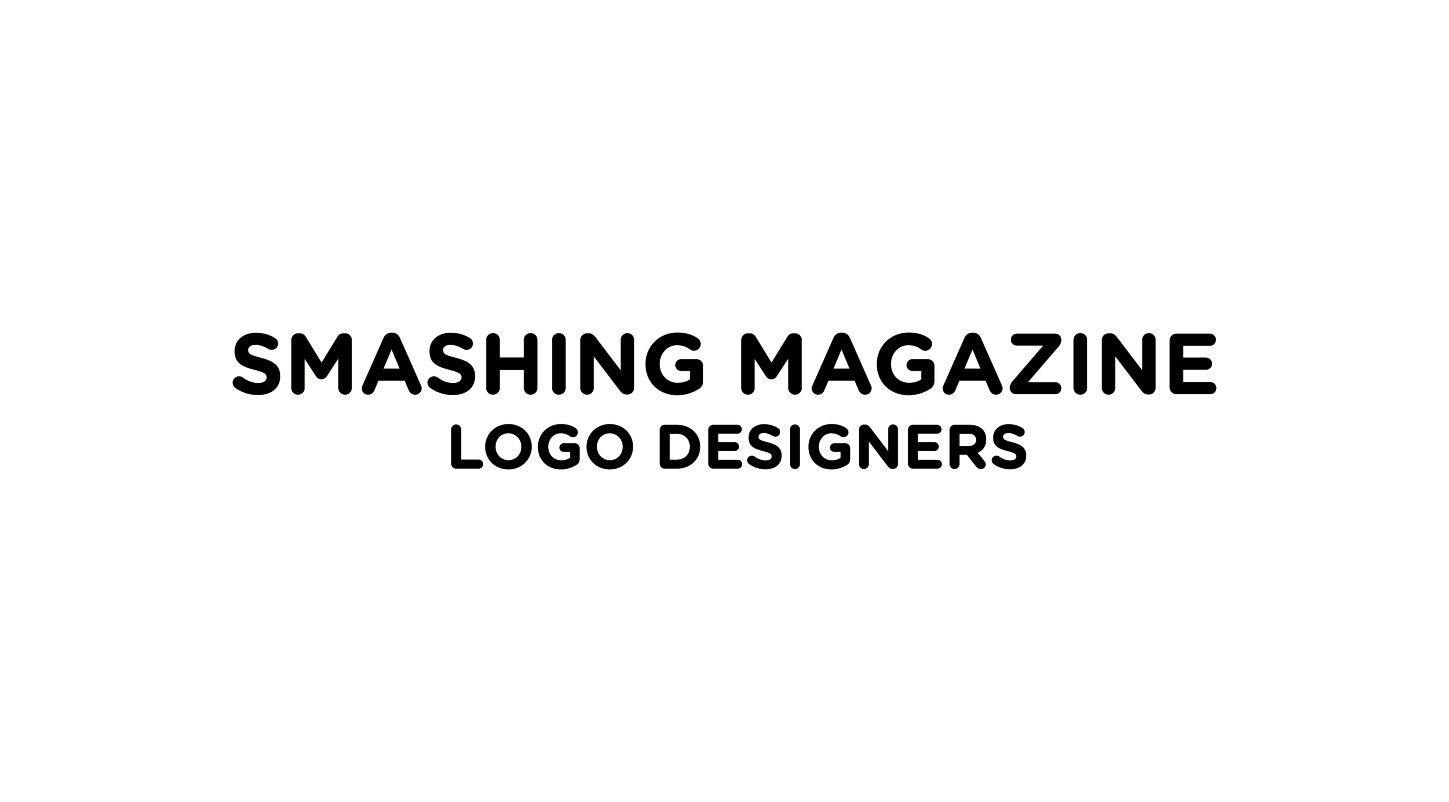
Added focus on the important part of the brand name.
Modifying Typefaces
Altering the paths of the typeface itself should only be attempted by designers who have an in-depth knowledge of type and the art of drawing typefaces.
When resizing the typeface, always make sure that that the scale is of equal proportions. In Illustrator, press Shift + Tab while your type is selected to retain the proper proportions. If you fail to keep the proportions equal, you’ll make the typeface design look squashed, because the overall vertical height or width is being adjusted (see Figure 8-20).

Figure 8-20: This example shows the original typeface (on the left) next to a version that has been incorrectly rescaled (on the right).
To increase the uniqueness of the type and the design as a whole, you can make adjustments to the individual characters of the type or even the whole style, as long as it doesn’t affect the legibility, balance, and emphasis. You can make alterations where you feel they could improve the visual output. For example, there are a variety of ways I can modify this letter A set in Gotham Medium (see Figure 8-21).
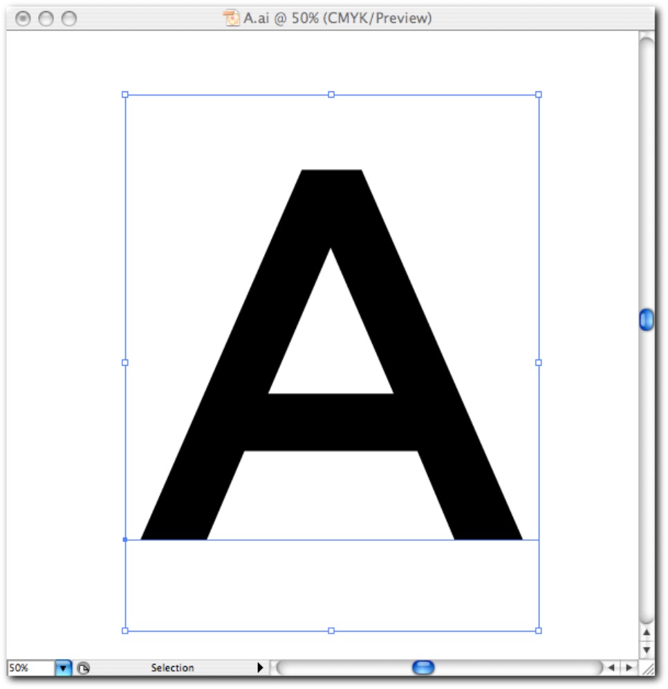
Figure 8-21: A letter that I may want to modify.
Here are the steps to take to modify a letter:
1. In Illustrator, choose Type → Convert Outlines. This transforms the letter into an editable vector path. You’ll see the points that make the path (see Figure 8-22).
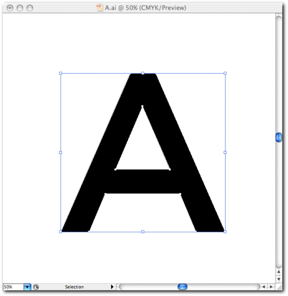
Figure 8-22: Type converted to a vector path.
2. If you want to remove any area of the fill, select the Pen tool (P) and draw the shape of the area you want to use, using a color fill of white to symbolize the negative space, while using the arrow keys to move any points of the newly drawn path into position (see Figure 8-23).
3. To make sure that the white negative space that you’ve drawn removes the unwanted area from the character, select both the path that you drew and the original A and open the Pathfinder tool (choose Window → Pathfinder). If you click the Subtract from Shape Area button, the white path will remove the fill behind it (see Figure 8-24). Choosing Object → Expand Appearance makes the new points editable for further refinement if needed.
There are no limits to what you can do with modifying type. If you ever adjust the height, width, or common attributes for a character, be sure to apply the same alteration to the rest of the characters; otherwise, the type will look inconsistent.
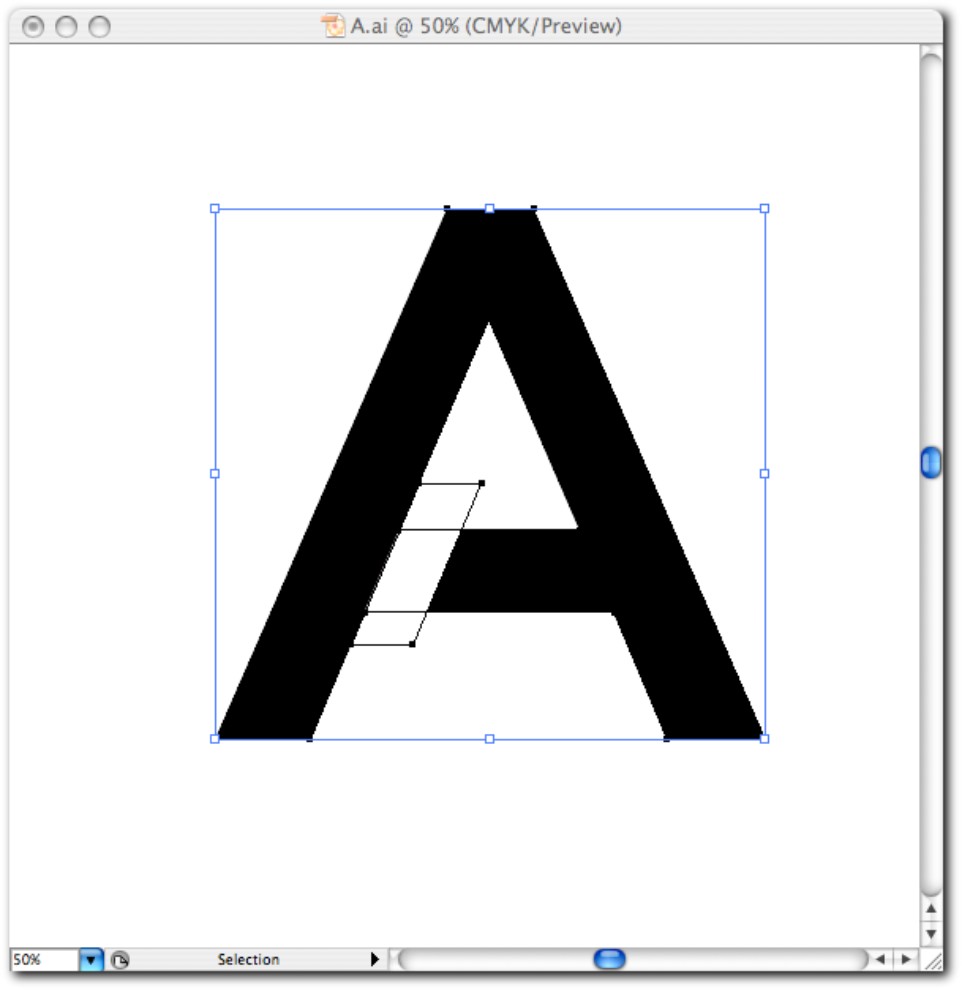
Figure 8-23: Drawing a new path on top of the type path
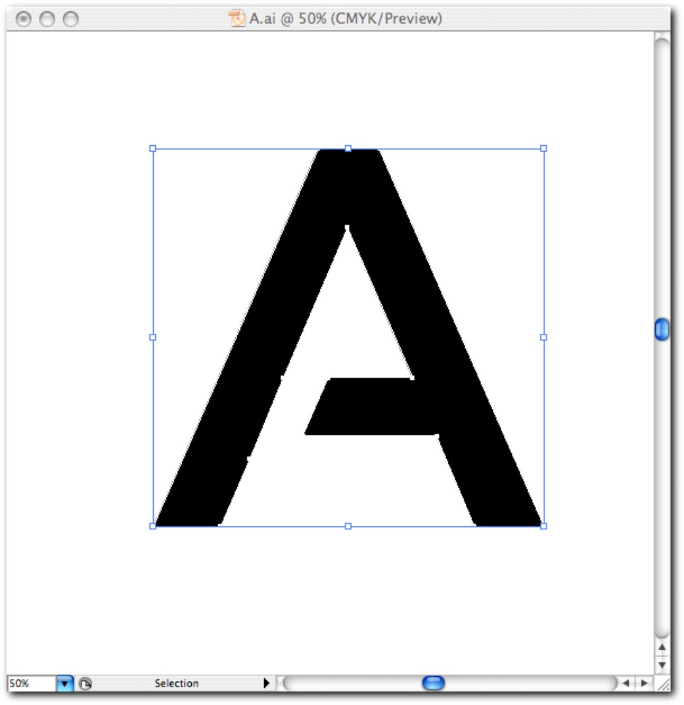
Figure 8-24: The new editable path.
Using symbols of ownership
Some designers think that it’s common practice to add a symbol to every logo they design to show that it’s copyrighted. You should only use any of the symbols of ownership when relevant, not just for decoration. Copyright law is very complex, but when it comes to logos the use of these symbols is fairly simple:
• The Registered Trademark symbol (®) should be used only when the logo has been officially registered with a national trademark office. It’s even illegal in some countries to use it without being officially registered. The ® symbol carries legal weight, meaning that a Registered Trademark has increased protection against use without prior permission.
• The Trademark symbol (™) and the Service Mark symbol (SM) can be used for anything that the owner considers to be a trademark or a service mark but hasn’t officially registered. The ™ and SM do not carry any legal weight—they just help the client in making it publicly known that they could apply to register the logo as a trademark if they wanted to do so.
• The Copyright symbol (©) is irrelevant to logos because it signifies authorship rather than ownership. If the logo isn’t being used by a client, then the designer may add the © symbol followed by a copyright disclaimer if it’s to be shown in the public domain for portfolio purposes. You automatically own the copyright of any original works that you create as long as you can prove it.
If in use, any of the symbols should be small enough so as not to interfere with the design of the logo, but large enough to be recognizable. The common position of a symbol is in the top or bottom right-hand corners of the design so that it’s the last element that the eye reads.
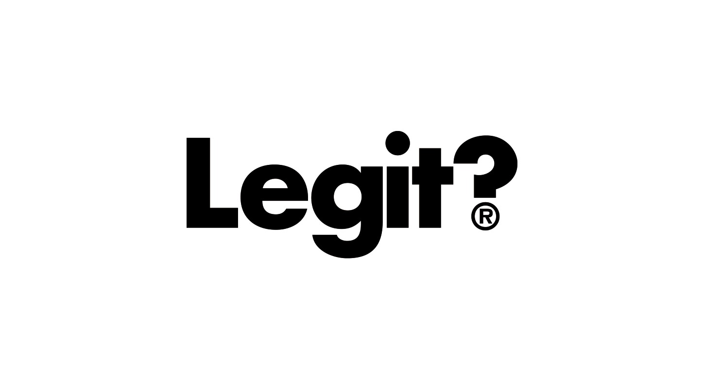
Is the logo really a registered trademark?
