Segmenting the world: Differences that make a difference
What you’ll learn
In this chapter, you will see how a statistical procedure called cluster analysis can help you group people, products or any other things based on (quantifiable) similarity. This lets you come up with targeted marketing strategies or helps you group employees who might need similar training. Cluster analysis is one of the most widely used unsupervised machine learning techniques; that means it requires no prior training data to do its job properly. You can use it for the automatic analysis of emails, photos, books, social media posts or customer surveys. There are different clustering methods, depending on the type, size and structure of the data. All of them, however, have certain benefits and drawbacks associated with them. So, having a basic understanding of clustering is helpful to use analytics results more judiciously (as they can vary dramatically).
As Herbert Simon, the only management scholar who ever won a Nobel prize in economics, put it: ‘An early step toward understanding any set of phenomena is to learn what kinds of things there are in the set – to develop a taxonomy’. But how do you develop a taxonomy and why do you need one?
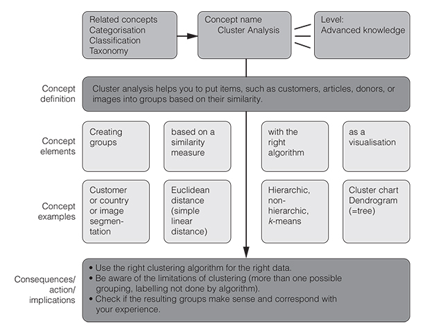
Well, the how is what this chapter is all about, namely cluster analysis – what Google and Amazon use to organise their data or to offer you recommendations. Cluster analysis is an iterative algorithm to group items based on their similarity regarding any number of given features (Figure 5.1).
The why should become clear if you look at the dialogue box below. We need taxonomies (what we call a classification that has been calculated quantitatively) whenever we have too many things to cater to (Bailey, 1994). It is easier, to pick up on the example above, to adapt e-mail messages to 12 different groups of clients than to 30,000 individual clients. Typical business applications of clustering are market segmentation, i.e., grouping people by their purchasing power, values, age, cultural backgrounds or past spending, to name but a few possibilities. Another application would be a risk-based segmentation where you could group your customers based on their credit history, for example. But clustering is also used in contexts such as HR, operations, insurance, project management (to cluster similar projects), in real estate (to find similar houses) or in urban planning. In these contexts, the power of this approach helps to distinguish meaningful groups of people, problems, projects, accidents, locations, houses or even regions based on key characteristics.
Data conversation
Josh’s organisation has grown enormously over the last three years. Josh is the proud founder and CEO of a charity-oriented e-commerce site with now more than 30,000 clients who order anything from ecologically friendly coffee cups to blankets on his online shop. In light of an upcoming holiday, Josh is wondering how he should communicate with these clients, as they range widely in terms of age, spending, country of residence and product preferences. To make sense of his current customer groups, he is asking his analyst Rose to come up with a customer segmentation ‘that makes sense based on their characteristics and purchasing behaviour thus far and that the marketing and sales team can then use to tailor Christmas messages to each segment’.
Rose is thrilled by this mission and tells Josh that she will run a cluster analysis on their internal customer database. Josh is happy that there is a method for his requests and has high hopes for the results.
When Rose presents her findings, however, he is anything but happy: Rose shows him 12 different customer groups and cannot pinpoint the one factor that distinguishes each group from another one. She even seems a bit unsure if the groups that she proposes are really the right segmentation. So, Josh decides that he should probe deeper and ask Rose in the next meeting what she has done to get to those groups and if the results from the cluster analysis could not be interpreted differently.
To do that, however, he believes he should first get a better understanding of clustering himself before confronting Rose. She has already thrown in a lot of jargon in their first discussion, and he had no idea why she brought up dendro-somethings and an old Greek geometer (Euclid), square roots and sums and even talked about the Matrix.
Josh now digs cluster analysis and feels prepared for a follow-up conversation with Rose.
He thanks Rose again for the analysis and asks: ‘Which clustering algorithm did you use and why?’ Rose answers that she used hierarchic cluster analysis. Josh thus asks Rose if she could show him the dendrogram that resulted from the cluster analysis algorithm. When Rose shows him the tree diagram, he realises that there was a simpler solution than the 12 groups mentioned by Rose. At a higher level of the dendrogram, there is a grouping that consists of just four groups. When Josh asks Rose why she suggested 12 groups instead of four she says: ‘I thought about that as well but then it seemed too simplistic and that the groups were a bit heterogenous that way, especially because of the outliers in each group, but it could still work for communicating to the customers’.
Josh and Rose first eliminate a few outliers, examine the new results, and then reduce the number of clusters to just four. They jointly find good names for each group (the hyperactive, the focused value shoppers, the occasional visitors, and the very passive) which helps to instruct the communication team on the specificities of each group and how to address them in their subsequent communication. They also analyse the outliers in each of the four groups and decide to address them separately.
Rose is as stunned at the end of the meeting as she is intellectually satisfied. Not only did she underestimate her boss’s data literacy, but also how much value a good data dialogue can bring to the business. She is glad that Josh and her ‘tortured’ the data (as Josh called this) till it spoke to them more clearly.
Broadly speaking, clustering helps us to deal with complexity and variety, and the mere mass of data or items. It helps us to literally see similarities and differences among things at one glance.
A cluster is basically any group of similar objects, whether its customers, houses, cities, donors, patients, products, risks or locations. But how, you may now ask, do I get to my clusters so that I can use them for planning, training, marketing or other purposes? How can I use the power of cluster analysis to segment my customers, group my photos, or find new market niches? These questions are answered in the next section where we describe the clustering process and the different kinds of clustering algorithms, as well as their application areas.
How clustering works
It is important to understand how clustering works, to interpret its results correctly, whether in marketing research, HR analytics, R&D or in other application areas. Creating groups based on their degree of similarity with regard to certain features is an iterative process, where certain steps have to be repeated by the computer to get it right. So even the computer cannot do this in one go. And it will not be able to do it alone, it needs you (yes you!) to give it some guidance and common sense in the process and come up with descriptive labels for the groups it has found.
You can let the program find the best clusters iteratively by giving it a suggested number of clusters to create and instructing it to find the best midpoint for that data cluster and then begin the process anew. This is called the k-means clustering approach. The letter ‘k’ designates the number of suggested segments or groups. An alternative to this would be to use a hierarchic clustering algorithm, where the computer starts building groups either from individual items to larger groups or vice versa. k-means is great for big data, while hierarchic cluster methods give you more flexibility as to how granular you want the groups to be (and it gives you really cool graphic representations called dendrograms).
Whatever mechanism you choose to build groups out of data, the ultimate number of groups may depend on your judgement call (and on the similarity measure that you chose) and what you believe is the most useful segmentation. There are certain rules of thumb for how many clusters make sense though. For example, if you jump from say five groups to four and notice that the variance within a cluster suddenly becomes a lot greater, you may want to stick with the initial five groups.
Summing up, here are the key steps you need to go through to group data with the help of cluster analysis:
- 1. Choose the data items that you want to group, such as customers or donors.
- 2. Gather data about those items (such as your customers’ or donors’ age, spending, location etc.). In other words, choose the variables that you want to use as clustering criteria.
- 3. Choose a way to calculate similarity (more on this in the following section).
- 4. Choose a clustering algorithm that finds items that are similar and groups them together.
- 5. Let it run (for a couple of times and perhaps with different clustering methods).
- 6. Examine the results and see if they make sense to you. For this step you may want to visualise the results of the cluster analysis (more on this option later).
- 7. If they do, give the resulting group informative names or labels that capture their essential traits (or how to deal with the respective group).
- 8. Devise measures to deal with the groups that have emerged (such as a segmented communication approach).
Simple enough, right? Key to this process, however, is quantifying similarity. Let’s look at how this is done now so that you can understand what it really means to segment customers, employees, projects, or any other set of things.
What is similarity – statistically speaking?
As you have gathered by now, the whole notion of segmentation centres around the concept of similarity. It is thus helpful to develop a deeper understanding of what similarity really means in statistics and data science. A good place to start to build that understanding is the so-called Jaccard coefficient or index (then we will move on to another one called Euclidean distance).
The Jaccard index, also known as ‘Intersection over Union’ or the Jaccard similarity coefficient is a metric used to compare the similarity of certain sample sets (Jaccard, 1912). It is defined as the size of the overlap divided by the size of all of the data of the sample sets, or visually speaking, the fraction shown in Figure 5.2.
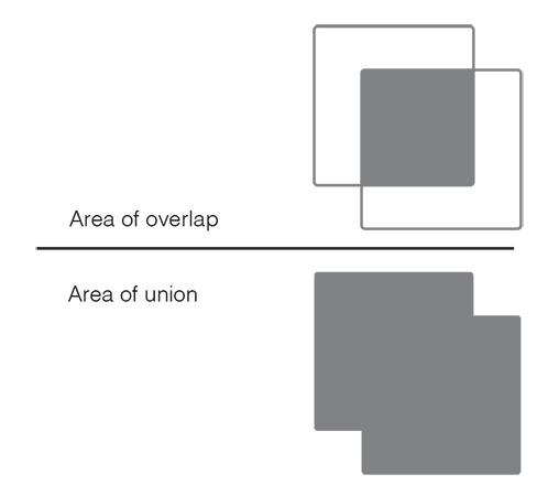
The Jaccard coefficient is a very simple quantification of similarity among sets. It can be used to detect plagiarism, or for other text mining purposes. A value of 40 per cent, for example, would indicate that the items in a group share 40 per cent of all their features. They are identical with regard to 40 per cent of their attributes but differ with regard to 60 per cent of them. Think of the members of a family and their visual traits like hair, eye colour, nose shape, or height etc. In the case of a family with a Jaccard coefficient of, say, 20 per cent, we can hardly tell that they are related. With a Jaccard coefficient of 80 per cent, we see at one glance that they must be part of the same family.
The Jaccard coefficient is quite a restricted way to compare entire groups regarding their members. For many other applications, however, we need a more versatile measure of similarity, a so-called distance metric (to express degrees of similarity). With a single variable, similarity is super simple: the smaller the difference regarding a variable (say age of a customer), the more similar items (the customers) are. Or another example: two individuals are similar in terms of purchasing power, if their income level has a small difference and the level of dissimilarity increases as their income difference increases.
Now multiple variables (or features of comparison) require an aggregate distance measure. As we compare items along many attributes, such as income, age, consumption habits, gender, it becomes more difficult to define similarity with a single value. For this, we have a handy little formula that helps you summarise the differences along various features.
The most famous measure of distance is the Euclidean distance, which is the concept we use in everyday life for straight line distances (think of a direct flight line between two cities). It is important to understand how this measure of similarity comes about, so that you understand what a data scientist really means when he or she says ‘we grouped similar data’. So, bear with us for a minute and try to digest the following formula.
To calculate this distance, you take the differences between the individual attributes and sum them up. You actually first square each difference so that negatives drop out and don’t affect the sum of the differences. You then get rid of this square again by taking the square root at the end. This gives us a neat little formula for calculating the similarity of any given data:

This basically means that we can express the many differences between two things as the distance between two points. This distance is made up of all the differences among the two things summed up. So Euclidean distance between two things can be expressed as the sum of their attributes’ differences and that squared so that negatives do not play a role anymore. We sum up all the absolute differences, in other words.
Let us take a simple example to bring this formula alive:
Say we have four customers, and we compare them according to the money that they spend on our e-commerce shop in total per year.
| Money spent | |
| Client 1 | 400 |
| Client 2 | 150 |
| Client 3 | 420 |
| Client 4 | 100 |
So, calculating their differences pairwise would give us these values:
| Client 1 vs Client 2 | 400 − 150 = 250 |
| Client 1 vs Client 3 | 400 − 420 = − 20 |
| Client 1 vs Client 4 | 400 − 100 = 300 |
| Client 2 vs Client 3 | 150 − 420 = − 270 |
| Client 2 vs Client 4 | 150 − 100 = 50 |
| Client 3 vs Client 4 | 420 − 100 = 320 |
The numbers on the right express the differences among the customers in terms of their spending. We see that client 1 and client 3 are very similar, whereas clients 1 and 2, as well as 1 and 4 are very different.
Now money spent may not be enough to create a good grouping of these clients, so we also have a look at their age next:
| Money spent | Age | |
| Client 1 | 400 | 55 |
| Client 2 | 150 | 37 |
| Client 3 | 420 | 64 |
| Client 4 | 100 | 29 |
To combine the age differences with the spending differences, we should use the formula we have just learned on the previous page. Doing these gives us these values:
| Client 1 vs Client 2 | √((400 − 150)2 + (55 − 37)2) = 250 |
| Client 1 vs Client 3 | √((400 − 420)2 + (55 − 64)2) = 22 |
| Client 1 vs Client 4 | √((400 − 100)2 + (55 − 29)2) = 301 |
| Client 2 vs Client 3 | √((150 − 420)2 + (37 − 64)2) = 271 |
| Client 2 vs Client 4 | √((150 − 100)2 + (37 − 29)2) = 50 |
| Client 3 vs Client 4 | √((420 − 100)2 + (64 − 29)2) = 322 |
Ta-da! We have just quantified multidimensional similarity. We now see that when taking both attributes into account clients 3 and 4 are the most different from one another, whereas clients 1 and 3 are the most similar to each other. This will help us target measures or marketing messages at this group of clients, and not at each client individually.
We can now use these values to map out the so-called Euclidean (or direct) distance between the customers and create groups based on this relative positioning of all clients (actually, the computer will do this for us with the help of the calculated distance measures above). In reality, we would of course do this with many more customers than just three and with many more dimensions than just spending and age. We also might use another (or an additional) distance measure than the Euclidean one. But you get the point.
Please note that the choice of the preferred similarity measure will affect your results (i.e., the groups the computer generates). Clustering analysis in practice often requires sensitivity analysis to see whether the clustering results remain stable when you switch from Euclidean distance to another similarity measure. So testing for the robustness of your clusters is always a good idea. Switch your distance measures and see if this leads to other groups.
Visualising groups
How does the computer now work with these similarity values? In the case of hierarchic cluster analysis (where you first build larger groups that are then split into smaller ones), it calculates a so-called similarity matrix – that’s the matrix Rose was mentioning to Josh – where the pairwise comparisons of differences are mapped out in a huge table.
The similarity matrix is sometimes also referred to as a distance matrix (as the values in it are the ‘distance’ between items, as calculated above). Based on this matrix (whose values are usually normalised to fall between 0 = no similarity to 1 = identical), the computer can calculate likely groupings. Note that other clustering algorithms, such as k-means, do not use this pointwise distance to calculate groups, but rather other measures such as means and deviations from the mean (for initially stipulated groups).
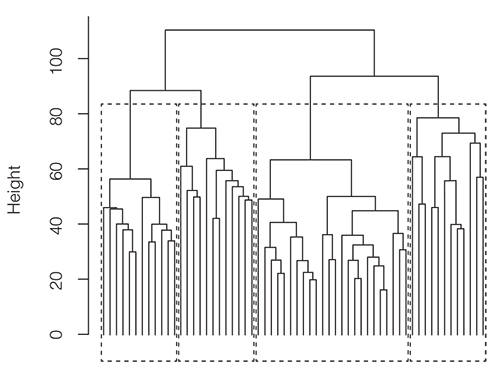
We can display the distances in a similarity or distance matrix visually in what is called a dendrogram, a simple tree diagram where the length of a branch indicates the distance between clusters (or items at its lowest level). Figure 5.3 shows an example of a simple dendrogram.
This dendrogram tells you that customers 3 and 1 are more similar to each other than to customers 3 and 4. It also tells you that the similarity between 3 and 1 is actually slightly bigger than the similarity between customers 2 and 4: the lower the items (or splits) on the dendrogram, the more similar they are, the higher the branching the less similar the items or groups are.
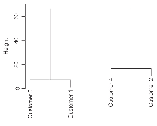
In reality, dendrograms look a lot more complicated than the above example and it’s not always easy to decide at which level to cut the tree and build a group. In the example above it is clear that we can create two clusters, one consisting of customers 3 and 1, and a second cluster consisting of customers 2 and 4. Let’s now examine the next, more realistic dendrogram. Where do you define the clusters here? A good rule is to cut wherever there is the most white space between branches. In the dendrogram below, this would give us just four main clusters. If useful, however, you can also use sub-clusters later for other purposes. That is the advantage of hierarchic clustering (and that you don’t need to specify how many clusters you want upfront like in the k-means approach). Its disadvantage is that it is often cumbersome (and a bit slow) for really big data sets. It is also particularly sensitive to outliers, although they can usually be spotted well when you look at the resulting dendrogram. For extremely large data sets, the dendrogram can also lose a bit of its clarity and become cluttered and hard to read (Figure 5.4).
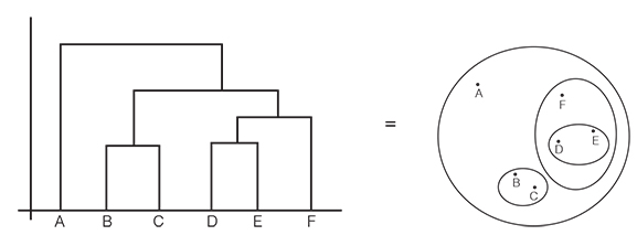
There are other ways to display distances, such as in a 3D space or on a simple plane. The latter visualisation would look like the figure in Figure 5.5 (right). The technical term for this graph would be a multidimensional scaling plot or a (self-organising) similarity map.
In our work with managers, however, we found that dendrograms often lead to more fruitful data discussions than the plot on the right, as they found the tree a more natural way to browse groups and levels. Unfortunately, though, many visual analytics packages, like Tableau or Power BI, only give you the result displayed on the right and cannot generate a dendrogram. Please note that there are no cartesian coordinates (there is no x- or y-axis) on the graphic on the right and that the only thing that counts is the direct distances among the items A to F (so D is more similar to E than F is to A). It may be a good exercise to visually inspect and compare the two graphs and see if you understand that they are equivalent (Figure 5.5).
![]() How to say it
How to say it
Help people in interpreting clustering charts correctly
Be careful when you are showing dendrograms or similarity maps to others, as they can be easily misinterpreted (or overly cluttered). Be sure to explain that in a dendrogram the forkings represent different groupings of items and that the lower a forking happens, the more similar items are below it.
When showing a similarity map, you should emphasise that this type of chart does not have proper (horizontal and vertical) x- and y-axes. You ought to emphasise that the only meaningful information is the direct (flight) distance between items to represent their degree of similarity or difference.
Caveats for clustering
Before we get all too enthusiastic about the cool application possibilities of clustering, there are several caveats that we need to be aware of when segmenting data with the help of cluster analysis. Even as a manager, you should be aware of the risks and limitations of this grouping approach as they affect the ultimate result and its implications. Here are the top three limitations of cluster analysis.
- 1. Cluster analysis will not always give you clear cut groups. You need to try different algorithms, different numbers of groups, or different levels and apply your experience to find the grouping that is right for your data scope and application context. Ask your data scientists how well the items really fit the cluster they are assigned to by checking that the so-called silhouette scores are closer to 1 than to 0. The silhouette value simply is a measure of how similar an object is to its own cluster compared to other clusters. If many points have a low or negative value, then the clustering may have too many or too few clusters.
- 2. The computer does not come up with an explicit rationale or with descriptive labels for the groups that it has created. You will have to use your common sense and experience to diagnose the underlying patterns in the clusters. The clusters will not always be organised in the most action-oriented manner, so working with different versions (clustering approaches, similarity measures, levels, or number of groups) may help you find the best segmentation.
- 3. As with many other statistical analyses, (hierarchical) cluster analysis is sensitive to outliers. So, make sure you analyse the role of outliers in your data set. Try running a cluster algorithm also with a version of your data set where the outliers have been deleted. See if this impacts the created groups.
A word of caution also regarding the scope of this method, as cluster analysis is not your go-to method for all things grouped. In fact, you may want to distinguish cluster analysis from other statistical procedures, such as dimension reduction or factor analysis. The latter is also important in HR, marketing or sales.
It’s useful to distinguish cluster analysis from other ‘segmentation’ techniques in this context. Remember that cluster analysis is used to group cases (things, customers, products) whereas factor analysis or principal component analysis (PCA) attempts to group features – characteristics or traits (such as size, volume, frequency etc.) that belong to one dimension for example. They are thus ‘dimensionality reduction’ techniques. Factor analysis (a very popular statistical technique) assumes the existence of latent or hidden factors underlying the observed data, whereas PCA tries to identify variables that are composites of the observed variables. So, if you want to group customers, your best bet is probably cluster analysis. If, however, you want to find out which factors relate to similar customer behaviour, then you might use one of the other techniques.
Cluster analysis, as mentioned earlier, is an example of unsupervised machine learning, as it is based on iteration and an examination of best fitting results and not on previously labelled training data (as in supervised machine learning). Because of this, you need to take the results of cluster analysis with a grain of salt and test them against your own judgement or experience, especially regarding group boundaries. You can care less about factor analysis as it is more of a behind the scenes tool for your data analyst than a front-end data torturing tool. Cluster analysis is typically used for such areas as customer segmentation, where an optimal solution is not guaranteed. You would need factor analysis, for example, if you would like to devise a personality test.
Having seen the benefits, types, procedures, visualisations, and caveats of cluster analysis, we can now return to Josh and Rose and how their data discussion turned out eventually.
Key take-aways
Whenever you need to make sense of data and think that grouping may be a good approach, ask yourself the following questions:
- 1. When looking at the results of a cluster analysis, ask yourself if this is the only way the group boundaries can be drawn? Does it correspond to your experiences; does it make sense? Could you reduce the number of groups for your purposes?
- 2. Are there outliers? What do we know about them? How do they affect the built groups?
- 3. What is the right number of groups for our purposes when we look at the dendrogram in detail?
- 4. How can we label the resulting groups in an informative manner, perhaps indicating how to actually deal with each respective group?
- 5. What is the best way to communicate the groups to your colleagues? If you have used hierarchical cluster analysis, think about showing a dendrogram. If you have used k-means or other non-hierarchic clustering algorithms, think about using a similarity map.
- 6. Am I grouping items or rather features? If I want to group features, such as personality traits or product characteristics, then factor analysis is the right choice. If you want to group elements, such as clients or products, then clustering algorithms are the right approach.
 Traps
Traps
Analytics traps
Possible risks with regard to cluster analysis are:
- ●Taking the results of the clustering for granted without conducting a sanity check or common-sense validation of the resulting groups.
- ●Using a clustering approach when factor analysis would be the right method because you want to group features (think personality traits) and not items (think customers or employees).
- ●Giving the groups non-descriptive labels that do not give a sense of the group items’ characteristics.
- ●Not understanding the impact of the chosen similarity measure on the final grouping. Hence, be sure to ask for a sensitivity analysis of the type of similarity measures used. That means that the analysts show you the impact (on the resulting groups) of using another similarity measure.
- ●A lack of data preparation that can greatly affect your clustering results (such as standardising versus not standardising the input variables). So ask whether data preparation has been done judiciously (and how).
Communication traps
- ●Don’t dive right into the details of the clustering algorithm that you used and why it is the right one, but first set the scene with regard to overall purpose.
- ●Make sure you use an interactive version of a dendrogram when using it in a live presentation. This will allow you to show the different possible groups that can emerge from a cluster analysis.
- ●Pro-actively mention the limitations of the clustering method.
Further resources
A simple YouTube tutorial on four of the most important clustering techniques:
https://www.youtube.com/watch?v=Se28XHI2_xE
A great and concise book that also covers cluster analysis in a succinct matter:
Bailey, K.D. (1994) Typologies and taxonomies: An introduction to classification techniques. Sage.