Detecting data distortions: Analytics biases that everyone should know
What you’ll learn
In this chapter we discuss frequently made mistakes in the analytics process. These so-called biases affect the quality of analytics-based decision making negatively and should thus be recognised and avoided.
Like most of you, we trust our intuition in areas where we have lots of experience, but we rather rely on data where we don’t. In the latter case, we feel more secure and confident when we have relevant data. However, caution is warranted as the mere availability of data may give us a false sense of security.
So, whenever there is relevant data, we feel that our decision making must improve.
But that ain’t necessarily so.
Sometimes data is the very reason why we make a wrong decision.
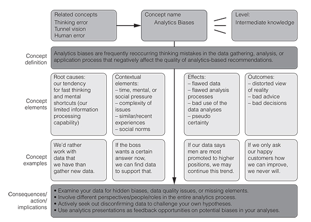
Why? Because data, its analysis, or the way that it is communicated or used may be severely biased or misleading (Figure 6.1). That is the bad news.
The good news is that you can cultivate a healthy scepticism against data biases: you can detect or even prevent such distortions. You can immunise your analytics endeavours against these recurring thinking errors.
How? By knowing about them, by recognising them in your analytics work, by understanding (and addressing) their root causes and, of course, by knowing their remedies. See if you can already recognise a few problematic aspects in the short dialogue below.
John is a junior risk analyst in an insurance company. He is reporting to Beth who runs the analytics team of the firm. There is a request from a risk management team who recently detected a slight increase in claims (i.e., reported damages to cover by the insurance) for one group of individual customers and wants to understand why that is. Having looked at the data, John schedules a meeting with Beth to discuss this request and his findings thus far.
John:I’m glad that we get the chance to talk about that case of the spiking damages, Beth.
Beth:Yes, me too, tell me more about it. I only read the e-mail from the risk management team that has noticed the increase in claims.
John:When I got their claims data, I remembered reading an article last week about how the lockdown may lead to more domestic accidents. So, I suspected this might be the cause here as well and started looking at corona-related causes in those claims. I was quite sure that many of the damages were related to the quarantine and to activities that happen when you stay in your home office and guess what: I found quite a few of them. So, I looked at clients whose job was directly affected by the pandemic and indeed I found that many of them had claims related to accidents while working at home. I even ran a regression on that data set and the R-squared values were excellent, which kind of proves my point. There is a corona premium that we are paying out due to increased home office work and thus increased domestic accidents. I see a clear causal chain there, more time at home leads to more accidents at home. Perhaps we should advise the communication team to run a campaign on ‘how to keep your home office safe’.
Beth: Wait just a minute here, John. Haven’t you focused a bit too much and too early on just corona there as a cause of the rise in claims? Couldn’t there be other reasons why the claims went up?
John: Well, the data I collected is quite clear on that point: home office is the culprit.
Beth: John, I want you to re-do the analysis on this. This time be as broad and open minded as possible and look out for data that contradicts your hypothesis that the increase in claims is due to increased home office work. Look at other clients as well who also work from home and whose claims have not gone up, okay? Look at contractual differences, at the demographics and the rest.
John: Um, okay boss, I’ll get right to it. Only the paranoid survive, I guess.
John: Thanks Beth for this follow-up meeting opportunity. I must apologise. I really jumped to conclusions last time and fell in love with my hypothesis of corona being the cause of all evil. I was too selective in my analysis of the data and just wanted to confirm my own hypothesis. It turns out something completely different caused the spike in claims that had nothing to do with home office work. The real driver of the increase is that for many of the clients with increased claims, their contractual conditions are about to change. So, it seems, that quite a few of them just wanted to profit from the old contract parameters and thus filed a claim just before their conditions changed. This happened across the board, including customers who did not work at home, but continued working in grocery stores etc.
Beth: Wow, so we scrap the ‘safe home office campaign idea’ and we should immediately advise our agents to carefully re-check that all these claims are really legitimate, right?
John: Exactly. It probably has no connection whatsoever with corona. Sorry about that Beth. It could be fraud in some of the cases. I just didn’t think of that possibility as we had very few fraud incidences so far.
Beth: Well, when people are financially in dire straits, as many are now, this is actually more likely to happen. So, there is a corona connection after all, John, just not the one you were thinking of.
John: That is a small consolation. Next time before I check my data, I need to check my thinking, that’s what I’m really taking away from this. And thank you for your scepticism, it made a huge difference and ultimately paid off.
Did you recognise the hidden biases in John’s work? Maybe this will help.
Figure 6.2 presents ten crucial biases in the analytics process. If you are using data in HR processes, in risk assessment, in marketing or sales, in controlling or in credit approval, then you want to make sure you are steering clear of these ten analytics pitfalls. In these contexts, any of the three biases outlined below can lead to decision fiascos, as biased data may lead you to wrong recommendations.
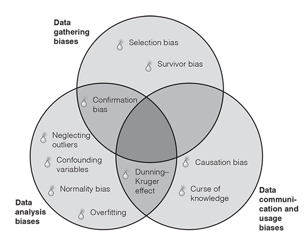
The biases are structured along the data gathering, data analysis and data application (i.e., communication and usage) process. We had three main reasons for choosing our list of ten crucial biases from the large group of biases (see our interactive map at bias.visual-literacy.org for more than 180 of them).
- ●We have seen that they occur frequently in the analytics process of many organisations.
- ●They have a big negative impact on the quality of analytics and the subsequent decisions.
- ●They can be prevented as effective countermeasures exist against them.
In the following section, we discuss why these biases happen (their root causes), how you can recognise them (the symptoms) and of course how to fight them (their remedies) to improve the quality of data analytics (Figure 6.2).
1. Data gathering biases
It sounds paradoxical, but one of the biggest mistakes that you can make in analytics is simply working with the data that you have.
It’s like in the story of the man searching for his keys under a streetlight. A passenger asks him whether he is sure that he has lost them there, to which the man replies: ‘No, I lost them over there, but the lighting is much better over here’. So just because you have data, doesn’t mean that it’s the right one for your decision.
When looking for data, be aware of three specific biases that may distort your data sourcing: our tendency to use conveniently available data instead of the right data, our tendency to look at data that was completed rather than data that is still missing (think of customer surveys), and our tendency to seek data that confirms our initial opinion. Here is our snapshot of each data gathering bias.
- ●Selection bias
- ●Description: our tendency to use conveniently available data instead of representative data (e.g., the participants in a study differ systematically from the population of interest).
- ●Root causes: time pressure, laziness, budget constraints, technical constraints.
- ●Symptoms: skewed data that does not represent the full spectrum of the underlying population (e.g., overly positive product evaluations), gaps between expected outcomes (e.g., successful product launch) and reality (e.g., the product flops).
- ●Remedies: examine your sampling approach and the inclusion/exclusion criteria that you apply, use randomisation methods when selecting items from your population of interest.
- ●Survivor bias
- ●Description: focusing on the results that came through and ignoring what has not. For example, only analysing completed customer surveys, and ignoring those that have not been fully completed.
- ●Root causes: important data collection opportunities were overlooked, barriers to data completion at the source, cumbersome data entering process.
- ●Symptoms: data is skewed (for example, only happy customers or really upset clients have answered the survey), gaps between expected outcomes and reality.
- ●Remedies: follow-up on data sources that did not yield data and find alternative ways to achieve completion. If possible, make the data entering process a more seamless experience.
- ●Confirmation bias
- ●Description: data analysts sometimes only seek data to confirm their (or their manager’s) opinions.
- ●Root causes: social/peer pressure, opinionated mindset, overly homogenous analytics team, time pressure.
- ●Symptoms: data corresponds perfectly to one’s own hypotheses (‘too good to be true’).
- ●Remedies: actively seek out contradictory data. Split up the data gathering and/or analysis tasks among two independent teams. Ask for data or variables that have been excluded from the analysis.
2. Data analysis biases
Once you have de-biased your data gathering approach, make sure that you also immunise your data analysis against typical statistical biases. These classic statistics blunders are not just the result of sloppy thinking. They may also result from a naïve treatment of data, or an overly narrow analysis focus. Here are our top four data analysis biases.
- ●Confounding variables
- ●Description: not taking forces – i.e., variables – into account that affect the association between two things (i.e., resulting in a mixing of effects). Thinking that a drives b, just because a and b move in the same direction (e.g., swimming pool visits may not drive ice cream sales, as both are driven by hot temperatures).
- ●Root causes: incomplete hypotheses or models.
- ●Symptoms: spurious associations among variables; no observed association, although it would be reasonable to assume that there is one.
- ●Remedies: measure and report all variables that might affect an outcome, include potential confounding variables in your analyses, provide adjusted estimates for associations after the effects of the confounder have been removed.
- ●Neglecting outliers
- ●Description: not acknowledging outliers (radically different items in a sample) at all or simply eliminating them.
- ●Root causes: exotic or extreme items in data sets that go unchecked.
- ●Symptoms: when you plot your data, you see a few items that are far apart from the rest.
- ●Remedies: identify outliers and their impact on the data’s descriptive statistics, use appropriate measures of central tendency (e.g., median instead of mean), run analyses without the outliers and compare results.
- ●Normality bias
- ●Description: not taking the actual distribution of the sample into account (for example, an employee survey where most employees are quite happy with their working conditions).
- ●Root causes: assuming normal distribution for a data set (even if it’s not a bell curve) and running statistical tests that are for normal distribution only (otherwise use non-parametric tests).
- ●Symptoms: unreliable quality indicators for the statistical tests.
- ●Remedies: examine the real frequency distribution of the sample and run the tests that are fit for that kind of distribution.
- ●Overfitting
- ●Description: playing with models so that they fit the data we have, but not beyond it.
- ●Root causes: a limited data sample, a model that is too specific.
- ●Symptoms: a seemingly perfect model that accommodates all the available data perfectly, but is bad at predicting future observations (beyond the dataset).
- ●Remedies: collect additional data to extend and re-validate the model, remove variables that do not really have a relationship with the outcome.
3. Data communication and usage biases
Data has no value if it is not properly communicated and used. The last step in the analytics process – communication and use – is thus of special importance. In this crucial step several things can go wrong. The data analysts could communicate their results badly (incomprehensibly using jargon) or the managers could misinterpret the results (because they overestimate their own data literacy or confuse correlation with causation).
- ●Curse of knowledge
- ●Description: analysts fail to adequately communicate (simplify) their analyses to managers because they have forgotten how complex their procedures are.
- ●Root causes: lacking knowledge about target groups of analysis. Lacking data storytelling skills.
- ●Symptoms: puzzled looks on managers’ faces, off-topic questions, lacking follow-up.
- ●Remedies: grandma test (how would you explain it to your grandmother?). Seek feedback from managers on what they find most difficult to understand. Communication training for data scientists.
- ●Dunning–Kruger effect
- ●Description: managers overestimate their grasp of statistics at times and are unaware of their wrong data interpretation or use.
- ●Root causes: overoptimism of managers regarding their own statistics understanding.
- ●Symptoms: superficial data conversations.
- ●Remedies: the first rule of the Dunning–Kruger club is that you don’t know that you’re a member of it, so enable managers to pre-test their data literacy and discover their knowledge gaps. Ask them challenging questions so that they can see the limitations of their own statistics know-how (in a face-saving way).
- ●Causation bias
- ●Description: believing that one factor causes another, simply because the two are correlated (for example, employee fluctuations and sales).
- ●Root causes: limited statistics understanding.
- ●Symptoms: ‘strange’ relationships that contradict common sense, a design that does not allow for such inferences (e.g., because data was not gathered using strict experimental methods).
- ●Remedies: inform managers about the difference between correlation and causation. Show the additional tests that need to be made to clarify causation (beyond correlation).
Reducing the curse of knowledge
Try the following approaches to overcome the curse of knowledge and communicate analytics in an overly complex manner:
- ●Try to find out how much your audience actually already knows about analytics, statistics, or the data that you are sharing with them. Why not meet one of your data consumers for an informal cup of coffee and assess their previous knowledge in this way?
- ●Explain your data first in a one-on-one session with someone who never had to deal with them before and ask them for honest feedback on how clear you were. Ask him or her what others might find difficult hearing about this data for the first time.
- ●Think about all the terms that you have used in describing the data that could have other meanings. Try to replace those words (such as robust, significant, bootstrapping, distribution etc.) with more specific ones or explain them further.
- ●Make it extra easy for your data consumers to ask questions by encouraging them to do so at various points during a data presentation.
You now know ten of the most relevant biases in the analytics context. Use this knowledge wisely. Bust those biases, detect those distortions and control the quality of your data-based decision making.
So, inform both managers and data analysts about these risks and about their remedies and install safeguards or countermeasures wherever possible. First and foremost, however, protect yourself against the specific biases that are most likely to affect you. Shakespeare’s following famous quote is a useful reminder for this last point:
‘A fool thinks himself to be wise, but a wise man knows himself to be a fool’.
Key take-aways
Whenever you are dealing with data and its analysis, there are a few questions that are important to ask from a bias or distortion point of view:
- 1. Has the data selection been undertaken in an open manner and is it free of systematic bias?
- 2. Has the data analysis addressed disconfirming evidence, outliers, potential confounding variables, and non-normal distribution issues?
- 3. Has the data been properly understood and adequately used by the recipients? Has it become crystal clear what the data tells us and where its limitations are?
 Traps
Traps
Important risks to be aware of that can distort your data or the subsequent analysis are the following:
- ●Sampling risks: getting the wrong kind of data for your analysis.
- ●Analysis risks: conducting an analysis that is not accurate enough, distorted by outliers or too narrowly focused on a data-subset.
- ●Communication risks: conveying the risks in a (overly complicated and one-sided) way that leads to misunderstanding and misusing the data.
Further resources
Further biases with a relevance for analytics can be found at:
https://tinyurl.com/statsbiases
https://www.allerin.com/blog/avoiding-bias-in-data-analytics
https://medium.com/de-bijenkorf-techblog/cognitive-biases-in-data-analytics-b53ea3f688e4
A great article of our St Gallen colleagues on the key biases in machine learning can be found at:
https://aisel.aisnet.org/cgi/viewcontent.cgi?article=1166&context=wi2021