Handling data disagreements: Argue with and about data
What you’ll learn
Being able to argue over data is an important analytics capability today, as data is not always clear-cut in terms of its quality, interpretation or application. You need to learn how to argue with and about data and have good fights over it to get the most value from it. This is what this chapter will instruct you to do. Companies such as the industry group Swiss Re or the Technical University of Sydney consider arguing with data and managing data disagreements key elements of data literacy. So let’s get ready to rumble.
Data conversation
Setting:A meeting room in the upper floor of a large building complex. Participants: a corporate merger and acquisition task force consisting of bankers, lawyers and financial consultants. The mood: Tense.
Peter: So, looking at the performance data in review, it seems clear to me that we need to stop this acquisition project at this point. The candidate company looked good at first glance, but having carefully looked at its financial and commercial data, we believe it is best to stop the due diligence process and tell our counter party that the deal won’t happen after all.
Ellen: Peter, that is not at all what the data says, who had you go through it, an intern, or the guys from the post office?
Peter: My team of analysts looked at all data points very carefully, including cost data, supplier data and historic sales and profitability data. What gives you the right to question our methods? Our track record is rock solid. So, anyhow, we concluded that the performance data from the last 5 years was mediocre at best and that we should not acquire this company.
Ellen: You should have looked at the more recent sales data and especially the trend data regarding customer spend. That’s what you should have done.
Peter: We took that into account.
Ellen: If you had, you’d come to another conclusion, just run a regression and you’ll see that customer spend drives profitability in the medium term. Steve, I suggest we have another team look at the performance data and I’m sure they will share my conclusion that the outlook of that company is extremely promising.
Steve: But Ellen, Peter’s team did a thorough job analysing the data. Are you saying they don’t know what they’re doing?
Ellen: I don’t know what they did, but the data does tell another story, believe me.
Steve: I trust Peter and his work, but I also heard that there are data quality issues when it comes to the company’s sales forecasting data. So, here’s what we will do. We’ll set up a slightly longer meeting where Peter and his analysts will show us the key data, metrics and analyses that they have conducted. We’ll take a deep dive to see how serious the performance gaps really are and what kind of outlook makes sense. Is Monday doable for that Peter?
Peter: I think so, yes.
Steve: Good. In the meantime, Ellen, you will have full access to Peter’s analyses, and you can flag anything where you might disagree. We can then also discuss this next Monday.
Steve: Thanks Peter for preparing the analysis presentation and Ellen for playing the devil’s advocate. I’m glad that we can have this 360-degree view on the due diligence data today. Just a few ground rules before we get started. Our goal is not to see who is right, but to achieve a common understanding of the company’s financial situation and outlook based on the data that we have been able to access. I want us to be constructive and argue about the data, not the people. Okay?
Ellen: For sure. Peter’s team had a lot of data to go through and I saw that they did a very thorough job. I just see a few points differently that’s all.
Steve: Good, we will get to those. Peter, can you focus on the last two years in sales of this company and what conclusions you drew from the data and how?
Peter: Gladly, yes.
Ellen: And show us the stats you ran on this too, please. You did run a regression, right?
Peter: Yes, after your suggestion, we did a regression and current customer spend seems to be a good predictor for future sales. Based on the recent customer spend data, the outlook is indeed more positive than one could think looking only at the past performance track record in terms of sales volume, and partly also profitability.
Ellen: You still seem sceptical though?
Peter: Yes, that is because our analysis of their cost accounting data revealed that they manage cost and suppliers badly. We’ve been able to collect benchmark data as well, and our candidate company finishes last in terms of cost efficiency. And the situation doesn’t really seem to improve.
Ellen: Okay I admit I didn’t run all the numbers regarding cost evolution. But we could help them in that, right? We could help them keep costs down and become more competitive.
Peter: I guess we would be able to, yes. However, our own track record is not spotless. We are usually not in the top group when it comes to cost management. Because of this, our recommendation was to stop the due diligence at this point.
Steve: So, sales wise the data warrants our optimism, but the cost development is of concern. Great that we have gotten to this joint understanding. I suggest we ask for an additional week to identify cost reduction potential. If this does not materialise within 5 days, we stop the whole exercise.
In business, nobody likes a fight. Sometimes, however, you need to engage in controversial discussions surrounding data. Why? To shed different perspectives on the scope of data, its quality, its analysis, and interpretation, and ultimately its use. Only when you combine different perspectives in your data dialogues, can you be sure that you’re using data well (Figure 12.1).
The technical perspective of your data analysts, for example, should be combined with the manager’s bigger picture and strategic outlook. Alternatively, different sector experts may have a healthy debate about their respective data and how it might be combined.
The bottom line is: if you want to get the full value from data, you should not shy away from dissensus around it, but embrace good fights. In such debates, the common goal should be to come to a higher level of understanding of the data and clearly see its potential, but also its shortcomings and limitations.
To do this, we present a simple four-step process for productive data dissensus.
A process for data-centred debates
So, how can you design a dialogue that leads to productive disagreement instead of an abrasive clash of viewpoints? Here’s our four-step design approach.
1. Frame it right
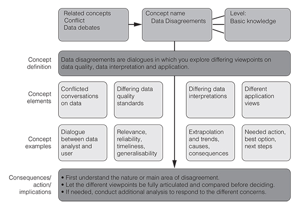
Whenever discussing an issue, frame the disagreement positively by inviting more perspectives, experiences, options, or insights. Don’t frame a controversial discussion as ‘let the stronger argument win’, but rather as ‘let’s have as many angles as could be useful on this data’. Label it as ‘360 degrees thinking’ rather than ‘a crossing of swords’. Learn from designers and artists: how you label something influences its perception and use. Part of the framing is also pinpointing the specific areas of disagreement about the discussed data. So, in other words: understand which type of disagreement is there or where the source of the disagreement lies, and where you may have consensus already. Are there different views regarding the data’s quality, its interpretation, or how to apply it to the decision at hand? Answering this question early is crucial for more productive data dialogues. Also visualisation, our step 2, may help you clarify the issues with the data.
2. Visualise it right
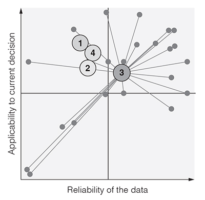
By using instant polling tools such as Mentimeter.com (which also provides anonymity) or offline means such as dots and whiteboards, you can visualise the different viewpoints in a joint framework so that minority views surface and so that you can truly see the degree of consensus or dissensus about the discussed data. Figure 12.2 provides an example of such a dissensus visualisation where we can see that although the average view on data set 3 is positive (it’s in the top right-hand corner), there are eight colleagues who have rated it as not very reliable (the left side of the grid). This visualised variety empowers them to speak up and share their reliability concerns with the others. Their sceptical votes may help to examine potential data deficiencies in dataset 3 or clarify their doubts. So, look beyond the average votes and examine the spread of opinions (represented by the individual small dots in the diagram).
You can also see in the diagram that four people are doubtful about the data set’s applicability to the decision that needs to be taken. Again, encouraging them to speak up will help you assess the data better and recognise its limitations.
3. Discuss it right
Using the dissensus visualisation, direct criticism at the visualised issues and not at the people in the room. Separate the arguments from the person and discuss why minority views may have merit (irrespective of seniority). Spend more time on discussing data with high dissensus and a bit less time on areas where agreement has already been reached. The following data discussion principles can help you in that endeavour.
- 1. Questions first: Don’t feel shy about validating your understanding of the data before criticising it (also see Chapter 7 on analytics Q&A for this point). Ask for details regarding sampling, variable and data definitions, statistical procedures used etc.
- 2. Constructive criticism: Don’t just criticise the data, but add suggestions on how to improve the data’s reliability or applicability.
- 3. Connect the dots: Make sure, especially as a facilitator of data dialogues, that you relate the different views voiced about the data to each other and to possible action implications (such as data cleansing or additional data gathering activities). This last principle leads us to the final step in our process: consolidating the debate.
4. Consolidate it right
Discuss how the minority views could be incorporated in the team’s (or your own) decision and combine the proposed arguments so that they lead to a richer, joint picture and ultimately to a more refined view on the data. In consolidating the views of your teammates, work with visualisations that signal that they are subject to revision and work in progress. Use flipchart drawings, whiteboards sketching and the like to invite others to refine the joint level of understanding by adding new considerations or modifying existing ones. Don’t forget to capture the to do’s that surfaced during this process. This may include refined data analyses, additional sampling efforts, dealing with outliers, or re-running certain statistical procedures.
Designing data dissensus properly is thus a crucial analytics task. It requires the design of a fitting label for a dissensus discussion (i.e., ‘360 degrees data dialogue’), designing a visual representation of the different views (such as the reliability–applicability matrix example above), as well as designing a conversation process around minority views or counter opinions. The last element for fruitful dissensus discussions consists of creating a fluid yet convergent design for the documentation of the results. This may include a graphic ranking of data issues from the most to the least controversial one (and the measures that should be taken).
Avoiding confrontation and saving face
Criticising data and the underlying analytics is important, but you have to find the right way to do it. Good data debates are all about joint learning and improving together. To avoid hurting someone’s professional pride in the process, try these ways outlined in Table 12.1 to soften your critique but still be crystal clear.
Table 12.1 How to avoid confrontation and save face.
| Instead of saying this | Try this |
| You don’t know what you are doing. | Which methods have you used and are you a 100 per cent sure they fit the data? |
| I don’t trust your work. | Show me how you proceeded step-by-step when analysing this data. |
| I don’t trust this data. | Can we be sure that this data is reliable? What gives you confidence in this data? |
| This data is irrelevant. | Are you sure that this is the right data to consult for this decision? |
| Your interpretation of this data is ludicrous. | Help me understand how you draw those conclusions from the data. |
| This makes no sense whatsoever. | I really need to understand what you have done in terms of analytics, so please go through this again step-by-step. |
| Do you even believe in what you’re saying here? | Where are areas where you have less certainty when it comes to the data interpretation? |
Discussing data often comes with differing points of view and thankfully so. We need to embrace disagreement about the relevance, reliability and scope of data in order to make high-quality evidence-based decisions. Otherwise we have an illusion of reliable data, and an illusion of consensus, where there really isn’t. So don’t shy away from grilling your analysts, but do so respecting the rules of constructive criticism, and by first making sure you really understand the data and the areas of disagreement.
Key take-aways
- ●Don’t see data as a given, but understand that they are the result of human choices.
- ●Actively invite different perspectives about data when interpreting it. Ask questions such as: ‘Is anyone sceptical about where this data has come from or how it’s been analysed?’
- ●Give voice to sceptics, dissenters and contrarians or minority opinions and try to integrate their concerns into your data dialogues. Sometimes it’s better to surface such potential dissenting opinions before an actual meeting in bilateral formats.
 Traps
Traps
Communication traps
- ●Don’t let criticism get personal and affect work relationships. Set ground rules for constructive criticism.
- ●Generally, beware of finger pointing and making data disagreements about culprits.
- ●Beware of a comprehensive data critique and pinpoint potential biases or data issues as specifically as possible.
Further resources
These are great articles on how to have better disagreements in general:
Edmondson, V.C. and Munchus, G. (2007) Managing the unwanted truth: A framework for dissent strategy. Journal of Organizational Change Management, 20(6), 747–760.
Garner, J.T. (2012) Making waves at work: Perceived effectiveness and appropriateness of organizational dissent messages. Management Communication Quarterly, 26(2), 224–240.
Leigh, P., Francesca, G. and Larrick, R. (2013) When power makes others speechless: The negative impact of leader power on team performance. Academy of Management Journal, 56(5), 1465–1486.
Mengis, J. and Eppler, M.J. (2006) Seeing versus arguing: The moderating role of collaborative visualization in team knowledge integration. Journal of Universal Knowledge Management, 1(3), 151–162.
Schulz-Hardt, S., Brodbeck, F.C., Mojzisch, A., Kerschreiter, R. and Frey, D. (2006) Group decision making in hidden profile situations: Dissent as a facilitator for decision quality. Journal of Personality and Social Psychology, 91(6), 1080–1093.