
Color Grading, Color Effects, and HDRI
Digital composites are ultimately dependent on the three color channels: red, green, and blue. Hence, color grading and the use of color effects is an important part of the compositing process. Color effects allow you to alter the balance of colors. You can shift colors, reduce a particular color, replace colors with other colors, increase contrast between color channels, creatively “re-light,” and so on (Figure 8.1). Although After Effects provides numerous color effects, many of them provide similar results with different methodologies. If you understand the underlying functionality of these effects, you can make educated decisions on their use. Color grading, on the other hand, is a process by which colors are altered with a particular goal. For example, color grading can help ensure that multiple shots match within a scene or that a particular shot takes on a different mood through the adjustment of color. Beyond that, After Effects supports the ability to work with 8-bit, standard images or 32-bit High-Dynamic Range Imagery (HDRI).
This chapter includes the following critical information:
• Overview of color grading goals and techniques
• Functionality of useful color effects
• Overview of HDRI support
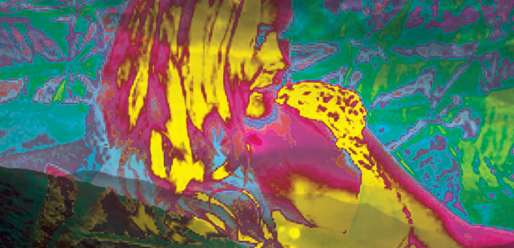
FIG 8.1 Top: An ungraded shot. Bottom: Color grading is limited to the left side of an actress, which creates a new, artificial shadow.
Color grading, as it’s applied to film, video, animation, and visual effects industries, has several main functions, which are discussed in this section. (Note that the terms color grading and color correction are often used interchangeably.)
Aesthetic Adjustment
Colors are adjusted to create pleasing results. This may involve shifting the main color tone of a shot to alter the mood. For example, you can desaturate an otherwise bright, saturated shot to make the mood more somber (Figure 8.2).
Colors are shifted to match a different time of day. For example, you can color grade an afternoon shot to look more like sunset (Figure 8.2).
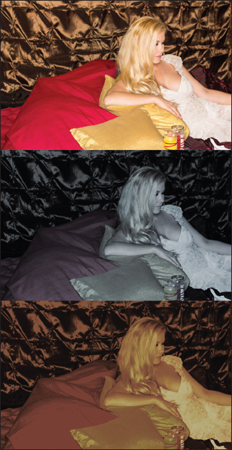
FIG 8.2 Top: Ungraded frame. Middle: Frame graded to make the scene more somber. Bottom: Frame graded to approximate sunset. This image is included as ungraded.png in the ProjectFilesArt directory.
Shots are graded so they match each other and are consistent across a scene. Before color grading, each shot may vary slightly due to differences in lighting setups or shifting natural light.
Element Integration
When 3D renders digital matte paintings, and other 2D artwork are integrated with live-action footage, it must be graded to match. For example, the darkest areas of a 3D render are often significantly different from similar areas captured on video.
Stylistic Changes
Colors are adjusted to create psychedelic, fanciful, or otherwise unnatural results. Such changes may be suitable for equally fantastic subjects, such as dream sequences, science-fiction or horror plots, and so on.
You can apply color grading with any effect or tool that alters colors within the image. Color grading generally involves the alteration of red, green, and blue ratios within an entire frame or a portion of a frame (through masking or rotoscoping).
Working with Blacks, Whites, and Color Cast
Color grading is only successful if it can be properly gauged. Aside from simply looking at the resulting frame, you can measure color values for each channel. After Effects provides the Info panel, at the top right of the program, for this purpose. When you drag your mouse over any of the view panels, the red, green, blue, and alpha channel values are printed out. The readout reflects the current color space bit depth. The 8-bit setting reads out values between 0 and 255, with 255 the maximum white value. The 16-bit setting reads out from 0 to 32,768. (Note that After Effects “16-bit” color space is actually 15-bit, or 215, with one extra color level; see Chapter 1 for more information.) The 32-bit setting, due to its floating-point architecture, reads out from 0 to 1.0. With 32-bit, 1.0 is the maximum value an 8-bit display can show; however, 32-bit files often carry superwhite values above 1.0. In addition to a space-centric readout, you can choose different scales through the panel’s upper-right arrow menu (CC 2014) or panel tab menu (CC 2015). For example, you can switch to 10-bit, which runs from 0 to 1023. The 10-bit scale is a common bit-depth for logarithmic formats originally designed for motion picture scanning, such as Cineon and DPX.
When checking color values, a common task of color grading is matching blacks and whites. In this case, blacks refers to the darkest values within the frame. This may be a shadow area, an object that has a dark surface color, or the dark area of an actor’s hair or eyes. Whites refers to the brightest area of a frame. These may be specular highlights, bright sky, and so on. For example, in Figure 8.2 in the previous section, the blacks are found within the wrinkles of the background while the whites are found within the dress. Within After Effects, matching blacks and whites requires matching color values between two different layers. For example, if the shadow area in layer A has a value around 35, 20, 15 in RGB, then the goal for grading layer B is to move the layer B shadow values into the same approximate range.
Along similar lines, another common color grading task is the matching of color casts. A color cast is the overall tint of a shot—that is, the specific hue the shot is biased towards. Some shots may have reddish casts, others may have blueish casts, and so on. Color casts may be a product of the natural lighting (e.g. blue daylight) or a film/video camera filter (e.g. a filter to shift the natural green of specific fluorescent lighting). As such, if shots within a scene must be matched, color grading a consistent color cast across shots is important.
You can find After Effects color effects within the Effect > Color Correction menu.
It’s important to remember that color effects are dependent on the current color space. As discussed in Chapter 1, After Effects supports three color spaces: 8-bit, 16-bit, and 32-bit floating point. The higher the bit-depth is, the more accurate the color calculations are. Nevertheless, higher accuracy may not be discernible on screen. Thus, it may be more efficient to work at a lower bit-depth unless there is a noticeable degradation. That said, not all effects are designed to work at higher bit-depths. If an effect is intended for 8-bit color space, a warning icon appears when in 16-bit or 32-bit space (Figure 8.3).
![]()
FIG 8.3 The bit-depth warning appears as a yellow triangle. With this example, the Broadcast Colors effect, designed to limit the color range of footage intended for video broadcast, does not function properly in 16- or 32-bit space.
Before familiarizing yourself with the functionality of color effects, it’s helpful to understand basic color theory terminology. Here are a few critical definitions.
Hue/Color
As a general term, hue refers to pure spectrum colors that have specific names, such as red, blue, yellow, and so on. Within a digital color system, hue is the degree to which a color is similar or dissimilar to those pure spectrum colors. Although hue and color are often used interchangeably, you can think of hue as a more specific subset of all potential colors.
Saturation
Saturation is intrinsically linked to colorfulness and chroma. Colorfulness is the difference between the color and gray. Chroma is the difference between the color and what is considered white. Saturation is the colorfulness of a color as compared to white. You can equate saturation to the mixing of a hue with white. High saturation leads to a more intense color (more hue and less white) while low saturation leads to a pale color (less hue and more white). In After Effects, saturation is adjusted by altering the contrast between color channels.
Contrast
Contrast is the ratio of brightness to darkness within an image. A high-contrast image contains dark areas and bright areas with few mid-range values. A low-contrast image contains values evenly spread across the entire color range. Low-contrast images appear “washed out.”
Brightness/Intensity/Lightness/Luminance
With a digital color system, brightness is the numeric value of a pixel within a color channel. A “bright” value is closer to the top of the current scale. For example, a pixel with a red value of 200 on a 0-to-255 scale is fairly bright while a pixel with a value of 20 is fairly dark. If a pixel has equal red, green, and blue values, it appears desaturated; that is, the pixel appears gray. If the channels share the same maximum value, they appear white. (The white may carry a color cast based on the color temperature of the monitor—see Chapter 1 for more information.) Brightness is also referred to as intensity, lightness, and luminance. Although these terms carry specific scientific or mathematical connotations, they are often use interchangeably by artists. Some color models incorporate these terms into their channels. For example, HSV stands for Hue Saturation Value. HSL stands for Hue Saturation Lightness. (HSL is sometimes called HLS.) You can graphically represent HSV and HSL with a conical of cylindrical shape where hue is plotted around the circumference, lightness/value is plotted along the height, and saturation is plotted from the central core to the outer surface (Figure 8.4).
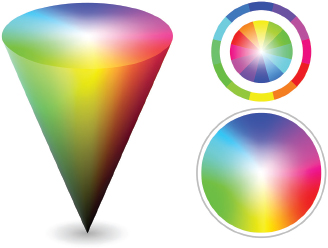
FIG 8.4 Left: HSV/HSL color space represented with a cone. Right: Same space represented with 2D color wheels. Note how red, green, and blue are positioned 120 degrees apart. Secondary colors are visible as cyan, magenta, and yellow.
Black Point, White Point, and Midtone
A black point is a value that is considered black, or the lowest possible value. Although this is usually 0, you can select a different black point by applying effects. A white point is a value that is considered white. Although this is generally the maximum value available to a color space, you can select a new white point value. This is sometimes necessary for color grading intended for a particular output medium. For example, “broadcast safe” video requires a white point below the available maximum. A midtone point is a value in the center of the range available to the color space. For example, on a 0-to-1.0 32-bit floating point space, 0.5 is the midtone. Note that a white point is established for an operating system through monitor calibration—this is separate from the compositing process. For more information on monitor calibration, see Chapter 1.
The RGB color model, which digital imaging software employs, is additive. That is, equal additions of red, green, and blue produce gray. Maximum additions of red, green, and blue produce white. This is the opposite of subtractive color models, where the absence of colors produces white (as with the white of the unprinted page with CMYK printing).
Working with Hue, Saturation, Tint, and Color Balance
The Hue/Saturation effect allows you to shift the hue and alter the saturation and brightness (Figure 8.5).
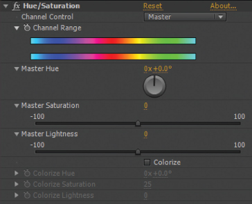
FIG 8.5 The Hue/Saturation effect properties with their default values.
With this effect, you can carry out the following tasks:
• You can shift the hues contained within the layer by altering the Master Hue color wheel. Essentially, the Hue/Saturation converts the color space to HSL, where hue is separated from saturation and lightness. In terms of the mathematical color model, hue is identified as a position on a conical or cylindrical representation of all hues available to the model. Thus, you can “spin” the cone or cylinder to shift all the hues within the layer. For example, setting the Master Hue to –50 shifts the layer’s orange colors to violet and blue colors to blue-green (Figure 8.6). Note that you can go either direction on the color wheel. The 0 setting is equivalent to 360 and –50 is equivalent to 310.

FIG 8.6 Left: Ungraded layer. Middle: Same layer with the Master Hue wheel set to –50. Right: Same layer with the Master Hue wheel set to 30. Photo © 2014 Kevron2001/Dollar Photo Club.
• The Master Saturation and Master Lightness sliders control their namesakes. Increasing the saturation has the practical effect of increasing the contrast between color channels in favor of the brightest channels. For example, if the red channel has slightly higher values than the green and blue channels, increasing the saturation exaggerates the value gap between red, green, and blue. Red receives higher values while green and blue receive reduced values. On the other hand, increasing the lightness pushes the values of all three channels, as a unit, closer to the range limit. For example, increasing the lightness moves the values closer to 255 on an 8-bit scale. This makes the layer appear less saturated and more white. Shadows become brighter while previously bright areas may be pinned to the maximum scale value, such as 255.
• You can also “colorize” the layer by selecting the Colorize check box. Colorization desaturates the layer so that it is grayscale, and then adds back the hue chosen through its Colorize Hue wheel. This is similar to the tinting process and is useful for giving a strong color cast to a layer. You can control the saturation and lightness of the colorize result through the Colorize Saturation and Colorize Lightness sliders.
The Tint effect produces a similar result as the Colorize feature of the Hue/Saturation effect. However, it operates by allowing you to replace the blacks and whites with two colors of your choice via Map Black To and Map White To eyedroppers (Figure 8.7). You can mix the tinted result with the original values by setting the Amount To Tint value.
FIG 8.7 The Tint effect is applied to a layer with Map Black To set to dark red and Map White To set to orange.
The Color Link effects also colorizes; however, the colorize color is determined by averaging pixels within a target layer, which you can select through the Source Layer menu. In addition, the CC Toner effect tints a layer based on shadow, midtone, and highlight target colors.
The Color Balance effect allows you to manually adjust the balance between red, green, and blue channels. The effect breaks the color balance into brightness “zones” with Shadow, Midtone, and Highlights slider groups (Figure 8.8). If you raise a slider above 0, the associated color channel receives higher values. The remaining two channels are unaffected. Nevertheless, the resulting hues for the layer change as the overall mixture of red, green, and blue is updated. In a similar way, if you reduce a slider below 0, the associated color channel receives lower values. In addition, the effect provides a Preserve Luminosity check box. Preserve Luminosity maintains the average brightness within the image as the colors are altered; this helps to prevent overexposure if sliders are raised above 0. The Color Balance effect offers an efficient means of matching blacks, matching whites, and changing color casts by altering the channel balance.
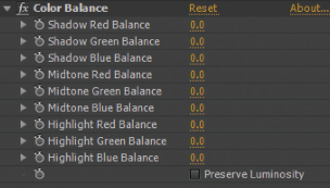
FIG 8.8 The Color Balance effect properties with default values.
The Color Balance (HLS) effect operates in a manner similar to the Hue/Saturation effect. A number of effects in After Effects share identical functionality. Although this gives you competing options for adjusting a layer, it also gives you the flexibility of choosing effects whose property sets and user interface options you find the most efficient.
Working with Brightness and Contrast
A number of effects in After Effects are designed to alter the overall brightness/darkness of an image. In addition, they can alter the layer’s inherent contrast. The best way to understand what these effects are doing is to examine a histogram. A histogram, in terms of digital image manipulation, is a graph that represents the distribution of values. With a histogram, you can identify whether an image is high contrast, low contrast, or fails to include pixels with values in a particular range. For example, the Levels effect includes a built-in histogram. The value scale runs from left to right, where dark values correspond to the graph left and bright values correspond to the graph right. Each vertical line represents the number of pixels in the frame that possess a particular value (Figure 8.9). All pixels are represented, although the small size of the histogram means that the distribution is drawn in a simplified manner. By default, the distribution is shown for all three color channels, with the lines for red, green, and blue overlapping. In addition, white lines are superimposed over the color lines to show the average distribution of all three channels. To more clearly see a single color channel, you can change the channel menu, at the top right, to Red, Green, or Blue. This places the lines for the selected channel in front of the other lines.
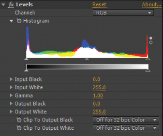
FIG 8.9 The Levels effect histogram, as applied to the ungraded image in Figure 8.6.
When you apply an effect that alters brightness and/or contrast, the distribution of values within the layer is changed. You can think of the change as a push, a stretch, or a compression. For example, if you apply a Brightness & Contrast effect, you can alter the histogram and the layer in the following ways:
Push Towards White Values are pushed to the right of the histogram (Figure 8.10). A compression of the value distribution occurs at the right while the distribution on the left is stretched. The resulting image is brighter with the potential that some values reach the maximum value of the color space, such as 255 (Figure 8.11).
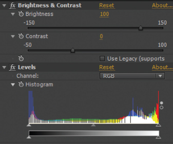
FIG 8.10 Brightness & Contrast and Levels effects are applied. Brightness is set to 150. The histogram reflects the change.
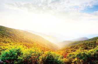
FIG 8.11 The result of the Brightness & Contrast effect.
Push Towards Black Values are pushed to the left of the histogram. A compression of the value distribution occurs at the left while the distribution on the right is stretched. The resulting image is darker with the potential that some values reach the minimum of the color space, which is usually 0. You can achieve this by lowering the Brightness value of the Brightness & Contrast effect below 0.
Stretch Towards Black and White Values are pushed left and right. Value distribution is compressed at the left and right sides and stretched in the center towards both sides. This tends to flatten out the distribution in the center but increase the peaks in the darkest and brightness areas (Figure 8.12). This leads to an image with greater overall contrast (Figure 8.13).
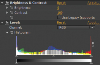
FIG 8.12 Brightness & Contrast and Levels effects are applied. Contrast is set to 100. The histogram reflects the change.
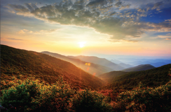
FIG 8.13 The result of the Brightness & Contrast effect.
Compress Towards Midtones Values are pushed towards the center. Value distribution is compressed at the center and stretched at the left and right sides towards the center. This tends to flatten out the distribution on the histogram ends but increases the peaks in the midtone area. This leads to an image with less overall contrast. You can achieve this by lowering the Contrast value of the Brightness & Contrast effect below 0.
You can use any combination of color effects on a layer. In fact, you can apply a Levels effect with default settings to simply view its histogram. However, the order in which you apply effects is important. After Effects applies the topmost effect first and works its way downward. You are free to reorder effects at any time by LMB-dragging the effects name up or down in the Effect Controls panel.
Whenever you apply a color effect in an aggressive manner (with high or low property values), there is the potential for histogram combing. Combing is the stretching of the value distribution in such a way that some values are carried by no pixels and gaps appear in the histogram much like the gaps between comb teeth. Severe combing may lead to degradation, where there are no longer smooth transitions between colors (known as color banding or posterization). For example, in Figure 8.14, aggressive darkening leads to color banding in the sky. You can see histogram combing in Figures 8.10 and 8.12 earlier in this section.
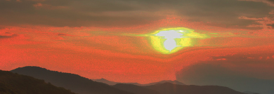
FIG 8.14 Color banding appears in a sky.
You can apply even finer control to brightness and contrast by adding the Curves effect. With the Curves effect, you can interactively insert and move points of a control curve (sometimes called a response curve) within a graph. The bottom of the graph represents the darkest available value (0). The top of the graph represents the brightest available value (e.g. 255 in an 8-bit scale). The effect remaps layer input values to new output values based on the shape of the curve. Hence, a default curve remaps 0 to 0, 128 to 128, and 255 to 255 in 8-bit space, producing no change. However, nondefault curve shapes produce predictable changes, as illustrated in Figure 8.15, where an S-shaped curve increases the contrast. An inverted-S-shaped curve reduces contrast. A bowed-up curve increases the overall brightness. A bowed-down curve increases overall darkness.
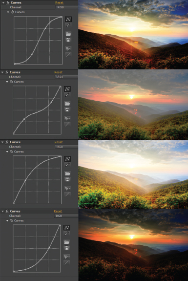
FIG 8.15 Top to bottom: Increased contrast, reduced contrast, increased brightness, and increased darkness, and a product of a custom curve with the Curves effect, as seen in After Effects CC 2013.
To insert a new point, LMB-click the curve. To move a point, LMB-drag it. You can reset the curve by clicking the Reset button at the bottom right of the graph. By default, the effect operates on RGB equally. However, you can alter a single channel by changing the Channel menu, at the top right of the graph, to Red, Green, Blue, or Alpha. The effect can store a unique curve for each channel.
Note that the CC 2014 and CC 2015 Curves effect simultaneously displays the curves for other channels if they are altered in such a way that they don’t overlap. The channel curves are colored to match the channel names. The master RGB curve remains white. The alpha curve is dark gray. You can alter any of the curves once they are visible. If they are not visible, change the channel menu to the appropriate channel. The CC 2014 and CC 2015 Curves effect also includes graph size buttons at the top left.
Aside from displaying a histogram, you can also alter the brightness and contrast with the Levels effect. The histogram has three handles, which correspond to a black point, a white point, and a gamma value (Figure 8.16). The handles appear as small triangles directly below the histogram’s colored lines. For example, if you move the left handle, it reestablishes the black point. Values to the left of the handle are essentially thrown away and replaced with 0-black. The black point handle actually drives the Input Black property slider. Input Black shows you the value of the new black point.
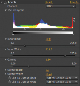
FIG 8.16 A new black point, white point, and gamma value are selected with a Levels effect.
The right histogram handle reestablishes the white point and drives the Input White slider. If you pull this handle to the left, values to the right of the handle are thrown away and replaced with the maximum value in the current color space. This leads to an image where a greater portion is pure white. When you move the black point or white point handle, the gamma handle also moves to stay centered within the new range. (The overall range of values is often referred to as a tonal range.) If you manually move the center handle to the right, the image is darkened. If you manually move the center handle to the left, the image is brightened. The center handle remotely drives the Gamma slider. The Gamma value represents the exponent of a power curve that’s used to adjust the overall brightness and contrast of an image.
In general, the black point of an image appears as the darkest pixel (pure black) and the white point appears as the brightness pixel (pure white). However, you have the option to choose what is the darkest and brightest value by altering the Output Black and Output White property values of the Levels effect. For example, if you set Output Black to 25 and Output White to 200, the lowest pixel value within a layer is 25 and the highest is 200. This has the effect of making the layer appear faded (Figure 8.17).
FIG 8.17 A high Output Black value and low Output White value makes the layer appear faded.
Like many effects in After Effects, the Levels effect adjusts itself to the current project bit-depth. For example, if you are working in 16-bit, the slider ranges update to display the correct 16-bit values (once again, After Effects “16-bit” space is actually 15-bit). If you are working in 32-bit, the Levels effect may produce superwhite or superblack (below 0) values. You can force the effect to clip the values to 0 and 1.0 by changing the Clip To Output Black and Clip To Output White menus to On.
After Effects also provides the Levels (Individual Controls) effect. This works in the same fashion as Levels, but splits the properties into red, green, and blue sliders.
Working with Pedestal, Gain, Gamma, and Photo Filters
Several color effects in After Effects use terminology borrowed from the motion picture and photography industries. For example, you can adjust brightness, contrast, black points, and white points with the Gamma/Pedestal/Gain effect. With this effect, Pedestal sliders control the black point of each channel. Negative values are equivalent to raising the value of the Input Black value of the Levels effect. For example, a –1.0 value for Red Pedestal causes a greater portion of the red channel to carry a 0-black value. This produces a layer that is less red and more blue and green (Figure 8.18). If you raise a Pedestal slider over 0, a greater portion of the channel color is inserted into the layer. You can see the result of the effect in a particular channel by changing the Composition view’s Show Channel And Color Management button to the channel name, such as Red. Each channel is displayed as a grayscale image, which represents the brightness/intensity of each channel pixel.
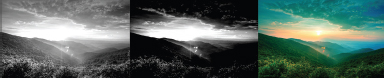
FIG 8.18 Left: Ungraded red channel. Middle: Red channel with Red Pedestal set to –1.0. Right: Result on the RGB view.
The Gamma/Pedestal/Gain effect also provides Gain sliders. These brighten or darken each color channel. The Gamma sliders have a result similar to the Gain sliders. However, the Gamma sliders create a more subtle result whereby values are less likely to be pushed down to 0-black or up to maximum-white.
On the other hand, the Photo Effect filter mimics physical filters placed in front of lenses of real-world cameras. The filters affect the overall color balance of a photo or video sequence by blocking some color wavelengths and exaggerating others. The Filter menu includes a number of presets that emulate specific filters. The virtual thickness of the filter and the intensity of the effect are set by the Density property. For example, setting the Filter to Cooling Filter (82) and the Density to 75 percent shifts white highlights to cyan (Figure 8.19).
FIG 8.19 The Photo Filter effect “cools” a layer.
You can create your own custom filter by setting the Filter menu to Custom and choosing a color through the Color property. Although the result is similar to the Tint effect, the saturation of the tint is more subtle with the Photo Filter effect.
Working with Stylistic Color Effects
A number of color effects are designed to create surreal or fantastic results. Although these may not be useful for traditional color grading, you can employ them as smaller components of more complex compositions. For example, they may be useful when creating a laser beam, heads-up display, alien vision, or portal effect in a science-fiction-themed shot.
The Colorama effect allows you to remap specific color ranges or substitute specific colors with new colors. This is interactively achieved by manipulating the Input Phase and Output Cycle color wheels (Figure 8.20). In a similar fashion, the Change To Color effect allows you to replace one color with a new one with the From and To properties.
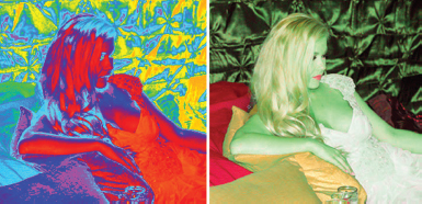
FIG 8.20 Left: The Colorama effect shifts all the hues of a layer. Right: The Change To Color effect replaces one color with another.
The most efficient way to see the potential of stylistic effects is to apply them and experiment with their property values. Other stylistic effects include Black & White (converts layer to grayscale), CC Color Offset (allows you to offset each color channel by adjusting individual hue wheels), Channel Mixer (modifies a color channel by mixing current channels), and Leave Color (desaturates a layer except where there is a chosen color).
An Introduction to Color Finesse 3
The Synthetic Aperture Color Finesse 3 LE plug-in provides an expansive set of color grading tools. You can access the plug-in through the Effect > Synthetic Aperture menu. When you apply the effect, you have the option of working with a simplified interface, which stays in the Effect Controls panel. To choose this, expand the Simplified Interface section. You can also choose the full interface by clicking the button with the same name. The full interface launches in a separate window (Figure 8.21). The window has several unique features, which are discussed briefly in this section.
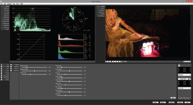
FIG 8.21 The Color Finesse 3 LE full interface window. The Combo readout is displayed at the upper left with a luma waveform and vectorscope at the top of this area.
Color Finesse includes a series of graphic readouts that are patterned after those used in the broadcast television and video production industries. You can access these by clicking the readout names in the top-left column. For example, the vectorscope displays the distribution or color values within the color spectrum of the color space. The vectorscope divides the spectrum into color axes that include red, magenta, blue, cyan, green, and yellow. These colors are indicated with the codes R, Mg, B, Cy, G, and Yl. While hue is indicated around the circumference of the circular readout, chroma (saturation in reference to the difference between the color and white) is indicated from the center point to the outer edge. For example, in Figure 8.22 a green screen plate causes points to cluster along the green axis (for the green screen) and red (for the skin and hair tones).
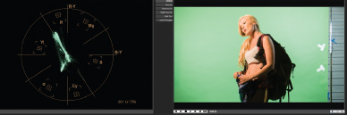
FIG 8.22 A vectorscope view of a green screen plate.
The plug-in also provides several waveform monitors. These are listed as WFM and are designed for several different color channels and color spaces, including standard RGB, luma (luminance only), and YcbCr (color space where luma and chroma are separated). With these waveforms, the pixel intensity distribution is displayed. The vertical scale runs from 0 to 1.0 and indicates the range between 0-black and maximum-white. The left-right direction correlates to the left-right portions of the image. For example, in Figure 8.23 the left and right “wings” correspond to the left and right green screen area of the plate seen in Figure 8.22; the central cluster of points corresponds to the actress in the center of the frame. A waveform offers a means to gauge the general brightness and contrast of an image and how different areas of the frame (as read left to right) correlate to each other. If you choose a waveform that carries multiple channels, like RGB, separate waveforms are displayed next to each other. Comparing channels side by side allows you to gauge color saturation (contrast between color channels) and any color cast. Note that the plug-in also supplies histogram readouts.
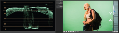
FIG 8.23 A luma waveform view of the same green screen plate.
The lower left section of the Color Finesse window include a battery of sliders that adjust common color components, including brightness, contrast, gamma, pedestal, hue, and saturation. The sliders are divided into master, highlight, midtone, and shadow sections. In addition, you can choose the color space in which to apply the sliders by selecting a space along the program’s bottom left column.
You can apply any adjustments by clicking the OK button and thus close the window. You can combine Color Finesse with other color effects.
After Effects supports High Dynamic Range (HDR) images by offering a 32-bit, floating-point color space via the Depth menu in the File > Project Settings window. (For more information on color space selection, see Chapter 1.) HDR still images or image sequences may be generated in one of several ways:
• A 3D program, such as Autodesk Maya, is set to render with a 32-bit floating-point buffer.
• Multiple photographs of a subject are combined with special HDR software, such as HDR Shop. Multiple photographs are used to properly expose every part of the scene or location.
HDR image formats supported by After Effects include Radiance files (generally ending with .hdr), OpenEXR (which has a 32-bit floating-point variation), and TIFF (which also supports 32-bit floating-point variants). The 32-bit color space varies from 16-bit in After Effects in that only 32-bit carries floating-point architecture. Floating-point architecture allows for arbitrary decimal accuracy, where stored values may be incredibly small, like 0.0000000001, or incredibly large, like 1.5x10¹². This offers two main advantages: a high degree of accuracy and a color range much larger than 8-bit or 16-bit can support.
The main disadvantage of a 32-bit image is the inability to see all of the stored values on an 8-bit or 10-bit monitor (which are used universally). When you view a 32-bit image in After Effects, you are not seeing superwhite (above 1.0) or superblack (below 0) values within the view panel. You can only see the values as a numeric printout in the Info panel. When rendering out a composition, only a limited number of formats support the 32-bit color space. More problematically, almost all media destinations (broadcast video, motion picture film, and so on) only operate in 8- or 10-bit. Nevertheless, After Effects supplies several effects to manage and alter HDR images. These are described here.
HDR Compander (Effect > Utility)
This effect compresses or expands the values found within a high-bit-depth image so that the values fit within a lower range. Hence, you can compress the values found within an HDR image sequence so they fall within 0 and 1.0 and can thus be displayed on an 8-bit monitor. For example, in Figure 8.24, an OpenEXR image sequence carries values between 0 and 1.7. Values between 1.0 and 1.7 appear pure white with no variation. With the addition of the HDR Compander effect, the values are brought back within the 0-to-1.0 range. Although the layer appears darker overall, more subtle color transitions appear in the brightest areas around the candles. The Gain property controls the compression. The value carried by the Gain represents the highest HDR value that is compressed into the new 0-to-1.0 range. Gain values below 1.0 expand the range so more values are pushed into superwhite; this may be useful for expanding 8-bit values into a 32-bit space. In addition, a Gamma slider is provided to fine-tune the result. For example, if you raise the Gamma, the shadow areas become brighter without pushing values above 1.0.
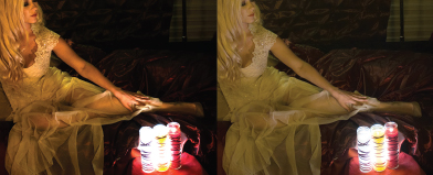
FIG 8.24 Left: Ungraded OpenEXR sequence with values ranging from 0 to 1.7. Right: Result of HDR Compander with Gain set to 2.0 and Gamma set to 1.75. This project is included as compander.aep in the ProjectFilesaeFilesChapter8 directory.
HDR Highlight Compression (Effect > Utility)
Much like HDR Compander, HDR Highlight Compression compresses superwhite values into the 0-to-1.0 range. However, it only compresses highlights without affecting midtones or shadow areas. Its sole property, Amount, sets the aggressiveness of the compression. If Amount is set to 100 percent, no value in the image will be over 1.0.
Exposure (Effect > Color Correction)
The Exposure effect is designed to adjust the tonal range of HDR images. The Exposure property emulates the F-stop of a real-world camera. An F-stop is a number derived by dividing lens focal length by the diameter of the aperture opening. With each increase of F-stop, the amount of light reaching the film or video is halved due to the reduced size of the aperture. Positive Exposure values are multiplied against the current pixel values, giving them higher values and making them brighter. Negative Exposure values reduce the pixel values and make them darker. The Offset property brightens or darkens the shadow and midtone values without affecting the highlights.
Chapter Tutorial: Color Grading Effects
With this tutorial, we’ll return to earlier projects and improve them with the addition of color grading. We’ll start with a motion-tracking project from Chapter 4:
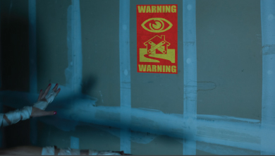
1. Open tutorial_4_finished.aep from the Chapter 4 tutorial directory. This features a corner-pin tracked sign on a wall. The sign’s colors are significantly different from the video image sequence (Figure 8.25).
2. Drag your mouse over the Composition view. Note the value readout in the Info panel at the upper right of the program window. The values should range from 0 to 255. If they do not, go to the panel’s menu and choose Auto Color Display or 8Bpc (0–255). (Auto Color Display changes the readout based on the current project bit-depth.)
3. Place your mouse over a portion of the composition that comes the closest to pure white. For example, place your mouse over one of the round nail patches on the wall or over the bandages on the woman’s forearms. Note the readout. The readout for a nail patch is roughly 70, 135, 170 in RGB. This shows that the blue channel is at approximately 66 percent (170/255), while green is at 53 percent, and red is at 27 percent. There is almost three times the blue in a “white” area when compared to red. Studying the white point of a layer will help us determine how to color grade the sign art so it fits better with the scene.
4. To properly grade the sign, we need to study its values. Because the sign contains no part that would be considered white, we’ll concentrate on the red and yellow areas. Place your mouse over the yellow part of the sign. Here, the red and green channels are almost equal around 130 while the blue channel is a low 30. Place your mouse over the red part of the sign. Here, green and blue are almost equal at 30 while red is around 155. Whereas the white point of the shot is extremely blue, the sign contains little blue.
5. Select the sign layer and choose Effect > Color Correction > Color Balance. The Color Balance effect appears after the Corner Pin effect. Change the Shadow Blue Balance, Midtone Blue Balance, and Highlight Blue Balance to 100. Read the values in the red and blue areas of the sign. The blue component has increased in the yellow, but is essentially the same in the red areas. This shows that the channels are intrinsically linked. To increase the amount of blue, you have to also adjust the red and green sliders. Experiment by reducing the Red and Green slider values. To determine if the sign’s yellow values are correct, you can compare them to the yellow found within the woman’s hair. The values are roughly 65, 85, 85 in RGB. To determine if the red values are correct, you can compare them to the red found within the woman’s fingernails. The values are roughly 50, 20, 40 in RGB. In this way, you are able to compare “points” for other colors. For example, Figure 8.26 uses the following slider values:
Shadow Red Balance: –40
Shadow Green Balance: –25
Shadow Blue Balance: 100
Midtone Red Balance: –75
Midtone Green Balance: –60
Midtone Blue Balance: 100
Highlight Red Balance: –100
Highlight Green Balance: –25
Highlight Blue Balance: 100
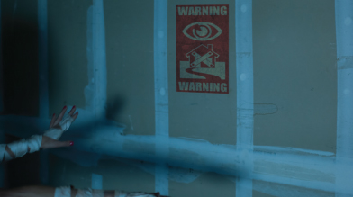
FIG 8.26 The color graded result using the Color Balance, Hue/Saturation, and Fast Blur effects.
6. Although it’s important to read red, green, and blue values within the frame as you make adjustments, it’s equally important to make aesthetic judgments to determine what settings look the best. Even after the Color Balance effect is adjusted, the sign appears saturated with intensely red areas. You can alter this by adding additional color effects. For example, add the Hue/Saturation effect and reduce the Master Saturation value to –50.
7. As a final touch, you can soften the sign art to better match the softness of the image sequence. With the sign layer selected, choose Effect > Blur & Sharpen > Fast Blur and set Blurriness to 2. Play back the timeline. The color grading is complete. An example project is saved as project_4_graded.aep in the ProjectFilesaeFilesChapter8 directory.
You can apply similar color grading techniques to the color_pin_offset.aep project in the ProjectFilesaeFilesChapter4 directory. However, with this project, the dominant color is purple (intense red and blue). Because the purple color cast of the shot is so intense, you can also use the Tint effect to better integrate the sign. To do so, follow these steps:
1. Open the color_pin_offset.aep project. Select the sign layer and choose Effect > Color Correction > Tint. Go to the Effect Controls panel.
2. Use the Map Black To eyedropper to select a dark color from the image sequence. Use the Map White To eyedropper to select a bright color from the image sequence. The sign is tinted purple (Figure 8.27).
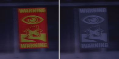
FIG 8.27 Left: Close-up of ungraded sign. Right: Sign graded with the Tint effect and given increased Opacity.
3. If the sign is too difficult to see, raise the sign layer’s Opacity (for example, set it back to 100 percent). You can also adjust the selected tint colors by clicking directly on the color swatches and choosing a new color through the color chooser window. The color grading is complete. An example project is saved as corner_pin_offset_graded.aep in the ProjectFilesaeFilesChapter8 directory.
The Curves effect also offers a convenient means of grading by adjusting the overall brightness and contrast of a layer. For example, you can better integrate the spaceship render demonstrated in Chapter 7. You can follow these steps:
1. Open the passes_matte.aep project from the ProjectFilesaeFilesChapter7 directory. Go to Comp 2. Note that the spaceship is composed of multiple layers. The reflection is separate from the main shading components.
2. Select the Comp 1 nested layer and choose Effect > Color Correction > Curves. A new Curves effect is added after the original Curves effect. There is no penalty for adding multiple iterations of an effect to a layer. Raise the leftmost point of the new Curves effect upwards (Figure 8.28). This raises the values of the shadow area of the spaceship. This creates a sense that there is atmospheric haze because no part of the spaceship achieves 0-black. This better matches the hazy background layer.
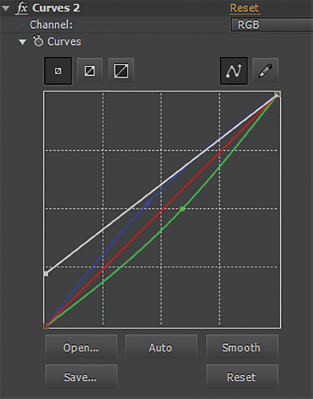
FIG 8.28 The left side of the master RGB curve is lifted up so that the shadow area becomes brighter (as seen in CC 2015). The blue curve is bowed up and the green curve is bowed down to shift the midtone balance toward blue.
3. By default, the Curves effect affects all three color channels. However, you can also adjust individual channels by changing the upper right Channel menu. For example, change the menu to Blue and bow the curve center slightly upwards. Change the menu to Green and bow the curve center slightly downwards. This shifts the midtone balance closer to blue, which better matches the mountains seen in the background (Figure 8.29). The color grading is complete. An example project is saved as passes_matte_graded.aep in the ProjectFilesaeFilesChapter8 directory.
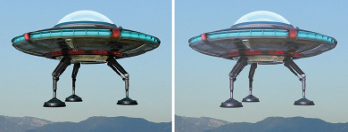
FIG 8.29 Left: Ungraded ship. Right: Ship graded with a Curves effect. The RGB Green and Blue curves are adjusted.
It’s not necessary to apply color grading to an entire layer equally. For example, you can limit it to specific areas with masking. For example, we can use this technique to create shadow areas on a green screen shot we worked with in Chapters 2 and 3. You can follow these steps:
1. Open the tutorial_8_start.aep project from the ProjectFilesaeFilesChapter8 directory. Go to Comp 2. This features a green screen shot of an actress. The green screen is removed in Comp 1. A new 3D render is imported as a new background as part of Comp 2. No color grading is applied at this point.
2. Select the Comp 1 nested layer and choose Edit > Duplicate. Select the new top Comp 1 layer. Using the Pen tool, roughly draw a closed mask that separates the left side of the face and body of the actress (Figure 8.30). Change the Mask Feather to 300.
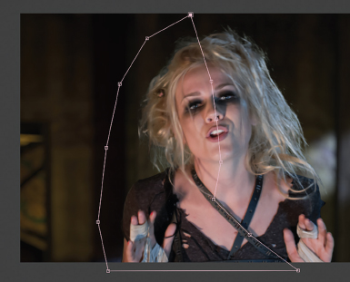
FIG 8.30 A new copy of the green screen layer is masked to separate the left side.
3. With the top layer selected, choose Effect > Color Correction > Color Balance, Effect > Color Correction > Curves, and Effect > Color Correction > Hue/Saturation. Adjust the effects to make the left side darker and more yellowish to match the background render (see Figure 8.1 at the start of this chapter).
4. You are also free to apply color effects to the lower Comp 1 layer to alter the right side of the actress. Color grading different zones of a composition provides a means to creatively “re-light” a shot during the postproduction phase. However, keep in mind that the mask must be animated over time if the subject, like the actress, moves. A graded example of this project is saved as tutorial_8_finished.aep in the ProjectFilesaeFilesChapter8 directory.