
C H A P T E R 10
Client-Side Development with Silverlight
One particularly nice feature of SharePoint Online is the capability to develop and deploy Silverlight client applications within it. Silverlight allows you to create rich Internet applications (RIAs) within SharePoint and can significantly enhance the user experience of your site. You can also access and work with SharePoint data within your Silverlight application by using the SharePoint client object model or Representational State Transfer (REST) services (see Chapter 9). Among other benefits, using Silverlight can improve the performance of your site because Silverlight code runs on the client rather than on the server.
The topic of Silverlight integration with SharePoint is pretty broad and is impossible to cover in just one chapter, so we had to be fairly selective in what we chose to include here. For example, because there are already a lot of great resources available for learning Silverlight, we chose not to cover that topic here. We assume if you’re reading this, you at least have a passing familiarity with Silverlight development (XAML, data binding, out-of-browser applications, .xap files, and so on). However, if you need a primer on Silverlight development, a great place to start is http://www.silverlight.net.
In this chapter, we’ll cover the following topics, all of which relate specifically to developing Silverlight applications for SharePoint Online:
- Preparing Your Development Environment for Silverlight
- Building a Silverlight Application with the Client Object Model
- Deploying Silverlight Applications to SharePoint Online
- Hosting Silverlight Applications in SharePoint Online
Preparing Your Development Environment for Silverlight
First, it’s important to understand that although server-side code for SharePoint Online cannot exceed version 3.5 of the .NET Framework, Silverlight has no such restriction. Silverlight 4 and 5 will both work just fine with SharePoint Online. Because the most recent release of Silverlight at the time of this writing is Silverlight 5, we’ll be using that version throughout the rest of this chapter.
Getting the Necessary Tools and Software
If you haven’t already done so, the first thing you need to do is install Service Pack 1 for Visual Studio 2010 because it’s required by the Silverlight 5 Tools for Visual Studio. You can download Service Pack 1 at http://bit.ly/khSjYE.
Next, you need to install the Silverlight 5 Tools for Visual Studio SP1, which can be downloaded at http://bit.ly/rTuFvc. This package installs the Silverlight 5 SDK and runtime so you can use them for development.
Optionally, you can also download and install the Silverlight 5 Toolkit, which is available on CodePlex at http://silverlight.codeplex.com. Strictly speaking, the toolkit isn’t required for Silverlight development, but it provides additional controls and examples you will likely find useful. DataForm and BusyIndicator, for example, are two controls that both come from this toolkit and are used in a lot of Silverlight applications.
Expression Blend is another optional tool you may want to consider using for Silverlight development. It’s an integrated development environment (IDE) like Visual Studio, but is oriented toward designers rather than developers. Although Visual Studio 2010 now has a fairly decent XAML designer baked in for Silverlight, Expression Blend is still a far superior tool for developing sophisticated user interfaces (UIs), especially when themes or animations are involved. Expression Blend 4 is the current version at the time of this writing and is designed to work with Silverlight 4 projects. However, there’s a preview version of Expression Blend 5 available for working with Silverlight 5 projects. Visit http://www.microsoft.com/expression for more details.
 Note Unless you’re doing only Silverlight development (and someone else is doing the SharePoint work), your development environment also needs to be set up for SharePoint Online, as described in Chapter 3.
Creating and Linking Your Projects
If you can get away with it, the easiest way to structure your projects is to place your Silverlight and SharePoint projects within a single solution in Visual Studio. Among other benefits, this structure lets you link the projects together. Linking the projects ensures the Silverlight project is built when the SharePoint project is built and also ensures the output (.xap file) of the Silverlight project is automatically added to the SharePoint project for deployment (via a module element in a feature). That way, you don’t have to worry about keeping everything synchronized.
Note that if you plan to deploy the Silverlight application manually and have no other need for a SharePoint project in Visual Studio, simply creating the Silverlight project alone should be sufficient (and there’s also no need to link it with any other projects in that case).
Creating a SharePoint Project
First, we’ll walk through creating a SharePoint project in Visual Studio. You can skip this step if you already have one or have no need for a SharePoint project in your solution.
- Open the File menu in Visual Studio and choose New
Project.
- On the New Project dialog, expand the SharePoint node on the left and choose 2010. Select the Empty SharePoint Project template, give it a name, and click OK. See Figure 10-1 for an illustration of this step.
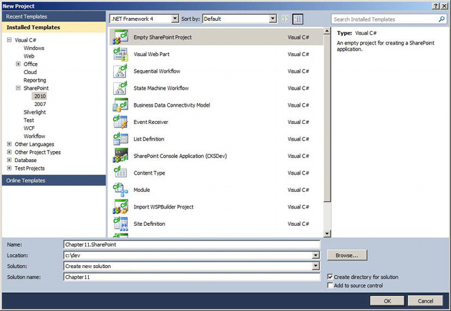
Figure 10-1. Creating a new SharePoint project in Visual Studio 2010
- After clicking OK to create the project, Visual Studio will display the SharePoint Customization Wizard, as depicted in Figure 10-2. Enter the URL of the site where you’ll be testing/debugging your code, and select the Deploy as sandboxed solution deployment option (recall from Chapter 7 that farm solutions—the other choice–are not allowed in SharePoint Online even though Visual Studio doesn’t specifically call that out).
- Click Finish on the SharePoint Customization Wizard to finish creating the project.
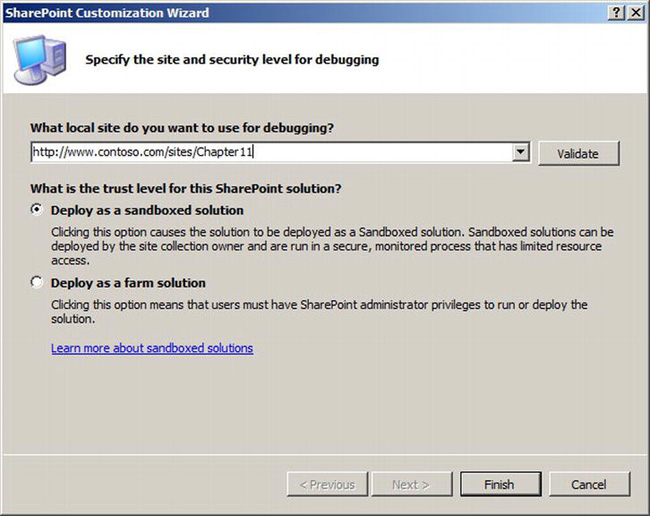
Figure 10-2. SharePoint Customization Wizard in Visual Studio
Creating a Silverlight Project
The following steps will guide you through creating a Silverlight project in Visual Studio. Steps 2 and 3 are illustrated in Figure 10-3.
- Open the File menu in Visual Studio, and choose New
- On the New Project dialog, select the Silverlight node on the left. Select a Silverlight project template (normally Silverlight Application) and give it a name.
- If you’re adding this project to an existing solution, select Add to solution from the Solution drop-down near the bottom of the dialog.
- Click OK to create the project.
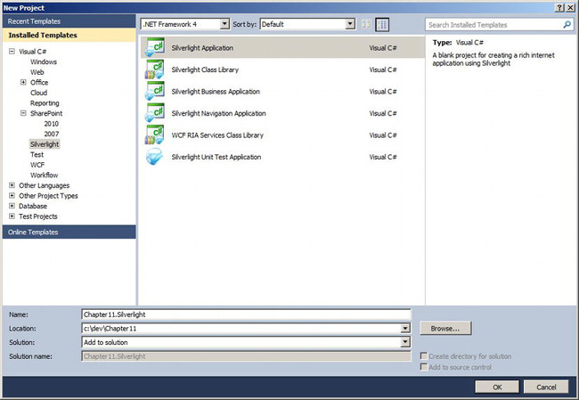
Figure 10-3. Creating a new Silverlight project in Visual Studio 2010
If you choose Silverlight Application or Silverlight Navigation Application for Step 2, a dialog similar to the one shown in Figure 10-4 will pop up during project creation. The dialog offers a couple of configuration options for your project, including whether you want a web project (website) created to host your Silverlight application. (The dialog will be slightly different if your solution already contains a web project. In that case, you’ll be asked whether you want the Silverlight application hosted in the existing web project.)
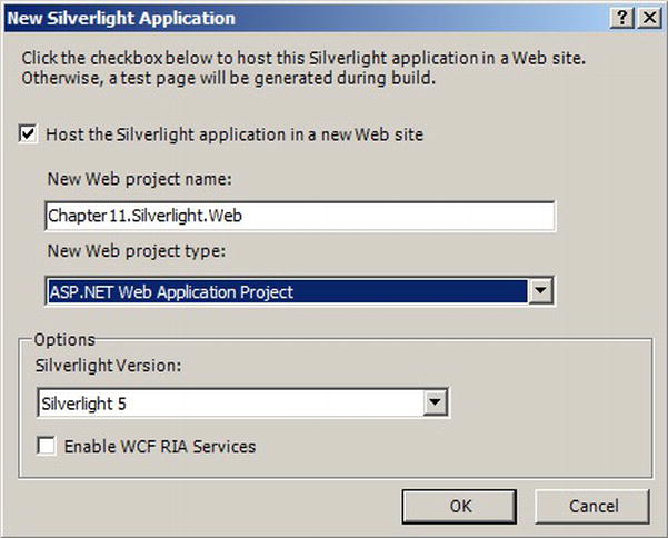
Figure 10-4. Dialog for creating a new Silverlight Application project
It’s up to you whether you want a separate web project created. Strictly speaking, you don’t need one because you can do your testing and debugging in your local SharePoint environment. However, during the early stages of developing a Silverlight app, when you’re building out the application framework and creating the UIs, having a separate website for testing can be helpful because you can spin it up and debug it pretty quickly. Just keep in mind that if your SharePoint site requires authentication and you connect to it through code in your Silverlight application, you’ll be prompted to authenticate if you run the Silverlight app in another website outside of SharePoint.
Assuming you do want a web project created, the dialog also offers you the choice of enabling WCF RIA Services for your Silverlight and web projects. WCF RIA Services is an application framework that simplifies the development of n-tier applications by more tightly integrating ASP.NET with Silverlight (see http://bit.ly/1euj3T for more information). However, it’s unlikely you’ll need to enable WCF RIA Services because SharePoint Online doesn’t provide any built-in support for it on the server side.
Linking Your SharePoint and Silverlight Projects Together
If you plan to deploy your Silverlight application to SharePoint Online using a module element in a feature, linking your SharePoint and Silverlight projects together in Visual Studio will help ensure everything stays synchronized.
Follow these steps to link a Silverlight and SharePoint together in Visual Studio:
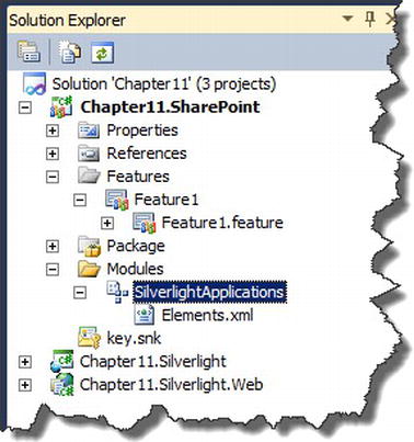
- Locate your SharePoint project in the Solution Explorer. As shown in Figure 10-5, select the module through which the Silverlight application will be deployed (be sure to select the actual SharePoint project item that represents the module, not any files or folders beneath it).
- Once the module is selected, examine the Properties window and locate the Project Output References property, as shown in Figure 10-6. Edit the property to access the Project Output References dialog.
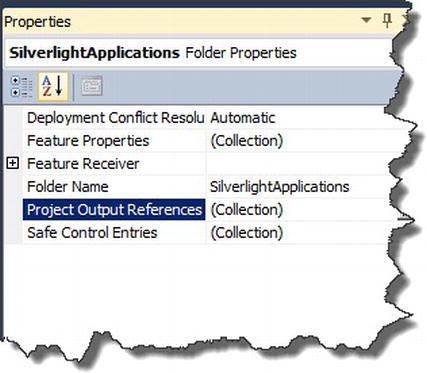
Figure 10-6. Project Output References property in the Properties window
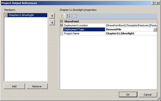
- Click the Add button on the Project Output References dialog. Select your Silverlight project in the drop-down next to the Project Name field and change the Deployment Type to ElementFile (see Figure 10-7).
- Open your module’s Elements.xml file and verify the .xap file from your Silverlight project was added. Tweak the
Urlattribute of the <File> tag for the .xap file as needed (for example, the path to the document library where you’re deploying might need to be set).
Now your SharePoint and Silverlight projects are linked. When you’re ready to test, you can simply build and deploy the SharePoint project to SharePoint Online. The Silverlight project will automatically be built as well and its output will be added to the module it was linked with.
Building a Silverlight Application with the Client Object Model
If you aren’t already familiar with the client object model in SharePoint Online, we recommend you first read Chapter 9 before continuing. Chapter 9 introduces and describes the client object model, including the Silverlight application programming interface (API).
In this section we’ll walk you through building a simple Silverlight application that uses the client object model to retrieve data from a SharePoint document library and display it in a pie chart. Our goal here is to expand your horizons beyond simply reading and updating list data (of which you can find examples almost everywhere) and instead demonstrate how you might use Silverlight as a data analysis or business intelligence tool by helping you better visualize your data.
Although this section will show you snippets of the application, you can download a completed version of the entire application if you want. It’s available as part of the download that accompanies this chapter.
Referencing the Client Object Model
Before you can use the client object model in your Silverlight application, you must add the necessary assembly references to your Silverlight project.
The files you want are Microsoft.SharePoint.Client.Silverlight.dll and Microsoft.SharePoint.Client.Silverlight.Runtime.dll. When you open the Visual Studio Add Reference dialog, browse to the following location to find the assemblies: C:Program FilesCommon FilesMicrosoft SharedWeb Server Extensions14TEMPLATELAYOUTSClientBin (assuming SharePoint was installed at C:Program Files, as is common in development environments).
Once the references have been added, most of the classes you will need in your code can be found in the Microsoft.SharePoint.Client namespace.
Getting the Chart Control
Silverlight 5 doesn’t provide a built-in pie chart control, but you can use the one provided by the Silverlight toolkit. As we mentioned in the Preparing Your Development Environment for Silverlight section earlier in this chapter, you can download the toolkit for free at http://silverlight.codeplex.com. Make sure you download the toolkit for Silverlight 5, not the one for Windows Phone. At the time of this writing, the December 2011 version of the toolkit is the most current release.
Once you’ve downloaded and installed the toolkit, you’ll need to add a reference in your project to the System.Windows.Controls.DataVisualization.Toolkit.dll assembly, which you can find in the C:Program Files (x86)Microsoft SDKsSilverlightv5.0Toolkitdec11Bin folder.
The control you’ll be using from this assembly is the System.Windows.Controls.DataVisualization.Charting.Chart control. The Chart control can be used to render several different types of charts, including pie charts.
Adding the Chart to a View
The next step is to add the Chart control to a view (.xaml file) in your Silverlight application. Listing 10-1 shows the code we used to add a Chart control to the MainPage.xaml file in our application.
Listing 10-1. Code to add a Chart control to MainPage.xaml
<UserControl x:Class="Chapter10.Silverlight.MainPage"

    xmlns="http://schemas.microsoft.com/winfx/2006/xaml/presentation"

    xmlns:x="http://schemas.microsoft.com/winfx/2006/xaml"

    xmlns:d="http://schemas.microsoft.com/expression/blend/2008"

    xmlns:mc="http://schemas.openxmlformats.org/markup-compatibility/2006"

    xmlns:toolkit="http://schemas.microsoft.com/winfx/2006/xaml/presentation/toolkit"

    mc:Ignorable="d"

    d:DesignHeight="300" d:DesignWidth="400">


    <Grid x:Name="LayoutRoot" Margin="10" Background="White">

        <toolkit:Chart LegendTitle="{Binding LegendTitle}" Title="{Binding Title}">

            <toolkit:Chart.Series>

                <toolkit:PieSeries

                    ItemsSource="{Binding FileTypes}"

                    DependentValueBinding="{Binding Count}"

                    IndependentValueBinding="{Binding TypeName}" />
            </toolkit:Chart.Series>

        </toolkit:Chart>

    </Grid>

</UserControl>
As shown in Listing 10-1, the way to construct a pie chart using the Chart control is to add a PieSeries object to the Chart’s Series collection. The PieSeries object has three important properties you’ll need: ItemsSource, DependentValueBinding, and IndependentValueBinding.
The ItemsSource property will reference your collection of data objects. Each data object in this case will have two values: a file type name (e.g., .docx for a Microsoft Word 2010 document) and a count (e.g., 10 if there are 10 files of that type in the library). In pie chart lingo, the file type name is the independent variable in the chart and the count is the dependent variable (in that it determines the size of the “chunk” representing that file type in the pie).
Presenting Data to the View
When it comes to modeling the data and presenting it to the view, we recommend following the Model-View-View-Model (MVVM) design pattern that’s commonly used for Silverlight development. The MVVM pattern is designed to work well with XAML and data binding and helps ensure proper separation of concerns in your application.
Listing 10-2 shows a starting point for a PieChartViewModel class that could be used to present data to the view.
Listing 10-2. PieChartViewModel class
   public class PieChartViewModel : BaseViewModel

    {

        public List<PieChartFileType> FileTypes

        {

            get { /* Return a list of PieChartFileType objects */ }

            set { /* Set property value and notify view */ }

        }


        public string LegendTitle

        {

            get  { return "File Types"; }

        }


        public string Title

        {

            get { return “File Breakdown by Type”; }

        }


        public void Load()

        {

            // Get data from a service and load it into the ViewModel

        }

    }
Although the code in Listing 10-2 isn’t entirely complete, it illustrates the basic structure of a ViewModel class. It has properties to which the view can bind, and it has a mechanism for loading data into those properties. It also inherits from a “base” ViewModel class, which is pretty common practice. At a minimum, the base ViewModel class usually implements the INotifyPropertyChanged interface (required for data binding) and provides a method that child classes can call to invoke the PropertyChanged event (which tells a view bound to a property to refresh its value for that property).
Modeling the Data
To create our pie chart, we need to construct a data series. For each data point in that series, we need two values: a file type and a count (the independent and dependent variables, respectively, which we’re plotting on the pie chart).
Continuing with the sample code we showed in Listing 10-2, we present a PieChartFileType class in Listing 10-3 that could be used to model each data point in our series.
Listing 10-3. PieChartFileType class that represents a data point for the pie chart
    public class PieChartFileType

    {

        public PieChartFileType(string typeName, int count)

        {

            this.TypeName = typeName;

            this.Count = count;

        }


        public string TypeName { get; set; }

        public int Count { get; set; }

    }
Now the FileTypes property we showed in Listing 10-2 should make more sense. If you set that property value to a list of PieChartFileType objects, you have a data series for plotting on your pie chart.
Getting the Data from SharePoint
Once you have a way to model the data, the next step is to retrieve it from SharePoint. There are many ways to structure that logic. Listing 10-4 presents a PieChartDataService class as one possible way to do it.
Listing 10-4. Sample PieChartDataService class for retrieving data
    public class PieChartDataService

    {

        public void GetData(Action<List<PieChartFileType>> onSuccess, Action<string> onError)

        {

            try

            {

                ClientContext ctx = ClientContext.Current;

                List mpGallery = ctx.Web.Lists.GetByTitle(“Shared Documents”);

                CamlQuery query = new CamlQuery();

                query.ViewXml = "<View Scope='Recursive' />";


                ListItemCollection items = mpGallery.GetItems(query);


                ctx.Load(items);
                ctx.ExecuteQueryAsync(

                    (sender, successArgs) => {

                        // Process data and invoke onSuccess callback

                    },

                    (sender, failureArgs) => {

                        // Invoke onError callback

                    }

                );

            }

            catch (Exception ex)

            {

                // Invoke onError callback

            }

        }

    }
The class shown in Listing 10-4 is small and simply contains a GetData method for retrieving the necessary data from SharePoint. To simplify life for callers in light of the asynchronous nature of retrieving the data, the GetData method takes two parameters: onSuccess and onError. Both parameters use the generic System.Action<T> type to define callback functions that are called when the data is loaded successfully or when an error occurs, respectively. In the former case, a list of data points is passed to the caller; in the latter, a string variable containing an error message.
In both cases, whether the data is loaded successfully or not, we are returning from an asynchronous call and must marshal our subsequent calls back to the UI thread so we don’t get exceptions when control values are updated on the view. Normally, that process involves getting a handle to a Dispatcher object, but Microsoft provides a SmartDispatcher class (available at http://bit.ly/dihIDd) that makes marshaling to the UI thread even easier by abstracting out the details of finding a Dispatcher object.
Listing 10-5 builds on Listing 10-4 by showing how the SmartDispatcher class can be used to process the data returned from SharePoint and pass it to the caller.
Listing 10-5. Using SmartDispatcher to process and return data from SharePoint
SmartDispatcher.BeginInvoke(() =>

    {

        List<PieChartFileType> fileTypes = new List<PieChartFileType>();


        var groups =

        from item in items.ToArray()

        group item by (string)item["File_x0020_Type"];


        foreach (var group in groups)

        {

            fileTypes.Add(new PieChartFileType(group.Key, group.Count()));

        }


        if (onSuccess != null)

        {

            onSuccess(fileTypes);

        }

    }

);
Note To use the SmartDispatcher class, you must call its static Initialize method in the Application_Startup event of your Silverlight application.
Note the use of LINQ to Objects in Listing 10-5 to group the list items by file type. Grouping them this way makes it easy to count how many there are of each type.
Now that we have a data service for retrieving data, the Load method from Listing 10-2 could be written as shown in Listing 10-6.
Listing 10-6. Body of Load method in the PieChartViewModel class
PieChartDataService service = new PieChartDataService();


service.GetData(

    (fileTypes) =>

        {

            this.FileTypes = fileTypes;

        },

    (error) =>

        {

            // Display error to user

        }

);
Now you have all the core pieces you need to get started building a Silverlight application that displays SharePoint data in a pie chart. Figure 10-8 shows what the final application might look like.
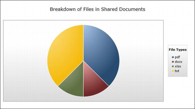
Figure 10-8. Silverlight application with pie chart showing breakdown of file types
The next two sections of this chapter discuss the options for deploying and hosting a Silverlight application in SharePoint Online.
Deploying Silverlight Applications to SharePoint Online
There are two ways you can deploy a Silverlight application to SharePoint Online: manual deployment or feature-based deployment. Both approaches are presented here so you can choose the one that works best for your situation.
Manual Deployment
Manually deploying a Silverlight application to SharePoint Online is as easy as uploading the .xap file to a document library. Once the file is uploaded, it is ready to be referenced and hosted in the browser. The steps for uploading a .xap file are no different from uploading any other type of file, so they aren’t covered in detail here.
There’s no specific library in which you have to store your .xap files, but we definitely recommend keeping permissions in mind when making your choice. If it’s an important application you don’t want accidentally deleted, for example, choosing a library with loose permissions (such as the Shared Documents library in a team site) is probably not the best approach. Creating a new dedicated library or using an existing one with more restrictive permissions (such as the Master Page Gallery) would be a better way to go.
In any case, anyone who has permissions to upload files to your site can upload a Silverlight application, making it a fairly easy and accessible approach.
Feature-Based Deployment
Feature-based deployment is a more repeatable and controlled way of deploying a Silverlight application to SharePoint Online, but does require some SharePoint development knowledge.
Feature-based deployment consists of creating a feature (in a SharePoint solution package or .wsp file) that deploys the Silverlight application using a module element. As was mentioned in the “Creating and Linking Your Projects” section earlier in this chapter, the easiest way to do this is by having your SharePoint and Silverlight projects in a single solution and linking them together in Visual Studio.
Once you create your feature and solution package, you can upload it to the Solution Gallery of a SharePoint Online site and activate it normally.
Hosting a Silverlight Application in SharePoint Online
Once you deploy a Silverlight application to SharePoint Online, the next decision you’re faced with is how to host it (i.e., how to reference it and render the appropriate markup to the browser).
You have two options when it comes to hosting a Silverlight application. The first option is to use the Silverlight web part that’s included with SharePoint Online. Using this web part is as simple as pointing it at a .xap file, and it renders the appropriate markup to the browser. The second option is to render your own HTML markup to the page just as you would in any website outside of SharePoint. This latter option can be implemented in a variety of ways, including emitting markup from a custom web part, adding markup to a page using SharePoint Designer, and adding markup with a Content Editor web part, just to name a few. Basically, any means you can use to inject HTML markup into a page in SharePoint Online will work with the latter approach.
This section focuses on two of the most common approaches: using the Silverlight web part and emitting markup from a custom web part. As usual, we recommend choosing the approach that best fits your specific requirements.
Using the Silverlight Web Part
Using the Silverlight web part is a very common way to host Silverlight applications in SharePoint Online. It’s simple to configure and can be easily added to a page by anyone with permissions to do so.
There are at least two ways we can use the Silverlight web part in SharePoint Online to host a Silverlight application. One way is to add the built-in Silverlight web part to a page and configure it using the web part’s tool pane. Another way is to create a preconfigured version of the Silverlight web part that requires no (or minimal) configuration after being added to a page. We’ll discuss both approaches in this section.
Using the Built-In Silverlight Web Part
To use the built-in Silverlight web part, start by editing one of the pages on your site. On the Insert tab of the Editing Tools group in the ribbon, click the More Web Parts button, as shown in Figure 10-9.
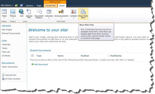
Figure 10-9. The More Web Parts button on the page editing ribbon
When the dialog window with more web parts appears, select the Silverlight web part from the Media and Content category (see Figure 10-10). Click the Add button to add the web part to the page.
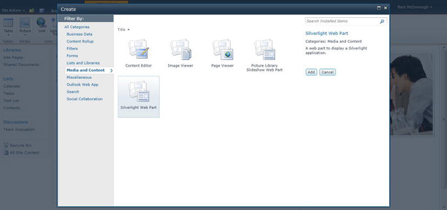
Figure 10-10. Selecting the Silverlight web part from the Media and Content category
After being added to the page, the web part will display the message shown in Figure 10-11. Click the tool pane link in the message to open the web part’s tool pane so you can configure it.
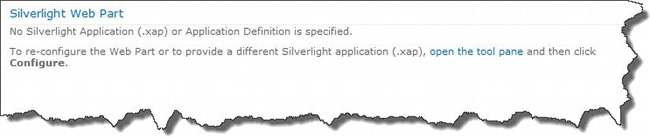
Figure 10-11. Configuration message displayed by the Silverlight web part
Note When you click the tool pane link, you may get a message asking whether you want to save your changes (to the page) before continuing. Click OK to save and then continue with configuring the web part.
Once the tool pane is open, click the Configure button in the Application section at the top. Enter the URL (local or remote) of the .xap file you want to host and click OK to close the dialog. You must also enter a fixed height for the web part under the Appearance section (if you don’t, you’ll get an error when trying to save your changes). Click OK or Apply in the tool pane to save your changes.
Using a Preconfigured Silverlight Web Part
Using the built-in Silverlight web part as-is is fine if you don’t mind configuring it every time you use it. However, what if you have a Silverlight application that may get used repeatedly throughout your site? Or what if you just want to make life easier for your users by not requiring them to know how to configure .xap file URLs?
You can address both cases by deploying a preconfigured version of the Silverlight web part for your users. There’s no server-side code involved here, and there’s no need to deploy any DLLs.
You’ll just deploy a custom .webpart file (XML file) to the Web Part Gallery in the top-level site of your site collection. The files in this gallery are designed to tell SharePoint how a web part should be configured when added to a page (i.e., which .NET web part class should be used and how its properties should be set). You can have multiple files in the gallery that reference the same web part as long as they’re named uniquely.
The following steps help you create your own preconfigured version of the Silverlight web part and deploy it to the Web Part Gallery:
- Edit a page on your site and add a Silverlight web part to the page, as discussed in the previous section.
- Edit the web part. Under the Advanced section in its editing tool pane, look for the Export Mode property. Set the property value to Export All Data and save your changes.
- Now, from the web part’s menu (the right side of its header), choose the
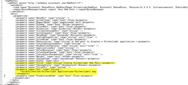
Exportcommand. Save the resulting .webpart file where you can find it easily because you’ll need it again in a moment.- Open the .webpart file in a text editor or in Visual Studio. Look for a <property> tag with a name of “Url” and a type of “string.” Set the value of this tag to the URL of a .xap file. You should also find the property with a name of “title” and set its value to a descriptive title for the web part. Figure 10-12 shows a sample .webpart file and highlights these two properties. Note that the Url property can contain two special tokens (~siteCollection or ~site) to reference the base URL of the site collection or site (web) where the web part is used.
- Deploy your custom .webpart file to the Web Part Gallery in the top-level site of your site collection. One way to do this is to use a module element within a feature. However, it can also be done manually by following these steps:
- Navigate to the
Site Settingspage of the top-level site in your site collection.- Click the Web parts link under the Galleries heading.
- Upload your .webpart file into the gallery (go to the Documents tab in the ribbon and select Upload Document).
- You’ll be prompted to fill out a few properties for your file, including its name and group. Whatever name you give it is fine as long as it’s unique within the gallery. The group value is the category that shows up on the left side of the web part dialog when adding the web part to a page (for example, the “Media and Content” group in Figure 10-10). If you don’t supply a group name, SharePoint will create a group called “Miscellaneous” and add it to that.
Using a Custom Web Part
Depending on your requirements, the Silverlight web part may not always be a good fit. Sometimes, you may need or want to create your own web part that hosts a Silverlight application.
To do so, you can emit your Silverlight application markup from the CreateChildControls method of your web part, as shown in Listing 10-7.
Listing 10-7. Emitting Silverlight markup from a custom web part
protected override void CreateChildControls()

{

    string markup = String.Format(

        @"<div id=""silverlightControlHost"">

                 <object data=""data:application/x-

silverlight-2,"" type=""application/x-silverlight-2"" width=""100%"" height=""100%"">

                     <param name=""source"" value=""/_catalogs/masterpage/MySilverlightApp.xap""/>

                     <param name=""minRuntimeVersion"" value=""5.0.61118.0"" />

                     <param name=""initParams"" value=""MS.SP.url={1}"" />

                     <param name=""autoUpgrade"" value=""true"" />

                     <a href=""http://go.microsoft.com/fwlink/?LinkID=149156&v=5.0.61118.0""

style=""text-decoration:none"">

                         <img src=""http://go.microsoft.com/fwlink/?LinkId=161376"" alt=""Get

Microsoft Silverlight"" style=""border-style:none""/>

                     </a>

                 </object><iframe id=""_sl_historyFrame"" style=""visibility:hidden;height:0px;width:0px;border:0px""></iframe>

             </div>",

             SPHttpUtility.HtmlEncode(SPContext.Current.Web.Url)

    );


    this.Controls.Add(new LiteralControl(markup));

}
The Silverlight markup in Listing 10-7 is essentially what Visual Studio generates when creating a web application with a test page to accompany a Silverlight 5 project. The two key differences are the source and initParams parameters that are passed to the <object> tag. The former was changed to reference the Silverlight app at its location within SharePoint, and the latter was changed to include a special variable called MS.SP.url. The reason for passing MS.SP.url (with the URL of the current site or site collection we’re in) to Silverlight as an initialization parameter is so ClientContext.Current will work if the Silverlight app is using the client object model. Without that variable, ClientContext.Current would return null. SharePoint automatically adds the MS.SP.url variable when the Silverlight web part is used, but you must do it yourself if emitting your own markup.
Summary
We began this chapter by helping you prepare your development environment for Silverlight. We then walked you through the process of creating SharePoint and Silverlight projects in a single solution in Visual Studio and linking them together to make deployment easier. We then discussed developing a Silverlight application using the client object model and concluded by discussing options for deploying and hosting Silverlight applications in SharePoint Online.
It’s impossible to cover every possible scenario for using Silverlight in SharePoint Online in a single chapter because the topic is so broad. However, we hope we’ve given you some good information to help you get started on your own project.