
3-14. Forwarding Touch Events
You have views or other touch targets in your application that are too small for the average finger to reliably activate.
Solution
Use TouchDelegate to designate an arbitrary rectangle to forward touch events to your small views. TouchDelegate is designed to attach to a parent ViewGroup for the purpose of forwarding touch events it detects within a specific space to one of its children. TouchDelegate modifies each event to look to the target view as if it had happened within its own bounds.
How It Works
Listings 3-38 and 3-39 illustrate the use of TouchDelegate within a custom parent ViewGroup.
Listing 3-38. Custom Parent Implementing TouchDelegate
public class TouchDelegateLayout extends FrameLayout {

    public TouchDelegateLayout(Context context) {
        super(context);
        init(context);
    }

    public TouchDelegateLayout(Context context, AttributeSet attrs) {
        super(context, attrs);
        init(context);
    }

    public TouchDelegateLayout(Context context, AttributeSet attrs,
            int defStyle) {
        super(context, attrs, defStyle);
        init(context);
    }

    private CheckBox mButton;
    private void init(Context context) {
        //Create a small child view we want to forward touches to.
        mButton = new CheckBox(context);
        mButton.setText("Tap Anywhere");

        LayoutParams lp = new FrameLayout.LayoutParams(
                LayoutParams.WRAP_CONTENT,
                LayoutParams.WRAP_CONTENT,
                Gravity.CENTER);
        addView(mButton, lp);
    }


    /*
     * TouchDelegate is applied to this view (parent) to delegate all
     * touches within the specified rectangle to the CheckBox (child).
     * Here, the rectangle is the entire size of this parent view.
     *
     * This must be done after the view has a size so we know how big
     * to make the Rect, thus we've chosen to add the delegate in
     * onSizeChanged()
     */
    @Override
    protected void onSizeChanged(int w, int h, int oldw, int oldh) {
        if (w != oldw || h != oldh) {
            //Apply the whole area of this view as the delegate area
            Rect bounds = new Rect(0, 0, w, h);
            TouchDelegate delegate = new TouchDelegate(bounds, mButton);
            setTouchDelegate(delegate);
        }
    }
}
Listing 3-39. Example Activity
public class DelegateActivity extends Activity {

    @Override
    protected void onCreate(Bundle savedInstanceState) {
        super.onCreate(savedInstanceState);
        TouchDelegateLayout layout =
                new TouchDelegateLayout(this);

        setContentView(layout);
    }
}
In this example, we create a parent view that contains a centered check box. This view also contains a TouchDelegate that will forward touches received anywhere inside the bounds of the parent to the check box. Because we want to pass the full size of the parent layout as the rectangle to forward events, we wait until onSizeChanged() is called on the view to construct and attach the TouchDelegate instance. Doing so in the constructor would not work, because at that point, the view has not been measured and will not have a size we can read.
The framework automatically dispatches unhandled touch events from the parent through TouchDelegate to its delegate view, so no additional code is needed to forward these events. You can see in Figure 3-14 that this application is receiving touch events far away from the check box, and the check box reacts as if it has been touched directly.
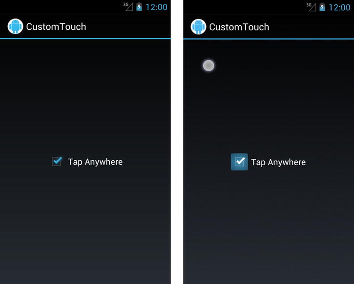
Figure 3-14. Sample application with check box (left), and check box receiving a forwarded touch event (right)
Custom Touch Forwarding (Remote Scroller)
TouchDelegate is great for forwarding tap events, but it has one drawback: each event forwarded to the delegate first has its location reset to the exact midpoint of the delegate view. This means that if you attempt to forward a series of ACTION_MOVE events through TouchDelegate, the results won’t be what you expect, because they will look to the delegate view as if the finger isn’t really moving at all.
If you need to reroute touch events in a more pure form, you can do so by manually calling the dispatchTouchEvent() method of the target view. Have a look at Listings 3-40 and 3-41 to see how this works.
Listing 3-40. res/layout/main.xml
<LinearLayout
    xmlns:android="http://schemas.android.com/apk/res/android"
    android:layout_width="match_parent"
    android:layout_height="match_parent"
    android:orientation="vertical" >

    <TextView
        android:id="@+id/text_touch"
        android:layout_width="match_parent"
        android:layout_height="0dp"
        android:layout_weight="1"
        android:gravity="center"
        android:text="Scroll Anywhere Here" />

    <HorizontalScrollView
        android:id="@+id/scroll_view"
        android:layout_width="match_parent"
        android:layout_height="0dp"
        android:layout_weight="1"
        android:background="#CCC">
        <LinearLayout
            android:layout_width="wrap_content"
            android:layout_height="match_parent"
            android:orientation="horizontal" >
            <ImageView
                android:layout_width="250dp"
                android:layout_height="match_parent"
                android:scaleType="fitXY"
                android:src="@drawable/ic_launcher" />
            <ImageView
                android:layout_width="250dp"
                android:layout_height="match_parent"
                android:scaleType="fitXY"
                android:src="@drawable/ic_launcher" />
            <ImageView
                android:layout_width="250dp"
                android:layout_height="match_parent"
                android:scaleType="fitXY"
                android:src="@drawable/ic_launcher" />
            <ImageView
                android:layout_width="250dp"
                android:layout_height="match_parent"
                android:scaleType="fitXY"
                android:src="@drawable/ic_launcher" />
        </LinearLayout>
    </HorizontalScrollView>
</LinearLayout>
Listing 3-41. Activity Forwarding Touches
public class RemoteScrollActivity extends Activity implements
        View.OnTouchListener {

    private TextView mTouchText;
    private HorizontalScrollView mScrollView;

    @Override
    protected void onCreate(Bundle savedInstanceState) {
        super.onCreate(savedInstanceState);
        setContentView(R.layout.main);

        mTouchText = (TextView) findViewById(R.id.text_touch);
        mScrollView =
            (HorizontalScrollView) findViewById(R.id.scroll_view);
        //Attach a listener for touch events to the top view
        mTouchText.setOnTouchListener(this);
    }

    @Override
    public boolean onTouch(View v, MotionEvent event) {
        // You can massage the event location if necessary.
        // Here we set the vertical location for each event to
        // the middle of the HorizontalScrollView.

        // View's expect events to be relative to their
        // local coordinates.
        event.setLocation(event.getX(),
                mScrollView.getHeight() / 2);

        // Forward each event from the TextView to the
        // HorizontalScrollView
        mScrollView.dispatchTouchEvent(event);
        return true;
    }
}
This example displays an activity that is divided in half. The top half is a TextView that prompts you to touch and scroll around, and the bottom half is a HorizontalScrollView with a series of images contained inside. The activity is set as the OnTouchListener for the TextView so that we can forward all touches it receives to the HorizontalScrollView.
We want the events that the HorizontalScrollView sees to look, from its perspective, as if they were originally inside the view bounds. So before we forward the event, we call setLocation() to change the x/y coordinates. In this case, the x coordinate is fine as is, but we adjust the y coordinate to be in the center of the HorizontalScrollView. Now the events look as if the user’s finger is moving back and forth along the middle of the view. We then call dispatchTouchEvent() with the modified event to have the HorizontalScrollView process it.
Note Avoid calling onTouchEvent() directly to forward touches. Calling dispatchTouchEvent() allows the event processing of the target view to take place the same way it does for normal touch events, including any intercepts that may be necessary.
3-15. Blocking Touch Thieves
Problem
You have designed nested touch interactions in your application views that don’t work well with the standard flow of touch hierarchy, in which higher-level container views handle touch events directly by stealing them back from child views.
Solution
(API Level 1)
ViewGroup, which is the base class for all layouts and containers in the framework, provides the descriptively named method requestDisallowTouchIntercept() for just this purpose. Setting this flag on any container view indicates to the framework that, for the duration of the current gesture, we would prefer they not intercept the events coming into their child views.
How It Works
To showcase this in action, we have created an example in which two competing touchable views live in the same space. The outer containing view is a ListView, which responds to touch events that indicate a vertical drag by scrolling the content. Inside the ListView, added as a header, is a ViewPager, which responds to horizontal drag touch events for swiping between pages. In and of itself, this creates a problem in that any attemps to horizontally swipe the ViewPager that even remotely vary in the vertical direction will be cancelled in favor of the ListView scrolling, because ListView is monitoring and intercepting those events. Since humans are not very capable of dragging in an exactly horizontal or vertical motion, this creates a usability problem.
To set up this example, we first have to declare a dimension resource (see Listing 3-42), and then the full activity is found in Listing 3-43.
Listing 3-42. res/values/dimens.xml
<?xml version="1.0" encoding="utf-8"?>
<resources>
    <dimen name="header_height">150dp</dimen>
</resources>
Listing 3-43. Activity Managing Touch Intercept
public class DisallowActivity extends Activity implements
        ViewPager.OnPageChangeListener {
    private static final String[] ITEMS = {
            "Row One", "Row Two", "Row Three", "Row Four",
            "Row Five", "Row Six", "Row Seven", "Row Eight",
            "Row Nine", "Row Ten"
    };

    private ViewPager mViewPager;

    private ListView mListView;

    @Override
    protected void onCreate(Bundle savedInstanceState) {
        super.onCreate(savedInstanceState);

        //Create a header view of horizontal swiping items
        mViewPager = new ViewPager(this);
        //As a ListView header, ViewPager must have a fixed height
        mViewPager.setLayoutParams(new ListView.LayoutParams(
                ListView.LayoutParams.MATCH_PARENT,
                getResources().getDimensionPixelSize(
                        R.dimen.header_height)) );
        // Listen for paging state changes to disable
        // parent touches
        mViewPager.setOnPageChangeListener(this);
        mViewPager.setAdapter(new HeaderAdapter(this));

        // Create a vertical scrolling list
        mListView = new ListView(this);
        // Add the pager as the list header
        mListView.addHeaderView(mViewPager);
        // Add list items
        mListView.setAdapter(new ArrayAdapter<String>(this,
                android.R.layout.simple_list_item_1, ITEMS));

        setContentView(mListView);
    }

    /* OnPageChangeListener Methods */

    @Override
    public void onPageScrolled(int position,
            float positionOffset, int positionOffsetPixels) { }

    @Override
    public void onPageSelected(int position) { }

    @Override
    public void onPageScrollStateChanged(int state) {
        //While the ViewPager is scrolling, disable the
        // ScrollView touch intercept so it cannot take over and
        // try to vertical scroll. This flag must be set for each
        // gesture you want to override.
        boolean isScrolling =
                state != ViewPager.SCROLL_STATE_IDLE;
        mListView.requestDisallowInterceptTouchEvent(isScrolling);
    }

    private static class HeaderAdapter extends PagerAdapter {
        private Context mContext;

        public HeaderAdapter(Context context) {
            mContext = context;
        }

        @Override
        public int getCount() {
            return 5;
        }

        @Override
        public Object instantiateItem(ViewGroup container,
                int position) {
            // Create a new page view
            TextView tv = new TextView(mContext);
            tv.setText(String.format("Page %d", position + 1));
            tv.setBackgroundColor((position % 2 == 0) ? Color.RED
                    : Color.GREEN);
            tv.setGravity(Gravity.CENTER);
            tv.setTextColor(Color.BLACK);

            // Add as the view for this position, and return as
            // the object for this position
            container.addView(tv);
            return tv;
        }

        @Override
        public void destroyItem(ViewGroup container,
                int position, Object object) {
            View page = (View) object;
            container.removeView(page);
        }

        @Override
        public boolean isViewFromObject(View view,
                Object object) {
            return (view == object);
        }
    }
}
In this activity, we have a ListView that is the root view with a basic adapter included to display a static list of string items. Also in onCreate(), a ViewPager instance is created and added to the list as its header view. We will talk in more detail about how ViewPager works later in this chapter, but suffice it to say here that we are creating a simple ViewPager instance with a custom PagerAdapter that displays a handful of colored views as its pages for the user to swipe between.
When the ViewPager is created, we construct and apply a set of ListView.LayoutParams to govern how it should be displayed as the header. We must do this because the ViewPager itself has no inherent content size and list headers don’t work well with a view that isn’t explicit about its height. The fixed height is applied from our dimension’s resource so we can easily get a properly scaled dp value that is device independent. This is simpler than attempting to fully construct a dp value completely in Java code.
The key to this example is in the OnPageChangeListener the activity implements (which is then applied to the ViewPager). This callback is triggered as the user interacts with ViewPager and swipes left and right. Inside the onPageScrollStateChanged() method, we are passed a value that indicates whether the ViewPager is idle, actively scrolling, or settling to a page after being scrolled. This is a perfect place to control the touch intercept behavior of the parent ListView. Whenever the scrolling state of the ViewPager is not idle, we don’t want the ListView to steal the touch events ViewPager is using, so we set the flag in requestDisallowTouchIntercept().
There is another reason we continuously trigger this value. We mentioned in the original solution that this flag is valid for the current gesture. This means that each time a new ACTION_DOWN event occurs, we need to set the flag again. Rather than adding touch listeners just to look for specific events, we continuously set the flag based on the scrolling behavior of the child view and we get the same effect.
3-16. Making Drag-and-Drop Views
Your application’s UI needs to allow the user to drag views around on the screen and to possibly drop them on top of other views.
Solution
Use the drag-and-drop APIs available in the Android 3.0 framework. The View class includes all the enhancements necessary to manage a drag event on the screen, and the OnDragListener interface can be attached to any View that needs to be notified of drag events as they occur. To begin a drag event, simply call startDrag() on the view you would like the user to begin dragging. This method takes a DragShadowBuilder instance, which will be used to construct what the dragging portion of the view should look like, and two additional parameters that will be passed forward to the drop targets and listeners.
The first of these is a ClipData object to pass forward a set of text or a Uri instance. This can be useful for passing a file location or a query to be made on a ContentProvider. The second is an Object referred to as the local state of the drag event. This can be any object and is designed to be a lightweight instance describing something application-specific about the drag. The ClipData will be available only to the listener where the dragged view is dropped, but the local state will be accessible to any listener at any time by calling getLocalState() on the DragEvent.
The OnDragListener.onDrag() method will get called for each specific event that occurs during the drag-and-drop process, passing in a DragEvent to describe the specifics of each event. Each DragEvent will have one of the following actions:
- ACTION_DRAG_STARTED: Sent to all views when a new drag event begins with a call to startDrag()
- The location can be obtained with getX() and getY().
- ACTION_DRAG_ENTERED: Sent to a view when the drag event enters its bounding box
- ACTION_DRAG_EXITED: Sent to a view when the drag event leaves its bounding box
- ACTION_DRAG_LOCATION: Sent to a view between ACTION_DRAG_ENTERED and ACTION_DRAG_EXITED with the current location of the drag inside that view
- The location can be obtained with getX() and getY().
- ACTION_DROP: Sent to a view when the drag terminates and is still currently inside the bounds of that view
- The location can be obtained with getX() and getY().
- ClipData passed with the event can be obtained with getClipData() for this action only.
- ACTION_DRAG_ENDED: Sent to all views when the current drag event is complete
- The result of the drag operation can be obtained here with getResult().
- This return value is based on whether the target view of the drop had an active OnDragListener that returned true for the ACTION_DROP event.
This method works in a similar way to custom touch handling, in that the value you return from the listener will govern how future events are delivered. If a particular OnDragListener does not return true for ACTION_DRAG_STARTED, it will not receive any further events for the remainder of the drag except for ACTION_DRAG_ENDED.
How It Works
Let’s look at an example of the drag-and-drop functionality, starting with Listing 3-44. Here we have created a custom ImageView that implements the OnDragListener interface.
Listing 3-44. Custom View Implementing OnDragListener
public class DropTargetView extends ImageView implements OnDragListener {

    private boolean mDropped;

    public DropTargetView(Context context) {
        super(context);
        init();
    }

    public DropTargetView(Context context, AttributeSet attrs) {
        super(context, attrs);
        init();
    }

    public DropTargetView(Context context, AttributeSet attrs,
            int defaultStyle) {
        super(context, attrs, defaultStyle);
        init();
    }

    private void init() {
        //We must set a valid listener to receive DragEvents
        setOnDragListener(this);
    }

    @Override
    public boolean onDrag(View v, DragEvent event) {
        PropertyValuesHolder pvhX, pvhY;
        switch (event.getAction()) {
        case DragEvent.ACTION_DRAG_STARTED:
            //React to a new drag by shrinking the view
            pvhX = PropertyValuesHolder.ofFloat("scaleX", 0.5f);
            pvhY = PropertyValuesHolder.ofFloat("scaleY", 0.5f);
            ObjectAnimator.ofPropertyValuesHolder(this,
                    pvhX, pvhY).start();
            //Clear the current drop image on a new event
            setImageDrawable(null);
            mDropped = false;
            break;
        case DragEvent.ACTION_DRAG_ENDED:
            // React to a drag ending by resetting the view size
            // if we weren't the drop target.
            if (!mDropped) {
                pvhX = PropertyValuesHolder.ofFloat("scaleX", 1f);
                pvhY = PropertyValuesHolder.ofFloat("scaleY", 1f);
                ObjectAnimator.ofPropertyValuesHolder(this,
                        pvhX, pvhY).start();
                mDropped = false;
            }
            break;
        case DragEvent.ACTION_DRAG_ENTERED:
            //React to a drag entering this view by growing slightly
            pvhX = PropertyValuesHolder.ofFloat("scaleX", 0.75f);
            pvhY = PropertyValuesHolder.ofFloat("scaleY", 0.75f);
            ObjectAnimator.ofPropertyValuesHolder(this,
                    pvhX, pvhY).start();
            break;
        case DragEvent.ACTION_DRAG_EXITED:
            //React to a drag leaving by returning to previous size
            pvhX = PropertyValuesHolder.ofFloat("scaleX", 0.5f);
            pvhY = PropertyValuesHolder.ofFloat("scaleY", 0.5f);
            ObjectAnimator.ofPropertyValuesHolder(this,
                    pvhX, pvhY).start();
            break;
        case DragEvent.ACTION_DROP:
            // React to a drop event with a short keyframe animation
            // and setting this view's image to the drawable passed along
            // with the drag event

            // This animation shrinks the view briefly down to nothing
            // and then back.
            Keyframe frame0 = Keyframe.ofFloat(0f, 0.75f);
            Keyframe frame1 = Keyframe.ofFloat(0.5f, 0f);
            Keyframe frame2 = Keyframe.ofFloat(1f, 0.75f);
            pvhX = PropertyValuesHolder.ofKeyframe("scaleX",
                    frame0, frame1, frame2);
            pvhY = PropertyValuesHolder.ofKeyframe("scaleY",
                    frame0, frame1, frame2);
            ObjectAnimator.ofPropertyValuesHolder(this,
                    pvhX, pvhY).start();
            //Set our image from the Object passed with the DragEvent
            setImageDrawable((Drawable) event.getLocalState());
            //We set the dropped flag so the ENDED animation will
            // not also run
            mDropped = true;
            break;
        default:
            //Ignore events we aren't interested in
            return false;
        }
        //Declare interest in all events we have noted
        return true;
    }

}
This ImageView is set up to monitor incoming drag events and animate itself accordingly. Whenever a new drag begins, the ACTION_DRAG_STARTED event will be sent here, and this view will scale itself down to 50 percent size. This is a good indication to the user where they can drag this view they’ve just picked up. We also make sure that this listener is structured to return true from this event so that it receives other events during the drag.
If the user drags their view onto this one, ACTION_DRAG_ENTERED will trigger the view to scale up slightly, indicating it as the active recipient if the view were to be dropped. ACTION_DRAG_EXITED will be received if the view is dragged away, and this view will respond by scaling back down to the same size as when we entered “drag mode.” If the user releases the drag over the top of this view, ACTION_DROP will be triggered, and a special animation is run to indicate the drop was received. We also read the local state variable of the event at this point, assume it is a Drawable, and set it as the image content for this view.
ACTION_DRAG_ENDEDwill notify this view to return to its original size because we are no longer in drag mode. However, if this view was also the target of the drop, we want it to keep its size, so we ignore this event in that case.
Listings 3-45 and 3-46 show an example activity that allows the user to long-press an image and then drag that image to our custom drop target.
Listing 3-45. res/layout/main.xml
<?xml version="1.0" encoding="utf-8"?>
<RelativeLayout
    xmlns:android="http://schemas.android.com/apk/res/android"
    android:layout_width="match_parent"
    android:layout_height="match_parent" >

    <!-- Top Row of Draggable Items -->
    <LinearLayout
        android:layout_width="match_parent"
        android:layout_height="wrap_content"
        android:orientation="horizontal" >
        <ImageView
            android:id="@+id/image1"
            android:layout_width="0dp"
            android:layout_height="wrap_content"
            android:layout_weight="1"
            android:src="@drawable/ic_send" />
        <ImageView
            android:id="@+id/image2"
            android:layout_width="0dp"
            android:layout_height="wrap_content"
            android:layout_weight="1"
            android:src="@drawable/ic_share" />
        <ImageView
            android:id="@+id/image3"
            android:layout_width="0dp"
            android:layout_height="wrap_content"
            android:layout_weight="1"
            android:src="@drawable/ic_favorite" />
    </LinearLayout>

    <!-- Bottom Row of Drop Targets -->
    <LinearLayout
        android:layout_width="match_parent"
        android:layout_height="wrap_content"
        android:layout_alignParentBottom="true"
        android:orientation="horizontal" >
        <com.examples.dragtouch.DropTargetView
            android:id="@+id/drag_target1"
            android:layout_width="0dp"
            android:layout_height="100dp"
            android:layout_weight="1"
            android:background="#A00" />
        <com.examples.dragtouch.DropTargetView
            android:id="@+id/drag_target2"
            android:layout_width="0dp"
            android:layout_height="100dp"
            android:layout_weight="1"
            android:background="#0A0" />
        <com.examples.dragtouch.DropTargetView
            android:id="@+id/drag_target3"
            android:layout_width="0dp"
            android:layout_height="100dp"
            android:layout_weight="1"
            android:background="#00A" />
    </LinearLayout>

</RelativeLayout>
Listing 3-46. Activity Forwarding Touches
public class DragTouchActivity extends Activity implements
        OnLongClickListener {

    @Override
    public void onCreate(Bundle savedInstanceState) {
        super.onCreate(savedInstanceState);
        setContentView(R.layout.main);
        //Attach long-press listener to each ImageView
        findViewById(R.id.image1).setOnLongClickListener(this);
        findViewById(R.id.image2).setOnLongClickListener(this);
        findViewById(R.id.image3).setOnLongClickListener(this);
    }

    @Override
    public boolean onLongClick(View v) {
        DragShadowBuilder shadowBuilder =
                new DragShadowBuilder(v);
        // Start a drag, and pass the View's image along as
        // the local state
        v.startDrag(null, shadowBuilder,
                ((ImageView) v).getDrawable(), 0);

        return true;
    }

}
This example displays a row of three images at the top of the screen, along with three of our custom drop target views at the bottom of the screen. Each image is set up with a listener for long-press events, and the long-press triggers a new drag via startDrag(). The DragShadowBuilder passed to the drag initializer is the default implementation provided by the framework. In the next section, we’ll look at how this can be customized, but this version just creates a slightly transparent copy of the view being dragged and places it centered underneath the touch point.
We also capture the image content of the view the user selected with getDrawable() and pass that along as the local state of the drag, which the custom drop target will use to set as its image. This will create the appearance that the view was dropped on the target. Figure 3-15 shows how this example looks when it loads, during a drag operation, and after the image has been dropped on a target.
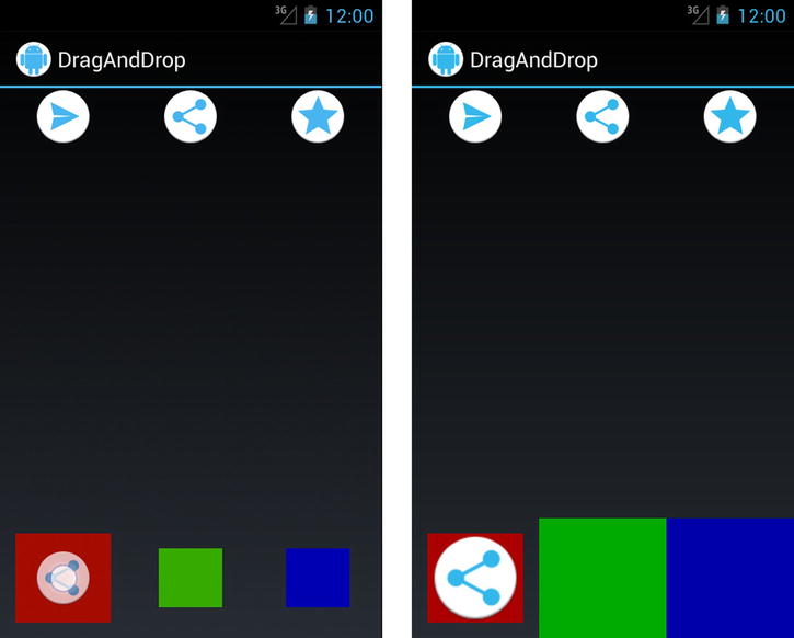
Figure 3-15. Drag example before the drag (top), while the user is dragging and hovering over a target (bottom left), and after the view has been dropped (bottom right)
The default implementation of DragShadowBuilder is extremely convenient, but it may not be what your application needs. Let’s take a look at Listing 3-47, which is a customized builder implementation.
Listing 3-47. Custom DragShadowBuilder
public class DrawableDragShadowBuilder extends DragShadowBuilder {
    private Drawable mDrawable;

    public DrawableDragShadowBuilder(View view, Drawable drawable) {
        super(view);
        // Set the Drawable and apply a green filter to it
        mDrawable = drawable;
        mDrawable.setColorFilter( new PorterDuffColorFilter(
                Color.GREEN, PorterDuff.Mode.MULTIPLY) );
    }

    @Override
    public void onProvideShadowMetrics(Point shadowSize,
            Point touchPoint) {
        // Fill in the size
        shadowSize.x = mDrawable.getIntrinsicWidth();
        shadowSize.y = mDrawable.getIntrinsicHeight();
        // Fill in the location of the shadow relative to the touch.
        // Here we center the shadow under the finger.
        touchPoint.x = mDrawable.getIntrinsicWidth() / 2;
        touchPoint.y = mDrawable.getIntrinsicHeight() / 2;

        mDrawable.setBounds(new Rect(0, 0, shadowSize.x, shadowSize.y));
    }

    @Override
    public void onDrawShadow(Canvas canvas) {
        //Draw the shadow view onto the provided canvas
        mDrawable.draw(canvas);
    }
}
This custom implementation takes in the image that it will display as the shadow as a separate Drawable parameter rather than making a visual copy of the source view. We also apply a green ColorFilter to it for added effect. It turns out that DragShadowBuilder is a fairly straightforward class to extend. There are two primary methods that are required to effectively override it.
The first is onProvideShadowMetrics(), which is called once initially with two Point objects for the builder to fill in. The first should be filled with the size of the image to be used for the shadow, where the desired width is set as the x value and the desired height is set as the y value. In our example, we have set this to be the intrinsic width and height of the image. The second should be filled with the desired touch location for the shadow. This defines how the shadow image should be positioned in relation to the user’s finger; for example, setting both x and y to zero would place it at the top-left corner of the image. In our example, we have set it to the image’s midpoint so the image will be centered under the user’s finger.
The second method is onDrawShadow(), which is called repeatedly to render the shadow image. The Canvas passed into this method is created by the framework based on the information contained in onProvideShadowMetrics(). Here you can do all sorts of custom drawing as you might with any other custom view. Our example simply tells Drawable to draw itself on the Canvas.
3-17. Building a Navigation Drawer
Problem
Your application needs a top-level navigation menu, and you want to implement one that animates in and out from the side of the screen in compliance with the latest Google design guidelines.
Solution
(API Level 4)
Integrate the DrawerLayout widget to manage menu views that slide in from the left or right of the screen, available in the Android Support Library. DrawerLayout is a container widget that manages each of the first child views in its hierarchy with a specified Gravity value of LEFT or RIGHT (or START/END if supporting RTL layouts) as an animated content drawer. By default, each view is hidden, but will be animated in from its respective side when either the openDrawer() method is called or a finger swipe occurs inward from the appropriate side bezel. To help indicate the presence of a drawer, DrawerLayout will also peek the appropriate view if a finger is held down on the appropriate side of the screen.
DrawerLayout supports multiple drawers, one for each gravity setting, and they can be placed anywhere in the layout hierarchy. The only soft rule is that they should be added after the main content view in the layout (that is, placed after that view element in the layout XML). Otherwise, the z-ordering of the views will keep the drawer(s) from being visible.
Integration with the action bar is also supported by way of the ActionBarDrawerToggle element. This is a widget that monitors taps on the Home button area of the action bar and toggles the visibility of the “main” drawer (the drawer with Gravity.LEFT or Gravity.START set).
Important DrawerLayout is available only in the Android Support Library; it is not part of the native SDK at any platform level. However, any application targeting API Level 4 or later can use the widget with the Support Library included. For more information on including the Support Library in your project, reference our guide in Chapter 1.
How It Works
While it is not required for you to use an action bar at all with DrawerLayout, it is the most common use case. The following examples show how to create navigation drawers with DrawerLayout as well as do the action bar integration. We will look at doing this on both a native action bar (for API Level 11 and later) and using the Support Library’s AppCompat action bar.
The following example creates an application with two navigation drawers: a main drawer on the left with a list of options to select from, and a secondary drawer on the right with some additional interactive content. Selecting an item from the list in the main drawer will modify the background color of the primary content view.
Native Action Bar
In Listing 3-48, we have a layout that includes a DrawerLayout. Notice that because this widget is not a core element, we must use its fully qualified class name in the XML.
Listing 3-48. res/layout/activity_main.xml
<?xml version="1.0" encoding="utf-8"?>
<android.support.v4.widget.DrawerLayout
    xmlns:android="http://schemas.android.com/apk/res/android"
    android:id="@+id/container_drawer"
    android:layout_width="match_parent"
    android:layout_height="match_parent" >

    <!-- Main Content Pane -->
    <FrameLayout
        android:id="@+id/container_root"
        android:layout_width="match_parent"
        android:layout_height="match_parent">

        <!-- Put your main contents here -->

    </FrameLayout>

    <!-- Main Drawer Content -->
    <!--
      Can be any View or ViewGroup content
      Standard drawer width is 240dp
      You MUST set the gravity
      Needs a solid background to be visible overtop the content.
      -->
    <ListView
        android:id="@+id/drawer_main"
        android:layout_width="240dp"
        android:layout_height="match_parent"
        android:layout_gravity="left"
        android:background="#555" />

    <!--
      You can create additional drawers, this one, for example
      will show up with a swipe from the right of the screen.
      -->
    <LinearLayout
        android:id="@+id/drawer_right"
        android:layout_width="240dp"
        android:layout_height="match_parent"
        android:layout_gravity="right"
        android:orientation="vertical"
        android:background="#CCC">
        <Button
            android:layout_width="match_parent"
            android:layout_height="wrap_content"
            android:text="Click Here!" />
        <TextView
            android:layout_width="match_parent"
            android:layout_height="match_parent"
            android:gravity="center"
            android:text="Tap Anywhere Else, Drawer will Hide" />
    </LinearLayout>
</android.support.v4.widget.DrawerLayout>
We have included two views that will be drawers in our application, one on the left and another on the right; we control the alignment by setting their android:layout_gravity attributes. DrawerLayout does the rest, mapping each view by inspecting the gravity, so we do not need to link them in any other way. Before we get to the activity, our project has one more resource in it; we have created an options menu to display some actions inside the action bar (see Listing 3-49).
Listing 3-49. res/menu/main.xml
<menu xmlns:android="http://schemas.android.com/apk/res/android" >
    <item
        android:id="@+id/action_delete"
        android:orderInCategory="100"
        android:showAsAction="always"
        android:icon="@android:drawable/ic_menu_delete"/>
    <item
        android:id="@+id/action_settings"
        android:orderInCategory="200"
        android:showAsAction="always"
        android:icon="@android:drawable/ic_menu_preferences"/>
</menu>
Finally, we have the activity in Listing 3-50. In addition to the DrawerLayout, this example includes an ActionBarDrawerToggle to provide integration with the action bar Home button.
Listing 3-50. Activity with DrawerLayout Integrated
public class NativeActivity extends Activity
        implements AdapterView.OnItemClickListener {

    private static final String[] ITEMS =
        {"White", "Red", "Green", "Blue"};
    private static final int[] COLORS =
        {Color.WHITE, Color.RED, Color.GREEN, Color.BLUE};

    private DrawerLayout mDrawerContainer;
    /* Root content pane in layout */
    private View mMainContent;
    /* Main (left) sliding drawer */
    private ListView mDrawerContent;
    /* Toggle object for ActionBar */
    private ActionBarDrawerToggle mDrawerToggle;

    @Override
    protected void onCreate(Bundle savedInstanceState) {
        super.onCreate(savedInstanceState);
        setContentView(R.layout.activity_main);

        mDrawerContainer =
            (DrawerLayout) findViewById(R.id.container_drawer);
        mDrawerContent =
            (ListView) findViewById(R.id.drawer_main);
        mMainContent = findViewById(R.id.container_root);

        //Toggle indicator must also be the drawer listener,
        // so we extend it to listen for the events ourselves.
        mDrawerToggle  = new ActionBarDrawerToggle(
                this,                 //Host Activity
                mDrawerContainer,     //Container to use
                R.drawable.ic_drawer, //Drawable for action icon
                0, 0) {               //Content descriptions

            @Override
            public void onDrawerOpened(View drawerView) {
                super.onDrawerOpened(drawerView);
                //Update the options menu
                invalidateOptionsMenu();
            }

            @Override
            public void onDrawerStateChanged(int newState) {
                super.onDrawerStateChanged(newState);
                //Update the options menu
                invalidateOptionsMenu();
            }

            @Override
            public void onDrawerClosed(View drawerView) {
                super.onDrawerClosed(drawerView);
                //Update the options menu
                invalidateOptionsMenu();
            }
        };
        //Set the toggle as the drawer's event listener
        mDrawerContainer.setDrawerListener(mDrawerToggle);

        //Enable home button actions in the ActionBar
        getActionBar().setDisplayHomeAsUpEnabled(true);
        getActionBar().setHomeButtonEnabled(true);

        //Our application uses Holo.Light, which defaults to
        // dark text; ListView also has a dark background.
        // Create a custom context so the views inflated by
        // ListAdapter use Holo, to display them with light text
        ContextThemeWrapper wrapper =
                new ContextThemeWrapper(this,
                        android.R.style.Theme_Holo);
        ListAdapter adapter = new ArrayAdapter<String>(wrapper,
                android.R.layout.simple_list_item_1, ITEMS);
        mDrawerContent.setAdapter(adapter);
        mDrawerContent.setOnItemClickListener(this);
    }

    @Override
    protected void onPostCreate(Bundle savedInstanceState) {
        super.onPostCreate(savedInstanceState);
        //Synchronize the state of the drawer after any instance
        // state has been restored by the framework
        mDrawerToggle.syncState();
    }

    @Override
    public void onConfigurationChanged(Configuration newConfig) {
        super.onConfigurationChanged(newConfig);
        //Update state on any configuration changes
        mDrawerToggle.onConfigurationChanged(newConfig);
    }

    @Override
    public boolean onCreateOptionsMenu(Menu menu) {
        // Create the ActionBar actions
        getMenuInflater().inflate(R.menu.main, menu);
        return true;
    }

    @Override
    public boolean onPrepareOptionsMenu(Menu menu) {
        //Display the action options based on main drawer state
        boolean isOpen =
                mDrawerContainer.isDrawerVisible(mDrawerContent);
        menu.findItem(R.id.action_delete).setVisible(!isOpen);
        menu.findItem(R.id.action_settings).setVisible(!isOpen);

        return super.onPrepareOptionsMenu(menu);
    }

    @Override
    public boolean onOptionsItemSelected(MenuItem item) {
        //Let the drawer have a crack at the event first
        // to handle home button events
        if (mDrawerToggle.onOptionsItemSelected(item)) {
            //If this was a drawer toggle, we need to update the
            // options menu, but we have to wait until the next
            // loop iteration for the drawer state to change.
            mDrawerContainer.post(new Runnable() {
                @Override
                public void run() {
                    //Update the options menu
                    invalidateOptionsMenu();
                }
            });
            return true;
        }

        //...Handle other options selections here as normal...
        switch (item.getItemId()) {
            case R.id.action_delete:
                //Delete Action
                return true;
            case R.id.action_settings:
                //Settings Action
                return true;
            default:
                return super.onOptionsItemSelected(item);
        }
    }

    //Handle click events from items in the main drawer list
    @Override
    public void onItemClick(AdapterView<?> parent, View view,
            int position, long id) {
        //Update the background color of the main content
        mMainContent.setBackgroundColor(COLORS[position]);

        //Manually close the drawer
        mDrawerContainer.closeDrawer(mDrawerContent);
    }
}
When the activity is initialized, we create an ActionBarDrawerToggle instance and set it as the DrawerListener of the DrawerLayout. This is required so the toggle can listen for events, but it also means we cannot listen for those events in our application unless we extend ActionBarDrawerToggle to override the listener method, which we’ve done here. The toggle is linked to the hosting activity, the DrawerLayout it should control, and the icon it should display in the action bar corner. This last item is an icon displayed next to the application logo in the action bar, and it is animated slightly as the drawer opens and closes.
Note You can supply any icon resource you like to ActionBarDrawerToggle, but the standard icon that Google recommends you use, which is the one we used in this project, can be downloaded from http://developer.android.com/downloads/design/.
There is a fair amount of boilerplate code required to get ActionBarDrawerToggle integrated, as it does not hook itself directly into any of the life-cycle methods of the activity. The methods syncState(), onConfigurationChanged(), and onOptionsItemSelected() all need to be called from their appropriate activity callbacks to allow the toggle widget to receive input and maintain state along with the activity instance. In order to trigger Home button events in the action bar, we must also enable it by calling setHomeButtonEnabled(). Finally, adding setDisplayHomeAsUpEnabled() enables the icon (an arrow by default) to be displayed next to the Home logo; this icon is what the drawer toggle customizes with its own version.
DrawerLayout is designed to close an open drawer when the main content view receives touch events (that is, the user touches outside the drawer). Touch events inside the layout (such as tapping an item in our main list or the button in our secondary drawer) require us to close the drawer manually when necessary. Inside the OnItemClickListener registered to our list, after changing the background color of the content view, we call closeDrawer() to do just that. It is interesting to note that even if the user taps on a noninteractive view inside a drawer (for example, a TextView), those touch events will be delivered to the next child view in line. If that child is the main content view (most common), then the drawer will close in the same fashion as if the user touched outside it.
Tip You can use a ContextThemeWrapper to customize the theme resources used to display certain pieces of your UI. Supplying one of these wrappers rather than the base Context causes the widget receiving it to load resources from a theme other than that defined for your application or the current activity. In our example here, we are using one to ensure the rows in the ListView are loaded with Theme.Holo rather than Theme.Holo.Light. This is because Theme.Holo is a dark theme with light text, which more closely matches our dark ListView than the main theme. This handy trick allowed us to customize the row items’ look and feel without creating a custom layout for each one.
Notice how methods such as openDrawer() and closeDrawer() take a view as an argument. Since DrawerLayout can manage more than one drawer, we have to tell it which drawer widget to act on. These methods can also be triggered using the Gravity parameter associated with the drawer if your application doesn’t have a reference to the drawer view itself.
Recall that we extended the ActionBarDrawerToggle in order to override the drawer’s event listener methods. Inside each method we call invalidateOptionsMenu(), which simply tells the activity to update the menu and call its setup methods again. Recall also that we created some actions to display inside the action bar by using an XML menu, and inside onPrepareOptionsMenu(), we control whether those actions are visible by the visibility state of the drawer. This way, the actions are shown only when the main drawer is not. The purpose of invalidating the menu in each event callback is to allow the menu visibility to update based on changes in the drawer.
Figure 3-16 shows how tapping the Home button in the action bar expands the main drawer to expose the options list; notice also that the actions are gone when the drawer is open. Figure 3-17 illustrates the secondary drawer peeking in from a bezel swipe on the right side of the screen, and then fully open.
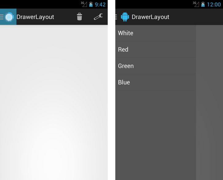
Figure 3-16. Activity with main drawer
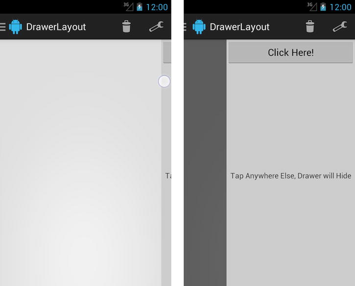
Figure 3-17. Activity with secondary drawer
Support Action Bar
(API Level 7)
Adapting the previous example to use the AppCompat library from the Android Support Library is fairly straightforward. We need to only change the theme our activity uses, inherit from the ActionBarActivity support class, and modify some of the method calls that refer to newer APIs.
Important ActionBarActivity is available only in the AppCompat Library, found as part of the Android Support Library; it is not part of the native SDK at any platform level. However, any application targeting API Level 7 or later can use the widget with the Support Library included. For more information on including the Support Library in your project, reference our guide in Chapter 1.
Listing 3-51 gets us started by showing an AndroidManifest.xml entry that might be used to apply the appropriate theme.
Listing 3-51. Portion of AndroidManifest.xml for the Activity
<activity
  android:name=".SupportActivity"
  android:label="@string/app_name"
  android:theme="@style/Theme.AppCompat.Light.DarkActionBar">
  <intent-filter>
    <action android:name="android.intent.action.MAIN" />
    <category android:name="android.intent.category.LAUNCHER" />
  </intent-filter>
</activity>
Notice when using AppCompat, we must include one of the Theme.AppCompat theme options. We need not modify any of the resource files, so they are not repeated here. Listing 3-52 shows us the modified activity code.
Listing 3-52. Support Activity with DrawerLayout Integrated
public class SupportActivity extends ActionBarActivity
        implements AdapterView.OnItemClickListener {

    private static final String[] ITEMS =
        {"White", "Red", "Green", "Blue"};
    private static final int[] COLORS =
        {Color.WHITE, Color.RED, Color.GREEN, Color.BLUE};

    private DrawerLayout mDrawerContainer;
    /* Root content pane in layout */
    private View mMainContent;
    /* Main (left) sliding drawer */
    private ListView mDrawerContent;
    /* Toggle object for ActionBar */
    private ActionBarDrawerToggle mDrawerToggle;

    @Override
    protected void onCreate(Bundle savedInstanceState) {
        super.onCreate(savedInstanceState);
        setContentView(R.layout.activity_main);

        mDrawerContainer =
            (DrawerLayout) findViewById(R.id.container_drawer);
        mDrawerContent =
            (ListView) findViewById(R.id.drawer_main);
        mMainContent = findViewById(R.id.container_root);

        //Toggle indicator must also be the drawer listener,
        // so we extend it to listen for the events ourselves.
        mDrawerToggle  = new ActionBarDrawerToggle(
                this,                 //Host Activity
                mDrawerContainer,     //Container to use
                R.drawable.ic_drawer, //Drawable for action icon
                0, 0) {               //Content description

            @Override
            public void onDrawerOpened(View drawerView) {
                super.onDrawerOpened(drawerView);
                //Update the options menu
                supportInvalidateOptionsMenu();
            }

            @Override
            public void onDrawerStateChanged(int newState) {
                super.onDrawerStateChanged(newState);
                //Update the options menu
                supportInvalidateOptionsMenu();
            }

            @Override
            public void onDrawerClosed(View drawerView) {
                super.onDrawerClosed(drawerView);
                //Update the options menu
                supportInvalidateOptionsMenu();
            }
        };

        //Our application uses Holo.Light, which defaults to
        // dark text; ListView also has a dark background.
        // Create a custom context so the views inflated by
        // ListAdapter use Holo, to display them with light text
        ContextThemeWrapper wrapper =
                new ContextThemeWrapper(this,
                        android.R.style.Theme_Black);
        ListAdapter adapter = new ArrayAdapter<String>(wrapper,
                android.R.layout.simple_list_item_1, ITEMS);
        mDrawerContent.setAdapter(adapter);
        mDrawerContent.setOnItemClickListener(this);

        //Set the toggle as the drawer's event listener
        mDrawerContainer.setDrawerListener(mDrawerToggle);

        //Enable home button actions in the ActionBar
        getSupportActionBar().setDisplayHomeAsUpEnabled(true);
        getSupportActionBar().setHomeButtonEnabled(true);
    }

    @Override
    protected void onPostCreate(Bundle savedInstanceState) {
        super.onPostCreate(savedInstanceState);
        //Synchronize the state of the drawer after any instance
        // state has been restored by the framework
        mDrawerToggle.syncState();
    }

    @Override
    public void onConfigurationChanged(Configuration newConfig) {
        super.onConfigurationChanged(newConfig);
        //Update state on any configuration changes
        mDrawerToggle.onConfigurationChanged(newConfig);
    }

    @Override
    public boolean onCreateOptionsMenu(Menu menu) {
        // Create the ActionBar actions
        getMenuInflater().inflate(R.menu.main, menu);
        return true;
    }

    @Override
    public boolean onPrepareOptionsMenu(Menu menu) {
        //Display the action options based on main drawer state
        boolean isOpen =
                mDrawerContainer.isDrawerVisible(mDrawerContent);
        menu.findItem(R.id.action_delete).setVisible(!isOpen);
        menu.findItem(R.id.action_settings).setVisible(!isOpen);

        return super.onPrepareOptionsMenu(menu);
    }

    @Override
    public boolean onOptionsItemSelected(MenuItem item) {
        //Let the drawer have a crack at the event first
        // to handle home button events
        if (mDrawerToggle.onOptionsItemSelected(item)) {
            //If this was a drawer toggle, we need to update the
            // options menu, but we have to wait until the next
            // loop iteration for the drawer state to change.
            mDrawerContainer.post(new Runnable() {
                @Override
                public void run() {
                    //Update the options menu
                    supportInvalidateOptionsMenu();
                }
            });
            return true;
        }

        //...Handle other options selections here as normal...
        switch (item.getItemId()) {
            case R.id.action_delete:
                //Delete Action
                return true;
            case R.id.action_settings:
                //Settings Action
                return true;
            default:
                return super.onOptionsItemSelected(item);
        }
    }

    //Handle click events from items in the main drawer list
    @Override
    public void onItemClick(AdapterView<?> parent, View view,
            int position, long id) {
        //Update the background color of the main content
        mMainContent.setBackgroundColor(COLORS[position]);

        //Manually close the drawer
        mDrawerContainer.closeDrawer(mDrawerContent);
    }
}
Besides now inheriting from ActionBarActivity, there are only two changes necessary. First, all calls to invalidateOptionsMenu() are replaced by supportInvalidateOptionsMenu(). Second, all calls to getActionBar() are replaced by getSupportActionBar(). With these changes in place, the DrawerLayout is now fully functional with an action bar on devices back to API Level 7.
THE REAL STAR OF THE SHOW
The drag and edge-swipe behavior provided in DrawerLayout is actually the work of another class also available in the Support Library: ViewDragHelper. This class can be quite helpful if you need to do any custom view manipulation based on user dragging.
ViewDragHelper is a touch event processor (similar to GestureDetector), so it needs to be fed events from your views. Typically, every event received in onTouchEvent() of your view must be handed directly to processTouchEvent() on the helper.
@Override
public boolean onTouchEvent(MotionEvent event) {
mHelper.processTouchEvent(event);
}
When a ViewDragHelper is instantiated, an instance of a ViewDragHelper.Callback must be passed as the handler for all events the helper will pass to your application. The most important of these is tryCaptureView(), which will be called when the helper starts seeing a drag over a given view; returning true causes the view to become “captured,” meaning its position will begin to follow the subsequent touch events in the gesture.
ViewDragHelper also supports swipes from the view edges if setEdgeTrackingEnabled() has been called with one or more valid edge flags. When edge events occur, onEdgeTouched() and onEdgeDragStarted() will be triggered on the Callback.
One final tip: A single ViewDragHelper is designed to capture and manage only one view at a time. Problems will occur if you attempt to use the same instance to slide two views at the same time. DrawerLayout, for example, has one ViewDragHelper for each drawer it supports to avoid this very issue.
Problem
You need to implement paging with a swipe gesture in your application’s UI in order to move between views or fragments.
(API Level 4)
Implement the ViewPager widget to provide paging with swipe scroll gestures. ViewPager is a modified implementation of the AdapterView pattern that the framework uses for widgets such as ListView and GridView. It requires its own adapter implementation as a subclass of PagerAdapter, but it is conceptually very similar to the patterns used in BaseAdapter and ListAdapter. It does not inherently implement recycling of the components being paged, but it does provide callbacks to create and destroy the items on the fly so that only a fixed number of content views are in memory at a given time.
Important ViewPager is available only in the Android Support Library; it is not part of the native SDK at any platform level. However, any application targeting API Level 4 or later can use the widget with the Support Library included. For more information on including the Support Library in your project, reference our guide in Chapter 1.
How It Works
Most of the heavy lifting in working with ViewPager is in the PagerAdapter implementation you provide. Let’s start with a simple example, shown in Listing 3-53, that pages between a series of images.
Listing 3-53. Custom PagerAdapter for Images
public class ImagePagerAdapter extends PagerAdapter {
    private Context mContext;

    private static final int[] IMAGES = {
        android.R.drawable.ic_menu_camera,
        android.R.drawable.ic_menu_add,
        android.R.drawable.ic_menu_delete,
        android.R.drawable.ic_menu_share,
        android.R.drawable.ic_menu_edit
    };

    private static final int[] COLORS = {
        Color.RED,
        Color.BLUE,
        Color.GREEN,
        Color.GRAY,
        Color.MAGENTA
    };

    public ImagePagerAdapter(Context context) {
        super();
        mContext = context;
    }

    /*
     * Provide the total number of pages
     */
    @Override
    public int getCount() {
        return IMAGES.length;
    }

    /*
     * Override this method if you want to show more than one page
     * at a time inside the ViewPager's content bounds.
     */
    @Override
    public float getPageWidth(int position) {
        return 1f;
    }

    @Override
    public Object instantiateItem(ViewGroup container, int position) {
        // Create a new ImageView and add it to the supplied container
        ImageView iv = new ImageView(mContext);
        // Set the content for this position
        iv.setImageResource(IMAGES[position]);
        iv.setBackgroundColor(COLORS[position]);

        // You MUST add the view here, the framework will not
        container.addView(iv);
        //Return this view also as the key object for this position
        return iv;
    }

    @Override
    public void destroyItem(ViewGroup container, int position,
            Object object) {
        //Remove the view from the container here
        container.removeView((View) object);
    }

    @Override
    public boolean isViewFromObject(View view, Object object) {
        // Validate that the object returned from instantiateItem()
        // is associated with the view added to the container in
        // that location.  Our example uses the same object in
        // both places.
        return (view == object);
    }

}
In this example, we have an implementation of PagerAdapter that serves up a series of ImageView instances for the user to page through. The first required override in the adapter is getCount(), which, just like its AdapterView counterpart, should return the total number of items available.
ViewPager works by keeping track of a key object for each item alongside a view to display for that object; this keeps the separation between the adapter items and their views that developers are used to with AdapterView. However, the implementation is a bit different. With AdapterView, the adapter’s getView() method is called to construct and return the view to display for that item. With ViewPager, the callback’s instantiateItem() and destroyItem() will be called when a new view needs to be created, or when one has scrolled outside the bounds of the pager’s limit and should be removed; the number of items that any ViewPager will keep hold of is set by the setOffscreenPageLimit() method.
Note The default value for the offscreen page limit is 3. This means ViewPager will track the currently visible page, one to the left, and one to the right. The number of tracked pages is always centered around the currently visible page.
In our example, we use instantiateItem() to create a new ImageView and then apply the properties for that particular position. Unlike AdapterView, the PagerAdapter must attach the View to display to the supplied ViewGroup in addition to returning the unique key object to represent this item. These two things don’t have to be the same, but they can be in a simple example like this. The callback isViewFromObject() is a required override on PagerAdapter so the application can provide the link between which key object goes with which view. In our example, we attach the ImageView to the supplied parent and then also return the same instance as the key from instantiateItem(). The code for isViewFromObject() becomes simple, then, as we return true if both parameters are the same instance.
Complementary to instantiate, PagerAdapter must also remove the specified view from the parent container in destroyItem(). If the views displayed in the pager are heavyweight and you wanted to implement some basic view recycling in your adapter, you could hold on to the view after it was removed so it could be handed back to instantiateItem() to attach to another key object. See Listing 3-54, which shows an example activity using our custom adapter with a ViewPager. The resulting application is shown in Figure 3-18.
Listing 3-54. Activity Using ViewPager and ImagePagerAdapter
public class PagerActivity extends Activity {

    @Override
    protected void onCreate(Bundle savedInstanceState) {
        super.onCreate(savedInstanceState);
        ViewPager pager = new ViewPager(this);
        pager.setAdapter(new ImagePagerAdapter(this));

        setContentView(pager);
    }
}
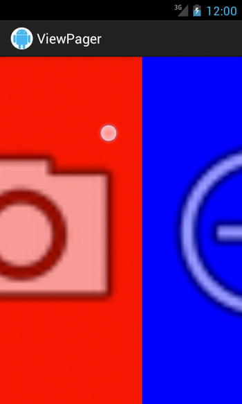
Figure 3-18. ViewPager dragging between two pages
Running this application, the user can horizontally swipe a finger to page between all the images provided by the custom adapter, and each page displays full-screen. There is one method defined in the example we did not mention: getPageWidth(). This method allows you to define for each position how large the page should be as a percentage of the ViewPager size. By default it is set to 1, and the previous example didn’t change this. But let’s say we wanted to display multiple pages at once; we can adjust the value this method returns.
If we modify getPageWidth() as in the following snippet, we can display three pages at once:
    /*
     * Override this method if you want to show more than one page
     * at a time inside the ViewPager's content bounds.
     */
    @Override
    public float getPageWidth(int position) {
        //Page width should be 1/3 of the view
        return 0.333f;
    }
You can see in Figure 3-19 how this modifies the resulting application.
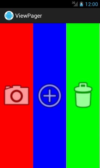
Figure 3-19. ViewPager showing three pages at once
Listing 3-55 illustrates a slightly more complex adapter for use with ViewPager. This example uses FragmentPagerAdapter as a base, which is another class in the framework where each page item is a fragment instead of a simple view.
This example is designed to take a long list of data and break it into smaller sections that display on each page. The Fragment this adapter displays is a custom inner implementation that receives a List of items and displays them in a ListView.
Listing 3-55. FragmentPagerAdapter to Display a List
public class ListPagerAdapter extends FragmentPagerAdapter {

    private static final int ITEMS_PER_PAGE = 3;

    private List<String> mItems;

    public ListPagerAdapter(FragmentManager manager,
            List<String> items) {
        super(manager);
        mItems = items;
    }

    /*
     * This method will only get called the first time a
     * fragment is needed for this position.
     */
    @Override
    public Fragment getItem(int position) {
        int start = position * ITEMS_PER_PAGE;
        return ArrayListFragment.newInstance(
                getPageList(position), start);
    }

    @Override
    public int getCount() {
        // Get whole number
        int pages = mItems.size() / ITEMS_PER_PAGE;
        // Add one more page for any remaining values if list size
        // is not divisible by page size
        int excess = mItems.size() % ITEMS_PER_PAGE;
        if (excess > 0) {
            pages++;
        }

        return pages;
    }

    /*
     * This will get called after getItem() for new Fragments, but
     * also when Fragments beyond the offscreen page limit are added
     * back; we need to make sure to update the list for these elements.
     */
    @Override
    public Object instantiateItem(ViewGroup container, int position) {
        ArrayListFragment fragment =
                (ArrayListFragment) super.instantiateItem(container,
                        position);
        fragment.updateListItems(getPageList(position));
        return fragment;
    }

    /*
     * Called by the framework when notifyDataSetChanged() is called,
     * we must decide how each Fragment has changed for the new data set.
     * We also return POSITION_NONE if a Fragment at a particular
     * position is no longer needed so the adapter can remove it.
     */
    @Override
    public int getItemPosition(Object object) {
        ArrayListFragment fragment = (ArrayListFragment)object;
        int position = fragment.getBaseIndex() / ITEMS_PER_PAGE;
        if(position >= getCount()) {
            //This page no longer needed
            return POSITION_NONE;
        } else {
            //Refresh fragment data display
            fragment.updateListItems(getPageList(position));

            return position;
        }
    }

    /*
     * Helper method to obtain the piece of the overall list that
     * should be applied to a given Fragment
     */
    private List<String> getPageList(int position) {
        int start = position * ITEMS_PER_PAGE;
        int end = Math.min(start + ITEMS_PER_PAGE, mItems.size());
        List<String> itemPage = mItems.subList(start, end);

        return itemPage;
    }

    /*
     * Internal custom Fragment that displays a list section inside
     * of a ListView, and provides external methods for updating the list
     */
    public static class ArrayListFragment extends Fragment {
        private ArrayList<String> mItems;
        private ArrayAdapter<String> mAdapter;
        private int mBaseIndex;

        //Fragments are created by convention using a Factory
        static ArrayListFragment newInstance(List<String> page,
                int baseIndex) {
            ArrayListFragment fragment = new ArrayListFragment();
            fragment.updateListItems(page);
            fragment.setBaseIndex(baseIndex);
            return fragment;
        }

        public ArrayListFragment() {
            super();
            mItems = new ArrayList<String>();
        }

        @Override
        public void onCreate(Bundle savedInstanceState) {
            super.onCreate(savedInstanceState);
            //Make a new adapter for the list items
            mAdapter = new ArrayAdapter<String>(getActivity(),
                    android.R.layout.simple_list_item_1, mItems);
        }

        @Override
        public View onCreateView(LayoutInflater inflater,
                ViewGroup container, Bundle savedInstanceState) {
            //Construct and return a ListView with our adapter
            ListView list = new ListView(getActivity());
            list.setAdapter(mAdapter);
            return list;
        }

        //Save the index in the global list where this page starts
        public void setBaseIndex(int index) {
            mBaseIndex = index;
        }

        //Retrieve the index where this page starts
        public int getBaseIndex() {
            return mBaseIndex;
        }
        public void updateListItems(List<String> items) {
            mItems.clear();
            for (String piece : items) {
                mItems.add(piece);
            }

            if (mAdapter != null) {
                mAdapter.notifyDataSetChanged();
            }
        }
    }
}
FragmentPagerAdapter implements some of the underlying requirements of PagerAdapter for us. Instead of implementing instantiateItem(), destroyItem(), and isViewFromObject(), we only need to override getItem() to provide the Fragment for each page position. This example defines a constant for the number of list items that should display on each page. When we create the Fragment in getItem(), we pass in a subsection of the list based on the index offset and this constant. The number of pages required, returned by getCount(), is determined by the total size of the items list divided by the constant number of items per page.
Tip FragmentPagerAdapter retains all fragment instances as active whether or not they are actively within the offscreen page limit. If your pager needs to hold a larger number of fragments, or some are more heavyweight, look at using FragmentStatePagerAdapter instead. The latter destroys fragments outside the offscreen page limit while maintaining their saved state—similar to a rotation operation.
This adapter also overrides one more method we did not see in the simple example, which is getItemPosition(). This method will get called when notifyDataSetChanged() gets called externally by the application. Its primary function is to sort out whether page items should be moved or removed as a result of the change. If the item’s position has changed, the implementation should return the new position value. If the item should not be moved, the implementation should return the constant value PagerAdapter.POSITION_UNCHANGED. If the page should be removed, the application should return PagerAdapter.POSITION_NONE.
The example checks the current page position (which we have to re-create from the initial index data) against the current page count. If this page is greater than the count, we have removed enough items from the list so that this page is no longer needed, and we return POSITION_NONE. In any other case, we update the list of items that should now be displayed for the current fragment and return the new calculated position.
The method getItemPosition() will get called for every page currently being tracked by the ViewPager, which will be the number of pages returned by getOffscreenPageLimit(). However, even though ViewPager doesn’t track a fragment that scrolls outside the limit, FragmentManager still does. So when a previous fragment is scrolled back in, getItem() will not be called again because the fragment exists. But, because of this, if a data set change occurs during this time, the fragment list data will not update. This is why we have overridden instantiateItem(). While it is not required to override instantiateItem() for this adapter, we do need to update fragments that are outside the offscreen page limit when modifications to the list take place. Because instantiateItem() will get called each time a fragment scrolls back inside the page limit, it is an opportune place to reset the display list.
Let’s look at an example application that uses this adapter. See Listings 3-56 and 3-57.
Listing 3-56. res/layout/main.xml
<?xml version="1.0" encoding="utf-8"?>
<LinearLayout xmlns:android="http://schemas.android.com/apk/res/android"
    android:layout_width="match_parent"
    android:layout_height="match_parent"
    android:orientation="vertical" >
    <Button
        android:layout_width="match_parent"
        android:layout_height="wrap_content"
        android:text="Add Item"
        android:onClick="onAddClick" />
    <Button
        android:layout_width="match_parent"
        android:layout_height="wrap_content"
        android:text="Remove Item"
        android:onClick="onRemoveClick" />

    <!-- ViewPager is a support widget, it needs the full name -->
    <android.support.v4.view.ViewPager
        android:id="@+id/view_pager"
        android:layout_width="match_parent"
        android:layout_height="match_parent" />
</LinearLayout>
Listing 3-57. Activity with ListPagerAdapter
public class FragmentPagerActivity extends FragmentActivity {

    private ArrayList<String> mListItems;
    private ListPagerAdapter mAdapter;

    @Override
    protected void onCreate(Bundle savedInstanceState) {
        super.onCreate(savedInstanceState);
        setContentView(R.layout.main);
        //Create the initial data set
        mListItems = new ArrayList<String>();
        mListItems.add("Mom");
        mListItems.add("Dad");
        mListItems.add("Sister");
        mListItems.add("Brother");
        mListItems.add("Cousin");
        mListItems.add("Niece");
        mListItems.add("Nephew");
        //Attach the data to the pager
        ViewPager pager =
                (ViewPager) findViewById(R.id.view_pager);
        mAdapter = new ListPagerAdapter(
                getSupportFragmentManager(),
                mListItems);

        pager.setAdapter(mAdapter);
    }

    public void onAddClick(View v) {
        //Add a new unique item to the end of the list
        mListItems.add("Crazy Uncle "
                + System.currentTimeMillis());
        mAdapter.notifyDataSetChanged();
    }

    public void onRemoveClick(View v) {
        //Remove an item from the head of the list
        if (!mListItems.isEmpty()) {
            mListItems.remove(0);
        }
        mAdapter.notifyDataSetChanged();
    }
}
This example consists of two buttons to add and remove items from the data set as well as a ViewPager. Notice that the ViewPager must be defined in XML using its fully qualified package name because it is only part of the Support Library and does not exist in the android.widget or android.view packages. The activity constructs a default list of items, and it passes it to our custom adapter, which is then attached to the ViewPager.
Each Add button click appends a new item to the end of the list and triggers ListPagerAdapter to update by calling notifyDataSetChanged(). Each Remove button click removes an item from the front of the list and again notifies the adapter. With each change, the adapter adjusts the number of pages available and updates the ViewPager. If all the items are removed from the currently visible page, that page is removed and the previous page will be displayed.
Using Other Helpful Methods
There are a few other methods on ViewPager that can be useful in your applications:
- setPageMargin() and setPageMarginDrawable() allow you to set some extra space between pages and optionally supply a Drawable that will be used to fill the margin spaces.
- setCurrentItem() allows you to programmatically set the page that should be shown, with an option to disable the scrolling animation while it switches pages.
- OnPageChangeListener can be used to notify the application of scroll and change actions.
- onPageSelected() will be called when a new page is displayed.
- onPageScrolled() will be called continuously while a scroll operation is taking place.
- onPageScrollStateChanged() will be called when the ViewPager toggles from being idle, to being actively scrolled by the user, to automatically scrolling to snap to the closest page.
3-19. Creating Modular Interfaces
You want to increase code reuse in your application’s UI between multiple device configurations.
Solution
Use fragments to create reusable modules that can be inserted into your activity code to tailor your UI to different device configurations or apply common interface elements to multiple activities. Fragments were originally introduced to the Android SDK in 3.0 (API Level 11) but are a main part of the Support Library that allows them to be used in applications targeting any platform version after Android 1.6 (API Level 4).
When using fragments with the Support Library, you must use the FragmentActivity class instead of the default Activity implementation. This version has the necessary functionality built into it, such as a local FragmentManager, that the newer platforms have natively. If your application is targeting Android 3.0 or later, you will not need the Support Library for this purpose, and you can use Activity instead.
Fragments have a life cycle just like an activity, so the same callback methods, such as onCreate(), onResume(), onPause(), and onDestroy() exist on Fragment. There are a few additional life-cycle callbacks as well, such as onAttach() and onDetach() when a fragment is connected to its parent activity. In place of a setContentView() method, the method onCreateView() is called by the framework to obtain the content to display.
A fragment is not required to have a UI component like an activity does. By not overriding onCreateView(), a fragment can exist purely as a data source or other module in your application. This can be a great way to modularize the model portion of your application, because FragmentManager provides simple ways for one fragment to access another. A fragment can also be retained by FragmentManager, which allows fragments that may be housing your data or obtaining it from the network to avoid getting re-created on device configuration changes.
How It Works
This example illustrates a simple master-detail application that uses three fragments. The MasterFragment displays a list of web sites the user can visit, while the DetailFragment contains a WebView to display the URL of the selected list item. A third DataFragment does not have a UI component to it, and it exists purely to serve the model data to the other fragments. Depending on the orientation configuration of the device, we will display these elements differently to best use the screen real estate.
Let’s first look at the DataFragment in Listing 3-58.
Listing 3-58. Data Fragment
public class DataFragment extends Fragment {
    /*
     * This is an example of a fragment that does not have a UI.
     * It exists solely to encapsulate the data logic for the
     * application in a way that is friendly for other
     * fragments to access.
     */

    public static final String TAG = "DataFragment";

    /*
     * Custom data model class to house our application's data
     */
    public static class DataItem {
        private String mName;
        private String mUrl;

        public DataItem(String name, String url) {
            mName = name;
            mUrl = url;
        }

        public String getName() {
            return mName;
        }

        public String getUrl() {
            return mUrl;
        }
    }

    /*
     * Factory method to create new instances
     */
    public static DataFragment newInstance() {
        return new DataFragment();
    }

    private ArrayList<DataItem> mDataSet;

    @Override
    public void onCreate(Bundle savedInstanceState) {
        super.onCreate(savedInstanceState);
        //Construct the initial data set
        mDataSet = new ArrayList<DataFragment.DataItem>();
        mDataSet.add(new DataItem("Google",
                "http://www.google.com"));
        mDataSet.add(new DataItem("Yahoo",
                "http://www.yahoo.com"));
        mDataSet.add(new DataItem("Bing",
                "http://www.bing.com"));
        mDataSet.add(new DataItem("Android",
                "http://www.android.com"));
    }

    //Accessor to serve the current data the application
    public ArrayList<DataItem> getLatestData() {
        return mDataSet;
    }
}
This fragment defines a custom model class for our list data, and it constructs the data set for the application to use. This example is simplified and the data set is static, but you could place the logic to download feed data from a web service or obtain database information from a ContentProvider (both of which we will describe in great detail in the coming chapters). It has no view component to it, but we can still attach it to the FragmentManager for other modules of the application to access.
Next, see Listing 3-59, which defines the MasterFragment.
Listing 3-59. Master View Fragment
public class MasterFragment extends DialogFragment implements
        AdapterView.OnItemClickListener {

    /*
     * Callback interface to feed data selections up to the
     * parent Activity
     */
    public interface OnItemSelectedListener {
        public void onDataItemSelected(DataItem selected);
    }

    /*
     * Factory method to create new instances
     */
    public static MasterFragment newInstance() {
        return new MasterFragment();
    }

    private ArrayAdapter<DataItem> mAdapter;
    private OnItemSelectedListener mItemSelectedListener;

    /*
     * Using onAttach to connect the listener interface, and guarantee
     * that the Activity we attach to supports the interface.
     */
    @Override
    public void onAttach(Activity activity) {
        super.onAttach(activity);
        try {
            mItemSelectedListener = (OnItemSelectedListener) activity;
        } catch (ClassCastException e) {
            throw new IllegalArgumentException(
                    "Activity must implement OnItemSelectedListener");
        }
    }

    /*
     * Construct a custom adapter to display the name field from
     * our data model.
     */
    @Override
    public void onCreate(Bundle savedInstanceState) {
        super.onCreate(savedInstanceState);

        mAdapter = new ArrayAdapter<DataFragment.DataItem>(getActivity(),
                android.R.layout.simple_list_item_1) {
            @Override
            public View getView(int position, View convertView,
                    ViewGroup parent) {
                View row = convertView;
                if (row == null) {
                    row = LayoutInflater.from(getContext())
                           .inflate(android.R.layout.simple_list_item_1,
                                   parent, false);
                }

                DataItem item = getItem(position);
                TextView tv =
                        (TextView) row.findViewById(android.R.id.text1);
                tv.setText(item.getName());

                return row;
            }
        };
    }

    @Override
    public View onCreateView(LayoutInflater inflater,
            ViewGroup container, Bundle savedInstanceState) {
        ListView list = new ListView(getActivity());
        list.setOnItemClickListener(this);
        list.setAdapter(mAdapter);
        return list;
    }

    /*
     * onCreateDialog is the opportunity to directly access the dialog
     * that will be shown.  We use this callback to set the title of
     * the dialog.
     */
    @Override
    public Dialog onCreateDialog(Bundle savedInstanceState) {
        Dialog dialog = super.onCreateDialog(savedInstanceState);
        dialog.setTitle("Select a Site");

        return dialog;
    }

    /*
     * When we resume, get the latest model information from our
     * DataFragment
     */
    @Override
    public void onResume() {
        super.onResume();
        //Get the latest data list
        DataFragment fragment = (DataFragment) getFragmentManager()
                .findFragmentByTag(DataFragment.TAG);
        if (fragment != null) {
            mAdapter.clear();
            for (DataItem item : fragment.getLatestData()) {
                mAdapter.add(item);
            }
            mAdapter.notifyDataSetChanged();
        }
    }

    @Override
    public void onItemClick(AdapterView<?> parent, View v,
            int position, long id) {
        // Notify the Activity
        mItemSelectedListener.onDataItemSelected(
                mAdapter.getItem(position));

        // Hide the dialog, if shown.  This returns false when the
        // fragment is embedded in the view.
        if (getShowsDialog()) {
            dismiss();
        }
    }
}
This component inherits from DialogFragment, which is a special instance in the SDK that has a secret power. DialogFragment can display its contents embedded in an activity or it can display them inside a dialog box. This will allow us to use the same code to display the list, but it will embed itself in the UI only when there is room to do so. In onCreate(), we implement a custom ArrayAdapter that can display the data out of our custom model class. In onCreateView(), we create a simple ListView that will display the model items.
In onResume(), we see how fragments can communicate with one another. This component asks the FragmentManager for an instance of the DataFragment we defined previously. If one exists, it obtains the latest data model list from that fragment. The fragment is found by referencing its tag value, and we will see shortly how that link is made.
This fragment also defines a custom listener interface that we will use to communicate back to the parent activity. In the onAttach() callback, we set the activity we attach to as the listener for this fragment. This is one of many patterns we could use to call back to the parent. If the fragment will always be attached to the same activity in your application, another common method is to simply call getActivity() and cast the result to access the methods you have written on your activity directly. We could have asked the MasterFragment to talk directly to the DetailsFragment in a similar fashion in which the DataFragment was accessed.
Whenever an item is selected in the list, the listener is notified. DialogFragment provides thegetShowsDialog() method to determine whether the view is currently embedded in the activity or being shown as a dialog box. If the fragment is currently shown inside of a dialog, we also call dismiss() after the selection.
Tip The dismiss() method technically does work even when the fragment is not shown as a dialog. This method just removes the view from its container. This behavior can be a bit awkward, so it is best to always check the mode first.
Now let’s look at our last item, the detail view, in Listing 3-60.
Listing 3-60. Detail View Fragment
public class DetailFragment extends Fragment {

    private WebView mWebView;

    /*
     * Custom client to enable progress visibility. Adding a
     * client also sets the WebView to load all requests directly
     * rather than handing them off to the browser.
     */
    private WebViewClient mWebViewClient = new WebViewClient() {
        @Override
        public void onPageStarted(WebView view, String url,
                Bitmap favicon) {
            getActivity()
                    .setProgressBarIndeterminateVisibility(true);
        }

        public void onPageFinished(WebView view, String url) {
            getActivity()
                    .setProgressBarIndeterminateVisibility(false);
        }
    };

    /*
     * Create and set up a basic WebView for the display
     */
    @Override
    public View onCreateView(LayoutInflater inflater,
            ViewGroup container, Bundle savedInstanceState) {
        mWebView = new WebView(getActivity());
        mWebView.getSettings().setJavaScriptEnabled(true);
        mWebView.setWebViewClient(mWebViewClient);

        return mWebView;
    }

    /*
     * External method to load a new site into the view
     */
    public void loadUrl(String url) {
        mWebView.loadUrl(url);
    }

}
This component is the simplest of the bunch. Here we just create a WebView that will load the contents of the URL passed to it. We also attach aWebViewClient to monitor the loading progress so we can display a progress indicator to the user. For more-detailed information about WebView and WebViewClient, check out the recipes in the next chapter.
Important Because this application uses a WebView to access remote sites, you will need to declare the android.permission.INTERNET permission in your manifest.
Finally, take a look at the activity defined for the example in Listings 3-61 through 3-63.
Listing 3-61. res/layout/main.xml
<?xml version="1.0" encoding="utf-8"?>
<!-- Portrait Device Layout -->
<LinearLayout
    xmlns:android="http://schemas.android.com/apk/res/android"
    android:layout_width="match_parent"
    android:layout_height="match_parent"
    android:orientation="vertical" >
    <Button
        android:layout_width="match_parent"
        android:layout_height="wrap_content"
        android:text="Show List"
        android:onClick="onShowClick" />
    <fragment
        android:name="com.examples.fragmentsample.DetailFragment"
        android:id="@+id/fragment_detail"
        android:layout_width="match_parent"
        android:layout_height="match_parent" />
</LinearLayout>
Listing 3-62. res/layout-land/main.xml
<?xml version="1.0" encoding="utf-8"?>
<!-- Landscape Device Layout -->
<LinearLayout
    xmlns:android="http://schemas.android.com/apk/res/android"
    android:layout_width="match_parent"
    android:layout_height="match_parent"
    android:orientation="horizontal" >
    <FrameLayout
        android:id="@+id/fragment_master"
        android:layout_width="0dp"
        android:layout_height="match_parent"
        android:layout_weight="1" />
    <fragment
        android:name="com.examples.fragmentsample.DetailFragment"
        android:id="@+id/fragment_detail"
        android:layout_width="0dp"
        android:layout_height="match_parent"
        android:layout_weight="3" />
</LinearLayout>
Listing 3-63. Master Detail Activity
public class MainActivity extends FragmentActivity implements
        MasterFragment.OnItemSelectedListener {

    private MasterFragment mMaster;
    private DetailFragment mDetail;

    @Override
    protected void onCreate(Bundle savedInstanceState) {
        super.onCreate(savedInstanceState);

        // Enable a progress indicator on the window
        requestWindowFeature(Window.FEATURE_INDETERMINATE_PROGRESS);
        setContentView(R.layout.main);
        setProgressBarIndeterminateVisibility(false);

        // Load the data fragment. If an instance does not exist
        // in the FragmentManager, attach a new one.
        DataFragment fragment =
                (DataFragment) getSupportFragmentManager()
                        .findFragmentByTag(DataFragment.TAG);
        if (fragment == null) {
            fragment = DataFragment.newInstance();
            // We want to retain this instance so we get the same
            // one back on configuration changes.
            fragment.setRetainInstance(true);
            //Attach the fragment with a tag rather than a container id
            FragmentTransaction ft =
                    getSupportFragmentManager().beginTransaction();
            ft.add(fragment, DataFragment.TAG);
            ft.commit();
        }

        // Get the details fragment
        mDetail = (DetailFragment) getSupportFragmentManager()
                .findFragmentById(R.id.fragment_detail);

        // Either embed the master fragment or hold onto it to
        // show as a dialog
        mMaster = MasterFragment.newInstance();
        // If the container view exists, embed the fragment
        View container = findViewById(R.id.fragment_master);
        if (container != null) {
            FragmentTransaction ft = getSupportFragmentManager()
                    .beginTransaction();
            ft.add(R.id.fragment_master, mMaster);
            ft.commit();
        }
    }

    @Override
    public void onDataItemSelected(DataItem selected) {
        //Pass the selected item to show in the detail view
        mDetail.loadUrl(selected.getUrl());
    }

    public void onShowClick(View v) {
        //When this button exists and is clicked, show the
        // DetailFragment as a dialog
        mMaster.show(getSupportFragmentManager(), null);
    }
}
We have created two different layouts for portrait (default) orientation and landscape orientation. In the portrait layout, we embed the DetailFragment directly into the UI by using the <fragment> tag. This will automatically create the fragment and attach it when the layout is inflated. In this orientation, the master list will not fit, so we add a button instead that will show the master list as a dialog. In the landscape layout, we have room to display both elements side by side. In this case, we embed the detail view again and then place an empty container view where we will eventually attach the master view.
When the activity is first created, the first thing we do is ensure that a DataFragment is attached to the FragmentManager; if not, we create a new instance and attach it. On this fragment specifically, we call setRetainInstance(), which tells FragmentManager to hold onto this even when a configuration change occurs. This allows the component responsible for the data model to exist only once and not be affected by changes to the user interface.
Fragments are added, removed, or replaced through a FragmentTransaction. This is because fragment operations are asynchronous. All the data associated with a particular operation, such as what operation to perform and whether that operation should be part of the BACK button stack, is set on a particular FragmentTransaction and that transaction is committed.
We obtain the DetailsFragment by using the findFragmentById() method on FragmentManager. Notice that this ID matches the value placed on the <fragment> tag in each layout. The MasterFragment is created in code, and then we decide what to do with it based on the state of the layout. If our empty container exists, we attach the fragment to the FragmentManager, referencing the ID of the container where we want the content view to display. This effectively embeds the MasterFragment into the view hierarchy. If the container view is not there, we do nothing further because the fragment will be shown later.
In a portrait layout, the user can press the Show List button, which will call show() on our MasterFragment, causing it to display inside a dialog. It is also at this point that the MasterFragment gets attached to the FragmentManager. Remember that, when a user clicks an option in the list, the listener interface method will be called. This activity forwards that selection on to the DetailsFragment for the content to be displayed in the WebView.
You can see in Figures 3-20 and 3-21 how the application displays in portrait and landscape orientation.
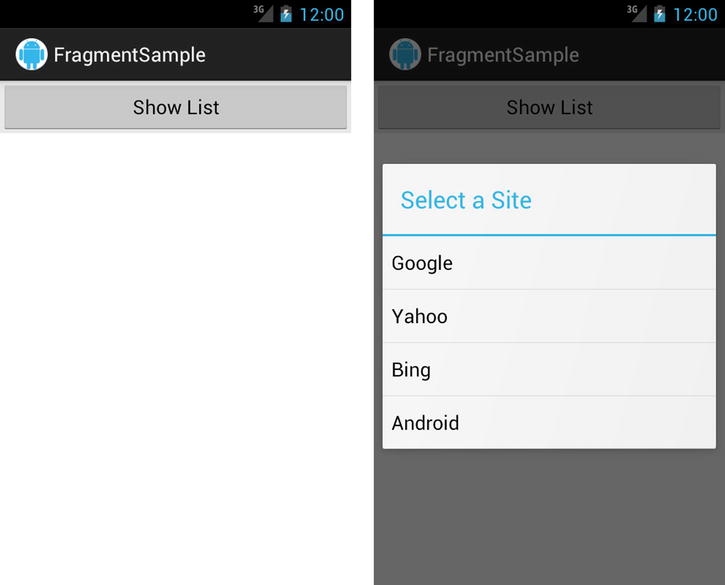
Figure 3-20. Portrait layout (left) and dialog display (right)
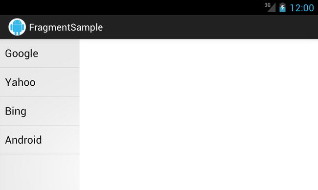
Figure 3-21. Landscape layout with fragments side by side
Fragments are a fantastic way to break up your code into modules that can be reorganized and reused in order to allow your application to scale easily to multiple device types while staying easy to maintain.
Summary
In this chapter, we explored a number of techniques that we can use to build a compelling user interface that conforms to the design guidelines that Google has set forth for the Android platform. We started out looking at how to effectively use the action bar interface elements in applications. We explored managing configuration changes such as device orientation in creative ways. You saw techniques for managing user input through text and touch handling. Finally, you were exposed to implementing common navigation patterns such as the drawer layout and swipe-paging views.
In the next chapter, we will look at using the SDK to communicate with the outside world by accessing network resources and talking to other devices by using technologies such as USB and Bluetooth.