
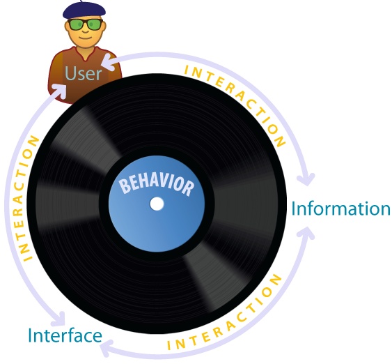
Chapter 3. Behavior
"If you have to ask what jazz is, you’ll never know.”
In music, improvisation is the art of creating a song while performing it, in the moment and in response to interplay and interaction. Along with blue notes, polyrhythms, and syncopation, improv is fundamental to the nature of jazz. The freedom and spontaneity of the solo passes from saxophone to piano to trumpet in the call-and-response pattern of African-American field hollers, while the drums and double bass weave a musical fabric in conversational rhythm. Good jazz engages the listener. It’s hard to resist the spellbinding power of a player with chops who’s in the pocket. We become fully immersed in a state of flow that dissolves the lines between act and actor. As the artist Henri Matisse once noted, “There are wonderful things in real jazz, the talent for improvisation, the liveliness, the being at one with the audience.”
In designing the interaction of search, we’d do well to keep jazz in mind, because behavior is a conversation and flow is a state worth striving for. When we search, our actions are reactions to the stimuli of information and interface. The box and its controls shape how we search, and what we find changes what we seek. The distinction between user and system dissolves in behavior. It’s an activity that’s open to flow. At its best, search absorbs our attention totally. Our experience of time and self are altered. We become lost in the most positive of senses. But we don’t get in the groove by accident. As Mihaly Csikszentmihalyi explains, activities such as music, dancing, sailing, and chess are conducive to flow because “they were designed to make optimal experience easier to achieve.”[11] They offer challenge, give control, support learning, reward skill, and provide feedback. We can both design for flow and experience flow in design, since our practice offers ample challenge and reward for those with the chops to put the swing in search.
Of course, music isn’t written on a blank slate. In the words of Wynton Marsalis, “Improvisation isn’t a matter of just making any ol’ thing up. Jazz, like any language, has its own grammer and vocabulary. There’s no right or wrong, just some choices that are better than others.” Similarly, there are patterns of behavior, elements of interaction, and principles of design that form the building blocks of search. The elements are always in flux. Technology shifts interaction from mouse and keyboard to multitouch to freeform gestures in thin air. But our patterns and principles? They’re timeless, both limited and inspired by the nature of information and the inherent affordances of our senses.
Patterns of Behavior
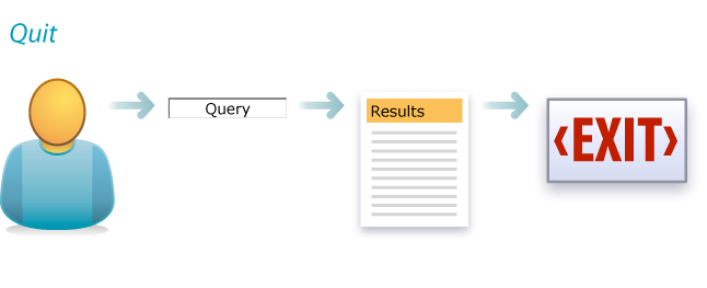
Search ends with an exit. Users always quit. The question is, why? Did they find what they need or simply give up? Was it the information or the interface? Too little, too much, too slow? Quit is a pattern that demands analytics. We must know the reason they’re leaving.
Quit
Quit
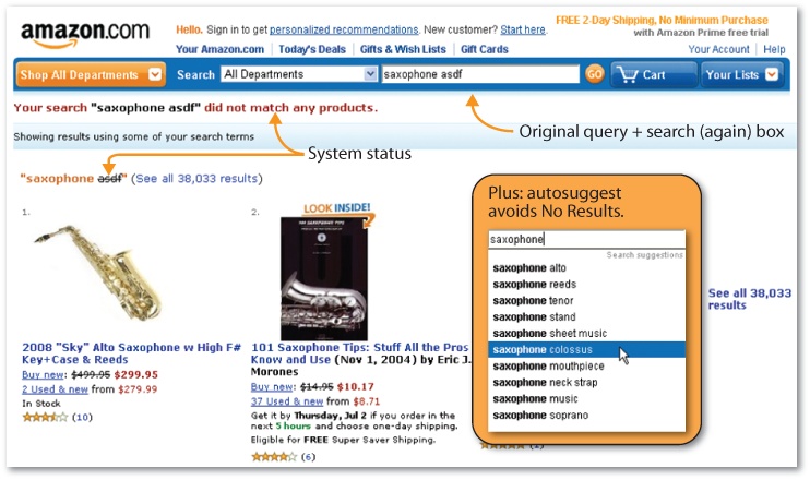
For instance, are we sending users away with No Results? If so, perhaps we can improve the interface. In Figure 3-3 Yale University fails to state the system status clearly (e.g., “No results were found”), but otherwise provides a good combination of feedback and next steps. Links to popular pages and popular searches might also be helpful.

On the other hand, if we can help users avoid “No Results” in the first place, that’s even better. As Figure 3-4 shows, we’re less likely to reach a dead end at Amazon, thanks to the autoexpand strategy of partial match, in which unrecognized keywords are omitted from the query string. Even a match against some search terms may be better than none.
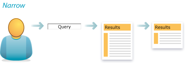
When users don’t quit, they refine. Narrow is the second most common pattern around. Our initial query casts a wide net. Upon seeing results, we pull back. Sometimes, we can avoid such initial imprecision. A wider box invites more words. So does experience with large (and growing) bodies of content. In fact, the average number of keywords per query in web search has moved from 1–2 to 2–3 in recent years.
Narrow
But presearch has its limits. Advance query specification is difficult, because we don’t know the size or structure of the index. When we’re searching without a map, even a traditional SERP tells us a lot. The nature of snippets and the number of results lets us judge how (and how much) to narrow. In particular, diversity algorithms ensure we can sort out synonyms. Upon seeing sample results from each distinct meaning (e.g., psychology versus cover flow), we can disambiguate our query.
Even better, faceted navigation puts metadata on the map. As Figure 3-6 shows, Artist Rising lets us clarify whether we want drinking bars (places) or lemon bars (cuisine) and photos or paintings. Plus, we can refine by searching within these results. And even Sort provides a way to limit what we see. Artist Rising offers us many ways to narrow.

The opposite pattern is rare. Expand is uncommon, partly because users often cast a wide net to begin, and partly because it’s a harder problem. Of course, users can try a broader query. When “low fat lemon bar” returns no results, we omit “low fat” and try again. And we can relax constraints. In Artist Rising, we can undo facet value selections or remove keywords to expand the query by closing the box. We can always take a step back.
Expand
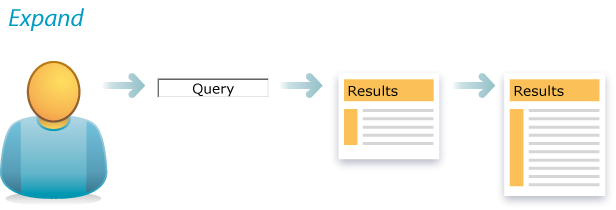
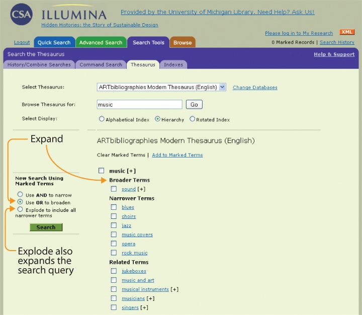
However, explicit support for expand is rare. It’s most commonly seen in the thesaurus browsers of library databases, as shown in Figure 3-8 where structured vocabularies and the risky expectation of searcher expertise afford designers a sense of freedom to reveal the hierarchy (and potential polyhierarchy) that connects to broader terms.
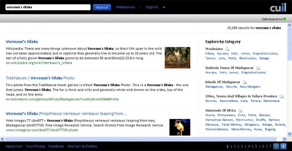
Rather than a formal hierarchy, search applications often let users expand (or at least explore) by showing related terms within matching categories, as shown in Figure 3-9.
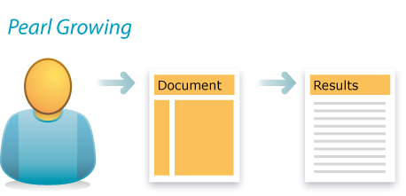
Independent of interface, expert searchers employ a singular strategy for expansion known as pearl growing. Find one good document, then mine its content and metadata for query terms and leads. We might look for more articles about this topic, by this author, or from this source. Pearl growing is an old trick that’s taught in library school.
Pearl Growing
Fortunately, pearl growing is also a strategy we can spread by embedding it within the interface. Google’s Similar link is the most ubiquitous example. Although the algorithms may be complex, the user needs only to click a link.

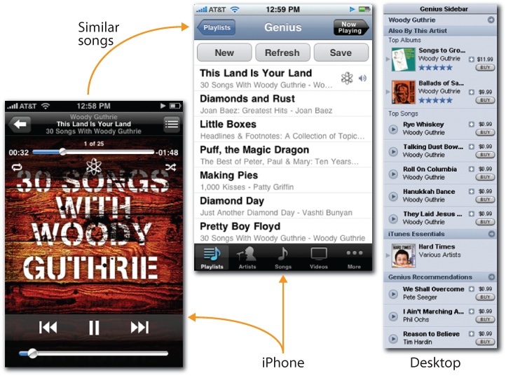
Similarly, music recommender systems make it easy to find songs we like by comparing the attributes, ratings, and collaborative filtering data of songs we know and those we don’t. Last.fm and Pandora rely heavily on up and down ratings of individual songs.

iTunes Genius, shown in Figure 3-13, pays more attention to the songs in our personal collections. Either way, these systems make pearl growing fun and easy. From one song, we can find many similar songs to buy and enjoy.
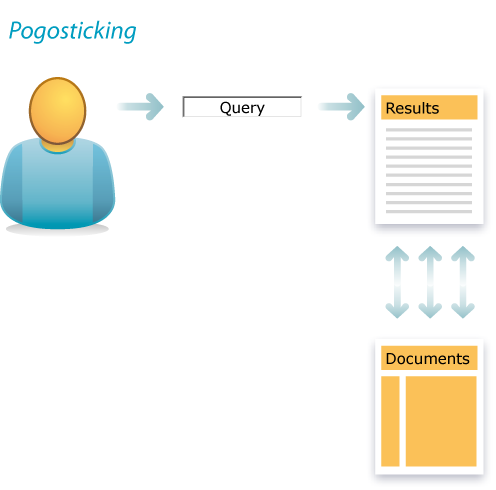
The patterns of behavior we’ve covered so far—quit, narrow, expand, and pearl grow—are timeless. They are inherent to search. Other patterns (or antipatterns) are produced by bad design. For instance, repetitive bouncing between the SERP and individual results is known as pogosticking. A little pogosticking means users are sampling results. That’s to be expected, but when it happens a lot, it’s not sampling; it’s a symptom.
Pogosticking
Perhaps our snippets and metadata lack the scent users need to effectively scan results, so they must visit each one in turn. Or, if sequential viewing of results is a desirable pattern, we need solutions that support this behavior. Cooliris, shown in Figure 3-15, uses the iPhone’s touchscreen to let users flick through image results in linear fashion.

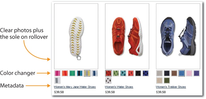
Lands’ End, shown in Figure 3-16, ensures the metadata and features that users need are available in the gallery of search results. It doesn’t stuff too many results on the page at the expense of rich summaries. A clear product image, displaying the sole on rollover, inline color selection, the name, and the price are just the right mix for most users.
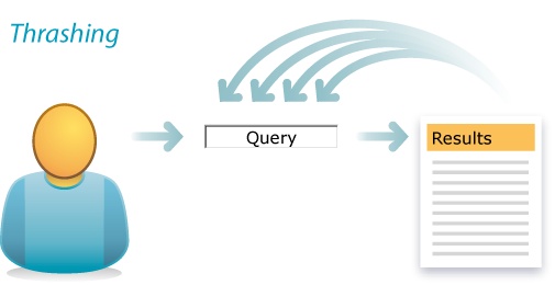
Another common antipattern is thrashing. In thrashing, a design flaw resides in users’ heads in the form of the anchoring bias. We set the anchor with our initial query, and then, despite poor results, we insist on small variations of the flawed search phrase rather than trying new approaches.
Thrashing
For instance, a user searching for a concert may try many queries that begin with the (misspelled) nickname rather than switching to the performer’s full name.
| sachmo |
| sachmo concert |
| sachmo jazz concert |
| sachmo jazz festival |
| sachmo music festival |
| sachmo summer celebration |
In Figure 3-18, Yahoo! illustrates two ways to break this pattern. First, autocomplete helps users avoid typos and get the query right to begin with. Second, autosuggest can recommend related queries that don’t include the original search term. This feature taps query reformulation data, the terms users enter after their first search fails, to make this semantic leap and help users who start in the wrong place to weigh anchor and move on.
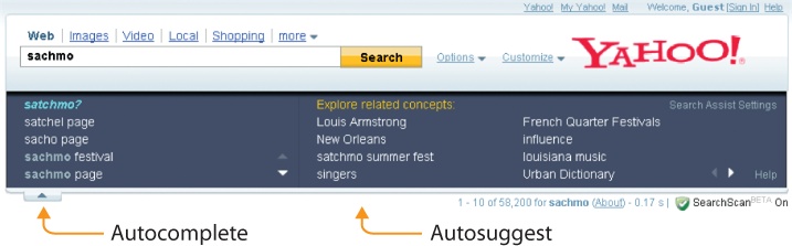
In fact, by identifying related concepts, autosuggest helps users to move forward (refine), backward (expand), and sideways (related). Like many good design patterns, autosuggest multitasks. It’s a timely solution to a timeless problem. After all, both autocomplete and autosuggest are recent additions online, made possible by the advance of technology. Even as core patterns of behavior endure, design patterns must adjust to new possibilities, which is why we must keep our eyes (and ears) attuned to the elements of interaction.
Elements of Interaction
It’s a stimulating period for the practice of interaction design. Emerging technologies reinvent what’s possible, new platforms challenge old metaphors, sensors add extra senses, and all this innovation disrupts our cozy patterns. A rare burst of evolutionary change is reshaping our expectations of interface. While the desktop still reigns supreme, the rapid adoption and improvement of mobile devices has our attention. The sensors and actuators of multitouch and gestural interaction are on our minds. Rich user interfaces blur the boundaries of web, desktop, and mobile applications. Design patterns flow back and forth between platforms in strange loops that keep us all on our toes. At such a heady time, it’s worth reviewing the elements of interaction that bind us to each platform.
The desktop is the most established platform and the main gateway to search. We all know the standard configuration: mouse, keyboard, monitor, speakers, and sometimes a video camera and microphone for audiovisual input. Once in a while we Ctrl-C a trick from the old command-line interface (CLI), but mostly we click and double-click the graphical user interface (GUI), dragging and dropping files and folders as we go. It’s a short distance from desktop to web, where sites and pages with URLs are simply new places for old faces. The boundaries are barely worth mention. Rollovers, hovers, clicks, and keywords are the main events, while menus, buttons, form fields, and links are the basic interface idioms.
In search, rich elements include scented widgets, Ajaxian calendars, DHTML sliders, radial menus, dynamic transitions, transparent overlays, drag-and-drop results, and advanced query wizards. There’s a great deal of freedom, and that’s part of the problem. In the absence of solid design process and principles, these rich elements give us more rope with which to hang our users. All too often, we sacrifice usability and accessibility for a sexy look and feel. Finding the right balance isn’t easy, mind you. The wealth of our palette affords us the paradox of choice, and we’re still learning to design the results.
Of course, we can’t dwell on the desktop. Mobile is the fastest growing platform ever, and for many designers it’s the most interesting to boot. While it may add tiny screens and keyboards to our constraints, mobile also creates fabulous new avenues for interaction. Multitouch lets us tap to open, spread to zoom, and slide to scroll. A camera, microphone, and speakers offer multisensory I/O, and our devices know where they go. Location, altitude, bearing, and velocity are all new inputs for queries we have yet to conceive. Plus, the accelerometer lets us rotate to landscape, shake to clear, and lift to search. Sensors and actuators presage an era of gestural interaction beyond the device.

While the Clapper is old and the Wii is popular, freeform gestural interaction is still in its infancy. Our presence opens doors, our hands turn on taps, and for paper towels, we wave to activate. However, our gestural vocabulary is limited and rarely applied to search. That said, it’s not too early to begin imagining gestural query interfaces and idioms for freeform discovery. In fact, now is precisely the time to think about how we want to search, before the next wave of innovation hype masks our view with froth and frivolity.
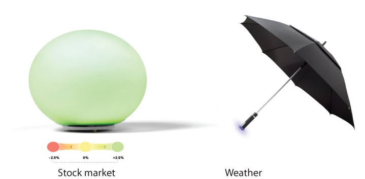
It’s smart to start with our senses. We can see, hear, touch, smell, and taste. We can sense acceleration, balance, pain, and the relative position of our body parts. We can feel a haptic buzz. How might we tap these channels of input and output? We can already search by singing. What’s next? Of course, we shouldn’t stop with our senses, since our sensors can know so much more. Location is just the beginning. Sensors can detect and measure everything from magnetic fields and air pollution around the globe to the heart rate and glucose levels of a single human body. Already, as shown in Figure 3-21, Ambient Devices is turning everyday objects into wireless information appliances. The umbrella’s handle pulses when rain is forecast, and the orb glows different colors to display real-time stock market trends, traffic patterns, pollen forecasts, and more. Sensors are enabling us to search beyond our senses, and together with new devices and rich interfaces, they’re transforming the how, what, where, when, and why of discovery.
We are also searching across channels. For many applications, we can’t limit or predict the context of use. The experience is out of control. A search may start at home on the desktop, move to mobile on the bus, continue on an in-store kiosk, and end in the shelves. And it may have been a television or radio advertisement or a highway billboard that provoked the search in the first place.
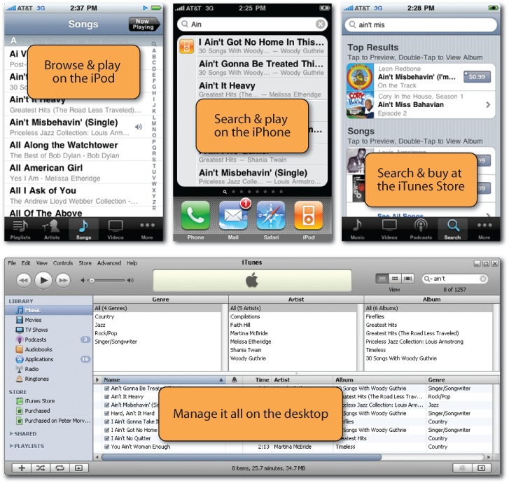
That’s why smart organizations take the time to map touchpoints across media and channels. By employing user experience research and service design principles to identify, optimize, and align all important interfaces and interactions with their products, services, and brands, organizations are able to improve customer satisfaction and the bottom line. Apple is the most famous case. The distinct features and the relationships between the iPod in your palm, the iTunes desktop application, and the iTunes Store on the Web serve as a familiar model. Apple’s genius was to locate key functions on the right platforms. As shown in Figure 3-22, we play on the device, manage on the desktop, and buy at the store. Of course, we search across all three. Early iPods and iPhones lacked search. It wasn’t necessary until it was. Now, it’s both a feature and a multichannel opportunity, because Apple needs better design and integration across platforms. The search applications are there, at last. But they’re not insanely great!
There are many less well-known examples. For instance, the Ann Arbor Library supports a successful cross-channel search experience. A catalog query on a desktop or mobile device offers “Request this title” for each result. Patrons can have books and other items shipped to their local branches, and receive email alerts when those items arrive. Patrons can arrange for pickup at the reserve shelf or from a convenient after-hours locker, and when an item gets many requests, the library buys more copies—there’s a feedback loop that improves results.

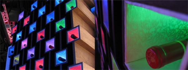
And then there are those things that make us think. For instance, as shown in Figure 3-24, WineM is a “smart” wine rack made by ThingM that uses radio frequency identification (RFID) to track individual bottles in a rack. A mobile device lets users query the collection by year, region, type, and price. Full-color LED lights transform the rack and bottles into a physical faceted search results interface.
In search interaction, the genie is out of the bottle. When we can do so much in and out of the box, there’s no going back. But we may come to pine for old limits. While the freedom to invent idioms and change channels makes design more interesting, it also makes our work more difficult. It’s all too easy to create elaborate, confusing interfaces that make our users come unglued. That’s why we must stick to our principles.
Principles of Design
Humans began using pigments such as ochres and iron oxides for colorful body decoration around 400,000 BCE. It took us a bit longer to invent written language (about 5,500 years ago). Since then, we’ve been creating and combining images, symbols, and words to communicate ideas and meaning. We’ve had time to practice design.
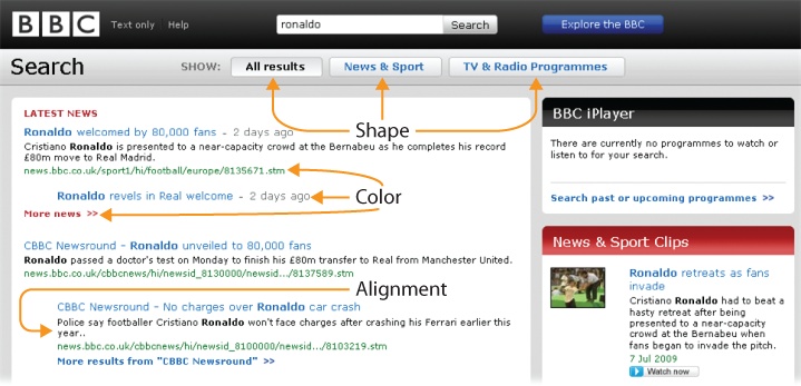
Of course, time is the last thing we have when users visit a search interface. In the first 250 milliseconds, the preattentive variables of size, shape, position, alignment, orientation, color, and texture have already worked their magic. A well-crafted interface reveals its core features and layout to our subconscious before we have time to think.
This magic doesn’t occur naturally. Great interfaces require talented designers who know how to use visual hierarchy to organize information and guide action, and who appreciate the importance of detail. For instance, early versions of Google’s spellcheck stated, “If you didn’t find what you were looking for…” at the top of the page, along with the suggested spelling. Nobody noticed it, so Google tested shorter variations such as, “Did you mean:” above and below the results—and use increased dramatically.
Designers must also be sensitive to context. In music, for instance, the animated 3D interface of Cover Flow makes sense. It’s fun to flip through colorful covers while listening to and searching for our favorite songs and albums. But this sexy design enjoys limited play in other categories. It certainly doesn’t belong in web search, where simplicity and speed are so vital. As Google’s user experience director, Irene Au, explains:
"A lot of designers want to increase the line height or padding in order to make the interface ‘breathe.’ We deliberately don’t do that. We want to squeeze in as much information as possible above the fold. We recognize that information density is part of what makes the experience great and efficient. Our goal is to get users in and out really quickly. All our design decisions are based on that strategy.”[12]
This statement reveals an important dimension of design. We can’t be concerned solely with how an interface looks. As Steve Jobs famously remarked, “Design is how it works.” Visual design shapes the first impression and has a lasting impact, but the halo effect carries the tune only so far. Interaction design is the missing link that lets the rough edges between user and system dissolve in behavior. It’s a discipline essential to flow. And it’s a practice that’s relatively new—although we’ve made tools for over a million years, we’ve been making interactive software for less than a century. That said, we’ve made a good start at defining first principles, and many of them apply directly to search.
Incremental Construction
We can accomplish amazing feats once we overcome fear and inertia at the start line. But oftentimes we don’t start. We’re overwhelmed by the enormity of a task or confused by the complexity of an interface. These feelings are so widespread that we collect idioms for inspiration. Get the ball rolling. Rome wasn’t built in a day. A journey of a thousand miles begins with a single step. Don’t make me think! Designers should heed these words, because search is a terribly common place to stop. A complex interface hits like a brick wall. Not only does it make users think, but it also makes them feel stupid, and that’s the kiss of death. So, we must recall the paradox of the active user and allow users to start small, with a keyword or two. Input hints or prompts near or within the box should show the what and the how of search, and the box should boast autocomplete and a forgiving format. Why should users worry about spelling and syntax when that’s our job?
Let’s get them started with good defaults and keep them moving with facets, filters, and intriguing branches. We must also support safe exploration by enabling undo, so users can modify parameters, step back, or start over. We must work hard to lower search costs and reduce barriers to entry, because search isn’t iterative and interactive when users stop before they begin. People will build great queries incrementally, one click at a time, if we can get them past the start line and always offer at least one next step.

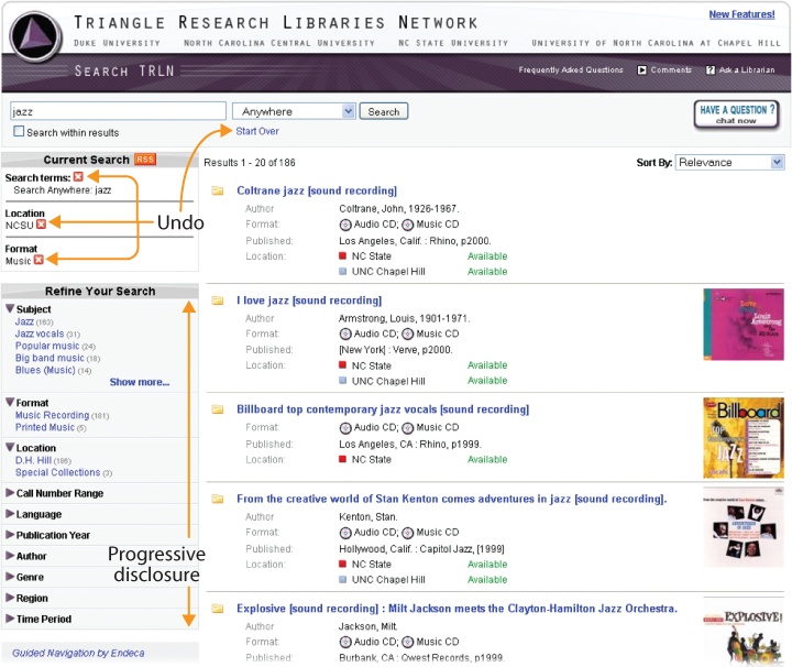
Progressive Disclosure
Experience with a tool or task often shifts the optimal balance of power and simplicity. To begin, users don’t want to be overwhelmed with features. But with time, more advanced options may be desirable. So, progressive disclosure defers these powerful or specialized features to a secondary screen, making software easier to use and learn. We must design applications that require the least amount of physical and mental effort, using contextual tools like hover-reveal to offer an invitation without cluttering the interface.
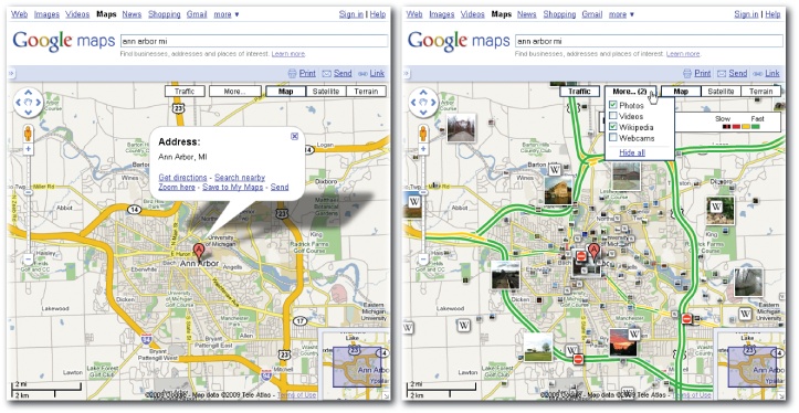
Google Maps offers a good example of progressive disclosure and careful adherence to the user dictate: “Show me only what I want.” The initial interface is a basic map with an overlay for popular tasks like getting directions. A click adds a colorful traffic layer and a hover reveals more options. Google designs disclosures that are responsive to users.
Faceted navigation is a similarly progressive design pattern. Users can begin with a few keywords and end with a few results. They can ignore the facets if they choose, but the power of incremental query refinement is available, plus the quantity and specificity of metadata fields often snowballs helpfully as they go. Facets allow people to learn search on gentle slopes rather than being forced into the big step from the bunny hills of the basic interface to the black diamond mode of advanced search.
In general, even though progressive disclosure may suggest the use of modes to prevent specialized features from cluttering the basic interface, we must take great care when introducing distinct system states like advanced search. Modes often lead to mode errors in which users forget the current state, attempt an action belonging in another mode, and get an unexpected result. These are not insurmountable problems, but it’s often easiest for everyone to rally around a modeless interface. Similarly, it’s best to add flexibility with support for deferred choices. Let the user search and then log in without losing results. Offering many paths to the same destination effectively supports both incremental construction and progressive disclosure. We get two principles for the price of one.
Immediate Response
Poor performance will turn any interface into a train wreck. Flow requires feedback, early and often. A few years ago, results were the only reply. Our goal was a subsecond response. Now, with autocomplete and autosuggest, the results may precede the query. How’s that for timely feedback? Of course, our systems can’t always deliver, in which case we rely on animations, cinematic effects, and other visual transitions to indicate progress and enhance engagement. But while transitions advance the perception of performance, they’re no substitute for speed, which can improve even a mediocre system by enabling iterative, interactive query refinement in response to results.
Volkswagen UK employs a wonderfully subtle form of feedback. During active control of a slider, the options to be excluded from the results fade to gray. Then, upon release of the mouse button, the faded options disappear, and the remaining cars gracefully shift into position within the smaller result set. It takes a while for this rich Internet application to load, but once running, it’s a smooth ride with great performance and quick response.

Alternate Views
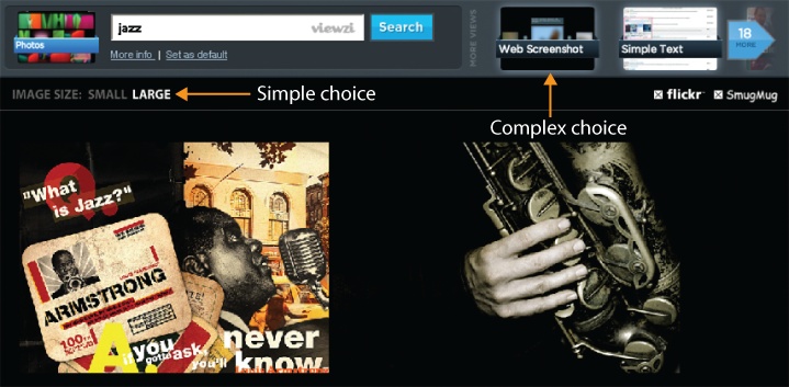
For many applications, the optimal view differs by user and task. One size does not fit all. This is certainly true in search, where the ideal mix of metadata depends upon user intent. A linear list of results rendered in text may work for quick lookup, but comparison shopping merits a tabular presentation with images. Conversely, the search for cooccurrence invites a geographic map with symbolic data overlays. Since we can’t always employ the query to accurately interpret intent, it’s important to provide the user with choices.
Viewzi takes alternate views to the extreme. This intriguing application provides the basic choice between small and large images, but it doesn’t stop there. Viewzi offers more than 18 different ways to view search results. Options include simple text, image grid, timeline, tag cloud, and a fashionable cover flow interface for browsing web screenshots. It’s not a model that most should emulate, but it does get us thinking about the layouts and lenses we might offer our users.
Sort order also provides users with the choice of alternate views. Since users rarely explore beyond the first page of results, sorts act much like filters. When we sort by most popular or best rated, we effectively limit our view by that criteria. On the other hand, we sometimes sort by date or title so we can quickly scan the list for a known item. Sort order is a relatively easy way to provide users with flexibility and control.

Another alternate view worth reflection is that of those who can’t see. As with other features of an application, search should be universally accessible. Clearly, this means that search and result interfaces must be easy to navigate with text-to-speech and Braille output screen readers. It’s also worth considering the content. Google’s Accessible Search, for instance, relies upon signals in HTML markup to identify and prioritize search results that are easier for blind and visually impaired users to use. As designers, we must make content and functionality accessible by adhering to the layered strategy of progressive enhancement (or the inverse principle of graceful degradation). It’s our responsibility to offer multiple paths to the same information to provide all users with freedom and to serve those who lack the basic options many of us take for granted.
Predictability
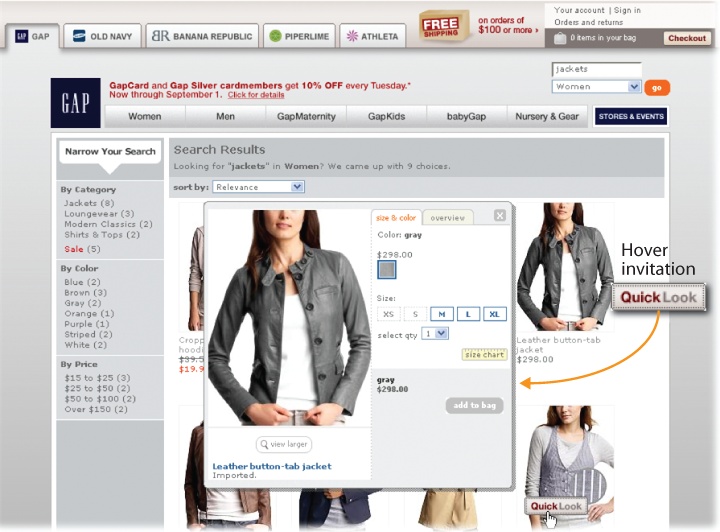
For most applications, predictability assures usability. Effectiveness, efficiency, and satisfaction generally follow when users can accurately predict what will happen next. In search, we need predictable features and results. Controls must be easy to discover and understand. The Gap, for instance, uses a simple hover invitation to feed-forward the Quick Look feature, which leads to an overlay instead of the detailed product page. Since the invite appears in the natural flow of result selection, it’s impossible to miss.
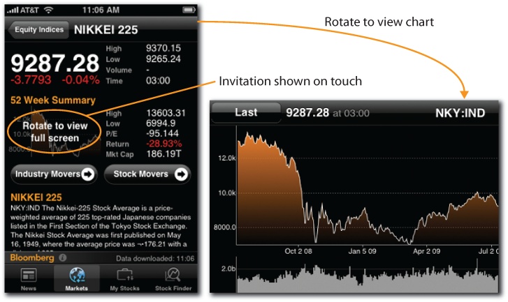
In contrast, Bloomberg’s rotate-to-view feature is less discoverable, but once found it works well, because it’s simple and consistent. When a gesture works the same way throughout an application, habituation improves efficiency. Users become comfortable with that gesture and know what to expect.
Consistency of placement is also important. When people use controls, they find and recognize them by location. So, in designing search and result interfaces, we must respect the power of spatial memory and position controls and widgets consistently.
Of course, search only works well when results are predictable. First, the box must do what’s expected by responding with the right results in good order. Second, each result must offer sufficient scent through the right mix of metadata so that users can sense its aboutness. We can’t have people wondering what’s hidden behind door number one.
Recognition Over Recall
Recognition is triggered by context. We’re quite good at it. With the radio on, we can sing the lyrics to thousands of songs. Recall works without context. At this, we’re terribly bad. With the radio off, our memories fade to black. This imbalance is shared across our senses, and it’s a huge factor in design. It’s a major reason why we shifted from CLI to GUI. Users couldn’t recall commands, but they could easily recognize buttons and links.
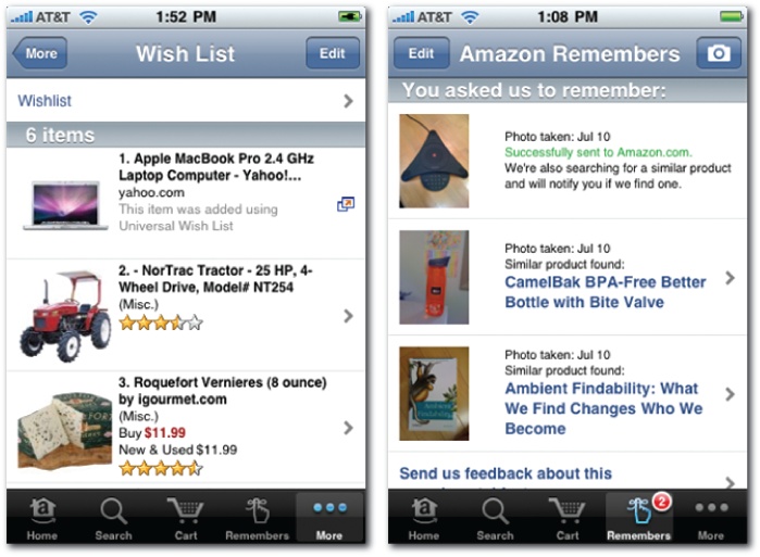
In search, the first step is to make valuable options visible. Otherwise, users forget what they can do. This requires compromise with progressive disclosure. We need just the right balance between show and hide. Second, we must offer tools that reduce users’ short-term memory load. Amazon is the best in this department. While searching, users can use a shopping cart, shopping list, and wish list as their personal memory managers.
But Amazon further boosts our memories by thinking outside the box. Users can drag the universal wish list button to their browsers’ toolbars, and then add items to wish lists while exploring any online store. Even better, while out and about in the physical world, users can tap the Remembers feature of Amazon’s mobile application to snap photos of anything they wish to remember. If the object is a product, Amazon will try to find it and send an email alert with a link, then show it on the home page the next time the user visits. It’s a truly amazing feature that makes it almost impossible to forget what we intended to buy.
Of course, sometimes the path to better recognition in search is browse. Search requires that we know what we want and have the words to describe our needs. In contrast, browse illustrates what’s available, shows the vocabulary, and reminds us of things we might need.
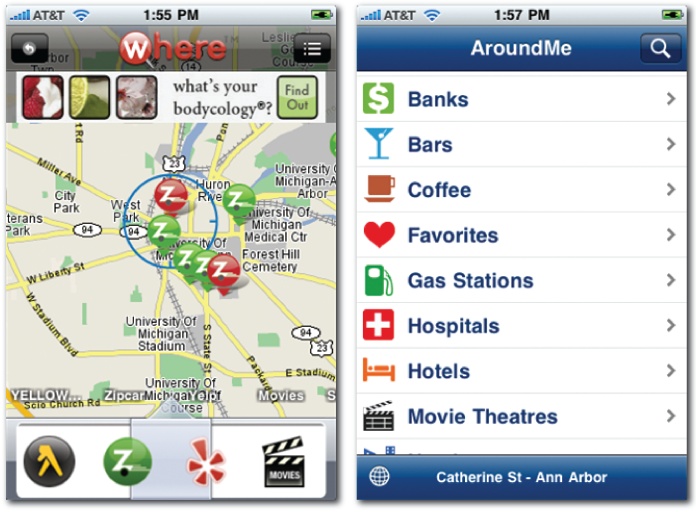
In mobile, browse is especially useful, because it takes time to type and we’re unsure what to search for. Applications like Where and AroundMe don’t require users to remember the types of things to be found. Instead, we can browse the map or a traditional taxonomy. We may not recall what we want, but we’ll recognize it when we see it.
Minimal Disruption
In light of our feeble memories, not to mention our general impatience and intolerance for change, it’s often best (when possible) to stay on the page. Modern applications usually offer such conveniences as same page error messages, edit in place, and contextual help. Overlays, inlays, tabs, virtual scrolling and panning, and inline paging are all creative ways to bring additional content and controls into the picture without shifting the frame.
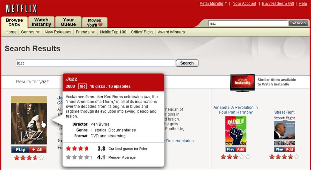
Netflix takes convenience a step further. In addition to a detail overlay, Netflix serves up actionable results, so we can add items to the Instant Queue or start playing a movie, all without leaving the results page. The controls and features move so we don’t have to.
Direct Manipulation
Yet another factor in the success of GUI is the principle of direct manipulation. Interfaces that enable users to interact directly with visible objects are more easily learned and used. Sometimes we rely on real-world metaphors. We sort files on the desktop and drag them into the trash can. Other times, our idioms have no analog, yet direct manipulation drives them into our muscle memory. Our bodies remember what our minds forget.
At first blush, search has little room for direct manipulation. After all, isn’t the box ground zero for the triumphant rebirth of the command line? But upon reflection, we find opportunities for tangible results. For instance, Searchme lets users drag results into custom search stacks for later review or for sharing with friends and colleagues. There’s also an Add to Stack link, but it lacks the visual and tactile gratification of drag-and-drop.
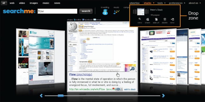
However, the link also lacks the problems of drag-and-drop. The perceived affordance of the link is clear. Predictability is high, and it favors recognition over recall. In contrast, there’s no perceived affordance to indicate the results are draggable. Searchme fails to provide a self-describing drag handle. It does a better job with the transition and drop zone. Upon result selection, the stack area lights up and the result spins and shrinks until it’s dropped into place. But this introduces another challenge. The use of drag-and-drop invokes Fitts’ Law: the time to acquire a target is a function of the distance to and size of the target. This means we must think carefully about the size and placement of the drop zone. Many users have a hard time getting the mouse (and cursor or drag handle) into just the right place, especially while holding down the mouse button.
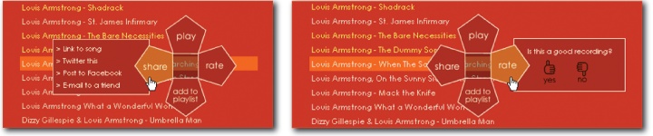
The pie menu (also known as a radial menu) is an interesting alternative. A music search engine named Songza illustrates the benefits. First, it’s self-revealing. When a user clicks on a result, the menu appears. Second, it plays well with Fitts’ Law. The options, including those within the nested menus, are near the original point of interaction. Third, it’s a gestural interface with the advantages of direct manipulation. Expert users can rely on muscle memory to select options without glancing at menus.
Of course, we must consider how these principles of design interact. For instance, the pursuit of direct manipulation may compromise accessibility, or our basic controls may simply fail the power user. It’s a constant balancing act that can only be done in context.
Context of Use
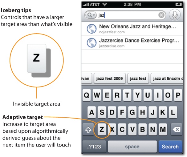
In design, context is a seven-letter word that means everything. It’s not enough for our applications to work great in the lab; they must succeed in the real world. This means we must consider users, goals, content, features, platform, and environment. An elderly man with fat fingers may have a hard time using the tiny touch targets of a soft keyboard to search for a nearby restaurant while bouncing on a bus. That’s why the iPhone employs iceberg tips and adaptive targets to make writing a little easier. It’s also why Google Mobile uses search history, autosuggest, and voice search to let us type a little less.
Of course, we’re all making it up as we go along. There’s no sheet music for what we do, since each context requires a new song. Interaction elements and design principles afford us a basic grammar and vocabulary. We can even string together a lick here and there by drawing upon established patterns of design. But, at the end of the day, innovation requires improvisation. We won’t find flow, get in the groove, or create designs that dissolve in behavior without embracing the risk of new rhythms. As Louis Armstrong once noted, “Never play a thing the same way twice.” It’s time we put the jazz in design.
[11] Flow: The Psychology of Optimal Experience, Mihaly Csikszentmihalyi (Harper).
[12] “Google’s Irene Au: On Design Challenges,” Business Week (March 18, 2009), www.businessweek.com/innovate/content/mar2009/id20090318_786470.htm.