The Squarespace platform is a powerful and flexible tool for building beautiful and compelling websites. The user-friendly system allows small businesses and individuals to easily maintain their online presence. Millions of websites have been built on the Squarespace platform, with more being added every day. The real strength of the Squarespace platform is the flexibility and range of control. A user with no coding knowledge can create a well-designed website using the built-in tools. Users with coding knowledge can harness the full power of the platform to produce highly customized websites.
The Squarespace platform combines web hosting and a content management system into a single subscription. This ensures that everything works seamlessly together. Other web platforms require a separate web host or require the user to regularly update the site for security. Squarespace monitors every site on their platform for security and reliability. This frees the user up to focus on the content of the website.
Every website built on the Squarespace platform runs on the same Squarespace content management system. This means that the functionality of the website is the same no matter what subscription plan you sign up for. Some plans limit the number of pages or users while others offer more advanced e-commerce integrations. Squarespace regularly updates their offerings with new features and integrations. The Squarespace website is where you can find current pricing and plans.
In this book I will not go into every single feature or template option. Since Squarespace regularly updates their system, the Squarespace knowledge base documentation has the most current information on templates and specific features. The goal of this book is to teach you the bigger picture of how to think about, and work with, Squarespace websites. This will empower you to use the full scope of the current Squarespace system as well as any features that are released in the future.
Selecting a Template
Squarespace websites all use a template. The template includes the general layout of the website, colors, fonts, and other design elements. Every template uses the same Page Editor and Layout Engine. Squarespace offers a number of templates to choose from. Users with coding knowledge can also create their own template using Developer Mode.
Squarespace templates offer a variety of layout and design styles. Every template has the same core functionality. Many of the templates have additional specialized features or layout options. Templates for Online Stores have more options for product styling, shopping cart display, and checkout page styling. Some templates are tailored to portfolios or blogging. The templates are all very flexible and all include the core functionality. Squarespace categorizes templates on their website, but don’t feel limited to a particular category. It is more important that the functionality of the template matches the functionality needs you have identified for the site.
Parallax Scrolling is often a deciding factor for which template to use. Parallax scrolling is a visual effect where the background image moves at a different rate than the content around it. It is often used to immerse a site visitor in the experience. Parallax scrolling can be turned on or off in the Style Editor. Some templates include Parallax Scrolling where others do not. If a template does not include parallax, it can be added but is difficult. The better option is to choose a template that includes it. Figure 1-1 illustrates how the different parts of a parallax index work together.
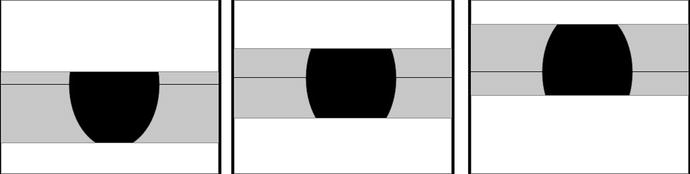
Figure 1-1. Parallax Scrolling effect
Index Pages are another deciding factor in template selection. Index Pages group a number of regular pages into a single collection. There are different Index Page layouts. A stacked layout stacks the pages in the collection in order. The stacked pages are all full width. The grid index layout stacks them in a grid format with equal rows and columns. Some index grid layouts allow you to select how many pages appear in each row of the grid. Figure 1-2 illustrates the two different types of index layouts.
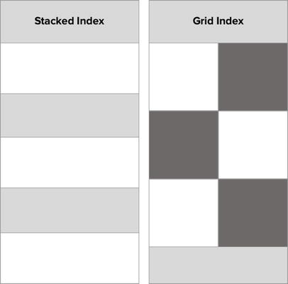
Figure 1-2. Stacked Index layout, Grid Index layout
Some templates offer masonry layouts for blog pages or galleries. A masonry layout is similar to a grid in that there are equal size rows or columns. The big difference is that the other dimension is not equal in size. This gives the layout the look of stone masonry. A typical use is a vertical masonry layout, in which the columns are equal width but the items vary in height. Figure 1-3 illustrates the difference between a grid layout and a masonry layout. The layout on the right shows a vertical masonry layout with equal size columns.
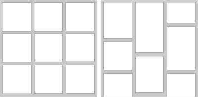
Figure 1-3. Left - Grid layout with equal size square tiles. Right – Masonry layout with equal width columns and varying height tiles
Squarespace templates do not allow per-page style customization. Any changes made in the Style Editor will affect all pages in the site. In the case of page type styles, like Blog styles, they will affect every Blog within the site. This restriction is to help DIY website builders ensure that their website has a cohesive design. As a web professional, I find this restrictive given my client’s needs. This is where custom coding becomes necessary. With custom CSS, HTML, and JavaScript code injections extensive per-page style customizations can be achieved. We will explore the various code injection techniques and best practices later on in this book.
Template Families
Squarespace templates are also a part of template families. Template families are templates that all share the exact same functionality, but the Style Editor options and demo content are different. For example in Figure 1-4 you can see the Brine, Clay, and Rally templates. Even though these templates look different they are all part of the Brine template family. The first template families we will cover are the new style template families. These templates are designed with more flexibility and features, making them flexible frameworks to build a site on.

Figure 1-4. Brine, Clay, and Rally template preview images
Brine Template Family
The Brine template family has over 30 variations available to choose from. The Brine template was the first one released on this framework, hence why the entire family is refered to by this name. Squarespace is regularly adding more templates to this family. A full list of Brine family templates can be found in the Squarespace Knowledge Base https://support.squarespace.com/hc/en-us/articles/212512738-Using-the-Brine-template . It is the largest template family and has the most layout flexibility. The Brine family was created with advanced e-commerce options including checkout page style options. The Brine demo site can be viewed at https://brine-demo.squarespace.com/ .
The notable qualities of the Brine template family include index page layouts, parallax scrolling, advanced e-commerce styling options, and full-page background images. The advanced e-commerce options include a product Quick View, zoom, and hover effects. This makes the template an excellent choice for any website that will include a store. The stacked Index Page layout includes parallax scrolling.
Other options included as part of the Brine family include full-page background images and a grid style blog layout. These features make it a great choice for non-e-commerce websites as well. One weakness of the Brine template is that there is not the option to add a sidebar to the individual blog posts. For a website that needs a sidebar as part of the blog posts, a different template must be chosen.
The Brine family also has multiple navigation menu areas. This is one of the notable differences between Brine and other template families. The Brine family template easily allows left, right, or split main header navigation. It also allows for a main navigation and a secondary navigation. The Brine family also has more options for styling the mobile navigation.
The Brine template family is the only template family with parallax functionality built in. The Brine template family allows for multiple content blocks to be added to an index section. It also calculates the position of the parallax image using a vertical and horizontal focal point. This allows great flexibility for different amounts of content to appear over a parallax banner image.
The Brine template family has two parallax image cropping options. The original option and the new Smart Crop option can be selected in the Style Editor. The original parallax code calculates the image size so that it overflows the content section by 500px on every side. This value, 500px, is known as the parallax offset. Figure 1-5 illustrates how the image is scaled relative to the parallax content container. For landscape orientation the image is scaled up to have 500px more width than the parallax content container. For portrait orientation the scaling and cropping is more significant. In Figure 1-5 portrait view the calculation ensures that the vertical height of the image is 500px greater than the height of the parallax content container. This results in a majority of the image being cut off.

Figure 1-5. Brine template family parallax image calculation
The Smart Crop option is the same parallax calculation that was used in the discontinued Marquee template family. Smart Crop images are not cropped if the background image is larger or the same size as the container. If the background image is smaller than the container it is scaled up and cropped only enough to create the parallax image effect. Figure 1-6 illustrates the Smart Crop calculations. For landscape orientations there is no left and right image offset unless the image is too short for the container. For portrait orientation the image is scaled enough to have a small top and bottom image offset. The top and bottom image offset are significantly smaller when using the Smart Crop calculation.
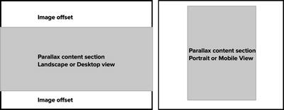
Figure 1-6. Parallax Smart Crop landscape and portrait parallax calculation
Tremont Template Family
The newest Squarespace template family is the Tremont family . It currently has four template variations: Tremont, Camino, Carson, and Henson. The Tremont demo site can be found at http://tremont-demo.squarespace.com/. Figure 1-7 shows the preview images for the Tremont family templates. Since this is a new template family I wouldn’t be surprised if Squarespace releases more variations in the near future.
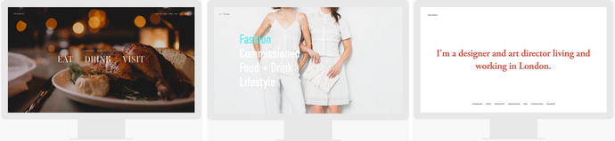
Figure 1-7. Preview images for Tremont, Carson, and Henson templates
The Tremont template family focuses on full-bleed images and dynamic overlay effects. The main distinguishing feature of the Tremont template is the Index Page layout, which functions as a portfolio. The Index Page displays each portfolio project page as a full-screen preview image. The Index Page allows the projects previews to be navigated through or transition automatically. The user can also get to the individual project pages.
The gallery pages have three unique layout options in the Tremont template family. There are also full-page color overlays that can be added. The color overlay is semi-transparent and can be customized with blend modes and color selections. Again, this is ideal for portfolio style websites or businesses in a creative field.
A feature of the Tremont template is the scaling font size. This means that the font size scales dynamically with the size of the browser window. Typically websites have the font size set for desktop size screens and mobile screens. There is a mobile “break point” where the website switches from desktop view to mobile view. This is not the case in the Tremont family templates. The fonts scale smaller in relation to the browser size. The Style Editor allows you to set minimum font sizes to ensure the font doesn’t get too small. I expect this new approach to font sizing will grow in popularity since it preserves the feel of the site across screen sizes.
York Template Family
The York template family was released in the spring of 2016. It has eight variations: York, Artesia, Flores, Harris, Jasper, Jones, Lange, and Shibori. In Figure 1-8 you can see the preview images for York and Lange. The York family was designed with advanced portfolio features to showcase the work of photographers, graphic designers, illustrators, and creative agencies. The template has a Project Page type that is not available in other templates. The Project Page type has a header area and footer area for customized content. The body of the Project Page displays a mix of text and images. For a project consisting of just images the regular gallery page is still available. The content of the York template appears to slide up from the bottom. This feature can be turned on or off in the Style Editor.
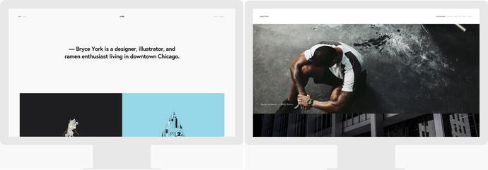
Figure 1-8. York and Lange preview images
Another strong feature of the York family templates is the Index Page. The Index Page has the capability to display projects in either a stacked or grid configuration. The York demo site, http://york-demo.squarespace.com/ , shows the Index Page with a mix of grid and banner layouts. The Lange demo site, http://lange-demo.squarespace.com/ , shows the Index Page with just a stacked layout. The different sections of the Index Page act as links to the project pages. This is different from the regular Index Pages that display all the content from the containing page.
The York template family also has dynamic font sizing like the Tremont family of templates. The template also offers page header banner images and background videos. The Style Editor selections also make the York family templates very flexible overall. The Style Editor also has additional mobile style options giving you more control over the mobile layout. One drawback to the York family is that there is not the option for a blog sidebar or a regular page sidebar .
Skye Template Family
The Skye template family consists of Skye, Foundry, Indigo, Ready, and Tudor templates. The Skye template family was designed for bloggers, magazines, reviewers, or anyone who would like a blog landing page for the homepage of the site. These templates don’t require that the blog landing page be the homepage, they were just designed with it in mind. I have seen this template family used to feature rental properties as well.
The blog landing page features a grid of tiles each linking to a blog post. The grid can be configured to show a thumbnail image, title, date, excerpt, and categories. There are multiple design options for the grid tiles. Figure 1-9 shows the preview images for Skye, Tudor, and Foundry. The Skye template demonstrates the grid as a true grid layout. The Tudor template is demonstrating a vertical masonry style layout. The Style Editor has the options to switch between aligning the grid at the top of the tile, the baseline of the tile, or as a masonry layout.

Figure 1-9. Skye, Tudor, and Foundry template preview images
The Blog Landing Page also has multiple loading options. The Blog Landing Page can display a set number of posts with a “Load More” button to allow site visitors to view more posts. The “Load More” button can be seen on the Tudor demo site at http://tudor-demo.squarespace.com/ . The Blog Landing Page can also be set to Infinite Scroll, which loads new posts automatically when the user has reached the bottom of the page. The Skye template demonstrates the Infinite Scroll option http://skye-demo.squarespace.com.
Additional blog features include an optional sidebar on the blog post pages, author profiles, and page position indicator. The next and previous post arrows, when hovered over, will display a thumbnail, blog post title, and date. Related posts can be displayed at the bottom of the page and turned on or off in the Blog Page Settings. The navigation icon, also known as a hamburger icon because of the three horizontal lines, opens up a navigation menu overlay. Figure 1-13 shows the navigation overlay when it is open. There are two sections where content blocks can be added. The first is at the bottom of the left-hand column. This section could be used to add additional sharing icons, text, or images. The right-hand column, called the sidetray , can be displayed or hidden using a Style Editor option. The sidetray can be used to highlight the author’s information as seen in Figure 1-10 although there are many possible uses.
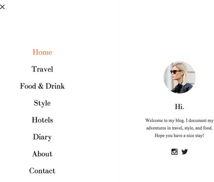
Figure 1-10. Skye template family navigation menu
It is important to note that the Skye template family does not have an Index Page option or a traditional navigation menu option. It only has the hamburger icon that opens the menu overlay. The hamburger icon can be confusing for some website visitors, particularly if they are not familiar with mobile devices. If this is the case for your website visitors, there are a couple of options. One option is to use a template with a traditional menu. The other option is to add the word “Menu” next to the hamburger icon with custom code or switch the hamburger icon out for just the word “Menu.” Several fellow web designers have found that just switching to the word Menu provided enough clarity for their website visitors. We will go over the CSS needed to switch the hamburger icon to the word “Menu” later on in this book.
Farro Template Family
The Farro template family consists of the Farro and Haute templates. This is another template family designed for bloggers or anyone who publishes a large amount of content. The Blog landing page is the standout feature of this blog. The Blog Page has a number of layout options that can be selected using the Style Editor. The layout options include the traditional Stacked layout and Grid layout. A Split layout intersperses rows of two or three tiles among the stacked tiles. The Packed layout has two columns and allows multiple tiles to be stacked next to a single tile as illustrated in the Farro preview image in Figure 1-11. The Feature layout displays the first post and every fourth post and blog width. The shape of the thumbnail images can be adjusted with the Aspect Ratio option in the Style Editor.
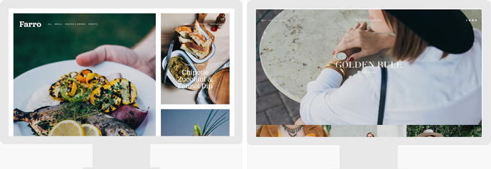
Figure 1-11. Farro and Haute template preview images
The Gallery, Album, Events, and Products Pages all have a special hear area below the site header for intro content. Text, images, and video can all go in the Intro area. The ability to add intro on a Product Page and an Event page is particularly useful. This type of intro content can be added to other sites but it requires custom CSS and JavaScript. If your website needs this type of intro content, then seriously consider using a Farro or Haute.
Like the Skye template family the Farro template family also has a related post feature at the bottom of each blog post, author profiles, and interactive navigation. Also like Skye the Farro template family does not have an Index Page. The Farro template family also has many of the e-commerce style options found in the Brine template family. This makes the Farro template family a very flexible and useful template. However, if you need an Index Page then a Brine family template would be a better choice .
Old Style Template Families
This next section will cover the old style template families. These templates have significantly fewer Style Editor options. This often requires a lot of custom code to create options that are included in the Style Editor of new style templates. Squarespace is looking to phase out all of the old style templates. It is more efficient for Squarespace to maintain a smaller number of very flexible template families than to maintain dozens of restrictive template families. Consolidating the template options into flexible frameworks will allow them to develop new features faster.
For new websites that I am building today I intentionally choose from the new style templates. I want to align my work with the direction that Squarespace is setting. However there are thousands of existing sites using the old style templates. As a Squarespace web professional it is good to understand these old style template families. We will cover the most popular template families first.
Bedford Template Family
The Bedford template family is one of the most popular old style templates. This family has four variations: Bedford, Anya, Bryant, and Hayden. Figure 1-12 has the preview images for the Bedford and Hayden variations. The Bedford template was originally released with Squarespace 6. Squarespace updated their system to Squarespace 7 in October of 2014. This template family has been updated since the release of Squarespace 7. The most recent update added the ability to have background videos in additional to background images. Squarespace probably won’t release any more variations of this template.
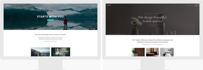
Figure 1-12. Bedford and Hayden template preview images
The Bedford template family is the most flexible of the old style templates. This flexibility has made it very popular with businesses. The multiple navigation options include sidebar navigation, product category navigation, and footer navigation. The main navigation has the option for drop-down menus and to turn the last menu item into a button. Many businesses have the Contact Us page as the last menu option and set it to be a button. This creates a visually distinct Call To Action in the header. The blog pages can also have a sidebar content area. The Bedford template family has a stacked Index Page layout.
The standout feature of the Bedford template is the special banners area at the top of the site. The special banners area can be a slideshow. Adding a gallery slideshow block to the top of a page will automatically turn it into a banner area slideshow. The banner areas can have an overlay with header text, description, and a button. The header at the top of the page can be transparent over the banner image. The text overlay and transparent header can be accomplished with other templates; however, the slideshow banner is unique to the Bedford and Brine template families .
Marquee Template Family
The Marquee template family consists of seven variations: Marquee, Adversary, Alex, Eamon, Ginger, Mint, and Shift. The Marquee template family has been discontinued. This means no new websites can be built using the template family. However, sites that currently use it can keep their template. This means as a web professional, we will likely encounter websites built using the template for at least the next couple years. The Marquee template family was the first template released with parallax scrolling. The parallax scrolling effect is part of the Marquee’s stacked Index Page. Figure 1-13 shows the Marquee, Adversary, and Alex template preview images.

Figure 1-13. Marquee, Adversary, and Alex template preview images
The Marquee template family limits the amount of text that can be added to overlay a parallax image. It is limited to customizing the Page Title and Page Description fields to add a header, description, and button to a parallax content section. This differs from the Brine template family, which allows any type of content block and any amount of content over the parallax image. A common request is to add a single image over the parallax image. Examples include a call to action image or a business logo. The Brine template family can easily do this.
Another feature of the Marquee template family is that the Style Editor has the option for a fixed header. A fixed header is one where the header of the page stays “fixed” or attached to the top of the browser window. This is sometimes called a sticky header. Brine family templates can have a fixed header using custom code; however, the custom code requires JavaScript and CSS to ensure that the fixed header and Announcement Bar don’t conflict .
Pacific Template Family
The Pacific template family has six variations: Pacific, Charlotte, Fulton, Horizon, and Naomi. It was designed to be a single-page website template with a stacked Index Page as the entire site. The Index Page is full-bleed meaning that images extend all the way to the browser edge. The Index Page also features a show on scroll navigation bar. This means when a user scrolls down on the homepage, the original header will scroll off the page with the content. Then when the user has scrolled to the second section of the Index Page, a new navigation bar will appear as a fixed navigation for the remainder of the Index Page. The show on scroll navigation can be turned on or off in the Style Editor. The Pacific demo site, http://pacific-demo.squarespace.com/ , has the show on scroll navigation enabled. Figure 1-14 shows the Preview images for Pacific, Fulton, and Horizon.

Figure 1-14. Pacific, Fulton, and Horizon template preview images
One of the defining characteristics of the Pacific template family is allowing the main navigation to be split evenly on either side of the logo and centered. Some template families can mimic this effect by using two separate menu sections to the left and right of a centered logo, but only the Pacific template family can do it with a single menu. Some of the templates can achieve the look with CSS but the CSS will need to be updated every time a menu item is added or removed.
Since the Pacific template family features a full-bleed Index Page this allows you to include a full-bleed slideshow using the gallery block. Most templates have padding around the content within sections of an index page or a regular page that prevent the gallery blocks from being full-bleed without custom code. The Brine template family also allows for full-bleed gallery slideshows. However, the Brine template allows it by adding a gallery section to an Index Page.
Montauk Template Family
The Montauk template family has four variations: Montauk, Julia, Kent, and Om. The preview images for Montauk, Julia, and Om can be found in Figure 1-15. The Montauk template family features a special grid Index Page layout designed as a project portfolio. The thumbnails in the index grid are navigation to each section of the index. The content sections can be Regular Pages, Gallery Pages, Blog Pages, Event Pages, Product Pages, and Album Pages. When a user clicks on a thumbnail the page content is added at the top of the screen below the header, and the rest of the index grid slides down and displays below the page content. You can see this effect on the Montauk demo site at https://montauk-demo.squarespace.com/artists-montauk/ .
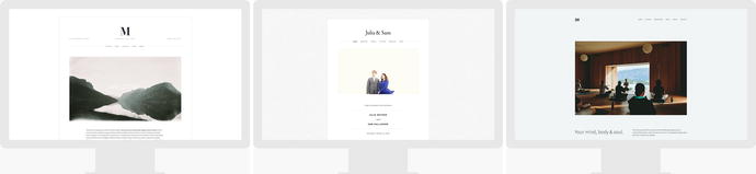
Figure 1-15. Montauk, Julia, and Om, template preview images
The Montauk template also has additional header and footer areas. The additional site header area can contain business information, tag line, or other custom text. The additional footer areas include a page-specific footer area and two site-wide areas. The page-specific footer area for Regular Pages and Gallery Pages does not display if the page is being viewed within an Index Page. The Montauk template family also supports banner images and background videos on Regular, Blog, and Event pages .
Aviator Template Family
The Aviator template family consists of three variations: Aviator, Aubrey, and Encore. It was designed to welcome visitors to a site via a homepage that acts as a simple landing page with a full-bleed background image. In Figure 1-16 you can see how this concept is used in all three of the demo sites. The homepage landing page concept was unique when this template family was first released. However, when Squarespace launched Cover Pages this feature became obsolete. Cover Pages now allow a homepage landing page on any website and offer multiple different options to choose from. There are no unique features for this template family.
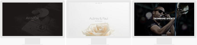
Figure 1-16. Aviator, Aubrey, and Encore template preview images
Other Templates
There are currently 12 other templates that are not a part of a template family. These templates are Adirondack, Avenue, Five, Flatiron, Forte, Galapagos, Ishimoto, Momentum, Native, Supply, Wells, and Wexley. Figure 1-17 shows the preview images for Flatiron, Native, and Wells . These templates were all released for Squarespace 6 and have limited customization. The Style Editor options offer little to no control over the mobile view.
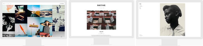
Figure 1-17. Flatiron, Native, and Wells template preview images
Each of these templates met a specific design need when the old style templates were the only option. The Flatiron template is still very popular because it is a unique portfolio layout. Five has a number of page layout options making it popular. However all of these templates are very likely to be discontinued in the near future.
Starting a Site
Once you have selected the template that you want to use you can start your website. From the template’s overview screen, select the “Start with Template Name” button. In Figure 1-18 you will see the overview screen for the Brine template. Start a site with the Brine template by selecting the “Start with Brine” button. Most of the examples in this book are going to use the Brine template. I am using the Brine template as a starting point since it is the largest template family and includes advanced e-commerce features.
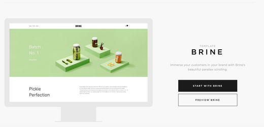
Figure 1-18. Brine template overview screen
Logging In
After clicking the Start button, you will be prompted to create a new account or to log in with an existing account . Squarespace accounts are unique to an email address. The email address becomes the username used to log in to Squarespace. Each person can associate their account with multiple websites. For example my email address and password allow me to log in to my personal Squarespace websites as well as my clients’ sites. The billing for each Squarespace website is set on a per-site basis and not directly associated with a user account. That way I can have administrator access to my clients’ websites without being responsible for Squarespace subscription payments.
If you do not have a Squarespace account then you need to create one. Figure 1-19 shows the prompt screen for creating a new account. The account creation page will create a new website based on your template selection. It will also create a user account for your email address. Creating a user account does not require a credit card, and the template selection can be changed once you are logged into the site.
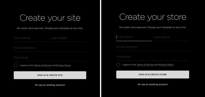
Figure 1-19. Create a new Squarespace account
The prompt screen text varies slightly depending on the template. The text uses the word “store” instead of “site” for templates that are categorized as “Online Stores” in the template list at http://www.squarespace.com/templates . Templates within the same family can exhibit this variation. For example, the Brine template uses “Store” while the Mercer template, part of the Brine template family, uses “Site.”
If you already have a Squarespace user account, then you would select “Or use an existing account” found underneath the sign-up button in Figure 1-19. Figure 1-20 shows the “Create your site” screen for using an existing login. The major difference between this screen and the previous one is that it only creates a new website. This form will not create a new login.
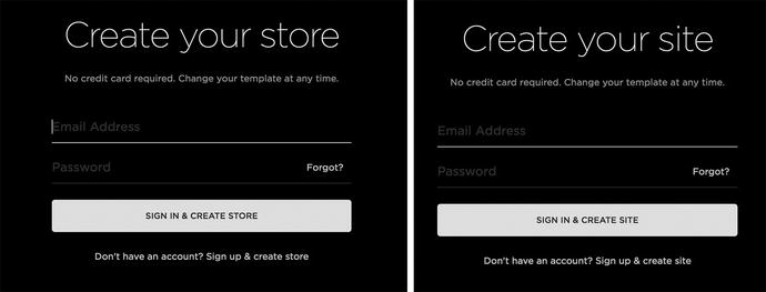
Figure 1-20. Create Site with Existing Login
Getting Started with a New Website
When you log in to a brand new website there are a series of prompts that come up. These prompts are for Squarespace to collect user information. The prompts vary for templates categorized as “Online Store.” Squarespace also regularly updates the prompts. The images in Figure 1-21 are the Welcome screens that start the series of prompts. To start filling out the prompts click the “Start” button at the bottom of the prompt.
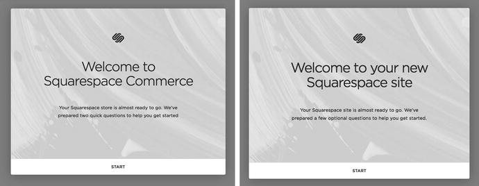
Figure 1-21. Welcome screen starting prompt
The prompts will have required fields. For example, if you are starting an online store you will have to enter a physical address. This starting information will also be entered into the website account information section as well as being sent to Squarespace. Any information entered in the prompts can be changed later on in the Squarespace system .
Trial Account Website
All new sites start as trial account websites . Trial account sites have full access to all the Squarespace features but require a login before a user can access the site. This is to ensure that the general public and search engines do not find the website before you are ready. Figure 1-22 shows the trial account prompt that appears when a user goes to the URL of a trial site. The website visitor is asked to log in using a Squarespace user account or continue as a visitor. Visitors need to enter a series of letters shown in the prompt in order to access the site. The visitor access screen in Figure 1-22 shows the prompt. The letters of the visitor access prompt are different every time the website is visited.

Figure 1-22. Squarespace Trial mode dialog and Visitor Access prompt
Trial sites also have an expiration date. The standard expiration date is 14 days. Squarespace Circle Members have six-month free trials for all websites. For more information on the Squarespace Circle program visit http://circle.squarespace.com/. Figure 1-23 shows the trial site banner that will appear at the bottom of any trial website when the user is logged in. The trial banner states how many days are left in the free trial .
Figure 1-23. Trial site banner
When a trial website expires, visitors are no longer able to view the site. Figure 1-24 shows the screen a visitor would see for an expired trial site. The site still exists but the pages and content cannot be accessed until a paid subscription is started. An expired trial site can also be deleted from your user profile screen. I will cover launching a site and changing it from trial to active later in Chapter 4, “Site Settings and Best Practices.”
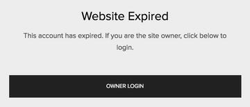
Figure 1-24. Expired site screen
Squarespace Menus
Once logged in, you will see the Squarespace interface and option menu for the site. The menu is referred to as the Home menu. The Home menu appears along the left-hand side of the browser window. There are two configurations for the Home menu: the default view and the commerce view. Figure 1-25 shows both versions of the Home menu. The difference between these two menus is that the commerce view has been optimized for an online store website. The Order, Inventory, Customers, and Discounts menu settings have been moved from a sub-menu item of the Commerce menu option to the home menu. All templates can switch between these two menu options in the Settings section.
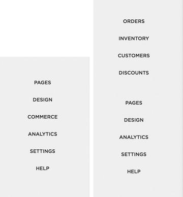
Figure 1-25. Default Home menu configuration and Commerce Home menu configuration
The first menu option is the Pages panel. The Pages panel contains all the pages and navigation menus for a site. There are two portions to the pages panel. The first section contains the menu options that are coded into the template. Some templates only have a Main Navigation section. The Brine template has three navigation sections: main navigation, secondary navigation, and footer navigation as seen in Figure 1-26. Any items that are added to the menu sections will appear in the navigation for the website. The second section of the Pages panel is the Not Linked section. Pages and items in the Not Linked section are a part of the website but they are not a part of any of the navigation menus .
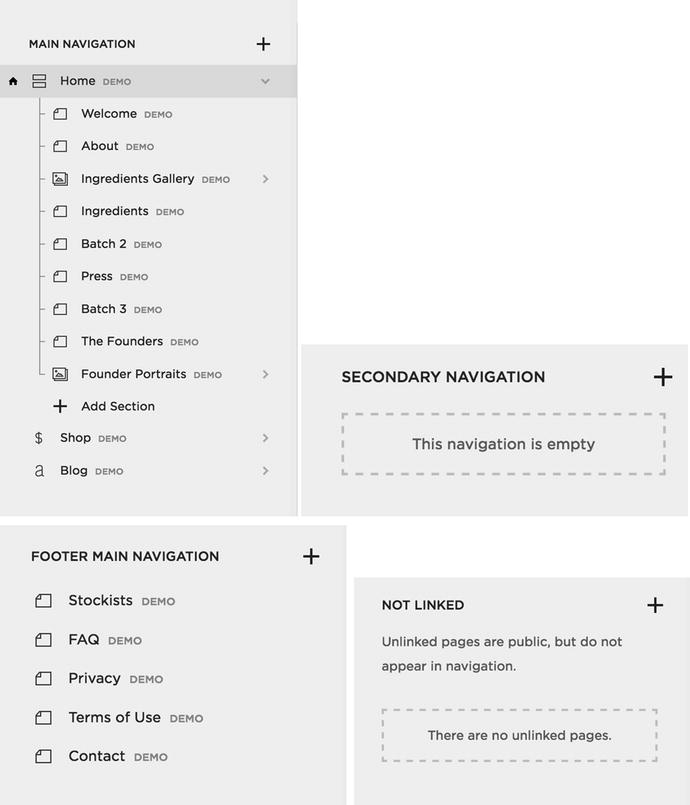
Figure 1-26. Main Navigation, Secondary Navigation, Footer Navigation, and Not Linked sections
The Design Panel contains all the style settings for the website. Figure 1-27 shows the Design Panel options. The template, logo, and title are all set from the Design panel. The Style Editor in the Design panel contains the built-in styling tools for the site. We will cover the Style Editor in depth later. The Checkout Page Style Editor is available in the e-commerce website templates. The Lock Screen has the settings for putting up a password protected Lock screen on the site. This is useful for sites that are active but still under construction. The Announcement Bar can be turned on or off and is a banner that appears across the top of the site. The Mobile Information Bar option contains the settings for enabling the Mobile Information Bar feature and configuring the content. The Squarespace Badge option enables the Squarespace Badge and has configuration settings. The Custom CSS option opens the Custom CSS editor, which we will cover in depth later in this book. The Advanced option allows you to add a Typekit ID to the site to use other Typekit web fonts that aren’t already included in the site.
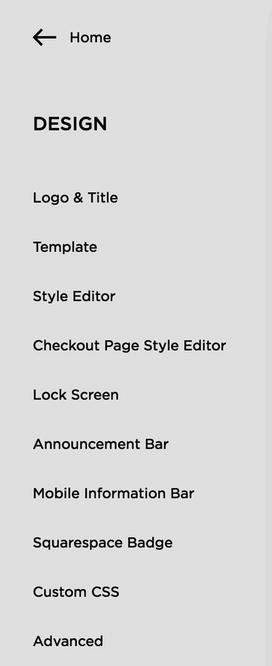
Figure 1-27. Design Panel options
The Commerce Panel contains all the online store information. The Order option shows the existing orders and their status. Orders can be edited from the Order option. The Inventory option is where the online store inventory is controlled. The Discounts option is where all discounts are controlled. Discounts can be set on a product, category, or storewide basis. Squarespace is regularly updating its store capabilities. Orders, Inventory, and Discounts all appear in the Home menu for Commerce sites. Commerce plan sites also have a Customers option. This is where customer information is stored and managed. Figure 1-28 shows the Commerce Panel for the default view Home menu.
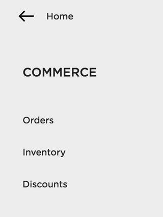
Figure 1-28. Commerce Panel for default Home Menu
The Analytics Panel option contains all the data for the site. You can view Traffic Overview information and Mobile Usage. If your site has an RSS feed you can also track the number of RSS Subscribers. The Referrers option tracks the websites that send traffic to your website. The Popular Content option takes a look at what users are looking at most often. The Search Engine Queries option reports on the search terms users are typing into your site’s search boxes. There are also Activity Log and Sales Overview options. Figure 1-29 shows the Analytics Panel. Squarespace is continuing to expand on their Analytics capabilities. At this time it is also recommended to add Google Analytics to your website to supplement the Squarespace analytics. We will cover adding Google Analytics later in the book.
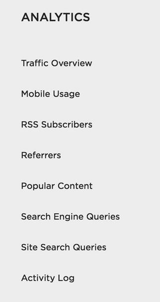
Figure 1-29. Analytics Panel options
The Settings Panel has three different sections of settings. Figure 1-30 shows the Settings Panel. The first section is the General section. These are the general website account settings. The Permissions option is where additional users can be invited to contribute to the website. The Billing & Account information is where the website account subscription and billing information can be changed. The second section is the Website settings section. This contains the basic website information, settings to connect other accounts and advanced settings. Most of these we will go over in depth later in the book. The third section of the Settings Panel is the Commerce section. The commerce settings control the payment options, checkout configuration, shipping, taxes, and notifications for an online store.
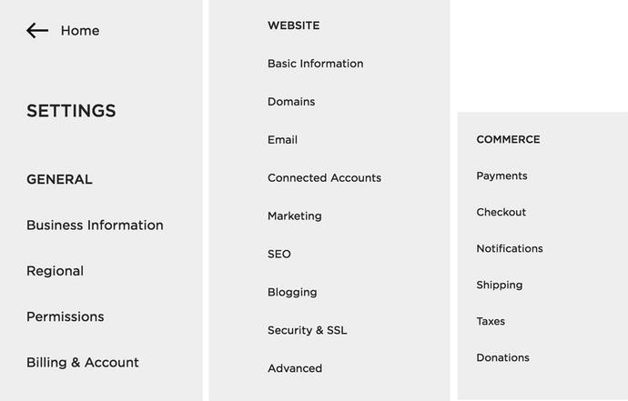
Figure 1-30. Settings Panel General, Website, and Commerce sections
The Help Home menu option links to the Squarespace Knowledge Base. The final portion of the Home menu is the profile section. It appears at the very bottom of the Home menu. Figure 1-31 shows my profile. I have added a profile picture and suggest that you do as well. Clicking the profile picture opens up the User Account panel . There are preview images and links to every Squarespace site that your user account is connected to. As you can see in Figure 1-32 my business website and my client websites appear in this section. There is also the option to “Edit Profile” where you can control your notification subscriptions for each website.
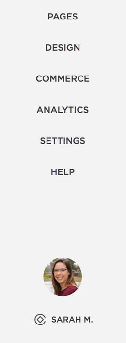
Figure 1-31. Profile in Home menu
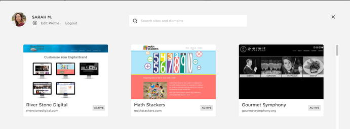
Figure 1-32. User Account panel
Squarespace Preview Panel
The other part of the browser window contains the preview panel . This is where you can edit the content of your site and view it in desktop, tablet, and mobile sizes. At the very top of the preview panel in the center there is a gray line. When you hover over the line it turns into a down arrow. You can see these icons in Figure 1-33. When the down arrow is clicked the screen size preview options appear. The preview options are mobile, tablet, and desktop size. When you select one it changes the size of the preview window.

Figure 1-33. Gray line, down arrow, and preview size icons
The mobile phone and tablet size screens will show an outline of the device that is being previewed. Figure 1-34 shows the preview panel set to mobile size. The preview panel sizes are great for checking the general layout while you are working on your site. I highly recommend also checking your website on actual mobile and tablet devices when you are nearing the end of the project. While the preview window does a very good job mimicking mobile and tablet devices, it is not perfect.
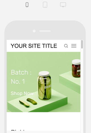
Figure 1-34. Mobile screen preview
The preview panel also has an expand arrow in the top left corner. It only appears on hover. When the expand arrow is clicked it hides the Squarespace menu panel on the left allowing for a full-screen preview of the website. Once in full-screen preview the collapse arrow will appear in the top left corner on hover. The collapse arrow when clicked returns the preview panel to its original state and the Squarespace menus are again visible on the left-hand side. Figure 1-35 has the expand arrow, the collapse arrow, and a screenshot to see the arrows in context .
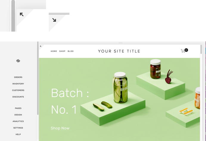
Figure 1-35. Expand arrow, collapse arrow, and arrow in context
Introduction to Squarespace Wrap-Up
You should now be familiar with Squarespace and feel comfortable selecting a template and starting a website. Once logged into the site you should have a general understanding of the menus and feel confident exploring your new site. In the following chapters we will look at all the tools available to add content to your website. In Chapter 3 we will take a look at how to style your new website. In Chapter 4 we will go over the general site settings and best practices. The second part of this book, Chapters 5-11, will cover in depth all the ways to customize a Squarespace website.