
Xamarin has become so cross-platform that it now includes iOS, Android, Windows, macOS, Tizen, WPF, Hololens, GTK, and others. That’s a lot of platforms. How does Xamarin do it?
Descended from the open-source Mono Project that brought .NET to Linux, the Xamarin platform is a port of .NET to the iOS and Android operating systems. Underlying Xamarin.Android is Mono for Android, and beneath Xamarin.iOS is MonoTouch. These are C# bindings to the native Android and iOS APIs for development on mobile and tablet devices. This gives us the power of the Android and iOS user interface, notifications, graphics, animation, and phone features such as location and camera—all using C# and XAML. Each new release of the Android and iOS operating systems is matched by a new Xamarin release that includes bindings to their new APIs. Xamarin.Forms is a layer on top of the other UI bindings, which provides a fully cross-platform UI library.
Xamarin.Forms is a cross-platform UI library for Android, iOS, and many others.
A platform-specific (or native) UI approach uses Xamarin.Android, Xamarin.iOS.
We will talk about when Xamarin.Forms is useful and when a more platform-specific approach might be better. Then we’ll delve into building a Xamarin.Forms UI using pages, layouts, and views. We will create a Xamarin.Forms solution containing shared projects and platform-specific ones. While adding Xamarin.Forms controls to a project, we will touch upon basic UI concepts such as image handling and formatting controls in a layout.
Let’s start by discussing Xamarin.Forms.
Understanding Xamarin.Forms
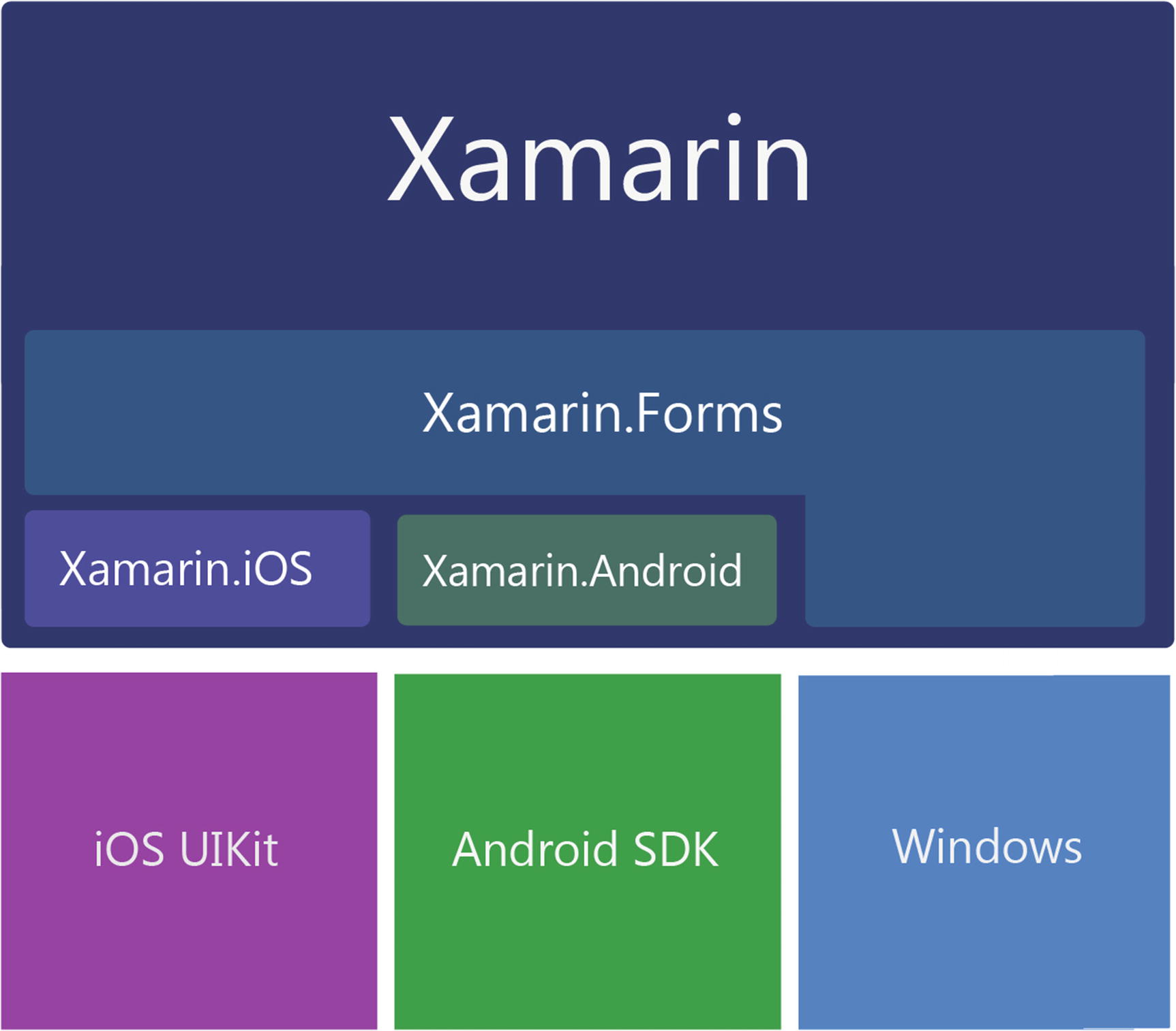
Xamarin libraries bind to native OS libraries
XAML vs. C#
Xamarin.Forms provides a cross-platform toolkit of pages, layouts, and controls and is a great place to start to begin building an app quickly. There are two ways to create user interfaces in Xamarin.Forms, either in C# using the rich Xamarin.Forms API or using Extensible Markup Language (XAML), a declarative markup language created by Microsoft used to define user interfaces. My previous book, Xamarin Mobile Application Development, covered the C# approach, but this book is all about XAML. You can create exactly the same kind of UI in both C# and XAML, so the choice is largely subjective and personal, although there are architectural considerations. XAML forces separation of the View code, while the C# approach does not. Jason Smith, the principal software engineer on the Xamarin.Forms team at Microsoft, explained it this way, “We build Xamarin.Forms code first. That means that all features are first created to work using C#, then we implement them for XAML.”
Xamarin.Forms elements are built using Page, Layout, and View classes. This API provides a broad range of built-in cross-platform mobile UI patterns. Beginning with the highest-level Page objects, it provides familiar menu pages such as NavigationPage for hierarchical drilldown menus, TabbedPage for tab menus, a MasterDetailPage for making navigation drawers, a CarouselPage for scrolling image pages, and a ContentPage, a base class for creating custom pages. Layouts span the standard formats we use on various platforms including StackLayout, AbsoluteLayout, RelativeLayout, Grid, ScrollView, and ContentView, the base layout class. Used within those layouts are dozens of familiar controls, or views, such as ListView, Button, DatePicker, and TableView. Many of these views have built-in data binding options.
Tip
Various synonyms for mobile UI screens exist, such as views and pages, and these are used interchangeably. A view can mean a screen but can also refer to a control in certain contexts.
Xamarin.Forms comprises platform-independent classes that are bound to their native platform-specific counterparts. This means we can develop basic, native UIs for all three platforms with almost no knowledge of iOS and Android UIs. Rejoice but beware! Purists warn that trying to build apps for these platforms without an understanding of the native APIs is a reckless undertaking. Let’s heed the spirit of their concerns. We must take a keen interest in Android and iOS platforms, their evolution , features, idiosyncrasies, and releases. We can also wallow in the convenience and genius of the amazing cross-platform abstraction that is Xamarin.Forms!
Xamarin.Forms Solution Architecture
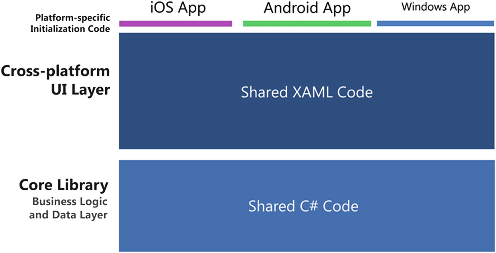
Xamarin.Forms solution architecture: one app for multiple platforms

Xamarin.Forms architecture with customization
Note
Chapter 8 provides more on the use of customization and platform-specific code in Xamarin.Forms solutions.
When are Xamarin.Forms appropriate to use and when do we consider other Xamarin options? I’ll address this key question a bit later in the chapter, but first let’s define Xamarin’s platform-specific UI options.
Understanding the Platform-Specific UI Approach
Before Xamarin.Forms, there were the platform-specific (or native) UI options, which include the Xamarin.Android, Xamarin.iOS, and Windows Phone SDK libraries. Building screens using platform-specific UIs requires some understanding of the native UIs exposed by these libraries. We don’t need to code directly in iOS UIKit or Android SDK, as we’re one layer removed when using Xamarin bindings in C#. Using the Windows SDK, of course, we’re coding natively in C# against the Windows OS. The advantage of using Xamarin's platform-specific UIs is that these libraries are established and full-featured. Each native control and container class has a great many properties and methods, and the Xamarin bindings expose many of them out of the box.
Note
We’re not talking about native UI development using Objective-C or Java here but the use of Xamarin C# platform-specific bindings to native UI libraries. To avoid such confusion, this book favors the term platform-specific over native when referring to Xamarin libraries, but Xamarin developers will sometimes use the term native to refer to the use of platform-specific libraries Xamarin.iOS and Xamarin.Android.
Platform-Specific UI Solution Architecture
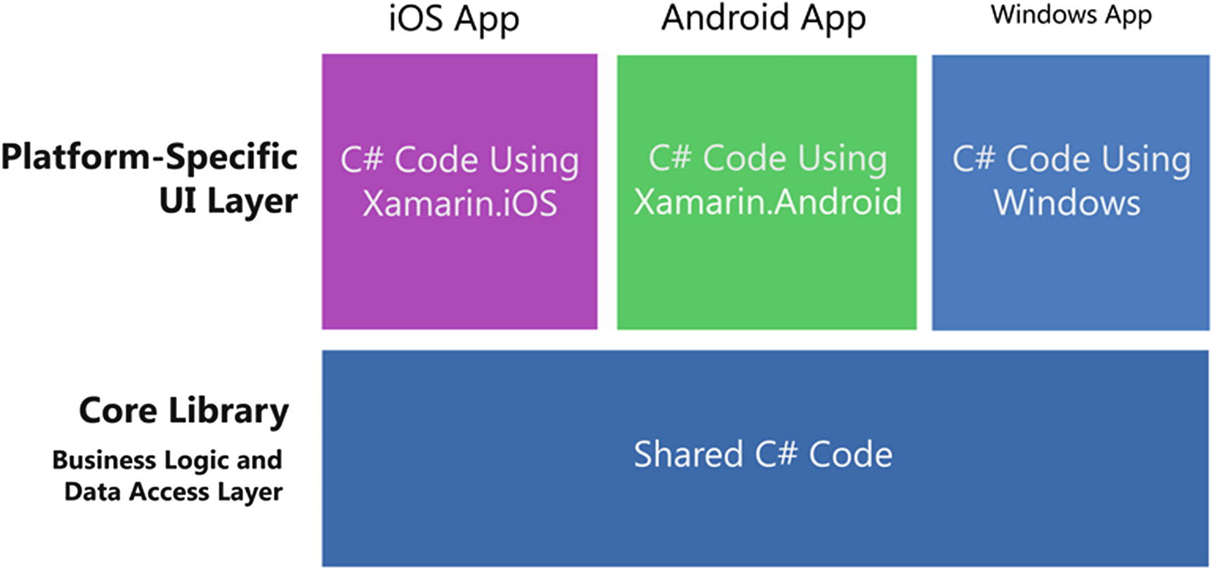
Platform-specific UI solution architecture
If you compare this diagram to the Xamarin.Forms diagram in Figure 1-2, you’ll see that there’s a lot more coding to be done here: a UI for every platform as opposed to one for all. Why would anyone bother to do it this way? There are quite a few good reasons why some or even all of the code might be done better this way. So how do we know when to use Forms?
Choosing Xamarin.Forms or a Platform-Specific UI
Which do I use, Xamarin.Forms or a Xamarin platform-specific UI?
The comparison is ease and portability of Xamarin.Forms versus the full-featured functionality of Xamarin’s platform-specific UIs, namely, Xamarin.Android and Xamarin.iOS. The platform-specific Xamarin APIs have considerably more features than Xamarin.Forms out of the box, although customization closes the gap with some work. The answer to our question will range from one, to the other, to both, depending on your needs. Here are suggested guidelines:
Learning Xamarin : If you’re new to mobile development using C#, then Xamarin.Forms is a great way to get started!
Sharing UI code : Save development and testing time and money by writing the UI only once for all your platforms with Xamarin.Forms (e.g., Android, iOS).
Business apps : Xamarin.Forms does these things well—basic data display, navigation, and data entry. This is a good fit for many business apps.
Basic design : Xamarin.Forms provides controls with baseline design features, facilitating basic visual formatting.
Simple cross-platform screens : Xamarin.Forms is great for creating fully functional basic screens. For more complex screens, leverage Xamarin.Forms custom renderers for platform-specific details.
Complex screens : When an entire screen (or an entire app) requires a nuanced and complex design and UI approach, and Xamarin.Forms isn’t quite up to the task, go with a platform-specific UI using Xamarin.Android and Xamarin.iOS.
Consumer apps : Platform-specific UI has everything a developer needs to create a consumer app with complex visual design, nuanced gesture sensitivity, and high-end graphics and animation.
High design : This approach provides complete native UI APIs with low-level access to design properties on each control, allowing for a high visual standard of design. Native animation and graphics are also available with this approach.
Single-platform apps : If you’re building for only one platform, and a cross-platform approach for your app is not important in the foreseeable future (a rare case even if you’re starting with one platform), consider using a platform-specific UI.
However, clever developers are creating more and more advanced Forms apps. Also, the Xamarin development team at Microsoft moves quickly. With each new release of Xamarin.Forms, more properties and methods are included in the bindings, bringing this library closer to the platform-specific ones and giving us increased control over our cross-platform UI. Also, open-source projects and third-party tools such as Telerik’s UI for Xamarin and Syncfusion Xamarin UI controls are swiftly extending the options available with added controls, charts, and data grids.
When complex tasks or high design are required by Xamarin.Forms, virtually anything is possible using customization.
Using Custom Renderers, Effects, and Native Views
You’ll eventually need more from Xamarin.Forms than it gives you out of the box. When complex tasks or designs are required by Xamarin.Forms, virtually anything is possible using Xamarin.Forms customization. Custom renderers provide access to the lower-level, platform-specific, screen-rendering classes called renderers, which use platform-specific controls to create all Xamarin.Forms screens. Any Xamarin.Forms screen can be broken into platform-specific screens and classes using this approach. This means we can write a Xamarin.Forms page or app and customize it by platform whenever necessary. More about this in Chapter 8.
Custom renderers are powerful and thorough in their implementation as platform-specific enablers of Xamarin.Forms UI elements. Custom renderers are, however, heavy artillery. If you want something more tactical, like merely customizing a property on a Xamarin.Forms control, consider an “effect.” In addition to exposing properties, effects also have the capacity to pass parameters to those properties and define events on Xamarin.Forms controls. You pass parameters to the effect using attached properties or the Common Language Runtime (CLR).
Sometimes you just want a real native control. You’ll settle for nothing less than absolute power. Thankfully there’s now a way to get this in Xamarin.Forms via native view declaration. They’re easiest to use in XAML, secondarily in C#.
All of this means that you can write a Xamarin.Forms page or app and customize it by platform, which is raw power in your hands as you work with a cross-platform toolset.
Use customization mindfully or risk a fragmented UI code base that probably should have been written entirely as a platform-specific UI. Used judiciously, customization can turn your basic, lackluster product into a versatile, unique, popular app. Let’s do a quick refresher of the mobile user interface.
Exploring the Elements of Mobile UIs
Screens, views, and pages in mobile apps are made up of several basic groups of components: pages, layouts, and controls. Pages can be full or partial screens or groups of controls. In Xamarin.Forms, these are called pages because they derive from the Page class. In iOS, they are views; and in Android, they’re screens, layouts, or sometimes loosely referred to as activities.
Controls are the individual UI elements we use to display information or provide selection or navigation. Xamarin.Forms calls these views, because a View is the class that controls inherit from. Certain controls are called widgets in Android. More on these shortly in Chapter 5.
Layouts are containers for controls that determine their size, placement, and relationship to one another. Xamarin.Forms and Android use this term, while in iOS everything is a view. More on these in Chapter 3.
Lists , typically scrollable and selectable, are one of the most important data display and selection tools in the mobile UI. More on these in Chapter 6.
Navigation provides the user with a way to traverse the app by using menus, tabs, toolbars, lists, tappable icons, and the up and back buttons. More on this in Chapter 7.
Modals, dialog boxes, and alerts are usually pop-up screens that provide information and require some response from the user. More on these in Chapter 7.
Now that we have context and some terminology to work with, let’s get started with Xamarin.Forms!
Using the Xamarin.Forms UI

Page , layouts, and views on a Xamarin.Forms screen
Page
ContentPage
MasterDetailPage
NavigationPage
TabbedPage
CarouselPage
In addition to serving as containers for layouts and views, pages provide a rich menu of prefabricated screens with useful functionality that includes navigation and gesture responsiveness. More on these in Chapter 7.
Layout
StackLayout
FlexLayout
Grid
AbsoluteLayout
RelativeLayout
ScrollView
Frame
ContentView
The layout’s Content and/or Children properties contain other layouts and views. Horizontal and vertical alignment is set by the properties HorizontalOptions and VerticalOptions. Rows, columns, and cells within a layout can be padded with space, sized to expand to fill available space, or shrunk to fit their content. More on layouts in chapter 3.
Tip
Xamarin.Forms layouts are derived from the View class, so everything contained in a page is actually some form of a view.
View
- Basic—fundamental views
Label
Image
Button
BoxView
- List—make a scrollable, selectable list
ListView
SearchBar
- Text entry—user entry of text strings using a keyboard
Entry
Editor
- Selection—user choice of a wide range of fields
Picker
DatePicker
TimePicker
Stepper
Slider
Switch
- User feedback—notify the user of app processing status
ActivityIndicator
ProgressBar
- Others
Map
WebView
Tip
Be careful not to confuse the Xamarin.Forms View class with a view meaning screen or presentation layer.
Creating a Xamarin.Forms Solution
Xamarin.Forms : Cross-platform UI code called by one of the platform-specific projects. This can be accomplished using .NET Standard, though for backward compatibility, Portable Class Library (PCL) and shared project are also available. The example we’ll be creating in this chapter uses .NET Standard.
Xamarin.Android : Android-specific code, including Android project startup.
Xamarin.iOS : iOS-specific code, including iOS project startup.
Core Library : Shared app logic such as business logic and data access layer using .NET Standard, a PCL, or a shared project.

Xamarin.Forms solution
Tip
The Core Library project is not added by solution templates and must be created manually, either as a .NET Standard project or a shared project. If you are just getting started with Xamarin.Forms, you can skip the Core Library for now and put all your shared files in the Xamarin.Forms project.
Let’s create a simple demo app to help us explore the foundations of Xamarin.Forms and many of its commonly used features.
Create a Xamarin.Forms solution. In Visual Studio, create a New Project and select project type Visual C# ➤ Cross-Platform ➤ Mobile App (Xamarin.Forms). In Visual Studio for Mac, create a New Solution and select project type Multi-platform ➤ App ➤ Xamarin.Forms ➤ Blank Forms App. Name it FormsExample.
This will create multiple projects: one for Xamarin.Forms code and then platform-specific projects including Android and iOS. The platform-specific projects available depend on whether you’re on a PC or a Mac, whether you’re in Visual Studio or Visual Studio for Mac, and the licenses you own. Visual Studio for Mac will give you an iOS project and an Android project. A PC with Visual Studio will create three projects: one .NET Standard for Xamarin.Forms, one Android, and one iOS.
Tip
Xamarin is free with a Visual Studio license, and Visual Studio Community edition is free.
The following sections provide each of the projects in the solution and the code they contain.
Xamarin.Forms Project
App.cs in a New Xamarin.Forms XAML Project
Each platform has a wrapper class that takes the shared App class and renders it as its native implementation. The default code sets the MainPage property in its constructor to this case a ContentPage object called MainPage. Soon we will replace MainPage with our own ContentPage class and place controls on it using XAML.
Tip
A static Application.Current property references the current application object anywhere in your app.
The OnStart, OnSleep, and OnResume method overrides created for us are used to manage our app when it is moved to and from the background.
Application Lifecycle Methods: OnStart, OnSleep, and OnResume
OnStart —Called when the app is first started. Useful for loading values into memory that are needed by the app.
OnSleep —Called each time the app is moved into the background. Useful for cleanup and initiating background calls.
OnResume —Called when the app is resumed after being in the background. Useful for reloading values into memory and returning from background threads.
OnSleep is also used for normal application termination (not a crash). Any time an app moves into a background state, it must be assumed that it may never return from that state.
Tip
Use the Properties dictionary for disk persistence in these methods when an app is backgrounded. See Chapter 7 for more on state management.
Building Pages Using ContentPage
MainPage.xaml in a New Xamarin.Forms XAML Project
MainPage.xaml.cs in a New Xamarin.Forms XAML Project
ContentPage has properties that affect the appearance of the page. The Padding property creates space around the margins of the page to improve readability and design. BackgroundImage can contain an image that is displayed on the background of the page.
Several of ContentPage's members are useful for navigation and state management. The Title property contains text, and the Icon property contains an image that is displayed at the top of the page when NavigationPage is implemented. Lifecycle methods OnAppearing and OnDisappearing can be overridden to handle initialization and finalization of a ContentPage . The ToolBarItems property is useful for creating a drop-down menu. All of these navigation-related members are covered in Chapter 7.
Xamarin.Android
MainActivity.cs in the FormsExample.Droid Project
In the OnCreate method , Xamarin.Forms is initialized and LoadApplication sets App as the current Application.
Xamarin.iOS
AppDelegate.cs in the FormsExample.iOS Project
Xamarin.Forms is initialized in the Init() method and LoadApplication sets App as the current page.
All of our platform-specific initializers, the Android MainActivity and the iOS AppDelegate, get the starting page from the Xamarin.Forms App class, which, by default, returns a stubbed demo page.
Core Library
The Core Library is a project in a Xamarin.Forms solution for the business and/or data access layer of an app which should be largely platform independent. Although not explicitly created as part of the Xamarin.Forms solution templates, a Core Library project is standard practice. Create one yourself and add it to your solution. This can contain data models, shared files or resources, data access, business logic, or references to PCLs. This is the place for platform-independent middle-tier or back-end non-UI code. It is referenced by any or all of the other projects in the solution. Use it to optimize code reuse and to decouple the UI projects from the data access layer and business logic. Note Core Library is an advanced solution architecture. If you’re just starting out with Xamarin.Forms, consider putting your data access, business logic, and shared code in the Xamarin.Forms project, and hold off on using a Core Library for now.
Now we need to build out the pages of our app. Time to code!
Setting the App’s Main Page
Now we have the custom page class ready and can load up our ContentPageExample XAML file with controls.
Adding Xamarin.Forms Views
View is the term for control in Xamarin.Forms, the smallest unit of UI construction. Most views inherit from the View class and provide basic UI functions, such as a label or a button. From this point on, we will use the terms view and control interchangeably.
Tip
All example code solutions can be found under the title of this book on https://www.apress.com/us/book/9781484240298 in the Source Code/Downloads tab, or on GitHub at https://github.com/danhermes/xamarin-xaml-book-examples .
Let’s start simply and put some views into ContentPageExample.xaml.
Label View
Multiline text happens implicitly when enough text is used that it wraps, or explicitly with line breaks.
The TextAlignment enumeration assigned to these alignment properties has three values: Start, Center, and End.
Next, the labels must be assigned to a layout for placement on the page. In this example we use the text alignment defaults and don’t explicitly declare text alignment.
Placing Views Using StackLayout
We place all the child views onto the StackLayout parent view and set the requested height with HeightRequest. HeightRequest has been set larger than the visible page so later we can make it scroll.
Note
StackLayout child views are laid vertically unless horizontal order is specified using Orientation = "Horizontal".

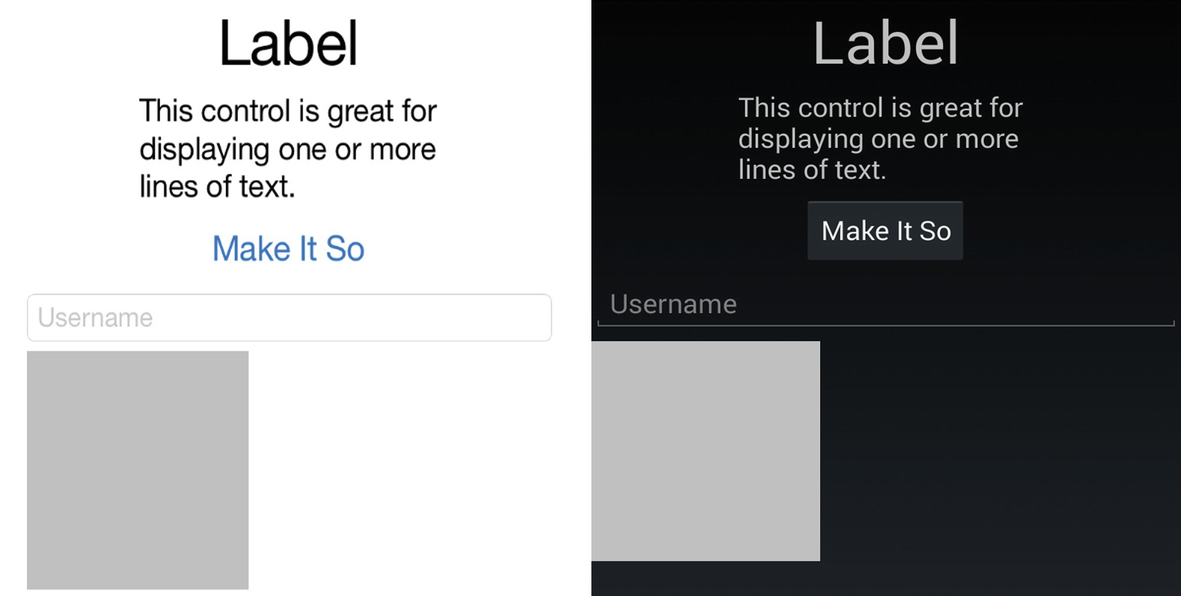
Xamarin.Forms Labels on a StackLayout
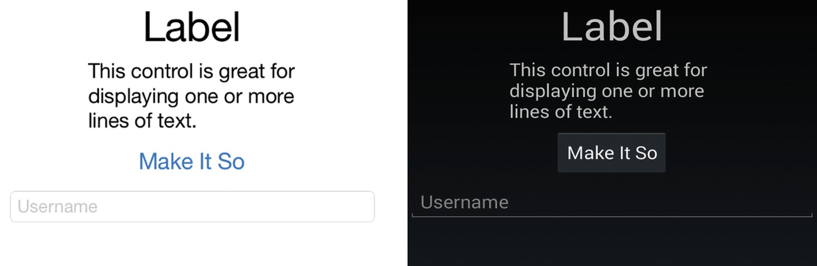
If you’re using iOS and want your Xamarin.Forms projects to look more like examples in this book that have a black background and white text, or you’re using another platform and want more of an iOS look, setting background color and font color can help you.
Background Color and Font Color
Page background color and view font color can be changed using the ContentPage's BackgroundColor property and the TextColor property found on text-based Views.
We use fonts in many controls, so let’s do a quick overview of those.
Using Fonts
FontFamily : Set the name of the font in the FontFamily property; otherwise, the platform’s default font will be used, for example, FontFamily = "Courier".
FontSize : The font size and weight are specified in the FontSize property using a double value or a NamedSize enumeration. Here is an example using a double: FontSize = "40". Set a relative size by using NamedSize values such as NamedSize.Large, using NamedSize members Large, Medium, Small, and Micro, for example, FontSize ="Large".
FontAttributes : Font styles such as bold and italics are specified using the FontAttributes property. Single attributes are set like this: FontAttributes = "Bold" options are None, Bold, and Italic.
Multiple attributes are specified using an attribute string formatted as “[font-face],[attributes],[size]”.
Tip
These text formatting properties can be also set up app-wide using Styles, which is covered in Chapter 4.
Using Platform-Specific Fonts
Tip
Another way to declare the On tags in OnPlatform involves the Value parameter.
<On Platform="Android" Value="Droid Sans Mono"/>
Button View
Xamarin.Forms buttons are rectangular and clickable.
The Text property contains the text visible on the button. HorizontalOptions and VerticalOptions (discussed in the next section) determine the control’s alignment and size. This NamedSize font setting makes the font Large.
Tip
Buttons can be customized using the BorderColor, BorderWidth, BorderRadius, and TextColor properties. The BorderWidth is defaulted to zero on iOS.

Xamarin.Forms Button

button.Clicked event fired
Tip
BorderWidth assigns the weight of the line that draws the button.
Setting View Alignment and Size: HorizontalOptions and VerticalOptions
Considerations in view layout are the space provided to the view by the layout and surrounding elements, the padding space around the view, and the size of the view itself. These types of formatting are accomplished using LayoutOptions and AndExpand.
Justification with LayoutOptions
Start left or top—justifies the control (depending upon layout Orientation).
Center centers the control.
End right or bottom—justifies the control.
Fill expands the size of the control to fill the space provided.
AndExpand Pads with Space
StartAndExpand left or top-justifies the control and pads around the control with space.
CenterAndExpand centers the control and pads around the control with space.
EndAndExpand right or bottom-justifies the control and pads around the control with space.
FillAndExpand expands the size of the control and pads around the control with space.
Tip
HorizontalOptions set to Fill and FillandExpand look the same with a single control in a column.
VerticalOptions set to Center or Fill is useful only if vertical space has been explicitly provided. Otherwise, these options can appear to do nothing. LayoutOptions.Fill won’t make your control taller if there’s no space to grow.
VerticalOptions set to Expand and CenterAndExpand imposes padding space around a control in a StackLayout.
There are more formatting examples later in this chapter and a lot more on the topic of control layout and alignment in Chapter 3. Next let’s create some user input.
Entry View for Text Input
User input goes into the Text property as a String.
Xamarin.Forms user entry view
Tip
Set IsPassword = "True" to replace entered text letters with dots.
For multiline entry, use the Editor control.
BoxView
The Color property can be set to any Color member value. The default dimensions are 40×40 pixels, which can be changed using the WidthRequest and HeightRequest properties.
Tip
Be careful when setting HorizontalOptions and VerticalOptions to Fill and FillAndExpand, as this can override your HeightRequest and WidthRequest dimensions.
Xamarin.Forms BoxView
Eventually your designer will give you those promised icons and you can replace your BoxViews with real images.
Image View

Let’s look at how an image is handled.
Local Images
Android uses the Resources/drawable folder. Don’t use special characters in the filename. The Build Action must be set to Android Resource.
iOS 9 and later uses Asset Lists and Image Sets which can be set up in Visual Studio on the iOS project. Apple has deprecated the /Resources folder approach where we would create images for Retina displays with an @2x or @3x suffix on the filename.
Image Sizing: Aspect Property
AspectFill: Scale the image to fill the view, clipping if necessary.
AspectFit: Scale the image to fit within the view maintaining the aspect ratio with no distortion and leaving space if necessary (letterboxing).
Fill: Scale the image to fill the view entirely and exactly, possibly distorting the image.
Those are the image formatting options. Next we will make our image clickable.
Making an Image Clickable with a GestureRecognizer
Tappable images and icons are common in mobile applications for actions and navigation. Like many Xamarin.Forms views, the Image doesn’t have a click or tap event and must be wired up using the GestureRecognizer class. A gesture recognizer is a class that can be added to many views to respond to user interaction. It currently supports just the tap gesture. The terms click and tap are used interchangeably in mobile UI development.
Give that a try and make your monkey fade so you can see that the gesture recognizer works.
Tip
An alternative implementation of GestureRecognizer uses the Command property:
<Image.GestureRecognizers>
<TapGestureRecognizer Command="{Binding ImageTappedCommand}"/>
</Image.GestureRecognizers>
User feedback is a crucial concept in mobile UI development. Any time a user does something in the UI there should be some subtle acknowledgment by the app. A tap, for instance, should respond to the user with visible feedback. Usually an image will gray out or have a white background for a sec when touched. Let’s do that professionally using the image’s Opacity property but adding async/await to create a slight delay in our fade without affecting the app’s performance.
Tapping on the image will now fade the image slightly, then back to normal, providing a responsive user experience.
Tip
For more subtle animation, instead of Opacity, use the FadeTo method:
await image.FadeTo(0.5, 450);
await Task.Delay(1000);
await image.FadeTo(1, 450);
In your own projects, you’ll use gesture recognizers (and async/await) to actually do something when an image is tapped. If you want to see async/await in action in this example, bump up the Delay to 2000, then click the “Make It So” button while it’s awaiting and you’ll see that the app is still responsive. You could do many things in this Tapped handler without interrupting the flow of the app! Often when a button or image is pressed, the result should be backgrounded using async/await for an optimal user experience.
Tip
Async/await is a standard C# technique for queuing up activities in the background for simultaneous activity using the Task Parallel Library (TPL). Many Xamarin methods and functions are provisioned for background processing using async/await.
We have one more view to add, a container class to permit scrolling of our views.
ScrollView
Tip
ScrollView scrolls vertically by default but can also scroll sideways using the Orientation property. For example, Orientation = "Horizontal".
That’s it for the views on this page. The final touch will be padding around the entire page, so views won’t be mashed up against the sides of the screen.
Padding Around the Entire Page
This last Padding expression is what we use in this project and in most projects in this book, padding around the edges of the page with a bit more room at the top on iOS for the status bar.

Final build and run of the FormsExample solution
CODE COMPLETE: Adding Xamarin.Forms Views
ContentPageExample.xaml in the FormsExample Project
ContentPageExample.xaml.cs in the FormsExample Project
Summary
Xamarin.Forms provides a jumping-off point for cross-platform mobile app UI development, fully loaded with stock and customizable pages, layouts, and views. This book tackles Xamarin development using XAML for UI declaration with C# code behinds.
A Xamarin.Forms solution typically has a separate project for each of these platforms: Android and iOS. A Xamarin.Forms project is useful for housing cross-platform UIs, and a Core Library project contains the business logic and data access layer.
Developers are faced with a decision of Xamarin.Forms vs. a platform-specific UI approach with Xamarin.Android and Xamarin.iOS. The more Xamarin.Forms releases that come out, the less of a decision this is, as Xamarin.Forms approaches the functionality of native UI APIs. Xamarin.Forms custom renderers, effects, and native views help us combine the two approaches.
View is the Xamarin.Forms term for control, and we delved into a few of the most frequently used views: Label, Entry, BoxView, Image, StackLayout, and ScrollView.
Xamarin.Forms XAML, like all markup languages, comes with its own set of considerations, grammars, rules, and techniques to help us build our apps UI. Let’s dive into XAML!