© Ervin Varga 2019
E. Varga Practical Data Science with Python 3https://doi.org/10.1007/978-1-4842-4859-1_6

6. Data Visualization

Ervin Varga1 
(1)
Kikinda, Serbia
 

Visualization is a powerful method to gain more insight about data and underlying processes. It is extensively used during the exploration phase to attain a better sense of how data is structured. Visual presentation of results is also an effective way to convey the key findings; people usually grasp nice and informative diagrams much easier than they grasp facts embedded in convoluted tabular form. Of course, this doesn’t mean that visualization should replace other approaches; the best effect is achieved by judiciously combining multiple ways to describe data and outcomes. The topic of visualization itself is very broad, so this chapter focuses on two aspects that are not commonly discussed elsewhere: how visualization may help in optimizing applications, and how to create dynamic dashboards for high-velocity data. You can find examples of other uses throughout this book.

Visualization should permeate data science processes and products. It cannot be treated as an isolated entity, let alone be reduced to fancy diagrams. In this respect, I frown upon any sort of rigid categorization and dislike embarking on templatizing what kind of visualization is appropriate in different scenarios. There are general guidelines about encoding of variables (see reference [1]) using various plot types, and these should be followed as much as possible. Nonetheless, the main message is that if visualization helps to make actionable insights from data, then it is useful.

Algorithms are the cornerstone of doing data science and dealing with Big Data. This is going to be demonstrated in the next case study. Algorithms specify the asymptotic behavior of your program (frequently denoted in Big-O notation), while technologies including parallel and distributed computing drive the constant factors. We will apply visualizations of various sorts to showcase these properties. It is important to emphasize that the notion of a program may symbolize many different types of computations. Computing features is one such type. A fast algorithm may enable your model to properly run in both the batch regime and online regime. For an example using interactive visualization to show the implementation of data structures and algorithms, you may want to visit the Data Structure Visualizations web site (see https://www.cs.usfca.edu/~galles/visualization ). Another interesting site for you to explore is Python Tutor, which is related to visualizing the execution of Python programs (visit https://pythontutor.com ). It also has links to similar sites for learning other popular languages, like JavaScript, C++, Java, etc.

Producing static graphs is totally different than trying to depict major characteristics of data in continual flux. This will be our topic in the second part of this chapter. Efficient dashboards allow real-time monitoring of processes by visualizing business metrics, so that operators may promptly act upon them.

Visualizing Temperature Data Case Study

The aim of this section is to illuminate the architecture of matplotlib, which is the most famous Python visualization framework (you should read the definitive guide at http://aosabook.org/en/matplotlib.html ). To make the topic more comprehensible, we will use a sample publicly available dataset from NOAA’s Global Historical Climatology Network - Daily (GHCN-Daily), Version 3. This sample dataset contains measurements from a single station for January 2010. It is available in the source code for this chapter, but you can download it directly from https://www1.ncdc.noaa.gov/pub/data/cdo/samples/GHCND_sample_csv.csv . For each day we will use the columns denoting the minimum and maximum temperature readings given in tenths of degree Celsius. The station’s latitude and longitude are expressed in the correspondingly named columns.

Figure 6-1 shows the major components of the matplotlib ecosystem. Many sophisticated extensions are built on top of it, like the Seaborn library (you will see it in action in later chapters). You may wonder why Pandas is shown here. Well, it has its own visualization subsystem that directly relies on matplotlib. Matplotlib also comes with a simple scripting library called pyplot. This is used for quick solutions that are especially useful during exploratory data analysis.
../images/473947_1_En_6_Chapter/473947_1_En_6_Fig1_HTML.jpg
Figure 6-1

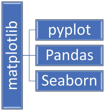
Some higher-level components that sit on top of matplotlib, which is further segregated into smaller units that you can reference

Showing Stations on a Map

Listing 6-1 shows the function to produce a geographic map with data sources (in our case the sole temperature sensor). The code uses the mplleaflet Python library for converting a matplotlib plot into a Leaflet map (see https://leafletjs.com ). The plot_stations.py module inside the temp_plots folder for showing our data source on a map. It uses matplotlib in scripting regime via pyplot.
import matplotlib.pyplot as plt
import mplleaflet
def plot_stations(longitudes, latitudes, embedded = False):
    if embedded:
        plt.figure(figsize = (8, 8))
    plt.scatter(longitudes, latitudes,
                c = 'b',
                marker = 'D',
                alpha = 0.7,
                s = 200)
    return mplleaflet.display() if embedded else mplleaflet.show()
Listing 6-1

Module for Showing Our Data Source on a Map.

The embedded parameter should be set to True to include the generated map inline in a Jupyter notebook. Listing 6-2 shows the first part of the driver code.
import pandas as pd
df = pd.read_csv('GHCND_sample_csv.csv',
                 usecols = [3, 4, 5, 6, 7],
                 index_col = 2,
                 parse_dates = True,
                 infer_datetime_format = True)
df['TMIN'] = df['TMIN'] / 10
df['TMAX'] = df['TMAX'] / 10
print(df.head())
from plot_stations import plot_stations
plot_stations(df['LONGITUDE'].tolist()[0], df['LATITUDE'].tolist()[0])
Listing 6-2

First Part of the temp_visualization_demo.py Module

The following is printed as output when this code is executed:
            LATITUDE  LONGITUDE  TMAX  TMIN
DATE
2010-01-01   48.0355     -98.01 -17.8 -31.1
2010-01-02   48.0355     -98.01 -24.4 -32.2
2010-01-03   48.0355     -98.01 -19.4 -28.9
2010-01-04   48.0355     -98.01 -16.7 -20.0
2010-01-05   48.0355     -98.01 -13.3 -16.7

Figure 6-2 shows the generated interactive map with a blue diamond denoting our temperature sensor. You will also find the _map.html file in the current working directory. This is automatically created by mplleaflet.show() (it is possible to change the output file name).

Plotting Temperatures

We will now plot both the minimum and maximum temperatures as well as overlay points that designate extremely high (> 0) and low (< –30) temperatures in Celsius. To make the plot more useful, we will add an additional y axis for showing temperatures in Fahrenheit, too. This time the code relies on matplotlib and Pandas visualization and illustrates how to switch between different abstraction layers. Listing 6-3 shows the second part of the driver code that prepares the data as well as calls our custom plotting function, which is shown in Listing 6-4 and displayed in Figure 6-3. The solution is also reusable in other contexts with minor modifications (for example, changing the titles of axes, altering the tick marks, etc.).
../images/473947_1_En_6_Chapter/473947_1_En_6_Fig2_HTML.jpg
Figure 6-2

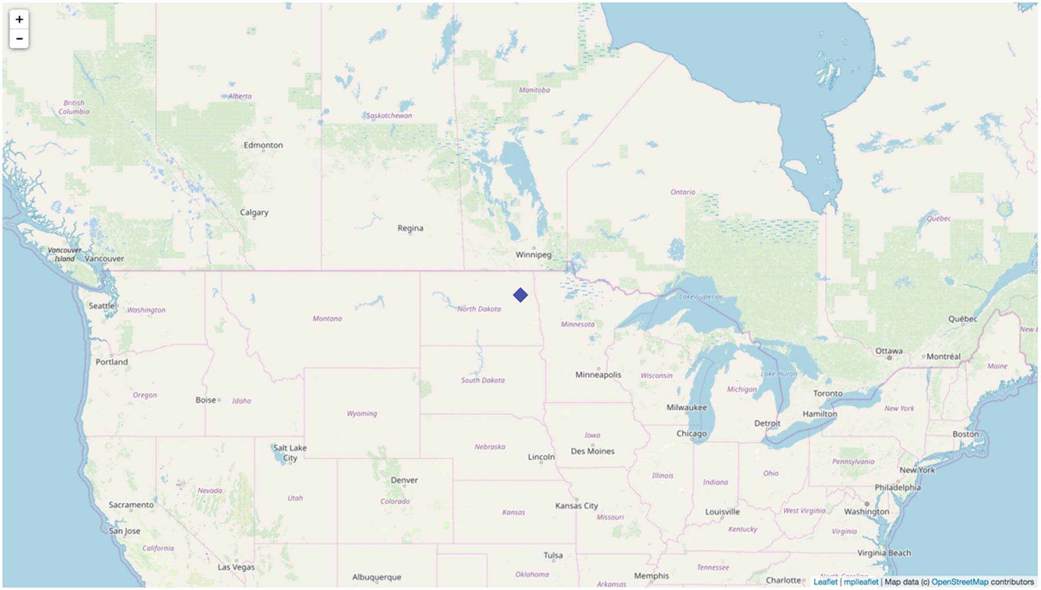
The interactive map with our temperature sensor (a quite remarkable result with just a couple of lines of code)

min_temp = df['TMIN'].min()
max_temp = df['TMAX'].max()
print(" Minimum temperature: %g Maximum temperature: %g " % (min_temp, max_temp))
LIMIT_HIGH = 0
LIMIT_LOW = -30
extreme_high_temps = df['TMAX'][df['TMAX'] > LIMIT_HIGH]
extreme_low_temps = df['TMIN'][df['TMIN'] < LIMIT_LOW]
print('Extreme low temperatures ', extreme_low_temps)
print(' Extreme high temperatures ', extreme_high_temps)
from plot_temps import plot_temps
plot_temps(df, min_temp, max_temp, extreme_low_temps, extreme_high_temps)
Listing 6-3

Second Part of the temp_visualization_demo.py Module

The following is the textual report generated by the previous code:
Minimum temperature: -32.8
Maximum temperature: 3.9
Extreme low temperatures
 DATE
2010-01-01   -31.1
2010-01-02   -32.2
2010-01-08   -32.8
2010-01-09   -32.2
Name: TMIN, dtype: float64
Extreme high temperatures
 DATE
2010-01-14    3.9
2010-01-16    2.2
2010-01-17    3.3
2010-01-18    0.6
Name: TMAX, dtype: float64
from matplotlib.ticker import MultipleLocator
def plot_temps(df, min_temp, max_temp, extreme_low_temps, extreme_high_temps):
    ax1 = df.plot.line(y = ['TMAX', 'TMIN'],
            figsize = (12, 9),
            ylim = (1.3 * min_temp, 1.3 * max_temp),
            rot = 45, fontsize = 12, style = ['-r', '-b'], linewidth = 0.6,
            legend = False,
            x_compat = True)
    ax1.lines[0].set_label('Max. temperature')
    ax1.lines[-1].set_label('Min. temperature')
    ax1.set_title('Low and High Temperatures in January 2010 North Dakota, United States',
                  fontsize = 20, y = 1.06)
    ax1.set_xlabel('Date', fontsize = 14, labelpad = 15)
    ax1.set_ylabel('Temperature [u2103]', fontsize = 14)
    ax1.spines['right'].set_visible(False)
    ax1.spines['top'].set_visible(False)
    ax1.yaxis.set_minor_locator(MultipleLocator(5))
    ax1.fill_between(df.index, df['TMAX'], df['TMIN'],
                     facecolor = 'lightgray', alpha = 0.25)
    def fahrenheit_to_celisus(temp):
        return 1.8 * temp + 32
    ax2 = ax1.twinx()
    y_min, y_max = ax1.get_ylim()
    ax2.set_ylim(fahrenheit_to_celisus(y_min), fahrenheit_to_celisus(y_max))
    ax2.set_ylabel('Temperature [u2109]', fontsize = 14, labelpad = 15)
    ax2.spines['top'].set_visible(False)
    ax2.yaxis.set_minor_locator(MultipleLocator(5))
    for label in ax2.get_yticklabels():
        label.set_fontsize(12)
    ax1.scatter(extreme_low_temps.index, extreme_low_temps,
                color = 'blue', marker = 'v', s = 100,
                label = 'Unusually low temperatures')
    ax1.scatter(extreme_high_temps.index, extreme_high_temps,
                color = 'red', marker = '^', s = 100,
                label = 'Unusually high temperatures')
    ax1.legend(loc = 4, frameon = False, title = 'Legend')
Listing 6-4

The Function plot_temps That Produces the Plot As Shown in Figure 6-3

Observe the bold lines, which show how you switch from a higher Pandas visualization layer into the lower core matplotlib level. The raw interface is handy to fine-tune your diagram. It is also possible to go in the opposite direction by setting the parameter ax to your axis reference.
../images/473947_1_En_6_Chapter/473947_1_En_6_Fig3_HTML.jpg
Figure 6-3

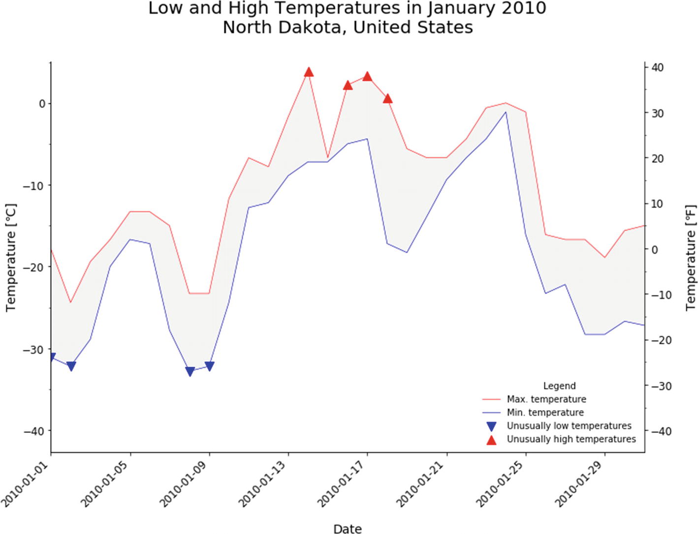
The plot of low and high temperatures with markers for extreme temperatures (defined via thresholds)

Closest Pair Case Study

Finding the closest pair is a well-known task from computational geometry with many applications . We have a set of points in the plane given by their x and y coordinates, represented as P = {(x, y)| x, y ∈ }. We need to find the closest pair of points pi ≠ pj whose Euclidian distance is defined as $$ sqrt{{left({x}_i-{x}_j
ight)}^2+{left({y}_i-{y}_j
ight)}^2} $$. Let us assume that the number of points n is in the range of [2, 107].

We will develop three core variants with different asymptotic behaviors: O(n2), O(nlog2n), and O(n log n). You can refresh your memory about asymptotic notation and algorithms by consulting references [2] through [4]. Afterward, we will bring down the constants to show how they affect the overall performance. Visualization will help us to illustrate the results more clearly. This is an example of using visualization to acquire deeper understanding of a program’s run-time trait.

In the spirit of API-centric and object-oriented development, we will first create an abstract base class. In this manner, all children will simply inherit the same API, so clients would be able to smoothly change the implementation as desired (see also Exercise 6-1). Listing 6-5 shows this foundational class (look into the closest_pair package’s base_closest_pair.py file). Having a common API instigates experimentation, since you can switch implementations without disturbing the rest of your system. Moreover, a clear API is a prerequisite for successful code reuse.
"""The base class for implementing various variants to find the closest pair."""
import abc
from typing import Tuple, Callable, TypeVar, Sequence, Generic
import numpy as np
Coordinates = TypeVar('Coordinates', Sequence[int], np.ndarray)
class BaseClosestPair(Generic[Coordinates], metaclass=abc.ABCMeta):
    """
    Finds the closest pair among 2D points given by their x and y coordinates. The distance is by default defined as a standard Euclidian distance.
    Args:
    x: the list of x coordinates of all points.
    y: the list of y coordinates of all points. The ordering of elements matches the list of x coordinates, i.e., the ith point is specified as (x[i], y[i]).
    """
    _x: Coordinates
    _y: Coordinates
    def __init__(self, x: Coordinates, y: Coordinates):
        assert len(x) >= 2 and len(x) == len(y)
        self._x = x
        self._y = y
    @property
    def x(self) -> Coordinates:
        """Gets the x coordinates of points."""
        return self._x
    @property
    def y(self) -> Coordinates:
        """Gets the y coordinates of points."""
        return self._y
    @staticmethod
    def load_from_stdin() -> Tuple[Coordinates, Coordinates]:
        """
        Loads points from standard input by enumerating x and y coordinates in succession .
        Each datum must be separated with space.
        Output:
        The tuple of x and y coordinates.
        """
        import sys
        data = sys.stdin.read()
        points = list(map(int, data.split()))
        x = points[1::2]
        y = points[2::2]
        return x, y
    @staticmethod
    def generate_points(n: int, seed: int) -> Tuple[Coordinates, Coordinates]:
        """
        Generates random points for stress testing.
        Output:
        The tuple of x and y coordinates.
        Examples:
        >>> BaseClosestPair.generate_points(3, 10)
        ([227077737, -930024104, -78967768], [36293302, 241441628, -968147565])
        """
        import random
        assert n >= 2
        random.seed(seed)
        x = [random.randint(-10**9, 10**9) for _ in range(n)]
        y = [random.randint(-10**9, 10**9) for _ in range(n)]
        return x, y
    @staticmethod
    def distance(x1: int, x2: int, y1: int, y2: int) -> float:
        """
        Returns the Euclidian distance between two points.
        Args:
        x1: the x coordinate of the first point.
        x1: the x coordinate of the second point.
        y1: the y coordinate of the first point.
        y2: the y coordinate of the second point.
        Output:
        The distance between points defined as the square root of the sum of squared differences of the matching coordinates.
        Examples:
        >>> BaseClosestPair.distance(1, 2, 1, 2)
        1.4142135623730951
        >>> BaseClosestPair.distance(1, 1, 1, 1)
        0.0
        """
        from math import sqrt
        return sqrt((x1 - x2)**2 + (y1 - y2)**2)
    @abc.abstractmethod
    def closest_pair(self, distance: Callable[[int, int, int, int], float])
                    -> Tuple[int, int, float]:
        """
        Returns back the tuple with indexes of closest points as well as their distance .
        Args:
        distance: the function that receives four parameters (x1, x2, y1, y2) and returns back the distance between these points.
        """
if __name__ == "__main__":
    import doctest
    doctest.testmod()
Listing 6-5

Abstract Base Class Specifying the Shared API for All Subsequent Variants

The closest_pair method can be easily customized by passing a new function to measure distances between points. The generate_points method can be used to stress test an implementation. To type check this module, issue the following command from Spyder’s console (make sure you are in the closest_pair subfolder of this chapter’s source code):
!mypy --ignore-missing-imports base_closest_pair.py

Our next task is to create a small test harness that will measure execution times and create a proper visualization. It turns out that there are available software tools for this purpose: cProfile (read more details at https://docs.python.org/3/library/profile.html ) and SnakeViz (you may need to install it by executing conda install snakeviz from a command line). cProfile outputs data in a format that is directly consumable by SnakeViz.

Version 1.0

This version is a naive realization of the closest pair algorithm. It simply computes all pairwise distances and finds the minimum one. Listing 6-6 shows this version’s source code.
"""Naive implementation of the closest pair algorithm."""
from typing import Tuple, Callable
from closest_pair.base_closest_pair import BaseClosestPair
class NaiveClosestPair(BaseClosestPair):
    def closest_pair(self, distance: Callable[[int, int, int, int], float] =
                           BaseClosestPair.distance
                    ) -> Tuple[int, int, float]:
        """
        Iterates over all pairs and computes their distances.
        Examples:
        >>> x = [0, 3, 100]
        >>> y = [0, 4, 110]
        >>> ncp = NaiveClosestPair(x, y)
        >>> ncp.closest_pair()
        (0, 1, 5.0)
        """
        from math import inf
        n = len(self.x)
        min_distance = inf
        for i in range(n - 1):
            for j in range(i + 1, n):
                d = distance(self.x[i], self.x[j], self.y[i], self.y[j])
                if d < min_distance:
                    min_distance = d
                    p_i = i
                    p_j = j
        return p_i, p_j, min_distance
if __name__ == "__main__":
    import doctest
    doctest.testmod()
Listing 6-6

The Brute-Force Implementation of This Problem

Tip

Don’t underestimate the value of such a simple but straightforward variant like NaiveClosestPair. It can be a very useful baseline both for performance comparisons and for assurance of correctness. Namely, it can be used together with the point generator to produce many low-dimensional test cases.

Let’s profile one run using 100 autogenerated points. Execute the following statements inside Spyder’s console (make sure that you are in this chapter’s base source folder; see also Exercise 6-2):
>> from closest_pair import *
>> import cProfile
>> x, y = BaseClosestPair.generate_points(100, 1)
>> ncp = NaiveClosestPair(x, y)
>> %mkdir results
>> cProfile.run('ncp.closest_pair()', filename = 'results/ncp_100_stats')
We now should have the binary profile data inside the results subfolder. From a separate command-line shell, execute snakeviz results/. This starts up a local web server that listens by default on port 8080. The exact URL will be printed on a command line. Figure 6-4 shows the initial screen of SnakeViz.
../images/473947_1_En_6_Chapter/473947_1_En_6_Fig4_HTML.jpg
Figure 6-4

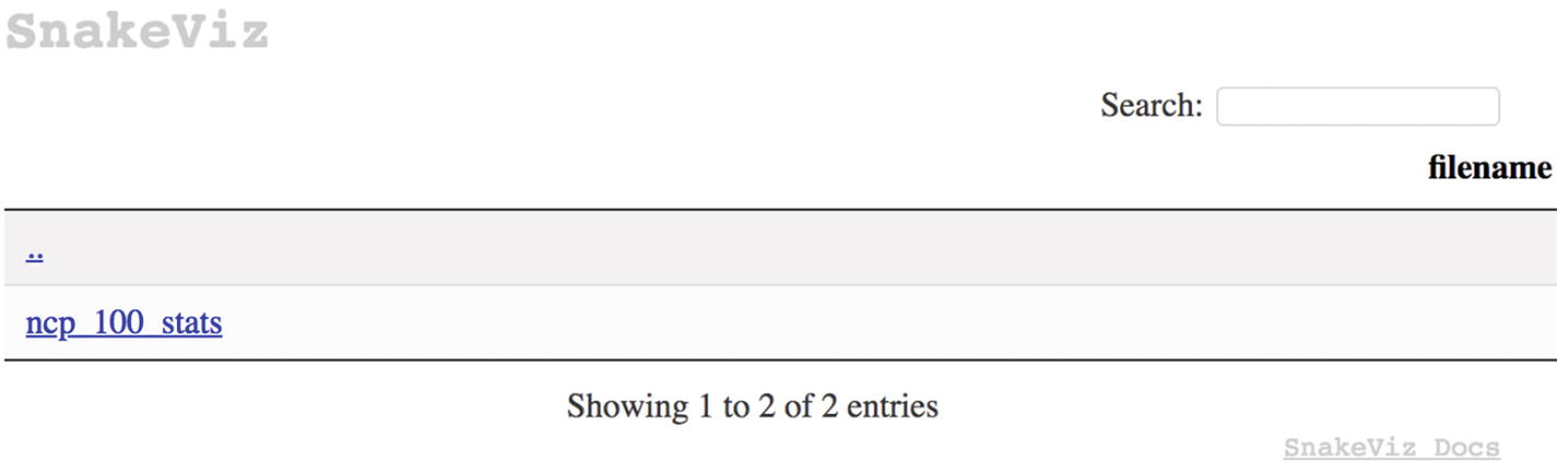
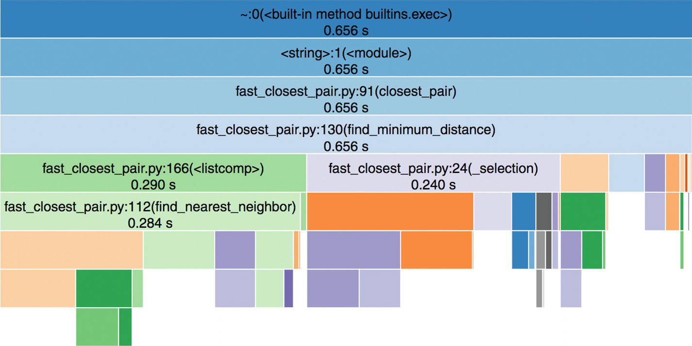
The entry page of SnakeViz, where you can select the ncp_100_stats file for visualization

If you select the ncp_100_stats file in Figure 6-4, then you will see something like Figure 6-5 in the upper part of the page. I’ve hovered over the third rectangle from the top, which immediately displayed some more details about the execution of the closest_pair method. There are separate boxes for the overall signature (context) of a method and its constituent parts, including the body.
../images/473947_1_En_6_Chapter/473947_1_En_6_Fig5_HTML.jpg
Figure 6-5

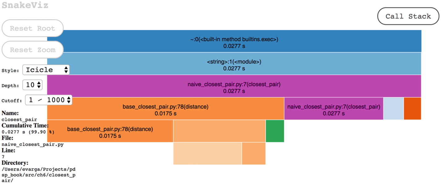
The diagram is interactive

Figure 6-6 shows the content of the lower part, which may look familiar to you (a classical tabular presentation of data). Having multiple views is very convenient, as you can smoothly switch between display formats to focus on the desired level of details. You may sort data by columns by clicking a column’s label. Here, rows are ordered in descending order of tottime. The boxes are nested and organized into a hierarchy that reflects the call stack. Colors are additionally used to group elements. For example, the signature and body of the closest_pair method are colored pink. There are options on the right side to customize the view. Figure 6-7 shows the so-called sunburst diagram style.
../images/473947_1_En_6_Chapter/473947_1_En_6_Fig6_HTML.jpg
Figure 6-6

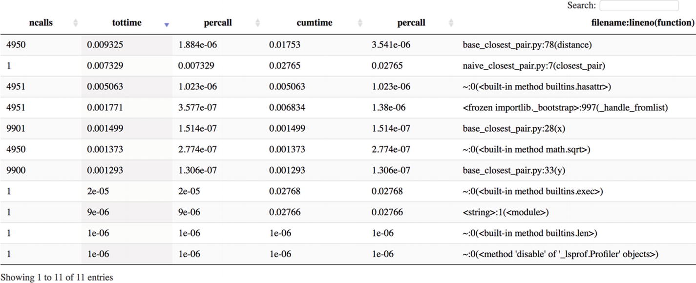
ncalls designates the number of calls made to a function (for example, 4950 = 100 × 99 / 2, which is the number of times distance was called), while tottime shows the total time spent inside a method

../images/473947_1_En_6_Chapter/473947_1_En_6_Fig7_HTML.jpg
Figure 6-7

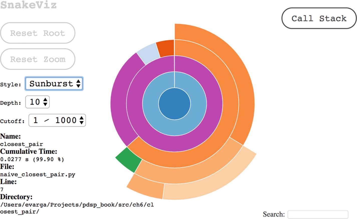
Another way to visualize the calling hierarchy, which may be useful to see the big picture

Let’s try to run our quadratic algorithm on an input of size 3000. Here are the steps to execute:
>> x, y = BaseClosestPair.generate_points(3000, 1)
>> ncp = NaiveClosestPair(x, y)
>> cProfile.run('ncp.closest_pair()', filename = 'results/ncp_3000_stats')

This will take much more to finish. Navigate back to the folder page of SnakeViz by visiting http://127.0.0.1:<port number>/snakeviz/results and selecting ncp_3000_stats. Sort the table by cumulative time in decreasing order and you will see that the running time is around 20 seconds (on my Mac it was 23.48s).1 The previous run with 100 points took only 0.0277s; a 30× increase of input size induced a roughly 900× upsurge of the running time. This is what O(n2) is all about. The exact times on your machine will be different, but the ratio will stay the same. Whatever you do to speed things up (for example, using Numba), you will remain at the same asymptotic level; in other words, the ratio of running times will mirror the quadratic dependence on input size. A pure Python code running a better algorithm will always outperform at one point an ultra-technologically boosted version that uses some slow algorithm.

Version 2.0

In this section we will lay out the O(nlog2n) variant of the algorithm that uses the divide-and-conquer technique . This technique divides the initial problem into multiple subproblems of the same type and solves them independently. If any subproblem is still complex, then it is further divided using the same procedure. The chain ends when you hit a base case (i.e., a problem that is trivial to solve). Afterward, the results of subproblems are combined until the final answer is composed. A representative example of this methodology is the merge sort.

The major steps of this algorithm are as follows (see reference [2]):
  1. 1.

    Split the points into two halves based upon their x coordinate. More formally, if we denote the cutting coordinate as x, then we want to produce two sets of points, L (stands for left) and R (stands for right), such that all points of L have xi ≤ x and all points of R have xi > x.

     
  2. 2.

    Recursively treat groups L and R as separate subproblems and find their solutions as tuples (pL, qL, dL) and (pR, qR, dR), respectively. Take d = min(dL, dR) and remember from which group that minimum came.

     
  3. 3.

    Check if there is any point in L and R whose distance is smaller than d. Select all points of L and R whose x coordinate belongs to interval [x – d, x + d]. Sort these middle (M) points by their y coordinate (the ordering doesn’t matter).

     
  4. 4.

    Iterate over this sorted list, and for each point, calculate its distance to at most seven subsequent points and maintain the currently found best pair. Let it be the triple (pM, qM, dM).

     
  5. 5.

    The final solution is the minimum among pairs of L, M, and R. Recall that in step 2 we already found the minimum between L and R, so we just need one extra comparison with M.

     
At this level, an algorithm looks much like a recipe. You can even put these steps into your source code as comments before doing any detailed coding. As all steps are at a high level of detail, they nicely complement low-level implementation stuff. This is the core idea behind pseudo-code programming (planning with pseudo-code). Figure 6-8 visually provides the proof of correctness of this algorithm. Proving a theorem about your program’s behavior is crucial when dealing with high-volume data. Testing can reveal bugs in your code but cannot establish a ground truth. Usually, it is hard to cover all possible scenarios purely with tests (i.e., to find all equivalence classes in input). The downside of establishing a mathematical proof (embodied inside formal software development methods) is that it requires a specialized knowledge that most software engineers lack. Moreover, you can only apply it to the core parts of your system. For example, an operating system kernel is a feasible target for such formal treatment.
../images/473947_1_En_6_Chapter/473947_1_En_6_Fig8_HTML.jpg
Figure 6-8

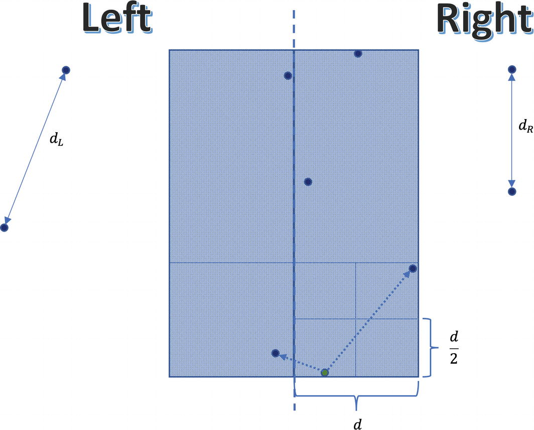
Notice that inside any block of size d×d there can be at most four points

Any of the OS kernel’s subblocks of size $$ frac{d}{2}	imes frac{d}{2} $$ can only contain at most one point. In other words, if a square of dimensions d×d would contain five or more points, then some of its subblocks will surely host more than one point. Nonetheless, in this case we would reach a contradiction that d isn’t correctly computed. Furthermore, any two points in this strip whose distance is < d must be part of the same rectangle of size 2d×d. Consequently, they definitely will be compared, which guarantees correctness. Recall that this rectangle may encompass at most eight points (including the reference point). Here, we will find a shorter distance than d, because the distance between the lowest-right point and subsequent left point is small.

Analysis of the Running Time

Assume that we are given n points in the plane. In step 1 we can find the median point that splits the set into two equally sized subsets, in O(n) time using a randomized divide-and-conquer algorithm. Creating subsets L and R is another O(n) time operation. After solving both subproblems of size $$ frac{n}{2} $$ the algorithm selects points belonging to the middle strip in O(n) time. Afterward, it sorts these filtered points in O(n log n) time. Finally, it computes distances inside this strip in O(n) time (for each point it does some fixed amount of work). Remember that for any function f = kn, k ∈ ℕ it is true that f = O(n); that is, it is bounded by some linear function. Therefore, irrespectively of how many times we do O(n) operations in succession or whether we do 3n, 5n, or 7n operations, their aggregate effect counts as O(n). All in all, the overall running time is defined by the recurrent formula $$ T(n)=2Tleft(frac{n}{2}
ight)+Oleft(nlog n
ight) $$. We cannot directly apply the Master Theorem, although we may reuse its idea for analyzing our expression.

If we draw a recursion tree, then at some arbitrary level k, the tree’s contribution would be $$ {t}_k={2}^kfrac{n}{2^k}log frac{n}{2^k}={2}^kfrac{n}{2^k}left(log n-k
ight) $$. The depth of the tree is logn, so by summing up all contributions from each level, we end up with $$ sum limits_{k=0}^{log n}{t}_k=n{log}^2n-nsum limits_{k=0}^{log n}kle n{log}^2n-frac{n}{2}{log}^2n=Oleft(n{log}^2n
ight) $$.

In step 3 we repeatedly sort points by their y coordinate, and this amounts to that extra logn multiplier. If we could eschew this sorting by only doing it once at the beginning, then we would lower the running time to O(n log n). This is evident from the new recurrence relation $$ T(n)=2Tleft(frac{n}{2}
ight)+O(n) $$, since we may immediately apply the Master Theorem. Of course, we should be careful to preserve the y ordering of points during all sorts of splitting and filtering actions.

Version 3.0

To prevent disturbing the y ordering of points, we will sort them indirectly by finding the proper permutation of indices. All sorting functions actually compute this but usually don’t explicitly return back. All access to original coordinates will happen through double indirection, as shown in Figure 6-9. Listing 6-7 presents the fast O(n log n) implementation of the previously described algorithm.
../images/473947_1_En_6_Chapter/473947_1_En_6_Fig9_HTML.jpg
Figure 6-9

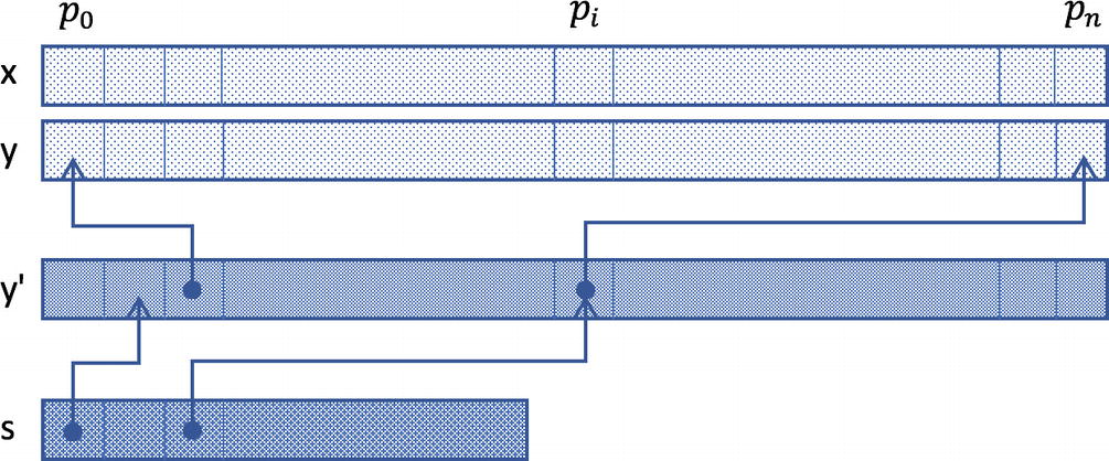
The array s denotes the ordered indices of points belonging to the middle strip

The array s comprises pointers into the sorted array of indices y', which finally point back into original positions. The complexity of accessing points in this manner will be hidden inside appropriate accessor methods.
"""Fast implementation of the closest pair algorithm."""
from typing import List, Tuple, Callable
from closest_pair.base_closest_pair import Coordinates, BaseClosestPair
class FastClosestPair(BaseClosestPair):
    _y_prime: List[int]
    def _argsort_y(self) -> List[int]:
        """Finds the permutation of indices that arranges points by y coordinate."""
        return [t[0] for t in sorted(enumerate(self.y), key = lambda t: t[1])]
    def _get_x(self, i: int, s: List[int]) -> int:
        return self.x[self._y_prime[s[i]]]
    def _get_y(self, i: int, s: List[int]) -> int:
        return self.y[self._y_prime[s[i]]]
    def __init__(self, x: Coordinates, y: Coordinates):
        super().__init__(x, y)
        self._y_prime = self._argsort_y()
    def _selection(self, s: List[int], k: int) -> int:
        """Returns the x value of kth smallest point by x coordinate contained in s."""
        def split(v: int) -> Tuple[List[int], List[int], List[int]]:
            """Indirectly splits points in-place around value v into 2 sets (left and right)."""
            store = 0
            sl_idx = 0
            for i in range(len(s)):
                if self._get_x(i, s) < v:
                    s[i], s[store] = s[store], s[i]
                    store += 1
                    sl_idx = store
            for i in range(store, len(s)):
                if self._get_x(i, s) == v:
                    s[i], s[store] = s[store], s[i]
                    store += 1
            return (s[:sl_idx], s[sl_idx:store], s[store:])
        import random
        v_idx = random.randrange(len(s))
        v = self._get_x(v_idx, s)
        sl, sv, sr = split(v)
        sl_size = len(sl)
        sv_size = len(sv)
        if k <= sl_size:
            return self._selection(sl, k)
        if k > sl_size and k <= sl_size + sv_size:
            return self._get_x(-1, sv)
        return self._selection(sr, k - sl_size - sv_size)
    @staticmethod
    def _merge(sl: List[int], sr: List[int]) -> List[int]:
        """
        Merges the two sorted sublists into a new sorted list . The temporary storage may be allocated upfront as a further optimization.
        """
        sl_size = len(sl)
        sr_size = len(sr)
        s = [0] * (sl_size + sr_size)
        k = 0
        i = 0
        j = 0
        while i < sl_size and j < sr_size:
            if sl[i] <= sr[j]:
                s[k] = sl[i]
                k += 1
                i += 1
            else:
                s[k] = sr[j]
                k += 1
                j += 1
        while i < sl_size:
            s[k] = sl[i]
            k += 1
            i += 1
        while j < sr_size:
            s[k] = sr[j]
            k += 1
            j += 1
        return s
    def closest_pair(self,
                     distance: Callable[[int, int, int, int], float] = BaseClosestPair.distance
                    ) -> Tuple[int, int, float]:
        """
        Computes the minimum distance in O(n*log n) time.
        Examples:
        >>> x = [0, 3, 100]
        >>> y = [0, 4, 110]
        >>> fcp = FastClosestPair(x, y)
        >>> fcp.closest_pair()
        (0, 1, 5.0)
        """
        from math import inf
        def filter_points(s: List[int], d: float, x: int) -> List[int]:
            """Returns the list of point indexes that fall inside the [x-d, x+d] interval."""
            return [s[i] for i in range(len(s)) if abs(self._get_x(i, s) - x) <= d]
        def find_nearest_neighbor(i: int, s: List[int]) -> Tuple[float, int, int]:
            """
            Finds the minimum distance between the current point i and next 7 seven subsequent points by y coordinate.
            """
            curr_x = self._get_x(i, s)
            curr_y = self._get_y(i, s)
            d = inf
            min_idx = i
            for j in range(i + 1, min(len(s), i + 7 + 1)):
                curr_d = distance(curr_x, self._get_x(j, s), curr_y, self._get_y(j, s))
                if curr_d < d:
                    d = curr_d
                    min_idx = j
            return d, s[i], s[min_idx]
        def find_minimum_distance(s: List[int]) -> Tuple[int, int, float]:
            """Main driver function to find the closest pair."""
            if len(s) == 1:
                # We will treat the distance from a single point as infinite.
                return s[0], -1, inf
            if len(s) == 2:
                return s[0], s[1], distance(self._get_x(0, s),
                                      self._get_x(1, s),
                                      self._get_y(0, s),
                                      self._get_y(1, s))
            # This is the median value of input array x in regard of s.
            median_x = self._selection(s.copy(), len(s) // 2)
            # Separate points around median.
            sl = []
            sr = []
            for i in range(len(s)):
                if self._get_x(i, s) <= median_x:
                    sl.append(s[i])
                else:
                    sr.append(s[i])
            # Find minimum distances in left and right groups.
            p_l, q_l, d_l = find_minimum_distance(sl)
            p_r, q_r, d_r = find_minimum_distance(sr)
            if d_l < d_r:
                p_min, q_min = p_l, q_l
                d = d_l
            else:
                p_min, q_min = p_r, q_r
                d = d_r
            # Merge left and right indices keeping their sorted order.
            sm = FastClosestPair._merge(sl, sr)
            # Find the minimum distance inside the middle strip.
            sf = filter_points(sm, d, median_x)
            # Find the final minimum distance among three groups (left, middle, and right).
            d_m, p_m, q_m = min([find_nearest_neighbor(i, sf) for i in range(len(sf))])
            if d_m < d:
                return p_m, q_m, d_m
            else:
                return p_min, q_min, d
        p, q, d = find_minimum_distance(list(range(len(self._y_prime))))
        # We need to map back the point indices into their original base.
        return self._y_prime[p], self._y_prime[q], d
if __name__ == "__main__":
    import doctest
    doctest.testmod()
Listing 6-7

Implementation of the FastClosestPair Class

Obviously, this version is much more complex than our naive attempt in version 1.0. Let’s see how it performs on the same dataset of 3000 points. The steps to create a new report are as follows (I assume that you are continuing the last console session, so you already have arrays x and y defined):
>> from closest_pair import FastClosestPair
>> fcp = FastClosestPair(x, y)
>> cProfile.run('fcp.closest_pair()', filename = 'results/fcp_3000_stats')
Figure 6-10 shows the diagram of this run. If you scroll down in SnakeViz, you will see that the cumulative time has dropped well below one second. Once you have a good algorithm, then you can be sure that your solution is scalable. Of course, even this improvement is far from the absolute lower bound, after you reduce the constant factor and apply parallel processing (see also Exercise 6-3). Nevertheless, such additional tweaks are meaningful only after you have already obtained a good asymptotic behavior.
../images/473947_1_En_6_Chapter/473947_1_En_6_Fig10_HTML.jpg
Figure 6-10

The picture only shows the Icicle-style diagram. Apparently, there are many additional details, since the code base is more involved.

Enquiry of Algorithms Evolution

The differences between the brute-force and sophisticated versions are indeed striking from multiple viewpoints. Besides exponential speedup (from n × n to n × log n), there is a proportional increase in complexity. Nonetheless, by focusing on API-centric development, clients of our classes are totally shielded from inner details. Both versions can be used in exactly the same fashion by invoking public methods specified in the base class. This is once again a testimony that sound software engineering skills are real saviors in data science endeavors.

The moral of the story is that purely technological hocus-pocus cannot get you far away. Sure, we demonstrated Numba in the previous chapter, but real breakthroughs can only happen by heralding mathematics. This is generally true for computer science, not only data science, although in case of the latter, the effect is even more amplified, as no naive approach can cope with Big Data.

Besides time-related performance optimization, you may want to measure memory consumption and other resources. For this you also have lots of offerings. Take a look at the memory-profiler package (see https://pypi.org/project/memory-profiler ). There are also suitable magic command wrappers %memit and %mprun. You can use them by first issuing %load_ext memory_profiler. The same is true for time profiling using the line_profiler module (see https://pypi.org/project/line_profiler ) with the %lprun magic command.

Interactive Information Radiators

Most often we produce active reports that summarize our findings regarding some static dataset. A common platform to deliver live reports of this kind is the standard Jupyter notebook. However, in some situations the supporting dataset is continually changing over time. Forcing users to rerun notebooks and pick up the latest dataset isn’t a scalable solution (let alone resending them a refreshed notebook each time). A better option is to set up a pipeline and let dynamic reports be created automatically. This is the idea behind information radiators, which are also known as dashboards.

We can differentiate two major categories of fluctuating data: batch-oriented data, which is accumulated and processed at regular intervals (for example, hourly, daily, weekly, etc.), and streaming data, which is updated continuously. The concomitant dashboard must reflect this rate of change and expose solely crucial business metrics for monitoring and fast decision making. Any superfluous detail will just deter users’ attention. Of course, which type of dashboard you should build also depends on your pipeline’s capabilities.

Suppose that you collect electrical power production data from various power plants, including those using wind and solar energy. The following information may be useful to efficiently gauge the current and near future state of the power network:
  • Current energy production and consumption

  • Energy production by different plants (nuclear, thermal, water, wind, solar, etc.)

  • The short-term weather forecast, which is an outside factor that could considerably impact the efficacy of wind and solar plants

Once you decide what to put onto your dashboard, then you must contemplate how to convey things visually in the best possible fashion. Domain knowledge is very important here. It turns out that a Sankey diagram is a perfect match. It visualizes the flow between nodes in an acyclic directed graph (a power network may be represented in such form). Figure 6-11 shows an example of this graph.
../images/473947_1_En_6_Chapter/473947_1_En_6_Fig11_HTML.jpg
Figure 6-11

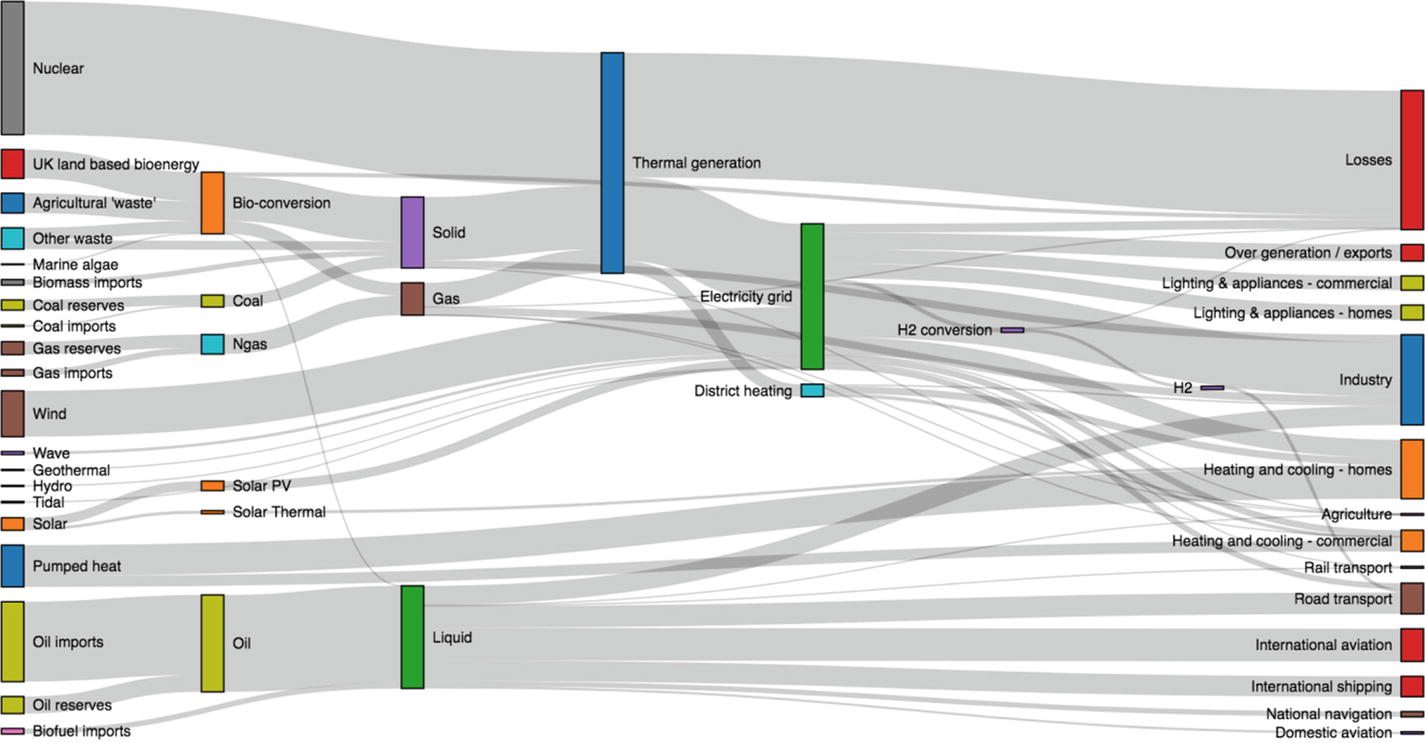
A contrived scenario of energy production and consumption in the UK in the future (see https://github.com/d3/d3-sankey )

The Sankey diagram is by default interactive, and you can select more details about particular branches by clicking or hovering over it. Now imagine this diagram is part of your widely accessible notebook that is regularly updated by your pipeline. This is the core idea behind dashboarding with notebooks (see reference [5]).

The key ingredients for realizing the vision of interactive information radiators (let’s assume Jupyter Notebook as our document format) are as follows:
  • Regularly updated and published dataset(s) (for trying out things, you may use some datasets offered by Kaggle; see reference [5])

  • A dashboarding pipeline that would pick up relevant datasets and rerun your notebook

  • An interactive notebook, most likely utilizing Altair (see https://altair-viz.github.io ), Plotly (see https://plot.ly ), Bokeh (see https://bokeh.pydata.org ), or a similar framework, as you probably don’t want to code stuff from scratch

The Power of Domain-Specific Languages

A domain-specific language (DSL) aids productivity and quality by relieving you from mundane implementation details, so that you can concentrate on business-related elements only. Visualization is a well-bounded domain and is amenable to being supported by a DSL. Altair is a framework that provides such a DSL and enables you to do declarative visualization in Python. This capability is especially vital for crafting complex interactive workflows in the form of dashboards. Spending time on low-level minutiae is unproductive and is a common source of error. Let me demonstrate the power of DSL by introducing Anscombe’s quartet. Besides its technical aspects, this example is also instructive to emphasize the prominence of visualization. Listing 6-8 shows how you might address this task using only matplotlib. It still looks like ordinary Python code despite using matplotlib’s object-oriented API.
import numpy as np
import matplotlib.pyplot as plt
quartets = np.asarray([
    (
     [10.0, 8.0, 13.0, 9.0, 11.0, 14.0, 6.0, 4.0, 12.0, 7.0, 5.0],
     [8.04, 6.95, 7.58, 8.81, 8.33, 9.96, 7.24, 4.26, 10.84, 4.82, 5.68]
    ),
    (
     [10.0, 8.0, 13.0, 9.0, 11.0, 14.0, 6.0, 4.0, 12.0, 7.0, 5.0],
     [9.14, 8.14, 8.74, 8.77, 9.26, 8.10, 6.13, 3.10, 9.13, 7.26, 4.74]
    ),
    (
     [10.0, 8.0, 13.0, 9.0, 11.0, 14.0, 6.0, 4.0, 12.0, 7.0, 5.0],
     [7.46, 6.77, 12.74, 7.11, 7.81, 8.84, 6.08, 5.39, 8.15, 6.42, 5.73]
    ),
    (
     [8.0, 8.0, 8.0, 8.0, 8.0, 8.0, 8.0, 19.0, 8.0, 8.0, 8.0],
     [6.58, 5.76, 7.71, 8.84, 8.47, 7.04, 5.25, 12.50, 5.56, 7.91, 6.89]
    )
])
roman = ['I', 'II', 'III', 'IV']
fig = plt.figure(figsize = (12, 9))
fig.suptitle("Anscombe's Quartets", fontsize=16)
axes = fig.subplots(2, 2, sharex = True, sharey = True)
for quartet in range(quartets.shape[0]):
    x, y = quartets[quartet]
    coef = np.polyfit(x, y, 1)
    reg_line = np.poly1d(coef)
    ax = axes[quartet // 2, quartet % 2]
    ax.plot(x, y, 'ro', x, reg_line(x), '--k')
    ax.set_title(roman[quartet])
    ax.set_xlim(3, 19.5)
    ax.set_ylim(2, 13)
    # Print summary statistics for the current dataset
    print("Quartet:", roman[quartet])
    print("Mean X:", x.mean())
    print("Variance X:", x.var())
    print("Mean Y:", round(y.mean(), 2))
    print("Variance Y:", round(y.var(), 2))
    print("Pearson's correlation coef.:", round(np.corrcoef(x, y)[0][1], 2))
    print()
plt.show()
Listing 6-8

Without Any High-level Framework, There Are Lots of Moving Targets to Keep Under Control

The program will print the following statistics about each quartet (observe that they are all the same):
Quartet: I
Mean X: 9.0
Variance X: 10.0
Mean Y: 7.5
Variance Y: 3.75
Pearson's correlation coef.: 0.82
Quartet: II
Mean X: 9.0
Variance X: 10.0
Mean Y: 7.5
Variance Y: 3.75
Pearson's correlation coef.: 0.82
Quartet: III
Mean X: 9.0
Variance X: 10.0
Mean Y: 7.5
Variance Y: 3.75
Pearson's correlation coef.: 0.82
Quartet: IV
Mean X: 9.0
Variance X: 10.0
Mean Y: 7.5
Variance Y: 3.75
Pearson's correlation coef.: 0.82

Nonetheless, the differences are obvious once you visualize these datasets, as shown in Figure 6-12. Listing 6-9 shows the snippet that achieves a similar visualization, but this time using Altair’s DSL (see also reference [6] about DSLs). The code is compact without unnecessary low-level details. With a DSL, you only specify what you want to accomplish and let the engine decide the best tactic to deliver the requested output. You need to run this code from a JupyterLab notebook by simply pasting it into a code cell.

Figure 6-13 shows its graphical output (see also Exercise 6-4).
import altair as alt
from vega_datasets import data
source = data.anscombe()
base = alt.Chart(
    source, title = "Anscombe's Quartets"
).mark_circle(color = 'red').encode(
    alt.X('X', scale = alt.Scale(zero = True)),
    alt.Y('Y', scale = alt.Scale(zero = True)),
    column = 'Series'
).properties(
    width = 150,
    height = 150
).interactive()
base
Listing 6-9

Visualization Using Altair’s DSL

../images/473947_1_En_6_Chapter/473947_1_En_6_Fig12_HTML.jpg
Figure 6-12

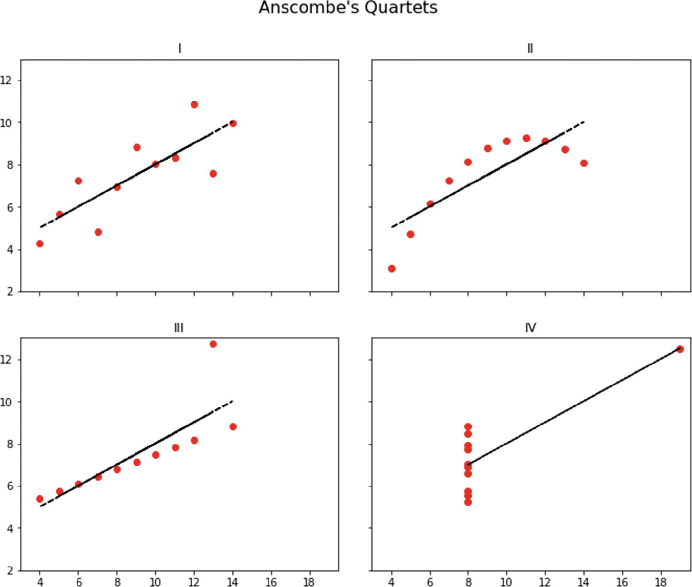
The four quartets are definitely different, although they share the same summary statistics

You will need to install Altair via the conda package manager by issuing the following statement (it will also install the useful vega_datasets, which already contains data for Anscombe’s quartet):
conda install -c conda-forge altair vega_datasets

Tip

You may want to create a snapshot of the dashboard’s state at some moment. All charts produced by Altair include a drop-down menu to save diagrams as images or export them into Vega format.

../images/473947_1_En_6_Chapter/473947_1_En_6_Fig13_HTML.jpg
Figure 6-13

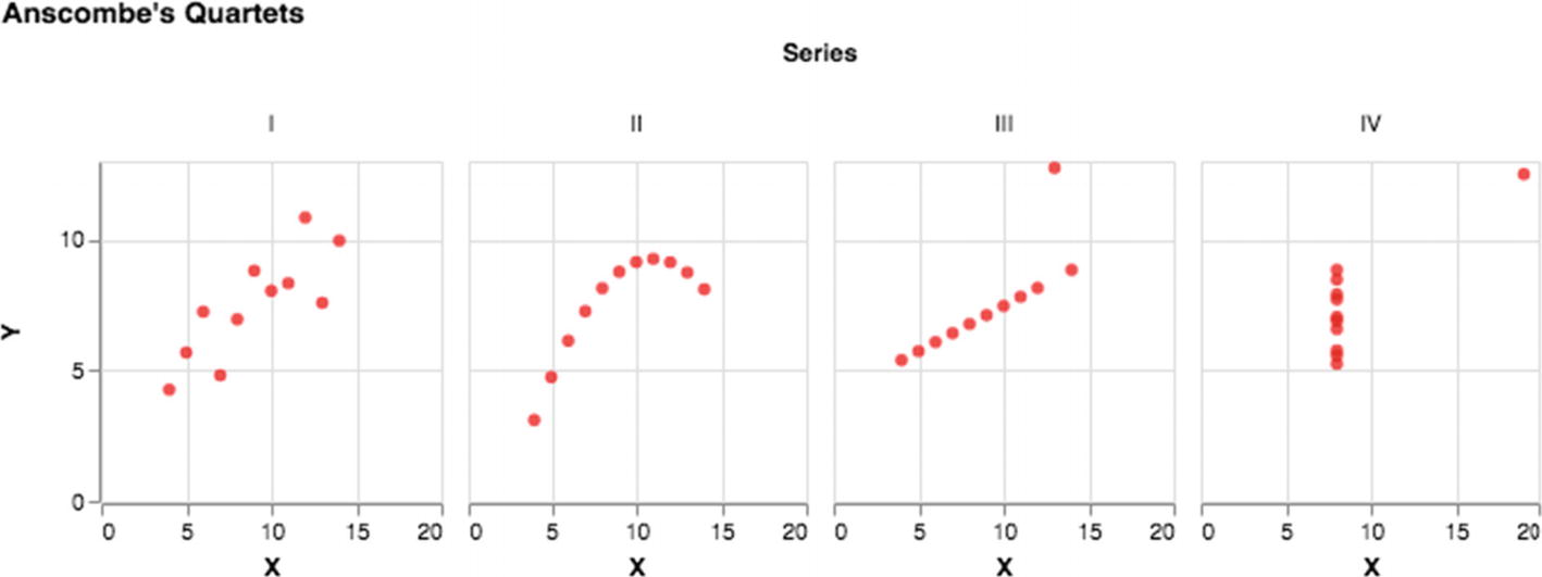
Anscombe’s quartet using default arrangement in Altair

The plot is interactive, and you may pan and zoom each diagram. In interactive dashboards you may want to minimize textual information as well as hide code cells in your notebook. These steps bring your graphical elements into the foreground.

Another advantage of using declarative frameworks is that your notebook will be devoid of device-specific stuff. The whole point of having dashboards is to allow people to access data anytime and everywhere. This entails that many people will use portable devices to browse data. Your dashboard must fit the screen perfectly regardless of whether the user is viewing it on a computer, laptop, tablet, or smart phone. Taking care of all this should be left to the framework.

Exercise 6-1. Create a Factory

Clients shouldn’t instantiate classes directly; ideally, they shouldn’t even be aware of concrete implementation classes. This is the doctrine behind the principle to program against interfaces instead of implementation artifacts. There are two design patterns associated with realizing this vision: Factory Method and Abstract Factory. The latter makes another step in this direction to isolate clients even from factory implementations.

Refactor the code base and introduce these factory entities. In this manner, clients would simply pass the relevant portfolio to a factory (describing the properties of the desired implementation) and receive an object exposed through the shared API (interface).

Exercise 6-2. Implement a Test Harness

Instead of trying out different versions from the console, which is a bit tedious, create a new utility class to test the system. You should encompass the following steps in your flow:
  1. 1.

    Get a fresh instance of points by calling the BaseClosestPair.generate_points method (the number of points should be capped at 1000).

     
  2. 2.

    Find the correct solution using some reliable oracle (for example, by using the trivial NaiveClosestPair class).

     
  3. 3.

    Call the target implementation with the same dataset.

     
  4. 4.

    Compare and report the result.


Thanks to the existence of the common API, your test harness may accept any target implementation of this type. This will create an opportunity for future optimization attempts. Try to produce a ParallelClosestPair class. Observe that our algorithm is inherently parallelizable, since left and right groups may be processed independently.

Exercise 6-3. Produce an Ultra-Fast Variant

Thus far, we have used only pure Python constructs. Unfortunately, this does not usually result in a top-performing solution. Lists are very slow, since they are flexible and heterogeneous. Using the built-in array would be a better option for our case. Nonetheless, even this is not enough. Real speedup would happen by switching to Numpy arrays and compiled code.

Create an UltraFastClosestPair class that utilizes Numpy arrays; I recommend that you do Exercise 6-2 before embarking on this exercise. Notice that some stuff will automatically disappear from the current source. For example, Numpy provides the argsort method out of the box. Furthermore, you can use libraries around Numpy. The sortednp package (see https://pypi.org/project/sortednp ) is very handy, as it implements the merge method in O(n) time.

Exercise 6-4. Practice Overlaying Charts in Altair

In our matplotlib-based code, notice how the regression line is combined with the base scatter plot; see the bold plot instruction in Listing 6-4. Everything was bundled together without having the notion of a chart as a separate abstraction. This is completely different in Altair, where charts behave like self-contained entities. If you have handles to multiple charts, then you can mix them in an ad hoc manner utilizing the overloaded + operator.

Add regression lines to the chart referenced from variable base. You would still use Numpy to compute the coefficients. Take a look at the following tutorial for more details: https://altair-viz.github.io/gallery/poly_fit.html . Furthermore, visit https://stackoverflow.com/questions/50164001/multiple-column-row-facet-wrap-in-altair for help on how to simulate subplots from matplotlib.

Summary

It is impossible to iterate over all kinds of visualizations, since there are myriads of them; you may want to visit the D3 visualization gallery at https://github.com/d3/d3/wiki/Gallery , which collects many types of visualizations in a single place. The most important thing to remember is to always take into account the goals of stakeholders and contemplate how graphical presentation of information may help them. In other words, everything you do must have a good reason and be part of the context. Don’t make fancy displays just for the sake of entertainment.

Interactive displays are very powerful, as they combine analytics with graphical presentation. When the underlying data is changing rapidly, users typically like to monitor those changes and perhaps perform actions pertaining to what-if scenarios. Therefore, center your interaction around those frequent activities, so that users may quickly play around with data in a focused manner. Making powerful interactive dashboards demands knowledge and proficiency about user experience design, which is quite extensive territory. Again, we have revisited the same conclusion that any nontrivial data science project is a team effort.

Dashboarding requires automation, and cloud-based services are well suited for this purpose. They provide the necessary scalable and fault-tolerant infrastructure so that you can set up your pipeline smoothly. You might want to look into two prominent options: PythonAnywhere (see https://www.pythonanywhere.com ) and Google Cloud Platform (see https://cloud.google.com ). The former relies on Amazon Web Services (AWS). Of course, you can also create an on-premises solution using OpenStack (see https://www.openstack.org ). You can quickly get a jump-start on dashboarding by using Kaggle’s API and guidelines from reference [5].

References

  1. 1.

    Michael Dubakov, “Visual Encoding,” https://www.targetprocess.com/articles/visual-encoding , Sept. 2012.

     
  2. 2.

    Sanjoy Dasgupta, Christos Papadimitriou, and Umesh Vazirani, Algorithms, McGraw-Hill Education, 2006.

     
  3. 3.

    Thomas H. Cormen, Charles E. Leiserson, Ronald L. Rivest, and Clifford Stein, Introduction to Algorithms, Third Edition, MIT Press, 2009.

     
  4. 4.

    Tom Cormen and Devin Balkcom, “Algorithms,” Khan Academy, https://www.khanacademy.org/computing/computer-science/algorithms .

     
  5. 5.

    Rachael Tatman, “Dashboarding with Notebooks: Day 1,” https://www.kaggle.com/rtatman/dashboarding-with-notebooks-day-1/notebook , 2019.

     
  6. 6.

    Martin Fowler, Domain-Specific Languages, Addison-Wesley Professional, 2010.

     
..................Content has been hidden....................

You can't read the all page of ebook, please click here login for view all page.
Reset
18.119.19.217