
After project initiation, the data engineering team takes over to build necessary infrastructure to acquire (identify, retrieve, and query), munge, explore, and persist data. The goal is to enable further data analysis tasks. Data engineering requires different expertise than is required in later stages of a data science process. It is typically an engineering discipline oriented toward craftsmanship to provide necessary input to later phases. Often disparate technologies must be orchestrated to handle data communication protocols and formats, perform exploratory visualizations, and preprocess (clean, integrate, and package), scale, and transform data. All these tasks must be done in context of a global project vision and mission relying on domain knowledge. It is extremely rare that raw data from sources is immediately in perfect shape to perform analysis. Even in the case of a clean dataset, there is often a need to simplify it. Consequently, dimensionality reduction coupled with feature selection (remove, add, and combine) is also part of data engineering. This chapter illustrates data engineering through a detailed case study, which highlights most aspects of it. The chapter also presents some publicly available data sources.
Data engineers also must be inquisitive about data collection methods. Often this fact is neglected, and the focus is put on data representation. It is always possible to alter the raw data format, something hardly imaginable regarding data collection (unless you are willing to redo the whole data acquisition effort). For example, if you receive a survey result in an Excel file, then it is a no-brainer to transform it and save it in a relational database. On the other hand, if the survey participants were not carefully selected, then the input could be biased (favor a particular user category). You cannot apply a tool or program to correct such a mistake.
Poorly worded questions do not lead to good answers. Similarly, bad input cannot result in good output.
E-Commerce Customer Segmentation: Case Study
This case study introduces exploratory data analysis (EDA) by using the freely available small dataset from https://github.com/oreillymedia/doing_data_science (see also [1] in the “References” section at the end of the chapter).1 It contains (among other data) simulated observations about ads shown and clicks recorded on the New York Times home page in May 2012. There are 31 files in CSV format, one file per day; each file is named nyt<DD>.csv, where DD is the day of the month (for example, nyt1.csv is the file for May 1). Every line in a file designates a single user. The following characteristics are tracked: age, gender (0=female, 1=male), number of impressions, number of clicks, and signed-in status (0=not signed in, 1=signed in).
The preceding description is representative of the usual starting point in many data science projects. Based on this description, we can deduce that this case study involves structured data (see also the sidebar “Flavors of Data”) because the data is organized in two dimensions (rows and columns) following a CSV format, where each column item is single valued and mandatory. If the description indicated some column items were allowed to take multiple values (for example, a list of values as text), be absent, or change data type, then we would be dealing with semistructured data. Nevertheless, we don’t know anything about the quality of the content nor have any hidden assumptions regarding the content. This is why we must perform EDA: to acquaint ourselves with data, get invaluable perceptions regarding users’ behavior, and prepare everything for further analysis. During EDA we can also notice data acquisition deficiencies (like missing or invalid data) and report these findings as defects in parallel with cleaning activities.
Note
Structured data doesn’t imply that the data is tidy and accurate. It just emphasizes what our expectation is about the organization of the data, estimated data processing effort, and complexity.
Flavors of Data
We have two general categories of data types: quantitative (numeric) and qualitative (categorical). You can apply meaningful arithmetic operations only to quantitative data. In our case study, the number of impressions is a quantitative variable, while gender is qualitative despite being encoded numerically (we instead could have used the symbols F and M, for example).
A data type may be on one of the following levels: nominal, ordinal, interval, or ratio. Nominal is a bare enumeration of categories (such as gender and logged-in status). It makes no sense to compare the categories nor perform mathematical operations. The ordinal level establishes ordering of values (T-shirt sizes XS, S, M, L, and XL are categorical with clear order regarding size). Interval applies to quantitative variables where addition and subtraction makes sense. Nonetheless, multiplication and division doesn’t (this means there is no proper starting point for values). The ratio level allows all arithmetic operations, although in practice these variables are restricted to be non-negative. In our case study, age, number of impressions, and number of clicks are all at this level (all of them are non-negative).
Understanding the differentiation of levels is crucial to understanding the appropriate statistics to summarize data. There are two basic descriptors of data: center of mass describes where the data is tending to, and standard deviation describes the average spread around a center (this isn’t a precise formulation, but will do for now). For example, it makes no sense to find the mean of nominal values. It only makes sense to dump the mode (most frequent item). For ordinals, it makes sense to present the median, while for interval and ratio we usually use the mean (of course, for them, all centers apply).
Chapter 1 covered the data science process and highlighted the importance of project initiation, the phase during which we establish a shared vision and mission about the scope of the work and major goals. The data engineering team must be aware of these and be totally aligned with the rest of the stakeholders on the project. This entails enough domain knowledge to open up proper communication channels and make the outcome of the data engineering effort useful to the others. Randomly poking around is only good to fool yourself that you are performing some “exploration.” All actions must be framed by a common context.
That being said, let us revisit the major aims of the case study here and penetrate deeper into the marketing domain. The initial data collection effort was oriented toward higher visibility pertaining to advertisement efforts. It is quite common that companies just acquire data at the beginning, as part of their strategic ambitions. With this data available, we now need to take the next step, which is to improve sales by better managing user campaigns.
As users visit a web site, they are exposed to various ads; each exposure increases the number of impressions counter. The goal is to attract users to click ads, thus making opportunities for a sale. A useful metric to trace users’ behavior is the click-through rate
(part of domain knowledge), which is defined as  . On average, this rate is quite small (2% is regarded as a high value), so even a tiny improvement means a lot. The quest is to figure out what is the best tactic to increase the click-through rate.
It is a well-known fact in marketing that customized campaigns are much more effective than just blindly pouring ads on users. Any customization inherently assumes the existence of different user groups; otherwise, there would be no basis for customization. At this moment, we cannot make any assumptions about campaign design nor how to craft groups. Nonetheless, we can try to research what type of segmentation shows the greatest variation in users’ behavior. Furthermore, we must identify what are the best indicators to describe users. All in all, we have a lot of moving targets to investigate; this shouldn’t surprise you, as we are in the midst of EDA. Once we know where to go, then we could automate the whole process by creating a full data preparation pipeline (we will talk about such pipelines in later chapters).
Creating a Project in Spyder
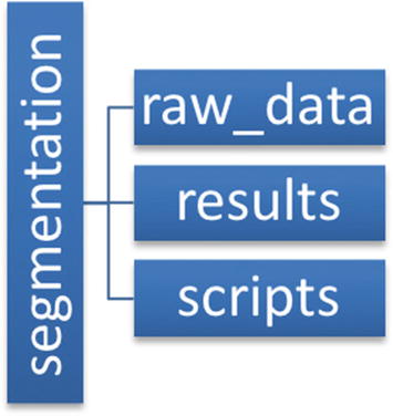
Folder structure of our Spyder project
Downloading the Dataset
The nyt_data.py Script
The Driver Code
After the execution of Listing 2-2, the CSV files will be available in the raw_data subfolder. You can easily verify this in Spyder’s File Explorer.
Exploring the Dataset
The %pwd magic command is mimicking the native pwd bash command. You could also get the same result with !pwd (! is the escape character to denote what follows is a shell command). The shell-related magic commands are operating system neutral, so it makes sense to use them when available. Sometimes, as is the case with !cd, the native shell command cannot even be properly run (you must rely on the corresponding magic variant). Visit https://ipython.readthedocs.io/en/stable/interactive/magics.html to receive help on built-in magic commands; run %man <shell command> to get help on a shell magic command (for example, try %man head or %man wc). Now, switch into the raw_data folder by running %cd raw_data (watch how the File Explorer refreshes its display).
The first line is a header with decently named columns. The rest of the lines are user records. Nonetheless, just with these ten lines displayed, we can immediately spot a strange value for age: 0. We don’t expect it be non-positive. We will need to investigate this later.
So, the number of records fluctuates in the range of [360K, 790K] with sizes between 3.7MB and 8.0MB; we shouldn’t have a problem processing a single file in memory even on a modest laptop.
Finding Associations Between Features
The pd is a common acronym for the pandas package (like np is for numpy). The read_csv function does all the gory details of parsing the CSV file and forming the appropriate DataFrame object. This object is the principal entity in the Pandas framework for handling 2D data. The head method shows the first specified number of records in a nice tabular format. Observe that our table has inherited the column names from the CSV file. The leftmost numbers are indices; by default, they are record numbers starting at 0, but the example below shows how it may be easily redefined.
We have 458441 records (rows) and 5 features (columns). The number of rows is very useful for finding out missing column values. So, you should always print the shape of your table.
The describe method calculates the descriptive statistics (as shown in the leftmost part of the output) for each column and returns the result as a new DataFrame. When we display summary_stat, then it automatically abbreviates the output if all columns cannot fit on the screen. This is why we need to explicitly print the information for the Impressions column.
At first glance, all counts equal the total number of rows, so we have no missing values (at least, in this file). The Age column’s minimum value is zero, although we have already noticed this peculiarity. About 36% of users are male and 70% of them were signed in (the mean is calculated by summing up the 1s and dividing the sum by the number of rows). Well, presenting a mean for a categorical variable isn’t right, but Pandas has no way to know what terms like Gender or Signed In signify. Apparently, conveying semantics is much more than just properly naming things.
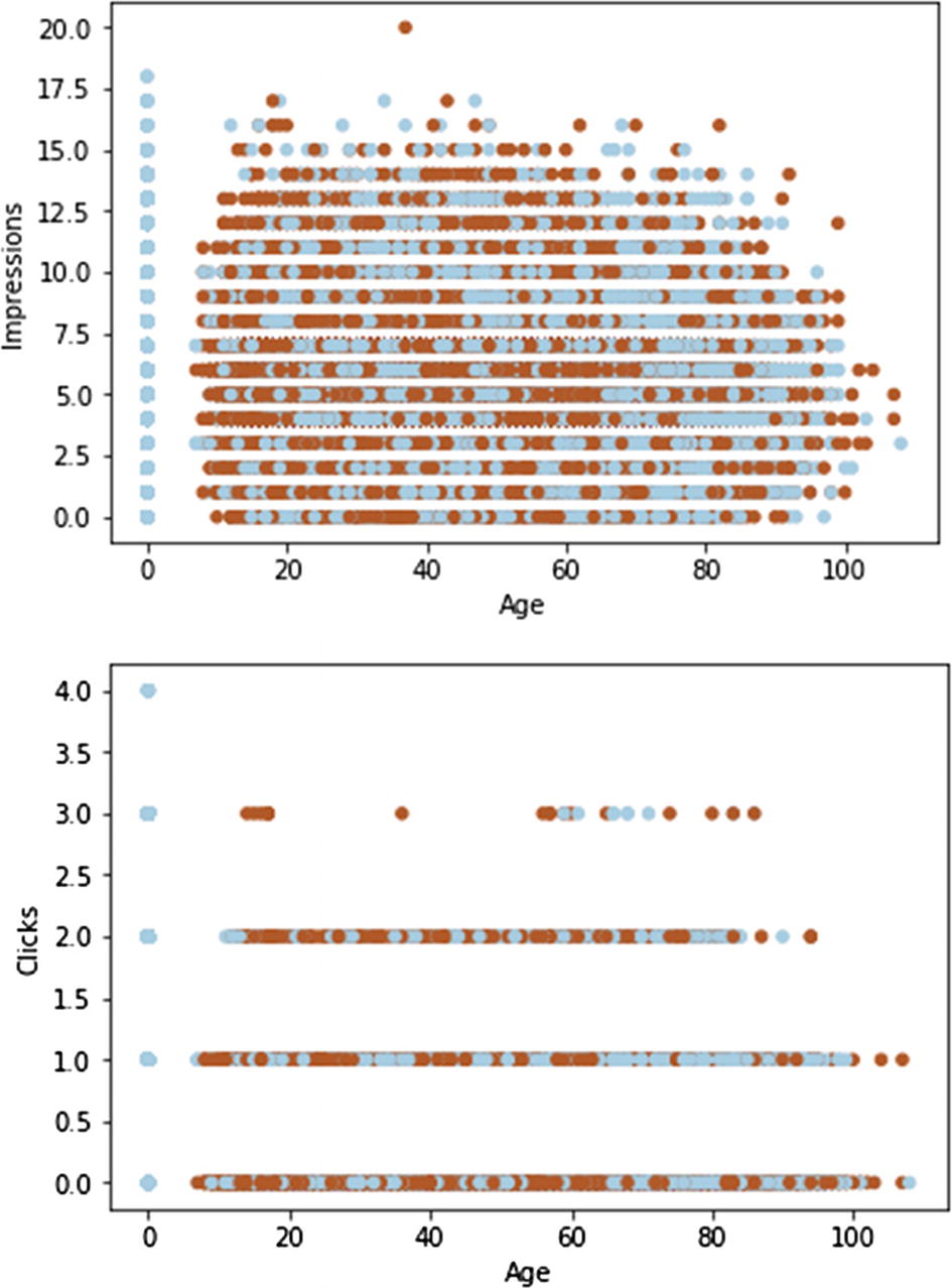
A scatter plot is handy to show potential relationships between numerical variables
You can add a third dimension by differently coloring the points.3 The dark dots denote males, while the light ones denote females. Due to the very large number of records (points are heavily overlapped), we cannot discern any clear pattern except that the zero age group is special.
The bolded section illustrates the Boolean indexing technique (a.k.a. masking), where a Boolean vector is used for filtering records. Only those records are selected where the matching element is True. Based on the dump, we see that all users are marked as females and logged out.
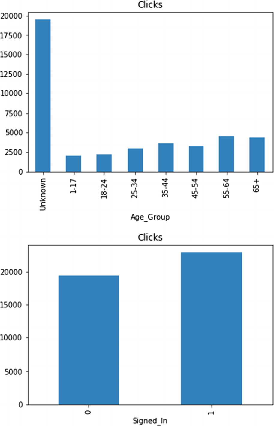
The any method checks if there is at least one True element in a Boolean mask. Both times we see False. Therefore, we can announce a very important rule that every logged-out user is signaled with zero age, which absolutely makes sense. If a user isn’t logged in, then how could we know her age? Observe that we have gradually reached this conclusion, always using data as a source of truth buttressed with logic and domain knowledge. All in all, the Signed_In column seems redundant (noninformative), but it may be useful for grouping purposes.
We have grouped the data by the signed-in status and aggregated it based on minimum and maximum. For a logged-out state, the only possible age value is zero. For a logged-in state, the youngest user is 7 years old.
Incorporating Custom Features
Feature engineering is both art and science that heavily relies on domain knowledge. Many scientists from academia and industry constantly seek new ways to characterize observations. Most findings are published, so that others may continue to work on various improvements. In the domain of e-commerce, it turned out that click-through rate, demographics (in our case study, gender), and age groups (see reference [2]) are informative features.
The Boolean mask must be converted to an array of indices where elements are True. This is the job of the nonzero method . Of course, we could also get an empty array, but this is OK. As you likely realize, besides exploring, we are also cleaning up the dataset. Most actions in data science are intermixed, and it is hard to draw borders between activity spaces.
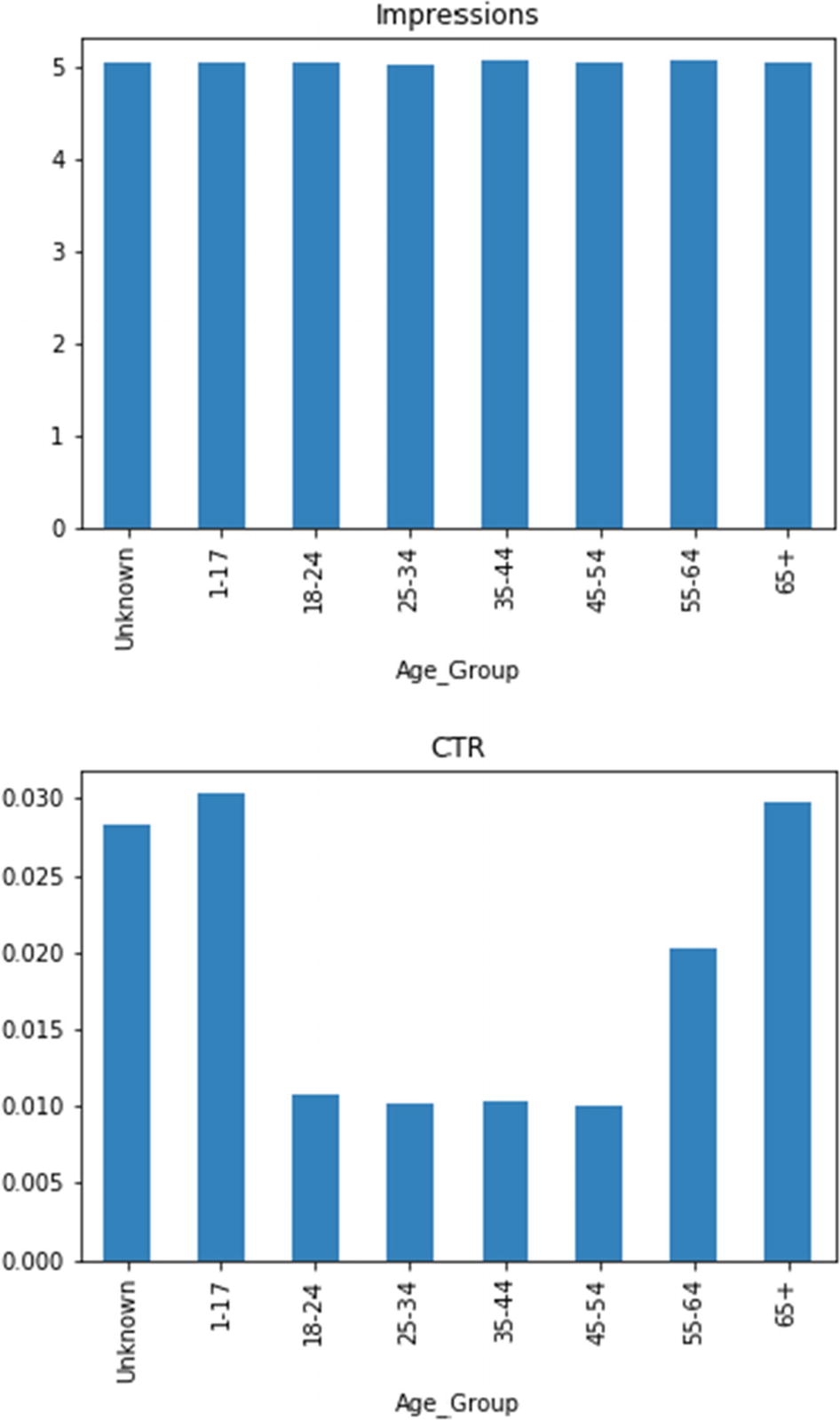
These two bar plots clearly emphasize the difference between features: number of impressions and CTR. The youngest and oldest people are more susceptible to click ads. The unknown age group is a mixture of all ages. At any rate, the segmentation by age groups turns out to be useful.
The total number of clicks represents the matching group’s importance (potential) to generate sale
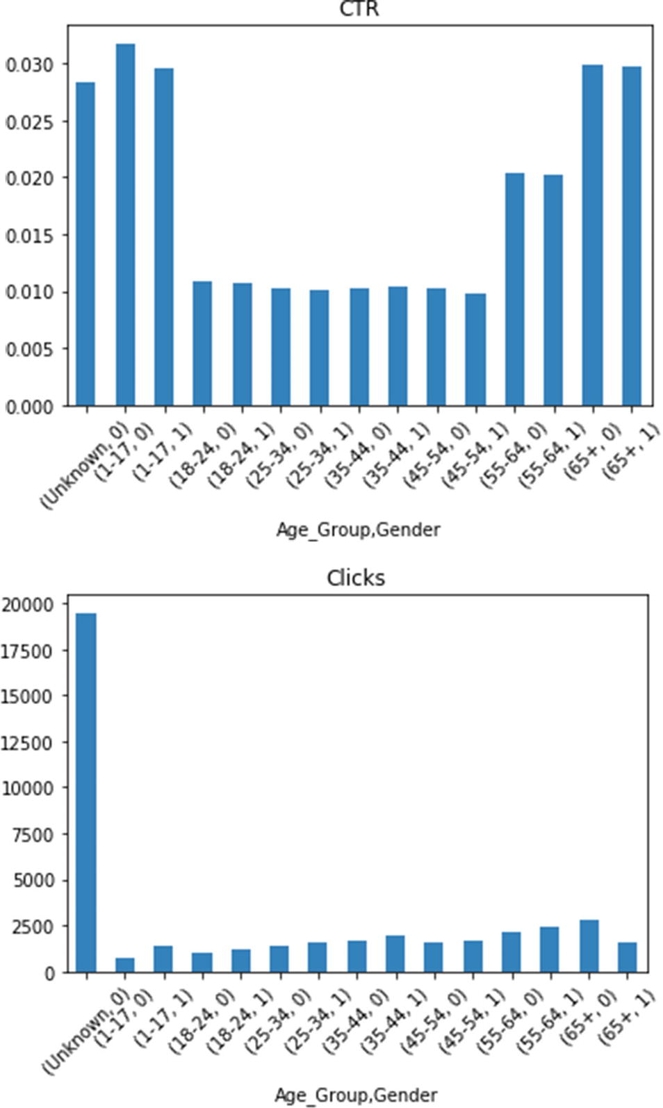
There is no significant difference between genders, aside from total number of clicks for the youngest and oldest age groups
These diagrams also show how easy it is to customize plots. To enhance readability, I have printed the X axis labels slanted by 45 degrees.
The preceding table contains enough information to even restore some other properties. For example, the size of groups may be calculated by dividing the corresponding total number of clicks by its mean.
Automating the Steps
The summarize Function Responsible for Preprocessing a Single Data File
You should get back the same result as from the previous section after passing the 'nyt1.csv' file to summarize . We are now left with implementing the pipeline to process all files. Observe how all those preliminary sidesteps and visualizations are gone. The source code is purely an end result of complex intellectual processes.
Inspecting Results
The traverse Function Calling Back a Custom Collector
np.empty Allocates Spaces for 31 Days of Data Points
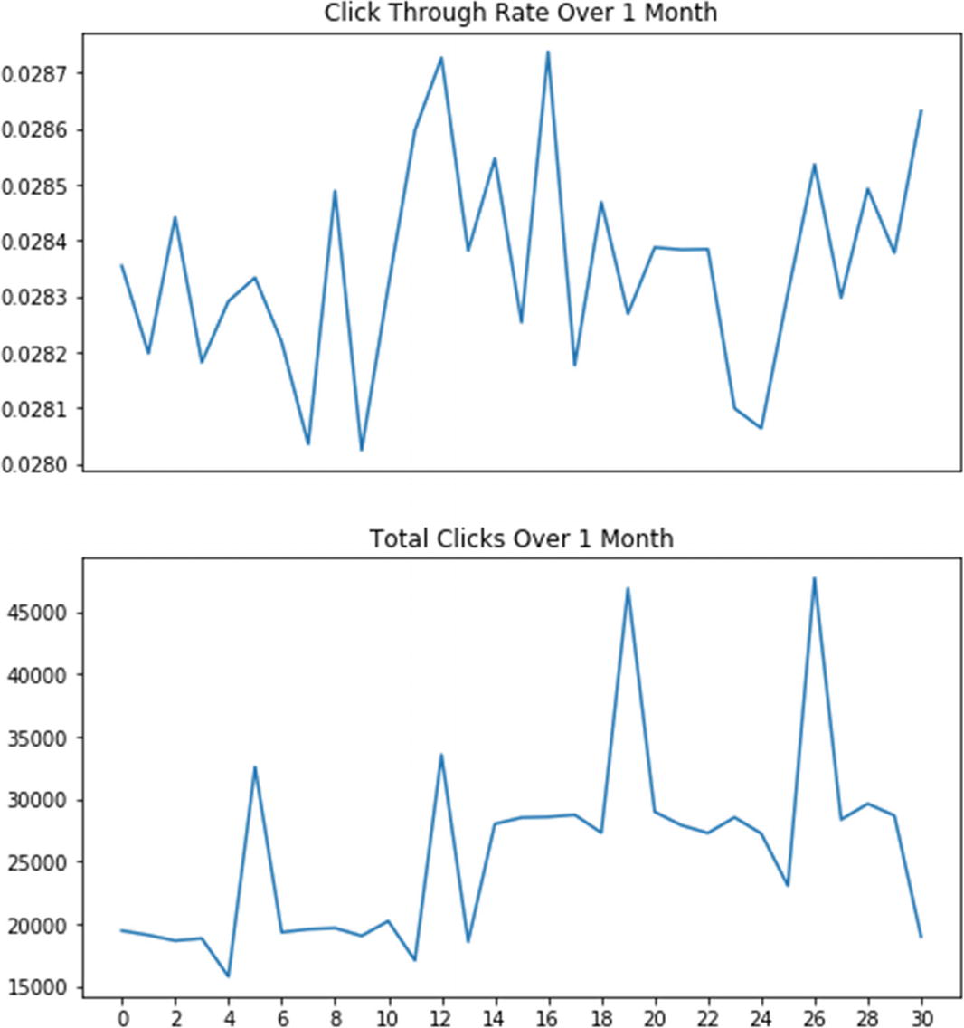
There is no noticeable fluctuation pattern in click-through rate
Notice that there are clear peaks in the total number of clicks. They happened on the 6th, 13th, 20th, and 27th of May 2012, which are all Sundays (the numbering starts at zero; see also Exercise 2-2). Consequently, on those days the web site had experienced much higher traffic than during weekdays. Moreover, we see an overall increase in activity in the second half of the month (could be that people waited their monthly salaries until around 15th). This may be a recurring condition, since on the last day of the month the number of clicks drops to the level witnessed at the beginning of the month. Finally, on every Saturday, activity languished a bit compared to the rest of the week (perhaps people typically sit in front of their computers less on Saturdays). These effects are intriguing and deserve deeper analysis with more data.
Persisting Results
It faithfully and efficiently writes and reads data frames.
It allows sharing of data across a multitude of programming languages and frameworks.
It nicely interoperates with the Hadoop ecosystem.
Pandas has a very intuitive API for handling serialization and deserialization of data frames into/from this format.
Code to Write Data Frames into Parquet Files Using the nyt_summary_<day number>.parquet File Naming Convention
It is mandatory to have string column names in a DataFrame instance before writing it into a Parquet file. The code shows how to convert a multilevel index into a flat structure, where the top index’s name is prepended to its subordinate columns. This transformation is reversible, so nothing is lost.
After all files are written, you may browse them in the File Explorer. They are all the same size of 6KB. Compare this to initial CSV file sizes.
Parquet Engines
An easy to way to resolve this is to issue conda install pyarrow (you may also want to specify an environment). This command installs the pyarrow package, which is a Python binding for Apache Arrow (see http://arrow.apache.org ). Arrow is a cross-language development platform for columnar in-memory format for flat and hierarchical data. With pyarrow it is easy to read Apache Parquet files into Arrow structures. The capability to effortlessly convert from one format into another is an important criterion when choosing a specific technology.
Restructuring Code to Cope with Large CSV Files
Breaking up data into smaller files, as we have done so far, is definitely a good strategy to deal with a massive volume of data. Nonetheless, sometimes even a single CSV file is too large to fit into memory. Of course, you can try vertical scaling, by finding a beefed-up machine, but this approach is severely limited and costly. A better way is to process files in chunked fashion. A chunk is a piece of data from a file; once you are done with the current chunk, you can throw it away and get a new one. This tactic can save memory tremendously but may increase processing time.
Restructured nyt_data_chunked.py to Showcase Chunked Data Processing
The traverse function accepts chunksize as a parameter, which is set by default to 10000. The driver.py script is redirected to use the new module, and all the rest runs unchanged.
Public Data Sources
Data.gov ( https://www.data.gov ) is the U.S. federal government’s data hub. In addition to loads of datasets, you can find tools and resources to conduct research and create data products.
Geocoding API ( https://developers.google.com/maps/documentation/geocoding/start ) is a Google REST service that provides geocoding and reverse geocoding of addresses. This isn’t a dataset per se but is important in many data engineering endeavors.
GitHub repository ( https://github.com/awesomedata/awesome-public-datasets ) offers a categorized list of publicly available datasets. This is an example of a source aggregator that alleviates the burden of targeted searches for datasets.
HealthData.gov ( https://healthdata.gov ) offers all sorts of health data for research institutions and corporations.
Kaggle ( https://www.kaggle.com ) is a central place for data science projects. It regularly organizes data science competitions with excellent prizes. Many datasets are accompanied by kernels, which are notebooks containing examples of working with the matching datasets.
National Digital Forecast Database REST Web Service ( https://graphical.weather.gov/xml/rest.php ) delivers data from the National Weather Service’s National Digital Forecast Database in XML format.
Natural Earth ( http://www.naturalearthdata.com ) is a public domain map dataset that may be integrated with Geographic Information System software to create dynamic map-enabled queries and visualizations.
Open Data Network (see https://www.opendatanetwork.com ) is another good example of a source aggregator. It partitions data based on categories and geographical regions.
OpenStreetMap ( https://wiki.openstreetmap.org ) provides free geographic data for the world.
Quandl ( https://www.quandl.com ) is foremost a commercial platform for financial data but also includes many free datasets. The data retrieval is via a nice API with a Python binding.
Scikit Data Access ( https://github.com/MITHaystack/scikit-dataaccess ) a curated data pipeline and set of data interfaces for Python. It prescribes best practices to build your data infrastructure.
Statistics Netherlands opendata API client for Python ( https://cbsodata.readthedocs.io ) is a superb example of using the Open Data Protocol (see https://www.odata.org ) to standardize interaction with a source.
UCI Machine Learning Repository ( http://archive.ics.uci.edu/ml/index.php ) maintains over 400 datasets for different machine learning tasks. Each set is properly marked to identify which problems it applies to. This is a classical example of a source where you need to download the particular dataset.
Exercise 2-1. Enhance Reusability
The driver.py script contains lots of hard-coded values. This seriously hinders its reusability, since it assumes more than necessary. Refactor the code to use an external configuration file, which would be loaded at startup.
Don’t forget that the current driver code assumes the existence of the input and output folders. This assumption no longer holds with a configuration file. So, you will need to check that these folders exist and, if not, create them on demand.
Exercise 2-2. Avoid Nonrunnable Code
The driver.py script contains a huge chunk of commented-out code. This chunk isn’t executed unless the code is uncommented again. Such passive code tends to diverge from the rest of the source base, since it is rarely maintained and tested. Furthermore, lots of such commented sections impede readability.
Restructure the program to avoid relying on comments to control what section will run. There are many viable alternatives to choose from. For example, try to introduce a command-line argument to select visualization, output file generation, or both. You may want to look at https://docs.python.org/3/library/argparse.html .
Exercise 2-3. Augment Data
Sometimes you must augment data with missing features, and you should be vigilant to search for available solutions. If they are written in different languages, then you need to find a way to make them interoperate with Python. Suppose you have a dataset with personal names, but you are lacking an additional gender column. You have found a potential candidate Perl module, Text::GenderFromName (see https://metacpan.org/pod/Text::GenderFromName ). Figure out how to call this module from Python to add that extra attribute (you will find plenty of advice by searching on Google).
This type of investigation is also a job of data engineers. People focusing on analytics don’t have time or expertise to deal with peculiar data wrangling.
Summary
Data engineering is an enabler for data analysis. It requires deep engineering skills to cope with various raw data formats, communication protocols, data storage systems, exploratory visualization techniques, and data transformations. It is hard to exemplify all possible scenarios.
The e-commerce customer segmentation case study demonstrates mathematical statistics in action to compress the input data into a set of descriptive properties. These faithfully preserve main behavioral traits of users whose actions were preserved in raw data. The case study ends by examining large datasets and how to process them chunk-by-chunk. This is a powerful technique that may solve the problem without reaching to more advanced and distributed approaches.
In most cases, when dealing with common data sources, you have a standardized solution. For example, to handle disparate relational database management systems in a unified fashion, you can rely on the Python Database API (see https://www.python.org/dev/peps/pep-0249 ). By contrast, when you need to squeeze out information from unusual data sources (like low-level devices), then you must be creative and vigilant. Always look for opportunity to reuse before crafting your own answer. In the case of low-level devices, the superb library PyVISA (see https://pyvisa.readthedocs.io ) enables you to control all kinds of measurement devices independently of the interface (e.g., GPIB, RS232, USB, and Ethernet).
Data-intensive systems must be secured. It isn’t enough to connect the pieces and assume that under normal conditions all will properly work. Sensitive data must be anonymized before being made available for further processing (especially before being openly published) and must be encrypted both at rest and in transit. It is also imperative to ensure consistency and integrity of data. Analysis of maliciously tampered data may have harmful consequences (see reference [4] for a good example of this).
There is a surge to realize the concept of data as commodity , like cloud computing did with computational resources. One such initiative is coming from Data Rivers (consult [5]), whose system performs data collection, cleansing (including wiping out personally identifiable information), and validation. It uses Kafka as a messaging hub with Confluent’s schema registry to handle a humungous number of messages.
Another interesting notion is data science as a service (watch the webinar at [6]) that operationalizes data science and makes all necessary infrastructure instantly available to corporations.
References
- 1.
Cathy O’Neil and Rachel Schutt, Doing Data Science, O’Reilly, 2013.
- 2.
“Using Segmentation to Improve Click Rate and Increase Sales,” Mailchimp, https://mailchimp.com/resources/using-segmentation-to-improve-click-rate-and-increase-sales , Feb. 28, 2017.
- 3.
Wes McKinney, Python for Data Analysis: Data Wrangling with Pandas, NumPy, and IPython, 2nd Edition, O’Reilly, 2017.
- 4.
UC San Diego Jacobs School of Engineering, “How Unsecured, Obsolete Medical Record Systems and Medical Devices Put Patient Lives at Risk,” http://jacobsschool.ucsd.edu/news/news_releases/release.sfe?id=2619 , Aug. 28, 2018.
- 5.
Stephanie Kanowitz, “Open Data Grows Up,” GCN Magazine, https://gcn.com/articles/2018/08/28/pittsburgh-data-rivers.aspx , Aug. 28, 2018,.
- 6.
“Introducing the Data Science Sandbox as a Service,” Cloudera webinar recorded Aug. 30, 2018, available at https://www.cloudera.com/resources/resources-library.html .