2
Great Designers Are Great Communicators
Words: so innocent and powerless as they are standing in a dictionary, how potent for good and evil they become in the hands of one who knows how to combine them.
NATHANIEL HAWTHORNE
TRYING TO NAVIGATE THIS new reality that designers are at the fore-front of the digital product business can be a real challenge. We creative thinkers are now thrust into the middle of a process with business people, expected to be the experts on design, and then asked to tell everyone else what we think should be done. Like a fish out of water, we struggle to breathe. To make this mental shift and be effective in our new role, it’s critical that we understand just how important good communication is to design.
Too Many Cooks
Designing in this new reality called UX would all go really well if it weren’t for the fact that other people on the project might disagree with our decisions. Actually, they will!
There are now a lot of people who may know little or nothing about design, yet who have the authority to oversee and dictate our design practice. They have a vested interest in participating in the conversation, but they aren’t trained designers and they don’t have the same depth of knowledge in design or technology that we do. What used to be a somewhat obscure conversation between graphic artists is now open and available to many other players in the business.
What’s more, these people will often gladly admit that they aren’t the experts. They know that they don’t know, yet they still insist their ideas and opinions are right. This is one of the most bizarre parts of our relationship with stakeholders. People who have influence over our project readily admit they are not good at our jobs, yet insist on making changes that we believe will be detrimental to the user experience. They say that they trust us and yet frequently overrule us. It can be incredibly demeaning and confusing, but the problem may not lie entirely with them.
These stakeholders have to be part of our process, but we struggle with including them in a way that’s helpful and doesn’t derail our objectives. This is what we need to figure out.
Everyone Is a Designer!
Everyone knows good design when they see it, even if they don’t know how to create it. That sounds frustrating (even ridiculous), but it’s actually true. The same can be said for other arts, such as music. I may not know how to play an instrument, but I can recognize a pleasing tune. I can decide what music I like (and don’t like) even if I can’t tell you how to create it. Although there may be different preferences, we’re all able to choose music we want to listen to, regardless of whether we know how to reproduce those sounds ourselves.
The phenomenon that a nonexpert can have an opinion about your design work is something that is almost entirely unique to design within today’s organizations. Accounting practices are fairly standard, and few employees would complain about how money is tracked as long as it is being tracked—that is, unless it ever affects them personally, as in their paychecks: the way they’re paid or the details on their pay stub. In accounting, the paycheck is the user interface for most people in the organization.
The same could be said for development. Few people look at the code except the developers, right? No one cares what the programmers are doing unless it actually affects them. For example, if the performance of a network, website, or computer were so slow as to render it unusable, suddenly everyone will have an opinion: we should make it faster. Yet, the details of how to accomplish that are obscured to the end user; the only part we “see” is the speed. That is the main interface for development.
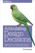
Andy Zelman, Skeleton Claw Comics. (Used with permission: http://skeletonclaw.com)
The Interface Is Your Interface
No passion in the world is equal to the passion to alter someone else’s draft.
HG WELLS
Similarly with design, people only care about the part that affects them. They care about the interface. However, when you’re in the business of doing nothing but creating the user interface, everyone is going to care about everything that you do! All of your work is exposed, so it naturally conjures more opinions and ideas than many other areas in the organization. More than that, your work is now becoming the interface of the entire company like never before. Not surprisingly, the people who run the business have strong opinions about how your work reflects on them. Few people will tell you how to create those interfaces. The process or tools you use to create the designs are obscured to them. Unlike accounting or development, though, the vast majority of your work is exposed to every stakeholder.
It’s a strange feeling: what could be more rewarding than to know that our work and expertise is so highly valued that so many people want to be a part of it? Design is being held up on a pedestal! Finally getting the recognition it deserves! We knew that we could solve real business problems and make our mark in the world. It’s what we’ve always wanted, right? Maybe, but be careful what you wish for! If we want our work to be the center of attention, we must also take responsibility for showing people how and why our work is valued. That part doesn’t come automatically. It takes work, it takes practice, but more importantly...it takes good communication.

Tom Chi & Kevin Cheng, OK/Cancel (Used with permission: http://bit.ly/1Nkl7pI)
There Is No U or X in Team
Collaboration seems like it should be the pinnacle of great design work: different opinions coming together to form the best possible solution. That’s what everyone really wants. The image is of a handful of respectful intellectuals, passionately debating the right solutions, ultimately leading to a collaborative discussion and an ideal design that no one could have thought of on their own. Teamwork at its best! Everyone leaves satisfied, fulfilled, and respected—ready to take on the next design challenge, right? We think we want that kind of collaboration, but it becomes far more complicated when we disagree with one another. When we disagree, we tend to become defensive. When we become defensive, we fail to focus on the real issues. The meeting ends, not with collaboration, but with grumbling compromise and, often, a crippled user experience.
In situations like this, meetings can easily turn into design-by-committee. Everyone has a suggestion for how to solve a problem. We hear different opinions on every side and are unable to defend our own choices against this barrage of feedback. One suggestion evolves into an idea for something else. That idea spurs a thought about something different. Unchecked, the conversation can spiral out of control into a hodgepodge of well-intentioned tweaks that collectively spell doom for the overall goals of the project. The thing we came together to accomplish has been muddied by group think and mob mentality. Remember, teamwork always ends with work.
THE CEO BUTTON
Because of this, we see things like the CEO button.
The CEO button is an unusual or otherwise unexpected request from an executive to add a feature that completely destroys the balance of a project and undermines the very purpose of a designer’s existence.
It’s funny because it’s true. You might spend weeks or months building the best possible app. Your team has poured in all the best practices that you learned at that one conference. You’ve done usability testing to prove it works. Your mom was even able to use it without incident! And yet, one executive can come in and blow up the whole thing. We want to avoid this.
HOME PAGE SYNDROME
Another common problem is the home page syndrome.
The home page syndrome is a condition whereby the home screen of an application or website becomes a catchall for everything, creating a garage sale of links, buttons, and banner ads that unravels the fabric of usability, causing designers to cry themselves to sleep.
You see, sometimes no matter how hard we try, the home page just becomes a huge mess. Everyone wants their business unit represented on the home page. It’s as if something doesn’t exist if it isn’t on the home page. That new thing we’re launching? Put it on the home page. And that other thing that isn’t performing well? Maybe if we put it on the home page, it will get better. Sound familiar? We have to learn to deal with this phenomenon.
Communication Matters
The good news is that it doesn’t have to be this way. It’s possible to avoid the disruption and compromise that happens so frequently in organizational design through better communication with our stakeholders. I’ve found that the majority of issues or concerns that our stakeholders bring to our attention are often just a matter of misunderstanding or miscommunication. The way that we talk to them about our designs is the key to ensuring that we always end up with the best possible user experience.
It makes sense when you think about it. All human relationships are really nothing more than a series of bound-up understandings and misunderstandings. We don’t always have control over how other people understand us in the beginning. Everyone brings their past experiences into conversations we have with them on a daily basis. We do, however, have control over how we communicate with them in order to influence those future understandings. The way that we talk to people and the things we say will influence the future.
WORDS ARE POWERFUL
This makes our words really powerful. Throughout human history, words have had significant power to change people, circumstances, and entire systems of government. Words can spark wars, end relationships, and damage emotions. Conversely, words can also be used to build people up, change minds, and reinforce positive connections. Saying something out loud can make it real. So real, in fact, that you can make things happen simply by talking about them.
Our words have a profound effect on the people around us. As a parent, I have to be careful about how I talk to my kids because the things that I say to them are the things that they will grow up to believe, whether what I say is even true. If I am constantly berating my kids over their behavior, they will believe bad behavior is just part of who they are. If I tell my kids they’re stupid, they could grow up believing that they shouldn’t even try to learn. The things I say to my kids will shape their understanding of themselves and their perception of the world around them. You might think it’s just impressionable children who don’t know better, but all people are just as easily impacted by our words. In life, there are no adults, only more experienced children.
For decades, eyewitness testimony has been called into question because of how easily it can be influenced. Police have to be careful about what they say because a witness’s perception of what happened is so greatly influenced by what they hear. A witness’s memory can actually be changed by the way he or she is questioned. It’s well documented that memories can be altered under interrogation by police.1 The truth is not necessarily what actually happened, but what we think happened. We can use words not only to express ourselves and make our opinions known, but also to speak into the reality of other people. Our words can actually alter people’s perception of the situation.
GOOD COMMUNICATORS WIN
Overall, being a better communicator will give you more opportunities. I’m amazed (and offended) at the number of designers who apply for a job yet lack basic communication skills. People will send me a resume without explanation, forget about interviews, or fail to follow instructions. Ultimately, I’m only going to pursue candidates who can communicate well, and so the poor communicators are passed over very quickly.
It’s common for my clients to express that one of the reasons they hired me was because it’s so hard to find people who are reliable and can communicate effectively. I’ve heard many stories about former contractors who simply couldn’t pull it together enough to set expectations, follow instructions, or clearly articulate their work. The need to work with other people on the project, particularly developers and managers, is quite often the thing that sets me apart from other designers. When one of my clients went on vacation, he asked me to help run his business while he was gone because he knew he could trust me to represent him well. A contractor with good communication skills was more trusted than his own employees! I get more work simply because I can communicate effectively.
If you’ve ever hired an overseas contractor, you know how difficult it is to find quality people. They can be really inexpensive, but it’s questionable whether you can justify the cost savings when it comes to quality and communication. The biggest barrier is usually communication. I have to spend an inordinate amount of time writing everything down, detailing requirements, and going over it with them multiple times before they finally understand what I need. The mistakes are almost always the result of a miscommunication. It’s not that they’re unintelligent; it’s that there’s a gap in communication. It’s much easier to have a miscommunication when you don’t speak the same language. Still, even in this situation, the overseas contractors with better communication skills (and better English-language proficiency) are far more likely to be chosen for work for the simple matter that they will be easier to work with because of those skills.
No matter what sort of design work you’re looking for, it will be easier if you’re a good communicator. Strangely enough, being a good communicator may be all it takes to set yourself apart from other designers—even designers who might be more artistically talented than you. Very simply: good communicators win.
Being Articulate Means Success
It’s more than just communication; we have to turn those words into something that will enact change or compel people to agree with us. It’s not just about using words with a frequency or persistence; it’s about using them in a way that is compelling and convincing. It’s about being articulate.
Being articulate can make you successful in any area of life. It can help you get almost anything you want: a job, a spouse, or a bargain. It is the ability to use your words, tone, and approach with people to communicate a specific message and elicit a specific response. The key to being articulate is to understand both the message you want to communicate and the response you want in return. If you can learn to craft your messages in such a way that they yield the desired response, you’ll find that you’re much more successful at getting the things that matter to you. You can apply the same ideas in your design practice.
THE BEST IDEAS (DON’T ALWAYS) WIN
In general, designers are pretty terrible at explaining themselves to nondesigners, yet when people disagree, the most articulate person usually wins. It’s too altruistic to believe that the best ideas are the ones that always win. They should, perhaps, but the reality is far from that. The best ideas are stuffed into an amalgamation of meetings where competing needs vie for attention. The person who can convince the other that they’re right is the one who gets his way. Your design might be revolutionary, but an aggressive and well-spoken salesperson is more likely to get his way if he can convince your boss that he’s right and you’re not.
Designers lacking the ability to explain why they did what they did end up on the losing side of the argument, forced to make changes they disagree with simply because they were unable to fend them off. This is not to say that the stakeholder relationship is adversarial. No, these discussions can feel very much like good, solid teamwork. But the inability to speak up and articulate your side will often land you in the position of making changes that won’t yield the best results.
Alternately, being articulate about our designs:
Imparts intelligence
You’re smart, you know what you’re talking about, you have expertise in this area, and you can be trusted with the solution.
Demonstrates intentionality
You’ve thought about it, pursued it, and are logical in your approach. This isn’t just a random idea; there is purpose and focus.
Expresses confidence
You know what you want and how to get it done. Having a solid argument shows that you’re not wishy-washy and you mean what you say.
Shows respect
You value everyone’s opinions and time enough that you’re well prepared. You’re not wasting time or disregarding others.
The way to be articulate about design is to offer a message that communicates why we did what we did in order to help stakeholders understand our rationale. We build trust with stakeholders by showing our expertise through logic and reason, not feelings and intuition. So, we need to harness the power of communication, be articulate, and use these skills to help people see that our decisions provide the best possible solution. Being articulate will help us be successful.
Becoming a Great Designer
To hone in on the best practices for articulating design decisions, let’s look at what makes a design project successful, because that will form the basis for how we communicate about it. To overcome these obstacles, we need to boil down UX to its very core. We must understand the fundamentals of what makes a great experience and how we can reproduce that thinking and approach in others.
FOCUS ON THE PRODUCT, NOT THE PROCESS
Many teams are into the latest methodology: Waterfall, Agile, Lean. Whatever your flavor of project management or product development, don’t let the details of process prevent you from being truly creative and making sure that your ideas get to market. Although these approaches can be incredibly useful for keeping projects on track and creating great results, we can get bogged down in the details of execution and less focused on what we’re trying to achieve. This carries over into our meetings with stakeholders who may have no idea about the methodology we follow. These approaches use language that can cloud our stakeholders’ ability to understand our decisions. Let’s not burden them with a subculture that is unfamiliar. (Scrum master, anyone?) The truth is, it’s irrelevant to the discussion of the designs. We need to think about our work differently if we want to talk about it more effectively.
THE BIG THREE
Let’s return to the question that I ask every designer that I interview for a job: what makes a good design good? We could debate the answer to this question, but when it comes to creating the user experience for a web or mobile application, a design is really only good when it solves a problem. Mostly, we are trying to solve problems for the business; we’re trying to accomplish some goal that will help the business grow. But, if we’re also practicing a user-centered design approach, we must also make our designs easy to use for the people who will use it. Those two things together (solving a problem and making it easy for users) will help us create truly great experiences. This is what makes a good design good.
However, the one thing that we often forget is that there are other people involved who have influence over our project. It’s not enough to simply create an incredible app; we also have to get the support of everyone else on our team. Without their support, our project can’t see the light of day. The difference between a good designer and a great designer is the ability to not only solve the problem, but also to articulate how the design solves it in a way that is compelling and fosters agreement. If you can do that, you’re a great designer.
So, I would say there are three things that every design needs to be successful:
It solves a problem
It’s easy for users
It’s supported by everyone
These are the basics of creating a great user experience that the average person (such as your stakeholders) can understand. Projects that fail are usually lacking in one of these areas. If you can do all three of these, your project will be a success.
Let’s look at each one in more detail.
SOLVE THE PROBLEM
Designers involved in the practice of creating a user experience should already be accustomed to solving problems. This is, after all, the great shift that’s taken place in corporate design practice in recent years. Of all the things we’re trying to accomplish with our work, we have to solve problems: business goals, engagement, conversion, frequency, feedback. Whatever the problem is, our job is to find a solution and measure its success. How will we know if we’ve done our job? By looking at the results before and after, tracking some specific metric, and watching it improve. We may not all remember this in practice, but we’re at least aware that this is (or should be) the primary focus of our jobs as UX professionals.
Hopefully you and your team have already established these goals, metrics, or key performance indicators (KPIs) for your project. If not, I recommend doing them yourself so that you have a measuring stick to use in all of your conversations. Projects without goals will surely languish because there is no way to convince someone else that you’re right if you have nothing by which to measure its success. It just becomes a matter of opinions, and subjectivity will make it difficult to move forward. Therefore, if your team isn’t set up to establish these in the beginning, do it now for your own sanity. Find out what the most important factors are for your stakeholders—impressions, conversion, account sign-ups—and then pick one or two measurable issues that you’d like to improve and write them down. Set this as your goal and use it to your advantage when talking to other people.
Although we’re certainly adept at approaching these problems to find creative solutions, we’re not always in tune with our own thought process to help other people understand why we did what we did. This is where our intuition becomes so vital and this is what makes us good designers: we know how to solve problems with design. It’s often natural for us to see a solution without giving it much thought. Other times, we might wrestle with a solution through trial and error. Either way, we’re making changes over time, morphing our ideas into something that will add value. In fact, what sets us apart from nondesigners is our ability to intuitively solve problems. The hard part, though, is figuring out what drives that intuition. What makes this “feel right” so that we can help other people see our perspective? How does this combination of small moves result in the right solution? The practice of solving problems with design must also be accompanied by an awareness that will help us explain our decisions to other people.
Let’s take a step back to the first time you design a UI control or element for your app. You need to make yourself consciously aware of every decision you’re making and why. You need to be constantly asking yourself, “What problem am I trying to solve with this?” Chapter 8 will list some of the most common ways I describe my own solutions, but for now just consider that you need to practice making yourself aware of all the changes you’re making, all the new things you’re adding, and all the rearranging that goes into finding the right interface. Those unconscious choices hold the key to explaining your designs to other people and ensuring that your expert perspective remains at the center of the final decision process.
The best way I know to practice being conscious of your decisions is to write them down. There is something about moving your unconscious thought to a tangible form that allows you to remember everything you’ve done. Because you have measurable problems you’re trying to solve, write down the problem and then list your solutions next to it. Do whatever it takes to document your own thought process. I am a list maker, so I love to type lists and sync them across all my devices so that I can have access to them if needed. Some people prefer to put pen to paper and allow their hand to make the physical movements necessary to connect their thoughts to the real world. You can do this with simple notes or more complex sketches. Make a list on paper of your solutions or even draw a storyboard that demonstrates the before and after effect of your designs. The method you use for writing down your answers doesn’t matter. The point is to get you thinking about your decisions in concrete ways.
Here are a few examples from my own work:
PROBLEM |
PROPOSED SOLUTION |
Users don’t realize the filter controls have updated the list of results because it’s instantaneous. |
• Move the count of items in the list closer to the filters so that the user can see the number change. • Briefly show a loading spinner on each checkbox as the user selects it. • Add a Done button that closes the panel to give the user a sense of completing the task. |
Users do not proceed to the next steps from the marketing landing page. |
• Move the headline and hero image to the left to make space for the call to action on the right. • Change the color of the call to action to red; update the copy. • Remove background image, too distracting. • Position the “Next steps” list so that it will usually overlap on the fold, causing the user to want to scroll to the second CTA. |
Users are not adding to their carts from the “search results” list view. |
Reduce the number of actions required to add an item to the cart from search. One-Tap Add: • Tapping “Add to cart” will auto-add the item to the cart first without requiring a quantity or other information • On tap, the button changes to a quantity with an initial value of 1. User can increment quantity as needed. • Remove secondary “add to cart” confirmation button. • New messaging animates to indicate that the item was added. • “Ready to Checkout?” call to action slides in underneath messaging. • Items with options, such as color or size, will automatically select a default but provide the user with the option to change it within view. |
It can also be useful to describe your designs using only words. So much of our work is purely visual that it can be difficult to understand what that “sounds like” in a world without pictures. Because our end goal is to tell other people about it, why not attempt to describe every detail in sentence form and assume that the reader doesn’t have the ability to see it? How would you describe your designs to someone on the phone? Or by email? Writing down how you see your work will reveal many of your motivations, some of which you never realized were there. The purpose of this exercise is to help you uncover your thought process and articulate your decisions first to yourself. It’s not intended to be a substitute for demonstrating your designs visually.
Here’s an example from one of my projects:
The list view is sorted alphabetically by country by default. The standard sort menu is available in the top right. I made each item in the list exactly the right height for a mobile touch target. On the far left of each item is that country’s flag. We thought that would make them more easily identifiable to people. Next to the flag is the name of the country in bold and then a short description of the project directly underneath, in smaller gray type. A quick reference to the report title. On the far right of these controls are two things: (1) a summary of the data for the report type the users has selected. For example, it will show the percentage, like 34 percent for infection rate or the total in short form like 1.5 m. (2) A disclosure arrow to indicate that there is more content “to the right” if the user taps this item. The flag will make it quick for the user to find the right country and the short snippet of data will help him know if he needs to tap for a more detailed report. With this design, users should be able to quickly browse the list to find the correct report.
It doesn’t need to be long, and it shouldn’t be time-consuming. This isn’t busywork. Do whatever it takes to help you identify your thinking. For example, if you find yourself comparing your designs to another popular platform, it’s a good sign that your decision was based on solving a problem that the other platform might have already addressed. “When you tap the button, it loads the next set of results the same way that SocialApp does.” It’s okay to make decisions based on another app, but it doesn’t always make the best case. What it will do is allow you to go through a new series of questions to get to the bottom of your thinking: Why does SocialApp do it this way? Is our context similar enough that solving the problem in the same way makes sense? Does SocialApp have any data about doing it this way? Every time you’re able to describe your designs, you’ll uncover a part of your thought process that can help you find the best ways to talk about it.
You do not have to share these notes with your client. They may never see them, and that’s OK. For now, this is more about practicing being intentional than it is about communicating with others. The takeaway here is that the process of writing about what you create will help your brain to connect the dots between the problem you’re working on and how your designs solve it. The better you are at making those connections, the better prepared you’ll be to talk about them with others. Whatever works for you, the goal here is to find a way to turn your thought process into something real, sharable, and visible; to uncover the words that will help you to explain yourself to other people in a way that makes sense.
MAKE IT EASY
If we’re truly taking a user-centered design approach, we absolutely must be designing interfaces that are easy for users. We may be solving business problems, but we must make it simple to use if we’re going to create a great user experience. Like solving problems, this is another area where many UX practitioners do pretty well. Really, a focus on usability is the entire purpose of UX. In the same way that UX has become a focal point of the organizational product design process, so too has our own understanding of ease of use. We know that usability is the core issue to be faced with our designs, but it can be difficult to describe that to other people.
My assumption is that you already understand something about usability or you wouldn’t be here in the first place. The purpose of this section is not to tell you how to make your apps easy to use (that’s the topic of many other classic UX books), but rather to think about usability in a way that will help you defend, talk about, and evolve your designs to the point of a public release.
Just as you were solving problems and making yourself aware of your decisions, you must also do the same thing here. At every step of the process, for every decision you make, ask yourself, “How does this affect the user?” The trick to answering this question is that often we simply don’t know how our decisions will affect our users. We can only make our best guess, try it out, and then draw conclusions from what we observe. Like the previous section, write it down. You need to be able to answer this question first to yourself so that you’re prepared to give that answer to stakeholders.
One way that I capture how my designs affect users is to write a story that is either based on a user session I observed or loosely based on the overall use case. Here are some examples:
DESIGN CHANGES |
HOW IT AFFECTS THE USER |
|
Having two similar buttons for Login and Sign Up next to each other is confusing to some users. We’ve observed users hesitate when deciding which button they should choose because the buttons are so similar. Because Sign Up is the most common case in this context, I’ve made that button the full width of the container and changed the Login button to a text link. This should make it easier for new users to sign up while still facilitating easy login for existing users. Most existing users will go directly to their account page by being automatically logged in. This should reduce confusion and increase conversion. |
|
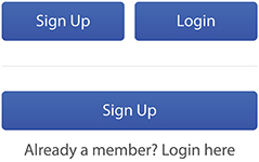
When researchers are in the field, they need quick access to their data without having to navigate through the app. So, rather than keep the hero image at the top of the home screen, we’re moving it down in favor of a “Recent Projects” list at the top. Users can still see this important information, but their reports are more easily available to them because that’s their primary use of the app after they’ve already accessed the projects. |
Simplified, usability is about two things: common sense and research. When you’re first beginning a project, you may not have much to work with as far as data or user observation. You really have no choice but to make your best guess about what will work for the user. As a usability expert, you have experience designing interfaces, so you’re able to make informed assumptions based on what you believe will create the simplest experience. This is where common sense comes to play. There really is no reason to overthink it. Create the easiest solution you can think of. Do what makes sense and move on.
Of course, what you think makes sense and what a user does are quite often two different things. That’s why we have research. After we’ve made some informed guesses, we need to test our ideas by using real people. We aren’t doing user experience design if we haven’t actually seen a user experience it. Research can take many forms, but the most common tools are either analytics or a usability study. We will talk more about this in Chapter 7, but let me say here that the challenge with analytics is that it can only tell us what the users did. It cannot tell us why they did it. The only way to actually know how your decisions affect users is to observe them. So make your best guess with the data you have, but then verify your designs with real people and make notes. You’ll always be surprised by the results, and you’ll be in a much better position to defend your decisions.
GET SUPPORT
It’s not enough to solve problems and make our app easy to use, because if a stakeholder disagrees with our solution, we aren’t going to get anywhere at all. You could have the most innovative design in the world, but if no one on your team understands what you’re trying to do, you’re not going to be successful at implementing it.
What happens if you don’t get support? You’ll constantly rehash the same conversations over and over again. When people don’t remember why you did what you did (because your explanation wasn’t compelling or memorable), they’ll bring it up again at the next meeting. “Now, why did we agree to do this again?” When people aren’t convinced that you’re right, they’ll continue to think of alternatives to suggest. The project scope will increase over time as people propose adding more things: a simple control, one more button, a new menu. As a result, you won’t be able to move as fast as you need to because you’ll be bogged down managing requests. In the end, you might have to ship a product with a compromised user experience, all because you couldn’t get stakeholders on board with your solution.
Getting the support of everyone on your team is the primary focus of this book. We aren’t going to be able to get anywhere unless we’re able to get everyone on the same page and agree to move in the right direction. That’s what getting support is all about: convincing people that the way we’ve solved the problem will make it easy for our users and is, therefore, the best possible choice for a great user experience. You need to create an environment where everyone understands what you’re doing so that you can move on to the next thing.
To gain the support we need, we have to understand our designs by asking ourselves, “Why is this better than the alternative?” Implicit in this question is that we know what the alternatives are, we’ve considered them or even tried them, and we’re prepared to explain why our solution is better.
Everything we design has another way of doing it. For each design we create, there is an alternate, often opposing, way of solving the same problem. This is the reason why we have disagreements about the solutions to begin with and a key problem with articulating design decisions. Designers can be really good at coming up with a solution for the problem, but we’re less adept at coming up with all of the solutions to the problem. We become so myopic when we think we’ve found it. Eureka! Our solution seems so obvious that there is very little need to waste time considering any other approach. (After all, we’re on a tight sprint and need to get something to the client by the end of the day.) Yet, this thinking almost always creates a conversation that we’re not prepared to deal with: when the client suggests an alternate idea that we haven’t considered.
Ironically, we are usually cognitively aware of some of the other alternatives. We probably tried them, moved stuff around, and eventually landed on the solution we believe is best. But it’s all those little movements that we failed to make ourselves consciously aware of, and so we’re less prepared to help other people understand our thought process. Likewise, we often know what our clients are going suggest. If you’ve worked with your stakeholders before, you can make a pretty good guess about how they’ll react (this is addressed at length in Chapter 4). Yet if you can guess how they’ll react but you fail to consider those alternatives and understand why your solution is better, you will have a difficult time winning them over.
The point is this: be consciously aware of why your design decisions are better than the alternatives. Just like the previous two questions, write down your answers. Make a list of the other ways that you could solve this problem. Create a bunch of alternative designs, don’t throw them away, and have them available if you need them. With those alternatives, make a short list of why you think they don’t solve the problem as well as your proposed design. Thinking critically about these other options will help you to be prepared to discuss your decisions with other people.
Sometimes, I create very simple wireframes of the alternatives in addition to my recommendation. When the client begins asking questions about my proposed solution, I can quickly show these to visually demonstrate why my recommendation is better.
MAKE IT HAPPEN
If we’re going to be successful at communicating with people about our designs, we must be able to answer these three questions about our work:
What problem does it solve?
How does it affect the user?
Why is it better than the alternative?
The purpose of answering these questions is more of an exercise in getting you to understand your choices than it is a prescriptive method for documenting them. Don’t worry too much about the details of how you write them down. If you can answer these three questions, you’ll be well on your way to defending your decisions with the people who have influence over your project. These answers will form the basis of your response to every stakeholder concern about your designs.
Your ability to be thoughtful about a problem and articulate any solution is more important than your ability to design the perfect solution every time. When other people realize that you’ve put thought into it and are being intentional, they’re more willing to trust you, even if they disagree. That’s how you become a great designer: by describing and expressing your designs to other people in way that makes sense to them.
In that sense, being a great designer is just as much about communication skills as it is about design chops. You need to understand your decisions and then articulate them to someone else who doesn’t know design as well as you do. Using these questions as our guide, you can find better ways to explain your design decisions for the purpose of convincing people you’re right and ensuring the best experience for users.
Even though it’s easy to see exactly how being more articulate will help us succeed, in practice it’s far more difficult and complicated than that. Being articulate is more than just learning to say the right things, because nothing we say will have any affect if we don’t first consider our audience. Recognizing the importance of communication in design makes it natural for us to take the next step on this path toward being a great designer: to begin seeing things from the perspective of our stakeholders.