
Chapter 8. Text Visualization
Machine learning is often associated with the automation of decision making, but in practice, the process of constructing a predictive model generally requires a human in the loop. While computers are good at fast, accurate numerical computation, humans are instinctively and instantly able to identify patterns. The bridge between these two necessary skill sets lies in visualization—the precise and accurate rendering of data by a computer in visual terms and the immediate assignation of meaning to that data by humans.
In Chapters 5 and 6 we examined several practical examples of applied machine learning models. Yet in the execution of these examples, we observed that the integration of machine learning is often not as straightforward as merely fitting a model. For one thing, the first model is rarely optimal, meaning that an iterative process of model fitting, evaluation, and tuning is frequently necessary.
Moreover, the evaluation, steering, and presentation of results from applied text analytics is significantly less straightforward than with numeric data. What is the best way to find the most informative features when features can be words, word fragments, or phrases? How do we know which classification model is best suited to our corpus? How can we know when we have selected the best value for k in a k-means clustering model?
It is these types of questions, coupled with our need to iterate toward an optimal, deployable solution as efficiently as possible, that have led us to adopt the model selection triple workflow as described in “The model selection triple”. In this chapter, we’ll see how visual diagnostics extends this workflow with visual mechanisms to diagnose problems or to more easily qualify models with respect to each other. We’ll explore a set of visual tools that can be useful in steering machine learning models, enabling more effective interventions in the modeling process led by our own innate abilities to see patterns in pictures.
We’ll begin by building a variety of feature analysis and engineering techniques for text, from n-gram time series plots to stochastic neighbor embeddings. We’ll then move toward visual analysis of text models and diagnostic tools for detecting model error, such as confusion matrices and class prediction error plots. Finally, we’ll explore some visual methods for engaging in hyperparameter optimization to steer models toward higher performance.
Visualizing Feature Space
Within traditional numeric prediction pipelines, feature engineering, model evaluation, and tuning can be done in a fairly straightforward fashion. In low-dimensional space, we can identify a dataset’s most informative features by fitting a model and computing how much of the observed variance is explained by each feature; such results can be visualized using bar charts or two-dimensional pairwise correlation heatmaps.
Visualizing feature space is not as easy when our data is text. This is in part because visualizing high-dimensional data is inherently more difficult, but also because visualizing text data in Python requires additional hoop-jumping compared to plotting purely numeric data. In this section, we’ll explore a range of Matplotlib visualization routines we have found useful for feature analysis and feature engineering.
Visual Feature Analysis
In essence, feature analysis is the process by which we go about getting to know our data. With low-dimensional numeric data, the visual feature analysis techniques we might use would include box plots and violin plots, histograms, scatterplot matrices, radial visualizations, and parallel coordinates. Unfortunately, the high dimensionality of text data makes these techniques not only inconvenient, but also not always especially relevant.
In the context of text data, feature analysis amounts to building an understanding of what is in the corpus. For instance, how long are our documents and how big is our vocabulary? What patterns or combinations of n-grams tell us the most about our documents? For that matter, how grammatical is our text? Is it highly technical, composed of many domain-specific compound noun phrases? Has it been translated from another language? Is punctuation used in a predictable way?
These are the kinds of questions that enable us to begin forming sound hypotheses that will set us up for effective experimentation and efficient prototyping. In this section, we’ll see a few specialized feature analysis techniques that are particularly well suited to text data: n-gram time series, network analyses, and projection plots.
n-gram viewer
In Chapter 7 we performed grammar-based feature extraction, aiming to identify significant patterns of tokens across many documents. In practice, we will have a much easier time steering this phase of the workflow if we can visually explore the frequency of combinations of tokens as a function of time. In this section, we’ll illustrate how to create an n-gram viewer to support this kind of feature analysis.
Warning
While the corpus readers we constructed in Chapters 3 and 4 did not have a dates method, this visualizer requires us to add some mechanism of mapping the timestamp of a document to its corresponding fileid.
Let’s assume that the corpus data has been formatted as a dictionary where keys are corpus tokens and the values are (token count, document datetime stamp) tuples. Assume that we also have a comma-separated list, terms, with strings that correspond to the n-grams we would like to plot as a time series.
In order to explore n-grams over time, we begin by initializing a Matplotlib figure and axes, with the width and height dimensions specified in inches. For each term in our term list, we will plot the count of the target n-gram as the x-value and the datetime stamp of the document in which the term appeared as the y-value. We add a title to the plot, a color-coded legend, and labels for the y- and x-axes. We can also specify a particular date range to allow for zoom-and-filter functionality:
fig,ax=plt.subplots(figsize=(9,6))forterminterms:data[term].plot(ax=ax)ax.set_title("Token Frequency over Time")ax.set_ylabel("word count")ax.set_xlabel("publication date")ax.set_xlim(("2016-02-29","2016-05-25"))ax.legend()plt.show()
The resulting plot, an example of which is shown in Figure 8-1, shows the frequency of mentions of political candidates (here represented by their unigrams) across news articles leading up to an election.

Figure 8-1. n-gram viewer displays token frequency over time
As such, time series plots can be a useful way to explore and compare the occurrences of n-grams in our corpus over time.
Network visualization
In practice, network visualizations are the current state of the art for text, as shown by the predominance of network style visualizations in a recent survey of text visualization.1 This is because networks visually encode complex relationships that can only otherwise be expressed through natural language. They are particularly popular for social network analysis. Such graphs can be useful to illustrate relationships between entities, documents, and even concepts within a corpus, which we will explore more fully in Chapter 9. In this section, we’ll create a plot that represents The Wizard of Oz by L. Frank Baum as a social network, where characters are nodes and their relationships are illustrated with edges that are shorter the closer their connection.
Note
In this section, we’ll build a force-directed graph modeled on Mike Bostock’s Les Misérables character co-occurrence network.2 While such graphs are easier to render with D3 and other JavaScript frameworks, we will illustrate building them in Python using Matplotlib and NetworkX.
For our graph, we’re using a postprocessed version of the Gutenberg edition stored in a JSON file that contains a dictionary with two items: first, a list of character names reverse-sorted by their frequency in the text, and second, a dictionary of chapters represented with {chapter heading: chapter text} key-value pairs. For simplicity, double newlines have been removed from the chapters (so each appears as a single paragraph), and all double quotation marks within the text (e.g., dialogue) have been converted to single quotes.
Since we will be representing the Oz characters as nodes in the graph, we need to establish the linkages between nodes. We can write a cooccurrence function that scans through each chapter, and for every possible pair of characters, checks how often both appear together. We initialize a dictionary with keys for each possible pair, then for each chapter, we use NLTK’s sent_tokenize method to parse the text into sentences, and for each sentence that contains both characters’ names, we increment the dictionary value by one:
importitertoolsfromnltkimportsent_tokenizedefcooccurrence(text,cast):"""Takes as input text, a dict of chapter {headings: text},and cast, a comma separated list of character names.Returns a dictionary of cooccurrence counts for eachpossible pair."""possible_pairs=list(itertools.combinations(cast,2))cooccurring=dict.fromkeys(possible_pairs,0)fortitle,chapterintext['chapters'].items():forsentinsent_tokenize(chapter):forpairinpossible_pairs:ifpair[0]insentandpair[1]insent:cooccurring[pair]+=1returncooccurring
Next, we’ll open our JSON file, load the text, extract the list of characters, and initialize a NetworkX graph. For each pair generated by our cooccurrence function with a nonzero value, we’ll add an edge that stores the co-occurrence count as a property. We’ll then perform an ego_graph extraction on the graph that sets Dorothy as the center. We use a spring_layout to push nodes away from her in inverse proportion to their shared edge weight, specifying the desired distance between nodes using the k parameter (to avoid a hairball), and the number of iterations of spring-force relaxation with the iterations parameter. Finally, we use NetworkX’s draw method to generate a Matplotlib figure with the desired node and edge colors and sizes, specifying that the node labels (the character names) be shown in a font that will be big enough to read:
importjsonimportcodecsimportnetworkxasnximportmatplotlib.pyplotaspltwithcodecs.open('oz.json','r','utf-8-sig')asdata:text=json.load(data)cast=text['cast']G=nx.Graph()G.name="The Social Network of Oz"pairs=cooccurrence(text,cast)forpair,wgtinpairs.items():ifwgt>0:G.add_edge(pair[0],pair[1],weight=wgt)# Make Dorothy the centerD=nx.ego_graph(G,"Dorothy")edges,weights=zip(*nx.get_edge_attributes(D,"weight").items())# Push nodes away that are less related to Dorothypos=nx.spring_layout(D,k=.5,iterations=40)nx.draw(D,pos,node_color="gold",node_size=50,edgelist=edges,width=.5,edge_color="orange",with_labels=True,font_size=12)plt.show()
The resulting plot shown in Figure 8-2 very effectively illustrates Dorothy’s relationships in the book; the nodes closest to her include her closest allies—her dog, Toto, the Scarecrow, and the Tin Woodman, while those on the outer edges are characters with whom Dorothy interacts the least. The social graph also shows Dorothy’s close promixity to Oz and the Wicked Witch, both of whom she has significant, albeit more complex, relationships.
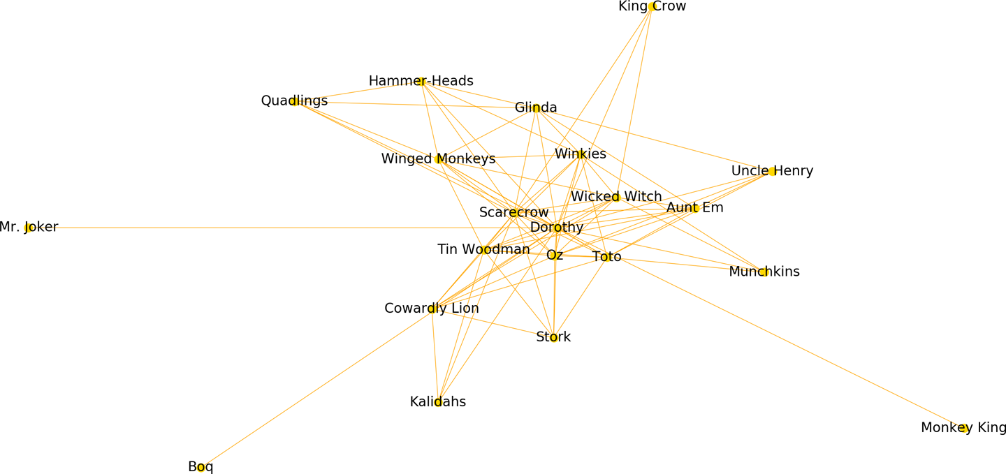
Figure 8-2. Force-directed ego graph for the Wizard of Oz
Note
The construction and utility of property graphs as well as NetworkX’s add_edge, ego_graph and draw methods will be discussed in greater detail in Chapter 9.
Co-occurrence plots
Co-occurrence is another way to quickly understand relationships between entities or other n-grams, in terms of the frequency with which they appear together. In this section we’ll use Matplotlib to plot character co-occurrences in The Wizard of Oz.
First, we create a function matrix that will take in the text of the book and the list of characters. We initialize a multidimensional array that will be a list that contains a list for every character with the count of its co-occurrences with every other character:
fromnltkimportsent_tokenizedefmatrix(text,cast):mtx=[]forfirstincast:row=[]forsecondincast:count=0fortitle,chapterintext['chapters'].items():forsentinsent_tokenize(chapter):iffirstinsentandsecondinsent:count+=1row.append(count)mtx.append(row)returnmtx
We can now plot our matrix. To approximate the D3 plots, we want to plot two co-occurrence matrices side by side; one with the characters ordered alphabetically and one where they are ordered by overall frequency in the text. We’ll initialize a figure and axes, add a title and increase the default whitespace between the subplots to ensure there will be room for the characters names, and create enough x- and y-tick marks to correspond to every character.
We can then specify the modifications we’ll be making to the first plot by referencing its index (121)—the number of rows (1), the number of columns (2), and the plot number (1) of the target subplot. We can then set the x- and y-tick marks and label the marks with the characters’ names, reducing the default font size and rotating the labels by 90 degrees to ensure they will be easy to read. We’ll specify that the x-ticks should appear on the top and add a label to our first axes plot. Finally, we’ll call the imshow method to produce a heatmap with the interpolation parameter, specifying a yellow, orange, and brown colormap and using the lognorm of the frequency of each co-occurrence to ensure that very rare co-occurrences will not be too light to show up:
...# First make the matrices# By frequencymtx=matrix(text,cast)# Now create the plotsfig,ax=plt.subplots()fig.suptitle('Character Co-occurrence in the Wizard of Oz',fontsize=12)fig.subplots_adjust(wspace=.75)n=len(cast)x_tick_marks=np.arange(n)y_tick_marks=np.arange(n)ax1=plt.subplot(121)ax1.set_xticks(x_tick_marks)ax1.set_yticks(y_tick_marks)ax1.set_xticklabels(cast,fontsize=8,rotation=90)ax1.set_yticklabels(cast,fontsize=8)ax1.xaxis.tick_top()ax1.set_xlabel("By Frequency")plt.imshow(mtx,norm=matplotlib.colors.LogNorm(),interpolation='nearest',cmap='YlOrBr')
To create the alphabetic view of the co-occurrence plot, we begin by alphabetizing the list of characters and specifying that we want to work with the second subplot, (122), and add the axes elements much in the same way as for the first subplot:
...# And alphabeticallyalpha_cast=sorted(cast)alpha_mtx=matrix(text,alpha_cast)ax2=plt.subplot(122)ax2.set_xticks(x_tick_marks)ax2.set_yticks(y_tick_marks)ax2.set_xticklabels(alpha_cast,fontsize=8,rotation=90)ax2.set_yticklabels(alpha_cast,fontsize=8)ax2.xaxis.tick_top()ax2.set_xlabel("Alphabetically")plt.imshow(alpha_mtx,norm=matplotlib.colors.LogNorm(),interpolation='nearest',cmap='YlOrBr')plt.show()
As with the network graph, the representation is only an approximation, as we are simply looking at the cast as though they are strings of characters, when in reality there are multiple ways in which characters can manifest (“Dorothy” and “the girl from Kansas,” “Toto,” and “her little dog, too”). Nonetheless, the resulting plot, shown in Figure 8-3, tells us a great deal about which characters interact the most within the text.

Figure 8-3. Character co-occurrences in the Wizard of Oz
Text x-rays and dispersion plots
While the network and co-occurrence plots do begin to elucidate the relationships between entities in a text (or characters in a plot), as well as which entities play some of the most important roles, they do not reflect very much about their various roles in the narrative. For this, we require something akin to Jeff Clark3 and Trevor Stephen’s4 dispersion plots.
A dispersion plot provides a kind of “x-ray” of the text, plotting each character name along the y-axis and having the narrative plotted along the x-axis, such that a horizontal line can be added next to each character at the points in which he or she appears in the plot.
We can recreate a dispersion plot in Matplotlib using our Wizard of Oz text as follows. First, we need a list of oz_words of every word in the text in the order it occurs. We will also keep track of the lengths and headings of each chapter, so that we can later plot these along the x-axis to show where chapters begin and end:
...fromnltkimportword_tokenize,sent_tokenize# Plot mentions of characters through chaptersoz_words=[]headings=[]chap_lens=[]forheading,chapterintext['chapters'].items():# Collect the chapter headingsheadings.append(heading)forsentinsent_tokenize(chapter):forwordinword_tokenize(sent):# Collect all of the wordsoz_words.append(word)# Record the word lengths at each chapterchap_lens.append(len(oz_words))# Mark where chapters startchap_starts=[0]+chap_lens[:-1]# Combine with chapter headingschap_marks=list(zip(chap_starts,headings))
Now we want to search through the list of oz_words to look for places where the characters appear, adding these to a list of points for plotting. In our case, some of our characters have one-word names (e.g., “Dorothy,” “Scarecrow,” “Glinda”), while others have two-word names (“Cowardly Lion,” “Monkey King”). To ensure we match types of strings, we’ll first catalog the one-word name matches, checking for each word in the text to see if it matches a name, and then we’ll look for the two-name characters by looking at each word together with its preceding word:
...cast.reverse()points=[]# Add a point for each time a character appearsforyinrange(len(cast)):forxinrange(len(oz_words)):# Some characters have 1-word namesiflen(cast[y].split())==1:ifcast[y]==oz_words[x]:points.append((x,y))# Some characters have 2-word nameselse:ifcast[y]==' '.join((oz_words[x-1],oz_words[x])):points.append((x,y))ifpoints:x,y=list(zip(*points))else:x=y=()
We will create a figure and axes, specifying a much wider x-axis than the default to ensure the plot will be easy to read. We will also add vertical lines to label the start of each chapter, and plot the names of each chapter as labels, adjusting them so that they will appear slightly below the axis, with a smaller font and a 90-degree rotation. We’ll then plot our x and y points and modify the tick_params to turn off the default bottom ticks and labels. Then we add ticks along the y-axis for every character and label them with the character names, and finally, add a title:
...# Create the plotfig,ax=plt.subplots(figsize=(12,6))# Add vertical lines labeled for each chapter startforchapinchap_marks:plt.axvline(x=chap[0],linestyle='-',color='gainsboro')plt.text(chap[0],-2,chap[1],size=6,rotation=90)# Plot the character mentionsplt.plot(x,y,"|",color="darkorange",scalex=.1)plt.tick_params(axis='x',which='both',bottom='off',labelbottom='off')plt.yticks(list(range(len(cast))),cast,size=8)plt.ylim(-1,len(cast))plt.title("Character Mentions in the Wizard of Oz")plt.show()
The resulting plot, shown in Figure 8-4, provides a mini-map of the overall narrative of the text. Such a view not only enables us to see where certain characters (or, more generally, n-grams) enter and exit the story; it also emphasizes those characters who play a central role throughout the narrative, and even highlights some areas of interest in the text (e.g., those in which many characters are engaged simultaneously, or in which the cast shifts suddenly).
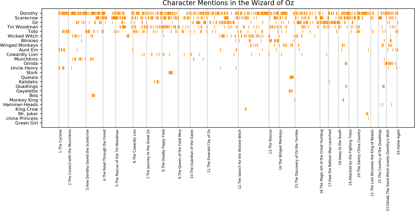
Figure 8-4. Dispersion plot of character mentions in the Wizard of Oz
Guided Feature Engineering
Once we have a more confident grasp on the raw content of our corpus, we must engineer the smallest and most predictive feature set for use in modeling. This engineered feature set must be as small as possible because each new dimension will inject noise and makes the decision space more difficult to model.
With text data, we need creative ways to dramatically reduce the dimensionality without sacrificing too much signal. Options such as Principal Component Analysis and linear discriminant analysis (and Doc2Vec in the case of text data) are all effective ways of compressing the dimensionality of the original data. However, these techniques can present problems later on if user stories require us to be able to retrieve the original features (e.g., the specific terms and phrases that make two documents similar).
In this section, we’ll see a few visual techniques for steering feature engineering that we find are particularly well suited to text data: visual part-of-speech tagging and frequency distributions.
Part-of-speech tagging
As we learned in Chapter 3, parts of speech (e.g., verbs, nouns, prepositions, adjectives) indicate how a word is functioning within the context of a sentence. In English, as in many other languages, a single word can function in multiple ways, and we would like to be able to distinguish those uses (e.g., the words “ship” and “shop” can function as either verbs or nouns, depending on the context). Part-of-speech tagging lets us encode information not only about a word’s definition, but also its use in context.
In Chapter 7, we used the part-of-speech tags together with a grammar to perform keyphrase extraction. One of the challenges of this kind of feature engineering is that it can be very difficult to know a priori which grammar to use to find significant keyphrases. Generally, our strategy is to use heuristics and experimentation until we land on a regular expression that does a good job at capturing the high-signal keyphrases. This strategy actually works quite well with grammatical English text. But what if the text with which we are working is ungrammatical, or rife with spelling and punctuation errors? In these cases, our out-of-the-box part-of-speech tagger may do more harm than good.
Consider if the text we are using does not encode the meaningful keyphrases according to the adjective-noun pattern? For example, there are numerous cases where the salient information could be captured not in the adjective phrases but instead in verbal or adverbial phrases, or in the proper nouns. In this case, even if our part-of-speech tagger is working properly and our keyphrase chunker looks something like…
grammar=r'KT: {(<JJ>* <NN.*>+ <IN>)? <JJ>* <NN.*>+}'chunker=nltk.chunk.regexp.RegexpParser(grammar)
…we might indeed fail to capture the signal in our corpus!
It would be helpful to be able first to visually explore the parts-of-speech in a text before proceeding on to normalization, vectorization, and modeling (or perhaps as a diagnostic tool for understanding disappointing modeling results). For example, discovering that a large percentage of our text is not being labeled (or is being mislabeled) by our part-of-speech tagger might lead us to train our own regular expression–based tagger using our particular corpus. Alternatively, it might impact the way in which we choose to normalize our text (e.g., if there were many meaningful variations in the ways a certain root word was appearing, it might lead us to choose lemmatization over stemming, in spite of the increased computation time).
The Yellowbrick library offers a feature that enables the user to print out colorized text that illustrates different parts of speech. A PosTagVisualizer colorizes text to enable the user to visualize the proportions of nouns, verbs, etc., and to use this information to make decisions about part-of-speech tagging, text normalization (e.g., stemming versus lemmatization), and vectorization.
The transform method transforms the raw text input for the part-of-speech tagging visualization. Note that it requires that documents be in the form of (tag, token) tuples:
fromnltkimportpos_tag,word_tokenizefromyellowbrick.text.postagimportPosTagVisualizerpie="""In a small saucepan, combine sugar and eggsuntil well blended. Cook over low heat, stirringconstantly, until mixture reaches 160° and coatsthe back of a metal spoon. Remove from the heat.Stir in chocolate and vanilla until smooth. Coolto lukewarm (90°), stirring occasionally. In a smallbowl, cream butter until light and fluffy. Add cooledchocolate mixture; beat on high speed for 5 minutesor until light and fluffy. In another large bowl,beat cream until it begins to thicken. Addconfectioners' sugar; beat until stiff peaks form.Fold into chocolate mixture. Pour into crust. Chillfor at least 6 hours before serving. Garnish withwhipped cream and chocolate curls if desired."""tokens=word_tokenize(pie)tagged=pos_tag(tokens)visualizer=PosTagVisualizer()visualizer.transform(tagged)(' '.join((visualizer.colorize(token,color)forcolor,tokeninvisualizer.tagged)))('')
This code produces the results shown in Figure 8-5, when executed either in the command line or within a Jupyter Notebook.

Figure 8-5. Part-of-speech tagged recipe
We can see from Figure 8-5 that the part-of-speech tagging has performed moderately well on the cookbook text, with only a few places where the tagger failed to tag or mistagged. However, we can see in the following example that the basic NLTK part-of-speech tagger does not perform equally well in all domains, such as in nursery rhymes (Figure 8-6).

Figure 8-6. Part-of-speech tagged nursery rhyme
Visual part-of-speech tagging can thus be used by the user as a tool for evaluating the efficacy of different preprocessing tasks (as described in Chapter 3) as well as for feature engineering and model diagnostics.
Most informative features
Identifying the most informative (i.e., predictive) features from a dataset is a key part of the model selection triple. Yet the techniques with which we are most familiar from numeric modeling (e.g., L1 and L2 regularization, Scikit-Learn utilities like select_from_model, etc.) are often less helpful when our data is comprised of text and our features are tokens or other linguistic characteristics. Once the data has been vectorized as in Chapter 4, the encoding makes it difficult to extract insights while keeping a natural narrative intact.
One method for visually exploring text is with frequency distributions. In the context of a text corpus, a frequency distribution tells us the prevalence of a vocabulary item or token.
In the next few examples, we’ll use Yellowbrick to visually explore the “hobbies” subcorpus of Baleen, which can be downloaded along with the rest of Yellowbrick’s datasets.
Once we have our hobbies corpus loaded, we can use Yellowbrick to produce a frequency distribution to explore the vocabulary. NLTK also offers frequency distribution plots that show the top 50 tokens, but we’ll use Yellowbrick here so that we can leverage its consistent API throughout a few examples. Note that neither the NLTK FreqDist method nor the Yellowbrick FreqDistVisualizer perform any normalization or vectorization on our behalf; both expect text that has already been count-vectorized.
We first instantiate a FreqDistVisualizer object and then call fit() on that object with the count vectorized documents and the features (i.e., the words from the corpus), which computes the frequency distribution. The visualizer then plots a bar chart of the top most frequent terms in the corpus (50 by default, but can be adjusted using the N parameter), with the terms listed along the x-axis and frequency counts depicted at y-axis values. We can then generate the finalized visualization by invoking Yellowbrick’s poof() method:
fromyellowbrick.text.freqdistimportFreqDistVisualizerfromsklearn.feature_extraction.textimportCountVectorizervectorizer=CountVectorizer()docs=vectorizer.fit_transform(corpus.data)features=vectorizer.get_feature_names()visualizer=FreqDistVisualizer(features=features)visualizer.fit(docs)visualizer.poof()
In Figure 8-7, we can see the 50 most frequently occurring terms from the hobbies corpus. However, when we look at the words along the x-axis, we see that most of the terms are not particularly interesting (e.g., “the,” “and,” “to,” “that,” “of,” “it”). Thus, while these are the most common terms, they likely aren’t the most informative features.

Figure 8-7. Frequency distribution of the Baleen corpus
In Chapter 4, we explored stopwords removal as a method for dimensionality reduction, and a means for arriving at the features that most likely encode salient information; here we’ll use a frequency distribution to visualize the impact of removing the most common English words from our corpus, passing the stop_words parameter into Scikit-Learn’s CountVectorizer in advance of fit_transform:
vectorizer=CountVectorizer(stop_words='english')docs=vectorizer.fit_transform(corpus.data)features=vectorizer.get_feature_names()visualizer=FreqDistVisualizer(features=features)visualizer.fit(docs)visualizer.poof()
As we can see in Figure 8-8, now that the stopwords have been removed, the remaining features are somewhat more interesting (e.g., “game,” “season,” “team,” “world,” “film,” “book,” “week”). However, the diffuseness of the data is also evident. In Chapter 1 we learned that building language-aware data products relies on a domain-specific corpus rather than a generic one. What we need to determine now is whether the hobbies corpus is sufficiently domain specific to be modeled. We can continue to use frequency distribution plots to search within our corpus for more tightly focused subtopics and other patterns.

Figure 8-8. Frequency distribution of the Baleen corpus after stopwords removal
The hobbies corpus that comes with Yellowbrick has already been categorized (try corpus['categories']). Frequency distribution plots for two of the categories, “cooking” and “gaming,” with stopwords removed are shown in Figures 8-9 and 8-10, respectively.

Figure 8-9. Frequency distribution for the cooking subcorpus

Figure 8-10. Frequency distribution for the gaming subcorpus
We can visually compare these plots, and instantly see how different they are; the most common words from the cooking corpus include “pasta,” “pan,” “broccoli,” and “pepper,” while the gaming corpus includes tokens like “players,” “developers,” “character,” and “support.”
Model Diagnostics
After feature analysis and engineering, the next phase of the model selection triple workflow is model selection. In practice, we will select and compare multiple models, since it is generally very difficult to predict in advance which model will be most effective with a new corpus. Thus, our next task is to determine when our models are performing well or poorly.
In a traditional machine learning context, we can rely on model performance scores—such as mean square error or coefficient of determination in the case of regression, and precision, accuracy, and F1 score for classification—to determine which models are strongest. These techniques can also be extended to the context of visual analytics. Regression problems are less common with text data, though we will see an example in Chapter 12, when we attempt to predict the floating-point scores of albums based purely on the text of their reviews. As discussed in Chapters 5 and 6, classification and clustering are more common learning approaches for text corpora, and in this section we will take a look at a few techniques for model evaluation in these contexts.
Visualizing Clusters
Model evaluation is not nearly as straightforward when it comes to clustering algorithms as it is in supervised learning problems, when we have the advantage of knowing the right and wrong answers a priori. With clustering, there is really no numeric score; instead, the relative success of a model is generally a function of how effectively it finds patterns that are distinguishable and meaningful to a human. For this reason, visualization becomes increasingly important.
Just as we looked for small-scale indications of separability and diffuseness using our frequency distribution plots, we should also investigate the degree of document similarity across all features. One very popular method for doing so is to use the nonlinear dimensionality reduction method t-distributed stochastic neighbor embedding, or t-SNE.
Scikit-Learn implements the t-SNE decomposition method as the sklearn.manifold.TSNE transformer. By decomposing high-dimensional document vectors into two dimensions using probability distributions from both the original dimensionality and the decomposed dimensionality, t-SNE is able to effectively cluster similar documents. By decomposing to two or three dimensions, the documents can be visualized with a scatterplot.
Unfortunately, t-SNE is very computationally expensive, so typically a simpler decomposition method such as SVD or PCA is applied ahead of time. The Yellowbrick library exposes a TSNEVisualizer, which creates an inner transformer pipeline that applies such a decomposition first (SVD with 50 components by default), then performs the t-SNE embedding. The TSNEVisualizer expects document vectors, so we will use the TfidfVectorizer from Scikit-Learn in advance of passing the documents into the TSNEVisualizer fit method:
fromyellowbrick.textimportTSNEVisualizerfromsklearn.feature_extraction.textimportTfidfVectorizertfidf=TfidfVectorizer()docs=tfidf.fit_transform(corpus.data)tsne=TSNEVisualizer()tsne.fit(docs)tsne.poof()
What we’re looking for in such graphs are spatial similarities between the points (documents) and any other discernible patterns. Figure 8-11 displays a projection of the vectorized Baleen hobbies corpus in two dimensions using t-SNE. The result is a scatterplot of the vectorized corpus, where each point represents a document or utterance. The distance between two points in the visual space is embedded using the probability distribution of pairwise similarities in the higher dimensionality; thus our TSNEVisualizer shows clusters of similar documents in the hobbies corpus and the relationships between groups of documents.

Figure 8-11. A t-distributed stochastic neighbor embedding visualization of the Baleen hobbies corpus
As mentioned before, the TSNEVisualizer expects vectorized text as input, and in this case, we have used TF–IDF, though we could have used any of the vectorization techniques described in Chapter 4 and then generated t-SNE visualization to compare the results. To speed the rendering, the TSNEVisualizer also employs decomposition ahead of the stochastic neighbor embedding, defaulting to using a sparse method (TruncatedSVD); we might also experiment with a dense method like PCA, which we can do by passing decompose = "pca" into TSNEVisualizer() upon initialization.
When used in conjunction with a clustering algorithm, TSNEVisualizer can also be used for visualizing clusters. Used this way, the technique can help to assess the efficacy of one clustering method over another. Here, we’ll use sklearn.cluster.KMeans, set the number of clusters to 5, and then pass the resulting cluster.labels_ attribute as y into the TSNEVisualizer fit() method:
# Apply clustering instead of class names.fromsklearn.clusterimportKMeansclusters=KMeans(n_clusters=5)clusters.fit(docs)tsne=TSNEVisualizer()tsne.fit(docs,["c{}".format(c)forcinclusters.labels_])tsne.poof()
Now, not only are all points in the same cluster grouped together, the points are also colored based on k-means similarity (Figure 8-12). We could experiment with different clustering methods here, or with different values of k, which we’ll explore more fully later in the section on hyperparameter tuning.

Figure 8-12. A t-SNE visualization of the Baleen hobbies corpus after k-means clustering
Visualizing Classes
For classification problems, we can simply provide a target value (stored in corpus.target here) to our TSNEVisualizer to produce a version of the graph where the colors of points are associated with the categorical labels corresponding to the documents. By specifying these labels as an argument for the classes when we call fit() on our t-SNE visualizer, we can colorize our dimensionality-reduced points with respect to their category:
fromyellowbrick.textimportTSNEVisualizerfromsklearn.feature_extraction.textimportTfidfVectorizertfidf=TfidfVectorizer()docs=tfidf.fit_transform(corpus.data)labels=corpus.targettsne=TSNEVisualizer()tsne.fit(docs,labels)tsne.poof()
As we can see in the scatterplot in Figure 8-13, this view extends our neighbor embedding with more information about similarity, which can allow for better interpretation of our classes. If we were interested in exploring only a few of the categories within our corpus, this is as easy as passing in a classes parameter into the TSNEVisualizer upon instantiation, with a list of the strings representing the different subcategories (e.g., TSNEVisualizer(classes=['sports', 'cinema', 'gaming'])).
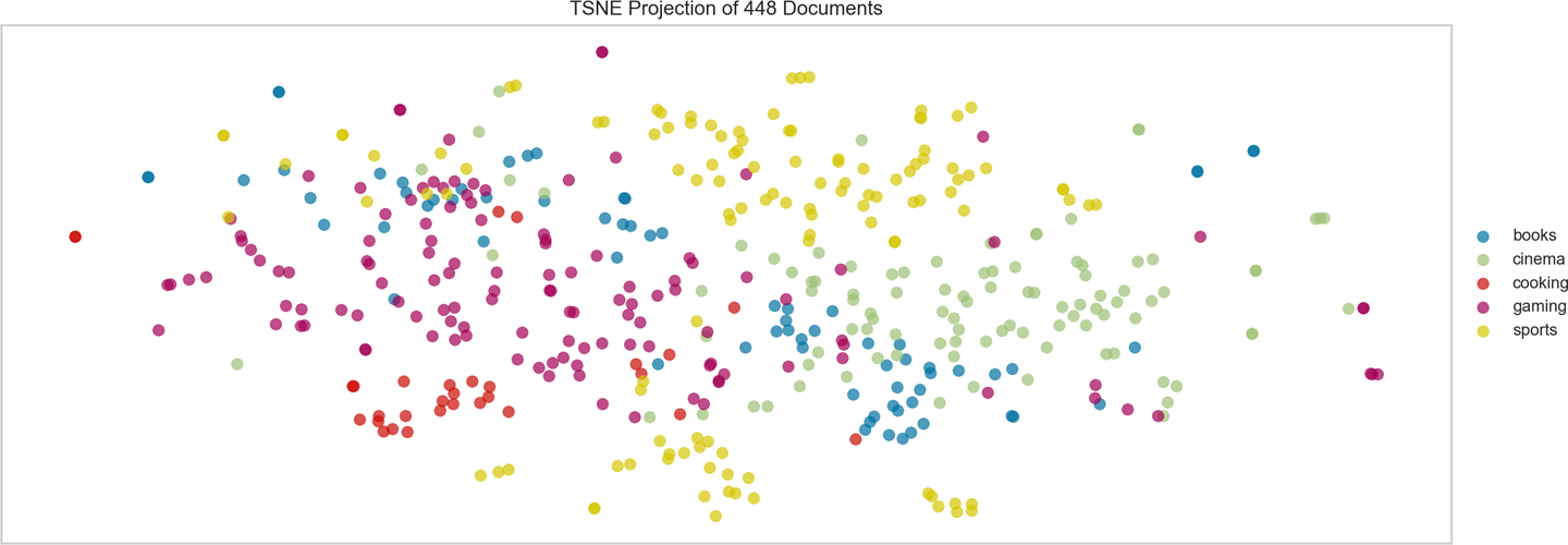
Figure 8-13. A t-distributed stochastic neighbor embedding visualization of the Baleen hobbies corpus with category labels
Visually iterating through these plots can enable us to see the categories whose documents are more tightly grouped, as well as those that are comparatively more diffuse, which might complicate the modeling process.
Diagnosing Classification Error
In traditional classification pipelines, fitted models can be optimized and then described with respect to their precision, recall, and F1 scores. We can visualize these measures using confusion matrices, classification heatmaps, and ROC-AUC curves.
In Chapter 5, we used cross-validation to test our models’ performance on different train and test splits within the corpus. We also created a method to test a number of different models, so that their results could be compared using classification reports and confusion matrices. We were able to use the metrics to identify which of our models performed best, but the metrics alone did not provide much insight into why a certain model (or train test split) performed the way it did.
In this section, we’ll explore two of our favorite techniques for visually analyzing and comparing the performance of classifiers on text: classification heatmaps and confusion matrices.
Classification report heatmaps
A classification report is a text summary of the main metrics for assessing the success of a classifier: precision, the ability not to label an instance positive that is actually negative; recall, the ability to find all positive instances; and f1 score, a weighted harmonic mean of precision and recall. While the Scikit-Learn metrics module does expose a classification_report method, we find that the Yellowbrick version, which integrates numerical scores with a color-coded heatmap, supports easier interpretation and problem detection.
To use Yellowbrick to create a classification heatmap, we load our corpus as in “Loading Yellowbrick Datasets”, TF–IDF vectorize the documents and create train and test splits. We then instantiate a ClassificationReport, pass in the desired classifier, and the names of the classes, the call fit and score, which call the internal Scikit-Learn fitting and scoring mechanisms for the model. Finally, we call poof on the visualizer, which adds the requisite labeling and coloring to the plot and then calls Matplotlib’s draw:
fromsklearn.naive_bayesimportGaussianNBfromsklearn.model_selectionimporttrain_test_splitfromyellowbrick.classifierimportClassificationReportcorpus=load_corpus('hobbies')docs=TfidfVectorizer().fit_transform(corpus.data)labels=corpus.targetX_train,X_test,y_train,y_test=train_test_split(docs.toarray(),labels,test_size=0.2)visualizer=ClassificationReport(GaussianNB(),classes=corpus.categories)visualizer.fit(X_train,y_train)visualizer.score(X_test,y_test)visualizer.poof()
The resulting classification heatmap, shown in Figure 8-14, displays the precision, recall, and F1 scores for the fitted model, where the darker zones show the model’s highest areas of performance. In this example, we see that the Gaussian model successfully classifies most of the categories, but struggles with false negatives for the “books” category.

Figure 8-14. Classification heatmap for Gaussian Naive Bayes classifier on the hobbies corpus
We can compare the Gaussian model to another model simply by importing a different Scikit-Learn classifier and passing it into the ClassificationReport on instantiation. By comparison, the SGDClassifier, shown in Figure 8-15, is less successful at classifying the hobbies corpus, struggling with false positives for “gaming” and false negatives for “books.”

Figure 8-15. Classification heatmap for stochastic gradient descent classifier on the hobbies corpus
Confusion matrices
A confusion matrix provides similar information as what is available in a classification report, but rather than top-level scores, it provides more detailed information.
In order to use Yellowbrick to create this type of visualization, we instantiate a ConfusionMatrix and pass in the desired classifier and the names of the classes, as we did with the ClassificationReport, and call the fit, score, poof sequence:
fromyellowbrick.classifierimportConfusionMatrixfromsklearn.linear_modelimportLogisticRegression...visualizer=ConfusionMatrix(LogisticRegression(),classes=corpus.categories)visualizer.fit(X_train,y_train)visualizer.score(X_test,y_test)visualizer.poof()
The resulting confusion matrix, shown in Figure 8-16, demonstrates which classes are most challenging for the model to identify. In this example, the LogisticRegression model is successful at identifying “sports” and “gaming,” but appears to struggle with the other categories.

Figure 8-16. Confusion matrix for logistic regression classifier on the hobbies corpus
We can compare the model’s performance by substituting a different model on instantiation of the ConfusionMatrix, just as we did for the ClassificationReport. By comparison, a MultinomialNB classifier, shown in Figure 8-17, seems to have similarly weak performance at classifying most of the hobby subcategories, and appears to frequently confuse the “books” and “gaming.”
Overall performance is highly context-dependent, and it is important to set application-specific benchmarks rather than relying on high-level metrics like F1 score to determine if a model is adequate for deployment. For instance, if our hypothetical application will depend on successfully identifying sports-related content, these models may be sufficient. If we’re intending to find book reviews, though, the consistently poor performance of these classifiers suggests we may need to revisit our original dataset.

Figure 8-17. Confusion matrix for multinomial Naive Bayes classifier on the hobbies corpus
Visual Steering
When we call fit on a Scikit-Learn estimator, the model learns the parameters of the algorithm that best fit the data it has been provided. However, some parameters are not directly learned within an estimator. These are the ones we provide on instantiation, the hyperparameters.
Hyperparameters are model-specific, but include things such as the amount of penalty to use for a regularization, the kernel function for a support vector machine, the number of leaves or depth of a decision tree, the number of neighbors used in a nearest neighbor classifier, or the number of clusters in k-means clustering.
Scikit-Learn models are often surprisingly successful with little to no modification of the default hyperparameters. Rather than a matter of luck, this is a signal of the substantial amount of experience and domain expertise that have been contributed to the library. Nonetheless, after we have arrived at the suite of models we find most successful for our problem, the next step of the process is to experiment with tuning the hyperparameters so that we can arrive at the most optimal settings for each model.
In this section, we will demonstrate how to explore hyperparameters visually, specifically to steer k-selection for k-means clustering problems.
Silhouette Scores and Elbow Curves
As we saw in Chapter 6, k-means is a simple unsupervised machine learning algorithm that groups data into a specified number k of clusters. Because the user must specify in advance what k to choose, the algorithm is somewhat naive—it assigns all members to k clusters whether or not it is the right k for the dataset. The Yellowbrick library provides two mechanisms for selecting an optimal k parameter for centroidal clustering, silhouette scores and elbow curves, which we’ll explore in this section.
Silhouette scores
The silhouette coefficient is used when the ground-truth about the dataset is unknown, instead computing the density of clusters produced by the model. A silhouette score can then be calculated by averaging the silhouette coefficient for each sample, computed as the difference between the average intracluster distance and the mean nearest-cluster distance for each sample, normalized by the maximum value.
This produces a score between 1 and -1, where 1 is highly dense clusters, -1 is completely incorrect clustering, and values near zero indicate overlapping clusters. The higher the score the better, because the clusters are denser and more separate. Negative values imply that samples have been assigned to the wrong cluster, and positive values mean that there are discrete clusters. The scores can then be plotted to display a measure of how close each point in one cluster is to points in the neighboring clusters.
The Yellowbrick SilhouetteVisualizer can be used to visualize the silhouette scores of each cluster in a single model. Because it is very difficult to score a clustering model, Yellowbrick visualizers wrap Scikit-Learn “clusterer” estimators via their fit() method. Once the clustering model is trained, the visualizer can call poof() to display the clustering evaluation metric. In order to create the visualization, we first train the clustering model, instantiate the visualizer, fit it on the corpus, and then call the visualizer’s poof() method:
fromsklearn.clusterimportKMeansfromyellowbrick.clusterimportSilhouetteVisualizer# Instantiate the clustering model and visualizervisualizer=SilhouetteVisualizer(KMeans(n_clusters=6))visualizer.fit(docs)visualizer.poof()
The SilhouetteVisualizer displays the silhouette coefficient for each sample on a per-cluster basis, visualizing which clusters are dense and which are not. The vertical thickness of the plotted cluster indicates its size, and the dashed red line is the global average. This is particularly useful for determining cluster imbalance, or for selecting a value for k by comparing multiple visualizers. We can see from Figure 8-18 that several clusters are vertically thick but low scoring, suggesting that we should pick a higher k.
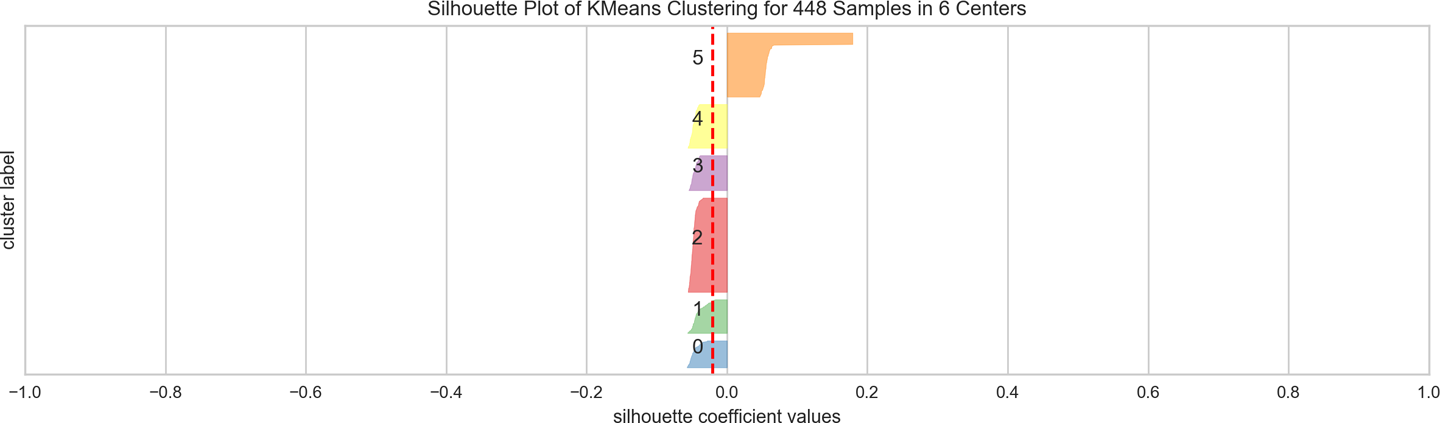
Figure 8-18. A visualization of the silhouette scores for k-means clustering
Elbow curves
Another visual technique that can be used for k selection is the elbow method. The elbow method visualizes multiple clustering models with different values for k. Model selection is based on whether or not there is an “elbow” in the curve (i.e., if the curve looks like an arm with a clear change in angle from one part of the curve to another).
In Yellowbrick, the KElbowVisualizer implements the elbow method of selecting the optimal number of clusters for k-means clustering. The user instantiates the visualizer, passing in the unfitted KMeans() model and a range of values for k (say, from 4 to 10). Then, when fit() is called on the model with the documents from the corpus (we assume below the corpus has already been TF–IDF vectorized), the elbow method runs k-means clustering on the dataset for each value of k and computes the silhouette_score, the mean silhouette coefficient for all samples. When poof() is called, the silhouette score for each k is plotted:
fromsklearn.clusterimportKMeansfromyellowbrick.clusterimportKElbowVisualizer# Instantiate the clustering model and visualizervisualizer=KElbowVisualizer(KMeans(),metric='silhouette',k=[4,10])visualizer.fit(docs)visualizer.poof()
If the line chart looks like an arm, then the “elbow” (the point of inflection on the curve) is the best value of k; we want as small a k as possible such that the clusters do not overlap. If the data isn’t very clustered, the elbow method may not always work well, resulting either in a smooth curve or a very jumpy line. Such results might lead us to use the SilhouetteScore visualizer instead, or to reconsider the partitive clustering approach for our data. While fairly jumpy, our plot in Figure 8-19 suggests that setting the number of clusters to 7 might improve the density and separability of our document clusters.

Figure 8-19. A visualization of the elbow curve for k-means clustering
Conclusion
Regardless of whether our data consists of numbers or text (or of image pixels or acoustic notes, for that matter), a single score, or even a single plot, is often insufficient to support the construction of model selection triples. For exploratory analysis, feature engineering, model selection, and evaluation, visualizations are very useful for diagnostic purposes. In combination with numeric scores, they can help build better intuition around performance. However, text data can present some special challenges for visualization, particularly with regards to dimensionality and interpretability.
In our experience, steering leads to better models (e.g., higher F1 scores, more distinct clusters, etc.), arrived at more quickly and with greater overall insight. Thanks to the visual cortex, we are frequently much better at detecting such patterns visually than we are using numeric outputs alone. Thus, using visual steering we can more effectively engage the modeling process.
While there are as yet not a wide variety of Python libraries to support visual diagnostics for modeling on text data, the techniques demonstrated in this chapter can prove to be very good resources, lowering the barrier between the human level and the computational layer by providing an interactive interface for machine learning on text. Of the visualization libraries available, two very useful tools are Matplotlib and Yellowbrick, which together enable visual filtering, aggregation, indexing, and formatting, to help render large corpora and feature space more interpretable and interactive.
One of the most effective text visualizations we saw in this chapter are graphs, which enable us to distill tremendous amounts of information in very intuitive ways. In Chapter 9, we will explore graph models more deeply, both to the extent to which they enable effective visual aggregation, but also their capacity to model information that would otherwise require significantly more complex feature engineering efforts.
1 The ISOVIS Group. Text Visualization Browser: A Visual Survey of Text Visualization Techniques, (2015) http://textvis.lnu.se/
2 Mike Bostock, Force-Directed Graph, (2018) http://bit.ly/2GNRKNU
3 Jeff Clark, Novel Views: Les Miserables, (2013) http://bit.ly/2GLzYKV
4 Trevor Stephens, Catch-22: Visualized, (2014) http://bit.ly/2GQKX6c