Chapter 5. Mastering the Basics
LIKE ANY LANGUAGE, VISUAL communication has its equivalent of letters, words, and phrases to learn, before you can combine them in lots of interesting ways. That’s what this chapter is all about: showing you some letters, words, and phrases to try first.
I should emphasize again that there’s nothing stunningly new here; whether you’re new to sketching like this or a seasoned veteran, it’s nice to establish the individual parts of this visual language first so that you can combine and extend them in any way you see fit.
Here’s what we’ll cover in this chapter:
Basic mark making
Sketching figures and faces
Characterful lettering
Sketching lots of basic objects
Sketching frames and separators
Warming Up with Basic Lines
It’s time to warm up and get some basic lines and shapes happening. As you go through this book, and as you advance in your own sketching proficiency, you’ll come to realize that there’s really just a fairly small set of different marks that you make, over and over again.
Figure 5-1 shows an array of different marks and patterns that you can use to get warmed up.1 Go ahead, grab something to draw with and something to draw on, and fill a few pages with these lines, loops, and shapes.
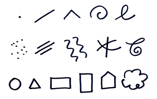
Figure 5-1. The basic set of lines and shapes that will make up pretty much everything in this book: The top row is the pure set of marks. The middle row shows variations of those marks. The bottom row shows a range of shapes.
Now, you might be thinking: “Hmmf! Drawing dots and lines is one thing, Ben, but drawing complex things like a car, or Gavin my little goldfish, is quite another.” And you’d be right. But don’t worry, I’m not going to ask you to leap up a cliff in one go; most of this book is devoted to taking you up to that level step by step.
The more you practice, the more your hand will understand what your brain is trying to say, and the more natural it will feel.
Sketching at Different Scales
It’s important to practice your sketching at different scales (Figure 5-2). I’ve worked with several designers who have incredible ability when sketching interfaces on paper, but lose all confidence when it comes to drawing on the smooth, unforgiving surface of a whiteboard. So, try sketching these basic practice lines and shapes at a range of sizes, from itty-bitty on a Post-It Note all the way up to nearly as big as you, on a whiteboard, if you can.
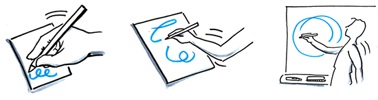
Figure 5-2. Get used to sketching at different scales: Smaller motions from the wrist (left), larger motions from the elbow (middle), and largest motions from the shoulder (right).
This is really useful because it gets you used to drawing from the wrist, from the elbow, and from the shoulder. When your body loosens up, your mind and confidence will loosen up, too.
Exercises
The following exercises will help continue building that important bond between your brain and your hand. The more you work on your accuracy with exercises like this, the more your hand will understand what your brain is trying to say to it!
 Exercise 5-1: Parallel lines
Draw some parallel lines. Begin with sets of shorter lines and then work up to sets that cover the full width of your page. Be aware of the pressure you’re putting on the paper; you want to keep it light. Imagine the pencil (or whatever you’re sketching with) is actually you holding the end of a thread, and you’re pulling the thread evenly along the page. Take your time, and take care of the ends of your lines; keep them neat and avoid any little hooks.
Exercise 5-2: Get to the point
Draw some lines at various angles, and try to make them all meet at one point in the middle. Don’t beat yourself up if at first you can’t seem to make three lines cross at the same point, and avoid curving the lines to make them cross. Give it a few goes.
Exercise 5-3: That’s the shape of it
Draw a few simple shapes, like squares, rectangles, and triangles. Try drawing some ovals and circles, too, but make sure that you enclose each shape (i.e., bring the pencil back to where you first started each shape). Then, fill each shape with parallel lines close together, as shown in Figure 5-3. Try drawing the lines at a variety of angles. Be aware of how your wrist and elbow are moving. If necessary, turn the paper around to make it easier; there’s nothing wrong with doing that.
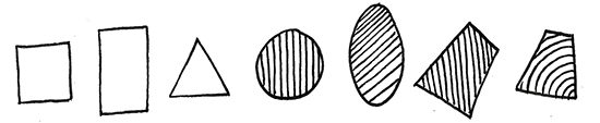
Figure 5-3. More shapes and lines: Practice precision and uniformity with these shapes and lines.
Sketching Figures and Action
Figures add vitality, interest, and scale to any sketch, as any architect will tell you. They also help us to understand and relate to whatever the object or concept is that’s being illustrated because figures help us to empathize and put ourselves “in the picture.”
Say Goodbye to the Stick Figure
We’ll get more into conveying story as the book goes on, but for now I have some news for you. When it comes to drawing figures, you can do a lot better than stick figures. I’m serious, unless you’re drawing Actors in UML,2 you’ll experience far more satisfaction—and gain much more respect from others—if you put aside the sad old way of drawing stick figures and embrace the better way of drawing figures with actual bodies.
Now, in case you’re smiling nervously and backing away slowly from this page, let me explain. As you probably know, more than half of our communication is through body language,3 which means if our little figures don’t have bodies, we’re missing out on a whole lot of potential for communication. Plus, they just look better. And drawing figures with bodies really is easy.
Take a look at the very simple examples in Figure 5-4. It’s amazing how much life, character, and action you can pack into a figure when it has a body.
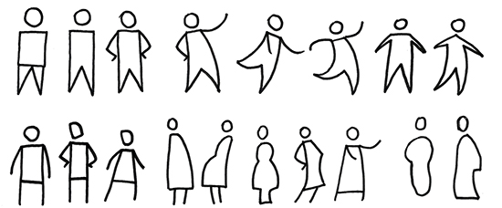
Figure 5-4. A range of simple figures to try: Note that including a body makes it easier to hang arms and legs off a figure, which makes it seem a little more realistic and a little more alive.
Don’t forget that we spend a lot of our time sitting, running, slouching, lying down—moving our arms and bodies in all manner of ways, rather than just standing bolt upright all the time. So, it’s appropriate that our figure sketches reflect this, too, n’est-ce pas? Figure 5-5 shows some more simple figure sketch examples in different poses.4 Look at them go!
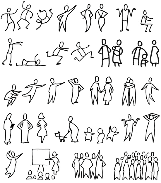
Figure 5-5. A range of simple figure sketches in different poses: Make sure that you try sketching some figures that are sitting, lying down, and leaning on things, both individually and in groups.
Now, as I’ve stressed from the beginning, Presto Sketching is about exploring, explaining, and envisioning. This isn’t about rendering anatomically realistic people; it’s just about capturing the essence of a figure.
This basic way of showing figures is all you’ll really need, but if you do want to take the style up a notch, try rendering your figure sketches as silhouettes, like those in Figure 5-6.
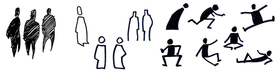
Figure 5-6. A range of silhouette figures: A simple outline has a nice style on its own, but coloring in your figure sketch or adding parallel shading lines can add visual interest and attention.
Sometimes, we need to be a little more specific about what type of figure we’re sketching, with indications such as gender, role, culture, and so on. Figure 5-7 and Figure 5-8 show you some ideas for simple additions to figures to help your audiences understand those different aspects.
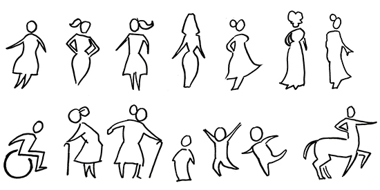
Figure 5-7. Simple ways of showing different gender and age: Try adding details such as hair and figure shape to indicate gender, and using head/body proportion to indicate age.
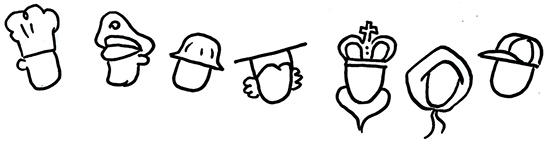
Figure 5-8. A simple way to show roles for figures: Try putting different hats on your figures to show different roles; for example, chef, police officer, construction worker, teacher, and monarch. Adding other details like hoods and caps also enhances visual interest and character.
Exercises
Exercise 5-4: Basic figures
Sketch a range of basic figures, using the ones in this chapter as inspiration. Go ahead and fill a page. Make some smaller and some larger. Try some different styles of figures to see which ones appeal to you more.
Exercise 5-5: Figures in action
This time, sketch some figures in different poses according to the suggestions in the list that follows, again using the range of basic figures in this chapter as inspiration:
She went that way!
Has anyone seen my glasses?
I’m running from that bear!
I’m dancing like no one’s watching...
Exercise 5-6: Silhouette figures
Sketch some figures as you did before, but this time try some silhouette techniques, as shown in Figure 5-6.
Sketching Faces and Expressions
Faces, of course, convey expression, making it possible for us as viewers to empathize and identify with figures in sketches even more. Figures and faces together convey more about the story, intention, and relationships, rather than just capturing an abstract clinical moment in time.
The rise and rise of emojis has made it easier to enhance whatever we write (typically in instant messaging and emails) with how we’re feeling. They’re a great shorthand that people tend to recognize, and they’re a great place from which to draw inspiration.
Just like we’ve improved on stick figures, we can also do better at expressions than just the basic smiley and frowny faces. After all, think about the huge range of emotions that people have as they go about their daily lives. Indeed, we have 35 individual muscles in our faces,5 capable of pulling an amazing number of expressions! As Presto Sketchers, we can sketch expressions that go beyond the basic “happy” and “sad” and cover so much more of the expression spectrum, like frustration, incredulity, and boredom. Or, what about surprise, disgust, or nostalgia? The more nuanced the expressions are in your sketches, the more character your figures will have, and the more they’ll resonate with your audience.
Take a look at the first set of faces in Figure 5-9. Notice the variations of eyebrows and mouths; even though they’re just simple lines, they really bring the faces to life.
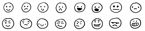
Figure 5-9. Faces, eyebrows, and mouths: Here’s a set of faces showing variation in eyebrows and mouths.
Now take a look at this next set of faces, in Figure 5-10. This set demonstrates how changing the position of the eyes can convey the direction of gaze as well as the mood and expression.

Figure 5-10. Faces and position of the eyes: Another set of faces, this time showing variation in the position of the eyes as well as different mouths, eyes, and eyebrows to show where the face is gazing.
I’ve drawn all these faces as circles to emphasize the expressions, but of course faces don’t need to be circles; it’s worth experimenting with different shapes (as in Figure 5-11) to find what you like best.
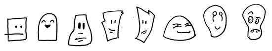
Figure 5-11. Variation of face shapes: Here’s another set of faces, with more variation in expressions and using different shapes for the heads.
It’s also worth playing around with different shapes of hair, to add further interest and character (Figure 5-12). And that’s not all! We can draw on6 the visual language used in comics to bring even more expression to faces in our sketches, using elements like surprise lines, sweat droplets, and so on.
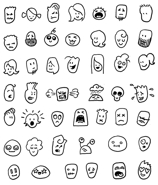
Figure 5-12. Yet another set of faces: This set shows various hair shapes and embellishments, from the visual language of comics.
Exercises
Exercise 5-7: Play with faces
Draw a set of nine circles, which will become a set of faces. Experiment with different expressions by adding different sorts of eyes, eyebrows, and mouths. Play with the position of the eyes, noses, and mouths, too.
 Exercise 5-8: Copy some emojis
Open your nearest and dearest instant messaging app and take a look at the menu of emojis. Choose some of your favorites and copy them. As you sketch them, think about what each of the elements is doing; what is it about the eyes, mouth, and so on that conveys that particular emotion?
Exercise 5-9: Sketch these emotions
Draw another set of nine circles, and try to capture the emotions suggested in the list that follows. Feel free to sit in front of a mirror (don’t worry, no one’s watching), act out the emotion, and try to copy what your eyes, eyebrows, and mouth are doing.
Pleasantly surprised
Really angry
Dreamy
Guilty
Smug
Skeptical
“I think I’m going to be sick...”
Exasperation
“Turn that music down!”
Lettering
Visual communication still involves words, and if your sketching is going to be viewed by others, it’s good to pay attention to the way you write whatever it is that you’re writing.
Your handwriting shows a lot of your character, and you can use this to good effect in your sketching. Your lettering can command attention and add another flavor of magic to your sketching. Let’s look at neatening up your lettering first, and then we’ll get into characterful lettering.
Treat Your Handwriting as a Set of Fonts
There’s probably a variety of ways in which you currently write. The way you write a shopping list might be scrappier than the way you write in your mum’s birthday card, which might be different again to the way you write on a whiteboard at work (see Figure 5-13).
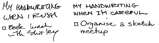
Figure 5-13. Messy writing versus neat writing: My normal handwriting (on the left) is shocking, but the writing on the right shows the two “fonts” that I’ve come to use regularly if I write neatly. Notice the lowercase e’s in my capitals? I found that writing lowercase e’s was faster than uppercase E’s, and the habit has stuck over time.
Treat these styles as a set of fonts that you carry around with you, and focus on one or two styles with which you want to get better and more consistent. Practice them, be neater and more intentional about how you write, and your sketches will look much better for it.
Watch out for problem letters! Pay attention to any letters that you can’t seem to get right, and practice them individually until you’re confident with them.
Pumping More Meaning into Lettering
Now that you’ve smartened up your regular writing, we can get into more characterful lettering styles. As someone famous once said, fonts are the clothes that words wear; thus, there is so much character and meaning you can pack into each and every word by “dressing them in different clothes,” and paying attention to how you graphically sketch those words.
Figure 5-14 shows some fun examples of different types of lettering to try. The range is as endless as your imagination.
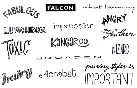
Figure 5-14. Examples of expressive and characterful lettering: Note how different styles convey different mood and tone, depending on style (capitals, script), height, spacing, contrast, and texture.
Exercises
Exercise 5-10: What are your fonts?
Imagine that your handwriting is a font. Practice writing “Pack my box with five dozen liquor jugs”7 a few times on paper. Now practice the same sentence on a whiteboard. Are there differences? What makes your “fonts” distinctive?
Exercise 5-11: Graphic word hunt
Take a look at ads, billboards, movie posters, comics, and album (or, more accurately today, playlist) covers around you and try to spot some interesting ways in which someone else has “dressed” words in different clothes, to bring out different types of meaning and character. Copy them in your own sketchbook. As you do, think about how you just know what the meaning is that’s meant to be conveyed. You might also want to think about how you could sketch the same words with even more of that meaning.
Exercise 5-12: Words as pictures
Figure 5-15 shows some examples of how adding graphic style to words can express more character and meaning. Using these as inspiration, try sketching the following phrases:
This is taking too long
It’s so foggy
She’s so in love with him

Figure 5-15. Examples of “words as pictures” for inspiration: As you sketch words, experiment with each word’s shape, texture, and direction.
Exercise 5-13: Try different markers
The type of marker you use imparts a lot of character into whatever you write or sketch, too (Figure 5-16). Mix up your markers a bit and try variations like chisel-tips (rather than bullet-tips), alcohol-based tint markers, and so on.

Figure 5-16. Examples of words written with different types of markers: From left to right: Sharpie, Copic gray tint marker, Staedtler Calligraphy Duo Tip Marker (3.5 mm end).
Sketching Simple Objects
It’s very useful to be able to sketch a wide variety of simple objects as a way to illustrate product designs and experiences. This will stand you in good stead when it comes to sketching more complex images, and then sketching visual metaphors in Chapter 7.
A Word About Fidelity
You might be wondering, “Why is a book about sketching suddenly swerving into marriage counseling territory?” No, it’s not that that kind of fidelity. I mean visual fidelity, or how accurately we represent real-world objects and places in our sketches.
When we sketch real-world objects, how we sketch them is measured on a scale of visual fidelity (shown in Figure 5-17), with literal representation at one end, and symbolic representation at the other end.8 At the literal representation end, you’ll find photorealistic images. At the symbolic representation end, you’ll find symbols and icons. In a sense, the closer you get to the symbolic end of the scale, the less “realistic” and more abstracted the image becomes. But get this: an image can lose realism yet retain all of its meaning, if not more. Indeed, as Scott McCloud says in Understanding Comics:
When we abstract an image...we’re not so much eliminating details as we are focusing on specific details. By stripping down an image to its essential ‘meaning’, an artist can amplify that meaning in a way that realistic art can’t.
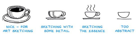
Figure 5-17. Sketching at different levels of fidelity: From higher fidelity (more photorealistic) on the left, to low fidelity on the right. We’d be here all day if we always sketched things like the coffee cup on the left, but if the sketch is too simple (far right), we miss some important details and a little bit of character. Aim for the fidelity level of the second cup from the right.
This is another very important part of Presto Sketching: sketching the essence, and amplifying meaning. As Presto Sketchers, we need to sketch just enough to communicate our message quickly and clearly.
Photorealism is impractical for our purposes, but you might be surprised to learn that sometimes the other end of the spectrum isn’t practical either. There are some pictograms that might make sense to you, but won’t make sense to others, whether because they’re from a different business or a different country and culture. The other thing to remember is, as the revered philosopher and media theorist Marshall McLuhan taught us, the medium is the message.9 In other words, the way the message comes to us is part of the message. So, it can actually be quite effective if you invest just a little bit of time, a little bit of skill, and a little bit of panache in your sketches. This is actually what makes Presto Sketching a bit different.
Sketching Simple Objects Based on Simple Shapes
Now, why have I included this fireside chat about fidelity, symbols, and capturing the essence? Because nowhere else do you see this so much at play than in sketching basic objects and icons. Thanks to the incredible spread and ubiquity of our symbol-oriented culture, everyone is carrying around a truly gargantuan load of images in their heads, with lots and lots of meaning attached to those images. This is why I can draw a rectangle with three lines in it, and you will probably recognize that as an icon that represents “page.”
What do I mean by capturing the essence of the object? It means to look for what makes the object unique and meaningful and then ensure that your sketch shows that. This is going to mean different things for different objects.
I won’t lie: this is going to take practice. You must not only work on your confidence and ability with sketching, but your confidence and ability with synthesis, which is distilling the essence from what you see and hear.
Consider the coffee cup in Figure 5-17. The handle on the cup and some wavy lines above it show enough visual information to communicate to us that it’s a hot liquid in a cup and therefore probably coffee. Or consider objects like vases, bottles, and wine glasses (Figure 5-18). A lot of their essence is to do with the fact that they’re symmetrical. Sketches of glasses and bottles look wrong when they’re not symmetrical.
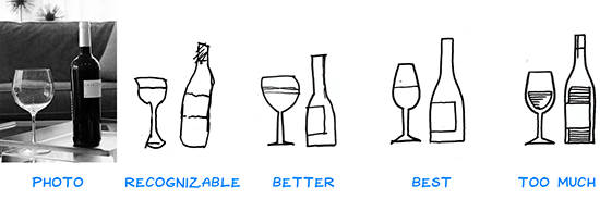
Figure 5-18. Sketch the essence #1: This shows a photo of a wine bottle and glass, with a progression of sketched equivalents. The first sketch is clearly of a wine bottle and glass, but the sketching technique lacks precision and confidence. The second sketch displays more confidence, but the essence—the symmetrical quality of their shapes—isn’t quite there. The third sketch isn’t perfect, but it’s confident, crisp, clean, and includes the minimum amount of detail. The last sketch (right) has some finessing to display the liquid, but that detail probably isn’t needed. (Photo credit: Guillermo Nolasco, via unsplash.com)
Or consider cats (Figure 5-19). A lot of their essence is to do with the two pointy ears, and the nose. The sketches here show how you can actually vary a lot of aspects of a drawing of a cat, but as long as the ears and nose connect with our mental image of a cat’s ears and nose, each sketch “works” as a cat.
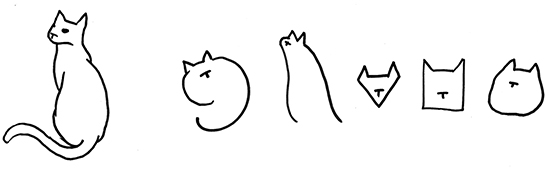
Figure 5-19. Sketch the essence #2: To the left is a fairly simple sketch of my cat, Albert. The rest of the sketches are very basic, but they all share the “essence of cat”—the pointy ears and the nose—and so no matter how simple the shape is, you still recognize each one as a cat.
So, with that, let’s sketch some objects that we find around us every day that are easy to draw. The objects in Figure 5-20 are all based on a single rectangle. Begin by drawing a set of rectangles on a page, and then see how you go with drawing these objects over the top of your rectangles. Remember, there is no shame in copying. This is how you can train your hand to know what it’s doing.
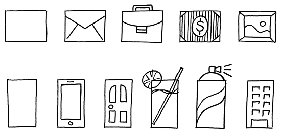
Figure 5-20. Some basic objects based on a rectangle: Watch those lines! Neatness pays off.
Figure 5-21 shows some more objects that are all based on a circle. If nothing else, these sorts of exercises help train your hand in drawing shapes like rectangles, circles, and triangles more consistently and more confidently.
Figure 5-21. Some basic objects based on a circle: They don’t need to be perfect; I mean, that middle one is a bit wonky.
Exercises
Exercise 5-14: The essence of laptop
Take a good 10 minutes and sketch a laptop computer, with as much detail as you can cram in. Now, sketch the same laptop, but this time take only five minutes. Next, sketch the laptop again, but give yourself only one minute. Finally, draw the laptop in five seconds.
Take a look at your different sketches of the same object. What detail did you remove in each version? What would you say is the “essence of laptop,” that you can record in five seconds?
Exercise 5-15: All squared away
Sketch a row of four squares, and then, using your imagination and rapidly improving sketching skills, turn each square into a simple recognizable object.
Sketch another row of squares, but this time sketch them tilted at different angles. Again, turn each square into a simple recognizable object. Did looking at tilted squares rather than flat squares give you different ideas?10
Exercise 5-16: Sketch your skyline
Wherever you are, go outside and sketch the silhouette of the skyline. If it’s a city line, notice the geometric shapes and outlines of the buildings. If it’s in the suburbs or country, notice the contrasts between angles and shapes of buildings and the angles and shapes of trees.11
Sketching Frames and Separators
The last basic sketching technique we’ll tackle is sketching frames and separators. Frames and separators are the unsung heroes of visual communication,12 and after you practice the different ways of using them, you’ll come up with more ways yourself in no time.
Frames
Frames (Figure 5-22) are a fantastic, economical way of grouping and drawing attention to certain objects in your sketches or written notes, quietly telling the viewer that whatever is inside the frame is different from what surrounds it.
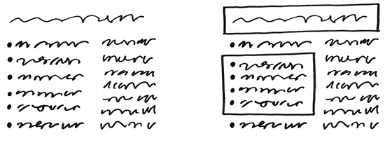
Figure 5-22. The power of being framed: The first set of content elements (left) all have the same level of importance; adding a frame around some of them (right) makes the ones within the frames look more important. The elements within the lower frame also look like they somehow belong together as a subgroup.
The frame can be as basic as a single line or as complex as a multifiligreed box with three-dimensional shading, and everything in between. Many visual conventions you’ve seen before are just frames, dressed up in different ways. The visual language of comics, for example, uses a variety of frames (Figure 5-23). Each frame of a comic is like a window cut through the paper or screen into another world that you’re viewing, and the speech balloons and thought balloons inside those frames are frames, as well.13
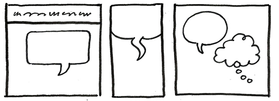
Figure 5-23. Some examples of frames used in comics: The visual language of comics uses frame devices in different ways.
Your frames can take on the appearance of objects, too, like paper, signs, people, animals...anything! Consider the variations sketched in Figure 5-24 and the shades of meaning that they add to what’s within each frame.
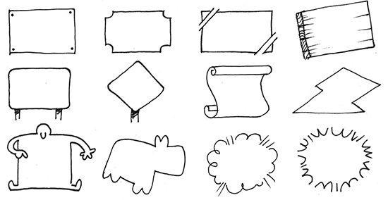
Figure 5-24. Some examples of frames made to look like various objects: Sketching frames to look like different objects in themselves adds a lot of meaning and interest.
Banners and ribbons (Figure 5-25) make really popular and interesting frames for titles, quotes, and just about anything that you want to hold up as the most interesting thing on the page for your viewer to look at.
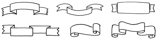
Figure 5-25. Examples of banners and ribbons: Experiment with banners and ribbons folding and flowing in different directions.
Separators
Just like frames can help visually prioritize different elements in an image or text, we can use separators to both visually and meaningfully separate content (Figure 5-26). White space, in a way, is an invisible separator, visually showing us different sections of content that are distinct from one another yet part of a whole.
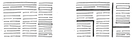
Figure 5-26. Gotta keep ’em separated: The first set of elements (left) looks cluttered and noisy, whereas the second set has some separators, which group the elements and guide the eye.
You can also embellish separators with different visual effects (as seen in Exercise 5-19), to help emphasize certain aspects of meaning in your sketches or just to have some good clean fun.
Exercises
Exercise 5-17: Sketch a banner
Write any word you like and then follow the step-by-step sketches in Figure 5-27 to sketch a banner.
Start with a rectangle around the word, and then add a zigzag line in each bottom corner. Fill in a top line, and try to keep the heights the same either side. Finish off by sketching a chevron at either end, and sketching the third side of the little triangle under each bottom corner.
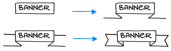
Figure 5-27. How to sketch a simple banner: Start with a rectangle (upper left), and then add a zigzag line in each bottom corner (upper right). Fill in a top line (lower left), and finish off by sketching a chevron at either end and the third side of the little triangle under each bottom corner (lower right).
Exercise 5-18: Sketch a ribbon
This time, sketch a flowing ribbon by following the step-by-step sketches in Figure 5-28. Start by sketching a nice flowy line, but be careful not to have the line cross itself! Sketch lines of equal height straight up from each point where the line curves around. Copy each curve of the bottom line along the top, keeping the heights the same. Finish it off by sketching a chevron at either end, and some little lines straight up from the other edges of the bottom curves.
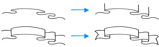
Figure 5-28. How to sketch a simple ribbon: Sketch a nice flowy line (upper left), then add lines of equal height straight up from each point where the first line curves around (upper right). Copy each curve of the bottom line along the top (lower left). Sketch a chevron at either end and then some little lines straight up from the other edges of the bottom curves (lower right).
Exercise 5-19: Sketch some separators
Try copying the styled separators in Figure 5-29. You might like to try copying them as straight lines first, and then try the curved versions (it helps to sketch a light single curved line first).
Feel free to come up with some of your own creative patterns and visual effects, too.
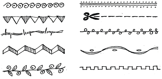
Figure 5-29. Styling your separators: Have fun with adding different visual effects to separators.
Some questions for you
What if your last presentation was in pictures?
Take a look through the last presentation you gave at work. What could you possibly show as pictures rather than words? What would you be brave enough to sketch yourself?
How could you improve on clip art?
Do you (or someone you work with) use clip art of some sort? Odds are, the images you (or someone else) use don’t quite nail the meaning you’re after. How might you sketch them differently, to more accurately show what you mean?
What if your annual report was in pictures?
Go through a few pages of your company’s latest annual report (or a similar business document), and circle all the nouns. Try drawing each of those nouns.
How easy or tricky was that? Are there many real-world objects there (e.g., cars, customer, or buildings), or are they mostly abstract concepts (e.g., markets, leverage, or growth)? How might representing them visually affect readers’ comprehension of what they’re reading, do you think?
Interview with Matthew Magain
Creativity can spark in the most unexpected places. What began for Matthew in a Tokyo schoolroom has since flourished into Sketch Group, a thriving visual consulting business with a glorious vision.
MM: I always drew as a kid, but I had an affinity for computers, as well, which led me to an early career as a software developer. After three years of having my soul crushed by a toxic boys’ club, I ran away to Asia and taught English in schools and businesses in Tokyo, Japan.
It was in these classes that I rediscovered sketching. I realized that I could create much more interesting ways to help students learn English by sketching things like conversation sheets, vocabulary activities, and board games. That’s what sparked my creativity. Every lesson was a new opportunity to present something in a different way. It got me thinking: “What are we trying to achieve with this lesson?” I’d start there, and work back from the needs of the students.
Back in Melbourne, I started working at SitePoint, doing illustrations for SitePoint books and managing the design team there. We would get together, make a big mess on the wall with user flows, have stakeholders contribute, and I thought: “I need to capture and share this.” Around then, I was inspired by those whiteboard videos by RSA Animate and Cognitive. I decided to distill what we learned about user experience [UX] design into a video like that.
My next door neighbor Simon is a videographer who shoots for TV, especially the cricket and football. We partnered up, borrowed a client’s boardroom for an hour, and shot the “What the F*ck is UX?” video. It’s now at over 600,000 views on YouTube. Around then I was also sketchnoting a lot, and getting more and more gigs for graphic facilitation.
Never underestimate the value of a sketch! I once had a client who was hoping to get funding for a new initiative to be launched in every country they were operating in. I had a brain-dump conversation with them and produced a sketch, just a simple A4 drawing. From that sketch, the initiative got 50 million dollars in funding. There’s real value in this sort of sketching. That’s the most valuable thing I can do with this skill that I have.
At the moment, I feel very energized and challenged about growing my business, which now has nine illustrators, and has actually tripled in size in the past year.
I engaged a business coach to learn more about working on the business rather than being in the business all the time. I’ve learned that being excellent at this craft doesn’t necessarily mean being excellent at technical draftsmanship: it means being reliable as someone to partner with, responsible, and giving clients more than they expect.

Figure 5-30. Matthew showing his skill at sketching ideas: “The great joy and privilege in this industry is that we get to be the fly on the wall in so many industries. Most of my clients have never heard of graphic recording/facilitation; it’s a skill people don’t realize they need yet. When they see it, then they realize it could be a way to do things better.”
I get asked all the time: “Isn’t that hand-drawn style a fad?” The answer is no: people will always find it magical watching someone draw. Film directors work hard building suspense in a movie, and we get that for free, it’s baked into the medium. Sure, there are a lot of effects we can add to animate a sketch, like stop motion, color, and so on. But the fact is that someone creating something with their hands in front of you is always going to be alluring.
There are so many industries and so many companies where most aren’t utilizing that creativity, still stuck in business buzzwords and PowerPoint decks that spew forth those buzzwords. The great joy and privilege in this industry is that we get to be the fly on the wall in so many industries. Most of my clients have never heard of graphic recording/facilitation; it’s a skill people don’t realize they need yet. When they see it, then they realize it could be a way to do things better. So, there are infinite possibilities for someone who’s prepared to package themselves in the right way in terms of skill set and the way they deal with clients, to help someone visually. The world is your oyster!
The fact is that someone creating something with their hands in front of you is always going to be alluring.
1 The set you see here is derived from a mix of Dave Gray’s Visual Alphabet, popularized by Sunni Brown in her book The Doodle Revolution, and Austin Kleon’s array of five simple elements.
2 That’s Unified Modeling Language, which was all the rage in the 1990s for visualizing software systems. The official notation for Actors in these systems is—you guessed it—a stick figure. Sigh. Kills me.
3 A lot of people throw around the claim that up to 90% of our communication is nonverbal, which includes body language and tone of voice; the remainder (some say only 7%!) is up to the actual words. Do take this with a grain of salt, though. Those numbers stem from research by Professor Albert Mehrabian, who emphasized in his book Nonverbal Communication (Aldine Transaction) that it was about when the words didn’t match the body language: “When there are inconsistencies between attitudes communicated verbally and posturally, the postural component should dominate in determining the total attitude that is inferred.” So, yeah. Wheel that one out at your next dinner party.
4 You can also download more figures to copy and use to practice your simple figure sketching from prestosketching.com/downloads.
5 This is straight from Gray’s Anatomy (sigh, the original book, not the show on TV), although the Internet would tell us it’s 43 muscles. I’m not sure where that number is from, maybe researchers have discovered more muscles. Either way, the point is that we have a lot!
6 C’mon...you knew this pun would happen in this book sooner or later.
7 Or, if you like: “Sixty zippers were quickly picked from the woven jute bag.” These two pangrams are a bit more interesting than “The quick brown fox jumps over the lazy dog.”
8 The best exploration of this concept is by Scott McCloud in his book Understanding Comics. The spectrum actually extends further when we want to sketch ideas and concepts that don’t exist in the real world. I get into this in Chapter 8.
9 This famous quote of his is from his book Understanding Media: The Extensions of Man (MIT Press). If you want to dig into theories of how we communicate, Marshall McLuhan is your man. He also basically predicted the internet, when in his book The Gutenberg Galaxy: The Making of Typographic Man (University of Toronto Press) he wrote, “The next medium...will include television as its content, not as its environment, and will transform television into an art form. A computer as a research and communication instrument could enhance retrieval, obsolesce mass library organization, retrieve the individual’s encyclopedic function and flip it into a private line to speedily tailored data of a saleable kind.” Impressive, eh?
10 That’s a bit of a loaded question, isn’t it? But honestly, I hope you did have different ideas, simply by looking at the same thing at a different angle.
11 And if you’re feeling brave, put your skyline sketch on social media and tag it #prestosketching; it would be brilliant to see a growing community of skyline Presto Sketchers online!
12 Except maybe for arrows, but don’t worry! They’ll have their moment in the sun later on in the book. Several moments, even.
13 Like comics? Stay tuned, because in Chapter 11 we’re going to look at how to sketch storyboards.