
Chapter 3. Styling the Page with CSS
Once you’ve formatted your web page with HTML, you’re going to want to liven it up. Though web pages using default styling are functional, they’re not that interesting-looking or unique. To make them so, you’ll need Cascading Style Sheets (CSS).
CSS is a way of adding visual and other styling to web page contents. It can be applied directly to an element, using the style attribute. In the following HTML, the background color for the div element contents is set to red:
<div style="background-color: red">...</div>
Using style attributes directly in elements is supported in all of the browsers, but its use is discouraged. Making a style change means having to search for all uses of the style attribute and changing them individually. A preferred approach is to use a stylesheet.
CSS Stylesheets
A stylesheet is a listing of CSS settings grouped together. By grouping the settings together, we can easily find the style settings to make our changes. The stylesheet can either be embedded directly into the web page or linked in as an external document. The latter approach is particularly favored, because then we can apply the same CSS across several different web pages without having to repeat the same CSS in each page.
To include an embedded stylesheet, add a style element to the head element in the web page:
<head>
   <style>
     ...
   </style>
</head>
You can specify a type attribute for the element, but the default type of text/css is sufficient for our needs.
To link an external CSS stylesheet, using the link element:
<linktype="text/css"rel="stylesheet"media="screen"href="./css/main.css"/>
A CSS stylesheet link has a type of text/css, and the rel attribute is set to stylesheet. The rel attribute establishes the relationship type of the linked document. The media attribute specifies the media type to which it applies, such as screen in this instance. This setting means the stylesheet is configured for computer screens.
The last attribute in the link is href, containing the relative or absolute URL for the stylesheet. An absolute URL provides the entire URL (e.g., http://somedomain.com/main.css), while a relative URL provides information about where the file is located relative to the current document. In the example, the main.css file is located in the css subdirectory directly accessible from the host page’s location. The ./ signals the current web page location. If the host web page is located at the top-level directory of the website, we could also use /css/main.css.
Applying CSS
There are several basic ways you can apply CSS to web page elements, and in this chapter, I’m covering the most basic. The most common and simplest is to apply the CSS to an entire set of a specific type of element. As an example, if we want to change the default font family for all paragraph elements in a web page, we’d use the following CSS:
p {
   font-family: Times, "Times New Roman", Georgia, serif;
}
The selector is the element name, followed by an opening curly bracket (brace), the CSS, and the closing curly bracket/brace. Unless the style setting is overridden later in the same stylesheet, or in another stylesheet linked after this one in the document, all paragraphs in the page use one of Times, Times New Roman, Roman, Georgia, or serif. The reason multiple values are listed is that not all browsers support all font families. The browser traverses the list and stops once it finds a font family it does support.
The style setting ends with a semicolon. The style rule itself consists of a property name (font-family) and the setting. Multiple style settings can be given for the same element(s):
p {
   font-family: Times, "Times New Roman", Georgia, serif;
   font-size: 14px;
}
If we’re only interested in applying the style setting to certain paragraphs, we can use the class attribute. The class attribute is added to the target paragraphs:
<pclass="highlight">...</p>
And the class name is used in the stylesheet, preceded by a dot, indicating that the item is a class name:
p.highlight {
   font-family: Times, "Times New Roman", Georgia, serif;
   font-size: 14px;
}
If you want the style setting to apply to all elements with the given class name, leave off the element designation:
.highlight {
   font-family: Times, "Times New Roman", Georgia, serif;
   font-size: 14px;
}
If you want to be more selective and apply a style setting to only one element, use the id attribute in the element:
<div id="sidebar">...</div>
Now, the style setting applies only to the one given element:
#sidebar {
   width: 200px;
   margin: 10px;
   float: right;
}
Many (but not all) CSS styles are inheritable, which means when you apply a CSS style setting to an element, it applies to all elements contained within that element. So if you have a div element with a couple of paragraphs, setting the font family for the div element, also sets the font family for the contained paragraphs:
#sidebar {
   font-family: Verdana, Geneva, sans-serif;
}
The only time the paragraphs won’t inherit the CSS for the parent element is if it has its own CSS setting:
#sidebar p {
   font-family: Georgia, serif;
}
This stylesheet selector applies to all paragraphs that are nested within the div element with an id of sidebar. Any other elements contained in the same div element inherit the sans-serif fonts, while the paragraphs have their own serif fonts.
That Cascading Thing
Another impact on the CSS setting for an element is if there are multiple CSS stylesheets, all applying their own rules to the same element. The browser than uses an algorithm, the CSS cascade, to determine which settings are applied to which elements. I defer to my favorite website, Mozilla Developer Network, for a detailed explanation of the CSS cascade.
There is also a way of providing a CSS selector pattern, such as looking for all first paragraphs in a div block and so on, but this is beyond the scope of this book. At the end of the chapter, I’ll provide references to help you get into more advanced CSS.
The CSS
Now that you know how to add the CSS to the web page, let’s dive directly into the most common CSS you’ll need or are likely to encounter until you get into more advanced web page design.
To demonstrate the impact various style settings can have on a web page, let’s start with an HTML page, shown in Example 3-1, with various elements that we’ll style throughout this section.
Example 3-1. Example HTML used to demonstrate style settings
<body>
  <div id="main">
     <h1>Hello, World!</h1>
     <p>Now that you know how to add the CSS to the web page,
let's dive directly into the most common CSS you'll need, or
are likely to encounter until you get into more advanced web
page design.</p>
     <p>The most significant change you can make to a web
page is altering the fonts used for all of the text. The
default fonts provided by the browsers are serviceable but
don't provide the unique look and feel you want from your site.</p>
     </div>
     <div id="sidebar"
        <ul>
           <li>First item</li>
           <li>Next item</li>
           <li>Last item in list</li>
        </ul>
     </div>
</body>
Without custom CSS styling, the page looks like the one shown in Figure 3-1, when loaded in Opera.

Figure 3-1. Demonstration HTML with default styling
Fonts
The most significant change you can make to a web page is altering the fonts used for all of the text. The default fonts provided by the browsers are serviceable, but don’t provide the unique look and feel you want for your site.
The fonts can be changed for every element that displays text. This includes headers and paragraphs, as well as the content in lists. To demonstrate, let’s start with a simple stylesheet that changes the font family for the h1, p, and li page elements. We’ll mix it up a bit, using different types of fonts:
<style>h1{font-family:Times,"Times New Roman",serif;}p{font-family:Arial,Helvetica,sans-serif;}li{font-family:"Lucida Console",Monaco,monospace;}</style>
I used three different types of font families: serif, sans-serif, and monospace. The results are shown in Figure 3-2. As you’ll notice, the header isn’t different from the default styling, because headers are usually styled using Times New Roman. The paragraphs and list items, though, are significantly different.

Figure 3-2. Demonstration web page with changed font families
Font families aren’t the only thing you can change about fonts. The list of font settings you can style with CSS is comprehensive:
- font-weight
- font-style
- font-variant
- font-family
- font-size
- line-height
I include line-height in the list because of its impact on the overall appearance of the font.
Let’s take a look at how each of these properties impacts the font. The font-weight property sets the font’s weight—making the font appear as normal to progressively heavier and more bold. You can specify a font weight number (e.g., 400) or keyword (e.g., bold), return the font weight to its default value (initial), or inherit the font-weight setting from any parent element’s CSS settings.
Let’s do something different. Let’s make the header lighter and the font in the list bolder. We’ll leave the paragraph text alone:
  <style>
    h1 {
      font-family: Times, "Times New Roman", serif;
      font-weight: normal;
    }
    p {
      font-family: Arial, Helvetica, sans-serif;
    }
    li {
      font-family: "Lucida Console", Monaco, monospace;
      font-weight: 900;
    }
  </style>
The impact on the header isn’t as noticeable, but the impact on the list items is obvious, as shown in Figure 3-3.

Figure 3-3. Example after modifying font-weight for header and list
The reason the change with the header isn’t as apparent is its large size. We can change that, though, just by changing the font size of the header, using the font-size property:
 h1 {
      font-family: Times, "Times New Roman", serif;
      font-weight: normal;
      font-size: 1em;
}
The font-size property supports multiple types of sizing units, including the em units in the code, as well as pixels, expressed as px. One em unit is equivalent to the font size of the parent element, or if not specified, equal to the default font size, which is 16 pixels. Because of this sizing algorithm, em units are dynamic. If you want to use specific sizes, then use pixels:
font-size: 12px;
You can also use enumerated values, like small, medium, and large; or relative size, like smaller and larger. Another approach is to use a percentage:
font-size: 50%;
If you’re only interested in modifying some text within an element, you can utilize the span element. I modified the first paragraph to include a span element with an id attribute:
<p>Now that you know how to add the CSS to the web page,
<span id="text1">let's dive directly into the most common
CSS you'll need</span>, or are likely to encounter until you
get into more advanced web page design.</p>
Now I’m going to modify the font-style property for this span:
#text1 {
      font-style: oblique;
}
The text enclosed in the span is now oblique, a variation on the italic style. But it’s still not enough. Let’s also modify the text’s font-variant, setting it to small-caps:
#text1 {
      font-style: oblique;
      font-variant: small-caps;
}
The last property I’m covering in this section is line-height. It’s not a font property but can influence the appearance of the text. To make text more readable, adjust the line-height.
To demonstrate, add another id attribute, this time to the second paragraph:
<p id="second">...</p>
and then add styling to decrease the font-size and increase the line-height:
#second {
      font-size: smaller;
      line-height: 150%;
}
The smaller font size could make the text harder to read, but the increased line height adds clarity, as shown in Figure 3-4.

Figure 3-4. Web page after all the font modifications
The font properties are handy, but sometimes it gets cumbersome having to list all of them. The last font property is font itself. You can use it to change several font properties, all in one setting. To demonstrates, let’s change the style setting for the second paragraph, using font to set several properties at once:
#second {
   font: italic bold 14px/36px "Comic Sans MS", cursive,
   serif;
    }
The properties changed are font-style, font-weight, font-size/line-height, and font-family. Now take a look at the web page, in Figure 3-5. It’s definitely unique!

Figure 3-5. Going absolutely mad with the font CSS properties
Decorative Accents and Color
One aspect of the font we didn’t change in the last section is the font’s color. The CSS property to do so is color:
#second {
   font: italic bold 14px/36px "Comic Sans MS", cursive,
   sans-serif;
   color: red;
}
If you want to get particularly colorful, you can also change the background color of the element’s contents:
#second {
   font: italic bold 14px/36px "Comic Sans MS", cursive,
   sans-serif;
   color: red;
   background-color: #ffff00;
}
Both examples demonstrate two ways to specify a color in CSS. The first uses a color name, from the many that are supported. The second uses a hexadecimal color. A third approach is to use RGB notation:
background-color: rgb(255,255,0);
RGB stands for red, green, and blue, the three colors that, combined, make up all of the colors we see in web pages. Each color value has a range from zero to 255, with 255 representing the strongest saturation of color. The hexadecimal notation is a conversion of the digital value (0...255) into hexadecimal, with a value of 255 equivalent to ff. The hexadecimal version is a combination of the colors without the parentheses, and use of rgb annotation. So the following are both equivalent:
background-color: rgb(255,255,0);
background-color: #ffff00;
You can also use a shorthand version of the hexadecimal number. The hexadecimal number for yellow can be #ffff00, or it can be given as #ff0. The individual two-character representation for each color value can be shortened to one, if both characters for each value are the same.
If a color isn’t enough for the background, you can also use an image as wallpaper for the element:
#header {
   background-image: url(myimage.jpg);
   background-size: 100%;
}
The image given for the background is sized to fit the element’s width, with the height adjusted automatically to compensate. Other background image properties are:
- background-repeat: Repeat along y- or x-axis, or both
- background-position: Where to position background image in element
- background-clip: How to clip an image larger than element
- background-origin: Position of origin of image
- background-attachment: Whether image is fixed or scrolls with the element as user scrolls
Just specifying an image sets other values to their default:
- The image’s initial size is used.
- The image’s upper-left corner is placed in the element’s upper-left corner.
- The image is repeated, across and down, until it fills the container.
- The image scrolls with the element.
Let’s add some color to the example page. First, we’ll modify the HTML to add a div element wrapper around the h1 header, and add a new paragraph with author name:
<div id="header">
     <h1>Hello, World!</h1>
     <p>Shelley Powers</p>
</div>
Next, we’ll adjust the font for the paragraph given the id value of second, because we really don’t want to use Comic Sans MS in our web pages. (Whether deserved or not, Comic Sans MS is almost universally loathed by a surprisingly large number of people.)
The line spacing was good for demonstration, but now we want to clean it up, too, so the paragraph looks like we’re serious about design:
#second {
      font: 14px/20px "Georgia", serif;
}
Lastly, in preparation, we’ll change the h1 font size back to its default by removing all of the style settings for it. All the changes leave us with the web page in Example 3-2.
Example 3-2. Example page in preparation for adding some color
<!doctype html>
<html lang="en">
<head>
  <meta charset="utf-8">
  <title>Blip de Bit</title>
  <meta name="description" content="Blip de Bit!">
  <style>
    h1 {
      font-family: Times, "Times New Roman", serif;
      font-weight: normal;
      font-size: 1em;
    }
    p {
      font-family: Arial, Helvetica, sans-serif;
    }
    li {
      font-family: "Lucida Console", Monaco, monospace;
      font-weight: 900;
    }
    #text1 {
      font-style: oblique;
      font-variant: small-caps;
    }
    #second {
      font: 14px/20px "Georgia", serif;
    }
  </style>
</head>
<body>
  <div id="main">
    <div id="header">
     <h1>Hello, World!</h1>
     <p>Shelley Powers</p>
    </div>
     <p>Now that you know how to add the CSS to the web page,
<span id="text1">let's dive directly into the most common CSS you'll
need</span>, or are likely to encounter until you get into more
advanced web page design.</p>
     <p id="second">The most significant change you can make to a
 web page is altering the fonts used for all of the text. The default
 fonts provided by the browsers are serviceable, but don't provide
the unique look and feel you want from your site.</p>
     </div>
     <div id="sidebar">
        <ul>
           <li>First item</li>
           <li>Next item</li>
           <li>Last item in list</li>
        </ul>
     </div>
</body>
</html>
Now we’re ready to paint the page. First, we’ll add a background image for the header. It’s a nice generalized darker background, and I’ll set it to repeat along the x-axis. Since we’re using a darker background, we’ll change the font color within the header to white:
#header {
   background-image: url(background.jpg);
   background-repeat: repeat-x;
   color: white;
}
Next, we’ll add some colorful highlights to the inline span text:
#text1 {
      font-style: oblique;
      font-variant: small-caps;
      color: rgb(255,0,0);
      background-color: #ffff00;
}
With just these two pages, the web page has come alive, as shown in Figure 3-6.

Figure 3-6. Adding a little color to fonts and background
This is an improvement. The highlighted text is much more noticeable, and the header more distinct. We’re not finished, though.
The sidebar listing can be improved. That’s the group of list items at the bottom. The first change we’ll make is to add a nice border around the element, using the CSS border properties. The border properties can either be used to add the same border to all sides of the element’s container, or each side can be different. And each border can have a different color, width, and design, by altering the following CSS properties:
- border
- border-width
- border-style
- border-color
There are other border properties, but these are the most commonly applied. The border property is a shorthand property, which can be used to set the border-width, border-color, and border-style, all at once. So we can define a border that’s orange, three pixels wide, and solid by modifying the individual properties:
#sidebar {
   border-width: 3px;
   border-style: solid;
   border-color: orange;
}
Or we can declare all three at one time:
#sidebar {
   border: 3x solid orange;
}
I like simplicity, so we’ll go with the latter approach. We can also define the border differently for all the sides by using the border-bottom-, border-top-, border-left-, and border-right- annotation. It’s not uncommon for the top and bottom borders of a sidebar to be slightly different than the sides. So we’ll use the following for the sidebar element (pulling in more named web colors):
#sidebar {
   border-left: 1px solid PaleGoldenRod;
   border-right: 1px solid PaleGoldenRod;
   border-bottom: 3px solid orange;
   border-bottom: 3px solid orange;
}
We’re not done with the sidebar, yet. The list items will eventually be turned into links, which means the list style annotation is going to look a little odd. We want to get rid of the list item default circles and just leave the text.
The decoration for the list item elements is controlled by a set of properties:
- list-style-type
- list-style-position
- list-style-image
By default, the list-style-type is a disc, as displayed in previous figures. Other values include circle, square, decimal, and so on. If the built-in styles aren’t sufficient, you can supply an image to use via list-style-image. You can also specify if the image is displayed within the block (value of inside) for the list item or outside the block (value of outside). By default, the image is displayed outside the block.
All three values can be set using the shorthand list-style property:
ul {
   list-style: square inside none;
}
This CSS changes the list items for the given ul element to a square image, inside the block, and no user-supplied image.
The list style properties are an interesting variation in CSS: they’re defined for the parent ul element, though displayed for each li element. To make the change we want to make to the sidebar—remove any decoration on the individual list items—the list-style-type property for the parent element is set to a value of none:
#sidebar ul {
   list-style-type: none;
}
The CSS demonstrates how you can attach a style to an element that’s a child of another element. The div element has an id, but the ul element doesn’t. We don’t want to remove the decoration for all lists in the page, so we specify that we want to attach the style only to unordered lists that are children of the div element with the id of sidebar.
Figure 3-7 shows the page with the new modification. It’s starting to look a little more polished, but there are still some tweaks left to apply.
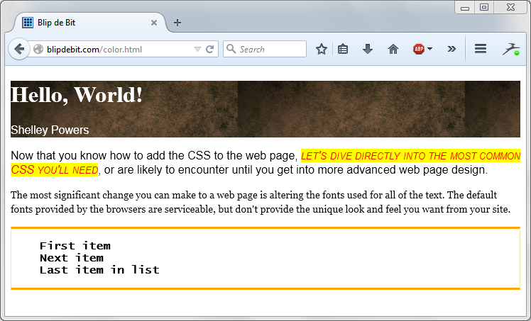
Figure 3-7. Adding border and removing list item decoration
Spacing
Another set of CSS properties that can have significant impact on the web page display is those controlling space, both within and outside an element’s boundary box.
The most commonly used of the properties are those related to margins:
- margin
- margin-left
- margin-right
- margin-top
- margin-bottom
The margin creates space around a web page element. As you can deduce from the property names, you can control the margin for a particular side of the element, more than one side, or for all sides. If you have a div element with an id of main, and want to set the right margin to 10 pixels, you’d use the following CSS:
#main {
   margin-right: 10px;
}
If you’re interested in setting all sides to 10 pixels, use the following:
#main {
   margin: 10px;
}
If you want to set each margin to a different value, you could set each margin individually:
#main {
   margin-left:10px;
   margin-right: 5px;
   margin-top: 15px;
   margin-bottom: 20px;
}
Or set all sides using margin:
#main {
   margin: 15px 5px 20px 10px;
}
The shorthand approach sets the margins for the top, right, bottom, and left, in that order. You can also specify only two values:
margin: 10px 20px;
For setting both the top and bottom margins to the same value (10px), as well as the left and right (20px).
The margin provides spacing outside the element. Each block-level element exists in a box, and the margin creates whitespace around this box. In the example that we’re modifying, the page seems to have whitespace between the top and side of the browser’s window, and the header. If we want to ensure the header is flush against the top and side of the window, we’ll need to make a couple of new settings using margin.
First, we’ll need to set the header’s h1 element’s margin-top to zero. This ensures it’s not pushing out against the top of the header:
#header h1 {
   margin-top: 0;
}
Next, we need to make sure the body element’s own default margin is zeroed out:
body {
   margin: 0;
}
This leads us to one of the little challenges we’ll run into from time to time with CSS: the default settings for many of the elements, specifically the margin and padding settings (I’ll cover padding a little later). They can play havoc with a web page design, because the overall effect is our CSS in addition to the default values. The preferred way to ensure that the default values are not messing around with our carefully wrought design is to use the universal selector (*) and set all the margins and padding values to zero:
* { margin: 0px; padding: 0px; }
This line is added to the top of the first stylesheet used in the page and helps to eliminate one frustrating problem. The universal selector is a way of applying a CSS setting to every element in the page.
Of course, doing this creates its own problems. We’ll quickly find out we’ve lost the whitespace around our paragraphs, our lists, and other elements. Rather than have to add back the necessary whitespace we need for all elements, for now we’ll just add the modifications for the h1 and body elements and experiment around with the universal selector another time.
The padding properties operate in a similar manner to the margin, in that you can specify padding for each element’s side individually or as a group:
- padding
- padding-left
- padding-right
- padding-top
- padding-bottom
The padding properties add whitespace within the element’s box, rather than the outside. Let’s look at that header again. It’s nicely flush against the browser window, but the elements in it are smashed up against the top and side. What we want to do is give them a little space.
Rather than modify their margins, what we’re going to do is add whitespace inside of the header, by modifying the padding for the element:
#header{
  background-image: url(background.jpg);
  background-repeat: repeat-x;
  color: white;
  padding: 10px 0 10px 10px;
}
We’re setting the left, top, and bottom of the header’s padding values to 10 pixels, and the right to zero.
We’re not quite done with margins and padding. The paragraphs now are smooshed up against the left side of the browser’s window. We can fix this problem in one of two ways. The first is add a left and right margin for all paragraphs:
p {
   margin-left: 10px;
   margin-right: 10px;
}
Another approach is to make one modification to the page: pull the header element out of the main div block, so that the main div block only wraps the two paragraphs:
<div id="header">
   <h1>Hello, World!</h1>
   <p>Shelley Powers</p>
</div>
<div id="main">
   <p>...</p>
   <p>...</p>
</div>
The reason is that now we can set the margin’s of the main element, and everything contained in main benefits from the side whitespace, as shown in Figure 3-8.

Figure 3-8. After margin and padding modifications
Margins, padding, borders, and the content are all components of the CSS Box Model. Figure 3-9 displays the CSS Box Model graphic in the W3C documentation.
Each element has a box around it with the element’s contents. Around that is another box representing the element’s padding. If the padding is set to zero, the edges of this box are the same as the edges for the content box. Around the padding box is one representing the element’s border. If it’s set to zero (no border), then the edges of this box are the same as the padding edges.

Figure 3-9. CSS Box Model graphic from the W3C CSS documentation
The last box represents the margin. If it’s set to zero, it’s edge would be the same as the border’s edge. If the padding, border, and margins of an element are set to zero, then the content edge is what defines the element’s width and height. And all of this impacts on the element’s position within the page layout, covered next.
Layout
Our page is starting to come together. The only problem is, the sidebar isn’t positioned as a sidebar: it’s positioned like a footer. We really want to position the main web page contents to one side of the page and the sidebar to the other, with the header along the top. The last modifications we’ll make to the example page is to modify the layout of the page so the main and sidebar sections are side by side.
First, we’ll have to resize both of these container elements so they’ll fill the page when placed side by side. Next, we need to change how they relate to each other so they’ll display correctly. The CSS properties to make these changes are the width and the float. Along the way, we’ll also have to tweak margins and padding.
The width allows us to control the width of a block-level element, like our main and sidebar div elements. A popular page width is 960 pixels, so we’ll set the width of the main element to 650 pixels and the sidebar to 220 pixels. This is a good size for readable text in the main element and allows for whitespace around both:
#main{width:650px;}#sidebar{border-left:1pxsolidPaleGoldenRod;border-right:1pxsolidPaleGoldenRod;border-bottom:3pxsolidorange;border-top:3pxsolidorange;width:220px;}
The float allows the two block elements that would normally stack on each other, to exist side by side. The float removes the element from the standard flow, positioning it in either the left or right side of its container, depending on the float value. If you set the float of two consecutive block-level elements, they’ll end up side by side within their parent container. If you set the float value to right, the first element in the page will float to the right of the first. If you set the float value to left, the first element will float to the left. We want the second element, the sidebar, to float to the right of the primary main element, so we’ll set the float value for each to left.
Opening the page, we can see both elements are positioned correctly, if too close to each other. However, if the page isn’t expanded to accommodate the width of both, then the sidebar pushes down the page and ends up underneath the main content. The float properties position both elements within their container element, which is the body element. If the browser window is resized, the body element’s width is changed, impacting main and sidebar.
To provide better control of the elements’ positions, we’ll add another div element, given an id of container. It wraps both the main and sidebar elements, but not the header. The container element is given a width of 960 pixels, a padding of zero, and the top is set to a value where it won’t cover any of the top banner graphic. The side margins are set to auto, which means they expand and contract automatically as the browser window is resized. Using the auto setting ensures the page contents always stay in the center of the window:
#container {
   width: 960px;
   padding: 0;
   margin: 100px auto 0 auto;
}
The main and sidebar elements are given margins to provide whitespace around both:
#main {
   margin:  0 10px;
   float: left;
   width: 650px;
}
#sidebar {
   border-left: 1px solid PaleGoldenRod;
   border-right: 1px solid PaleGoldenRod;
   border-bottom: 3px solid orange;
   border-top: 3px solid orange;
   float: left;
   width: 220px;
   margin: 0 0 0 30px;
}
We can leave the header fixed to the left regardless of browser size. However, to ensure it’s always positioned over the content, it’s also given a width of 960 pixels, and it’s left-right margins are set to auto:
#header{
  color: white;
  padding: 10px 0 10px 10px;
  width: 960px;  margin: 0 auto;
}
One last necessary change: if both of the child elements in the container are to float, then the parent element essentially collapses. To prevent this, we’ll need to add one more element: another div element with an id of footer and a CSS setting with the following:
#footer {
      clear: both;
}
The element is placed last in the container element. When an element’s clear property is set, floating elements aren’t allowed around it. If it’s set to left, no floating element is allowed to the left. If it’s set to right, no floating element is allowed to the right. Setting it to both doesn’t allow floating elements around it, at all, which means it’s pushed down below the floating elements. This serves to ensure the container properly flows around the new element and the two floating elements. We’re giving the new element a footer id so that we can find it easily if we want to add footer content at some future time.
Now our page reflects the proper layout, as shown in Figure 3-10.

Figure 3-10. Example page with proper layout
Finishing Up
The CSS stylesheet for the example is quite large now. There’s far too much CSS to copy and paste from page to page. And it makes the web page harder to read.
To finish the example, we’re going to copy the CSS into its own file, named main.css (CSS files are given a cssfile extension). We’re only copying the CSS, not the outer style opening and closing tags. The complete contents are given in Example 3-3.
Example 3-3. The CSS stylesheet
body{margin:0;background-image:url(background.jpg);background-repeat:repeat-x;}#header{color:white;padding:10px010px10px;width:960px;margin:0auto;}#headerh1{margin-top:20px;}p{font-family:Arial,Helvetica,sans-serif;}li{font-family:"Lucida Console",Monaco,monospace;font-weight:900;}#main{margin:010px;float:left;width:650px;}#text1{font-style:oblique;font-variant:small-caps;color:rgb(255,0,0);background-color:#ffff00;}#second{font:14px/20px"Georgia",serif;}#sidebar{border-left:1pxsolidPaleGoldenRod;border-right:1pxsolidPaleGoldenRod;border-bottom:3pxsolidorange;border-top:3pxsolidorange;float:left;width:220px;margin:00030px;}#sidebarul{list-style-type:none;margin:20px10px;padding:0;}#container{width:960px;padding:0;margin:100pxauto0auto;}#footer{clear:both;}
Once the file is saved, delete the style element and its contents from the web page.
To include the newly created external stylesheet, add the following link to the head element, where the style element was originally located:
<linktype="text/css"rel="stylesheet"href="/main.css"media="all"/>
The HTML page is now much cleaner, and you can use the same stylesheet in other pages:
<!doctype html><htmllang="en"><head><metacharset="utf-8"><title>Blip de Bit</title><metaname="description"content="Blip de Bit!"><linktype="text/css"rel="stylesheet"href="/main.css"media="all"/></head><body><divid="header"><h1>Hello, World!</h1><p>Shelley Powers</p></div><divid="container"><divid="main"><p>Now that you know how to add the CSS to the web page,<spanid="text1">let's dive directly into the most common CSS you'll need</span>, or are likely to encounter until you get into more advanced web page design.</p><pid="second">The most significant change you can make to a web page is altering the fonts used for all of the text. The default fonts provided by the browsers are serviceable, but don't provide the unique look and feel you want from your site.</p></div><divid="sidebar"><ul><li>First item</li><li>Next item</li><li>Last item in list</li></ul></div><divid="footer"></div></div></body></html>
You’ll want to test your HTML and CSS in as many browsers as possible, of course, but first you’re going to want to check to see if your use of HTML and CSS is valid. Browsers are forgiving, but each is forgiving in different ways. Just because the page looks good in two browsers doesn’t mean it will look good in all.
HTML can be validated in the W3C’s validator. You can copy and paste your HTML or just type in the URL for the page you’re testing. The validator will check the markup based on the version of HTML specified by the doctype. Any errors or warnings are displayed when the validator is finished. If the HTML is valid, you’ll get a valid result. Since you’re validating HTML5, you’ll get one warning, about the fact that the validator is using an experimental HTML5 validator. You can disregard this warning.
To validate your CSS, the W3C provides a CSS Validator. It works the same as the HTML Validator.
HTML and CSS are changing all the time. A great place to check whether a new HTML element or CSS property can be safely used in most browsers is the Can I use website. You can type in the element or CSS property, and the site provides a graph showing browser support. For instance, Figure 3-11 shows the result when I checked for support for the newer input element type of color.

Figure 3-11. Can I Use results for color
For More on CSS
The Mozilla Developer Network provides an excellent reference for HTML and the same for CSS. When you’re ready to get into more advanced CSS, I recommend CSS3: The Missing Manual by David Sawyer McFarland (O’Reilly).