PRACTICE
On Shelves
From simple paperbacks to sturdy hardcovers to opulent coffee-table specimens, books remain one of the most consistent sources for rich visual, tactile, and intellectual experiences—and one of the most pleasurable challenges for graphic designers, whether the job is a book jacket or a cover-to-cover design. As miniature posters, book covers have long fascinated designers for their challenge to create something not only memorable and gripping but also able to serve as a visual megaphone in service of the content, giving the viewer an immediate sense of the entire book. And the prospect of designing an internal structure to deliver text and imagery across hundreds of pages through considerate pacing, is even more pleasurable when the daunting task of composing all the material takes its final form.
Perhaps this is not a universal experience, but the majority of graphic designers will merrily admit that the album covers that accompanied their youth had something to do with their desire or inclination to design, and although not all of them have album covers to their credit, the zeal to give visual form to ideas was most likely bred in lengthy listening sessions. It’s fair to acknowledge that album covers do not exert the same influence they once did as the work has transitioned—both in size and social context—from 12-inch LPs to 5-inch jewel cases browsed through in music stores among fellow listeners to 72-dpi digital images online browsed through solo in a computer. So it is with a slight sense of nostalgia that the profession constantly remembers the individual designers or in-house groups at different labels that gave shape to the cultural force music can be.
A note on the artwork in this section: While it would be ideal to show the artwork as it was originally released, specifically for LPs, acquiring such work is sometimes prohibitive. In these cases, the CD version of the work, which may be slightly different, is shown.
With literally dozens of choices for every type of product, be it a rudimentary necessity or a luxurious indulgence, and sometimes with only vaguely varying degrees of quality separating them, the manner in which these products are presented and packaged becomes increasingly important as the defining differentiator; this phenomenon affords graphic designers the opportunity to influence consumers at the critical point-of-purchase. The physical attributes of a product—its shape, its label, the box or bag it comes in—can be as important as the product itself in building a bond with the consumer and catapulting it into being the first or only choice among the competition.

MRS. MEYER’S CLEAN DAY IDENTITY AND PACKAGING FOR CLEAN & COMPANY LLC / Werner Design Werks, Inc.: design, Sharon Werner, Sarah Nelson / USA, 2001
Penguin Books
First published in 1935 under the helm of British publisher The Bodley Head, its managing director, Allen Lane, began Penguin Books as a way to provide affordable, good-quality paperbacks of fiction and nonfiction reprints. With ten titles in its original offering, the paperbacks launched with the deceptively simple and now iconic covers designed by 21-year-old Edward Young: three horizontal bars—the top and bottom color-coded (orange for fiction, green for crime, dark blue for biography)—sandwiching a white bar—one bar holding the Penguin Books cartouche, the next one the title and author, set in Gill Sans › 370, and the last one the habitat for its logo › 346, a penguin, also designed by Young. With its initial success, Penguin Books became independent in 1936, and by 1937 the company had sold three million paperbacks—marking only the beginning of a torrent of titles under numerous collections and imprints that generated a voluminous number of infinitely varied and memorable book covers diverging from the original.
Penguin Books’ covers have evolved with the appointment of different creative leaders. Most significant was Jan Tschichold’s › 140 post–World War II reign from 1947 to 1949, when he was brought in to coalesce the growing library and its diminishing print and production standards. Tschichold overhauled every aspect of the paperbacks, from the cover to the inside text to the logo, and through the Penguin Composition Rules document he ensured that printers and typesetters abided by the new standards. Others have taken the covers in different directions, sometimes literally. Hans Schmoller, who took over Tschichold, oversaw the implementation of a vertical cover grid in 1951. In 1957, Schmoller invited Abram Games to design a range of full-color covers with a new layout. In 1961, art director Germano Facetti, with a new cover grid by Romek Barber, redesigned the crime and classics series and made wider use of commissioned photography and illustrations. Alan Aldridge, put in charge of fiction covers in 1965, took an eclectic approach that veered completely away from previous consistency and treated each cover separately—although his science fiction covers were unified by a black background, purple typography, and his own wild illustrations.

Clockwise
WITHOUT MY CLOAK, Kate O’Brien / UK, 1949

ARIEL, André Maurois / UK, 1935
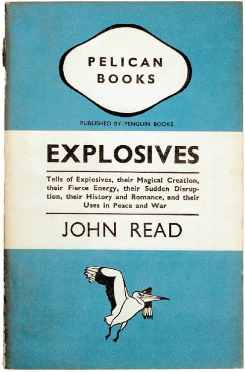
EXPLOSIVES, John Read / UK, 1942
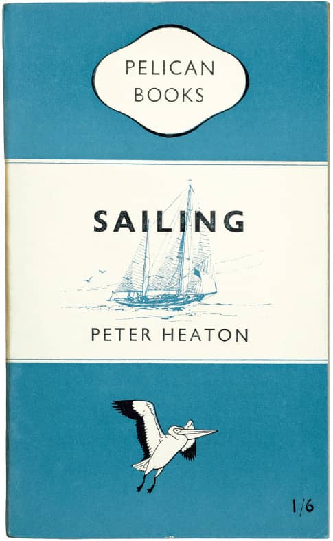
SAILING, Peter Heaton / UK, 1949
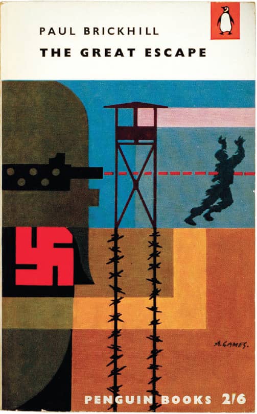
THE GREAT ESCAPE, Paul Brickhill / illustration, Abram Games / UK, 1957

THE CASE OF THE HAUNTED HUSBAND, Erle Stanley Gardner / illustration, David Caplan / UK, 1957
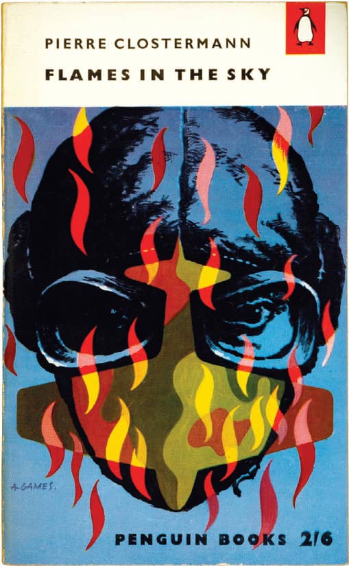
FLAMES IN THE SKY, Pierre Clostermann / illustration, Abram Games / UK, 1958
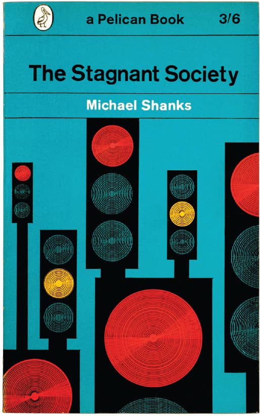
THE STAGNANT SOCIETY, Michael Shanks / Germano Facetti / UK, 1964
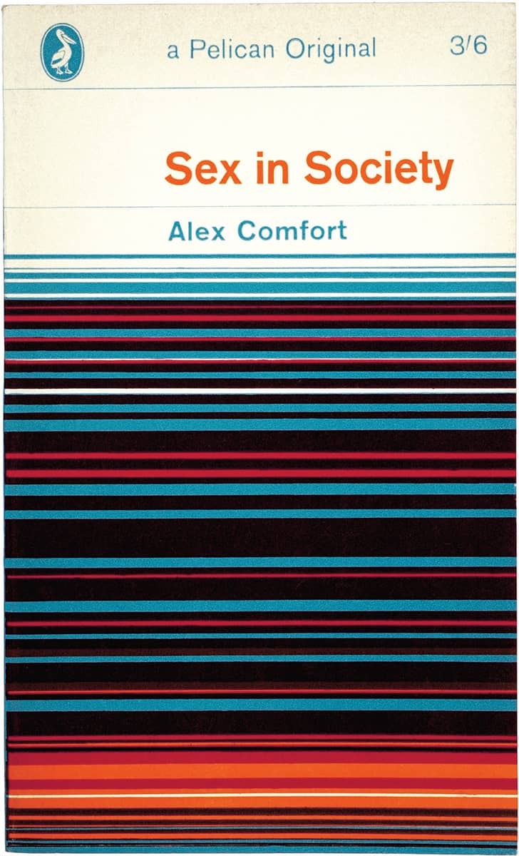
SEX IN SOCIETY, Alex Comfort / Jock Kinneir / UK, 1964
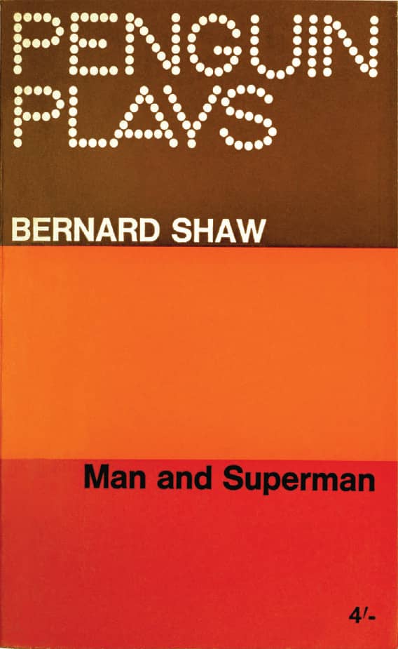
MAN AND SUPERMAN, George Bernard Shaw / Denise York / UK, 1965

RHINOCEROS, THE CHAIRS, THE LESSON, Eugène Ionesco / Denise York / UK, 1967
Aldridge left in 1967. After a year without a fiction art director, Penguin Books hired David Pelham, who brought a versatile layer of consistency—chiefly the logo on either top corner of the book and standard designs for the spines and back covers—that then allowed interpretations for the cover art and typography. Although certain authors were given a specific design that carried over several titles, the consistency that had distinguished Penguin Books slowly disappeared into the 1980s and 1990s.

TERMINAL BEACH, J.G. Ballard / illustration, David Pelham / UK, 1974

DROWNED WORLD, J.G. Ballard / illustration, David Pelham / UK, 1976
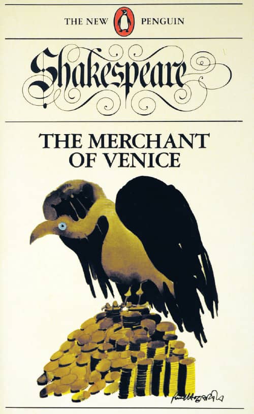
THE MERCHANT OF VENICE, William Shakespeare / illustration, Paul Hogarth / UK, 1980
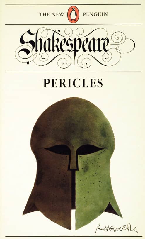
PERICLES, William Shakespeare / illustration, Paul Hogarth / UK, 1986

FRANKENSTEIN, Mary Shelley / Pentagram: Angus Hyland; photography, SMK Foto / UK, 2003

LATER ROMAN EMPIRE, Ammianus Marcellinus, selected and edited by Walter Hamilton / Pentagram: Angus Hyland; photography, Art Archive / Dagli Orti / UK, 2004

MEDITATIONS, Marcus Aurelius, translated by Maxwell Staniforth / Phil Baines / UK, 2004

CONFESSIONS OF A SINNER, St. Augustine, translated by R.S. Pine-Coffin / Catherine Dixon / UK, 2004
As a twenty-first-century publisher, Penguin Books competes in an increasingly design-conscious market populated by covers of outstanding quality, and its fiction and nonfiction covers, under the direction of Jim Stoddart, now run a wide gamut defined by the marketing and creative needs of each title, and many different designers are hired for the individual jobs. Special collections like the Modern Classics in 2000 by freelance designer Jamie Keenan, the Penguin Classics in 2003 by Pentagram’s › 162 Angus Hyland, and the deliciously tactile Great Ideas in 2004 by David Pearson briefly evince Penguin’s original approach, but with its massive reach and a concern with design since the beginning, Penguin Books is a constant and influential public mirror of the growth and evolution of the disciplines and practice of printing, design, art direction, photography, illustration, and book publishing itself.
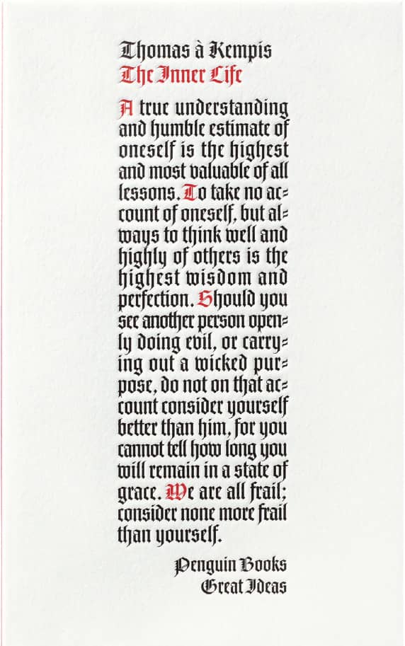
THE INNER LIFE, Thomas Kempis / Penguin: David Pearson / UK, 2004

THE CHRISTIANS AND THE FALL OF ROME, Edward Gibbon / Phil Baines / UK, 2004

CIVILIZATIONS AND ITS DISCONTENTS, Sigmund Freud / Penguin: David Pearson / UK, 2004
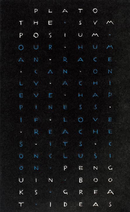
THE SYMPOSIUM, Plato / Penguin: David Pearson / UK, 2005

THE MYTH OF SISYPHUS, Albert Camus / Penguin: David Pearson / UK, 2005

THE WORK OF ART IN THE AGE OF MECHANICAL REPRODUCTION, Walter Benjamin / Penguin: David Pearson / UK, 2008

BOOKS V. CIGARETTES, George Orwell / Penguin: David Pearson / UK, 2008
Images: Reproduced by permission of Penguin Books Ltd.
New Directions
Established in 1936 by 22-year-old James Laughlin, New Directions became a haven for poets and writers—like Tennessee Williams, Ezra Pound, and William Carlos Williams—who fell outside the mainstream of literature, as Laughlin printed what other publishers wouldn’t. Covers for some of New Directions’ earliest work, including annual anthologies of recent writing and poems, were simple and, in contrast to its successors, relatively unattractive, with centered arrangements of serif typography. “A writer friend had told me,” recalls Laughlin in his (self-described) auto-bug-offery, The Way It Wasn’t, “that I ought to investigate a young chap who was doing ‘queer things’ with type.” The young chap was Alvin Lustig › 144, and their first meeting in the late 1930s developed into a 15-year relationship that yielded some of the most iconic and pioneering book covers of the time.
From his first cover for Laughlin—a concoction of metal pieces from his type cases for Henry Miller’s The Wisdom of the Heart in 1941—Lustig was able to develop, especially as he delved into the New Classics series around 1945, a visual language that, rather than relying on literal translations or representations, was driven by abstract symbols and interpretations of the writers’ texts rendered through striking color combinations (typically limited to two or three) and paired rather dexterously with either handlettering or typography. Covers for the Modern Reader series, 1946 to 1955, were similar in philosophy but starkly contrasting in their execution: dramatic, symbolic photography in black and white complemented by more restrained typography. Lustig continued to work on New Directions covers through his blindness, brought on by diabetes, until his death in 1955.
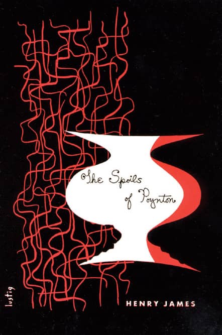
THE SPOILS OF POYNTON, Henry James / New Directions, New Classics / 1943
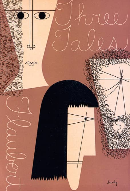
THREE TALES, Gustave Flaubert / New Directions, New Classics / 1944
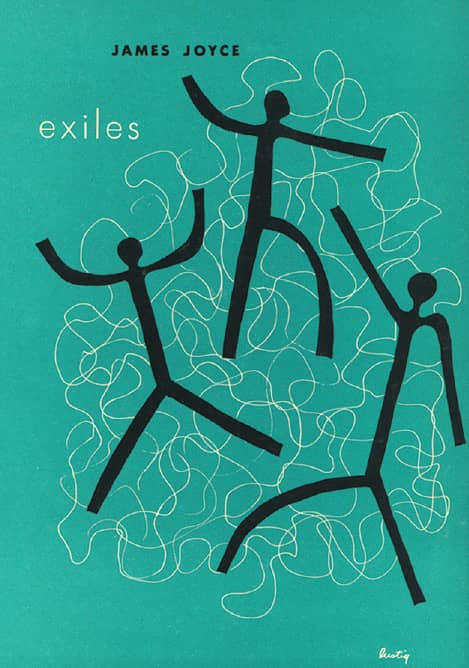
EXILES, James Joyce / New Directions, New Classics / 1946
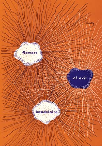
FLOWERS OF EVIL, Charles Baudelaire / New Directions, New Classics / 1946
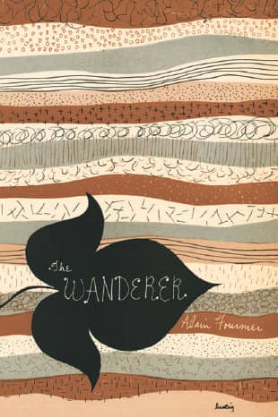
THE WANDERER, Alain Fournier / New Directions, New Classics / 1946
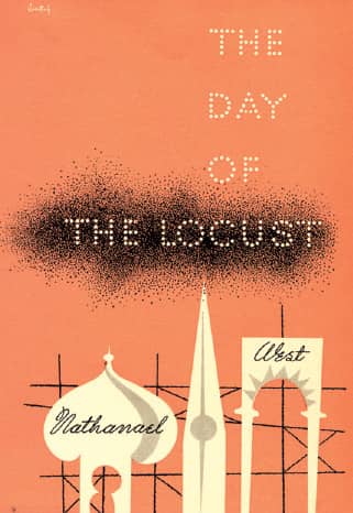
THE DAY OF THE LOCUST, Nathanael West / New Directions, New Classics / 1950

LIGHT IN AUGUST, William Faulkner / New Directions, Modern Reader / 1946
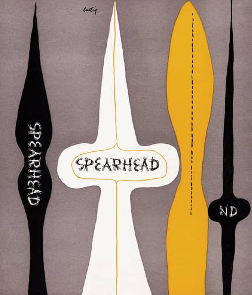
SPEARHEAD / New Directions / 1947
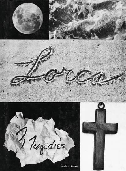
3 TRAGEDIES, Federico García Lorca / New Directions, Modern Reader / 1948

THE SHELTERING SKY, Paul Bowles / New Directions / 1948
Alvin Lustig / USA
Zone Books
When Bruce Mau › 201 started his firm, Bruce Mau Design (BMD), in Toronto in 1985, one of his first projects was designing Zone 1|2: The Contemporary City, the inaugural double issue of the independent publisher Urzone, established that same year. This was the beginning of a relationship that thrived on the cerebral combination of the books’ topics and their design. With the success of Zone 1|2, Urzone initiated an ambitious publishing program, and over the next 15 years BMD designed every single book, now a collection of more than 50 titles, as well as Zone Books’ catalogs and marketing materials—allowing Zone, as noted in Mau’s Life Style, to “explore certain terrain that would not have been accessible in the higgledy-piggledy production hierarchies of conventional publishing.”
Updating Jan Tschichold’s Penguin Composition Rules, BMD developed a set of conceptual design strategies that characterized many of the books. The “image weave,” for the Zone Readers series, featured two images that could be seen simultaneously; the “Zone morph” drew 380 interpolations of the word Zone in different typefaces for the running heads; the “constant tonal length,” considers the full body of text as a long piece of string that fluctuates when a single part changes. In isolation, these may seem farfetched conceits, but in the context of the body of work they form a uniquely designed set of books. BMD also went to great lengths in designing the physicality of the books, creating unique paper stocks or formulating the perfect ink, like “Zone Black,” which had enough density to print richly on uncoated paper. By engaging in a lengthy and committed relationship, Zone Books and BMD were able to form a fluctuating identity hinged on the liaison between content and form.

ASSORTED ZONE COVERS / Zone Books / Bruce Mau Design / Canada

SAMPLES OF THE ZONE MORPH, AN INTERPOLATION OF TYPEFACES LIKE BODONI, DIN, AND FUTURA THAT RESULTED IN 380 NEW TYPOGRAPHIC TREATMENTS, ONE FOR EACH PAGE OF ZONE 6: INCORPORATIONS / Bruce Mau Design / Canada, 1992

MATTER AND MEMORY, Henri Bergson; Translated by N.M. Paul and W.S. Palmer / Zone Books / Bruce Mau Design / Canada, 1991

ZONE 6: INCORPORATIONS, edited by Jonathan Crary and Sanford Kwinter / Zone Books / Bruce Mau Design / Canada, 1992
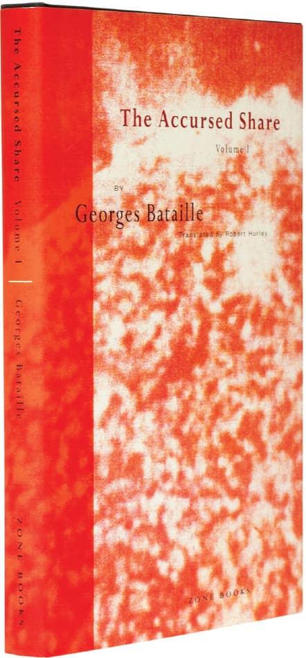
ACCURSED SHARE, VOLUME 1: CONSUMPTION, Georges Bataille; translation, Robert Hurley / Zone Books / Bruce Mau Design / Canada, 1991
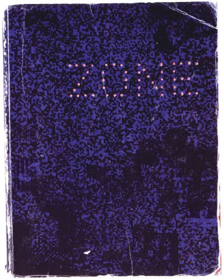
ZONE 1|2: THE CONTEMPORARY CITY, edited by Michel Feher and Sanford Kwinter / Zone Books / Bruce Mau Design / Canada, 1985
McSweeney’s
In 1998, Dave Eggers published the first issue of the literary journal McSweeney’s Quarterly Concern as a collection of magazine-rejected work, and in both its endearing design naiveté and forgivable technical scarcity it established a visual aesthetic that contrasted brightly with the visual excess of the web-driven tail end of the 1990s. The first issues were designed by Eggers himself—an accomplished writer, as attested to by his acclaimed A Heartbreaking Work of Staggering Genius, but not nearly an equally celebrated graphic designer—who chose Garamond 3 as the publication’s default typeface, later to become its signature typeface. McSweeney’s website, launched in 1999, boldly stated on its “About Us” page, “Design: Nothing will be designed”; as in the Quarterly, the prickly content and writing steered the design and commanded all the attention.
Between 2000 and 2001 the Quarterly, now with support by freelance designer Elizabeth Kairys, began a steep and lauded climb in production values. First it was loose booklets in a box; then, alternate dustjackets, rubber bands, foil stamping on cloth spines, faux-leather covers, and numerous folds, pockets, and flaps turned these books into objects worth keeping. In 2002, Eli Horowitz joined Eggers as managing editor—and second designer-without-formal-training—of McSweeney’s, which was now publishing, along with the Quarterly, books and a new magazine, The Believer. The slowly growing library of books, by authors like David Byrne, Michael Chabon, and Nick Hornby, have received the same treatment as the Quarterly and have been lusciously produced and designed despite—or perhaps because of—Eggers’s and Horowitz’s blissful ignorance of the rules and principles of graphic design.

RISING UP AND RISING DOWN, William T. Vollmann / McSweeney’s: design, Dave Eggers / USA, 2003
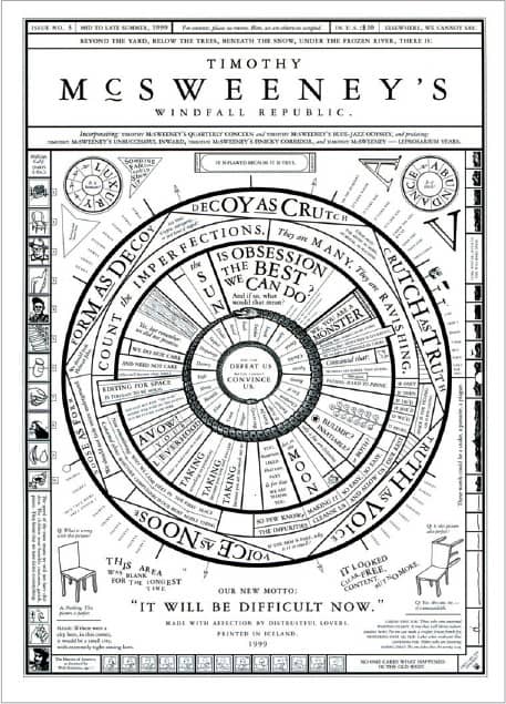
MCSWEENEY’S ISSUE 3 / McSweeney’s: design, Dave Eggers / USA, 1999

MCSWEENEY’S ISSUE 9 / McSweeney’s: design, Dave Eggers / USA, 2002

ALL KNOWN METAL BANDS, Dan Nelson / McSweeney’s: design, Alvaro Villanueva, Dan Nelson, Eli Horowitz, Autumn Wharton / USA, 2008

MCSWEENEY’S ISSUE 27 / Cover art for the stories-booklet portion / McSweeney’s: artist, Scott Teplin / USA, 2008
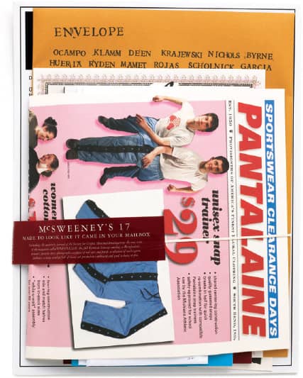
MCSWEENEY’S ISSUE 17 / McSweeney’s: design, Dave Eggers, Brian McMullen (Pantalaine and Yeti Researcher portions) / USA, 2005
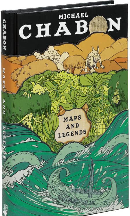
MAPS AND LEGENDS, Michael Chabon / McSweeney’s: design, Dave Eggers, Eli Horowitz, Jordan Crane; cover and jacket illustration, Jordan Crane / USA, 2008

THE PEOPLE OF PAPER, Salvador Plascencia / McSweeney’s: design, Salvador Plascencia, Eli Horowitz, Rachell Sumpter; cover illustration, Rachell Sumpter / USA, 2005
Photos: Joseph McDonald
Pocket Canons
Conceived by Matthew Darby and published by Scottish publishing house Canongate Books in 1997, the Pocket Canons presented 12 (of the 66) books from the King James Bible in a significantly contemporary approach. Each book, sold separately in pocket book form, featured an introduction by popular figures from the world of contemporary culture, from writer Will Self to musician Nick Cave—igniting controversy that atheists and Buddhists, not Christians, were penning them. The Pocket Canons were packaged, by biblical standards, unconventionally as well.
Designed by Angus Hyland from Pentagram’s › 162 London office as if they were covers for modern works of fiction, each book uses a single, stark black-and-white photograph culled from existing stock photography that alludes to its content: a nuclear explosion, the equivalent of a modern-day Armageddon, for Revelation; a reflective body of water for Genesis; a winding road for Exodus; and, perhaps too obvious not to, a whale, for Jonah. The title of each book is set in lowercase neon-orange Univers › 372, further modernizing the centuries-old texts, now available for 1 sterling pound (US$1.70 at the time) each. The series was successful, triggering a second print run in Britain (totaling 900,000 copies in circulation) and more than a dozen other countries purchasing rights to translate and distribute. In 1999, Canongate Books released a second series with 12 more books—including an introduction from the rock band U2’s singer, Bono—also designed by Pentagram. And in 2005 they released Revelations: Personal Responses to the Books of the Bible, an anthology of all the introductions—it was not designed by Pentagram.
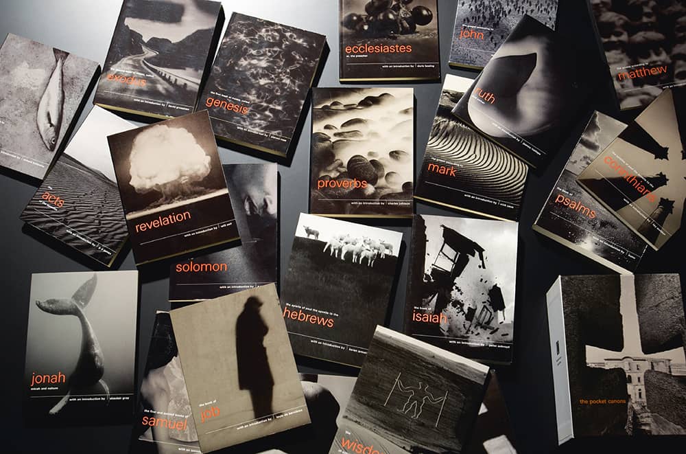
THE POCKET CANONS BOOK DESIGN FOR CANONGATE BOOKS / Pentagram: Angus Hyland / UK, 1997–1999 / Photo: Nick Turner
The Medium Is the Massage
Canadian writer, scholar, critic, media theorist (and myriad other nouns) Marshall McLuhan had a remarkable facility to construct small bursts of words and sentences, often referred to as McLuhanisms, like “The future of the book is the blurb,” or “Art is whatever you can get away with,” and in 1964, in the pages of Understanding Media: The Extensions of Man, he coined the expression “The medium is the message.” He posited that the medium—everything from television to railways to light bulbs—regardless and independent of the content it is meant to deliver has its own messages and is as much responsible for changes in human affairs as its content. In 1967, the famous McLuhanism was meant to be the title for The Medium Is the Massage: An Inventory of Effects, except that a typesetter error rendered “Message” as “Massage”—an error McLuhan was rather pleased with and approved to publish.
The Medium Is the Massage is not a book by McLuhan but rather a collection of excerpts from his writings and statements, selected and organized by graphic designer Quentin Fiore and author, editor, and book packager Jerome Agel. Through extreme crops of photography, changes in typographic scale, and repetition of elements, Fiore, who had worked as a lettering artist for Lester Beall › 146 and then established his own design practice, introduced a highly kinetic structure that, perhaps oxymoronically, was rigorously executed through a simple grid and the consistent deployment of Akzidenz Grotesk › 369. Seventeen publishers turned down the opportunity to publish The Medium Is the Massage before Bantam Books published it as a paperback. The initial run of 35,000 was quickly followed by two equal runs, and the book eventually sold close to a million copies worldwide.
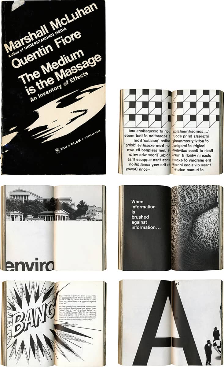
THE MEDIUM IS THE MASSAGE: AN INVENTORY OF EFFECTS, Marshall McLuhan, Quentin Fiore / Bantam Books / USA, 1967
S, M, L, XL
In theory, S, M, L, XL was 264 pages designed and finished in 265 days, but in practice, the collaboration of Dutch architect Rem Koolhaas and designer Bruce Mau › 201 engorged to 1,344 pages and finished in 1,185 days (five years). Released in 1995 as a monograph of Koolhaas and the work of his firm, Office for Metropolitan Architecture (OMA), S, M, L, XL went well beyond the expectations and traditions of an architect’s monograph. Chiefly, the book doesn’t revolve around the 30-plus houses, buildings, and urbanism projects selected but instead is a windmill of discordantly harmonious text and images, with projects organized not by sector, discipline, or chronological order but by size: from small (houses and villas) to extra-large (urban planning).
S, M, L, XL is also unusual in that, despite being a monograph on Koolhaas, its designer is given as much credit as its subject, both literally and figuratively: Other than Koolhaas’s name being printed in color, Mau’s name is given equal billing, and the book is associated as much with its delivery as with its content. Clad in a selection of relatively austere typefaces—Times New Roman › 385, Bell Gothic, and Monotype Grotesque—the book presents Koolhaas’s projects, thoughts, worldviews, and much, much more through a comprehensive barrage of distinctly arranged images that range from project drawings to a picture of an eyeball being sliced, all in deadpan layouts. As a connecting thread through the book, an alternative dictionary runs on the left edge of nearly every left-handed page with terms like Babel, confidence, and iffy. S, M, L, XL reflects not just the title of the book but also the experience of discovering the smallest details embedded in this extra-large book.
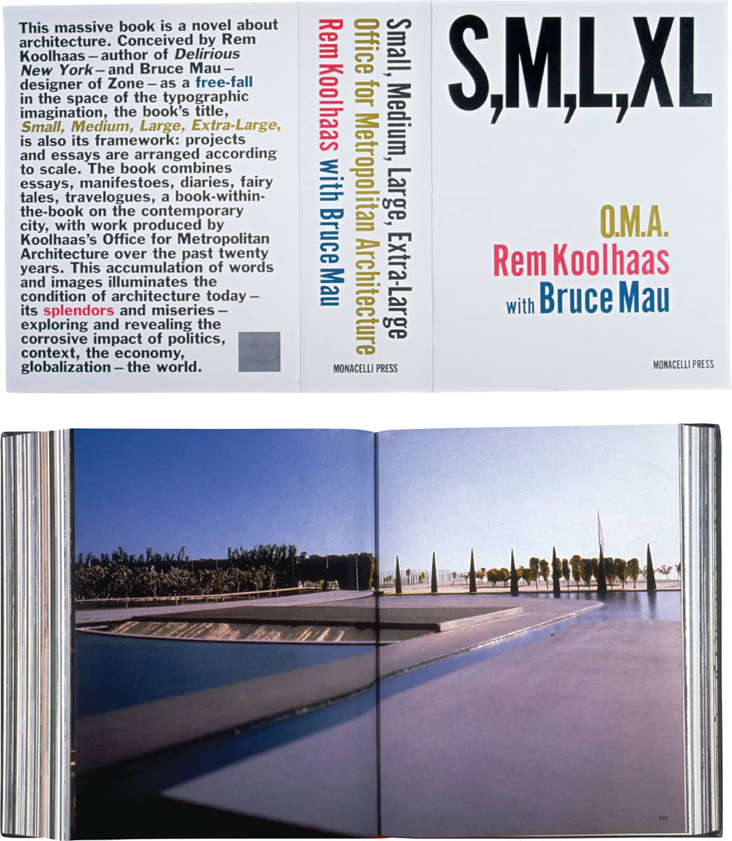
S, M, L, XL, Rem Koolhaas, Bruce Mau / Monacelli Press / Bruce Mau Design / Canada, 1995
SHV Think Book 1996–1896
In 1896, a group of eight Dutch trading families founded the Steenkolen Handels-Vereeniging (SHV, or Coal Trade Association) and soon established itself as the leading trader in German coal in Western Europe. During the twentieth century, SHV diversified into oil, transportation, and even consumer retail with the introduction of Makro, a chain of self-service wholesale stores in 1968, now with 33 stores in Europe; today, SHV is one of the largest private trading groups in the world. To commemorate the organization’s centenary, its president, Paul Fentener van Vlissingen—who inherited a large shareholding in the company from his father, Frits Fentener van Vlissingen II, whose own father had been one of the founding members—commissioned Dutch book designer Irma Boom › 193, five years in advance, to create a commemorative book.
The brief was completely open-ended and the budget was not necessarily a concern, as van Vlissingen simply asked for something “unusual,” musing that whatever it cost, it would certainly be cheaper than opening a new Makro store. Working closely with van Vlissingen and historian Johan Pijnappel, Boom delved into a five-year process. Three and a half of those years were spent on research, unearthing materials from the archives of SHV across Europe; these came together in 2,136 pages weighing nearly 8 pounds and measuring more than 4 inches thick, requiring a steel sheet on the spine to ensure its structure. Organized in reverse chronological order, the book has no page numbers or index. The viewer is coaxed into loosely exploring the book, a seemingly endless juxtaposition of archival imagery and text. The book is a winner of the “Most Beautiful Book in the World” prize awarded at the Leipzig Book Fair.
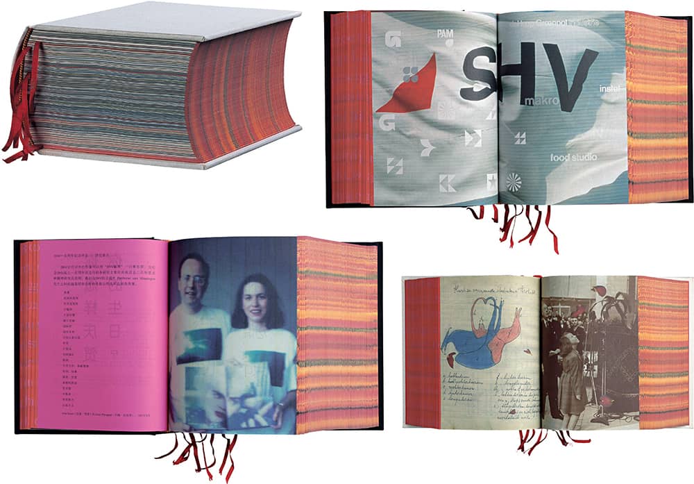
SHV THINK BOOK 1996–1896 / Irma Boom / Netherlands, 1996
Fackel Wörterbuch: Redensarten
From 1899 to 1936, Karl Kraus, an Austrian writer and journalist, self-published, edited, and authored Die Fackel (“The Torch”), a journal he used to launch scathing criticisms of Austrian society, making sure no political leader, artist, or author went unnoticed. Kraus was also highly concerned with language and the implications of every choice or mistake made in its use. Through Die Fackel, he regularly attacked other writers for their grammatical shortcomings. In 1999, the Austrian Academy of Sciences published Fackel Wörterbuch: Redensarten (Torch Dictionary: Idioms), a selection of 144 entries across 1,056 pages culled from the 37 issues of Die Fackel, which totaled more than 30,000 pages. The dictionary’s full title, for the record, is Wörterbuch der Redensarten zu der von Karl Kraus 1899 bis 1936 herausgegebenen Zeitschrift ‘Die Fackel.’
Working with Evelyn Breiteneder and Hanno Biber, literary scientists at the Academy, Los Angeles-based designer and educator Anne Burdick began a two-year collaborative process to structure and design the linguistically and visually complex dictionary. At its most basic, the book is divided in three vertical sections; the middle section carries the bulk of the content, including direct reproductions from Die Fackel, and the left and right columns are divided by “documentation texts” that quantify and categorize and “interpretive texts” for editorial commentary. At its most detailed, each entry requires the careful design of nine textual functions, and the essays at the beginning and ending of the book use a complex system of reference and quotation that prompted Burdick to invent a “multilevel system of punctuation.” Not being a book designer per se, Burdick was rather surprised when the book won the “Most Beautiful Book in the World” prize at the Leipzig Book Fair after the editors had submitted it.

WÖRTERBUCH DER REDENSARTEN ZU DER VON KARL KRAUS 1899 BIS 1936 HERAUSGEGEBENEN ZEITSCHRIFT ‘DIE FACKEL,’ Karl Kraus, Die Fackel / Österreichischen Akademie der Wissenschaften / design, Anne Burdick; typography consultant, Jens Gelhaar; photography, Susan L. Burdick / USA, 1999
VAS: An Opera in Flatland
Flatland, a satire of the social tropes of Victorian England published in 1884 by prolific author and clergyman Edwin Abbott, is narrated by Square, who talks about his two-dimensional world and describes meeting a sphere from the third dimension, among other story lines. Flatland has remained an influential book in literary and mathematical circles, serving as inspiration and reference for numerous authors, among them Steve Tomasula. In 1995, as an extension of another book he was writing, Tomasula began developing VAS: An Opera in Flatland, an exploration of genetic engineering and its influence on the body. Taking the characters from Flatland, Tomasula tells the story of Square, his wife, Circle, and their daughter, Oval, as the patriarch considers a vasectomy. The book has a kinetic, layered design by Stephen Farrell—who, coincidentally, had earlier written and rendered an essay informed by Flatland.
Tomasula and Farrell had worked together in a similar fashion at the literary magazine Private Arts and then at Emigre › 100. Around 1999, Farrell began giving VAS its unconventionally arresting look. The book uses only three spot colors: blood, matched from Farrell’s own blood; flesh, based on Crayola’s discontinued “flesh” color; and black. The text relies on three type families—Clarendon › 375, Univers › 372, and Cholla—to carry the story’s dominant voices, with a number of accent typefaces peppered throughout. Imagery was drawn from various sources: books on evolutionary biology, anthropology, and eugenics, genetics supply catalogs, doll catalogs, and plastic surgery and egg donor websites. Despite its unconventional content, VAS found a championing publisher in Barrytown | Station Hill Press, Inc. with additional distribution from Winterhouse Editions. Its first hardcover, published in 2002, sold out promptly. The University of Chicago Press handled the softcover edition, now in its second printing.
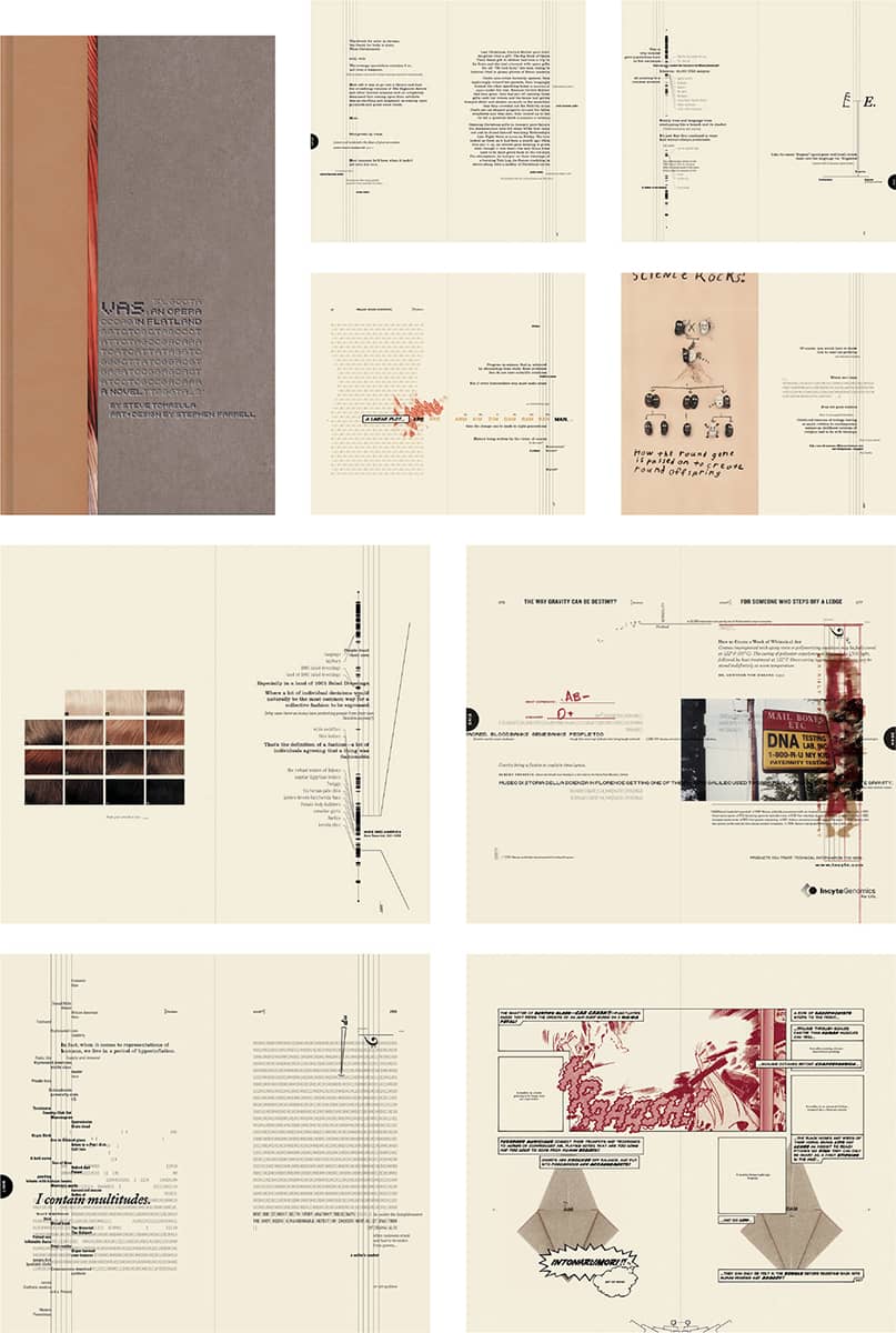
VAS: AN OPERA IN FLATLAND, Steve Tomasula, Stephen Farrell / Barrytown | Station Hill Press, Inc. / art and design, Stephen Farrell / USA, 2002
America (The Book)
As a spinoff from the popular comedy news program The Daily Show with Jon Stewart, Warner Books released America (The Book): A Citizen’s Guide to Democracy Inaction—written by Jon Stewart and the show’s motley crew of writers and “correspondents”—a comically ravaging assessment of the United States and its political process in 1994, satirizing everything Americans presumably learned in high school. Shaped and imagined just like a high school textbook, America (The Book) was designed by Paula Scher › 182 and her team, Julia Hoffmann and Keith Daigle, at Pentagram’s › 162 New York office. The writers, already at work for close to a year, began working with Pentagram with only nine months left in their schedule.
Working collaboratively with them, Scher, Hoffmann, and Daigle developed a visual language and structure that allowed visual manifestations of the text-based jokes, designing charts, timelines, graphs, quizzes, faux documents, and anything else that would elicit a laugh at the expense of America. The book wasn’t without challenges, the least of which may have been the more than 50 potential covers presented. The cover eventually selected featured a bald eagle, but as it is legally impossible to photograph these birds (an endangered species), a very (very) steep price was paid for a day of shooting a golden eagle. With some patience and wrangling, the photograph was taken with both Stewart and the eagle—a rope holding the eagle was removed in Photoshop. For the infamous graphic showing naked Supreme Court justices, Pentagram turned to a nudist colony in Vermont to supply appropriate poses. The latter joke earned the book a ban from Wal-Mart. But other than that, it was a runaway success, with 2.5 million copies printed by 2005; it spent 49 weeks on the New York Times bestseller list, and the subsequent “Teacher’s Edition” featured corrections by a “real-life bearded college professor.”
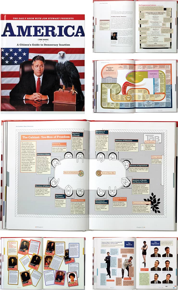
THE DAILY SHOW WITH JON STEWART PRESENTS AMERICA (THE BOOK): A CITIZEN’S GUIDE TO DEMOCRACY INACTION, Jon Stewart and the writers of The Daily Show / Warner Books / Pentagram: Paula Scher; design, Julia Hoffman, Keith Daigle / USA, 2004
FORTY-TWO-LINE BIBLE
Trained as a goldsmith and later developing skills as a gem cutter and metalworker, Johannes Gutenberg was not responsible for the invention of movable type—in one form or another, it had been developed in China centuries before—but for concocting numerous innovations that made it a viable method of production. First was the method for creating metal-cast type: A steel punch, containing the master shape of a letter, is stamped in a softer brass matrix, creating a “positive” that is then placed in a mold (a key aspect of Gutenberg’s invention) and filled with a metal alloy (Gutenberg’s proprietary formula) to create the type. Then were Gutenberg’s improvements on the printing press, derived from wine and cheese presses, which resulted in improved speed and precision. Furthering these advances was not affordable, and Gutenberg borrowed a substantial amount of money from Johann Fust, a wealthy Mainz merchant and financier who accepted Gutenberg’s equipment as collateral. A second loan from Fust was meant to finance the production of a Bible per Gutenberg’s aspirations.
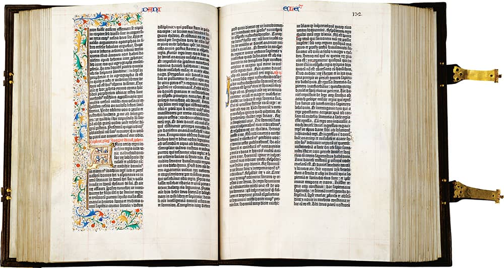
BIBLIA LATINA, 42 LINES FOL. 131V–132R / Photo: Courtesy of The Pierpont Morgan Library, New York PML 13
Around 1452, Gutenberg began the printing of the forty-two-line Bible. First with two and then four presses, the 1,282 pages were typeset in a textura blackletter; spaces for ornamental initial caps were left blank, to be filled in later by hand. It is estimated that 210 copies were produced. In 1455, for undefined reasons, Fust sued Gutenberg, and when he failed to appear in court, Fust seized all equipment and work—reaping the benefits of the sale of the momentous forty-two-line Bible. Gutenberg continued printing, producing a Catholicon (religious dictionary) for Johannes Balbus in 1460. As far as historic status goes, good guys do finish first—Gutenberg’s name is synonymous with printing, Fust’s not as much.
Ulysses
In 1918, The Little Review, an American literary publication, began publishing installments of Irish writer James Joyce’s Ulysses; in 1920, it was tried under obscenity charges and ordered to cease publication. Ulysses was banned in the United States until 1933, when Random House was able to lift the ban and publish the first American edition in 1934. The book is considered a foremost example of modernist literature, and the Random House covers, especially the first edition, by Ernst Reichl, and the 1949 edition, by E. McKnight Kauffer, also serve as examples of modernism. It was in this simple, typographic-driven vein—in particular McKnight’s use of the oversized U—that the editor and art director of Random House’s Vintage books asked Carin Goldberg to create a book cover for a 1986 reprint. Goldberg’s eventual solution paid homage to a 1928 Paul Renner poster for a Zurich exhibition of work from the Bavarian Trade Schools.
During the 1980s, designers like Peter Saville › 180 and Barney Bubbles › 181 in the United Kingdom and Charles S. Anderson › 195, Paula Scher › 182, and Goldberg in the United States began mining historical resources in their work, and as questions about appropriation arose during the height of postmodernism, work like Goldberg’s Ulysses cover came under fire as being abusive of history. “One symptom of this tendency,” wrote Tibor Kalman › 183, Abbott Miller, and Karrie Jacobs in “Good History/Bad History,” a 1991 article for Print › 94, “has been the production of graphic design in which style is a detachable attribute, a veneer rather than an expression of content. This is nowhere clearer than in the so-called historicist and eclectic work which has strip-mined the history of design for ready-made style.” Goldberg doesn’t dwell on the debate. “I moved on,” she quipped in a 2007 interview for STEP › 102, “the day after I handed in the comp.”
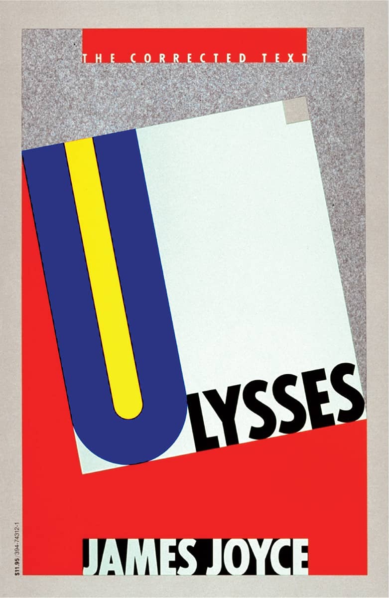
ULYSSES, James Joyce / Random House / Carin Goldberg / USA, 1986

BAVARIAN TRADE SCHOOLS EXHIBITION POSTER / Paul Renner / Germany, 1928
The Lover
“At the age of fifteen,” wrote Marguerite Duras in 1984’s The Lover, “I had the face of pleasure, and yet I had no knowledge of pleasure. There was no mistaking that face.” Duras’s memoir chronicling her affair as a 15-year-old girl with a Chinese businessman nearly twice her age in 1930s colonial Indochina begins with reflections on her facial features and their transformation over time—a state of flux elegantly captured in the author’s photograph that graces the cover designed by Louise Fili › 197, then art director at Pantheon. The photograph of Duras, taken at the time of her affair, is vignetted, isolating the face from all context and directly engaging the reader.
As in many of her covers, Fili’s Lover interpolated an historical aesthetic, in this case 1930s Art Deco, with her unconventional instinct to revive found letterforms from the printed ephemera and packaging she collects from flea markets around the world. For The Lover, she worked with letterer and designer Craig De Camps to create the red, elongated letters with their barely present shadows. In contrast to other book covers of the time, Fili’s simple three-color cover was subtly loud.

THE LOVER, Marguerite Duras / Pantheon / Louise Fili / USA, 1983

EVERYTHING IS ILLUMINATED, Jonathan Safran Foer / Perennial, an imprint of HarperCollins / Jonathan Gray / USA, 2002
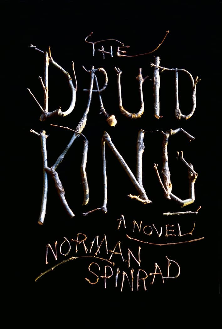
THE DRUID KING, Norman Spinrad / Knopf Publishing Group, Random House / Doyle Partners: Stephen Doyle / USA, 2003
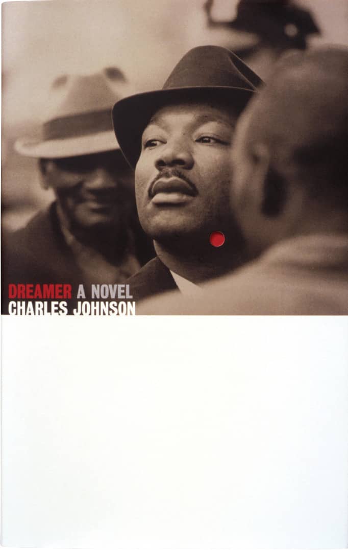
DREAMER, Charles Johnson / Scribner / Pentagram: Angus Hyland / UK, 1999

ALBERT CAMUS SERIES / Vintage / art direction, John Gall; design, Helen Yentus / 1989, 1991, 1991, 1991, 2007
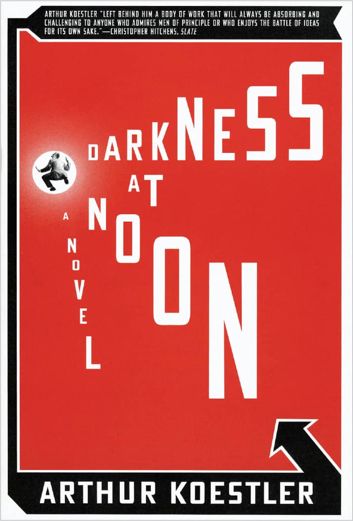
DARKNESS AT NOON, Arthur Koestler / Scribner / Paul Sahre / USA, 2006

JURASSIC PARK, Michael Crichton / Knopf Publishing Group, Random House / Chip Kidd / USA, 1990

THE NEW TESTAMENT, translated by Richmond Lattimore / North Point Press / Chip Kidd; photography, Andres Serrano / USA, 1996

SOUTH OF THE BORDER, WEST OF THE SUN, Haruki Murakami / Vintage / John Gall / USA, 2000

MAO: L’UOMO, IL RIVOLUZIONARIO, IL TIRANNO, Philip Short / Rizzoli / Mucca Design: art direction, Andrea Brown / Italy, 2006
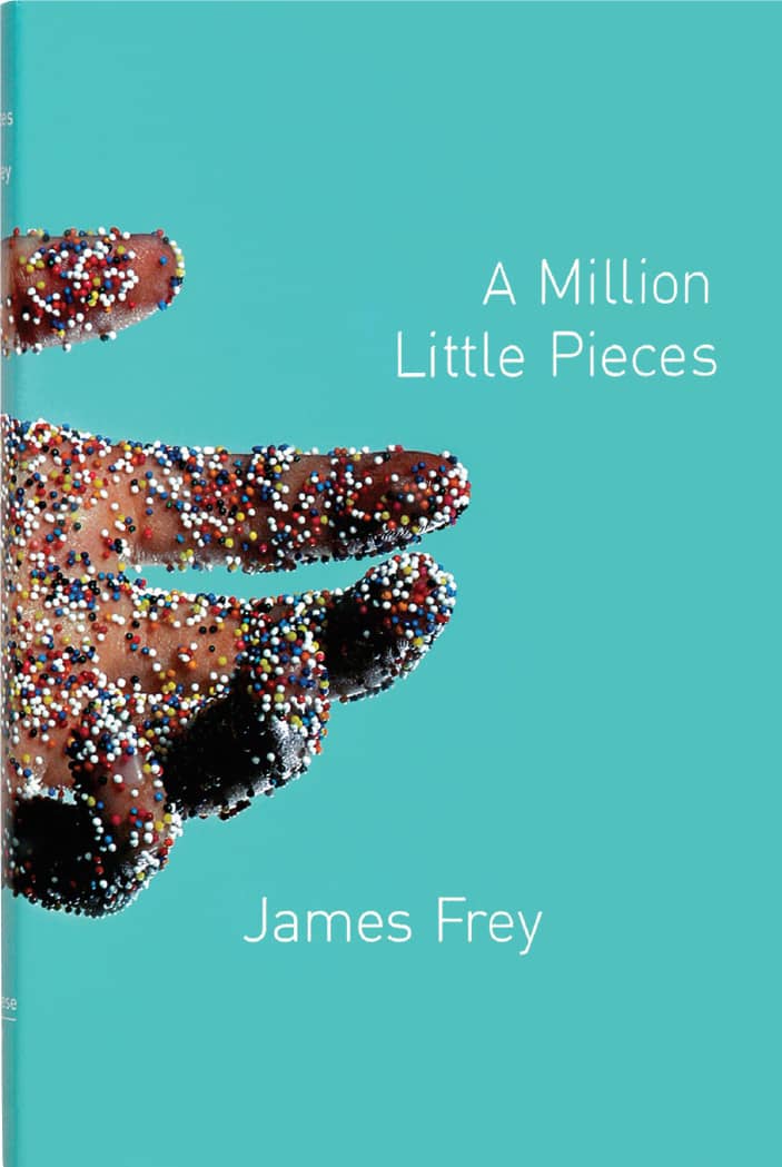
A MILLION LITTLE PIECES, James Frey / Anchor / Rodrigo Corral / USA, 2003
ANNUAL REPORTS
Formed in 1934 as an agency of the U.S. federal government, the Securities and Exchange Commission (SEC) is responsible for overseeing the stock market and preventing corporate malfeasance in stock sales and financial reporting to shareholders. As part of the Securities Exchange Act of 1934, all publicly traded corporations became required to submit quarterly and annual reports detailing their finances. Little did the SEC know that 50 and 60 years later, annual reports would be one of the most lucrative and creative categories of project for the graphic design profession.
For the first 10 or 12 years, centered arrangements and margin-to-margin typography were the norm in four- or eight-page documents. By the early and mid-1940s, corporations saw the potential of the annual report as a public relations vehicle to communicate not just with their shareholders and the government but with employees, prospective investors, and the media. At first it was the cover of the annual report that received most of the attention, but steadily, as print and type production became more affordable and accessible, corporations developed the inside with more care to showcase their story through photographs, diagrams, and rich narrative stories.

EASTMAN KODAK COMPANY 1927 ANNUAL REPORT / USA, 1926

TIME WARNER, INC., 1989 ANNUAL REPORT / Frankfurt Gips Balkind, NY/LA: cover photography, Scott Morgan / USA, 1990

TUPPERWARE CORPORATION 2001 ANNUAL REPORT / SamataMason / USA, 2002
By the mid-1950s, annual reports were attracting talented graphic designers who began to orchestrate the story, design, and production of these documents. A notable early contribution was by Erik Nitsche › 148, who was in charge of the identity of General Dynamics, which he extended from advertising to annual reports, presenting a cohesive design for the company. In the 1960s and 1970s, esteemed designers like Saul Bass › 158 and Lester Beall › 146 included annual reports in their multidisciplinary practices. Paul Rand › 159 created reports that adhered to bigger identity programs for IBM and Cummins, and in-house design executives like Lou Dorfsman › 173 at CBS and John Massey at Container Corporation of America executed consummate documents. The practice kept growing through the late 1970s and 1980s, with design firms like Arnold Saks and Jonson Pedersen Hinrichs & Shakery taking on multiple annual reports every year. Even Push Pin Studios › 168 was in on the action.
Up to that point, annual reports were handsomely produced and designed, but they followed relatively conventional norms by presenting text and image in a clear, professional manner. In 1989 Warner Communications, Inc., and Time, Inc., merged to form one of the largest media and entertainment companies in the world, and its groundbreaking annual report served to signal a new kind of company. Designed by Frankfurt Gips Balkind, the report was a restlessly kinetic display of information that presented expressive bursts of text, facts, and imagery in condensed bundles for quick consumption. Printed in black and yellow, green, orange, and pink fluorescent colors, the report did not just speak to its shareholders and the media, it screamed. The New York Times even covered the report to mixed peer reviews, with Alan Siegel claiming it “trivializes an important and valuable company,” while Stephen Doyle complained that “[the] report is sometimes so confusing, it might as well have been printed in a foreign language.” Frankfurt Gips Balkind’s work set the stage for a new breed of graphically emotional annual report.

IBM 2000 ANNUAL REPORT / VSA Partners: art direction, Curt Schreiber, Jeff Walker; design, Greg Sylvester, Scott Hickman / USA, 2001


As the 1990s wore on, a few firms surfaced as the leaders in this discipline, creating dozens of annual reports every year and dominating awards shows: Cahan & Associates, VSA Partners › 194, and SamataMason, along with smaller firms or solo designers like Tolleson Design, Thirst › 200, and Jennifer Sterling. The concept, execution, and production of their work were consistently impressive and turned the annual report into a creative venture that required engaging storytelling, confident pacing, imaginative photography and illustration, flawless typography, and ingenious information graphics. By the end of the century, annual reports for corporations and nonprofit organizations were some of the most coveted and celebrated projects. This near-obsession has lent itself to mockery. Virtual Telemetrix, a fictitious corporation created by designer John Bielenberg, issued an annual report in 1993 and 1997 with faux text, imagery, and diagrams poking fun at both designers and clients. In 2001, for the forty-fifth Mead Show Annual—the now defunct premiere competition for annual reports—VSA Partners designed a pocket-sized compendium that featured the winners as well as humorous tips for the industry, presented in bundles of 45, as in “45 Ways to Say Change,” “45 Ways to Photograph an Executive,” and “45 Things You Forgot in Order to Win This Award.”

FOR GOURMETS ONLY 2001 PODRAVKA ANNUAL REPORT / Bruketa&ŽinićOM: creative direction, Davor Bruketa, Nikola Zinic / Croatia, 2002

BON APPETIT 2002 PODRAVKA ANNUAL REPORT / Bruketa&ŽinićOM: creative direction, Davor Bruketa, Nikola Zinic / Croatia, 2003
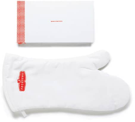
SECRETS OF GOOD CUISINE 2003 PODRAVKA ANNUAL REPORT / Bruketa&ŽinićOM: creative direction, Davor Bruketa, Nikola Zinic; art direction and design, Maja Bagic; photography, Marin Topic / Croatia, 2004
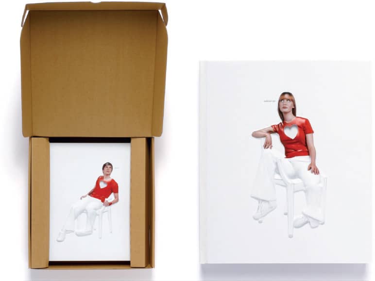
FEED ME 2004 PODRAVKA ANNUAL REPORT / Bruketa&ŽinićOM: creative direction, Davor Bruketa, Nikola Zinic; photography, Marin Topic, Domagoj Kunic / Croatia, 2005

EXCERPT OF THE ETERNAL DEBATE ABOUT THE HEART 2005 PODRAVKA ANNUAL REPORT / Bruketa&ŽinićOM: creative direction and writing, Davor Bruketa, Nikola Zinic; art direction and design, Imelda Ramovic, Mirel Hadzijusufovic; photography, Domagoj Kunic / Croatia, 2006

WELL DONE 2006 PODRAVKA ANNUAL REPORT / Bruketa&ŽinićOM: creative direction and writing, Davor Bruketa, Nikola Zinic; art direction and design, Imelda Ramovic, Mirel Hadzijusufovic / typography, Nikola Djurek; illustration, Nikola Wolf; photography, Domagoj Kunic / Croatia, 2007
Back in 1987, the SEC had already allowed for smaller reports to be filed, and starting in 1993 it required that Form 10-K, the nuts and bolts of the financial information, be submitted electronically, leaving the adorned printed annual report as a kind of optional luxury for corporations. As budgets tightened after 2001, some corporations took their annual report online, attempting to bring the same kind of design emphasis to the medium or simply posting a PDF document on their website. Attractive printed annual reports are still being created, but without the same fervor and volume of the 1990s, and design firms that counted on the income of annual report season have diversified into other disciplines. As 2008 comes to an economically dismal close, with most corporations having little to no good news to share, the annual report might soon return to its roots as a dull, obligatory document.
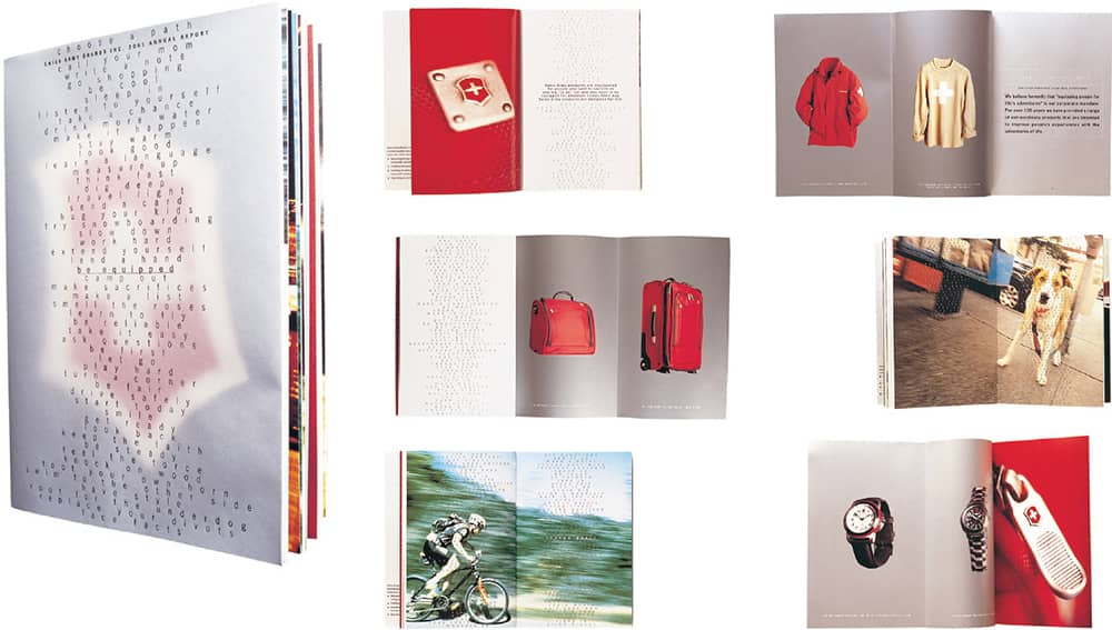
SWISS ARMY BRANDS, INC. 2001 ANNUAL REPORT / SamataMason / USA, 2002
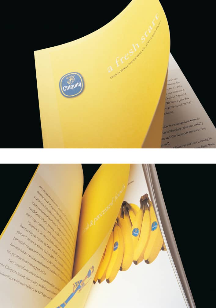
CHIQUITA BRANDS INTERNATIONAL, INC. 2001 ANNUAL REPORT / SamataMason / USA, 2002

Blue Note Records
Brought together by German immigrant Alfred Lion, pianists Albert Ammons and Meade Lux Lewis recorded the first Blue Note Records album in January 1939. Later that year, Lion’s childhood friend Francis Wolff, a photographer, arrived in New York from Germany and joined Lion in his spare time to evolve Blue Note through their mutual passion for jazz. Through the 1940s—with a two-year interruption starting in 1941, when Lion was drafted into the U.S. Army—Blue Note increased its library and embraced the changing sounds of jazz, working with artists like Thelonious Monk, Fats Navarro, and Bud Powell. One of their first album cover designers was saxophonist Gil Melle, who also recorded under Blue Note. In the late 1940s and early 1950s, two other designers contributed to the label: Paul Bacon, who later became a prolific book cover designer; and John Hermansader, whose simple and bold use of photography and typography preceded the iconic covers produced between 1956 and 1967 by Reid Miles.
Arriving in New York from Los Angeles, Miles was hired by Hermansader as his assistant, giving him the opportunity to woo Lion and Wolff with his work for Blue Note. Following a brief position at Esquire › 326 magazine, Miles was hired as the designer for Blue Note in 1956. Combining the soulful black and white photographs Wolff took during recording sessions, depicting the artists in their true element, with impeccably simple yet infinitely varied typographic treatments and lone bursts of color, Miles established the singularly distinctive look of Blue Note. Interestingly, Miles much preferred classical music over jazz, often giving away the album copies he received from Blue Note. Miles designed approximately 500 covers until 1967 when, two years after Liberty Records purchased Blue Note, he and Lion left. Wolff stayed at the label until his death in 1971.

INNER URGE, Joe Henderson / 1964
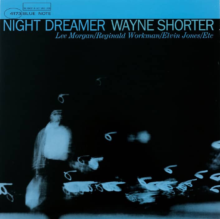
NIGHT DREAMER, Wayne Shorter / 1964
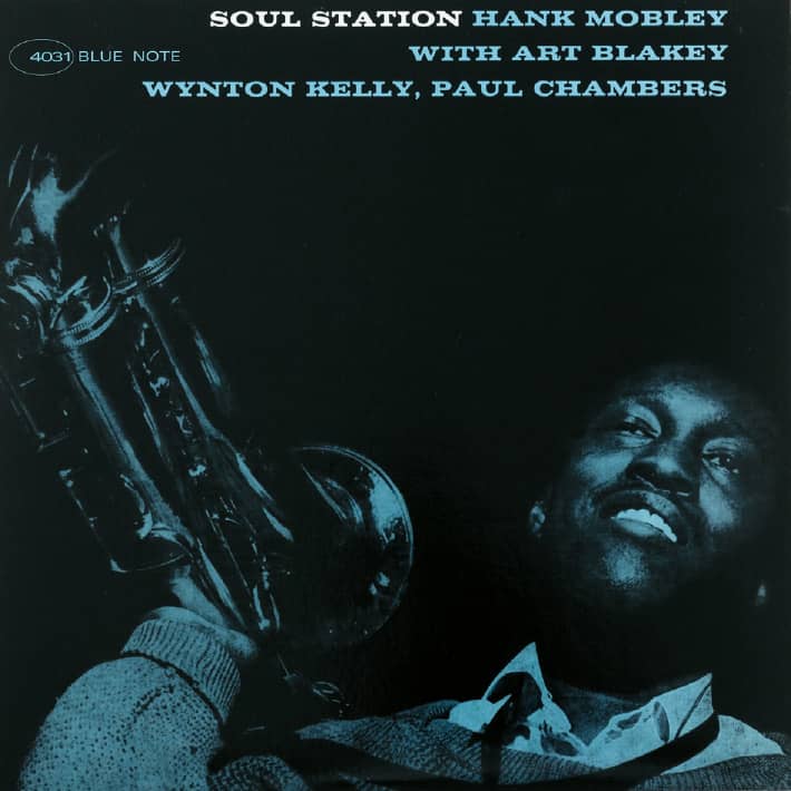
SOUL STATION, Hank Mobley / 1960
Blue Note Records / design, Reid Miles; photography, Francis Wolff (except for Out to Lunch!) / USA
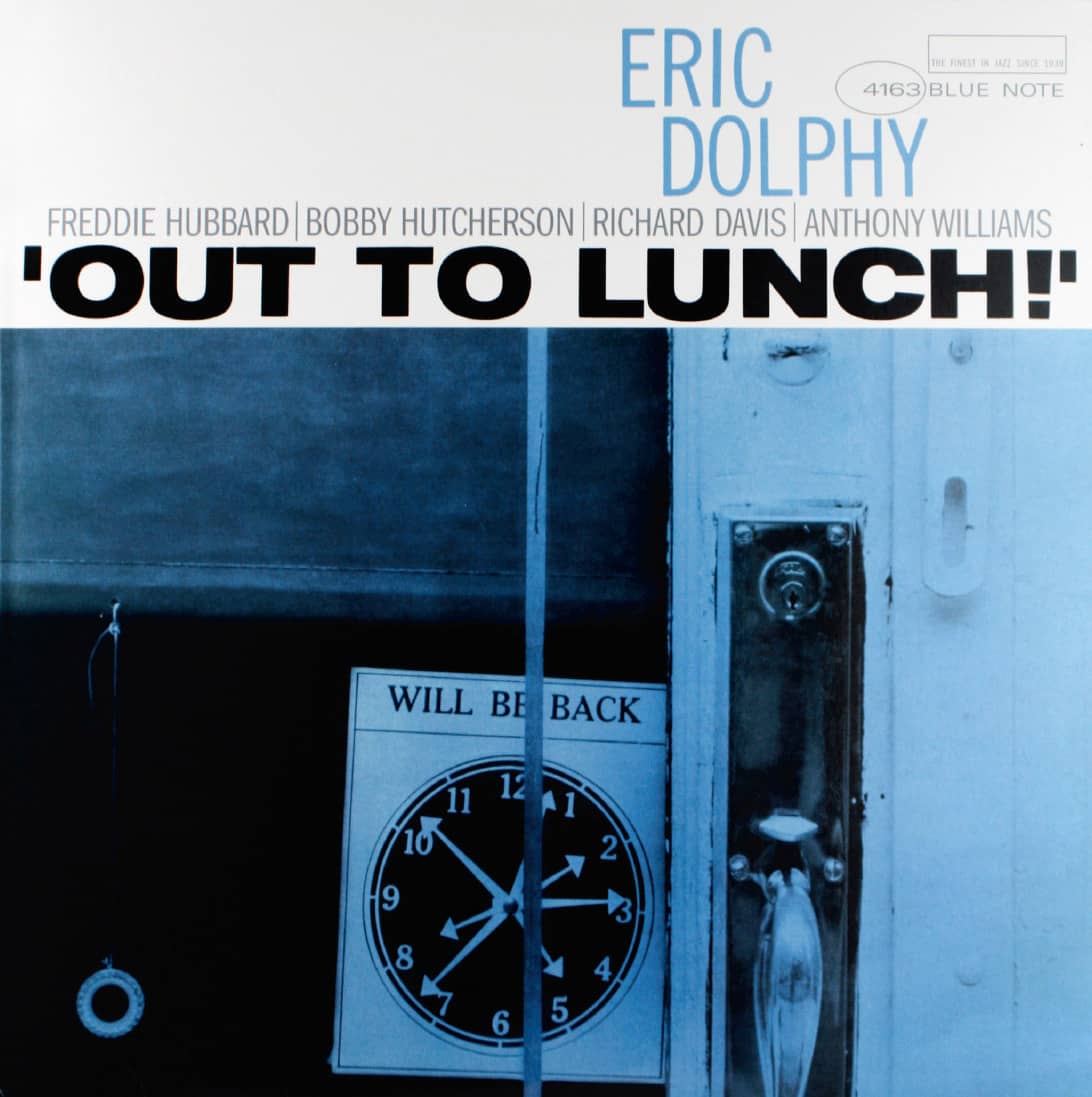
OUT TO LUNCH!, Eric Dolphy / photography, Reid Miles / 1964
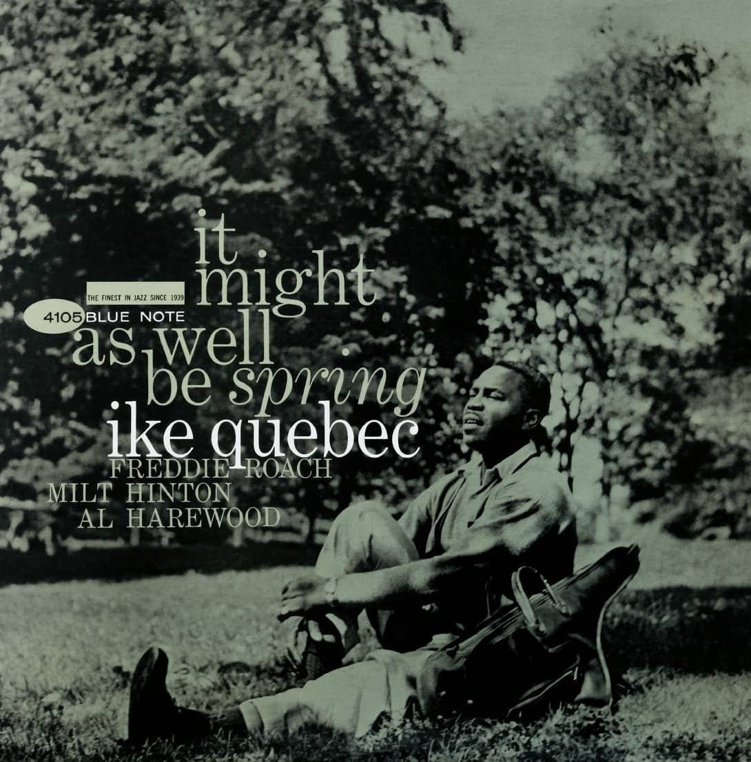
IT MIGHT AS WELL BE SPRING, Ike Quebec / 1961
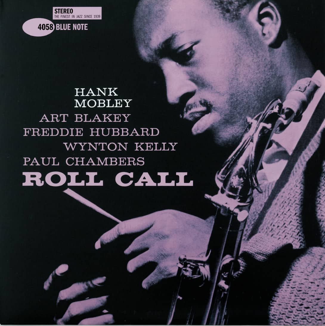
ROLL CALL, Hank Mobley / 1960

BLUE TRAIN, John Coltrane / 1957
Columbia Records
Established in 1888, Columbia Records went through several ownership changes and became a blip in the library of the American Record Corporation (ARC) by 1934. However, in 1938 Columbia Records was reestablished when Columbia Broadcasting System (CBS) purchased ARC. Through the next four decades, it produced an astounding number of memorable and influential album covers through the stewardship of its famous art directors, designers, and freelance illustrators and photographers. The initial responsibility fell on Alex Steinweiss › 142—who, unofficially, invented the album cover by using artwork and typography together for the previously stale pasteboard folders for 78 rpm records. Steinweiss remained at Columbia Records until 1944, when he joined the U.S. Navy, but he continued designing for them independently until the early 1950s. Meanwhile, staff member (and eventual renowned illustrator) Jim Flora took his position, but, weary of the office’s dynamics, left in 1950, leaving an inspiring trail of his artwork in numerous album covers.
In 1954, S. Neil Fujita, previously at advertising agency N.W. Ayer & Son, was appointed art director. While many of his album covers featured his own illustrations, he introduced bolder and more dramatic photography and typography. Taking one year off to run his own studio in 1957—Roy Kuhlman unceremoniously filled in—Fujita left in 1960. Having worked for Alexey Brodovitch › 143 at Harper’s Bazaar › 327, Bob Cato was the next art director in 1959. His social flair played well across the art department, sales and marketing, and even with musicians and artists like Andy Warhol, Robert Rauschenberg, and R. Crumb. In 1960 Cato hired John Berg, and the two worked together until Cato’s departure in 1968. With Berg at the helm and Columbia Records enjoying increasing success throughout the 1970s, the label’s creative department became a magnet for talented designers—among them Paula Scher › 182, Carin Goldberg, and Henrietta Condak—and was a commanding bastion of album cover design until the mid 1980s. At that point, Columbia Records lost steam; it was purchased by Sony in 1988.
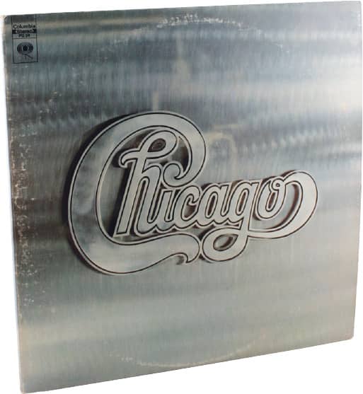
CHICAGO V / In more than a dozen covers for Chicago, John Berg kept the size and position of the logo consistent, rendering it differently each time / design, John Berg; illustration, Nicholas Fasciano / 1969

RIMSKY-KORSAKOV’S GREATEST HITS / illustration, Milton Glaser / 1971
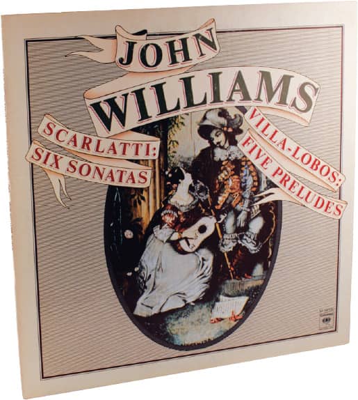
SCARLATTI: SIX SONATAS; VILLA-LOBOS: FIVE PRELUDES, John Williams / design, Paula Scher; cover art, courtesy of the Victoria and Albert Museum / 1972
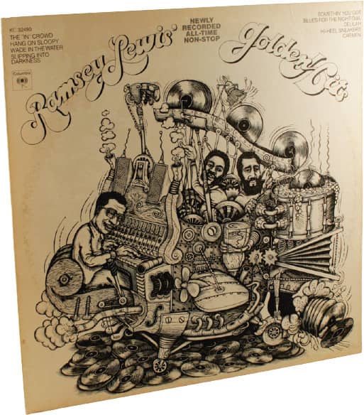
RAMSEY LEWIS’ NEWLY RECORDED, ALL-TIME, NON-STOP GOLDEN HITS / design, John Berg, Karen Lee Grant; illustration, James Grashow / 1973
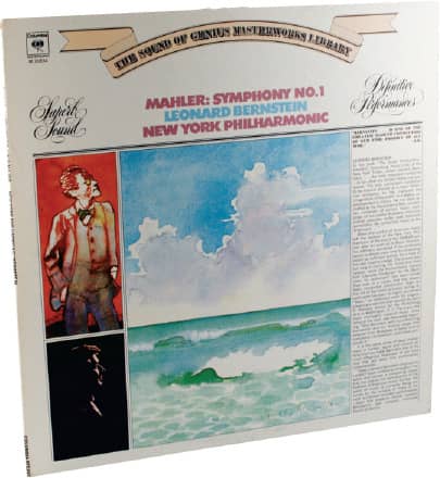
MAHLER: SYMPHONY NO. 1, New York Philharmonic / design, John Berg, Hiroshi Morishima, Richard Mantel; illustration, James McMullan / 1973
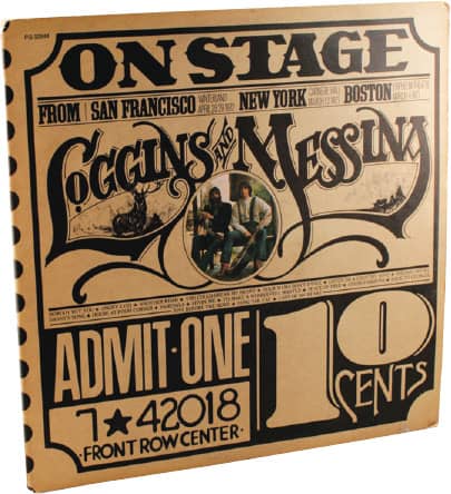
ON STAGE, Loggins and Messina / 1974

SUITE FOR FLUTE AND JAZZ PIANO, Jean-Pierre Rampal / design, John Berg, Andy Engel; illustration, Roger Huyssen / 1975
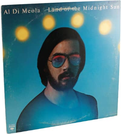
LAND OF THE MIDNIGHT SUN, Al Di Meola / design, Paula Scher; photography, Jerry Abromowitz / 1976
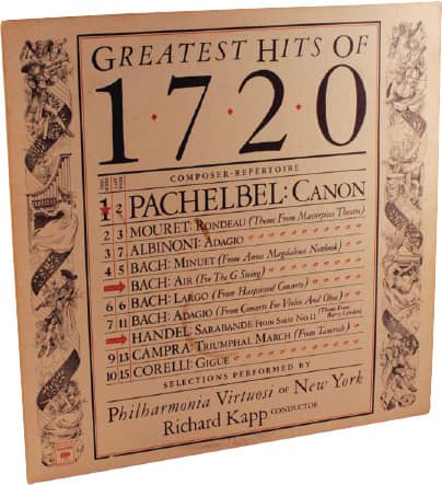
GREATEST HITS OF 1720, Philharmonia Virtuosi of New York / design, Robert Biro; illustration, Laszlo Kubinyi / 1977
Columbia Records / USA
4AD
As employees of Beggars Banquet—an independent record label formed in 1977 from a series of new and used record stores in London opened in 1974—Ivo Watts-Russell and Peter Kent launched Axis, a subsidiary label, in 1979. An identically named label forced them to change their name, and they settled on 4AD. By the end of their first year, with seminal bands like Modern English and Bauhaus, 4AD released nearly 20 records, and Kent left to establish another label, while Watts-Russell remained in charge.
1981 marked the beginning of a long collaboration between 4AD and Vaughan Oliver, who began his career almost gnawingly. Drawn to the idea of designing record covers, he enrolled in Newcastle Polytechnic in 1976 for graphic design but focused on illustration while avoiding typography and graphic design altogether; not until he was working at packaging firm Michael Peters & Partners (MP&P), where he was obligated to use it, did he discover the potential of typography as something he could subvert through his own approach.
Oliver knew Watts-Russell through their shared interest in music and frequent meetings at clubs. He began working on a freelance basis with 4AD while still at MP&P, eventually becoming a fulltime employee in 1983. He was responsible for the majority of the firm’s album covers through the late 1980s, establishing the mysterious and uncommon visual language the label, designer, and bands like the Pixies and the Cocteau Twins became known for. Working in collaboration with photographer Nigel Grierson, the firm’s work was credited as Envelope 23 until 1988, when Grierson left and Oliver adopted the name V23 working collaboratively with designer Chris Bigg. In 1998 they established a formal partnership when they left the 4AD offices, allowing them to work on other projects while still taking commissions from 4AD, which also began working with other designers—but it was that early, practically unadulterated output by Envelope23 and V23 that gave 4AD much of its luster and appeal.

DOOLITTLE, Pixies / 4AD / v23: art direction and design, Vaughan Oliver; photography, Simon Larbalestier / UK, 1989

BOSSANOVA, Pixies / 4AD / v23: art direction and design, Vaughan Oliver; design assistance, Chris Bigg; photography, Simon Larbalestier; globe, Pirate Design / UK, 1990

COME ON PILGRIM, Pixies / 4AD / v23: art direction and design, Vaughan Oliver; photography, Simon Larbalestier / UK, 1987
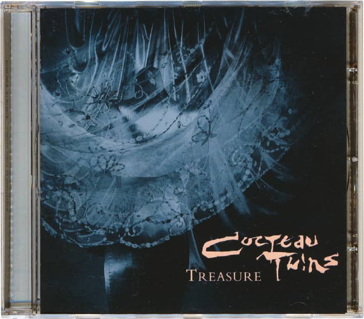
TREASURE, Cocteau Twins / 4AD / 23 Envelope / UK, 1984
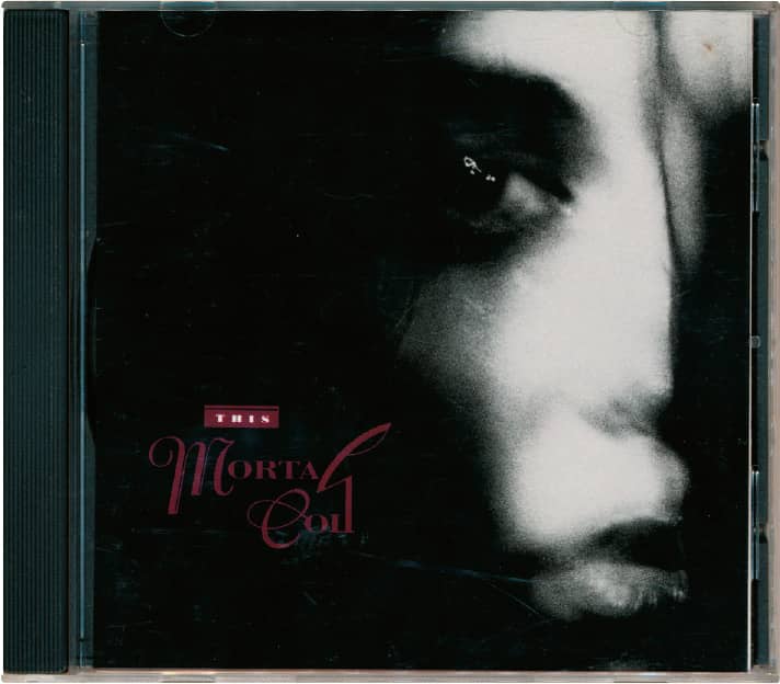
FILIGREE AND SHADOW, This Mortal Coil / 4AD / 23 Envelope; photography, Nigel Grierson / UK, 1986
Hipgnosis
Doing book covers for Penguin Books › 274 in the late 1960s under the moniker of Consciousness Incorporated, Storm Thorgerson and Aubrey Powell, whose early circle of friends included Pink Floyd’s Syd Barrett and Roger Waters, established Hipgnosis in 1968 to accommodate the commission to design Pink Floyd’s second album, A Saucerful of Secrets; the relationship lasted for more than two decades and nearly a dozen album covers. At first, the Hipgnosis facilities consisted of Powell’s bathroom as a darkroom, but the firm soon established a studio in London, and in 1974, musician and photographer Peter Christopher joined as an assistant, later becoming a partner. Both Thorgerson and Powell studied film and had no formal concept of design—at least not in the typical sense of typographic and layout knowledge—and their proficiency in photography wasn’t immediate, so their album covers were invariably driven by the narrative of a single image concocted in their imagination . . . and what an imagination.
With today’s digital technology, it’s easy to forget that the surreal compositions of Hipgnosis actually existed to be photographed—for example, the 120 inflatable red balls lined up in the Moroccan desert for Elegy or the 40-foot-long inflatable pig hoisted over Battersea Power Station for Animals. Other covers were exceptional works of retouching and paste-up, bringing to life some of the most unexpected concepts, and many illustrators and lettering artists—notable among these was George Hardie—further contributed to the diversity of Hipgnosis’s covers. The group separated in 1983, but the visual legacy they left was probably as important as the cultural imprint left by the musicians they collaborated with: Peter Gabriel, Genesis, Pink Floyd, Led Zeppelin, and Black Sabbath.

ANIMALS, Pink Floyd / Columbia Records / sleeve design, Roger Waters; organized by Storm Thorgerson, Aubrey Powell; graphics, Nick Mason; photography, Aubrey Powell, Peter Christopherson, Howard Bartrop, Nic Tucker, Bob Ellis, Bob Brimson, Colin Jones; inflatable pig, E.R.G. / USA, 1977
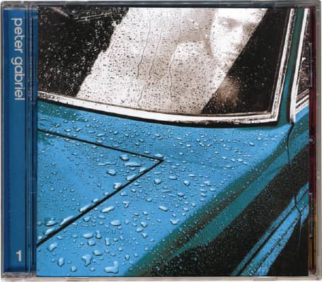
PETER GABRIEL | 1 / Charisma Records / Hipgnosis / UK, 1977
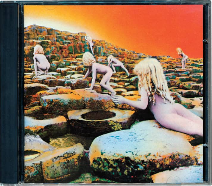
HOUSE OF THE HOLY, Led Zeppelin / Atlantic Recording Corporation / Hipgnosis / UK, 1973

PETER GABRIEL | 3 / Charisma Records / Hipgnosis / UK, 1980 (Note: this is a reissue; the design differs from the original)

TECHNICAL ECSTASY, Black Sabbath / Vertigo Records / Hipgnosis / UK, 1976
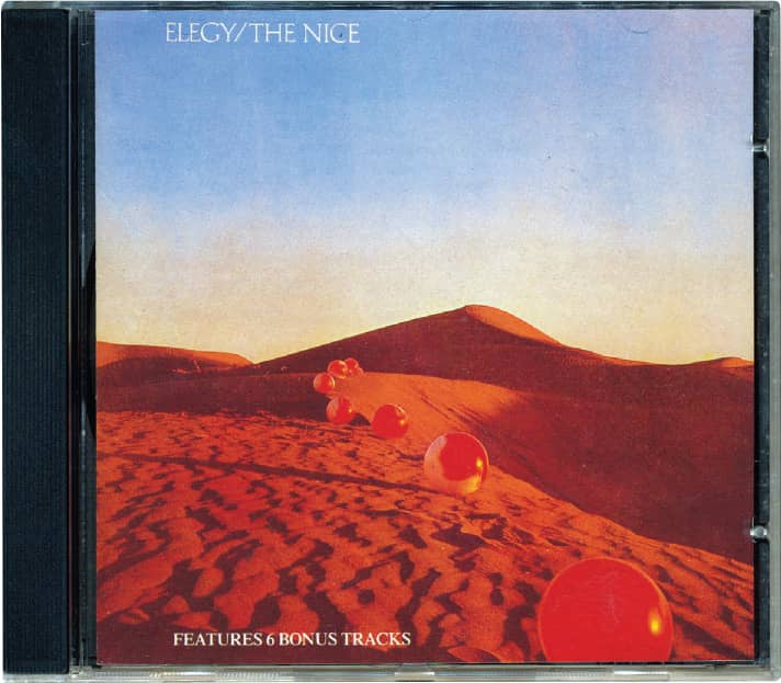
ELEGY, The Nice / Charisma Records / Hipgnosis / UK, 1971
Sun Ra
Born on the South Side of Chicago in the early 1950s, Sun Ra—birth name Herman Poole Blount, legal name Le Sony’r Ra—was a complex jazz artist with an incongruous mythology. He claimed to be from another planet and lived by a philosophy described as “an unexpected hybrid of space-age science fiction and ancient Egyptian cosmo religious trappings” in a 1989 press kit from A&M Records, one of the many labels that distributed his recordings. With friend and fellow mystic follower Alton Abraham as manager, he established El Saturn Records in 1955, one of the first independent artist-owned labels in the industry. Ra performed with a growing, fluctuating cadre of musicians (as many as 30) known as the Arkestra, with everyone draped in outlandish robes, headgear, and footwear. Lest this sound like a circus, be assured their contribution to jazz is highly regarded.
The eccentricity of Ra and his Arkestra permeated the design and production methods of their album covers, mostly because either Ra or some other member of the Arkestra regularly drew the artwork. Space-age and otherworldly themes and Egyptian iconography were regular visual tropes of the group, as were hero portraits of Ra taking over the full cover. The albums were rarely mass produced; quite the contrary, they were often hand-printed in the recording studio through silkscreen or by producing metal plates, inking them by hand, and printing cover by cover; in some cases an Arkestra member would simply draw the cover, which would exist as a one-off edition. As Ra and his Arkestra swayed across New York and Philadelphia, performing everywhere from the Egyptian pyramids to Saturday Night Live, they produced hundreds of small-run album covers that were, indeed, out of this world.
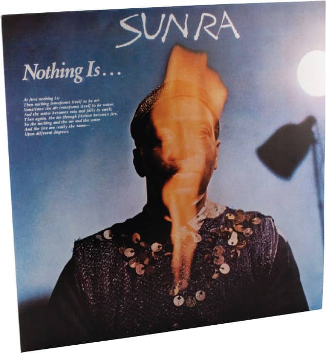
NOTHING IS . . ., Sun Ra / ESP-Disk / design, Raphael Boguslav, Howard Bernstein, Baby Jerry; cover photography, Thomas Hunter / USA, 1970

LANQUIDITY, Sun Ra / Philly Jazz, Inc. / photography, Charles Shabacon / USA, 1978
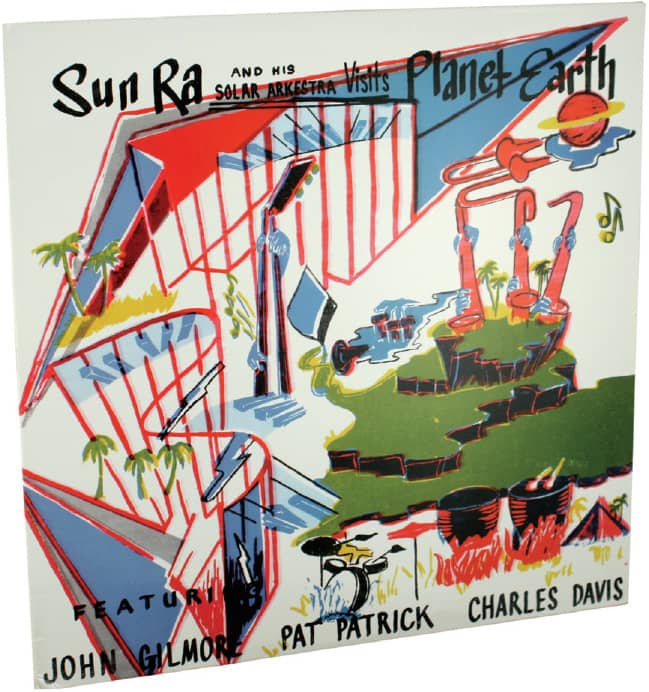
THE MAGIC CITY, Sun Ra and His Solar Arkestra / Saturn Records / art direction, Rothacker Advertising & Design; cover art, William White / USA, 1966
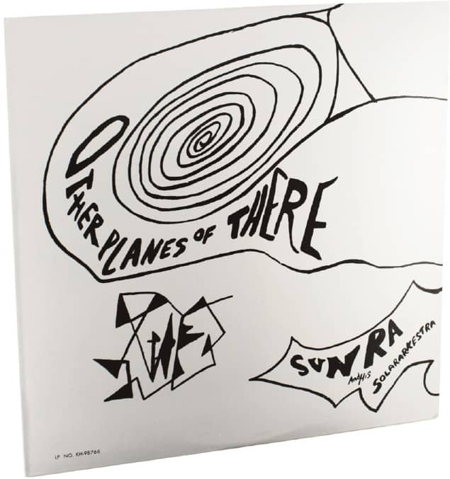
JAZZ IN SILHOUETTE, Sun Ra and His Arkestra / Saturn Records / art direction, Spencer Drate and Judith Salavetz; disc graphics, Marcolina Design / USA, 1958

ATLANTIS, Sun Ra and His Astro Infinity Arkestra / Saturn Records / art direction, Rothacker Advertising & Design / USA, 1969

SUPER-SONIC JAZZ, Sun Ra and His Arkestra / “About the cover: With your mind’s eye you are invited to see other scenes of the space age by focusing your eyes on the cover and your mind on the music. The scenes are from the space void.” / Saturn Records / USA, 1957
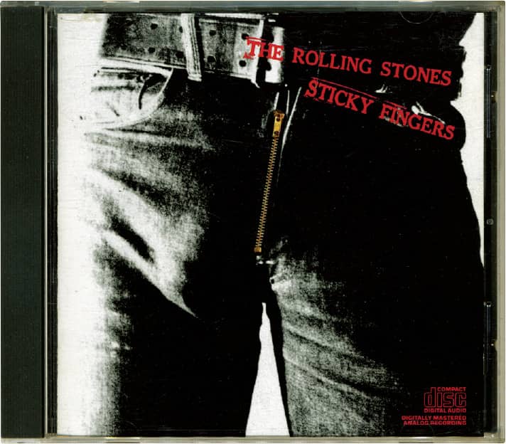
STICKY FINGERS, Rolling Stones / Columbia Records / cover concept, Andy Warhol; design, Craigbrauninc. / USA, 1971

GOD SAVE THE QUEEN SINGLE, Sex Pistols / Virgin Records / Jamie Ried / UK, 1977

NEVER MIND THE BOLLOCKS, HERE’S THE SEX PISTOLS / Virgin Records / Jamie Ried / UK, 1977
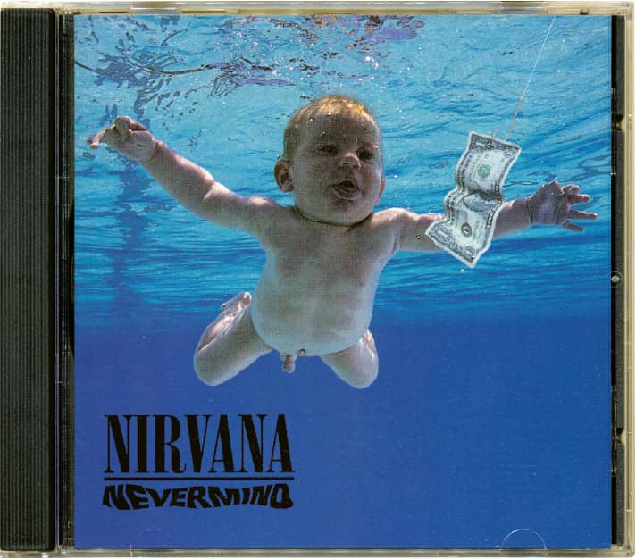
NEVERMIND, Nirvana / Geffen Records / art direction and design, Robert Fisher; cover photo, Kirk Weddle / USA, 1991

DARK SIDE OF THE MOON, Pink Floyd / Harvest Records / Hipgnosis: Nicholas Thirkell Associates; George Hardie / UK, 1973

LOOK INTO THE EYEBALL, David Byrne / Virgin Records / Doyle Partners: photography, Stephen Doyle / USA, 2001

THE INFORMATION, Beck / The booklet comes with a selection of stickers so the cover can be customized / Interscope Records / Big Actice, Mat Maitland, Gerard Saint; Beck / USA, 2006

UNKNOWN PLEASURES, Joy Division / Factory Records / art direction, Peter Saville; design, Saville Parris Wakefield; photography, Kevin Cummins / UK, 1979
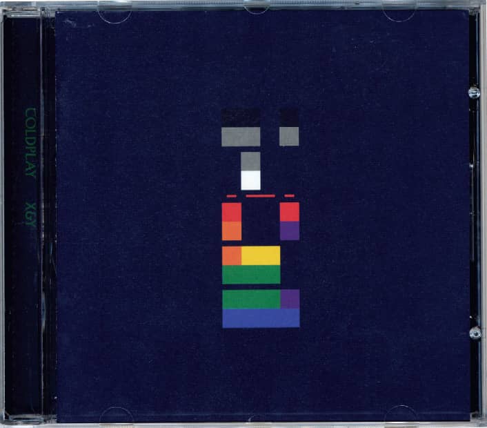
X&Y, Coldplay / EMI Records Ltd. / art direction and design, Tappin Gofton; photography, Kevin Westenberg, Tom Sheehan, Coldplay / USA, 2005
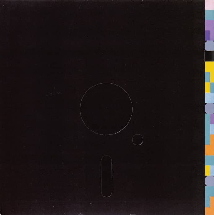
BLUE MONDAY single, New Order / Factory / design, Peter Saville, Brett Wickens / UK, 1983
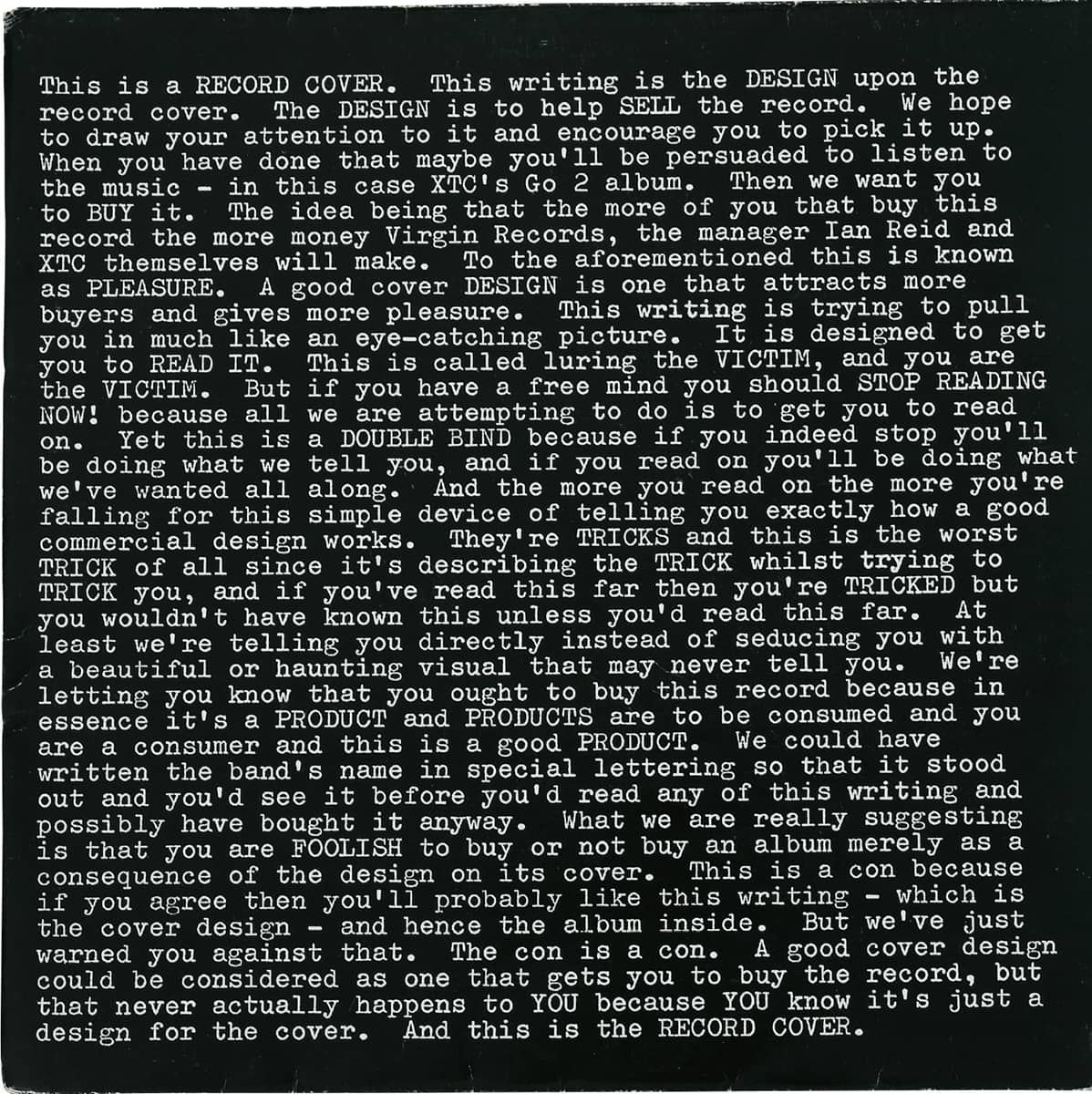
GO2, XTC / Virgin Records / Hipgnosis / UK, 1978
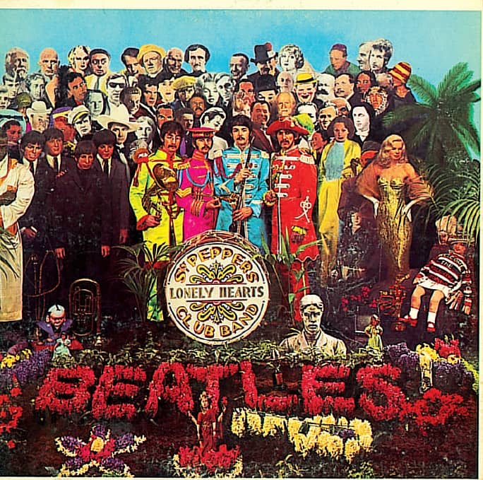
SGT. PEPPER’S LONELY HEARTS CLUB BAND, Beatles/ EMI Records Ltd. / art direction, Robert Fraser; design, Peter Blake, Jann Haworth; photography, Michael Cooper / UK, 1967
Altoids
Smith & Co. was a confectionery business started in London by William Smith in 1780, and one of its first products was Altoids, a lozenge intended to remedy indigestion, not bad breath. Altoids were marketed through pharmacies by Smith & Co., along with other products like Benoids and Zenoids, through the 1920s, and in the 1930s as a diet pill or food supplement. During World War II, the confectioner had a contract to ship Altoids to the armed forces. It is not clear when Altoids came to the United States. Some sources say it was as early as 1918 and others as late as 1980, but what is certain is that Altoids have enjoyed considerable popularity in America. Part of its early appeal was the metal tin, introduced in the 1920s to replace little cardboard boxes that tended to spill or crush the chalky mints. Altoids gained traction in the mid- to late 1990s with a comically relentless and sometimes abrasive advertising campaign by Leo Burnett, but what has separated Altoids from its minty competitors is its distinctive tin packaging, which invokes Old World nostalgia while warning the public of their “curious” strength.

Tiffany & Co.
“Charles Lewis Tiffany has one thing in stock that you cannot buy of him for as much money as you may offer,” a 1906 New York Sun article has been paraphrased as stating. “He will only give it to you. And that is one of his boxes.” The founder of Tiffany & Co. understood how to control his brand from the beginning. The article further explains how no robin’s-egg blue box or bag bearing the company’s name could leave the store without “an article which has been sold by them and for which they are responsible.” The Tiffany blue box has come to mean many things beyond the jewelry it encases: luxury, romance, and expectation. The box and the blue—designated Pantone 1837, based on the year it was founded, not Pantone’s color spectrum and numbering—have remained consistent all these years, and in 2003, Pentagram’s › 162 Paula Scher added a level of consistency and luxury by redrawing the wordmark and having it foil-stamped instead of printed on the boxes, which are now wrapped, inside and out, with a custom made paper with a luxurious matte finish. Hearts around the world flutter.
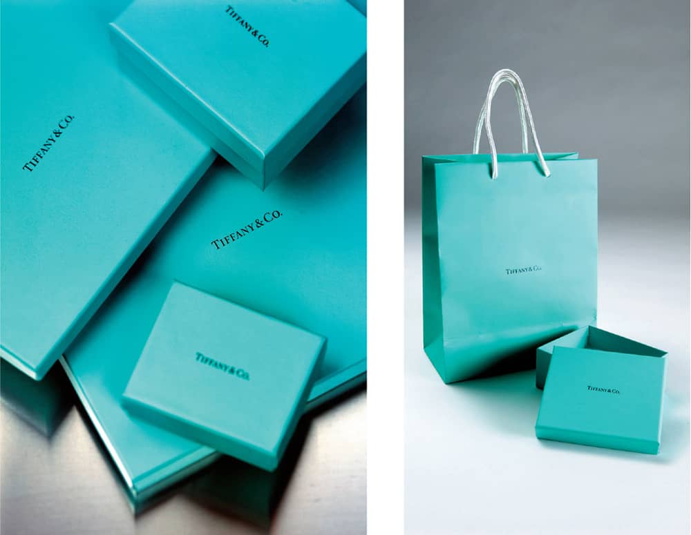
TIFFANY & CO. IDENTITY AND PACKAGING / Pentagram: Paula Scher / USA, 2003 / Photos: Nick Turner
Absolut
Absolut rent bränvin, Swedish for “absolute pure vodka” was a spirit created by Lars Olsson Smith in 1879 in the small village of Åhus, Sweden. In 1917, Vin & Sprit (V&S), a national monopoly for the production, import, export, and wholesale trade of alcoholic beverages, took over, and in the 1970s looked to export the product to the United States. V&S hired advertisers Lars Börje Carlsson and Gunnar Broman to create a bottle design and advertising. Among many options they gathered for presentation was a medicine bottle with a short neck and rounded shoulders. In the late 1970s, Broman and representatives from V&S traveled to the United States, the latter to find a distributor and the former to secure a partnership with the prestigious advertising agency N.W. Ayer & Son in New York. Broman succeeded and proceeded to design the clear bottle with the name and legend printed directly on it—an anomaly in the spirit consumer category. After many rejections, distribution was secured with Carillon Importers, who hired ad agency TBWA to promote the product. Despite consumer research showing the name to be presumptuous and the bottle to be ugly and hard to read, TBWA centered its advertising campaign on it to create the now legendary ad series, with artists like Keith Haring, Ed Ruscha, and Andy Warhol.

ABSOLUT VODKA / Gunnar Broman, Lars Borje Carlsson / Sweden, 1979
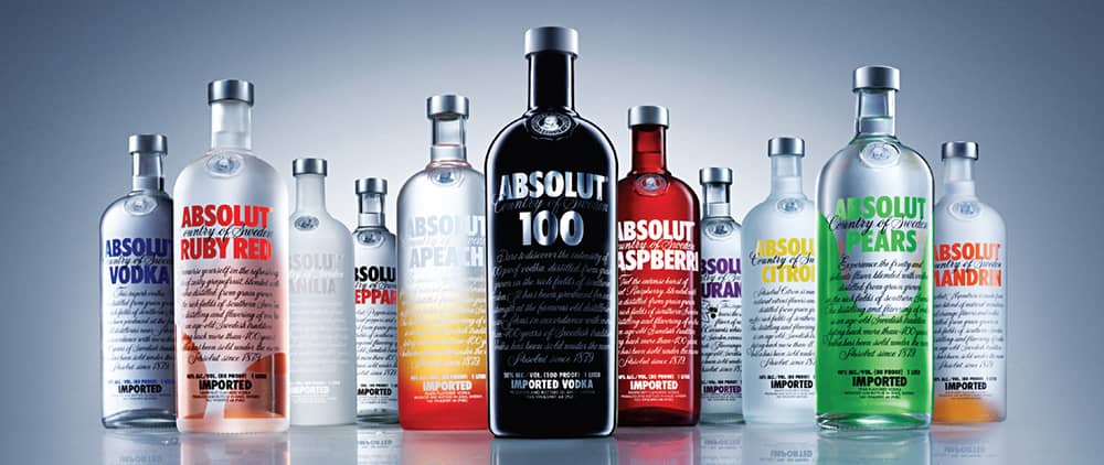
ABSOLUT FAMILY / Sweden, 1986–2008
Lucky Strike
Since its introduction in 1871 as chewing tobacco sold in green metal tins by the R.A. Patterson Tobacco Company, Lucky Strike has used a red circle with its name spelled in black, broken in two lines. Purchased by the American Tobacco Company (ATC) in 1905, by the 1930s Lucky Strike developed its original design into a green-dyed pack with simplified typography in the red circle, now with gold, white, and black concentric circles around it, creating the iconic bull’s-eye. Looking to attract a female consumer base, ATC commissioned Raymond Lowey, a successful industrial and identity designer, to improve the pack—it is told that ATC’s president, George Washington Hill, bet him $50,000 to improve sales. Lowey removed the green color, simplified the logo, and placed it on the front and back of the pack. The new design launched in 1942, and Lowey won the bet. More than 60 years later, the pack remains nearly unchanged.

Coca-Cola
On May 1886 at Jacob’s Pharmacy in Atlanta, Georgia, pharmacist Dr. John S. Pemberton made Coca-Cola by combining carbonated water with a syrup of his own invention. Through the end of the nineteenth century and the beginning of the twentieth, Coca-Cola was consumed only at soda fountains, where a tender mixed the beverage on demand and served it in a glass. Joseph A. Biedenharn, a soda fountain owner in Vicksburg, Mississippi, was one of the first to offer Coca-Cola in a bottle around 1894, but it was Benjamin F. Thomas and Joseph B. Whitehead of Chattanooga, Tennessee, who arranged a contract to bottle it exclusively on a large scale starting in 1899. For the next 15 years, Coca-Cola was packaged in a straight-sided bottle with an embossed logo and a diamond-shaped label. Facing product imitation, Coca-Cola sought to differentiate itself through a unique bottle, calling for a design that “even if broken,” as the design brief stated, “a person could tell at a glance what it was.” Alexander Samuelson and Earl R. Dean of the Root Glass Company in Terre Haute, Indiana, developed the hobble skirt-shaped, pale-green tinted bottle in 1916. The bottle has since undergone evolutions—its latest incarnation, a smooth aluminum bottle designed by Turner Duckworth in 2007, is being tested for broad distribution—but it remains one of the most recognized designs in the world.

COCA-COLA CLASSIC, 8-OZ GLASS BOTTLE / USA, 1916
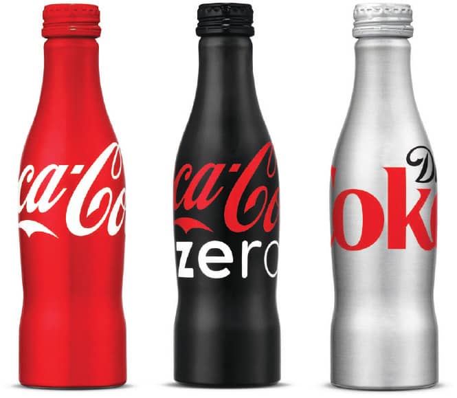
COCA-COLA PACKAGING FOR COCA-COLA CLASSIC, COCA-COLA ZERO, AND DIET COKE / Turner Duckworth / USA, 2006–2007
Campbell’s Tomato Soup
After a few years of operation under different names, the Joseph Campbell Preserve Co. was established in 1891, specializing first in canning produce and, later, soup. The first tomato soup label was created in 1895 with elaborate lettering and an illustration of two men carrying a red beefsteak tomato against a white background. In 1897, condensed soup was introduced with the same design, now on a split horizontal background of blue and orange. The first red and white label debuted in 1898, after the company’s treasurer attended a Cornell University football game, admired their red and white uniforms, and suggested those colors for the label. At the 1899 National Export Exposition in Philadelphia, the soup was awarded a gold medallion for excellence, and an image of the medallion was placed on the label. This was replaced with the medallion won at the 1900 International Exposition in Paris, which remains on the label to this day. The design was streamlined in 1942 by removing the address from the bottom and a pair of torches to the side. Aside from minor improvements over the years, the tomato soup label looks nearly as it did more than 60 years ago.

CAMPBELL’S TOMATO SOUP LABEL / USA, 1978–1998, 2001
Hershey’s Chocolate Bar
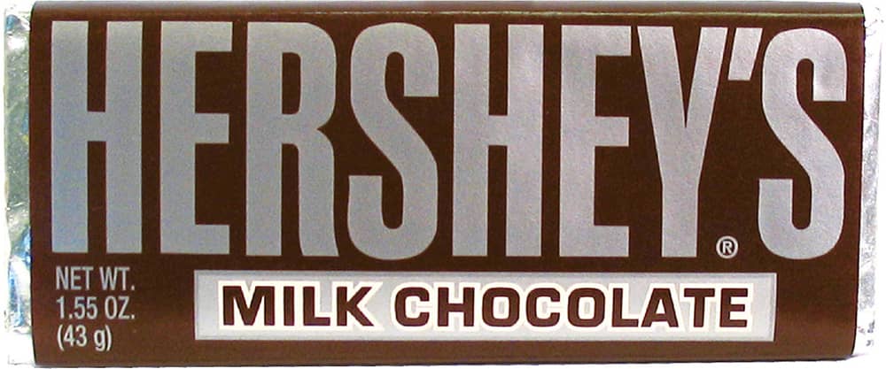
As a school dropout at the age of 13 and an apprentice confectioner, Milton S. Hershey was an improbable entrepreneur, but by 1900 he had sold his first caramel business for a reported $1 million and started a new venture to develop affordable chocolate. The result was the five-cent Hershey’s Chocolate Bar. Setting up a factory in 1903 in Derry Church, Pennsylvania, to mass-produce his chocolate, Hershey created an unprecedented town structure, including a transit system, school, stores, community center, and even its own post office, to support his employees. The town was renamed Hershey in 1906.
The success of the chocolate bar was instant, and the ritual of peeling off the silver foil surrounding it had tongues salivating for close to a century. Packaged in a glossy yet silky wrapper, the design was first introduced on a white background, switching to the signature dark maroon color in 1902. Until 1911, the lettering was an adorned serif; in 1912 a blocky sans serif was introduced that boldly evolved over the years. In 2003, the silver foil and paper wrapper were replaced by a single plastic wrapper like that used by the rest of the market—an understandable change that limits material waste, but a big blow to nostalgia.
Toblerone
With the Matterhorn as the backdrop for the city of Bern, Switzerland—and, as one version goes, as the inspiration for the chocolate bar’s triangular shape and peaks—Theodor Tobler and Emil Baumann introduced Toblerone in 1908. Over the years, the triangular packaging has remained constant, although the typography has evolved and icons have come and gone. First was the eagle, which in 1920 was replaced by a bear—the heraldic symbol of Bern—only to return in 1930 grasping a T in its claws. From 1969 onward, an abstract Matterhorn with the word Tobler on it served as the logo until 2000, when brand consultancy SiebertHead introduced a streamlined redesign with a new logo depicting the Matterhorn in a simple drawing and the silhouette of a bear barely but playfully discernable on its surface. Curious? Look for it below.

Fossil
Tom Kartsotis, a Dallas-based entrepreneur, began importing watches in different design styles from the Far East in 1984, based on advice from his brother, Kosta, and selling them to department stores and boutiques; one of his most popular styles was a range of retro watches. In 1986 they began designing and manufacturing their own watches; the first line was named Fossil, after their affectionate nickname for their own father. Tim Hale, who had been doing freelance work for Tom, joined Fossil as its art director in 1987, and Kosta joined in 1988, as the company enjoyed rapid success. The latter, on a trip to Europe, returned with a tin pencil box, noting how well their watches fit into it. The first Fossil watches in a tin were on shelves in 1989.
Building from the retro premise of the product, Hale established a highly mutable system for the design of the tins that joyfully references American ephemera from the 1940s and 1950s: Matchbooks, consumer packaging, sports trading cards, lifestyle magazines, travel brochures, and hotel soap wrappers all serve as continuous inspiration for Hale and his team of graphic designers, who take visual cues from the source material and reinterpret in the tins. Not just mimicking styles, the designers try to incorporate the techniques and materials from that era and then digitize it. The result on the shelves—in department stores and Fossil’s more than 100 retail stores—is a distinctive and immediately identifiable package that is consistently refreshed; the company introduces new designs four or five times a year. Two decades and 1,000 tin designs later, Hale and his team are far from losing their well of inspiration as the 1970s and 1980s become the new retro.
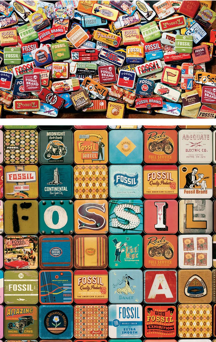
FOSSIL TINS / USA, © 2002 Fossil Design
Dr. Bronner’s Magic Soaps
The descendant of three generations of German soapmakers, Emmanuel Heilbronner immigrated to the United States in 1929 at the age of 21, working with various soap companies in the East before establishing himself in the 1930s in Milwaukee and dropping the first syllable from his last name. In the 1940s, now a self-titled doctor, Bronner began to draft and persistently share a plan for world peace in “Spaceship Earth” through unity of religion. In 1945 Dr. Bronner was arrested for speaking without a permit at the University of Chicago and institutionalized in the Elgin State Insane asylum. He escaped six months later and fled to Los Angeles. There, in his small apartment, he began mixing soap with a broom handle, which he sold while expounding on his theories at the Pershing Square public park. When he noticed people bought his soap but did not bother to listen to him talk, he started writing his philosophy on the labels.
In the late 1960s, Dr. Bronner’s Magic Soaps gained popularity with the hippie culture because of its all-natural ingredients, durability, and its equal effectiveness in cleaning groovy locks of hair, bell-bottom jeans, and Volkswagen vans. Packaged extremely simply in brown plastic bottles with one-color labels—the text on Dr. Bronner’s products became evolving soliloquies on its founder’s philosophy, referred to as “The Moral ABC.” The labels of the 32-ounce soap package each carry as many as 3,000 words expressing Dr. Bronner’s thinking, which references everything from Mao Tse-tung to Albert Einstein, Joseph Stalin, and Halley’s Comet. Dr. Bronner passed away in 1997, but his sons maintain his legacy and are overseeing their increased popularity. The Bronners have declined purchase offers, and while sale may still be a possibility, the labels will be safe: A provision in the company’s charter states they must remain the same.


MAGIC SOAPS / Cosmic Egg / USA
Jones Soda
After years as a professional skier and instructor, Peter van Stolk established Urban Juice and Soda Company (UJS) in Vancouver, Canada, in 1987 to distribute niche beverages like AriZona teas, Just Pik’t Juices, and West End Soda. He later began bottling a root beer manufactured by Thomas Kemper Brewing Co. in Seattle. In 1994, van Stolk concentrated on developing his own beverages, introducing the bottled water Wazu in 1995 and the carbonated flavor drink Jones Soda in 1996. With the motto “Run with the little guy . . . ” and no marketing budget, van Stolk promoted Jones Soda by placing coolers in strategic spots catering to his 18- to 24-year-old demographic: skate parks, tattoo parlors, and clothing stores. Through word of mouth and by exuding an authenticity that large beverages can only dream of, Jones Soda quickly became a cult favorite among the younger generation.
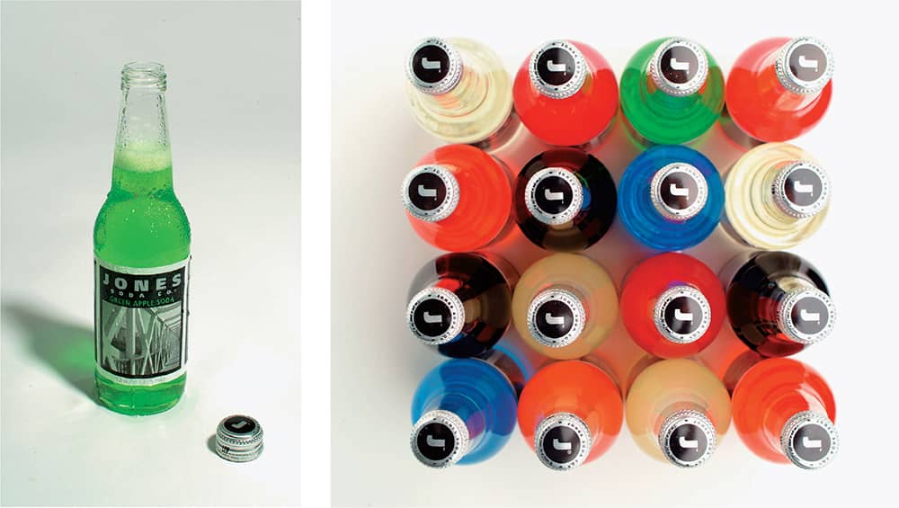
Rather than spending upwards of a quarter-million dollars for a custom bottle mold, van Stolk opted for stock components, combining a clear bottle with a simple screw cap that allow the energetic colors of eccentric flavors like Blue Bubble Gum, Chocolate Fudge, and Fufu Berry to show through. Designed by Vancouver- and Chicago-based SamataMason, the Jones Soda bottles are deceptively simple. The labels display the name unobtrusively inside a white or black background that frames a photograph—the key to Jones Soda’s ability to make a connection with its customers. The first 35 labels were images by Vancouver-based photographer Victor John Penner, but after that, Jones Soda turned to user-generated content long before mainstream products did. Jones Soda customers submit photos online (more than 875,000 so far). Winners are picked in-house and stamped on each subsequent batch of bottles, and at myjones.com, anyone can order a 12-pack with their own photographs.

JONES SODA PACKAGING FOR URBAN JUICE & SODA / SamataMason: design, Dave Mason, Victor John Penner, Pamela Lee / USA, 1994–1995 / Photos: Victor John Penner
Tazo
A master tea maker, Steve Smith founded the Stash Tea Company in 1972 in Portland, Oregon, and oversaw its growth and popularity as one of the most successful tea companies in the United States until he left in 1994. With vast experience in the tea industry, he realized the marketing of tea was anything but exciting, so he set out to create a new kind of tea company with innovative blends and an engaging story. With partner Steve Lee, also a founder of Stash Tea, Smith imagined a brand that would revolve around the theme of “Marco Polo meets Merlin the Magician with some Raiders of the Lost Ark sprinkled in for good measure.” Working with Portland locals Steve Sandoz of Wieden + Kennedy and Steve Sandstrom of Sandstrom Partners, they decided to create a brand-new mythology and history around the tea. Sandoz came up with the name Tazo, devoid of meaning so they could imbue it with their own—although later, when Smith had his tea leaves read by a Roma (gypsy), he learned it means “river of life” in her language, Romany.
Sandoz continued to develop the language for Tazo, mixing fact with fiction and giving it an eccentric and ancient voice, sometimes going so far as to translate his copy to another language and then back into English. The design by Sandstrom followed in the same vein, with typography that looked as if it had been lifted from ancient, if not alien, inscriptions or manuscripts. Yet, despite its ancient grounding, Tazo feels decidedly contemporary and has a strong presence on the shelf. Tazo was purchased by Starbucks in 1999, giving it a wider exposure, and even though the packaging has gradually played down the tea’s lore, Tazo still manages to tell an engaging story in a monotonous category.
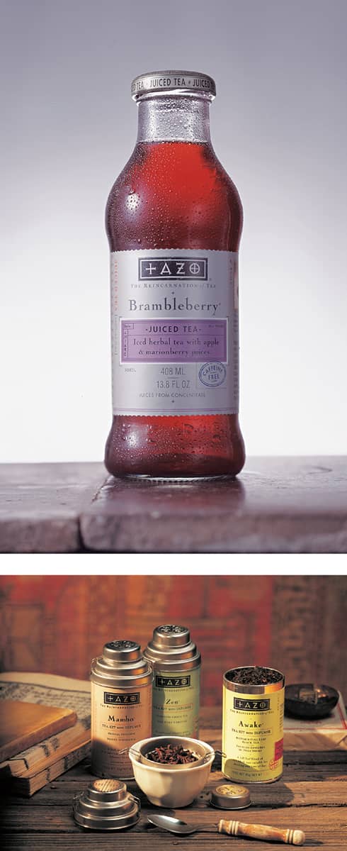
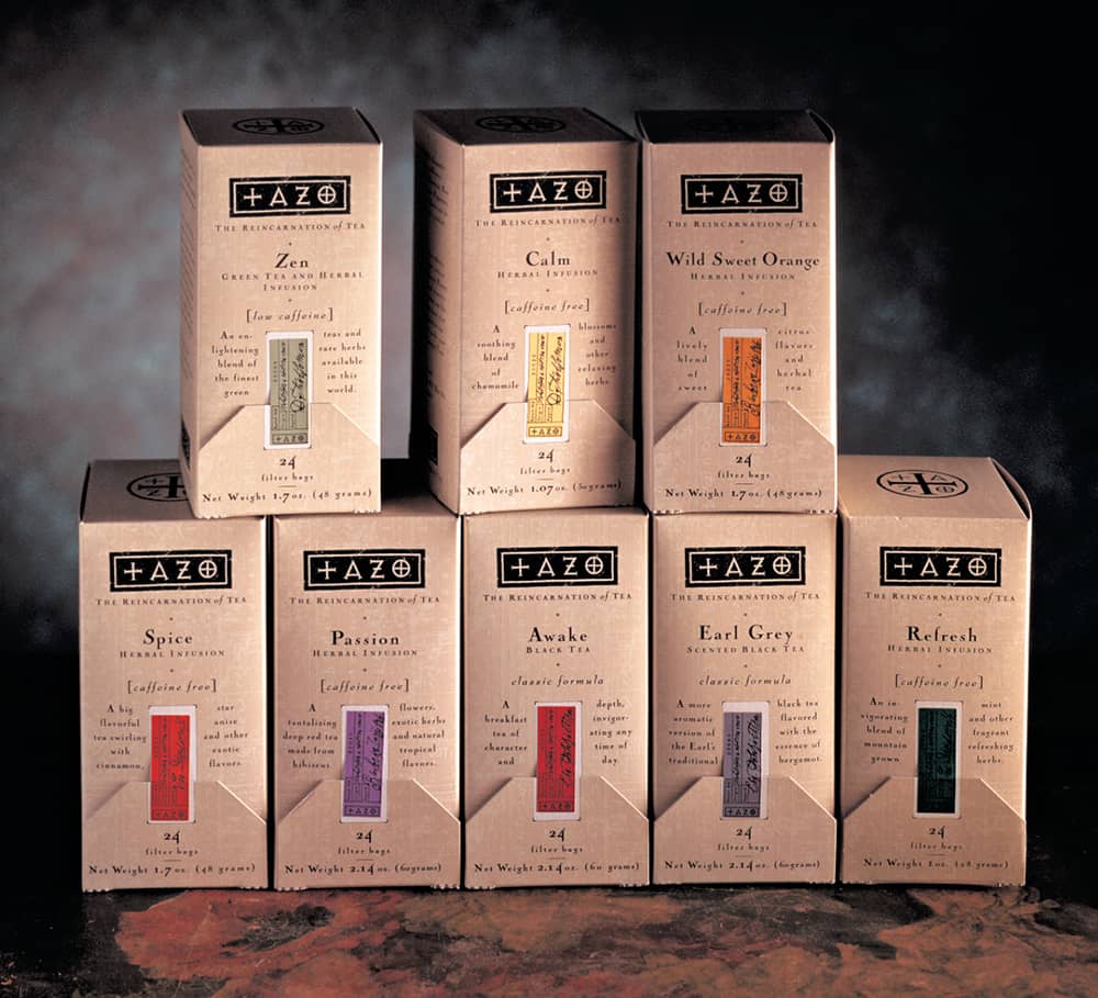
TAZO TEA PACKAGING / Sandstrom Partners: creative direction, Steve Sandstrom / USA, 1994–ongoing
Target Halloween
With design mavens like Michael Graves, Isaac Mizrahi, and Cynthia Rowley creating design-conscious wares at affordable prices, the large retailer Target has been a consumer favorite since the late 1990s, when Graves’s elegant and friendly line of housewares (including a toaster worth hugging) premiered in 1999. In 2005 it introduced its “Design for All” campaign—“Great design. Every day. For everyone.”—further establishing it as a fashionable shopping destination.
For all of its success in creating affordable design alternatives and introducing innovations like the ClearRx › 318 prescription bottle, one of Target’s most advanced design solutions may be for one of its most elementary challenges: Halloween. Prior to 2001, Target adorned its stores in typical Halloween regalia, peppering pumpkins, ghosts, and bats throughout. These were proper efforts to set the mood for the holiday, but they were not memorable. Right before the 2000 Halloween season, Target commissioned Werner Design Werks (WDW) in St. Paul, Minnesota, to create an identity for 2001. Target did not have a specific design brief for Sharon Werner and Sarah Nelson of WDW, but they did require a system that dozens of manufacturers, vendors, and partners could implement on their own. Werner and Nelson created a family of characters—witch, ghost, vampire, Frankenstein, and spider, among others—with a cohesive illustration style as well as a range of patterns, borders, and frames. They created two style guides, one for “hardlines” (plates, glasses, etc.) and one for “softlines” (pajamas, T-shirts, wrappers, etc.), and handed them to Target in December 2000. By Halloween 2001, Target and its vendors had generated an unimaginable amount of products and decorations based on the style guides and even created a television commercial, which was a first for Target’s Halloween efforts.
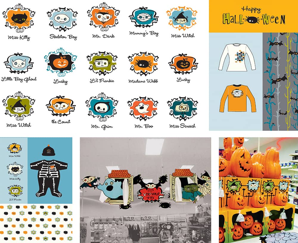
TARGET CORPORATION HALLOWEEN CAMPAIGN / Werner Design Werks, Inc.: design and illustration, Sharon Werner, Sarah Nelson / USA, 2001
The success of the WDW identity and style guide was followed in 2003 by Minneapolis-based Charles S. Anderson Design (CSA) › 195. They created a set of ghoulish characters, borders, and patterns that were translated into candy wrappers and three-dimensional applications, and they also introduced a new decorative element for the stores: five-foot-high vacuum-formed, vintage-inspired masks that hang from the ceilings. Some graphic designers patiently waited for Target to put out the masks for trash collection to snatch one up.
Other notable contributions have been by the San Francisco-based firm Office, led by former CSA designer Jason Schulte, and New York-based Parham Santana in 2006, who added diversity by relating Halloween to the Latin Day of the Dead and referenced the cut-paper technique used to decorate small, rural towns and their plazas. Halloween for All.
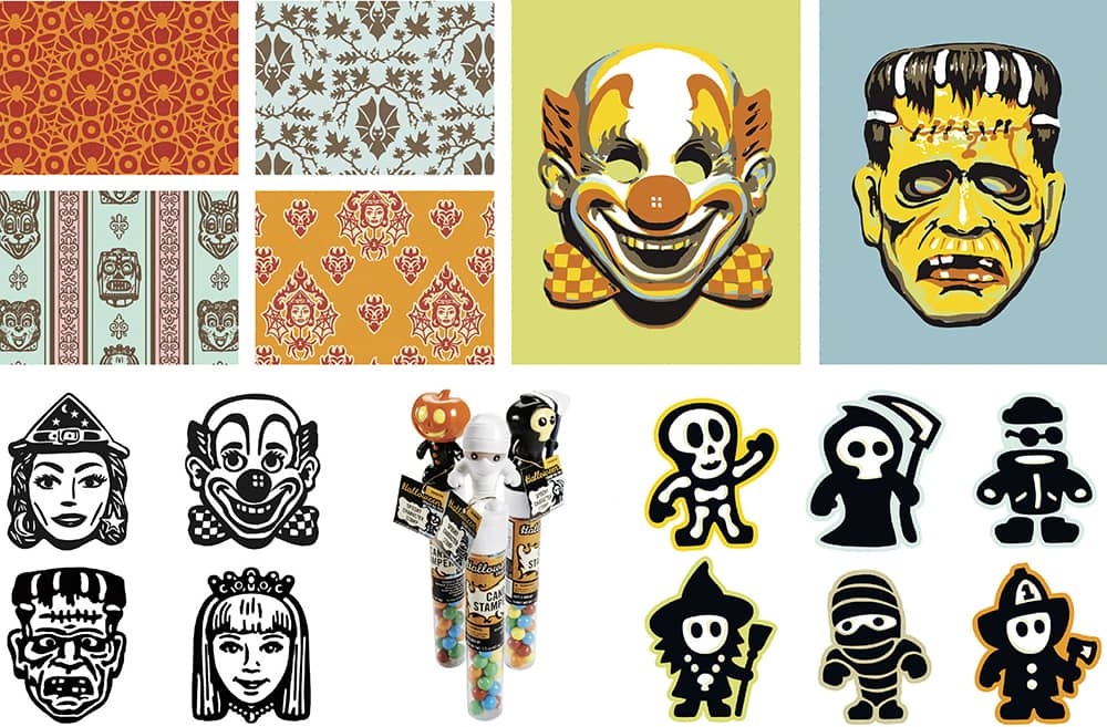
TARGET CORPORATION HALLOWEEN CAMPAIGN / Target: creative direction, Eric Erickson; art direction, Ron Anderson / Charles S. Anderson Design Company: art direction, Charles S. Anderson; design, Charles S. Anderson, Todd Piper-Hauswirth, Erik Johnson, Kyle Hames, Sheraton Green, Jovaney Hollingsworth / USA, 2003
Martha Stewart Everyday
Around 1995, the discount chain Kmart closed more than 200 stores, nearly faced bankruptcy, and suffered dismal revenues. Among other comeback strategies was the initiative to expand brand-name and private-label lines, one of them Martha Stewart, who had become associated with Kmart in 1987. Under the moniker Martha Stewart Everyday (MSE), in 1997 Kmart established a line of products spanning utensils, bedding, tableware, and glassware, for dining, outdoor living, the kitchen, and the bath—products for the everyday. Since its inception and for the next five years, Stephen Doyle of Doyle Partners led a team that designed the identity and full range of packaging for MSE.
Doyle was contracted by Kmart but worked in close collaboration with the creative in-house group at Martha Stewart Living Omnimedia (MSLO)—including his wife and MSLO chief creative officer Gael Towey and with Stewart herself—especially as they oversaw the photography of the products to extend the brand aesthetic they had successfully established in their flagship magazine › 335. Doyle brought a sense of accessibility and playfulness to mass-market retailing that had seldom been present on shelves prior to MSE. Through a vibrant color palette punctuating pure white backgrounds that permeated both the products and the packaging, MSE became a flexible yet cohesive product line that was easily identifiable and approachable, as most items were packaged so they could be touched. The packages were also peppered with information, recipes, and charts of related products, extending the brand promise of Martha Stewart: inspiration and information.
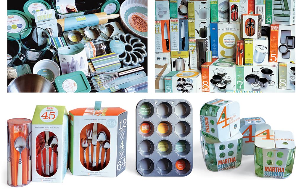
MARTHA STEWART EVERYDAY PRODUCTS FOR KMART / Doyle Partners: creative direction, Stephen Doyle; design, Rosemarie Turk, Lisa Yee, Vivian Ghazarian, Ariel Apte / USA, 1997–2000
Adobe CS1, CS2
After establishing itself as an intrinsic ingredient to the mid-1980s desktop revolution with the development of the PostScript language adopted by Apple Computer, Adobe Systems entered the consumer software market in 1987 with Adobe Illustrator version 1–88, followed by Adobe PhotoShop version 1 in 1988. Over the next 20 years, these two programs became the de facto applications for designers worldwide—Macromedia Freehand fanatics excluded—as each version became more refined, powerful, and accessible. While features changed, the visual identity—from packaging to the startup screen and application icon for the desktop—remained constant through the twentieth century. Illustrator was represented by Sandro Botticelli’s The Birth of Venus, while PhotoShop was identified by a floating eye, often accompanied by a camera lens. These visual cues became as ubiquitous as their software.
By 2002, Illustrator and PhotoShop had reached versions 10 and 7 respectively, and InDesign version 1.5, had begun to gain traction. Looking to present a unified front, Adobe developed the Creative Suite (CS), bringing all of its applications under the same version number, standardizing the user interface with an integrated design. Introduced in 2003, the software received major improvements, and so did the design. Gone were Venus and the eye. San Francisco-based MetaDesign, lead by creative director Brett Wickens and design director Conor Mangat, created a new identity around the theme of nature as a “metaphor for the creative process, reflecting precision, beauty, and aspiration.” Imagery within silhouettes against a white background provided the zest that declared CS a whole new set of software. Adobe CS2 followed in 2005, and MetaDesign provided a handsome evolution of its original design, taking the elements of each application—flower for Illustrator, feather for PhotoShop, butterfly for InDesign, and stars for GoLive—and exposing, literally, their inner beauty. Nick Veasey, the famed British photographer-cum-radiographer, create the ghostly X-ray images. Like the software, the design was a worthy upgrade.

ADOBE CS1 PACKAGING / MetaDesign: creative direction, Brett Wickens; design, Brett Wickens, Conor Mangat, Kihwan Oh; photography, Brett Wickens, Stephen Underwood / USA, 2003

ADOBE CS2 PACKAGING / MetaDesign: creative direction, Brett Wickens; design, Brett Wickens, Hui-Ling Chen; radiography, Nick Veasey / USA, 2004
Target ClearRx
When Deborah Adler was a student in the School of Visual Arts Designer as Author MFA program › 132, her 2002 thesis project—a reaction to her grandmother accidentally taking her grandfather’s pills—laid the blueprint for Target’s innovative ClearRX prescription bottle and redesigned communication system, launched in 2005. Through a partnership with Target and collaboration with Milton Glaser › 170, Deborah managed to address a half-century-old problem. The new amber-colored prescription bottle sits firmly on its cap. Each family member is assigned a band color that identifies his or her bottles. Labels clearly show the medication name on top, followed by dosage instructions, doctor information, and refill options, while the back features clear warning icons. A card with additional patient information is tucked behind the back label. To sweeten Deborah’s contribution to thousands of users, Target offers cherry or grape flavoring.

SAFERX THESIS PROJECT FOR THE SCHOOL OF VISUAL ARTS DESIGNER AS AUTHOR MFA / Deborah Adler / USA, 2002


TARGET CORPORATION CLEARRX PACKAGE / Deborah Adler; industrial design, Klaus Rosburg / USA, 2005
Saks Fifth Avenue
Since its inception in the early 1900s and the opening of its flagship store on Manhattan’s Fifth Avenue in 1924, Saks Fifth Avenue has stood for high-end quality, elegance, and fashion. Throughout its history, many designers and typographers, including Frederic W. Goudy, Alexey Brodovitch › 143, Erik Nitsche › 148, Tom Carnase, and Massimo Vignelli › 160, have been involved in Saks’s advertising and design, yet an iconic identity or cultural marker like Tiffany & Co.’s › 306 blue or Burberry’s check pattern have eluded it. In 2004, Saks commissioned Pentagram › 162 partner Michael Bierut › 203 to design a new logo and overarching identity that could be applied to their numerous packaging needs, from shopping bags to boxes of various sizes. Going through the logo history of Saks, Bierut noted that it has often employed script lettering, and a 1973 version lettered by Tom Carnase caught his attention.
Bierut worked with type and logo designer Joe Finocchiaro to update Carnase’s logo with more slender lines. He then placed the new white lettering within a black square, cropping off its edges, and proceeded to slice it into 64 smaller squares that could be configured in, literally, hundreds of millions of configurations. The logo itself remains intact and appears throughout the identity, but the endless combinations of little black and white squares are giddily applied to every conceivable packaging surface. The result is an extremely mutable identity that remains consistent in its color and texture. Now consumers proudly flaunt their purchases iniconic Saks Fifth Avenue shopping bags.
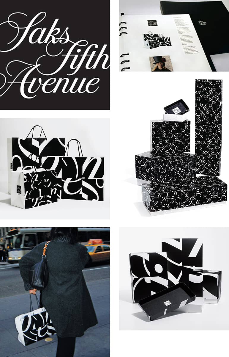
SAKS FIFTH AVENUE IDENTITY AND BRANDING APPLICATIONS / Pentagram: Michael Bierut / USA, 2006–2007 / Photos: Courtesy of Saks Fifth Avenue / Street Photo: Elizabeth Bierut
