
7 Univariate Distributions: One Variable, One Sample
Overview
This chapter introduces statistics in the simplest possible setting—the distribution of values for one variable. The Distribution command in the Analyze menu launches the JMP Distribution platform. This platform describes the distribution of a single column of values from a table using graphs and summary statistics.
This chapter also introduces the concept of the distribution of a statistic, and how confidence intervals and hypothesis tests can be obtained.
Chapter Contents
True Distribution Function or Real-World Sample Distribution
Describing Distributions of Values
Outlier and Quantile Box Plots
Other Summary Statistics: Skewness and Kurtosis
Statistical Inference on the Mean
Confidence Intervals for the Mean
Testing Hypotheses: Terminology
The Normal z-Test for the Mean
Case Study: The Earth’s Ecliptic
Comparing the Normal and Student’s t Distributions
Practical Significance versus Statistical Significance
Statistical Tests for Normality
Special Topic: Practical Difference
Special Topic: Simulating the Central Limit Theorem
Seeing Kernel Density Estimates
Looking at Distributions
Let’s examine some actual data and start noticing aspects of its distribution.
![]() Begin by selecting Help > Sample Data Library and opening Birth Death.jmp, which contains the 2009 birth and death rates of 74 nations (Figure 7.1).
Begin by selecting Help > Sample Data Library and opening Birth Death.jmp, which contains the 2009 birth and death rates of 74 nations (Figure 7.1).
![]() From the main menu bar, select Analyze > Distribution.
From the main menu bar, select Analyze > Distribution.
![]() On the Distribution launch window, assign the birth, death, and Region columns to Y, Columns, and then click OK.
On the Distribution launch window, assign the birth, death, and Region columns to Y, Columns, and then click OK.
Figure 7.1 Partial Listing of the Birth Death.jmp Data Table

When you see the report (Figure 7.2), be adventurous: scroll around and click in various places on the surface of the report. You can also right-click in plots and reports for additional options. Notice that histograms and statistical tables can be opened or closed by clicking the disclosure icon on the title bars.
![]() Open and close tables, and click on bars until you have the configuration shown in Figure 7.2.
Open and close tables, and click on bars until you have the configuration shown in Figure 7.2.
Figure 7.2 Histograms, Quantiles, Summary Statistics, and Frequencies

Note that there are two types of analyses:
● The analyses for birth and death are for continuous distributions. Quantiles and Summary Statistics are examples of reports that you get when the column in the data table has the continuous modeling type. The ![]() next to the column name in the Columns panel of the data table indicates that this variable is continuous.
next to the column name in the Columns panel of the data table indicates that this variable is continuous.
● The analysis for Region is for a categorical distribution. A frequency report is an example of the type of report you get when the column in the data table has the modeling type of nominal or ordinal. ![]() or appears next to the column name in the Columns panel.
or appears next to the column name in the Columns panel.
You can click on the icon and change the modeling type of any variable in the Columns panel to control which type of report you get. You can also right-click on the modeling type icon in any platform launch window to change the modeling type and redo an analysis. This changes the modeling type in the Columns panel as well.
For continuous distributions, the graphs give a general idea of the shape of the distribution. The death data cluster together with most values near the center. Distributions like this one, with one peak, are called unimodal. The birth data have a different distribution. There are more countries with low birth rates, with fewer countries gradually tapering toward higher birth rates. This distribution is skewed toward the higher rates.
The statistical reports for birth and death show a number of measurements concerning the distributions. There are two broad families of measures:
● Quantiles are the points at which various percentages of the total sample are above or below.
● Summary Statistics combine the individual data points to form descriptions of the entire data set. Two common summary statistics are the mean and standard deviation.
The report for the categorical distribution focuses on frequency counts. This chapter concentrates on continuous distributions and postpones the discussion of categorical distributions until Chapter 11, “Categorical Distributions.”
Before going into the details of the analysis, let’s review the distinctions between the properties of a distribution and the estimates that can be obtained from a distribution.
Probability Distributions
A probability distribution is the mathematical description of how a random process distributes its values. Continuous distributions are described by a density function. In statistics, we are often interested in the probability of a random value falling between two values described by this density function. For example, “What’s the probability that I will gain between 100 and 300 points if I take the SAT a second time?”. The probability that a random value falls in a particular interval is represented by the area under the density curve in this interval, as illustrated in Figure 7.3.
Figure 7.3 Continuous Distribution

The density function describes all possible values of the random variable, so the area under the whole density curve must be 1, representing 100% probability. In fact, this is a defining characteristic of all density functions. In order for a function to be a density function, it must be nonnegative and the area underneath the curve must be 1.
These mathematical probability distributions are useful because they can model distributions of values in the real world. This book avoids the formulas for distributional functions, but you should learn their names and their uses.
True Distribution Function or Real-World Sample Distribution
Sometimes it is difficult to keep straight when you are referring to the real data sample and when you are referring to its abstract mathematical distribution.
This distinction of the property from its estimate is crucial in avoiding misunderstanding. Consider the following problem:
Why do statisticians talk about the variability of a mean—that is, the variability of a single number? When you talk about variability in a sample of values, you can see the variability because you have many different values. However, when computing a mean, the entire list of numbers has been condensed to a single number. How does this mean—a single number—have variability?
To get the idea of variance, you have to separate the abstract quality from its estimate. When you do statistics, you are assuming that the data come from a process that has a random element to it. Even if you have a single response value (like a mean), there is variability associated with it—a magnitude whose value is possibly unknown.
For example, suppose you are interested in finding the average height of males in the United States. You decide to compute the mean of a sample of 100 people. If you replicate this experiment several times gathering different samples each time, do you expect to get the same mean for every sample that you pick? Of course not. There is variability in the sample means. It is this variability that statistics tries to capture—even if you don’t replicate the experiment. Statistics can estimate the variability in the mean, even if it has only a single experiment to examine. The variability in the mean is called the standard error of the mean.
If you take a collection of values from a random process, sum them, and divide by the number of them, you have calculated a mean. You can then calculate the variance associated with this single number. There is a simple algebraic relationship between the variability of the responses (the standard deviation of the original data) and the variability of the sum of the responses divided by n (the standard error of the mean). Complete details follow in the section “Standard Error of the Mean” on page 144.
Table 7.1. Properties of Distribution Functions and Samples
| Concept | Abstract mathematical form, probability distribution | Numbers from the real world, data, sample |
| Mean | Expected value or true mean, the point that balances each side of the density | Sample mean, the sum of values divided by the number of values |
| Median | Median, the mid-value of the density area, where 50% of the density is on either side | Sample median, the middle value where 50% of the data are on either side |
| Quantile | The value where some percent of the density is below it | Sample quantile, the value for which some percent of the data are below it. For example, the 90th percentile represents a point where 90 percent of the variables are below it. |
| Spread | Variance, the expected squared deviation from the expected value | Sample variance, the sum of squared deviations from the sample mean divided by n – 1 |
| General Properties | Any function of the distribution: parameter, property | Any function of the data: estimate, statistic |
The statistic from the real world data is an estimate of the parameter from the distribution.
The Normal Distribution
The most notable continuous probability distribution is the normal distribution, also known as the Gaussian distribution, or the bell curve, like the one shown in Figure 7.4. It is an amazing distribution.
Figure 7.4 Standard Normal Density Curve

Mathematically, the greatest distinction of the normal distribution is that it is the most random distribution for a given variance. (It is “most random” in a very precise sense, having maximum expected unexpectedness or entropy.) Its values are as if they had been realized by adding up billions of little random events.
It is also amazing because so much of real world data are normally distributed. The normal distribution is so basic that it is the benchmark used as a comparison with the shape of other distributions. Statisticians describe sample distributions by saying how they differ from the normal. Many of the methods in JMP serve mainly to highlight how a distribution of values differs from a normal distribution. However, the usefulness of the normal distribution doesn’t end there. The normal distribution is also the standard used to derive the distribution of estimates and test statistics.
The famous Central Limit Theorem says that under various fairly general conditions, the sum of a large number of independent and identically distributed random variables is approximately normally distributed. Because most statistics can be written as these sums, they are normally distributed if you have enough data. Many other useful distributions can be derived as simple functions of random normal distributions.
Later, you meet the distribution of the mean and learn how to test hypotheses about it. Later in this chapter, we’ll introduce the four most useful distributions of test statistics: the normal, Student’s t, chi-square, and F distributions.
Describing Distributions of Values
The following sections take you on a tour of the graphs and statistics in the JMP Distribution platform. These statistics reveal the properties of the distribution of a sample, especially in these four focus areas:
● Location refers to the center of the distribution.
● Spread describes how concentrated or “spread out” the distribution is.
● Shape refers to symmetry, whether the distribution is unimodal, and especially how it compares to a normal distribution.
● Extremes are outlying values far away from the rest of the distribution.
Generating Random Data
Before getting into more real data, let’s make some random data with familiar distributions, and then see what an analysis reveals. This is an important exercise. There is no other way to get experience with the distinction between the true distribution of a random process and the distribution of the values that you get in a sample.
In Plato’s theory of forms, the “true” world to be an ideal form. What you perceive as real data are only shadows that give hints at what the true data are like. Most of the time the true state is unknown, so an experience where the true state is known is valuable.
In the following example, the true world is a distribution. You use the random number generator in JMP to obtain realizations of the random process to make a sample of values. Then you see that the sample mean of those values is not exactly the same as the true mean of the original distribution. This distinction is fundamental to what statistics is all about.
To create your own random data:
![]() Open RandDist.jmp. (Select Help > Sample Data and click the Simulations outline).
Open RandDist.jmp. (Select Help > Sample Data and click the Simulations outline).
This data table has four columns, but no rows. The columns contain formulas used to generate random data having the distributions Uniform, Normal, Exponential, and Dbl Expon (double exponential).
![]() Select Rows > Add Rows and type 1000 to see a table like the one shown in Figure 7.5.
Select Rows > Add Rows and type 1000 to see a table like the one shown in Figure 7.5.
Adding rows generates the random data using the column formulas. Note that your random results are a little different from those shown in Figure 7.5; the random number generator produces a different set of numbers each time a table is created.
Figure 7.5 Partial Listing of the RandDist.jmp Data Table

![]() To look at the distributions of the columns in the RandDist.jmp table, select Analyze > Distribution.
To look at the distributions of the columns in the RandDist.jmp table, select Analyze > Distribution.
![]() In the Distribution launch window, assign the four columns to Y, Columns, select Histograms Only, and then click OK.
In the Distribution launch window, assign the four columns to Y, Columns, select Histograms Only, and then click OK.
The analysis automatically shows a number of graphs and statistical reports. To see further graphs and reports (Figure 7.6, for example), select an option from the red triangle menu for each analysis. The following sections examine the graphs and the text reports available in the Distribution platform.
Histograms
A histogram defines a set of intervals and shows how many values in a sample fall into each interval. It shows the shape of the density of a batch of values.
Try the following histogram features:
![]() Click in a histogram bar.
Click in a histogram bar.
When the bar is highlighted, the corresponding values in other histograms also highlight, as do the corresponding data table rows. When you do this, you are seeing conditional distributions—the distributions of other variables that correspond to a subset of the selected variable’s distribution.
![]() Double-click on a histogram bar to produce a new JMP table that is a subset corresponding to that bar.
Double-click on a histogram bar to produce a new JMP table that is a subset corresponding to that bar.
![]() Go back to the Distribution plots. For any histogram, select the Normal option from the Continuous Fit command (Continuous Fit > Normal) on the red triangle menu.
Go back to the Distribution plots. For any histogram, select the Normal option from the Continuous Fit command (Continuous Fit > Normal) on the red triangle menu.
This superimposes over the histogram the normal density that corresponds to the mean and standard deviation in your sample. Figure 7.6 shows the four histograms with normal curves superimposed on them.
Figure 7.6 Histograms of Various Continuous Distributions

![]() Click the hand tool from the Tools menu or toolbar.
Click the hand tool from the Tools menu or toolbar.
![]() Drag the Uniform histogram to the right, and then back to the left to see the histogram bars get narrower and wider (Figure 7.7).
Drag the Uniform histogram to the right, and then back to the left to see the histogram bars get narrower and wider (Figure 7.7).
Figure 7.7 The Hand Tool Adjusts Histogram Bar Widths

![]() Make them wide and then drag up and down to change the position of the bars.
Make them wide and then drag up and down to change the position of the bars.
Keep this data table open. You will use it later.
Stem-and-Leaf Plots
A stem-and-leaf plot is a variation on the histogram. It was developed for tallying data in the days when computers were rare and histograms took a lot of time to make. Each line of the plot has a stem value that is the leading digits of a range of column values. The leaf values are made from other digits of the values. As a result, the stem-and-leaf plot has a shape that looks similar to a histogram, but also shows the data points themselves.
To see two examples, select Help > Sample Data Library and open the Big Class.jmp and A utomess.jmp sample data tables.
![]() For each table, select Analyze > Distribution. On the launch window, the Y, Columns variables are weight from the Big Class.jmp sample data table and Auto theft from the Automess.jmp sample data table.
For each table, select Analyze > Distribution. On the launch window, the Y, Columns variables are weight from the Big Class.jmp sample data table and Auto theft from the Automess.jmp sample data table.
![]() When the histograms appear, select Stem and Leaf from the red triangle menu next to the histogram names.
When the histograms appear, select Stem and Leaf from the red triangle menu next to the histogram names.
This option appends stem-and-leaf plots to the end of the text reports.
Figure 7.8 shows the plot for weight on the left and the plot for Auto theft on the right. The values in the stem column of the plot are chosen as a function of the range of values to be plotted.
You can reconstruct the data values by joining the stem and leaf as indicated by the legend on the bottom of the plot. For example, on the bottom line of the weight plot, the values correspond to 64 and 67 (6 from the stem, 4 and 7 from the leaf). At the top, the weight is 172 (17 from the stem, 2 from the leaf). At the top, the weight is 172 (17 from the stem, 2 from the leaf).
The leaves respond to mouse clicks.
![]() Click on the two 5s on the bottom stem of the Auto theft plot. Hold down the Shift key to select more than one value at a time.
Click on the two 5s on the bottom stem of the Auto theft plot. Hold down the Shift key to select more than one value at a time.
This highlights the corresponding rows in the data table and the histogram, which are “California” with the value 154 and the “District of Columbia” with the value of 149.
Figure 7.8 Examples of Stem-and-Leaf Plots

Dot Plots
Dot plots are a variation on the histogram. Like a histogram, dot plots show how many values fall within an interval. But, instead of displaying bars, dots are drawn to represent each observation.
Because dot plots are primarily a teaching tool, they are available in JMP as a teaching script. To access the dot plot script, select Help > Sample Data > Teaching Script > Teaching Demonstrations and select Dot Plot.
Outlier and Quantile Box Plots
Box plots are schematics that also show how data are distributed. The Distribution platform offers two varieties of box plots. You can turn these box plots on or off in the red triangle menu on the report title bar, as shown here. These are the outlier and the quantile box plots.

Figure 7.9 shows these box plots for the simulated distributions. The box part within each plot surrounds the middle half of the data. The lower edge of the rectangle represents the lower quartile; the higher edge represents the upper quartile; and the line in the middle of the rectangle is the median. The distance between the two edges of the rectangle is called the interquartile range. The lines extending from the box show the tails of the distribution, points that the data occupy outside the quartiles. These lines are sometimes called whiskers.
Figure 7.9 Quantile and Outlier Box Plots

In the outlier box plots, shown on the right of each panel in Figure 7.9, the tail extends to the farthest point that is still within 1.5 interquartile ranges from the quartiles. Individual points shown farther away are possible outliers.
In the quantile box plots (shown on the left in each panel) the tails are marked at certain quantiles. The quantiles are chosen so that if the distribution is normal, the marks appear approximately equidistant, like the figure on the right. The spacing of the marks in these box plots gives you a clue about the normality of the underlying distribution.
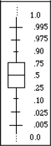
Look again at the boxes in the four distributions in Figure 7.9, and examine the middle half of the data in each graph. The middle half of the data is wide in the uniform, thin in the double exponential, and very one-sided in the exponential distribution.
In the outlier box plot, the shortest half (the shortest interval containing 50% of the data) is shown by a red bracket on the side of the box plot. The shortest half is at the center for the symmetric distributions, but off-center for non symmetric ones. Look at the exponential distribution to see an example of a non symmetric distribution.
In both box plots, the mean and its 95% confidence interval are shown by a diamond. Since this experiment was created with 1,000 observations, the mean is estimated with great precision, giving a very short confidence interval, and thus a thin diamond. Confidence intervals are discussed in the following sections.
Mean and Standard Deviation
The mean of a collection of values is its average value, computed as the sum of the values divided by the number of values in the sum. Expressed mathematically,
ˉx=x1+x1+…+xnn=∑xin
The sample mean has these properties:
● It is the balance point. The sum of deviations of each sample value from the sample mean is zero.
● It is the least squares estimate. The sum of squared deviations of the values from the mean is minimized. This sum is less than would be computed from any estimate other than the sample mean.
● It is the maximum likelihood estimator of the true mean when the distribution is normal. It is the estimate that makes the data that you collected more likely than any other estimate of the true mean would.
The sample variance (denoted s2) is the average squared deviation from the sample mean, which is shown as the expression
S2=∑(xi−ˉx)2n−1
The sample standard deviation is the square root of the sample variance.
S=√(xi−ˉx)2n−1
The standard deviation is preferred in reports because (among other reasons) it is in the same units as the original data (rather than squares of units).
If you assume that a distribution is normal, you can completely characterize its distribution by its mean and standard deviation.
When you say “mean” and “standard deviation,” you are allowed to be ambiguous. You might be referring to the true (and usually unknown) parameters of the distribution or the sample statistics you use to estimate the parameters.
Median and Other Quantiles
Half the data are above and half are below the sample median. It estimates the 50th quantile of the distribution. A sample quantile can be defined for any percentage between 0% and 100%; the 100% quantile is the maximum value, where 100% of the data values are at or below. The 75% quantile is the upper quartile, the value for which 75% of the data values are at or below.
There is an interesting indeterminacy about how to report the median and other quantiles. If you have an even number of observations, there might be several values where half the data are above, half below. There are about a dozen ways for reporting medians in the statistical literature. Many of these ways are different only if you have the same values on either or both sides of the middle. You can take one side, the other, the midpoint, or a weighted average of the middle values, with a number of weighting options. For example, if the sample values are {1, 2, 3, 4, 4, 5, 5, 5, 7, 8}, the median can be defined anywhere between 4 and 5, including one side or the other, half way, or two-thirds of the way into the interval. The halfway point is the most common value chosen.
Another property of the median is that it is the least-absolute-values estimator. That is, it is the number that minimizes the sum of the absolute differences between itself and each value in the sample. Least-absolute-values estimators are also called L1 estimators, or Minimum Absolute Deviation (MAD) estimators.
Mean versus Median
If the distribution is symmetric, the mean and median are estimates of both the expected value of the underlying distribution and its 50% quantile. If the distribution is normal, the mean is a “better” estimate (in terms of variance) than the median, by a ratio of 2 to 3.1416 (2: π). In other words, the mean has only 63% of the variance of the median.
If an outlier contaminates the data, the median is not greatly affected, but the mean could be greatly influenced, especially if the outlier is extreme. The median is said to be outlier-resistant, or robust.
Suppose you have a skewed distribution, like household income in the United States. This set of data has lots of extreme points on the high end, but is limited to zero on the low end. If you want to know the income of a typical person, it makes more sense to report the median than the mean. However, if you want to track per-capita income as an aggregating measure, then the mean income might be better to report.
Other Summary Statistics: Skewness and Kurtosis
Certain summary statistics, including the mean and variance, are also called moments. Moments are statistics that are formed from sums of powers of the data’s values. The first four moments are defined as follows:
● The first moment is the mean, which is calculated from a sum of values to the power 1. The mean measures the center of the distribution.
● The second moment is the variance (and, consequently, the standard deviation), which is calculated from sums of the values to the second power. Variance measures the spread of the distribution.
● The third moment is skewness, which is calculated from sums of values to the third power. Skewness measures the asymmetry of the distribution.
● The fourth moment is kurtosis, which is calculated from sums of the values to the fourth power. Kurtosis measures the relative shape of the middle and tails of the distribution.
Skewness and kurtosis can help determine whether a distribution is normal and, if not, what the distribution might be. A problem with these higher order moments is that the statistics have higher variance and are more sensitive to outliers.
![]() To get the skewness and kurtosis, select Display Options > Customize Summary Statistics from the red triangle menu next to the histogram’s title. The same command is in the red triangle menu next to Summary Statistics.
To get the skewness and kurtosis, select Display Options > Customize Summary Statistics from the red triangle menu next to the histogram’s title. The same command is in the red triangle menu next to Summary Statistics.
Extremes, Tail Detail
The extremes (the minimum and maximum) are the 0% and 100% quantiles.
At first glance, the most interesting aspect of a distribution appears to be where its center lies. However, statisticians often look first at the outlying points—they can carry useful information. That’s where the unusual values are, the possible contaminants, the rogues, and the potential discoveries.
In the normal distribution (with infinite tails), the extremes tend to extend farther as you collect more data. However, this is not necessarily the case with other distributions. For data that are uniformly distributed across an interval, the extremes change less and less as more data are collected. Sometimes this is not helpful, since the extremes are often the most informative statistics on the distribution.
Statistical Inference on the Mean
The previous sections talked about descriptive graphs and statistics. This section moves on to the real business of statistics: inference. We want to form confidence intervals for a mean and test hypotheses about it.
Standard Error of the Mean
Suppose there exists some true (but unknown) population mean that you estimate with the sample mean. The sample mean comes from a random process, so there is variability associated with it.
The mean is the arithmetic average—the sum of n values divided by n. The variance of the mean has 1/n of the variance of the original data. Since the standard deviation is the square root of the variance, the standard deviation of the sample mean is 1/√n of the standard deviation of the original data.
Substituting in the estimate of the standard deviation of the data, we now define the standard error of the mean, which estimates the standard deviation of the sample mean. It is the standard deviation of the data divided by the square root of n.
Symbolically, this is written
Sˉy=Sy√n
where sy is the sample standard deviation.
The mean and its standard error are the key quantities involved in statistical inference concerning the mean.
Confidence Intervals for the Mean
The sample mean is sometimes called a point estimate, because it’s only a single number. The true mean is not this point, but rather this point is an estimate of the true mean.
Instead of this single number, it would be more useful to have an interval that you are pretty sure contains the true mean (for example, 95% sure). This interval is called a 95% confidence interval for the true mean.
To construct a confidence interval, first make some assumptions. Assume:
● The data are normal, and
● The true standard deviation is the sample standard deviation. (We revisit this assumption later.)
Then, the exact distribution of the mean estimate is known, except for its location (because you don’t know the true mean).
If you knew the true mean and had to forecast a sample mean, you could construct an interval around the true mean that would contain the sample mean with probability 0.95. To do this, first obtain the quantiles of the standard normal distribution that have 5% of the area in their tails. These quantiles are –1.96 and +1.96.
Then, scale this interval by the standard deviation and add in the true mean: μ±1.96sˉy.
However, our present example is the reverse of this situation. Instead of a forecast, you already have the sample mean. Instead of an interval for the sample mean, you need an interval to capture the true mean. If the sample mean is 95% likely to be within this distance of the true mean, then the true mean is 95% likely to be within this distance of the sample mean. Therefore, the interval is centered at the sample mean. The formula for the approximate 95% confidence interval is
95% C.I. for the mean = ˉx±1.96sˉy
Figure 7.10 illustrates the construction of confidence intervals. This is not exactly the confidence interval that JMP calculates. Instead of using the quantile of 1.96 (from the normal distribution), it uses a quantile from Student’s t-distribution, discussed later. It is necessary to use this slightly modified version of the normal distribution because of the extra uncertainty that results from estimating the standard error of the mean (which, in this example, we are assuming is known). So the formula for the confidence interval is
(1−α) C.I. for the mean=ˉx±(t1−α2⋅ sˉy)
The alpha (α) in the formula is the probability that the interval does not capture the true mean. That probability is 0.05 for a 95% interval. The Summary Statistics table reports the confidence interval as the Upper 95% Mean and Lower 95% Mean. It is represented in the quantile box plot by the ends of a diamond (see Figure 7.11).
Figure 7.10 Illustration of Confidence Interval

Legend:
1. This is the distribution of the process that makes the data with a standard deviation s.
2. This is the distribution of the mean, whose standard deviation is ⋅s√n⋅
3. This is the true mean of the distribution.
4. We happened to get this mean from our random sample.
5. So, if we make an interval of 1.96 standard errors around the sample mean, we expect it to capture the true mean 95% of the time.
Figure 7.11 Summary Statistics Report and Quantile Box Plot

If you have not done so, you should read the section “Confidence Intervals” on page 120 in Chapter 6, “Simulations,” and run the associated script.
Testing Hypotheses: Terminology
Suppose you want to test whether the mean of a collection of sample values is significantly different from a hypothesized value. The strategy is to calculate a statistic so that if the true mean were the hypothesized value, getting such a large computed statistic value would be an extremely unlikely event. You would rather believe the hypothesis to be false than to believe that this rare coincidence happened. This is a probabilistic version of proof by contradiction.
The way you see an event as rare is to see that its probability is past a point in the tail of the probability distribution of the hypothesis. Often, researchers use 0.05 as a significance indicator. This means you believe that the mean is different from the hypothesized value if the chance of being wrong is only 5% (one in twenty).
Statisticians have a precise and formal terminology for hypothesis testing:
● The possibility of the true mean being the hypothesized value is called the null hypothesis. This is frequently denoted H0, and is the hypothesis that you want to reject. Said another way, the null hypothesis is that the hypothesized value is not different from the true mean. The alternative hypothesis, denoted HA, is that the mean is different from the hypothesized value. This can be phrased as greater than, less than, or unequal. The latter is called a two-sided alternative.
● The situation where you reject the null hypothesis when it happens to be true is called a Type I error. This declares that the difference is nonzero when it is really zero. The opposite mistake (not detecting a difference when there is a difference) is called a Type II error.
● The probability of getting a Type I error in a test is called the alpha-level (α- level) of the test. This is the probability that you are wrong if you say that there is a difference. The beta-level (β-level) or power of the test is the probability of being right when you say that there is a difference. 1 – β is the probability of a Type II error.
● Statistics and tests are constructed so that the power is maximized subject to the α-level being maintained.
In the past, people obtained critical values for α-levels and ended with a reject or don’t-reject decision based on whether the statistic was bigger or smaller than the critical value. For example, researchers would declare that their experiment was significant if the test statistic fell in the region of the distribution corresponding to an α-level of 0.05. This α-level was specified in advance, before the study was conducted.
Computers have changed this strategy. Now, the α-level isn’t pre-determined, but rather is produced by the computer after the analysis is complete. In this context, it is called a p-value or significance level. The definition of a p-value can be phrased in many ways:
● The p-value is the α-level at which the statistic would be significant.
● The p-value is how unlikely getting so large a statistic would be if the true mean were the hypothesized value.
● The p-value is the probability of being wrong if you rejected the null hypothesis. It is the probability of a Type I error.
● The p-value is the area in the tail of the distribution of the test statistic under the null hypothesis.
The p-value is the number that you want to be very small, certainly below 0.05, so that you can say that the mean is significantly different from the hypothesized value. The p-values in JMP are labeled according to the test statistic’s distribution. p-values below 0.05 are marked with an asterisk in many JMP reports. The label “Prob >|t|” is read as the “probability of getting an even greater absolute t statistic, given that the null hypothesis is true.”
The Normal z-Test for the Mean
The Central Limit Theorem tells us that if the original response data are normally distributed, then, when many samples are drawn, the means of the samples are normally distributed. More surprisingly, it says that even if the original response data are not normally distributed, the sample mean still has an approximate normal distribution if the sample size is large enough. So the normal distribution provides a reference to use to compare a sample mean to a hypothesized value.
The standard normal distribution has a mean of zero and a standard deviation of one. You can center any variable to mean zero by subtracting the mean (even the hypothesized mean). You can standardize any variable to have standard deviation 1 (“unit standard deviation”) by dividing by the true standard deviation, assuming for now that you know what it is. This process is called centering and scaling. If the hypothesis were true, the test statistic that you construct should have this standard distribution. Tests using the normal distribution constructed like this (hypothesized mean but known standard deviation) are called z-tests. The formula for a z-statistic is
z-statistic = estimate−hypothesized estimatestandard deviation
You want to find out how unusual your computed z-value is from the point of view of believing the hypothesis. If the value is too improbable, then you doubt the null hypothesis.
To get a significance probability, you take the computed z-value and find the probability of getting an even greater absolute value. This involves finding the areas in the tails of the normal distribution that are greater than absolute z and less than negative absolute z. Figure 7.12 illustrates a two-tailed z-test for α = 0.05.
Figure 7.12 Illustration of the Two-Tailed z-test

Case Study: The Earth’s Ecliptic
In 1738, the Paris observatory determined with high accuracy that the angle of the earth’s spin was 23.472 degrees. However, someone suggested that the angle changes over time. Examining historical documents found five measurements dating from 1460 to 1570. These measurements were somewhat different from the Paris measurement, and they were done using much less precise methods. The question is whether the differences in the measurements can be attributed to the errors in measurement of the earlier observations, or whether the angle of the earth’s rotation actually changed. We need to test the hypothesis that the earth’s angle has actually changed.
![]() Select Help > Sample Data Library and open Cassub.jmp (Stigler, 1986).
Select Help > Sample Data Library and open Cassub.jmp (Stigler, 1986).
![]() Select Analyze > Distribution and assign Obliquity to Y, Columns.
Select Analyze > Distribution and assign Obliquity to Y, Columns.
![]() Click OK.
Click OK.
The Distribution report in Figure 7.13 shows a histogram of the five values.
We now want to test that the mean of these values is different from the value from the Paris observatory. Our null hypothesis is that the mean is not different.
![]() Click on the red triangle menu next to Obliquity and select Test Mean.
Click on the red triangle menu next to Obliquity and select Test Mean.
![]() Type the hypothesized value of 23.47222 (the value measured by the Paris observatory), and enter the standard deviation of 0.0196 found in the Summary Statistics table (we assume this is the true standard deviation).
Type the hypothesized value of 23.47222 (the value measured by the Paris observatory), and enter the standard deviation of 0.0196 found in the Summary Statistics table (we assume this is the true standard deviation).
![]() Click OK.
Click OK.
Figure 7.13 Report of Observed Ecliptic Values

Note: Keep this data table open. You will use it later.
The z-test statistic has the value 3.0298. The area under the normal curve to the right of this value is reported as Prob > z. This is the probability (p-value) of getting an even greater z-value if there was no difference. In this case, the p-value is 0.0012. This is an extremely small p-value. If our null hypothesis were true (for example, the measurements were the same), our measurement would be a highly unlikely observation. Rather than believe the unlikely result, we reject H0 and claim the measurements are different.
Notice that, here, we are interested only in whether the mean is greater than the hypothesized value. We therefore look at the value of Prob > z, a one-sided test. Our null hypothesis stated above is that the mean is not different, so we test that the mean is different in either direction. For this two-sided test, we need the area in both tails. This statistic is two-sided and listed as Prob >|z|, in this case 0.0024.
The one-sided test Prob < z has a p-value of 0.9988, indicating that you are not going to prove that the mean is less than the hypothesized value. The two-sided p-value is always twice the smaller of the one-sided p-values.
Student’s t-Test
The z-test has a restrictive requirement. It requires the value of the true standard deviation of the response, and thus the standard deviation of the mean estimate, be known. Usually, this true standard deviation value is unknown and you have to use an estimate of the standard deviation.
t=ˉx−x0s√n
Using the estimate in the denominator of the statistical test computation requires an adjustment to the distribution that was used for the test. Instead of using a normal distribution, statisticians use a Student’s t-distribution. The statistic is called the Student’s t-statistic and is computed by the formula shown here. x0 is the hypothesized mean, and s is the sample standard deviation of the sample data. In words, you can say
t−statistic=sample mean−hypothesized valuestandard error of the mean
A large sample estimates the standard deviation very well, and the Student’s t- distribution is remarkably similar to the normal distribution, as illustrated in Figure 7.14. However, in this example there were only five observations.
There is a different t-distribution for each number of observations, indexed by a value called degrees of freedom. Degrees of freedom is the number of observations minus the number of parameters estimated in fitting the model. In this case, five observations minus one parameter (the mean) yields 5 – 1 = 4 degrees of freedom. As you can see in Figure 7.14, the quantiles for the t-distribution spread out farther than the normal when there are few degrees of freedom.
Figure 7.14 Comparison of Normal and Student’s t Distributions

Comparing the Normal and Student’s t Distributions
JMP can produce an animation to show you the relationships in Figure 7.14. This demonstration uses the Normal vs. t.jsl script.
![]() To run the script, select Help > Sample Data > Teaching Scripts > Teaching Demonstrations > Normal vs. t.
To run the script, select Help > Sample Data > Teaching Scripts > Teaching Demonstrations > Normal vs. t.
You should see the window shown in Figure 7.15.
Figure 7.15 Normal vs t Comparison

The small square located just above 0 is called a handle. It is draggable, and adjusts the degrees of freedom associated with the black t-distribution as it moves. The normal distribution is drawn in red.
![]() Drag the handle up and down to adjust the degrees of freedom of the t- distribution.
Drag the handle up and down to adjust the degrees of freedom of the t- distribution.
Notice both the height and the tails of the t-distribution. At what number of degrees of freedom do you feel that the two distributions are close to identical?
Testing the Mean
We now reconsider the ecliptic case study, so return to the Cassub.jmp Distribution of Obliquity report window. It turns out that for a 5% two-tailed test, the t- quantile for 4 degrees of freedom is 2.776, which is far greater than the corresponding z-quantile of 1.96 (shown in Figure 7.14). That is, the bar for rejecting H0 is higher, due to the fact that we don’t know the standard deviation. Let’s do the same test again, using this different value. Our null hypothesis is still that there is no change in the values.
![]() Select Test Mean and again enter 23.47222 for the hypothesized mean value. This time, do not fill in the standard deviation.
Select Test Mean and again enter 23.47222 for the hypothesized mean value. This time, do not fill in the standard deviation.
![]() Click OK.
Click OK.
The Test Mean report (shown here) now displays a t-test instead of a z-test (as in the Obliquity report in Figure 7.13 on page 151).
When you don’t specify a standard deviation, JMP uses the sample estimate of the standard deviation. The significance is smaller, but the p-value of 0.0389 still looks convincing, so you can reject H0 and conclude that the angle has changed. When you have a significant result, the idea is that under the null hypothesis, the expected value of the t-statistic is zero. It is highly unlikely (probability less than α) for the t-statistic to be so far out in the tails. Therefore, you don’t put much belief in the null hypothesis.

Note: You might have noticed that the test window offers the options of a Wilcoxon signed-rank nonparametric test. Some statisticians favor nonparametric tests because the results don’t depend on the response having a normal distribution. Nonparametric tests are covered in more detail in Chapter 9, “Comparing Many Means: One-Way Analysis of Variance.”
The p-Value Animation
Figure 7.12 on page 150 illustrates the relationship between the two-tailed test and the normal distribution. Some questions might arise after looking at this picture.
● How would the p-value change if the difference between the truth and my observation were different?
● How would the p-value change if my test were one-sided instead of two sided?
● How would the p-value change if my sample size were different?

To answer these questions, JMP provides an animated demonstration, written in JMP scripting language. Often, these scripts are stored as separate files or are included in the Sample Scripts folder. However, some scripts are built into JMP. This p- value animation is an example of a built-in script.
![]() Select PValue animation from the red triangle menu next to Test Mean, as shown here.
Select PValue animation from the red triangle menu next to Test Mean, as shown here.
The p value animation script produces the window in Figure 7.16.
Figure 7.16 p-Value Animation Window for the Ecliptic Case Study

The black vertical line represents the mean estimated by the historical measurements. You can drag the handle around the window. In this case, the handle represents the true mean under the null hypothesis. To reject this true mean, there must be a significant difference between it and the mean estimated by the data.
The p-value calculated by JMP is affected by the difference between this true mean and the estimated mean. You can see the effect of a different true mean by dragging the handle.
![]() Drag the handle left and right. Observe the changes in the p-value as the true mean changes.
Drag the handle left and right. Observe the changes in the p-value as the true mean changes.
As expected, the p-value decreases as the difference between the true and hypothesized mean increases.
The effect of changing this mean is also illustrated graphically. As shown previously in Figure 7.12, the shaded area represents the region where the null hypothesis is rejected. As the area of this region increases, the p-value of the test also increases. This demonstrates that the closer your estimated mean is to the true mean under the null hypothesis, the less likely you are to reject the null hypothesis.
This demonstration can also be used to extract other information about the data. For example, you can determine the smallest difference that your data would be able to detect for specific p-values. To determine this difference for p = 0.10:
![]() Drag the handle until the p-value is as close to 0.10 as possible.
Drag the handle until the p-value is as close to 0.10 as possible.
You can then read the estimated mean and hypothesized mean from the text display. The difference between these two numbers is the smallest difference that would be significant at the 0.10 level. Any smaller difference would not be significant.
To see the difference between p-values for two-sided and one-sided tests, use the buttons at the bottom of the window.
![]() Click the High Side button to change the test to a one-sided t-test.
Click the High Side button to change the test to a one-sided t-test.
The p-value decreases because the region where the null hypothesis is rejected has become larger. It is all piled up on one side of the distribution, so smaller differences between the true mean and the estimated mean become significant.
![]() Repeatedly click the Two Sided and High Side buttons.
Repeatedly click the Two Sided and High Side buttons.
What is the relationship between the p-values when the test is one- and two- sided? To edit and see the effect of different sample sizes:
![]() Click on the values for sample size beneath the plot and enter different values.
Click on the values for sample size beneath the plot and enter different values.
What effect would a larger sample size have on the p-value?
Power of the t-Test
As discussed in the section “Testing Hypotheses: Terminology” on page 147, there are two types of errors that a statistician is concerned with when conducting a statistical test—Type I and Type II. JMP contains a built-in script to graphically demonstrate the quantities involved in computing the power of a t-test.
![]() Select Power animation from the red triangle menu next to Test Mean to display the window shown in Figure 7.17.
Select Power animation from the red triangle menu next to Test Mean to display the window shown in Figure 7.17.
Figure 7.17 Power Animation Window

The probability of committing a Type I error (reject the null hypothesis when it is true), often represented by α, is shaded in red. The probability of committing a Type II error (not detecting a difference when there is a difference), often represented as β is shaded in blue. Power is 1 – β, which is the probability of detecting a difference. The case where the difference is zero is examined below.
There are three handles in this window. One handle is for the estimated mean (calculated from the data). One handle is for the true mean (an unknowable quantity that the data estimates).The other handle is for the hypothesized mean (the mean assumed under the null hypothesis). You can drag these handles to see how their positions affect power.
Note: Click on the values for sample size and alpha beneath the plot to edit them.
![]() Drag the true mean (the top handle on the blue line) until it coincides with the hypothesized mean (the red line).
Drag the true mean (the top handle on the blue line) until it coincides with the hypothesized mean (the red line).
This simulates the situation where the true mean is the hypothesized mean in a test where α=0.05. What is the power of the test?
![]() Continue dragging the true mean around the graph.
Continue dragging the true mean around the graph.
Can you make the probability of committing a Type II error (Beta) smaller than the case above, where the two means coincide?
![]() Drag the true mean so that it is far away from the hypothesized mean. Notice that the shape of the blue distribution (around the true mean) is no longer symmetrical. This is an example of a non central t-distribution.
Drag the true mean so that it is far away from the hypothesized mean. Notice that the shape of the blue distribution (around the true mean) is no longer symmetrical. This is an example of a non central t-distribution.
Finally, as with the p-value animation, these same situations can be further explored for one-sided tests using the buttons along the bottom of the window.
![]() Explore different values for sample size and alpha.
Explore different values for sample size and alpha.
Practical Significance versus Statistical Significance
This section demonstrates that a statistically significant difference can be quite different from a practically significant difference. Dr. Quick and Dr. Quack are both in the business of selling diets, and they have claims that appear contradictory. Dr. Quack studied 500 dieters and claims,
A statistical analysis of my dieters shows a statistically significant weight loss for my Quack diet.
Dr. Quick followed the progress of 20 dieters and claims,
A statistical study shows that on average my dieters lose more than three times as much weight on the Quick diet as on the Quack diet.
So which claim is right?
![]() To compare the Quick and Quack diets, select Help > Sample Data Library and open Diet.jmp.
To compare the Quick and Quack diets, select Help > Sample Data Library and open Diet.jmp.
Figure 7.18 shows a partial listing of the Diet data table.
Figure 7.18 Partial Listing of the Diet Data

![]() Select Analyze > Distribution, assign both variables to Y, Columns, and then click OK.
Select Analyze > Distribution, assign both variables to Y, Columns, and then click OK.
![]() Select Test Mean from the red triangle menu next to each histogram title bar to compare the mean weight loss for each diet to zero.
Select Test Mean from the red triangle menu next to each histogram title bar to compare the mean weight loss for each diet to zero.
You should use the one-sided t-test because you are interested only in significant weight loss (not gain).
If you look closely at the means and t-test results in Figure 7.19, you can verify both claims!
Quick’s average weight loss of 2.73 is more than three times the 0.91 weight loss reported by Quack, and Quack’s weight loss was significantly different from zero. However, Quick’s larger mean weight loss was not significantly different from zero. Quack might not have a better diet, but the doctor has more evidence—500 cases compared with 20 cases. So even though the diet produced a weight loss of less than a pound, it is statistically significant. Significance is about evidence, and having a large sample size can make up for having a small effect.
Note: If you have a large enough sample size, even a very small difference can be significant. If your sample size is small, even a large difference might not be significant.
Looking closer at the claims, note that Quick reports on the estimated difference between the two diets, whereas Quack reports on the significance of his results. Both are somewhat empty statements. It is not enough to report an estimate without a measure of variability. It is not enough to report a significance without an estimate of the difference.
The best report in this situation is a confidence interval for the estimate, which shows both the statistical and practical significance. The next chapter presents the tools to do a more complete analysis on data like the Quick and Quack diet data.
Figure 7.19 Reports of the Quick and Quack Example

Examining for Normality
Sometimes you might want to test whether a set of values is from a particular distribution. Perhaps you are verifying assumptions and want to test that the values are from a normal distribution.
Normal Quantile Plots
Normal quantile plots show all the values of the data as points in a plot. If the data are normal, the points tend to follow a straight line.
![]() Return to the four RandDist.jmp histograms that you opened in “Generating Random Data” on page 134.
Return to the four RandDist.jmp histograms that you opened in “Generating Random Data” on page 134.
![]() Hold down the Ctrl key and select Normal Quantile Plot from one of the red triangle menus next to a histogram.
Hold down the Ctrl key and select Normal Quantile Plot from one of the red triangle menus next to a histogram.
Note: Holding down the Ctrl key while selecting a command broadcasts that command to other analyses.
The histograms and normal quantile plots for the four simulated distributions are shown later in Figure 7.21 and Figure 7.22.
The y (vertical) coordinate is the actual value of each data point. The x (horizontal) coordinate is the normal quantile associated with the rank of the value after sorting the data.
If you are interested in the details, the precise formula used for the normal quantile values is
Φ−1(riN+1)
where ri is the rank of the observation being scored, N is the number of observations, and Φ-1 is the function that returns the normal quantile associated with the probability argument p, where p equals
riN+1
The normal quantile is the value on the x-axis of the normal density that has the portion p of the area below it. For example, the quantile for 0.5 (the probability of being less than the median) is 0.5, because half (50%) of the density of the standard normal is below 0.5. The technical name for the quantiles JMP uses is the van der Waerden normal scores; they are computationally cheap (but good) approximations to the more expensive, exact expected normal order statistics.
Figure 7.20 shows the normal quantile plot with the following components:
● A red straight line, with confidence limits, shows where the points tend to lie if the data were normal. This line is purely a function of the sample mean and standard deviation. The line crosses the mean of the data at the normal quantile of 0.5. The slope of the line is the standard deviation of the data.
● Dashed lines surrounding the straight line form a confidence interval for the normal distribution. If the points fall outside these dashed lines, you are seeing a significant departure from normality.
● If the slope of the points is small (relative to the normal), then you are crossing a lot of (ranked) data with little variation in the real values. Therefore, you encounter a dense cluster. If the slope of the points is large, then you are crossing a lot of real values with few (ranked) points. Dense clusters make flat sections, and thinly populated regions make steep sections. (See upcoming figures for examples.)
Figure 7.20 Normal Quantile Plot Explanation

The middle portion of the uniform distribution (left plot in Figure 7.21) is steeper (less dense) than the normal. In the tails, the uniform is flatter (more dense) than the normal. In fact, the tails are truncated at the end of the range, where the normal tails extend infinitely.
The normal distribution (right plot in Figure 7.21) has a normal quantile plot that follows a straight line. Points at the tails usually have the highest variance and are most likely to fall farther from the line. Because of this, the confidence limits flair near the ends.
Figure 7.21 Uniform Distribution (left) and Normal Distribution (right)

The exponential distribution (Figure 7.22) is skewed – that is, one-sided. The top tail runs steeply past the normal line; it spreads out more than the normal. The bottom tail is shallow and much denser than the normal.
The middle portion of the double exponential (Figure 7.22) is denser (more shallow) than the normal. In the tails, the double exponential spreads out more (is steeper) than the normal.
Figure 7.22 Exponential Distribution and Double Exponential Distribution

Statistical Tests for Normality
A widely used test that the data are from a specific distribution is the Kolmogorov test (also called the Kolmogorov-Smirnov test). The test statistic is the greatest absolute difference between the hypothesized distribution function and the empirical distribution function of the data. The empirical distribution function goes from 0 to 1 in steps of 1/n as it crosses data values. When the Kolmogorov test is applied to the normal distribution and adapted to use estimates for the mean and standard deviation, it is called the Lilliefors test or the KSL test. In JMP, Lilliefors quantiles on the cumulative distribution function (cdf) are translated into confidence limits in the normal quantile plot. Therefore, you can see where the distribution departs from normality by where it crosses the confidence curves.
Another test of normality produced by JMP is the Shapiro-Wilk test (or the W- statistic), which is implemented for samples as large as 2000. For samples greater than 2000, the KSL (Kolmogorov-Smirnov-Lillefors) test is done. The null hypothesis for this test is that the data are normal. Rejecting this hypothesis would imply the distribution is non-normal.
![]() Look at the Birth Death.jmp data table again or re-open it if it is closed.
Look at the Birth Death.jmp data table again or re-open it if it is closed.
![]() Select Analyze > Distribution, assign birth and death to Y, Columns, and then click OK.
Select Analyze > Distribution, assign birth and death to Y, Columns, and then click OK.
![]() Select Fit Distribution > Continuous Fit > Normal from the red triangle menu next to Birth.
Select Fit Distribution > Continuous Fit > Normal from the red triangle menu next to Birth.
![]() Select Goodness of Fit from the red triangle menu next to Fitted Normal.
Select Goodness of Fit from the red triangle menu next to Fitted Normal.
![]() Repeat for the death distribution.
Repeat for the death distribution.
The results are shown in Figure 7.23.
The conclusion is that neither distribution is normal.
This is an example of an unusual situation where you hope the test fails to be significant, because the null hypothesis is that the data are normal.
If you have a large number of observations, you might want to reconsider this tactic. The normality tests are sensitive to small departures from normality. Small departures do not jeopardize other analyses because of the Central Limit Theorem, especially because they are also probably highly significant. All the distributional tests assume that the data are independent and identically distributed.
Some researchers test the normality of residuals from model fits, because the other tests assume a normal distribution. We strongly recommend that you do not conduct these tests, but instead rely on normal quantile plots to look for patterns and outliers.
Figure 7.23 Test Distributions for Normality

So far we have been doing statistics correctly, but a few remarks are in order.
● In most tests, the null hypothesis is something that you want to disprove. It is disproved by the contradiction of getting a statistic that would be unlikely if the hypothesis were true. But in normality tests, you want the null hypothesis to be true. Most testing for normality is to verify assumptions for other statistical tests.
● The mechanics for any test where the null hypothesis is desirable are backward. You can get an undesirable result, but the failure to get it does not prove the opposite—it only says that you have insufficient evidence to prove it is true. “Special Topic: Practical Difference” on page 167 gives more details about this issue.
● When testing for normality, it is more likely to get a desirable (inconclusive) result if you have very little data. Conversely, if you have thousands of observations, almost any set of data from the real world appears significantly non-normal.
● If you have a large sample, the estimate of the mean is distributed normally even if the original data is not. This result, from the Central Limit Theorem, is demonstrated in a later section beginning on page 170.
● The test statistic itself doesn–t tell you about the nature of the difference from normality. The normal quantile plot is better for this.
Special Topic: Practical Difference
Suppose you really want to show that the mean of a process is a certain value. Standard statistical tests are of no help. The failure of a test to show that a mean is different from the hypothetical value does not show that it is that value. It says only that there is not enough evidence to confirm that it isn–t that value. In other words, saying “I can’t say the result is different from 5” is not the same as saying “The result must be 5.”
You can never show that a mean is exactly some hypothesized value, because the mean could be different from that hypothesized value by an infinitesimal amount. No matter the sample size, you might have a value that is different from the hypothesized mean by an amount that is so small that it is quite unlikely to get a significant difference even if the true difference is zero.
So instead of trying to show that the mean is exactly equal to a hypothesized value, you need to choose an interval around that hypothesized value and try to show that the mean is not outside that interval. This can be done.
There are many situations where you want to Ctrl a mean within some specification interval. For example, suppose that you make 20-amp electrical circuit breakers. You need to demonstrate that the mean breaking current for the population of breakers is between 19.9 and 20.1 amps. (Actually, you probably also require that most individual units be in some specification interval, but for now we just focus on the mean.) You’ll never be able to prove that the mean of the population of breakers is exactly 20 amps. You can, however, show that the mean is close—within 0.1 of 20.
The standard way to do this is the TOST method, an acronym for Two One-Sided Tests (Westlake 1981, Schuirmann 1981, Berger and Hsu 1996):
1. First, you do a one-sided t-test that the mean is the low value of the interval, with an upper tail alternative.
2. Then you do a one-sided t-test that the mean is the high value of the interval, with a lower tail alternative.
3. If both tests are significant at some level α, then you can conclude that the mean is outside the interval with a probability less than or equal to α, the sig- nificance level. In other words, the mean is not practically different from the hypothesized value, or, in still other words, the mean is practically equiva- lent to the hypothesized value.
Note: Technically, the test works by a union intersection rule, whose description is beyond the scope of this book.
For example, a material coating process requires the mean coating weight to be 20.4 +/-0.2 units.
![]() Select Help > Sample Data Library and open Quality Ctrl/Coating.jmp.
Select Help > Sample Data Library and open Quality Ctrl/Coating.jmp.
![]() Select Analyze > Distribution, assign Weight to Y, Columns, and then click OK. When the report appears,
Select Analyze > Distribution, assign Weight to Y, Columns, and then click OK. When the report appears,
![]() Select Test Mean from the red triangle menu next to Weight, type 20.2 as the hypothesized value, and then click OK.
Select Test Mean from the red triangle menu next to Weight, type 20.2 as the hypothesized value, and then click OK.
![]() Select Test Mean again, enter 20.6 as the hypothesized value, and then click OK.
Select Test Mean again, enter 20.6 as the hypothesized value, and then click OK.
This tests the null hypothesis that the mean Weight is between 20.2 and 20.6 (that is, 20.4±0.2) with a protection level (α) of 0.05.
The p-value for the hypothesis from below is approximately 0.228, and the p-value for the hypothesis from above is also about 0.22. Since both of these values are far above the α of 0.05 that we were looking for, we declare it not significant. We cannot reject the null hypothesis. The conclusion is that we have not shown that the mean is practically equivalent to 20.4 ± 0.2 at the 0.05 significance level. We need more data.
Figure 7.24 Compare Test for Mean at Two Values

The Test Equivalence option in the Distribution platform applies the TOST method, directly conducting the two one-sided t-tests. You enter the hypothesized value, the threshold, and the confidence level.
Figure 7.25 Test Equivalence

Special Topic: Simulating the Central Limit Theorem
The Central Limit Theorem, which we visited in a previous chapter, says that for a very large sample size, the sample mean is very close to normally distributed, regardless of the shape of the underlying distribution. That is, if you compute means from many samples of a given size, the distribution of those means approaches normality, even if the underlying population from which the samples were drawn is not.
You can see the Central Limit Theorem in action using the template called Central Limit Theorem.jmp. in the sample data library.
![]() Select Help > Sample Data Library and open Central Limit Theorem.jmp.
Select Help > Sample Data Library and open Central Limit Theorem.jmp.
![]() Click on the plus sign next to column N=1 in the Columns panel to view the formula.
Click on the plus sign next to column N=1 in the Columns panel to view the formula.
![]() Do the same thing for the rest of the columns, called N=5, N=10, and so on, to look at their formulas (Figure 7.26).
Do the same thing for the rest of the columns, called N=5, N=10, and so on, to look at their formulas (Figure 7.26).
Figure 7.26 Formulas for Columns in the Central Limit Theorem Data Table

Looking at the formulas might help you understand what’s going on. The expression raising the uniform random number values to the fourth power creates a highly skewed distribution. For each row, the first column, N=1, generates a single uniform random number to the fourth power. For each row in the second column, N=5, the formula generates a sample of five uniform numbers, takes each to the fourth power, and computes the mean. The next column does the same for a sample size of 10, and the remaining columns generate means for sample sizes of 50 and 100.
![]() Add 500 rows to the data table using Rows > Add Rows. When the computations are complete:
Add 500 rows to the data table using Rows > Add Rows. When the computations are complete:
![]() Select Analyze > Distribution. Select all the variables, assign them to Y, Columns, and then click OK.
Select Analyze > Distribution. Select all the variables, assign them to Y, Columns, and then click OK.
Your results should be similar to those in Figure 7.27. When the sample size is only 1, the skewed distribution is apparent. As the sample size increases, you can clearly see the distributions becoming more and more normal.
Figure 7.27 Example of the Central Limit Theorem in Action

The distributions also become less spread out, since the standard deviation (s) of a mean of n items is ⋅s√n⋅.
![]() To see this dramatic effect, select Uniform Scaling from the red triangle menu next to Distribution.
To see this dramatic effect, select Uniform Scaling from the red triangle menu next to Distribution.

Note: The Sampling Distribution of Sample Means teaching module provides a more flexible interface for exploring the central limit theorem. The collection of teaching modules can be found under Help > Sample Data > Teaching Scripts > Interactive Teaching Modules.
Seeing Kernel Density Estimates
The idea behind kernel density estimators is not difficult. In essence, a normal distribution is placed over each data point with a specified standard deviation. Each of these normal distributions is then summed to produce the overall curve.
JMP can animate this process for a simple set of data. For details about using scripts, see “Working with Scripts” on page 60.
![]() Open the demoKernel.jsl script. Select Help > Sample Data and click the Open Sample Scripts Directory to see the sample scripts library.
Open the demoKernel.jsl script. Select Help > Sample Data and click the Open Sample Scripts Directory to see the sample scripts library.
![]() Select Edit > Run Script to run the demoKernel script.
Select Edit > Run Script to run the demoKernel script.
You should see a window like the one in Figure 7.28.
Figure 7.28 Kernel Addition Demonstration

The handle on the left side of the graph can be dragged with the mouse.
![]() Move the handle to adjust the spread of the individual normal distributions associated with each data point.
Move the handle to adjust the spread of the individual normal distributions associated with each data point.
The larger red curve is the smoothing spline generated by the sum of the normal distributions. As you can see, merely adjusting the spread of the small normal distributions controls the smoothness of the spline fit.
Exercises
1. The sample data table Hollywood Movies.jmp contains data for all Hollywood movies released in 2011. The data table contains the name of a movie, the amount of money that it made in the United States (Domestic) and in foreign markets (in millions of dol- lars), the movie genre, and other information.
(a) Create a histogram of the movie genres. What are the levels of this variable? How many of each level are in the data set?
(b) Create a histogram of the domestic gross for each movie. What is the range of values for this variable? What is the average domestic gross of these movies?
(c) Consider the histogram that you created in part (b) for the domestic gross of these movies. You should notice several outliers in the outlier box plot. Move your mouse over the points to identify the movies. Use your cursor to draw a box around these points. Then, use Rows > Label to label the points. What was the top grossing movie in 2011?
(d) Create a subset of the data consisting of only drama movies. Create a histogram and find the average domestic and world grosses for your subset. Are there outliers in either variable?
2. The sample data table Analgesics.jmp contains pain ratings from patients after treat- ments from three different pain relievers. The patients are labeled only by gender in this study. The study was meant to determine whether the three pain relievers were different in the amount of pain relief the patients experienced.
(a) Create a histogram of the variables gender, drug, and pain. Click on the histogram bars to determine whether the distribution of gender is approximately equal among the three analgesics.
(b) Create a separate histogram for the variable pain for each of the three different analgesics (Note: Use the By button). Does the mean pain response seem the same for each of the three analgesics?
3. The sample data table Scores.jmp contains data for the United States from the Third International Mathematics and Science Study, conducted in 1995. The variables came from testing more than 5000 students for their abilities in Calculus and Physics, and are separated into four regions of the United States. Note that some students took the Cal- culus test, some took the Physics test, and some took both. Assume that the scores rep- resent a random sample for each of the four regions of the United States.
(a) Produce a histogram and find the mean scores for the United States on both tests. By clicking on the bars of the histogram, can you determine whether a high calculus score correlates highly with a high Physics score?
(b) Find the mean scores for the Calculus test for the four regions of the country. Do they appear to be approximately equal?
(c) Find the mean scores for the Physics tests for the four regions of the country. Do they appear to be approximately equal?
(d) Suppose that from an equivalent former test, the mean score of United States Calculus students was 450. Does this study show evidence that the score has increased since the last test?
(e) Construct a 95% confidence interval for the mean calculus score.
(f) Suppose that Physics teachers say that the overall United States score on the Physics test should be higher than 420. Do the data support their claim?
(g) Construct a 95% confidence interval for the mean Physics score.
4. The sample data table Cereal.jmp contains nutritional information for 76 types of cereal.
(a) Find the mean number of fat grams for the cereals in this data set. List any unusual observations.
(b) Use the Distribution platform to find the two types of cereal with unusually high fiber content.
(c) The hot/cold variable is used to specify whether the cereal was meant to be eaten hot or cold. Find the mean amount of sugars contained in the hot cereals and the cold cereals. Construct a 95% confidence interval for each.
5. Various crime statistics for each of the 50 states in the United States are stored in the sample data table Crime.jmp.
(a) Examine the distributions of each statistic. Which (if any) do not appear to follow a normal distribution?
(b) Which two states are outliers with respect to the robbery variable?
6. Data for the Brigham Young football team are stored in the sample data table Foot- ball.jmp.
(a) Find the average height and weight of the players on the team.
(b) The Position variable identifies the primary position of each player. Which position has the smallest average weight? Which has the highest?
(c) Which position has the largest average neck measurements? What position (on average) can bench press the most weight?
7. The sample data table Hot Dogs.jmp came from an investigation of the taste and nutri- tional content of hot dogs.
(a) Construct a histogram of the type of hot dogs (beef, meat, and poultry). Is there an equal number of each type considered?
(b) The $/oz variable represents the cost per ounce of hot dog. Construct an outlier box plot of this variable and find any outliers.
(c) Construct a 95% confidence interval for the caloric content of the three types of hot dogs. Which type gives (on average) the lowest calories?
(d) Test the conjecture that the mean sodium content of all hot dogs is 410 grams.