
12 Categorical Models
Overview
Chapter 11, “Categorical Distributions,” introduced the distribution of a single categorical response. You were introduced to the Pearson and the likelihood ratio chi-square tests and saw how to compare univariate categorical distributions.
This chapter covers multivariate categorical distributions. In the simplest case, the data can be presented as a two-way contingency table (also called a cross tabulation or cross tab) of frequency counts. The contingency table contains expected cell probabilities and counts formed from products of marginal probabilities and counts. The chi-square test again is used for the contingency table and is the same as testing multiple categorical responses for independence.
Correspondence analysis is shown as a graphical technique useful when the response and factors have many levels or values.
Also, a more general categorical response model is used to introduce nominal and ordinal logistic regression, which allows multiple continuous or categorical factors.
Chapter Contents
Fitting Categorical Responses to Categorical Factors: Contingency Tables
Testing with G2 and X2 Statistic
Two-Way Tables: Entering Count Data
Expected Values under Independence
Entering Two-Way Data into JMP
Special Topic: Correspondence Analysis— Looking at Data with Many Levels
Continuous Factors with Categorical Responses: Logistic Regression
Polytomous (Multinomial) Responses: More Than Two Levels
Ordinal Responses: Cumulative Ordinal Logistic Regression
Surprise: Simpson’s Paradox: Aggregate Data versus Grouped Data
Fitting Categorical Responses to Categorical Factors: Contingency Tables
When a categorical response is examined in relationship to a categorical factor (in other words, both X and Y are categorical), the question is: do the response probabilities vary across factor-defined subgroups of the population? Comparing a continuous response and a categorical factor in this way was covered in Chapter 9, “Comparing Many Means: One-Way Analysis of Variance.” In that chapter, means were fit for each level of a categorical variable and tested using an ANOVA. When the continuous response is replaced with a categorical response, the equivalent technique is to estimate response probabilities for each subgroup and test that they are the same across the subgroups.
The subgroups are defined by the levels of a categorical factor (X). For each subgroup, the set of response probabilities must add up to 1. For example, consider the following:
● The probability of whether a patient lives or dies (response probabilities) depending on whether the treatment (categorical factor) was drug or placebo
● The probability that type of car purchased (response probabilities) depending on marital status (the categorical factor)
To estimate response probabilities for each subgroup, you divide the count in a given response level by its total count.
Testing with G2 and X2 Statistic
You want to test whether the factor affects the response. The null hypothesis is that the response probabilities are the same across subgroups. The model compares the fitted probabilities over the subgroups to the fitted probabilities combining all the groups into one population (a constant response model).
As a measure of fit for the models that you want to compare, you can use the negative log-likelihood to compute a likelihood-ratio chi-square test. To do this, subtract the log-likelihoods for the two models and multiply by 2. For each observation, the log-likelihood is the log of the probability attributed to the response level of the observation.
Warning: When the table is sparse, neither the Pearson or likelihood ratio chi- square is a very good approximation to the true distribution. The Cochran criterion, used to determine whether the tests are appropriate, defines sparse as when more than 20% of the cells have expected counts less than 5. JMP presents a warning when this situation occurs.
The Pearson chi-square tends to be better behaved in sparse situations than the likelihood ratio chi-square. However, G2 is often preferred over X2 for other reasons, specifically because it is applicable to general categorical models where X2 is not.
Chapter 11, “Categorical Distributions,” discussed the G2 and X2 test statistics in more detail.
Looking at Survey Data
Survey data often yield categorical data suitable for contingency table analysis. For example, suppose a company did a survey to find out what factors relate to the brand of automobile people buy. In other words, what type of people buy what type of cars? Cars were classified into three brands: American, European, and Japanese (which included other Asian brands). This survey also contained demographic information (marital status and gender of the purchasers).
The results of the survey are in the sample data table called Car Poll.jmp. A good first step is to examine probabilities for each brand when nothing else is known about the car buyer. Looking at the distribution of car brand gives this information. To see the report on the distribution of brand shown in Figure 12.1:
![]() Select Help > Sample Data Library and open Car Poll.jmp.
Select Help > Sample Data Library and open Car Poll.jmp.
![]() Select Analyze > Distribution and then assign country to Y, Columns.
Select Analyze > Distribution and then assign country to Y, Columns.
Overall, the Japanese brands have a 48.8% share.
Figure 12.1 Histograms and Frequencies for country in Car Poll Data

The next step is to look at the demographic information as it relates to brand of auto.
![]() Select Analyze > Fit Y by X, assign country to Y, Response and sex, marital status, and size to X, Factor.
Select Analyze > Fit Y by X, assign country to Y, Response and sex, marital status, and size to X, Factor.
![]() Click OK.
Click OK.
The Fit Y by X platform displays mosaic plots and contingency tables for the combination of country with each of the X variables. By default, JMP displays Count, Total%, Col%, and Row% (listed in the upper left corner of the table) for each cell in the contingency table.
![]() Click the red triangle menu next to Contingency Table or right-click anywhere in the contingency table to see a menu of the optional items to include in the table cells.
Click the red triangle menu next to Contingency Table or right-click anywhere in the contingency table to see a menu of the optional items to include in the table cells.
![]() Deselect all items except Count and Row% to see the table shown above.
Deselect all items except Count and Row% to see the table shown above.

Note: Hold down the Ctrl key while deselecting items to broadcast these changes to other analyses.
Contingency Table: Country by Sex
Is the distribution of the response levels different over the levels of other categorical variables? In principle, this is like a one-way analysis of variance, estimating separate means for each sample, but this time they are rates over response categories rather than means.
In the contingency table, you see the response probabilities as the Row% values in the bottom of each cell. The percents for each country are not much different between “Female” and “Male.”
Mosaic Plot
The Fit Y by X platform for a categorical variable displays information graphically with mosaic plots like the one shown here.

A mosaic plot is a set of side- by-side divided bar plots to compare the subdivision of response probabilities for each sample. The mosaic is formed by first dividing up the horizontal axis according to the sample proportions. Then each of these cells is subdivided vertically by the estimated response probabilities. The area of each rectangle is proportional to the frequency count for that cell. To get a better understanding of the mosaic plot:
![]() Hold your mouse over the cells in the mosaic plot to display the number of rows, the corresponding rows in the data table, and the relative frequencies.
Hold your mouse over the cells in the mosaic plot to display the number of rows, the corresponding rows in the data table, and the relative frequencies.
![]() Right-click anywhere on the plot and select a Cell Labeling option, such as Show Counts or Show Percents.
Right-click anywhere on the plot and select a Cell Labeling option, such as Show Counts or Show Percents.
![]() Use your cursor to grab the edge of the country legend and drag to widen it.
Use your cursor to grab the edge of the country legend and drag to widen it.
![]() Click in any cell to highlight, which also selects the corresponding rows in the data table.
Click in any cell to highlight, which also selects the corresponding rows in the data table.
Testing Marginal Homogeneity
Now ask the question, “Are the response probabilities significantly different across the samples (in this example, male and female)?” Specifically, is the proportion of sales by country the same for males and females? The null hypothesis that the distributions are the same across the sample’s subgroup is sometimes referred to as the hypothesis of marginal homogeneity.
Instead of regarding the categorical X variable as fixed, you can consider it as another Y response variable and look at the relationship between two Y response variables. The test would be the same, but the null hypothesis would be known by a different name, as the test for independence.
When the response was continuous, there were two ways to get a test statistic that turned out to be equivalent:
● Look at the distribution of the estimates, usually leading to a t-test.
● Compare the fit of a model with a submodel, leading to an F-test.
The same two approaches work for categorical models. However, the two approaches to getting a test statistic for a contingency table both result in chi- square tests.
● If the test is derived in terms of the distribution of the estimates, then you are led to the Pearson X2 form of the χ2 test.
● If the test is derived by comparing the fit of a model with a submodel, then you are led to the likelihood-ratio G2 form of the χ2 test.
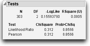
For the likelihood ratio chi-square (G2), two models are fit by maximum likelihood. One model is constrained by the hypothesis that assumes a single response population, and the other is not constrained. Twice the difference of the log-likelihoods from the two models is a chi-square statistic for testing the hypothesis. The table here has the chi-square tests that test whether country of car purchased is a function of sex.
The model constrained by the null hypothesis (fitting only one set of response probabilities) has a negative log-likelihood of 298.45. After you partition the sample by the gender factor, the negative log-likelihood is reduced to 298.30. The difference in log-likelihoods is 0.1559, reported in the -LogLike line. This doesn’t account for much of the variation. The likelihood ratio (LR) chi-square is twice this difference, that is, G2 = 0.312, and has a nonsignificant p-value of 0.8556. These statistics don’t support the conclusion that the car country purchase response depends on the gender of the driver.

Note: The log-likelihood values of the null and constrained hypotheses are not shown in the Fit Y By X report. If you are interested in seeing them, launch Analyze > Fit Model using the same variables: country as Y, sex as an effect. The resulting report has more detail.
If you want to think about the distribution of the estimates, then in each cell, you can compare the actual proportion to the proportion expected under the hypothesis. Square the number and divide by something close to its variance, giving a cell chi-square. The sum of these cell chi-square values is the Pearson chi- square statistic X2, here also 0.312, which has a p-value of 0.8556. In this example, the Pearson chi-square happens to be the same as the likelihood ratio chi-square.
Car Brand by Marital Status
Let’s look at the relationships of country to other categorical variables. In the case of marital status (Figure 12.2), there is a more significant result, with the p-value for the Likelihood Ratio G2 statistic of 0.0765. Married people are more likely to buy the American brands. Why? Perhaps because the American brands are generally larger vehicles, which make them more comfortable for families.
Notice that the red triangle menu next to Contingency Analysis offers many options, including Fisher’s Exact Test in JMP Pro. In this example, the result of Fisher’s test is 0.0012, with a p-value of 0.0754.
Figure 12.2 Mosaic Plot, Crosstabs, and Tests Table for country by marital status

Car Brand by Size of Vehicle
If marital status is a proxy for size of vehicle, looking at country by size should give more direct information.
The Tests table for country by size (Figure 12.3) shows a strong relationship with a very significant chi-square. The Japanese dominate the market for small cars, the Americans dominate the market for large cars, and the European share is about the same in all three markets. The relationship is highly significant, with p-values less than 0.0001. The null hypothesis that car size and country are independent is easily rejected.
Figure 12.3 Mosaic Plot, Crosstabs, and Tests Table for country by size

Two-Way Tables: Entering Count Data
Often, raw categorical data is presented in textbooks in a two-way table like the one shown below. The levels of one variable are the rows, the levels of the other variable are the columns, and cells contain frequency counts. For example, data for a study of alcohol and smoking (based on Schiffman, 1982) is arranged in a two-way table, like this:
| Smoking Relapse | |||
| Yes | No | ||
| Alcohol Consumption | Consumed | 20 | 13 |
| Did Not Consume | 48 | 96 | |
This arrangement shows the two levels of alcohol consumption (“Consumed” or “Did Not Consume”) and levels of whether the subject relapsed and returned to smoking (reflected in the “Yes” column) or managed to stay smoke-free (reflected in the “No” column).
In the following discussion, keep the following things in mind:
● The two variables in this table do not fit neatly into independent and dependent classifications. The subjects in the study were not separated into two groups, with one group given alcohol, and the other not. The interpretation of the data, then, needs to be limited to association, and not cause-and-effect. The tests are regarded as tests of independence of two responses, rather than the marginal homogeneity of probabilities across samples.
● For a 2 × 2 table, JMP Pro automatically produces Fisher’s Exact Test in its results. This test, in essence, computes exact probabilities for the data rather than relying on approximations.
Does it appear that alcohol consumption is related to the subject’s relapse status? Phrased more statistically, if you assume that these variables are independent, are there surprising entries in the two-way table? To answer this question, we must know what values would be expected in this table, and then determine whether there are observed results that are different from these expected values.
Expected Values under Independence
To further examine the data, the following table shows the totals for the rows and columns of the two-way table. The row and column totals have been placed along the right and bottom margins of the table and are therefore called marginal totals.
| Smoking Relapsed | ||||
| Yes | No | Total | ||
| Alcohol Consumption | Consumed | 20 | 13 | 33 |
| Did Not Consume | 48 | 96 | 144 | |
| Total | 68 | 109 | 177 | |
These totals aid in determining what values would be expected if alcohol consumption and relapse to smoking were not related.
As is usual in statistics, assume at first that there is no relationship between these variables. If this assumption is true, then the proportion of people in the “Yes” and “No” columns should be equal for each level of the alcohol consumption variable. If there was no effect for consumption of alcohol, then we expect these values to be the same except for random variation. To determine the expected value for each cell, compute
Row total×Column TotalTable Total
for each cell. Instead of computing it by hand, let’s enter the data into JMP to perform the calculations.
Entering Two-Way Data into JMP
Before two-way table data can be analyzed, it needs to be flattened or stacked. Then it is arranged in two data columns for the variables, and one data column for frequency counts. Follow these steps:
![]() Select File > New > Data Table to create a new data table.
Select File > New > Data Table to create a new data table.
![]() Click on the title of Column 1 and name the column Alcohol Consumption.
Click on the title of Column 1 and name the column Alcohol Consumption.
![]() Select Cols > New Columns to create a second column in the data table (or, double-click in the column header area next to the first column). Name this column Relapsed.
Select Cols > New Columns to create a second column in the data table (or, double-click in the column header area next to the first column). Name this column Relapsed.
![]() Create a third column named Count to hold the cell counts from the two- way table.
Create a third column named Count to hold the cell counts from the two- way table.
![]() Select the Count column, and select Cols > Preselect Role > Freq to assign the frequency role.
Select the Count column, and select Cols > Preselect Role > Freq to assign the frequency role.
![]() Select Rows > Add Rows and add four rows to the table—one for each cell in the two-way table.
Select Rows > Add Rows and add four rows to the table—one for each cell in the two-way table.
![]() Enter the data so that the data table looks like the one shown here.
Enter the data so that the data table looks like the one shown here.

These steps have been completed, and the resulting table is included in the sample data library as Alcohol.jmp.
Testing for Independence
One explanatory note is in order at this point. Although the computations in this situation use the counts of the data, the statistical test deals with proportions. The independence that we are concerned with is the independence of the probabilities associated with each cell in the table. Specifically, let
ρininandρj=njn
where ρi and ρj are, respectively, the probabilities associated with each of the i rows and j columns. Now, let ρij be the probability associated with the cell located at the ith row and jth column. The null hypothesis of independence is that ρij=ρiρj.
Although the computations that we present use counts, do not forget that the essence of the null hypothesis is about probabilities.
The test for independence is the X2 statistic, whose formula is
∑(Observed−Expected)2Expected
To compute this statistic in JMP:
![]() Select Analyze > Fit Y By X. Assign Alcohol Consumption to X and Relapsed to Y. Because Count was pre-assigned the Freq role, it automatically is displayed as the Freq variable.
Select Analyze > Fit Y By X. Assign Alcohol Consumption to X and Relapsed to Y. Because Count was pre-assigned the Freq role, it automatically is displayed as the Freq variable.
![]() Click OK.
Click OK.
This produces a report that contains the contingency table of counts, which should agree with the two-way table used as the source of the data. To see the information relevant to the computation of the X2 statistic:
![]() Right-click inside the contingency table and deselect Row%, Col%, and Total%.
Right-click inside the contingency table and deselect Row%, Col%, and Total%.
![]() Again, right-click inside the contingency table and make sure that Count, Expected, Deviation, and Cell Chi Square are selected.
Again, right-click inside the contingency table and make sure that Count, Expected, Deviation, and Cell Chi Square are selected.
Note: To display all red triangle options for a report, hold down the Alt key (Option on Macintosh) before clicking the red triangle.
The Tests table (Figure 12.4) shows the Likelihood Ratio and Pearson Chi-square statistics. The Pearson statistic is the sum of all the cell chi-square values in the contingency table. The p-values for both chi-square tests are less than 0.05, so the null hypothesis is rejected. Alcohol consumption seems to be associated with whether the patient relapsed into smoking.
Figure 12.4 Contingency Report

The composition of the Pearson X2 statistic can be seen cell by cell. The cell for “Yes” and “Consumed” in the upper right has an actual count of 20 and an expected count of 12.678. The difference (deviation) between the counts is 7.322. This cell’s contribution to the overall chi-square is
(20−12.678)212.678
which is 4.22. Repeating this procedure for each cell shows the chi-square as 2.63 + 0.60 + 4.22 + 0.97 = 8.441.
If You Have a Perfect Fit
If a fit is perfect, every response’s category is predicted with probability 1. The response is completely determined by which sample it is in. In the other extreme, if the fit contributes nothing, then each distribution of the response in each sample subgroup is the same.
For example, consider collecting information for 156 people on what city and state they live in. It’s likely that you would think that there is a perfect fit between the city and the state of a person’s residence. If the city is known, then the state is almost surely known. Figure 12.5 shows what this perfect fit looks like.
Figure 12.5 Mosaic Plot, Crosstabs, and Tests Table for City by State

Now suppose the analysis includes people from Austin, a second city in Texas. City still predicts state perfectly, but not the other way around (state does not predict city). Conducting these two analyses shows that the chi-squares are the same. They are invariant if you switch the Y and X variables. However, the mosaic plot and the R2 are different (Figure 12.6).
What happens if the response rates are the same in each cell as in Figure 12.5? Examine the artificial data for this situation and notice that the mosaic levels line up perfectly and the chi-squares are zero.
Figure 12.6 Comparison of Plots, Tables, and Tests When X and Y Are Switched

Special Topic: Correspondence Analysis— Looking at Data with Many Levels
Correspondence analysis is a graphical technique that shows which rows or columns of a frequency table have similar patterns of counts. Correspondence analysis is particularly valuable when you have many levels, because it is difficult to find patterns in tables or mosaic plots with many levels.
The sample data table Mbtied.jmp has counts of Myers-Briggs personality types by educational level and gender (Myers and McCaulley). The values of educational level (Educ) are D for dropout, HS for high school graduate, and C for college graduate. Gender and Educ are concatenated to form the variable GenderEd. The goal is to determine the relationships between GenderEd and personality type. Remember, there is no implication of any cause-and-effect relationship because there is no way to tell whether personality affects education or education affects personality. The data can, however, show trends. The following example shows how correspondence analysis can help identify trends in categorical data:
![]() Select Help > Sample Data Library and open Mbtied.jmp.
Select Help > Sample Data Library and open Mbtied.jmp.
![]() Select Analyze > Fit Y by X and assign MBTI to X, Factor and GenderEd to Y, Response. Count is displayed as the Freq variable.
Select Analyze > Fit Y by X and assign MBTI to X, Factor and GenderEd to Y, Response. Count is displayed as the Freq variable.
![]() Click OK.
Click OK.
Now try to make sense out of the resulting mosaic plot and contingency table shown in Figure 12.7. It has 96 cells—too big to understand at a glance. A correspondence analysis clarifies some patterns.
Note: For purposes of illustration, only the Count column is shown in Figure 12.7
Figure 12.7 Mosaic Plot and Table for MBTI by GenderEd

![]() Select Correspondence Analysis from the red triangle menu next to Contingency Analysis to see the plot in Figure 12.8.
Select Correspondence Analysis from the red triangle menu next to Contingency Analysis to see the plot in Figure 12.8.
![]() Resize the graph to better see the labels.
Resize the graph to better see the labels.
The Correspondence Analysis plot organizes the row and column profiles in a two-dimensional space. The X values that have similar Y profiles tend to cluster together, and the Y values that have similar X profiles tend to cluster together. In this case, you want to see how the GenderEd groups are associated with the personality groups.
This plot shows patterns more clearly. Gender and the Feeling(F)/Thinking(T) component form a cluster, and education clusters with the Intuition(N)/Sensing(S) personality indicator. The Extrovert(E)/Introvert(I) and Judging(J)/Perceiving(P) types do not separate much. The most separation among these is the Judging(J)/Perceiving(P) separation among the Sensing(S)/Thinking (T) types (mostly non-college men).
Figure 12.8 Correspondence Analysis Plot

The correspondence analysis indicates that the Extrovert/Introvert and Judging/ Perceiving do not separate well for education and gender.
Note: Correspondence Analysis is also available from Analyze > Consumer Research > Multiple Correspondence Analysis.
Continuous Factors with Categorical Responses: Logistic Regression
Suppose that a response is categorical, but the probabilities for the response change as a function of a continuous predictor. In other words, you are presented with a problem with a continuous X and a categorical Y. Some situations like this are the following:
● Whether you bought a car this year (categorical) as a function of your disposable income (continuous).
● The type of car that you bought (categorical) as a function of your age (continuous).
● The probability of whether a patient lived or died (categorical) as a function of blood pressure (continuous).
Problems like these call for logistic regression. Logistic regression provides a method to estimate the probability of choosing one of the response levels as a smooth function of the factor. It is called logistic regression because the S-shaped curve that it uses to fit the probabilities is called the logistic function.
Fitting a Logistic Model
The Spring.jmp sample data is a weather record for the month of April. The variable Precip measures rainfall.
![]() Select Help > Sample Data Library and open Spring.jmp.
Select Help > Sample Data Library and open Spring.jmp.
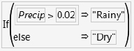
![]() Add a column named Rained to categorize rainfall using the formula shown here.
Add a column named Rained to categorize rainfall using the formula shown here.
![]() Select Analyze > Distribution to generate a histogram and frequency table of the Rained variable.
Select Analyze > Distribution to generate a histogram and frequency table of the Rained variable.

Out of the 30 days in April, there were 9 rainy days. Therefore, with no other information, you predict a 9/ 30 = 30% chance of rain for every day.
Suppose you want to increase your probability of correct predictions by including other variables. You might use morning temperature or barometric pressure to help make more informed predictions. Let’s examine these cases.
In each case, the thing being modeled is the probability of getting one of several responses. The probabilities are constrained to add to 1. In the simplest situation, like this rain example, the response has two levels (a binary response). Remember that statisticians like to take logs of probabilities. In this case, what they fit is the difference in logs of the two probabilities as a linear function of the factor variable.
If p denotes the probability for the first response level, then 1– p is the probability of the second, and the linear model is written
log(p)−log(1−p)=b0+b1*X or log(p/(1−p))=b0+b1*X
where log(p/(1–p)) is called the logit of p or the log odds-ratio.
There is no error term here because the predicted value is not a response level; it is a probability distribution for a response level. For example, if the weather forecast predicts a 90% chance of rain, you don’t say there’s a mistake if it doesn’t rain.
The accounting is done by summing the negative logarithms of the probabilities attributed by the model to the events that actually did occur. So if p is the precipitation probability from the weather model, then the score is –log(p) if it rains, and –log(1–p) if it doesn’t. A weather forecast that is a perfect prediction comes up with a p of 1 when it rains (–log(p) is zero if p is 1) and a p of zero when it doesn’t rain (–log(1–p)=0 if p=0). The perfect score is zero. No surprise –log(p) = 0 means perfect predictions. If you attributed a probability of zero to an event that occurred, then the –log-likelihood would be infinity, a pretty bad score for a forecaster.
So the inverse logit of the model b0+b1*X expresses the probability for each response level, and the estimates are found so as to maximize the likelihood. That is the same as minimizing the negative sum of logs of the probabilities attributed to the response levels that actually occurred for each observation.
You can graph the probability function as shown in Figure 12.9. The curve is just solving for p in the expression
log(p/(1–p)) = b0+b1*X
which is
p = 1/(1+exp(–(b0+b1*X))
For a given value of X, this expression evaluates the probability of getting the first response. The probability for the second response is the remaining probability, 1–p, because they must sum to 1.
Figure 12.9 Logistic Regression Fits Probabilities of a Response Level

To fit the rain column by temperature and barometric pressure for the spring rain data:
![]() Select Analyze > Fit Y by X and assign the nominal column Rained to Y, Response, and the continuous columns Temp and Pressure to X, Factor.
Select Analyze > Fit Y by X and assign the nominal column Rained to Y, Response, and the continuous columns Temp and Pressure to X, Factor.
![]() Click OK.
Click OK.
Note: By default, JMP models the probability that Rainy = Dry, because Dry is the first alphanumeric value. If, instead, we want to model the probability that it will be rainy, we would set Rainy as the Target Level in the Fit Y by X launch window.
The Fit Y by X platform produces a separate logistic regression for each predictor variable.
The cumulative probability plot on the left in Figure 12.10 shows that the relationship with temperature is very weak. As the temperature ranges from 35 to 75, the probability of dry weather changes only from 0.73 to 0.66. The line of fit partitions the whole probability into the response categories. In this case, you read the probability of Dry directly on the vertical axis. The probability of Rained is the distance from the line to the top of the graph, which is 1 minus the axis reading. The weak relationship is evidenced by the very flat line of fit; the precipitation probability doesn’t change much over the temperature range.
The plot on the right in Figure 12.10 indicates a much stronger relationship with barometric pressure. When the pressure is 29.0 inches, the fitted probability of rain is near 100% (0 probability for Dry at the left of the graph). The curve crosses the 50% level at 29.32. (You can use the crosshair tool to see this.) At 29.8, the probability of rain drops to nearly zero (therefore, nearly 1.0 for Dry).
You can also add reference lines at the known X and Y values.
![]() Double-click the Rained (Y) axis to open the Axis Settings window. Enter 0.5 as a reference line.
Double-click the Rained (Y) axis to open the Axis Settings window. Enter 0.5 as a reference line.
![]() Double-click the Pressure (X) axis and enter 29.32 in the Axis Settings window.
Double-click the Pressure (X) axis and enter 29.32 in the Axis Settings window.
When both reference lines appear, they intersect on the logistic curve as shown in the plot on the right in Figure 12.10.
Figure 12.10 Cumulative Probability Plot for Discrete Rain Data

For the variable Temp, the Whole-Model Test table and the Parameter Estimates table reinforce the plot. The R2 measure of fit, which can be interpreted on a scale of 0 to 100%, is only 0.07% (shown as 0.0007 in Figure 12.11). A 100% R2 would indicate a model that predicted outcomes with certainty. The likelihood ratio chi- square is not at all significant. The coefficient on temperature is a very small—0.008. The parameter estimates can be unstable because they have high standard errors with respect to the estimates.
In contrast, the overall R2 measure of fit with barometric pressure is 34%. The likelihood ratio chi-square is highly significant, and the parameter coefficient for Pressure increased to 13.8 (Figure 12.11).
The conclusion is that if you want to predict whether it will be rainy, it doesn’t help to know the temperature, but it does help to know the barometric pressure.
Figure 12.11 Logistic Regression for Discrete Rain Data

Degrees of Fit
The illustrations in Figure 12.12 summarize the degree of fit as shown by the cumulative logistic probability plot.
When the fit is weak, the parameter for the slope term (X factor) in the model is small, which gives a small slope to the line in the range of the data. A perfect fit means that before a certain value of X, all the responses are one level, and after that value of X, all the responses are another level. A strong model can bet almost all of its probability on one event happening. A weak model has to bet conservatively with the background probability, less affected by the X factor’s values.
Figure 12.12 Strength of Fit in Logistic Regression

Note that when the fit is perfect, as shown on the rightmost graph of Figure 12.12, the slope of the logistic line approaches infinity. This means that the parameter estimates are also infinite. In practice, the estimates are allowed to inflate only until the likelihood converges and are marked as unstable by the computer program. You can still test hypotheses, because they are handled through the likelihood, rather than using the estimate’s (theoretically infinite) values.
A Discriminant Alternative
There is another way to think of the situation where the response is categorical and factor is continuous. You can reverse the roles of the Y and X and treat this problem as one of finding the distribution of temperature and pressure on rainy and dry days. Then, work backward to obtain prediction probabilities. This technique is called discriminant analysis. (Discriminant analysis is discussed in detail in Chapter 16.)
![]() For this example, select Help > Sample Data Library and open (or make active) Spring.jmp. (Note: If you open it from scratch, you need to add the Rained variable as detailed on page 321.)
For this example, select Help > Sample Data Library and open (or make active) Spring.jmp. (Note: If you open it from scratch, you need to add the Rained variable as detailed on page 321.)
![]() Select Analyze > Fit Y by X and assign Temp and Pressure to Y, Response, and Rained to X, Factor.
Select Analyze > Fit Y by X and assign Temp and Pressure to Y, Response, and Rained to X, Factor.
![]() Click OK.
Click OK.
![]() Hold down the Ctrl key and select Means/Anova/Pooled t from the red triangle menu next to Oneway to see the results in Figure 12.13.
Hold down the Ctrl key and select Means/Anova/Pooled t from the red triangle menu next to Oneway to see the results in Figure 12.13.
You can quickly see that the difference between the relationships of temperature and pressure to raininess. However, the discriminant approach is a somewhat strange way to go about this example and has some problems:
● The standard analysis of variance assumes that the factor distributions are normal.
● Discriminant analysis works backward: First, in the weather example, you are trying to predict rain. But the ANOVA approach designates Rained as the independent variable, from which you can say something about the predictability of temperature and pressure. Then, you have to reverse- engineer your thinking to infer raininess from temperature and pressure.
Figure 12.13 Temperature and Pressure as a Function of Raininess

Inverse Prediction
If you want to know what value of the X regressor yields a certain probability, you can solve the equation, log(p/(1–p)) = b0 + b1*X, for X, given p. This is often done for toxicology situations, where the X-value for p = 50% is called an LD50 (Lethal Dose for 50%). Confidence intervals for these inverse predictions (called fiducial confidence intervals) can be obtained.
The Fit Model platform has an inverse prediction facility. Let’s find the LD50 for pressure in the rain data—that is, the value of pressure that gives a 50% chance of rain.
![]() Select Analyze > Fit Model.
Select Analyze > Fit Model.
When the Model Specification window appears:
![]() Assign Rained to Y.
Assign Rained to Y.
![]() Select Pressure and click Add to assign it as a model effect.
Select Pressure and click Add to assign it as a model effect.
![]() Click Run.
Click Run.
![]() Select Inverse Prediction from the red triangle menu next to Nominal Logistic to see the Inverse Prediction window at the top in Figure 12.14.
Select Inverse Prediction from the red triangle menu next to Nominal Logistic to see the Inverse Prediction window at the top in Figure 12.14.
The Probability and Confidence Level fields are editable, and you can select a Two Sided, Lower One Sided, or Upper One Sided prediction from the menu on the window. Enter any values of interest into the window and select the type of test you want. The result is an inverse probability for each probability request value that you entered at the specified alpha (confidence) level.
![]() For this example, enter 0.5 as the first entry in the Probability column, as shown on Figure 12.14.
For this example, enter 0.5 as the first entry in the Probability column, as shown on Figure 12.14.
![]() You know there is a relationship between lower pressure and raininess, so select the Lower One Sided test from the menu on the inverse prediction window, and then click OK.
You know there is a relationship between lower pressure and raininess, so select the Lower One Sided test from the menu on the inverse prediction window, and then click OK.
The Inverse Prediction table and plot shown at the bottom of Figure 12.14 are appended to the output. The inverse prediction computations say that there is a 50% chance of rain when the barometric pressure is 29.32.
Figure 12.14 Inverse Prediction Window
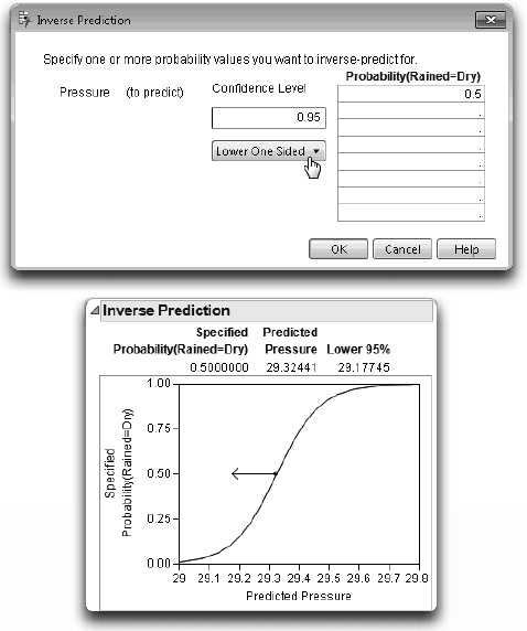
To see this prediction clearly on the graph:

![]() Get the crosshair tool from the Tools menu or toolbar. Click in the middle of the circle in the crosshairs to see the predicted Pressure when the specified probability of rain is 0.50.
Get the crosshair tool from the Tools menu or toolbar. Click in the middle of the circle in the crosshairs to see the predicted Pressure when the specified probability of rain is 0.50.
![]() Move the crosshair up or down the logistic curve to see other predicted values.
Move the crosshair up or down the logistic curve to see other predicted values.
Polytomous (Multinomial) Responses: More Than Two Levels
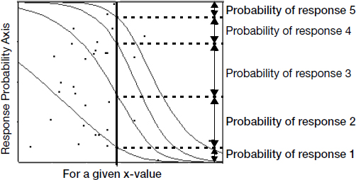
If there are more than two response categories, the response is said to be polytomous, and a generalized logistic model is used. For the curves to be very flexible, you have to fit a set of linear model parameters for each of r – 1 response levels. The logistic curves are accumulated in such a way as to form a smooth partition of the probability space as a function of the regression model. The probabilities shown in Figure 12.15 are the distances between the curves, which add up to 1.
Where the curves are close together, the model is saying that the probability of a response level is very low. Where the curves separate widely, the fitted probabilities are large.
Figure 12.15 Polytomous Logistic Regression with Five Response Levels
For example, consider fitting the probabilities for country with the Car Poll.jmp sample data as a smooth function of age. The result (Figure 12.16) shows the relationship where younger individuals tend to buy more Japanese cars and older individuals tend to buy more American cars. Note the double set of estimates (two curves) needed to describe three responses.
Figure 12.16 Cumulative Probability Plot and Logistic Regression for Country by Age

Ordinal Responses: Cumulative Ordinal Logistic Regression
In some cases, you don’t need the full generality of multiple linear model parameter fits for the r – 1 cases. However, you can assume that the logistic curves are the same, only shifted by a different amount over the response levels. This means that there is only one set of regression parameters on the factor, but r – 1 intercepts for the r responses.
Figure 12.17 Ordinal Logistic Regression Cumulative Probability Plot

The logistic curve is actually fitting the sum of the probabilities for the responses at or below it, so it is called a cumulative ordinal logistic regression. In the Spring.jmp sample data table, there is a column called SkyCover with values 0 to 10.
First, note that you don’t need to treat the response as nominal because the data have a natural order. Also, in this example, there is not enough data to support the large number of parameters needed by a 10-response level nominal model. Instead, use a logistic model that fits SkyCover as an ordinal variable with the continuous variables Temp and Humid1: PM, the humidity at 1 p.m.

![]() Change the modeling type of the SkyCover column to Ordinal by clicking the icon next to the column name in the Columns panel, located to the left of the data grid.
Change the modeling type of the SkyCover column to Ordinal by clicking the icon next to the column name in the Columns panel, located to the left of the data grid.
![]() Select Analyze > Fit Y by X and assign SkyCover to Y, Response.
Select Analyze > Fit Y by X and assign SkyCover to Y, Response.
![]() Assign Temp and Humid1:PM to X, Factor and click OK.
Assign Temp and Humid1:PM to X, Factor and click OK.
The top analysis in Figure 12.18 indicates that the relationship of SkyCover to Temp is very weak, with an R2 of 0.09%, fairly flat lines, and a nonsignificant chi-square. The direction of the relation is that the higher sky covers are more likely with the higher temperatures.
The bottom analysis in Figure 12.18 indicates that the relationship with humidity is quite strong. As the humidity approaches 70%, it predicts more than a 50% probability of a sky cover of 10. At 100% humidity, the sky cover will most likely be 10. The R2 is 29%, and the likelihood ratio chi-square is highly significant.
Note that no data occur for SkyCover = 1, so that value is not even in the model.
Figure 12.18 Ordinal Logistic Regression for Ordinal Sky Cover with Temperature (top) and Humidity (bottom)

There is a useful alternative interpretation to this ordinal model. Suppose you assume that there is some continuous response with a random error component that the linear model is really fitting. But, for some reason, you can’t observe the response directly. You are given a number that indicates which of r ordered intervals contains the actual response, but you don’t know how the intervals are defined. You assume that the error term follows a logistic distribution, which has a shape similar to a normal distribution. This case is identical to the ordinal cumulative logistic model. And the intercept terms are estimating the threshold points that define the intervals corresponding to the response categories.
Unlike the nominal logistic model, the ordinal cumulative logistic model is efficient to fit for hundreds of response levels. It can be used effectively for continuous responses when there are n unique response levels for n observations. In such a situation, there are n – 1 intercept parameters constrained to be in order, and there is one parameter for each regressor.
Surprise: Simpson’s Paradox: Aggregate Data versus Grouped Data
Several statisticians have studied the “hot hand” phenomenon in basketball. The idea is that basketball players seem to have hot streaks, when they make the most of their shots, alternating with cold streaks when they shoot poorly. The Hothand.jmp sample data table contains the free throw shooting records for two Boston Celtics players (Larry Bird and Rick Robey) over the 1980-81 and 1981-82 seasons (Tversky and Gilovich, 1989).
The null hypothesis is that two sequential free throw shots are independent. There are two directions in which they could be non-independent, the positive relationship (hot hand) and a negative relationship (cold hand).
The Hothand.jmp sample data have the columns First and Second (first shot and second shot) for the two players and a count variable. There are four possible shooting combinations: hit-hit, hit-miss, miss-hit, and miss-miss.
![]() Select Help > Sample Data Library and open Hothand.jmp.
Select Help > Sample Data Library and open Hothand.jmp.
![]() Select Analyze > Fit Y by X.
Select Analyze > Fit Y by X.
![]() Assign Second to Y, Response, First to X, Factor Count to Freq, and then click OK.
Assign Second to Y, Response, First to X, Factor Count to Freq, and then click OK.
![]() When the report appears, right-click in the contingency table and deselect all displayed numbers except Col%.
When the report appears, right-click in the contingency table and deselect all displayed numbers except Col%.
The results in Figure 12.19 show that if the first shot is made, then the probability of making the second is 75.8%. If the first shot is missed, the probability of making the second is 24.1%. This tends to support the hot hand hypothesis. The two chi- square statistics are on the border of 0.05 significance.
Figure 12.19 Crosstabs and Tests for Hot Hand Basketball Data

Does this analysis really confirm the hot hand phenomenon? A researcher (Wardrop 1995), looked at contingency tables for each player. You can do this using the By grouping variable.

Note: To repeat any analysis using the same variables, use the Recall button in the launch window.
![]() Again, select Analyze > Fit Y by X and assign Second to Y, Response, First as X, Factor, and Count to Freq.
Again, select Analyze > Fit Y by X and assign Second to Y, Response, First as X, Factor, and Count to Freq.
![]() This time, assign Player to By and click OK.
This time, assign Player to By and click OK.
The results for the two players are shown in Figure 12.20.
Figure 12.20 Crosstabs and Tests for Grouped High-End Basketball Data

Contrary to the first result, both players shot better the second time after a miss than after a hit. So how can this be when the aggregate table gives the opposite results from both individual tables? This is an example of a phenomenon called Simpson’s paradox (Simpson, 1951; Yule, 1903).
In this example, it is not hard to understand what happens if you think how the aggregated table works. If you see a hit on the first throw, the player is probably Larry Bird. Because he is usually more accurate, he will likely hit the second basket. If you see a miss on the first throw, the player is likely Rick Robey. So the second throw will be less likely to hit. The hot hand relationship is an artifact that the players are much different in scoring percentages generally and populate the aggregate unequally.
A better way to summarize the aggregate data, taking into account these background relationships, is to use a blocking technique called the Cochran- Mantel-Haenszel test.
![]() Click on the report for the analysis shown in Figure 12.19 (without the By variable) and select Cochran Mantel Haenszel from the red triangle menu next to Contingency Analysis.
Click on the report for the analysis shown in Figure 12.19 (without the By variable) and select Cochran Mantel Haenszel from the red triangle menu next to Contingency Analysis.
A grouping window appears that lists the variables in the data table.
![]() Select Player as the grouping variable in this window and click OK.
Select Player as the grouping variable in this window and click OK.
These results are more accurate because they are based on the grouping variable instead of the ungrouped data. Based on these p-values, the null hypothesis of independence (between the first and second shot) is not rejected.
Figure 12.21 Crosstabs and Tests for Grouped Hothand Basketball Data

Generalized Linear Models
In recent years, generalized linear models have emerged as an alternative (and usually equivalent) approach to logistic models. There are two different formulations for generalized linear models that apply most often to categorical response situations: the binomial model and the Poisson model. To demonstrate both formulations, we use the Alcohol.jmp sample data table. Figure 12.4 on page 316 shows that relapses into smoking are not independent of alcohol consumption, supported by a chi-square test (G2 = 8.22, p = 0.0041).
The binomial approach is always applicable when there are only two response categories. To use it, we must first reorganize the data.
![]() Select Help > Sample Data Library and open Alcohol.jmp if it is not already open.
Select Help > Sample Data Library and open Alcohol.jmp if it is not already open.
![]() Select Tables > Split.
Select Tables > Split.
![]() Assign variables as shown in Figure 12.22.
Assign variables as shown in Figure 12.22.
Figure 12.22 Split Window for Alcohol Data

![]() Click OK.
Click OK.
![]() In the Alcohol Consumption table, add a new column that computes the total of the columns No + Yes, as shown in Figure 12.23.
In the Alcohol Consumption table, add a new column that computes the total of the columns No + Yes, as shown in Figure 12.23.
Figure 12.23 Final Data Table

We’re now ready to fit a model.
![]() Select Analyze > Fit Model.
Select Analyze > Fit Model.
![]() Change the Personality to Generalized Linear Model.
Change the Personality to Generalized Linear Model.
![]() Select the Binomial distribution.
Select the Binomial distribution.
![]() Assign Yes and Total to Y.
Assign Yes and Total to Y.
![]() Remove No from the Freq role.
Remove No from the Freq role.
![]() Assign Alcohol Consumption as the effect in the model.
Assign Alcohol Consumption as the effect in the model.
The Model Specification window should look like the one in Figure 12.24.
Figure 12.24 Binomial Model Specification Window

![]() Click Run.
Click Run.
In the resulting report, notice that the chi-square test and the p-value agree with our previous findings in Figure 12.4.
Figure 12.25 Results of General Linear Model Using Binomial Distribution

The other approach, the Poisson model, uses the original sample data Alcohol.jmp. In this formulation, the count is portrayed as the response.
![]() Select Analyze > Fit Model.
Select Analyze > Fit Model.
![]() Select the Generalized Linear Model personality.
Select the Generalized Linear Model personality.
![]() Select the Poisson distribution.
Select the Poisson distribution.
![]() Assign Count to Y.
Assign Count to Y.
![]() Remove Count as a Freq variable. (It was automatically assigned since it has a Freq role in the data table, but that’s not how we’re using it here.)
Remove Count as a Freq variable. (It was automatically assigned since it has a Freq role in the data table, but that’s not how we’re using it here.)
![]() Select Alcohol Consumption and Relapsed in the Select Columns list on the Model Specification window.
Select Alcohol Consumption and Relapsed in the Select Columns list on the Model Specification window.
![]() Now select Macros > Full Factorial on the Model Specification window.
Now select Macros > Full Factorial on the Model Specification window.
This adds both main effects and their crossed term.
Figure 12.26 Model Specification Window for General Linear Model with Poisson Distribution.

![]() Click Run.
Click Run.

Examine the Effect Tests section of the report. There are three tests reported, but we ignore the main effect tests because they don’t involve a response category. The interaction between the two variables is the one that we care about and, again, it is identical with previous results in Figure 12.4 and Figure 12.25.
Since all these methods produce equivalent results (in fact, identical test statistics), they are interchangeable. The choice of method can then be a matter of convenience, generalizability, or comfort of the researcher.
Exercises
1. M.A. Chase and G.M. Dummer conducted a study in 1992 to determine what traits children regarded as important to popularity. Their data is represented in the sample data table Children’s Popularity.jmp. Demographic information was recorded, as well as the rating given to four traits assessing their importance to popularity: Grades, Sports, Looks, and Money.
(a) Is there a difference based on gender on the importance given to making good grades?
(b) Is there a difference based on gender on the importance of excelling in sports?
(c) Is there a difference based on gender on the importance of good looks or on having money?
(d) Is there a difference between Rural, Suburban, and Urban students on rating these four traits?
2. One of the concerns of textile manufacturers is the absorbency of materials that clothes are made out of. Clothes that can quickly absorb sweat (such as cotton) are often thought of as more comfortable than those that cannot (such as polyester). To increase absorbency, material is often treated with chemicals. In this fictional experiment, sev- eral swatches of denim were treated with two acids to increase their absorbency. They were then assessed to determine whether their absorbency had increased or not. The investigator wanted to determine whether there is a difference in absorbency change for the two acids under consideration. The results are presented in the following table:
| Acid | |||
| A | B | ||
| Absorbency | Increased | 54 | 40 |
| Did Not Increase | 25 | 40 | |
Does the researcher have evidence to say that there is a difference in absorbency between the two acids?
3. The taste of cheese can be affected by the additives that it contains. McCullagh and Nelder (1983) report a study (conducted by Dr. Graeme Newell) to determine the effects of four different additives on the taste of a cheese. The tasters responded by rat- ing the taste of each cheese on a scale of 1 to 9. The results are in the sample data table Cheese.jmp.
(a) Produce a mosaic plot to examine the difference in taste among the four cheese additives.
(b) Do the statistical tests say that the difference amongst the additives is significant?
(c) Conduct a correspondence analysis to determine which of the four additives results in the best-tasting cheese.
4. The sample data table Titanic Passengers.jmp contains information about the Passengers of the RMS Titanic. Use JMP to answer the following questions:
(a) How many passengers were on the ship? How many survived?
(b) How many passengers were male? Female?
(c) How many passengers were in each class?
(d) Test the hypothesis that there is no difference in the survival rate among the passenger classes.
(e) Test the hypothesis that there is no difference in the survival rate between males and females.
(f) Use logistic regression to determine whether age is related to survival rate.
5. Do dolphins alter their behavior based on the time of day? To study this phenomenon, a marine biologist in Denmark gathered the data presented in the sample data table Dolphins.jmp (Rasmussen, 1998). The variables represent different activities observed in groups of dolphins, with the Groups variable showing the number of groups observed.
(a) Do these data show evidence that dolphins exhibit different behaviors during different times of day?
(b) There is a caution displayed with the chi-square statistic. Should you reject the results of this analysis based on the warning?