CHAPTER 4 BETTER CHARTS IN A COUPLE OF HOURS A SIMPLE FRAMEWORK
MOST OF THE STRESS we feel about creating charts relates to picking the right kind of chart, which often amounts to scanning preset options in a software program and trying out a few until one looks right or just seems pleasing. If you have time, you might adorn it with a few more clicks—make it 3-D or change some colors. The tools make it so easy to produce a visualization that the biggest challenge in crafting good charts is overcoming the inclination—temptation, really—to just click and use what’s spit out. It seems hardly worth putting more time and effort into the process.
Of course, that’s flat wrong. That approach might be fast, and it might spruce up the look of a chart, but it doesn’t refine the ideas that the chart conveys. Recall the Good Charts Matrix in the introduction: Good charts are a positive combination of well-understood context and some design refinement. Even if software programs automatically generated well-designed charts (most of them don’t), none yet can divine the context of a chart well enough to create excellent default output. None sets context to any meaningful degree. For example, recall the weather chart from the previous chapter in which we were exploring high temperatures in the 70s. The software initially generated this:

This is not useful for our context (and probably not useful for many contexts at all) in which we were trying to learn about days with high temperatures in the 70s. The colors are assigned to years, which don’t matter at all to us. The y-axis was automatically created and doesn’t include a line for 70 degrees, the range I’m interested in. This was a fine starting point, but it was only that. The software has no idea what I want to accomplish. It’s incumbent on me to manipulate the visual to match my context.
Programs visualize data. People visualize ideas.
Instead of jumping right to chart types and design, you need more inputs to help define your context and identify the visual approach that will be most effective. This isn’t a waste of time and effort; it’s the antidote to unthinking, automatically generated charts. With just a little effort we can turn prosaic and uninformative charts into powerful, good charts.
And it doesn’t take as much time or effort as you might suspect. You can make major gains in the quality of your visual communication often in under an hour. Other times you may spend an afternoon on creating a compelling visualization.
Here’s how. Let’s start with these steps and time frames:
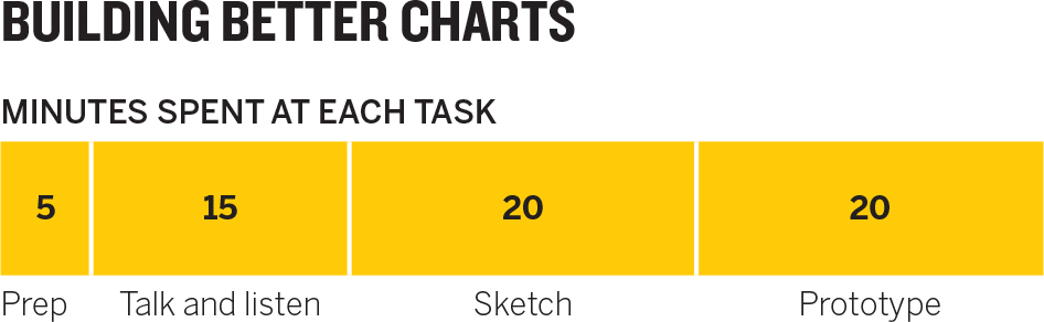
Prep time shouldn’t take more than a few minutes. But as you might expect, ensuing steps’ time will vary according to the type of visualization and the complexity of the project. For one or two good charts, start with this time distribution as a guide.
PREP
Cooks would call this mise en place—all their ingredients and their kitchen organized to prepare for cooking. Do these three things:
Create three kinds of space.
- Mental space: Block out time on your calendar. Turn off email and social channels. Focus.
- Physical space: If you’re in an open-concept office, get a room. Even if you have an office, find a quiet, closed-off area away from your desk to minimize interruptions. You’ll be seeking others’ ideas and opinions, but you don’t want random, unsolicited comments from passers-by.
- White space: Bring plenty of paper, whiteboards, sketch apps, whatever allows you to draw and take notes. A rolling whiteboard will allow you to take notes back to your desk. If you can’t get one, bring a phone to snap pictures of your sketches. It’s helpful to have markers and pens or pencils in three or four colors.
Put aside your data. This may seem counterintuitive, but it’s key to allowing for more-expansive thinking. Don’t ignore the data—make sure you understand it—but don’t lead with it. “When you start with the data set in mind, it limits how you think,” says Jeff Heer, an associate professor of computer science who teaches data visualization. “First you need to step back and think more broadly.”
Focusing on the cells of data can lead to banal results—charts that just convert tables to visual form. If you start with a more open point of view, you may discover ways to make your idea come through more strongly by introducing new data or re-crunching the data you have.
Here’s a simple example. A general manager for an e-commerce site is looking at customer purchase activity by time of day. Visualizing the data from one of his spreadsheet’s columns yields this:

This is not bad, and it was simple to execute. But if the manager had put aside the data and talked through what he was trying to show (a process I’ll get to in a minute), he’d have realized that purchase data was set to Eastern Standard Time, in the location where the purchase was registered, not to the time in the location where the purchase was made. It would be more useful to show volume of sales by the purchaser’s time of day:
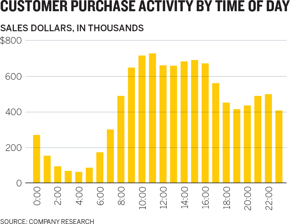
Starting from what he wanted to show rather than from what data he had on hand led to a different, more useful chart.
Write down the basics. You’ve created space. Now document a few key pieces of information on your paper or whiteboard to help frame your thinking. Include:
- What you’ll call it
- Who it’s for
- What setting it will be used in
- Which of the four types of visualization you’re creating
- Where on the Good Charts Matrix between context and design you should aim
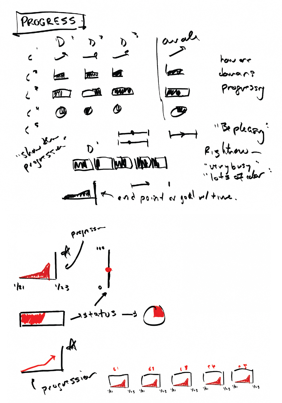
For an example, take a look at the Sales Team Performance sketches below.
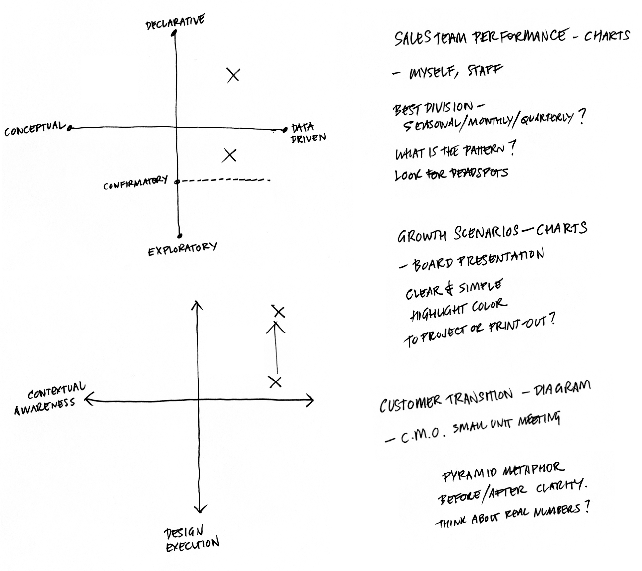
Add keywords and notes as prompts and reminders. This will serve as a launching point, or as a buoy you can return to if you drift off in the talking and sketching that you’re about to do (which should be encouraged; think expansively).
TALK AND LISTEN
This is the core of the context-setting that leads to good charts.
If you want your charts to get better, talk about what you’re trying to show, listen to yourself, and listen to others. Conversations contain a trove of clues about the best way forward. Words and phrases will steer you to the data you need, the parts of it to focus on, and possible chart types to use.
Of all the things you do to make better charts, this will be the most revelatory, but also possibly the least natural. It takes getting used to. Practice doing these three things:
Find a colleague or friend. Although you can talk out loud to yourself or take notes, having someone to chat with works much better. Who? That depends. If you feel uncertain about how you should visualize your data, ask an outsider, someone who doesn’t know much about either the data or what you’re doing, whose reactions will be free from the assumptions and biases of those who are more familiar with the data and its audience. That will force you to explain even basic information, organize your ideas, and provide even more context. It will feel like brainstorming.
Conversely, if you’re confident about your approach but you want to refine it or to make sure that it’s sound, connect with someone closer to the project who knows more about the data and may even be part of the audience. This will feel more like a gut check.
Talk about specific questions. Don’t wander into the conversation without a plan. Start with these questions:
- What am I working on?
- What am I trying to say or show (or prove or learn)?
- Why?
The first question is straightforward and factual, most useful if your counterpart is an outsider. It gives rise to necessary exposition; their ensuing questions may signal when you’re making assumptions that they’re not and help you notice when you’re veering off topic.
Imagine starting one of these conversations this way:
I’m working on showing the bosses we have an opportunity to invest in new HR programs—
Wait—smaller programs for the upcoming fiscal year, or more like big, long-term investments?
Even in that one exchange, you’re being forced to focus more precisely on what you want to show. Make a note of it, even if it seems obvious.
The second question will vary according to whether you’re in the declarative space (What am I trying to say or show?) or the confirmatory or exploratory space (What am I trying to prove or learn?). Notice that you’re still explicitly avoiding your data. You don’t want to ask, What does the data say? Even if you’re reasonably certain that your viz will be a straightforward representation of the data, this is your chance to think more broadly about your approach, which may in turn lead you to seek out other data or information to incorporate into your visualization.
It will help with subsequent activities if, while you’re talking, you find and jot down a short phrase or sentence that becomes the working answer to What am I trying to say? Here’s a conversation that arrives at such a statement:
I’m trying to show my boss that we’re doing better than she thinks in terms of customer retention.
Why does she think you’re doing poorly?
Well, our retention rate has fallen for three straight quarters. I know it looks bad right now, and everyone is panicking.
So how is it better than she thinks?
Well, it’s not what we’re doing, as far as I can tell—it’s what’s happening in the industry. Although our retention rate is falling, it’s not falling nearly as dramatically as our two main competitors’. Something systemic is going on, I’d guess.
Ah!
If I can show her that, she’ll see that we should focus our worry, our energy, on figuring out what’s going on in the market, not on changing how we’re executing as a company.
The manager starts by suggesting that what he wants to tell his boss is “We’re doing better than you think.” His partner recognizes that as a qualitative statement and does well to press the manager into explaining. This leads the manager to a description of what he can show to prove it to his boss: “Although our retention rate is falling, it’s not falling nearly as dramatically as our two main competitors’.” Without realizing it, the manager has found a visual starting point and is drifting toward a visual solution: three falling lines with the emphasis on the fact that one line—theirs—is not falling the way the others are.
The third question to keep in mind in this conversation is the most difficult and, frankly, the most annoying. Keep asking “Why?” and encourage the person you’re speaking with to challenge you as well. If you become exasperated or find yourself unable to come up with a good answer, or hear yourself saying “Just because!” that’s a good sign that you need to think more critically about what you’re trying to show. This conversation and its litany of “Why?” forces a manager to admit that she’s not prepared to create the declarative she’s proposing:
I want to compare financial results to key productivity data like time spent on email and in meetings.
Why? What’s the connection there?
It just seems like there’s probably a relationship between the two. Revenues are down. I ask myself, Why? We’re in meetings so much now. We never have time to work!
But don’t you get work done in meetings? Why are they the problem?
I mean, I know I’m getting less done because of all this time spent on other stuff.
Why does one lead to the other, though? How can you actually prove that more meetings and emails equals lower revenue?
I’m not sure, but of course there’s some connection there. There has to be!
Why? What if they’re helping you get work done, too?
Just because! I’m sick of sitting in meetings!
If you’re trying to create a declarative dataviz and you can’t adequately answer the “Why?” you might want to stop, form a few hypotheses, and test them with exploratory visuals to see what emerges.
Listen and take notes. As you talk, listen to your counterpart, but listen to yourself, too. Pick out visual words and phrases that describe how you see the ideas and information and write them down. If, for example, you hear yourself using words like distributed and spread out over, or different types and clusters, they are clues to your potential approach. Listen for metaphors: The money’s flying out of our department. We saw a huge dip. Revenues fell off a cliff. It’s a crazy maze of choices. They evoke powerful imagery that could inform how you design your information.
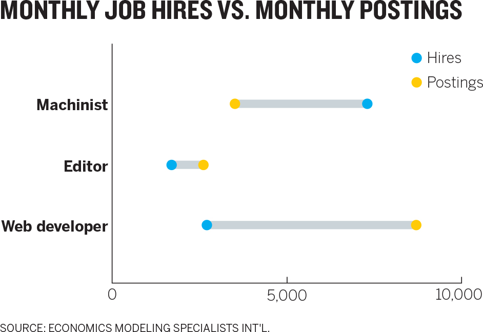
Take this statement: “I want to compare the number of job postings to hires to see what the ratio is for different types of jobs.” That sentence contains enough information to suggest a strong visual approach. Here it is again, with the visual cues emphasized:
I want to compare the number of job postings to hires to see what the ratio is for different types of jobs.
Compare the number suggests a chart that plots data points along a numbered axis. The ratio tells you you’re comparing one number with another. Different types suggests that you can repeat the comparison across several categories, and maybe create subgroups. (You may also notice some of the other nouns describe potential variables: Postings, hires, and jobs are all important categories of data. Note these, too.)
Let’s skip ahead for a moment. Pulling those keywords from that one sentence could bring the manager, eventually, to the following final visualization. Reread the sentence the manager captured: It’s all reflected in the chart:
Here’s another example, this one of a sales manager who wants to do some exploratory visualization of his teams’ sales performance. “It’s not clear,” he says to his friend, “that there’s any regular pattern to our sales. I’m really trying to understand how and when they make sales—how sales are happening over time. Is it mostly smooth, or are there bursts of sales with periods of nothing? Is it the same month to month or not? Are different seasons showing different sales patterns?”
If he’s been doing this for a while, he will have jotted down several keywords and phrases from his chat:
It’s not clear there’s any regular pattern to our sales. I’m really trying to understand how and when they make sales—how sales are happening over time. Is it mostly smooth or are there bursts of sales with periods of nothing? Is it the same month to month or not? Are different seasons showing different sales patterns?
It’s a bit strange at first, listening to yourself talk in such an active way, but it’s undeniably valuable. Time and again I’ve watched people’s eyes light up as someone utters a phrase that creates a Eureka! moment. Suddenly they realize exactly how they’ll make their chart.
Below is one of my favorite examples. A consultant needed to transform his ineffective bar charts. These represent four possible strategic directions the client could pursue, and the consultant was asking the client to compare scenarios.

That’s not easy! The type is small, so the consultant found himself explaining all of the labels and axes because his audience couldn’t see them. What’s more, the y-axes are not the same range, so even though he was asking his audience to compare sets of bars, that was near impossible given that the bars on the right are generally as high or higher than the ones on the left, but they represent about one-third the value. The chart so confused the client that it scuttled the meeting.
He needed something better. We began talking and trying to set his context. I asked some of the basic context-setting questions, and at one point he said, “I need the client to be able to compare revenues and margins across scenarios and revenues to margins within scenarios.” I jotted down several words there: compare, across, within.
After some time, I asked him why the bars were different colors for each year. “I don’t know. That’s just what the software did,” he said, defeated. “Well, does it matter? Do you need to distinguish between years?” I asked.
It felt like he had reached his limit with my questions, and he impatiently blurted out, “Look! The years don’t matter to me. I don’t care about the bars! All that matters is the trend line for each scenario. Do revenues go up or down and do margins go up or down?”
It was an amazing moment. Without realizing it, the consultant had literally blurted out that the chart type he was using, a bar chart, wasn’t useful to him, and the chart type he should have been using, a line chart, is what mattered. That, combined with his note about comparing across and between led to a successful revision, shown below.

It was a good outcome. And it’s a much more pleasing, pretty chart. But here’s the wonderful thing about that: It’s not a good chart because it’s nicer looking. It’s nicer looking because it’s a good chart. That is, when you take time to set your context, design decisions are made for you. Extraneous information—color, extra variables, whatever—is eliminated because it’s not important to your context.
When you’re talking and listening, force yourself to answer that fundamental question out loud: What am I trying to show or say (or learn, or prove)? More of your answer than you may suspect lurks in a brief conversation. Once you extract those words, it’s time to draw.
SKETCH
Finally, you’re drawing. You should come out of this step with an approach and a rough draft that can be refined. Here’s how to start:
Match keywords to approaches. The words, phrases, and notes you wrote down can now be put to use. Start drawing examples of the visual words you captured. Match those words to types of visual forms. You can match them to the types of visualizations that typically best show what they describe.
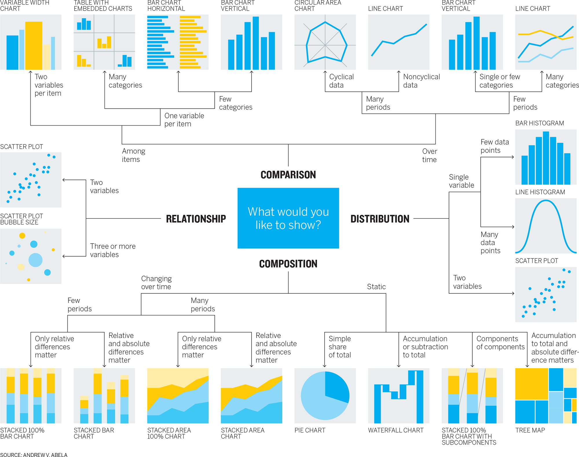
There are references you can use. Andrew Abela, the university provost and former dean of the business school at Catholic University of America who has written books about effective presentations, created a guide, below, that organizes typical charts well, but it comes with caveats.1 For instance, not everyone will agree on which chart types should be included and which excluded. Some people will take exception, for example, with Abela’s inclusion of pie charts and spider charts (or what he calls “circular area charts”), which they consider difficult or suboptimal. Others will ask why unit charts and slope graphs aren’t included. Newly popular forms such as dot plots and lollipop charts aren’t here either. And what about tables?
Also, a guide like this could narrow our thinking at a stage when we should be broadening it. It’s something like pouring out a bucket of Legos in front of a child and then telling her she can make only the ten things in the instruction booklet. At the beginning of the sketching phase, we’re better off just messing around with the Legos.
Remember that no cheat sheet will encompass all options. Under every common chart type shown here is a remarkable diversity of variations. New chart species are being spawned all the time. Trying to identify and document every variation of every chart type would be a quixotic effort at best. It’s better to just learn basic categories and types and then become a collector. Look around; collect examples of chart types that appeal to you or that you find exceptionally effective. Make notes about what you think works well or caught your eye. Visit websites devoted to dataviz and follow people on Twitter who post new charts daily. (Shortcut: Make lists for #dataviz, #visualization, #viz.)
Still, Abela’s guide is here for two reasons. First, it’s as good as any typology out there (an online search will yield many more) at helping us understand categories of forms—comparison versus distribution, for example.
Second, I’m showing Abela’s because I’ve adapted its main categories for a worksheet that matches typical keywords you may find yourself saying during the talk and listen stage of this process to the types of charts you might try to sketch.

This transforms Abela’s decision machine into more of an inspiration guide. I’ve simplified the categories and types and added conceptual forms that don’t appear in Abela’s chart. (Ironically, the type of visualization Abela used to create his typology—a hierarchical decision tree—isn’t listed on the typology, because he shows only data-driven forms.) To use this guide, see if your visual words match those in any of the quadrants. For instance, if you wrote down proportion and a percentage of, you might consider starting with stacked bars or a pie.
Keep in mind that this worksheet is neither complete nor definitive. It’s not meant to tell you what chart type to use, only what types to play with as you start sketching. You may find that some projects, for example, can benefit from multiple chart types or hybrids (say, a bar chart overlaying a map). It’s just meant to help you get started. (Also, you can use the glossary at the back of this book to quickly reference chart types and see some of their strengths and weaknesses.)
Keep in mind that bars, lines, and scatter plots are your workhorses. Those three forms alone will help you arrive at many good charts in most situations. While you shouldn’t shun other forms, you also don’t need to choose different ones just to be different.
Start sketching. Sketching bridges idea and visualization. Good sketches are quick, simple, and messy.2 Don’t think too much about real values or scales or any refining details. In fact, don’t think too much. Just keep in mind those keywords, the possible forms they suggest, and that overarching idea you keep coming back to, the one you wrote down in answer to What am I trying to say (or learn)? And draw. Create shapes, develop a sense of what you want your audience to see. Try anything.
Sometimes the form will seem so obvious that you won’t feel the need to sketch a lot of alternatives. A basic comparison between categories can often result in a bar chart. Trends over time are usually plotted as line charts. Still, don’t forgo the exercise altogether. Hannah Fairfield, a graphics editor behind some of the most celebrated data visualizations in the New York Times, always tries out at least two completely different forms to check her assumptions about the best approach and to stay creatively open.
For an article comparing the price of various Apple products to median monthly household income, my coauthor on that piece, Walter Frick, and I thought we’d show a simple bar chart, with one bar for the cost of a product and the other for income.
It would have been a natural choice because we were comparing values within categories. The bar chart is valid. But, in keeping with Fairfield’s advice to always sketch a couple of options, we decided to look for other ways to show the comparison. One phrase kept recurring while we sketched: how much monthly income the cost of an Apple product would take up. This led us to think about the product’s cost as a piece or portion of monthly income, rather than just a comparative value. Eventually, we settled on the less likely but arguably more effective approach of mini treemaps. Arguably, a stacked bar would have worked as well. The key was our discussion, the keywords we kept using, and sketching led us away from comparisons to proportions. Sketches of both the simple approach and the alternative are shown below.

Even if you think a standard chart type will work for your visual, sketch an alternative to check your assumptions and stay creatively open. Sometimes it will lead to a better form.
Even if you’re confident that you should be using a simple bar chart, line chart, or a scatter plot, sketching these basic forms is still important. Just as rough drafts improve even staff memos and other prosaic writing, sketches will make even simple charts better.
Remember the manager in chapter 2 who wanted to show his boss that customer service performance was declining in spite of, not because of, a website outage? He could have thrown together a basic line chart showing the data he’d collected: customer service calls and customer service performance. As a reminder, that chart is shown here.

But when he sketched the basic chart, he saw that the dramatic shape of the call volume would probably fight for attention with the performance trend. So he spent a few minutes sketching alternatives (shown below), looking for ways to increase the focus on customer service performance. He kept referring back to the statement he had jotted down to describe what he wanted to communicate to his boss: Even when service was restored after a website outage, customer service ratings continued to decline. And they started declining before the outage.
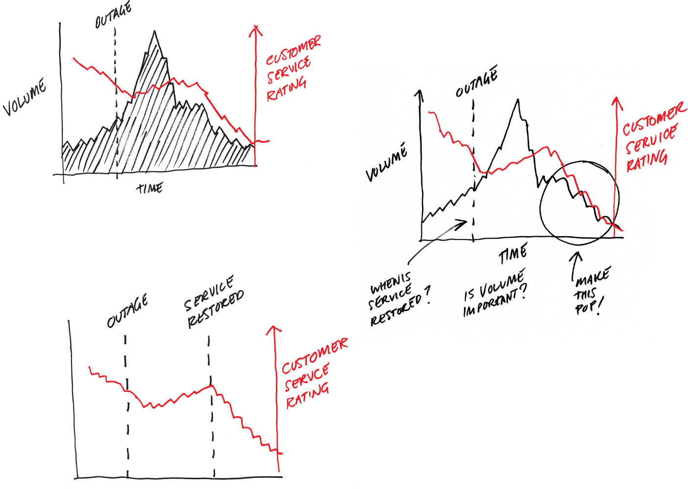
The breakthrough came when he realized that his statement didn’t mention customer service calls at all. The data was there, and he had plotted it unthinkingly. So he sketched a version without the outage data and immediately felt it was better. Then he added two key points that were reflected in his statement: after service was restored and before the outage.
As he sketched, he didn’t try to portray the data accurately; he knew the trend was downward—that was good enough for the time being. He added notes about possible treatments, such as magnifying and shading. But few final decisions were made. The most important decisions at the sketching phase are what not to pursue and what form to use. This is illustrative brainstorming. In 15 minutes, the manager went from visualizing some cells of data to visualizing what he wanted to say.
Sometimes sketching lasts longer. The sales manager from earlier in the chapter who was looking for seasonal and month-to-month patterns in his team’s sales performance noted some keywords from his conversation with a friend about his project:
It’s not clear there’s any regular pattern to our sales. I’m really trying to understand how and when they make sales—how sales are happening over time. Is it mostly smooth, or are there bursts of sales with periods of nothing? Is it the same month to month or not? Are different seasons showing different sales patterns?
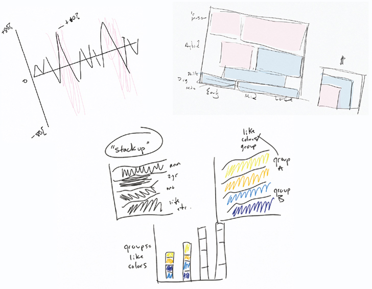
Looking at his notes, he saw that he was really talking about two things here: patterns and time. He actually used a phrase that was the potential visual approach: sales over time. He sketched those two variables as axes and then started to think about how to use them.

Line graphs are usually a good starting point for trends. So he drafted one of those over a year. From there his sketches reflect an effort to find the right set of line graphs based on some of his words—seasons, periods, and month to month—which suggested ways to organize his visuals. As he proceeded, his approach came into focus; but again, his charts weren’t accurate or to scale. He was just homing in on the approach.
Sketching is also useful to help us try different approaches to complex stories. Here’s part of a conversation from the talk and listen stage for an economics student. The student extracted lots of keywords from her conversation:
I’m trying to show a lot of things, actually. I want to see where the greatest growth is in jobs in the coming decade, compare sectors that are strong or weak. But also how is pay in those jobs relative to the total number of jobs that will be created? That’s the tricky part, because it’s easy to show a super high growth of jobs, but if it’s growing from 10 jobs to 20, what does that percent growth really mean? If high-growth jobs are low-paying ones, what does that mean? What about manufacturing versus knowledge work? Could I divide the data that way? There’s just a lot going on in the data.
Why is it important to show so many things?
That’s just it. Many times you see one piece of this data highlighted and it ignores these other factors, so it’s like, “Look at all that job growth,” but it doesn’t take into account pay or raw numbers of jobs. I’m looking for a holistic picture, a smarter look at this.
It’s silly to think the student could extract one chart style or approach from this conversation. She will need multiple charts and will need to think about what information goes in which chart type. She’ll need storytelling skills, which we’ll explore later on. Here, sketching is meant to explore options for organizing this student’s holistic picture.

Whether it takes five minutes to confirm the approach you sensed you should use, or an hour of slogging to find a good way to organize your information, sketching is a crucial habit to form. For many professional designers and dataviz pros, it ranks at or near the top of their list of activities that improve visual communication.
When people ask me what tools are best for making good data visualization, I tell them that paper and pencil or whiteboard and markers should top their list. You can usually get 90% of the way to a good chart just by sketching.
One final note. The sketches you see here are rather neat. That’s because I’m trying to create a good user experience for you. But I can’t stress enough how going fast and being messy is okay. It keeps your mind at a high level and open to new ideas. Just to give you a sense of what it’s like in the real world, I’ve included here a few of my real sketches from projects.
PROTOTYPE
At some point, you’ll have done enough sketching and will be ready to start making more-realistic pictures. But when? Watch out for these signs that you can begin to prototype:
- Your sketches reasonably match your What am I trying to say or show? statement.
- Your sketches are becoming refinements of one idea, rather than broad stabs at different ideas.
- You find yourself plugging in actual data or trying to imitate the actual values.
- You find yourself designing the charts, focusing on color, titles, and labels.
- You feel that you don’t have any more ideas.

Sketching is generative; it’s meant to bring up ideas. Prototyping is iterative; it’s meant to hone good ones. Prototypes should incorporate real data, or realer data. Don’t try to be perfect with your plotting but use realistic axis ranges and approximate values that give a sense of what the actual shape of the thing will be. Often, it’s useful to prototype with a subset of the data to create accurate pictures without feeling the burden of having to prototype everything. The manager plotting seasonal sales data, for example, might focus on one season for his prototypes.
Prototypes should also begin to incorporate broad design decisions such as use of color, and the media you’ll be building it for.
Again, to put this in the real-world perspective, recall the difficult-to-parse chart that included many bars in five clusters. I mentioned then that we fixed that by using this process. Below is one of the sketches and the first prototype created for that project. It should be obvious which is which.
The prototype, which plots only three categories even though the final chart will catalog many more, is cleaner and more realistic than the quick sketches. It uses real labels and includes a key. It also raises questions—Will this x-axis range work, given the data? Should color be used for categories—that can be addressed in ensuing iterations.
Most prototyping you’ll do falls into one of three categories:
- Paper, physically sketched on paper or a whiteboard, as with the previous examples
- Digital, done in software or on the web
- Team, done with partners who are subject-matter experts with deep knowledge of your data, or who have skills you lack, such as programming or design
Paper prototyping requires virtually no setup beyond what you’ve already done. Even if you plan on doing digital prototypes, a paper prototype is a good transition from sketching; a first paper prototype is like a final-draft sketch. Paper prototyping is good for simpler data sets (or subsets of larger data sets) and simpler visualizations, because it’s slow. A chart with ten categories could become difficult and tedious to draw by hand. It’s also harder to maintain clean plotting on paper as the amount of information piles up.
Digital prototyping is much faster than drawing and manages more information more cleanly. Here you can use tools built into the software where your data exists (such as Excel or Tableau) to quickly build visuals, or you can upload some data to a website that offers the ability to try multiple approaches. Digital prototyping is rapid prototyping. It’s especially powerful for confirmatory and exploratory dataviz. When my colleague and I explored Boston’s weather data, we used digital prototyping.
The good news for managers is that the number of tools suited to digital prototyping is growing—and the tools are improving.
More on tools in the coming chapters. Suffice it to say for now that online tools such as Plotly Chart Studio, Flourish, Infogram, Datawrapper, RAWGraphs, and others have made quick work of digital prototyping.
The four prototypes below, based on when sales happen, were created online in less than ten minutes. Notice they are only lightly refined—they feel as if they are in process and not like final visualizations. Even as you want prototypes to loosely reflect reality, you still don’t want to use this time to refine to a finished product. You’re only trying to get a sense of the final product.


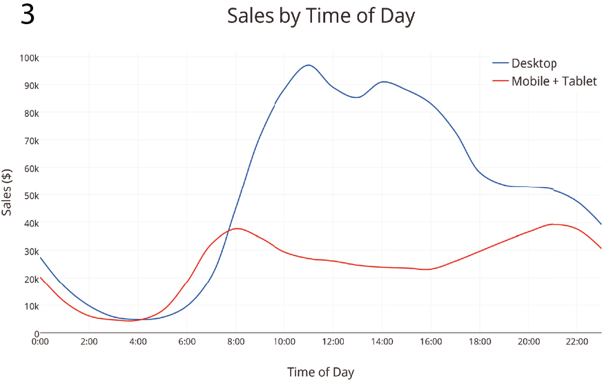

That you can move a visualization prototype so far in ten minutes demonstrates the power of digital prototyping. You can almost read the manager’s thoughts in the iterations: This is way too much information crammed into a bar chart. The trend is what matters anyway, so let’s try a line chart. Mobile and tablet can go together, and it’s simpler to have just the two trends to compare. Now let’s zoom in on this interesting slice of the data that I want to focus on.
Digital prototyping has its limitations. For one, the tools that do it best require more training to use. The free online ones have a lower learning curve but more-sporadic feature sets. All do some things well. None does all things well. Each has its strengths and weaknesses, so you may find yourself jumping from tool to tool depending on your project or even within a project. Digital prototyping may also be overkill for simple visualizations in which paper prototypes get you close enough to where you need to be. And few of these tools are designed to help prototype conceptual forms, which often require more sketching and prototyping than data-driven visuals. When working on conceptual graphics, paper and whiteboard are probably your best options.
Team prototyping is something else altogether. The previous techniques are defined by the tools you use. Team prototyping is defined by the way in which you work: with expert partners. The concept is based on a system of data analysis called paired analysis, which itself borrows from a software development process called extreme programming and other sources.3 In each of these the idea is to pair a subject-matter expert with a tools expert who can manipulate data and visuals quickly, and who can suggest solutions you may be unaware are available to you.
Team prototyping speeds up development of visuals and is vital to visual exploration.
Brian Fisher and David Kasik used this method at Boeing.4 “This turns out to be highly effective,” Kasik says. “The key is to have them actually sit and work together, not throw things over the wall.”
Paired analysis has proved powerful at Boeing, cutting time to visual insights dramatically since those who have and know the data aren’t spending cycles figuring out how to manipulate the visualization tools. In one case, the company used it for some deep exploratory sessions in which a team of two wanted to visualize information about bird strikes on airplanes. Bird strikes are a serious safety issue (a strike by Canada geese on an Airbus A320 passenger jet caused the notable “Miracle on the Hudson” water landing in New York in 2009)—at the time of the analysis, the cost of bird strikes was estimated at anywhere from $123 million to $615 million a year, but very little was known about the patterns of bird strikes and how they might be mitigated.
Little was known in part because the data analysis required to understand bird strikes was a tedious process of finding and reading through thousands of records from dozens of sources, correlating them, and then updating the results as new events occurred. To speed things up, Boeing paired a subject-matter expert (an aviation safety specialist) with a tools expert (in this case, an expert in both Tableau and IN-SPIRE visualization software). They worked together over several days. The following example shows the workflow. Think of the images as responses from the tools expert to requests from the subject-matter expert. Obviously, in a real-life setting they’d be discussing each of these steps in depth before the person visualizing went ahead and created charts.
Also notice how prototypes are not refined until they have to be. They work together to see just what they need to see, then change or refine based on that.
We need a way to identify and extract data on bird strikes from XYZ data sources. And once you have that system set up, we really want to see when bird strikes happen, by both month and time of day.

That’s good, but is there a way to map this by geography? I’d like to know where the most bird strikes happen. And can each spot break down the type of bird that was involved?
Wow. Great. Can we combine those two? Time of day and location? But less detail. I want to be able to show this to management and discuss the findings.

Can we also see altitude versus speed? Maybe see if there’s any pattern there.

Great. For the presentation, we also should show frequency of where on planes birds strike. Something simple.

Obviously, this is a radically simplified and abbreviated version of the work the two put in on the project. The insights they gained along the way, for example, were put into more presentation-worthy charts that others would be able to understand. But it shows how the subject-matter expert focused on articulating the problems and explaining the context he was trying to create. The tools expert, meanwhile, drew on his knowledge of good visualization techniques and how the tools could quickly generate different views to give his partner what he needed.
Kasik says this process brought new insights faster than other methods and has led to design improvements to shield airplanes and better pilot training to recognize and react to bird strikes.5
You can borrow this framework to achieve similarly powerful results with your prototyping, especially on bigger and more complicated projects. Recruit a tools expert, someone with expertise in some aspect of visualization that you don’t have. That could be:
- A developer who can create interactivity with complex programs like D3—the most popular JavaScript visualization library for programmers
- A designer who can help you visualize a complex or unusual form using professional design tools like Adobe Illustrator
- A data analyst who knows how to find, scrape, clean, and manipulate data in business intelligence and visualization software systems like Tableau or QlikView so that you can find patterns and relationships that you’d otherwise miss.
Sit together. Describe to the expert what you’re trying to achieve. Talk. (More talking!) Show the expert your sketches, the keywords you jotted down; clarify your ideas. Then begin the back-and-forth exchange. Even better, you can go through the whole development process with the expert.
IN PRACTICE, START TO FINISH
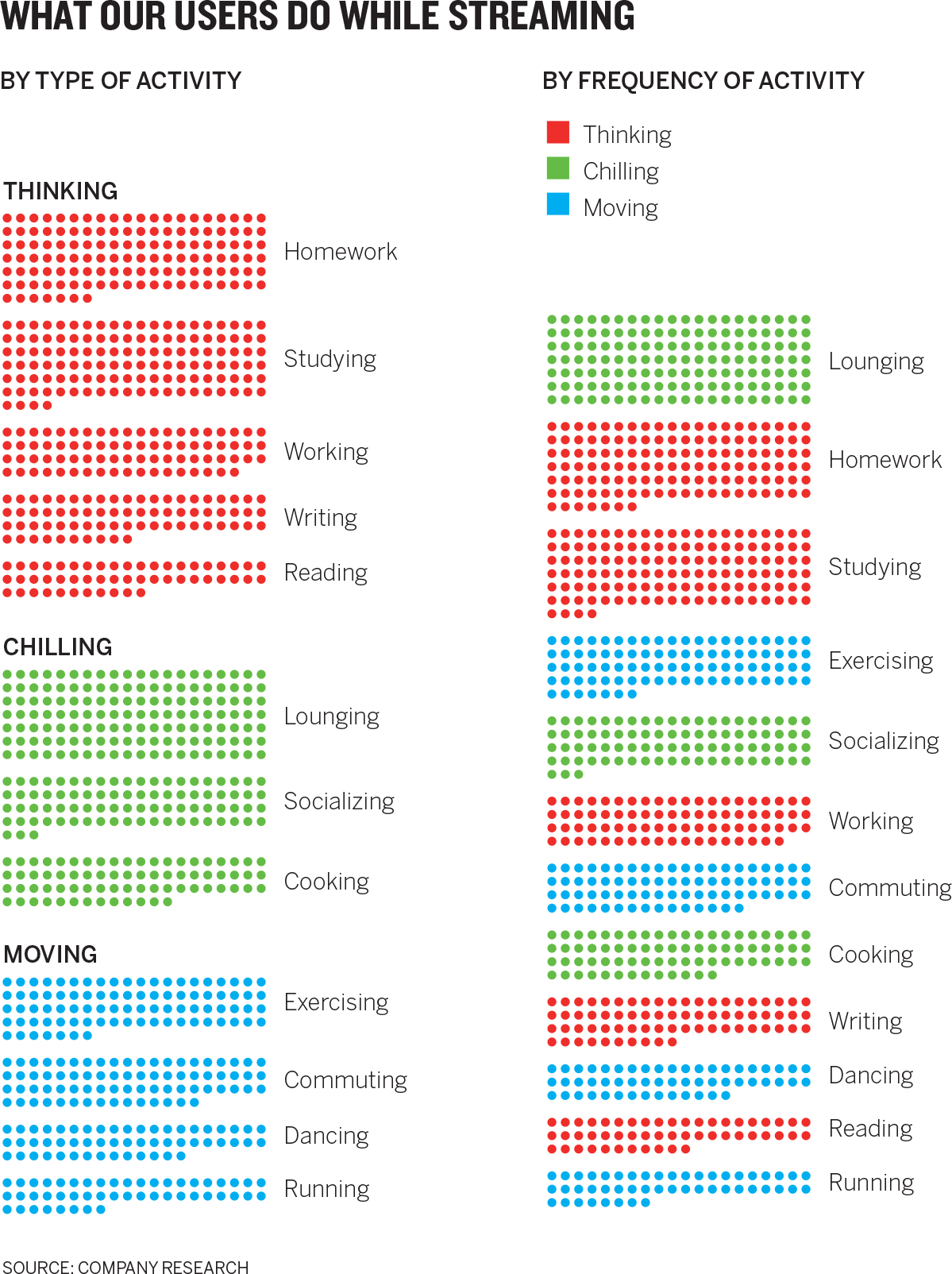
Here’s an example of thinking through a visualization from beginning to end. Lisbeth is a marketing manager at a company that provides streaming music services. The company is trying to understand what other activities customers engage in while they’re streaming music. Data collected by the company will help shape its multimillion-dollar marketing strategy.
Lisbeth has seen the data. She’s even quickly generated a pie chart from her spreadsheet program, just to see at a high level what was there:

She knows that even a cleaned-up, well-labeled version of this pie won’t be effective. She’s having trouble herself extracting any meaning from it other than users do a lot of different things while streaming music. She blanches at the idea of presenting this to the marketing department as a visual aide to a multimillion-dollar investment decision. She decides to make it better.
Prep: 5 minutes. Lisbeth finds a small workroom with a whiteboard and a few color markers. She brings coffee for herself and a friend she has invited to help. She spends a few minutes framing her effort at the top of the whiteboard. In addition to plotting her work in the declarative, data-driven quadrant (everyday dataviz), she plots what will make this chart “good” on the Good Charts Matrix. Her sketches are shown below.

Her chart should look good, but she’s willing to forgo time refining the design to focus on getting the context as close to perfect as possible in the time frame she has. After all, she’s presenting to her unit, where people will have deep knowledge and opinions on the topic and data. She makes a brief note that if this chart gets it right, she may have to make a better-designed one for other, more formal presentations.
Talk and listen: 20 minutes. Her friend—who’s not part of this project—arrives. Lisbeth wants not only to talk through her idea but also to check her assumptions with someone who doesn’t have much knowledge or bias about the project.
So, I need to show my department what people do while they’re using our service. I want to be able to show any trends or dominant activities, for sure, but there are a dozen different things they do, and it all seems pretty random.
Why can’t you tell your team there’s no dominant activity?
We can’t market to everyone; we have to figure out who we want to target and know why. Plus I’m not convinced that it’s trendless. I just think I haven’t figured out the way to group the data that will expose the trends.
Is there a category of activity, or a couple of categories you can focus on, like exercising?
Maybe. Actually, the data wasn’t grouped, but that’s something to look at.
Their conversation goes on for about ten minutes. Later Lisbeth spends ten more minutes chatting up a colleague who’ll be at the meeting. Here’s part of what she says to this friend:
So the big meeting is coming up, and I know Tom is going to give me the “So what?” because it’s not entirely clear we’ve found one or two dominant activities that we can focus on. Plus I get frustrated when we just put up these percentages and don’t think about the individuals. You can’t just market to some 60% because they’re all doing the same thing. You have to think about people. Anyway, I’m looking for ways to organize the information so it’s not just random. But I also think it’ll be more effective if we get people in a mindset to think about talking to people, not just these aggregate groups.
Sketching: 20 minutes. Even as Lisbeth captures the conversations, she starts sketching as shown. She knows right away that grouping the activities in general categories will help make a pie chart more accessible, so she looks over the activities again and assigns each to one of three categories. Although she’s pretty sure a pie chart won’t work, she sketches one anyway. She sketches bars and tries out a Venn diagram, with circles for each category overlapping with some of the activities. She scribbles. The word individuals keeps staring back at her from the whiteboard. She really wants to make the information feel more personal and less like a generic stat. She draws a few icons of people, remembering a dataviz she found online that went viral called “If Twitter were 100 people,” which used a similar technique.7
She writes, “Activity of 1,000/10,000? What would that look like?” And she jabs the whiteboard with dots. Could she put thousands of dots on the screen in her presentation? That form is called a unit chart—assigning visual units to some value, like a person or a dollar. It helps audiences to make that connection to the thing behind the data in a way that more abstract concepts like a percentage can’t. When we see the dots, we think about the individual units, the people. When we see a bar, we think about the whole.
Prototyping: 65 minutes. Lisbeth likes the idea of a unit chart and recruits another friend who can do some light programming to create some, paired-prototyping style. In 30 minutes, they have multiple unit charts to evaluate—each showing proportional numbers of participants in activities—including the version below.

Lisbeth recognizes that 10,000 dots, although stunning, is somewhat impractical for a presentation. It’s hard to see any values or differences in values in the picture. She asks her programmer to try versions with 1,000 dots. She asks him if he can “make it so the differences in value are easily seen.” He iterates. They need just 15 more minutes to produce versions with 1,000 dots, including the two below.
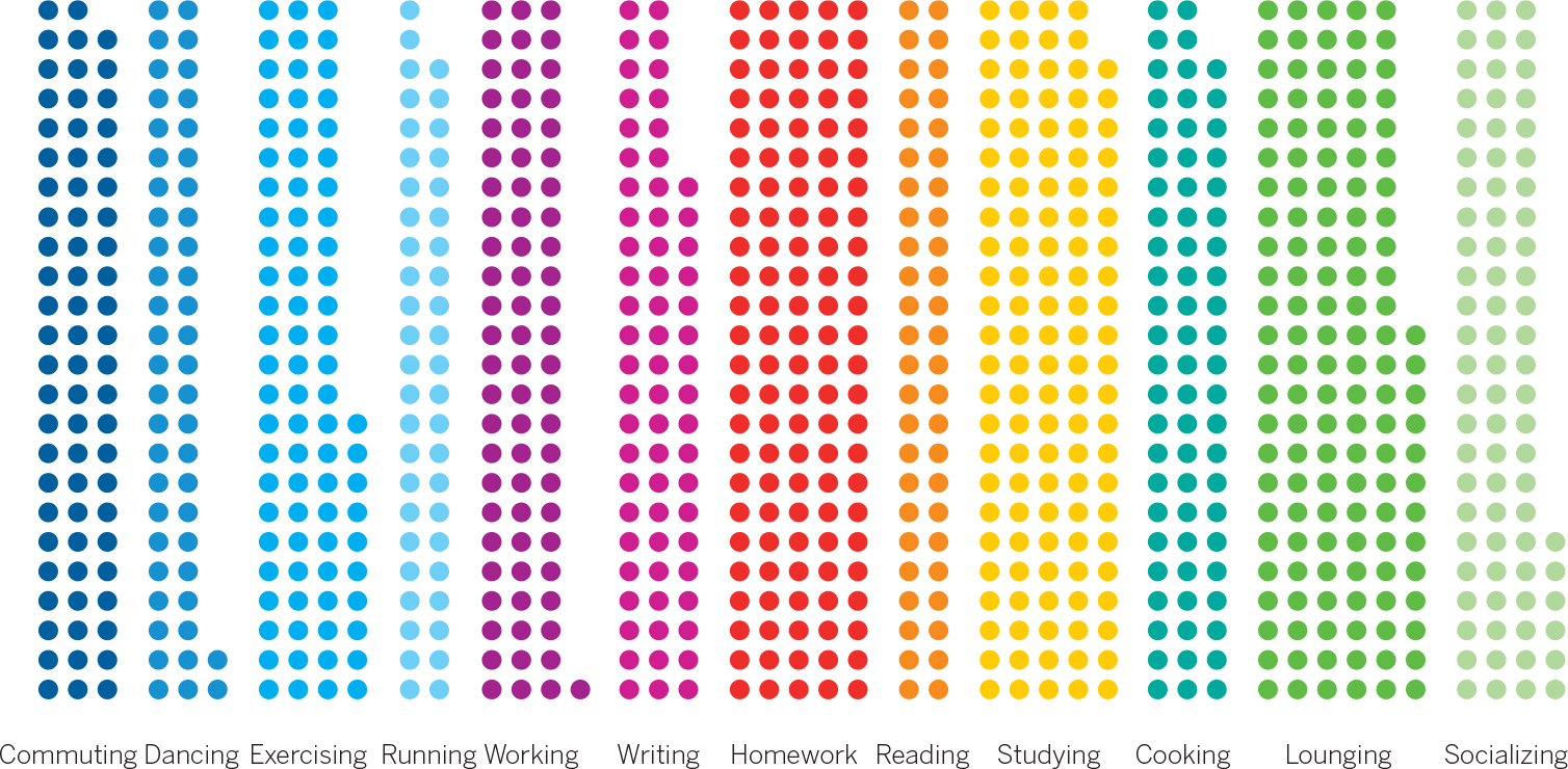

Lisbeth likes the first of these because the differences feel meaningful and the form feels familiar. Each group of dots evokes a group of people, but you can also easily see overall proportions within groups. It’s a unit chart and a stacked bar chart at the same time. In just 20 more minutes—less than two hours after she started—Lisbeth has a presentation version of her chart, the pair shown below, which organizes activities both by category in one chart and by most-to-least-common in the other. She thinks, These are visualizations we can have a conversation about.
OVERLAPPING, NOT SEQUENTIAL
I’ve outlined a process that goes from one step to the next with fixed time intervals, largely because that’s the easiest, most accessible way to describe the progression of activities.

In practice, the process won’t be so linear. The steps will bleed into one another. You may find yourself sketching as you talk, for example. You should: It’s hard not to start drawing as you capture keywords and talk through your challenge. Sometimes a prototype will expose a weakness in your visualization (or an opportunity you hadn’t seen) that will literally send you back to the drawing board to sketch alternatives.
In short, the process may proceed something more like this, which shows how, in that typical hour, the steps might overlap:
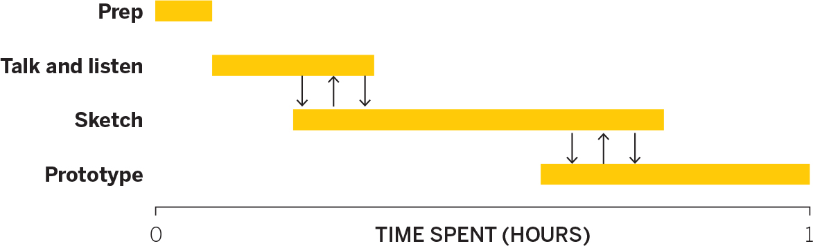
Not every project is typical, though. When the best visual approach isn’t clear, talking and sketching may dominate your efforts. Or, if you have a good idea of what you’re trying to show, or if prototypes lead you to further manipulate the data to refine the idea, you may quickly settle on the visual approach and spend much more time refining prototypes. You can imagine the length of these bars stretching and shrinking, and the arrows between them shifting.
VISUAL CRIT
There’s one final technique you should use as you develop your charts—constructive criticism. This can be part of your own chart development, to hone your product. It can also be done separately when you encounter others’ data visualizations, so that over time, you learn about what you find appealing and effective.
Good writers are great readers. They look to others’ work for ideas and borrow (okay, steal) from what inspires them. Creators in general approach their craft this way, and visualization is no exception. One of the best ways to get better at making charts is to look at, and think about, a lot of them.
Good news: There’s a surplus available. It’s hard to be on the internet for a hot minute without stumbling on some dataviz that’s going viral. If you follow #dataviz or visit any number of visualization-heavy websites (the Upshot on the New York Times website, for example, or the Economist, which tweets many charts every day), you’ll find plenty of fodder.
You can critique any chart and get something out of it. Find simple ones. Boring ones. Complex, artful ones. Ones on topics you know nothing about. Look at each one with a purpose. Do you get it? What do you like? What don’t you like? Deconstruct technique. Think of ways you might have approached the chart differently. Recreate it in your own way.
This doesn’t have to feel like homework. It can be done casually and quickly. Here’s a way to learn from others’ work or to take a fresh look at your own.
1. Make a note of the first few things you see. We see first whatever stands out. Document the first element your eyes focus on. A “spike”? “Blue bars”? It may be more impressionistic: “a long smooth line,” or “pickup sticks crossing over each other all over the place.” What you wouldn’t see first is “interest rates going up in the past few fiscal quarters.” That kind of content focus requires some parsing of the idea beyond what first hits the eyes. Here you want to get at that initial, instantaneous visual perception.
2. Make a note of the first idea that forms in your mind and then search for more. You’ve looked at the chart for a few seconds now. What is it trying to tell you? Here’s where you might say, “It tells me interest rates are going up, and fast.” Ask critical questions about this idea you’ve formed: “Does it match the chart’s intent?” “Is the chart misleading or is something missing?” After your initial impression, study it; see if you can find deeper narratives, or if more questions arise the longer you look at it.
3. Make notes on likes, dislikes, and wish-I-saws. Focus on the feeling you get from elements in the chart. “I don’t like all the labels.” “I don’t like how the y-axis is cut off.” “I like how I immediately get it.” “I like how they used gray for the background information.” “I wish I saw this in comparison to last year.” Sometimes these gut feelings signal what makes a chart successful; other times they expose what may be improved. Over time, you’ll find that you react consistently to certain elements; you’ll discover both common missteps and your own aesthetic.
4. Find three things you’d change and briefly say why. “Say why” is the crucial bit. Your reason should ultimately improve the chart’s effectiveness. “Because I don’t like blue” is thin reasoning. “Because the blue is hard to see with the yellow right next to it” is better. Limit yourself to three changes—that will force you to prioritize only the most important ones. The aim here is to focus on what will help the main ideas shine through.
5. Sketch and/or prototype your own version, and critique yourself. Revisualizing is the most powerful way to learn. The before-and-after comparison helps you see whether what you thought would make a chart better actually does. If you have a data set, great. Otherwise, create a simple spreadsheet with estimates of the key values, or just sketch and estimate the values. (If it’s a conceptual visualization, you don’t need anything; just start.) Value speed over precision here, as you do when you sketch and prototype your own dataviz. The self-critique will attach what you’ve learned about what works and what doesn’t work to your effort. Try to include both positives and negatives in your self-critique.
VISUAL CRIT IN PRACTICE
Many people hesitate to do visual crits. Some may not feel qualified because they’re neither a designer nor a data scientist. Others don’t feel comfortable with criticism even when it’s constructive. But as a consumer of the chart, you are qualified to have opinions about what it makes you see and feel. As for comfort with criticism, I tell people I do this with to avoid judgmental words about what you like and don’t like and to talk instead on what you think works and doesn’t work. The best way to get comfortable with visual crit is to just start doing it. Here’s a simple example of one I performed using the step-by-step process we just laid out.

1. Make a note of what you see first.
- My eyes go right to the Chrysler Building and Empire State Building, maybe because I recognize them, but their bars also stand out on the left.
- I also see many stripes, with salmon-colored ones jumping out at me.
- I also see blue, until lots of colors take over when the bars shoot up.
2. Make a note of the first idea that forms in your mind and then search for more.
- All the tall buildings used to be in North America, and now they’re not. I got that pretty quickly from the color. But if I’m supposed to be able to think about who’s building tall buildings now, that’s harder to see, because the colors are so various. It reads to me like North America and Everywhere Else, unless I work at it.
- There’s an amazing surge in the height of the tallest buildings right now. It’s hard to pick up, though, because heavy labels and lines and stripes denoting eras drown it out.
- Those stripes denoting important world events may be meant to tell me something about the height of buildings during that time, but the more I look at them, the more random they seem.
3. Make notes on likes, dislikes, and wish-I-saws.
|
Like |
Dislike |
Wish I saw | ||
|---|---|---|---|---|
|
Thin lines, feels like skyscrapers, gives sense of great height |
Era demarcations heavy and overpowering |
Less stuff overall | ||
|
Labeling important buildings |
Pointers, y-axis grid heavy, labels redundant (year) |
Catchier title? | ||
|
Using color to denote location |
Color choice makes it hard to quickly pick location in recent times, especially with the spatial disconnect between the key and the colors |
Some point of reference for height, hugeness | ||
|
Y-axis on right for easier reference of tallest buildings |
Footnotes and symbols confuse me |
Maybe shapes/profiles of buildings? |
4. Find three things you’d change and briefly say why.
- Eliminate the demarcations for eras. It’s not clear what they add, and they definitely make it harder for me to see the progression of tall buildings. It feels like it’s inviting me to make a correlation that I can’t find.
- Work on labels. Make them simpler so that they don’t overpower the bars. No elbows in pointers. Make labels less intrusive in the visual field. Lighten the grid lines.
- Color. Find a way to make color more instructive at a glance. Combine China with Asia?
5. Sketch and/or prototype your own version, and critique yourself.
Self-critique: I like how my prototype (shown below) feels simpler and less cluttered. I don’t miss the era demarcations. A key breakthrough was dividing the labels into new tallest-building milestones running neatly along the bottom, aligned, while well-known landmarks stay in the visual field. This helped solve the busyness of the labels. Also, the labels in the field escalate in an echo of the visual itself. Removing some belt-and-suspenders design with the labels also helped. Looking at the y-axis tick lines, I had an idea to align them to the landmark buildings rather than make them traditional, evenly divided ranges. That would be unconventional but might help add to the sense of accelerating height.

I haven’t addressed the problem that some of these buildings are “projected heights” rather than completed structures. And I don’t think I’ve solved the color puzzle at all. I want to ask a professional designer what she would do to make so many lines that require so many colors render as clearly distinct. I’d love to not have a key at all. Finally, I wish the chart included some point of reference to get a sense of just how astonishingly high 1,000 meters actually reaches. Could it be included without cluttering?
Note that this is only a prototype. My goal wasn’t to create a clean, finished, good chart, but rather to learn from dissecting the original and just navigating to some ideas around a better solution. That’s enough for this crit. I could keep going, but I’ll stop this one here.
Inevitably when people try this process, they tell me it feels strange at first but that it does work for them. I’ve had some people tell me how surprised and delighted they were when they first started hearing the visual words they were saying out loud. One person told me it felt like a “cheat code” because they kept figuring out how to better show their data just by talking about it.
The talk, sketch, prototype process will get you to good charts by getting you to a better, more specific, and clearer context. A by-product of great context is good design. Yes, there are design techniques to improve your charts—and we’ll be covering those next—and yes, practicing visual critique will further hone your ability to make good-looking dataviz. But most of what will make an audience regard your charts as good looking and effective is not down to design skills. It’s down to context. A chart that knows its context well will naturally end up looking better because it’s showing what it needs to show and nothing else. Good context begets good design.
Good charts are only the means to a more profound end: presenting your ideas effectively. Good charts are not the product you’re after. They’re the way to deliver your product—insight.
RECAP BETTER CHARTS IN A COUPLE OF HOURS
To improve visual communication, fight the impulse to go right from getting data to choosing a chart type from the preset options in a software program. First spend time creating context and thinking through the idea you want to convey. Usually, an hour or so of prepping, talking and listening, sketching, and prototyping will help produce a superior visualization.
Follow these steps to make it happen:
1. Prep: 5 minutes
• Create a workspace with plenty of paper or whiteboards.
• Put aside your data so that you can think more broadly about ideas.
• Write down the basics as constant reminders, including who the visualization is for and what setting it will be used in.
2. Talk and listen: 15 minutes
• Enlist a colleague or a friend to talk about what you’re trying to say or show, or prove or learn.
• Capture words, phrases, and statements that possibly sum up the idea you want to convey.
3. Sketch: 20 minutes
• Match keywords you’ve captured to chart types that you may try out, using the chart on 94 as inspiration.
• Start sketching, work quickly, and try out multiple visual approaches. Sketching is generative.
4. Prototype: 20 minutes
• Once you have an approach you think will work, prototype it by making a more accurate and detailed sketch.
• Refine your prototypes just enough to see what you need. Prototyping is iterative.
• Use digital prototyping tools or paired-prototyping techniques if you want to iterate further.
VISUAL CRIT
Just as good writers are great readers, good chart makers are great at mining visualizations for inspiration and instruction. One of the best ways to get better at making charts is to critique them.
First pick out some charts to evaluate. Pick all different kinds. Simple ones. Boring ones. Complex ones. Ones you know nothing about. Then follow this simple process for critiquing and workshopping them:
1. Make a note of the first few things you see.
Don’t think—react. What stands out? Is it a peak? A color? Lots of words?
2. Make a note of the first idea that forms in your mind and then search for more.
Decide what idea you think is being conveyed. Does it match the chart’s seeming intent? Is the chart misleading? Is something missing?
3. Make notes on likes, dislikes, and wish-I-saws.
Don’t focus on what you think is right or wrong. Instead, think about your gut reaction to the visual, the feeling you get.
4. Find three things you’d change and briefly say why.
Limit them to three so that you’re forced to prioritize only the most important changes. Saying “why” is key to making sure you focus on effectiveness rather than taste. “Because I don’t like blue” is not a good reason to make a change. “Because it’s hard to see blue next to yellow” is.
5. Sketch and/or prototype your own version, and critique yourself.
Just as when you sketch and prototype your own dataviz, value speed over precision here. Include both positives and negatives in your self-critique.