
The Polymer.dart framework provides a set of Polymer (UI and other) components, but it will only work in the most recent versions of browsers: IE9, IE10, Safari 6, Firefox, and the latest Chrome version (also for Android). It is important to know that, in Polymer, you can only have a single Dart script tag on an HTML document. So, get started with creating a new Polymer application, polymer1, by selecting the Polymer Web application project template (using the polymer library) in Dart Editor.
A new Polymer application
Inspecting pubspec.yaml will reveal the polymer dependency as well as a transformer:
dependencies:
  browser: '>=0.10.0 <0.11.0'
  paper_elements: '>=0.7.0 <0.8.0'
  polymer: '>=0.16.0 <0.17.0'
transformers:
- polymer:
    entry_points: web/index.html
Pub is invoked automatically and it installs polymer and a whole group of packages needed by polymer (such as observe, polymer_expressions, web_components, and so on). We'll now examine in detail how a web component is defined in Polymer.
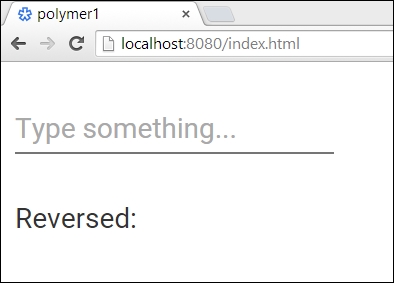
This is what we will see when the webindex.html file is run: a web component from the paper_elements package, which expects input and a <p> tag to show the reversed text:
The clickable counter in polymer1
This start up index.html HTML file contains the following important sections:
<link rel="import" href="packages/polymer1/main_app.html">  (1)

<body unresolved>

  <main-app></main-app>                                     (2)

  <script type="application/dart"> export 'package:polymer/init.dart';</script>                    (3)
</body>
We need polymer/init.dart in line (3) to automatically initialize the polymer elements. <main-app></main-app>, in line (2), is the placeholder where our web component will appear. Its definition is imported through the <link> import in line (1).
The name of a component must contain a dash (-); in general, the first half of the name should make it unique (for example, by including a project or a business name) so as to avoid conflicts with the other components. Now, let's turn our attention to the definition of the web component. The structure and style of the <main-app> web component is defined in the libmain_app.html file inside <template> in a <polymer-element> tag, whose name attribute in line (4) is the name of the web component:
<polymer-element name="main-app">                         (4)
  <template>
    <style>
      :host {
        display: block;
      }
    </style>

    <paper-input label="Type something..." on-keyup="{{reverseText}}"></paper-input>                (5)

    <p>
      Reversed: {{ reversed }}                             (6)
    </p>
  </template>
<script type="application/dart"  src="main_app.dart"></script>                         (7)
</polymer-element>
In general, the <template> section contains markup outlining the UI appearance of the web component. We observe that an HTML file containing a Polymer element definition does not need <html>, <head>, or <body> tags. Line (5) shows that <main-app> is a paper-input element that reacts on the keyup event by calling a reverseText method. Line (6) tells us that a reversed variable is shown with the polymer expression {{reversed}}. This is the typical {{ expression }} syntax used for data binding to an expression but, as shown in line (5), an event handler is also called in the same way.
The behavior of the component is defined in the main_app.dart Dart script referenced in the <script> tag in line (7). This does a lot of things:
import 'dart:html';
import 'package:paper_elements/paper_input.dart';
import 'package:polymer/polymer.dart';                     (8)
@CustomTag('main-app')                                     (9)
class MainApp extends PolymerElement {                      (10)
  @observable String reversed = '';                        (11)
  /// Constructor used to create instance of MainApp.
  MainApp.created() : super.created();                     (12)

void reverseText(Event event, Object object, PaperInput target) {
    reversed = target.value.split('').reversed.join(''),    (13)
  }
}
In line (8), the polymer package is imported. @CustomTag, in line (9), registers main-app as an element in the Polymer framework. Our model is represented by the MainApp class in line (10), which has to inherit from the PolymerElement class and override its created() constructor in line (12). This is because the polymer elements are legitimate HTML elements. Note that the name of the Dart class is obtained after converting the first letter of each word separated by - into an uppercase letter, and removing -.
The Polymer framework provides for synchronization of the model with screen data. In this case, it is the reversed variable that is annotated with @observable in line (11) to indicate simple, one-way (model to screen) data binding. Finally, it contains the reverseText method in line (13), which is called at the key up event; this will set reversed to the reversed input text. This change will automatically be shown on the web page. In general, the Dart script implements the behavior of the component and can change the model's data. Each time a custom element is instantiated, as in line (2) in the index.html file, an instance of the Dart class is created and associated with the custom element. Data bindings in the template are bound to fields in that instance.
Tip
As a best practice, a web component has two files to separate the HTML markup from the Dart code. In some simple examples, you will see the code embedded in the <script> tag in the HTML file, but this is not recommended. When both the files have the same name, it is easier to recognize them as parts of the same component.
Developing web applications with web components is a new approach that will let us divide a page in sections and use a web component for each section. If web components become reusable in different contexts, we may have a catalog of web components that would allow us to select and reuse them in a few lines of code. A page can also contain multiple instances of the same component, each behaving independently from each other. A polymer element is like a supercharged custom element, with functionality provided by the Polymer framework. It automatically allows for simple component registration and uses the Shadow DOM. This means that its markup is hidden in the web page in which it is embedded, thus providing encapsulation by itself. Polymer uses the composability of elements as much as possible, to the extent that the framework advocates proclaim that everything is a component in Polymer. Let's now examine data binding a bit closer.