Bootstrap provides a host of different HTML elements that are styled and ready to use. These elements include the following:
- Tables
- Buttons
- Forms
- Images
Bootstrap provides default styling for HTML tables with a few options to customize their layouts and behaviors. The default ASP.NET MVC scaffolding automatically adds the .table class name to the table element when generating a List view.
In the previous chapter, we created an empty ASP.NET Core project. In order to enable the built-in Visual Studio Scaffolding and because the new ASP.NET's approach is to only add the dependencies you need, we have to manually add the required dependencies to the project by completing the following tasks:
- Open the project you created in Chapter 1, Getting Started with ASP.NET Core and Bootstrap 4, in Visual Studio.
- Locate the
project.jsonfile in the project's root folder and double-click it to edit. - Add or update the following dependencies to the dependencies array inside the file:
"Microsoft.AspNetCore.Mvc": "1.0.0", "Microsoft.AspNetCore.StaticFiles": "1.0.0", "Microsoft.AspNetCore.Razor.Tools": { "version": "1.0.0-preview2-final", "type": "build" }, "Microsoft.VisualStudio.Web.CodeGeneration.Tools": { "version": "1.0.0-preview2-final", "type": "build" }, "Microsoft.VisualStudio.Web.CodeGenerators.Mvc": { "version": "1.0.0-preview2-final", "type": "build" } - Next, add the following to the tools array in the
project.jsonfile:"Microsoft.VisualStudio.Web.CodeGeneration.Tools": { "version": "1.0.0-preview2-final", "imports": [ "portable-net45+win8" ] } - The added dependencies and tools will enable the MVC-specific scaffolding templates to Visual Studio. If successful, you should see a New Scaffolded Item... entry in the Add context menu of the Visual Studio Solution Explorer. Here is a screenshot to illustrate the new menu item:

To scaffold an MVC View that will automatically include a Bootstrap table, follow these steps:
- Create a new folder called
Modelsin your project. - Create a new view model class in the project's
Modelsfolder calledProductModel.cs. This class will contain six properties and its code is as follows:public class ProductModel {public int Id { get; set; } public string Name { get; set; } public decimal UnitPrice { get; set; } public int UnitsInStock { get; set; } public bool Discontinued { get; set; } public string Status { get; set; } } - Next, add a new empty
ProductsControllerand only add one action result, calledIndex, to it. The controller's filename should beProductsController.csand it should be created inside theControllersfolder. The code for the class is as follows:public class ProductsController : Controller { public IActionResult Index() { var model = new List<ProductModel>(); var product1 = new ProductModel { Name = "Chai", UnitPrice = 18, UnitsInStock = 35, Discontinued = false, Id = 1, Status = "active" }; var product2 = new ProductModel { Name = "Chang", UnitPrice =19, UnitsInStock = 17, Discontinued = false, Id = 2, Status = "success" }; var product3 = new ProductModel { Name = "Aniseed Syrup", UnitPrice = 10, UnitsInStock = 13, Discontinued = false, Id = 3, Status = "info" }; var product4 = new ProductModel { Name = "Pavlova", UnitPrice =17, UnitsInStock = 29, Discontinued = false, Id = 4, Status = "warning" }; var product5 = new ProductModel { Name = "Carnarvon Tigers", UnitPrice = 62, UnitsInStock = 42, Discontinued = true, Id = 5, Status = "danger" }; model.AddRange(new[] { product1, product2, product3, product4, product5 }); return View(model); } }
The preceding code initialized a new List object, called model, containing a collection of the ProductViewModel class. Five new ProductViewModel objects were created with sample product data and then added to the model list. The model list was then passed to the view.
Tip
Do not be dismayed about the amount of work it takes to enable scaffolding for MVC. These steps are only required when creating an empty ASP.NET project. The default MVC project template will automatically add all the required code configuration and dependencies. However, bear in mind that the default MVC project, at the time of writing, still uses Bootstrap 3.
To scaffold a view that will include a Bootstrap table containing the list of products we've created in the Index action, complete the following steps:
- Create a new subfolder called
Productsin the project'sViewsfolder. - Right-click on the newly added
Productsfolder and select Add | View.... - In the Add | View... dialog windows, set the following field values as shown in the following screenshot:

- Click on the Add button, and Visual Studio will scaffold a view containing a Bootstrap table with the column headings containing the names of the properties of the
ProductModelclass. - The default ASP.NET MVC scaffolding will generate a basic
<table>element with a class name of.table. We'll change the default-generated markup by adding a table head element (<thead>), which will be used to define the column headings for the table. - This element will be followed by a table body element (
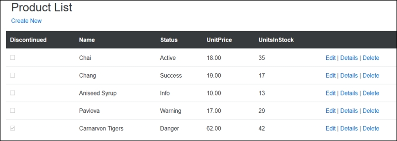
<tbody>). The table body element will contain the actual row data. The resulting markup will look like the following:<table class="table"> <thead> <tr> <th> @Html.DisplayNameFor(model => model.Discontinued) </th> <th> @Html.DisplayNameFor(model => model.Name) </th> <th> @Html.DisplayNameFor(model => model.Status) </th> <th> @Html.DisplayNameFor(model => model.UnitPrice) </th> <th> @Html.DisplayNameFor(model => model.UnitsInStock) </th> <th></th> </tr> </thead> <tbody> @foreach (var item in Model) { <tr> <td> @Html.DisplayFor(modelItem => item.Discontinued) </td> <td> @Html.DisplayFor(modelItem => item.Name) </td> <td> @Html.DisplayFor(modelItem => item.Status) </td> <td> @Html.DisplayFor(modelItem => item.UnitPrice) </td> <td> @Html.DisplayFor(modelItem => item.UnitsInStock) </td> <td> <a asp-action="Edit" asp-route-id="@item.Id">Edit</a> | <a asp-action="Details" asp-route-id="@item.Id">Details</a> | <a asp-action="Delete" asp-route-id="@item.Id">Delete</a> </td> </tr> } </tbody> </table>
In the preceding markup, note the <table> element's class name is set to table. When you run the project and navigate to the products controller (for example, open this view), your table should be styled using the Bootstrap table styles as illustrated in the following screenshot:

Bootstrap provides additional classes with which you can style your tables to their desired appearance. To inverse the colors of the table, simply change the <table> element's class name to .table table-inverse. For example, the following table element, <table class="table table-inverse">, will produce the following table:

You also have the option to change the appearance of the table's header <thead> element to a lighter or darker color. Changing the <thead> element's class to .thead-inverse will result in the header using the current Bootstrap theme's inverse color (which, in the case of the default Bootstrap style, is darker).
To use the Bootstrap theme's default color for the table heading, simply set the <thead> element's class name to .thead-default, which will result in a table with a header using the Bootstrap theme's default color, which, in the case of the default Bootstrap theme, is a light gray color, as shown here:

To create a bordered table, add .table-bordered to its class name, for example:
<table class="table table-bordered">
To create a table where each odd row is highlighted with another color than the base color, change the table's class name to .table table-striped, as illustrated below:
<table class="table table-striped">
Lastly, Bootstrap also gives you the option to enable hover state on a table. This means the row that the user hovers their cursor over will be highlighted. To accomplish this, change the table class to .table table-hover, for example:
<table class="table table-hover">
All the different class names can be combined to create a zebra-striped, bordered table with hovering, as illustrated in the following markup:
<table class="table table-striped table-bordered table-hover">
The result will look similar to the following in your browser:

Tip
You can read more about Bootstrap tables at http://v4-alpha.getbootstrap.com/content/tables/.
Bootstrap provides additional classes with which you can style either your table's rows or cells. Adding one of the following class names to either the <td> or <tr> element of your HTML table will highlight it in either grey, green, blue, orange, or red. These colors respectively represent the following:
.table-active.table-success.table-info.table-warning.table-danger
Of course, you could also apply these styles dynamically to your MVC views. The ProductModel class has a Status property, which could be one of the five contextual Bootstrap classes. By setting the <tr> element's class to this property, the color of the rows in the table can be dynamically changed based on their data, as illustrated in the following markup:
<tbody>
    @foreach (var item in Model)
    {
        <tr class="[email protected]">
            <td>
                @Html.DisplayFor(modelItem => item.Discontinued)
            </td>
            <td>
                @Html.DisplayFor(modelItem => item.Name)
            </td>
            <td>
                @Html.DisplayFor(modelItem => item.Status)
            </td>
            <td>
                @Html.DisplayFor(modelItem => item.UnitPrice)
            </td>
            <td>
                @Html.DisplayFor(modelItem => item.UnitsInStock)
            </td>
            <td>
               <a asp-action="Edit" asp-route-id="@item.Id">Edit</a> |
               <a asp-action="Details" asp-route-id="@item.Id">Details</a> |
               <a asp-action="Delete" asp-route-id="@item.Id">Delete</a>
            </td>
        </tr>
    }
</tbody>
In the preceding code, you will notice that the table row's class was set to [email protected]. This will cause the rows to be highlighted based on the mapping we've specified for the status property, as illustrated in the following screenshot:

To create a smaller table whose cell padding is halved, set the <table> element's class to .table table-sm as illustrated in the following code snippet:
<table class="table table-sm">
To change tables into responsive tables that scroll horizontally on small devices, set the <table> element's class to .table table-responsive, for example:
<table class="table table-responsive">
The change will only be visible on devices with a resolution smaller than 768 pixels, but no difference will be visible on larger displays.
Bootstrap provides a wide range of buttons that come in a variety of colors and sizes. The core buttons offer a choice of five colors and four sizes. The color and size of a button are applied using its class attribute. Here is the list of classes for setting the size of the button:
btn btn-default btn-xsbtn btn-default btn-smbtn btn-defaultbtn btn-default btn-lg
To create four white/default buttons ranging from extra small to large, you'll need to implement the following HTML markup:
<div class="row">
    <!-- Standard button -->
    <button type="button" class="btn btn-default btn-xs">Default Extra Small</button>
    <button type="button" class="btn btn-default btn-sm">Default Small</button>
    <button type="button" class="btn btn-default">Default</button>
    <button type="button" class="btn btn-default btn-lg">Default Large</button>
</div>
Button colors are also specified by class name. The following is a list of available color class names:
btn-defaultbtn-primarybtn-successbtn-infobtn-warning
The range of buttons is illustrated in the following screenshot:

Bootstrap 4 introduces a new style of button called Outline Buttons. To apply it to your buttons, simply add the .btn-*-outline class to the <button> element. For example, the following code creates a primary (blue) outline button:
<button type="button" class="btn btn-primary-outline">Primary</button>
The preceding code will generate the following Bootstrap button: