
Bootstrap provides over a dozen components, such as input groups, drop-down menus, navigation, alerts, and iconography. By using these components in your web application, you can offer a consistent and easy-to-use interface for your users.
Bootstrap components are essentially made by combining various existing Bootstrap elements, adding a number of unique class names, and representing a number of the common metaphors used on many websites.
In this chapter, we will cover the following topics:
- Using the Bootstrap navigation bar
- How to implement button groups and drop-down menus
- Exploring the different input groups
- Using the different Navs (navbars, pills, and so on)
- Implementing alerts, progress bars, and badges
- Introduction to cards
The Bootstrap navigation bar is one of the components that is used on the majority of sites using the Bootstrap framework. The navbar functions as a navigation header in your sites and will collapse on smaller devices showing only an icon menu, using the Bootstrap Collapse plugin. It is ideally suited to include site branding and navigation.
A basic navigation bar consists of the website logo or brand name, navigation menu, and options for toggling behavior on smaller devices. A basic Bootstrap navigation bar might look similar to this:
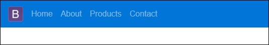
The preceding navigation bar consists of an <a> element containing the site logo, with a class name of .navbar-brand. It also contains a <ul> element, whose class name is set to .nav navbar-nav. Each <li> child element's class name is set to .nav-item. The full HTML markup required to create the navigation bar is listed here:
<nav class="navbar navbar-full navbar-dark bg-primary">
    <a class="navbar-brand" href="#">
        <img src="~/img/bootstraplogo.png" alt="Logo"/>
    </a>
    <ul class="nav navbar-nav">
        <li class="nav-item active">
            <a class="nav-link" asp-controller="Home"
             asp-action="Index">Home</a>
        </li>
        <li class="nav-item">
            <a class="nav-link" href="#">About</a>
        </li>
        <li class="nav-item">
            <a class="nav-link" href="#">Products</a>
        </li>
        <li class="nav-item">
            <a class="nav-link" href="#">Contact</a>
        </li>
    </ul>
</nav>
Bootstrap uses the Collapse library to allow navigation bars to be responsive on smaller devices. You may have noticed a hamburger menu that hides the menu item that is normally visible when visiting most modern websites from your mobile device:

In order to achieve the desired menu illustrated in the previous screenshot, you'll need to change the navbar markup to the following:
<nav class="navbar navbar-full navbar-dark bg-primary">
    <button class="navbar-toggler hidden-sm-up" type="button" data-toggle="collapse" data-target="#navCollapse">
        ☰
    </button>
    <div class="collapse navbar-toggleable-xs" id="navCollapse">
        <a class="navbar-brand" href="#">
            <img src="~/img/bootstraplogo.png" alt="Logo" />
        </a>
        <ul class="nav navbar-nav">
            <li class="nav-item active">
                <a class="nav-link" asp-controller="Home"
                 asp-action="Index">Home</a>
            </li>
            <li class="nav-item">
                <a class="nav-link" href="#">About</a>
            </li>
            <li class="nav-item">
                <a class="nav-link" href="#">Products</a>
            </li>
            <li class="nav-item">
                <a class="nav-link" href="#">Contact</a>
            </li>
        </ul>
    </div>
</nav>
As highlighted in the preceding code, and in order to show a button that will toggle the navigation bar items when collapsed, a <button> element was added with a class name of .navbar-toggler hidden-sm-up.
Note that the icon displayed on the button is a Font Awesome icon, and will only work if you've added Font Awesome to your project as explained in Chapter 1, Getting started with ASP.NET Core and Bootstrap 4.
The rest of the menu items are wrapped inside a <div> element with a class name of .collapse navbar-toggleable-xs.
By combining the .navbar-toggler and .navbar-toggleable-* class names you can specify on which device sizes the content is meant to be shown.
Tip
Rest assured that the Bootstrap team is actively working on improving and enhancing all of Bootstrap, and most of the problems should be sorted out as soon as the final version of Bootstrap 4 is released. You can see a list of open issues for Bootstrap 4 on GitHub https://github.com/twbs/bootstrap/issues/.
In many instances, you would like to display additional child menus under the main menu items. For example, in the following screenshot, we display a list of product categories as child menus of the Product menu:

The preceding navigation bar is created with the same markup as the first nav bar, but the Products menu item's class name is changed to .nav item dropdown and the <a> element inside the <li> element receives a class name of . nav-link dropdown-toggle. The HTML markup for the Products menu item is as follows:
<li class="nav-item dropdown">
    <a class="nav-link dropdown-toggle" data-toggle="dropdown"  href="#" role="button"
       aria-haspopup="true" aria-expanded="false">
        Products
    </a>
    <div class="dropdown-menu" aria-labelledby="Products">
        <a class="dropdown-item" href="#">Beverages</a>
        <a class="dropdown-item" href="#">Condiments</a>
        <a class="dropdown-item" href="#">Seafood</a>
    </div>
</li>
Bootstrap 4 allows you to theme the navbar with a simple combination of the .navbar-* and .bg-* class names of the <nav> element. For example, in the following screenshot, we created two navigation bars, one with a blue and the other with a red background:

The preceding navbar colors are achieved by adding .bg-primary or .bg-danger to the navbar <nav> element.
<nav class="navbar navbar-dark bg-primary">
<nav class="navbar navbar-light bg-danger">
You can also apply a custom color to a navbar by setting the background-color CSS attribute. For example, the following screenshot was achieved by using the following HTML markup:
<nav class="navbar navbar-light bg-inverse" style="background-color: #8361B7;">

Bootstrap provide four basic color styles that you can use to style the navbar:
bg-success - Greenbg-warning - Orangebg-info - Light Bluebg-danger - Red