
Chapter 9: Backend Views
In all previous chapters, you have seen the server and database side of Odoo. In this chapter, you will see the UI side of Odoo. You will learn how to create different types of views. Aside from the views, this chapter also covers other components, such as action buttons, menu, and widgets, which will help you make your application more user-friendly. After completing this chapter, you will be able to design the UI of an Odoo backend. Note that this chapter does not cover the website part of Odoo; we have a separate chapter for that.
In this chapter, we will cover the following recipes:
- Adding a menu item and window actions
- Having an action open a specific view
- Adding content and widgets to a form view
- Adding buttons to forms
- Passing parameters to forms and actions – context
- Defining filters on record lists – domain
- Defining list views
- Defining search views
- Adding a search filter side panel
- Changing existing views – view inheritance
- Defining document-style forms
- Dynamic form elements using attrs
- Defining embedded views
- Displaying attachments on the side of the form view
- Defining kanban views
- Showing kanban cards in columns according to their state
- Defining calendar views
- Defining graph view and pivot view
- Defining the cohort view
- Defining the dashboard view
- Defining the gantt view
- Defining the activity view
- Defining the map view
- Show Banner on tree view
Technical requirements
Throughout this chapter, we will assume that you have a database with the base add-on installed and an empty Odoo add-on module where you can add XML code from the recipes to a data file referenced in the add-on's manifest. Refer to Chapter 3, Creating Odoo Add-On Modules, for more information on how to activate changes in your add-on.
The technical requirements for this chapter include an online Odoo platform.
All of the code used in this chapter can be downloaded from the GitHub repository at https://github.com/PacktPublishing/Odoo-14-Development-Cookbook-Fourth-Edition/tree/master/Chapter09.
Adding a menu item and window actions
The most obvious way to make a new feature available to users is by adding a menu item. When you click on a menu item, something happens. This recipe walks you through how to define that something.
We will create a top-level menu and its sub-menu, which will open a list of all customers.
This can also be done using the web user interface, through the settings menu, but we prefer to use XML data files since this is what we'll have to use when creating our add-on modules.
Getting ready
In this recipe, we will need a module with a dependency on the account module, as the account module adds new fields to the res.partner model to differentiate between customer and supplier records. So, if you are using an existing module, please add the account dependency in the manifest. Alternatively, you can grab the initial module from https://github.com/PacktPublishing/Odoo-14-Development-Cookbook-Fourth-Edition/tree/master/Chapter09/00_initial_module.
How to do it...
In an XML data file of our add-on module, perform the following steps:
- Define an action to be executed:
<act_window
id="action_all_customers"
name="All customers"
res_model="res.partner"
view_mode="tree,form"
domain="[('customer_rank', '>', 0)]"
context="{'default_customer_rank': 1}"
limit="20"/>
- Create the top-level menu, which will be as follows:
<menuitem id="menu_custom_top_level"
name="My App menu"
web_icon="my_module,static/description/icon.png"/>
- Refer to our action in the menu:
<menuitem id="menu_all_customers"
parent="menu_custom_top_level"
action="action_all_customers"
sequence="10"/>
If we now upgrade the module, we will see a top-level menu with the label My App menu that opens a sub-menu called All Customers. Clicking on that menu item will open a list of all customers.
How it works...
The first XML element, act_window, declares a window action to display a list view with all the customers. We used the most important attributes:
- name: To be used as the title for views opened by the action.
- res_model: This is the model to be used. We are using res.partner, where Odoo stores all the partners and addresses, including customers.
- view_mode: This lists the view types to make available. It is a comma-separated values file of the views type. The default value is tree, form, which makes list and form views available. If you just want to show calendar and form views, then the value of view_mode should be calendar, form. Other possible view choices are kanban, graph, pivot, calendar, cohort, and dashboard. You will learn more about these views in forthcoming recipes.
- domain: This is optional and allows you to set a filter on the records to be made available in the views. In this case, we want to limit the partners to only those who are customers. We will see all of these views in more detail in the Defining filters on record lists – Domain recipe of this chapter.
- context: This can set values made available to the opened views, affecting their behavior. In our example, on new records, we want the customer rank's default value to be 1. This will be covered in more depth in the Passing parameters to forms and actions – Context recipe of this chapter.
- limit: This sets the default amount of records that can be seen on list views. In our example, we have given a limit of 20, but if you don't give a limit value, Odoo will use the default value of 80.
Next, we create the menu item hierarchy from the top-level menu to the clickable end menu item. The most important attributes for the menuitem element are as follows:
- name: This is used as the text that the menu items display. If your menu item links to an action, you can leave this out, because the action's name will be used in that case.
- parent (parent_id if using the record element): This is the XML ID that references the parent menu item. Items with no parents are top-level menus.
- action: This is the XML ID that references the action to be called.
- sequence: This is used to order the sibling menu items.
- groups (groups_id with the record tag): This is an optional list of user groups that can access the menu item. If empty, it will be available to all users.
- web_icon: This option only works on the top-level menu. It will display an icon of your application in the Enterprise edition.
Window actions automatically determine the view to be used by looking up views for the target model with the intended type (form, tree, and so on) and picking the one with the lowest sequence number. act_window and menuitem are convenient shortcut XML tags that hide what you're actually doing. If you don't want to use the shortcut XML tags, then you can create a record of the ir.actions.act_window and ir.ui.menu models via the <record> tag. For example, if you want to load act_window with <record>, you can do so as follows:
<record id='action_all_customers' model='ir.actions.act_window'>
<field name="name">All customers</field>
<field name="res_model">res.partner</field>
<field name="view_mode">tree,form</field>
<field name="domain">[('customer_rank','>', 0)]</field>
<field name="context">{'default_customer_rank': 1}</field>
<field name="limit">20</field>
</record>
In the same way, you can create a menuitem instance through <record>.
Important information
Be aware that names used with the menuitem shortcut may not map to the field names that are used when using a record element – parent should be parent_id and groups should be groups_id.
To build the menu, the web client reads all the records from ir.ui.menu and infers their hierarchy from the parent_id field. Menus are also filtered based on user permissions to models and groups assigned to menus and actions. When a user clicks on a menu item, its action is executed.
There's more...
Window actions also support a target attribute to specify how the view is to be presented. The possible choices are as follows:
- current: This is the default and opens the view in the web client main content area.
- new: This opens the view in a popup.
- inline: Like current but opens a form in edit mode and disables the Action menu.
- fullscreen: The action will cover the whole browser window, so this will overlay the menus too. Sometimes, this is called tablet mode.
- main: Like current, but also clears out the breadcrumbs.
There are also some additional attributes available for window actions that are not supported by the act_window shortcut tag. To use them, we must use the record element with the following fields:
- res_id: If opening a form, you can have it open a specific record by setting its ID here. This can be useful for multi-step wizards, or in cases when you have to view or edit a specific record frequently.
- search_view_id: This specifies a specific search view to use for tree and graph views.
Keep in mind that the menu in the top left (or the apps icon in the Enterprise version) and the menu in the bar at the top are both made up of menu items. The only difference is that the items in the menu in the top left don't have any parent menus, while the ones on the top bar have the respective menu item from the top bar as a parent. In the left bar, the hierarchical structure is more obvious.
Also bear in mind that for design reasons, the first-level menus will open the dropdown menu if your second-level menu has child menus. In any case, Odoo will open the first menu item's action based on the sequence of child menu items.
Refer to the following to learn more about menus and views:
- The ir.actions.act_window action type is the most common action type, but a menu can refer to any type of action. Technically, it is the same if you link to a client action, a server action, or any other model defined in the ir.actions.* namespace. It just differs in what the backend makes of the action.
- If you need just a tiny bit more flexibility in the concrete action to be called, look into server actions that return a window action. If you need complete flexibility, take a look at the client actions (ir.actions.client), which allow you to have a completely custom user interface. However, only do this as a last resort as you lose a lot of Odoo's convenient helpers when using them.
See also
- For detailed explanation filters on all of the views have a look at the Defining filters on record lists – Domain recipe of this chapter.
Having an action open a specific view
Window actions automatically determine the view to be used if none is given, but sometimes we want an action to open a specific view.
We will create a basic form view for the res.partner model, and then we will create a new window action specifically open that form view.
How to do it...
- Define the partner minimal tree and form view:
<record id="view_all_customers_tree" model="ir.ui.view">
<field name="name">All customers</field>
<field name="model">res.partner</field>
<field name="arch" type="xml">
<tree>
<field name="name" />
</tree>
</field>
</record>
<record id="view_all_customers_form" model="ir.ui.view">
<field name="name">All customers</field>
<field name="model">res.partner</field>
<field name="arch" type="xml">
<form>
<group>
<field name="name" />
</group>
</form>
</field>
</record>
- Update the action from the Adding a menu item and window action recipe to use a new form view:
<record id="action_all_customers_tree" model="ir.actions.act_window.view">
<field name="act_window_id" ref="action_all_customers" />
<field name="view_id" ref="view_all_customers_tree" />
<field name="view_mode">tree</field>
<field name="sequence" eval="2"/>
</record>
<record id="action_all_customers_form" model="ir.actions.act_window.view">
<field name="act_window_id" ref="action_all_customers" />
<field name="view_id" ref="view_all_customers_form" />
<field name="view_mode">form</field>
<field name="sequence" eval="2"/>
</record>
Now, if you open your menu and click on a partner in the list, you should see the very minimal form and tree that we just defined.
How it works...
This time, we used the generic XML code for any type of record, that is, the record element with the required id and model attributes. The id attribute on the record element is an arbitrary string that must be unique for your add-on. The model attribute refers to the name of the model you want to create. Given that we want to create a view, we need to create a record of the ir.ui.view model. Within this element, you set fields as defined in the model you chose through the model attribute. For ir.ui.view, the crucial fields are model and arch. The model field contains the model you want to define a view for, while the arch field contains the definition of the view itself. We'll come to its contents in a short while.
The name field, while not strictly necessary, is helpful when debugging problems with views. So, set it to a string that tells you what this view is intended to do. This field's content is not shown to the user, so you can fill in any technical hints that you deem sensible. If you set nothing here, you'll get a default name that contains the model name and view type.
ir.actions.act_window.view
The second record we defined works in tandem with act_window, which we defined earlier in the Adding a menu item and window action recipe. We already know that by setting the view_id field there, we can select which view is used for the first view mode. However, given that we set the view_mode field to the tree, form view, view_id would have to pick a tree view, but we want to set the form view, which comes second here.
If you find yourself in a situation like this, use the ir.actions.act_window.view model, which gives you fine-grained control over which views to load for which view type. The first two fields defined here are examples of the generic way to refer to other objects; you keep the element's body empty but add an attribute called ref, which contains the XML ID of the object you want to reference. So, what happens here is we refer to our action from the previous recipe in the act_window_id field, and refer to the view we just created in the view_id field. Then, though not strictly necessary, we add a sequence number to position this view assignment relative to the other view assignments, for the same action. This is only relevant if you assign views for different view modes by creating multiple ir.actions.act_window.view records.
Important information
Once you define the ir.actions.act_window.view records, they take precedence over what you filled in the action's view_mode field. So, with the preceding records, you won't see a list at all, but only a form. You should add another ir.actions.act_window.view record that points to a list view for the res.partner model.
There's more...
As we saw in the Adding a menu item and window action recipe, we can replace act_window with <record>. If you want to use a custom view, you can follow the given syntax:
<record id='action_all_customers' model='ir.actions.act_window'>
<field name="name">All customers</field>
<field name="res_model">res.partner</field>
<field name="view_mode">tree,form</field>
<field name="domain">[('customer_rank', '>', 0)]</field>
<field name="context">{'default_customer_rank': 1,
'tree_view_ref': 'my_module.view_all_customers_tree',
'form_view_ref': 'my_module.view_all_customers_form'
}</field>
<field name="limit">20</field>
</record>
This example is just an alternative of act_window. In the code base of Odoo, you will find both types of action.
Adding content and widgets to a form view
The preceding recipe showed how to pick a specific view for an action. Now, we'll demonstrate how to make the form view more useful. In this recipe, we will use the form view that we defined earlier in the Having an action open a specific view recipe. In the form view, we will add the widgets and content.
How to do it...
- Define the basic structure of the form view:
<record id="form_all_customers" model="ir.ui.view">
<field name="name">All customers</field>
<field name="model">res.partner</field>
<field name="arch" type="xml">
<form>
<!--form content goes here -->
</form>
</field>
</record>
- To add a head bar, which is usually used for action buttons and stage pipeline, add this inside the form:
<header>
<button type="object" name="open_commercial_entity"
string="Open commercial partner"
class="btn-primary" />
</header>
- Add fields to the form, using group tags to organize them visually:
<group string="Content" name="my_content">
<field name="name" />
<field name="category_id" widget="many2many_tags" />
</group>
Now, the form should display a top bar with a button and two vertically aligned fields as shown in the following screenshot:
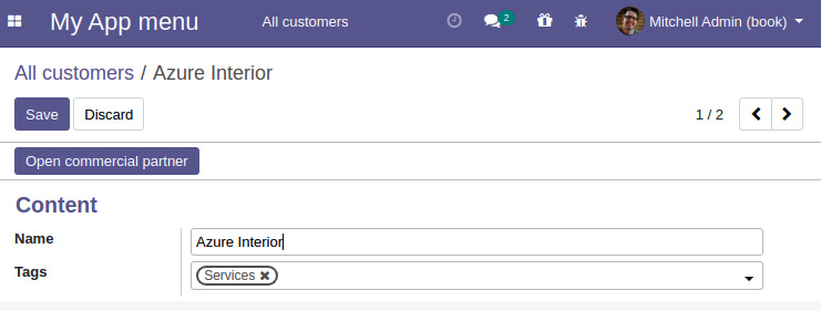
Figure 9.1 – Screenshot of the form view
How it works...
We'll look at the arch field of the ir.ui.view model first. First, note that views are defined in XML, so you need to pass the type="xml" attribute for the arch field, otherwise the parser will be confused. It is also mandatory that your view definition contains well-formed XML, otherwise you'll get in trouble when loading this snippet.
We'll now walk through the tags that we used previously and summarize the others that are available.
form
When you define a form view, it is mandatory that the first element within the arch field is a form element. This is used internally to derive the record's type field.
In addition to the following elements, you can use arbitrary HTML within the form tag. The algorithm has it that every element unknown to Odoo is considered plain HTML and is simply passed through to the browser. Be careful with that, as the HTML you fill in can interact with the HTML code the Odoo elements generates, which might distort the rendering.
header
This element is a container for elements that should be shown in a form's header, which is rendered as a white bar. Usually, as in this example, you place action buttons here. Alternatively, if your model has a state field, you could opt for a status bar.
button
The button element is used to allow the user to trigger an action. Refer to the Adding buttons to forms recipe for details.
group
The <group> element is Odoo's main element and is used for organizing content. Fields placed within a <group> element are rendered with their title, and all fields within the same group are aligned so that there's also a visual indicator that they belong together. You can also nest <group> elements; this causes Odoo to render the contained fields in adjacent columns.
In general, you should use the <group> mechanism to display all of your fields in the form view and only revert to the other elements, such as <notebook>, <label>, <newline>, and more, when necessary.
If you assign the string attribute on a group, its content will be rendered as a heading for the group.
You should develop the habit of assigning a name to every logical group of fields, too. This name is not visible to the user but is very helpful when we override views in the following recipes. Keep the name unique within the form definition to avoid confusion about which group you refer to. Don't use the string attribute for this, because the value of the string will change eventually because of translations.
field
In order to actually show and manipulate data, your form view should contain some field elements. Here is an example:
<field name="category_id" widget="many2many_tags" readonly="1"/>
These have one mandatory attribute, called name, which refers to the field's name in the model. Earlier, we offered the user the ability to edit the partner's categories. If we only want to disable the editing feature on a field, we can set the readonly attribute to 1 or True. This attribute may actually contain a small subset of Python code, so readonly="2>1" will make the field read-only too. This also applies to the invisible attribute, for which you used to have a value that is read from the database but not shown to the user. Later, we'll take a look at which situations this can be used in.
You must have noticed the widget attribute in the categories field. This defines how the data in the field is supposed to be presented to the user. Every type of field has a standard widget, so you don't have to explicitly choose a widget. However, several types provide multiple ways of representation, in which case you might opt for something other than the default. As a complete list of available widgets would exceed the scope of this recipe, consult Odoo's source code to try them out. Take a look at Chapter 14, CMS Website Development, for details on how to make your own.
notebook and page
If your model has too many fields, then you can use the <notebook> and <page> tags to create tabs. Each <page> in the <notebook> tag will create a new tab, and content inside the page will be the tab content. The following example will create two tabs with three fields in each tab:
<notebook>
<page string="Tab 1">
<field name="field1"/>
<field name="field2"/>
<field name="field3"/>
</page>
<page string="Tab 2">
<field name="field4"/>
<field name="field5"/>
<field name="field6"/>
</page>
</notebook>
The string attribute in the <page> tag will be the name of the tab. You can only use <page> tags in the <notebook> tag, but in the <page> tag, you can use any other elements.
General attributes
On most elements (this includes group, field, and button), you can set the attrs and groups attributes. Here is a small example:
<field name="category_id"
attrs="{'readpnly': [('state', '='. 'done')]}"
groups="base.group_no_one"/>
While attrs is discussed in the Dynamic form elements using attrs recipe, the groups attribute gives you the possibility to show some elements only to members of certain groups. Simply put, the group's full XML ID (separated by commas for multiple groups) is the attribute, and the element will be hidden for everyone who is not a member of at least one of the groups mentioned.
Other tags
There are situations in which you might want to deviate from the strict layout groups prescribed. For example, if you want the name field of a record to be rendered as a heading, the field's label will interfere with the appearance. In this case, don't put your field into a group element, but instead into a plain HTML h1 element. Then, before the h1 element, put a label element with the for attribute set to your field name:
<label for="name" />
<h1><field name="name" /></h1>
This will be rendered with the field's content as a big heading, but the field's name will be written in a smaller type, above the big heading. This is basically what the standard partner form does.
If you need a line break within a group, use the newline element. It's always empty:
<newline />
Another useful element is footer. When you open a form as a popup, this is a good place to put the action buttons. It will be rendered as a separate bar too, analogous to the header element.
The form view also has special widgets such as web_ribbon. You can use it with the <widget> tag as follows:
<widget name="web_ribbon" title="Archived" bg_color="bg-danger" attrs="{'invisible': [('active', '=', True)]}"/>
You can use attrs to hide and show the ribbon based on a condition. Don't worry if you are not aware of attrs. It will be covered in the Dynamic form elements using attrs recipe of this chapter.
Important tip
Don't address XML nodes with their string attribute (or any other translated attribute, for that matter), as your view overrides will break for other languages because views are translated before inheritance is applied.
There's more...
Since form views are basically HTML with some extensions, Odoo also makes extensive use of CSS classes. Two very useful ones are oe_read_only and oe_edit_only. Elements with these classes will be visible only in read-only mode or edit mode respectively. For example, to have the label visible only in edit mode, use the following:
<label for="name" class="oe_edit_only" />
Another very useful class is oe_inline, which you can use on fields to make them render as an inline element, to avoid causing unwanted line breaks. Use this class when you embed a field into text or other markup tags.
Furthermore, the form element can have the create, edit, and delete attributes. If you set one of these to false, the corresponding action won't be available for this form. Without this being explicitly set, the availability of the action is inferred from the user's permissions. Note that this is purely for straightening up the UI; don't use this for security.
See also
The widgets and views already offer a lot of functionality, but sooner or later, you will have requirements that cannot be fulfilled with the exiting widgets and views. Refer to the following recipes to create your own views and widgets:
- Refer to the Adding buttons to forms recipe in this chapter for more details about using the button element to trigger an action.
- To define your own widgets, refer to the Creating custom widgets recipe of Chapter 15, Web Client Development.
- Refer to the Creating a new view recipe of Chapter 15, Web Client Development, to create your own view.
Adding buttons to forms
Buttons are used on form view to handle user actions. We added a button in the form view in the previous recipe, but there are quite a few different types of buttons that we can use. This recipe will add another button that will help the user to open another view. It will also put the following code in the recipe's header element.
How to do it...
Add a button that refers to an action:
<button type="action"
name="%(base.action_partner_category_form)d"
string="Open partner categories" />
How it works...
The button's type attribute determines the semantics of the other fields, so we'll first take a look at the possible values:
- action: This makes the button call an action as defined in the ir.actions.* namespace. The name attribute needs to contain the action's database ID, which you can conveniently have Odoo look up with a Python-format string that contains the XML ID of the action in question.
- object: This calls a method of the current model. The name attribute contains the function's name.
- string: The string attribute is used to assign the text the user sees.
There's more...
Use the btn-primary CSS classes to render a button that is highlighted and btn-default to render a normal button. This is commonly used for cancel buttons in wizards or to offer secondary actions in a visually unobtrusive way. Setting the oe_link class causes the button to look like a link. You can also use other bootstrap button classes to get different button colors.
A call with a button of the object type can return a dictionary that describes an action, which will then be executed on the client side. This way, you can implement multiscreen wizards or just open another record.
Note
Note that clicking on a button always causes the client to issue a write or create call before running the method.
You can also have content within the button tag by replacing the string attribute. This is commonly used in button boxes, as described in the Document style forms recipe.
Passing parameters to forms and actions – context
Internally, every method in Odoo has access to a dictionary, called context, that is propagated from every action to the methods involved in delivering that action. The UI also has access to it, and it can be modified in various ways by setting values in the context. In this recipe, we'll explore some of the applications of this mechanism by toying with the language, default values, and implicit filters.
Getting ready
While not strictly necessary, this recipe will be more fun if you install the French language, if you haven't got this already. Consult Chapter 11, Internationalization, for how to do it. If you have a French database, change fr_FR to some other language; en_US will do for English. Also, click on the Active button (changing to Archive when you hover over it) for one of your customers in order to archive it and verify that this partner doesn't show up anymore in the list.
How to do it...
- Create a new action, very similar to the one from the Adding a menu item and window action recipe:
<act_window id="action_all_customers_fr"
name="Tous les clients"
res_model="res.partner"
domain="[('customer_rank', '<', 1)]"
context="{'lang': 'fr_FR', 'default_lang': 'fr_FR',
'active_test': False, 'default_customer_rank': 1}" />
- Add a menu that calls this action. This is left as an exercise for the reader.
When you open this menu, the views will show up in French, and if you create a new partner, they will have French as their pre-selected language. A less obvious difference is that you will also see the deactivated (archived) partner records.
How it works...
The context dictionary is populated from several sources. First, some values from the current user's record (lang and tz, for the user's language and the user's time zone) are read. Then, we have some add-ons that add keys for their own purposes. Furthermore, the UI adds keys about which model and which record we're busy with at the moment (active_id, active_ids, active_model). Also, as seen in the Having an action open a specific view recipe, we can add our own keys in actions. These are merged together and passed to the underlying server functions, and also to the client-side UI.
So, by setting the lang context key, we force the display language to be French. You will note that this doesn't change the whole UI language, which is because only the list view that we open lies within the scope of this context. The rest of the UI was loaded already with another context that contained the user's original language. However, if you open a record in this list view, it will be presented in French too, and if you open a linked record on the form or press a button that executes an action, the language will be propagated too.
By setting default_lang, we set a default value for every record created within the scope of this context. The general pattern is default_$fieldname: my_default_value, which enables you to set default values for newly created partners, in this case. Given that our menu is about customers, we have added default_customer_rank: 1 as the value for the Customer rank field by default. However, this is a model-wide default for res.partner, so this wouldn't have changed anything. For scalar fields, the syntax for this is as you would write it in Python code: string fields go in quotes, number fields stay as they are, and Boolean fields are either True or False. For relational fields, the syntax is slightly more complicated; refer to Chapter 6, Managing Module Data, to learn how to write them.
Note
Note that the default values set in the context override the default values set in the model definition, so you can have different default values in different situations.
The last key is active_test, which has very special semantics. For every model that has a field called active, Odoo automatically filters out records where this field is False. This is why the partner where you unchecked this field disappeared from the list. By setting this key, we can suppress this behavior.
Important information
This is useful for the UI in its own right but even more useful in your Python code when you need to ensure that an operation is applied to all the records, not just the active ones.
There's more...
When defining a context, you have access to some variables, the most important one being uid, which evaluates to the current user's ID. You'll need this to set default filters (refer to the next recipe, Defining filters on record lists – domain). Furthermore, you have access to the context_today function and the current_date variable, where the first is a date object that represents the current date, as seen from the user's time zone, and the latter is the current date as seen in UTC, formatted as YYYY-MM-DD. To set a default value for a date field to the current date, use current_date, and, for default filters, use context_today().
Furthermore, you can do some date calculations with a subset of Python's datetime, time, and relativedelta classes.
Important tips
Most of the domains are evaluated on the client side. The server-side domain evaluation is restricted for security reasons. When client-side evaluation was introduced, the best option in order to not break the whole system was to implement a part of Python in JavaScript. There is a small JavaScript Python interpreter built into Odoo that works well for simple expressions, and that is usually enough.
Beware of the use of the context variable in the <act_window /> shortcut. These are evaluated at installation time, which is nearly never what you want. If you need variables in your context, use the <record /> syntax.
We can also add different contexts for the buttons. It works the same way as how we added context keys in our action. This causes the function or action that the button calls to be run in the context given.
Most form element attributes that are evaluated as Python also have access to the context dictionary. The invisible and readonly attributes are examples of these. So, in cases where you want an element to show up in a form sometimes, but not at other times, set the invisible attribute to context.get('my_key'). For actions that lead to a case in which the field is supposed to be invisible, set the context key to my_key: True. This strategy enables you to adapt your form without having to rewrite it for different occasions.
You can also set a context on relational fields, which influences how the field is loaded. By setting the form_view_ref or tree_view_ref keys to the full XML ID of a view, you can select a specific view for this field. This is necessary when you have multiple views of the same type for the same object. Without this key, you get the view with the lowest sequence number, which might not always be desirable.
See also
- The context is also used to set a default search filter. You can learn more about the default search filter in the Defining search views recipe of this chapter.
- For more details on setting default recipe refer to the next recipe, Defining filters on record lists – domain.
- To learn how to install the French language, consult Chapter 11, Internationalization.
- You can refer to learn how to write the syntax for relational fields in Chapter 6, Managing Module Data.
Defining filters on record lists – domain
We've already seen an example of a domain in the first recipe of this chapter, which was [('customer_rank', '>', 0)]. Often, you need to display a subset of all available records from an action or allow only a subset of possible records to be the target of a many2one relation. The way to describe these filters in Odoo is by using domains. This recipe illustrates how to use a domain to display a selection of partners.
How to do it...
To display a subset of partners from your action, you need to perform the following steps:
- Add an action for non-French speaking customers:
<record id="action_my_customers" model="ir.actions.act_window">
<field name="name">
All my customers who don't speak French
</field>
<field name="res_model">res.partner</field>
<field name="domain">
[('type', '=', 'contact'), ('user_id', '=', uid), ('lang', '!=', 'fr_FR')]
</field>
</record>
- Add an action for customers who are customers or suppliers:
<record id="action_no_email_or_phone" model="ir.actions.act_window">
<field name="name">Customers with no email or phone</field>
<field name="res_model">res.partner</field>
<field name="domain">
['|', ('phone', '=', False), ('email', '=', False)]
</field>
</record>
- Add menus that call these actions. This is left as an exercise for the reader.
How it works...
The simplest form of domain is a list of three tuples that contain a field name of the model in question as string in the first element, an operator as string in the second element, and the value that the field is to be checked against as the third element. This is what we did before, and this is interpreted as, "All those conditions have to apply to the records we're interested in." This is actually a shortcut, because the domains know the two prefix operators – & and | – where & is the default. So, in normalized form, the first domain will be written as follows:
['&', '&', ('type', '=', 'contact'), ('user_id', '=', uid), ('lang', '!=', 'fr_FR')]
While they can be a bit hard to read for bigger expressions, the advantage of prefix operators is that their scope is rigidly defined, which saves you from having to worry about operator precedence and brackets. It's always two expressions: the first & applies to '&', ('type', '=', 'contact'), with ('user_id', '=', uid) as the first operand and ('lang', '!=', 'fr_FR') as the second. Then, the second & applies to ('customer', '=', True) as the first operand and ('user_id', '=', uid) as the second.
In the second step, we have to write out the full form because we need the | operator.
For example, say we have a complex domain such as this: ['|', ('user_id', '=', uid), '&', ('lang', '!=', 'fr_FR'), '|', ('phone', '=', False), ('email', '=', False)]. See the following figure to learn about how this domain is evaluated:

Figure 9.2 – The evaluation of a domain
There is also a ! operator for negation, but, given logical equivalences and negated comparison operators such as != and not in, it is not really necessary.
Note
Note that this is a unary prefix operator, so it only applies to the following expression in the domain and not to everything that follows.
Note that the right operand doesn't need to be a fixed value when you write a domain for a window action or other client-side domains. You can use the same minimal Python as in the Passing parameters to forms and actions – context recipe, so you can write filters such as changed last week or my partners.
There's more...
The preceding domains work only on fields of the model itself, while we often need to filter based on properties of linked records. To do this, you can use the notation that's also used in @api.depends definitions or related fields: create a dotted path from the current model to the model you want to filter for. To search partners that have a salesperson who is a member of a group starting with the letter G, you would use the [('user_id.groups_id.name', '=like', 'G%')] domain. The path can be long, so you only have to be sure that there are relation fields between the current model and the model you want to filter for.
Operators
The following table lists the available operators and their semantics:

Table 9.1
Note that some of the operators work only with certain fields and values. For example, the domain [('category_id', 'in', 1)] is invalid and will generate an error, while the domain [('category_id', 'in', [1])] is valid.
Pitfalls of searching using domains
This all works fine for traditional fields, but a notorious problem is searching for the value of a non-stored function field. People often omit the search function. This is simple enough to fix by providing the search function in your own code, as described in Chapter 4, Application Models.
Another issue that might baffle developers is Odoo's behavior when searching through one2many or many2many fields with a negative operator. Imagine that you have a partner with the A tag and you search for [('category_id.name', '!=', 'B')]. Your partner shows up in the result and this is what you expected, but if you add the B tag to this partner, it still shows up in your results, because for the search algorithm, it is enough that there is one linked record (A in this case) that does not fulfill the criterion. Now, if you remove the A tag so that B is the only tag, the partner will be filtered out. If you also remove the B tag so that the partner has no tags, it is still filtered out, because conditions on the linked records presuppose the existence of this record. In other situations, though, this is the behavior you want, so it is not really an option to change the standard behavior. If you need a different behavior here, provide a search function that interprets the negation the way you need.
Important information
People often forget that they are writing XML files when it comes to domains. You need to escape the less-than operator. Searching for records that have been created before the current day will have to be written as [('create_date', '<', current_date)] in XML.
Domains are used widely in Odoo. You will find them everywhere in Odoo; they are used for searching, filtering, security rules, search views, user actions, and more.
If you ever need to manipulate a domain you didn't create programmatically, use the utility functions provided in odoo.osv.expression. The is_leaf, normalize_domain, AND, and OR functions will allow you to combine domains exactly the way that Odoo does. Don't do this yourself, because there are many corner cases that you have to take into account, and it is likely that you'll overlook one.
See also
- For the standard application of domains, see the Search views recipe.
Defining list views
After having spent quite some time on the form view, we'll now take a quick look at how to define list views. Internally, these are called tree views in some places and list views in others, but given that there is another construction within the Odoo view framework called tree, we'll stick to list here.
How to do it...
- Define your list view:
<record id="tree_all_contacts" model="ir.ui.view">
<field name="model">res.partner</field>
<field name="arch" type="xml">
<tree
decoration-bf="customer_rank > 0"
decoration-danger="supplier_rank > 0"
decoration-warning="customer_rank > 0
and supplier_rank > 0">
<field name="name" />
<field name="user_id" widget="many2one_avatar_user"/>
<field name="state_id" optional="hide" />
<field name="country_id" optional="show" />
<field name="customer_rank" invisible="1" />
<field name="supplier_rank" invisible="1" />
</tree>
</field>
</record>
- Register a tree view in the action we created in the Adding a menu item and window action recipe of this chapter:
<record id='action_all_contacts' model='ir.actions.act_window'>
<field name="name">All Contacts</field>
<field name="res_model">res.partner</field>
<field name="view_mode">tree,form</field>
<field name="context">
{'tree_view_ref': 'my_module.tree_all_contacts'}
</field>
<field name="limit">20</field>
</record>
- Add menus that call these actions. This is left as an exercise for the reader.
Install/Upgrade the module. After that, you will see our tree view for the customers. And if you check it, it will show different row styles based on our conditions.
How it works...
You already know most of what happens here. We define a view, of the tree type this time, and attach it to our action with an ir.actions.act_window.view element. So, the only thing left to discuss is the tree element and its semantics. With a list, you don't have many design choices, so the only valid children of this element are the field and button elements. You can also use some widgets in list view; in our example, we have used the many2one_avatar_user widget. The tree view has the support of a special widget called handle. This is specific to list views. It is meant for integer fields and renders a drag handle that the user can use to drag a row to a different position in the list, thereby updating the field's value. This is useful for sequence or priority fields.
By using the optional attribute, you can show fields optionally. Adding the optional attribute to a field will allow the user to hide and show the column at any time from the UI. In our example, we have used it for the country and state fields.
What is new here are the decoration attributes in the tree element. This contains rules as to which font and/or color is chosen for the row, given in the form of decoration-$name="Python code". All matches turn into the corresponding CSS class, so the previous view renders partners that are both suppliers and customers in brown, customers only in bold, and suppliers only in red. In your Python code, you can only use the fields you named in the view definition, which is why we have to pull the customer and supplier fields too. We made these invisible because we only need the data and don't want to bother our users with the two extra columns. The possible classes are decoration-bf (bold), decoration-it (italic), and the semantic bootstrap classes, decoration-danger, decoration-info, decoration-muted, decoration-primary, decoration-success, and decoration-warning.
There's more...
For numeric fields, you can add a sum attribute that causes this column to be summed up with the text you set in the attribute as a tooltip. Less common are the avg, min, and max attributes, which display the average, minimum, and maximum, respectively. Note that these four only work on the records that are currently visible, so you might want to adjust the action's limit (covered earlier in the Adding a menu item and window action recipe) in order for the user to see all the records immediately.
A very interesting attribute for the tree element is editable. If you set this to top or bottom, the list behaves entirely differently. Without it, clicking on a row opens a form view for the row. With it, clicking on a row makes it editable inline, with the visible fields rendered as form fields. This is particularly useful in embedded list views, which are discussed later in the Defining embedded views recipe of this chapter. The choice of top or bottom relates to whether new lines will be added to the top or bottom of the list.
By default, records are ordered according to the _order property of the displayed model. The user can change the ordering by clicking on a column header, but you can also set a different initial order by setting the default_order property in the tree element. The syntax is the same as in _order.
Important tip
Ordering is often a source of frustration for new developers. As Odoo lets PostgreSQL do the work here, you can only order by fields that PostgreSQL knows about, and only the fields that live in the same database table. So, if you want to order by a function or a related field, ensure that you set store=True. If you need to order by a field inherited from another model, declare a stored related field.
The create, edit, and delete attributes of the tree element work the same as for the form element we described earlier in the Adding content and widgets to a form view recipe of this chapter. They also determine the available controls if the editable attribute is set.
Defining search views
When opening your list view, you'll notice the search field to the upper right. If you type something there, you get suggestions about what to search for, and there is also a set of predefined filters to choose from. This recipe will walk you through how to define these suggestions and options.
How to do it...
- Define your search view:
<record id="search_all_customers" model="ir.ui.view">
<field name="model">res.partner</field>
<field name="arch" type="xml">
<search>
<field name="name" />
<field name="category_id"
filter_domain="[('category_id', 'child_of', self)]" />
<field name="bank_ids" widget="many2one" />
<filter name="suppliers" string="Suppliers"
domain="[('supplier_rank', '>', 0)]" />
<group expand="0" string="Group By">
<filter string="Country" name="country"
context="{'group_by':'country_id'}"/>
</group>
</search>
</field>
</record>
- Tell your action to use it:
<record id="action_all_customers" model="ir.actions.act_window">
<field name="name">All customers</field>
<field name="res_model">res.partner</field>
<field name="view_mode">tree,form</field>
<field name="search_view_id" ref="search_all_customers" />
</record>
When you type something into the search bar now, you'll be offered the ability to search for this term in the name, categories, and bank account fields. If your term happens to be a substring of a bank account number in your system, you'll even be offered to search exactly for this bank account.
How it works...
In the case of name, we simply listed the field as the one to be offered to the user to search for. We left the semantics at the default, which is a substring search for character fields.
For categories, we do something more interesting. By default, your search term is applied to a many2many field trigger, name_search, which would be a substring search in the category names in this case. However, depending on your category structure, it can be very convenient to search for partners who have the category you're interested in or a child of it. Think of a main category, Newsletter subscribers, with the subcategories Weekly newsletter, Monthly newsletter, and a couple of other newsletter types. Searching for newsletter subscribers with the preceding search view definition will give you everyone who is subscribed to any of those newsletters in one go, which is a lot more convenient than searching for every single type and combining the results.
The filter_domain attribute can contain an arbitrary domain, so you're restricted neither to searching for the same field you named in the name attribute nor to using only one term. The self variable is what the user filled in, and also the only variable that you can use here.
Here's a more elaborate example from the default search view for partners:
<field name="name"
filter_domain="[
'|', '|',
('display_name', 'ilike', self),
('ref', '=', self),
('email', 'ilike', self)]"/>
This means that the user doesn't have to think about what to search for. All they need to do is type in some letters, press Enter, and, with a bit of luck, one of the fields mentioned contains the string we're looking for.
For the bank_ids field, we used another trick. The type of field not only decides the default way of searching for the user's input, but it also defines the way in which Odoo presents the suggestions. Also, given that many2one fields are the only ones that offer auto-completion, we force Odoo to do that, even though bank_ids is a one2many field, by setting the widget attribute. Without this, we will have to search in this field, without completion suggestions. The same applies to many2many fields.
Note
Note that every field with a many2one widget set will trigger a search on its model for every one of the user's keystrokes; don't use too many of them.
You should also put the most-used fields on the top, because the first field is what is searched if the user just types something and presses Enter. The search bar can also be used with the keyboard; select a suggestion by pressing the down arrow and open the completion suggestion of a many2one by pressing the right arrow. If you educate your users in this and pay attention to the sensible ordering of fields in the search view, this will be much more efficient than typing something first, grabbing the mouse, and selecting an option.
The filter element creates a button that adds the content of the filter's domain attribute to the search domain. You should add a logical internal name and a string attribute to describe the filter to your users.
The <group> tag is used to provide a grouping option under the Group by button. In this recipe, we have added an option to group records based on the country_id field.
There's more...
You can group filters with the group tag, which causes them to be rendered slightly closer together than the other filters, but this has semantic implications, too. If you put multiple filters in the same group and activate more than one of them, their domains will be combined with the | operator, while filters and fields not in the same group are combined with the & operator. Sometimes, you might want disjunction for your filters, which is where they filter for mutually exclusive sets, in which case selecting both of them will always lead to an empty result set. Within the same group, you can achieve the same effect with the separator element.
Note
Note that if the user fills in multiple queries for the same field, they will be combined with | too, so you don't need to worry about that.
Apart from the field attribute, the filter element can have a context attribute, whose content will be merged with the current context and eventually other context attributes in the search view. This is essential for views that support grouping (refer to the Defining kanban view and Defining graph view recipes), because the resulting context determines the field(s) to be grouped with the group_by key. We'll look into the details of grouping in the appropriate recipes, but the context has other uses, too. For example, you can write a function field that returns different values depending on the context, and then you can change the values by activating a filter.
The search view itself also responds to context keys. In a very similar way to default values when creating records, you can pass default values for a search view through the context. If we had set a context of {'search_default_suppliers': 1} in our previous action, the suppliers filter would have been preselected in the search view. This works only if the filter has a name, though, which is why you should always set it. To set defaults for fields in the search view, use search_default_$fieldname.
Furthermore, the field and filter elements can have a groups property with the same semantics as in the form views in order to make the element only visible to certain groups.
See also
- For further details about manipulating the context, see the Passing parameters to forms and actions – context recipe.
- Users who speak languages with heavy use of diacritical marks will probably want to have Odoo search for e, è, é, and ê when filling in the e character. This is a configuration of the PostgreSQL server, called unaccent, which Odoo has special support for, but is outside the scope of this book. Refer to https://www.postgresql.org/docs/10/unaccent.html for more information about unaccent.
Adding a search filter side panel
Odoo provides one more way to display search filters, which is a search filter side panel. This panel shows a list of filters on the side of the view. A search panel is very useful when search filters are used frequently by the end user.
Getting ready
The search panel is part of the search view. So, for this recipe, we will continue using the my_module add-on from the previous recipe. We will add our search panel to the previously designed search view.
How to do it...
Add <searchpanel> in the search view, as shown here:
<record id="search_all_customers" model="ir.ui.view">
<field name="model">res.partner</field>
<field name="arch" type="xml">
<search>
<field name="name" />
<field name="category_id"
filter_domain="[('category_id', 'child_of', self)]" />
<field name="bank_ids" widget="many2one" />
<filter name="suppliers"
string="Suppliers"
domain="[('supplier_rank', '>', 0)]" />
<group expand="0" string="Group By">
<filter string="Country" name="country"
context="{'group_by':'country_id'}"/>
</group>
<!-- Search Panel code -->
<searchpanel>
<field name="user_id" icon="fa fa-users"/>
<field name="category_id" icon="fa fa-list"
select="multi"/>
</searchpanel>
</search>
</field>
</record>
Update the module to apply the modification. After the update, you will see the search panel on the left side of the view.
How it works...
To add the search panel, you will need to use the <searchpanel> tag in the search view. To add your filter, you will need to add a field in the search panel.
In our example, first we added a user_id field. You also need to add an icon attribute to the field. This icon will be displayed before the title of the filter. Once you add the field in the search panel, it will display the title with an icon, and below that, a list of all the users. Upon clicking on a user, the records in the list view will be filtered and you will only see the contacts for the selected user. In this filter, only one item can be active, meaning once you click on another user's filter, the previous user's filter will be removed. If you want to activate multi-user filters, you can use the select="multi" attribute. If you use that attribute, you will find the checkbox for each filter option, and you will be able to activate multiple filters at a time. We have used the select="multi" attribute on the category_id filter. This will allow us to select and filter by multiple categories at once.
Note
Be careful when you are using the side panel filter on many2one or many2many. If the relation model has too many records, only the top 200 records will be displayed, to avoid performance issues.
There's more...
If you want to display search panel items in groups, you can use the groupby attribute on a field. For example, if you want to group a category based on its parent hierarchy, you can add the groupby attribute with the parent_id field, as here:
<field name="category_id"
icon="fa fa-list"
select="multi"
groupby="parent_id"/>
This will show the category filters grouping by the parent category of the record.
Changing existing views – view inheritance
So far, we have ignored the existing views and declared completely new ones. While this is didactically sensible, you'll rarely be in situations where you'll want to define a new view for an existing model. Instead, you'll want to slightly modify the existing views, be it to simply have them show a field you added to the model in your add-on, or to customize them according to your needs or your customers' needs.
In this recipe, we'll change the default partner form to show the record's last modification date and make the mobile field searchable by modifying the search view. Then, we'll change the position of one column in the partners' list view.
How to do it...
- Inject the field into the default form view:
<record id="view_partner_form" model="ir.ui.view">
<field name="model">res.partner</field>
<field name="inherit_id" ref="base.view_partner_form" />
<field name="arch" type="xml">
<field name="website" position="after">
<field name="write_date" />
</field>
</field>
</record>
- Add the field to the default search view:
<record id="view_res_partner_filter" model="ir.ui.view">
<field name="model">res.partner</field>
<field name="inherit_id" ref="base.view_res_partner_filter" />
<field name="arch" type="xml">
<xpath expr="." position="inside">
<field name="mobile" />
</xpath>
</field>
</record>
- Add the field to the default list view:
<record id="view_partner_tree" model="ir.ui.view">
<field name="model">res.partner</field>
<field name="inherit_id" ref="base.view_partner_tree" />
<field name="arch" type="xml">
<field name="email" position="after">
<field name="phone" position="move"/>
</field>
</field>
</record>
After updating your module, you should see the Last updated on field beneath the website field on the partner form. When you type something into the search box, it should suggest that you search for the partners on the mobile field, and in the partner's list view, you will see that the order of the phone number and email has changed.
How it works...
In step 1, we added a basic structure for the form inheritance. The crucial field here is, as you've probably guessed, inherit_id. You need to pass it the XML ID of the view you want to modify (inherit from). The arch field contains instructions on how to modify the existing XML nodes within the view you're inheriting from. You should actually think of the whole process as simple XML processing, because all the semantic parts only come a lot later.
The most canonical instruction within the arch field of an inherited view is the field element, which has the required attributes, name and position. As you can have every field only once on a form, the name already uniquely identifies a field. With the position attribute, we can place whatever we put within the field element, either before, inside, or after the field we named. The default is inside, but for readability, you should always name the position you require. Remember that we're not talking semantics here; this is about the position in the XML tree relative to the field we have named. How this will be rendered afterward is a completely different matter.
Step 2 demonstrates a different approach. The xpath element selects the first element that matches the XPath expression named in the expr attribute. Here, the position attribute tells the processor where to put the contents of the xpath element.
Note
If you want to create an XPath expression based on a CSS class, Odoo provides a special function called hasclass. For example, if you want to select a <div> element with the test_class CSS class, then the expression will be expr="//div[hasclass('test_class')]".
Step 3 shows how you can change the position of an element. This option was introduced in version 12 and it is rarely used. In our example, we moved the phone field to come after the email field with the position=move option.
XPath might look somewhat scary but it is a very efficient means of selecting the node you need to work on. Take the time to look through some simple expressions; it's worth it. You'll likely stumble upon the term context node, to which some expressions are relative. In Odoo's view inheritance system, this is always the root element of the view you're inheriting from.
For all the other elements found in the arch field of an inheriting view, the processor looks for the first element with the same node name and matching attributes (with the attribute position excluded, as this is part of the instruction). Use this only in cases where it is very unlikely that this combination is not unique, such as a group element combined with a name attribute.
Important tip
Note that you can have as many instruction elements within the arch field as you need. We only used one per inherited view because there's nothing else we want to change currently.
There's more...
The position attribute has two other possible values: replace and attributes. Using replace causes the selected element to be replaced with the content of the instruction element. Consequently, if you don't have any content, the selected element can simply be removed. The preceding list or form view would cause the email field to be removed:
<field name="email" position="replace" />
Warning
Removing fields can cause other inheriting views to break and several other undesirable side effects, so avoid that if possible. If you really need to remove fields, do so in a view that comes late in the order of evaluation (refer to the next section, Order of evaluation in view inheritance, for more information).
attributes has very different semantics from the preceding examples. The processor expects the element to contain the attribute elements with a name attribute. These elements will then be used to set attributes on the selected element. If you want to heed the earlier warning, you should set the invisible attribute to 1 for the email field:
<field name="email" position="attributes">
<attribute name="invisible">1</attribute>
</field>
An attribute node can have add and remove attributes, which in turn should contain the value to be removed from or added to the space-separated list. This is very useful for the class attribute, where you'd add a class (instead of overwriting the whole attribute) by using the following:
<field name="email" position="attributes">
<attribute name="class" add="oe_inline" separator=" "/>
</field>
This code adds the oe_inline class to the email field. If the field already has a class attribute present, Odoo will join the value with the value of the separator attribute.
Order of evaluation in view inheritance
As we have only one parent view and one inheriting view currently, we don't run into any problems with conflicting view overrides. When you have installed a couple of modules, you'll find a lot of overrides for the partner form. This is fine as long as they change different things in a view, but there are occasions where it is important to understand how overriding works in order to avoid conflicts.
Direct descendants of a view are evaluated in ascending order of their priority field, so views with a lower priority are applied first. Every step of inheritance is applied to the result of the first, so if a view with priority 3 changes a field and another one with priority 5 removes it, this is fine. This does not work, however, if the priorities are reversed.
You can also inherit from a view that is an inheriting view itself. In this case, the second-level inheriting view is applied to the result of the view it inherits from. So, if you have four views, A, B, C, and D, where A is a standalone form, B and C inherit from A, and D inherits from B, the order of evaluation is A, B, D, C. Use this to enforce an order without having to rely on priorities; this is safer in general. If an inheriting view adds a field and you need to apply changes to this field, inherit from the inheriting view and not from the standalone one.
Important information
This kind of inheritance always works on the complete XML tree from the original view, with modifications from the previous inheriting views applied.
The following points provide information on some advanced tricks that are used to tweak the behavior of view inheritance:
- For inheriting views, a very useful and not very well-known field is groups_id. This field causes the inheritance to take place only if the user requesting the parent view is a member of one of the groups mentioned there. This can save you a lot of work when adapting the user interface for different levels of access, because with inheritance, you can have more complex operations than just showing or not showing the elements based on group membership, as is possible with the groups attribute on form elements.
- You can, for example, remove elements if the user is a member of a group (which is the inverse of what the groups attribute does). You can also carry out some elaborate tricks, such as adding attributes based on group membership. Think about simple things such as making a field read-only for certain groups, or more interesting concepts such as using different widgets for different groups.
- What was described in this recipe has the mode field of the original view set to primary, while the inheriting views have the mode extension, which is the default. We will investigate the case that the mode of an inheriting view is set to primary later, where the rules are slightly different.
Defining document-style forms
In this recipe, we'll review some design guidelines in order to present a uniform user experience.
How to do it...
- Start your form with a header element:
<header>
<button type="object" name="open_commercial_entity"
string="Open commercial partner"
class="btn-primary" />
</header>
- Add a sheet element for content:
<sheet>
- Put in the stat button, which will be used to show total invoiced amount and redirect to invoices:
<div class="oe_button_box" name="button_box">
<button type="object" class="oe_stat_button"
icon="fa-pencil-square-o"
name="action_view_partner_invoices">
<div class="o_form_field o_stat_info">
<span class="o_stat_value">
<field name="total_invoiced"/>
</span>
<span class="o_stat_text">Invoiced</span>
</div>
</button>
</div>
- Add some prominent field(s):
<div class="oe_left oe_title">
<label for="name" />
<h1>
<field name="name" />
</h1>
</div>
- Add your content; you can use a notebook if there are a lot of fields:
<group>
<field name="category_id" widget="many2many_tags" />
<field name="email"/>
<field name="mobile"/>
</group>
- After the sheet, add the chatter widget (if applicable):
</sheet>
<div class="oe_chatter">
<field name="message_follower_ids" widget="mail_followers"/>
<field name="activity_ids" widget="mail_activity"/>
<field name="message_ids" widget="mail_thread"/>
</div>
Let's have a look at how this recipe works.
How it works...
The header should contain buttons that execute actions on the object that the user currently sees. Use the btn-primary class to make buttons visually stand out (in purple at the time of writing), which is a good way to guide the user regarding which is the most logical action to execute at the moment. Try to have all the highlighted buttons to the left of the non-highlighted buttons and hide the buttons that are not relevant in the current state (if applicable). If the model has a state, show it in the header using the statusbar widget. This will be rendered as right-aligned in the header.
The sheet element is rendered as a stylized sheet, and the most important fields should be the first thing the user sees when looking at it. Use the oe_title and oe_left classes to have them rendered in a prominent place (floating left with slightly adjusted font sizes at the time of writing).
If there are other records of interest concerning the record the user currently sees (such as the partner's invoices on a partner form), put them in an element with the oe_right and oe_button_box classes; this aligns the buttons in it to the right. On the buttons themselves, use the oe_stat_button class to enforce a uniform rendering of the buttons. It's also customary to assign an icon class from the Font Awesome icons for the icon attribute. You can learn more about Font Awesome at https://fontawesome.com/v4.7.0/icons/.
You can use the oe_chatter class and Chatter widgets to get the default chatter at the bottom of the form view. For this, you need to use the mail.thread mixin. We will see this in detail in Chapter 23, Managing Emails in Odoo.
Important information
Even if you do not like this layout, stick to the element and class names described here, and adjust what you need with CSS and possibly JavaScript. This will make the user interface more compatible with existing add-ons and allow you to integrate better with core add-ons.
See also
- To find out more about Font Awesome, go to https://fontawesome.com/v4.7.0/icons/.
- For more details on the mail.thread mixin, refer to Chapter 23, Managing Emails in Odoo.
Dynamic form elements using attrs
So far, we have only looked into changing forms depending on the user's groups (the groups attribute on elements and the groups_id field on inherited views) and nothing more. This recipe will show you how to modify the form view based on the value of the fields in it.
How to do it...
- Define an attribute called attrs on a form element:
<field name="parent_id"
attrs="{
'invisible': [('is_company', '=', True)],
'required': [('is_company', '=', False)]
}" />
- Ensure that all the fields you refer to are available in your form:
<field name="is_company"/>
This will make the parent_id field invisible if the partner is a company and required if it's not a company.
How it works...
The attrs attribute contains a dictionary with invisible, required, and readonly keys (all of which are optional). The values are domains that may refer to the fields that exist on the form (and really only those, so there are no dotted paths), and the whole dictionary is evaluated according to the rules for client-side Python, as described earlier in the Passing parameters to forms and actions – context recipe of this chapter. So, for example, you can access the context in the right-hand operand.
There's more...
While this mechanism is quite straightforward for scalar fields, it's less obvious how to handle the one2many and many2many fields. In fact, in standard Odoo, you can't do much with those fields within an attrs attribute. However, if you only need to check whether such a field is empty, use [[6, False, []]] as your right-hand operand.
Defining embedded views
When you show a one2many or a many2many field on a form, you don't have much control over how it is rendered if you haven't used one of the specialized widgets. Also, in the case of the many2one fields, it is sometimes desirable to be able to influence the way the linked record is opened. In this recipe, we'll look at how to define private views for those fields.
How to do it...
- Define your field as usual, but don't close the tag:
<field name="child_ids">
- Write the view definition(s) into the tag:
<tree>
<field name="name" />
<field name="email" />
<field name="phone" />
</tree>
<form>
<group>
<field name="name" />
<field name="function" />
</group>
</form>
- Close the tag:
</field>
How it works...
When Odoo loads a form view, it first checks whether the relational type fields have embedded views in the field, as outlined previously. Those embedded views can have the exact same elements as the views we defined before. Only if Odoo doesn't find an embedded view of some type does it use the model's default view of this type.
There's more...
While embedded views might seem like a great feature, they complicate view inheritance a lot. For example, as soon as embedded views are involved, field names are not guaranteed to be unique, and you'll usually have to use some elaborate XPaths to select elements within an embedded view.
So, in general, you should better define standalone views and use the form_view_ref and tree_view_ref keys, as described earlier in the Having an action open a specific view recipe of this chapter.
Displaying attachments on the side of the form view
In some applications, such as invoicing, you need to fill in data based on a document. To ease the data-filling process, a new feature was added to Odoo version 12 to display the document on the side of the form view.
In this recipe, we will learn how to display the form view and the document side by side:
Figure 9.3 – Cascading attachments and the form view
Important information
This feature is only meant for large displays (>1534px), so if you have a small viewport, this feature will be hidden.Internally, this feature uses some responsive utilities, so this feature only works in the Enterprise edition. However, you can still use this code in your module. Odoo will automatically handle this, so if the module is installed in the Enterprise edition, it will show the document, while in the Community edition, it will hide everything without any side effects.
How to do it...
We will enable this feature to modify a form view for the res.partner model, as follows:
<record id="view_all_customers_form" model="ir.ui.view">
<field name="name">All customers</field>
<field name="model">res.partner</field>
<field name="arch" type="xml">
<form>
<sheet>
<group>
<field name="name" />
<field name="email"/>
</group>
</sheet>
<div class="o_attachment_preview"
options="{types: ['image', 'pdf'], 'order': 'desc'}" />
<div class="oe_chatter">
<field name="message_follower_ids" widget="mail_followers"/>
<field name="activity_ids" widget="mail_activity"/>
<field name="message_ids" widget="mail_thread"/>
</div>
</form>
</field>
</record>
Update the module to apply the changes. You need to upload a PDF or image via the record chatter. When you upload it, Odoo will display the attachment on the side.
How it works...
This feature only works if your model has inherited the mail.thread model. To show the document on the side of any form view, you will need to add an empty <div> with the o_attachment_preview class before the chatter elements. That's it – the documents attached in the chatter will be displayed on the side of the form view.
By default, pdf and image documents will be displayed in ascending order by date. You can change this behavior by providing extra options, which include the following:
- type: You need to pass the list of document types you want to allow. Only two values are possible: pdf and image. For example, if you want to display only pdf type images, you can pass {'type': ['pdf']}.
- order: Possible values are asc and desc. These allow you to show documents in ascending order or descending order of the document creation date.
There's more...
In most cases, you want to display documents on the side of the initial state of any record. If you want to hide the attachment preview based on domain, you can use attrs on the <div> tag to hide the preview.
Take a look at the following example: it will hide the PDF preview if the value of the state field is not draft:
<div class="o_attachment_preview"
attrs="{'invisible': [('state', '!=', 'draft')]/>
This is how you can hide attachments when they are not needed. Usually, this feature is used to fill data from PDFs and is only activated in draft mode.
Defining kanban views
So far, we have presented you with a list of records that can be opened to show a form. While those lists are efficient when presenting a lot of information, they tend to be slightly boring, given the lack of design possibilities. In this recipe, we'll take a look at kanban views, which allow us to present lists of records in a more appealing way.
How to do it...
- Define a view of the kanban type:
<record id="view_all_customers_kanban" model="ir.ui.view">
<field name="model">res.partner</field>
<field name="arch" type="xml">
<kanban>
- List the fields you'll use in your view:
<field name="name" />
<field name="supplier_rank" />
<field name="customer_rank" />
- Implement a design:
<templates>
<t t-name="kanban-box">
<div class="oe_kanban_card">
<a type="open">
<field name="name" />
</a>
<t t-if="record.supplier_rank.raw_value or
record.customer_rank.raw_value">
is
<t t-if="record.customer_rank.raw_value">
a customer
</t>
<t t-if="record.customer_rank.raw_value and
record.supplier_rank.raw_value">
and
</t>
<t t-if="record.supplier_rank.raw_value">
a supplier
</t>
</t>
</div>
</t>
</templates>
- Close all the tags:
</kanban>
</field>
</record>
- Add this view to one of your actions. This is left as an exercise for the reader. You will find a full working example in the GitHub example files: https://github.com/PacktPublishing/Odoo-13-Development-Cookbook-Fourth-Edition/tree/master/Chapter09/15_kanban_view/my_module.
How it works...
We need to give a list of fields to load in step 2 in order to be able to access them later. The content of the templates element must be a single t element with the t-name attribute set to kanban-box.
What you write inside this element will be repeated for each record, with special semantics for t elements and t-* attributes. For details about that, refer to the Using client-side QWeb templates recipe from Chapter 15, Web Client Development, because technically kanban views are just an application of QWeb templates.
There are a few modifications that are particular to kanban views. You have access to the read_only_mode, record, and widget variables during evaluation. Fields can be accessed using record.fieldname, which is an object with the value and raw_value properties, where value is the field's value that has been formatted in a way that is presentable to the user, and raw_value is the field's value as it comes from the database.
Important information
many2many fields make an exception here. You'll only get an ID list through the record variable. For a user-readable representation, you must use the field element.
Note the type attribute of the link at the top of the template. This attribute makes Odoo generate a link that opens the record in view mode (open) or edit mode (edit), or it deletes the record (delete). The type attribute can also be object or action, which will render links that call a function of the model or an action. In both cases, you need to supplement the attributes for buttons in form views, as outlined in the Adding buttons to forms recipe of this chapter. Instead of the a element, you can also use the button element; the type attribute has the same semantics there.
There's more...
There are a few more helper functions worth mentioning. If you need to generate a pseudo-random color for an element, use the kanban_color(some_variable) function, which will return a CSS class that sets the background and color properties. This is usually used in the t-att-class elements.
If you want to display an image stored in a binary field, use kanban_image(modelname, fieldname, record.id.raw_value), which returns a data URI if you included the field in your fields list and the field is set, a placeholder if the field is not set, or a URL that makes Odoo stream the field's contents if you didn't include the field in your fields list. Do not include the field in the fields list if you need to display a lot of records simultaneously or you expect very big images. Usually, you'd use this in a t-att-src attribute of an img element.
Important tip
Doing design in kanban views can be a bit trying. What often works better is generating HTML using a function field of the HTML type and generating this HTML from a QWeb view. This way, you're still doing QWeb, but on the server side, which is a lot more convenient when you need to work on a lot of data.
See also
- To know more about template elements, refer to the Using client-side QWeb templates recipe from Chapter 15, Web Client Development.
Showing kanban cards in columns according to their state
This recipe shows you how to set up a kanban view where the user can drag and drop a record from one column to the other, thereby pushing the record in question into another state.
Getting ready
From now on, we'll make use of the project module here, as this defines models that lend themselves better to date- and state-based views than those defined in the base module. So, before proceeding, add project to the dependencies list of your add-on.
How to do it...
- Define a kanban view for the tasks:
<record id="kanban_tasks" model="ir.ui.view">
<field name="name">project.task.kanban</field>
<field name="model">project.task</field>
<field name="sequence">20</field>
<field name="arch" type="xml">
<kanban default_group_by="stage_id">
<field name="stage_id" />
<field name="name" />
<templates>
<t t-name="kanban-box">
<div class="oe_kanban_card oe_kanban_global_click">
<field name="name" />
</div>
</t>
</templates>
</kanban>
</field>
</record>
- Add a menu and an action using this view. This is left as an exercise for the reader.
How it works...
Kanban views support grouping, which allows you to display records that have a group field in common in the same column. This is commonly used for a state or stage_id field, because it allows the user to change this field's value for a record by simply dragging it into another column. Set the default_group_by attribute on the kanban element to the name of the field you want to group by in order to make use of this functionality.
To control the behavior of kanban grouping, there are a few options available in Odoo:
- group_create: This option is used to hide or show the Add a new column option in grouped kanban. The default value is true.
- group_delete: This option enables or disables the Column delete option in the kanban group context menu. The default value is true.
- group_edit: This option enables or disables the Column edit option in the kanban group context menu. The default value is true.
- archivable: This option enables or disables the option to archive and restore the records from the kanban group context menu. This only works if the active Boolean field is present in your model.
- quick_create: With this option, you can create records directly from the kanban view.
- quick_create_view: By default, the quick_create option displays only the name field in kanban. But with the quick_create_view option, you can give the reference of the minimal form view to display it in kanban.
- on_create: If you don't want to use quick_create when creating a new record and you don't want to redirect the user to the form view either, you can give the reference of the wizard so it will open the wizard on a click of the Create button.
There's more...
If not defined in the dedicated attribute, any search filter can add grouping by setting a context key named group_by to the field name(s) to group by.
Defining calendar views
This recipe walks you through how to display and edit information about dates and duration in your records in a visual way.
How to do it...
Follow these steps to add a calendar view for the project.task model:
- Define a calendar view:
<record id="view_project_task_calendar" model="ir.ui.view">
<field name="model">project.task</field>
<field name="arch" type="xml">
<calendar date_start="date_assign" date_stop="date_end" color="project_id">
<field name="name" />
<field name="user_id" />
</calendar>
</field>
</record>
- Add menus and actions using this view. This is left as an exercise for the reader.
How it works...
The calendar view needs to be passed the field names in the date_start and date_stop attributes to indicate which fields to look at when building the visual representation. Only use fields with the Datetime or Date type; other types of fields will not work and will instead generate an error. While date_start is required, you can leave out date_stop and set the date_delay attribute instead, which is expected to be a Float field that represents the duration in hours.
The calendar view allows you to give records that have the same value in a field the same (arbitrarily assigned) color. To use this functionality, set the color attribute to the name of the field you need. In our example, we can see at a glance which tasks belong to the same project, because we assigned project_id as the field to determine the color groups.
The fields you name in the calendar element's body are shown within the block that represents the time interval covered, separated by commas.
There's more...
The calendar view has some other helpful attributes. If you want to open calendar entries in a popup instead of the standard form view, set event_open_popup to 1. By default, you create a new entry by just filling in some text, which internally calls the model's name_create function to actually create the record. If you want to disable this behavior, set quick_add to 0.
If your model covers a whole day, set all_day to a field's name that is true if the record covers the whole day, and false otherwise.
Defining graph view and pivot view
In this recipe, we'll take a look at Odoo's business intelligence views. These are read-only views that are meant to present data.
Getting ready
We're still making use of the project module here. You can configure a graph and pivot views to get different statistics. For our example, we will focus on the assigned user. We will generate a graph and pivot view to see the users of the tasks per user. By the way, the end user can generate statistics of their choice by modifying the view options.
How to do it...
- Define a graph view using bars:
<record id="view_project_tasks_graph" model="ir.ui.view">
<field name="model">project.task</field>
<field name="arch" type="xml">
<graph type="bar">
<field name="user_id"/>
<field name="stage_id"/>
</graph>
</field>
</record>
- Define a pivot view:
<record id="view_project_tasks_pivot" model="ir.ui.view">
<field name="model">project.task</field>
<field name="arch" type="xml">
<pivot>
<field name="user_id" type="row"/>
<field name="project_id" type="col"/>
<field name="stage_id" type="col"/>
</pivot>
</field>
</record>
- Add menus and actions using this view. This is left as an exercise for the reader.
If everything went well, you should see graphs that show how many tasks are assigned to which user and the state of those tasks.
How it works...
The graph view is declared with a root element, graph. The type attribute on a graph element determines the initial mode of a graph view. The possible values are bar, line, and chart, but bar is the default. The graph view is highly interactive, so the user can switch between the different modes and also add and remove fields. If you use type="bar", you can also use stacked="1" to show a stacked bar chart during grouping.
The field elements tell Odoo what to display on which axis. For all graph modes, you need at least one field with the row type and one with the measure type to see anything useful. Fields of the row type determine the grouping, while those of the measure type stand for the value(s) to be shown. Line graphs only support one field of each type, while charts and bars handle two group fields with one measure nicely.
Pivot views have their own root element, pivot. The pivot view supports an arbitrary amount of group and measure fields. Nothing will break if you switch to a mode that doesn't support the number of groups and measures you defined; some fields will just be ignored and the result might not be as interesting as it could be.
There's more...
For all graph types, Datetime fields are tricky to group, because you'll rarely encounter the same field value here. So, if you have a Datetime field of the row type, also specify the interval attribute with one of the following values: day, week, month, quarter, or year. This will cause the grouping to take place in the given interval.
Important information
Grouping, like sorting, relies heavily on PostgreSQL. So, here also, the rule applies that a field must live in the database and in the current table in order to be usable.
It is a common practice to define database views that collect all the data you need and define a model on top of this view in order to have all the necessary fields available.
Depending on the complexity of your view and the grouping, building the graph can be quite an expensive exercise. Consider setting the auto_search attribute to False in these cases, so that the user can first adjust all the parameters and only then trigger a search.
The pivot table also supports grouping in columns. Use the col type for the fields you want to have there.
Defining the cohort view
For the cohort analysis of records, the new cohort view was added in Odoo version 12. The cohort view is used to find out the life cycle of a record over a particular time span. With the cohort view, you can see the churn and retention rate of any object for a particular time.
Getting ready
The cohort view is part of the Odoo Enterprise edition, so you cannot use it with only the Community edition. If you are using the Enterprise edition, you need to add web_cohort in the manifest file of your module. For our example, we will create a view to see the cohort analysis for tasks.
How to do it...
Follow these steps to add the cohort view for the project.task model:
- Define a cohort view:
<record id="view_project_tasks_graph" model="ir.ui.view">
<field name="name">project task cohort</field>
<field name="model">project.task</field>
<field name="arch" type="xml">
<cohort date_start="date_start"
date_stop="date_deadline"
interval="month"
string="Task Cohort" />
</field>
</record>
- Add menus and actions using this view. This is left as an exercise for the reader.
How it works...
To create a cohort view, you need to provide date_start and date_stop. These will be used in the view to determine the time span of any record. For example, if you are managing the subscription of a service, the start date of the subscription will be date_start and the date when the subscription is going to expire will be date_stop.
By default, the cohort view will be displayed in retention mode by intervals of a month. You can use the given options to get different behaviors in the cohort view:
- mode: You can use cohort with two modes, retention (default) or churn. retention mode starts with 100% and decreases with time, while churn mode starts at 0% and increases with time.
- timeline: This option accepts two values: forward (default) or backward. In most cases, you need to use the forward timeline. But if date_start is in the future, you will need to use the backward timeline. An example of when we would use the backward timeline would be for the registration of an event attendee where the event date is in the future and the registration date is in the past.
- interval: By default, the cohort is grouped by month, but you can change this in the interval options. Other than months, cohort also supports day, week, and year intervals.
- measure: Just like graph and pivot, measure is used to display the aggregated value of a given field. If no option is given, cohort will display the count of records.
Defining the dashboard view
A new view called dashboard was introduced with Odoo version 12. This is used to display multiple views and the various business KPIs in a single screen.
Getting ready
The dashboard view is part of the Odoo Enterprise edition, so you can't use it with Community edition. If you are using the Enterprise edition, you need to add the dependency of the web_dashboard in the manifest file of your module.
In our example, we will display a few KPIs and a few existing views. We will display the graph and the pivot view in the same screen, so follow the Defining graph views recipe, if you haven't created the pivot and graph views. We will use the ID of these views in the dashboard view.
How to do it...
- Define a dashboard view:
<record id="view_project_tasks_dashboard" model="ir.ui.view">
<field name="name">project task dashbaord</field>
<field name="model">project.task</field>
<field name="arch" type="xml">
<dashboard>
<view ref="my_project.view_project_tasks_graph"
type="graph" />
<group>
<aggregate name="all_task"
string="Total Tasks"
group_operator="count"
field="id" measure="__count__"/>
<aggregate name="progress_task"
string="In Progress Tasks"
domain="[('stage_id.name', 'ilike', 'In Progress')]"
group_operator="count"
field="id" measure="__count__"/>
<aggregate name="done_task"
string="Completed Tasks"
domain="[('stage_id.name', 'ilike', 'Done')]"
group_operator="count" field="id"
measure="__count__"/>
<formula name="price_average"
string="Overall Progress"
value="record.done_task / record.all_task"
widget="percentage"/>
</group>
<view ref="my_project.view_project_tasks_pivot"
type="pivot"/>
</dashboard>
</field>
</record>
- Add menus and actions using this view. This is left as an exercise for the reader.
How it works...
With the dashboard view, you can display KPIs with aggregate and formula. You can display multiple views on the same screen. If you look at the definition of the view, you will see that we have added two views: graph at the beginning and pivot at the end. To display the views, you just need to use the <view> tag with the XML reference and the type of view.
We have displayed various KPIs, including the total tasks, the tasks in progress, and the completed tasks, with the <aggregate> tag. This tag will display the aggregated result for the records of the current domain in the search view. In the <aggregate> tag, you can use the optional domain attribute to display aggregates for a particular set of records. By default, the aggregate function displays the count of records, but you can provide a SQL aggregate function using a group_operator attribute, such as avg or max.
Sometimes, it is not possible to display the KPI with <aggregate>; it needs some extra computation. With the help of <formula>, you can define the formula for any KPI. In our example, we have displayed the progress of all tasks and we have used the optional widget attribute to display the value as a percentage.
There's more....
Another useful element is the <widget> tag. With this, you can display data with the UI of your choice. In Chapter15, Web Client Development, we will look at how to create a custom widget.
Defining the gantt view
Odoo version 13 added a new gantt view with new options. The gantt view is useful for seeing overall progress and scheduling business processes. In this recipe, we will create a new gantt view and look at its options.
Getting ready
The gantt view is part of the Odoo Enterprise edition, so you can't use it with the Community edition. If you are using the Enterprise edition, you need to add the web_gantt dependency in the manifest file of your module.
In our example, we will continue using the my_project module from the previous recipe. We will create a new gantt view for the tasks of the project.
How to do it...
- Define a gantt view for the task model as follows:
<record id="view_project_tasks_gantt" model="ir.ui.view">
<field name="name">project task gantt</field>
<field name="model">project.task</field>
<field name="arch" type="xml">
<gantt date_start="date_assign" date_stop="date_end"
string="Tasks" default_group_by="project_id"
color="project_id" progress="sequence">
<field name="name"/>
<field name="stage_id"/>
</gantt>
</field>
</record>
- Add menus and actions using this view. This is left as an exercise for the reader.
Install and update the module to apply the changes; after the update, you will see the gantt view on the project tasks.
How it works...
With the gantt view, you can display an overall schedule on one screen. In our example, we have created a gannt view for tasks grouped by project. Typically, you need two attributes to create a gantt view, start_date and stop_date, but there are some other attributes that extend the functionality of the gantt view. Let's see all the options:
- start_date: Defines the starting time of the gantt item. It must be a date or date-time field.
- stop_date: Defines the starting time of the gantt item. It must be a date or date-time field.
- default_group_by: Use this attribute if you want to group the gantt items based on field.
- color: This attribute is used to decide the color of a gantt item.
- progress: This attribute is used to indicate the progress of a gantt item.
- decoration-* : Decoration attributes are used to decide the color of a gantt item based on conditions. It can be used like this: decoration-danger="state == 'lost'". Its other values are decoration-success, decoration-info, decoration-warning, and decoration-secondary.
- scales: Use the scales attribute if you want to enable the gantt view only for few scales. For example, if you only want day and week scales, you can use scales="day,week".
- By default, gantt view items are resizable and draggable, but if you want to disable that, you can use the edit="0" attribute.
There's more...
When you hover over a gantt view item, you will see the name and date for the item. If you want to customize that popup, you can define a QWeb template in the gantt view definition like this:
<gantt date_start="date_assign" date_stop="date_end" string="Tasks">
<field name="name"/>
<field name="stage_id"/>
<templates>
<div t-name="gantt-popover">
<ul class="pl-1 mb-0 list-unstyled">
<li>
<strong>Name: </strong> <t t-esc="name"/>
</li>
<li>
<strong>Stage: </strong> <t t-esc="stage_id[1]"/>
</li>
</ul>
</div>
</templates>
</gantt>
Note that you will need to add the fields that you want to use in the template via the <field> tag.
Defining the activity view
Activities are an important part of Odoo apps. They are used to schedule to-do actions for different business objects. The activity view helps you to see the statuses and schedules of all activities on the model.
Getting ready
In our example, we will continue using the my_project module from the previous recipe. We will create a new activity view for the tasks of the project.
How to do it...
- Define a gantt view for the task model as follow:
<record id="view_project_tasks_activity" model="ir.ui.view">
<field name="name">project task activity</field>
<field name="model">project.task</field>
<field name="arch" type="xml">
<activity string="Tasks">
<templates>
<div t-name="activity-box">
<div>
<field name="name" display="full"/>
<field name="project_id"
muted="1" display="full"/>
</div>
</div>
</templates>
</activity>
</field>
</record>
- Add menus and actions using this view. This is left as an exercise for the reader.
How it works...
The activity view is simplistic; most of the things are managed automatically. You just have the option to customize the first column. To display your data in the first column, you need to crate QWeb template with the name activity-box and that's it. Odoo will manage the rest.
The activity view will display your template in the first column and other columns will show the scheduled activities grouped by activity type.
Defining the map view
Odoo version 13 adds a new view called a map view. As its name suggests, it is used to show a map with a marker. They are very useful for on-site services.
Getting ready
In our example, we will continue using the my_project module from the previous recipe. We will create the new map view on for the customer of the task.The map view is part of the Odoo Enterprise edition, so you can't use it with the Community edition. If you are using the Enterprise edition, you need to add the web_map dependency in the manifest file of your module.
Odoo uses the API from https://www.mapbox.com/ to display maps in the view. In order to see the map in Odoo, you will need to generate the access token from the mapbox. Make sure you have generated an access token and set it in the Odoo configuration.
How to do it…
- Define a map view for the task model as follows:
<record id="view_project_tasks_map" model="ir.ui.view">
<field name="name">project task map</field>
<field name="model">project.task</field>
<field name="arch" type="xml">
<map res_partner="partner_id">
<marker-popup>
<field name="name" string="Title "/>
<field name="partner_id" string="Customer "/>
</marker-popup>
</map>
</field>
</record>
- Add menus and actions using this view. This is left as an exercise for the reader.
How it works...
Creating a map view is pretty simple: you just need a many2one field that refers to the res.partner model. The res.partner model has address fields, which are used by the map view to display the marker for the address. You will need to use the res_partner attribute to map the address for the map view. In our case, we have used the partner_id field as the customer record is set in the partner_id field.
Additionally, you can customize the fields that are displayed on the marker popup when the user clicks on the marker. To display data in a marker popup, you will need to use the <marker-popup> tag and place the fields inside it.