
Chapter 15: Web Client Development
Odoo's web client, or backend, is where employees spend most of their time. In Chapter 9, Backend Views, you saw how to use the existing possibilities that backends offer. Here, we'll take a look at how to extend and customize those possibilities. The web module contains everything related to the user interface in Odoo.
All of the code in this chapter will depend on the web module. As you know, Odoo has two different editions (Enterprise and Community). Community uses the web module for user interfaces, while the Enterprise version uses an extended version of the Community web module, which is the web_enterprise module.
The Enterprise version provides some extra features compared with the Community web, including mobile compatibility, searchable menus, and material design. We'll work on the Community Edition here. Don't worry—the modules developed in Community work perfectly in the Enterprise Edition because, internally, web_enterprise depends on the Community web module and just adds some features to it.
Important information
Odoo 14 is a bit unique for the backend web client compared to other Odoo versions. It contains two different frameworks to maintain the GUI of the Odoo backend. The first one is the widget-based legacy framework, and the second one is the component-based modern framework called the Odoo Web Library (OWL). OWL is the new UI framework introduced in Odoo v14. Both use QWeb templates for structure, but there are significant changes in the syntax and the way those frameworks work.
Although Odoo 14 has a new framework OWL, Odoo does not use this new framework everywhere. Most of the web client is still written with the old widget-based framework. In this chapter, we will see how to customize the web client using a widget-based framework. In the next chapter, we will look at the OWL framework.
In this chapter, you will learn how to create new field widgets to get input from users. We will also be creating a new view from scratch. After reading this chapter, you will be able to create your own UI elements in the Odoo backend.
Note
Odoo's user interface heavily depends on JavaScript. Throughout this chapter, we will assume you have a basic knowledge of JavaScript, jQuery, Underscore.js, and SCSS.
In this chapter, we will cover the following recipes:
- Creating custom widgets
- Using client-side QWeb templates
- Making RPC calls to the server
- Creating a new view
- Debugging your client-side code
- Improving onboarding with tours
- Mobile app JavaScript
Technical requirements
The technical requirements for this chapter include the online Odoo platform.
All the code used in this chapter can be downloaded from the GitHub repository at https://github.com/PacktPublishing/Odoo-14-Development-Cookbook-Fourth-Edition/tree/master/Chapter15.
Creating custom widgets
As you saw in Chapter 9, Backend Views, we can use widgets to display certain data in different formats. For example, we used widget='image' to display a binary field as an image. To demonstrate how to create your own widget, we'll write one widget that lets the user choose an integer field, but we will display it differently. Instead of an input box, we will display a color picker so that we can select a color number. Here, each number will be mapped to its related color.
Getting ready
For this recipe, we will be using the my_library module with basic fields and views. You will find the basic my_library module in the Chapter15/00_initial_module directory in the GitHub repository.
How to do it...
We'll add a JavaScript file that contains our widget's logic, and an SCSS file to do some styling. Then, we will add one integer field to the books form to use our new widget. Perform the following steps to add a new field widget:
- Add a static/src/js/field_widget.js file. For the syntax that's used here, refer to the Extending CSS and JavaScript for the website recipe from Chapter 14, CMS Website Development:
odoo.define('my_field_widget', function (require) {
"use strict";
var AbstractField = require('web.AbstractField');
var fieldRegistry = require('web.field_registry');
- Create your widget by extending AbstractField:
var colorField = AbstractField.extend({
- Set the CSS class, root element tag, and supported field types for the widget:
className: 'o_int_colorpicker',
tagName: 'span',
supportedFieldTypes: ['integer'],
- Capture some JavaScript events:
events: {
'click .o_color_pill': 'clickPill',
},
- Override init to do some initialization:
init: function () {
this.totalColors = 10;
this._super.apply(this, arguments);
},
- Override _renderEdit and _renderReadonly to set up the DOM elements:
_renderEdit: function () {
this.$el.empty();
for (var i = 0; i < this.totalColors; i++ ) {
var className = "o_color_pill o_color_" + i;
if (this.value === i ) {
className += ' active';
}
this.$el.append($('<span>', {
'class': className,
'data-val': i,
}));
}
},
_renderReadonly: function () {
var className = "o_color_pill active readonly o_color_" + this.value;
this.$el.append($('<span>', {
'class': className,
}));
},
- Define the handlers we referred to earlier:
clickPill: function (ev) {
var $target = $(ev.currentTarget);
var data = $target.data();
this._setValue(data.val.toString());
}
}); // closing AbstractField
- Don't forget to register your widget:
fieldRegistry.add('int_color', colorField);
- Make it available for other add-ons:
return {
colorField: colorField,
};
}); // closing 'my_field_widget' namespace
- Add some SCSS in static/src/scss/field_widget.scss:
.o_int_colorpicker {
.o_color_pill {
display: inline-block;
height: 25px;
width: 25px;
margin: 4px;
border-radius: 25px;
position: relative;
@for $size from 1 through length($o-colors) {
&.o_color_#{$size - 1} {
background-color: nth($o-colors, $size);
&:not(.readonly):hover {
transform: scale(1.2);
transition: 0.3s;
cursor: pointer;
}
&.active:after{
content: "f00c";
display: inline-block;
font: normal 14px/1 FontAwesome;
font-size: inherit;
color: #fff;
position: absolute;
padding: 4px;
font-size: 16px;
}
}
}
}
}
- Register both files in the backend assets in views/templates.xml:
<?xml version="1.0" encoding="UTF-8"?>
<odoo>
<template id="assets_end" inherit_id="web.assets_backend">
<xpath expr="." position="inside">
<script src="/my_library /static/src/js/field_widget.js"
type="text/javascript" />
<link href="/my_library/static/src/scss/field_widget.scss"
rel="stylesheet" type="text/scss" />
</xpath>
</template>
</odoo>
- Finally, add the color integer field to the library.book model:
color = fields.Integer()
- Add the color field to the book's form view, and then add widget="int_color":
...
<group>
<field name="date_release"/>
<field name="color" widget="int_color"/>
</group>
...
Update the module to apply the changes. After the update, open the book's form view and you will see the color picker, as shown in the following screenshot:

Figure 15.1 – How the custom widget is displayed
How it works...
So that you can understand our example, let's go over the life cycle of the widget by looking at its components:
- init(): This is the widget constructor. It is used for initialization purposes. When the widget is initialized, this method is called first.
- willStart(): This method is called when the widget is initialized and in the process of being appended in the DOM. It is used to initialize asynchronous data in the widget. It is also supposed to return a deferred object, which can be obtained simply from a super() call. We will use this method in the subsequent recipe.
- start(): This method is called after the widget has completed the rendering, but has not yet been added to the DOM. It is very useful for a post-rendering job and is supposed to return a deferred object. You can access a rendered element in this.$el.
- destroy(): This method is called when the widget is destroyed. It is mostly used for basic cleanup operations, such as event unbinding.
Important information
The fundamental base class for widgets is Widget (defined by web.Widget). If you want to dig further into this, you can study it at /addons/web/static/src/js/core/widget.js.
In step 1, we imported AbstractField and fieldRegistry.
In step 2, we created colorField by extending AbstractField. Through this, colorField will get all the properties and methods from AbstractField.
In step 3, we added three properties: className is used to define the class for the root element of the widget; tagName is used for the root element type; and supportedFieldTypes is used for deciding which type of fields are supported by this widget. In our case, we want to create a widget for the integer type field.
In step 4, we mapped the events of our widget. Usually, the key is a combination of the event name and the optional CSS selector. The event and CSS selector are separated by a space, and the value will be the name of the widget method. So, when the event is performed, the assigned method is called automatically. In this recipe, when a user clicks on the color pill, we want to set the integer value in the field. To manage click events, we have added a CSS selector and the method name to the events key.
In step 5, we overrode the init method and set the value of the this.totalColors attribute. We will use this variable to decide on the number of color pills. We want to display 10 color pills, so we assigned the value of 10.
In step 6, we added two methods—_renderEdit and _renderReadonly. As their names suggest, _renderEdit was called when the widget was in edit mode, and _renderReadonly was called when the widget was in read-only mode. In the edit method, we added a few <span> tags, with each representing a separate color in the widget. Upon clicking the <span> tag, we will set the value in the field. We added them to this.$el. Here, $el is the root element of the widget, and it will be added in the form view. In read-only mode, we just want to display the active color, so we added a single pill via the _renderReadonly() method. For now, we have added pills in a hardcoded way, but in the next recipe, we will use a JavaScript QWeb template to render the pills. Note that in the edit method, we used the totalColors property, which was set from the init() method.
In step 7, we added the clickPill handler method to manage pill clicks. To set the field value, we used the _setValue method. This method is added from the AbstractField class. When you set the field value, the Odoo framework will rerender the widget and call the _renderEdit method again so that you can render the widget with the updated values.
In step 8, after we've defined our new widget, it's crucial to register it with the form widget registry, which lives in web.field_registry. Note that all view types look at this registry, so if you want to create another way of displaying a field in a list view, you can also add your widget here and set the widget attribute on the field in the view definition.
Finally, we exported our widget class so that other add-ons can extend it or inherit from it. Then, we added a new integer field called color to the library.book model. We also added the same field to the form view with the widget="int_color" attribute. This will display our widget in the form instead of the default integer widget.
There's more...
The web.mixins namespace defines a couple of very helpful mixin classes that you should not miss out on when developing form widgets. You have already used these mixins in this recipe. The AbstractField is created by inheriting from the Widget class, and the Widget class inherits two mixins. The first one is EventDispatcherMixin, which offers a simple interface for attaching event handlers and triggering them. The second one is ServicesMixin, which provides functions for RPC calls and actions..
Important tip
When you want to override a method, always study the base class to see what the function is supposed to return. A very common cause of bugs is forgetting to return the super user's deferred object, which causes trouble with asynchronous operations.
Widgets are responsible for validation. Use the isValid function to implement your customization of this aspect.
Using client-side QWeb templates
Just as it's a bad habit to programmatically create HTML code in JavaScript, you should only create the minimum amount of DOM elements in your client-side JavaScript code. Fortunately, there's a templating engine available for the client side, too, and even more fortunately, the client-side templating engine has the same syntax as the server-side templates.
Getting ready
For this recipe, we will be using the my_library module from the previous recipe. We will make this more modular by moving the DOM element creation to QWeb.
How to do it...
We need to add the QWeb definition to the manifest and change the JavaScript code so that we can use it. Perform the following steps to get started:
- Import web.core and extract the qweb reference to a variable, as shown in the following code:
odoo.define('my_field_widget', function (require) {
"use strict";
var AbstractField = require('web.AbstractField');
var fieldRegistry = require('web.field_registry');
var core = require('web.core');
var qweb = core.qweb;
...
- Change the _renderEdit function to simply render the element (inherited from widget):
_renderEdit: function () {
this.$el.empty();
var pills = qweb.render('FieldColorPills', {widget: this});
this.$el.append(pills);
},
- Add the template file to static/src/xml/qweb_template.xml:
<?xml version="1.0" encoding="UTF-8"?>
<templates>
<t t-name="FieldColorPills">
<t t-foreach="widget.totalColors" t-as='pill_no'>
<span t-attf-class="o_color_pill o_color_#{pill_no} #{widget.value === pill_no and 'active' or ''}"
t-att-data-val="pill_no"/>
</t>
</t>
</templates>
- Register the QWeb file in your manifest:
"qweb": [
'static/src/xml/qweb_template.xml',
],
Now, with other add-ons, it is much easier to change the HTML code our widget uses because they can simply override it with the usual QWeb patterns.
How it works...
As there is already a comprehensive discussion on the basics of QWeb in the Creating or modifying templates – QWeb recipe from Chapter 14, CMS Website Development, we'll focus on what is different here. First of all, you need to realize that we're dealing with the JavaScript QWeb implementation, as opposed to the Python implementation on the server side. This means that you don't have access to browsing records or the environment; you only have access to the parameters you have passed from the qweb.render function.
In our case, we have passed the current object via the widget key. This means that you should have all the intelligence in the widget's JavaScript code and have your template only access properties, or possibly functions. Given that we can access all the properties that are available on the widget, we can simply check the value in the template by checking the totalColors property.
As client-side QWeb has nothing to do with QWeb views, there's a different mechanism to make those templates known to the web client—add them via the qweb key to your add-on's manifest in a list of filenames relative to the add-on's root.
Note
If you do not want to list your QWeb template in the manifest, you can use the xmlDependencies key on the snippet to lazily load the template. With xmlDependencies, the QWeb template is only loaded when the widget is being initialized.
There's more...
The reason for going to the effort of using QWeb here was extensibility, and this is the second big difference between client-side and server-side QWeb. On the client side, you can't use XPath expressions; you need to use jQuery selectors and operations. If, for example, we want to add user icons to our widget from another module, we'll use the following code to have an icon in each pill:
<t t-extend="FieldColorPills">
<t t-jquery="span" t-operation="prepend">
<i class="fa fa-user" />
</t>
</t>
If we also provided a t-name attribute here, we'd have made a copy of the original template and left that one untouched. Other possible values for the t-operation attribute are append, before, after, inner, and replace, which causes the content of the t element to either be appended to the content of the matched element via append, put before or after the matched element via before or after, the content of the matched element replaced via inner, or the complete element replaced via replace. There's also t-operation='attributes', which allows you to set an attribute on the matched element, following the same rules as server-side QWeb.
Another difference is that the names in client-side QWeb are not namespaced by the module name, so you have to choose names for your templates that are probably unique over all add-ons you install, which is why developers tend to choose rather long names.
See also
If you want to learn more about the QWeb templates, refer to the following points:
- The client-side QWeb engine has less convenient error messages and handling than other parts of Odoo. A small error often means that nothing happens, and it's hard for beginners to continue from there.
- Fortunately, there are some debug statements for client-side QWeb templates that will be described later in this chapter, in the Debugging your client-side code recipe.
Making RPC calls to the server
Sooner or later, your widget will need to look up some data from the server. In this recipe, we will add a tooltip on the color pill. When the user hovers their cursor over the color pill element, the tooltip will show the number of books related to that color. We will make an RPC call to the server to fetch a book count of the data associated with that particular color.
Getting ready
For this recipe, we will be using the my_library module from the previous recipe.
How to do it...
Perform the following steps to make an RPC call to the server and display the result in a tooltip:
- Add the willStart method and set colorGroupData in the RPC call:
willStart: function () {
var self = this;
this.colorGroupData = {};
var colorDataPromise = this._rpc({
model: this.model,
method: 'read_group',
domain: [],
fields: ['color'],
groupBy: ['color'],
}).then(function (result) {
_.each(result, function (r) {
self.colorGroupData[r.color] = r.color_count;
});
});
return Promise.all([this._super.apply(this, arguments), colorDataPromise]);
},
- Update _renderEdit and set up a bootstrap tooltip on pills:
_renderEdit: function () {
this.$el.empty();
var pills = qweb.render('FieldColorPills', {widget: this});
this.$el.append(pills);
this.$el.find('[data-toggle="tooltip"]').tooltip();
},
- Update the FieldColorPills template and add the tooltip data:
<t t-name="FieldColorPills">
<t t-foreach="widget.totalColors" t-as='pill_no'>
<span t-attf-class="o_color_pill o_color_#{pill_no} #{widget.value === pill_no and 'active' or ''}"
t-att-data-val="pill_no"
data-toggle="tooltip"
data-placement="top"
t-attf-title="This color is used in #{widget.colorGroupData[pill_no] or 0 } books."
/>
</t>
</t>
Update the module to apply the changes. After the update, you will be able to see a tooltip on the pills, as shown in the following screenshot:
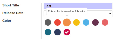
Figure 15.2 – Tooltip that uses the data obtained from RPC
How it works...
The willStart function is called before rendering and, more importantly, it returns a Promise object that must be resolved before the rendering starts. So, in a case like ours, where we need to run an asynchronous action before rendering can occur, this is the right function to do this.
When dealing with data access, we rely on the _rpc function provided by the ServicesMixin class, as we explained earlier. This function allows you to call any public function on models such as search, read, write, or, in this case, read_group.
In step 1, we made an RPC call and invoked the read_group method on the current model, which is library.book in our case. We grouped data based on the color field, so that the RPC call will return book data that was grouped by color and add an aggregate in the color_count key. We also mapped the color_count and color index in the colorGroupData so that we could use it in the QWeb template. In the last line of the function, we resolved willStart with super and our RPC call using $.when. Because of this, rendering only occurs after the values are fetched and after any asynchronous action super that was busy earlier, has finished, too.
Step 2 is nothing special. We just initialized the bootstrap tooltip.
In step 3, we used colorGroupData to set the attributes that are needed to display the tooltip. In the willStart method, we assigned a color map via this.colorGroupData, so that you can access them in the QWeb template via widget.colorGroupData. This is because we passed the widget reference; this is the qweb.render method.
Note
You can use _rpc anywhere in the widget. Note that it is an asynchronous call, and you need to manage a deferred object properly to get the desired result.
There's more...
The AbstractField class comes with a couple of interesting properties, one of which we just used. In our example, we used the this.model property, which holds the name of the current model (for example, library.book). Another property is this.field, which contains roughly the output of the model's fields_get() function for the field the widget is displaying. This will give all the information related to the current field. For example, for x2x fields, the fields_get() function gives you information about the co-model or the domain. You can also use this to query the field's string, size, or whatever other property you can set on the field during model definition.
Another helpful property is nodeOptions, which contains data passed via the options attribute in the <form> view definition. This is already JSON parsed, so you can access it like any object. For more information on such properties, dig further into the abstract_field.js file.
See also
Refer to the following documentation if you have issues managing asynchronous operations:
- Odoo's RPC returns JavaScript's native Promise object. You will get requested data once Promise is resolved. You can learn more about Promise here: https://developer.mozilla.org/en-US/docs/Web/JavaScript/Reference/Global_Objects/Promise.
Creating a new view
As you saw in Chapter 9, Backend Views, there are different kinds of views, such as form, list, and kanban. In this recipe, we will create a brand-new view. This view will display the list of authors, along with their books.
Getting ready
For this recipe, we will be using the my_library module from the previous recipe. Note that views are very complex structures, and each existing view has a different purpose and implementation. The purpose of this recipe is to make you aware of the MVC pattern view and how to create simple views. In this recipe, we will create a view called m2m_group, the purpose of which is to display records in groups. To divide records into different groups, the view will use the many2many field data. In the my_library module, we have the author_ids field. Here, we will group books based on authors and display them in cards.
In addition, we will add a new button to the control panel. With the help of this button, you will be able to add a new book record. We will also add a button to the author's card so that we can redirect users to another view.
How to do it...
Perform the following steps to add a new view called m2m_group:
- Add a new view type in ir.ui.view:
class View(models.Model):
_inherit = 'ir.ui.view'
type = fields.Selection(selection_add=[('m2m_group', 'M2m Group')])
- Add a new view mode in ir.actions.act_window.view:
class ActWindowView(models.Model):
_inherit = 'ir.actions.act_window.view'
view_mode = fields.Selection(selection_add=[('m2m_group', 'M2m group')], ondelete={'m2m_group': 'cascade'})
- Add a new method by inheriting from the base model. This method will be called from the JavaScript model (see step 4 for more details):
class Base(models.AbstractModel):
_inherit = 'base'
@api.model
def get_m2m_group_data(self, domain, m2m_field):
records = self.search(domain)
result_dict = {}
for record in records:
for m2m_record in record[m2m_field]:
if m2m_record.id not in result_dict:
result_dict[m2m_record.id] = {
'name': m2m_record.display_name,
'children': [],
'model': m2m_record._name
}
result_dict[m2m_record.id]['children'].append({
'name': record.display_name,
'id': record.id,
})
return result_dict
- Add a new file called /static/src/js/m2m_group_model.js and add the following content to it:
odoo.define('m2m_group.Model', function (require) {
'use strict';
var AbstractModel = require('web.AbstractModel');
var M2mGroupModel = AbstractModel.extend({
__get: function () {
return this.data;
},
__load: function (params) {
this.modelName = params.modelName;
this.domain = params.domain;
this.m2m_field = params.m2m_field;
return this._fetchData();
},
__reload: function (handle, params) {
if ('domain' in params) {
this.domain z= params.domain;
}
return this._fetchData();
},
_fetchData: function () {
var self = this;
return this._rpc({
model: this.modelName,
method: 'get_m2m_group_data',
kwargs: {
domain: this.domain,
m2m_field: this.m2m_field
}
}).then(function (result) {
self.data = result;
});
},
});
return M2mGroupModel;
});
- Add a new file called /static/src/js/m2m_group_controller.js and add the following content to it:
odoo.define('m2m_group.Controller', function (require) {
'use strict';
var AbstractController = require('web.AbstractController');
var core = require('web.core');
var qweb = core.qweb;
var M2mGroupController = AbstractController.extend({
custom_events: _.extend({}, AbstractController.prototype.custom_events, {
'btn_clicked': '_onBtnClicked',
}),
renderButtons: function ($node) {
if ($node) {
this.$buttons = $(qweb.render('ViewM2mGroup.buttons'));
this.$buttons.appendTo($node);
this.$buttons.on('click', 'button', this._onAddButtonClick.bind(this));
}
},
_onBtnClicked: function (ev) {
this.do_action({
type: 'ir.actions.act_window',
name: this.title,
res_model: this.modelName,
views: [[false, 'list'], [false, 'form']],
domain: ev.data.domain,
});
},
_onAddButtonClick: function (ev) {
this.do_action({
type: 'ir.actions.act_window',
name: this.title,
res_model: this.modelName,
views: [[false, 'form']],
target: 'new'
});
},
});
return M2mGroupController;
});
- Add a new file called /static/src/js/m2m_group_renderer.js and add the following content to it:
odoo.define('m2m_group.Renderer', function (require) {
'use strict';
var AbstractRenderer = require('web.AbstractRenderer');
var core = require('web.core');
var qweb = core.qweb;
var M2mGroupRenderer = AbstractRenderer.extend({
events: _.extend({}, AbstractRenderer.prototype.events, {
'click .o_primay_button': '_onClickButton',
}),
_render: function () {
var self = this;
this.$el.empty();
this.$el.append(qweb.render('ViewM2mGroup', {
'groups': this.state,
}));
return this._super.apply(this, arguments);
},
_onClickButton: function (ev) {
ev.preventDefault();
var target = $(ev.currentTarget);
var group_id = target.data('group');
var children_ids = _.map(this.state[group_id].children, function (group_id) {
return group_id.id;
});
this.trigger_up('btn_clicked', {
'domain': [['id', 'in', children_ids]]
});
}
});
return M2mGroupRenderer;
});
- Add a new file called /static/src/js/m2m_group_view.js and add the following content to it:
odoo.define('m2m_group.View', function (require) {
'use strict';
var AbstractView = require('web.AbstractView');
var view_registry = require('web.view_registry');
var M2mGroupController = require('m2m_group.Controller');
var M2mGroupModel = require('m2m_group.Model');
var M2mGroupRenderer = require('m2m_group.Renderer');
var M2mGroupView = AbstractView.extend({
display_name: 'Author',
icon: 'fa-id-card-o',
config: _.extend({}, AbstractView.prototype.config, {
Model: M2mGroupModel,
Controller: M2mGroupController,
Renderer: M2mGroupRenderer,
}),
viewType: 'm2m_group',
searchMenuTypes: ['filter', 'favorite'],
accesskey: "a",
init: function (viewInfo, params) {
this._super.apply(this, arguments);
var attrs = this.arch.attrs;
if (!attrs.m2m_field) {
throw new Error('M2m view has not defined "m2m_field" attribute.');
}
// Model Parameters
this.loadParams.m2m_field = attrs.m2m_field;
},
});
view_registry.add('m2m_group', M2mGroupView);
return M2mGroupView;
});
- Add the QWeb template for the view to the /static/src/xml/qweb_template.xml file:
<t t-name="ViewM2mGroup">
<div class="row ml16 mr16">
<div t-foreach="groups" t-as="group" class="col-3">
<t t-set="group_data" t-value="groups[group]" />
<div class="card mt16">
<img class="card-img-top" t-attf-src="/web/image/#{group_data.model}/#{group}/image_512"/>
<div class="card-body">
<h5 class="card-title mt8"><t t-esc="group_data['name']"/></h5>
</div>
<ul class="list-group list-group-flush">
<t t-foreach="group_data['children']" t-as="child">
<li class="list-group-item"><i class="fa fa-book"/> <t t-esc="child.name"/></li>
</t>
</ul>
<div class="card-body">
<a href="#" class="btn btn-sm btn-primary o_primay_button" t-att-data-group="group">View books</a>
</div>
</div>
</div>
</div>
</t>
<div t-name="ViewM2mGroup.buttons">
<button type="button" class="btn btn-primary">
Add Record
</button>
</div>
- Add all of the JavaScript files to the backend assets:
...
<script type="text/javascript" src="/my_library/static/src/js/m2m_group_view.js" />
<script type="text/javascript" src="/my_library/static/src/js/m2m_group_model.js" />
<script type="text/javascript" src="/my_library/static/src/js/m2m_group_controller.js" />
<script type="text/javascript" src="/my_library/static/src/js/m2m_group_renderer.js" />
...
- Finally, add our new view for the library.book model:
<record id="library_book_view_author" model="ir.ui.view">
<field name="name">Library Book Author</field>
<field name="model">library.book</field>
<field name="arch" type="xml">
<m2m_group m2m_field="author_ids" color_field="color">
</m2m_group>
</field>
</record>
- Add m2m_group to the Book action:
...
<field name="view_mode">tree,m2m_group,form</field>
...
Update the my_library module to open the Book view, and then, from the view switcher, open the new view that we just added. This will look as follows:
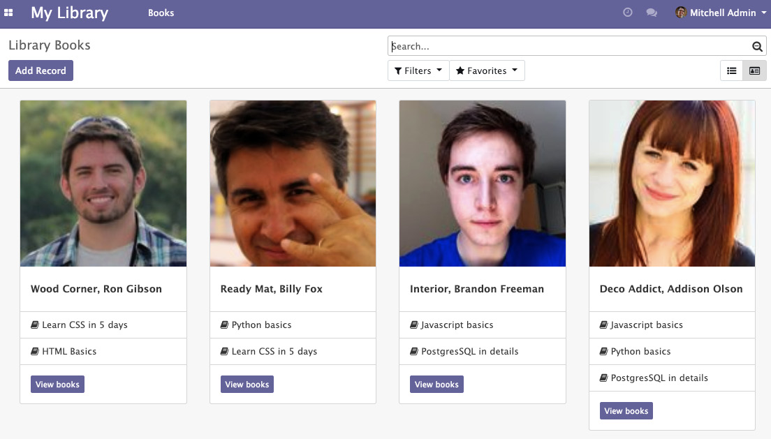
Figure 15.3 – Many2many group view
Important information
Odoo views are very easy to use and are very flexible. However, it is often the case that easy and flexible things have complex implementations under the hood. This is true of Odoo JavaScript views: they are easy to use, but complex to implement. They consist of lots of components, including the model, renderer, controller, view, and QWeb template. In the next section, we have added all of the required components for the views and have also used a new view for the library.book model. If you don't want to add everything manually, grab a module from the example file in this book's GitHub repository.
How it works...
In steps 1 and 2, we registered a new type of view, called m2m_group, in ir.ui.view and ir.actions.act_window.view.
In step 3, we added the get_m2m_group_data method to the base. Adding this method to the base will make that method available in every model. This method will be called via an RPC call from the JavaScript view. The view will pass two parameters—the domain and m2m_field. In the domain argument, the value of the domain will be the domain generated with a combination of the search view domain and the action domain. m2m_field is the field name by which we want to group the records. This field will be set on the view definition.
In the next few steps, we added the JavaScript files that are required to form the view. An Odoo JavaScript view consists of the view, model, renderer, and controller. The word view has historical meaning in the Odoo code base, so model, view, controller (MVC) becomes model, renderer, controller (MRC) in Odoo. In general, the view sets up the model, renderer, and controller, and sets the MVC hierarchy so that it looks similar to the following:
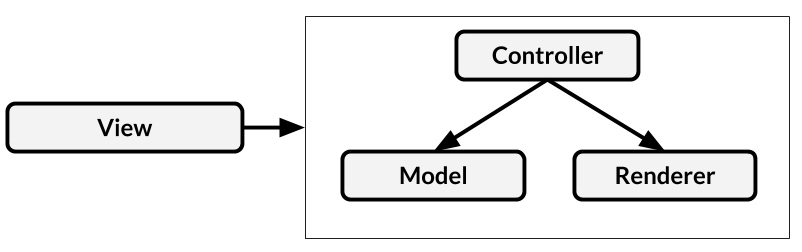
Figure 15.4 – View components
Let's look at the roles of Model, Renderer, Controller, and View. Abstract versions of Model, Renderer, Controller, and View have all the basic things that are needed to form a view. Consequently, in our example, we have created the model, renderer, controller, and view by inheriting them.
Here is an in-depth explanation of the different parts that are used to create a view:
- Model: The role of the model is to hold the state of the view. It sends an RPC request to the server for the data, and then passes the data to the controller and renderer. We then override the __load and __reload methods. When the view is being initialized, it calls the __load() method to fetch the data, and when the search conditions are changed and the view needs a new state, then the __reload() method is called. In our case, we have created the common _fetchData() method to make an RPC call for data. Note that we used the get_m2m_group_data method that we added in step 3. The __get() method will be called from the controller to get the state of the model.
- Controller: The role of the Controller is to manage coordination between the Model and the Renderer. When an action occurs in the Renderer, it passes that information to the controller and performs the action accordingly. Sometimes, it also calls some methods in the Model. In addition to this, it manages the buttons in the control panel. In our example, we added a button to add new records. To do so, we had to override the renderButtons() method of AbstractController. We also registered custom_events so that when a button in the author card is clicked, the renderer will trigger the event to the controller to make it perform the action.
- Renderer: The role of the renderer is to manage the DOM elements for the view. Every view can render data in a different way. In the renderer, you can get the state of the model in a state variable. It calls the render() method for the rendering. In our example, we rendered the ViewM2mGroup QWeb template with its current state to display our view. We also mapped the JavaScript events to take user actions. In this recipe, we have bound the click event for the buttons of the card. Upon clicking the author card button, it will trigger the btn_clicked event to the controller, and it will open the list of books for that author.
Important note
Note that events and custom_events are different. Events are normal JavaScript events, while custom_events events are from the Odoo JavaScript framework. Custom events can be invoked via the trigger_up method.
- View: The role of the View is to get all the basic things that are required to build views, such as a set of fields, a context, a view arch, and some other parameters. After that, the view will initialize the controller, renderer, and model triplet. It will set them in the MVC hierarchy. Usually, it sets up the parameters that are required in the model, view, and controller. In our example, we want the m2m_field name to get properly grouped data in the Model, so we have set the model parameter in it. In the same way, this.controllerParams and this.rendererParams can be used to set the parameters in the controller and renderer.
In step 8, we added a QWeb template for the views and control panel buttons. To learn more about the QWeb template, refer to the Using client-side QWeb templates recipe in this chapter.
Important information
Odoo views have tons of methods for different purposes; we looked at the most important one in this section. If you want to learn more about views, you can explore them further by going to the /addons/web/static/src/js/views/ directory. This directory also includes code for the abstract model, controller, renderer, and view.
In step 9, we added JavaScript files to the assets.
Finally, in the last two steps, we added a view definition for the book.library model. In step 10, we used the <m2m_group> tag for the view, and we also passed the m2m_field attribute as the option. This will be passed to the model to fetch the data from the server.
There's more...
If you don't want to introduce the new view type and you just want to modify a few things in the view instead, you can use js_class on the view. For example, if we want a view similar to the kanban one that we created, then we can extend it as follows:
var CustomRenderer = KanbanRenderer.extend({
...
});
var CustomRendererModel = KanbanModel.extend({
...
});
var CustomRendererController = KanbanController.extend({
...
});
var CustomDashboardView = KanbanView.extend({
config: _.extend({}, KanbanView.prototype.config, {
Model: CustomDashboardModel,
Renderer: CustomDashboardRenderer,
Controller: CustomDashboardController,
}),
});
var viewRegistry = require('web.view_registry');
viewRegistry.add('my_custom_view', CustomDashboardView);
We can then use the kanban view with js_class (note that the server still thinks of this as a kanban view):
...
<field name="arch" type="xml">
<kanban js_class="my_custom_view">
...
</kanban>
</field>
...
Debugging your client-side code
For debugging server-side code, this book contains a whole chapter, that is, Chapter 7, Debugging Modules. For the client-side part, you'll get a kick-start in this recipe.
Getting ready
This recipe doesn't really rely on specific code, but if you want to be able to reproduce exactly what's going on, grab the previous recipe's code.
How to do it...
What makes debugging client-side script difficult is that the web client relies heavily on jQuery's asynchronous events. Given that breakpoints halt execution, there is a high chance that a bug caused by timing issues will not occur when debugging. We'll discuss some strategies for this later:
- For the client-side debugging, you will need to activate debug mode with the assets. If you don't know how to activate debug mode with the assets, read the Activating the Odoo developer tools recipe from Chapter 1, Installing the Odoo Development Environment.
- In the JavaScript function you're interested in, call debugger:
debugger;
- If you have timing problems, log in to the console through a JavaScript function:
console.log("I'm in function X currently");
- If you want to debug during template rendering, call the debugger from QWeb:
<t t-debug="" />
- You can also have QWeb log in to the console, as follows:
<t t-log="myvalue" />
All of this relies on your browser offering the appropriate functionality for debugging. While all major browsers do that, we'll only look at Chromium here, for demonstration purposes. To be able to use the debug tools, open them by clicking on the top-right menu button and selecting More tools | Developer tools:

Figure 15.5 – Opening Developer Tools in Chrome
How it works...
When the debugger is open, you should see something similar to the following screenshot:

Figure 15.6 – Paused debugger
Here, you have access to a lot of different tools in the separate tabs. The currently active tab in the preceding screenshot is the JavaScript debugger, where we set a breakpoint in line 31 by clicking on the line number. Every time our widget fetches the list of users, the execution should stop at this line, and the debugger will allow you to inspect variables or change their values. Within the watch list to the right, you can also call functions to try out their effects without having to continuously save your script file and reload the page.
The debugger statements we described earlier will behave the same as soon as you have the developer tools open. The execution will then stop, and the browser will switch to the Sources tab, with the file in question opened and the line with the debugger statement highlighted.
The two logging possibilities from earlier will end up in the Console tab. This is the first tab you should inspect in case of problems in any case because, if some JavaScript code doesn't load at all because of syntax errors or similar fundamental problems, you'll see an error message there explaining what's going on.
There's more...
Use the Elements tab to inspect the DOM representation of the page the browser currently displays. This will prove helpful when it comes to familiarizing yourself with the HTML code the existing widgets produce, and it will also allow you to play with classes and CSS attributes, in general. This is a great resource for testing layout changes.
The Network tab gives you an overview of which requests the current page made and how long it took. This is helpful when it comes to debugging slow page loads as, in the Network tab, you will usually find the details of the requests. If you select a request, you can inspect the payload that was passed to the server and the result returned, which helps you to figure out the reason for unexpected behavior on the client side. You'll also see the status codes of requests made—for example, 404—in case a resource can't be found because you misspelled a filename, for instance.
Improving onboarding with tours
After developing a large application, it is crucial to explain software flows to the end users. The Odoo framework includes a built-in tour manager. With this tour manager, you can guide an end user through learning specific flows. In this recipe, we will create a tour so that we can create a book in the library.
Getting ready
We will be using the my_library module from the previous recipe. Tours are only displayed in the database without demo data, so if you are using a database with demo data, create a new database without demo data for this recipe.
How to do it...
To add a tour to a library, perform the following steps:
- Add a new /static/src/js/my_library_tour.js file with the following code:
odoo.define('my_library.tour', function (require) {
"use strict";
var core = require('web.core');
var tour = require('web_tour.tour');
var _t = core._t;
tour.register('library_tour', {
url: "/web",
rainbowManMessage: _t("Congrats, you have listed a book."),
sequence: 5,
}, [tour.stepUtils.showAppsMenuItem(), {
trigger: '.o_app[data-menu-xmlid="my_library.library_base_menu"]',
content: _t('Manage books and authors in <b>Library app</b>.'),
position: 'right'
}, {
trigger: '.o_list_button_add',
content: _t("Let's create new book."),
position: 'bottom'
}, {
trigger: 'input[name="name"]',
extra_trigger: '.o_form_editable',
content: _t('Set the book title'),
position: 'right',
}, {
trigger: '.o_form_button_save',
content: _t('Save this book record'),
position: 'bottom',
}
]);
});
- Add the tour JavaScript file in the backend assets:
...
<script type="text/javascript" src="/my_library/static/src/js/my_library_tour.js" />
...
Update the module and open the Odoo backend. At this point, you will see the tour, as shown in the following screenshot:
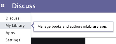
Figure 15.7 – Tour step for user onboarding
Make sure you have disabled demo data in your Odoo instance. An instance with demo data does not show tours.
How it works...
The tour manager is available under the web_tour.tour namespace.
In the first step, we imported web_tour.tour. We can then add a new tour with the register() function. We registered our tour with the library_tour name and passed the URL on which this tour should run.
The next parameter is a list of these tour steps. A tour step requires three values. The trigger is used to select the element on which the tour should be displayed. This is a JavaScript selector. We used the XML ID of the menu because it is available in the DOM.
The first step, tour.stepUtils.showAppsMenuItem(), is the predefined step from the tour for the main menu. The next key is the content, and this is displayed when the user hovers over the tour drop. We used the _t() function because we want to translate the string, while the position key is used to decide on the position of the tour drop. Possible values include top, right, left, or bottom.
Important information
The tours improve the onboarding experience of the user, as well as managing the integration tests. When you run Odoo with test mode internally, it also runs the tours and causes the test case to fail if a tour has not finished.
Mobile app JavaScript
Odoo v10 introduced the Odoo mobile application. It provides a few small utilities to perform mobile actions, such as vibrate phone, show toast message, and scan QR code.
Getting ready
We will be using the my_library module from the previous library. We will show you the toast when we change the value of the color field from the mobile app.
Warning
The Odoo mobile app only supports the Enterprise Edition, so if you don't have the Enterprise Edition, then you cannot test it.
How to do it...
Perform the following steps to show a toast message in the Odoo mobile app:
- Import web_mobile.rpc in field_widget.js:
var mobile = require('web_mobile.core');
- Modify the clickPill method to display the toast when the user changes the color from the mobile device:
clickPill: function (ev) {
var $target = $(ev.currentTarget);
var data = $target.data();
if (mobile.methods.showToast) {
mobile.methods.showToast({ 'message': 'Color changed' });
}
this._setValue(data.val.toString());
}
Update the module and open the form view of the library.book model in the mobile app. When you change the color, you will see the toast, as shown in the following screenshot:

Figure 15.8 – Toast on color change
How it works...
web_mobile.rpc provides the bridge between a mobile device and Odoo JavaScript. It exposes a few basic mobile utilities. In our example, we used the showToast method to display toast in the mobile app. We also need to check the availability of the function. The reason behind this is that some mobile phones might not support a few features. For example, if devices don't have a camera, then you can't use the scanBarcode() method. In such cases, to avoid tracebacks, we need to wrap them with the if condition.
There's more...
The mobile utilities that are to be found in Odoo are as follows:
- showToast(): To display a toast message
- vibrate(): To make a phone vibrate
- showSnackBar(): To display a snack bar with a button
- showNotification(): To display a mobile notification
- addContact(): To add a new contact to the phonebook
- scanBarcode(): To scan QR codes
- switchAccount(): To open the account switcher in Android
To learn more about mobile JavaScript, refer to https://www.odoo.com/documentation/14.0/reference/mobile.html.