
Overview
In this chapter, you will create your first chart in Tableau and work through some basic and intermediate charts, such as tree maps, bar-in-bar charts, and stacked area charts. You will learn how to choose the optimal chart for a given scenario, look at the best ways to create a trend report, and explore comparisons across measures (using bar-in-bar and bullet charts). Then, in this lesson's final activity, you will put all you've learned into practice by analyzing data from Singapore's vehicle population audits over the past decade. By the end of this chapter, you will be familiar with working with bar charts, area charts, and Marks cards, which are used to add contextual detail to charts and views.
Introduction
Thus far, you have prepared, imported, and manipulated data for your visualizations. Considering that Tableau is a business intelligence and visualization tool, it is natural to now start creating your first charts. Before you can do this, however, (and certainly before you can create more advanced charts as you will in Chapter 5, Data Exploration: Distribution and Relationships), you must first learn the ins and out of creating charts.
For this reason, you'll only be creating some basic charts initially, and then eventually work through some intermediate-level charts, such as tree maps and bar-in-bar charts. The goal for this chapter is to be able to answer questions such as "How much profit was generated in sales by each sub-category in a specific year?," which is basically asking "How much of your total sales was generated by each sub-category?" In doing so, this chapter also teaches you how to remove complex terminology and communicate about data effectively.
Tableau is an intuitive and flexible tool. You can consider Tableau the Photoshop of business intelligence. In Photoshop, there are multiple ways for you to achieve the same result with an image; similarly, in Tableau, there is often more than one way to create the same chart. Tableau's Show Me panel comes in pretty handy most of the time, though the goal of this book is also to show you methods for creating these charts without the Show Me panel. This chapter will try to simplify most charts by describing when they should be used, why a chart is useful, and for what data type they are useful.
The whole chapter is designed so that, as a reader, you can follow along with detailed steps for each exercise and activity, including creating both basic and intermediate-level charts. But that does not mean you need to memorize these steps; instead, try to understand the reasoning behind why we are doing what we are doing. Although each step in the exercise of this chapter includes as many details as possible, you are encouraged to ask yourself questions such as, "Why is this step being done, and can I improve the method?" You might find that you can indeed obtain a given visualization using different means and, similarly, that the charts will get better as you unleash your creativity.
Exploring Comparisons across Dimensional Items
Before diving into chart making, it is important to differentiate between dimensions and measures.
Every column that is present in some data has a data type associated with it, such as string, integer, or date. Also, every column that exists in some data is either a dimension or a measure. Dimensions are qualitative or categorical data, such as names, regions, dates, or geographical data, and the columns have categories of distinct values. Measures, on the other hand, are quantitative values that can be aggregated.
Consider the following: a Country column has country names such as Canada, India, and Spain. Can you sum the regions? Would a sum of Canada, India, and Spain make any sense? No, it wouldn't, so a region is a dimension. Similarly, data to which you can apply mathematical functions, such as sum, average, min/max, and so on, are measures. Hence, the rule of thumb is as follows: columns to which you can apply a mathematical function are columns of measures, and data you cannot apply functions to are columns of dimensions.
In this book, whenever measures are mentioned, it means that the chart will contain numerical/quantitative data in the view, whereas whenever dimensions are mentioned, we will be using qualitative/categorical data in the view.
Bar Chart
The bar chart is a versatile chart type that makes it easy to quickly understand data for spot checking or adding part of a total comparison for some categorical data. No other charts can beat the flexibility, ease of understanding, and usability of bar charts. The length of the bars in a bar chart represents the proportional aspect of the value for that categorical variable. The illustrative aspect of the bar chart makes it one of the most used charts; it gives accurate insights into our data. Bar charts in Tableau can use a combination of zero or more dimensions and one or more measures.
Note
Exercises in this chapter will use the sample Superstore dataset, which comes pre-loaded into each Tableau Desktop installation. Our version of Tableau Desktop contains another Sample – Superstore dataset, which has data till 2019; Tableau recently updated the data file to also include 2020 data, which you will have if you are using the latest version of Tableau Desktop. So, if your metrics/charts are not exactly the same as ours, do not worry. Our goal is to teach you the skills to develop these charts, reports, and dashboards instead of having you replicate our exact charts.
Exercise 4.01: Creating Bar Charts
As a business analyst for your organization, one of the stakeholders has asked you to create a report displaying the total sales and profits across categories and segments using bar charts. You will be using the Sample – Superstore dataset to visualize the data.
Dataset: Superstore
Dataset download link: https://packt.link/cX32T.
Note
In Tableau, continuous fields are green, and when they're discrete, they're blue.
The following steps will help you complete this exercise:
- Load the Orders table from the sample Superstore dataset in your Tableau instance.
- Click on the Show Me panel in the top-right corner and hover over the bar chart. You will observe that it says For horizontal bars try 0 or more Dimensions | 1 or more Measures.
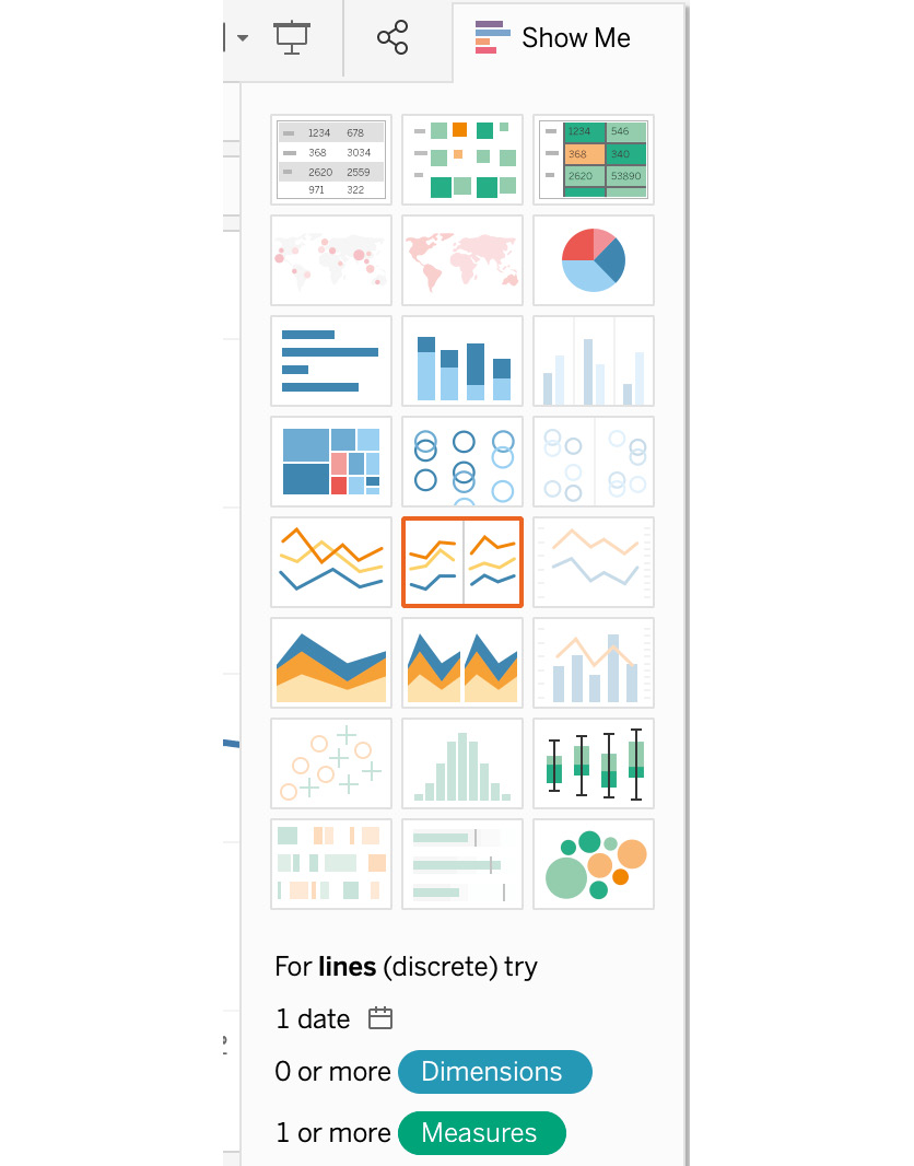
Figure 4.1: Bar chart in the Show Me panel
In this exercise, you will begin with no dimensions and only one measure, before moving on to adding dimensions to your view.
- Drag Sales to Rows (for a vertical bar chart) or Columns (for a horizontal bar chart).
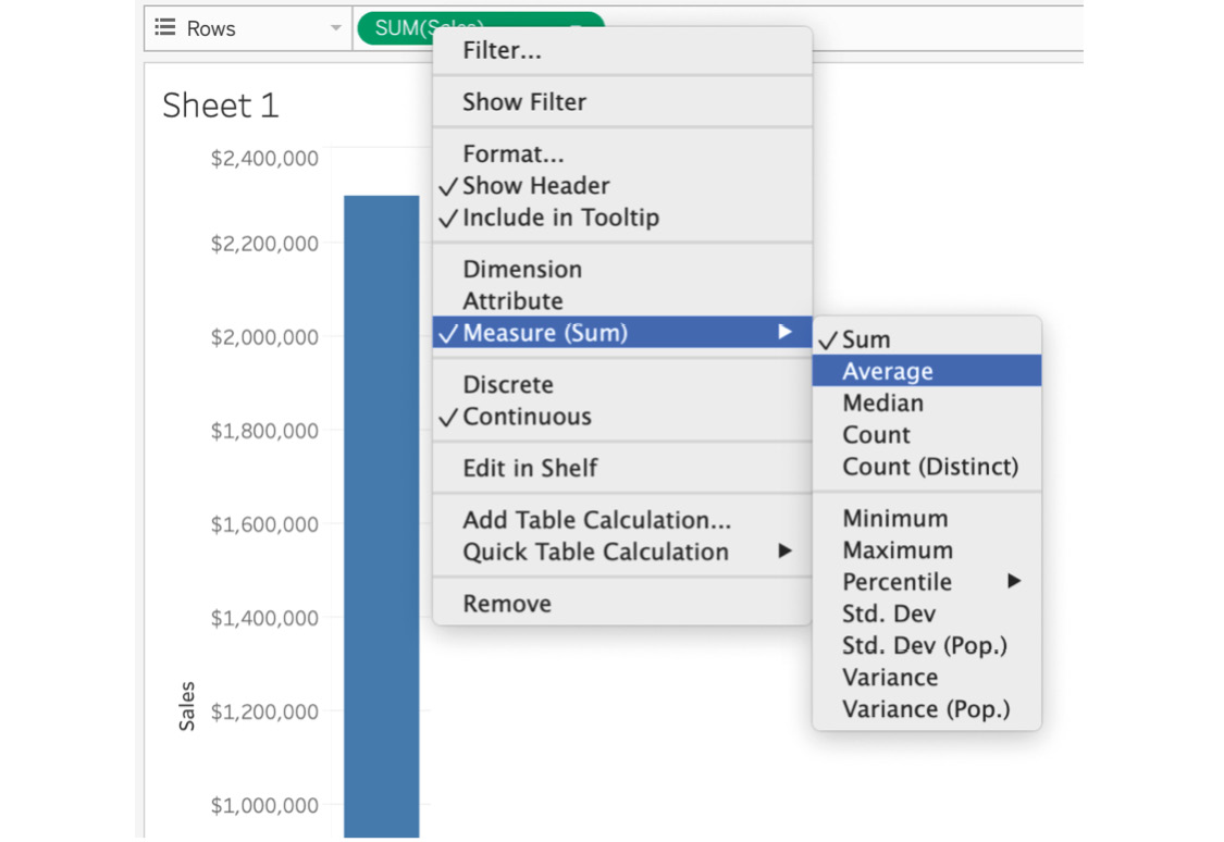
Figure 4.2: Changing the aggregation
When you drag Sales to the Columns/Rows shelf, the default aggregation changes to SUM(Sales).
- Click on the SUM(Sales) capsule in the Columns/Rows shelf and change the aggregation from SUM(Sales) to any other aggregation average.
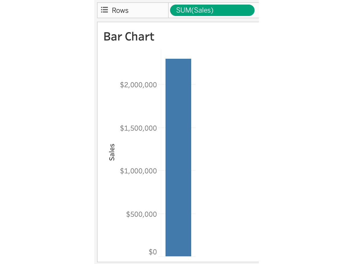
Figure 4.3: Bar chart for the sales figure
In the preceding screenshot, note that the total sales figure is around $2.3M for the whole store, which is the least granular metric in our sample Superstore dataset. Next, you will change the granularity of your bar chart.
- To do that, add a dimension to your view. Add a Category dimension to our Columns shelf. When you add the Category dimension to the view, you get three bars to represent each category. Thus, you've just changed your granularity from the sum of sales for all the data to the sum of sales for each category.
For better readability, also add Sales from the Measures data pane to the Label Marks card. As we can see, SUM(Sales) is now divided by category:
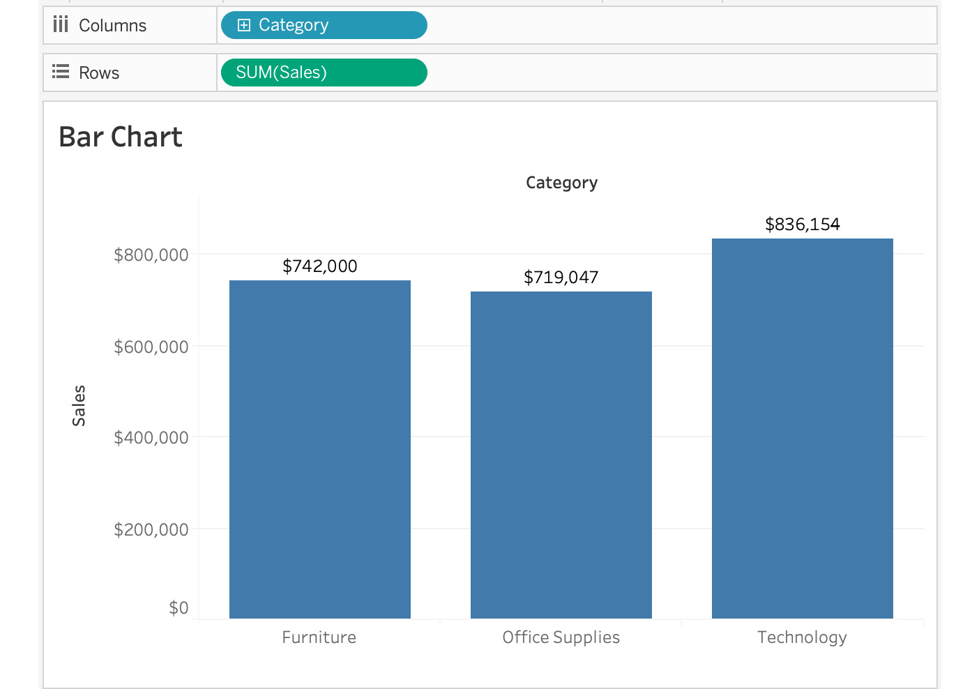
Figure 4.4: Sales by category
The preceding chart uses one dimension and one measure, so we can see that the total sales of Furniture, Office Supplies, and Technology are $742,000, $719,000, and $836,000, respectively. However, what if we want to study the total sales for each of these categories in more detail? We can make it more granular by adding more dimensions or measures. Let's explore our options in the next step.
- Drag Segment to the Columns shelf.
You will notice that the sales by category are now divided into sales by segment and category. We just added another level of granularity to our view:
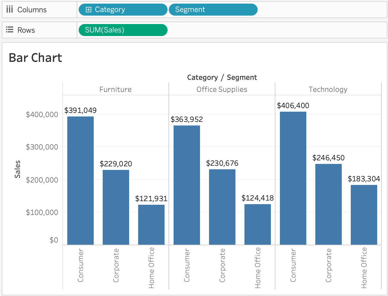
Figure 4.5: Sales by category and segment
In the preceding figure, you can see that even though Technology had the highest sales, the Corporate and Home Office segments of all three categories are not so performing well and will require attention. As the total sales of the categories are now bifurcated, it gives you more visibility as to how many sales you have in each of the segments (that is, Consumer, Corporate, and Home Office). Now that you know the sales values in greater detail, you can also find out the amount of profit gained in each of the categories and segments.
- Add another measure, Profit, to the Rows shelf. As soon as you drop the measure onto the Columns shelf, you can see that a new row was added for profits:
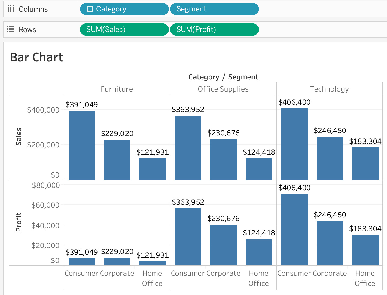
Figure 4.6: Sales and profits by category and segment
As you can see, there is very little profit gained from Furniture and a huge amount of profit from Technology. This will help in making great business decisions as we now know that investing more in Technology and Office Supplies is more profitable.
When you create a bar chart one way, either horizontally or vertically, you will on occasion find that your dashboard design or storyboard design (a storyboard is where you use multiple visualizations/dashboards to convey a story) would be more aesthetically pleasing if the alignment was different—say, vertical instead of horizontal. There are multiple ways to change the alignment; the manual method is demonstrated in the next step.
- Drag both the Columns dimensions to the Rows shelf and vice versa. Alternatively, Tableau makes it easy to swap things around by giving us a Swap button in our tool menu.
The final output is as follows:
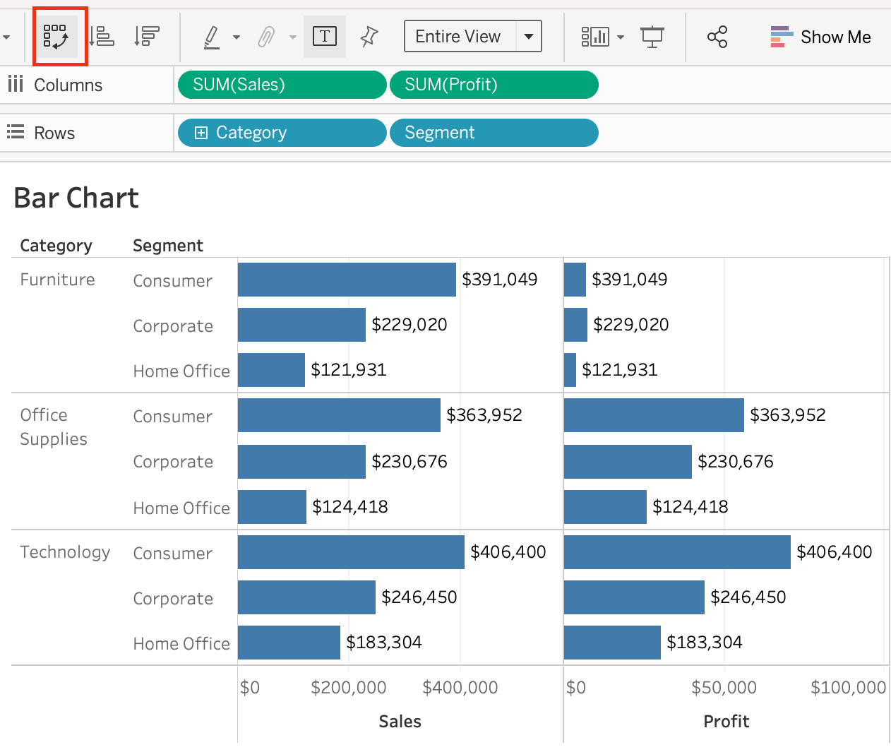
Figure 4.7: Horizontally aligned bars
In this exercise, we explored how adding more granularity to our views can help add more context and data to our views without over cluttering.
This wraps up this section on bar charts for one or more dimensional items. Next, we will explore comparisons over time by using bar charts and line charts.
Exploring Comparisons over Time
As an analyst, one of the most common requests that stakeholders will have is about comparing certain KPIs/metrics over time (for example, revenue quarter on quarter). In this section of the book, you will use date dimensions to create charts with which you can compare your KPIs over a certain time period. You will use date dimensions to compare metrics using a bar chart first and then move on to using line charts for KPI comparison.
Exercise 4.02: Creating Bar Charts for Data over Time
Imagine you are a business analyst who is asked to provide a report about the total sales of your organization in different segments, namely, Consumer, Corporate, and Home Office, over a period of time. Use the sample Superstore dataset provided by Tableau to visualize the chart and display the output.
Perform the following steps to complete the exercise:
- Load the the Orders table from the sample Superstore dataset in your Tableau instance.
- Drag Sales to your Rows shelf.
- Add Order Date to the Columns shelf. Tableau will automatically create a line chart (which will be covered in detail in the next exercise).
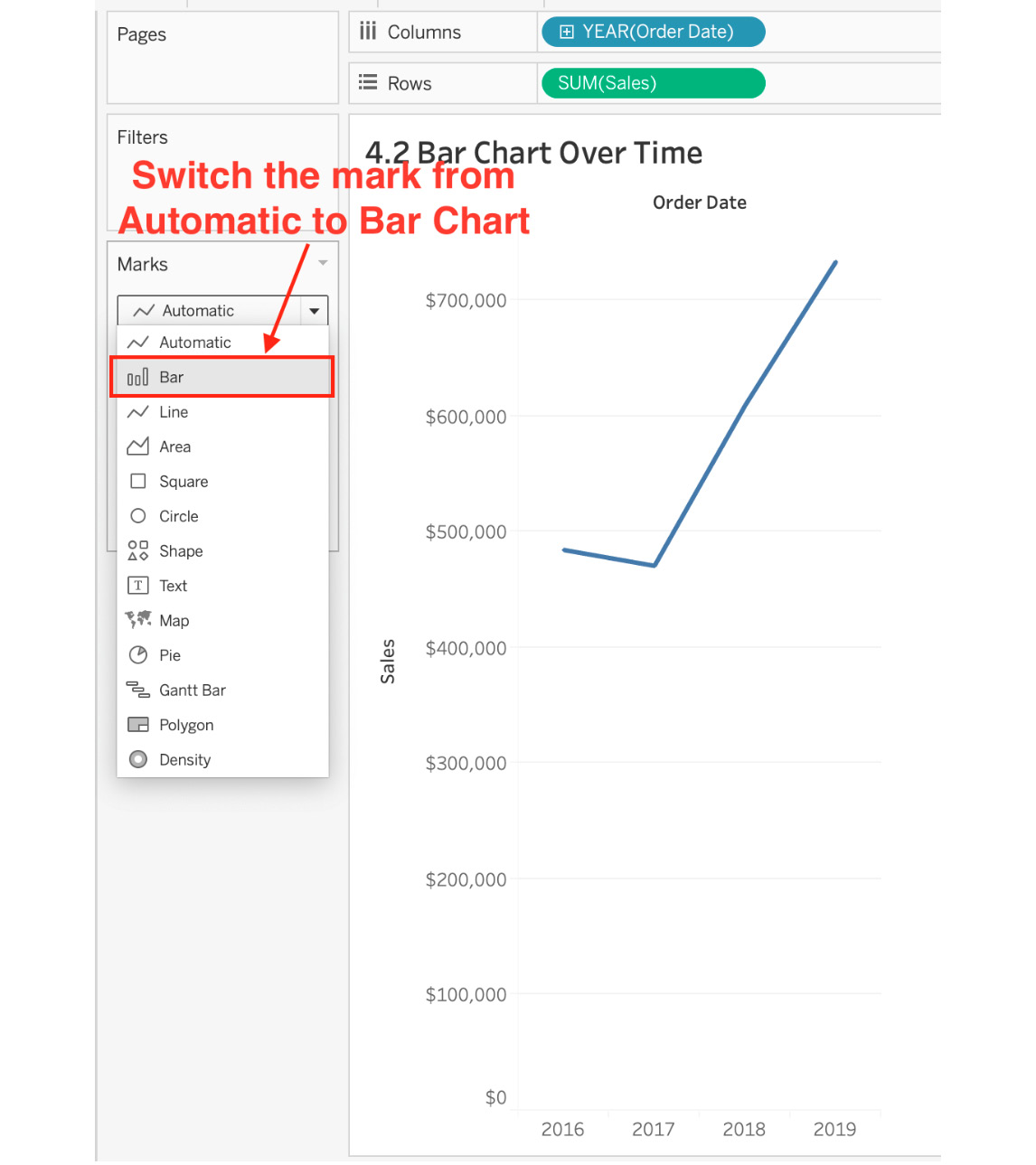
Figure 4.8: Bar chart over time as a line chart
The preceding figure shows the sales of the products on a yearly basis in the form of a line chart. To change the marks from line chart to bar chart, click first on the dropdown in the Marks shelf, then Bar as shown in the preceding figure. The view can be read as sales by year.
- For readability, add Label to Bars by dragging Sales from the measures Data pane to the label in the Marks card:
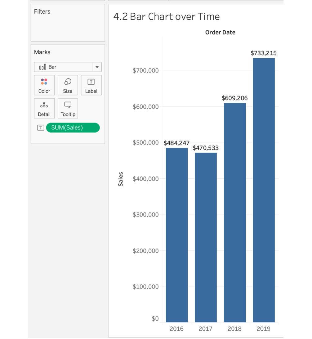
Figure 4.9: Sales by year (bar chart over time)
As you can see, by adding the labels, you have the exact sales values earned in the respective years. But you still don't know the value of sales earned over time for each of the segments. You will have to change the granularity of the view from sales by year to sales by year by segment.
- To achieve that, drag Segment to the Columns shelf.
The view can change a lot depending on where you place your Segment on the Columns shelf. If you place Segment after Order Date, your view will read as sales by year by segment with the following view:
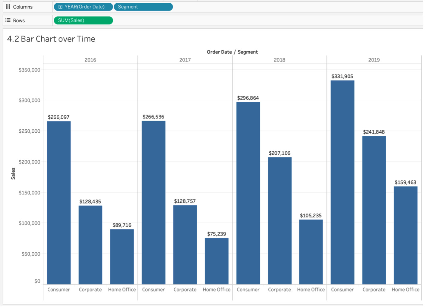
Figure 4.10: Bar chart over time by segment
From the preceding figure, it is clear that there has been progressive growth over the years, and you can also see the exact sales values for the segments. Although you got the data that you wanted, it is also important to present it in a formulated way. It will be more useful and understandable if you have the data for Consumer over the years together and the data for Corporate and Home Office together.
- To do this, place Segment before Order Date. Your view will read as sales by segment by year with the following view:
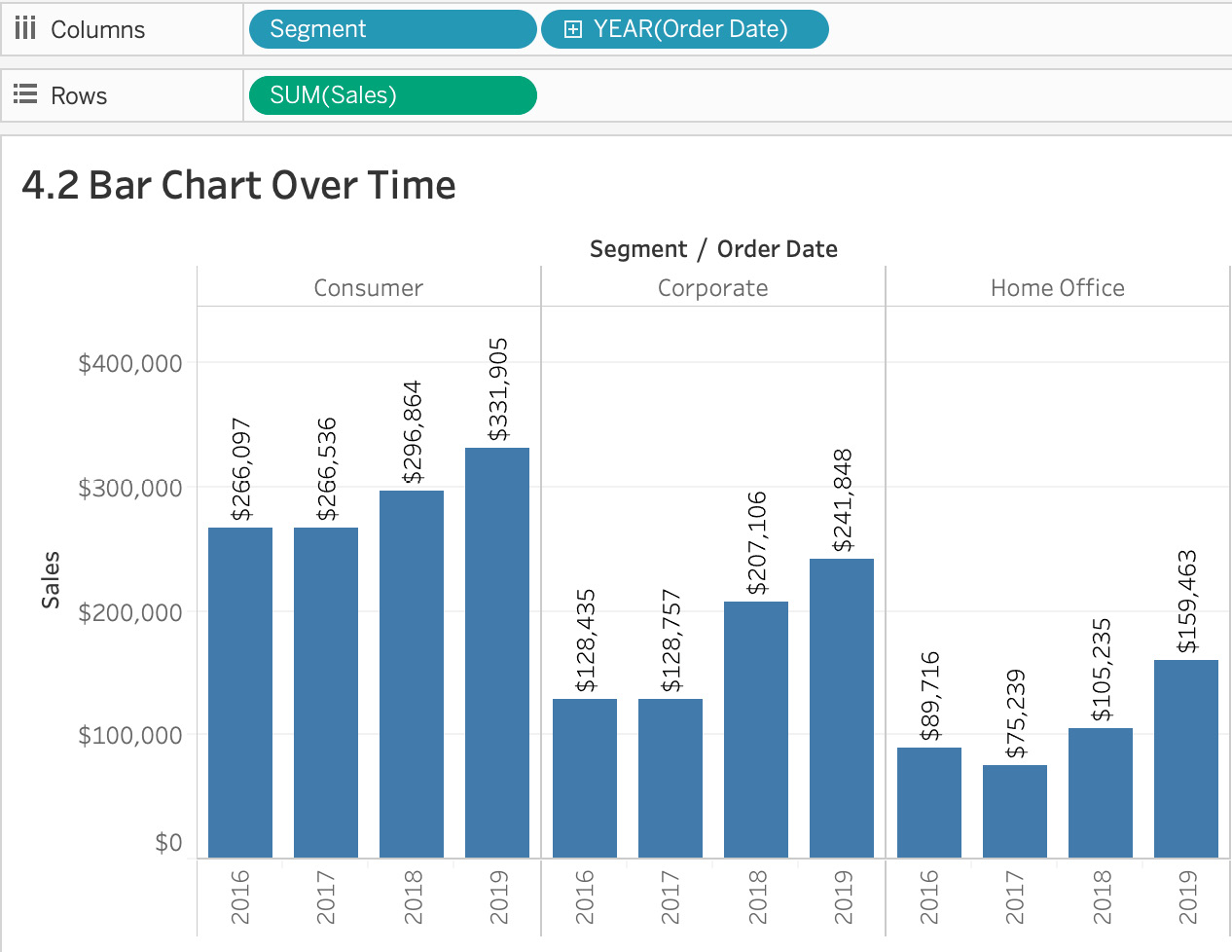
Figure 4.11: Sales by year by segment
In Figure 4.10, you had sales by year by segment, whereas in Figure 4.11, you have sales by segment by year. This allows any stakeholder to take a quick peek at the sales trend for each of your segments. As you can see, Corporate saw considerable growth from 2017 to 2018, which was not easily understandable from the previous screenshot.
In this exercise, you reviewed bar charts over time and practiced adding more granularity and dimensionality to your data. Next, you will review comparisons over time using line charts.
Line Charts
Line charts are another set of charts that are versatile, easy on the eye, universally understood. These have been used since the 18th century when William Playfair created them. They represent multiple data points connected with each other through a single line, usually signifying the trend of the data. In Tableau, you require at least one date, one measure, and zero or more dimensions to create a line chart.
Difference between Discrete Dates and Continuous Dates
In the upcoming exercises, when you right-click the Date dimension in the view, you'll notice you have two options for selecting the quarter. The one at the top is the discrete date, where you will have discrete dates by year/quarter/month/day. If you observe the following screenshot, instead of 2016 Q2 to 2016 Q3 ….. 2019 Q1 data points, you just have four data points—one for each discrete quarter. Essentially, discrete dates are unique dates in the view. So, when you select discrete quarters, the view will only contain unique quarters without considering the year as part of the date.
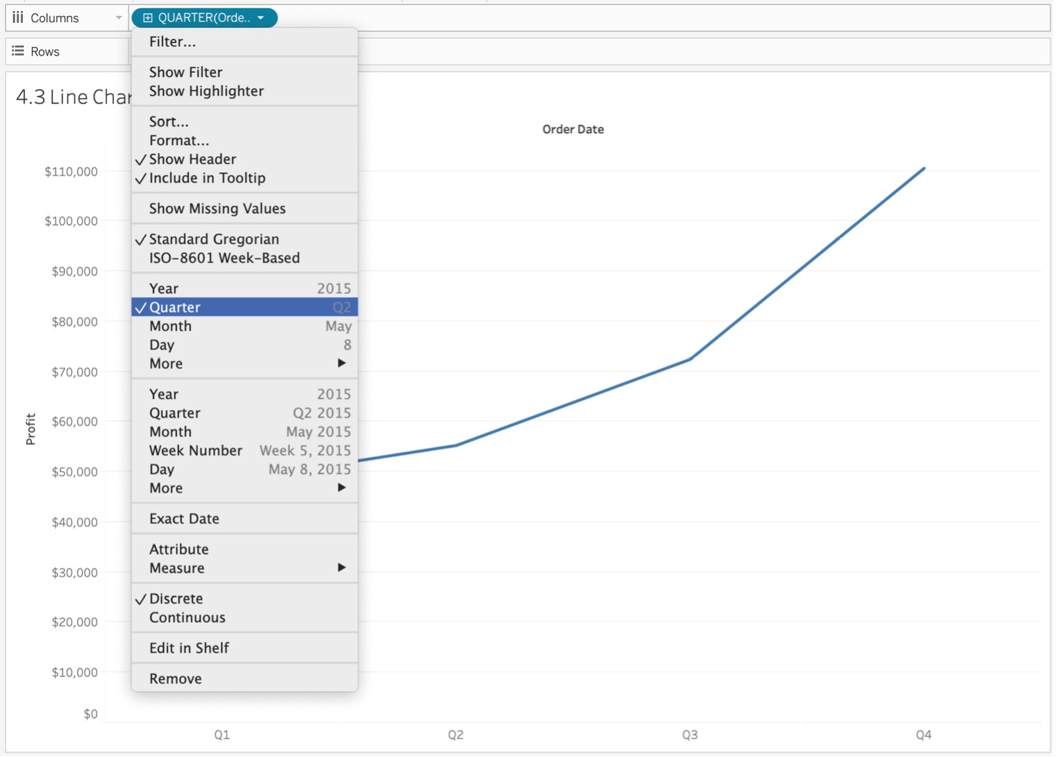
Figure 4.12: Discrete dates
The main difference between continuous dates and discrete dates is that continuous dates will give you more granular dates. So, instead of just Q1, Q2, Q3, and Q4, continuous dates will also factor in the year that the quarter/month/day is associated with. In most cases, you will want to use continuous dates because stakeholders often want to look at their metrics by month/quarter across multiple years.
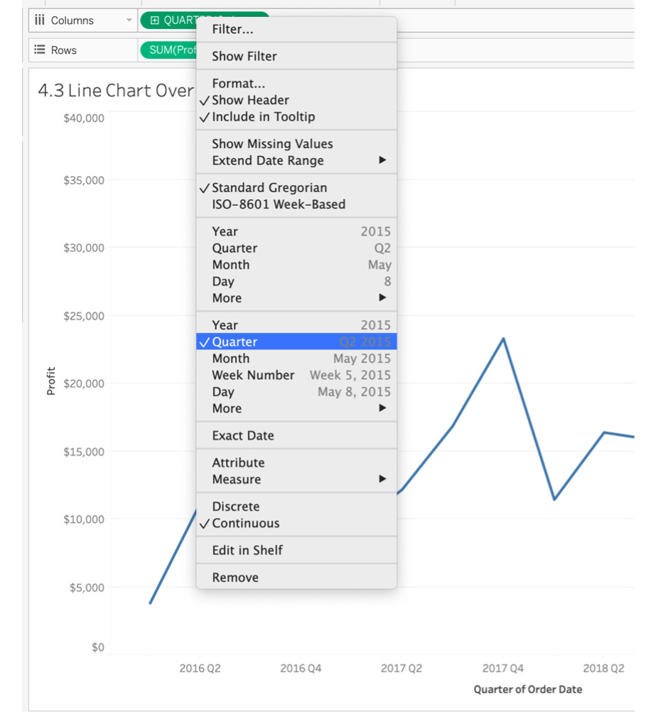
Figure 4.13: Continuous dates
Exercise 4.03: Creating Line Charts over Time
As an analyst, the category manager of your company would like you to create a chart so that they can look at the total profit across all the categories since 2016. They do not have a favorite chart type, but they do prefer a minimal look for their charts. In this exercise, you will tackle this stakeholder request as you go step by step in detail on how to make the best use of line charts and how adding color or changing the level of detail in the view adds incredible value to your charts.
Perform the following steps to complete the exercise:
- Load the Orders table from the sample Superstore dataset in your Tableau instance, if you haven't already.
- Similar to the steps for the bar chart, drag one of the measures to the Rows shelf. In this exercise, drag Profit to the Rows shelf.
- Next, add Order Date to the Columns shelf. As soon as you add the Date Time dimension to your view, Tableau automatically creates a line chart (which you also saw previously in your bar chart view).
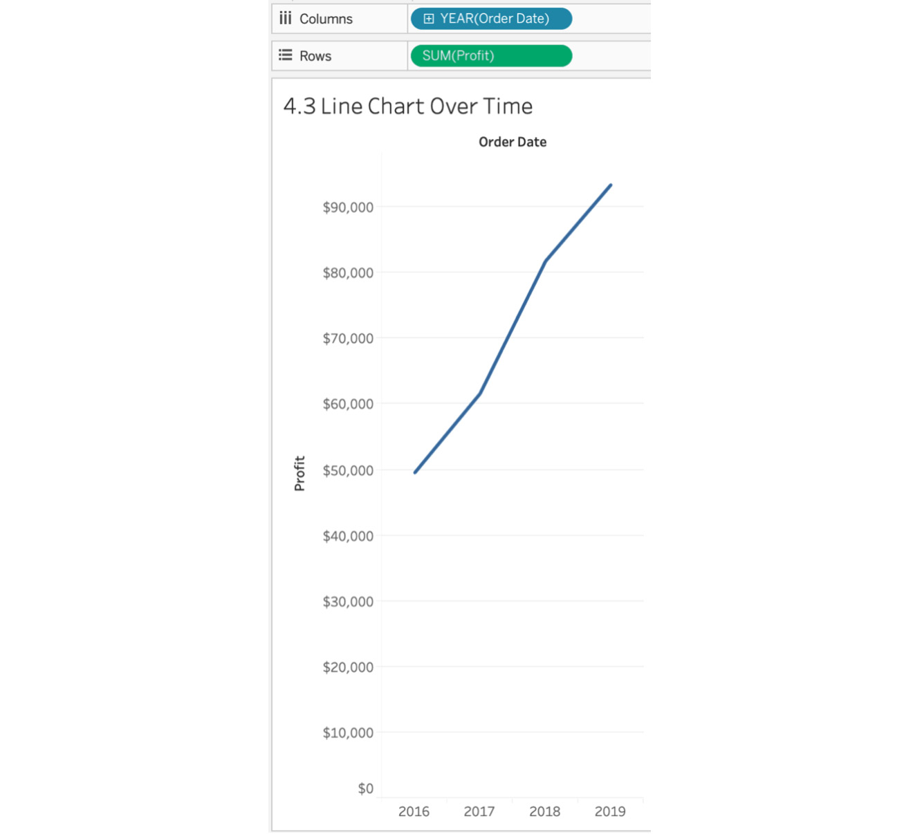
Figure 4.14: Simple line chart over time
In the chart, you have plotted profit by year and connected those points using a line. The profit grew from $50,000 in 2016 to almost $100,000 in 2019.
That is a basic line chart for you, but as previously mentioned, the goal is to learn more than just the basics of Tableau. So, let's explore some of the options for more context or details for your line chart.
- Add a Profit label to your line chart by dragging Profit from the data pane to Label Marks card in your view.
- To have the line chart show your sales by quarter instead of by year so it is more granular and helps decision-making for your stakeholders, click on the + sign or click the arrow on the dimension in your YEAR(Order Date) dimension on the Columns shelf and change the granularity from YEAR(Order Date) to QUARTER(Order Date).
- To make your view even more granular, add Segment to your Color or Detail Marks shelf. Your data will be split by segment with a corresponding color for each segment, as observed here:
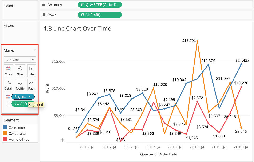
Figure 4.15: Line chart by segment
In the preceding figure, you can see that the profit for the Consumer segment has grown at a higher rate when compared to other segments. The line chart clearly illustrates the trend by segment across multiple years.
This wraps up our coverage of line charts. This section discussed line charts over time, the difference between discrete dates and continuous dates, and how you can add more color or contextual details to your line charts.
Exploring Comparison across Measures
Bullet charts are a type of bar chart that allow you to add target/goal comparisons to your charts/views. As much as bar charts are useful, more often than not when you are presenting data using bar charts, you will hear questions such as "How does this compare to this KPI/metric?" and "So, what should we do with this data?" because bar charts fail to add the additional context that stakeholders are looking for. This is where bullet charts shine as they add the required comparisons to goals/targets/thresholds. Think of bullet charts as bar charts with historical context or a baseline for comparison.
Say you are working on a project for which you are presenting sales figures for your SaaS products as bar charts. The first question you receive from your stakeholders might be "How does this compare to our previous quarter's/year's results? Did we do well or underperform?" If you had shown the same data with bullet charts, you could have also added a point of comparison for the period you want to compare your sales figures to. Here is a sample bullet chart:
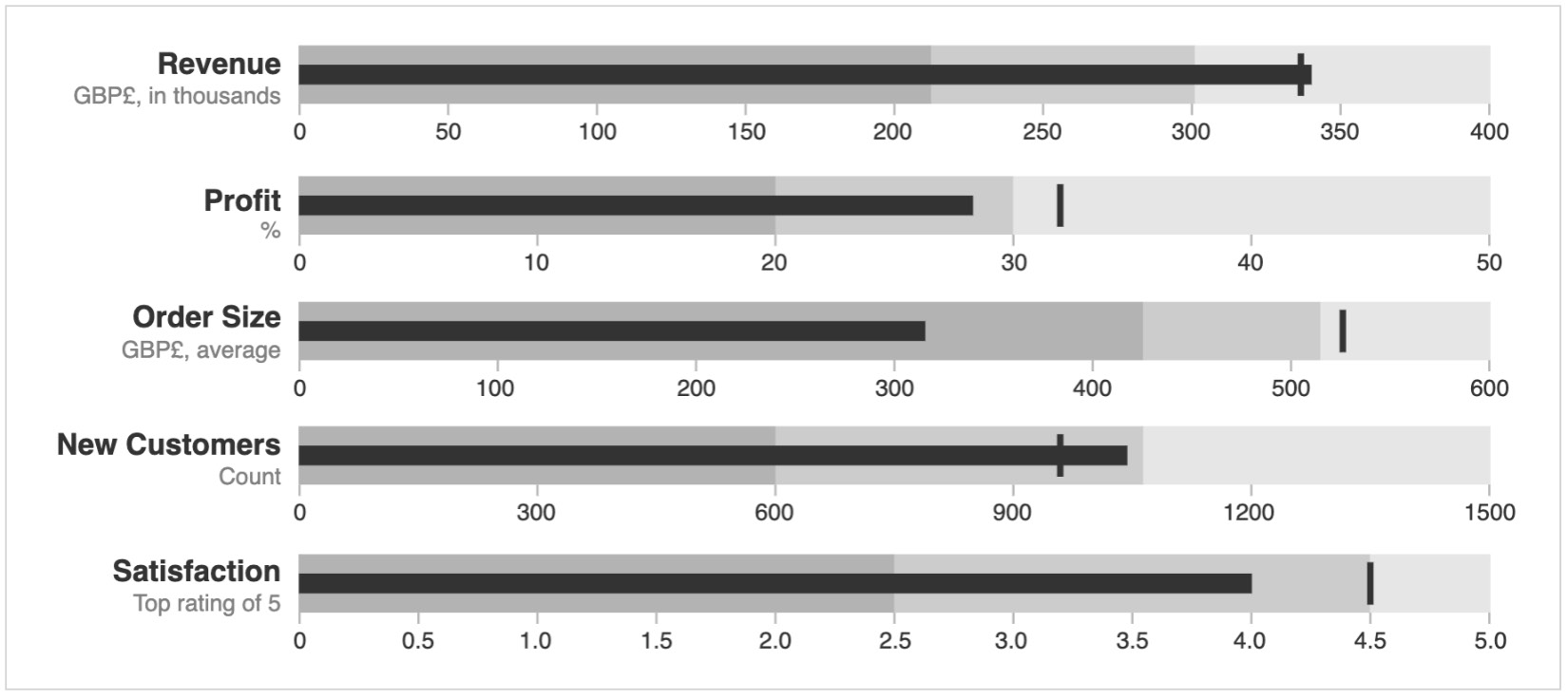
Figure 4.16: Sample bullet chart
In the following exercise, you will create a bullet chart that tackles that problem and learn about the impact that bullet charts can have on your reports/presentations.
Exercise 4.04: Creating a Bullet Chart
You receive another request from the category manager: they now want to look at how each of the sub-categories trends toward the sales target for 2019. As an analyst, your job is to create a view with actual sales for each sub-category for 2019 while showcasing the target sales (the black vertical lines in the following sample bullet chart) for 2019.

Figure 4.17: Sample bullet chart
Note
How to create a bullet chart using the Show Me panel could be studied here, but the book wouldn't do you justice if it didn't show you how to create a bullet chart using calculated fields, where you compare the sales of 2019 to the target sales of 2019 (which is a calculated field). We have not discussed calculated fields yet in the book, but we will be discussing them in depth in Chapter 6, Exploration: Exploring Geographical Data; for now, we will just try to explain each step of this exercise in as much detail as possible.
Perform the following steps to complete this exercise:
- Load the Orders table from the sample Superstore dataset in your Tableau instance if you haven't already.
Think of calculated fields as formulas that you can use to manipulate a field, create a subset of data, or extract information from rows/columns. In the following calculated fields, you will be creating two fields: Sales Target 2019 and Actual Sales 2019.
- Sales Target 2019: You are creating a dummy sales target for 2019 so you need a target field that can be used for comparing the actual to the target. Your Sales Target 2019 field will be 125% of the 2018 sales figures. To create a calculated field using your Sales measures and Order Date, first, navigate to the Order Date dimension and right-click on it. Click on Create | Calculated Field...:
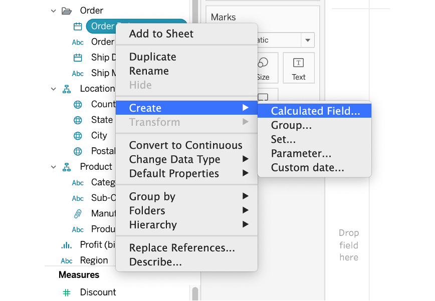
Figure 4.18 Creating a calculated field
- Rename the field from "Calculation1" to "Sales Target 2019". In the calculated field window, type the following formula:
If YEAR([Order Date]) = 2019 THEN [Sales]*1.25 END
The formula is read as follows: if the year of order date is 2019, make the target sales 125% of the 2019 sales figures.
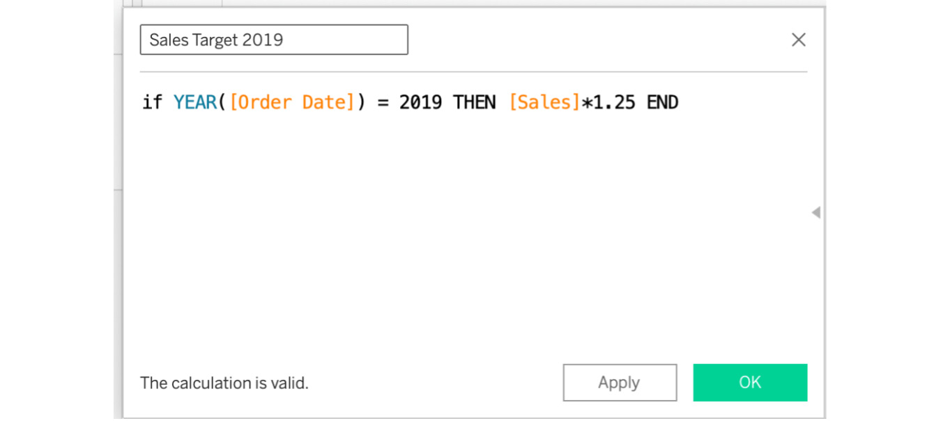
Figure 4.19: Creating a Sales Target 2019 field
- Repeat the same steps for the Actual Sales in 2019 calculated field with the following formula:
If YEAR([Order Date]) = 2019 THEN [Sales] END
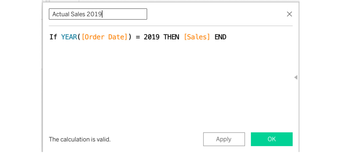
Figure 4.20: Creating an Actual Sales Target 2019 field
- Drag Sub-category to the Rows shelf.
The next steps will demonstrate both the Show Me and non-Show Me methods. You'll start with the Show Me panel method.
- Drag the Actual Sales in 2019 and Sales Target in 2019 calculated fields to the Column shelf:
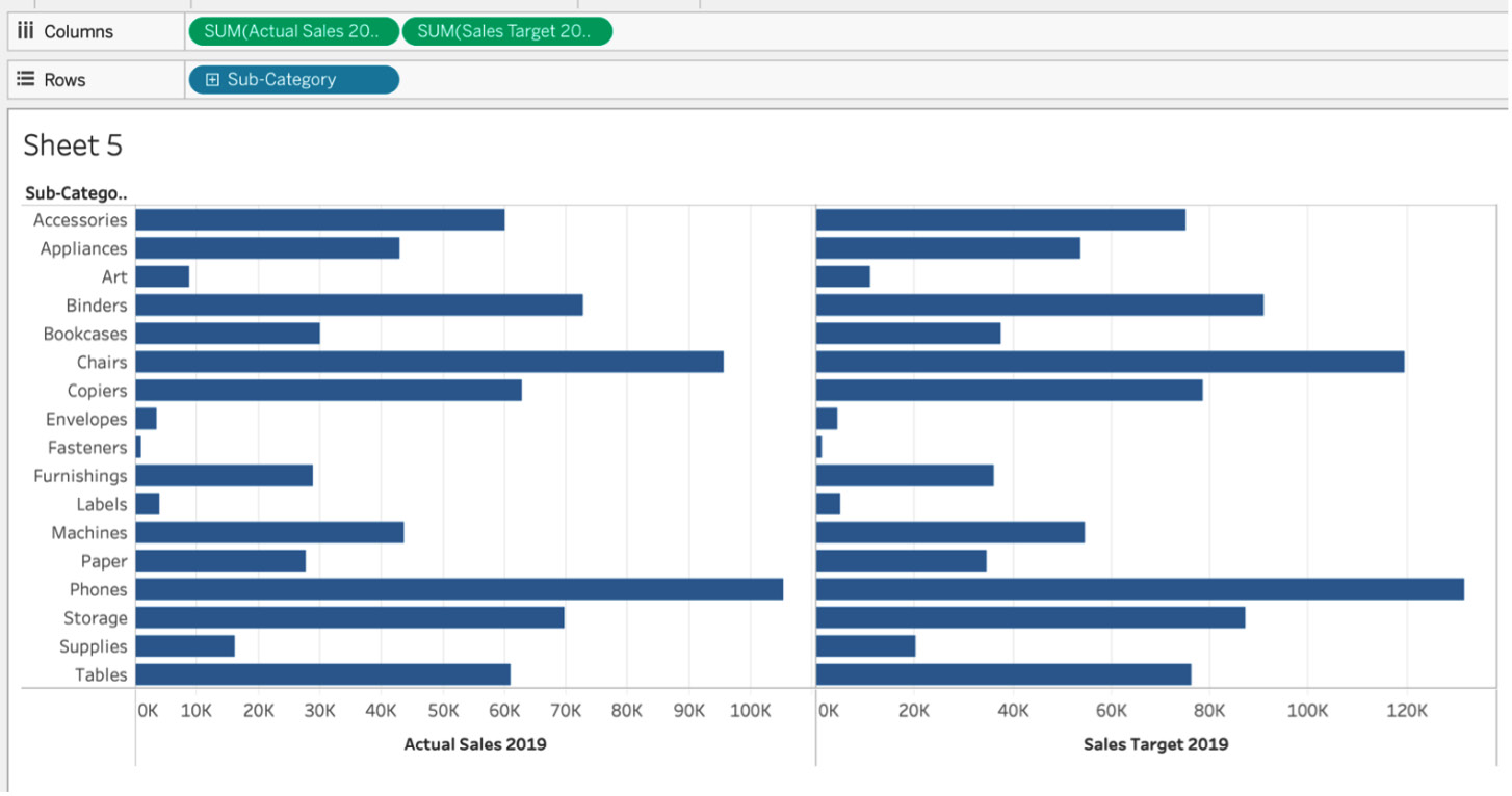
Figure 4.21: Side-by-side bar charts for actual versus target sales
In the previous figure, you have two charts: Actual Sales in 2019 and Sales Target in 2019 by sub-category. If you observe closely, you can see that Actual Sales 2019 for Accessories is 60,000 whereas Sales Target 2019 is 75,000, which is 125% of Actual Sales 2019. In the next step, you will convert these two bar charts into a bullet chart.
- Navigate to the Show Me panel and click on Bullet Chart.
As soon as you click on Bullet Chart, you will notice multiple bars with a black reference line that has been added to each bar. The reference line is the target/goal line that adds the additional context:
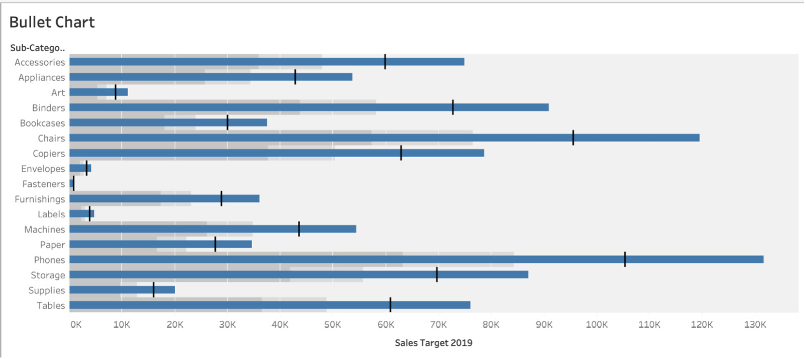
Figure 4.22: Bullet chart
You just created a bullet chart where the bars represent the sales targets in 2019 and the reference lines are the actual sales. But ideally, you want your sales targets in 2019 to be reference lines because that is the target that you want your sub-categories to aim for. You'll make those changes next.
- If your bullet chart has Sales Target in 2019 as bars instead of the target line, you can right-click on the x axis and click on Swap Reference Lines (this may be Swap Reference Line Fields in later Tableau versions) to change your reference lines to target sales instead of actual sales:
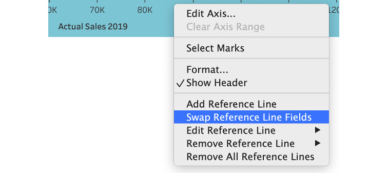
Figure 4.23: Swapping the reference lines
- For the other method where the Show Me panel is not used, create a new sheet and drag Sub-Category to Columns, Actual Sales 2019 to Columns, and Sales Target in 2019 to the Details Marks card.
- Right-click on the x axis and click Add Reference Lines. In the Line tab, click on the Per Cell radio button. In the Value dropdown, select SUM(Sales Target in 2019) and aggregate it as SUM in the dropdown right next to the Value dropdown. Change the Label dropdown from Computation to None.
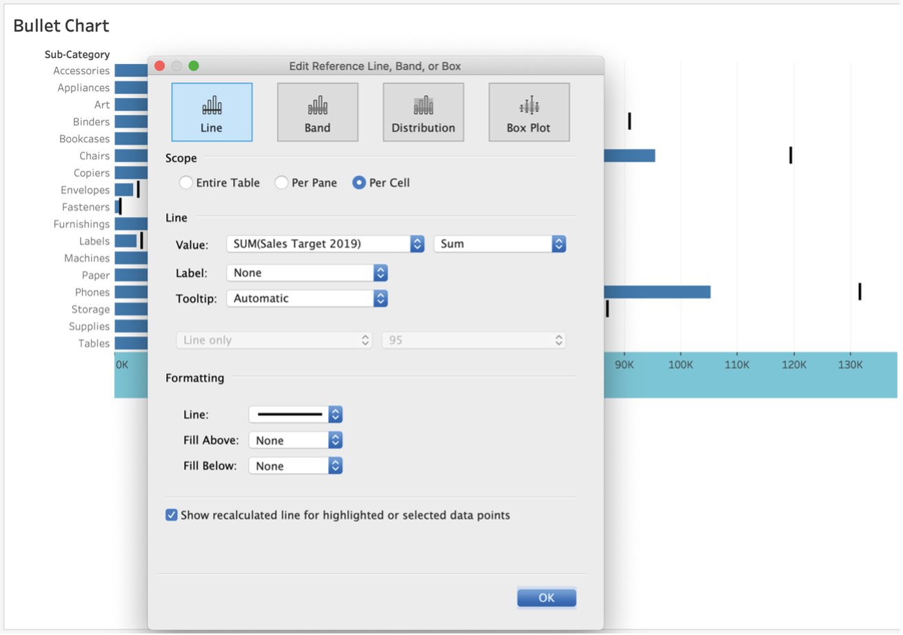
Figure 4.24: Editing the reference lines
After making the preceding changes, the final output of the bullet chart will be as follows:
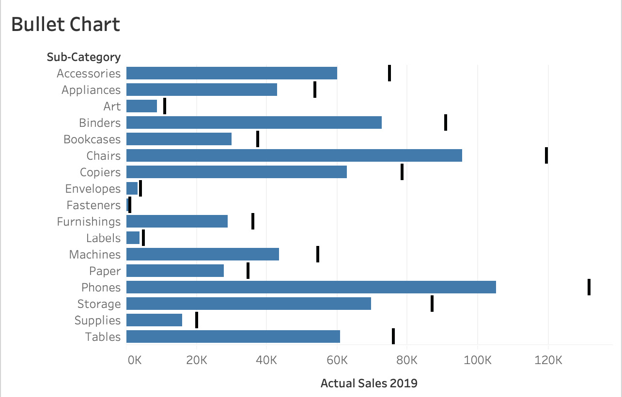
Figure 4.25: Bullet chart
In the preceding screenshot, the reference lines are now the sales targets for 2019, as opposed to the initial bullet chart where they were Actual Sales 2019, which was actually confusing. You want your stakeholders to understand how far off the target each of the sub-categories is.
In this exercise, you were able to create bullet charts using the Show Me panel as well as by manually adding reference lines to your view. We also briefly touched on calculated fields, which we will cover further in Chapter 7: Data Analysis: Creating and Using Calculations and Chapter 8: Data Analysis: Creating and Using Table Calculations.
Bar-in-Bar Charts
Similar to bullet charts, this type of chart is used when you want to compare two measures or two values in the same row/column. Essentially, it adds the comparison/goal/target context that every stakeholder is looking for in your report. It works pretty much like a bullet chart, the main difference being that instead of reference lines as comparison points, you will have another secondary bar embedded within your primary bar.
Think of a scenario similar to that of the bullet chart (for example, the US presidential election of 2019). As the electoral college votes were being counted, the Democrat and Republican vote counts were racing toward the target seat amount of 269. As the hours passed and more votes were counted, the actual number was updated and grew even closer to the target number of 269. That is a good example of where a bar-in-bar chart, such as the following, can be used.
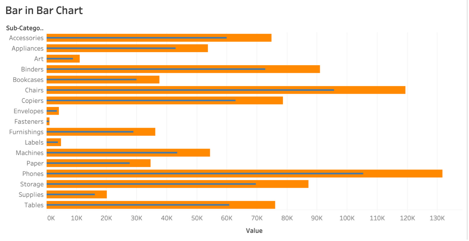
Figure 4.26: Sample bar-in-bar chart
Exercise 4.05: Creating a Bar-in-Bar Chart
The previous view that you created for tracking actual sales versus target sales had a reference point in the view that, without additional helpful text and explanation, would have been confusing for stakeholders. The category manager has asked you to make the actuals versus targets comparison simpler. As an analyst, after researching potential chart ideas, you identify the bar-in-bar chart as a great chart for a simpler view. You will be re-creating the bullet chart view with same dimensions and measures but will be utilizing a bar-in-bar chart. You will be using the same Superstore dataset for the analysis.
Perform the following steps to complete the exercise:
- Load the Orders table from the sample Superstore dataset if it's not already open in your Tableau instance.
- Drag Sub-category to the Rows shelf and Sales Target 2019 to the Columns shelf.
- Drag Actual Sales 2019 to the view and hover over the Sales Target 2019 axis until you get two green stack bars highlighted in the axis, and then drop Actual Sales 2019 on the Sales Target 2019 axis as shown here:
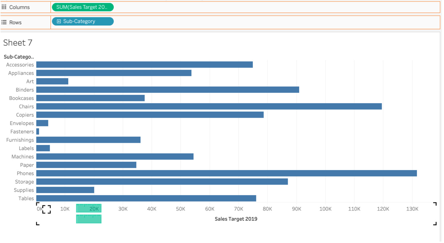
Figure 4.27: Sales by sub-category bar chart
In the preceding screenshot, you just plotted sales by sub-category, and in the next step, you will color-split these bars into actual versus target so that you can achieve your desired bar-in-bar result.
- Drag Measure Names from the Rows shelf to the Color Marks card on the left. As soon as you do that, the two measures will be distinguished by different colors and will be stacked on top of each other:
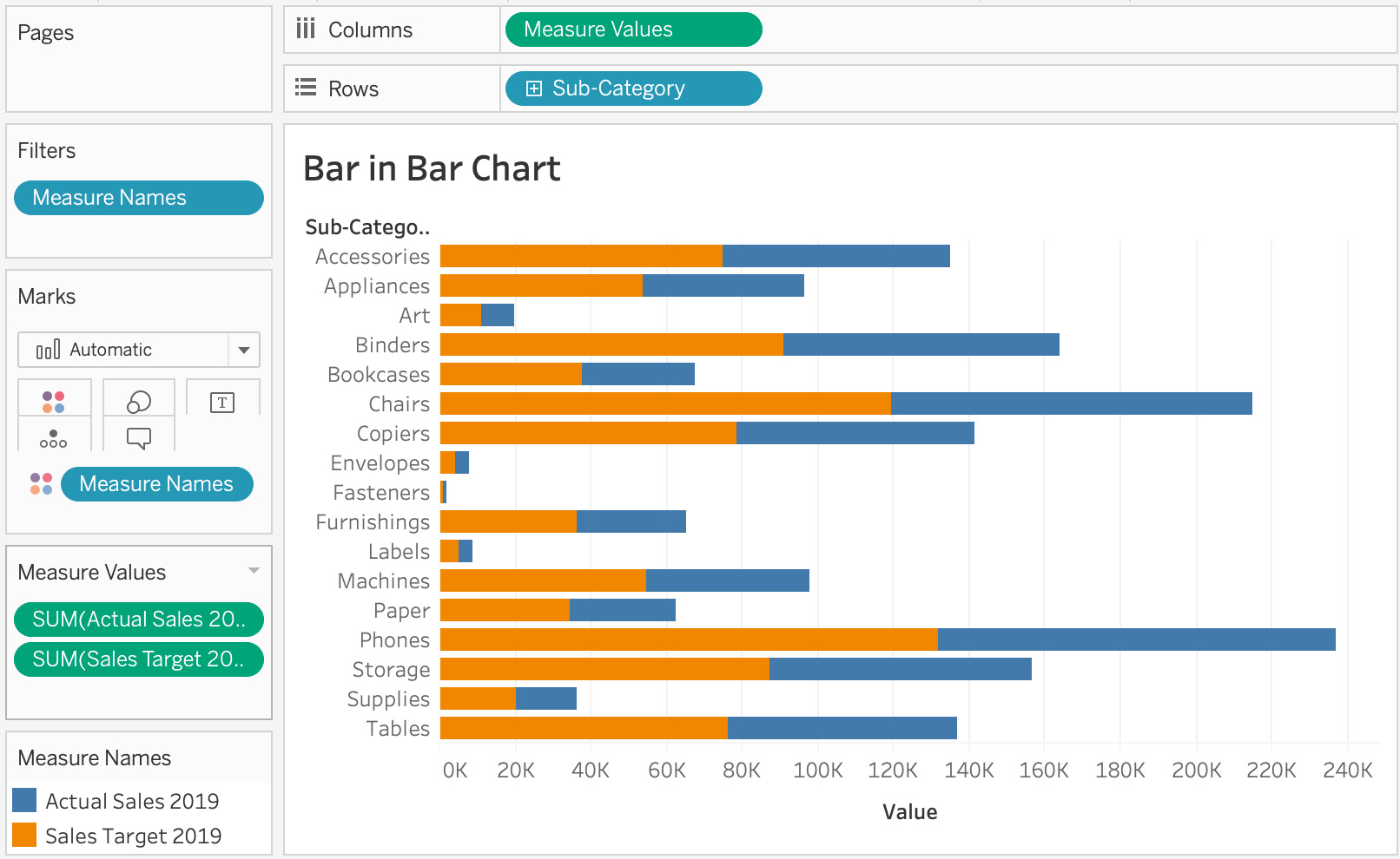
Figure 4.28: Sales by actual versus target 2019
By adding Measure Values to Columns and adding Actual Sales 2019 and Sales Target 2019 to the Measure Values Marks card, you will see you were able to stack two bars on top of each other, with the orange bar being Sales Target 2019 and the blue bar being Actual Sales 2019.
- You'll also notice that both the measures are stacked on top of each other rather than starting at zero. Essentially, the Actual Sales 2019 bar starts where Sales Target 2019 ends, which is not how you want your data to be presented. To change that, navigate to Analysis in the menu, select Stack Marks, then choose Off.
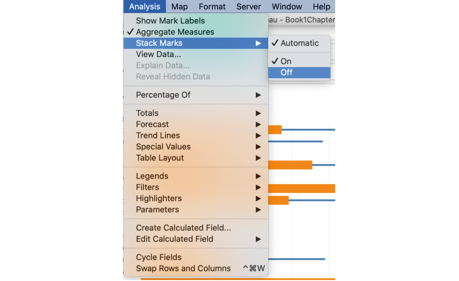
Figure 4.29: Turning off Stack Marks
- As much as the current view looks good, you also want to differentiate Actual Sales 2019 and Sales Target 2019 by size too. Do this by dragging Measure Names from the Dimensions data pane and dropping it on the Size Marks card, as shown here:
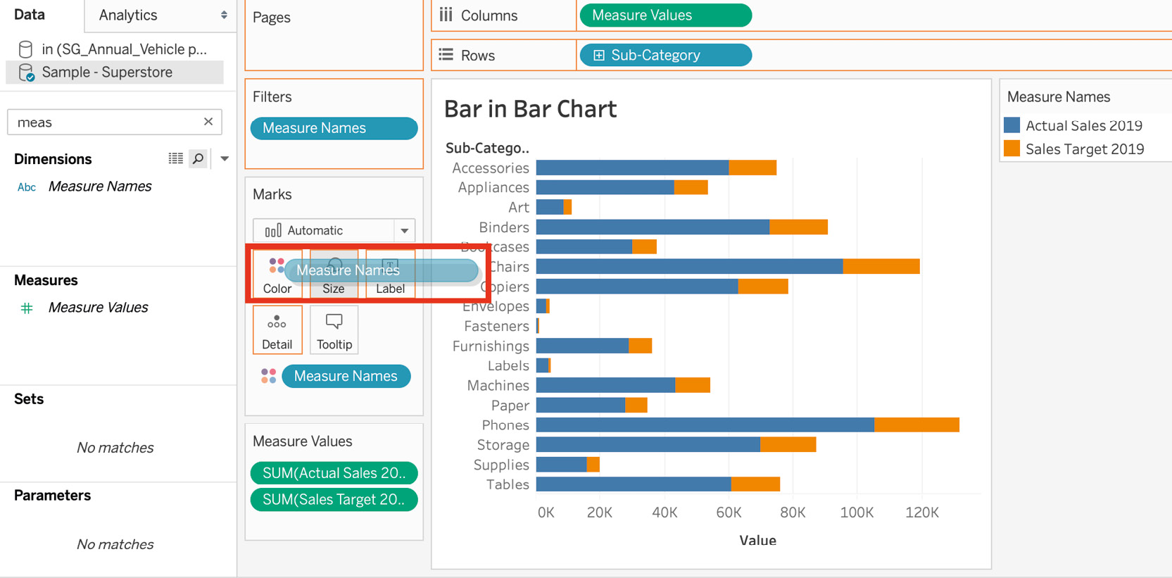
Figure 4.30: Un-stacked bar chart
The preceding screenshot shows that Measure Names was added from the dimension pane to the Size Marks card.
- If you want, you can swap the measure that is in the foreground. The current view is good as Actual Sales 2019 is in the foreground and is racing toward Sales Target 2019, but if you want to change this, just swap the measures in the Measure Values card and play with the size, color, or width of the bar:
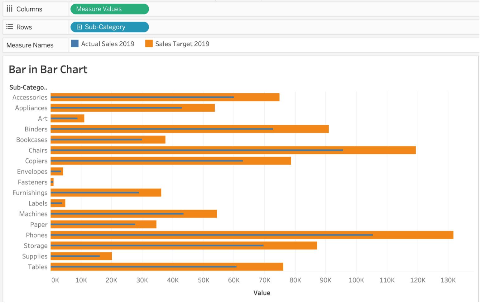
Figure 4.31: Bar-in-bar chart
In the preceding figure, the blue bar is Actual Sales 2019, which is racing toward Target Sales 2019, which is the orange bar. For example, the Bookcases sub-category has actual sales of 30,000 in 2019 and is racing toward the sales target of approximately 33,000.
You could have also achieved the same bar-in-bar chart using dual axis, but we will be covering that in the next chapter. Here, we went with a standard approach and learned how to utilize Measure Names and Measure Values, which play an important role in Tableau report/dashboard building.
Exploring Composition Snapshots – Stacked Bar Charts
A stacked bar chart is nothing but a bar chart with an extra level of detail embedded in the bars, where each bar represents distinct dimensions/values. Stacked bar charts come in handy when you want to compare the whole to a segment of the dimensions/value, which are essentially smaller segments of the same bar. Think of the revenue generated by a car company: as an analyst, you want to show the revenue split by car/product type in a single bar graph without using too much space. By color-coding the bar chart with the car type, you can create a single graph with lots of contextual detail.
Think of stacked bar charts as showing totals against parts:
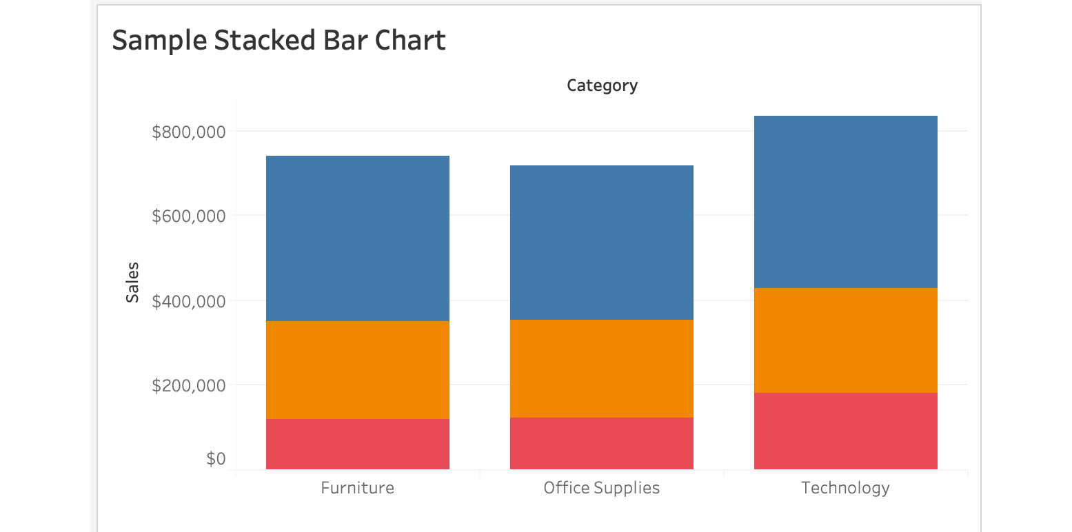
Figure 4.32: Sample stacked bar chart
Try your hand at creating a stacked bar chart with the next exercise.
Exercise 4.06: Creating a Stacked Bar Chart
In this new request from your direct manager, they want to look at sales by sub-category in bar chart format, where the sales sub-categories are segments by color. Essentially, the manager expects a stacked bar for each sub-category, split into segments. You will continue to utilize the Superstore dataset for this exercise.
Follow these steps to complete this exercise:
- Load the Orders table from the sample Superstore dataset if it's not already open in your Tableau instance.
- Drag one of the measures to the Rows shelf. This exercise uses Sales, but you can use any of the measures in your own projects.
- Drag Sub-Category to the Columns shelf, and now you shall have a simple bar chart for sales by sub-category:
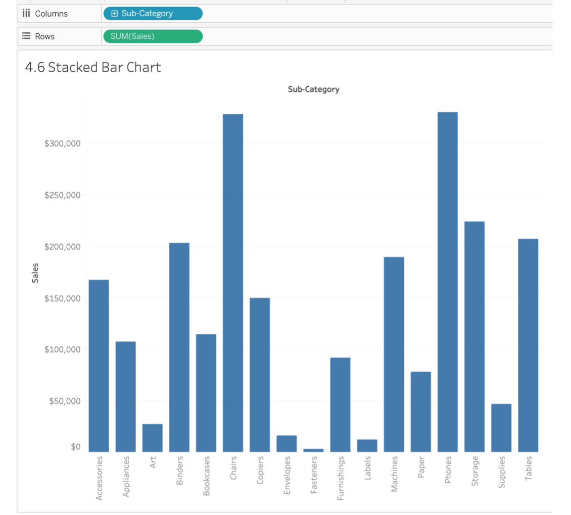
Figure 4.33: Stacked bar chart – sales by sub-category bar chart
- To convert this bar chart into a stacked bar chart, select one of the dimensions (either YEAR[Order Date] or Segment) and drag it to the Color Marks card as shown here:
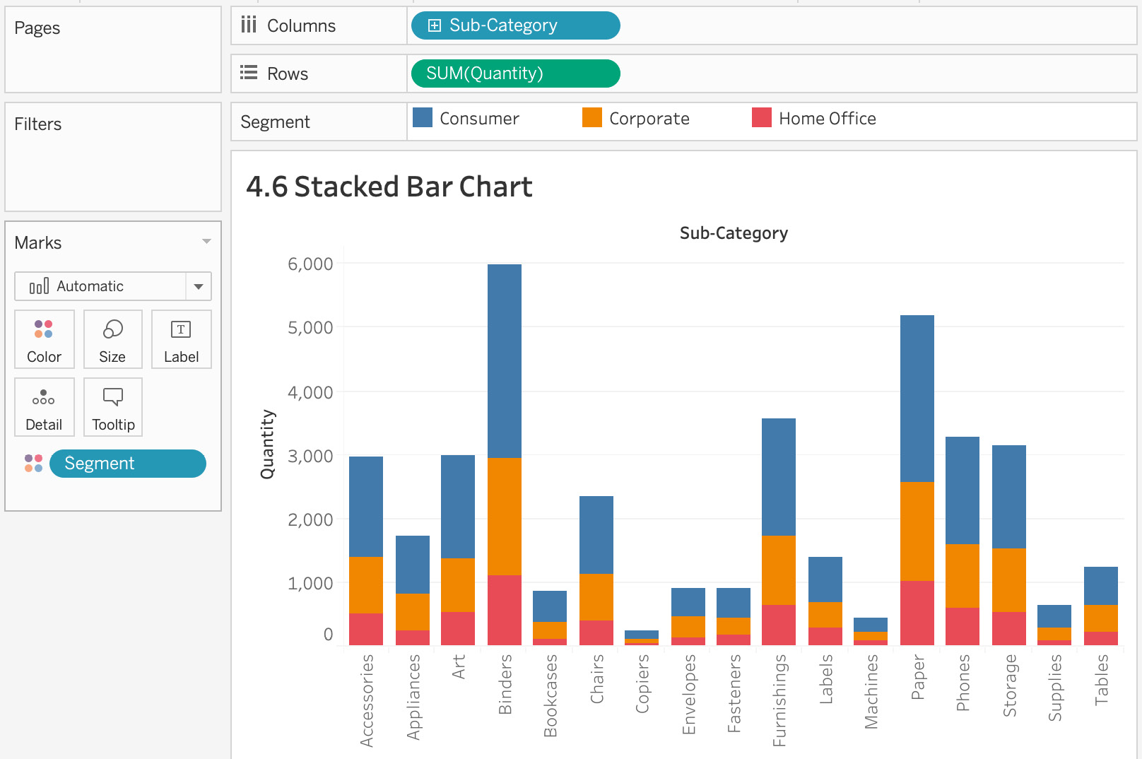
Figure 4.34: Stacked bar – sales by sub-category and segment
You have now essentially converted your simple bar chart into a stacked bar chart as you have color-coded or stacked multiple bars on top of each other by segment. Chairs and Phones were the highest-grossing sub-categories, but it is not clear which of those segments contributed more; so, next, you will add more elements to your stacked bar chart for readability.
- Add SUM(Sales) as a label for your bars. Drag Sales from the Measures data pane to the Label Marks card:
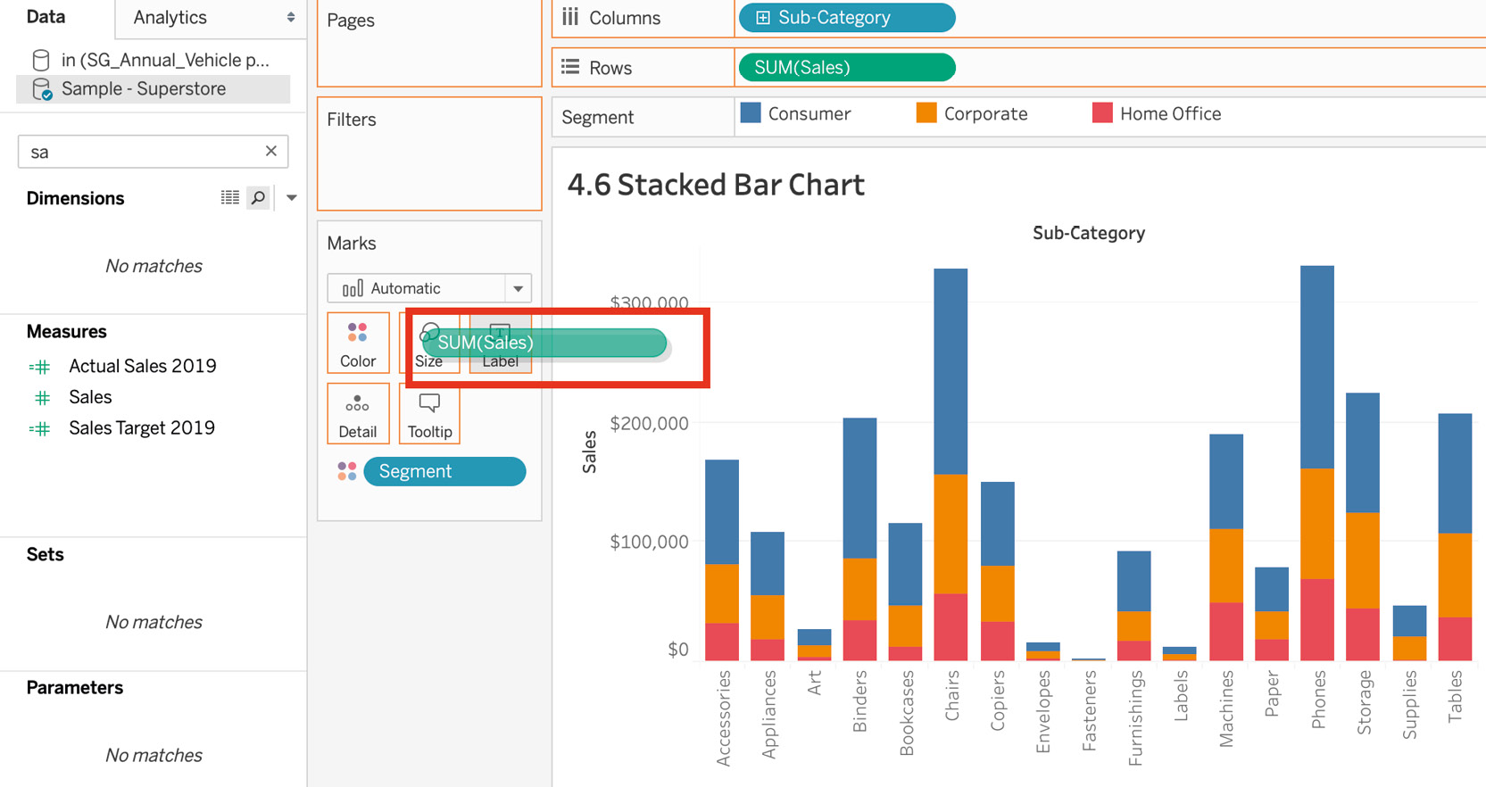
Figure 4.35: Stacked bar – sales by sub-category and segment
- You might notice that the Sales label is taking a lot of space in our bars. The reason it is taking so much space is that the unit of Sales is tens, but considering that most of your sales are greater than 1,000, you can change the unit from tens to thousands so it is easier to read and saves you some real estate.
- To change the unit for the Sales figures, navigate to SUM(Sales) in the Marks card. Right-click and select Format.
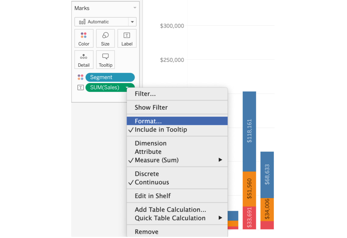
Figure 4.36: Formatting Sales
- In the default section of the dialog box, click on the Numbers dropdown, select Numbers(Custom), and change Display Units from None to Thousands(K):
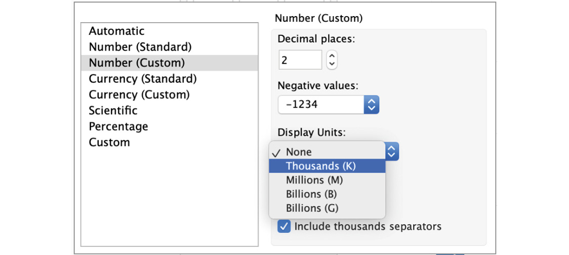
Figure 4.37: Formatting Sales
The stacked bar chart will now look as follows:
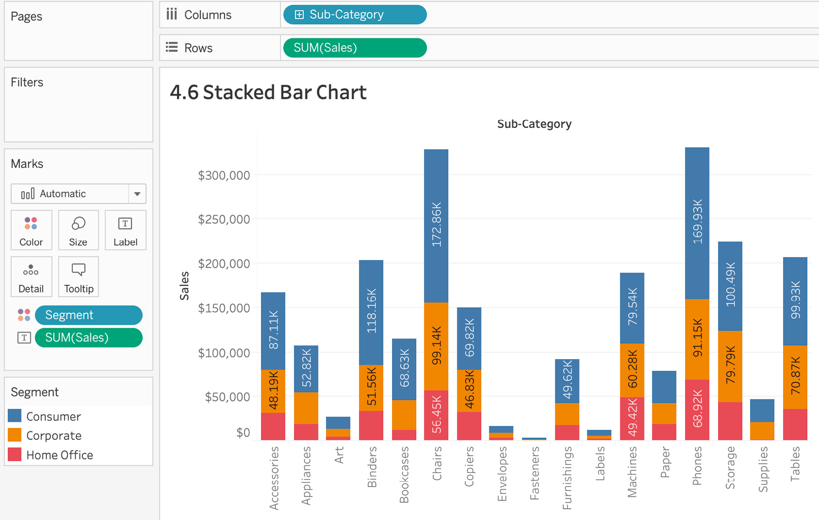
Figure 4.38: Final stacked bar chart
Note
In the preceding figures, you might notice that the smaller bars have no information embedded inside them. This is a limitation of Tableau. When you hover over the smaller bars, Tableau will display the information you need.
In this exercise, you looked at how to create a stacked bar graph. This is probably one of the easiest charts to build in Tableau, but it is an incredibly useful choice when you want to answer questions about parts against the total.
Exploring Composition Snapshots – Pie Charts
Although pie charts are quite often used, in the author's personal experience and the opinion of industry leaders in the field of data visualization, they are best avoided in reports/dashboards because it gets difficult to draw insights accurately from them. Pie charts often confuse even the best in the business. Notice how it is easy to trick people with the following pie chart (tricking people is not what we as data analysts/visualizers are supposed to do):
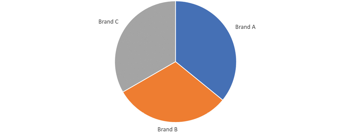
Figure 4.39: Sample pie chart
The goal of the pie chart is to display market penetration levels for brands A, B, and C. A simple visual inspection may cause one to believe that Brand A and C have equal market penetration, but in reality the difference between them could be several millions of dollars due to a couple of percentage points' difference. Therefore, it is recommended not to use pie charts. That said, if there is no way to avoid using them, keep in mind the following rule of thumb: if your pie chart has more than six labels, you are better off creating either a bar chart or a stacked bar chart.
Exercise 4.07: Creating a Pie Chart
The VP of the company is going to be presenting in a board meeting today, and they are looking for your help to create a simple pie chart showing sales by segment. In this exercise, you will create your first pie chart and fulfill the requirement as requested by the VP. You will continue to use the Superstore dataset.
The following steps will help you complete this exercise:
- Load the Orders table from the sample Superstore dataset if it's not already open in your Tableau instance.
- Drag Sales to the Rows shelf and Segment to the Columns shelf, which creates your standard bar chart:
Figure 4.40: Pie chart – step 1
- To convert the bar chart to a pie chart, open the Show Me panel and click on the pie chart icon:
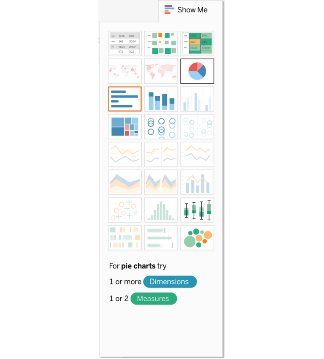
Figure 4.41: Adding a pie chart using the Show Me panel
When you convert the bar chart to a pie chart, the pie chart might be too small to read.
- To increase the size of the pie, on a Mac, you can press Command + Shift + B to increase or Command + B to decrease the size of the chart. On Windows, press Ctrl + Shift + B to increase the size of the chart and Ctrl + B to decrease the size of the chart. Another way to increase or decrease the size of the chart is by using the Size tab in our Marks card:
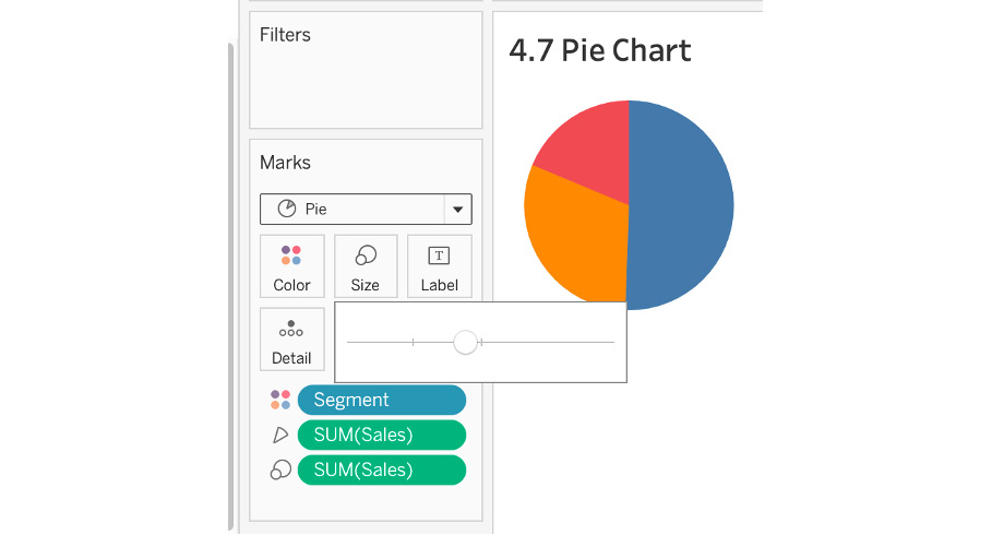
Figure 4.42: Increasing the size of the pie
- To add labels to the chart, drag Segment as well as Sales to your Label Marks card. Increase the size of our label to 15 or higher. You can also change the units of the SUM(Sales) figure to thousands or millions as discussed in the previous exercise:
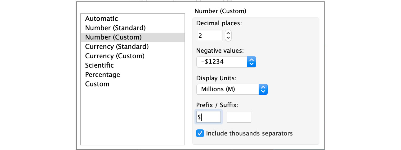
Figure 4.43: Adding the $ prefix
The final output after making the changes will be as follows:
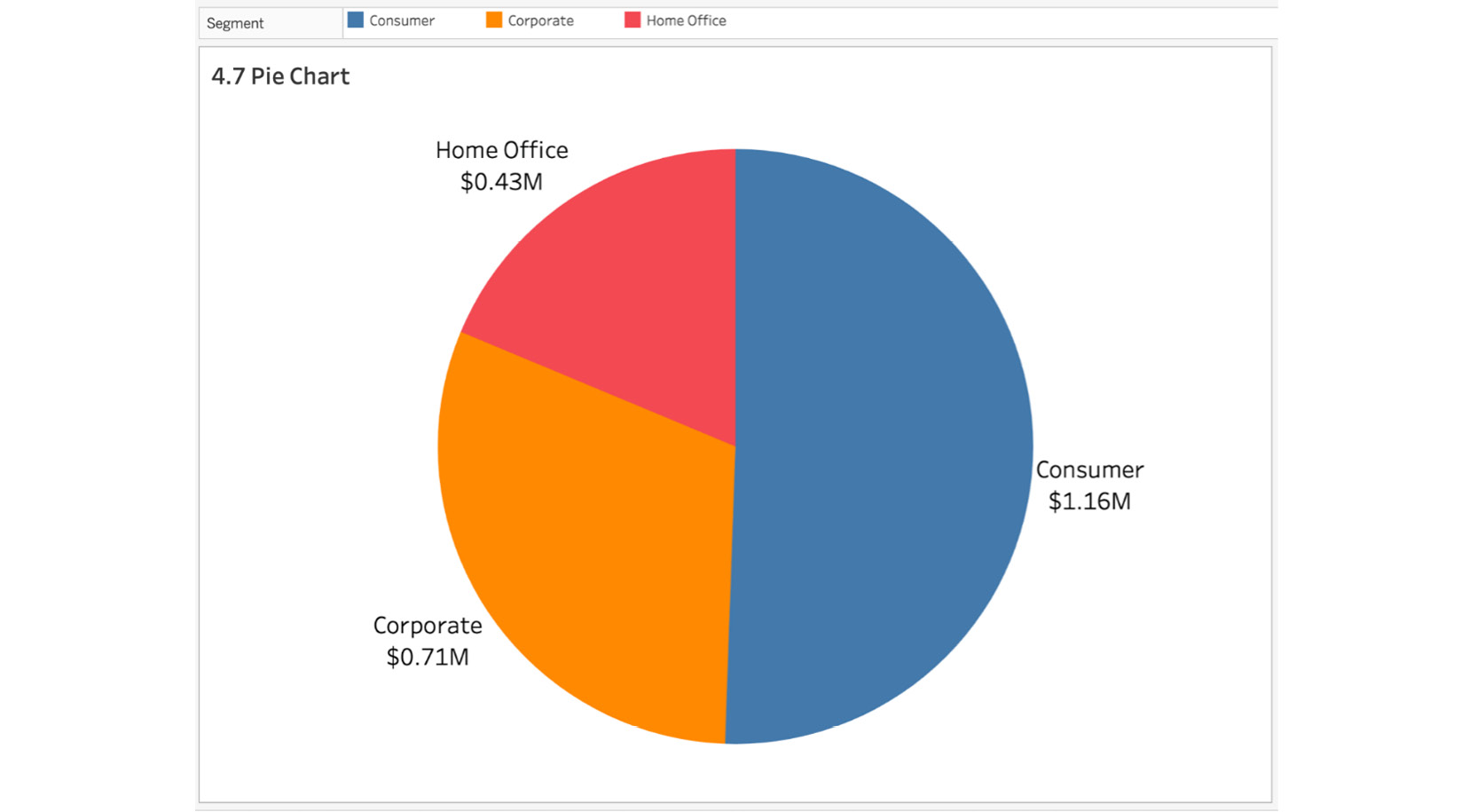
Figure 4.44: Final pie chart
In the preceding screenshot, you were able to show sales by segment in a pie chart. Although they have their drawbacks, pie charts can be really useful when the number of labels does not exceed 5-7 and the useable space on the screen is very limited.
Treemaps
Like pie charts and stacked bar charts, treemaps help you answer parts-of-the-whole types of questions, but the main difference is that treemaps and bar-in-bar charts show hierarchical relationships using rectangles. Using Marks card elements such as Color and Size, you can better analyze the data. When a rectangle is bigger or has a more concentrated color, it represents the highest value of the dimension in the view. Treemaps allow you to quickly measure contributions to the whole. Like pie charts, treemaps are not always the best choice, but depending on the analysis needed, treemaps can use contextual labels for better readability; they are also one of those chart types where you can plot hundreds of data points in a view.
Think of a case where the VP of delivery operations has requested a presentation on the total deliveries to each state as well as whether deliveries in those states were on time or not. Using treemaps, you can compare the delivery activity for each of the states, where the number of deliveries is communicated by the size of the rectangle for each state and the proportion of deliveries that were delayed is shown by color:
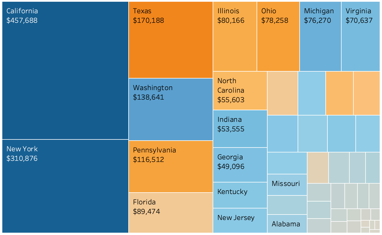
Figure 4.45: Sample treemap
Exercise 4.08: Creating Treemaps
As an analyst, you want to create a view of profitable versus non-profitable states by category without using a cross-table in your view. For this exercise, you will use the Superstore dataset. You are required to color-code the states based on their profitability and sort the states in descending order based on total sales. The reason you are using treemaps for this is that you can use both size and color to convey information without sacrificing anything.
Perform the following steps to complete the exercise:
- Open the sample Superstore dataset if it's not already open in your Tableau instance.
- For this exercise, you have two measures: Sales and Profit Ratio. You will use Sales for sizing and Profit Ratio for coloring the treemap. Drag the primary measure (in this case, Sales) to the Size Marks card and the secondary metric, Profit Ratio, to the Color Marks card:
Figure 4.46: Adding Sales to the treemap
Note
If you are using a version of Tableau later than 2020.1, you may need to choose Profit rather than Profit Ratio for this step.
- Drag State to your Detail Marks card as it will make your data more granular and represent the states with sizes and colors.
When you add State to the Detail Marks card (in Tableau version 2020.1), you will see that Country/Region is automatically added as State is part of the hierarchy. Remove Country/Region from the Detail Marks card because it is not adding any value or detail to your view. While you are at it, drag State as a label:
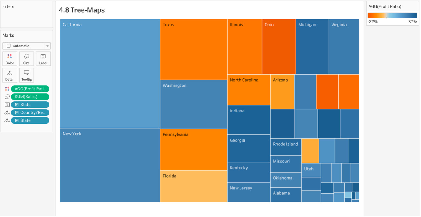
Figure 4.47: Color coding by profit ratio
In the preceding figure, you have represented sales and profit ratios by states. California and New York have the largest number of sales (larger rectangles means more sales), but states such as Michigan have higher profit ratios (darker blue means higher profits).
- You could potentially stop the analysis/charting here, and this would be your treemap representing sales by each state and their profit ratios. However, in this case, you'll add another layer of detail to your view. Drag Category to the Rows shelf, and in the toolbar, change the view from Standard to Entire View, as shown in the following screenshot:
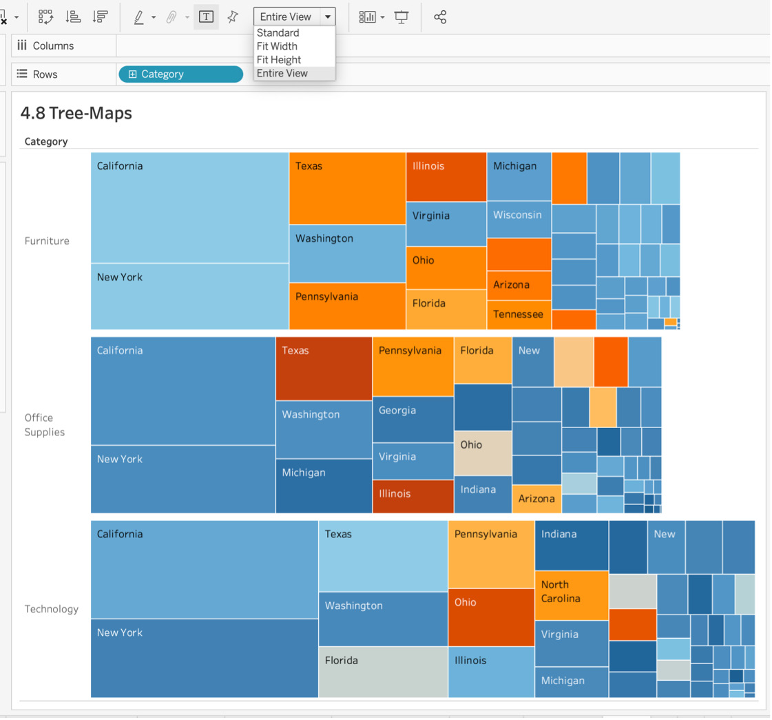
Figure 4.48: Treemap by category
You are just about finished, but the color range that you have used in the chart is a bit confusing because the stakeholders just want to know whether a state was profitable or not. They neither need nor want to know the exact profit or loss ratio for each of the states. You can add those exact Profit ratio details in a tooltip later.
- Navigate to the Marks card and click on the Color tab. Check the Stepped color checkbox and enter its value as 2 steps.
Note
If you are using a version of Tableau later than 2020.1, you will need to select Edit Colors to find the Stepped color option.
- Next, select the palette you want and click on << Advanced. Check the Center checkbox and enter its value as 0 (green represents a profitable state):
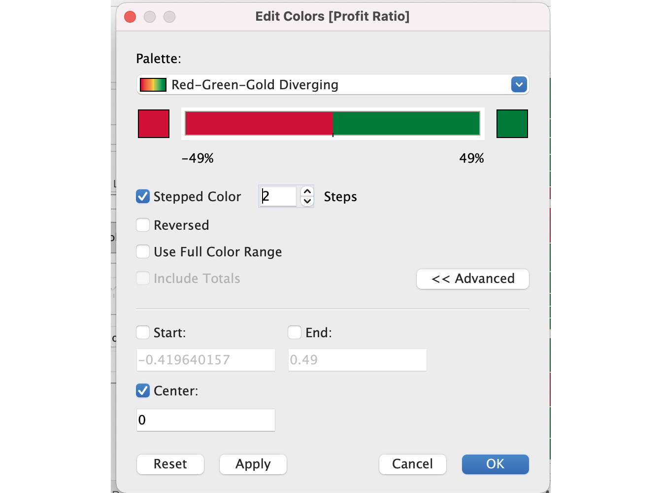
Figure 4.49: Treemap by category and state with red/green color coding
The final output is as follows:
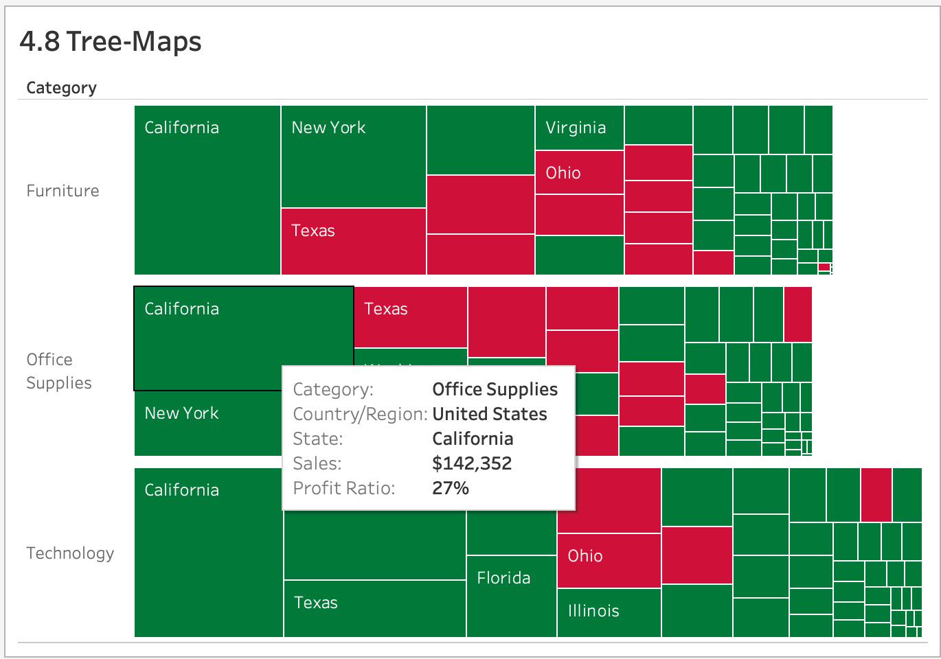
Figure 4.50: Treemap by category and state with red/green color coding
The main difference between this view of the treemap (Figure 4.50) and the default treemap you created in the previous step (Figure 4.48) is that in the latest treemap, instead of color-coding your profit ratio with gradient colors, you color-coded loss as red and profit as green, so it's easier for stakeholders to quickly view the most profitable and least profitable states.
If you look, you can see that California is the highest-selling state across all categories, and if you want to know the profit ratio of the state, all you have to do is hover over any of the states.
Exploring Compositions for Trended Data
Area Charts
Area charts are among the most visually pleasing charts available and are used pretty frequently for reporting cadence. Area charts are essentially combinations of line charts and bar charts in that they show the relationships between the proportions of the total.
Think of a use-case wherein the branch manager of an electronics company wants to look at the total quantity sold in each television category by the series that they belong to. You can fulfill this requirement by using a stacked bar chart, but with an area chart, you can also add time trends, which is what you will explore in this exercise here.
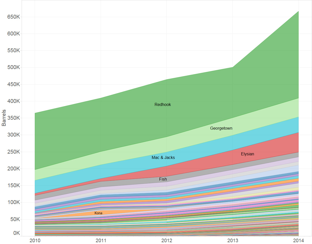
Figure 4.51: Sample Area Charts
Note: Word of caution for area charts
When you use an area chart as a stacked area chart, it can easily be misinterpreted—especially if you use stacked area charts for percentages. For example, say you are creating an email marketing report where you have conversion rates for different campaigns. Campaign 1 had a click-through rate (CTR) of 3%, campaign 2 had a 7% CTR, and campaign 3 had a 6% CTR for a particular month. The true CTR for that month was 5.3%, but using a stacked area chart, the CTR for all campaigns may show up as 16%, which is factually incorrect. Just be aware of the caveats here.
Exercise 4.09: Creating an Area Chart
The director of financial operations reaches out to you, looking to understand how the sales for each sub-category trends across each month. The director wants to know whether they sell more in July or August. As an analyst, your job is to create a color-coded area chart showing sales by month of the year and how sales trend across the year. You will continue to utilize the Superstore dataset for this exercise. You will also explore continuous as well as discrete area charts in this exercise, utilizing Order Date, Sub-Category, and Sales.
Perform the following steps:
- Open the sample Superstore dataset if it's not already open in your Tableau instance.
- Drag Order Date to the Columns shelf and change the granularity from year to month by clicking the arrow on the Order Date capsule and selecting continuous Month (you will first create a continuous stacked area chart).
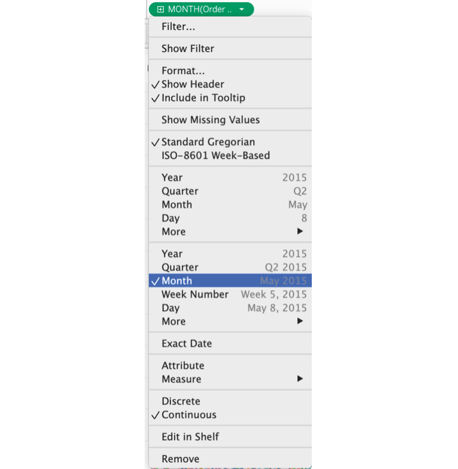
Figure 4.52: Continuous month selection
- Drag Sales to the Rows shelf. As soon as you drop it onto the Rows shelf, a line chart is created.
- Drag Sub-Category from data pane onto Color Marks card to and then change the Marks type from Automatic to Area using the dropdown:
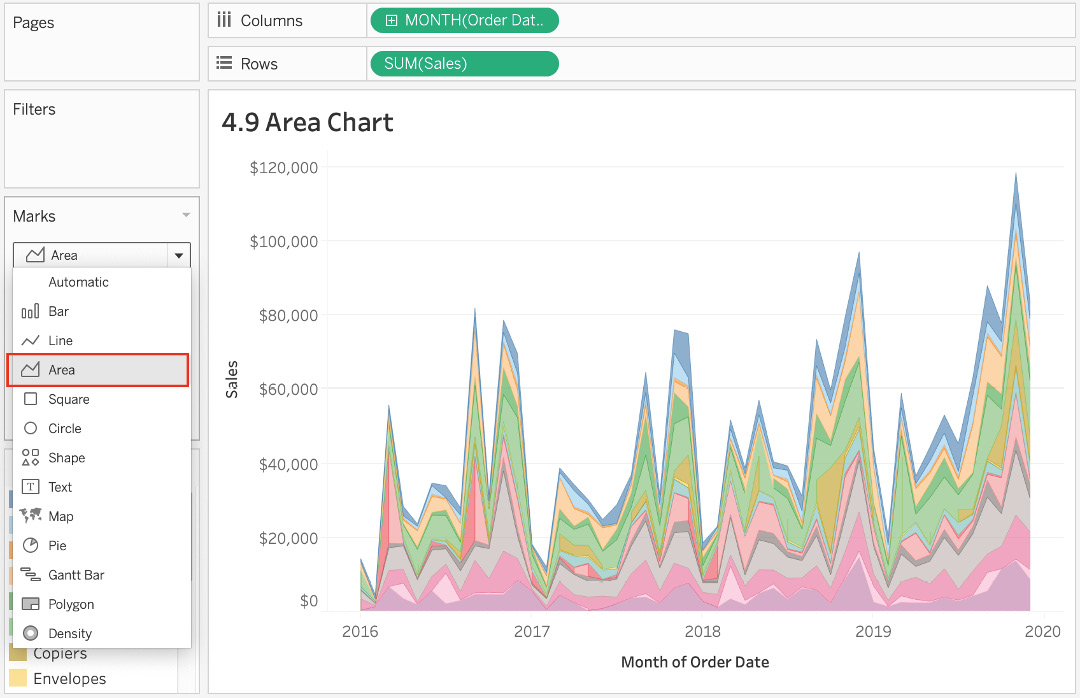
Figure 4.53: Area chart
The preceding chart represents the continuous stacked area chart. If you don't want the areas to be stacked on top of each other, you can turn off stacking.
- Navigate to Analysis in the menu and click on Stack Marks | Off. Similarly, you follow the same steps to turn the stack marks back on:
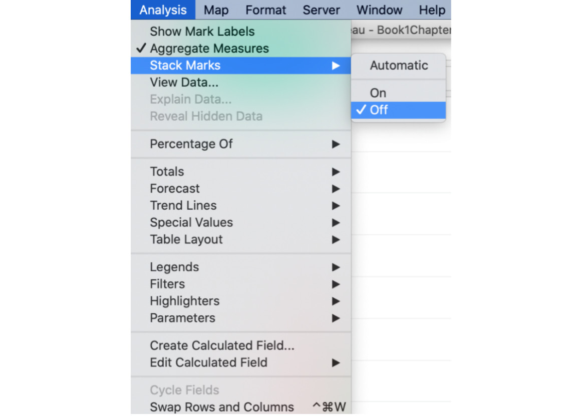
Figure 4.54: Turn Stack Marks off
The only reason that someone would want to turn off Stack Marks in an area chart is if they want to look at individual trends for the dimension in question (in this case, Sub-Category). The limitation of an unstacked area chart is that it carries a risk of hidden data points because what the background area represents is not clear:
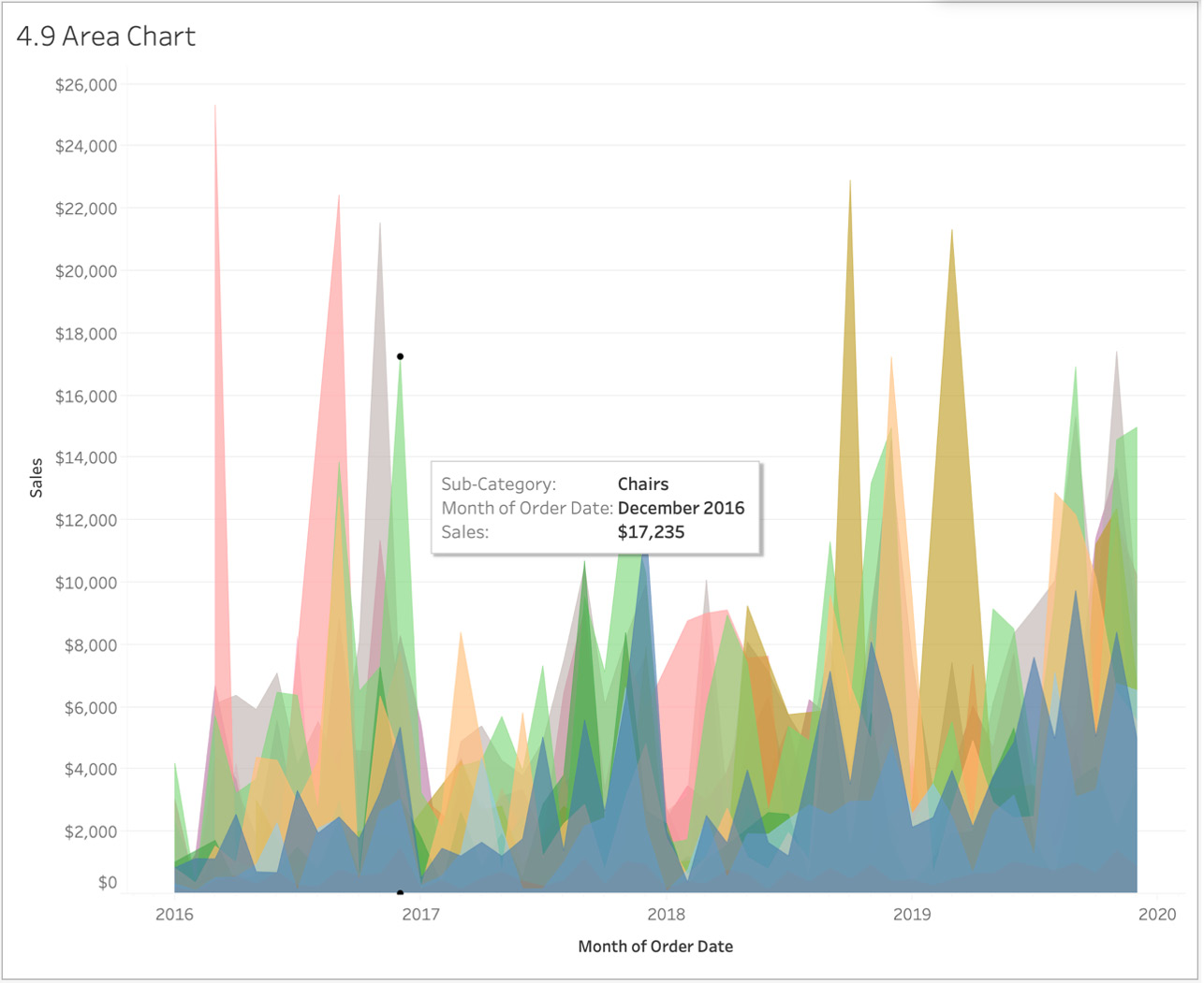
Figure 4.55: Area chart
- To change the area chart to be discrete, change the type of Order Date from Continuous to Discrete:
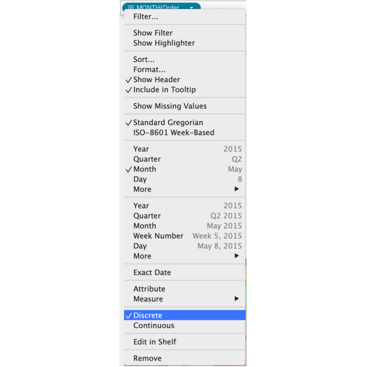
Figure 4.56: Discrete dates selection
With discrete charts, instead of Month for each year, now you only show discrete months without considering the year in the view. The view is a less granular view compared to that of the continuous stacked area chart. You will change the axis tick marks from $50,000 to $25,000 increments.
- To change the axis tick marks, right-click on the Sales axis and click on Edit Axis….

Figure 4.57: Editing the axis
- In Edit Axis [Sales], click on Tick Marks (this may be Major Tick Marks in later versions) and select Fixed, then set Tick interval to 25000, as shown here:
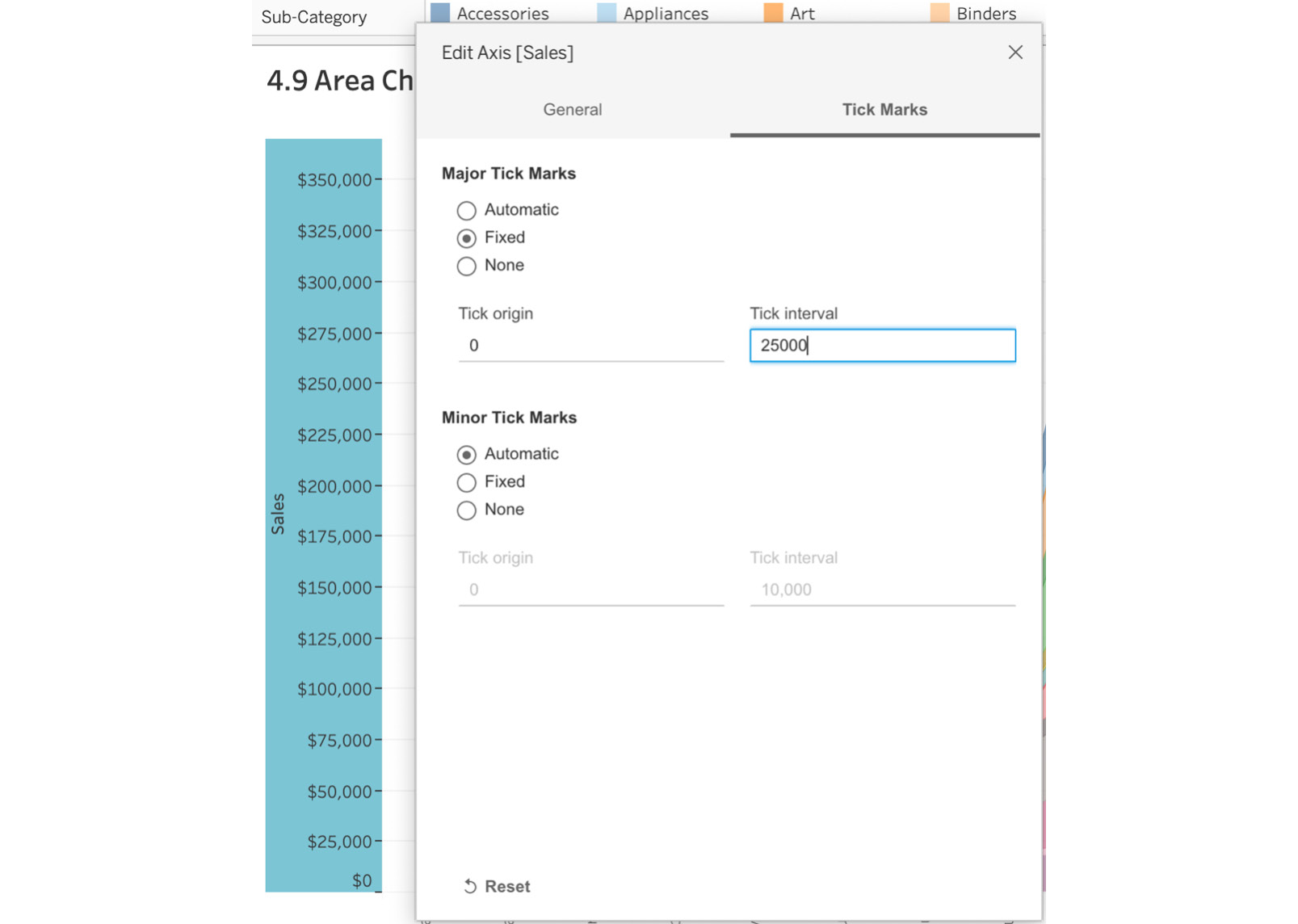
Figure 4.58: Setting Major Tick Marks
The final output is as follows:
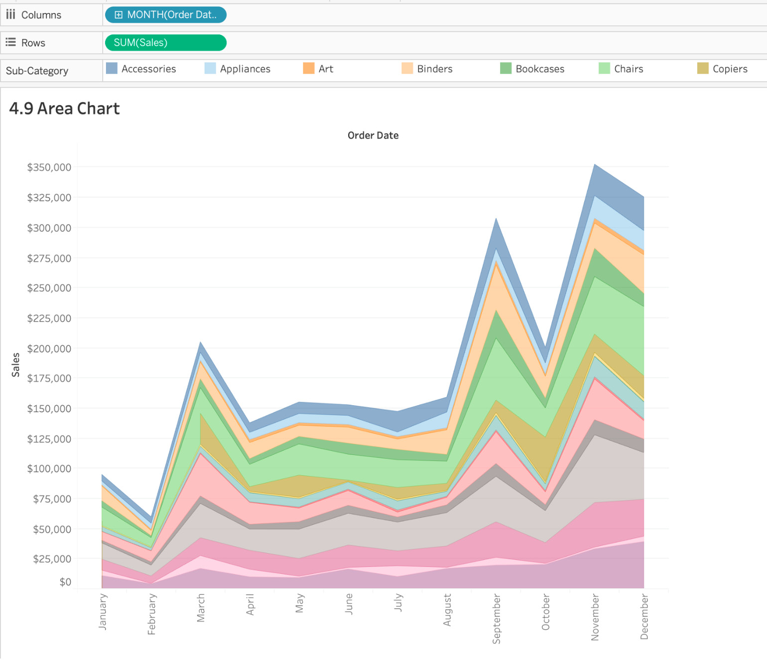
Figure 4.59: Final stacked area chart
In the preceding screenshot, each of the sub-categories is stacked on top of each other, while the sales trends are shown across months. From the given chart, you can easily make out that November is the highest-grossing month for the Superstore dataset.
In this exercise, you learned when and when not to use area charts, looked at stacked versus non-stacked area charts, and studied the best use cases for continuous and discrete area charts.
Activity 4.01: Visualizing the Growth of Passenger Cars in Singapore
Recently, the Singapore government appointed a new head of vehicle inspection. This newly created department will analyze vehicle sales over the past few decades, study growth/trends, and create policies and rules to further help the government reduce emissions. As part of the initial onboarding, the head of vehicle inspection has asked to look at sales trends for each vehicle category, including buses, taxis, cars, and goods vehicles. They expect an analyst to create a single view showcasing the trends for sales of these vehicle categories. As an analyst, considering that the head of vehicle inspection expects to see trends across multiple categories and years, you decide to use an area chart with color coding for easier readability.
In this activity, you will be showcasing the skills that you have learned in this chapter by creating multiple charts. You will be using the SG_Annual_Vehicle_Population data, which can be downloaded from https://packt.link/wLR2x.
Perform the following steps to complete this activity:
- Import and open the data that was downloaded.
- Drag Category to the Columns shelf and Number to the Rows shelf.
- Drag Year to the Columns shelf.
- Drag and drop Category to the Color Marks card.
- Drag and drop Year to the Label Marks card.
- Change the Axis title to just Year of Audit.
- Edit the axis to change Major Tick Marks to Fixed and set the intervals to 1.
- Change the title of the worksheet to Activity 4.1.
The expected output is as follows:
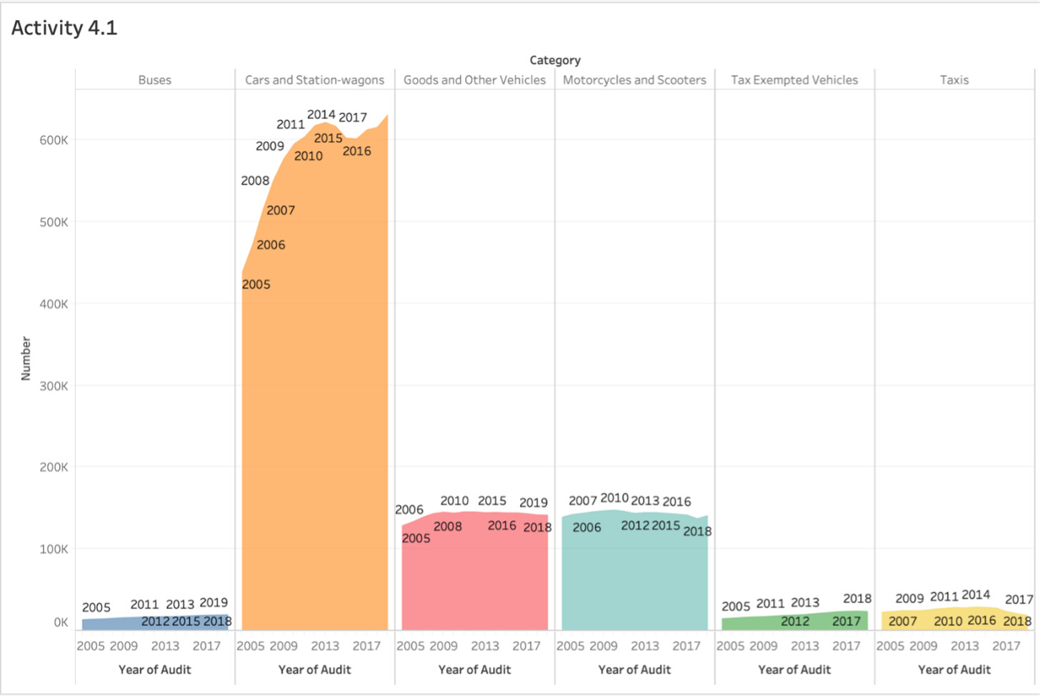
Figure 4.60: Activity 4.01 expected output
Note
The solution to this activity can be found here: https://packt.link/CTCxk.
Summary
That wraps up this chapter. In this lesson, you created your first charts in Tableau, starting with bar charts, which are used for comparisons across dimensions, followed by line charts to show comparisons over time. You also looked at how bullet charts and bar-in-bar charts differ and the best use cases for them when exploring comparisons across measures.
You further composed snapshots, working through three major chart types: stacked bar charts, pie charts, and treemaps. When exploring treemaps, instead of using a standard treemap, you added an extra layer by utilizing multiple measures where the primary measure, Sales, was used for the size of the rectangle and a secondary measure, Profit ratio, was used for profit/loss using two different colors. The different colors made it easier for stakeholders to identify profit-making states across superstore categories.
Although we did discuss line charts for time series data, we also decided to work through an area chart problem and study the issues with stacked (cannot aggregate percentages) versus non-stacked (risk of hidden data) area charts. We briefly touched on continuous versus discrete stacked area charts. We wrapped up the chapter by working through a new dataset on Singapore's annual vehicle population audit and created an area chart for understanding the different trends of vehicle growth over the past 15 years in Singapore.
In the next chapter, we will take a step forward and work through dual axis, histograms, box and whisker plots, and scatter plots, as well as discussing some statistics related to reference lines and when to use different reference line models. Consider the next chapter as covering advanced charting in Tableau.